
Melissa C. Walker's Blog, page 32
April 18, 2011
Cover Stories: Kissed by an Angel and Evercrossed by Elizabeth Chandler
 Elizabeth Chandler's bestselling Kissed by an Angel trilogy has been re-released with the cover you see at left, and her latest book, Evercrossed, matches that new style. I had to ask her how this cover evolution came about (it's a long way from the look of the first trilogy covers, below). Here's Elizabeth:
"For me, covers as well as titles are the last step in creating a book. I use working titles—very obvious and unimaginative ones—then usually beg for help from my editors. I just don't have those marketing genes! (I was also bad at titling school projects and research papers.)
"I am as clueless when it comes to imagining covers. My mind is full of images when writing a book, and I cut out and tape up all around my desk pictures of people, places, and things that somehow connect with my novel—these help me to live in the world of my story—but I don't think about an image for a cover. To me, that feels as if I'm summarizing or crystallizing the story before I truly know it. I need to let the story spin out through its words before I mentally pull it together enough to know what is right for a title or cover image.
 "Kissed by an Angel has had three very different American covers. I didn't have input on any of them, and as you now know, that was probably a good thing. When the trilogy was first published as three separate books, it had covers that appear to me to be photos of characters combined and reworked by an artist. I didn't like the covers then, and I still don't like them now. But they were right for that time period. When the trilogy first came out, all the publishers used photos, and the truth is, the publisher could have found the perfect models and I would not have liked them. I've never liked photographs or realistically drawn covers on novels—whether I write or read them. I find them disappointing, perhaps because characters created by words are so real to me as to be almost larger than life, and those pictures make them look like little dolls.
"The second cover for the trilogy, when the three books were published as one 'Collector's Edition' was incredibly romantic, the picture dominated by silhouette views of the hero and heroine's faces, looking as if they were about to kiss (right). To me, they looked older than teens and the gauzy pink overlay made the book look like an adult romance. I liked it better than the first covers, but it looked like somebody else's book, not the story I wrote.
 "The current cover is my favorite—I love it! Black, with the image of a single rose that has a bit of a supernatural feel because of its coloring and transparency, it is striking and romantic. It connects with the story: Tristan gives Ivy roses the night he dies, and identical roses come back as a sign to her in the sequel, Evercrossed. The newest book, Evercrossed has a similar cover, black with a single rose (left). They used the same font for both of these new covers, and I really like it. The lettering is elegant in a simple way, and that is what my heroine Ivy is like. She dislikes fluff and flounce, and if asked, would have chosen this font for her story."
Thanks, Elizabeth! I love how the original series covers reflect the time of their releases, and I think the current cover is luscious. Also: How cool is it to consider your character's taste in fonts?
What do you guys think?


April 15, 2011
Photo Friday: Rocking the Drop
Um, that was insanely awesome. Did you guys follow Rock the Drop yesterday? Check out the photos on the readergirlz blog and facebook page. EPIC.
Here are the books I put down:
Forgiven: In front of my apartment
Hereafter: On a park bench
[image error]
The Vespertine: At the park entrance
[image error]
Hush: In a tree (had to!)
[image error]
Triple-Book Bench!
[image error]
Rotters: At the 15th Street entrance
[image error]
Shades of Gray: At Connecticut Muffin!
[image error]
Starcrossed: Waiting for the subway
[image error]
Faerie Winter: On the F train!
[image error]
2 by Alyson Noel: In a planter on Elizabeth Street
[image error]
Cut: On Bleecker
[image error]
Die For Me: Isn't this door/wall cute?
[image error]
Kindred: On Bleecker
[image error]
Tortall: Not "free daily" but free yesterday!
[image error]
Small Town Sinners: Had to drop it at the Church Avenue subway stop!
Phew! Happy Friday! Did you guys do the Drop?
April 13, 2011
Win-It Wednesday: E. Lockhart's Ruby Oliver series
[image error]
[image error]
(The secret is that it's actually a photo from my wedding day, but you can't REALLY tell that... right? And I loved how AmandaSue said, "it just seems more you," which is what I'm going for overall.)
Anyway, the winner of Gayle Forman's Where She Went--chosen randomly from the comments--is... Julia, That Hapa Chick! And I realize I forgot to announce a winner for the week before last's giveaway for Ruta Sepetys's Shades of Gray... oops! That winner is Ariel! Send me your addresses, J and A.
[image error]
This week, I'm throwing Win-It Wednesday over to Readergirlz, where Figment and Readergirlz are encouraging everyone to Rock the Drop tomorrow (Thurs, 4/14) to support YALSA's Teen Lit Day! That means leaving a YA title or two out in a public place for someone else to find (you can get a bookplate to explain the donation here). If you do that, and then email a photo of your dropped book or share the story with readergirlz AT gmail.com, you're entered to win the full set of E. Lockhart's Ruby Oliver books, which make me so happy. They are seriously GREAT.
So pick a book to give away (you know your shelves are crowded anyway!) and let readergirlz know when you Rock the Drop!
Win-It Wednesday: E. Lockhart's Ruby Oliver series
The winning author photo is… Formal-ish! Thanks to the 250 people who voted. Total landslide:
[image error]
[image error]
(The secret is that it's actually a photo from my wedding day, but you can't REALLY tell that… right? And I loved how AmandaSue said, "it just seems more you," which is what I'm going for overall.)
Anyway, the winner of Gayle Forman's Where She Went–chosen randomly from the comments–is… Julia, That Hapa Chick! And I realize I forgot to announce a winner for the week before last's giveaway for Ruta Sepetys's Between Shades of Gray… oops! That winner is Ariel! Send me your addresses, J and A.
[image error]
This week, I'm throwing Win-It Wednesday over to Readergirlz, where Figment and Readergirlz are encouraging everyone to Rock the Drop tomorrow (Thurs, 4/14) to support YALSA's Teen Lit Day! That means leaving a YA title or two out in a public place for someone else to find (you can get a bookplate to explain the donation here). If you do that, and then email a photo of your dropped book or share the story with readergirlz AT gmail.com, you're entered to win the full set of E. Lockhart's Ruby Oliver books, which make me so happy. They are seriously GREAT.
So pick a book to give away (you know your shelves are crowded anyway!) and let readergirlz know when you Rock the Drop!
April 12, 2011
Rock the Drop with Readergirlz and Figment
Join me in your own town? Here's more info from Readergirlz (including how you can win a set of E. Lockhart's Ruby Oliver books, shown above).
Oh, and a video by Crissa Chappell and her niece Corie, who are both geniuses:
I Rock The Drop from crissachappell on Vimeo.
Happy Tuesday!
Rock the Drop with Readergirlz and Figment
[image error]I love this coming Thursday, when I'm going to sprinkle NYC with YA novels to celebrate YALSA's Support Teen Lit Day! Brooklyn, the West Village, midtown, and the subway in between. YES!
Join me in your own town? Here's more info from Readergirlz (including how you can win a set of E. Lockhart's Ruby Oliver books, shown above).
Oh, and a video by Crissa Chappell and her niece Corie, who are both geniuses:
I Rock The Drop from crissachappell on Vimeo.
Happy Tuesday!
April 11, 2011
Cover Stories: Illegal by Bettina Restrepo
"For the cover, I imagined two trailer-truck doors with the title in graffiti. But, I also knew that the art directors they have at HarperCollins could design something beyond my expectations. I only have a silly picture I drew (below). This is why I don't even try to suggest art. I leave the art to the experts.
[image error] "I received pictures of the shirt the model wore and they asked if it was okay (it was, I have one similar to it!). Then, when the font came out wonky and Frankensteinish (below) - they quickly agreed [with my objections] and came back with the beautiful barbed wire font.
[image error]
"They asked me if I like royal blue or the purple. Hands down - purple.
"When I saw the final cover, I cried and then hugged my laptop. My main character, Nora, only existed to me as someone in my head. I knew she had long hair and olive/Latina skin. But, to see her - she took my breath away. It's a model super imposed onto half of a burned out field, and half of the skyline of Houston (which is smudged up a bit with smog... just like the real city!)
"After the initial giddiness of seeing the cover, I noticed that Nora was wearing earrings. She wants pierced ears throughout the book, and doesn't get them done until the epilogue. I had to go back and give them to her earlier in the story - which I find kind of funny.
"I really love the cover because it conveys a sense of longing. It's wistful and shows movement. It was important NOT to see her face. Nora could be anyone... she could be you."
Thanks, Bettina! Yeah, I'm glad the art department got to do the final design (not that your illo isn't quite cute in that Book Report kinda way). And the font change is key -- I love the subtle barbed purple font (maybe inspired by your drawing?). Also: Those shirts like she's wearing are divine classics that never go out of style. I have one for summer! What do you guys think?
PS-Trailer!
April 8, 2011
Photo Friday: The Dominican Republic Getaway
The view from above our private beach (seriously!):
[image error]
There were excellent fresh drinks (even a virgin Pina Colada tasted good):
[image error]
I got to get lost in some amazing books, including Tara Altebrando's Dreamland Social Club , which swept me away into whimsy-land!
[image error]
There were peacocks by the pool, naturally:
[image error]
Did I mention there were amazing drinks? (Remember I have a thing for coconut milk.)
[image error]
Oh yeah, Dave was there too, drinking large beers (the food on the beach = incredible!)
[image error]
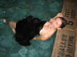
And lastly, because it's been requested (eek), a bump shot. Beach bump, no less.
[image error]
Happy Friday!
April 6, 2011
Win-It Wednesday (& Help Me Pick an Author Photo!): Where She Went by Gayle Forman
To enter to win this gleaming new hardcover, you've gotta help me out. Small Town Sinners is ready to go to press, and I can't pick an author photo! I had decided on one, but it's starting to look too serious to me or something. So below are three options, and I'd really love it if you could weigh in with your favorite (vote in the poll, definitely, but leave a comment too because I'll choose a winner from the comments -- you can just say "I voted!" if you don't have more to add). One commenter will win Gayle's book. Merci!
Option 1: Formal-ish.
[image error]
Option 2: Is the tiara too much?
[image error]
Option 3: Casual stoop shot.
[image error]
Which author photo do you like best?
Formal-ishTiara!Casual Stoop ShotThank you for your help! Seriously, so much.
PS-Remember this boat name contest from last year? It's almost decided! I'm handing in revisions on this book very soon. (See how long this book-writing thing takes? Forever!)
April 4, 2011
Cover Stories: Where She Went by Gayle Forman
"The image that kept coming to mind as I wrote was the Brooklyn Bridge. It plays a pivotal role in the story and for some reason it just stuck because it's so strong both from both a visual and literary standpoint. I believe that Penguin did experiment with using the bridge initially but decided that it didn't work.
[image error] "The challenge for the US publication was marrying the US If I Stay paperback cover--the eerily half-dead-looking girl, right--with a new hardcover look. But I had to make it extra tricky because, unlike If I Stay, which is from Mia's perspective, Where She Went is in Adam's voice. So how to create a cover that seemed like a package with the paperback but was from a guy's perspective?
"We were obviously departing from the quieter US hardcover look, with the flower, tree and branches (below left), which I loved but would not work at all in terms of a new book about a rock and roll guy, so I'm so glad we had the paperback cover to use as a jumping-off point. [image error]
"In the end, in sort of a duh, why didn't we think of it sooner epiphany, we all realized that the US cover had to have another Mia. Because even though the book is from Adam's POV, it's still about Mia. It's about where she went. So the covers are meant to be bookends. One horizontal, one vertical, one passive, one more active. There's no Brooklyn Bridge, and yet the covers are, in my opinion, such a perfect bridge.
"My publisher asked for ideas, but honestly, I knew that I had thrown them such a huge challenge in finding a cover for Where She Went that would be both striking, true to the book, and of a piece with If I Stay that I kept my mouth shut. Because really, truly, I had no clue what to do. I was relieved that I was not in the design department. Had Where She Went been a stand-alone, I think there would've been so many directions to go in. But in a way, the design was limited by the If I Stay cover. So I just sat back and wondered what they were going to do and felt grateful that coming up with a cover concept was not my job.
"When I saw the first version of the cover, my response was: Everything but the girl. Because I loved the general concept, and the idea of having a girl--Mia--on the cover, seemed so right. But the original girl looked nothing like the Mia from the first cover. And the model from the first cover was no longer available, and, oddly, other photos we'd found of her, looked nothing like the girl from the If I Stay cover. Also, the girl in the Where She Went cover try, aside from not resembling the original Mia, looked rather sad and wistful. Mia needed to look more fierce.
"My editor was in total agreement with me, both about the Mia needing to look the If I StayMia and about the wrongness of her expression--actually, she was the one who first raised the second point. So she took our case to the art department.
"I am sure the art department went through a period of not loving my editor or me. I think they thought we were asking for the moon: a twin of the initial Mia with a fierce expression on her face? They must've been like: How the hell are we going to find that? And then they went and pulled a rabbit out of a hat. Found the perfect image. The girl on Where She Went totally looks like the girl on the If I Stay cover. And what I love most is the look on her face. On If I Stay, the girl's look is haunting; it draws you in. On Where She Went, it's determined, which is fitting for who Mia has become, and also draws you in. Which is what a cover must do.
"Aside from the model swap, the background went from this sort of bright colored spots reminiscent of city lights--now on the inside flaps--to the smoky gray, which tied it more to the If I Stay cover. When you see the two covers together, they really are of a set. A lovely, striking set.
"The cover is a stock photo. I believe that they did do a photo shoot on the Brooklyn Bridge, but it just didn't capture the right feeling as well as this existing image did. Funnily enough, the bridge wound up becoming an element for some of the foreign covers, like the French and UK jackets (below). New York City is a strong selling point abroad, apparently. But it didn't work for the US cover.
[image error] [image error]
"It's funny because back when I was trying to imagine how they would jacket Where She Went, I wouldn't have imagined this direction. And it was a bit of an evolution to get it totally right, so it wasn't that initial visceral YES! But when I saw the jacket on the ARC, it just felt so absolutely right, as though that were the way it was meant to be all along.
'There are two things that make the cover perfect to me: One is the look on the girl's face. It beckons you, or at least it beckons me. So yes, this is Adam's book, but if you read it, it will make sense to you that Mia is on the cover and this girl will make sense as Mia. And second, when I hold this book up against the paperback of If I Stay--which has become the dominant image now--they look stunning together. Yin and Yang. They complete each other."
[image error] [image error]
Thanks, Gayle! I love the cloudy blue-gray ethereal feel that the covers have, and though I'm a fan of the original If I Stay cover, and I even like the way the Brooklyn Bridge looks on the UK version, I agree that this matched set is really lovely.
What do you guys think?


![[image error]](http://www.melissacwalker.com/wp-content/uploads/2011/04/forgiven-fox.jpg)
![[image error]](http://www.melissacwalker.com/wp-content/uploads/2011/04/hereafter-bench1.jpg)
![[image error]](http://www.melissacwalker.com/wp-content/uploads/2011/04/vespertine-in-park.jpg)
![[image error]](http://www.melissacwalker.com/wp-content/uploads/2011/04/hush-tree.jpg)
![[image error]](http://www.melissacwalker.com/wp-content/uploads/2011/04/3-bench.jpg)
![[image error]](http://www.melissacwalker.com/wp-content/uploads/2011/04/rotters.jpg)
![[image error]](http://www.melissacwalker.com/wp-content/uploads/2011/04/shades-of-gray.jpg)
![[image error]](http://www.melissacwalker.com/wp-content/uploads/2011/04/starcrossed.jpg)
![[image error]](http://www.melissacwalker.com/wp-content/uploads/2011/04/faerie-winter.jpg)
![[image error]](http://www.melissacwalker.com/wp-content/uploads/2011/04/noel.jpg)
![[image error]](http://www.melissacwalker.com/wp-content/uploads/2011/04/cut-bleecker.jpg)
![[image error]](http://www.melissacwalker.com/wp-content/uploads/2011/04/die-for-me.jpg)
![[image error]](http://www.melissacwalker.com/wp-content/uploads/2011/04/kindred.jpg)
![[image error]](http://www.melissacwalker.com/wp-content/uploads/2011/04/tamora.jpg)
![[image error]](http://www.melissacwalker.com/wp-content/uploads/2011/04/sinners-drop.jpg)
![[image error]](http://www.melissacwalker.com/blog/Screen%20shot%202011-04-13%20at%202.54.19%20PM.png)
![[image error]](http://www.melissacwalker.com/blog/Melissa%20Walker%20headshot.jpg)
![[image error]](http://www.melissacwalker.com/blog/Ruby-Oliver-series.jpg)
![[image error]](http://www.melissacwalker.com/blogimages/Screen%20shot%202011-04-13%20at%202.54.19%20PM.png)
![[image error]](http://www.melissacwalker.com/blogimages/Melissa%20Walker%20headshot.jpg)
![[image error]](http://www.melissacwalker.com/blogimages/Ruby-Oliver-series.jpg)
![[image error]](http://www.melissacwalker.com/blog/illegal.jpg)
![[image error]](http://www.melissacwalker.com/blog/illegal%20illo.jpg)
![[image error]](http://www.melissacwalker.com/blog/frankensteinfont.jpg)
![[image error]](http://www.melissacwalker.com/blog/above%20beach.jpg)
![[image error]](http://www.melissacwalker.com/blog/pina.jpg)
![[image error]](http://www.melissacwalker.com/blog/DSC.jpg)
![[image error]](http://www.melissacwalker.com/blog/peacock.jpg)
![[image error]](http://www.melissacwalker.com/blog/coconut%20milk.jpg)
![[image error]](http://www.melissacwalker.com/blog/dave%20beer.jpg)
![[image error]](http://www.melissacwalker.com/blog/beach%20bump.jpg)
![[image error]](http://www.melissacwalker.com/blog/whereshewent.jpg)
![[image error]](http://www.melissacwalker.com/blog/MelissaWalker.jpg)
![[image error]](http://www.melissacwalker.com/blog/melissa.jpg)
![[image error]](http://www.melissacwalker.com/blog/ifistaypb.jpg)
![[image error]](http://www.melissacwalker.com/blog/ifistay.jpg)
![[image error]](http://www.melissacwalker.com/blog/ifistay%20french.jpg)
![[image error]](http://www.melissacwalker.com/blog/where%20she%20went%20uk.jpg)