
Melissa C. Walker's Blog, page 35
February 23, 2011
Win-It Wednesday: Two Alyson Noel Books!
Before Alyson Noel wrote the bestselling
Immortals
series, she had a few other fantastic titles under her belt, and today I'm giving away two of them (sorry Win-It Wednesday has been on hiatus for a couple of weeks!).
Two of Alyson's books have been given new covers and re-released, so here are the original and new covers of Faking 19 for your enjoyment:
[image error] [image error]
And here are the two versions of Saving Zoe , original and new:
[image error] [image error]
For the record, the winner will receive these lovely paperbacks with the new covers. I like how there's a move away from the broken up photos with background/banner stuff. A full bleed photo feels more now, right? Thoughts?
One commenter who weighs in on the covers or just names their favorite Alyson Noel book (if you've read one) will win both of these novels. I'll choose a winner next week, when Alyson will share the Cover Story for her last Immortals novel, Everlasting . Good luck!
PS-Read the stories behind the covers of Alyson's Cruel Summer , Evermore , Blue Moon and Dark Flame .


February 21, 2011
Cover Stories: Where I Belong by Gwendolyn Heasley
[image error]
The cover for Gwendolyn Heasley's
Where I Belong
(out this month) made me think of about a million things I love: Texas cowboys, green-gold fields, Louboutins... it's pretty genius. I had to ask her how it came to be:
"I wrote the book somewhat on a whim, and I never (initially) expected it to be published. After the book's sale, I definitely thought about the cover and I figured that there was a good chance it would be a photograph since that's very popular in YA right now.
"It's funny though because none of my favorite YA books growing up ever had photographic images as covers.... Sometimes, I love to reimagine what those covers would have looked like if they were photos.
"The publisher (HarperCollins) was extremely nice about listening to input. They asked for it after the first initial image (which was just a mock-up) of a girl standing on a cobblestone street. This version reflected the NYC Corrinne, but the story primarily takes place in Texas.
"I really wanted a truck on the cover since trucks (especially one named Billie Jean the Second) are important characters in my novel. I wanted the cover to be more country. My editor, agent and I had many conversations about the cover before they actually went to shoot it. I am so happy with HarperCollins for including me in the talks before images were actually shot.
[image error] "When I saw the final photograph from the shoot (shown again, right, just for fun), I was incredibly excited. Not only did the art department take careful note of how I described Corrinne, but they also even got her clothes right! The purse and dress are not only Corrinne-like, but they are actually based on what she wore in the book.. down the designers! The purse is Marc Jacobs and the shoes are the famous, red heeled (very expensive) Christian Louboutins And I love how you can see elements of her face, but there's still some mystery to what she looks like! And the boy is very country cute, which is dead on. What girl doesn't like a cowboy!
"My editor worked hard to get me my dream cover. And my agent, Leigh Feldman, worked extremely, extremely hard to get me my dream cover as well. She was a true cheerleader for and champion of my vision. But she's like that all the time, so it didn't surprise me.
"They shot several scenes at the photo shoot including one with a truck. In the end, this image best reflected the novel, and I am absolutely thrilled with it. And I am also incredibly pleased that the reader reaction to it has been extremely strong. I am very happy the final version reflects the city girl in the country. And I like the fact that there's a romantic angle to the cover because the novel is both about finding out who you are and who you should be with.
"The cover was shot for just my book! I can't thank HarperCollins enough for putting that time and money into making the cover look great! And the models wherever they are! I hope to run into them someday in some weird twist of fate.
"I think the cover reflects the fish out of water story that's the cornerstone of WHERE I BELONG. And the grass background (which extends to the back cover) is very vibrant and unique. And I love the hay because Corrinne is a rider and works at a stable, so it alludes to that.
"Beyond that, I think the body language between the two models is very intense and gives the reader/viewer a peek into a very private moment. We all have (or will have -- I promise) amazing, tiny moments in our lives where something clicks -- sometimes it's a personal moment, and sometimes it's a moment with someone else. And I think my cover is a still frame from one of those moments that changes your life. So in five words, I am a huge fan."
Thanks, Gwendolyn! I love this cover. How about you guys?
Here's the trailer, in case you need more incentive to check this one out:
February 18, 2011
Photo Friday: Florida!
I know I've been MIA this week. I'm just returning from Florida, where I visited my mom on vacation and also, um, tried to finish my book that's due in 10 days. Eek!
Anyway, here are some shots!
The beach in the morning:
[image error]
The book I totally enjoyed by the pool -- Sean Griswald's Head by Lindsey Leavitt (so adorable).
[image error]
An airboat ride involved crazy moss-covered trees and lovely lilypads!
[image error] [image error]
And the sunset last night. Sigh. Back to reality...
[image error]
Happy Friday!
February 14, 2011
Cover Stories: The Language of Love by Deborah Reber
[image error]
Happy Valentine's Day! I knew exactly which book I wanted to feature today. Actually, it's two books. And Deborah Reber, author of The Language of Love (one of the books in this two-book set) is here to tell the story behind the cover of
Love, Love, Love
, which also includes a book by Caroline Goode.
"If the cover story for my book Language of Love were to be made into a movie, it would have as many twists and turns as any good romantic comedy.
"It all started with this cover, below right, which I LOVED. This original cover was illustrated by Ann Zeak, who has designed covers for the more than two dozen Simon Pulse Romantic Comedies, the series to which Language of Love originally belonged.
[image error] "In developing this cover, Simon Pulse asked for guidance regarding the physical description of my main characters Janna (Emma Waston pre-pixie haircut) and Julian (a scruffier version of a Zac Efron/Chace Crawford blend) and any insight I could provide on the setting for the book or a scene that might make for a good cover. And this is what they came back with, right.
"I absolutely love this cover, especially the color scheme, the adorable rain jacket and rain boots, and Seattle's landmark Space Needle in the background. The scene portrayed on the cover stems from the night that Janna and Julian fell in love. Awww...
"But then this cover went away.
"Simon Pulse made some changes with their Romantic Comedies series and decided to repackage them and create 2-book collections in a bigger size with a new, photographic cover treatment.
"To be honest, I was pretty bummed when I found out about this, partly because my book publication date got pushed from June to December, partly because I would rather my book have been a standalone as opposed to packaged with another story, and partly because I loved the original cover so very much.
"So, I was pleasantly surprised when a few weeks later, I received an email from my editor with this image attached:
[image error]
"As soon as I opened up the jpeg, I realized I could fall in love again.
"I didn't provide any input on this new cover - the publisher worked hard to create a cover that would tie together the two stories contained within without being specific to either one. To me, this cover is all about the mood it evokes - love, happiness, joy, frivolity, playfulness. And then there are those adorable shoes.
"I've gotten more comments on those little red shoes than almost anything else regarding the book. People have responded so favorably to this design, and that, along with the flat finish of the cover, the layout of the interior, and the bang for the buck (hey, you really can't beat 2 books in 1), makes for a pretty great package (IMHO).
"About those shoes...yes, they are too cute. And no, I don't own a pair. Although I am certainly keeping my eyes open."
[image error] Thanks, Deborah! I adore the final cover -- I think the cartoon covers are cute, but sometimes I think they turn off older readers who might love the romance. This story reminds me of Jennifer Echols's tale about Endless Summer , which combined two of her Simon Pulse romantic comedies (left). You definitely can't beat two books in one, and romantic comedies are such bubbly, fun reads that this seems like the perfect book to pick up, oh, today?
What do you guys think of the cover, and of the change in the Simon Pulse romantic comedies line in general?
February 11, 2011
Photo Friday + Cover Story: Blessed by Cynthia Leitich Smith
[image error]
This week, I got to meet the amazing Cynthia Leitich Smith at a super-fun event at the Brooklyn Public Library. She was incredible and dozens of kids were totally engaged as she spoke -- about 30 hands went up when she asked for questions. Loved it! That's us, above.
[image error] Her latest book, Blessed, came out in January, and the Cover Story is awesome. So here's Cynthia with a Photo Friday/Cover Story mix:
"I knew what I didn't want on the cover of Blessed: a sword. Not because I don't like swords (I do!*) or like them on covers (ditto!), but because the sword in the story is borrowed, and I wanted something that was more closely related to Quincie herself.
"Beyond that, I had no idea. Book one in the series, Tantalize (right), featured a profile of the protagonist. [image error] Book two, Eternal, featured a luminescent angel wing (below left). So there wasn't a standard pattern, and I felt great about that.
"This series isn't the story of one protagonist. It's the story of four. The books are coming out in both prose and graphic format. Some are told in a singular point of view, others in alternating. If I wasn't going to embrace a formula, why should the cover designer(s)?
"I had a lot of faith in Candlewick Press. One of the reasons I decided to first send Tantalize to the house was because of the wonderful art and production values of the books on its list.
[image error] "When I first saw the cover, I was so surprised to see the dress! I don't know why. It's something symbolic of Quincie, which is exactly what I wanted, and it speaks to several themes of the novel.
"I did worry a bit that it would be off-putting to boys, especially because a couple of men in my life made a point of saying so. But I often hear from guy readers who weren't the least repelled by the photo of Quincie on the cover of Tantalize. So, I'm hopeful that, coupled with the other books in the series, it'll be clear that Blessed is for both genders.
"To the extent that girls tend to be the romance readers, there's plenty for them here. But my books aren't genre romances per se. They also feature strong elements of suspense, action, and mystery. So, readers--both male and female--looking for more will find it.
[image error] "I'm crazy about the cover, and I think the white stands out on shelves. I didn't expect to see the rose petals, but the red provides a lovely Gothic juxtaposition as does the makeshift path.
"The gown is Quincie's late mother's wedding dress, and Quincie wears it into battle at the end of the story. Growing up, she felt a bit overshadowed by her mom and has been trying to fill her shoes at the family restaurant.
"More recently, the vampire chef Bradley, who cursed Quincie with his blood, had dressed her in a white nightgown on the night she rose undead. So, this is her way of both distracting him and facing him down on her own terms.
"What's more, a wedding is a sacrament (or at least it is to Quincie), and this is a novel wherein she is given a guardian angel, which reassures her that she's still a child of God. That her soul is still wholly hers.
"Finally, Quincie is fighting alongside her true love, the hybrid werewolf Kieren, which is romantic in its way, especially since they've been recently reunited after what could've been a permanent separation.
"They're only seventeen with no plans of marriage at the moment, just reveling in being together and being in love. That said, Kieren's mother is a wedding planner, so you know, if the day ever comes...!
"*I like swords as decorative/art objects and in stories, but in real life, I wouldn't want one pointed at me or you."
Thanks, Cynthia! I think all of her covers are gorgeous, and I'm a sucker for an amazing dress shot. Super Valentiney, right? What do you guys think?
PS-The sky on my walk home from that library visit? So pretty/creepy it made me want to be listing to Cynthia's book on my iPod.
[image error]
February 10, 2011
Oops! Winner!
[image error]
Sorry I missed Win-It Wednesday yesterday! The winner of Michael Northrop's Trapped is... LiLi! Send me your address, L.
I'm not sure if LiLi's living in Florida will make the book seem more like a fantasy novel than a contemporary one, but I sure wish I were in the Sunshine State. (And I'm going there next week--yay!)
And, that said, I'm buried under work! Book stuff! So Win-It Wednesday is on pause until next week. Besides, it's Thursday anyway and I like the "W" thing of Win-It Wednesday so it just wouldn't work today. I'm justifying.
Side note: Don't you love those old-timey post cards? Divine.
PS-If you're in a win-it mood and I've disappointed, I direct you to readergirlz, where Megan Whalen Turner is giving away *twenty* copies of her awesome book The Thief. Go, go!
February 7, 2011
Cover Stories: The Space Between Trees by Katie Williams
[image error]
Katie Williams has one of the most jump-out-at-you covers I've seen in a while. It's got three dimensional cut-outs. Seriously! It's hard to do the cover of
The Space Between Trees
justice in this 2D format, but hopefully you've seen the book in person (if you haven't, definitely seek it out).
Here's Katie with the Cover Story:
"I'm superstitious, so as I'm writing something, I try hard not to think about the will it? or won't it? of publication, and that includes dreaming up cover designs. I must be very strict with myself! In fact, I try to pretend that I have the demon hand from the Evil Dead movies; my left hand may be sending out stuff to editors or my agent, but the rest of me is writing away in an oblivious, artistic bubble.
"Once I found out that The Space Between Trees was accepted for publication, I suppose I may have entertained a cover daydream or two. I probably imagined we'd end up with the body part of a girl--so popular these days--but I never imagined anything as cool as what Chronicle did.
[image error] "Chronicle is so good to their authors! My editor asked my for input on the design. She had the idea of the cut-out branches and negative space, which came from the title (also, her idea). I suggested that the tree branches might form the outline of a girl's face, and the art team even mocked that up for us (right). In the end, though, it was too subtle an image for someone glancing at a bookshelf packed with enticing covers.
[image error] [image error] [image error]
"The cover of the ARC (advanced reader's copy, above) used a red, gray, and black color scheme and no girl outline. (It also has a typo; see if you can spot it!) But even though the novel isn't girlie, the two main characters are girls, and so Chronicle quite rightly wanted to appeal to that readership. To do this better, the designers added the girl outline and changed the color scheme to a very sharp metallic lavender, below:
[image error]
"Okay, I'm not lying here. When I first saw my cover, I genuinely thought, I hope readers judge my book by its cover. I couldn't believe how different it was, how gorgeous, how evocative.
"The cover design--tree branches with the title and image peeking through between them--comes from the title, which is, in turn, taken from a sentence toward the end of the novel. One of the themes explored in The Space Between Trees is that what is not there--a memory, an idea of someone, a lie--can sometimes have more power than what is present and true. The spaces between the trees can be more powerful than the trees themselves. The cut-out cover, which one can open and peer through, expresses this idea better than any flat image could. It truly is the perfect cover for my book."
Ahh. It's gorgeous and unique. Thanks, Katie! I can honestly say that I see hundreds of covers and this one is just, like, BAM!
Have you guys seen it in person? Let me know what you think.
February 4, 2011
Photo Friday: San Diego!
Sadly, I didn't get photos with Kara and Ruthie on the first part of my sunny SD trip, but rest assured that we had a blast. Here are some shots Erin took of Part 2:
Now this is a BOAT! (Though, shoutout to my dad, I still prefer sailboats.)
[image error]
There was a lovely bar on the boat too:
[image error]
The view from the water, and Erin on the back of the yacht:
[image error]
[image error]
And hiking in Torrey Pines with Erin. So pretty. Sigh.
[image error]
[image error]
Have great weekends!
February 2, 2011
Win-It Wednesday: Trapped by Michael Northrop
Last week's winner of Fall for Anything by Courtney Summers is... Travis! Send me your address, T.
[image error] This week, I'm giving away an ARC of Trapped by Michael Northrop. I've joked with Michael that these massive snowstorms are probably the best promotional efforts by an author that I've ever seen. I'm only half kidding.
I've raved about this book in other spots (like on The Contemps this week), so here, I'll just tell you that it's un-put-downable. For real. To enter to win, how about you just tell me where you are and what the weather's like there. It's all we New Yorkers can talk about: "Snow! Ice! Brrrrr!"
So, what is the weather like? I'll chose a winner next week.
PS-Here's Michael being hilarious as usual, just for fun:
January 30, 2011
Cover Stories: The Iron Witch by Karen Mahoney
[image error]
Karen Mahoney is here to tell the tale behind her amazingly gorgeous new cover.
The Iron Witch
is out this month!
"My publisher asked for my input on the cover, which was awesome! (And unexpected.) I'm lucky that Flux are open to author input - although obviously there's no guarantee that what you say will be in any way 'followed' or slavishly adhered to. All I really wanted was to make sure that we didn't actually see Donna's face (I'm not so keen on that with covers, though there are always exceptions that I fall in love with), and that we get to see her iron tattoos. Other than that, I just left it up to the art department.
"Truly, the very first time I saw the initial cover concept I fell in love. I can honestly say that the cover for The Iron Witch is perfect - every single part of it. I can't believe I was so lucky with my first ever book! I didn't have any need to ask for changes (even if they would have been considered) because there was simply nothing I wanted to change. I couldn't believe how well all the elements came together: Donna's pose shows how conflicted she is, and how angst-filled the decision she has to make; her tattoos are gorgeous and exactly how I imagined them; and she's even holding a vial of the Elixir of Life (which plays a big part in the story). The vial is beautiful, and Lisa Novak - the amazing designer - made the liquid inside it red, which is accurate to the story. I couldn't possibly ask for more.
"I'll now pass you over to Lisa Novak from Flux to tell you more about how she actually put the cover together. It's so interesting to hear Lisa talk about the cover in this way. Everything she says about the presentation of the main character (Donna Underwood) and the general atmosphere of the cover - and, therefore, of the book - is just perfect:
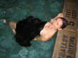
Lisa: "The image of the girl is stock photography. I don't know anything about what prompted the photographer to take the photo the way he did but I can tell you that it is titled 'Grief.' [image error]The only part of the photo that had color in it when I found it was the girl's hair, the photographer had desaturated the rest of the photo to focus the viewer's eye on the hair, the highlights, the way it fell. Because that sort of photo treatment wouldn't work for our book I added the color back into her skin before adding the 'iron tattoo' (right).
"When I'm putting together a cover like The Iron Witch I start by searching for the main element, which in this case was the girl. There are about half a dozen stock photo sites that I typically use and after entering some basic search words I end up sifting through hundreds of photos to find the one that speaks most strongly to the book. Sometimes this search can be over in an hour, other times it might take days. I think this one came to me somewhere around the 6 - 8 hour mark of scanning images.
"Once I find an image that feels like it might be right I'll look at it and see what I can add or change to make it become the book even more. In this case, I knew I needed to add the iron tattoo to Donna's arm and hand. I wanted something delicate, but densely entwined, and ultimately strong looking in a feminine way.
[image error]"Next came the vial (left). Because the rest of the cover is fairly stark I wanted the vial to be intricate and beautiful and something you couldn't take your eyes off of. After adding the red Elixir I thought it looked almost a little too out of place and richly colored so I pulled back the saturation a bit and ended up giving it a bit of a steampunky look in doing so.
"And finally, to keep the image from floating away in space and to tie her to the title, I added the same iron filigree in the open area around Donna that is on her arm. I think it gives it an overcrowded feeling and helps heighten the tension going on with the angle of her arm and the fact that she's hiding her face from us. I think the cover makes people slightly uncomfortable, yet draws them in at the same time."
[image error] "You can see some alternate cover concepts on Lisa's website [one is on the right] but, really, everyone at Flux was in agreement that there was no competition and our chosen cover was The One."
Thanks, Kaz and Lisa! This design is so intricate and lovely -- you can tell how much thought went into it at first glance. The colors are perfect, and the sparkle of the vial is completely intriguing.
What do you guys think?
"My publisher asked for my input on the cover, which was awesome! (And unexpected.) I'm lucky that Flux are open to author input - although obviously there's no guarantee that what you say will be in any way 'followed' or slavishly adhered to. All I really wanted was to make sure that we didn't actually see Donna's face (I'm not so keen on that with covers, though there are always exceptions that I fall in love with), and that we get to see her iron tattoos. Other than that, I just left it up to the art department.
"Truly, the very first time I saw the initial cover concept I fell in love. I can honestly say that the cover for The Iron Witch is perfect - every single part of it. I can't believe I was so lucky with my first ever book! I didn't have any need to ask for changes (even if they would have been considered) because there was simply nothing I wanted to change. I couldn't believe how well all the elements came together: Donna's pose shows how conflicted she is, and how angst-filled the decision she has to make; her tattoos are gorgeous and exactly how I imagined them; and she's even holding a vial of the Elixir of Life (which plays a big part in the story). The vial is beautiful, and Lisa Novak - the amazing designer - made the liquid inside it red, which is accurate to the story. I couldn't possibly ask for more.
"I'll now pass you over to Lisa Novak from Flux to tell you more about how she actually put the cover together. It's so interesting to hear Lisa talk about the cover in this way. Everything she says about the presentation of the main character (Donna Underwood) and the general atmosphere of the cover - and, therefore, of the book - is just perfect:
Lisa: "The image of the girl is stock photography. I don't know anything about what prompted the photographer to take the photo the way he did but I can tell you that it is titled 'Grief.' [image error]The only part of the photo that had color in it when I found it was the girl's hair, the photographer had desaturated the rest of the photo to focus the viewer's eye on the hair, the highlights, the way it fell. Because that sort of photo treatment wouldn't work for our book I added the color back into her skin before adding the 'iron tattoo' (right).
"When I'm putting together a cover like The Iron Witch I start by searching for the main element, which in this case was the girl. There are about half a dozen stock photo sites that I typically use and after entering some basic search words I end up sifting through hundreds of photos to find the one that speaks most strongly to the book. Sometimes this search can be over in an hour, other times it might take days. I think this one came to me somewhere around the 6 - 8 hour mark of scanning images.
"Once I find an image that feels like it might be right I'll look at it and see what I can add or change to make it become the book even more. In this case, I knew I needed to add the iron tattoo to Donna's arm and hand. I wanted something delicate, but densely entwined, and ultimately strong looking in a feminine way.
[image error]"Next came the vial (left). Because the rest of the cover is fairly stark I wanted the vial to be intricate and beautiful and something you couldn't take your eyes off of. After adding the red Elixir I thought it looked almost a little too out of place and richly colored so I pulled back the saturation a bit and ended up giving it a bit of a steampunky look in doing so.
"And finally, to keep the image from floating away in space and to tie her to the title, I added the same iron filigree in the open area around Donna that is on her arm. I think it gives it an overcrowded feeling and helps heighten the tension going on with the angle of her arm and the fact that she's hiding her face from us. I think the cover makes people slightly uncomfortable, yet draws them in at the same time."
[image error] "You can see some alternate cover concepts on Lisa's website [one is on the right] but, really, everyone at Flux was in agreement that there was no competition and our chosen cover was The One."
Thanks, Kaz and Lisa! This design is so intricate and lovely -- you can tell how much thought went into it at first glance. The colors are perfect, and the sparkle of the vial is completely intriguing.
What do you guys think?


![[image error]](http://www.melissacwalker.com/blog/faking19original.jpg)
![[image error]](http://www.melissacwalker.com/blog/faking%2019%20new.jpg)
![[image error]](http://www.melissacwalker.com/blog/zoe%20original.jpg)
![[image error]](http://www.melissacwalker.com/blog/zoe_200.jpg)
![[image error]](http://www.melissacwalker.com/blog/whereibelong.jpg)
![[image error]](http://www.melissacwalker.com/blog/photo%20%2836%29.jpg)
![[image error]](http://www.melissacwalker.com/blog/photo%20%2831%29.jpg)
![[image error]](http://www.melissacwalker.com/blog/photo%20%2832%29.jpg)
![[image error]](http://www.melissacwalker.com/blog/photo%20%2833%29.jpg)
![[image error]](http://www.melissacwalker.com/blog/photo%20%2834%29.jpg)
![[image error]](http://www.melissacwalker.com/blog/NewLangofLove.jpg)
![[image error]](http://www.melissacwalker.com/blog/lang%20of%20love%20original.jpg)
![[image error]](http://www.melissacwalker.com/blog/assets_c/2011/02/NewLangofLove-thumb-400x599-2452.jpg)
![[image error]](http://www.melissacwalker.com/blog/EndlessSummercover.jpg)
![[image error]](http://www.melissacwalker.com/blog/MW%20and%20CLS.JPG)
![[image error]](http://www.melissacwalker.com/blog/BLESSED_hardcover_CP.jpg)
![[image error]](http://www.melissacwalker.com/blog/tantalize_paperback.jpg)
![[image error]](http://www.melissacwalker.com/blog/eternal_paperback.jpg)
![[image error]](http://www.melissacwalker.com/blog/park%20sky.jpg)
![[image error]](http://www.melissacwalker.com/blog/ct_greetings_florida.jpg)
![[image error]](http://www.melissacwalker.com/blog/space%20cover.jpg)
![[image error]](http://www.melissacwalker.com/blog/SpaceBtwnTrees_PubCover_02.jpg)
![[image error]](http://www.melissacwalker.com/blog/SpaceBtwnTrees_CatCover_03.jpg)
![[image error]](http://www.melissacwalker.com/blog/SpaceBtwnTrees_Cover01.jpg)
![[image error]](http://www.melissacwalker.com/blog/SpaceBtwnTrees_Cover02.jpg)
![[image error]](http://www.melissacwalker.com/blog/SpaceBtwnTrees_Case_120209.jpg)
![[image error]](http://www.melissacwalker.com/blog/boat.jpg)
![[image error]](http://www.melissacwalker.com/blog/erin%20mel%20on%20boat.jpg)
![[image error]](http://www.melissacwalker.com/blog/san%20diego%20from%20water.jpg)
![[image error]](http://www.melissacwalker.com/blog/erin%20on%20boat.jpg)
![[image error]](http://www.melissacwalker.com/blog/mel%20erin%20tpines.jpg)
![[image error]](http://www.melissacwalker.com/blog/mel%20tpines.jpg)
![[image error]](http://www.melissacwalker.com/blog/trapped.jpg)
![[image error]](http://www.melissacwalker.com/blog/The%20Iron%20Witch%20Final.jpg)
![[image error]](http://www.melissacwalker.com/blog/iron_witch_grief.jpg)
![[image error]](http://www.melissacwalker.com/blog/iron_witch_vial.jpg)
![[image error]](http://www.melissacwalker.com/blog/iron_witch_2.jpg)