
Melissa C. Walker's Blog, page 33
April 1, 2011
Photo Fr-Sunday: Penguin's Hand-Sewn Covers
Saw this in
The Atlantic
and had to share! Penguin has teamed up with artist Jillian Tamaki to produce hand-sewn covers for three classic novels. I mean: So Cool. Here are the full jackets:
[image error]
[image error]
[image error]
Aren't these the perfect book-lover birthday gift?
Happy Sunday!
[image error]
[image error]
[image error]
Aren't these the perfect book-lover birthday gift?
Happy Sunday!


March 30, 2011
Win-It Wednesday: Between Shades of Gray by Ruta Sepetys
Thanks, everyone, for sharing bullying tales with such bravery. The winner of Carrie Ryan's The Dark and Hollow Places, chosen at random, is... Amy! Send me your address, A.
[image error] This week, I'm giving away a copy of Between Shades of Gray by Ruta Sepetys.
From the publisher: "In 1941, fifteen-year-old Lina is preparing for art school, first dates, and all that summer has to offer. But one night, the Soviet secret police barge violently into her home, deporting her along with her mother and younger brother. They are being sent to Siberia. Lina's father has been separated from the family and sentenced to death in a prison camp. All is lost."
I have to admit that I didn't know much about Stalin's victims in this time -- the focus of what I've learned is so much on Hitler. Lina's story is heartbreaking and riveting and uplifting -- I think you'll love it. (And how about that soft, understated cover. Lovely!)
To enter to win, share the the last book that made you cry in the comments (I know, I'm prying again--can't help it. So curious!). For me it was this one. Easy.
Good luck!
March 28, 2011
Cover Stories: Touch Blue by Cynthia Lord
[image error]
Cynthia Lord's
Touch Blue
has a cover that is really unique, I think. House, ocean, rocks, Monopoly? I was intrigued. Here's the back story from Cynthia:
"The first time I saw the cover for Touch Blue it was slightly different than the final cover, but the design and all the elements were there: the house, the rocks, and the Monopoly tokens. I was a little apprehensive when the preliminary cover arrived in the mail, because I had no idea what to expect. I didn't know what direction my editor and art director were thinking, but I did know they had struggled with the cover.
[image error] "Part of that struggle was due to my first novel, Rules (right). Rules has an amazing cover, and my audience for Rules was wide and diverse. It stretched from 3rd grade to 8th grade, and it included both boys and girls. It was important that the cover for Touch Blue didn't lose any of that audience, but that's a lot to expect from one cover.
"So when I opened the envelope and saw Touch Blue's cover, I was surprised and delighted. It kept my audience. The cover also went well with Rules' cover. And it showed something deeper about the story. Touch Blue takes places on a small island in Maine. The island school is in danger of being closed, because there aren't enough students to keep it open. So the islanders come up with a plan to adopt foster children to give those children good homes and to increase their school enrollment. Touch Blue is fiction, but it was inspired by a true event.
"Tess, my main character, has a little sister who loves to play Monopoly. A boy named Aaron comes to live with them through foster care, and they get off to a rocky start. The first time Tess feels like the three kids are finally becoming a family happens during a game of Monopoly. The tokens on the cover of Touch Blue are the ones the kids choose. Tess chooses the boat, her little sister chooses the dog, and Aaron chooses the car.
'When I looked at the cover, I could see how much thought my editor, Leslie Budnick, and art director, Marijka Kostiw, and David Saylor at Scholastic had put into the cover--not just showing the facts of the story in an appealing way, but also hinting at the deeper themes underneath it.
"My editor asked me what I thought. After saying how much I loved it, I brought up three small concerns. In the first version of the cover, there was a white walkway extending from the house over the ocean to the edge of the cover.
[image error] "I'm not sure where Marijka found the photo, but I recognized the house immediately. In a strange coincidence, I had done a research trip for Touch Blue back in 2008 and had taken a photo of that same house (left). It's actually a lighthouse keeper's cottage about an hour north of where I live, and the walkway leads to a small lighthouse. But without showing the lighthouse on the cover, the walkway looked like a bridge. In Touch Blue, it's important to the story that the island has no bridge. So I asked my editor if they would remove that walkway.
"The second issue was that the color of the water. The book is set in Maine, and the water looked Carribean. But my editor explained when they made the water darker and greener and grayer, as it would be in Maine, it changed the tone of the cover. The scene took on an omninous feel with that change. That would've been the wrong tone for the book. I actually love the blue of the cover, so I was glad to have a good reason to keep it.
"The last issue was the rocks. Maine beach stones are mostly granite, and the original rocks looked like craft rocks--glossy black and tan. They just didn't look real to me. I live near the ocean, so I offered to send some Maine beach stones, knowing they might say no. And I would have let it go if they had.
"But my editor came back and said the photographer agreed I could mail him some rocks! So my daughter and I drove down to the ocean and filled up one of those little 'If it fits, it ships!' boxes from the Post Office and sent off a whole box of Maine beach stones to New York City!
[image error] [image error]
"So when I look at Touch Blue's cover, I see how much thought and care went into it. I see the talent of the people I'm lucky enough to work with. And I see some real rocks from Maine!"
Thanks, Cynthia! I love that you shipped a box of rocks! I also think the story sounds amazing, and it's so intriguing that it was inspired by real events.
What do you guys think of this cover? Have you read the book?
March 25, 2011
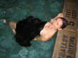
Photo Friday: Balanced Meals and Basketball
Broccoli salad and Cheetos: This has been my lunch basically all week. I'm nothing if not balanced. (And that puzzle is totally kicking my butt.)
[image error]
And these are my boys this weekend (with apologies to my twitter followers). Go, Heels!
[image error]
Happy weekend!
[image error]
And these are my boys this weekend (with apologies to my twitter followers). Go, Heels!
[image error]
Happy weekend!
March 23, 2011
Win-It Wednesday: The Dark and Hollow Places by Carrie Ryan
Last week's winner of
Teenie
by Christopher Grant is... jpetroroy! J, send me your address.
[image error] This week, I have a hot-off-the-presses copy of Carrie Ryan's The Dark and Hollow Places , the third book in her Forest of Hands and Teeth series!
I recently contributed to an anthology edited by Carrie Ryan and Megan Kelley Hall called Dear Bully . I can't WAIT for it to come out in August.
To enter to win, answer these questions: Have you ever encountered bullying? How did you handle it? (I know, I'm so nosy! But I'm interested. And I have a feeling we all have experiences with this topic, sadly. To hear about mine, you'll have to wait for the anthology!)
Good luck -- I'll pick a winner from the comments next Wednesday.
March 22, 2011
Cover Stories: 6 at Unabashedly Bookish
You guys know I'm moonlighting over at the bn.com blog, right? Click through to read the full Cover Stories teased here.
[image error] Georgia Bottoms by Mark Childress. "Who is this girl and why does she have her fabulous shoes propped up on this old granny sofa? I think the best cover images set a scene..." Read more...
[image error] The Way He Lived by Emily Wing-Smith. "As a debut novelist, I had no idea what to expect when my publishers sent me that first jpeg. What if I hated it? Was there anything I could do? Mostly, though, I was just curious. How did they choose to convey this story through an image?" Read more...
[image error] Hollywood Stories by Stephen Schochet. "I always wanted Shirley Temple in the front with Frankenstein's Monster behind her just because they were such a fun combination. I wanted to make sure the Monster was not threatening her in any way..." Read more...
[image error] The Orchid Affair by Lauren Willig. "Not only did my editor listen to my howl of, 'But this is the wrong era!' (accompanied by a rather tedious exposition on historical costume), she went out, hired another designer, another model, new costumes, and did a whole new photo shoot." Read more...
[image error] Smile for the Camera by Kelle James. "My memoir details my teenage years, a tumultuous time in New York City. A time when, for reasons beyond my control, I was without family or money and struggling to find my place in an oftentimes, overwhelming world. The tiny replica of me standing in the middle of all those massive New York City buildings, looking out through the shattered snow globe glass captures the spirit of Smile for the Camera perfectly." Read more...
[image error] Scrawl by Mark Schulman. "Uh oh. Now I'm in the art director's office. My editor has very kindly invited me along to the kind of meeting I know many novelists don't get to attend. And I'm hoping my nodding and grinning aren't too obvious. I am ready to give them a blank check. I just want to surrender in style." Read more...
March 21, 2011
Cover Stories: Sean Griswold's Head by Lindsey Leavitt
[image error]
Lindsey Leavitt is a member of The Contemps (along with me) and her new book, Sean Griswold's Head, is a super fun read. Hear more about what I thought at The Contemps blog.
For now, we're gonna talk covers! Here's Lindsey:
"It all started with a head.
"Sean Griswold's Head, to be exact. When I started writing this book, I knew I wanted the story to be about that boy--the one who is always there, the one you know nothing about, except maybe that he wears the same shirt every Thursday, or peed his pants two days in a row in second grade. [image error] So I always pictured Sean's head when I thought of the cover. Kind of like Feed by MT Anderson (right), but with hair.
"I shared this with my editor when we first broached cover design, and she said, great! But we do want to play up the romance angle, so we'll think about it. I never considered the romance to be the focus of the story, but I figured... cool. Give him a HOT head then. Hot heads sell.
[image error] "But then I got an email that sales wasn't sure the title would work. We went back and forth for a few months, brainstorming titles. It's an aggravating process--there were some possibilities I liked, but nothing felt right. At one point, my publisher was leaning toward THE SEAN GRISWOLD PROJECT. Here is one cover comp that design came up with that my editor just now sent me (left). I'm glad we didn't use this. I can say that now, right?
"I trusted my publisher, but I was still feeling down about the title madness. Then my editor sent me an email, saying there had been a meeting and they'd decided the title should be... SEAN GRISWOLD'S HEAD. [image error] Sales had somehow warmed up to the idea, and they agreed I could keep the quirky title IF they could get the romance in there still. So we went back to the head. My editor and I talked and they decided to go with the boy-in-class approach with some doodles. A few weeks later, my editor sent an email explaining that this was a VERY ROUGH comp, a non-refined work-in-progress, and the designer was still toying with the idea. Which was a relief because it looked, you know, rough (right).
"I wasn't a fan of the purple. Or the boy. Or the doodles. Or the font.
"Okay, so I wasn't a fan. And I felt bad, because Bloomsbury had listened to my input throughout the developmental process. I got to keep my title. They'd pretty much given me exactly what I asked for. [image error] And I'd even decided not to say anything, but... the purple just did me in. My first book (PRINCESS FOR HIRE, left) had a girly cover, and I was really hoping to branch out with color schemes.
"My agent wrote with some notes, and I decided to just talk to my editor, who'd been wonderful every step of the way, and asked for my input. So I got over myself and wrote back with my thoughts. We decided that the doodles should tell more of a story, and that the color scheme and font should be quirkier, like Juno . I hung up the phone feeling really excited about the new direction.
"And the next time I got a cover email, I screamed. I LOVED the font. I LOVED the chalkboard. I LOVED how hot Sean was without even seeing his face! And they'd even added a heart for the romance :) I called my editor right away and gushed and garbled. This was what I wanted, and I didn't know it until I saw it (below, left).
[image error] [image error]
"From there, the designer made a few more changes to the cover: the sweatshirt stripes, sharpened the colors, added the genius tag line, played with fonts, and slimmed Sean's build (he looked like a wrestler, when he's a tri-athlete). Which all led us to the final cover (above, right). I love the final product, love the stock image of Sean, and hope teens will open the cover to fall in love with the boy (and girl!) on the inside of the pages as well."
Thanks, Lindsey! I love the final cover--especially the chalkboard doodles--and the iconic head-in-front-of-you in class is such a fun idea. This concept evolved so much, and I'm so glad Bloomsbury made it just what it needed to be!
What do you guys think?
March 18, 2011
Photo Friday: Banana Shakes!
This week my friend Katie told me about Banana Shakes, and they are my new favorite thing.
[image error]
See? Okay, here's how you make it:
[image error] Cut a banana in cubes and freeze it overnight. The next day, blend the frozen banana cubes (which act like ice) with 8 oz of milk. Add a spoonful of peanut butter if you want protein, or whatever vitamin powder you're into (you won't taste it).
You get this foamy milk-and-bananas shake that taste like dessert but is really healthy too! Love.
Happy Friday.
March 17, 2011
Win-It We-Thursday: Teenie by Christopher Grant (Signed!)
Sorrysorrysorry. It's NYC Teen Author Festival week (check out the amazing schedule) and I'm a little of kilter! So... it's Thursday and this is Win-It Wednesday. I do not pretend to always make sense.
The winner of last week's giveaway of Miles From Ordinary by Carol Lynch Williams is... Maryam! Send me your address, M.
[image error] Anyway, today I got to do a reading at the Brooklyn Public Library's Grand Army branch with amazing authors Melissa Kantor, Gayle Forman, Cathleen Bell, Jeri Smith-Ready and Christopher Grant . I happened to have a copy of Teenie , Christopher's debut novel, in my bag, and he happened to sign it. So that's what you have a shot at winning today.
First, let me just say that Christopher is awesome, and he holds a very busy day job as a stock trader, but he writes on the subway. I mean, anyone who says they don't have time to write has to sit down and talk to this guy. He makes the time.
Teenie is his super delightful debut, about a high school freshman growing up in Brooklyn with a promising future and a dream to study in Spain. But you know, boys and best friends and life get in the way of some of her goals... and she has to work it all out. You can read excerpts on Christopher's site -- I was into Teenie from page one. (And how gorgeous is that cover?) Here's the full jacket:

I would have had Christopher here for a Cover Story, but when I asked him about it he said, "They sent me this image, and I said, 'That's it!'" So there, that's the Cover Story. I love it when it's so easy.
Anyway, to win this signed copy of Teenie, name the last author event/reading you attended. If you haven't ever been to one, admit it! But then promise me you'll attend one soon? They're fun -- I promise.
Happy Wednes, uh, Thursday!
March 14, 2011
Cover Stories: The Vespertine by Saundra Mitchell
[image error]
The lovely Saundra Mitchell is here today with a rollercoaster ride of a Cover Story for her latest novel, The Vespertine! Here goes:
"I didn't have a specific image in mind for the cover, but I knew in my soul that I wanted the book to be in russet, sunset colors. The main character, Amelia, can see the future, but only at sunset--and the book is full of loving descriptions of that time of day.
"My editor, Julie, sent me a note one Thursday afternoon and asked for a detailed description of Amelia, the main character. She told me that the design department was scheduled to start my cover the next day.
"She didn't ask for any particular input beyond that. But I come from a filmmaking background, where we make contact sheets for everything from paint colors, to car styles, to actors. So I put together this contact sheet and forwarded it with my notes.
[image error]
"When I wrote the book, I'd had Malese Jow in my mind as Amelia (I loved her as Anna on The Vampire Diaries) and I'd taken all the clothing directly out of Harper's Bazar, circa 1881-1889. Lucky for me, costume designers do the same thing. The exact gown that Amelia wears in my book is the same pattern that costume designer Janet Patterson used when dressing the cast of Portrait of a Lady . And of course, everything in sunset colors, because that's how I saw the book.
"The first time I saw the cover, I cried! Because what I saw first was the concept art for the cover. I was in New York for the very first time. Julie, my editor, took me on a tour of the offices, which ended at her desk, where she'd just gotten the preliminary art for my cover.
She turned on her monitor, and there it was:
[image error] "It was perfect! There's the girl! There's the dress! There are the sunset colors, and even the necklace that Amelia gets during the book!
"Regina Roff, the designer at HMH, owned a deck of Archeon Tarot by artist Timothy Lantz. She thought he would be the perfect artist for my cover, so HMH contracted him and he was available. It's gorgeous, gorgeous art. I loved it so, so much. I could go on for hours about the details, but seriously. It made me cry; it was extraordinary.
"So... of course it had to change.
"There's a feeling in the industry that illustrated covers are for juvenile and middle grade novels; photographic covers are for young adult novels. And a lot of people have a say on the final cover.
[image error] "After a lot of discussion in-house and with some book buyers, people felt that a cover with Mr. Lantz's extraordinary art fell too close to illustration. I was devastated! When I found out it was changing, I sent a note that said that I wouldn't mind seeing a new cover modeled on Melissa de la Cruz's Blue Bloods covers (right), or something wholly iconic. But I honestly didn't know what to expect.
"On the second round of covers, my agent and I had more input. HMH kindly put together three comps, and I was so anxious. After loving the first cover so much, I was prepared to pick the new one based on the art I hated the least.
"But when I saw the comps, I loved them all. They were gorgeous--and really varied. It was so exciting to see so many different artist conceptions of my book. My agent and I had some notes, which my editor took to the jacket meeting.
[image error]
"My fave was actually #3, but I knew at the time that it wouldn't fly as a YA cover. After the jacket meeting, HMH decided on Comp #2 as the final cover. And my only issue was that the clothes we could see were anachronistic to the book. I asked them to hide that as best as they could, and they did a fantastic job of doing that. Plus, it was really exciting to see that they used the exact pendant I'd put in the book right on the cover! And thus, I had a final cover, which was this:
[image error]
"So I was really happy again, because once again, HMH had gone above and beyond to create a really meaningful cover for this book. But...
"I had a lot of fun unveiling the final, got lots of neat stuff printed and then... My editor called. She was incredibly apologetic, but they were changing the cover again. People felt the second cover was still too illustrated looking. Everyone really wanted a clean, photographic cover with a lot of BANG to it.
"The second cover had already gone out on digital ARCs, but they were trying to get the new cover done in time for print ARCs. It was looking less and less likely though, because another publisher was interested in using the gorgeous image they'd selected for the third cover. The stock company would only license it to one of us, so it was a nail-biting several days.
"But finally we got word that we could use the image, and so my designer put together a stunning new cover. I cried again, because it was that gorgeous. And here it is:
[image error]
"It's remarkable how much that model looks like Malese Jow. How amazing that dress is. How much I want to just grab it and hold it and show it to the world. Friends have called it The Luxe with Motion, and I think they've nailed it. It's just screamingly beautiful.
"The original art is a photographic illustration by Timothy Lantz. The second cover was a stock photo, edited by Regina Roff. The final cover is a photograph by Susan Fox, edited by Regina Roff.
"In the end, I love it. I just love it. Beyond being a great cover, I think it's a truly beautiful piece of art. It captures a moment in the story, but more than that, it really reflects the mood and sensibility.
[image error] [image error] [image error]
"There's so much storytelling going on in the image too. I think it's mysterious and wonderful and you know what? The first cover showed the girl and the dress from my contact sheet. The second cover showed the exact pendant I'd put in the book. And the third has the girl and the dress again. Every single one of these covers emphasize how much care and thought everyone at HMH has put into my book. It makes me smile every time I see them--all three of them. I'm a lucky, lucky author indeed."
Thank you, Saundra! I love an epic Cover Story, and this one certainly qualifies. I have to say, I'm a sucker for flowy dresses, and I'm so happy that the cover ended up where it did -- it's gorgeous!
What do you guys think?


![[image error]](http://www.melissacwalker.com/blog/SecretGarden_French%20FlapsEDIT-thumb-600x264-46240.jpg)
![[image error]](http://www.melissacwalker.com/blog/BlackBeauty_French%20FlapsEDIT-thumb-600x264-46251.jpg)
![[image error]](http://www.melissacwalker.com/blog/Emma_French%20FlapsEDIT-thumb-600x261-46253.jpg)
![[image error]](http://www.melissacwalker.com/blog/shadesofgray_book.png)
![[image error]](http://www.melissacwalker.com/blog/touchblue.jpg)
![[image error]](http://www.melissacwalker.com/blog/rules.jpg)
![[image error]](http://www.melissacwalker.com/blog/Boothbay_22.jpg)
![[image error]](http://www.melissacwalker.com/blog/rocks_4.jpg)
![[image error]](http://www.melissacwalker.com/blog/rocks_5.jpg)
![[image error]](http://www.melissacwalker.com/blog/photo%20%2841%29.JPG)
![[image error]](http://www.melissacwalker.com/blog/barnes%20henson.jpg)
![[image error]](http://www.melissacwalker.com/blog/DHP%20new%20low%20res%20cover.jpg)
![[image error]](http://www.melissacwalker.com/blog/Childress_GeorgiaBottoms-1.jpg)
![[image error]](http://www.melissacwalker.com/blog/wayhelived.jpg)
![[image error]](http://www.melissacwalker.com/blog/hollywood%20stories.jpg)
![[image error]](http://www.melissacwalker.com/blog/Orchid-ActualCover.jpg)
![[image error]](http://www.melissacwalker.com/blog/smile.jpg)
![[image error]](http://www.melissacwalker.com/blog/ShulmanScrawlv2Final.jpg)
![[image error]](http://www.melissacwalker.com/blog/SeanGriswoldsHead%20RGB.jpg)
![[image error]](http://www.melissacwalker.com/blog/feed.jpg)
![[image error]](http://www.melissacwalker.com/blog/Image%201%20SGH.jpg)
![[image error]](http://www.melissacwalker.com/blog/Image%203%20SGH.jpg)
![[image error]](http://www.melissacwalker.com/blog/princess_for_hire.jpg)
![[image error]](http://www.melissacwalker.com/blog/SGH%20Image%204.jpg)
![[image error]](http://www.melissacwalker.com/blog/photo%20%2840%29.JPG)
![[image error]](http://www.melissacwalker.com/blog/peanutbutterbananashake1.jpg)
![[image error]](http://www.melissacwalker.com/blog/teenie.jpg)
![[image error]](http://www.melissacwalker.com/blog/tv-finalcover.jpg)
![[image error]](http://www.melissacwalker.com/blog/tv-contactsheet.jpg)
![[image error]](http://www.melissacwalker.com/blog/tv-timothylantz.jpg)
![[image error]](http://www.melissacwalker.com/blog/bluebloods.jpg)
![[image error]](http://www.melissacwalker.com/blog/tv-comps.jpg)
![[image error]](http://www.melissacwalker.com/blog/tv-secondcover.jpg)