
Patrick O'Shaughnessy's Blog, page 25
March 22, 2016
The More Unique Your Portfolio, The Greater Its Potential
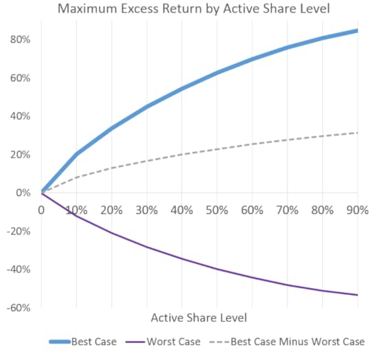
If there is a lot of overlap between your portfolio and the market, there is only so much alpha you can earn. This is obvious. Still, when you visualize this potential it sends a powerful message. Active share—the preferred measure of how different a portfolio is from its benchmark—is not a predictor of future performance, but it is a good indicator of any strategy’s potential excess return. As you’ll see below, the higher your active share, the more extreme your performance can be, good and bad.
Active share, most simply understood, is a percentage between 0-100 that tells you the percent of a portfolio which is different from the benchmark. An active share of 90% means that only 10% of the weight in that portfolio overlaps with the weight of the market (say, the S&P 500). An index fund has an active share at or near 0%–perfect overlap with the index itself.
Imagine you had perfect foresight and knew every year how every stock in the S&P 500 would perform over the next 12 months. Even with perfect knowledge, if you were limited by how active/different you could be from the benchmark, you’d be unable to realize the full potential of your power.
Here is what we do. On every date through history (1962-2015), we build portfolios that will achieve the highest possible 1-year forward excess return at each level of active share between 0% and 90%. We use only stocks in the S&P 500 itself and allow a maximum position size of 5% in the portfolios, to avoid piling into just a few of the best-performing stocks.
This chart shows the maximum possible excess return (average of all historical periods) vs. the S&P 500 by active share level.

The more overlap with the market (lower active share), the less potential alpha exists. If you could only have 10-20% of your portfolio distinct from the benchmark, your Cassandra-like foresight would allow you to outperform by 20-30% per year. If you move up to an active share of 80-90, your potential expands to 80-90% per year.
Here is the same data for each calendar year:
Some years, like 2009, hold enormous potential for active management to outperform. Other years, like 1984, hold less potential. But every single year has the same characteristic upward slope.
The Bad News
At this point, I am sure you are thinking: “great, but this “potential” cuts both ways. Being more active also means I can underperform by wider and wider margins.” Well, that is very true. Here is the dark side of active share.
On the dark side, the years with the greatest potential for underperformance are big up years for the market. In 1998, with the S&P up 30% or so, it was possible to build a portfolio with an active share of 90% that was down 51% overall, for an underperformance of 81%. After 1998, the next years with the greatest potential for underperformance were 1999, 1982, 1997, 1991, and 1995–all years where the S&P 500 was up big.
The years with the widest spread of potential (the widest gap between potential on the upside and potential on the downside) were, in order, 1999, 2009, 1991, 1998, 2000, and 2003. Years with the narrowest spreads were 1977, 1966, 2006, 1984, and 1964.
Bottom line
What is amazing is that in the early 1980’s, well over half of mutual funds had an active share above 80%, but as of 2009, only 20% or so of funds were this active[i]. In 1950, between 7-8% of the market was managed by large institutions. In 2010, that number was 67%. Investment “products” are increasingly homogenous, coalescing around indexes and titled variations of those indexes.
In the final chart, we combine best and worst and show the spread between them. At any given level of active share, the “potential” excess return skews more to the positive (dotted-line). Of course, stocks can only go down 100%, but can go up much more, which drives the upward sloping spread between best and worst. Still, more active portfolios have more potential for excess than less active portfolios. No one has perfect foresight, so nobody achieves alpha like this with any consistency. But these “best case scenarios” show the potential of being different–both good and bad.
Note: thanks to Manson Zhu for running the optimizations behind these charts
[i] http://www.cfapubs.org/doi/pdf/10.246...


March 7, 2016
When Measures Become Targets: How Index Investing Changes Indexes
in·dex noun : an indicator, sign, or measure of something.
In Vietnam, under French colonial rule, there was a rat problem. To solve the rat infestation, the French offered a bounty on rats, which could be collected by delivering a rat’s tail as proof of murder. Many bounties were paid out, but the rat problem didn’t improve. Officials soon noticed rats running around without tails–people were cutting off the tails and releasing the rats to breed, so as to increase the pool of potential bounty revenue for themselves.
The same thing happened in Colonial India: a bounty was offered on cobras because they were attacking people, which caused people to breed cobras for more bounties, and ultimately resulted in a higher cobra population when the bounty system was abandoned and the breeders released their now worthless snakes.
What you choose as a measure of performance—rat tails or dead snakes in these examples—is what you end up getting. Tell a portfolio manager that they will get paid on Sharpe Ratio, and you can bet that their Sharpe will improve, relative to other measure of investing success. This can become a problem.
Goodhart’s law says “when a measure becomes a target, it ceases to be a good measure.” Rat’s tails and dead cobras were measures of progress against vermin overpopulation in Vietnam and India. But those measures then became the targets of enterprising citizens, and in the process ceased to be a good measures. In America, home ownership was a measure of quality of life and happiness, so it became a target, and we know how that ended. This is becoming a bigger and bigger problem in the stock market.
Stock indexes were originally designed as reference points—measurements of market success. But now they are also the targets for the most popular investing strategies in the world, for both pure indexers and closet indexers. As of 2009 when the below chart ends, roughly half of mutual fund assets are indexed or closet indexed. It’s grown a lot since then.

To save ourselves as investors from some trouble down the road, we should start asking ourselves where Goodhart’s law applies in the market. Nearly free access to markets is a wonderful thing. Bogle should get a Nobel prize. But management fees are one thing, valuations another. I’d rather pay 100 bps for an S&P 500 index fund trading at 12 times normalized earnings than 5 basis points for the same market trading at 25 times earnings, which it does as of March 2016.
If indexes are now primary targets, are they still good measures of stock market performance? This issue shows up all over the place. Let’s look at an example in the world of value investing.
Price to Book: Measure, Then Target
Price to Book has been the most common measure of valuation. It was the factor originally used in Fama and French’s seminal 1993 paper (and a driving factor for the nearly $400 billion asset manager with which Fama is associated). It is also the factor that is used to define value in the most prominent style indexes: the Russell Growth and Value indexes.
Here is the cumulative excess return of the cheapest stocks by a few different measures of value between 1963 and 1993, when the paper was published, and then, below that, the same cumulative excess for the factors between 1993 and 2015, and finally between just 2007 and 2015.

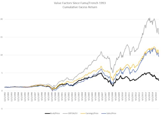

As I’ve written elsewhere, how you define value has a huge impact on returns (up to 100% in the last ten years if you’d just swapped out sales for book value).
Price to book was a key measure, then it became the target around which hundreds of billions in assets built value portfolios and indexes, and along the way has decoupled from other major value factors. Everything else—sales, earnings, EBITDA, free cash flow, total yield—has been a better indicator of value since book to price was first held out as the defining value factor.
Interestingly, if price-to-book value goes fully out of favor (don’t think we are there yet), it may finally make price-to-book a good measure of value again! Watch for big names to change their definition of value from price-to-book to something else.
Measure or Target
The return of the total market will always be a relevant and accurate measure of stock market success and performance: it is, after all, reflective of the total return earned in aggregate by all investors. But I am not concerned with the aggregate, which I cannot influence. I am concerned about you and me!
Active management is on its heels, and it should be. Since the crisis, it’s lost gross and net of fees because 1) its more expensive and costs compound (which is all Bogle ever really said) and 2) large/mega cap have been doing very well, helping indexes relative to non-cap weighted active managers. But cost conscious active management can work very well for long periods of time, as it did in the early to mid-2000s following a valuation bubble in the very mega cap stocks that dominated the S&P 500 and other cap-weighted indexes. In almost every meeting these days, I hear “we are (or are moving) passive in large cap.” It is ubiquitous. The primary measure is now the primary target.
Here is Seth Klarman writing (a touch early!) in 1991 about indexing more broadly:
“I believe that indexing will turn out to be just another Wall Street fad. When it passes, the prices of securities included in popular indexes will almost certainly decline relative to those that have been excluded. More significantly, as Barron’s has pointed out, “a self-reinforcing feedback loop has been created, where the success of indexing has bolstered the performance of the index itself, which, in turn promotes more indexing.” When the market trend reverses, matching the market will not seem so attractive, the selling will then adversely affect the performance of the indexers and further exacerbate the rush for the exits.”
Indexes are affected and changed by asset flows into strategies which target those indexes. This is true when hundreds of billions of dollars seek low price-to-book strategies, and for the entire market as a whole. Fund flows affect everything, especially when those flows have T after them. To this point, this has worked in one direction, for the most part. Portfolios with decent valuations, by historical standards, are only achievable today through portfolios that are very different from the S&P 500. Costs are very important. But there are management fees and there are valuation multiples. At the very least, I urge you to consider both.
Thanks to Alex Rubalcava for introducing me to Goodhart’s law.
(apocryphally)
http://www.cfapubs.org/doi/pdf/10.246...
February 19, 2016
Will You Be a Gambler or the House In the Stock Market?
Blackjack odds are as good as you’ll get at most casinos. In most cases, the casino has just a 1% edge versus the gambler. So in a given night, you can go on a great run and win a lot of money playing blackjack. But of course if you played every day, all day, your odds of a sustained run steadily decline and approach zero. Active investors should try to be the house (value), but many will always be gamblers (growth).
Quick reminders on value and growth. I define value as the cheapest 10% of U.S. stocks and growth as the 10% most expensive U.S. stocks. In the average 12 month period, value outperforms the equal-weighted market return by 5.6% (and its somewhat consistent: value has a 76% win rate). A long-term value investor of this type has obviously been hugely successful. Growth is pretty much the inverse. Average annual underperformance of -6.8%, and a 73% lose rate.
But here is the interesting part. The “edge” for our value investor is pretty similar to that of the casino. Within that cheap value portfolio which does so well on average and over time, just 53% of the stocks beat the equal-weighted market return. These winners outperform by an average of 29.2%, but 47% are still losers. Growth looks very different. Within the expensive growth portfolio just 34% of the stocks beat the equal-weighted market return. This 34% outperforms by a much higher average of 48.9% (as compared to the 29.2% for the value “winners”).
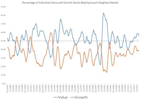
Notice this contrast between value and growth very clearly in the below distribution. 34% of the growth curve and 53% of the value curve lie to the right of the 0% line (positive excess returns). Growth has the more significant tail (more growth stocks deliver ridiculous excess returns), but the overall odds for value are much better.

Of course, this isn’t some universal truth. It bounces around. Here is a time series (smoothed) of the percentage of individual value and growth stocks beating the market.
Just like the house in a casino, value investors sometimes get destroyed. Several very high profile investors with great long term track records felt that pain in 2015. Real value stocks (and strategies) hurt to buy and sometimes really hurt to hold.
This great research report from Kaleidoscope Capital puts this idea of good odds with occasionally acute pain well:
This profile of small gains followed by the occasional large loss looks awfully similar to that of writing insurance. The insurance underwriter safely collects a monthly premium until the hurricane blows through, resulting in large losses. Similarly, selling stock market insurance through put options earns consistent returns until a 1987- or 2008-style market crash strikes. While value investors rarely traffic in actual options, one has to wonder if there is something about their strategy that intrinsically results in this short option profile.
Value investing (historically) is like selling insurance, like writing puts, like being the house. In each of these examples, the key is turning a small advantage on each individual bet into a huge advantage across a large number of bets over a long period of time.
These systems only work with tremendous discipline. An actuary would never change his pricing for a fat 50-year old smoker just because the guy tells an emotional and convincing story about how he will turn his life around and get healthy.
With more people aware of these odds than ever before, the magnitude of the “edge” is an open question for the future. Not everyone can open a casino and be the house, you need gamblers too. But even a reduced edged, paired with steel discipline, can grow to a huge advantage over an investing lifetime.
February 6, 2016
Stocks That Triple In One Year
There have been 1,700 individual U.S. stocks (with starting market caps of at least $200MM, inflation adjusted) which have tripled in a 12-month period since 1962. Many of these individual stocks tripled in more than one 12-month period, so we have 7,500 or so separate observations of a stock tripling in a 12-month period.
Tripling your money quickly is pretty good. So what do these three-baggers have in common? Three key things.
They are clustered around specific dates/markets. Here is a time series of the number of stocks which triple from a given start date. The spikes occur coming out of bear market bottoms (early 80’s, 2003, 2009) and during the tech bubble (1995-2000).

They are very concentrated in certain sectors. Below is the breakdown of which sectors had the most three-baggers. Tech dominates, which is no surprise. Health Care and Consumer Discretionary stocks are also well represented. Even if you remove 1997, 1998, and 1999 from the sample, Tech still has the most three-baggers. Recently, its been all biotech companies. Utilities and Staples stocks rarely triple. Consumer Staples have been the best performing sector long term, with smooth and very steady returns across decades, but they are rarely the highest flying stocks. Tech, meanwhile, has been among the worst performing sectors over the long term. The tech sector is often characterized by a few massive winners and lots of losers. Picking those winners ahead of time–with any consistency–is extremely difficult.

Three-baggers are, on average, very small and very expensive at the start of their run. While some stocks tripled from high starting market caps (Oracle and Sun Microsystems both tripled despite starting market caps in the tens of billions), most stocks that triple in a 12-month period are small. The average starting market cap (adjusted for inflation into today’s dollars) for a three bagger was $1.2B and the median market cap was $423MM. Value has outperformed growth by wide margins in most markets, but the growth stock category delivers far more three-baggers. The median three-bagger begins with a valuation (based on sales, earnings, free cash flow, and EBITDA) that is more expensive than 77% of all stocks on the start date.
So, if you are enticed by the idea of quick, lottery-like returns (which I am sure most people reading this site ARE NOT), then you have a tough task ahead. You probably need to sort through thousands of small cap stocks. Your best odds (if history repeats) are in technology or biotech stocks, many of which are hard to understand and have binary outcomes (outcomes which themselves may be due to random chance). You”ll probably have to buy with little-to-no margin of safety, because these companies tend to trade at very expensive valuations.
Good luck, you’ll need lots of it!
January 23, 2016
The Few Rule the Many — Power Laws in Market Returns (2015 Case Study)
As index investing has grown in popularity, investors focus more and more on the market’s overall return and less on the return of its component parts (individual stocks). But underneath the hood of each market index we find many inequalities. The top 20% of stocks represent 85% of the overall market’s size in 2015. Similarly, the top 20% of the stocks account for 85% of the market’s total sales. These ratios have been constant through time.

A similar pattern emerges in the distribution of market returns. Again, we find that the top 20% of stocks represent, on average, 80% of the market’s total return in any given year.
2015 Case Study
The easiest market story to tell in 2015 was the dominance of F.A.N.G. and 5-10 more dominant stocks. Without them, the market would have been negative. It is because of these stocks that so many have described the market as “narrow.” As we shall see, what was unique about 2015 was not so much the contribution of the top 10 stocks, but rather the fact that the top ten contributed more than the bottom 490 stocks (which, for 2015, were down in aggregate).
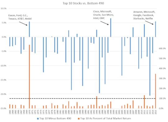
There are several different ways we can put the performance of the top 10 stocks from 2015 in historical context. First is to take the total contribution to return for the top 10 stocks every year and compare that to the contribution from the bottom 490 stocks in the S&P 500. You can see in the chart below the historical results in blue. Any time the blue line is above zero, it means the top 10 stocks out-contributed the bottom 490 stocks, which has been rare (in calendar years, anyways). NOTE: I’ve only included years in which the market’s total return was positive here.
In this same chart, I’ve also included, in orange, the ratio of the top ten contributors to the total market’s return (which contrasts with a simple spread up top in blue). If the ratio is greater than 100%, which it was in 2015, it means that the rest of the market was net negative. The return spread (blue) was very wide in 1970, 2011, and 2015, but a big reason was because the rest of the market was negative. 1999 stands out (as it always does) as a bizarre outlier. The spread between top 10 and the rest was the widest ever, but those top 10 (including Cisco, Microsoft, Oracle, Sun Microsystems, Intel, and EMC) still represented less than 100% of the total market return—crazy times.
The opposite end of the spectrum (wide performance breadth) would be a year like 2013, where the bottom 490 (which added 26.2%) contributed +20.5% MORE than the top 10 (which contributed 5.7%). To many, this might seem obvious: of course 490 stocks added more than 10 stocks! But in a world governed by power laws, the top 10 stocks have usually accounted for between 40-60% of the market’s total return. More often than not, the few rule the many.
Best vs. Worst
The best stocks are one thing, but the worst stocks play a huge role as well. There is a built in skewness to market returns: stocks can only go down -100%, but can go up any amount (although, as Jim Chanos says, there are a lot more stocks that go to zero than infinity). On average, the top 10 contributors overpower the bottom 10 detractors. When you add up the total contribution from the best and worst 10 stocks, you get the blue line in the following chart. Usually, the top stocks pull the market up MORE than the bottom stocks drag it down. The notable exceptions are during the major bear markets.

What’s interesting in this cycle is that while everyone is talking about how much the top ten helped stocks, what they haven’t mentioned is how much the bottom ten have hurt them. Exxon, Chevron, Conoco, Kinder Morgan, Berkshire Hathaway and others negated a sizeable chunk of F.A.N.G.’s meteoric rise.
When we account for the bottom 10 alongside the top 10 stocks, 2015 doesn’t look peculiar at all: just a little below the long-term average.
Power laws, again
In 2015, all the talk was about the top 10 stocks, but let’s step back to our 80/20 paradigm again.
If you isolate all 12-month periods historically (1964 on) where 1) the overall market is up and 2) both the top 20% and the bottom 80% of stocks in the S&P 500 are up (that is, both groups have a positive total contribution), then you find another remarkable tendency. In these periods, the top 20% of stocks in the S&P 500 account for 79.5% of the markets total return—almost exactly matching the 80/20 rule.
If you isolate all 12-month periods where the market is down, the worst 20% of stocks in the S&P 500 account for 81.2% of the markets total loss, closely hugging the 80/20 rule yet again—you can’t make this up.
Active Management and Power Laws
Given that stocks at the tail ends of the distribution explain an outsize chunk of the overall market’s performance, active managers can try to harness the power-law tendencies of the market in a few different ways. Many managers emerged as stars because of the tech stocks that they didn’t own between 2000-2002. Howard Mark’s often points out that one great way to succeed in investing is to view it as a “negative art.” By simply not owning (or being significantly underweight) the stocks on the left (bad) side of the return distribution, you can do very well.
Conversely, if you overweight stocks in the right (good) side of the return distribution, you can do extremely well. This is, of course, much easier said than done. The popular “active share” metric, which measures what percent of any portfolio is unique or distinct from its benchmark, is a great way of seeing how much of a potential advantage a given manager has. The more different a portfolio from the overall market, the wider the potential range of excess returns, both good and bad.
My next post will investigate whether or not these stocks at the tails of the return distribution share any common attributes which may be useful for active managers.
A quick word on the simple math for return contribution here. On every starting date, I calculate each stocks weight in the overall market (market cap (float) for stock x, divided by the sum of all market caps). I then fetch the return over the next year (or, if a stock is acquired or goes to zero, the return over the stub-period less than 1-year). I then multiple the starting weight to the forward 1-year return to get each stock’s contribution to total return. So, for example, Microsoft started 2015 as 2.2% of the market’s overall weight, it went up 22% or so, leading to a total contribution of +0.5% (2.2%*22%=~0.5% contribution). Get a contribution for every stock, add them all up, and you have the market’s return.
A quite caveat/disclaimer: none of these numbers are “official,” they won’t exactly match the results for the S&P 500, but they will be darn close. When I don’t have actual SP 500 constituents, I use the top 500 stocks by market cap.
(the top ten show huge excess return when the market is down which muddles the message)
December 29, 2015
Three Value Investors Meet in a Bar
Bill, Ernie and Sam—three lifelong value investors—met in a bar on November 30th, 2015.
Bill was despondent. He’d underperformed the market by -47% over the past 10-years and was questioning his very belief in value.
Ernie was happier. He’d done poorly in 2015, but over the last ten years he’d outperformed the market by +19%.
Sam offered to buy the next round. He’d outperformed by +52% in the past 10 years, and was looking forward to the next 10 as a contrarian value investor.
All three had the exact same investing methodology: buy the cheapest 10% of the market every year, and hold for a year. Each of the three also selected from the exact same list of U.S. stocks. The only difference was how they measured value. Bill used book value, Ernie used earnings, and Sam used sales.
If a few more friends joined them—who used EBITDA, or free cash flow, or operating cash flow, or total yield—Bill would have remained the only despondent value investor. All of the other factors have either broken even or outperformed the market over the past decade.
But there is no “benchmark” for a value strategy which buys the cheapest 10% of stocks by price-to-sales and weights them equally. Instead, when evaluating whether or not value has worked, we use indexes which are 1) based mostly on price-to-book and 2) are market cap-weighted. And sure enough, the Russell 1000 Value has underperformed the Russell 1000 by -22% and the Russell 1000 Growth by -43% over the past decade (10 years ending 11/30/15).
Because most can’t do better than reference these large indexes (which is no fault of theirs), the market narrative has been that value has stunk. Investors still have $27.5 billion dollars invested in the price-to-book dependent Russell 1000 Value ETF ($IWD). Lots of people feel Bill’s pain.
Continuing our comparison from above, here is the rolling 10-year excess return earned by our three value investors over their investing lifetimes.

This 10-year period is the worst since 1964 for price-to-book, but it’s not the worst for any of the factors. Price-to-sales had a worse period culminating in 2000, a period during which Sam would have underperformed by 4.5% per year for ten years.
****
A quick aside: can you imagine sticking with a strategy that has lost by that much for 10-years? No asset management business would survive it. No intermediary acting on the behalf of an end investor (be it a financial advisor or pension plan sponsor) could continue to recommend such a strategy after such a long period of weak period of results. At the end of such a run, the portfolio manager him- or her-self would be indistinguishable from a dope, idiot, or moron. Quarterly performance reviews have had a profound impact on investing strategies and on the investing business.
****
Value-, Momentum-, and Quality-based strategies are now commonplace. Even passive/index proponents have sung their praises. I hope that this simple story about different types of value encourages a deeper investigation of these broad concepts. There are lots of ways of measuring value, or momentum, or quality. The definitions you choose can lead to very different results, even over 10+ year time frames. A balance of factors is likely best. Here, for example, is the same chart as before, but not including a “composite” value factor which looks at sales, earnings, EBITDA, free cash flow, and total yield. The results have been smoother, and better.

Everything with a market cap above $200MM, adjusted for inflation back in time
My benchmark is an equal weighted market return, the opportunity set from which these investors can select their stocks.
I am generalizing A BIT here, of course there are some with a truly long view, but they are few and far between
December 22, 2015
ZIRP, And The Factors That Launched 1,000 ETFs
The rise of smart beta–or more broadly, factor investing–has coincided with a 6 year period of zero interest rates. During this period, factors have been particularly ineffective relative to longer term results. Using publicly-available data (Ken French) we can explore the recent results for the most popular stock selection factors and compare them to longer-term periods of both rising and falling rates.
While Ken French publishes a wealth of useful data, the most important are data on “core” stock selection factors: book/price (value), size, operating profitability + investment (quality), and momentum (price trend). These are the factors that launched a thousand (ETF) ships.
Before we get to the results, it is important to note how difficult it is to pin down isolated, causal relationships between macro variables (like interest rates) and stock selection factors (like value). There are many things going on that affect the value factor, including relative popularity (value vs. growth fund flows), valuation spreads, sector specific trends (think energy), adaptive markets (where past alphas morph into future betas), and so on. With that in mind, remember that the below is meant to be educational, not prescriptive.
Here are the three regimes across which we can measure factors:
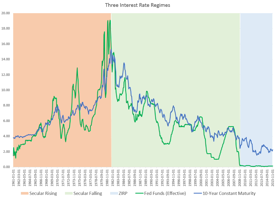
There are many ways to evaluate the effectiveness of a stock selection factor. To keep it simple, I’ll use the annualized long/short return spread (best-worst decile) for each factor. This is by no means comprehensive, but its a good start. Stocks in the best and worst deciles are equal-weighted (French also provides cap-weighted versions).
Across the five factors, the average long/short spread was 10.3%/year for the entire period (1964-2015), 10.6% for the period of rising rates (1964-1981), 11.8% for the period of falling rates (1981-2008) and 2.3% for the ZIRP period. Clearly, things have tailed off.

Here is the factor by factor look. Some immediate caveats: momentum looks so poor only because of 2009, which I’ve explored before. If you remove 2009, the spread jumps to +17.7%! So absent 2009, pure momentum has worked well. Even still, the average spread has come down considerably during the ZIRP period. Also, the spreads for operating profitability are not that impressive, but I include it here because its part of the Fama/French five factor model. The average spread across the five since 2010 (so removing 2009 from the calculation) is 4.9%, still a big drop.

The big market story this year has been growth over value. Across the five factors, value looks particularly bad in the last several years. But, during this period of zero interest rates, every factor has had a spread equal to, or below, the factor spread across the entire period.
One final view helps contextualize the performance of these factors. Below is the rolling 10-year long/short spread for each factor, show across the three regimes.

This tells a similar story: these particular factors have worked far less well in the recent past.
Is this drop a result of interest rates, or the result of some other cocktail of market influences/dynamics? It is very hard to say. I should also note that while Ken French’s data is the “gold standard,” I believe these factors can be improved upon (for example, book/price is among the worst performing value factors). These are also all individual factor results, meaning stocks in each best/worst decile are being measured by just one factor. I believe better use of factors is selecting stocks which look attractive across a broad spectrum of factors (quality, value, momentum, shareholder yield all at once).
Most people interested in this topic already know: factors are not a panacea. They come into and out of favor. Assuming the Fed raises more in the future, we will get a better sense of how factors perform during the first rising rate environment in years.
More to come, including more granular looks at interest rates cycles, and including different factors. I hope this becomes an open inquiry and topic of interest for all of you. Please email me or comment below to get involved.
December 18, 2015
Philosophy Books
Here’s a list of my favorites, hope you find something interesting!
**************
Freedom From the Known by J. Krishnamurti (http://amzn.to/1IYPQta)
The Essays of Arthur Schopenhauer; (http://amzn.to/1OcjKpU)
Michel de Montaigne – The Complete Essays (Penguin Classics) (http://amzn.to/1OcCtS0)
The Upanishads (Classic of Indian Spirituality) by Eknath Easwaran (http://amzn.to/1NXMXZS)
The Wisdom of Life by Arthur Schopenhauer (http://amzn.to/1OcjRBF)
Essays and Lectures: (Nature: Addresses and Lectures, Essays: First and Second Series, Representative Men, English Traits, and The Conduct of Life) by Ralph Waldo Emerson (http://amzn.to/1YmqgFr)
Walking (Annotated Edition) by Henry David Thoreau, Archibald MacMechan (http://amzn.to/1IYPm6e)
The Joyous Cosmology: Adventures in the Chemistry of Consciousness by Alan W. Watts (http://amzn.to/1IYPp1P)
Siddhartha by Hermann Hesse (http://amzn.to/1NXMsih)
Tao Te Ching Lao Tzu (http://amzn.to/1OcBNfu)
The World as Will and Representation, Vol. 1 by Arthur Schopenhauer (http://amzn.to/1NXMF5b)
Myths to Live By (The Collected Works of Joseph Campbell) by Joseph Campbell (http://amzn.to/1NXMDKD)
A Hero With a Thousand Faces by Joseph Campbell (http://amzn.to/1NXMlU8)
The Varieties of Religious Experience by William James (http://amzn.to/1YmqrjZ)
The Dhammapada (Classics of Indian Spirituality) by Eknath Easwaran Ed. (http://amzn.to/1IYPItH)
The Bhagavad Gita (Classics of Indian Spirituality) by Eknath Easwaran Ed. (http://amzn.to/1YmqwUS)
The Monk and the Philosopher: A Father and Son Discuss the Meaning of Life by Jean Francois Revel, Matthieu Ricard (http://amzn.to/1YmqxIw)
The Wisdom of Insecurity (Vintage) by Alan W. Watts (http://amzn.to/1YmqCM9)
The Consolations of Philosophy (http://amzn.to/1IYP4My)
The Tao of Philosophy (Alan Watts Love of Wisdom) by Alan Watts (http://amzn.to/1IYPbYz)
The Essential Rumi – reissue: New Expanded Edition by Coleman Barks, Jalal al-Din Rumi (http://amzn.to/1NXMKGb)
The Power of Myth by Joseph Campbell, Bill Moyers (http://amzn.to/1OcCeX5)
A Joseph Campbell Companion: Reflections on the Art of Living (Collected Works of Joseph Campbell) by Joseph Campbell (http://amzn.to/1OcCg1g)
The Perennial Philosophy by Aldous Huxley (http://amzn.to/1OcCp4H)
Waking Up: A Guide to Spirituality Without Religion by Sam Harris (http://amzn.to/1NXNbQF)
Meditations (Dover Thrift Editions) http://amzn.to/1NXNdYO)
December 15, 2015
Momentum Deterioration, Crashes, and Prospects
In this piece, I’ll explore the momentum factor in some detail, mainly because of the excellent article by @jesse_livermore on the dangers of back-testing and the recent deterioration in the momentum factor. As Jesse did, I’ll use Fama French data because its publicly available, even though I think that their definition of momentum (total return from one year ago to the end of last month, re-balanced monthly) can be improved upon (total return between 3 and 9 months, combined with a measure of volatility). I show results for both equally weighted and market cap weighted momentum deciles published by Fama/French. The equally weighted data is more interesting for investors building a benchmark-agnostic active portfolio.
Here is the cumulative excess return of the best decile of momentum stocks minus the worst decile since 1927, presented in an obfuscating log chart. I’ve circled a few periods on the chart which look tame or benign when viewed this way.

Cumulative log-scale growth charts have done more harm than good, because they make backtested strategies look so easy. They lull investors into what looks like a sure thing. To correct that impression, here is the same spread for rolling one year periods (shown twice, for equal weighted first then market cap weighted. Market cap weighted results tend to be reigned in).


The periods highlighted are momentum crashes, when high momentum stocks get obliterated by low momentum stocks. Coming out of the bottom in 1932, low momentum beat high momentum by 471%…in one year. Coming out of the 2009 bottom, high momentum stocks under-performed low momentum by 237%.
It is also useful to see how high momentum did versus the overall market (rather than in a long/short context). Coming out of the 1932 and 2009 bottoms, high momentum under-performed the equal-weighted market by 213% and 52% respectively. It is very difficult to recover from that sort of crash.

These momentum crashes show up in the long term data even as you extend the holding periods to 15-years. Here is the rolling 15-year excess returns of high minus low momentum. Only the middle part of the sample is unaffected by the major factor crashes in the 1930’s and 2000’s.


Despite the crashes, the momentum strategy has been quite consistent over longer holding periods. Here are the base rates/batting averages of the best and worst momentum versus the market.

A 99% win rate (for equal weighted vs. market) in 15-year periods sounds impressive: until you realize that that 1% of the time just happened, and this is all before any sort of transaction costs, which are significant for a strategy that re-balances monthly. Here is the cumulative growth of high momentum vs. the market since 2000. The equal weighted version has done poorly, almost entirely because of the momentum factor crash in 2008/09.

One final interesting comparison is the rolling 15-year excess return for both the best and worst momentum vs. the market. While the spread between high momentum and the market has collapsed, it is interesting to note that the spread between worst momentum decile and the market has been negative 8-9% per year over the past fifteen years (2000-2015).


Momentum has been useful two ways: buying high momentum, and avoiding (or shorting) poor momentum. Buying high momentum has had a rough 15-years relative to longer-term history, but avoiding poor momentum has continued to work quite well. As I’ve written before, combining value and momentum has produced very strong results (with considerably lower turnover than a monthly momentum strategy). Like many quality factors, momentum has been very effective when used to avoid certain stocks rather than to select certain stocks.
*********************************
So here is the question for prospective momentum investors must ask: is the deterioration of momentum since 2000 a product of 1) more widespread awareness/adoption of the strategy or 2) the result of the natural inversion (crash) of momentum that happens after severe bear market bottoms, and our bad luck to have had 2 such crashes over the past 15 years.
The answer may be a combination of 1) and 2), but there is no question that the momentum crashes in the 1930’s and 2000’s are a key driver of momentum’s weaker results around those periods–especially in an equally weighted, benchmark-agnostic context.
Momentum crashes cannot be ignored. They are extremely hard to survive, for both professional money managers (career risk atom bomb) and individuals (a test of one’s emotions and discipline). Many factor-investing, quant researchers are trying to solve this issue with momentum, because if we can somehow avoid future momentum crashes, the momentum strategy could continue to be extremely potent (and may be potent even despite future crashes).
The bottom line: you want your factors to be as unpopular as possible (value has been heading that direction), and perhaps momentum crashes serve as purging fires of sorts, washing out those investors who cannot stick with the factor over the very long-term.
An extra word of caution: this is all data on one factor in isolation. The best factor-based strategies combine different factors into a single portfolio (value, momentum, quality, and so on). I do not advocate a pure, momentum only approach to factor investing.
What questions do you have? Let me know in the comments below
December 9, 2015
The 15 Best Books of 2015
This year I read 103 books and collected 855,000 words worth of highlights and notes.
Here are the fifteen best books I read, with one sentence describing why, and one passage to gauge (and pique) your interest.
Consistent with my growing believe that it is more productive to read around one’s field than in one’s field, there are no investing books on this list. While I did read a few good investing books this year, nothing was life-changing. Hopefully you get as much or more from one of these great books.
Here are the best 15 books of 2015. For more each month, sign up for the Book Club.
The True Believer: Thoughts on the Nature of Mass Movements (Perennial Classics) by Eric Hoffer
The recipe for a mass movement = frustrated people + near term hope for change + a common devil. I wrote about it here.
There is a hope that acts as an explosive, and a hope that disciplines and infuses patience. The difference is between the immediate hope and the distant hope. A rising mass movement preaches the immediate hope. It is intent on stirring its followers to action, and it is the around-the-corner brand of hope that prompts people to act…The intensity of discontent seems to be in inverse proportion to the distance from the object fervently desired.
Letters of Note: An Eclectic Collection of Correspondence Deserving of a Wider Audience by Shaun Usher
A diverse collection a correspondence through history which entertains and enlightens.
This passage is written by Aldous Huxley’s wife following his passing; it describes her talking him to death after administering a hallucinogen. Every time I read this I find worries falling away and I think of my wife and family.
I told him I was going to do it, and he acquiesced. I gave him another shot, and then I began to talk to him. He was very quiet now; he was very quiet and his legs were getting colder; higher and higher I could see purple areas of cyanosis. Then I began to talk to him, saying, “Light and free.” Some of these things I told him at night in these last few weeks before he would go to sleep, and now I said it more convincingly, more intensely—“go, go, let go, darling; forward and up. You are going forward and up; you are going, willingly and consciously, and you are doing this beautifully; you are doing this so beautifully—you are going towards the light; you are going towards a greater love; you are going forward and up. It is so easy; it is so beautiful. You are doing it so beautifully, so easily. Light and free. Forward and up. You are going towards Maria’s love with my love. You are going towards a greater love than you have ever known. You are going towards the best, the greatest love, and it is easy, it is so easy, and you are doing it so beautifully.
The Razor’s Edge (Vintage International) by W. Somerset Maugham
The best fiction I read this year because I’ve never before so identified with a main character (Larry).
“he said that the world isn’t a creation, for out of nothing nothing comes; but a manifestation of the eternal nature; well, that was all right, but then he added that evil is as direct a manifestation of the divine as good. They were strange words to hear in that sordid, noisy café, to the accompaniment of dance tunes on the mechanical piano.”
Walking (Annotated Edition) by Henry David Thoreau
A short, relaxing essay that shows how walking leads to a better, fresher mindset. I wrote about it here (“The Future Is In The Quaking Swamps”).
The West of which I speak is but another name for the Wild; and what I have been preparing to say is, that in Wildness is the preservation of the World. Every tree sends its fibres forth in search of the Wild. The cities import it at any price. Men plow and sail for it. From the forest and wilderness come the tonics and barks which brace mankind. Our ancestors were savages. The story of Romulus and Remus being suckled by a wolf is not a meaningless fable. The founders of every State which has risen to eminence have drawn their nourishment and vigor from a similar wild source. It was because the children of the Empire were not suckled by the wolf that they were conquered and displaced by the children of the Northern forests who were.
Tragedy and Hope: A History of the World in Our Time by Carroll Quigley
A sweeping and unique history of the world, for hardcore history fans. Here is an example of the writing:
Agricultural activities, which provide the chief food supply of all civilizations, drain the nutritive elements from the soil. Unless these elements are replaced, the productivity of the soil will be reduced to a dangerously low level. In the medieval and early modern period of European history, these nutritive elements, especially nitrogen, were replaced through the action of the weather by leaving the land fallow either one year in three or even every second year. This had the effect of reducing the arable land by half or one-third. The Agricultural Revolution was an immense step forward, since it replaced the year of fallowing with a leguminous crop whose roots increased the supply of nitrogen in the soil by capturing this gas from the air and fixing it in the soil in a form usable by plant life. Since the leguminous crop which replaced the fallow year of the older agricultural cycle was generally a crop like alfalfa, clover, or sainfoin which provided feed for cattle, this Agricultural Revolution not only increased the nitrogen content of the soil for subsequent crops of grain but also increased the number and quality of farm animals, thus increasing the supply of meat and animal products for food, and also increasing the fertility of the soil by increasing the supply of animal manure for fertilizers. The net result of the whole Agricultural Revolution was an increase in both the quantity and the quality of food. Fewer men were able to produce so much more food that many men were released from the burden of producing it and could devote their attention to other activities, such as government, education, science, or business. It has been said that in 1700 the agricultural labor of twenty persons was required in order to produce enough food for twenty-one persons, while in some areas, by 1900, three persons could produce enough food for twenty-one persons, thus releasing seventeen persons for nonagricultural activities.
The Writing Life by Annie Dillard
My favorite book about writing. I’ve read this next passage a good hundred times.
To find a honey tree, first catch a bee. Catch a bee when its legs are heavy with pollen; then it is ready for home. It is simple enough to catch a bee on a flower: hold a cup or glass above the bee, and when it flies up, cap the cup with a piece of cardboard. Carry the bee to a nearby open spot—best an elevated one—release it, and watch where it goes. Keep your eyes on it as long as you can see it, and hie you to that last known place. Wait there until you see another bee; catch it, release it, and watch. Bee after bee will lead toward the honey tree, until you see the final bee enter the tree. Thoreau describes this process in his journals. So a book leads its writer. You may wonder how you start, how you catch the first one. What do you use for bait? You have no choice. One bad winter in the Arctic, and not too long ago, an Algonquin woman and her baby were left alone after everyone else in their winter camp had starved. Ernest Thompson Seton tells it. The woman walked from the camp where everyone had died, and found at a lake a cache. The cache contained one small fishhook. It was simple to rig a line, but she had no bait, and no hope of bait. The baby cried. She took a knife and cut a strip from her own thigh. She fished with the worm of her own flesh and caught a jackfish; she fed the child and herself. Of course she saved the fish gut for bait. She lived alone at the lake, on fish, until spring, when she walked out again and found people. Seton’s informant had seen the scar on her thigh.
Do not hurry; do not rest. —GOETHE
Sapiens: A Brief History of Humankind by Yuval Noah Harari
A wonderful and short book about humanity. I loved this passage below, and I wrote about the book here.
It was only 400,000 years ago that several species of man began to hunt large game on a regular basis, and only in the last 100,000 years – with the rise of Homo sapiens – that man jumped to the top of the food chain. That spectacular leap from the middle to the top had enormous consequences. Other animals at the top of the pyramid, such as lions and sharks, evolved into that position very gradually, over millions of years. This enabled the ecosystem to develop checks and balances that prevent lions and sharks from wreaking too much havoc. As lions became deadlier, so gazelles evolved to run faster, hyenas to cooperate better, and rhinoceroses to be more bad-tempered. In contrast, humankind ascended to the top so quickly that the ecosystem was not given time to adjust. Moreover, humans themselves failed to adjust. Most top predators of the planet are majestic creatures. Millions of years of dominion have filled them with self-confidence. Sapiens by contrast is more like a banana republic dictator. Having so recently been one of the underdogs of the savannah, we are full of fears and anxieties over our position, which makes us doubly cruel and dangerous. Many historical calamities, from deadly wars to ecological catastrophes, have resulted from this over-hasty jump.
Rise of the Robots: Technology and the Threat of a Jobless Future by Martin Ford
Explains what skills will be most useful in the age of automation. More here. A fun example:
In the chain’s 262 restaurants, robots help make the sushi while conveyor belts replace waiters. To ensure freshness, the system keeps track of how long individual sushi plates have been circulating and automatically removes those that reach their expiration time. Customers order using touch panel screens, and when they are finished dining they place the empty dishes in a slot near their table. The system automatically tabulates the bill and then cleans the plates and whisks them back to the kitchen. Rather than employing store managers at each location, Kura uses centralized facilities where managers are able to remotely monitor nearly every aspect of restaurant operations. Kura’s automation-based business model allows it to price sushi plates at just 100 yen (about $1), significantly undercutting its competitors.
The Act of Creation by Arthur Koestler
The best book I’ve ever read on creativity. I wrote about the six best here.
Self Reliance (Illustrated) by Ralph Waldo Emerson
My favorite essay from one of my biggest idols.
There is a time in every man’s education when he arrives at the conviction that envy is ignorance; that imitation is suicide; that he must take himself for better for worse as his portion; that though the wide universe is full of good, no kernel of nourishing corn can come to him but through his toil bestowed on that plot of ground which is given to him to till.
Impro: Improvisation and the Theatre by Keith Johnstone
The most surprising book of the year on the power of improvisation. More here.
There are people who prefer to say ‘Yes’, and there are people who prefer to say ‘No’. Those who say ‘Yes’ are rewarded by the adventures they have, and those who say ‘No’ are rewarded by the safety they attain. There are far more ‘No’ sayers around than ‘Yes’ sayers, but you can train one type to behave like the other.
The Wisdom of Life by Arthur Schopenhauer
The best self-help book ever.
Further, as no land is so well off as that which requires few imports, or none at all, so the happiest man is one who has enough in his own inner wealth, and requires little or nothing from outside for his maintenance, for imports are expensive things, reveal dependence, entail danger, occasion trouble, and when all is said and done, are a poor substitute for home produce.
The Dog Stars by Peter Heller
A beautifully written post-apocalyptic novel.
Nothing decided, nothing finished. The Dipper wheels back into place. Just one turn. One turn of the wheel and we are different, never the same. Not ever. Not even those stars. Even they, they decay, collapse, coalesce, break apart. Close my eyes. It’s what’s inside. What’s inside moving, swimming in the pain like a blind fish forever swimming. Is what lives what remains. Renews, renews the love and the pain. The love is the creek bed and the pain fills it. Fills it every day with tears.
The Origin of Consciousness in the Breakdown of the Bicameral Mind by Julian Jaynes
A preposterous theory (that humans have only been conscious for the past couple thousand years) that is somehow genius and compelling. I wrote about it here.
The Essays of Kevin Simler, Slate Star Codex, and Paul Graham
I group these final three writers as one, because each author writes amazing, thought-provoking essays. Here are three of my favorites (one from each).
From Simler: Honesty and the Human Body
From Graham: What You Can’t Say
From Slate Star Codex: Meditations on Moloch


