Aidan Moher's Blog, page 3
June 26, 2015
J.K. Rowling announces Harry Potter and the Cursed Child… but it’s not what you think

On the 18th anniversary of the publication of Harry Potter and the Sorcerer’s Stone, J.K. Rowling announced the next installment of the immensely popular fantasy series: Harry Potter and the Cursed Child. But, hold onto your britches… it’s not a novel. It’s actually the long talked-about theatrical production that Rowling first revealed in 2013. Sonia Friedman and Colin Callender will produce, and the score will be provided by Imogen Heap (!!).
According to its producers, will “tell the ‘untold part’ of the boy wizard’s story, including the story of the lives of his murdered parents.” This, however, contradicts Rowling’s statement on Twitter that the play “is not a prequel!” Perhaps the narrative of Harry’s childhood and his parents’ lives are wrapped around storytelling motif featuring an older Harry Potter and his children?
Friedman and Callender also revealed that the play will feature many popular characters from the series, and “will offer a unique insight into the heart and mind of the now legendary young wizard”
Why not a novel? “I am confident that when audiences see the play they will agree that it was the only proper medium for the story,” Rowling teased.
The first run of Harry Potter and the Cursed Child will run at the Palace Theatre in London during the summer of 2016.
The post J.K. Rowling announces Harry Potter and the Cursed Child… but it’s not what you think appeared first on A Dribble of Ink.


June 23, 2015
Cover Art for Skyborn by David Daglish
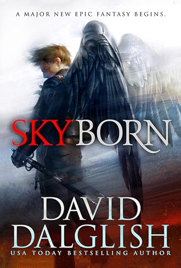
I adore this cover. For being bold, and putting focus on what makes the character interesting (his wings), rather than trying to create a clear image of the character himself. Lovely, simple typography (including the stylized R), and Arnold’s soft, impressionistic style are perfect for bringing together a cover you just can’t ignore.
“Skyborn is about the Seraphim, an elite military force protecting a floating island of Weshern,” said Kirk Benshoff, Art Director at Orbit Books. “The Seraphim guard the remnants of mankind, defying gravity using ancient wings and mastering powerful elements to wage war in the skies.” Starring militarized sword-wielding soldiers with huge metal wings, Skyborn begs for a cover that shows off Daglish’s unique denizens of Weshern. Artist Tommy Arnold was the perfect fit, says Benshoff.
“In what I would call serendipitous timing, the work of Tommy Arnold came across my desk as we were discussing the covers,” he said. “His style just hit the nail on the head for this project. His ability to illustrate characters was spot on. He could also handle textures beautifully: fabrics, metals, flames, etc. And most importantly, his illustrations really pull the viewer in and engage you. It was a no brainer in reaching out to get Tommy on board.”
This book just landed pretty high atop my fall “to-read” pile. Skyborn will be released by Orbit Books in November, 2015.
The post Cover Art for Skyborn by David Daglish appeared first on A Dribble of Ink.

June 19, 2015
Gollancz reveals UK cover art for Twelve Kings by Bradley P. Beaulieu
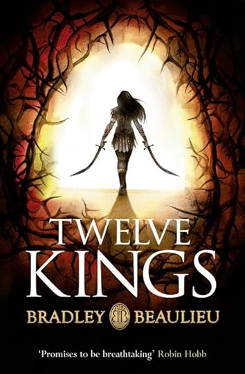
Today, Gollancz revealed the cover art for the UK edition of Bradley P. Beaulieu’s Twelve Kings, the first volume of the Songs of the Shattered Sands trilogy. I had a chance to read some early drafts of the novel, and readers are in for a treat. I also had the opportunity to see a few early sketches of this cover, and it’s fun to see Gollancz take a lot of the early feedback and create a cover with a lot of impact. I’m particularly impressed by the way they’ve focused on Ceda, the novel’s protagonist, making her identifiably badass and female (without over-sexualizing her, or falling back on the usual cover tropes applied to female characters.) It’s a nice compliment to the US cover.
Note, the title of the novel in the UK is Twelve Kings, versus the US title, Twelve Kings in Sharakhai. They both have their strengths, but I think I prefer the US version. There’s something about made-up fantasy names that resonates with the 16 year old in me.
The post Gollancz reveals UK cover art for Twelve Kings by Bradley P. Beaulieu appeared first on A Dribble of Ink.

June 12, 2015
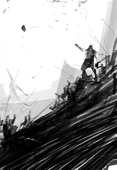
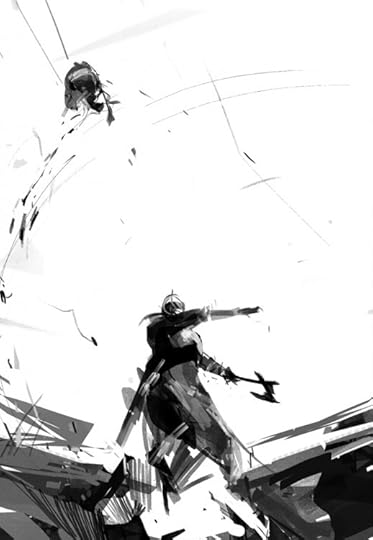
Cover art for The Death of Dulgath by Michael J. Sullivan
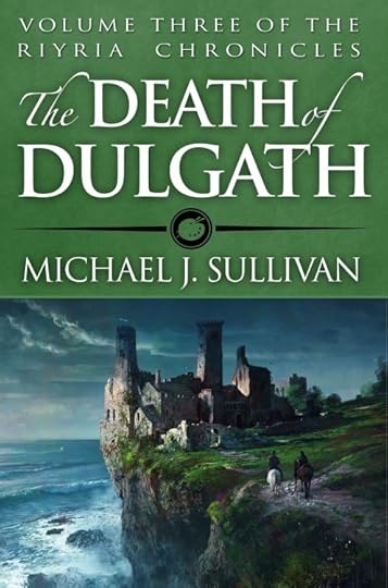
Art by Marc Simonetti
Michael J. Sullivan revealed the cover art for The Death of Dulgath, the third volume in his Riyira Chronicles series, with artwork by French artist Marc Simonetti.
Marc Simonetti is one of my favourite fantasy artists, and his work here is just sublime. It should surprise no one that I’m much in favour of the shift away from the photo-realistic, figure-based covers that Orbit produced for the first two books in the Riyira Chronicles series. Sullivan agrees. “I never felt that the models used for the other pair were a good representation of how I saw Royce and Hadrian. But, by the time I saw them it was far too late to do anything about it,” he said on his blog. “For [The Death of Dulgath], we wanted to keep Royce and Hadrian’s back to the camera and focus instead on Castle Dulgath, a run-down abode on the edge of the sea and the site of the majority of the novel.”
For fun, you can watch Simonetti create the illustration thanks to It’s Art Magazine.
We wanted to focus on Castle Dulgath, a run-down abode on the edge of the sea.
Sullivan is currently running a Kickstarter for The Death of Dulgath, a somewhat surprising move after Orbit Books published the five previous Riyira novels to, I believe, strong commercial success. However, Orbit recently declined their option to publish Sullivan’s Rhune, a pre-cursor to the Riyira Revelations, fulfilling their contract and leaving Sullivan free to return to his roots as a self-published author. Rhune was eventually picked up, along with several other volumes in the The First Empire series, by Del Rey.
Sullivan has written extensively about his decision to publish his books traditionally in concert with self-published volumes.
The post Cover art for The Death of Dulgath by Michael J. Sullivan appeared first on A Dribble of Ink.

June 9, 2015
Cover reveal for Sunset Mantle by Alter S. Reiss
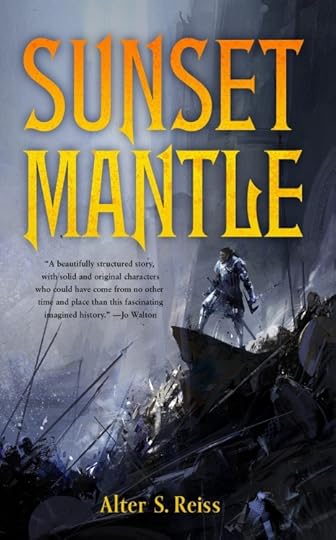
Art by Richard Anderson. Design by Christine Foltzer.
I am very proud to reveal the cover for Sunset Mantle by Alter S. Reiss, one of several novellas coming later this year as part of the debut lineup of SFF novellas from Tor.com’s new short fiction imprint. As always, I’m a big fan of Richard Anderson’s work, and Irene Gallo’s art team, including designer Christine Foltzer, has done a fine job of wrapping a cover around Anderson’s work.
For fun, here are some of Anderson’s early concept sketches:
![SunsetMantle_Thumbnails_02_ra[1]](https://i.gr-assets.com/images/S/compressed.photo.goodreads.com/hostedimages/1434268083i/15195041._SY540_.jpg)
Tor.com must’ve felt that a severed head being thrown into a waiting army was a hard sell, considering it didn’t make it into the final version of the cover, but, all around, Anderson’s artwork provides a sense of scope and frenzy that sounds perfect for Reiss’s story.
About the Book
With a single blow, Cete won both honor and exile from his last commander. Since then he has wandered, looking for a place to call home. The distant holdings of the Reach Antach offer shelter, but that promise has a price.
The Reach Antach is doomed.
Barbarians, traitors, and scheming investors conspire to destroy the burgeoning settlement. A wise man would move on, but Cete has found reason to stay. A blind weaver-woman and the beautiful sunset mantle lure the warrior to wager everything he has left on one final chance to turn back the hungry tides of war.
“Sunset Mantle was the fifth novella submission I read for Tor.com, and the first I fell in love with,” said Tor.com Editorial Assistant Carl Engle-Laird. “One of the first things I asked Lee Harris when we hired him as our Senior editor was, ‘Can I finally buy this novella?’ I’m glad he said yes.
“Sunset Mantle is the kind of epic fantasy I want to read, with none of the drag. It has stalwart, desperate characters who must balance their needs against the laws they hold dear in a fascinating world, plus a heart-pumping plot that gets started immediately, without a hundred pages of preamble. I hope you’ll enjoy Sunset Mantle as much as I did.”
As a reader, I’m ridiculously excited about the idea of novella-length epic fantasy with all the fun stuff that’s often found in big door-stopper novels: big battles, mysterious relics, and an exotic, far-reaching fantasy world. I’m all for bringing back the short novel, hearkening back the early days of sword and sorcery. Much love, once again, to the Tor.com Imprint for giving a home to novella-length SFF, we’re all better off for being able to read these stories.
More covers from the debut of Tor.com’s novella line-up can be found on io9, and they’re all predicatably awesome. (Particularly David Palumbo’s cover for Nnedi Okorafor’s Binti!)
The post Cover reveal for Sunset Mantle by Alter S. Reiss appeared first on A Dribble of Ink.

June 1, 2015
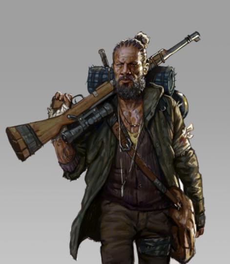
“Human, Near-human, Non-human” by Adrian Tchaikovsky
I get to put the monsters centre stage once in a while, give them a good run, even make the heroes.
The characters I liked most in The Empire Strikes Back were the bounty hunters – not Boba Fett, that grandly over-rated amateur jetpack enthusiast, but the other guys: the lizard guy, the insect guy with his insect-headed droid, because if you were an insect guy, you’d do that, wouldn’t you? You wouldn’t want that disconcerting standard model human mask staring at you while you travelled from bounty to bounty.
And there was a lizard guy in Battle Beyond The Stars, too, that bizarre Corman space opera that I still have all the feels for, no matter what. It’s full of weird and memorable characters, but for me it was always Cayman of the Lambda Zone, last of his species, and yet with a good fistful of decent lines and some self-deprecating humour thrown in. And he dies heroically which, along with looking like a bug or a lizard, has always done it for me.
So, “From childhood’s hour I have not been as others were”. Thank you Mr Poe. It’s true though: there never was someone to root for the monsters quicker than me. Now, as a writer, I get to put the monsters centre stage once in a while, give them a good run, even make the heroes.
There’s kind of a holy grail of writing, for me. I suspect that, like the grail, it’s not really achievable. It would be: to write a non-human character that is genuinely, plausibly and entirely non-human, and at the same time connect my human readers with it. Two opposite poles. I have tried to creep up on this grail from various directions, and perhaps occasionally I’ve got within a ballpark of it, but it’s a hell of a challenge.
Art by Lois van Baarle
Other writers have got pretty damn close, and usually the magic ingredient that binds human empathy and non-human character together is human intervention. AIs are a good example – built by humans, often for the purpose of relating to humans, they frequently don personas and masks that make them seem relatable, even when their purposes are anything but. Anne Leckie’s protagonist fromAncillary Justice is a ship’s AI used to acting simultaneously through multiple human bodies, and Leckie absolutely nails the bizarre and quite inhuman experience of all those overlapping perspectives whilst making her lead wholly sympathetic. Other memorable AIs include the titular entity from Gibson’s Neuromancer, which is able to play inordinately complex long games with people, but wants something utterly, well, alien, and the experimental subject from the recent film Ex Machina, which is an extraordinary and beautifully thought-through piece of science fiction.
Justina Robson also presents an AI with a friendly human face in Silver Screen, but her greatest exploration of the non-human protagonist is Jalaeka in Living Next Door to the God of Love. Jalaeka is… an entity, a cosmic superman with godlike powers, tempered by a driving need to love people and make them happy, and he comes alive as a complex, rounded and above all likeable character in God of Love. Robson also has the alien Karoo from The Glorious Angels to her credit, which can make themselves like us, but which have society, biology and motivations that are very, very different.
Another memorable inhuman character is the Weaver from Mieville’s Perdido Street Station. There are a lot of fun non-humans in that series, although most of them are at least humanlike (there’s speculation from one character that all the races are magically mutated from human stock. It’s not an opinion much espoused by the non-humans of course.) The Weaver, however, is something else again, a kind of chaos incarnate in the form of a spider. Mieville makes it entirely inhuman, almost an abstract force, but in doing so it becomes impossible to parse or understand, and that’s the entire point of it.
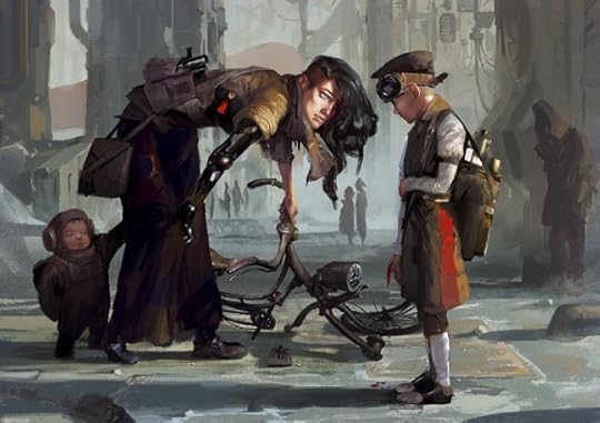
Art by Csaba Bánáti, Andrew Doma, and Jan Weßbecher
Before Children of Time I cut my teeth on inhumanity with my fantasy Spiderlight, which is part philosophy and part Dungeons and Dragons spoof. In that, a band of adventurers seeking to use a prophecy to thwart a dark lord have to recruit a very Mirkwood-esque giant spider to their party. The point of view hops from head to head but we spend quite a lot of time learning what the spider thinks of all this, most especially as it is forced into a human-like form. Nth, the spider, begins with a very simple worldview: food, family, protect mother. Wearing human form and living in a human world corrupts him in strange ways. In the end he finds that he can’t cross the same river twice: he can’t go back to the idyllic (and anthropophagous) life he yearns for.
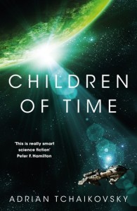
Buy Children of Time by Adrian Tchaikovsky
The non-humans of Children of Time are a step up from Nth, or from the sentient mantis Amalthae from War-Master’s Gate for example. They’ve got some science backing them, to start with, and because of the peculiar time-frame of the book we get to see them from the dawn of their culture all the way to… well, spoilers, I suppose. As with Nth, my starting point for their alien-ness was their sensorium – visual but also chemical and vibrational, and (per a lot of my writing) I just let the dominos fall from there, one logical step (or sometimes leap) to another. As they develop, generation to generation, they hit a lot of the same problems as we did back in the day: war, plague, internal strife, crises of morality and equality, and yet because they are not us, the problems come at them from different directions and are solved with very different tools. They are creatures whose biology gives them both strengths and weaknesses as against the human, and whose technology has gone in very different directions. And yet, at the last, I admit to stopping a few steps before the finshing line: no lifting the holy grail in triumph this time. Because these ‘aliens’ are on a human-made world, and they are an accident arising from a human plan, and the real humans are coming to darken their skies…
The post “Human, Near-human, Non-human” by Adrian Tchaikovsky appeared first on A Dribble of Ink.

May 29, 2015
Talkin’ Rockets, Tide of Shadows, self-publishing, and the state of blogging with Tor.com
Today, I join Justin Landon on the latest episode of Rocket Talk, Tor.com’s official podcast. We talk about a whole bunch of fun things, including:
Tide of Shadows and Other Stories ,
Why I’m self-publishing my book,
The state of blogging and where it’s going in the future,
Books! (Like Fran Wilde’s Updraft and Naomi Novik’s Uprooted ).
I had a lot of fun, and it was a good opportunity for the two of us, longtime bloggers both, to get a little Inside Baseball about publishing, blogging, and SFF in general. I can’t wait to hear what you think.
Find out more on Tor.com, or get Rocket Talk on iTunes/RSS.
The post Talkin’ Rockets, Tide of Shadows, self-publishing, and the state of blogging with Tor.com appeared first on A Dribble of Ink.

May 28, 2015
New cover art for Memory, Sorrow and Thorn by Tad Williams
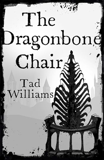
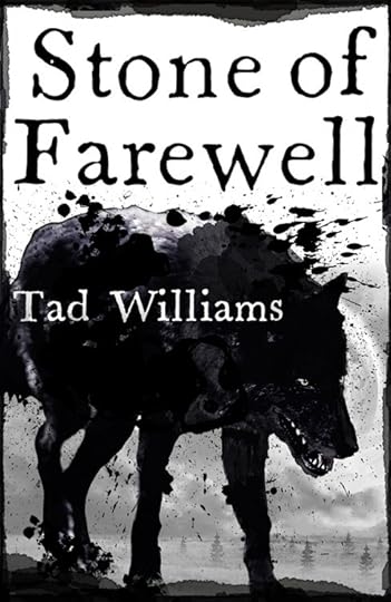
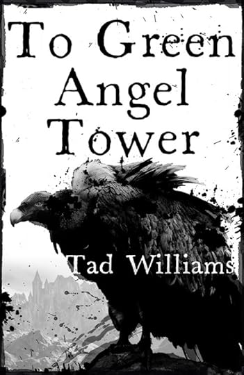
Uuuuurrrrggghh.
It’s no secret that I’m a huge fan of Tad Williams’ Memory, Sorrow and Thorn, a landmark epic fantasy trilogy published in the ’90s. So, when Hodder & Stoughton, one of my favourite SF/F imprints, announced they’d be publishing the series in the UK with brand new covers, I was appropriately excited. I’m usually a fan of Hodder & Stoughton’s covers, and Summers’ previous work for Hodder & Stoughton is stylish—particularly his cover for Lavie Tidhar’s A Man Lies Dreaming—but these are a big miss for me.
Even in a vacuum, where the series doesn’t already have some of the most iconic cover art, by one of the field’s legendary artists, these just aren’t right for the series. Memory, Sorrow and Thorn might have inspired George R.R. Martin to write A Song of Ice and Fire, but they’re not edgy or dark. They’re bright, expansive, and full of colour—these covers do little to convey the tone and spirit of Williams’ classic tale.
That all said, I do think the cover for Stone of Farewell is the best of the bunch, and is nice in a gritty, punch-you-in-the-face kind of way. Reminds me a bit of Stina Leicht’s (very good) contemporary Irish fantasy, Of Blood and Honey.
What do you think?
The post New cover art for Memory, Sorrow and Thorn by Tad Williams appeared first on A Dribble of Ink.

The End Has Come: An Interview with Leife Shallcross

In collaboration with editors John Joseph Adams and Hugh Howey, A Dribble of Ink is proud to introduce a series of interviews with the authors of The End Has Come, the final volume in the The Apocalypse Triptych. Following on The End is Nigh, and The End Is Here, The End Has Come contains 23 stories about life after the apocalypse.
Interview with Leife Shallcross about “Wandering Star”
(Interview by Sandra Odell)
In “Wandering Star” you have created a modern day post-apocalyptic tale with absolutely no fantastic elements, and the work is all the more stunning for its apparent normalcy. What inspired this story?
This story sprang from a couple of different places. Not to get too political, but Australia’s record on its treatment of refugees has gone from bad to worse over the last few years, and some of the commentary you hear excusing our current framework comes from a place of woeful ignorance about the adversity these human beings are trying to escape. This story sprang from me trying to understand how profoundly life can change due to events beyond a person’s control (war, famine, climate change, political instability… asteroid impact). My starting point was to question how I would react in such a dire situation. But I was mostly interested in how it would be to live through that unbearable quiet before the storm, when you know change is coming but you’re still essentially living the life you’re going to have to let go of.
Following on from that, often after these kinds of cataclysmic events have passed, there aren’t necessarily formal records of what it was like to live through them, and historians are left with putting together something of a puzzle from everyday items that have been left behind. I drew inspiration for Jessie’s quilt from a nineteenth century quilt in the Australian National Gallery collection called the Rajah Quilt. It was made in 1841 by women convicts being transported from England to Tasmania (which was a hellhole back then.) The quilt was sent back to England after completion, and then vanished for 147 years before it was rediscovered and acquired by the gallery. I love the idea of the stories of all those anonymous women being stitched into that enormous quilt – stories we have an inkling of, but will really only ever be able to guess at.
It has been said that the best stories take the readers by the throats and shake them vigorously until their worlds will never be the same again. Here the parents must not only contend with the impending death of their own world, but the realities of their children’s futures. Will their children be better off with their parents? Would it be more humane to send them away? How would the children survive in the world to come? You also leave the story intentionally vague at the end, a delightful torture indeed. What do you think happened to Jessie and her family?
I honestly don’t know what happened to Jessie. Sorry about that! I really terrified myself writing this story. I’ve got two kids about the same age as Jessie and Nate, and I just couldn’t bear to conjecture what their futures would be. If I’ve succeeded in imbuing this story with the sense of overwhelming anxiety for the future I felt when I was writing it, that’s probably why. I drew a lot of inspiration for this family’s predicament from the evacuation of children out of London during the Second World War. I can only imagine the anxiety of their parents, not knowing who their children would end up with and if they would really be any safer out of a city being blitzed to rubble (or if the parents, themselves, would survive the blitz to be reunited with them). It’s true that some of these children were sent to Australia, used as a kind of indentured labour and never saw their own families again. I’d like to think that since the advent of the UN Convention on the Rights of the Child, underage refugees would be treated differently in the scenario I have imagined, but reflecting on the actions of the politicians in charge of child refugees in my own country doesn’t fill me with hope.
The story also addresses the struggles of caring for elderly parents, the realities of extended family that may not be able to take care of themselves in an emergency situation. How do you feel you would respond to the challenge if you were ever caught in a situation where you had barely enough time to plan for the care of extended family?
There are plenty of families around the world that have experienced this kind of loss, through the advent of war or natural disasters, but those of us living in stable, first-world economies are generally going to be less vulnerable to such a sudden, fundamental shift in existence. It really made me wonder (doomsday preppers aside) how the average person would cope. To a large extent this story was me processing how I and my partner might react to a situation like this (Mum: it’s OK, I write fiction.) I realized that I would want all my family around me, that if something happened to my partner or I, it’s their grandparents and my sister who are my kids’ safety net. Also, Australia is probably a lot like the US geographically, in that it is big. When you can jump on a plane, living a couple of thousand miles from your family isn’t a disaster, but in the scenario contemplated in Wandering Star, there are going to be plenty of families who face a real prospect of never seeing each other again.
It’s the details that bring this story to life: the description of the materials in the quilt; Jessie’s girl guides uniform on the bed; how the main character rolls her eyes when her mother calls; the worn leather couch. What is it about such detailed descriptions that helps cement a reader into the story?
When cataclysmic events happen (even if it’s just a personal catastrophe, rather than a global one), it’s often the tiny details that trigger the strongest sense of loss and grief because these are the things that have been so intimately close to us, even whilst they represent something so much bigger than themselves. When I was writing this story I was trying to convey the central character’s sense of loss of a whole entire way of life. So, in picking the details that my character focuses on, I wanted to capture the minutiae from this family’s life that readers will recognize from their own lives. Many of the fabrics in the quilt could have been cut from my children’s clothes. Everyone’s mother does something that make them roll their eyes. And I tried to pick other touchstones that evoke a whole history for this family that has happened before the short period this story covers – like the couch. I hope readers can imagine the couch new, and imagine the constant use and small, domestic disasters that have turned it into the beloved and familiar piece of furniture my character has to leave behind.
Of late, the global fiction market has focused on encouraging a diverse range of writers from all nationalities and backgrounds. Still, many Australian writers feel that it is difficult to get their works published in non-Australian markets. What are some ways the publishing industry could improve in its efforts to promote the works of Australian writers in particular?
This is an interesting question, because I’m not sure that I necessarily agree that this is always the case. Australians seem to be well represented in the fields of science fiction, fantasy and horror, given our relatively small population base. For emerging writers, it is probably more true in relation to novels, as opposed to the short fiction markets. I wonder if marketing a work as ‘Australian’ (or, indeed, as actively representing any particular diversity group) might sometimes be doing that work a disservice, in that the ‘Australianness’ of the work might then shout louder than other story elements potential readers would find more compelling or relevant. There was an interesting article that came out last year that examined the tendency for books about Africa, or by African writers, to feature an image on the cover of an acacia tree against an orange sunset over the veldt. Frequently, this says nothing about the story (I’ve even seen an edition of Barbara Kingsolver’s The Poisonwood Bible with that image on the cover, and that story is set in a freaking jungle.) Which means that unless a potential reader is specifically interested in Africa, the cover art doesn’t offer much by way of enticement. So I guess my question is whether a work actually needs to be marketed as being Australian, if that’s only going to conjure up images of kangaroos and gum trees, when that might not have much, if anything, to do with the story. In science fiction and fantasy, more than any other genre, our readers are really looking to be presented with fascinating new worlds to explore, and if they perceive they’re being offered something they think they’re familiar with and not that interested in, it’s not going to do much to promote the work.
What’s next for Leife Shallcross? What can hopeful readers expect from you in the future?
This is quite an unusual piece for me in that I don’t often write pure science fiction. A lot of my work draws on fairy tales and folklore, so has a very different flavour to it. I have a couple more short stories coming out in 2015: one in an Australian anthology called The Never Never Land about two elderly people escaping the dreary world of their aged-care facility using magical knitting, and another story in a European Anthology, Strange Little Girls, which draws on one of my favourite figures in folklore, Jennie Greenteeth – a water hag that eats children. I’m also looking for a home for my first novel, which is a take on the Beauty and the Beast fairy tale. I’ve got another couple of novels in development and loads more short stories.
About Leife Shallcross
Leife Shallcross lives in Canberra, Australia. There is a possum living in a tree by her front gate and sometimes kangaroos visit her front garden in the night. Her work has appeared in Aurealis and several Australian anthologies of speculative fiction. She is the current president of the Canberra Speculative Fiction Guild. When her family, writing, and day job are not consuming her time and energy, she plays the fiddle (badly). She is currently working on her first novel. Leife can be found online at leifeshallcross.com and on Twitter @leioss.
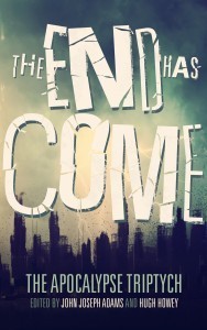
Buy The End Has Come, edited by John Joseph Adams and Hugh Howey
About the anthology
Famine. Death. War. Pestilence. These are the harbingers of the biblical apocalypse, of the End of the World. In science fiction, the end is triggered by less figurative means: nuclear holocaust, biological warfare/pandemic, ecological disaster, or cosmological cataclysm.
But before any catastrophe, there are people who see it coming. During, there are heroes who fight against it. And after, there are the survivors who persevere and try to rebuild.
Edited by acclaimed anthologist John Joseph Adams and bestselling author Hugh Howey, The Apocalypse Triptych is a series of three anthologies of apocalyptic fiction. The End Is Nigh focuses on life before the apocalypse. The End is Now turns its attention to life during the apocalypse. And The End Has Come focuses on life after the apocalypse.
Buy the book
The End Has Come is available as a trade paperback or eBook.
The post The End Has Come: An Interview with Leife Shallcross appeared first on A Dribble of Ink.

May 27, 2015
Bill Mudron’s woodblock prints inspired by Studio Ghibli will put a smile on your face
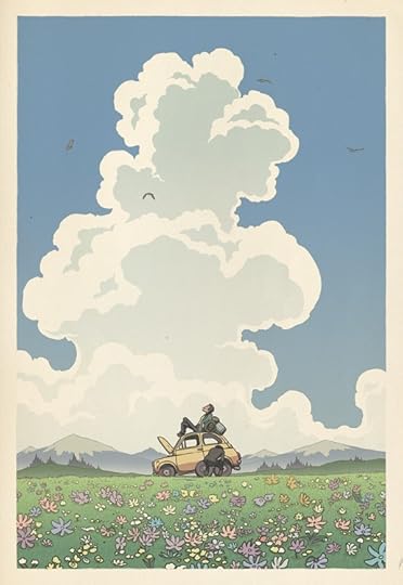
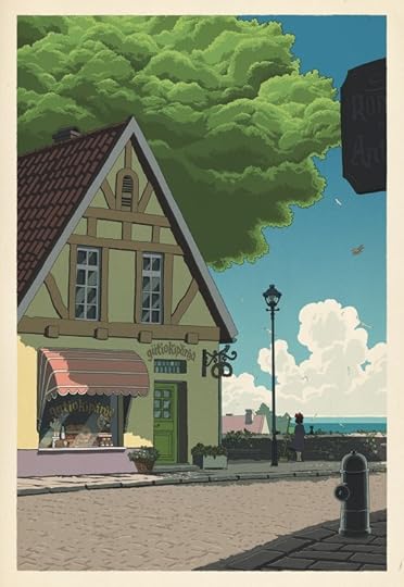
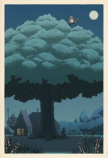
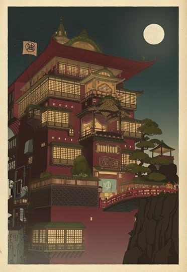
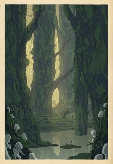
Of all the wonderful opportunities that come along with being a parent, introducing your child to your favourite books, movies, comics, and music is one of the greatest. When deciding on how to decorate our nursery, my wife and I quickly settled on a theme inspired by two of Hayao Miyazaki’s wonderful films: My Neighbour Totoro and Kiki’s Delivery Service. These woodblock-inspired posters from Bill Mudron would fit beautifully in our nursery. The drawn back perspective, with an emphasis on Miyazaki’s wonderful worlds, is a nice contrast to the character-centric imagery that you often see associated with films. You get a strong sense of the characters living in this world, of it continuing on past the rolling credits. Terrific stuff.
Posters of Mudron’s Studio Ghibli woodblock prints are available through his online store.
The post Bill Mudron’s woodblock prints inspired by Studio Ghibli will put a smile on your face appeared first on A Dribble of Ink.