
Randy Krum's Blog, page 42
February 2, 2015
The Anatomy of the Perfect Sales Presentation
Good infographics tell stories to the audience, and you sales presentations should too. The Anatomy of the Perfect Sales Presentation from Clemence Lepers (@PPTPOP) uses an infographic story to help people learn to tell better stories with PowerPoint. Very meta isn’t it?
You’re not gonna like it, but if you’re willing to start making some solid sales presentations that’ll help you generate more business, you’ll have to print the next sentence in your brain. Nobody cares about you. I repeat, nobody cares about you. People care about how YOU can solve their problems and deliver the outcomes they are interested in. To grab prospects attention and close more sales, you need to bring consistent, clear solutions to their problems.
Easier said than done, right?
To help you with that, I’ve created an infographic that breaks down the key elements of a highly effective sales presentation. Follow them, and you’ll be set to get your value proposition across, communicate a compelling message and convert more prospects.
There’s a structure to a story, no matter what medium is being used to tell it. Don’t just throw your data and talking points into an infographic (or a presentation). Tell a story that makes your data meaningful to the audience.


January 29, 2015
The Salesforce Economy
The Salesforce Economy infographic created by Outbox Systems is an overview of where the company is today and a little history on how it came to be.
Salesforce is a global powerhouse. This infographic displays the Salesforce economy, including the company’s growth, global reach, timeline and more.
This design is a great visual summary of the corporate history of Salesforce. Revenue growth, global presence, acquisitions, strategic partners and an overview of apps. Here’s the link to the high-resolution PDF version. The link on their landing page is broken.
The overall design is pushing the Fair Use of the Salesforce trademark pretty far. One of the trademark infringement tests is the “possibility for confusion”, and I wouldn’t be surprised if some readers walk away thinking this is an official infographic put out by Salesforce instead of Outbox.
Thanks to Darren for sending in the link!


January 27, 2015
2012 Statistics: Pennsylvania Crashes

This infographic is a very detailed look into the 2012 Statistics of Pennsylvania Crashes. Solnick & Levin, a law firm that works on cases of personal injury due to accidents, released the infographic to help potential clients understand where their case may fall in the overall state statistics.
The charts and visualizations in this infographic design are clear and very easy for the readers to understand.
However, I frequently talk about the differences between showing statistics with a data visualization versus showing them in text-alone. This is a great example, where some stats are visualized where others are not. Any of the stats shown as only text are generally considered to be secondary information by the readers because they weren’t important enough for the designer to spend the time to visualize.
My recommendation is that you should carefully choose to only include the important statistics that support the overall story in any particular infographic design. If a data point makes the cut and is picked to be included, the designer should take the time to visualize it to make it more easily understood by the readers.
Thanks to James for sending in the link!


January 26, 2015
How to Have the Perfect Workday
How do you manage your time? The How to Have the Perfect Workday infographic designed by Alissa Scheller for The Huffington Post tries to map out the perfect schedule to maximize your productivity.
The good news is that there are plenty of little things you can do to improve both your productivity and your happiness if you feel stuck at your desk all day.
One simple trick is to structure your time better — which includes taking more breaks. In fact, the highest performers work for 52 minutes consecutively before taking a 17-minute break, according to a recent experiment conducted by the productivity app DeskTime.
Check out HuffPost’s perfect workday below:
The doughnut chart is easily understood by readers as visualizing the complete day, and this design tells this one story in the visualization very well. Nicely done.


January 23, 2015
Equal Population Mapper
Ben Blatt has created the Equal Population Mapper infographic. The interactive version at Slate.com allows you to choose New York City, Los Angeles County, Wyoming, New Jersey, Texas, or the Coastal regions as the target population. Then you select anywhere else on the map and a red circle will appear to show how big of an area you would have to select to have an equal population to your selection.
If you throw in New York City’s other four boroughs, the Big Apple’s total population is just greater than 8 million. That’s about the same number of people who live in Idaho, Montana, Wyoming, North Dakota, South Dakota, Nebraska, and the western half of Minnesota combined.
But don’t let my New York City–centric comparisons hinder your imagination. The interactive at Slate.com lets you visualize how different parts of the country compare in population density.
Click the button at the bottom of the interactive to select Los Angeles County, for instance, and then click anywhere on the map to generate a (roughly) circular region of (roughly) equal population. The population data come from the 2010 census, and the square mileage was calculated by summing each highlighted county’s total area. You can also use New Jersey (the most densely populated state), Wyoming (the least densely populated state outside of Alaska), Texas, the coasts (the group of all counties that come within 35 miles of either the Atlantic or Pacific oceans), and, yes, New York City as the baseline for your population comparison.
Cool interactive map!
Found on Flowingdata!


January 20, 2015
The Key to Infographic Marketing: The Psychology of the Picture Superiority Effect
In Ancient times, Cicero considered memory training to not just be a method, but a form of art. He felt strongly that training your memory was one of the most valuable things you could do to improve your capabilities as a speaker, and a citizen. Even in ancient times, Cicero knew that remembering images was superior to remembering text alone.
People remember pictures better than words, especially over longer periods of time. This phenomenon as we know it today, is called the Picture Superiority Effect*. It refers to the notion that concepts that are learned by viewing pictures are more easily and frequently recalled than are concepts that are learned by reading their written word form counterparts.
What had been known to the Ancients throughout the centuries, has been quantified scientifically in our modern times. In my book, I included this quote from John Medina’s Brain Rules, to help explain the value of the Picture Superiority Effect. However, to make it visual I created this simple data visualization to help readers remember the power of visual information.
“Based on research into the Picture Superiority Effect, when we read text alone, we are likely to remember only 10 percent of the information 3 days later. If that information is presented to us as text combined with a relevant image, we are likely to remember 65 percent of the information 3 days later.” - John Medina, Brain Rules, 2008

via: coolinfographics.com/book
Advertisers have known this for years. Whether it’s been a simple application like the Yellow Pages (ads with pictures got more business) or giant billboards in New York’s Times Square. To see a real world example of how the Picture Superiority Effect works, check out this excellent coverage area map ad campaign from Verizon:
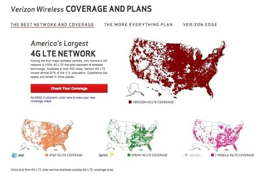
These maps show Verizon’s 4G LTE network coverage area, compared to the coverage area of their competitors. If you were only to get the text version, imagine how much of this paragraph explaining their coverage area you would remember 3 days after reading it:
“Among the four major wireless carriers, only Verizon’s 4G network is 100% 4G LTE the gold standard of wireless technology. Available in over 500 cities, Verizon 4G LTE covers almost 97% of the U.S. population. Experience the speed and power in more places.”
Now, take a look at the maps again. How much easier it is to see how the four major wireless carriers stack up against each other? It’s obvious Verizon covers the most area. Verizon takes it a step further, and has a link to a PDF highlighting their coverage in Alaska and an interactive map to view different parts of the country. All complete with map visualizations, of course.
However, there is another very important aspect of the Picture Superiority Effect that must be understood: It’s not just any image. It needs to be an image relevant to the content, which reinforces the message from your data. This works across all mediums of advertising, and of course, infographics.
In infographic design, the Picture Superiority Effect is extended to include charts, graphs, and data visualizations. Infographic designers use data visualizations and illustrations as the visual component of a design to trigger the Picture Superiority Effect, which can have incredible success getting the audience to remember the information presented.
Here is an great example from Dan Roam, author of the book, The Back of the Napkin, Solving Problems and Selling Ideas With Pictures, of how using images and text can help a designer understand which type of visualization is appropriate to use when communicating different types of information. Easy to understand, easy to remember.
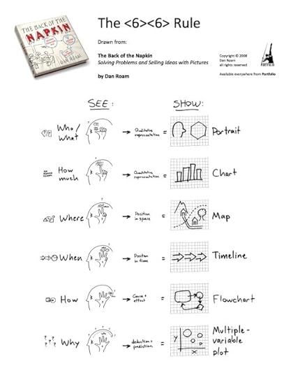
via: DanRoam.com
Infographics work so well because using text and images together helps people to retain the information. Remember, if it’s just words, people will only remember 10% of the information they read. But, if you combine the text with a relevant image, they are likely remember 65% of the information! While others may choose to work harder by crafting a perfectly written article or advertisement, it would be a smarter choice to use text and relevant images together.
Remember to “Make It Visual” if you want your audience to remember the information about your company’s products or services. You don’t have to be a professional designer either. You can make your content visual using a wide range of tools like the Adobe Creative Cloud suite, Microsoft PowerPoint, OmniGraffle, or online design tools like Visme.co or Tableau Public.
Sources:
*Nelson, D.L., Reed, U.S., & Walling, J.R. (1976). Pictorial superiority effect. Journal of Experimental Psychology: Human Learning & Memory, 2, 523-528.


January 19, 2015
The Future of Rare Earth Elements

Rare Earth Elements make up a large portion of our high tech equipment and the demand for the elements is only increasing. This infographic, published by Buy Metal Online, has that examines the situation and the troubling shortages in our future.
Here we have an infographic that takes a look at rare earth elements (REE) including information about what they are, what we use them for, who’s producing the World’s REEs and more.
Good topic with clear visualizations and attractive illustrations. They have a lot of valuable information packed into this design. However, in my opinion, there’s way too much text included, with multiple paragraphs explaining each section. In my experience, if readers see this much text in an infographic, they are likely to perceive it as too complicated and detailed. They’ll probably move on without ever reading it. Infographics are supposed to be simple explanations that are quick and easy to understand.
Thanks to Dave for sending in the link!


January 15, 2015
Starbucks Espresso Infographic Advertising


NOW AT STARBUCKS! The newest addition to the Starbucks menu is the Flat White. But what is the difference between The Flat white and the rest of Starbuck’s menu?
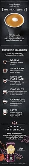
Starbucks sent this cool infographic as a content marketing piece in an email to all of their customers introducing The Flat White to their menu. The infographic visualizes the recipes for the 6 Espresso Classics. Currently available for view in most Starbucks stores around the country is an infographic that explains the differences between the styles of drinks on the menu.
The graphics in the email are actually the 3 separate images you see above, and I assume they could be changed for different people receiving the email. For example, someone else might receive an email about the Cappuccino or a different coffee flavor ad at the bottom. Good for flexibility in the emails, but bad for sharing in social media.
A product of simplicity, crafted into artistry, our baristas know that balance is key to the perfect Flat White. An extra ristretto shot ensures that it’s bolder than a latte, yet steamed milk keeps it smoother than a cappuccino. But perfection doesn’t end there—the technique for steaming and pouring the milk requires close attention as well. Steamed milk is folded into itself creating a velvety microfoam that gives the Flat White its silky texture and signature white dot.
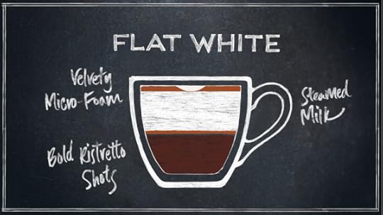
Love the cafe-style chalkboard look, and the layered drink r recipe visualization design!
Using this infographic in an email campaign is brilliant, but I wish it had been designed to also stand on its own so it could be shared online in social media easier.

They use this design style throughout their entire espresso menu of drinks.
Thanks to Starbucks for sending the infographic to it’s customers! I put the separate pieces together below to make sharing easier!


January 9, 2015
World Map for Power Plug Types

When traveling abroad, it is best to be prepared. However, does your check list include power plugs? The World Map for Power Plug Type infographic from Easy Smart, maps out the location and types of each plug throughout the world. Never go on vacation unprepared again!
Helpful, information visualizations are fantastic topics for infographics. Not a fan of the color scheme. Just a thought, but this would be even better if it was printed on small cards for travelers to carry!
Found on Life Hacker


January 8, 2015
Iconic Movie Glasses

Most of the fashion trends for eyewear come from characters in movies and at Yates and Suddell, eyewear is a big deal. The Iconic Movie Glasses infographic has 12 of the most memorable pieces of eye wear to hit the big screen all on one page!
We’re all about eyewear here at Yates & Suddell. Whether a stylish pair of spectacles or a sharp set of shades, the right glasses can really complete your look. Just ask the costume designers to the stars, who have long relied on a pair of specs to lend their subjects a certain “je ne sais quoi”. These glasses often become iconic aspects of the movies in which they appear, and can end up influencing frame fashion for years to come.
Check out our new infographic to see 12 of the most iconic pairs of glasses to ever grace the silver screen. How many do you recognise?
Of course, most of these frames are now many years old, so you’ll be very lucky to track down a pair of originals. However, you’ll find that many of today’s frames are based on the same iconic shapes as the most popular of these glasses, making it easy to recreate the style of the star you love the most!
Fantastic topic idea for an online retailer of eyewear. The design is eye-catching, with minimal text and the illustrations are easily recognizable.
The footer should include the URL to the infographic landing page, so when people find this infographic on other sites, they can easily find the full-size original.
Thanks to Matt for sending in the link!


