
Randy Krum's Blog, page 38
July 13, 2015
A Brief History of Open Source Code

Learn about the last 20 years of collaborative software development, language relationships, and the current state of the art with A Brief History of Open Source Code infographic. Kinvey, a company that helps its clients create mobile apps, published the infographic designed by Beutler Ink back in 2013. For more in-depth reading, check out this article at Read Write.
We were able to visualize the percentage of total commits in a given quarter for the top 16 programming languages from 1993 until today. We hope you’ll find this image—a provocative pattern of dips and spikes—to be as interesting as we do. It truly shows how dynamic the world of programming is. We’ve also included a few graphs on other interesting data points: total number of languages by year, average lines of code per commit, and tracking which languages influenced the development of others.
There is good use of colors and charts to tell the story of the 16 different source code languages. No numbers were needed to show the popularity of each language, only distances between the colors. The colors are similar, but not to the point where we would have trouble telling them apart. I like the gradual color gradient in the infographic. Too many different colors would make the graphic look too busy.
Found on http://readwrite.com


July 9, 2015
How to Pick Your First Programming Language

Udacity presents, How to Pick Your First Programming Language infographic. Your decision depends a lot on where and the job you are aiming for. Check out the graphic for some tips.
If you haven’t picked your first programming language, the programming world is your oyster. Yet with evangelists for every language telling you their language is the best, choosing one to start with can be incredibly overwhelming. We’ve looked at the data for the top ten programming languages in the US (based on IEEE Spectrum data) to help you pick the best language to start with based on your priorities in lifestyle, location, and career potential.
Python is a popular, well-paid language, being versatile enough to be used in many different applications, while Javascript is used widely across the country, and can be a good choice if you don’t want to relocate for a job. Although some newer programming languages, such as Swift, are not included, you shouldn’t discount the growth of their popularity. Career opportunities in iOS development using Swift, similar to Android development using Java, will increase as the field of mobile app development continues to expand.
There are many factors involved in choosing your first programming language. This data can help you figure out what works for you.
Good rundown of the stats behind the programming language careers. I'm not sure that Google searches in the best gauge of language popularity. Maybe something like number of projects on GitHub might have worked better.
The footer should include the URL back to the original infographic landing page, not just the main front page for Udacity.
Thanks to Lindsay for sending in the link!


June 25, 2015
Business Etiquette Around the World

When you are on a business trip, making a good impression is always key, but meeting internationally for business can make things a little tricky. The Business Etiquette Around the World infographic from CT Business Travel has compiled a list of expectations for those meeting in foreign countries around the world. As the infographic states, "Follow these tips and never put a hand, fork, or word out of place again."
Customs and etiquette vary wildly from country to country, and business professionals are often unaware of the differences.
This made us think, wouldn’t it be really useful to research and produce an illustrative guide that provides an easy to digest overview of the essential cultural differences for when professionals meet international clients, suppliers and colleagues overseas – so we did and here it is.
For instance the French prefer to shake hands lightly, as do the Japanese and South Koreans, and pre-business chit-chat may be customary in Brazil, but this is not the case in Russia, Switzerland and a number of other countries.
The following Infographic outlines the rules that can be unwittingly broken across the world and will be of interest to anyone who wants to seal the deal rather than tarnish their reputation.
Table data like this is always a challenge to visualize. Using icons in the table format is a good way to make the data easier to understand and compare between rows.
Thanks to Danny for posting the link on !


June 16, 2015
Visme 3.0 Design Platform Launches Improved User Interface
is an online design platform, and can be used to create infographics, presentations, banners, reports, and even resumes. With over 200,000 users, Visme is being used by many as a replacement for expensive desktop applications like Microsoft PowerPoint and Adobe Illustrator.
"Visme epitomizes everything we strive for. At the core we are a visualization tool and our mission is to simplify the ability for anyone to easily transform their thoughts and ideas into engaging visual content," - Founder Payman Taei
In April 2015, the team at Hindsite Interactive launched Visme 3.0, a complete redesign, moving to a cleaner, easy-to-use user interface. The redesign has made a major move towards flatter design elements that help users focus on the content they are creating without being distracted by the interface tools.
If you’re not a professional designer that can invest in a high-end hardware and software setup or don’t have the time or budget to hire a professional, Visme is a great platform to create eye-catching visual content with minimal effort. You can start with one of the many professional templates, and then customize your design by changing colors, rearranging the layout, uploading your own images, inserting video, building simple data visualizations using the Graph Tool, or use any of the millions of free icons and images from the huge built-in library.
Specifically for infographics design, the built-in Graph Tool and Infograph Widgets can be very helpful. Although you may import more complex data visualizations created elsewhere, the Graph Tool let’s you build simple charts directly in your design by entering the data and editing the chart settings. This is a huge advantage over many other online design tools that only provide chart shapes and objects that you have to adjust manually to match your data. Accuracy of your data visualizations in an infographic is crucial!
Here you can see a simple area chart created with the Visme Graph Tool. Over 600 data points were uploaded to create this simple data visualization. Because it was built with the Graph Tool, the chart is editable as the data set continues to grow in the future. The design has been inserted here using the embed code created by the Visme platform to display the chart. As future updates are made to the chart on the Visme site, the most current version will always be displayed here. For infographics, you can update the data in your design, and every site that uses the embed code will always display the latest version of your design.
Original: http://my.visme.co/projects/growth-of-infographics-in-search-613ce1
Personally, I’d like to see the Graph Tool expand into more visualization styles, and give the users more ability to customize the charts it creates. It’s pretty good with the simple charts, but I hope this is only the starting point for the Visme team. I hear that improvements to the Graph Tool are in the plan for release later this year.
Infographics are made to be shared, and the Visme tool gives you plenty of options. In addition to embed code for both animated and static sharing, you can also download your design as a static image file (JPG or PNG) or a PDF file for easy distribution. You can also download as HTML5 version which would retain all interactivity of your live version and open locally in any browser without third party software or plugins.
Two other advantages of designing your infographics in Visme. First, you can keep your designs private, and only allow those that have the link to view your design. You can even password protect your design so only those with the link and the password can view your design. Second, you can see the analytics for your design in one place. This is a real challenge for tracking infographics online, and seeing the combined statistics of views and visits to your infographic is a fantastic feature. For everyone that shares your infographic on their own using the embed code, those viewer statistics are all gathered together in your Visme analytics dashboard.
is free to everyone to try with many of the basic design tools. Paid plans start at just $6/month to unlock premium templates, along with the ability to manage privacy, download content, analytics and collaboration tools.
Special for readers of Cool Infographics, use the discount code VISME3 to get a lifetime 25% discount on any subscription.


June 15, 2015
Infographics Are Evolving into Many Formats
The internet is full of noise, and your job is to break through that wall of information with something that resonates with your target audience. When you are communicating any message, you want to ensure that your audience will understand and remember the valuable takeaways about your products or services. You want your communication to be clear and concise. This is where infographics come in.
Infographics are your opportunity to convey complex ideas and information in a simple and easily digestible manner. Simply put, our brains love visual information. Infographics can make your marketing and advertising stand out in the crowded world of visual content.
As the Internet, our computing devices and out screen sizes continue to evolve and change, infographics need to evolve as well. Moving past the original static images, infographic storytelling with data visualizations and illustrations can now be found in a number of different formats.
Below, are great examples of different ways to leverage the five different types of infographics to make your product or services more memorable.
1. Static Infographics - Kitchen Conversion Guide
Static infographics are the most simple and most common infographic format out there. They are usually saved as an image file to be easily distributed and consumed (JPG or PNG format). Static infographics are easily shared using email and social media since there are no moving parts to consider.

Source: https://shannon-lattin.squarespace.com/how-many-guide/
This type of infographic is also easily split up into segments in order to focus on one piece at a time. This is ideal for giving presentations or sharing on social media.
2. Interactive Infographics - Daily Dose of Water
Interactive infographics are great to utilize when you want people to move beyond simply looking at the information. Ideally your audience should get intimate with the facts you’re presenting by following a specific storyline told through your data. By giving your audience something to interact with, they are engaging more of their attention with the data, and will become more immersed in the information.
For example, this infographic from Good.is and Levi’s walks users through their typical routine and calculates how much water is used for each task. This allows a personalized experience for each person that views the infographic, creating a stronger connection to the information being shared.

Source: http://awesome.good.is/transparency/web/1204/your-daily-dose-of-water/flash.html
3. Video Infographics - The Fallen of WWII
Video infographics have been gaining popularity over the years in part for a lot of the same reasons static infographics work: the ease of sharing and the ability to embed it almost anywhere.
In this video infographic that has recently gone viral, the creator uses data visualization to make a powerful statement about the sacrifice soldiers made during World War II. Data visualization is used in such a way to show the stark juxtaposition between the Second World War and more modern conflicts. Check out this quick motion graphic titled, The Fallen of World War II from Austin-based developer Neil Halloran. His use of sound and motion brings the information to life.
The Fallen of World War II from Neil Halloran on Vimeo.
4. Zooming Infographics - The History of Film
Some infographic topics tackle a large amount of information, and a larger design is required to display all of its information. This infographic from Historyshots is a great example of a zooming infographic:

Source: http://www.historyshots.com/products/history-of-film
The History of Film plots out the most important films of the last 100 years into a beautiful, flowing timeline that visually separates the films into 20 different genres. As can be seen above, if this infographic was just left as a static image, it would be difficult to read everything because it is so detailed and complex. In the web browser, a large design is reduced in size so that the entire design can be viewed all at once on the screen, and the zooming controls are made available to the reader to view the small details clearly.
5. Animated Infographics - Flight Videos Deconstructed
Some topics for infographics are best created to feature motion, none more so than one that shows the the flight patterns of an Egyptian Fruit Bat, Dragonfly, Canada Goose, Hawk Moth, and Hummingbird. Flight Videos Deconstructed is an animated infographic about flight patterns within the animal kingdom. Covering five winged animals the and the motion their wings use while taking flight, this animated graphic uses vibrant colors and geometric shapes to convey the beauty and simplicity of flight.
Animated infographics create some motion or change in the design as the reader watches. It might be the bars in a bar chart growing, a color change, or (in the case of these winged animals) an animated character. These are differentiated from the video infographics because these are not video files. These are animated with HTML code or an animated GIF image file format to create the animation but can exist as a stand-alone object on a web page.

Source: http://tabletopwhale.com/2014/09/29/flight-videos-deconstructed.html
With so many new and different formats of infographics available to today’s marketers, providing your audience with a story that conveys your message has never been more exciting. Sharing the key takeaways from your product or services can be done in an expertly designed way that appeals to your audience and leaves them wanting more.


June 12, 2015
Death By Boating Under the Influence

The Never BUI (Boating Under the Influence) infographic helps share some of the grim statistics about the boating deaths caused by alcohol. This is a perfect topic for an infographic by Boat Ed, a source for Official Boater Safety Courses and Boat Safety Education Materials.
Before the thought of drinking on a boat crosses your mind, consider the physical and legal consequences of boating under the influence of alcohol. Not only is operating a boat while intoxicated illegal in all 50 states, it’s also dangerous and can have deadly consequences.
Alcohol use is the leading known contributing factor in fatal boating accidents; where the primary cause was known, it was listed as the leading factor in 21% of deaths. Safe boating means never boating under the influence (BUI).
Safe boating means sober boating. While it may be tempting to crack open a can of beer while cruising, keep in mind that your record, license, and life may be at stake!
I really like this design. Simple, clean design that focuses on telling one story really well. Easy to read. Easy to Understand the data. Easy to share.
Thanks to Joe for sending in the link!


June 11, 2015
UK Tax Burden Infographic Video
The UK Tax video, posted on Youtube by See What You Mean, explains how much money you actually receive after taxes in the UK. Below is the final infographic.
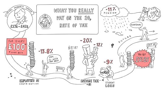
The tax and deductions on your job are much higher than you might think. The Government likes to talk about a ‘20p rate’ – as if that’s all you pay. But actually, for a typical middle income graduate, total deductions are more than 48p in every pound earned (over the £21k threshold). And will rise to nearly 60p when the statutory pension scheme comes in by 2018.
What will it do for the incentive to work and do better, and to the UK’s general prosperity, when graduates only get 40% of any extra they earn?
Against this backdrop some politicians still talk of increasing the taxes on these middle earners.
This is a great example of using the hand-drawn style of design for infographics. Often used for graphic recording of events and meetings, the hand-drawn style has the look of someone just drawing on a whiteboard.
Video infographics tells stories in a very linear way, and in this case the visual metaphor of a road builds on that linear storyline even more. The drawing continues to build and reveal more information as the video progresses, and the viewer can see the overall design coming together.
I say this often, but I'll say it again. "Big numbers are not data visualizations." Visualizations can help the audience by showing the taxes percentages as taking their portion of a person's total salary. Just showing the text number of the percentages, doesn't help the viewers understand how large that tax burden is to them.
Thanks to Richard for sending in the link!


June 8, 2015
The Process of Designing an Infographic
The Process of Designing an Infographic is an interactive design that outlines my own infographic design process. My data visualization and infographics design company, InfoNewt, uses this process when designing infographics for clients, and I teach this process in my workshops and classes. The team at Visme.co created an interactive infographic version of it using the Visme design platform. Visme.co is a fantastic online design platform for infographics, presentations, reports and more.
Most of my designs follow this 5-step process:
Data Research - Start with the data. What's the insight or story?
Wireframe - Wireframe your story before you start any design work
Design Concepts - Experiment with design ideas by creating rough concepts that visualize your data in a handful of different ways
Iterate - Choose one design direction or combine a few different ideas from your concepts.
Finalize - The final step is to finalize your design with the appropriate Copyright or Creative Commons license, and export the final design to a few different file formats as necessary.
One of the advantages of using Visme as the platform to design your infographic is that you can create interactive elements in your design. In this case, you can see the original interactive version on the Visme site, that includes additional information when you mouse over each process step. This is built in Javascript, and anyone can share the interactive version by using the embed code on their own website.
You can embed the interactive infographic on your own site by using this HTML code:
<script src='//my.visme.co/visme.js'></scr... <div class='visme_d' data-url='the-process-of-designing-an-infographic-d25a0c' data-w='800' data-h='2982'></div>


June 1, 2015
A World of Languages
A World of Languages - and How Many Speak Them is a new infographic by Alberto Lucas López for the South China Morning Post that compares the number of people that speak the top 23 languages in the world as their primary language. High resolution image version available HERE.
There are at least 7,102 known languages alive in the world today. Twenty-three of these languages are a mother tongue for more than 50 million people. The 23 languages make up the native tongue of 4.1 billion people. We represent each language within black borders and then provide the numbers of native speakers (in millions) by country. The colour of these countries shows how languages have taken root in many different regions
The dominant visual centerpiece appears to be a combination of a voronoi diagram & circular treemap, where the area of each section is representative of the number of people that speak each language as their first language. I don’t know any any software that will create this specific visualization style, so I’m assuming the area of each section had to be calculated separately. With the different, organic shapes how were those areas calculated? Iteration?
The data is a little bit controversial. It’s an estimate of the number of people that speak each language as their first language. There’s no accounting for multi-lingual people or language families. I love the data visualization design, but the underlying data may cause some concern.


May 27, 2015
The Fallen of World War II
The Fallen of World War II from Neil Halloran on Vimeo.
The Fallen of World War II is an animated infographic video by Neil Halloran showing the scale of deaths in the U.S. and other countries involved in the war. He also has an experiemental interactive version at fallen.io
An animated data-driven documentary about war and peace, The Fallen of World War II looks at the human cost of the second world war and sizes up the numbers to other wars in history, including trends in recent conflicts.
Visit fallen.io for more information.
Love this! Very well done animated infographic video.
The stacks of icons shown for each country are 20 across, which is hard for most people to comprehend. We live in a Base-10 society, and showing the icons in rows of 10 would be much easier for audiences to understand.
There are a couple discrepancies as well. For example, the narration mentions that France lost 92,000 in the Battle of France, but the visualization only shows 86,000.


![[image error]](http://cdn4.scmp.com/sites/default/files/styles/980w/public/2015/05/27/languages.png?itok=vmmQxGE7)