
Randy Krum's Blog, page 40
April 7, 2015
Greek Mythology Family Tree

Keeping track of Greek mythology’s genealogy can cause a headache. But now, Useful Charts has released a new update to the ultimate cheat sheet called the Greek Mythology Family Tree chart poster! The tree starts with Chaos from the Primordial gods, and finishes through the last of the Olympians.
The poster is available for purchase on Amazon for $24.95
Fans of Rick Riordan’s Percy Jackson books will love this poster! Covering all three generations of Greek gods (Primordial, Titans, and Olympians), it displays both the Greek and Roman names for the gods as well as their titles or functions. It is also color-coded to distinguish between sea gods, sky gods, earth gods, underworld gods, personifications, monsters, demigods, and mortals.
This is a great network map design, and way more complicated than your standard family tree. The images help tremendously.
Created by Matt Baker at UsefulCharts.com
For a detailed look at the poster, check out Matt’s video:


April 3, 2015
Best Film Awards From Around the World

In America, winning an Oscar is a dream come true for people in the film industry; however, the award is not one of a kind! There are many ‘Best Film’ Awards From Around the World and Robert Shaw has created this infographic to illustrate the coveted trophies.
The awards illustrated here represent only a small fraction of the festivals that celebrate achievements in cinema throughout the world. It is by no means a definitive list.
The criteria for this infographic was to include awards that hold a dedicated trophy or statuette for an overall ‘Best Film’ category, presented in ceremony for at least four years. However, some exceptions do appear in order to show as many nations as possible.
I think the size of this infographic is the primary message. I know many people don’t like tall infographics, but in this case that is the primary design element. It’s also eye-opening information because I would guess that most readers would have no idea that there are this many different film award organizations in other countries.
Thanks to Robert for sending in the link!


April 2, 2015
The True Cost of a Bad Hire

The True Cost of a Bad Hire infographic from Executives Online in the UK puts into perspective the £4.13 billion a year that UK businesses are losing from a bad hire. With one £50 note being less than 1 mm thick, the stack would reach about 933 meters tall. London’s Big Ben is 96 meters tall.
People are a businesses most valuable resource. Actively finding and attracting top talent is a never-ending task for any company that aspires to be the best.
The amount of new hires that don’t work out is frightening – in fact a study by leadership IQ across a range of industries and job roles found that up to 48% of new hires fail within 18 months. It’s a problem that’s estimated to cost UK businesses over £4 billion a year.
So What’s The True Cost When One Of These New Hires Doesn’t Work Out?
Outside of the obvious salary cost, there are a significant number of tangible and intangible factors that can drive the cost of a failed hire much higher than initially estimated.
We used an example of a £100k per annum executive to answer one question: “What’s the true cost of a bad executive hire?” We factored in salary, benefits, the cost of the recruitment and sourcing process, and the knock on effects of having a poor performing individual in a role for up to a year.
Using data from a range of external sources and our own databases we arrived at a final figure showing this cost to be around three and a half times more than a year’s salary. To demonstrate the scale of this cost we laid it all out in a infographic as well as breaking down how that cost was arrived at.
So Why Do Bad Hires Happen?
Part of this failure to make successful hires is down to company policies focussing on hiring cost rather than ROI.
As Steve Jobs put it: “A small team of A+ players can run circles around a giant team of B and C payers… I’ve noticed that the dynamic range between what an average person could accomplish and what the best person could accomplish was 50 or 100 to 1”.
Next time you’re making an executive hire, remember what it will cost if it doesn’t work out!
It’s a long/tall infographic design, but I think that the length is actually part of the visual story in this case.
Visually, the grids would be easier for readers to understand if the rows were 10 icons across instead of 20. We live in a Base-10 society. Rows of only 10 would make the infographic twice as long, but an alternative would be to add some spacing to visually separate the left 10 from the right 10. Same thought for vertical spacing. It would help to have a gap in the icon grids every 10 rows.
The confusing part is that every icon is a £50 note, so with 20 icons, each row represents an even £1,000. That’s why I think they designed the rows to be 20 icons across.
Odd that they published the infographic as a transparent PNG file.
Thanks to Alex for sending in the link!


March 27, 2015
How to Build a Website in 2015

Do you have plans to build a website soon? There are three major different workflow styles. How to Build a Website in 2015 from Rukzuk has shown the 3 most popular workflows so that you can pick the style that fits your skills.
There’s tons of different ways to get from client briefing to a live, working website. We’ve put the three most popular workflows up against each other. What’s your workflow of choice?
Simple clean design that does a good job of comparing the three different workflows without overwhelming the reader with too much information. Great job with the Creative Common license and complete list of data sources!
Found on Rukzuk.com


March 25, 2015
Ten Classic Superhero Vehicles

There are many popular superheroes from comic books, but not all of their vehicles are well known. The Ten Classic Superhero Vehicles infographic from Cherished Number Plates has illustrated a few of the lesser known choices of transportations of our heroes.
Here is an infographic we have created that takes a look at some of the less common classic superhero vehicles, from The Punisher’s Battle Van to The Flash’s rather unusual Cosmic Treadmill. Each vehicle - with the obvious exception of Wonder Woman’s Invisible Plane - is lovingly illustrated and presented in this infographic.
Light, fun content. Tangentially related to license plates.
The infographic footer is missing both a copyright (or Creative Commons) statement and the URL directly to the infographic landing page so readers can find the original, full-size version.
Thanks to Dave for sending in the link!


March 20, 2015
The Top Color Trends of 2014

Shutterstock has analyzed it’s collection of 40 million images to track color trends through the years. The newest infographic release, The Top Color Trends of 2014 explores the trend change from 2013 to 2014, as well as identifies the most popular colors in the countries that are Shutterstock’s top markets.
Earlier this year, we brought you Shutterstock’s annual Design Trends infographic, and now we’re following up with some facts and figures that are all about color. Using data from our collection of 40 million images and our 400 million all-time downloads, we analyzed which popular colors are set to dominate design in the coming months.
We know how important color is to design — that’s why we created two innovative color search tools, Palette and Spectrum. Color impacts everything: web and graphic design, fashion fads, even home decor. Some of the trends we saw this year, like a change from natural palettes to gray tones, reflected similar trends seen on Fashion Week runways and in home design. Others were influenced by global events like the World Cup, the continued rise of social media, and Pantone’s Color of the Year, Radiant Orchid.
Check out the infographic below to discover which colors are en vogue around the world, then scroll on to see which images we used to create it, and to explore six colorful image collections inspired by the 2014 Color Trends infographic.
In the Trending Colors section, the infographic chooses to use a photograph dominated by a specific color, then trimmed the edges of the photograph to represent a timeline of the downloads of that color throughout the year. The lines may also predict where the color trends may be heading for next year.
The use of hex color numbers in the Top Color by County section provides a precise color definition. By doing this, the viewer can accurately pinpoint which shade of “purple” that is popular and use it. The colors use values are diverse enough that the circle sizes are different enough for the reader to see the differences.
Found on Shutterstock


March 12, 2015
Apple Product Flops Timeline #Fail
Not all ideas are good ones. Apple has had it’s own fair share of ideas gone wrong. The Apple #Fail infographic from 7 Day Shop is a compiled list of Apple’s not so successful inventions.
Behind All Successes Are a Series of Failures
When starting your own business, you should be ready for some failures along the way – but the most successful firms learn from their mistakes. As author C.S Lewis once said: “Failures are finger posts on the road to achievement.”
Take Apple. The Cupertino-based tech giant may be known for the runaway success of the iPhone and Ipad. But as our Infographic shows, Steve Jobs suffered a number of epic fails over the years.
Some misses like the Apple III and the Macintosh Portable, almost put them out of business!
Never Giving Up
But they didn’t give up – even when their machines were tipped for success, but failed to appeal to the tech market. Take the PowerPC processor for example. It could be used as a games console and a word processor, but consumers weren’t bothered.
The same can be said for Apple’s U2 iPod and the U2 album giveaway “Songs of Innocence”. Both failed, but perhaps because of the music churned about by the Irish rock band more than the marketing idea.
And FireWire’s inability to displace the USB, encouraged Apple to develop the Lightning Cable, which is now the standard iPhone charger cable. Even some good ideas did catch on. What about the Power Mac G4 Cube? A shiny monitor in an acrylic glass enclosure with upgradeable video – surely, that had to work! The idea was magic in a box, or as Apple might say, it was genie-us. Consumers didn’t think so. It failed.
Thanks to Kunie for sending in the link!


March 10, 2015
Baking Units Demystified
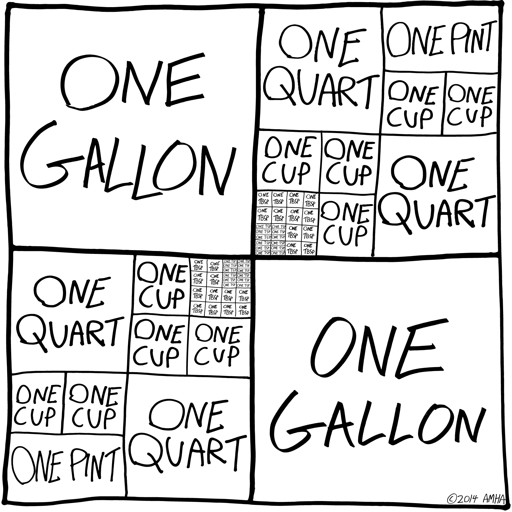
Memorizing cooking unit conversions can be frustrating. Most of us just have a cheat sheet on the refrigerator that tells us that 1 Gallon= 4 Quarts. Well thanks to Andrew M.H. Alexander you might want to replace those boring magnets with the Baking Units Demystified infographic!
Infographics should simplify information and make it easier to understand without “dumbing it down.” This is a perfect example of showing the measuring relationships to make them easy to understand and even remember.
Found on Flowing Data.


March 9, 2015
Life Hacks for the Modern Traveller

The Life Hacks for the Modern Traveller infographic from Direct Holiday Cottages provides you with some new travel tips for the connected traveller.
Here is an infographic that we have created providing a number of hacks to help you out on your holiday as well as some must have travel apps.
Busy design style, but that’s how people lay out their belongings before packing them all up in luggage. The font size is too small for the size of the infographic.


March 2, 2015
Stories of the Past and Future
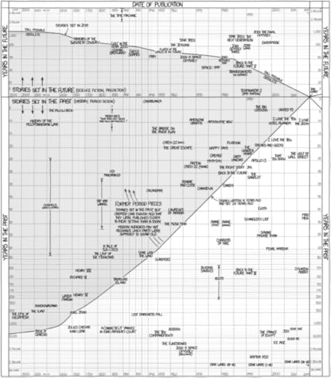
Stories of the Past and Future is an awesome timeline design from Randall Monroe at xkcd.com depicting the differences between when movies and TV shows were released, and the time periods they depicted. I printed off the large version and starting adding a few more on my own.
Thanks to Tweets from Nathan Yau @flowingdata and Alberto Cairo @albertocairo!


![[image error]](http://www.7dayshop.com/blog/wp-content/uploads/2015/03/APPLE-FAIL-Infographic-700px.jpg)