
Randy Krum's Blog, page 43
January 6, 2015
Infogr.am Acquires Infographics Blog Visualoop
Big news in the world of infographics. In December, the online design site Infogr.am closed a deal to acquire the infographics blog and news site Visualoop.
December 3, Riga. – Infogr.am, the company behind the popular infographic creator, has acquired Visualoop, one of the leading data visualisation news sites from Brazil. The website covers infographics and data visualisation in English and Portuguese languages.
“Our ambition is the make Visualoop the leading data visualisation blog in the World,” says Uldis Leiterts, co-founder and CEO of Infogr.am: “It would strengthen our presence in Brazil, it would also support the social mission of Infogr.am to educate and raise the overall interest in data visualization” Along with acquisition Infogr.am reveals a Portuguese version it’s web-based infographic creator.
I included Infogr.am in the Cool Infographics book chapter covering design tools, but it’s great to see them expanding their capabilities with this acquisition and other new endeavors like increasing global data literacy with Infogram.org.
Congratulations to Tiago Veloso, the Founder and Editor of Visualoop! Tiago has been a long-time friend of Cool Infographics, and supporter of the infographics design community as a whole. I asked Tiago for a brief comment about the acquisition…
“As you imagine, Randy, this is a very special moment for Visualoop, and for me personally. The deal with Infogr.am allows me to dedicate myself full time to both websites (English and Portuguese), and that without having to deal with all those concerns websmasters usually face, (you know what I mean, right?). And it also made me revisit old projects and ideas that go way beyond that notion of ‘blog’ that people are perhaps used to, when hearing the name Visualoop - so, who knows what will come out of all this! :).”
I hope we see some new and exciting things out of the partnership between Visualoop and Infogr.am!


January 2, 2015
SEO Rank Correlations and Ranking Factors 2014

The SEO world is constantly changing. The SEO Rank Correlations and Ranking Factors 2014 infographic is your guide to good rankings! The infographic was created by Search Metrics, and they determined that the most important factors to optimal SEO is high quality!
We made it and just in time for this fall’s season. So download Ranking Factors 2014 on your tablet or smartphone because this study will be your best SEO read yet. Last year’s Ranking Factor study placed positive emphasis on good content, onpage technology and social signals that correlate with better positioned websites.
Get the latest and greatest SEO Ranking Factors and Rank Correlations 2014 – Google U.S. and get an in depth definition and evaluation of the factors that have a high rank correlation with organic search results.
A great way to summarize the top level findings from a longer report. This is a detailed infographic, but the information is incredible valuable.
I wish more of the numbers and statistics were visualized. Big fonts are not data visualizations!
Found on Business2community.com


December 24, 2014
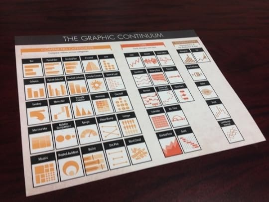
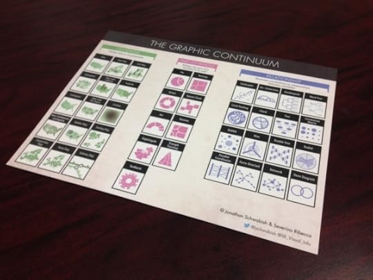
The Graphic Continuum - Desktop Version
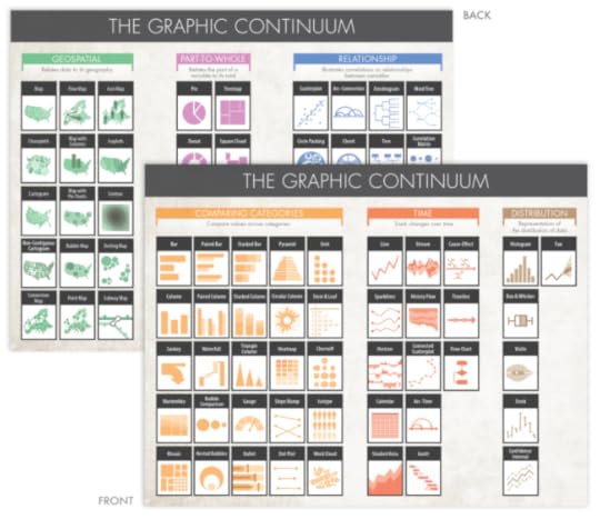
Jon Schwabish and Severino Ribecca have released a full-color, double-sided, laminated 8.5”x11” desktop version of The Graphic Continuum, available for only $10 until the end of the year when the price will go up to $13. This is a smaller version of The Graphic Continuum poster they released earlier this year.
Nearly 90 graphic types grouped into 6 categories on a laminated 8.5”x11” sheet. It does not include every type of graphic, nor does it display every type of link between visualization, but it serves as a thought-starter. Use it to develop ideas, consider different options, or simply as a piece of art.
A fantastic reference of data visualization methods to give you some ideas for ways you can visualize your data differently.


December 23, 2014
The Shapes of Snowflakes
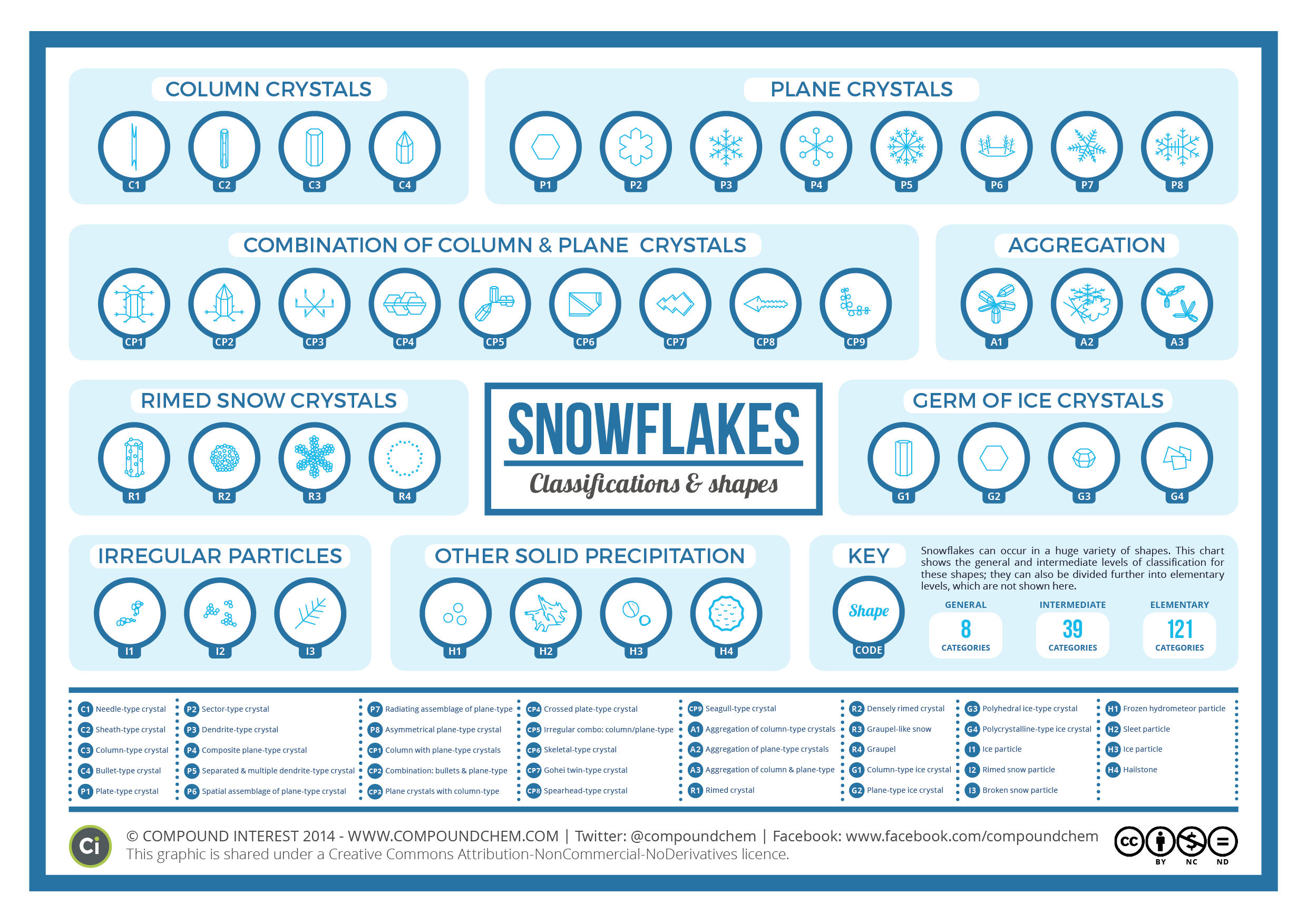
The Shapes of Snowflakes is a fascinating categorization of crystal structures from Compound Interest, a chemistry site run by Andy Brunning in the UK. The site has a huge selection of chemistry and science related infographics.
In the Northern Hemisphere at least, the idealised vision of Christmas involves snow. Whilst no one snowflake is exactly the same as another, at least on a molecular level, scientists have none-the-less devised a system of classification for the many types of crystals that snow can form. This graphic shows the shapes and names of some of the groups of this classification.
The number of categories snow crystals can be categorised into has been steadily increasing over the years. In early studies in the 1930s, they were classified into 21 different shape-based categories; in the 1950s, this was expanded into 42 categories, in the 1960s to 80 categories, and most recently in 2013 to a staggering 121 categories.
Science meets Christmas!
You can also download a high-resolution PDF version.


December 22, 2014
5 Ways to Market Yourself Visually
Visuals communicate complex ideas into something more digestible. Large amounts of text make it harder for our brains to find pertinent information in a timely manner. This problem can be remedied quite easily, by adding images and visuals into marketing yourself.
Visuals can help turn a complex idea into something more easily digestible, with less effort and time spent by the person viewing it. By putting extra work in on your end, you position yourself to leave a more lasting impression, and stand out from a pile of resumes. Especially when marketing yourself to a recruiter or HR department - making it easier for them to understand your most important work. In Cool Infographics, I cover how visuals are 6.5 times more likely to be remembered than text alone, and there’s no better time to be remembered than when you’re applying for a new job.
Below are five ways to start marketing yourself visually right away:
1. The Infographic Resume
[image error]Pinterest Board Gallery of over 900 Infographic Resumes
Infographics are an excellent visual tool to have in your arsenal. They are the pinnacle of displaying complex information in an easily digestible way. Either pay a talented infographic designer, or do one yourself. If you’re not comfortable using graphics design software, check out an excellent free option online like Visme.co - that will have you designing infographics in no time.
Take a look at this Infographic Resume Pinterest Board with over 900 examples for inspiration, and check out the great book The Infographic Resume by Hannah Morgan when you’re ready to get serious about developing your own.
2. Visualize Your LinkedIn Profile
via
It should be no big surprise that a prospective employer will look at your LinkedIn profile prior to checking you out in person. LinkedIn allows you to add photos and visually rich imagery, so take advantage of these opportunities. If you add companies that Linkedin recognizes to your work history, your profile will automatically display their logos.
Examples could be photos of you working at a trade show, product prototypes you designed, or a photo of you giving a presentation (LinkedIn has Sl SlideShare integration, so embed the presentation in your profile as well). Other images or PDF files work as well, like an advertisement you designed.
3. Create A Visual Portfolio of Your Work
Talking about your creative work only goes so far, you need to provide visuals. Visuals help the employer see what you’re capable of, and gives you the opportunity to control the work they see. Websites like Behance and Dribble are excellent options for creatives of all types. Not only do you get to upload all of your projects, but you get to interact with their creative communities as well - having the chance to inspire others, and be inspired yourself.
4. Create a Blog Post to Provide More Information and Visuals of Your Work
A resume should be a brief overview of skills, previous employment, education, and best works. One page is best. If you would like to expound further upon your projects, then create a blog post - loaded with visuals - that delves deeper into your work. Tumblr is a great free option for keeping a personal blog.
Include links to any additional content you publish in your Linkedin profile and even on your text resume. Make it as easy as possible for hiring managers and recruiters to find your work.
5. Content Curation
Similar to the idea of creating a blog post to highlight your best work, create a content curation site to highlight the best infographics, articles, quotes, YouTube videos, podcasts, brands, inspirational work, thought leaders, TED talks, and books you’re reading. Show your future employer that you have a passion for gaining knowledge, and are an expert in your field. Pinterest is a great option, and if you’re looking for a design-centric curation site, Designspiration has got you covered.
What other ideas would you recommend?


December 19, 2014
The World's Loudest Noises - An Audio Infographic
[image error]
Loud noises can be unpleasant. But how loud is too loud? The World’s Loudest Noises is an interactive infographic from Air Conditioning Company that explains the loudest noises in the world and how much damage they could do to your ears. So next time your air conditioning kicks on and you feel like complaining… Just remember, there is always something louder.
Turn your volume down before you start clicking!
Our initial attempt to explain how loud air conditioners are via an internet page was, in our opinion, a minor disaster.
An indisputable fact is that 99.999% of us haven’t got a clue what a decibel either sounds like or looks like! Let’s be honest, we didn’t even know ourselves precisely what a decibel was!
So we started to delve into the dark world of decibels to make the blinking things easier to understand. We initially wanted to create an amazingly informative infographic to best explain how loud our air conditioners are. However, we didn’t know where the ‘cut-off’ point should have been and we got somewhat carried away until we found the worlds loudest noise!
Despite all of our in-depth research, noise levels and decibels are still controversial and subjective. We found so many different accounts of how loud the same sound was. Indeed, most of our research showed that an aeroplane taking off is louder than a spaceship launch and surely this cannot be the case. Further investigation revealed that people forget to mention how far away they were when actually measuring the sounds. Also, based in London, we don’t live close enough to Cape Canaveral to run around waving our own decibel meter…..
Have some fun clicking around on our all-singing-and-dancing infographic below. Those of you who wish for a more academic approach can scroll to the bottom to check out our initial research.
An audio infographic! This is a new way to create an interactive infographic. Each of the sounds listed in the infographic above is clickable to play an audio sample of each noise. It’s more fun and entertaining than actually representing the decibels because there’s no way your computer speakers (or your mobile phone speakers) can reproduce some of the decibel levels shown here. Plus you have volume control.
I’m really disappointed that the vertical scale is out of proportion. The sounds should be accurately placed along the decibel scale, not just evenly spaced no matter what the values are. That’s just poor data visualization.
There’s a sharing issue that happens with an interactive infographic like this one. I was bale to get the embed code from the publisher, so all of the click-to-play sounds should work here on Cool Infographics as well. However, most people that share the infographic will only grab the JPG image file or click the sharing buttons, and that loses all of the interactivity included in the code. The sounds also don’t work on many iOS and mobile devices.
What other infographic topics could include sounds?
Thanks to David for sending in the link!


December 17, 2014
An Illustrated Guide To The Galaxy Of Women's Shoes
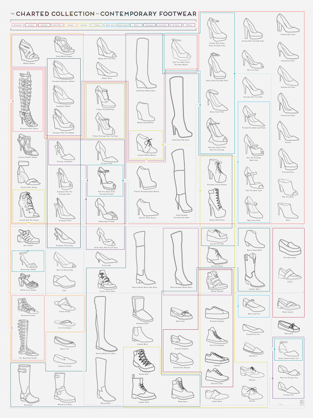
An Illustrated Guide to the Galaxy of Woman’s Shoes is the all knowing cheat sheet to any shoe that a woman could wear. Created by Pop Chart Lab, the color coding around the shoes d distinguishes the categories that each shoe falls under.
Can’t tell the difference between a slingback espadrille wedge and a peep-toe ankle strap platform wedge? The prolific infographic design studio Pop Chart Lab has you covered. The Charted Collection of Contemporary Footwear is a handy, color-coded cheat sheet of the many shoes the modern woman might go sauntering—or, in some cases, teetering—out of the house wearing.
It just boggles my mind.
Found on http://www.fastcodesign.com/


December 12, 2014
When to Use JPEG, GIF, & PNG Image File Types

Image file types are confusing to many people, but the Know Your File Types: When to Use JPEG, GIF, & PNG infographic from WhoIsHostingThis? Is here to save the day. Too many people just JPG image file because they don’t understand the differences.
Trying to save space on image files?
It can be tough to know exactly which filetype is the best to use. If you save your image as the wrong type, you could end up blurring a beautiful photo, losing all the detail of your logo, or turning a transparent background black.
If you’d like to know exactly which is the perfect image filetype to use for which images, and save a lot of space and bandwidth in the process while maintaining a quality image, check out the handy reference below for the facts.
Great topic for an infographic! A complex, confusing subject that needed the infographic design treatment to simplify the information.
The URL to the infographics landing page should be included in the footer so readers can find the original, full-size version from sites that don’t link back to the original source.
Found on LifeHacker


December 11, 2014
How to Take Better Holiday Photographs
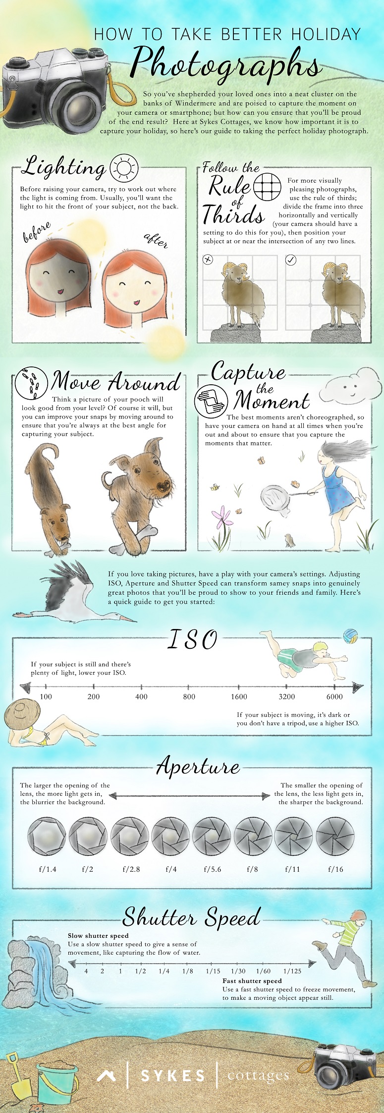
There are many moments in life that we love to capture with a photograph. The How to Take Better Holiday Photographs infographic from Sykes Cottages is a cheat sheet to help you get the most out of each photo you take.
Holidays mean different things to different people. For some, they’re about discovering new cultures, unearthing ancient history and indulging in fine local cuisine; whilst for others, they’re a chance to lounge on the beach, read a few chapters from a book, and do very little. But whatever you get up to on holiday, one thing’s for sure: you’re bound to take at least a few holiday photographs.
Whether you’re a snap-happy amateur or a kitted-out professional, capturing your holiday is important. To help you rookies take holiday pictures you’ll be proud of, we’ve created a handy guide on how to take better holiday photographs- check it out below.
Great “How-To” infographic that’s easy to read and understand. The hand-drawn, watercolor look also helps visually imply that the complex information will be easy to understand.
Thanks to Leanne for sending in the link!


December 5, 2014
Top Ten Christmas Life Hacks

The Top Ten Christmas Life Hacks article and infographic from Kid Rated shares some great tips & tricks for the holiday season! Use condiment bottles for icing! Brilliant!
Here at KidRated we have plenty of suggestions of where to go with kids during the holidays. But there will always be those days around Christmas when the weather is awful, you have so much to do, or even you have eaten too much that even the idea of leaving the house would never cross your mind.
So, because at KidRated we really do like to help our brilliant readers and viewers, we have come up with our top ten Christmas life hacks to help you through the holidays. Kids will love doing them so much that you might as well put your feet up and enjoy the few minutes of peace and quiet. It won’t last long.
Clear design that’s easy to follow! I would have cut back on some of the text, but they needed to include enough of the directions for people to be able to follow on their own.
The infographic isn’t currently part of the article page, and that seems like a major mistake. The infographic should be helping to drive traffic and links to the article page.
Thanks to David for sending in the link!


