
Randy Krum's Blog, page 41
February 27, 2015
Overtime Pay Laws
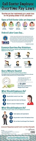
The Call Center Employee Overtime Pay Laws infographic from overtimepaylaws.org is in informative design can help both employees and employers understand the rules when it comes to paying overtime.
Call centers employ thousands of workers throughout the United States. Many call center employees are required to perform tasks before a shift and after a shift that are not considered “on the clock” by their employer, such as booting up a computer or loading dialing software. This additional time spent on these tasks can give rise to an overtime pay lawsuit brought under the Fair Labor Standards Act. Our Call Center Overtime Pay Infographic Explains the important issues in these cases.
This design follows a simple story format with only a few steps:
What’s the Problem?
What’s the Impact?
What can the Reader do?
I love that this design simplifies the information, and doesn’t try to include too much detail.


February 25, 2015
Five Innovative Ways Companies Are Using Infographics to Share Data
The popularity of turning data into visuals has skyrocketed in recent years. Especially the keyword “infographic,” as evidenced through Google Trends. This has sent capable marketers scrambling for a competent team of: designers, copywriters, and producers to create new and exciting content. While charts and graphs are nothing new, the way they are displayed visually (and the stories they can tell), is expanding into uncharted waters.
via: Google Trends - “Infographic”
Infographics and data visualizations were once the playthings of academics. Beautiful displays of information were created and tucked away in their ivory towers of academia. Those days are now long over, and the power of data combined with visual information has been passed on to the masses.
For a while, it seemed nearly everyone under the sun was creating infographics. This resulted in an over-saturation of infographics online, with marketers cranking them out as fast as possible. Complete with often poor designs, and misleading data.
While this over-saturation did hurt the online marketing reputation of infographics slightly, their growth in online popularity did not. This online exposure and awareness of infographics has driven a significant increase in the use of infographics inside companies as well.
To help clear the air, check out these six examples below for how companies are coming up with innovative ways to use infographics.
1. Hotels.com: PR Infographics
Traveling and flying to new cities can be equal parts exciting and terrifying. This infographic from Hotels.com, provides travelers with valuable insights they should know before arriving in major cities around the world. This infographic is great because it gives their customers valuable information (and saves a bit of decision-making time) to make their transition from the sky to the city that much smoother.
Another great thing about these infographics is that they are specifically targeting the press with their proprietary internal data. This builds their credibility by sharing their expertise and valuable insight into the hotel industry. They’re not just telling the press, they’re showing them the data visually as well.
2. Wine Folly: Food and Wine Pairing
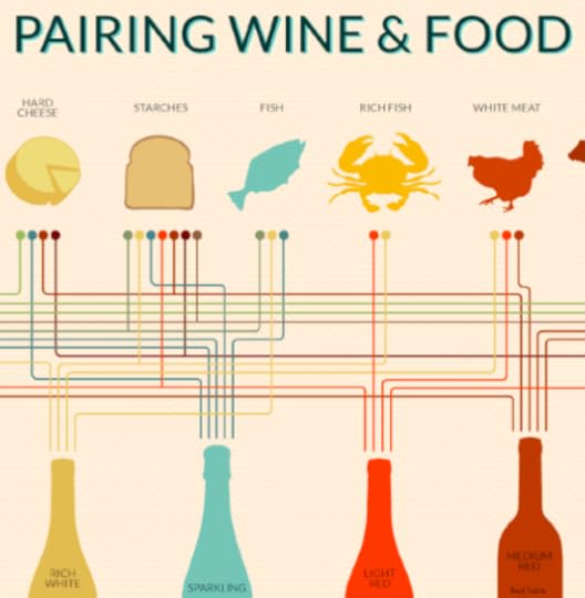
This infographic from Wine Folly looks at all the different taste profiles, such as sweet and sour, to create the perfect food and wine pairings. The great thing about this infographic is its online life span - which can easily last for many years. Twenty years from now, the information will still be the same, and the design will still be relevant to readers.
Online lifespan can make a huge difference to the ongoing SEO value of any infographic, and should be an integral part of the topic selection process.
3. SumAll: The Internet is a Zoo - The Ideal Length of Everything Online
This infographic from SumAll looks at something we all struggle with: our attention spans. How many characters long should a Facebook post be? What is the ideal subject line length? How many words should a blog post be so that it actually gets read? All the answers to your burning questions are here in one place.
What makes this graphic so good is that these observations apply to all social media audiences, no matter what industry they come from. It’s a valuable topic for marketers in any industry.
4. Warby Parker Annual Report
The annual report is getting a strong makeover thanks to innovative companies like Warby Parker. The annual report used to be a non-event. Everyone made an annual report, and they all basically looked and felt the same; i.e. lots of words, mixed in with some charts and graphs. Warby Parker really hit the mark with their 2013 Annual Report.
In an article on Business Insider, they explain how Warby Parker’s previous two annual reports fit into it’s quirky brand, but the 2013 annual report is it’s most ambitious. It may seem like it has plenty of meaningless information, but it’s a smart business move. Because amidst all of the meaningless information, you begin to realize that it’s not actually an annual report at all, but a giant advertisement intended to become viral. This resulted in some of their biggest sales days.
Seeing as how every business loves talking about itself on social media, it’s surprising it has taken this long for the annual report to become relevant again.
5. MHPM Corporate Sustainability Report
This infographic from MHPM examines the creation of a sustainably built environment, project by project. More and more, sustainability matters to clients, employees and the communities they all live and work in. With the right practices in place, a sustainable building is worth more (and costs less to operate) than traditional buildings, helping to make them an attractive choice versus competitors.
This new application of infographics lets MHPH tell their own story in a visually appealing way. By providing the numbers behind their commitment to keeping their projects green, MHPM has not only helped prove their own claim that Sustainability is Free™, but they also share how they can help their customers.
As we have seen over recent years, infographics have continued to grow in popularity. Giving rise to a new Internet, continually heading in the direction of displaying more advanced, and beautiful ways to visualize information. What are some other creative uses of infographics you have seen lately?


February 22, 2015
Cool Infographics Course at SMU
Infographics & Data Visualization Design
April 7-May 19, 2015 | 6am-9pm Tuesday Evenings | SMU CAPE Dallas Campus | $495
$50 off discount code for Cool Infographics readers: VIP50
I will be teaching a new course at the SMU Dallas Campus this spring as part of the CAPE program (Continuing and Professional Education). In this course, working professionals will become familiar with the exciting and expanding field of data visualization and infographics. By attending this course you will start to develop your own portfolio and learn:
The art and science of data visualization and infographics
The data visualization and infographics design process
Data analytics and basic statistics for the designer
Different chart types, dashboards and graphing options
How to use the various software and online tools readily available and when to use them
Strategies for publishing and promoting infographics online
Understanding IP, trademark and copyright issues and how they relate to infographics
And more…
Please share with anyone in the Dallas area, or join the class yourself. Enrollment is very limited, so register quickly!
Click Here to learn more: bit.ly/SMU-DataViz
Also check out the DFW Data Visualization & Infographics Meetup group with monthly speakers and events in the Dallas-Fort Worth area!


February 19, 2015
Busting Myths About Hand Sanitizers

The Debunking the Myths About Alcohol-Based Hand Sanitizer infographic from PURELL clears up some of the most common misconceptions about their products.
All germs are bad germs, right? Not necessarily. Using hand sanitizer dries out hands? Some don’t, but PURELL® Advanced Hand Sanitizer won’t strip your hands of their natural moisturizers. There is much confusion today around antibiotics, antibacterial soaps and hand sanitizers, as well as their effectiveness and whether they contain harmful chemicals like Triclosan (which Purell does not). Learn the truth about alcohol-based hand sanitizers as 7 of their most common myths are debunked for good.
Infographics are a fantastic way for companies to help consumers better understand complicated products and issues. Health and safety are some of the top concerns from consumers, and the team at PURELL has done a great job here of addressing the top concerns and misunderstandings they hear about their products.
The use of the infographic as part of a larger marketing campaign is also a great use of the data and design assets that have been created. The larger campaign includes videos, a SlideShare presentation, the infographic and a downloadable PDF.


February 16, 2015
Easy Longboard Buyer's Guide

If you are new to the longboard scene, or just need a little help learning exactly what you need, the Easy Longboard Buyers Guide infographic from Longboard Reviews could be a life saver. This cheat sheet tells you the differences between the board styles, wheel sizes, wheel hardness, and deck length.
Thinking of buying a longboard? Use this easy-to-follow guide to discover exactly which is the best type of longboard for the riding style you enjoy.
Need to know what trucks, deck or wheels to buy? This guide will help you with that too.
If you are new to longboarding then all the different types of decks, trucks, wheels and bearings can be quite daunting. It seems like there is a minefield of choices out there. Do I want hard wheels or soft wheels? A concave deck or a drop-through deck?
Accidentally buy a slalom board for cruising and you’ll be in trouble!
In my guide (on the left hand side) I have made it really easy for you. Simply decide which type of riding style you want to do and I’ll show you exactly what type of board to buy.
Once you have done that, head over to my reviews page and discover which is the best longboard on sale at the moment for your needs.
This is a really good side-by-side comparison style design. The mix of actual photo images with the illustrations to visualize the data works very well, and adds a lot of credibility to the design.
The URL in the footer, should be the link to the infographic landing page so readers can find the original full-size version. The infographic is nowhere to be found on the front page, which would make readers frustrated by trying to search the site.
Thanks to Jon for sending in the link!


February 12, 2015
Who's Going to Malofiej 23?

The Malofiej 23 Workshop days will be March 15-18, 2015, and the Infographics World Summit conference will be March 18-20, 2015. Malofiej 23 will be held this year in Pamplona, Spain by the Spanish Chapter of the Society for New Design (SNDE). The line up of speakers looks amazing! I’ll be giving a talk, but I can’t wait to hear some of these other fantastic speakers!
Here’s the link to download the conference program PDF:
This year I have will have the honor of both speaking during the conference, and acting as a judge for the Malofiej Awards. I’m putting together a new presentation titled “The Seven Deadly Sins of Infographics Design” that I will present during the conference portion.
If you have plans to attend the workshop or conference, let me know and we can arrange to meetup.


February 11, 2015
Sleeping Habits of the Rich & Famous

Even though we are all told that the recommended amount of sleep is 8 hours, everyone seems to function differently on the same amounts of sleep. The Sleeping Habits of the Rich & Famous infographic from Big Brand Beds introduces the sleep cycles of famous and successful people. I guess one sleep cycle doesn’t fit all!
We’re always told about getting a regular, solid eight hours’ sleep when it comes to being productive and successful, but not everyone follows this seemingly sound advice. Some of the most famous, successful and driven people throughout history have had some very strange sleeping habits - from micro-kips to sleeping in phases. We’ve got the oddest rich and famous sleeping habits in this new infographic.
There’s no way I could work with the staggered sleep patterns of Thomas Edison or Leonardo Da Vinci.
I like this design with simple time scales to show the sleep patterns and the series of circles to show the total number of hours per day. The visualization is repeated for each person, so once you understand the first one, you can easily understand the rest.
The design should have included the URL directly to the infographic landing page in the footer so readers can easily find the original, full-size version when they see the infographic on another site. Since they used a blog post as the infographic landing page, it will get shuffled down the blog page quickly as they post additional content. Don’t make your readers hunt for your infographic, or they will just give up and move on.
Thanks to Dave for sending in the link!


February 9, 2015
The Massive SciFi Starship Size Comparison Chart
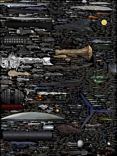
The massive SciFi Starship Size Comparison Chart is one of my favorite infographic design projects. Designed by Dirk Loechel and shared on DeviantArt, this is a project he has been working on for years. I posted an earlier version of his design in 2013 here which was hugely popular. Dirk’s notes claim that this may be the last update.
The last update
For real this time: This is the final major content update, though if there are issues I’ll still fix them. I also haven’t forgotten I wanted to vectorize the writing. It’s still on the radar. But content-wise, I think that is about all I can put in.
Also, I added the ISS. For scale. It’s on top, with a yellow frame so it’s relatively easy to find.
Lots of errors fixed, lots of new ships too. Well, off for now, but I’ll be replying in the comments more or less regularily.
This is probably at least for the forseseeable future the last round of adding ships. I have pretty much all I wanted now (excepting some old scifi, and many Anime series, which tend to not have many usable images). Lots of new content.
And that’s it for now. Enjoy the new-and-improved chart!
This is one of the visual designs that clearly demonstrates why visuals can be much more effective than text descriptions. Especially when it comes to comparing size and scale. You just don’t comprehend the scope when someone tells you that the Star Wars Executor Class Super Star Destroyer is 19,000 meters long. You have to see it in comparison to something you already know.
The images on DeviantArt are high enough in resolution, that you can download and print it out as a poster yourself to hang on your wall. The full-size poster resolution is 4,268 x 5,690 pixels. Most of the ships are clustered by franchise (Star Wars, Star Trek, Halo, Eve, Warhammer, etc.). As a reality check, the International Space Station (ISS) is included for reference.
Found on Geyser of Awesome, Nerd Approved and Nerdist


February 4, 2015
The Evolution of Spawn
The Evolution of Spawn infographic is a fantastic design. Not fan art, this official infographic was designed by Todd McFarlane, Creator of Spawn and Co-Founder and President of Image Comics!
From Todd’s Facebook post:
THE EVOLUTION OF Spawn!!!!!
With Spawn issue #250 coming up at the end of the month…. I thought it would be COOL to put together all the different costumes Spawn has had over the years.
And if you’re doing the math, that’s 24 YEARS. TWENTY-FOUR!!!!!!!! It’s cool to look back and see how things have changed since 1992….it’s hard to believe we’re already coming up on our #250th issue.
Thanks for all your support over the years!!! I’ll be doing a giveaway with these, soon.
TODD
P.S.- There have been a few requests for a downloadable poster (and higher res)… You should be able to download the poster from this link: https://flic.kr/p/qKcR9q
Found on GeekTyrant


February 3, 2015
The 6 Principles of Design

The 6 Principles of Design is an elegant design that visually shows the readers many of the ways design can visually communicate information. Designed by FOLO, a firm in Ahmedabad, India.
This infographic visualises the six guiding principles of Unity/Harmony, Balance, Hierarchy, Scale/Proportion, Dominance/Emphasis, Similarity & Contrast. How one applies these principles determines how successful a design may be.
Simple colors, minimal text and white space work together to tell a clear story.
Took me a while to find the original design. The footer should include the URL directly to the infographic landing page to make it easier for readers to find the original. Most people that share infographics, don’t include the link back to the original. They just share the image file.
Thanks to Peter Sena for pinning on Pinterest!


