Sarah Maddox's Blog, page 22
October 30, 2014
Web Directions 2014 – day 2
This week I’m attending Web Directions South 2014, a conference for people who “design, imagine, create or build digital products, web sites and applications”. I’m excited to be part of this event. I’ll blog about my take-aways from the sessions I attend, and anything else that comes to mind.
The keynote this morning was Being human in a digital world, by Genevieve Bell. The link is to my post about that funny, inspiring talk. Now for my notes on the rest of the day.
Elements of API excellence, by Jeremiah Lee
Jeremiah Lee is lead API engineer at Fitbit. His talk was about evaluating the maturity of APIs, and what it takes to make an excellent API.
Jeremiah ran through some scenarios that may result in a bad API. For example, you may create an API unintentionally (it was just something we auto-generated, and people started using it), selfishly (we looked only at our own requirements), or blindly (we imitated other APIs, without knowing why).
Instead, we need to actively understand the problem that needs to be solved, and to test it thoroughly before letting it loose in the wild. And we need to design it holistically. How? Tie up with our UX colleagues. We need to understand the people who use the code, as well as the code itself. The users of APIs are our peers – other engineers.
Empathy is an applied science. UX is a research-driven field. The aim is to acquire knowledge, with the purpose of doing something with that knowledge.
An excellent API is functional, reliable, secure, usable and pleasurable. Jeremiah broke down each of those points into smaller divisions. For example, usability breaks down into intuitability, testability, and corrective guidance. Pleasurable means that integrating the API is something you’d choose to do again.
Personas are a useful way of getting to know your users. Remember, in this case the users are other developers. Personas describe the people who use the product and the context they operate in. Personas also make visible our assumptions about users, and give our team a frame of reference. Jeremiah took us through the development of personas for API users, and the type of characteristics we’d need to analyse to create such personas. For example, what technologies are they using, what’s their skill level, and more.
Passive usability testing is the idea that we can use our existing data and systems to test the usability of our APIs. For example, the engineers can examine the support requests with specific questions in mind: at what times are people asking for help – immediately after a release or on long-running software; what are the frequently asked questions; what are the frequently misunderstood concepts; and so on. Another passive usability testing technique is to look at the data about API usage during an integration: how long between app registration and first request; what are the first requests and first errors; and so on.
Then there’s active usability testing. Go out and talk to people who are using the API. Hang out with them at their place of work, and take notes about how they use the API. See how they talk about the API with the rest of their team; how do they get started and what problems do they encounter/solve; how does the API fit in with the rest of their app? Or create a prototype of the API, and have people use it. Jeremiah recommends Silverback to record the user’s reaction, and then look at their emotional responses at various points during the integration. Were they happy or sad, and can we fix the sad moments.
Jeremiah finished by saying he hasn’t given us answers to building an excellent API, because there are no one-fits-all answers. Instead, he has given us the tools to find those answers.
Build better content, by Jonathon Colman
Jonathon Colman is a content strategist at Facebook. I’ve met Jonathon a couple of times, most recently at the STC Summit in Phoenix AZ earlier this year. It turns out we share the habit of waking up before the crack of dawn, and falling asleep soon after the birds stop tweeting for the day. We also share a love of technical writing. :)
Jonathan’s talk focused on how content strategy has to be part of UX strategy. He started off by promising us 127 slides! He’s a “madman with a clicker”. Heh. The slides are at bit.ly/fixourshit. Heh again.
First we looked at some definitions of content strategy. Then we saw some new Facebook content that aim to improve user experience, such as a privacy tool. It’s all about using language as an interface. Language is how we understand things. Content strategy is interaction design, because it focuses on experience, and the users of a product. Content strategy blurs the lines between engineering, design, testing, and so on. It crosses all those silos, focusing on the user. Jonathan calls this “intertwingling”.
The aim is to design content as a system, a product and an experience. Not as a campaign. Jonathan aligns his strategy with Lean principles: build, measure, learn. He also stresses the importance of incorporating your organisation’s core values into the design. And then go back and question your norms and values, especially if something breaks. Always remember that people are on the other end of the system.
“Slow down and fix your shit” – this is the essence of content strategy. Jonathan walked us through the quality framework his team uses at Facebook, and the content principles that guide them through the complex path of designing a product from strategy to the surface where the users see it. Aim for: simple, straightforward and human.
Thanks Jonathon for an information-packed session. Some quotes that made me think:
Keep it simple, get to the point, and talk like a person
Great content is invisible
If you want a better Web, you have to build it
A voice for everyone, by Doug Bowman
Doug Bowman talked about his experiences as Creative Director at Twitter, and how products like Twitter are giving people a voice. If eyes are the window to the soul, then the voice is the gateway to the heart. Whether the voice is spoken or written. A voice can change your day, or alter your life for ever. But a voice can only be powerful if it’s heard.
Doug started working at Twitter five years ago, when there were no designers in the company. So he got to grow the designer team from scratch. He loves Twitter. It’s connected him to so many people that he hadn’t met before.
The message that Doug wants to share is the human connection. Twitter is unique and wonderful because of the people who use it, not because of the service. We can connect with anyone who shares an interest with us, whether we know them or not. We get to overhear the conversations between people we don’t know.
Doug read out some tweets from conference attendees, showing lots of humour and character. He also showed us some cute, funny tweets between people or businesses, famous and not. Where else do you see businesses taking the time to reply to random mentions of their name, and often in the same humorous vein? Then we looked at some more serious tweets among people mourning a loss or going through other difficult experiences.
Tweets are a series of human moments. But you can also analyse the tweets en masse, to see patterns. For example, the tweets mentioning #hungry spike at certain times of the day. How about the tag #tired – it’s the pulse of humanity. You can see when people tend to be happy, late for work, hung over…
Big events show a huge outpouring of emotion, such as when the Giants won the World Series, or shocking world events happen. Doug told us the story of Vivienne, who made a commitment to earn $100,000 to free 500 child slaves, by selling lemonade at a stand on her street for a year. That was 5 years ago, when she was 5 years old. Her father helped her tweet about it. She reached her goal in half the time planned. What’s more, she’s given a TED Talk and runs a company that aims to end child slavery.
These stories of human connection were rooted in Twitter. But Doug’s message is for everything we do. As communicators and designers, we are the creators of the modern age. It’s our responsibility to make sure everyone on this Earth has a voice.
Architecting the rise of connected devices, by Hadi Michael
Hadi Michael is a digital adviser and software engineer at Deloitte Digital. He gave the first of three 15-minute sessions. His talk is about the importance of API layers in the growth of the Internet of Things. An example of a connected device might be a chair. It could have sensors, activators, computational power, and connectivity. The powerful idea is that the devices have contextual awareness. Some devices may decide to activate when you leave the home, such as those that clean the house. Others may switch off when you leave. Cisco estimates that we’ll have 50 billion connected devices by 2020. And that’s a conservative estimate.
How are we going to handle this – how will our solution architectures service this growing number of connected devices? Hadi showed us how various organisations have started preparing. Those that are successful have API layers at the core of their architectures, either unifying their API layer retrospectively, or doing it right from the start. The trick is to move your business systems behind the API layer, at least when there’s any chance that you’ll want to expose those systems to anything other than just the website.
Hadi walked through some tips for designers when taking connected devices into account. Thanks for a tantalising glimpse into the world of connected design!
Welcome to the fold, by Katie Miller
Katie Miller is an OpenShift Developer Advocate at Red Hat. Her presentation, the second 15-minute session, was about higher order functions in JavaScript. Katie started with a story about a secret garden, a chain of paper dolls, and a bowl of pebbles. That was a surprise! The rest of Katie’s talk was about fold, also known as reduce, and how to use it to write elegant JavaScript code. A higher-order function (HOF) is any function that takes another function as a parameter. Famous examples of HOFs are the map and filter functions, which can also be written as a fold.
Be aware also that there is a family of fold functions, such as fold left and fold right. Katie’s slides, with references, are at fold.codemiller.com.
Responsive in the wild, by Guy Podjarny
Guy Podjarny is Chief Technology Officer at Akamai. Guy’s talk was about the adoption of responsive web design. Which websites are going response, and how are we architecting them?
When we try to see if a website is responsive, we usually just resize the page and see if the content is cut off. We also look for a scrollbar, which indicates a non-responsive site. This isn’t ideal, but it’s pretty good and we can automate it. Guy showed us the details of the test he ran, and the results. Here are some highlights.
The adoption in the top 10,000 sites has grown by approx 8% over the last year. The average number of requests in responsive websites is substantially lower than non-responsive. The average resource size in the responsive websites is bigger. Interestingly, the image size is also bigger in responsive sites – perhaps because of retina?
Guy also compared responsive designs on the big screen with the small screen. We’d expect a substantially lower volume of data on the small screen. That’s not the pattern that shows up, presumably because the resources are downloaded anyway and then just hidden or shrunk on the client. Only approx 13% of responsive websites are 50%+ smaller on mobile. We’re doing better here than last year, but still need to make an effort.
Mobile-only sites are significantly smaller than responsive sites. Processing time follows the same pattern. Responsive sites take longer to process than mobile sites.
In summary: Adoption of responsive design has nearly doubled in less than a year. But we need to work on the performance.
Haunted machines, by Tobias Revell
Tobias Revell is a critical designer and futurist. He gave the closing keynote of the conference. Note: Today is 31 October. Halloween!
Tobias’s talk revolved around the notion that any sufficiently advanced technology is indistinguishable from magic. (From Arthur C Clarke.) Tobias gave some examples of recent hoaxes: that if you add this app to your phone, it will become waterproof, or that you can put your phone in a microwave oven to recharge it. The amazing thing is that people fell for these hoaxes. But the fact is that people are dealing with such advanced technology that they can’t understand it. As technology gets more and more advanced, it gets more and more opaque.
On the other hand, people have built computers on Minecraft. Some people are even trying to build a computer on Minecraft that you can play Minecraft on. Go figure.
Tobias gave us a link to his site: The Ongoing Collapse, “a growing collection of data sources and links positioned as a reflection of the state of the world in the terms that it likes to use. It’s a gentle ticking of the crumbling weird at the base of civilisation”. (More about the site.)
Tobias ended with this somewhat convoluted, dark thought: As makers of virtual reality, we control people’s perception of objective reality. Happy Halloween!
Thanks Tobias for a rollercoaster ride past ghosts and technologies past, present and future.


Web Directions 2014 – Being human in a digital world
This week I’m attending Web Directions South 2014, a conference for people who “design, imagine, create or build digital products, web sites and applications”. I’m excited to be part of this event. I’ll blog about my take-aways from the sessions I attend, and anything else that comes to mind.
Genevieve Bell is director of User Experience Research at Intel Corporation, and vice president of Intel Labs. She gave the keynote on day 2 of the conference: “Being human in a digital world”. Her focus was what makes us human and the intersection of tech and culture. Below are my take-aways from this funny, engaging, thought-provoking talk.
Genevieve told us about her childhood in the Northern Territories, where she lived amongst indigenous people who would take her out into the bush at the drop of a hat. She often spent time in the bush learning from the people instead of attending school. This has shaped the way she views the world. Next, Genevieve led us through a rollicking tale of how she got her job at Intel. It’s well worth hearing. When you have the chance, sit her down, give her coffee, and ask her about it.
Genevieve’s role could be summarised like this: How do you make sense of what people care about, and how do you use that to shape next-generation technology? It involves telling stories about the future. We saw some stories from the 50s about what the future may be. (This has been a theme of the conference keynote presentations.) Some of them were eerily close to the truth. Genevieve said that the stories show us what people’s aspirations are.
People need friends and family. The technology that makes use of this fact, such as telephony, as the ones that have succeeded. The ones that help people connect with other people. Facebook, Instagram, and so on. We also want to belong to community of people who share our skills, interests, or values. Technologies play into this too. Pinterest, Tumblr, eBay. We need to belong to something bigger than ourselves. Viz the Arab Spring. We use things to tell the world about ourselves: clothes, cars, and technology – what do you own, what services do you use, and what worlds do you belong to. And lastly, we need to keep secrets and tell lies. Evidently the average human being tells between 6 to 200 lies a day! Sharing secrets with just one or a few people is a way of bonding.
We worry what people think about us. So, we filter what we tell other people and what we put on the Internet. Are smart objects such as bathroom scales and fridges going to gossip about us? There are of course also genuine concerns about the amount of data that is available about us now. But the notion of new technology revealing information about us isn’t new. Genevieve told how, when electricity was about to be introduced to homes, gainsayers said it would make people vulnerable because strangers would be able to see what they were doing in their houses at night.
It turns out that people need to be bored. It puts our brains into a different state, where creativity can happen. But we’re living in a world where algorithms generate content that we should like. We’ll go with that for a while, because we like the familiar. Then we’ll get bored, and want to be surprised.
Genevieve says there’s something unnerving about living in a world that knows how to entertain us. The notion that once in a while, your device might do something different and surprise you, is one worth contemplating. Genevieve gave the example of a device that wakes you up with your favourite coffee every morning, then one morning suggests you look at a particular piece of art before having the coffee.
Is the Internet making us more uniform, more global, or more different? People want to be different. We want to retain our cultural identity. We spend a lot of effort maintaining our boundaries, and we imagine technology will help us do that. Even the “Internet” is now split into different internets in different parts of the world.
People want to feel the passage of time, and to have periods that are distinguished from other periods. Genevieve thinks this is a space worth investigating, particularly in connection to our smart devices and digital technology. How can we manage them, in their always-on state? We also want to be able to reinvent ourselves, which means we may want to be forgotten.
So, where does that leave us? There are things that make us human, that don’t change or only change very slowly. There are parts of us that have been in flux for ever. Genevieve showed two columns, “stable” and “in flux”, with five aspects of humanity in each column: friends and family, shared interest, reputation, and so on. The technology that plays to one of the stable aspects of humanity will endure. And the side of us that is in flux is where there is space for flashes of brilliance. This is where we can do extraordinary work.
Thanks Genevieve for a funny and idea-generating talk.


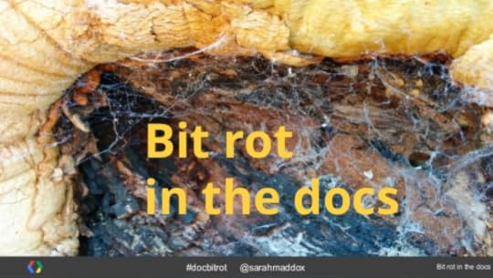
Bit rot in the documentation
This week I’m attending Web Directions South 2014, a conference for people who “design, imagine, create or build digital products, web sites and applications”. It’s a privilege to be here, and to speak at this cool get-together.
My session is called Bit Rot in the Docs. (The link goes to the slides on SlideShare.) The presentation looks at how documentation can degenerate over time, and some techniques for finding and fixing errors.
The very mention of bit rot will strike terror into an engineer’s heart. “Unused programs or features will often stop working after sufficient time has passed, even if ‘nothing has changed’.” (From the hacker’s Jargon File.)
Bit rot affects documentation too. Whether the cause be a changing environment, human error, or the infamous cosmic rays, we need to root out that rot. But should the technical writer read and test the documentation on a regular basis? That’s the least efficient and most error-prone way of detecting doc decay.
Instead, in this session we looked at the following techniques:
Automated testing of code samples.
Documentation reviews as a standard part of engineering team procedure.
Collaborative spot-testing.
Customer feedback.
For more details of the session, see the slides on SlideShare.


October 29, 2014
Web Directions 2014 – day 1
This week I’m attending Web Directions South 2014, a conference for people who “design, imagine, create or build digital products, web sites and applications”. I’m excited to be part of this event. I’ll blog about my take-aways from the sessions I attend, and anything else that comes to mind.
Day one started with an excellent keynote by Matt Webb. Now for some notes from other sessions I attended.
Lean Engineering, by Bill Scott
Bill Scott is the VP Engineering, Merchant | Retail | Online Payments at PayPal. His talk was about his journey from Netflix to PayPal, and how to make engineering a full lean UX partner. The concept is for the design team and the engineering team to work closely together, in tandem. Build, measure, and learn. Here are some snippets that I jotted down from this talk.
Any technology you use should be “Googlable”. When you hit a problem or want to learn something, you should be able to search for and find the solution.
When you want to make a change or pursue something innovative, decision turn around must be fast, so that you can “build, measure, and learn”.
Prototype in real time, with engineer and designer working alongside. Do sketches on a whiteboard and take them to regular design meetings, such as once a week. Make sure prototyping is enabled in the engineering stack. Your technology choices must reflect this methodology. Not everything that’s built has to be delivered to the customer. Bill talked us through the bits of tech that he and the team implemented at PayPal.
Create an engineering organisation that is partner to learning, and that encourages failure. Etsy does this well. Shift from celebration of delivery to celebration of failure and learning. Provide the framework that makes this happen.
Make delivery a non-event. A good way to do this is with continuous integration. Deliver all the time.
Engineer for volatility and throwaway-ability. Things will change. Design for that. Think of the UI as the experimentation layer. Choose a technology that allows you to control the experience and learn from it. Bill talked about choosing HTML 5 at Netflix for this reason.
Democratise innovation. Bill gave GitHub as a shining example here. Keep your teams small. Two pizzas should feed a team. Use a repo that democratises the code – no-one owns it. Get involved in and learn from external open source communities, such as in the JavaScript world. Use an open source model internally.
Bill sees the Lean methodology as a way of putting the customer into the Agile equation. Giving Agile a brain, where the brain is the user.
Unpacking technical decisions, by Sarah Mei
Sarah Mei is Chief Consultant at DevMynd. Her session was about finding out how we make technical decisions, with a mind to getting better at programming. How do people make decisions about code?
One of the biggest questions in webapp development today is, which JavaScript framework should I be using? There are so many choices. In the backend world, the question is: which datastore should I use? There’s a lot of information out there, but no easy way to make a decision. Making the wrong decision can have bad to disastrous consequences. What’s more, if you’re using an outdated technology you can be dragged to a standstill, yet changing to a new stack is expensive especially in training your team.
This type of decision is one we don’t make very often. So it’s hard to learn from previous decisions. One thing we can do is analyse the way we make other technical decisions, and then apply that process to the bigger ones. For example, you might ask an engineer, “Why did you name a variable as you did?” The answer might be, “experience”, or “it feels more natural”. That’s not useful data. So Sarah wanted to analyse the data that goes into these decisions.
Sarah considered an example of a decision between two pieces of code to be included in a project. One thing you may do is search the Web for information about the libraries involved, and read the READMEs. But those don’t give enough information. Sarah asked people what else they do. They look at recency and completeness of the docs, GitHub, StackOverflow, what people think of the maintainer of the library, what are people saying on forums… and so on. The way we collect and use this data is complicated. And most of the information is social rather than technical. One outlier was code analysis – how familiar does the code feel, how comfortable am I with it – you can summarise this by asking, how accessible is it.
Sarah took us through a four-quadrant analysis of the above findings. The quadrant had these poles: internal, external, project, people. She then had a go at applying the quadrant to a more complex problem: Deciding which JavaScript library to use.
We looked in particular at the code familiarity (accessibility) aspect to decide between AngularJS, Ember and Backbone. Accessibility falls into the internal/people section of Sarah’s quadrant. The feeling of accessibility depends on either what you’ve used before (such as Java) or what type of projects you’ve worked on. Everyone who develops a framework bases the design on their own bias. This is why a particular framework may or may not feel right for you.
Then you need to decide which of the quadrants is most important for you and your project. Is your team ready to move on to something new, or will they be better working on something similar to what they’ve used before? This will help you decide, for example, whether accessibility is an important factor for you.
An Internet for humans, too, by Dan Hon
Dan Hon is Content Director at Code for America. His role is making digital government easy to understand and easy to copy.
Looking back at the previous sessions of the day, Dan promised to break the pattern by adding some dissent to the mix.
Some of the best brand design is working out the emotional contact you want to make, and then making it. He showed us an add which he affectionately called “weaponised emotion”.
Dan is excited about the future, but also angry about the present. Over the last 40 years, computing and communication technology has become cheaper and faster. Now we’re talking about the Internet of Things. But at the same time, there’s a shift in the way Silicon Valley is developing technology and governments are legislating it. We’ve lost the human factor.
We should be building an Internet for humans. Dan is worried there’s a gap between how we build services and how they’re used. We need to understand this gap. It comes down to the need for an organisation to understand its audience. We need to empathise with what people are going through, and then use technology to make things better. In a possible dystopian future, inflexible software breaks the world. An example would be a car that refuses to start if you’re not up to date with your payments. What if you really need the car at this moment, to take a sick child to the doctor?
Dan discussed some recent technology products. This was a humorous and fairly ruthless look at current innovations. Some of them don’t “feel” quite right. Others don’t handle data well, in that they show data but don’t necessarily tell us what it means or what we should do with it.
Dan says it isn’t hard to design for people. It’s just a matter of empathising. It’s not new, and doesn’t rely on new technology. Dan gave some examples of good practice, such as Dropbox and Zappos for great customer service. Dan also thinks the UK’s Digital Government Services is providing great customer service as well as saving money. It turns out that when you do things properly, it saves money.
The future we wanted to grow up in, is where things work. To make that happen, we have to care about it and take the time to do things right. We need to do the user research. The more time designers and product owners spend with end users, the better the products get.
About the rest of day 1
I attended a few more sessions today, but haven’t blogged about them – chiefly because they were just before my own session so I was totally stressed out. :)
The opportunities to meet people and chat with old friends at Web Directions are great. We had morning tea, lunch, afternoon tea, and an opening party in the evening. The food was yummy and the people were awesome. I met a bunch of ex-colleagues from Atlassian. And tonight I’m attending the speakers’ dinner.
Best tweet of the day is from Mike Riethmuller:
So far the quality of speakers shoes has been awesome! Can’t wait till tomorrow. #wd14
Tomorrow I’ll be back for Web Directions South day 2, probably wearing the same shoes.


Web Directions 2014 – Interconnected
This week I’m attending Web Directions South 2014, a conference for people who “design, imagine, create or build digital products, web sites and applications”. I’m excited to be part of this event. I’ll blog about my take-aways from the sessions I attend, and anything else that comes to mind.
There are 700 attendees at Web Directions South this year. The conference spans two days, with 24 sessions on two tracks: engineering and product.
The event started with Nathan Moran of the Metropolitan Land Council, conducting a traditional “Welcome to Country”. Nathan welcomed us to the land originally owned by the Gadigal clan. He finished by saying he hopes we can inspire more of “our mob” to get into the creativity demonstrated by the web and modern technology.
Interconnected, by Matt Webb
Matt Webb is “co-founder of Berg, design studio turned Internet of Things tech startup” (from Matt’s speaker blurb). Matt presented the keynote on day one of the conference.
He started with some pictures from the last century, showing what people thought the future would look like. Phones that show TV as well as sound. Electronic mail that works by photocopying your letter and beaming it up to a satellite and back down again. So close, said Matt.
His aim was to toss around ideas, especially on the theme if the interconnectedness of things. So he took us on a spiderweb of associations, jumping from stories to ideas and back again.
What happens when the world is interconnected? It’s going to be super complex. How will we cope with that?
We’ve had huge things happen before in our history as mankind. Think of the great flood and other cultural myths. We have those memories and share those myths.
Matt likes the idea of panpsychism – everything is sentient, even tiny specks of dust. The Internet of Things is already happening. Product interconnectedness is the new electrification.
Matt told us a story of a recent interaction he had with Station Jim, a stuffed dog on a British train platform. When Matt tweeted about seeing the stuffed dog in a glass box, @stationjim tweeted back. You get a magic feeling when the world comes alive and starts talking to you. It’s powerful. The episode of Station Jim may be trivial, but think of the other events where the Internet has played an integral part.
The metaphors we use when talking about technology shape how we think about it. The metaphor quickly disappears, and the concept is set in our minds.. For example, the Web is based on the idea of paper and documents. This is good. But think of how it has affected copyright.
People form attachments to virtual things. What we’re walking into is a world where high tech merges with our mundane lives. Matt showed us a video of a robot folding towels, and joked that he really wants one of those.
The beginnings are important, because they set the culture. Do we need to keep striving for simplicity in our products? What’s special about the Web is that it’s egalitarian. When we decide how to build the internet of things, it’s important we make it just as egalitarian.
The above are just a few notes from this hour-long presentation. Thank you Matt for a funny and engaging introduction to Web Directions 2014. Drum roll for #wds14!


October 23, 2014
The DITA debate
I’m coming to the conclusion that there are specific types of content that suit a DITA environment, and that the converse is also true: DITA is not the best solution for every content type. (DITA is the Darwin Information Typing Architecture, an XML architecture for designing, writing, managing, and publishing information.)
“Well, duh,” you may say. :) I’ve never worked in a DITA environment, but I’ve attended two indepth training courses and a number of case studies that walked through successful DITA implementations. The most recent was at the ASTC (NSW) conference last week, where Gareth Oakes presented a case study of an automotive content management system that he designed and implemented in collaboration with Repco. The content is stored and managed in DITA format, and published on a website. (See my report on the session: Repco and DITA.) This was a convincing case study of a situation where DITA has succeeded very well.
In my analysis, the DITA implementations that work well are those where the content consists of a large number of topics, and where those topics have an identical structure. It’s almost as if you’re building a database of content. Good examples are catalogues of automotive spare parts, machine repair instructions, safety procedures, aircraft manufacturing manuals, and so on.
Apart from volume and support for a standard layout, this type of content has other requirements that DITA can satisfy well, including the ability to automatically build a variety of manuals by combining the topics into different configurations (via DITA maps) and multi-channel publishing.
On the other hand, some content doesn’t benefit much from such a highly structured storage format. Potentially, the overhead of a DITA environment is overkill and the costs may outweigh the benefits. If we have contributors to the docs who are not tech writers or developers, asking them to learn DITA or specific source control and editor rules can be a deterrent.
Dare I say it: Much of the documentation we write in the software industry falls into the latter category. Our topics tend to be lengthy, less uniform in structure, and more discursive than, say, an auto parts manual. API reference docs are an exception, but they’re auto-generated from software code anyway. We also don’t usually need to recombine the topics into different output configurations, such as different models of a car.
What do you think? Please contradict me. :) Do you have examples that gainsay or support the above conclusions? I’d love to see some examples of well-structured and well-presented documentation produced from DITA source.


October 18, 2014
ASTC (NSW) conference 2014 wrapup
This week I attended the annual conference of the Australian Society for Technical Communication (NSW), ASTC (NSW) 2014. This post is a summary of the conference, with links to individual blog posts on each session, and a thanks to the organisers.
The conference took place over two days, Friday and Saturday, in Sydney. There were 40 to 50 attendants each day. Because one of the days was a weekday and the other a Saturday, a slightly different set of people attended each day. This has been a characteristic of this conference over the years. I think it’s a clever design, giving more people the opportunity to be there for at least one of the days.
Thanks
A huge thank you and kudos to the organisers for putting the conference together. From my point of view as attendee and presenter, it ran without a hitch. (Well, except that the presentation gremlins hopped up and snaffled the internet connectivity during my session. But as a few people pointed out, that’s my fault for attempting a live demo during a presentation. :) ) The sessions were interesting and educational. People were enthusiastic and friendly. Networking was fun and productive.
Thanks to the ASTC (NSW) committee, the presenters, and all the conference delegates. It’s a wrap, and a good ‘un.
The sessions
There were six presentations on Friday and seven on Saturday. I attended all of them, presented one of them, and blogged about almost all of them. The links below point to my posts, in reverse chronological order:
Broadening the definition of technical communicator by Kylie Weaver
Issue trackers by David Stephensen
Increasing your visibility by Adrienne McLean
Embedded help by Dave Gash
Videos and screencasts in technical communication by Charles Cave
Content strategy: getting it and testing it by Carol Barnum
Repco and DITA by Gareth Oakes
Simplified Technical English: quirks and limitations Lyneve Rappell
Practical HTML5 and CSS3 for real writers by Dave Gash
Influencing without ‘real’ authority by Haydn Thomas
There were two more sessions that I attended but didn’t blog about, because their format didn’t lend itself to live blogging:
Responsive HTML5 publishing, by Brian Chau of Adobe. This was an informative session in which Brian showed us statistics of the number of apps developed in HTML5, eBook, and native mobile (iOS and Android) formats. The last is growing strongly. Then he showed us how to use Adobe products to author content and then build it into multiple formats as required by our customers. The primary products he demonstrated were RoboHelp and FrameMaker.
Using diagrams to improve your writing (and be happier and live longer) by Daniel Moody. This was an interactive session where Daniel described three types of diagrams that are useful in planning a document before you start writing, and we then practised creating each type. The three types are: associative (but I’ve forgotten the exact term Daniel used), mind mapping, and pyramid.
And the remaining session was my own…
My session on API technical writing
The presentation is on SlideShare: API Technical Writing: What, Why and How. (Note that I didn’t include slide 51 in the ASTC session.) It’s a technical writer’s introduction to APIs (Application Programming Interfaces) and to the world of API documentation. I hope it’s useful to writers who’ve had very little exposure to APIs, as well as to those who’ve played with APIs a bit and want to learn about the life of an API technical writer.
Here’s a summary of the presentation:
Introduction to the role of API technical writer.
Overview of the types of developer products we may be asked to document, including APIs (application programming interfaces), SDKs (software development kits), and other developer frameworks.
What an API is and who uses them.
Examples of APIs that are easy to play with: Flickr, Google Maps JavaScript API
Types of API (including Web APIs like REST or SOAP, and library-based APIs like JavaScript or Java classes).
A day in the life of an API technical writer—what we do, in detail.
Examples of good and popular API documentation.
The components of API documentation.
Useful tools.
How to become an API tech writer—tips on getting started.
Playing with a REST API: During the session, I attempted a live demo of the Flickr API. The internet connection went missing, so I had to just talk us through it rather than show it. If you’d like to play with this API yourself, take a look at the Flickr Developer Guide (and later the Flickr API reference documentation). You’ll need a Flickr API key, which is quick and easy to get. Slide 23 in my presentation shows the URL for a simple request to the Flickr API.
Playing with a JavaScript API: My second demo showed an interactive Google map, embedded into a web page with just a few lines of HTML, CSS and JavaScript. I used the Google Maps JavaScript API. If you’d like to try it yourself, follow the getting started guide in Google’s documentation. You’re welcome to start by copying my code. It’s on Bitbucket: HelloMaps.HTML. That code is what you’ll find on slide 28 in the presentation.
There are more links to follow in the presentation itself: API Technical Writing: What, Why and How. I hope you enjoy playing with some APIs and learning about the life of an API technical writer!


October 17, 2014
Broadening the definition of technical communicator at ASTC (NSW) 2014
I’m attending the annual conference of the Australian Society for Technical Communication (NSW), ASTC (NSW) 2014. These are my session notes from the conference. All credit goes to the presenter, and any mistakes are mine. I’m sharing these notes on my blog, as they may be useful to other technical communicators. Also, I’d like to let others know of the skills and knowledge so generously shared by the presenter.
Kylie Weaver‘s presentation was “Broadening the definition of the technical communicator”. Humans are very good at categorising things. This is very useful, both in life and in the workplace.
Rigid categories can be limiting. Kylie believes strongly that there’s a hybrid role in the workplace: tech writers and business analysts merged together. Technical writers often work through the entire project cycle, from the beginning of development to the end where the product is shipped.
Kylie has observed that poor documentation can slow a project down and reduce its quality. Poor communication leads to misunderstandings. We need more technical writers.
Being involved throughout software development lifecycle
Documentation is needed throughout the software development lifecycle. The roles involved include technical writer, instructional designer, change manager, business analyst, and project management. Kylie has worked in environments where these roles blur together. Technical writers tend to span all these roles during the course of a project.
Kylie walked through the documents produced at various stages of the SDLC: requirements analysis, specifications, design documents, test cases, requirements for usability testing, user documentation, training material, corporate communications, handover for production readiness, and more. The role of technical writer is traditionally confined to just the user docs and perhaps the training material. We can in fact contribute at all stages. It’s very exciting to get involved right from the start, and we have the skills to do that.
The hybrid role that can span the project is “business analyst/technical writer”. If you are are interested in solving the business problems and talking to the end users, this role is for you.
The importance of (all types of) documentation
Finding out what people want, and documenting that clearly, is essential at the start of the product. Specifications help developers and testers write code quickly and effectively. Kylie walked through the other documentation types, showing how each is essential to the successful conclusion of a project. Technical writers all know about audience analysis. So many business analysts and project managers don’t.
Comparing the roles of technical writer and business analyst
Technical writers translate geek speak into normal speak. And business analysts do it the other way round! We’re all good at creating technical documentation. We all focus on helping people do their job. And we care about the end user. We have good negotiation skills.
We’re all the hub of all knowledge, acting as the liaison point between the big-picture people (PMs) and the details people (developers). Kylie says that this is a particularly difficult aspect of the role. And we find pragmatic solutions.
So, what are the differences? Tech writers focus on the documentation solution, while BAs focus on the technical/software solution. TWs may focus on a specific procedure, whereas BAs often have a broad focus on business process. And both groups focus on different documentation standards and conventions, as defined for their roles.
BAs facilitate workshops, so this is something a TW may need to learn. They also manage the expectations of users’ and subject matter experts’.
How to move towards this hybrid role, if you want to
Look for opportunities and offer to help. Remember how you became a technical writer – you probably merged into it in much the same way. Remember that you have extremely valuable skills. It’s a joy to read a document written by a technical communicator.
Step back and look at the big picture.
Look back at the roles you’ve already filled. You’ve probably done part of the BA role already. Kylie gave some examples of hybrid-role projects she had worked on. One was an IT architecture project, connecting front end and back end systems. Kylie came into the project when it had been going a while, and was asked to define the scope of the end-user training that would be required. She found that none of the design or solution had been decided or documented yet. So she let the team know that they needed to define the business processes, and helped do that. She and the team created templates and a SharePoint site, pinned something down, and brought success out of the ashes. If they’d had a BA at the start, the project would never have been at that state by the time Kylie was called in.
Is this role for you?
An awesome, fun-filled section of the talk was Kylie’s overview of her motivation for “stepping between worlds”. She told us what she enjoys, and how it fits into the hybrid role of BA/tech writer. Basically, it’s just “tremendously exciting” and it all comes down to this: “if you enjoy getting your breakfast routine down to the most efficient sequence of tasks, then this role is for you.” :)
Conclusion
This was an inspiring, humorous, and buoying talk. Thank you Kylie for a unique, personal, authoritative session. Kylie’s favourite project was documenting how to refuel aircraft at Mascot airport!


Issue trackers at ASTC (NSW) 2014
I’m attending the annual conference of the Australian Society for Technical Communication (NSW), ASTC (NSW) 2014. These are my session notes from the conference. All credit goes to the presenter, and any mistakes are mine. I’m sharing these notes on my blog, as they may be useful to other technical communicators. Also, I’d like to let others know of the skills and knowledge so generously shared by the presenter.
David Stephensen presented a session titled, “Issue trackers are not just for complaints and bugs”. The presentation covers the basic operation of issue trackers, uses of issue trackers and how to set them up for use in business, and ideas for the use of issue trackers in your work. This third aspect, David says, will hopefully be in our imagination as he talks.
Basic operation of issue trackers
An issue is a request for action – someone asking someone else to do something. David talked about 3 basic statuses: assigned, resolved, closed, plus the possibility of another status: reopened.
The roles define the players in the issue, including the reporter (person who raised the issue) and problem solver (the person who did the work). Another potential role is manager.
An issue tracker manages issues through the cycle of statuses. There are a number of issue trackers out there. David chose Mantis Bug Tracker, which is free and is known for being simple. It allows basic configuration, enough to make it useful in business.
What do you need of a bug tracker in business?
Recommended features in an issue tracker:
Customisable workflow
Custom fields
Multiple projects
Full text search
Plus desirable features:
A plugin API
Support for Unicode
Record keeping is paramount. You need an audit trail for meeting minutes, audit reports, and to act as a statement that an action was taken.
The case study
David walked us through the procedure of creating an issue for one of the projects he’s worked on.
First, a list of existing issues shows the status of each issue, colour-coded by status. The list also shows the issue ID, due date, category, reporter, and more fields. To report (create) an issue, there’s a generic form. You fill it in and hit submit. An issue is logged in the system and the assigned person receives an email.
Issue types may include:
Request for service – please do something for me. Examples are maintenance requests and purchase requisitions.
Problem report – please fix it.
Something to record
For each issue type, it’s possible to add custom fields. That is, fields that are applicable to a particular type of issue. For example, for a maintenance request you may add a field to indicate severity, and another to indicate whether the problem has caused an injury or not. We saw an example of a maintenance request, noting that the lighting in a particular area (bay 6) needed fixing.
Another type of issue is a problem to be solved. There are 4 stages in a Corrective Action, and David showed us how he had included these stages in the issue tracker:
Containing the problem
Correcting the problem
Finding the root cause
Removing the root cause
The example was a person requesting that someone investigate the way an item was connecting with another. This was a preventive action, to ensure something doesn’t go wrong.
David demonstrated the third type of issue: something to record. This isn’t really an issue, but hi-jacking the issue tracker to ensure that you have a record of something, such as meeting minutes, audit reports, or a statement that action has been taken. The example was someone asking someone else to sign off on a review. Issue trackers have an indelible date stamp, which is very useful.
Following through on the lifecycle of an issue: People can add notes. It’s important for the problem solvers to report their progress, so that the report can see the updates. When the problem is fixed, you should resolve the issue on the tracker.
It’s possible to group issues into a project, which is useful for organising your issues. Being able to find issues is very important too, especially when there are 16000 issues on the tracker, as there were in the case studies. We looked at the filtering capabilities of the Mantis tracker, used to tailor search results. We also saw an example of the email notifications that the issue tracker sends when an event occurs, such as then an issue is assigned to you. You can also add yourself as a monitor of an issue, when you’re interested in receiving notifications about the progress on that issue.
A beautiful thing about issues is that everything that happens is recorded, and is visible in the issue history. David shows us an example, included the fact that files had been uploaded to the issue, it has been assigned, etc. The issue tracker display statistics, such as number of issues opened, resolved, or closed, and so on.
Getting a team to adopt an issue tracker
This can be tough. You need:
Strong executive sponsorship
Gradual introduction
Training
Tip: Acquire some allies. Get people to reject things if they haven’t been reported properly. Ask problem solvers to refuse requests unless they’re in the issue tracker. Show and discuss the statistics during meetings.
Simplifying an issue tracker for use in business
David showed us some techniques for reducing the number of roles and statuses, and other features of the tracker. For business use, you don’t need all the features that are useful in software development. We ran out of time a bit here, so we had to go through the configuration rather fast.
Conclusion
It was interesting to see Mantis at work, and to see the case study of how an issue tracker was used in a specific environment. Thanks David for an excellent introduction to configuring and using an issue tracker.


Increasing your visibility at ASTC (NSW) 2014
I’m attending the annual conference of the Australian Society for Technical Communication (NSW), ASTC (NSW) 2014. These are my session notes from the conference. All credit goes to the presenter, and any mistakes are mine. I’m sharing these notes on my blog, as they may be useful to other technical communicators. Also, I’d like to let others know of the skills and knowledge so generously shared by the presenter.
Adrienne Mclean presented a session titled, “Increase your visibility – 6 ways to promote yourself”. The session looks at marketing: ideas and ways to promote yourself, that you can use in the workplace and as a small business owner.
There are more than 2 million small businesses in Australia. How do you make yourself stand out? Here’s an overview of the presentation:
Why businesses need to innovate
Marketing principles
6 marketing approaches
How to stay connected with your audience
The 4 step process for implementation
The presentation was primarily targeted at small business owners, but Adrienne emphasised at the start that these techniques are applicable in the workplace too.
Innovation
Adrienne talked about some businesses that have shown innovation. McDonalds diversified from the plain hamburger. IBM from hardware to software. Apple is know for its innovation, says Adrienne. Innovation is important in marketing, as well as products and services.
Marketing principles
Think about these questions:
Who do you serve? Who is the target customer? Adrienne uses a marketing system called Book yourself Solid.
What do you help your customers do? You need to be clear about this, so that you can fine tune your offerings.
What do you stand for, and what makes your business so important?
Define your message. People want to know who you serve, what you stand for and what you will help them do. This is what people are looking for when they come to your website. The clearer and more concise your message is, the more likely your customers are to interact with you.
Be yourself, so that you can be passionate about what you do and so that you can let your clients know this.
6 marketing strategies
What we’ve already looked at forms the foundation. Now the 6 core strategies come into play.
Networking is the core of any business. It’s mandatory, says Adrienne. Use a CRM system, such as Contractually (which Adrienne uses) to keep track of contacts and to share information. Introduce people to each other.
Outreach is also mandatory: go out and look for people who may be able to help you. For example, you may be looking for quality assurance coordinators. Find out the names of some people at the Australian Bureau of Standards. Link to them on LinkedIn. Find someone else who knows them, and get them to introduce you. For example, for this presentation Adrienne looked for people who might want to sell their services. She made connections with people who are now interested in seeing the presentation. The lead time may be quite long.Adrienne met someone in April, which resulted in a presentation booking at the end of October.
Asking people for referrals is another mandatory activity. Be proactive. Ask the people you know or meet to refer you to someone else. The “gang of five” is a technique where a group of 5 people are associated with each other, although they all do different things. They refer each other for relevant roles.
Speaking is not mandatory, but is a wonderful way of getting your business known. It’s one-to-many whereas networking is one-to-one. Think about video as an interesting channel. You’re speaking one-on-one (typically, only one person looks at the video at a time) but it’s one-to-many in that it reaches many people. Embed your videos on your website. They’re a great way for people to get to know you and get a picture of you and your business. It’s a way of building rapport with people. Adrienne talked us through some presentation skills, such as confidence, rehearsing, knowing your audience, and more. Adrienne uses the Speaker’s Training Camp program, which focuses on steak (the content), sizzle (what makes the topic important) and style (the way the presenter presents). This program is similar to ToastMasters, but for presentations. Look at ReelSEO for enormous amounts of information and content around video marketing. Adrienne talked through the benefits of video marketing, including the increase in likelihood of purchase by 1.8%, and a more than 50% increase in views of press releases.
Writing is particularly applicable to technical writers. Write articles relevant to our world of technical writing. Perhaps specific “how to” tips on tech writing, or wider topics such as writing for business, how to prepare eBooks, the process of putting a novel together, writing for small business.
The Web – use it to post videos and articles. Find the social media platforms that work for you: Twitter, Facebook, LinkedIn, blogs and so on. Choose one or two social media platforms that work for you, and post regularly there. Adrienne compared LinkedIn to the yellow pages. She posted an update on LinkedIn and got 1100 views. This would not happen in the Yellow Pages, she says. Also, the social media are international.
Staying connected
Find ways to stay connected with the people you serve. Social media, mentioned above, are very useful here. You’ll see what people are doing in your world. Writing is a way of building your credibility, and you can post it on social media to show yourself as an expert in your field.
Write newsletters. Use an email marketing system like Mail Chimp. Produce promotional videos and how to tips and put them on YouTube – it’s the second-largest search engine now. Produce webinars or Google Hangouts. The hangout can be videod, which you can then edit and publish on YouTube. You can screenshare on Google+. Write articles and put them into eBooks. Books are the best business card. Self publishing is a valuable technique in marketing. Most professional speakers have a book and vidoes.
Implementation in 4 steps
We ran out of time, so Adrienne just mentioned these 4 steps:
Planning
Practice
Presentation
Promotion
Conclusion
Thanks Adrienne for a gentle and persuasive introduction to marketing yourself.