B.A. Fegles's Blog, page 11
January 30, 2017
DiscoverStarting a new WordPress website? These are the plugins you need!
While it is generally accepted that WordPress is mostly used for self-expression blogging tool, its considerable business-doing power seems to have remained in the shadows. Most people out there have no idea how WordPress can help them drive traffic to their websites, and most of all convert random visitors into regular buyers.
WordPress, as a matter of fact, helps achieve all sorts of all goals, be it sharing exciting holiday pictures, discussing scientific discoveries in your industry, or promoting products and services. WordPress does that, and much more.
Why exactly WordPress? To start with, this is the most popular and successful CMS on the net, where people share and distribute valuable information. In its core, WordPress offers a variety of impressive features and possibilities, but the genuine secret of its performance is the option of expanding functionality with plugins.
The number of plugins and plugin types is astonishing, to say at least, as you can use such to optimize, backup, distribute, secure, or edit content, but also to interact with your audience in the desired way.
On top of it, WordPress is pretty intuitive and easy to use even for non-savvy beginners, and so is the installation of important plugins to make sure the platform will function impeccably, and give users the experience they deserve. The truth is not all WordPress plugins are great, which is why we selected only the best among them to help you run your WordPress site quickly and easily.
WP Smush.it

Regardless of the type of content youâve decided to share on your WordPress blog, you will need images to beautify it and attract more visitors.
What can be tricky about this process is optimizing imagery to suit the required WP dimensions, as adding large size files usually ends up slowing the entire website, and making it look less valuable in the eyes of visitors and search engines. In order to avoid such effect, we recommend you to consider WP Smush.it, as it optimizes images right the way it should, and it is absolutely free to use.
How does it work? Once youâve installed it, Yahooâs Smush.it service will automatically check all screenshots, images, and other graphic youâve uploaded, and reduce their size to recommended levels without affecting the quality of their appearance. As a result of this easy single-click process, your images will look just the way you want them, and loading times will remain intact.
W3 Total Cache

Images are not always the reason why websites load slowly, which is why they all require a good caching plugin to prevent the owner from leaving a wrong first impression. W3 TotalCache is the most popular plugin of this kind that helps configure features in an optimized way and reduce loading times with minimal effort. What is more, it helps normalize mobile loading times, which as you know are also an important factor considered by Googleâs ranking algorithm.
All in One SEO Pack

One of the essential tasks of all WordPress site owners is to optimize the content and make it friendlier for search engines, which is relatively easy to achieve with the right SEO plugin. The most popular plugin for the purpose is All in One SEO Pack, followed by Yoast for SEO.
Floating Social

Once your content is optimized and ready to use, the most important task becomes to distribute it and make sure users can access it easily. Floating Social is the plugin that makes this possible, allowing you to share content on social networks at once, and embed an easy sharing button on all posts.
Unlike some disastrous examples that can be found on the web, Floating Socialâs sharing buttons are displayed on an unimposing vertical panel readers would have by hand once they decide to share the post with their followers and friends. You will also be allowed to customize the bar in the desired way, and include only the social networks that are relevant to you (Facebook, Google+, Twitter, and so on).
Visual Form Builder

As mentioned in the case of Contact Forms 7, websites need to provide visitors with easily accessible contact forms, be it to receive feedback or to provide an essential information on their products and services. Installing a plugin for the purpose is a critical step towards ensuring better usersâ experience, and engaging audiences in a personal and professional manner.
The plugin you should consider here is Visual Form Builder, a highly customizable tool that helps you add all required fields. Users love it because of the human-friendly anti-spam verification process, which ensures spammers wonât be able to hijack your site.
Akismet

As every WordPress blogger would agree, one of the most common problems that make life difficult is unwanted spam commenting, which unfortunately begins the first day you go live, and continues growing for as long as youâre doing nothing to prevent it. Luckily enough, WP developers had this in mind and provided users with an array of tidying tools to prevent your website from looking like a link farm. The most popular among them is Akismet.
Wordfence

Spam, as bad as it is, is still not the worst experience a website owner can have. The real threats are the intrusion and hacking issues, which luckily can also be solved using WordPress plugins. Our suggestion here is Wordfence, being the most powerful security plugin that comes for free.
The first thing Wordfence does after youâve installed it is to examine the website for problems and vulnerabilities. Once done, it ensures all breach gaps are closed, and it monitors all activities to detect known and unknown hacking attempts on your website. Users like to call it âthe stone that kills two birdsâ, as it also offers caching tools to accelerate the siteâs loading times.
BackWPup

The truth is, there is no 100% attack-proof tool to protect your web content, but the least you can do in case of an intrusion is to backup content on a location where it can be easily restored. The market is packed with solid backup plugins, but we recommend BackWPup as the best free one that ensures content is restored without delay in any malicious situation.
What makes it even greater are the numerous options for automated backup delivery to a selected destination, including S3, FTP servers, SugarSync, and Dropbox. The admin has the possibility to select his backup channels, schedule backup sessions, and restore content with a single click.
Contact Forms 7

Contact Forms 7 is a plugin designed to manage contact and engagement with your audience and can be easily customized by adding/removing relevant fields. It also supports Akismet spam filtering and Ajax-powered submission.
WordPress Simple Paypal Shopping Cart

WordPress Simple Paypal Shopping Cart is the best example of a handy online retail plugin, which allows businesses to close deals with a single click, right from the platform where their products/services are displayed. Depending on the type of e-store youâre running, WP Simple PayPal Shopping Cart will offer a variety of premade templates to support your business.
You may also like:
Top Responsive WordPress Themes
Best WordPress contact form plugins
Essential tips: How to create a great landing page
The post DiscoverStarting a new WordPress website? These are the plugins you need! appeared first on ThemeFuse.


January 26, 2017
DiscoverTop Responsive WordPress Themes
Responsive pages are a challenge even for the savviest bloggers and coding professionals. It is because of this that as a WordPress site owner you must be very attentive when choosing responsive website themes, and compromise for nothing but top quality.
Luckily, there is an easy getaway from spending hundreds of dollars hiring designers to do that for you â all you have to do is to look at the best responsive themes weâve listed for you and handpick the one you believe will meet your needs most accurately.
A genuinely responsive website template caters to all screen sizes and device types, and wonât require visitors to swipe around looking for sidebars or zooming to make text big enough to read it. In the best possible scenario, your premium responsive website templates will always display in their original form regardless of the device being used to open them.
If youâre into online retail, you can also opt for a responsive e-commerce template designed to serve the deal making the process from selection to closure.
The Core
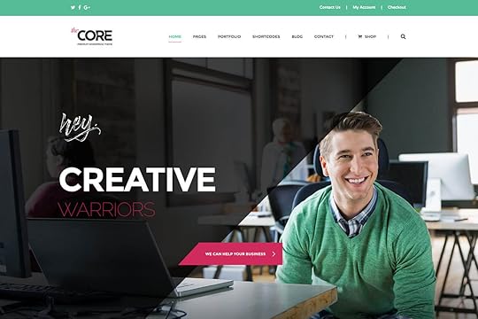
Rather than a theme, The Core is a massive template suite for different types of websites (20 overall) that has just started to develop and conquest users. Its functionality is due to it being built on ThemeFuseâs open source WordPress framework Unyson.
As one could expect from a premium WordPress theme, The Core offers plenty of cool features that facilitate design. The theme uses an Advanced Page Builder advertised as the easiest and most comprehensive editing tool for beginners, as they can literally drag and drop each element on the canvas to make pages look the way they like them. As complex as the page is, it wonât take more than few hours to prepare it.
Another handy asset provided by The Core is the auto-installation of responsive, WooCommerce, and retina ready demo content, as well as available shortcodes, sliders, fonts, and similar tools that further facilitate web design. The Core is also one of the rare themes where users are offered 24/7 live support to answer all of their questions.
MOVEDO

MOVEDO is another smart alternative for a multi-purpose and creative WordPress theme that has obviously been crafted to meet the needs of high-class websites. It revolutionized the WP theme industry with series of first-seen features, including radical safe buttons, ultra-dynamics parallax, an immaculate future-proof device for uniqueness, and super-crispy moldable type fonts.
Spring

Spring proved to be one of the most practical WordPress themes tested both for Google Page Speed Tools (92 out of 100) and a Pagespeed Score of GTMetrix (98%). There are only a few themes on the market with similar results.
UX Shop

If youâre looking to boost online sales with a user-friendly and astonishing website, UX Shop has you covered. This is one of the most popular premium WooCommerce themes where no sales-related process is neglected. On top of that UX Shop makes it possible to predict edge cases and fix issues at your current price range.
Be Theme

If youâve already made some research regarding multipurpose WP themes, youâre certainly familiar with Be Theme. Currently, this theme offers more than 200 stunning pre-built websites for different users, each of them with over 40 core features needed to tweak the themeâs functionality and make it business-specific.
Basically, there is no type, theme, or website topic Be Theme canât respond to â you just need to look at their fantastic database and choose the most suitable one for your business.
Diginex

Diginex is a modern magazine theme designed according to minimalist concepts. All details are handled with care and coupled with the best visual effects to be found on the market. Using it, you get access to several layout models for website creation that will allow you to design a beautiful website in less than no time.
Terminus

Terminus is another minimalist, pixel-perfect multipurpose theme for creative users, also operating with a drag-and-drop visual composer to build sites, and arrange blocks and sections in a flexible manner. The type of business youâre running wonât matter â Terminus is customizable enough to use it in every situation.
XStore

XStore adds a stylish touch to all individual product pages, which is why online retailers with large catalogs should look no further than it. Once again, they are offered with advanced layout packages and custom hover possibilities to close deals easily and accurately. The customer, on the other hand, benefits from a simplified purchase process, and the opportunity to star a product and add it to his wishlist.
What is really specific about this e-commerce theme are the numerous header options and design features which can help filter products, describe them with engaging videos, or use a custom widget to showcase the brands available for purchase.
MrBara

MrBara responds to two very important requirements: it is Bootstrap built and Visual Composer empowered and looks incredibly modern and unique. Ideally, the product aims to serve digital and hi-tech stores, or businesses offering furniture, clothing, books, cosmetics, jewelry, and so on.
Gridlove

Gridlove focuses primarily on magazines and news websites, for which it prepares predefined templates and layouts. The style is simply extraordinary, and no coding is required to put the theme in action in only a few minutes.
Grand Photography

Creative photographs looking to display their portfolios should give Grand Photography a look. This theme is minimal and very responsive, built using latest WP technology so that images would display equally well on all devices. As expected, templates and styling are predefined for a specific group of users, including not only photographers but also creative designers and agencies looking to share their work.
Publisher

The perfectionists among you looking to tweak every possible detail on their websites are the ideal audience for Publisher.
What Publisher is known for is unrestricted customization, as you can add and modify all headers and layers by simply dragging-and-dropping desired elements on the Admin Panel. Both personal blogs and online news magazines will benefit from its professional and attractive interface, but most of all the handy features and bulletproof code Publisher is based on.
Hook

Hook can also keep up with the requirements of all businesses, and help them deliver unique content with some of its creative touches. With Hook, you will have access to tons of customization options, a specific page builder, and a single-click feature for installing content. Other handy advantages are the multiple navigation options, carousel portfolio layouts, and almost unrestricted color schemes.
Modesto

Modesto will cater to your needs for a minimal, yet creative agency portfolio, which is why we recommend photographers and other professionals to consider it. This theme makes it easy to customize and modify content in a modern way, and it is suitable for all users from freelancers to corporate website owners.
Molly

When it comes to balancing function and modern appearance, Molly is definitely a leader. This advanced WooCommerce template focuses on helping businesses boost sales, as it bursts with friendly building elements that will make customers enjoy their shopping experience on your website.
Composer

Composer is developed by a popular group of elite developers and WordPress designers, which assures users that its functionality and responsiveness is impeccable. The target group is most of all professional designers – overall, Composer offers 50 different demos you could use to create stunning and memorable websites for your clients.
Nitro

Nitro is the preferred theme of website owners in many e-commerce industries, including electronics, digital, furniture, jewelry, and fashion. It is particularly designed for WooCommerce customers looking for great loading times, robust performance and unique sales features, and of course an understandable and user-friendly interface.
TheGem

TheGem is a high-performance WP theme for modern designers that offers versatile and responsive styles for building different types of websites. This ultimate website design kit is packed with impressive features, thanks to which you can craft a high-performing website in a matter of minutes.
Total

Last but not least, Total combines the advantages of the Visual Composer builder and WordPress customizer in a single powerful package, thanks to which users can build virtually any type of website they need.
You may also like:
Best WordPress contact form plugins
Essential tips: How to create a great landing page
Choosing images that can boost your websiteâs traffic
The post DiscoverTop Responsive WordPress Themes appeared first on ThemeFuse.

January 23, 2017
How To’s & TutorialsHow to Make Content Marketing Work for Small Budgets
Developing a smart content marketing strategy has never been more important than it is today. It embraces all practices of creating and delivering valuable, reliable, and comprehensive content which will genuinely attract the audience it has been designed for.

There are many marketing ideas that can help you turn to content marketing into a competitive edge.
Content marketing has also made it possible to surpass standard product pitching and replace it with useful and relevant content. This way, prospects are given something to rely on instead of being pursued to buy, and they rely on you as someone who can genuinely solve their issues.
Instead of pitching your products or services, you are providing truly relevant and useful content to your prospects and customers to help them solve their issues.
If content marketing is so awesome, why is not everyone doing it?
Well, being completely frank, there is nothing easy about it. As you will read in our marketing tips for small businesses, content marketing requires plenty of hard work and time, but it certainly pays off. With hours of effective work, you will end up taking content to a whole new quality level, and regardless of how much that could cost, it will bring more profit along the way.
The better news is that technology has advanced to make this process cheaper and less time-consuming even when your marketing budget can’t allow any large projects. This way, even startups and small market participants will have a chance to promote good content without spending a fortune to do it.
The first thing to do will be to develop a quality marketing plan that corresponds to your budget and consider options that come for free. Another critical step is to prevent silly mistakes that cost, organized work logically and productively and have a clearly defined goal.
Obviously, this will take you more time than hiring someone to do it for you, but it will definitely pay off.
Read our small business marketing tips, and start improving your content marketing strategy today.
Distinguish cost-efficient content types, and focus on them

Be clear with the cost of every content type
Have a clear overview of the baseline cost for each content type you’re going to produce:
Posts
Images
Videos
Animations
Infographics
Slideshows
Tools
Podcasts
E-books
Stock galleries
All of them will obviously have a different price, depending on what you’re looking to post. When negotiating or shopping, look for fair ranges instead of paying the first price you’re told. How can this happen?
Work with specialized freelancers, and negotiate a quote that suits both parties
Always think whether you’re paying for something you could do yourself, and how much you would charge per hour.
Visit websites and use public sources to help you estimate costs.
Technically, you can always turn to an agency and ask for a quote, but the price will certainly be higher than the one charged by freelancers.
The content of your competitors will reveal many important insights
Optimizing and promoting content is a piece of cake for experienced marketers, but for marketers short of knowledge and finances, giving competitors a look will help big time. Make your own spreadsheet to track their performance, and think how to improve the content and follow best practices.
The trick is quality, not quantity

Remember: every single piece of content you create must be amazing! What marketers spend the most on is boosting the potential of pieces they’ve already published, and that’s the line that separates them from top performers. Even if it means posting 3 pieces of content a week, it is still worthier than posting tons of useless articles. Make the most of every line your write, and quantity will follow.
Creativity is another blessing in disguise when it comes to cutting costs. You don’t really have to create content from scratch – find pieces that have already been used, and repurpose them for your needs. For instance, popular blog posts can inspire you to make interactive videos, podcasts, or slideshows. Research has already been done for you, so make the most of it.
Content marketing is full of parts that aren’t really necessary
The best and most ROI-productive way to promote content is email marketing, but despite it, some marketers are still stuck chasing followers on social media, delivering flyers and sending conference cards, participating in forums, and so on.
If social media is not absolutely mandatory for the niche you’re working in (clothing, home décor, healthy food, and so on), you can easily scratch it off the list. Two channels will be perfectly enough to obtain great results.
Don’t be afraid to go into details

SEO must remain your top priority. To start with, you should target longer keyword tails and invest in them, because they are less common and help you rank higher on search engines. Don’t expect traffic to boost right away – good things take time, and instead of being intimidated by waiting for results, you should keep your business in the game and observe tenths of queries turn into thousands. Believe it or not, most successful websites still have no explanation of how they made it from #10 to #1 in such a short period.
Plus, this strategy keeps your business growing constantly, and never stops enlarging your subscriber’s list. Even when it takes years, patience in content marketing is worth it.
Getting amazing content for free is not impossible
The way to do it is to accept guest posts. Have in mind that this doesn’t entail approving all sorts of pitches – eventually, you should arrive at a point where you’re accepting only 10% of what you’re being offered, and work only with credible and high-quality writers who will contribute to your site’s exposure.
If you’re online, make the most of your presence. Every business nowadays should have a blog, and use it to compete and become the best of its niche. If you turn around and look what successful providers are doing, you will see that quality content people like and share are currently ruling the market. So what does your audience like?
Content marketing helps you to be trendy and gives you access to a number of interactive materials to use as alternatives for long and complex texts.
The most challenging part will be to determine what type of content to post, after which you should look for the ideal channels to promote it. Start with the blog and the business’s website, and think of social media, email, or mobile marketing to help you distribute quality content. Not all channels will have a sense of your business and your strategy, so keep in line with those where the desired audience will certainly see them.
Luckily, technology development ensured a number of useful platforms to use, but this can also be a challenge for businesses running out of time. To make the process simpler, stick to traditional channels that can have the biggest impact on your performance, and where you’re comfortable to work and invest.
Channels to use

Sticking to a single channel is not the best idea, but try to limit yourself from displaying content in many fields, and splitting the attention it usually gets. Too many content delivery channels will also require more efforts and higher investments to manage.
The generally accepted rule is that social media is the goldmine of today’s marketers, as there they have access to most viewers, and are enabled to post all sorts of content.
Cool videos gain visibility when posted on YouTube, job announcements are easily seen on LinkedIn, and images are gladly shared on Facebook and Instagram. As you can conclude, the type of content you post will be determinative for choosing suitable distribution channels.
Making users stay on the site
Remember that users will here and there land directly on your blog and look for updates, but keeping them in the loop is still easier with a social network fun page. Once they like it, they will almost certainly come back, which takes away most of your demand generation efforts.
Another thing readers will certainly love is reliability, so show them who you are, share publicly your contact information, and amaze them with facts and personal stories. Doing this always invokes an effect bigger than the one of the abstract tales.
Attracting more attention in less time is easily done with popular ‘how to’ guides because there you can tackle questions and problems most people have, and share experienced insights to help them solve those.
Ending thoughts
Finally, remember that content marketing doesn’t have to break the bank: despite the fact there are business giants dictating some of the prices, small companies can still attract attention with day-to-day fresh content. Obviously, no one will stop you from spending thousands if you have them, but why doing something that is not absolutely necessary?
Come up with a brave content marketing strategy, but try to keep in line with what your business really needs, and what corresponds to your organizational goals. Regardless of whether you’re looking to boost sales or drum up customer loyalty, content marketing can be used to make your brand more competitive.
You may also like:
How to use quizzes to generate leads
Storytelling in Content Marketing – tools and resources
How to Design a Good Email Newsletter to Encourage Customer Engagement
The post How To’s & TutorialsHow to Make Content Marketing Work for Small Budgets appeared first on ThemeFuse.

How Toâs & TutorialsHow to Make Content Marketing Work for Small Budgets
Developing a smart content marketing strategy has never been more important than it is today. It embraces all practices of creating and delivering valuable, reliable, and comprehensive content which will genuinely attract the audience it has been designed for.
There are many marketing ideas that can help you turn to content marketing into a competitive edge.
Content marketing has also made it possible to surpass standard product pitching and replace it with useful and relevant content. This way, prospects are given something to rely on instead of being pursued to buy, and they rely on you as someone who can genuinely solve their issues.
Instead of pitching your products or services, you are providing truly relevant and useful content to your prospects and customers to help them solve their issues.
If content marketing is so awesome, why is not everyone doing it?
Well, being completely frank, there is nothing easy about it. As you will read in our marketing tips for small businesses, content marketing requires plenty of hard work and time, but it certainly pays off. With hours of effective work, you will end up taking content to a whole new quality level, and regardless of how much that could cost, it will bring more profit along the way.
The better news is that technology has advanced to make this process cheaper and less time-consuming even when your marketing budget canât allow any large projects. This way, even startups and small market participants will have a chance to promote good content without spending a fortune to do it.
The first thing to do will be to develop a quality marketing plan that corresponds to your budget and consider options that come for free. Another critical step is to prevent silly mistakes that cost, organized work logically and productively and have a clearly defined goal.
Obviously, this will take you more time than hiring someone to do it for you, but it will definitely pay off.
Read our small business marketing tips, and start improving your content marketing strategy today.
Distinguish cost-efficient content types, and focus on them
Be clear with the cost of every content type
Have a clear overview of the baseline cost for each content type youâre going to produce:
Posts
Images
Videos
Animations
Infographics
Slideshows
Tools
Podcasts
E-books
Stock galleries
All of them will obviously have a different price, depending on what youâre looking to post. When negotiating or shopping, look for fair ranges instead of paying the first price youâre told. How can this happen?
Work with specialized freelancers, and negotiate a quote that suits both parties
Always think whether youâre paying for something you could do yourself, and how much you would charge per hour.
Visit websites and use public sources to help you estimate costs.
Technically, you can always turn to an agency and ask for a quote, but the price will certainly be higher than the one charged by freelancers.
The content of your competitors will reveal many important insights
Optimizing and promoting content is a piece of cake for experienced marketers, but for marketers short of knowledge and finances, giving competitors a look will help big time. Make your own spreadsheet to track their performance, and think how to improve the content and follow best practices.
The trick is quality, not quantity
Remember: every single piece of content you create must be amazing! What marketers spend the most on is boosting the potential of pieces theyâve already published, and thatâs the line that separates them from top performers. Even if it means posting 3 pieces of content a week, it is still worthier than posting tons of useless articles. Make the most of every line your write, and quantity will follow.
Creativity is another blessing in disguise when it comes to cutting costs. You donât really have to create content from scratch â find pieces that have already been used, and repurpose them for your needs. For instance, popular blog posts can inspire you to make interactive videos, podcasts, or slideshows. Research has already been done for you, so make the most of it.
Content marketing is full of parts that arenât really necessary
The best and most ROI-productive way to promote content is email marketing, but despite it, some marketers are still stuck chasing followers on social media, delivering flyers and sending conference cards, participating in forums, and so on.
If social media is not absolutely mandatory for the niche youâre working in (clothing, home décor, healthy food, and so on), you can easily scratch it off the list. Two channels will be perfectly enough to obtain great results.
Donât be afraid to go into details
SEO must remain your top priority. To start with, you should target longer keyword tails and invest in them, because they are less common and help you rank higher on search engines. Donât expect traffic to boost right away â good things take time, and instead of being intimidated by waiting for results, you should keep your business in the game and observe tenths of queries turn into thousands. Believe it or not, most successful websites still have no explanation of how they made it from #10 to #1 in such a short period.
Plus, this strategy keeps your business growing constantly, and never stops enlarging your subscriber’s list. Even when it takes years, patience in content marketing is worth it.
Getting amazing content for free is not impossible
The way to do it is to accept guest posts. Have in mind that this doesnât entail approving all sorts of pitches â eventually, you should arrive at a point where youâre accepting only 10% of what youâre being offered, and work only with credible and high-quality writers who will contribute to your siteâs exposure.
If youâre online, make the most of your presence. Every business nowadays should have a blog, and use it to compete and become the best of its niche. If you turn around and look what successful providers are doing, you will see that quality content people like and share are currently ruling the market. So what does your audience like?
Content marketing helps you to be trendy and gives you access to a number of interactive materials to use as alternatives for long and complex texts.
The most challenging part will be to determine what type of content to post, after which you should look for the ideal channels to promote it. Start with the blog and the businessâs website, and think of social media, email, or mobile marketing to help you distribute quality content. Not all channels will have a sense of your business and your strategy, so keep in line with those where the desired audience will certainly see them.
Luckily, technology development ensured a number of useful platforms to use, but this can also be a challenge for businesses running out of time. To make the process simpler, stick to traditional channels that can have the biggest impact on your performance, and where youâre comfortable to work and invest.
Channels to use
Sticking to a single channel is not the best idea, but try to limit yourself from displaying content in many fields, and splitting the attention it usually gets. Too many content delivery channels will also require more efforts and higher investments to manage.
The generally accepted rule is that social media is the goldmine of todayâs marketers, as there they have access to most viewers, and are enabled to post all sorts of content.
Cool videos gain visibility when posted on YouTube, job announcements are easily seen on LinkedIn, and images are gladly shared on Facebook and Instagram. As you can conclude, the type of content you post will be determinative for choosing suitable distribution channels.
Making users stay on the site
Remember that users will here and there land directly on your blog and look for updates, but keeping them in the loop is still easier with a social network fun page. Once they like it, they will almost certainly come back, which takes away most of your demand generation efforts.
Another thing readers will certainly love is reliability, so show them who you are, share publicly your contact information, and amaze them with facts and personal stories. Doing this always invokes an effect bigger than the one of the abstract tales.
Attracting more attention in less time is easily done with popular âhow toâ guides because there you can tackle questions and problems most people have, and share experienced insights to help them solve those.
Ending thoughts
Finally, remember that content marketing doesnât have to break the bank: despite the fact there are business giants dictating some of the prices, small companies can still attract attention with day-to-day fresh content. Obviously, no one will stop you from spending thousands if you have them, but why doing something that is not absolutely necessary?
Come up with a brave content marketing strategy, but try to keep in line with what your business really needs, and what corresponds to your organizational goals. Regardless of whether youâre looking to boost sales or drum up customer loyalty, content marketing can be used to make your brand more competitive.
You may also like:
Best WordPress contact form plugins
Essential tips: How to create a great landing page
Choosing images that can boost your websiteâs traffic
The post How Toâs & TutorialsHow to Make Content Marketing Work for Small Budgets appeared first on ThemeFuse.
January 19, 2017
DiscoverBest WordPress contact form plugins
Businesses and organizations collecting common data can benefit significantly from web forms, as such gather all relevant visitor information, including email addresses, surveys, membership registrations, feedback, and much more. This is why most websites nowadays include at least a humble website contact form.
WP contact forms make it possible for visitors to type in short and quick messages and be responded the way they prefer. The email is then directed to the websiteâs database, and the visitor is satisfied with the clean, neat, and friendly interface that made it easy for him to contact you.
When choosing a contact form for WordPress, check whether there is already one embedded in your theme. In case there is not, you should consider using a plugin to add some of your own, personalize it and tailor its looks, and gain complete control over the fields it will contain.
But which is the best contact form for WordPress? Letâs check:
WPForms

WPForms is the WP plugin you should consider if youâre just starting with your website. The reason is that it allows creating web forms with only a few drags-and-drops, which is how even the least savvy users get to create amazing forms.
The plugin is free, but there is also a paid premium version thanks to which you can extend the functionality of your form, use business-specific conditional logic, build payment and multi-page forms, govern subscriptions, and much more.
The plugin is really popular among WP users, which is why it wonât be difficult for you to find tutorials, guides, and documentations to help you make the most of it.
What you will also like about WPForms are the many exclusive features that accompany its clean and neat interface, and that handy drag-and-drop mechanism used to make new forms or improve old ones. Inside the pluginâs directory, you will also find a number of cool prebuilt templates to accelerate forms creation.
All this being said, WPForms combines in a perfect way the power and user-friendliness that would make your contact form look more attractive. This is why WPForms doesnât include some of the complex functions other plugins can provide.
Gravity Forms

Gravity Forms is a popular, pay-per-use web form plugin whose functionality has no exceptions. Being powerful in its original form, Gravity also works with a variety of extra add-ons that further enhance its capacity to engage visitors.
You can use it to create fantastic quizzes, surveys, ask users to submit content, or simply subscribe to your web directory. It will also give you access to FAQs and similar premium support options, forums, knowledge bases, and much more. Long story short, you will have support at any moment of time.
Unfortunately, Gravity Forms is not available for free, and its prices often surpass the ones of other plugins and contact form creators. Big companies operating with multiple websites, on the other hand, will find it more than useful and affordable.
Pirates forms

Unlike Gravity Forms, Pirates forms come for free despite all great functionality the Themeisle team included in it. It may not do enough for complex contact forms and questionnaires, but it will be perfect for quick and simple updates. Some of its most important features are SMTP and CAPTCHA.
Ninja Forms

Ninja Forms is another freemium creator designed for WordPress users, well known for its highly interactive products that donât require effort, time, or coding knowledge.
All that users need to do is to open the WordPress repository, pull out some of the beautiful forms for different pages and websites, download it, and start using it instantly on all locations they like.
There are also a number of advanced extensions that allow you to connect Ninja Forms to Salesforce, FreshBooks, Campaign Monitor, or several email service and SMS providers. Guidelines and training documentation are also available.
The same as Gravity Forms, Ninja Forms can be used to design interesting quizzes, surveys, or subscription forms. Note that only the main plugin can be purchased for free â you need to pay additionally to use any of the extensions, including the whole developer bundle that costs more or less the same as Gravity Forms.
Formidable Forms

Formidable Pro may not be the best-known contact form creator for WordPress, but it is certainly developing faster than anyone could have expected. Thanks to it, you can create stunning and functional forms for free, or use even more handy goodies offered in the premium version of this plugin.
Overall, Formidable Pro can be extended with 12 add-ons, available both for the free and the premium users. In the best scenario, Formidable Pro will work impeccably with your Basecamp, MailChimp, Zapier, or Trillio data.
Fast Secure Contact Form

Fast Secure Contact Form is probably the easiest to use of all contact form plugins mentioned so far, mostly because its customization allows users to tweak it and make it more business-specific. Once working with it, you will create and modify forms in minutes, but also be enabled to use URLs from submitted forms to redirect users to the desired page.
All important fields you expect will be there (checkboxes, text areas, selection, attachments, radio, dates, and time), while you will also have the possibility to create ones of your own. Basically, it takes a single or few short and simple codes to insert a field wherever you need it.
Contact Form 7
Contact Form 7 provides users with unlimited access to WordPressâs popular Contact Dashboard, where they can create, modify, and manage virtually any type of contact forms. As a result of its extensive flexibility, Contact Form 7 is one of the most popular and frequently downloaded web form plugins of all times.
To make matters even better, Contact Form 7 supports CAPTCHA, Ajax Submissions, and Akismet Spam filtering. You can choose from 60 different languages, and extend functionality with many interesting add-ons.
ContactBuddy

ContactBuddy is the most popular iThemes product that comes for free. You can use it to design simple and beautiful contact forms, and add those to your posts, pages, widgets, or any other element on your WordPress website.
All basic fields such as name, subject, message, and email are already included, and a reCaptcha validation button is also available for those interested to use it.
Visual Form Builder
The Visual Form Builder plugin wonât charge for its basic services, but if you want a grasp of its advanced functionality, you will have to consider the higher plans starting from $29. Alike our other suggestions, Visual Form Builder doesnât require coding expertise to build forms and relies rather on a simple drag-and-drop mechanism to reorder fields in the desired ways. All forms can be exported in CSV format, or duplicated with a single click.
Nowadays, website owners canât afford the luxury of not having a contact form embedded for their users. This is particularly true for e-stores and membership portals, but we also recommend it to owners of personal portfolios and sole entrepreneurs. What a good contact form such as the ones we discussed does is to enable your visitors to contact you at any point of time, and receive a quick answer for all of their inquiries.
To start with, the web contact for should look nice and add value to your professional reputation, but streamline at the same time online communication with your clients. Using a contact form, you will prevent visitors from looking for your email address, and give them an instant and efficient way to get in touch.
You may also like:
Essential tips: How to create a great landing page
Choosing images that can boost your websiteâs traffic
Single-Page vs. Multipage Design: Pros & Cons
The post DiscoverBest WordPress contact form plugins appeared first on ThemeFuse.

How To’s & TutorialsEssential tips: How to create a great landing page
Did you know that you can make choices instantly – in the blink of an eye? One simple look and you already know you want to buy that something.
Have you ever felt this way? Feeling that you instantly want something once you saw it?
I bet you did. So did I.
But these decisions aren’t as simple as they may look like. This is the idea that Malcolm Gladwell tries to explain in his great book “Blink – The power of thinking without thinking”.
So, by now you’re probably wondering, what this all has to do with landing pages?
Let’s think. What is a landing page about?
Exactly, leading your visitors to a purchase decision. Making them want to buy. Instantly.
In the blink of an eye.
See?
A great landing page makes you really want that product, service or free e-book.
This feeling was the inspiration for this article.
Let’s see what is a landing page, its planning stages, and key elements and how you can easily build one using The Core’s Visual Builder and shortcodes.
And most of all, find out how landing pages should feel like.
Since Malcolm Gladwell’s thoughts were the sources of inspiration, you’ll get to see a landing page example for its other fantastic book – “Outliers”.
Let’s start with:
What is a landing page?
Landing pages should be perceived as particular parts of your website that are used for your product/service campaigns and have a single simple task.
For this reason,
Landing pages should never be confused with homepages.
[image error]
What’s a homepage? It’s the main area of your website which displays the general info about your products and company, as well as the navigation links for other areas of your site.
A homepage is used to explore your website.
On the other hand, a landing page is a separate webpage that’s focused solely on promotion and has the purpose of a) capturing your leads or b) warming up the customers through your sales funnel.
[image error]
This means that landing pages can be of two types:
Lead generation landing page – for capturing your customer’s e-mail address, with his/her given permission to receive future marketing materials from you. In exchange for the e-mail, you should give great content like e-books, whitepapers, insider tips or checklists:
[image error]
Click-through landing page – for warming the path between the marketing add and the final sales page. The CTR landing page should provide enough info about your product to the visitor, so he could become a customer and easily decide on making the purchase:
[image error]
Thus, a landing page has only one objective – making your customer press the call-to-action button.
But before proceeding to describe the call-to-action, you should get to know the planning process of your landing page and its essential elements.
How to plan your landing page?
Since the landing page is the foundation of your campaign, certain things must be planned ahead before working on its design.
You should keep in mind that the planning process of any landing page consists of three main stages:
1. Establish one goal;
2. Create the landing page based on its essential 5 elements;
3. Instantly deliver your offerings.
The first stage is very simple: you should decide what you want to receive from your customers? Is it their e-mail or you want them to buy your product? The key thing to remember is that it should be only one goal because otherwise your landing page is completely inefficient.
The second stage is where things get creative because it’s basically the creation of your landing page. It must be composed of the following 5 essential elements:
1. Unique Selling Proposition (USP)
Your USP should answer the question “What is this page about?” in the most comprehensive and convincing way so the visitor could find out why they “are here”. It should contain the headline, subheadline, the reinforcement statement and the closing argument.
Headline
[image error]
Subheadline
[image error]
Reinforcement statement
[image error]
Closing argument
[image error]
Starting with the headline, which is the first thing to notice on your page, you must get the visitors to feel that they came to the right place. The subheadline’s purpose is to support the headline by giving more details. Both of them shall be written in the most persuasive way to convince your visitors that they’ve found what they’ve been looking for.
The last two elements (the reinforcement statement and closing argument) are used in the middle copy and at the end of the landing page to sustain and highlight the USP.
Use USP to “smooth the way to conversion”.
2. Demo
[image error]
Also called the “hero shot”, the demo is usually an image or a video showcasing your offering. It should dominate the page, reinforce the USP and trigger the purchasing action.
Also, make sure to provide a preview of the product or services that are referred on the landing page. Since it’s not a face-to-face experience, your visitors would definitely appreciate trying your offering before deciding to buy it.
“Try before you buy”.
3. Copy
[image error]
The body copy should describe the benefits of your offerings in a very structured way, beginning with brief introductory paragraph followed by the detailed description.
But, you must remember that you shall never mistake the features of your product with its benefits. The last ones explain what particular problems your product/service is solving. In this explanation, you can mention what features makes it possible, but try to maintain your focus on benefits.
Therefore, make sure that once your visitor reads the copy, he thinks of “Oh, this will definitely make my life easier”.
4. Social Proof
[image error]
It’s the most powerful and persuasive type of copy which serves as a trust indicator. Through testimonials or popularity meters, like user numbers, customer satisfaction rate, etc., you will be able to convince your visitor to give your offering a try, since others use it and enjoy it.
It’s the “Oh, yes, I’ll have what he/she is having” thing.
5. CTA
[image error]
The superstar of your landing page – your Call-to-Action button. The single conversion goal and the main objective of your landing page.
If it’s a lead generation landing page, your CTA should be a subscription form; if it’s a CTR landing page, it’s just one single conversion button.
The CTA button consists of two pieces: the design and the copy.
Obviously, its design should be very eye-catching to point out where the user shall click. So, many would think that its color is crucial, like having a big red button it’s the best thing.
It may be, but in most of the cases it’s irrelevant: what’s the point of having a red button if the background is pink?
The only thing that really matters in designing CTA buttons is the contrast.
Make sure to make it visually stand out from the entire page. You can achieve this not only through color contrast but also by using encapsulation, white space, directional cues and clickability. Lock the eyes of your visitors on the most important element, let it “breath” on your page, guide them to it and make it easy to be clicked.
Less is always more. Be smart, not sophisticated.
Yet, the design of the CTA button will mean nothing if it’s not psychologically sustained by the best copy. For you to figure out what text your button should contain, you must complete the following sentence:
“I want my lead to …” The words that come after is your CTA’s copy.
Download the e-book. Buy the software. Enter the giveaway. Register for the webinar. Buy the book.
As simple as that. Your CTA button should immediately instigate to take action. You can ensure the urgency and scarcity by using power words like “Now” and “Free”, or additional copy like “Last chance” and “Only a few remaining”.
Another thing to keep in mind is the CTA placement. If the complexity of your offering is rather simple, then you should place your CTA button on the top of the page, right above the fold.
On the other side, if your product’s complexity is high, then the CTA should be definitely placed at the bottom of your page to make sure that the customer is aware of its benefits before making a purchase decision.
Moreover, remember that the headline should match the call-to-action message. This way, you will ensure your visitors that they’ve made the right choice and didn’t get to your landing page by accident.
Also, since most of the times, clients come to your landing pages by clicking on your ads, be sure to match the ad’s copy and design with those of your landing page, so the visitors don’t get confused.
The third and last stage is, again, extremely simple: if you promise something, you must deliver it instantly, either it’s an e-book, product or a service subscription. Once the visitor pressed on your CTA, be sure to be quick in giving them your offering.
Now, that you know the basics and the hints of an effective landing page, you can easily make it by yourself.
But practice makes perfect, right?
Let’s see how you can use The Core to build a landing page.
Building the landing page for “Outliers” book
[image error]
First things first:
Establish the goal: The visitors should buy this amazing book.
Then, the essential 5 elements:
1. USP:
Headline: Discover what makes us all unique.
Subheadline: Outliers will change the way you think about your own life story
Reinforcement statement: Find out why some people achieve so much more than others
Closing argument: No one, not even a genius, ever makes it alone
2. Demo – the image of the book
[image error]
3. Copy – the introductory paragraph consists of the ‘reasons to buy the book’ and ‘about the author’ column. Then, since it’s a book, it’s “benefits” are showcased as quotes that have the purpose of arousing the visitors’ curiosity.
[image error]
[image error]
4. Social proof – testimonials from famous editors and publications.
[image error]
5. CTA – “I want my lead to …” buy the book.
[image error]
The last step, instantly delivering the book – link to the book’s page on Amazon.
Once you have all the above, you can proceed to build your landing page.
With the Drag & Drop Visual builder and its shortcodes, making the “Outliers” landing page with The Core is a piece of cake. The best part of it, is that you can easily change elements for A/B testing purposes:
1. Image vs. video
[image error]
2. Changing the color of the button
[image error]
Or any other change, it only takes a couple of minutes.
Plan. Build. Test. Find the best shot.
Final thoughts
Creating landing pages isn’t a scary thing anymore. With the right tools and tips, it can be easily done by yourself. All you have to do is be sure what you want from your visitors. Once you know it, you can achieve so much more than others. Good luck!
You may also like:
How to use quizzes to generate leads
Storytelling in Content Marketing – tools and resources
How to Design a Good Email Newsletter to Encourage Customer Engagement
The post How To’s & TutorialsEssential tips: How to create a great landing page appeared first on ThemeFuse.

How Toâs & TutorialsEssential tips: How to create a great landing page
Did you know that you can make choices instantly – in the blink of an eye? One simple look and you already know you want to buy that something.
Have you ever felt this way? Feeling that you instantly want something once you saw it?
I bet you did. So did I.
But these decisions aren’t as simple as they may look like. This is the idea that Malcolm Gladwell tries to explain in his great book âBlink – The power of thinking without thinkingâ.
So, by now youâre probably wondering, what this all has to do with landing pages?
Letâs think. What is a landing page about?
Exactly, leading your visitors to a purchase decision. Making them want to buy. Instantly.
In the blink of an eye.
See?
A great landing page makes you really want that product, service or free e-book.
This feeling was the inspiration for this article.
Letâs see what is a landing page, its planning stages, and key elements and how you can easily build one using The Coreâs Visual Builder and shortcodes.
And most of all, find out how landing pages should feel like.
Since Malcolm Gladwellâs thoughts were the sources of inspiration, youâll get to see a landing page example for its other fantastic book â “Outliersâ.
Letâs start with:
What is a landing page?
Landing pages should be perceived as particular parts of your website that are used for your product/service campaigns and have a single simple task.
For this reason,
Landing pages should never be confused with homepages.
[image error]
Whatâs a homepage? Itâs the main area of your website which displays the general info about your products and company, as well as the navigation links for other areas of your site.
A homepage is used to explore your website.
On the other hand, a landing page is a separate webpage thatâs focused solely on promotion and has the purpose of a) capturing your leads or b) warming up the customers through your sales funnel.
[image error]
This means that landing pages can be of two types:
Lead generation landing page â for capturing your customerâs e-mail address, with his/her given permission to receive future marketing materials from you. In exchange for the e-mail, you should give great content like e-books, whitepapers, insider tips or checklists:
[image error]
Click-through landing page â for warming the path between the marketing add and the final sales page. The CTR landing page should provide enough info about your product to the visitor, so he could become a customer and easily decide on making the purchase:
[image error]
Thus, a landing page has only one objective â making your customer press the call-to-action button.
But before proceeding to describe the call-to-action, you should get to know the planning process of your landing page and its essential elements.
How to plan your landing page?
Since the landing page is the foundation of your campaign, certain things must be planned ahead before working on its design.
You should keep in mind that the planning process of any landing page consists of three main stages:
1. Establish one goal;
2. Create the landing page based on its essential 5 elements;
3. Instantly deliver your offerings.
The first stage is very simple: you should decide what you want to receive from your customers? Is it their e-mail or you want them to buy your product? The key thing to remember is that it should be only one goal because otherwise your landing page is completely inefficient.
The second stage is where things get creative because itâs basically the creation of your landing page. It must be composed of the following 5 essential elements:
1. Unique Selling Proposition (USP)
Your USP should answer the question âWhat is this page about?â in the most comprehensive and convincing way so the visitor could find out why they âare hereâ. It should contain the headline, subheadline, the reinforcement statement and the closing argument.
Headline
[image error]
Subheadline
[image error]
Reinforcement statement
[image error]
Closing argument
[image error]
Starting with the headline, which is the first thing to notice on your page, you must get the visitors to feel that they came to the right place. The subheadlineâs purpose is to support the headline by giving more details. Both of them shall be written in the most persuasive way to convince your visitors that theyâve found what theyâve been looking for.
The last two elements (the reinforcement statement and closing argument) are used in the middle copy and at the end of the landing page to sustain and highlight the USP.
Use USP to âsmooth the way to conversionâ.
2. Demo
[image error]
Also called the âhero shotâ, the demo is usually an image or a video showcasing your offering. It should dominate the page, reinforce the USP and trigger the purchasing action.
Also, make sure to provide a preview of the product or services that are referred on the landing page. Since itâs not a face-to-face experience, your visitors would definitely appreciate trying your offering before deciding to buy it.
âTry before you buyâ.
3. Copy
[image error]
The body copy should describe the benefits of your offerings in a very structured way, beginning with brief introductory paragraph followed by the detailed description.
But, you must remember that you shall never mistake the features of your product with its benefits. The last ones explain what particular problems your product/service is solving. In this explanation, you can mention what features makes it possible, but try to maintain your focus on benefits.
Therefore, make sure that once your visitor reads the copy, he thinks of âOh, this will definitely make my life easierâ.
4. Social Proof
[image error]
Itâs the most powerful and persuasive type of copy which serves as a trust indicator. Through testimonials or popularity meters, like user numbers, customer satisfaction rate, etc., you will be able to convince your visitor to give your offering a try, since others use it and enjoy it.
Itâs the âOh, yes, Iâll have what he/she is havingâ thing.
5. CTA
[image error]
The superstar of your landing page â your Call-to-Action button. The single conversion goal and the main objective of your landing page.
If itâs a lead generation landing page, your CTA should be a subscription form; if itâs a CTR landing page, itâs just one single conversion button.
The CTA button consists of two pieces: the design and the copy.
Obviously, its design should be very eye-catching to point out where the user shall click. So, many would think that its color is crucial, like having a big red button itâs the best thing.
It may be, but in most of the cases itâs irrelevant: whatâs the point of having a red button if the background is pink?
The only thing that really matters in designing CTA buttons is the contrast.
Make sure to make it visually stand out from the entire page. You can achieve this not only through color contrast but also by using encapsulation, white space, directional cues and clickability. Lock the eyes of your visitors on the most important element, let it âbreathâ on your page, guide them to it and make it easy to be clicked.
Less is always more. Be smart, not sophisticated.
Yet, the design of the CTA button will mean nothing if itâs not psychologically sustained by the best copy. For you to figure out what text your button should contain, you must complete the following sentence:
âI want my lead to â¦â The words that come after is your CTAâs copy.
Download the e-book. Buy the software. Enter the giveaway. Register for the webinar. Buy the book.
As simple as that. Your CTA button should immediately instigate to take action. You can ensure the urgency and scarcity by using power words like âNowâ and âFreeâ, or additional copy like âLast chanceâ and âOnly a few remainingâ.
Another thing to keep in mind is the CTA placement. If the complexity of your offering is rather simple, then you should place your CTA button on the top of the page, right above the fold.
On the other side, if your productâs complexity is high, then the CTA should be definitely placed at the bottom of your page to make sure that the customer is aware of its benefits before making a purchase decision.
Moreover, remember that the headline should match the call-to-action message. This way, you will ensure your visitors that theyâve made the right choice and didnât get to your landing page by accident.
Also, since most of the times, clients come to your landing pages by clicking on your ads, be sure to match the adâs copy and design with those of your landing page, so the visitors donât get confused.
The third and last stage is, again, extremely simple: if you promise something, you must deliver it instantly, either itâs an e-book, product or a service subscription. Once the visitor pressed on your CTA, be sure to be quick in giving them your offering.
Now, that you know the basics and the hints of an effective landing page, you can easily make it by yourself.
But practice makes perfect, right?
Letâs see how you can use The Core to build a landing page.
Building the landing page for âOutliersâ book
[image error]
First things first:
Establish the goal: The visitors should buy this amazing book.
Then, the essential 5 elements:
1. USP:
Headline: Discover what makes us all unique.
Subheadline: Outliers will change the way you think about your own life story
Reinforcement statement: Find out why some people achieve so much more than others
Closing argument: No one, not even a genius, ever makes it alone
2. Demo â the image of the book
[image error]
3. Copy â the introductory paragraph consists of the âreasons to buy the bookâ and âabout the authorâ column. Then, since itâs a book, itâs âbenefitsâ are showcased as quotes that have the purpose of arousing the visitors’ curiosity.
[image error]
[image error]
4. Social proof â testimonials from famous editors and publications.
[image error]
5. CTA – âI want my lead to â¦â buy the book.
[image error]
The last step, instantly delivering the book â link to the bookâs page on Amazon.
Once you have all the above, you can proceed to build your landing page.
With the Drag & Drop Visual builder and its shortcodes, making the âOutliersâ landing page with The Core is a piece of cake. The best part of it, is that you can easily change elements for A/B testing purposes:
1. Image vs. video
[image error]
2. Changing the color of the button
[image error]
Or any other change, it only takes a couple of minutes.
Plan. Build. Test. Find the best shot.
Final thoughts
Creating landing pages isnât a scary thing anymore. With the right tools and tips, it can be easily done by yourself. All you have to do is be sure what you want from your visitors. Once you know it, you can achieve so much more than others. Good luck!
You may also like:
Choosing images that can boost your websiteâs traffic
Single-Page vs. Multipage Design: Pros & Cons
How to do SEO in 2017: Full list of guidelines, tips and tricks
The post How Toâs & TutorialsEssential tips: How to create a great landing page appeared first on ThemeFuse.
January 16, 2017
How Toâs & TutorialsChoosing images that can boost your websiteâs traffic
Images are among the most important website elements nowadays, especially for bloggers looking to make content more attractive. The reason is that images make complex and factual content easier to digest and boost the number of shares on social networks.

Search engines are also fond of appealing images and pictures, people are easier attracted to images than text, and thus more likely to choose a blog that contains such.
But why some certain pictures make people click on them? Or even more importantly, why do images play such a vital role in websiteâs SEO strategies?
The answer is quite simple â good images respond to the two most important needs of every website: they attract the attention of visitors and search engines and retain people exploring their content once arrived. Basically, images can determine the websiteâs capacity to compete with its counterparts.
Optimizing your images is thereof the first thing you should do to preserve a competitive edge. It may take some time to perfect this strategy on your own, but it will definitely be worth the effort.
Optimize images with people in mind
It may sound like common sense, but the images you upload must speak in favor of your content. A mismatch between the image and the article may look unprofessional and misleading, in particular for bloggers intimidated by bold and big picture solutions. Technology nowadays allows you to upload all formats and sizes, so make use of it!
Upload with RSS feed users in mind â they will scan your content and be easily captured by large and attractive images. If the picture uses real people, make sure they are mimicking eye contact with the reader to secure you more views.
Optimize images with search engines in mind

First and foremost, consider the formats and sizes acceptable by different browsers and devices, and compress imagery until it corresponds with the requirements.
You will easily be tempted to add many images on the same page, but try not to exaggerate. Use only the pictures that are absolutely relevant.
Next, develop an SEO strategy. Use the most suitable keywords for your images positioned in strategic places, including page and image titles, descriptive texts, and alt texts. Before you know it, your website will be correctly indexed by all search engines and positioned high on their searching lists.
Optimize images with social media in mind
As we all know, the thing people share the most on social networks are images, followed closely by interesting and interactive videos. There are few activities you should consider to make sure images will spread fast on all social portals and bring you the desired traffic:
The measure is gorgeous: We probably donât even have to tell you this, but believe it or not, there are people who are challenged to choose inspiring images.
Keep the formats standardized: The most commonly used images type are jpg, png, and gif. In all other cases, you will endanger the imageâs capacity to display well on different devices, and hence lower the chance of it being seen and shared.
Donât wait for users to share your images first: be active and publish them yourself! All of your great pictures should be available on Facebook, Twitter & TwitPic, Instagram, Pinterest, Photobucket, Picassa, Google , and Flickr. This way, you will make sure everyone who wants to share them is able to do so.
Last, but not least, consider optimizing for Digg submission. In this case, you should preserve the jpg format, and adjust the size to 160×160 or 160×120 pixels. In all other cases, they wonât be presented well.
Optimize the text of the imageâs title and alt tag
This will be very easy using the SEO-Friendly Images plugin, which can do two very beneficial things for your images:
Adding title texts and alt tags â It will do it automatically so that you wonât have to worry about optimizing images yourself.
Changing the title texts and alt tags you already have â The plugin blends the following variables to make things easier for you:
%title â used to replace the post title
%name â used to replace the name of the image file (without extending it)
Êtegory â used to replace the postâs category
%tags â used to replace the postâs tags
Optimize the names of your image files

It may not sound logical at first, but optimizing the name of an image is just as important as optimizing the image for SEO purposes. There is another plugin in charge of this, and it is called Media File Renamer.
If you prefer to adjust names manually, you are allowed to do it, but there are few things you should keep in mind:
Choose a short name
Choose a name that closely describes what the image represents, and add the keywords.
Remember: The image fileâs title should not have any spaces in it. If you need such, replace them with dashes (not underscores).
Optimize with image load speed in mind

It is no secret that Google prioritizes images that load fast, so you must optimize with speed being your first concern. As huge and cool as you image may be, it wonât help you attract people unless it opens instantly.
Choosing images that are relevant to your content
When using images, you should always pick such that match the postâs story. The reader may avoid it otherwise, and leave the page with a negative impression. At that point, publishing posts with images wonât bring you any benefit.
Go large

Select bigger images for a bigger effect, as this universal rule, applies for all readers. Go for the largest and best-quality image out there, but make sure youâve considered all technical aspects before uploading it on your website. Otherwise, you may end up showing a blurry image that affects the reputation of your site and doesnât inspire the reader to remain there. Instead, try to make images inspirational enough for him to return and continue exploring your posts.
Stock photos are not your only option
We all know that subscribing to Shutterstock and GettyImages is easy, but posting something users have seen somewhere else has nothing thrilling about it. Explore other options, such as the Pinterest or Flickr photo community, where amazing author images have no protected rights and wonât charge you a penny for using them. An excellent and free alternative is to browse for photos on Google images, but you must take care not to post a protected piece.
The best way to engender credibility and make viewers appreciate your work is to use personal images. If youâre into photography, why not wasting few more minutes to capture a moment relevant for your text? This way, the reader will have first-hand, unique information, and will share your content much more often.
Research trendy topics and keep in line with them
Outdated images wonât really attract attention, so make sure you always have the most recent image of what youâre writing about. Readers certainly appreciate this, in particular when youâre using a high-quality photography you made yourself. A good idea may be to hire an expert photographer and discuss trends with him. If the photo is really good, make sure youâve shortened text to allow users to enjoy it instead.
Add infographics

When discussing numbers and complex subjects, you can make articles more appealing with infographic pictures that display figures in an appealing manner. This will be far more attractive for users than simply feeding them with boring and uninterrupted summaries. Long story short, make your content more illustrative.
Besides, the choice of infographic tools is almost unlimited: you can opt for illustrations, graphs, flow and pie charts, and so on. With the appropriate program in hands, it wonât take long to summarize your data with minimal manual input.
Ending thoughts
Overall, choose images that correspond well to the message youâre trying to convey. All of them should reveal a connection to your websiteâs final mission, or be the accent elements that add charm and confidence.
When promoting content, rely on Instagramâs snapshots to make it widely available and interesting.
Despite the fact that search engines donât pay that much attention to captions, that shouldnât discourage you from using them. There are many eye-tracking studies that have confirmed how often users read these short writings below or above images, and that they prefer them to the standard body copy where the image is described. Thatâs why we believe that all important things related to the image should be placed in captions.
Finally, letâs discuss images from an e-commerce point of view. In this case, the main goal is not traffic as such, but the percentage of leads that convert into buyers. Even in this case, images matter the world to success â for buyers, it is extremely important to see what they are buying, which is why imaged retail sites sell better than others even when a detailed description of products is not available.
You may also like:
Essential tips: How to create a great landing page
Single-Page vs. Multipage Design: Pros & Cons
How to do SEO in 2017: Full list of guidelines, tips and tricks
The post How Toâs & TutorialsChoosing images that can boost your websiteâs traffic appeared first on ThemeFuse.

January 12, 2017
DiscoverSingle-Page vs. Multipage Design: Pros & Cons
Single page websites are among the most practical and popular web trends, predominantly appreciated by owners looking for speed and simplicity.
Besides, single page sites are very responsive, and display equally well on all types of devices, but whether you will use them or not will still depend on the needs of your website. If offering fast food products, for instance, you may require more than a single page for users to browse quickly and make orders online.

Deciding between single page and multipage templates can nevertheless turn into a game of chance. Website owners happen to under/overestimate the needs of their business, and end up adding unnecessary materials on useful content’s behalf, especially when not in the position to implement stakeholders’ feedback. Another common trick web owners fall for is avoiding large and complex websites to save time, and sacrifice in such way must-have sections, content, and submenus.
There is no rule of thumb applicable to answer this question, but experts are firmly convinced that websites design should be driven by the urge to improve users’ experience. In brief, there are few basic questions applicable to every website:
How much information are you going to post for your users (and does it involve entertaining and interactive content)?
How will the website’s hierarchy look (which are the main elements)?
Will content be really accessible to every user?
How will the content benefit the users?
The overall conception is that users find single page websites more comfortable and easier to use, but that doesn’t exclude the possibility that they will like a comprehensive multipage website created by an experienced UX designers.
The advantages of single page websites
The competitive edge of all single page sites is their clean and simple design and the fact they display information in a comprehensive and operable manner.
What this means is that users are provided with an intuitive, linear experience, where the beginning, middle, and end are clearly distinguished. Besides, scrolling is by far the natural environment of mobile users who are accustomed to this way of browsing content.
As expected, navigation becomes more straightforward, and there is usually a single action expected from the visitor (buying a product, subscribing to a service, and so on).
Web storytellers have an even easier task, as all they are required to do is to make their visual narrative interesting and engaging for users. With single page websites, there are no endless links to click or page that could confuse readers – everything there is to the website is displayed on a single page.
They are simple – When you offer a visitor all he needs on a single page, he will certainly appreciate it. There are nothing visitors like more than being speared complex navigations and steep learning curves, in particular when exploring content from a mobile device.
They display natively on mobile screens – It is easier for single page websites to adapt to mobile technology, as there is no need to specifically adjust their design or functionalities. In most cases, they look absolutely the same displayed on desktop computers, smartphones or tablets.
They improve conversion rates – Your conversion rates don’t really matter – single page websites can help with sign-ups, email subscriptions, newsletters, and much more. Once you’ve assembled all phases of the conversion funnel on a single page, customers won’t give subscribing a second thought.
The disadvantages of single page websites

Being completely honest, single page websites can’t collate the more than basic information. Content there must be selected with care, displayed in clear visual hierarchy, and made striking visible for the user not to miss important information.
It may seem enough for simple sites and startup websites, but one mustn’t neglect the possibility to grow and increase the number of offered categories. Once content goes over the fence, it will be extremely difficult to manage it from single-page websites, and odds are huge visitors will miss most of it.
This is why there are many more single page website SEO techniques that should be considered to make the site work, and in the ideal scenario – load in normal timeframes.
Single page website owners must make their content as relevant as possible so that search engines would easily match it to visitors’ queries. Unless they’ve deliberately limited their SEO strategy to primary keywords, single page site owners are losing the relevancy subpages and sub-topics could earn by themselves.
Obviously, a super streamlined one-page website may work for companies offering a single product/service, but that won’t make it suitable for any complex provider. Once that page starts looking overwhelmed with information, it might be the right time to substitute it with a different layout.
They are not scalable – Scalability is probably the biggest issue troubling single page owners, as they have no possibility to create and attach content as they would have with a full-fledged blog. Eventually, they’ll need a full redesign of their website in order to restyle and improve their navigation.
They are not that SEO friendly – regardless of what you’ve been told, search engines fall for content, and there is little outside it that can convince them to consider you. The other problem is that assembling content on a single page may mess up important keywords, in the result of which you may lose some of your rating from a website that has more to offer.
They don’t make it possible to share a specific piece of content – With single page websites, all you have at disposal is a single link to share on social media. Theoretically, there is a way to share specific sections with implemented buttons on-site, but the question is whether t makes sense to invest so much effort for each post.
They make data more difficult to analyze – With one-page websites, performance becomes much more difficult to analyze, including simple conversions and page visits that actually expose best practices. Multipage websites, on the other hand, will inform you immediately on why visitors are leaving, and help reduce bounce rates much faster.
Multipage websites

The target audience for multipage website designs is usually larger businesses with many services/products, which prefer offering more interaction opportunities for their visitors. The common guidelines for each multipage website are as follows:
They are usually very large and complex, as the content requires it.
Their UI is intricate and way deeper than the one of single page websites
Often, they combine a number of subsections or even micro-websites where information is divided into several entry points
They are SEO-friendlier because they contain more pages and update content on regular basis.
What multipage site owners should always keep in mind is that the variety of pages they offer doesn’t mean the main page should be simple and dull.
On the opposite, they should try to make it as stunning and easy to navigate as possible, even if that incorporates long scrolling and creative effects.
Regardless of single page websites being perceived as more practical, bloggers are still recommended to work with multiple layouts so that they will be able to display all of their content.
Advantages of multipage websites
With users known to rely on traditional navigation, multipage websites shift all the way from desirable to absolutely necessary.
For the interested user, they will serve as a visual map on how to complete the desired actions, including locating your product, subscribing to your newsletter, or paying for your service. In case they’re not able to do this easily, they will most probably leave your website and look for a more effective one.
Multipage websites are also the ones that rank the highest on search engines, because they use a variety of keywords, and are able to optimize those per page.
Disadvantages of multipage websites
While it is true that traditional navigation leads to more conversions, adding too much content on your multipage website may hamper this concept. With several entry points in place, the user may be confused and find it difficult to return to the page he was on before.
Regardless of the theme, you’ve chosen, there are several generalized considerations you must take into account:
Content matters the most. Once you’ve targeted your audience, try to figure out what could be interesting to them, and adjust the interface to their needs. This will help you determine whether you need a single page or a multi-page website, or even lead you to consider hybrid options. Wherever multiple categories are involved, multipage websites are the must-have ones.
SEO should always be on top of your priority list. The possibility to run a well optimized single page website is not excluded, but search engines generally prefer fresh and robust content.
In fact, SEO can handle and even appreciate plenty of content humbled on one page, as all linking points are listed there, and the owner has full domain authority.
Nevertheless, there are more downsides you must keep in mind: Single pages won’t allow you to use all keywords that could optimize your content, while the single URL eliminates the chance for you to use richer internal anchor text links, tags, and Meta descriptions.
Eventually, collating all information on a single page may cause longer loading times, and put an end to your SEO career before it has even started.
Less is more. Regardless of whether you’ve used a single page or a multi-page template, consistency will please users, and allow them to reuse the same components on each page. In order to facilitate navigation for them, try to replicate colors, behaviors, and shapes.
Be clear with what you can offer. In the online world, where users can’t really meet you and evaluate your products, it is critical delivering a clear first impression and confirm your website is worth of consideration. Making people click on tenths of layers to arrive at the desired link won’t help you do this.
Hybrid websites – Are they the best the market can offer?

Luckily, there is a solution for indecisive users who love the clean looks of single page websites but wouldn’t give up the functionality of multipage ones either.
The truth is, you can still make both styles work for you, and that’s by utilizing a single-page template for the homepage and redirecting users to the conversion funnel from there. It may take some time to design separate FAQ pages, info blogs, and contact data sections, but the effort will be totally worth it (traffic from different sections is easily driven to the homepage).
Besides, hybrid websites are the smartest option for skipping at least some of the redesign and technology updates other sites would require, as they already offer a variety of ways for users to consume content.
You may also like:
Top 19 One-Page WordPress Themes
Headline writing can be fun: Get inspired to write some great headlines
The best keyword tools and plugins for WordPress
The post DiscoverSingle-Page vs. Multipage Design: Pros & Cons appeared first on ThemeFuse.

January 9, 2017
How Toâs & TutorialsHow to do SEO in 2017: Full list of guidelines, tips and tricks
Search engine optimization, or as it is popularly called SEO, is a popular strategy for improving website content and applying methods to help it rank higher on common search engines, including Google, Yahoo, and Bing.

Smartly optimized websites with a sharp eye for marketing trends are the ones that get the most organic traffic on the market â these website owners have in fact considered two important SEO trends: they have technically enabled their content to be found on the web, and naturally improved the image of their brand to make it more accessible.
How successful you will be with your own content doesnât really depend on whether youâve followed SEO tips and tricks by heart â more often, running a popular blog will depend on how good your content is, and how hard youâre trying to improve usersâ experience.
Weâve nevertheless prepared a list of online marketing trends and 2017âs top SEO tips to help you drive more users towards your website:
Start by choosing the main focus keywords
Regardless of whether we like it or not, WordPressâs SEO in 2017 will depend on Googleâs computerized algorithms just as much as it did in 2016. What this means is that keywords remain the leading optimization tools, and must be included in your content to ease readers looking for it on Google.
Obviously, youâre not required to be extremely technical but to write with the visitor in mind, paying attention to all of your audienceâs interests and needs. Unlike Google, Bing and Yahoo wonât rely on keywords that much and may consider older SEO practices you may already have scratched out as âoutdatedâ.
Think of at least one focus keyword for each blog post or page you create, even if that means publishing less content than what youâre used to.
Tools to use and how to use them

There is a specific plugin called Yoast SEO that can help you find perfect keywords for your type of content. Yoast is very popular for analyzing keywordsâ density and letting usersâ know whether theyâve optimized their content enough. The reported value you should aim for in all cases is 0.5% or more than that.
Look for LSI keywords â Use the plugin to find Latent Semantic Indexing Keywords, namely words collated from the internet that is somehow related to your content.
SEMRush is another great tool for keyword research which can help you defeat competitors, as it uses the seed word to generate multiple alternatives for it. Another important thing SEMRush can do for you is to depict the main keywords used by competitors so that you can analyze their performance, and discover the best options to redirect traffic from theirs to your website.
Use LSI Keywords more â Instead of stuffing your content with all keywords you can think of, try combining the main ones with LSI keywords on all meaningful on-page SEO factors.
SEO Check Up â SEO Check Up is another powerful tool that can help you boost your SEO scores, and fix tips for better SERP ranking.
Search engines will require bloggers to master some additional rules and guidelines so that they can âsurviveâ in their highly competitive ecosystems. The basic rule, nevertheless, remains unchanged: your content should be unique and good enough to preserve the attention of your audience. If you manage to do that, the search engine will find a way to appreciate it.
Using meta keywords
Meta keywords, on the other hand, are no longer a hot topic in the SEO world. Bing and Googleâs algorithms no longer need them to rank content, and the only search engine that actually relies on them is Yahoo.
However, bloggers should foremost consider the location where theyâre distributing content, as meta keywords are still the core of Chinaâs Baidu and Russiaâs Yandex.
Quality over quantity
In any case, we would like to remind you once again that what genuinely matters is the quality of your content. If you must, post things rarely but thoughtfully, and donât make dramatic length experiments. New sites, nevertheless, need to post more frequently and get backlinks in order to gain traffic and be discovered by the search engine.
Long tail keywords

Long content will also make it possible for the search engine to recognize your long-tail keyword variations, as long as they may be. Many bloggers have no idea that it is exactly long tail variations that bring traffic instead of focus keywords, and can help newly launched blogs excel in their performance.
Social Media
In 2017, there will no longer be an excuse to skip using the benefits of social media, so think about it as soon as your site becomes active. Even if most social backlinks cannot be followed, they provide precious traffic and help websites rate higher on search engines.
Company website? Add a blog to it.

For websites that are not particularly active publishing content day-per-day, we recommend activating an additional blog with 3-5 high-quality posts per week. Crawlers and search engine robots âlikeâ blogs because they help them understand what your website is all about.
Further on, you will be expected to use the right values and proportions on your search text pages, and limit text instances to phrases and words that are genuinely important for your content. Anything other than this may look exaggerated and fake in âthe eyesâ of search engines.
Donât go for the looks by crippling functionality
When choosing a designer or an administrator for your website, settle only for such who have adopted SEO considerations. In case you donât, you may end up with a beautiful new site that canât be indexed for readers to find it and engage it.
Even websites that are already functional and optimized may lose some of their visibility due to design changes, so make sure the designer knows what he is doing.
Ending thoughts
Last, but not least, make sure you appear on all natural listings and search engine directories by posting your website there. The two most important listings are the one of Google and Bing, but that shouldnât stop you from researching others.
Whatever tactic youâve chosen to optimize content, remain patient. Websites take the time to gain traffic and popularity, especially new and local ones people have no idea exist. The average time for boosting traffic with good SEO is three months, assuming that youâve tried enough to provide valuable content, updated in regularly, and targeted the right audience.
You may also like:
Essential tips: How to create a great landing page
Choosing images that can boost your websiteâs traffic
The best keyword tools and plugins for WordPress
The post How Toâs & TutorialsHow to do SEO in 2017: Full list of guidelines, tips and tricks appeared first on ThemeFuse.