
Jeremy Keith's Blog, page 139
February 29, 2012
Getting ahead in advertising
One of the other speakers at this year's Webstock was Matthew Inman. While he was in Wellington, he published a new Oatmeal comic called I tried to watch Game of Thrones and this is what happened.
I can relate to the frustration he describes. I watched most of Game of Thrones while I was in Arizona over Christmas. I say "most" because the final episode was shown on the same day that Jessica and I were flying back to the UK. Once we got back home, we tried to obtain that final episode by legal means. We failed. And so we torrented it …just as described in Matt's comic.
Andy Ihnatko posted a rebuttal to the Oatmeal called Heavy Hangs The Bandwidth That Torrents The Crown in which he equates Matt's sense of entitlement to that described by Louis C.K.:
The single least-attractive attribute of many of the people who download content illegally is their smug sense of entitlement.
As Marco Arment points out, Andy might be right but it's not a very helpful approach to solving the real problem:
Relying solely on yelling about what's right isn't a pragmatic approach for the media industry to take. And it's not working. It's unrealistic and naïve to expect everyone to do the "right" thing when the alternative is so much easier, faster, cheaper, and better for so many of them.
The pragmatic approach is to address the demand.
I was reminded of this kind of stubborn insistence in defending the old way of doing things while I was think about …advertising.
Have a read of this wonderful anecdote called TV Is Broken which describes the reaction of a young girl thitherto only familiar with on-demand streaming of time-shifted content when she is confronted with the experience of watching "regular" television:
"Did it break?", she asks. It does sometimes happen at home that Flash or Silverlight implode, interrupt her show, and I have to fix it.
"No. It's just a commercial."
"What's a commercial?", she asks.
"It is like little shows where they tell you about other shows and toys and snacks.", I explain.
"Why?"
"Well the TV people think you might like to know about this stuff."
"This is boring! I want to watch Shrek."
Andy Ihnatko might argue that the young girl needs to sit there and just take the adverts because, hey, that's the way things have always worked in the past, dagnabbit. Advertising executives would agree. They would, of course, be completely and utterly wrong. Just because something has worked a certain way in the past doesn't mean it should work that way in the future. If anything, it is the media companies and advertisers who are the ones debilitated by a sense of self-entitlement.
Advertising has always felt strange on the web. It's an old-world approach that feels out of place bolted onto our new medium. It is being interpreted as damage and routed around. I'm not just talking about ad-blockers. Services like Instapaper and Readability—and, to a certain extent, RSS before them—are allowing people to circumvent the kind of disgustingly dehumanising advertising documented in Merlin's Noise to Noise Ratio set of screenshots. Those tools are responding to the customers and readers.
There's been a lot of talk about advertising in responsive design lately—it was one of the talking points at the recent Responsive Summit in London—and that's great; it's a thorny problem that needs to be addressed. But it's one of those issues where, if you look at it deeply enough, keeping the user's needs in mind, the inevitable conclusion is that it's a fundamentally flawed approach to interacting with readers/viewers/users/ugly bags of mostly water.
This isn't specific to responsive design, of course. Cennydd wrote about the fundamental disconnect between user experience and advertising:
Can UX designers make a difference in the advertising field? Possibly. But I see it as a a quixotic endeavour, swimming against the tide of a value system that frequently causes the disempowerment of the user.
I realise that in pointing out that advertising is fundamentally shit, I'm not being very helpful and I'm not exactly offering much in the way of solutions or alternatives. But I rail against the idea that we need to accept intrusive online advertising just because "that's the way things have always been." There are many constructs—advertising, copyright—that we treat as if they are immutable laws of nature when in fact they may be outmoded business concepts more suited to the last century (if they ever really worked at all).
So when I see the new IAB Display Advertising Guidelines which consist of more of the same shit piled higher and deeper, my immediate reaction is:
"This is boring! I want to watch Shrek."
Tagged with
advertising
business
licensing
online


Webstocked
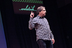
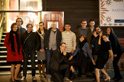
I spent most of February on the far side of the world. I had the great honour and pleasure of speaking at Webstock in New Zealand.
This conference's reputation had preceded it. I had heard from many friends who have spoken in previous years that the event is great and that the organisers really know how to treat their speakers. I can confirm that both assertions are absolutely true. Jessica and I were treated with warmth and affection, and the whole conference was a top-notch affair.
I gave a new talk called Of Time and the Network taking a long-zoom look at how our relationship with time has changed as our communications networks have become faster and faster. That's a fairly pretentious premise but I had a lot of fun with it. I'm pretty pleased with how it turned out, although maybe the ending was a little weak. The video and audio should be online soon so you can judge for yourself (and I'll be sure to get the talk transcribed and published in the articles section of this site).
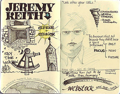
Perhaps it was because I was looking for the pattern, but I found that a number of the other talks were also taking a healthy long-term view of the web. Matt's talk in particular—Lessons from a 40 Year Old—reiterated the importance of caring for URLs.
Wilson reprised his Build talk, When We Build, the title of which is taken from John Ruskin's Lamp of Memory:
When we build, let us think that we build forever.
Let it not be for present delight nor for present use
alone. Let it be such work as our descendants will
thank us for; and let us think, as we lay stone on
stone, that a time is to come when those stones
will be held sacred because our hands have
touched them, and that men will say, as they look
upon the labor and wrought substance of them,
"See! This our father did for us."
Another recurring theme was that of craft …which is somewhat related to the theme of time (after all, craftsmanship takes time). Erin gave a lovely presentation, ostensibly on content strategy but delving deeply into the importance of craft, while Jessica, Adam and Michael gave us insights into their respective crafts of lettering and film-making.
All in all, it was a great event—although the way the schedule split into two tracks in the middle of the day led to the inevitable feelings of fomo.
Matt wrote about his Webstock experience when he got back home:
It was easily the best speaking gig I've ever had. I'm planning on making this conference a regular visit in the future (as an attendee) and I urge anyone else (especially in America) that has yearned for a top-quality, well-run technology conference in a place you've always wanted to visit to do the same.
Tagged with
webstock
conference
speaking
February 2, 2012
Image-y nation
There's a great article by Wilto in the latest edition of A List Apart. It's called Responsive Images: How they Almost Worked and What We Need.
What all I really like about the article is that it details the the thought process that went into trying working out responsive images for the Boston Globe. Don't get me wrong: I like it when articles provide code, but I really like it when they provide an insight into how the code was created.
The Filament Group team working on the Boston Globe site were attempting to abide by the two rules of responsive images that I've outlined before:
The small image should be default.
Don't load images twice (in other words, don't load the small images and the larger images).
There are three reasons for this: performance, performance, performance. As Luke put it so succinctly:
Being a Web designer & not considering speed/performance is like being a print designer & not considering how your colors will print.
That said, I came across a situation recently where loading both images for desktop browsers could actually be a pretty good thing to do.
Wait, wait! Here me out…
Okay, so the way that many of the responsive image techniques work is by means of a cookie. The basic challenge of responsive images is for the client to communicate with the server (and let it know the viewport size) before the server starts sending images. Because cookies can be used both by the client and the server, they offer a way to do that:
As the document begins to load, set a cookie on the client side with JavaScript recording the viewport width.
On the server side, when an image is requested, check for the contents of that cookie and serve up the appropriate image for the viewport size.
There are some variations on this: you could initially route all image requests to send back a 1x1 pixel blank .gif and then, after the page has loaded, use JavaScript to load in the appropriate image for the viewport size.
That's the theory anyway. As Mat outlined in his article, there's a bit of a race condition with the cookie being set by the client and the images being sent from the server. New browsers are doing some clever pre-fetching of images. That means they fetch the small images first, violating the second rule of responsive images.
But, like I said, in some situations that might not be so bad…
Josh is working on a responsive project at Clearleft right now—and doing a superb job of it—where he's deliberately cutting the server-side aspect of responsive images out of the picture. He's still starting with the small (mobile) images by default and then, after the page has loaded, swaps them out with JavaScript if the viewport is wide enough.
Suppose the small image is 20K and the large image is 60K. That means that desktop browsers are now loading 80K of images (instead of 60). On the face of it, this sounds like really bad news for performance… but because that extra 60K is being downloaded after the page has downloaded, the perceived performance isn't bad at all. In fact, the experience feels quite snappy. Here's what happens:
The markup contains the small image as well as some kind of indication where the larger size resides (either in a query string or in a data- attribute):
[image error]

That's about 240 by 180 pixels. Now for the large-screen layout, we want those pictures to be more like 500 by 375 pixels:
@media screen and (min-width: 50em) {
.photo {
width: 500px;
height: 375px;
}
}
That results in a "blown up" pixely image.
Once the page has loaded, that small image is swapped out for the larger image specified in the data- attribute.

Large-screen browsers have now downloaded 20K more than they actually needed but the perceived performance of the page was actually pretty snappy:
Blown-up pixely images act as placeholders while the page is downloading.
Once the page has loaded, the full-sized images snap into place.
Does that sound familiar? This is exactly what the lowsrc did.
I'm probably showing my age by even acknowledging the existence of lowsrc. It was a proprietary attribute created by Netscape back in the days of universally scarce bandwidth:
[image error]
(See how I'm using unquoted attributes and uppercase tags and attributes for added nostalgic value?)
The lowsrc value would usually be a monochrome version of the image in the src attribute.

And we only had 256 colours to play with. You tell that to the web developers today …they wouldn't believe you.
Seriously though, it's funny how problems from the early days of the web have a habit of resurfacing. I remember when Ajax was getting popular, all the problems associated with frames rose from the grave: bookmarking, breaking the back button, etc. Now that we're in a time of small-screen devices on low-bandwidth networks, we're rediscovering a lot of the same issues we had when we were developing for 640 pixel wide screens with 28K or 56K modems.
Ultimately, I think that what the great brainstorming around fixing the problems with the img element shows a fundamental impedance mismatch between the fluid nature of the web and the fixed pixel-based nature of bitmap images. We've got ems for setting type and percentages for specifying the proportions of our grids, but when it comes to photographic images, all we've got is the pixel—a unit that makes less and less sense every day.
Tagged with
responsive
images
development
lowsrc
February 1, 2012
Publishing Paranormal Interactivity
I've published the transcript of a talk I gave at An Event Apart in 2010. It's mostly about interaction design, with a couple of diversions into progressive enhancement and personality in products. It's called Paranormal Interactivity.
I had a lot of fun with this talk. It's interspersed with videos from The Hitchhiker's Guide To The Galaxy, Alan Partridge, and Super Mario, with special guest appearances from the existentialist chalkboard and Poshy's upper back torso.
If you don't feel like reading it, you can always watch the video or listen to the audio.
Adactio: Articles—Paranormal Interactivity on Huffduffer
You could even look at the slides but, as I always say, they won't make much sense without the context of the presentation.
Tagged with
transcript
conference
presentation
aea
aneventapart
aea2010
interaction
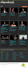
dConstruct Audio Archive
Clearleft has been running dConstruct since 2005. You can still visit the site for each year:
2005
2006
2007
2008
2009
2010
2011
Right from the first event, we recorded and released a podcast of the talks—thanks to Drew's l33t audio skillz—and all of those audio files are still online. That's quite a collection of aural goodies. So we decided to put them all together in one place. I give you…
Michelle came up with the visual design—evolving it from last year's dConstruct site—while I worked on the build. The small-screen and large-screen layouts were designed simultaneously and then I took a small-screen first approach to building it, progressively layering on the wider layouts and tweaking for the in-between states that didn't have mock-ups. It was a lot of fun.


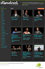
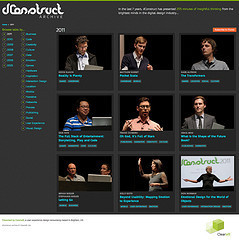
There's nothing very complicated going on in the back end. I'm just using a JSON file to store all the info about the talks and I'm piggybacking on the dConstruct Huffduffer account to offer up podcast feeds by year and by category. The categories are fairly arbitrary and unscientific but they give a good indication of the kind of topics that dConstruct speakers have covered over the years …and you can see the trend of each topic over time in a sparkline on each category page, generated by Google's Chart API.
One tricky challenge was figuring out how to handle the images of speakers to make them responsive. Initially I was looking at Andy's context-aware responsive images because the small-screen single-column layout often displayed wider images than on a larger screen's multiple-column layout. In the end though, I decided that my time would be better spent optimising the images for every screen by getting the file sizes as low as I could so I spent a lot of time in Photoshop blurring backgrounds and messing with export settings. So while the images are all 450 pixels wide by 300 pixels tall, the average file size is around 20K. That's not ideal for small-screen, low-bandwidth devices that are squishing the images down but I figured it was a good start.
There's still lots more I'd like to tweak (I need to add links to slides, transcripts and videos where available) but rather than wait for everything to be perfect, I thought I might as well launch it now and continue to work on it.
So feel free to explore the archive, find some talks you like, subscribe to a podcast of your liking or huffduff anything that catches your ear.
And if listening to all the previous talks piques your interest, you'll be happy to that dConstruct will be back this year …and it's going to be splendid!
Tagged with
dconstruct
audio
responsive
design
January 31, 2012
Brighton Coffee
We've had a new intern at Clearleft for the past few weeks: Alex Jones. He likes a good coffee and as it's his first time in Brighton, I promised I'd tell him where he could find the best flat whites. So I made a map tale of Brighton Coffee.
January 30, 2012
Detection
When I wrote about responsible responsive images a few months back, I outlined my two golden rules when evaluating the various techniques out there:
The small image should be default.
Don't load images twice (in other words, don't load the small images and the larger images).
I also described why that led to my dissatisfaction with most server-side device libraries for user-agent sniffing:
When you consider the way that I'm approaching responsive images, those libraries are over-engineered. They contain a massive list of mobile user-agent strings that I'll never need. Remember, I'm taking a mobile-first approach and assuming a mobile browser by default. So if I'm going to overturn that assumption, all I need is a list of desktop user-agent strings.
I finished by asking:
Anybody fancy putting it together?
Well, it turns out that Brett Jankord is doing just that with a device-detection script called Categorizr:
Instead of assuming the device is a desktop, and detecting mobile and tablet device user agents, Categorizr is a mobile first based device detection. It assumes the device is mobile and sets up checks to see if it's a desktop or tablet. Desktops are fairly easy to detect, the user agents are known, and are not changing anytime soon.
It isn't ready for public consumption yet and there are plenty of known issues to iron out first, but I think the fundamental approach is spot-on:
By assuming devices are mobile from the beginning, Categorizr aims to be more future friendly. When new phones come out, you don't need to worry if their new user agent is in your device detection script since devices are assumed mobile from the start.
Tagged with
mobilefirst
futurefriendly
ffly
device
detection
categorizr
Making
There's definitely something stirring in the geek zeitgeist: something three-dimensional.
Tim Maly just published an article in Technology Review called Why 3-D Printing Isn't Like Virtual Reality:
Something interesting happens when the cost of tooling-up falls. There comes a point where your production runs are small enough that the economies of scale that justify container ships from China stop working.
Meanwhile The Atlantic interviewed Brendan for an article called Why Apple Should Start Making a 3D Printer Right Now:
3D Printing is unlikely to prove as satisfying to manual labor evangelists as an afternoon spent with a monkey wrench. But by bringing more and more people into the innovation process, 3D printers could usher in a new generation of builders and designers and tinkerers, just as Legos and erector sets turned previous generations into amateur engineers and architects.
Last month Anil Dash published his wishlist for the direction this technology could take: 3D Printing, Teleporters and Wishes:
Every 3D printer should seamlessly integrate a 3D scanner, even if it makes the device cost much more. The reason is simple: If you set the expectation that every device can both input and output 3D objects, you provide the necessary fundamentals for network effects to take off amongst creators. But no, these devices are not "3D fax machines". What you've actually made, when you have an internet-connected device that can both send and receive 3D-printed objects, is a teleporter.
Anil's frustrations and hopes echo a white paper from 2010 by Michael Weinberg called It Will Be Awesome if They Don't Screw it Up: 3D Printing, Intellectual Property, and the Fight Over the Next Great Disruptive Technology:
The ability to reproduce physical objects in small workshops and at home is potentially just as revolutionary as the ability to summon information from any source onto a computer screen.
Michael Weinberg also appears as one of the guests on an episode ABC Radio's Future Tense along with Tom Standage, one of my favourite non-fiction authors.
But my favourite piece of speculation on where this technology could take us comes from Russell Davies. He gave an excellent talk as part of the BBC's Four Thought series in which he talks not so much about The Internet Of Things, but The Geocities Of Things. I like that.
BBC - Podcasts - Four Thought: Russell M. Davies 21 Sept 2011 on Huffduffer
It's a short talk. Take the time to listen to it, then go grab a copy of Cory Doctorow's book Makers and have a poke around Thingiverse
Tagged with
3dprinting
hacking
January 29, 2012
Eighteen
On Twitter the other day, Justin Hall wrote:
hah! 18 years ago today, I posted my home page on the public web; here's a 27 January 1994 version bit.ly/AraMW0
Eighteen years! That's quite something. For reference, Justin's site links.net is generally acknowledged to be the web's first blog, before John Barger coined the term "weblog" (or Peter coined the more common contraction).
If you go right back to the start of links.net, Justin explains that he was inspired to start publishing online by a 1993 article in the New York Times—he has kept a copy on his site. What's fascinating about the article is that, although it's talking about the growth of the World Wide Web, it focuses on the rising popularity of Mosaic:
A new software program available free to companies and individuals is helping even novice computer users find their way around the global Internet, the network of networks that is rich in information but can be baffling to navigate.
From a journalistic point of view, this makes a lot of sense: focusing on the interface to the web, rather than trying to explain the more abstract nature of the web itself is a good human-centric approach. When the author does get around to writing about the web, there's a lot that must be explained for the audience of the time:
With hypertext, highlighted key words and images are employed to point a user to related sources of information.
"I realized that if everyone had the same information as me, my life would be easier," Mr. Berners-Lee said.
From a small electronic community of physicists, the World-Wide Web has grown into an international system of data base "server" computers offering diverse information.
Links, servers, the World Wide Web …these were actually pretty tricky concepts to explain, and unlikely to elicit excitement. But explaining the browser gets straight to the heart of how it felt to surf the web:
Mosaic lets computer users simply click a mouse on words or images on their computer screens to summon text, sound and images from many of the hundreds of data bases on the Internet that have been configured to work with Mosaic.
Click the mouse: there's a NASA weather movie taken from a satellite high over the Pacific Ocean. A few more clicks, and one is reading a speech by President Clinton, as digitally stored at the University of Missouri. Click-click: a sampler of digital music recordings as compiled by MTV. Click again, et voila: a small digital snapshot reveals whether a certain coffee pot in a computer science laboratory at Cambridge University in England is empty or full.
These days we take it for granted that we have the ability to surf around from website to website (and these days we do so on many more devices). I think it's good to remember just how remarkable that ability is.
Thanks, Tim Berners-Lee for dreaming up the web. Thanks, Marc Andreessen for giving us a tool to navigate the web. Thanks, Justin Hall for publishing on the web.
Tagged with
web
history
blogging
publishing
January 26, 2012
Cool your eyes don't change
At last November's Build conference I gave a talk on digital preservation called All Our Yesterdays:
Our communication methods have improved over time, from stone tablets, papyrus, and vellum through to the printing press and the World Wide Web. But while the web has democratised publishing, allowing anyone to share ideas with a global audience, it doesn't appear to be the best medium for preserving our cultural resources: websites and documents disappear down the digital memory hole every day. This presentation will look at the scale of the problem and propose methods for tackling our collective data loss.
The audio has been huffduffed.
Adactio: Articles—All Our Yesterdays on Huffduffer
I've published a transcription over in the "articles" section.
I blogged a list of relevant links shortly after the presentation.
You can also download the slides or view them on speakerdeck but, as usual, they won't make much sense out of context.
I hope you'll enjoy watching or reading or listening to the talk as much as I enjoyed presenting it.
Tagged with
buildconf
conference
belfast
digital
preservation
transcript
video
audio
presentation
Jeremy Keith's Blog

- Jeremy Keith's profile
- 56 followers

