
Jeremy Keith's Blog, page 137
May 16, 2012
Secret src
There’s been quite a brouhaha over the past couple of days around the subject of standardising responsive images. There are two different matters here: the process and the technical details. I’d like to address both of them.
Ill communication
First of all, there’s a number of very smart developers who feel that they’ve been sidelined by the WHATWG. Tim has put together a timeline of what happened:
Developers got involved in trying to standardize a solution to a common and important problem.
The WHATWG told them to move the discussion to a community group.
The discussion was moved (back in February), a general consenus (not unanimous, but a majority) was reached about the picture element.
Another (partial) solution was proposed directly on the WHATWG list by an Apple employee.
A discussion ensued regarding the two methods, where they overlapped, and how the general opinions of each. The majority of developers favored the picture element and the majority of implementors favored the srcset attribute.
While the discussion was still taking place, and only 5 days after it was originally proposed, the srcset attribute (but not the picture element) was added to the draft.
A few points in that timeline have since been clarified. That second step—“The WHATWG told them to move the discussion to a community group”—turns out to be untrue. Some random person on the WHATWG mailing list (which is open to everyone) suggested forming a Community Group at the W3C. Alas, nobody else on the WHATWG mailing list corrected that suggestion.
Then there’s apparent causality between step 4 and 6. Initially, I also assumed that this was what happened: that Ted had proposed the srcset solution without even being aware of the picture solution that the Community Group had independently come up with it. It turns out that’s not the case. Ted had another email about the picture proposal but he never ended up sending it. In fact, his email about srcset had been sitting in draft for quite a while and he only sent it out when he saw that Hixie was finally collating feedback on responsive images.
So from the outside it looked like there was preferential treatment being given to Ted’s proposal because it came from within the WHATWG. That’s not the case, but it must be said: the fact that srcset was so quickly added to the spec (albeit in a different form) doesn’t look good. It’s easy to understand why the smart folks in the Responsive Images Community Group felt miffed.
But let’s be clear: this is exactly how the WHATWG is supposed to work. Use-cases are evaluated and whatever Hixie thinks is best solution gets put in the spec, regardless of how popular or unpopular it is.
Now, if that sounds abhorrent to you, I completely understand. A dictatorship should cause us to recoil.
That’s where the W3C come in. Their model is completely different. Everything is done by committee there.
Steve Faulkner chimed in on Tim’s post with his take on the two groups:
It seems like the development of HTML has turned full circle, the WHATWG was formed to overthrow the hegemony of the W3C, now the W3C acts as a counter to the hegemony of the WHATWG.
I think he’s right. The W3C keeps the rapid, sometimes anarchic approach of the WHATWG in check. But the opposite is also true. Without the impetus provided by the WHATWG, I’m not sure that the W3C HTML Working Group would ever get anything done. There’s a balance that actually works quite well in practice.
Back to the situation with responsive images…
Unfortunately, it appears to people within the Responsive Images Community Group that all their effort was wasted because their proposed solution was summarily rejected. In actuality all the use-cases they gathered were immensely valuable. But it’s certainly true that the WHATWG didn’t make it clearer how and where developers could best contribute.
Community Groups are a W3C creation. They don’t have anything to do with the WHATWG, who do all their work on their own mailing list, their own wiki and their own IRC channel.
I do think that the W3C Community Groups offer a good place to go bike-shedding on problems. That’s a term that’s usually used derisively but sometimes it’s good to have a good ol’ bike-shedding without clogging up the mailing list for everyone. But it needs to be clear that there’s a big difference between a Community Group and a Working Group.
I wish the WHATWG had done a better job of communicating to newcomers how best to contribute. It would have avoided a lot of the frustrations articulated by Wilto:
Unfortunately, we were laboring under the impression that Community Groups shared a deeper inherent connection with the standards bodies than it actually does.
But in any case, as Doctor Bruce writes at least know there’s a proposed solution for responsive images in HTML: The Living Standard:
I don’t really care which syntax makes the spec, as long as it addresses the majority of use cases and it is usable by authors. I’m just glad we’re discussing the adaptive image problem at all.
So let’s take a look at the technical details.
src code
The Responsive Images came up with a proposal based off the idea of minting a new element, called say picture, that mimics the behaviour of video
[image error]
One of the reasons why a new element was chosen rather than extending the existing img element was due to a misunderstanding. The WHATWG had explained that the parsing of img couldn’t be easily altered. That means that img must remain a self-closing element—any solution that requires a closing /img tag wouldn’t work. Alas, that was taken to mean that extending the img element in any way was off the cards.
The picture proposal has a number of things going for it. Its syntax is easily understandable for authors: if you know media queries, then you know how to use picture. It also has a good fallback for older browsers : a regular img element. This fallback mechanism (and the idea of multiple source elements with media queries) is exactly how the video element is specced.
Unfortunately using media queries on the sources of videos has proven to be very tricky for implementors, so they don’t want to see that pattern repeated.
Another issue with multiple source elements is that parsers must wait until the closing /picture tag before they can even begin to evaluate which image to show. That’s not good for performance.
So the alternate solution, based on Ted’s proposal, extends the img element using a new srcset attribute that takes a comma-separated list of values:
[image error]
Not nearly as pretty, I think you’ll agree. But it is actually nice and compact for the “retina display” use-case:
[image error]
Just to be clear, that does not mean that otherimage.png is twice the size of image.png (though it could be). What you’re actually declaring is “Use image.png unless the device supports double-pixel density, in which case, use otherimage.png.”
Likewise, when I declare:
srcset="/path/to/image.png 600w 400h"
…it does not mean that image.png is 600 pixels wide by 400 pixels tall. Instead, it means that an action should be taken if the viewport matches those dimensions.
It took me a while to wrap my head around that distinction: I’m used to attributes describing the element they’re attached to, not the viewport.
Now for the really tricky bit: what do those numbers—600w and 400h—mean? Currently the spec is giving conflicting information.
Each image that’s listed in the srcset comma-separated list can have up to three values associated with it: w, h, and x. The x is pretty clear: that’s the pixel density of the device. The w and h values refer to the width and height of the viewport …but it’s not clear if they mean min-width/height or max-width/height.
If I’m taking a “Mobile First” approach to development, then srcset will meet my needs if w and h refer to min-width and min-height.
In this example, I’ll just use w to keep things simple:
[image error]
(Expected behaviour: use small.png unless the viewport is wider than 600 pixels, in which case use medium.png unless the viewport is wider than 800 pixels, in which case use large.png).
If, on the other hand, w and h refer to max-width and max-height, I have to take a “Desktop First” approach:
[image error]
(Expected behaviour: use large.png unless the viewport is narrower than 800 pixels, in which case use medium.png unless the viewport is narrower than 600 pixels, in which case use small.png).
One of the advantages of media queries is that, because they support both min- and max- width, they can be used in either use-case: “Mobile First” or “Desktop First”.
Because the srcset syntax will support either min- or max- width (but not both), it will therefore favour one case at the expense of the either.
Both use-cases are valid. Personally, I happen to use the “Mobile First” approach, but that doesn’t mean that other developers shouldn’t be able to take a “Desktop First” approach if they want. By the same logic, I don’t much like the idea of srcset forcing me to take a “Desktop First” approach.
My only alternative, if I want to take a “Mobile First” approach, is to duplicate image paths and declare ludicrous breakpoints:
[image error]
I hope that this part of the spec offers a way out:
for the purposes of this requirement, omitted width descriptors and height descriptors are considered to have the value “Infinity”
I think that means I should be able to write this:
[image error]
It’s all quite confusing and srcset doesn’t have anything approaching the extensibility of media queries, but I hope we can get it to work somehow.
Tagged with
responsive
images
standards
browsers
whatwg
w3c
process
markup
html
adaptive


May 4, 2012
Your local mobile device lab
Last week I described how I go about getting hold of mobile devices to test with at Clearleft. I finished by throwing open the door to any other web devs in Brighton who want to test on our devices:
We’ve always had an open-door policy here, so if you want to pop around, use our WiFi, and test on our devices, you’re more than welcome.
There was a great response from my fellow Brightonians offering to add some of their devices to the collection:
@adactio I have a Nokia N9 and a 3GS that I can share, if it’d be ok to leave them there?
— Aegir Hallmundur (@aegirthor) April 30, 2012
@adactio @clearleft I’ve got a few phones that you don’t that I’m happy to leave in your capable hands. WP7, B2G, etc
— Remy Sharp (@rem) April 30, 2012
Aegir popped ‘round yesterday and dropped off an iPhone 3GS and a very cute Nokia N9.
This morning I arrived in to the office to find that Aron had dropped off a Samsung Galaxy Tab.
This is great! Just by opening up the testing suite to everyone, it has now expanded beyond what I had been able to gather together by myself.
Josh has put together a page on the Clearleft site that we’ll keep updated with a list of the devices we’ve got.
We’ve ordered some nice stands for the phones so that we can clear away some of the cable clutter. We don’t want the experience of testing to be any more unpleasant than it needs to be. To that end, I’ve installed Adobe Shadow on the iOS and Android devices.
If you want to test a site that isn’t live yet, I find that services like showoff.io and localtunnel are handy for previewing local sites. Do bear in mind that these devices are intended for testing websites: if you want to install apps or update software, sorry; that’s not what the test lab is for.
If you’re based in Brighton, pop ‘round whenever you want to use our devices.
If you’re not based in Brighton, maybe you could kick-start a similar sharing scheme with a local company or co-working space. Belfast, Bristol, Manchester, Birmingham …you’ve got loads of smart geeks and I bet they’ve got plenty of devices they could be sharing.
There are potential pitfalls to opening up a testing suite like this. What about the insurance? What about theft? What about breakage? But the thing about potential pitfalls is that they’re just that: potential. I’m treating all of them as YAGNI issues. I’ll address any problems if and when they occur rather than planning for worst-case scenarios.
“What’s the worst that could happen?” is really only valuable as a rhetorical question.
May 2, 2012
Questions for Mobilism
I’m going to Amsterdam next week for the Mobilism conference. Bizarrely, there are still tickets available. I say “bizarrely” because it’s such an excellent event—it’s like the European equivalent of the Breaking Development conference.
Don’t worry; I won’t be giving a presentation. I’ll leave that to experts like Remy, Lyza, Brad, and Jake. But I will be getting up on the stage. I’m going to moderating not one, but two, panels. I think it’s going to be fun.
We’ll be reprising the Mobile Browser panel from last year. Once again, there will be representatives from Opera, RIM, and Nokia. This year Google is also joining the line-up. As usual, Apple will not be present.
The new addition to the schedule is a panel on device and network APIs. I will be playing the part of a curious but clueless web developer interested in such things …because, well, that’s what I am.
I plan to open up both panels to questions from the audience. While I don’t quite fall into Cennydd’s camp, it would be great if more people would read this article on how to ask a question:
You have not been invited to give a speech. Before you stand up, boil your thoughts down to a single point. Then ask yourself if this point is something you want to assert or something you want to find out. There are exceptions, but if your point falls into the category of assertion, you should probably remain seated.
But I’m not planning to leave the questions entirely to the people in the room. Just as I did last year, I’d like to ask you to tell me what topics are burning in your mind when it comes to mobile browsers or device APIs.
Comments are open for one week. Let fly with your questions.
Tagged with
mobilism
conference
panel
questions
event
May 1, 2012
dConstruct optimisation
When I was helping Bevan with making the dConstruct site, I kept banging on to him about the importance of performance.
Don’t get me wrong: I wanted the site to look great, but I also very much wanted it to feel great …and nothing affects the feel of a site (the user’s experience, if you will) more than performance. As Jason wrote:
If you could only do one thing to prepare your desktop site for mobile and had to choose between employing media queries to make it look good on a mobile device or optimizing the site for performance, you would be better served by making the desktop site blazingly fast.
And yet this fundamental aspect of how performant a site is going to be is all too often left until the development phase. I’d really like to see it taken into account much earlier on, during the UX and visual design phases.
Anyway, as the dConstruct site came together, I just kept asking “What would Steve Souders do?”
For a start, that meant ripping out any boilerplate markup and CSS that was there “just in case.” I very much agree with Rachel when she says stop solving problems you don’t yet have. But one of the areas where the unfortunately-named HTML5 Boilerplate excels is in its suggestions for .htaccess rules so I made sure to rip off the best bits.
Initially jQuery was being included, but given how far browsers have come in their JavaScript support, I was able to ditch it and streamline the JavaScript a bit.
Wherever possible, I made sure that background images in CSS were Base64 encoded as data URIs; icons, textures, and the like. That helped to reduce the number of HTTP requests—one of the easy wins for improving performance.
I’ve already mentioned the conditional loading that’s going on.
Then there’s the thorny issue of responsive images. The dConstruct 2012 site is similar to the dConstruct archive in that there is no correlation between browser width and image: quite often, a smaller image is required for wider screens than for narrower viewports because of the presence of a grid. So instead of trying to come up with some complex interplay of client and server cross-communication to figure out which size image would be appropriate to serve up, I instead took the same approach as I did for the archive site: optimise the hell out of images, regardless of whether they’re going to be viewed in a desktop or a mobile device.
Take a look at the original image of Kevin Slavin compared to the version that appears on the dConstruct archive.

See how everything except the face is so much blurrier in the final version? That isn’t just an attempt to introduce some cool bokeh. It makes for much smaller JPGs with fewer jaggy artefacts. And because human beings tend to focus on other human faces, the technique isn’t really consciously noticeable (although you’ll notice it now that I’ve pointed it out to you).
The design of the 2012 dConstruct site called for monochrome images with colour filters applied.

That turned out to be a fortunate boon for optimising the images. This time we were using PNGs rather than JPGs and we were able to get the number of colours down to 32 or even 16. Run them through Image Optim or Smushit and you can squeeze even more bytes out of them.
The funny thing is that sweating the file sizes of images used to be part and parcel of web development. Back in the nineties, there was something of an aesthetic that grew out of the need to optimise images with limited (web-safe!) colour palettes. That was because bandwidth was at a premium and you could be pretty sure that plenty of people were accessing your site on slow connections.
Well, here we are fifteen years later and thanks to the rise of mobile, bandwidth is once again at a premium and we can be pretty sure that plenty of people are accessing our sites on slow connections. Yet again, mobile is highlighting issues that were always there. When did we get so lazy and decide it was acceptable to send giant unoptimised images down the pipe to our long-suffering visitors?
Mathew Pennell recently wrote:
…it’s certainly true that the golden rule I grew up with – no page should ever be over 100Kb – has long since been mothballed.
But why? That seems like a perfectly good and still-relevant rule to me.
Alas, on the dConstruct site I wasn’t able to hit that target. With an unprimed cache, the home page comes in at around 300K (it’s 17K with a primed cache). By far the largest file is the CSS, weighing at 113K, followed by the web font, Futura bold oblique, at 32K.
By the way, when it comes to analysing performance in the browser, this missing manual for the Webkit inspector is really, really handy. I also ran the site through Google Page Speed but it seems that the user-agent chooses an arbitrary browser width (960? 1024?) so some of the advice about scaling images needs to be taken with a pinch of salt when applied to responsive designs.
I took a look at some other conference sites too. The beautiful site for the Build conference comes in at just under a megabyte for the homepage—it has quite a few fonts and images. It also has a monochrome aesthetic going on so I suspect quite a few of those images could be squeezed down (and some far-future expiry dates would help for repeat visitors).
Then there’s site for this year’s Mobilism conference which is blazingly fast. The combined file size on the homepage isn’t that different to the dConstruct site (although the CSS is significantly smaller) and I suspect there’s some server-side wizardry going on. I’ll have to corner Stephen at the conference next week and quiz him about it.
For now, server-side performance optimisation is something beyond my ken. I should really do something about that, especially as I’m expecting the dConstruct site to take a hammering the day that tickets go sale (May 29th—save the date).
In the meantime, there’s still plenty I can do on the front end. As Bruce put it:
It seems to me that old-fashioned, oh-so-dull techniques might not be ready for retirement yet. You know: well-crafted HTML, keeping JavaScript for progressive enhancement rather than a pre-requisite for the page even displaying, and testing across browsers.
All those optimisation techniques we learned in the 90s—and even wacky ideas like lowsrc—are back in fashion. Everything old is new again.
Tagged with
performance
optimisation
development
images
responsive
April 30, 2012
Left to our own devices
In the final part of his series on responsive design in .net magazine, Paul talks about testing:
The key thing to remember here is that any testing is better than no testing. Build up a test suite as large as you can afford, and find opportunities to test on other devices whenever you can.
I agree wholeheartedly and I think that any kind of testing with real devices should be encouraged. I find it disheartening when somebody blogs or tweets about testing on a particular device, only to be rebuffed with sentiments like “it isn’t enough.” It’s true—it isn’t enough …but it’s never enough. And the fact that a developer is doing any testing at all is a good thing.
There are some good resources out there to help you get started in putting together a collection of test devices.
Testing for dummies is a great blog devoted specifically to testing responsive designs on mobile devices.
Luke gathered a number of links to device arsenals on this Bagcheck post.
Stephanie wrote about strategies for choosing test devices.
Actually, you should probably just read everything on Stephanie’s site: it’s all thoughtful and useful. In her post on the value of 1000 Androids she wrote:
The dirty little secret is that the more you test—the more accurately you will determine when it’s ok not to.
That’s crucial. I think there’s a common misunderstanding that testing on many different devices means developing for many different devices. Nothing could be further from the truth. Just as in the world of the desktop, we shouldn’t be developing for any specific devices or browsers. That’s why we develop with standards.
In fact I’ve found that one of the greatest benefits of testing on as many different platforms as possible is that it stops me from straying down the path of device-specific development. When I come across a problem in my testing, my reaction isn’t to think “how can I fix this problem on this particular device?”, which would probably involve throwing more code at it. Instead I think “how can I avoid this problem?” The particular device may have highlighted the issue, but there’s almost always a more fundamental problem to be tackled …and it’s very rarely tackled by throwing more code at it.
I wish I had more devices to test on …even if it might increase the risk of me getting reported to the police. At the same time, I realise that it’s a pretty crumby and expensive situation for developers, particularly freelancers. As Paul wrote:
Not only does it present a potential barrier to entry for anyone wanting to build responsive websites, but it encourages the purchase of yet more devices and gadgets.
I’ve been keeping my costs down by shopping in dodgy second-hand electronics shops that sell devices that have fallen off the back of a lorry. Most of them sell phones with a classification of A, B, or C. If something is labelled A, it is mint condition. If something is labelled C, there might be something wrong with it or you might not get all the cables or the box. But for my purposes, that’s absolutely fine. If anything, I’m usually hunting for outdated devices with older versions of operating systems.
So far I’ve got:
An HTC thingy running Windows Phone 7.5,
Another HTC thingy running Android 2.3.4,
A little Samsung running Android 2.2,
A Blackberry 9800 (Torch, right?),
A Blackberry Playbook,
A Kindle,
An iPod running iOS 3.1.3,
An iPad running iOS 5.something,
And I’ve got my own iPhone 4 and Kindle Touch.
I don’t know about you, but my eyes glaze over when it comes to phone models and operating system numbers, especially when they just end up . Luckily we’ve got people like PPK to help us figure out the smartphone browser landscape.
You’ll notice plenty of glaring omissions in my paltry list—there’s nary a Nokia device to be found—but I aim to plug those gaps as soon as I can.
In the meantime I’ve been setting up a desk at the Clearleft office for these devices so that they can stay charged up and within reach.
We’ve always had an open-door policy here, so if you want to pop around, use our WiFi, and test on our devices, you’re more than welcome. Give me some advance warning on Twitter and I can put the kettle on for a cup of tea. We’re at 28 Kensington Street, Suite 2.
Think of it as a quick’n’dirty, much smaller-scale version of Mobile Portland’s Device Lab.
Tagged with
testing
devices
mobile
responsive
development
April 27, 2012
Conditional CSS
I got some great comments on my post about conditionally loading content.
Just to recap, I was looking for a way of detecting from JavaScript whether media queries have been executed in CSS without duplicating my breakpoints. That bit is important: I’m not looking for MatchMedia, which involves making media queries in JavaScript. Instead I’m looking for some otherwise-useless CSS property that I can use to pass information to JavaScript.
Tantek initially suggested using good ol’ voice-family, which he has used for hacks in the past. But, alas, that unsupported property isn’t readable from JavaScript.
Then Tantek suggested that, whatever property I end up using, I could apply it to an element that’s never rendered: meta or perhaps head. I like that idea.
A number of people suggested using font-family, citing Foresight.js as prior art. I tried combining that idea with Tantek’s suggestion of using an invisible element:
@media screen and (min-width: 45em) {
head {
font-family: widescreen;
}
}
Then I can read that in JavaScript:
window.getComputedStyle(document.head,null).getPropertyValue('font-family')
It works! …except in Opera. Where every other browser returns whatever string has been provided in the font-family declaration, Opera returns the font that ends up actually getting used (Times New Roman by default).
I guess I could just wait a little while for Opera to copy whatever Webkit browsers do. (Ooh! Controversial!)
Back to the drawing board.
Stephanie suggested using z-index. I wouldn’t to do that in the body of my document for fear of screwing up any complex positioning I’ve got going on, but I could apply that idea to the head or a meta element:
@media screen and (min-width: 45em) {
head {
z-index: 2;
}
}
Alas, that doesn’t seem to work in Webkit; I just get back a value of auto (ironically, it works in Opera). Curses! It works fine if it’s applied to an element in the body but like I said, I’d rather not screw around with the z-indexing of page elements. Ironically, it works fine in Opera
A number of people suggested using generated content! “But how’s that supposed to work?” I thought. “I won’t be able to reference the generated DOM node from my JavaScript, will I?”
It turns out that I’m an idiot. That second argument in the getComputedStyle method, which I always just blindly set to null, is there precisely so that you can access pseudo-elements like generated content.
Dave McDermid, Aaron T. Grogg, Colin Olan, Elwin Schmitz, Emil, and Andy Rossi arrived at the solution roundabout the same time.
Here’s Andy’s write-up and code. His version uses transition events to fire the getComputedStyle check: probably overkill for what I want to do, but very smart thinking.
Here’s Emil’s code. I was initially worried about putting unnecessary generated content into the DOM but the display:none he includes should make sure that it’s never seen (or read by screenreaders).
I could just generate the content on the body element:
@media all and (min-width: 45em) {
body:after {
content: 'widescreen';
display: none;
}
}
It isn’t visible, but it is readable from JavaScript:
var size = window.getComputedStyle(document.body,':after').getPropertyValue('content');
And with that, I can choose whether or not to load some secondary content into the page depending on the value returned:
if (size == 'widescreen') {
// Load some more content.
}
Nice!
As to whether it’s an improvement over what I’m currently doing (testing for whether columns are floated or not) …probably. It certainly seems to maintain a nice separation between style and behaviour while at the same time allowing a variable in CSS to be read in JavaScript.
Thanks to everyone who responded. Much appreciated.
April 26, 2012
Fanfare for the common breakpoint
.net Magazine is running a series of articles on their site right now as part of their responsive week. There’s some great stuff in there: Paul is writing a series of articles—one a day—going step-by-step through the design and development of a responsive site, and Wilto has written a great summation of the state of responsive images.
There’s also an interview with Ethan in which he answers some reader-submitted questions. The final question is somewhat leading:
What devices (smartphones/tablets) and breakpoints do you typically develop and test with?
Ethan rightly responds:
Well, I’m a big, big believer of matching breakpoints to the design, not to individual devices. If we’re after more future-proof responsive designs, we should stop thinking in terms of ‘320px’, ‘480px’, ‘768px’, or whatever – the web’s so much more flexible than that, and those pixels are a snapshot of the web as we know it today. Instead, we should focus on breakpoints tailored to the design we’re working on.
He’s right. If we’re truly taking a Content First approach then we need to “Start designing from the content out, rather than the canvas in.”
If we begin with some specific canvases (devices), they’re always going to be arbitrary. There are so many different screen sizes and ratios out there that it doesn’t make sense to favour a handful of them out of tradition. 320, 480, 640 …those numbers aren’t any more special than any other screen widths.
But I now realise that I have been also been guilty of strengthening the hallowed status of those particular pixel widths. When I post screenshots to Flickr or include screenshots in presentations I automatically do what the Media Queries site does: I take snapshots at “traditional” widths like 320, 480, 640, 800, and 1024 pixels.
Physician, heal thyself.
So I’ve started taking screenshots at different widths. For the screenshots I posted of the new dConstruct site, I took a series of screenshots from 200 to 1200 pixels in increments of 100.


But really I should be illustrating the responsive nature of the design by taking screenshots at truly arbitrary widths: 173, 184, 398, 467, 543, 678, 832 …the sheer randomness of those kinds of numbers would better reflect the diversity of screen sizes out there.
Of course what I should really be doing is posting pictures of the website on actual devices.
I think our collective obsession with trying to nail down “common” breakpoints has led to a fundamental misunderstanding about the nature of responsive design: it’s not about what happens at the breakpoints—it’s about what happens between the breakpoints.
I think Jeffrey demonstrated this misunderstanding when he wrote about devices and breakpoints:
Of course, if breakpoints are dead, responsive design is dead, because responsive design relies on breakpoints both in creative workflow and as a key to establishing user-need-and-context-based master layouts, i.e. a minimal layout for the user with a tiny screen and not much bandwidth, a more fleshed-out one for the netbook user, and so on.
I was surprised that he suggested the long-term solution would be a shake-out of screen widths resulting in a de-facto standardisation:
But designers who persist in responsive or even adaptive design based on iPhone, iPad, and leading Android breakpoints will help accelerate the settling out of the market and its resolution toward a semi-standard set of viewports. This I believe.
I don’t think that will happen. If anything, I think we will see even more diversity in screen sizes and ratios.
But more importantly, I don’t think it’s desirable to have a “standard” handful of screen widths, any more than it’s desirable to have a single rendering engine in every browser (yes, I know some developers actually wish for that: they know not what they do).
I agree with Stephanie: diversity is not a bug …it’s an opportunity.
Tagged with
responsive
design
development
breakpoints
diversity
devices
mobile
mediaqueries
April 24, 2012
Conditionally loading content
Bevan did a great job on the dConstruct website. I tried to help him out along the way, which mostly involved me doing a swoop’n’poop code review every now and then.
I was particularly concerned about performance so I suggested base-64 encoding background images wherever possible and squeezing inline images through ImageOptim. I also spotted an opportunity to do a bit of conditional loading.
Apart from the home page, just about every other page on the site features a fairly hefty image in the header …if you view it in a wide enough browser window. If you’re visiting with a narrow viewport, an image like this would just interfere with the linearised layout and be an annoying thing to scroll past.
So instead of putting the image in the markup, I put a data-img attribute on the body element:
Then in a JavaScript file that’s executed after the DOM has loaded, I check to see if the we’re dealing with a wide-screen viewport or not. Now, the way I’m doing this is to check to see if the header is linearised or if it’s being floated at all—if it’s being floated, that means the layout styles within my media queries are being executed, ergo this is a wide-screen view, and so I inject the image into the header.
I could’ve just put the image in the markup and used display: none in the CSS to hide it on narrow screens but:
that won’t work for small-screen devices that don’t support media queries, and
the image would still be downloaded by everyone even if it isn’t displayed (a big performance no-no).
I’m doing something similar with videos.
If you look at a speaker page you’ll see that in the descriptions I’ve written, I link to a video of the speaker at a previous conference. So that content is available to everyone—it’s just a click away. On large viewports, I decided to pull in that content and display it in the page, kind of like I’m doing with the image in the header.
This time, instead of adding a data- attribute to the body, I’ve put in a div (with a class of “embed” and a data-src attribute) at the point in the document where I want to the video to potentially show up:
There are multiple video providers—YouTube, Vimeo, Blip—but their embed codes all work in much the same way: an iframe with a src attribute. That src attribute is what I’ve put in the data-src attribute of the embed div.
Once again, I use JavaScript after the DOM has loaded to see if the wide-screen media queries are being applied. This time I’m testing to see if the parent of the embed div is being floated at all. If it is, we must be viewing a widescreen layout rather than the linearised content. In that case, I generate the iframe and insert it into the div:
(function(win){
var doc=win.document;
if (doc.getElementsByClassName && win.getComputedStyle) {
var embed = doc.getElementsByClassName('embed')[0];
if (embed) {
var floating = win.getComputedStyle(embed.parentNode,null).getPropertyValue('float');
if (floating != 'none') {
var src = embed.getAttribute('data-src');
embed.innerHTML = '';
}
}
}
})(this);
In my CSS, I’m then using Thierry Koblentz’s excellent technique for creating intrinsic ratios for video to make sure the video scales nicely within its flexible container. The initial video proportion of 320x180 is maintained as a percentage: 180/320 = 0.5625 = 56.25%:
.embed {
position: relative;
padding-bottom: 56.25%;
height: 0;
}
.embed iframe {
position: absolute;
top: 0;
left: 0;
width: 100%;
height: 100%;
}
The conditional loading is working fine for the header images and the embedded videos, but I still feel a bit weird about testing for the presence of floating.
I could use matchMedia instead but then I’d probably have to use a polyfill (another performance hit), and I’d still end up maintaining my breakpoints in two places: once in CSS, and again in JavaScript. Likewise, if I just used documentElement.clientWidth, I’d have to declare my breakpoints twice.
Paul Hayes wrote about this issue a while back:
We need a way of testing media query rules in JavaScript, and a way of generating events when a new rule matches.
He came up with the ingenious solution of using transitionEnd events that are fired by media queries. The resulting matchMedia polyfill he made is very clever, but probably overkill for what I’m trying to do—I don’t really need to check for resize events for what I’m doing.
What I really need is some kind of otherwise-useless CSS declaration just so that I can test for it in JavaScript. Suppose there were a CSS foo declaration that I could use inside a media query:
@media screen and (min-width: 45em) {
body {
foo: bar;
}
}
…then in JavaScript I could test its value:
var foovalue = window.getComputedStyle(document.body,null).getPropertyValue('foo');
if (foovalue == 'bar') {
// do something
}
Of course that won’t work because foo wouldn’t be recognised by the browser so it wouldn’t be available to interrogate in JavaScript.
Any ideas? Maybe something like zoom:1 ? If you can think of a suitable CSS property that could be used in this way, leave a comment.
Of course, now that I’m offering you a textarea to fill in with your comments, you’re probably just going to use it to tell me what’s wrong with the JavaScript I’ve written …those “comments” might mysteriously vanish.
Tagged with
dconstruct2012
dconstruct
responsive
design
development
css
javascript
conditional
loading
April 23, 2012
Announcing dConstruct 2012
I was up in the big smoke last week for UX London. It was excellent: a thoroughly superb line-up of smart speakers and lovely attendees. Kate did a great job of making sure everything ran smoothly.
But there’s no rest for the wicked. With UX London done, Clearleft is gearing up for the other two events we’ve got lined up: Ampersand in June—there are still some tickets available—and dConstruct in September.
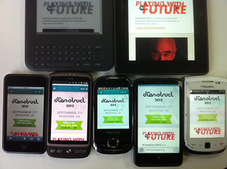
We sneakily soft-launched the dConstruct website while we were manning the front desk at UX London. It was put together by our current intern, Bevan Stephens, and as you can see, he’s done a superb job. I offered some guidance on the mobile-first approach which he implemented beautifully.
I’ll write some more later about some of the specifics of the site, but for now, I just want to say: check out that line-up!
Usually Andy is responsible for putting together the roster of speakers but this year it was my turn. It was a lot of work and I have a renewed appreciation for the great job Andy has done every year in putting together a kick-ass conference. I’ve always felt that one of the strengths of dConstruct is the way the day is curated.
There’s a lot to live up to: seven years worth of fantastic talks. But I couldn’t be happier about the line-up we’ve got for dConstruct 2012:
One of my favourite writers, Lauren Beukes; local genius Seb Lee-Delisle; brilliant London lads Tom Armitage and Ben Hammersley; my hero Jason Scott; brain-the-size-of-a-planet Scott Jenson; my super-smart friends Ariel Waldman and Jenn Lukas; and, wait for it …James. Fucking. Burke.
Your reaction to that last one will either be “who?” or “OMGWTFBBQ!” depending on your age and/or penchant for the greatest popular science television shows ever broadcast.
I realise it’s a very self-indulgent line-up—I’ve basically put together my wish list of the smartest, funniest, most eloquent people I know, but it’s all in service of the theme for this year: Playing With The Future.
(Yeah, I came up with that one. Can you tell?)
Lest there be any misunderstanding about the kind of event dConstruct 2012 will be, I’ve written a few words about what to expect:
The presentations may not contain any practical tips you can take back to work on Monday morning but you will gain insights into the direction our digital technology is taking. You might just find yourself showing up at work on Monday morning with an altered perspective on the world.
Tickets go on sale at the end of May. They’ll be a very affordable £130 plus VAT.
Oh, and did I mention the workshops that will precede the day of the conference? Ethan Marcotte, Remy Sharp, Lyza Danger Gardner, and Jonathan Snook: Kick. Ass!
I am so ridiculously excited. I cannot wait until September!
I hope to see you there.
April 21, 2012
AudioGO
You never forget your first DMCA takedown notice. In my case it was the Perfect Pitch incident, in which an incompetent business was sending out automatic takedown notices to Google for any website that contained a combination of the words Burge Pitch Torrent. That situation, which affected The Session, was resolved with an apology from the offending party.
Now I’ve received my second DMCA takedown notice. Or rather, my hosting company has. This time it involves Huffduffer.
When I created Huffduffer, I thought about offering hosting for audio files. One of the reasons I decided not to is because of the potential legal pitfalls. As it stands, Huffduffer is pretty much entirely text—it just links to audio files elsewhere on the web. That’s basically what an RSS enclosure is: another form of hypertext.
Linking is simply the act of pointing to a resource, and apart from a few extreme cases, it isn’t illegal.
Now it could be argued that pointing to an audio file on another site through a Flash player (or HTML5 audio element) is more like hotlinking with an img element than regular linking through an a element. The legal status of hotlinking isn’t quite as clear cut as plain ol’ linking, as explained on the Chilling Effects site:
When people complain about inline images, they are most often complaining about web pages that include graphics from external sources. The legal status of inlining images without permission has not been settled.
So the situation with inline audio is similarly murky.
Here’s the threatening email that was sent to the hosting company:
Notice of Copyright Infringement. {Our ref: [$#121809/228552]}
Sender: Robert Nichol
AudioGO Ltd
The Home of BBC Audiobooks
St James House, The Square, Lower Bristol Road
Bath
BA2 3BH
Phone number not available
Recipient: Rackspace Hosting
RE: Copyright Infringement.
This notice complies with the Digital Millennium Copyright Act (17 U.S.C. §512(c)(3))
I, Robert Nichol, swear under penalty of perjury that I am authorised to act on behalf of AudioGO Ltd, the owner(s) of the copyright or of an exclusive licence in the work(s) The Moving Finger by Agatha Christie BBC Audio.
It has come to my attention that the website huffduffer.com is engaged in the electronic distribution of copies of these works. It is my good faith belief that the use of these works in this manner is not authorised by the copyright owner, his agent or the law. This is in clear violation of United States, European Union, and International copyright law, and I now request that you expeditiously remove this material from huffduffer.com, or block or disable access to it, as required under both US and EU law.
The works are The Moving Finger by Agatha Christie BBC Audio.
The following URLs identify the infringing files and the means to locate them.
http://huffduffer.com/TimesPastOTR/68635 (IP: 67.192.7.4)
The information in this notice is accurate and I request that you expeditiously remove or block or disable access to all the infringing material or the entire site.
/Robert Nichol/
Robert Nichol
Wednesday April 18, 2012
Initially, my hosting company rebutted Robert Nichol’s claim but he’s not letting it go. He insists that the offending URL be removed or he will get the servers taken offline. So now I’ve been asked by my host to delete the relevant page on Huffduffer.
But the question of whether audio hotlinking counts as copyright infringement is a moot point in this case…
Go to the page in question. If you try to play the audio file, or click on the “download” link, you will find yourself at a 404 page. Whatever infringing material may have once been located at the end of the link is long gone …and yet AudioGO Ltd are still insisting that the Huffduffer page be removed!
Just to be clear about this, Robert Nichol is using the Digital Millennium Copyright Act—and claiming “good faith belief” while doing so—to have a site removed from the web that mentions the name of a work by his client, and yet that site not only doesn’t host any infringing material, it doesn’t even link to any infringing material!
It seems that, once again, the DMCA is being used in a scattergun approach like a machine-gun in the hands of a child. There could be serious repercussions for Robert Nichol in abusing a piece of legislation in this way.
If I were to remove the page in question, even though it just contains linkrot, it would set a dangerous precedent. It would mean that if someone else—like you, for instance—were to create a page that contains the text “Agatha Christie — The Moving Finger” while pointing to a dead link …well, your hosting company might find themselves slapped with a takedown notice.
In that situation, you wouldn’t be able to copy and paste this markup into your blog, Tumblr, Facebook, or Google+ page:
Agatha Christie — The Moving Finger
Remember: that link does not point to any infringing material. It points to nothing but a 404 page. There’s absolutely no way that you could have your site taken offline for pointing to a file that doesn’t exist, right?
That would be crazy.
Jeremy Keith's Blog

- Jeremy Keith's profile
- 56 followers

