
Jeremy Keith's Blog, page 133
October 21, 2012
Visionaries
In 2005 I went to South by Southwest for the first time. It was quite an experience. Not only did I get to meet lots of people with whom I had previously only interacted with online, but I also got to meet lots of lots of new people. Many of my strongest friendships today started in Austin that year.
Back before it got completely unmanageable, Southby was a great opportunity to mix up planned gatherings with serendipitous encounters. Lunchtime, for example, was often a chaotic event filled with happenstance: you could try to organise a small group to go to a specific place, but it would inevitably spiral into a much larger group going to wherever could seat that many people.
One lunchtime I found myself sitting next to a very nice gentleman and we got on to the subject of network theory. Back then I was very obsessed with small-world networks, the strength of weak ties, and all that stuff. I’m still obsessed with all that stuff today, but I managed to exorcise a lot my thoughts when I gave my 2008 dConstruct talk, The System Of The World. After giving that magnum opus, I felt like I had got a lot of network-related stuff off my chest (and off my brain).
Anyway, back in 2005 I was still voraciously reading books on the subject and I remember recommending a book to that nice man at that lunchtime gathering. I can’t even remember which book it was now—maybe Nexus by Mark Buchanan or Critical Mass by Philip Ball. In any case, I remember this guy making a note of the book for future reference.
It was only later that I realised that that “guy” was David Isenberg. Yes, that David Isenberg, author of the seminal Rise of the Stupid Network, one of the most important papers ever published about telecommunications networks in the twentieth century (you can watch—and huffduff—a talk he gave called Who will run the Internet? at the Oxford Internet Institute a few years back).
I was reminded of that lunchtime encounter from seven years ago when I putting together a readlist of visionary articles today. The list contains:
As We May Think by Vannevar Bush
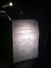
Information Management: A Proposal by Tim Berners-Lee (vague but exciting!)
Rise of the Stupid Network by David Isenberg
There’s Plenty of Room at the Bottom by Richard Feynman
The Coming Technological Singularity: How to Survive in the Post-Human Era by Vernor Vinge
There are others that should be included on that list but there’s are the ones I could find in plain text or HTML rather than PDF.
Feel free to download the epub file of those five articles together and catch up on some technology history on your Kindle, iPad, iPhone or other device of your choosing.
Tagged with
sxsw
sxsw2005
sxswi2005
austin
technology
readlist
history
networks
networking


October 17, 2012
Responsive readlist
I’m in Madison, Wisconsin where myself and Aaron are wrapping up three days of workshopping with Shopbop. It’s all going swimmingly.
This last of the three days is being spent sketching, planning and hacking some stuff together based on all the things that Aaron and I have been talking about for the first two days: progressive enhancement, responsive design, HTML5, JavaScript, ARIA …all the good stuff that Aaron packed into Adaptive Web Design.
We’re also assigning some homework: reading material for the Shopbop gang to read at their leisure after we have departed Madison. Aaron created a readlist called Adaptive Web Design and I’ve made a readlist called Responsive Enhancement.
Feel free to peruse the links contained therein and send them all to your Kindle or download them all as an epub file for the iPhone/iPad/Readmill/whatever.
Tagged with
readlist
responsive
reading
articles
workshop
madison
shopbob
October 5, 2012
iOS Six Fix
Last Christmas I gave you my bug report. Well, more of a whinge really. Scott put together a much better bug report and test page:
When the meta viewport tag is set to content=”width=device-width,initial-scale=1”, or any value that allows user-scaling, changing the device to landscape orientation causes the page to scale larger than 1.0. As a result, a portion of the page is cropped off the right, and the user must double-tap (sometimes more than once) to get the page to zoom properly into view.
Yes, it’s the old orientation and scale bug in Mobile Safari.
I’m pleased to report that as of iOS version 6, this bug seems to have finally been squashed. Hallelujah!
Given the relatively rapid upgrade path for iPhone, iPod Touch and iPad users, it won’t be long until we can remove our clever solutions for working around this problem.
Stand down, hackers, stand down. This bug has been taken care of.
October 4, 2012
To CERN with love
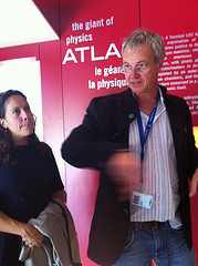
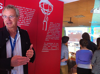
I went to Switzerland yesterday. More specifically, Geneva. More specifically, CERN. More specifically, ATLAS. Tireless Communications Officer Claudia Marcelloni went out of her way to make sure that I had a truly grand tour of life at CERN.
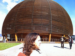
CERN is the ultimate area of overlap in the Venn diagram of geek interests: the place where the World Wide Web was invented while people were working on cracking the secrets of the universe.
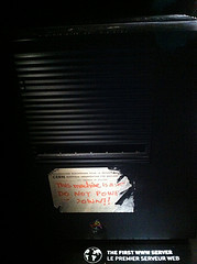
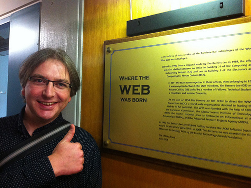
I saw the world’s first web server—Tim Berners-Lee’s NeXT machine. I saw the original proposal for the World Wide Web, complete with the note scribbled across the top “vague but exciting.”
But I understand what James meant when he described the whole web thing as a sideshow to the main event:
Because, you know the web is cool and all, but when you’re trying to understand the fundamental building blocks of the universe and constructing the single greatest scientific instrument of ours and perhaps any civilisation, the whole modern internet is a happy side effect, it is a nice to have.
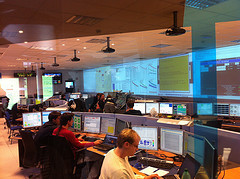
The highlight of my day was listening to Christoph Rembser geek out about his work: hunting for signs of elusive dark matter by measuring missing momentum when smashing particles together near the speed of light in a 27 kilometre wide massive structure 100 metres underneath France and Switzerland, resulting in incredible amounts of data being captured and stored within an unimaginably short timescale. Awesome. Literally, awesome.
But what really surprised me at CERN wasn’t learning about the creation of the web or learning about the incredible scientific work being done there. As a true-blooded web/science nerd, I had already read plenty about both. No, what really took me by surprise was the social structure at CERN.
According to most established social and economic theory, nothing should ever get done at CERN. It’s a collection of thousands of physics nerds—a mixture of theorists (the ones with blackboards) and experimentalists (the ones with computers). When someone wants to get something done, they present their ideas and ask for help from anyone with specific fields of expertise. Those people, if they like the sound of the idea, say “Okay” and a new collaboration is born.
That’s it. That’s how stuff gets done. It’s like a massive multiplayer hackday. It’s like the ultimate open source project (and yes, everything, absolutely everything, done at CERN is realised publicly). It is the cathedral and it is the bazaar. It is also the tower of Babel: people from everywhere in the world come to this place and collaborate, communicating any way they can. In the canteen, where Nobel prize winners sit with students, you can hear a multitude of accents and languages.
CERN is an amazing place. These thousands of people might be working on completely different projects, but there’s a shared understanding and a shared ethos amongst every one of them. That might sound like a flimsy basis for any undertaking, but it works. It works really, really well. And this isn’t just any old undertaking—they’re not making apps or shipping consumer products—they’re working on the most important questions that humans have ever attempted to answer. And they’re doing it all within a framework that, according to conventional wisdom, just shouldn’t work. But it does work. And that, in its own way, is also literally awesome.
Christoph described what it was like for him to come to CERN from Bonn, the then-capital of West Germany. It was 1989, a momentous year (and not just because Tim Berners-Lee wrote Information Management: A Proposal). Students were demonstrating and dying in Tiananmen Square. The Berlin wall was coming down (only later did I realise that my visit to CERN took place on October 3rd, Tag der Deutschen Einheit). At CERN, Christoph met Chinese students, Russian scientists, people from all over the world transcending their political differences to collaborate on truly fundamental questions. And he said that when people returned to their own countries, they surely carried with them some of that spirit that they had experienced together at CERN.
Compared to the actual work going on at CERN, that idea is a small one. It may not be literally awesome …but it really resonated with me.
I think I understand a little better now where the web comes from.
October 2, 2012
Scrollin’, scrollin’, scrollin’
A few weeks ago, when I changed how the front page of this site works, I wrote about “streams”, infinite scrolling, and the back button:
Anyway, you’ll notice that the new home page of adactio.com is still using pagination. That’s related to another issue and I suspect that this is the same reason that we haven’t seen search engines like Google introduce stream-like behaviour instead of pagination for search results: what happens when you’ve left a stream but you use the browser’s back button to return to it?
In all likelihood you won’t be returned to the same spot in the stream that were in before. Instead you’re more likely to be dumped back at the default list view (the first ten or twenty items).
That’s exactly what Kyle Kneath is trying to solve with this nifty experiment with infinite scroll and the HTML5 History API. I should investigate this further. Although, like I said in my post, I would probably replace automatic infinite scrolling with an explicit user-initiated action:
Interpreting one action by a user—scrolling down the screen—as implicit permission to carry out another action—load more items—is a dangerous assumption.
Kyle’s code is available from GitHub (of course). As written, it relies on some library support—like jQuery—but with a little bit of tweaking, I’m sure it could be rewritten to remove any dependencies (hint, hint, lazy web).
September 27, 2012
Relations
When I was writing about browser-developer relations yesterday, I took this little dig at Safari:
Apple, of course, dodges the issue entirely by having absolutely zero developer relations when it comes to their browser.
A friend of mine who works at Apple took me to task about this on Twitter (not in the public timeline, of course, but by direct message). I was told I was being unfair. After all, wasn’t I aware of Vicki Murley, Safari Technologies Evangelist? I had to admit that I wasn’t.
“What’s her URL?” I asked.
“URL?”
“Of her blog.”
“She doesn’t have one.”
That might explain why I hadn’t heard of her. Nor have I seen her at any conferences; not at the Browser Wars panels at South by Southwest, nor at the browser panels at Mobilsm.
The Safari Technologies Evangelist actually does speak at one conference: WWDC. And the videos from that conference are available online …if you sign on the dotted line.
Now, I’m not saying that being in developer relations for a browser vendor means that you must blog or must go to conferences. But some kind of public visibility is surely desirable, right? Not at Apple.
I remember a couple of years back, meeting the Safari evangelist for the UK. He came down to Brighton to have lunch with me and some of the other Clearlefties. I remember telling him that I could put him touch with the organisers of some mobile-focused conferences because he’d be the perfect speaker.
“Yeah,” he said, “I’m not actually allowed to speak at conferences.”
An evangelist who isn’t allowed to evangelise. That seems kind of crazy to me …and I can only assume that it’s immensely frustrating for them. But in the case of Apple, we tend to just shrug our shoulders and say, “Oh, well. That’s Apple. That’s just the way it is.”
Back when I was soliciting questions for this year’s browser panel at Mobilism, Remy left a little rant that began:
When are we, as a web development community, going to stop giving Apple a free fucking pass? They’re consistently lacking in the open discussion in to improving the gateway to the web: the browser.
And he ended:
Even the mighty PPK who tells entire browser vendors “fuck you”, doesn’t call Apple out, allowing them to slither on. Why is it we continue to allow Apple to get away with it? And can this ever change?
When I next saw Remy, I chuckled and said something along the usual lines of “Hey, isn’t that just the way it is at Apple?” And then Remy told me something that made me rethink my defeatist accepting attitude.
He reminded me about the post on Daring Fireball where John describes the sneak peak he was given of Mountain Lion:
But this, I say, waving around at the room, this feels a little odd. I’m getting the presentation from an Apple announcement event without the event. I’ve already been told that I’ll be going home with an early developer preview release of Mountain Lion. I’ve never been at a meeting like this, and I’ve never heard of Apple seeding writers with an as-yet-unannounced major update to an operating system. Apple is not exactly known for sharing details of as-yet-unannounced products, even if only just one week in advance. Why not hold an event to announce Mountain Lion — or make the announcement on apple.com before talking to us?
That’s when Schiller tells me they’re doing some things differently now.
And that, said Remy, is exactly why now is the time to start pushing back against Apple’s opaque developer relations strategy when it comes to Safari: they’re doing some things differently now.
He’s right.
Apple’s culture of secrecy has served them very, very well for some things—like hardware—but it’s completely at odds with the spirit of the web. That culture clash is most evident with Safari; not just a web browser, but a web browser built on the open-source Webkit platform.
I’m sure that Vicki Murley is great at her job. But her job will remain limited as long as she is hampered by the legacy of Apple’s culture.
That culture of secrecy is not written in stone. It can change. It should change. And the time for that change is now.
Tagged with
apple
browsers
safari
developer
relations
devrel
community
September 26, 2012
RoboHornet’s nest
Paul Irish recently announced that the RoboHornet browser benchmarking tool is being open-sourced. This is great news!
RoboHornet is designed to avoid the selective dick-measuring that characterises so many benchmarking results touted by browser vendors in their marketing spiel. Instead, the criteria that RoboHornet tests against are decided by developers like you and me. It’s like Stack Overflow for browser performance.
Sadly, Roger Capriotti from Microsoft used the announcement as an opportunity to engage in even more swaggering selective dick-measuring. Bizarrely, he seems to have completely misunderstood how RoboHornet works. Repeatedly mischaracterising it as “micro-framework”, he takes it to task as a tool that “only focuses on specific aspects of browser performance” …completely glossing over the fact that those “specific aspects” are chosen by us, the developers who build the websites that the browsers are supposed to render.
Instead, he chooses “a real-world scenario” …imitating the scrolling text effect seen in the 1999 movie The Matrix, concluding:
This is a great example of why we have consistently said real-world performance matters when evaluating a browser.
WAT?
But, y’know, the risible example and complete misrepresentation of RoboHornet isn’t what bothers me about the post. It’s the tone. I’ve had it with this sort of sniping, mean-spirited, playground politics. This does not move the web forward. This does not make a more beautiful web.
On the plus, crap like this makes you appreciate the professionalism of the people working on Firefox, Chrome and Opera (Apple, of course, dodges the issue entirely by having absolutely zero developer relations when it comes to their browser).
Don’t get me wrong: there are very, very good people working on Internet Explorer at Microsoft. But they’re not the ones writing petulant blog posts. I feel bad for them. If Roger Capriotti—whose job title is “Director, Internet Explorer Marketing”—is supposed to be speaking for them, he is letting them down badly.
Tagged with
browsers
testing
robohornet
microsoft
ie
September 24, 2012
Open device labs
It seems like there’s been a lot of activity lately around the idea of open device labs and I’ve been doing my best to keep track of it all.
There are communal device labs springing up all over the place: Berlin, Cape Town, Helsinki, Amsterdam and soon Washington DC. Here’s a list of most of them.
If you’re running an open device lab, or hoping to set one up, be sure to register at Lab Up, a site that aims to pool resources and hopefully get some device manufacturers to distribute their wares. There’s also a mailing list for open device labs. Sign up if you have or want a communal device lab. Sharing is caring.
Finally, there’s an article on Smashing Magazine that goes into great detail on every aspect of setting up and running a communal collection of devices. If you’ve been thinking about starting an open device lab in your area, now is the time. Do it.
September 23, 2012
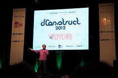
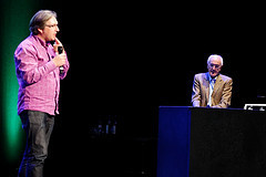
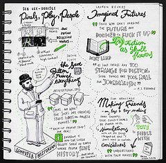
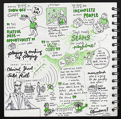
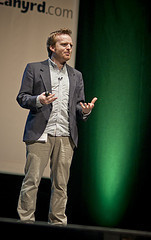
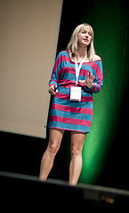
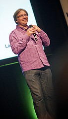
Rounding up dConstruct 2012
It’s been two weeks since the mind-blowing awesomeness of dConstruct 2012 and I’ve still got a brain full of the amazing knowledge bombs dropped by each and every speaker.
I’ve been keeping track of other people’s write-ups of the event too:
Hypernaked published a report.
Andrew Johns wrote down his thoughts, going through each talk in turn. He also wrote a follow-up post pointing out that one of the emergent themes of the conference was education.
Sjors Timmer wrote a review that cites Italo Calvino.
Happy Famous Artists pulled out three strands from the event:
Digital is about beauty and about layers.
The power of play.
The interconnectedness of things through chance.
There’s a write-up over at info.nl called Playing with the future at the seams.
But I think my favourite write-up comes from Laura who did a report for Ubelly called Our Positions Of Power. It’s a thoughtful piece that pulls together multiple strands that emerged throughout the day. And you’ve gotta love the opening sentence:
After a weekend of reflection, I’ve decided that dConstruct 2012 had the best talks of any conference I’ve ever attended.
Some people took some great pictures at dConstruct. I like this set on Flickr.


Eva-Lotta drew some fantastic sketchnotes (as usual).
And Geri took a bunch of really nice pictures.
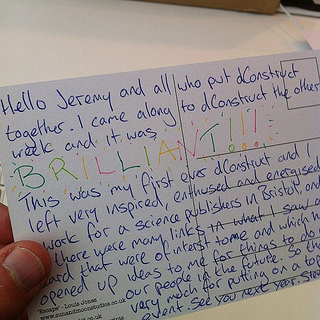
People said some very nice things on Twitter, Paul Swain wrote a very nice “thank you” post, and I even got a lovely postcard from an attendee.
If you want to re-live the magic, have a listen to the audio from dConstruct 2012.
Tagged with
dconstruct
conference
brighton
dconstruct2012
September 20, 2012
Return to Freiburg
I was in southern Germany this week to speak at the inaugural Smashing Conference. It was a really good event, packed with in-depth talks and workshops for web developers. Its practical nature contrasted nicely with the more inspirational value of dConstruct. I always say it’s good to have a balanced conference diet: too much code and I start itching for big-picture thinking; too much big-picture thinking and I start jonesing for some code.
That said, I have to admit that I missed out on quite a few of the talks. That’s because I was outside exploring Freiburg. Or should I say, I was outside rediscovering Freiburg.
I used to live there. I lived there for about six years, all told, during the ’90s. That’s where I met Jessica.
To start with, I was playing music on the streets of Freiburg. Later, I got a job in a bakery, selling bread, pretzels and all manner of excellent baked goods. Meanwhile, I was playing in a band (two bands actually: for a while I was the bassist in Leopold Kraus, the finest surf band in the Black Forest). At some point, the band decided we needed a website. I said I’d give it a go. That’s when this whole web thing started for me. I started freelancing on the side. Before too long, I was able to give up the bread-selling day job.
But after six years, Jessica and I decided that we were done with Freiburg. We moved to Brighton, where we’ve lived for twelve years now.
So it was with some excitement and a certain amount of nervous anticipation that we returned to Freiburg for the Smashing Conference. What would Freiburg be like now? Would it feel weird to be back there?
Well, Jessica has written all about what it was like to go back. I highly recommend that you read what she’s written because she puts it far better than I ever could.
Jessica has been publishing online at wordridden.com since we lived in Germany. Reading back through her posts from way back then about life in Freiburg makes me wish that I had started writing on adactio.com sooner. I don’t have much evidence of my time there: a box of cassettes (cassettes!) that the band recorded; a handful of photographs.
On this trip, I took quite a few photographs. In three days, I recorded an order of magnitude more data than I had done in six years of living in Freiburg.
Tagged with
freiburg
smashingconf
germany
conference
travel
Jeremy Keith's Blog

- Jeremy Keith's profile
- 56 followers

