
Jeremy Keith's Blog, page 136
July 16, 2012
Brighton SF
One of the perks of organising this year’s dConstruct is that I get to put together my dream line-up. Hence the presence of one of my favourite sci-fi authors and all-round lovely person, Lauren Beukes.
Now seeing as Lauren is coming to Brighton for dConstruct anyway, I started to wonder whether it might be possible to persuade some other authors to come to town for something specifically sci-fi to tie in with the Brighton Digital Festival. Myself and Kate started scheming together.
Here’s the result: Brighton SF.
Lauren will be joined by none other than Brian Aldiss! Yes, the Brian Aldiss.
I’ll be hosting the event. I’m simultaneously really excited and really nervous about that. I’m hoping that we’ll have a fun hour and a half of chat and readings. I’ll try to not to embarrass myself by being too much of a fan boy.
Brighton SF will take place from 6pm to 7:30pm on Thursday, September 6th—the day before dConstruct. Tickets are £7 but that includes a free drink at the bar beforehand, so get along early for that.
The venue is the Pavilion Theatre. That’s also the venue for this year’s Improving Reality during the afternoon. Last year’s Improving Reality was excellent and this year’s looks like it’s going to be another winner. Warren Ellis will be speaking along with a host of smart artists and thinkers.
Improving Reality will take place from midday to 5:30pm. Tickets are £15 (or £10 for students). If you’d like to go to both events (and who wouldn’t?), you can get a combination ticket for £20 (£15 for students).
This is going to be fun! Hope to see you there.


July 12, 2012
Austin Apart
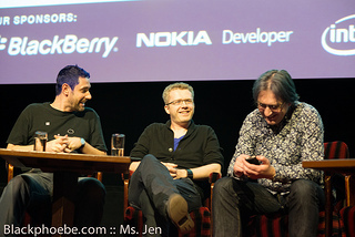
I’ve just been to Austin for An Event Apart. This was my ninth visit to Austin but the first time that it wasn’t during South By Southwest.
I liked it. I did not miss the throngs of marketers. Also, I was able to actually do things that require a lot more effort during Southby, like going to see movie (whilst having dinner and a few beers) at an Alamo Drafthouse—an excellent experience that I highly recommend. They have a code of conduct that would make Mark Kermode proud.
It was really nice to spend some time with some Austinites: the local Happy Cog crew, the Paravel gang, and teacher extraordinaire Sam Kap.
The conference was, as always, excellent.
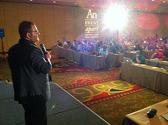
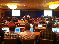
What was really great was seeing themes emerge and recur over the course of the two days. I remember this happening a couple of years back, when many of speakers started talking media queries (culminating with Ethan coining the term Responsive Web Design). This time, the recurring themes were pretty clear: process and workflow.
There was plenty of nitty-gritty design and development knowledge bombs too, but it was really great when Sarah, Andy, Ethan and myself all talked about the importance of style guides and pattern libraries in our work. Samantha’s style tiles got multiple shout-outs too.
The speakers at An Event Apart don’t collude and coordinate before the event, but I’m sure it must have looked as though we had been sent on stage with a mission to continue Anna’s excellent work.
Now that An Event Apart Austin is over, I’ll be heading back to England’s rainy shores. But before I do, I’m going to soak up another day or two of sunshine in Arizona, visiting the in-laws.
We were all set to spend yesterday evening watching the stars from one of Kitt Peak’s telescopes. Alas, the thunderclouds put paid to that. But we did get to have a look around Kitt Peak, which was quite marvellous.

I took some pictures. It would’ve been cool to have checked in on Foursquare there but a) there’s no reception way out there and b) they ask you to switch off your phone …not all the telescopes are optical.
Tagged with
aea
aneventapart
aeaaustin2012
aea2012
austin
texas
conference
kittpeak
arizona
July 1, 2012
Manual
I wrote a thing. I wrote it for The Manual, Andy’s rather lovely tertial dead-tree publication.
The thing I wrote is punnily titled As We May Link (and if you get the reference to what I’m punning on, I think you’re going to like it). It’s quite different to most of the other articles I’ve written. My usual medium is hypertext, but I knew that The Manual was going to be published by pressing solutions of pigments onto thinly-sliced pieces of vegetation.
There’s a lot of fetishisation around that particular means of production, often involving the emotional benefit of consuming the final product in the bathtub, something I’ve never understood—surely water is as unsuitable an environment for paper-based analogue systems as it is for silicon-based digital devices?
In any case, I wanted to highlight the bound—in both senses of the word—nature of The Manual’s medium. So I wrote about hypertext …but without being able to use any hyperlinks; an exercise in dancing about architecture, as whoever the hell it was so eloquently put it.
I’m pleased with how it turned out, though I suspect that’s entirely down to Carolyn’s editing skills combined with a lovely illustration by Rob Bailey.
If you’d like to read what I wrote (and what Tiffani wrote and what Ethan wrote and what all the other contributors wrote), then you can order The Manual online …but you’ll have to wait until it is delivered to you over a network of roads and other meatspace transportation routes. The latency is terrible, but the bandwidth is excellent: when you finally have the book in your hands, you’ll find that it contains an astonishing number of atoms.
That’s assuming there’s no packet loss.
Tagged with
writing
publishing
manual
hypertext
June 30, 2012
Cables
After speaking at Go Beyond Pixels in St. John’s, I had some time to explore Newfoundland a little bit. Geri was kind enough to drive me to a place I really wanted to visit: the cable station at Heart’s Content.
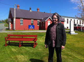
I’ve wanted to visit Heart’s Content (and Porthcurno in Cornwall) ever since reading The Victorian Internet, a magnificent book by Tom Standage that conveys the truly world-changing nature of the telegraph. Heart’s Content plays a pivotal role in the story: the landing site of the transatlantic cable, spooled out by the Brunel-designed Great Eastern, the largest ship in the world at the time.
Recently I was sent an advance reading copy of Tubes by Andrew Blum. It makes a great companion piece to Standage’s book as Blum explores the geography of the internet:
For all the talk of the placelessness of our digital age, the Internet is as fixed in real, physical places as any railroad or telephone system ever was.
There’s an interview with Andrew Blum on PopTech, a review of Tubes on Brain Pickings, and I’ve huffduffed a recent talk by Andrew Blum in Philadelphia.
Andrew Blum | Tubes: A Journey to the Center of the Internet - Free Library Podcast on Huffduffer
Now there are more places I want to visit: the nexus points on TeleGeography’s Submarine Cable Map; the hubs of Hibernia Atlantic, whose about page reads like a viral marketing campaign for some soon-to-be-released near-future Hollywood cyberpunk thriller.
I’ve got the kind of travel bug described by Neal Stephenson in his classic 1996 Wired piece Mother Earth Mother Board:
In which the hacker tourist ventures forth across the wide and wondrous meatspace of three continents, acquainting himself with the customs and dialects of the exotic Manhole Villagers of Thailand, the U-Turn Tunnelers of the Nile Delta, the Cable Nomads of Lan tao Island, the Slack Control Wizards of Chelmsford, the Subterranean Ex-Telegraphers of Cornwall, and other previously unknown and unchronicled folk; also, biographical sketches of the two long-dead Supreme Ninja Hacker Mage Lords of global telecommunications, and other material pertaining to the business and technology of Undersea Fiber-Optic Cables, as well as an account of the laying of the longest wire on Earth, which should not be without interest to the readers of Wired.
Maybe one day I’ll get to visit the places being designed by Sheehan Partners, currently only inhabited by render ghosts on their website (which feels like it’s part of the same subversive viral marketing campaign as the Hibernia Atlantic site).
Perhaps I can find a reason to stop off in Ashburn, Virginia or The Dalles, Oregon, once infamous as the site of a cult-induced piece of lo-tech bioterrorism, now the site of Google’s Project 02. Not that there’s much chance of being allowed in, given Google’s condescending attitude when it comes to what they do with our data: “we know what’s best, don’t you trouble your little head about it.”
It’s that same attitude that lurks behind that most poisonous of bullshit marketing terms…
The cloud.
What a crock of shit.
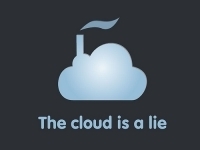
Whereas other bullshit marketing terms once had a defined meaning that has eroded over time due to repeated use and abuse—Ajax, Web 2.0, HTML5, UX—“the cloud” is a term that sets out to deceive from the outset, imbued with the same Lakoffian toxicity as “downsizing” or “friendly fire.” It is the internet equivalent of miasma theory.
My friend @substitute suggested replacing every technobabble instance of “cloud” with “the Moon” and it’s changed my life
— Pinboard (@Pinboard) January 6, 2012
Death to the cloud! Long live the New Flesh of servers, routers, wires and cables.
Tagged with
internet
technology
cloud
infrastructure
telegraph
tubes
newfoundland
June 28, 2012
September in Brighton
Last September was a pretty amazing time to be in Brighton: dConstruct followed by Maker Faire followed by Update followed by Flash On The Beach and Improving Reality.
This September looks like it’s going to be equally amazing. The Brighton Digital Festival is back—an umbrella label for all the arts and technology events under one banner. There’s already some great stuff lined up.
September is going to kick off with Reasons To Be Creative, the conference formerly known as Flash On The Beach. It’s got a great line-up of speakers. I’m looking forward to having Dan, Meagan, Mark, Jon, Colly, Yaili and Hannah in town. Tickets go on sale in a couple of weeks.
With a one-two punch, Reasons is going to be immediately followed by dConstruct. A few quick notes about this year’s event…
Tickets are still available. Not many, but they’re there. Grab one if you haven’t already.
There are also still places available for most of the workshops. Remy’s HTML5 workshop is sold out but you can still grab a spot on Ethan’s responsive design workshop, Lyza’s mobile web workshop and Jonathan’s CSS workshop at the early-bird rate. Remember: a workshop also gets you complementary access to the conference day.
If you work with a forward-thinking company and a bunch of you fancy coming to dConstruct, check out the sponsorship options. We’d love to have you on board.
And then, the day after dConstruct, it’ll be time for this year’s Maker Faire which promises to be bigger and even better than last year (and it was bloody brilliant last year).
I’ve also got a little something up my sleeve. I’m planning to put on an event the evening before dConstruct. It won’t be web-related but it will very much tie in to this year’s dConstruct theme, Playing With The Future.
Watch this space.
Tagged with
brighton
conference
event
dconstruct
June 25, 2012
Conferencing
June is about to draw to close and I’ve spent the entire month within the borders of the UK. That’s quite a change from the previous month: I was at three different conferences in three different countries in May.
First off, there was Mobilism in Amsterdam. It was, unsurprisingly, very good indeed. Mind you, I was getting a little disheartened on the first day of the conference when there was talk after talk describing how to make web apps look and feel more like native apps. The question of why exactly this would be desirable never seemed to get asked. I was beginning to worry that we were going to enter a period of making the same mistakes we did a few years back when everyone was trying to slavishly imitate desktop interactions on the web. The result is a kind of uncanny valley of interaction where apps behave almost, but not quite, like their native counterparts.
My fears were allayed on the second day of Mobilism though, particularly when Scott blew everyone’s minds. There was a veritable feast of future friendly thinking from Lyza, Jason, Brad, and Stephen too.
Speaking of future friendliness, there was a second Mobilewood gathering recently and the Future Friendly site now sports a new section entitled Come Aboard.
By the way, thank you to everyone who provided questions for my panels at Mobilism. They went well, although in retrospect two panels were maybe a bit much. Still, it was fun trying to get a statement other than “no comment” out of the Google Chrome representative on the browser panel.
Later in May I was in Belgium for Multi-Mania, a grassroots event run by students. I enjoyed myself but there was definitely a problem with having multiple tracks—the usual feeling of missing out on something, especially when some of the rooms filled up really quickly. The main stage also suffered from being directly connected to the exhibition hall which meant there was a lot of sound leakage. A shame, really.
My last speaking gig in May, on the hand, was a very smoothly-run event. I was in St. John’s, Newfoundland for Go Beyond Pixels. The fact that the conference was really well put together is all the more surprising considering it was the first time that Levin had ever organised an event! I hope it won’t be the last. He put on a great show and gave all the speakers a very warm welcome.
Oh, and Newfoundland was beautiful.
Since getting back, I’ve been enduring the English Summer. As nice as Brighton has been for a month, I’m looking forward to getting to sunnier climes.
So that’s exactly what I’m going to do, starting with a trip to Barcelona in just over a week’s time for Webvisions. I’ll be doing a half-day workshop on responsive design and progressive enhancement.
If you’re thinking of coming, here’s a little tip: go to the registration page, scroll down to the bit where it says “enter promotional code”, click that link, type “KEITH”, and hit the “Apply” button …Boom! Now your conference and workshop pass has a 20% discount applied.
Alas, I won’t be able to stick around for the conference day itself. I need to get over to Austin for An Event Apart.
I’m very excited to get to Austin when it’s not South by Southwest, but I’m also extremely nervous about my talk. I’ve spent most of this month at home trying to finish up my presentation. I fear I may be trying to squeeze an awful lot of stuff into one talk. I might have to speak very fast to fit it all in …or I suppose I could be sensible and try to trim the presentation down.
Anyway, there are still some tickets available for AEA Austin if you want to see me sweat …and I’m not just talking about the Texas heat.
Tagged with
conference
event
travel
speaking
mobilism
multi-mania
gobeyondpixels
aea
aneventapart
webvisions
June 23, 2012
Turing
One hundred years ago today, Alan Turing was born.
I could claim that without him, we wouldn’t have computers; that without him, World War Two would have lasted another two years at least.
But the truth is that the history of innovation and invention is rarely as linear as that, and that if one genius hadn’t made the great leap forward, some other genius would have. The pieces were there, waiting in the adjacent possible.
And yet, in our timeline, history played out the way it did. So I can say that thanks to Alan Turing, we have computers; thanks to Alan Turing, World War Two was shortened by at least two years.
And I can, with absolute certainty, say that the way Alan Turing was treated after the war was absolutely shameful.
We can learn a lot from the life of Alan Turing. We can learn about computation, universal machines, and artificial intelligence. We can also learn about tolerance, compassion …and love.
Happy birthday, Alan. Love you.
— Andy Hume (@andyhume) June 23, 2012
June 1, 2012
Device expansion
Remy popped ‘round to the Clearleft office the other day with some more devices for the communal testing lab …although the Matrix-era Nokia is probably not all that useful.
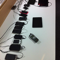
The list of devices is starting to look pretty good. Of course there’s no such thing as “enough” devices, but this is at least beginning to look like a nice cross-section. I’ve been buying phone chargers and power strips in enough quantities that I’m starting to get bulk discounts.
If you’re in the neighbourhood, come on ‘round and try out your sites on these devices.
May 31, 2012
Pepys out
Phil Gyford was down in Brighton visiting the Clearleft HQ today. We’re working with him on Matter, which I’m very excited about.
Today wasn’t just any ol’ day for Phil. Today marks the end of a project of his that has been running for nine years and five months: Pepys’ Diary:
This site is a presentation of the diaries of Samuel Pepys, the renowned 17th century diarist who lived in London, England. A new entry written by Pepys will be published each day over the course of several years; 1 January 1660 was published on 1 January 2003.
We invited Phil down to Brighton last year to talk about Pepys’ Diary at a Skillswap event. You can listen to the audio on Huffduffer.
The diary of Samuel Pepys: Telling a complex story online on Huffduffer
I’m a big fan of long-term thinking and—in web terms—this project is as old as Methuselah. It’s refreshing. In an industry so caught up in the churn and grind of the new and the shiny, I think it’s wonderful that Phil dedicated himself to a project that he knew would require a long-term investment of his time. Russell wrote about it in Wired recently:
In some worlds ten years isn’t very long: it’s not if you’re digging an undersea tunnel or discovering a cure for disease. But in the busy, silly world of early 21st-century media, making a ten-year assertion was a big deal — something akin to the Clock of the Long Now.
I’ll be sorry to see you go, Mister time-shifted Pepys. But I understand that it’s hard for you to keep writing a diary when your eyesight is failing.
The ill condition of my eyes, and my neglect for a year or two, hath kept me behindhand in my accounts, so as to render it difficult now.
— Samuel Pepys (@samuelpepys) May 31, 2012
May 29, 2012
dConstructickets
It’s been an exciting day at Clearleft Towers. Tickets for this year’s dConstruct went on sale today.
Sales are going briskly. At the end of the day, two thirds of the tickets were gone.
Needless to say, I think you should grab yourself a ticket. But then, I would say that, wouldn’t I? I think the line-up is bloody brilliant: James Burke! Lauren Beukes! Jason Scott! Unnecessary exclamation points!
But before you slap your virtual money down via the Herculean challenge of Google Checkout, let me reiterate what I wrote on the dConstruct website: dConstruct is not a conference of practical web design and development tutorials.
The presentations may not contain any practical tips you can take back to work on Monday morning but you will gain insights into the direction our digital technology is taking.
If you’re looking for practical know-how, I highly recommend the workshops. The actual conference day, however, is all about challenging your brainbits and making you think.
In this interview with .net magazine Andy does a good job of explaining where dConstruct is coming from, man, and what you can expect on the day:
While other conferences try to educate and inform, dConstruct aims to enlighten and inspire – to challenge the way you think about design and technology as it applies to our industry. It’s basically brain candy for a curious mind.
If that sounds like something you’d enjoy, get a ticket. I predict they’ll probably be gone by the end of the week.
Tagged with
dconstruct
conference
brighton
clearleft
dconstruct2012
Jeremy Keith's Blog

- Jeremy Keith's profile
- 56 followers

