
Jeremy Keith's Blog, page 138
January 17, 2012
One moment
I use my walk to and from work every day as an opportunity to catch up on my Huffduffer podcast. Today I started listening to a talk I've really been looking forward to. It's a Long Now seminar called Universal Access To All Knowledge by one of my heroes: Brewster Kahle, founder of The Internet Archive.
Brewster Kahle: Universal Access to All Knowledge — The Long Now on Huffduffer
As expected, it's an excellent talk. I caught the start of it on my walk in to work this morning and I picked up where I left off on my walk home this evening. In fact, I deliberately didn't get the bus home—despite the cold weather—so that I'd get plenty of listening done.
Round about the 23 minute mark he starts talking about Open Library, the fantastic project that George worked on to provide a web page for every book. He describes how it works as a lending library where an electronic version of a book can be checked out by one person at a time:
You can click on: hey! there's this HTML5 For Web Designers. We bought this book—we bought this book from a publisher such that we could lend it. So you can say "Oh, I want to borrow this book" and it says "Oh, it's checked out." Darn! And you can add it to your list and remind yourself to go and get it some other time.
Holy crap! Did Brewster Kahle just use my book to demonstrate Open Library‽
It literally stopped me in my tracks. I stopped walking and stared at my phone, gobsmacked.
It was a very surreal moment. It was also a very happy moment.
Now I'm documenting that moment—and I don't just mean on a third-party service like Twitter or Facebook. I want to be able to revisit that moment in the future so I'm documenting it at my own URL …though I'm very happy that the Internet Archive will also have a copy.
Tagged with
huffduffer
podcast
longnow
archive
books
html5forwebdesigners


January 16, 2012
Audio Update
Aral recently released the videos from last September's Update conference. You can watch the video of my talk if you like or, if video isn't your bag, I've published a transcription of the talk.
It's called One Web, Many Devices and I'm pretty happy with how it turned out. It's a short talk—just under 17 minutes—but I think I made my point well, without any um-ing and ah-ing. At the time I described the talk like this:
I went in to the lion's den to encourage the assembled creative minds to forego the walled garden of Apple's app store in favour of the open web.
It certainly got people talking. Addy Osmani wrote an op-ed piece in .net magazine after seeing the talk.
The somewhat contentious talk was followed by an even more contentious panel, which Amber described as Jeremy Keith vs. Everyone Else. The video of that panel has been published too. My favourite bit is around the five-minute mark where I nailed my colours to the mast.
Me: I'm not going to create something specifically for Windows Phone 7. I'm not going to create a specific Windows Phone 7 app. I'm not going to create a specific iPhone app or a specific Android app because I have as much interest in doing that as I do in creating a CD-ROM or a Laserdisc…
Aral: I don't think that's a valid analogy.
Me: Give it time.
But I am creating stuff that can be accessed on all those devices because an iPhone and Windows Phone 7 and Android—they all come with web browsers.
I was of course taking a deliberately extreme stance and, as I said at the time, the truthful answer to most of the questions raised during the panel discussion is "it depends" …but that would've made for a very dull panel.
Unfortunately the audio of the talks and panels from Update hasn't been published—just videos. I've managed to extract an mp3 file of my talk which involved going to some dodgy warez sitez.
Adactio: Articles—One Web, Many Devices on Huffduffer
I wish conference organisers would export the audio of any talks that they're publishing as video. Creating the sound file at that point is a simple one-click step. But once the videos are up online—be it on YouTube or Vimeo—it's a lot, lot harder to get just the audio.
Not everyone wants to watch video. In fact, I bet there are plenty of people who listen to conference talks by opening the video in a separate tab so they can listen to it while they do something else. That's one of the advantages of publishing conference audio: it allows people to catch up on talks without having to devote all their senses. I've written about this before:
Not that I have anything against the moving image; it's just that television, film and video demand more from your senses. Lend me your ears! and your eyes. With your ears and eyes engaged, it's pretty hard to do much else. So the default position for enjoying television is sitting down.
A purely audio channel demands only aural attention. That means that radio—and be extension, podcasts—can be enjoyed at the same time as other actions; walking around, working out at the gym. Perhaps it's this symbiotic, rather than parasitic, arrangement that I find engaging.
When I was chatting with Jesse from SFF Audio he told me how he often puts video podcasts (vodcasts?) on to his iPod/iPhone but then listens to them with the device in his pocket. That's quite a waste of bandwidth but if no separate audio is made available, the would-be listener is left with no choice.
SFFaudio with Jeremy Keith on Huffduffer
So conference organisers: please, please take a second or two to export an audio file if you're publishing a video. Thanks.
Tagged with
update
conference
audio
video
publishing
transcription
mobile
native
oneweb
January 12, 2012
Media queries and multiple columns
By far the most common use of media queries is to execute CSS based on viewport width (using min-width or max-width). Lately there's been more talk about using media queries based on height as well.
Paul talked about using min-height media queries to adjust content appearing above the fold. Owen Gregory wrote his superb 24 Ways article on using viewport proportions and device-aspect-ratio for media queries. Trent has documented his use of horizontal and vertical media queries to bump up the font size for wide and tall viewports.
One of the areas where I've found height-based media queries to be quite handy is in combination with another CSS3 module: multiple columns.
Splitting text over multiple columns is not something to be done lightly on a screen-based display. If the columns drop below the viewport then the user has to scroll down, scroll back up, scroll down again …you get the picture. It works fine in print but it's not something that should be attempted on the web unless the entire text is visible at one time.
Well, with media queries we can get a pretty good idea of whether the text will fit on the viewport …assuming we know the length of the text.
Here's an example (thanks to Space Ipsum for supplying the text). It splits the text into two columns if the viewport has enough width and height:
@media all and (min-width: 40em) and (min-height: 36em) {
[role="main"] {
column-count: 2;
column-gap: 2em;
}
}
If the viewport is wider still, the text can be split over three columns. In this case, the test for height can actually smaller because the text is spreading over a wider area, meaning the overall height of the text is shorter:
@media all and (min-width: 65em) and (min-height: 25em) {
[role="main"] {
column-count: 3;
column-gap: 2em;
}
}
The actual CSS is more verbose than that: vendor prefixes are still required. You can grab the example from Github if you want to have a play around with it.
Tagged with
mediaqueries
columns
css3
responsive
layout
January 10, 2012
Months and years
While I was in San Francisco for the last Event Apart of the year in December, Luke pulled me aside while he was preparing for his A Day Apart workshop on mobile web design. As befits the man who literally wrote the book on web forms and also wrote the the book on mobile-first design, Luke was planning to spend plenty of time covering input on mobile devices and he wanted my opinion on one of the patterns he was going to mention.
Let's say you've got your typical checkout form asking for credit card details. The user is going to need to specify the expiry date of their credit card, something that historically would have been done with select elements, like so:
January
February
March
April
May
June
July
August
September
October
November
December
2011
2012
2013
2014
2015
2016
2017
2018
2019
2020
With the introduction of the new input types in HTML5, we can now just use input type="month".
That's particularly nice on mobile devices that support input type="month" like Mobile Safari since iOS5.
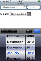
But the behaviour on non-supporting browsers would be to display just like input type="text" …not ideal for inputting a date.
So the pattern that Luke proposed was to start with the traditional double drop-downs for month and year, and then use feature detection to replace them with input type="month" in supporting browsers.
That was an angle I hadn't thought of. Usually when I'm implementing new HTML5 input types (like input type="number") I put the new type in the markup and then try to come up with JavaScript polyfills for older non-supporting browsers. In this case though, the old-fashioned way is what goes in the markup and JavaScript does the enhancing for newer browsers.
The only downside is that some the desktop browsers that do support input type="month" do so in a way that—from a UI standpoint—seems like a step backwards from simply having two selects: Safari displays it with a spinner control like input type="number", while Opera shows an entire Calendar (days'n'all).
Anyway, I threw a quick hack together as a proof of concept so you can see it in action. I'm sure you can improve upon it. Feel free to do so.
Tagged with
forms
html5
input
javascript
code
scripting
progressive
enhancement
markup
mobile
January 8, 2012
Command lines
Here's a nifty piece of in-browser behaviour…
Fire up Chrome and in the address field type "huffduffer.com" followed by a space and BOOM! …the address field transforms into a site-specific search field: "Search Huffduffer."
That's thanks to this XML file that's been on Huffduffer since day one. It's the most straightforward example of the OpenSearch format.
It's the same format that powers Firefox's search providers. If you visit Huffduffer with Firefox and click in the browser's search field, you'll see the option to "Add Huffduffer" to the list of search engines.
I can't imagine many people will actually do that but still, no harm in providing the option.
Another option that's been added to Huffduffer recently (thanks to Andy's hacking) is the ability to access the API through YQL. Feel free to open up the console and have a play around.
Tagged with
huffduffer
opensearch
yql
api
January 7, 2012
Who goes there?
Local lads British Sea Power have started up a residency, playing the first Friday of every month down at The Haunt. Myself and Jessica went along to the inaugural event, which was great fun.
The only downside was that it clashed with a one-off screening at The Duke of York's of The Thing, the 1982 classic that conspicuous by its absence from the recent John Carpenter all-nighter.
Now I'm sure you've probably seen the Thingu parody that's been doing the rounds.
Personally, I'm still laughing about The Thing: The Musical.
But there's one piece inspired by the film that's genuinely interesting. The Things by Peter Watts is a short story that tells John Carpenter's tale from the perspective of the title character.
I see myself through the window, loping through the storm, wearing Blair. MacReady has told me to burn Blair if he comes back alone, but MacReady still thinks I am one of him. I am not: I am being Blair, and I am at the door. I am being Childs, and I let myself in. I take brief communion, tendrils writhing forth from my faces, intertwining: I am BlairChilds, exchanging news of the world.
Tagged with
sci-fi
sciencefiction
film
movie
brighton
January 5, 2012
Osushi
A few years back, Craig took some lovely pictures of four generations of sushi chefs:
The story goes something like: Jiro trained Shiro who ran off to Seattle, started one of the first sushi joints in the city, and trained Taiichi, who now runs his own sushi shop. Jiro also trained his son, who works at Sukiyabashi Jiro and (one assumes) plans to take over the business once his octogenarian father retires (which, according to Jiro, is when he dies).
I love the additional photos that Craig took of each chef making their nigiri-te (the hand motion they use when forming nigiri).
The undisputed Jedi master of these sushi chefs is Jiro Ono. He's the subject of the forthcoming documentary Jiro Dreams of Sushi.
Tagged with
sushi
documentary
photography
food
japan
December 30, 2011
The change you want to see
A little while back, Andy wrote:
Even if you happen to be a genius in the waiting, there are no svengalis to pluck you from obscurity and put you on the pedestal you know you deserve. … So if you want to contribute to articles, write books and speak at conferences, you're the only person in the way.
You can contribute to A List Apart. You can write for Smashing Magazine. You can also put a resource written in HTML at your own URL that is retrievable via HTTP …write a blog post, in other words.
If you prefer dead trees, you no longer need a publishing house. Lulu, MagCloud, Newspaper Club …you have incredible resources at your fingertips.
Move The Web Forward is a guide to help web workers of any skill level contribute to web standards.
JSConf is looking for speakers. You have until January 15th to fill in this form and step up to the plate.
The Industry Conference is looking for speakers. Here's the form for you to fill in.
In a few days it will be a new year. Traditionally this is a time of resolutions and vows of self-betterment. If you were planning on making any kind of resolution related to contributing to the web community, I hope that you'll find some of these links useful.
And if you choose to ignore these links, that's fine. But then if at any time in the new year you find yourself kvetching about articles or talks from "the same old faces" …physician, heal thyself.
Tagged with
community
conference
writing
resolution
December 27, 2011
Retreat 4 Geeks 2012
As the year draws to a close, I find myself casting an eye back on the past twelve months. There are two events that stand out for me:
Mobilewood—the get-together in the woods of Tennessee that led to the Future Friendly movement and
Hackfarm—the Clearleft outing to Herefordshire that resulted in Map Tales.
I learned a lot at both events. I think there's enormous benefit in getting together with your peers for days of intense geekery—it's quite the learning experience.
Looking ahead to next year, there's one more such event on the horizon.
Aaron started up Retreats 4 Geeks last year and kicked it off with an outstanding week in the woods with Eric. From March 25th to 30th Aaron and I will be leading Retreat 4 Geeks on Progressive Enhancement. Here's the best bit: it'll be taking place on a horse ranch in Clark, Colorado.
I'm expecting an intense three days of hands-on coding bookended with some fun outdoor activities. Based on my experiences this year with these kinds of in-depth, focused gatherings, I think it's going to be pretty special.
If that sounds like something you'd like to be a part of, you can register your place now. Everything—except your airfare—is included: excellent food, luxurious lodging and multiple days of learning and practicing progressive enhancement and mobile-first responsive design. And if you need any assistance in convincing your boss to fork out for the event, there's a handy factsheet you can download, print out and leave in convenient spots around the office.
So …maybe I'll see you in the Rockies?
Tagged with
retreats4geeks
workshop
retreat
learning
development
event
December 24, 2011
iWish
Dear Apple Claus,
I've been a very good boy this year so I hope you don't me asking for a little present. What I'd really like for Christmas is for you to fix that strange orientation scaling bug in Mobile Safari.
Just in case you've forgotten about it, my friend Scott—who has been a very, very good boy this year (what with that whole Boston Globe thing)—put together a test page quite a while back to demonstrate the problem.
Basically, if I set meta name="viewport" content="width=device-width, initial-scale=1.0" then it means a pixel should be equal to a pixel: in portrait view, the width should be 320 pixels; in landscape view the width should be 480 pixels. But in Mobile Safari, if I move from portrait to landscape, the width jumps to a value larger than 480 pixels, which means the hapless user must double tap to bring the scale down to 1:1.
Now, admittedly, I could just set meta name="viewport" content="width=device-width" and leave it at that (or I could additionally declare minimum-scale=1.0). But then when the user changes from portrait to landscape, although it doesn't have the same over-zooming behaviour, it does scale up. That means I'm not getting the full 480 pixels (it's effectively still a 320 pixel wide display, even in landscape).
I could make the bug disappear by adding maximum-scale=1.0 or user-scaleable=no but that's the cure that kills the patient. I also did some hacking with Shi Chuan but what we come up with still feels fairly clunky.
So that's why I'm writing to you, Father Applemas. Won't you fix this bug for me?
My friend PPK thinks you won't fix this bug because it would trigger a reflow (and repaint) of the page …but I know that can't be the reason because the bug doesn't occur when going from landscape to portrait!
Also—and this is the really strange part—If I'm looking at a web page on my iPhone/Pod in a custom browser (like the Twitter app), rather than using Mobile Safari, then the bug doesn't occur.
I don't get, Apple Claus. Why have one behaviour for webviews in other people's apps and a different behaviour for your own app?
Anyway, if you could see your way to granting this boy's wish, it would make for a webby Christmas.
Hugs and kisses,
Jeremy
P.S. By this time next year, it would be lovely to have access to the camera (and other device APIs) from the browser …but I'm getting ahead of myself.
Tagged with
ios
apple
webkit
mobile
safari
scale
orientation
bug
viewport
Jeremy Keith's Blog

- Jeremy Keith's profile
- 55 followers

