
Jeremy Keith's Blog, page 135
August 22, 2012
Your own words
There has been a minor outbreak of handwringing and soul-searching amongst bloggers recently. Jon Udell asked Where have all the bloggers gone? Tim Bray responded with his own thoughts on the Blogodammerung. Paul Ford rallied with some straight-up old-fashioned blogging about the rotary dial.
For quite a while now, people have been pointing the finger at Twitter and Facebook, lamenting that these short-form services are time-sucking all their writing energy. There’s probably some truth to that but as harbingers of blogging doom go, they’re pretty weak. Some of us manage to both blog and tweet (I know, right‽).
If your craving to write is satiated by a service that limits you to 140 characters, then maybe blogging was never the right medium for you in the first place. Although, that said, most of the early blogs (or link-logs) tended to have short, snappy updates.
But there’s a more fundamental difference between posting to Twitter, Facebook, Tumblr, or Google+, and posting to your own blog. Unless you’re using a hosted service, your blog belongs to you. I’m not talking about ownership in the sense of copyright—I’m sure all those other services have T and Cs that make sure you retain to the rights to what you write. I’m talking about owning the URLs.
Scott puts it best when he writes Your words are wasted:
You are pouring your words into increasingly closed and often walled gardens. You are giving control - and sometimes ownership - of your content to social media companies that will SURELY fail.
He’s absolutely right. Over a long enough time period, all third-party services will let you down. There was a time when Friendster was too big to fail. There was a time when it wasn’t possible to imagine a web without Geocities. I’ve been burned by Pownce. Magnolia.
When Delicious was going to be “sunsetted” by Yahoo, a lot of people moved to Pinboard, a service that distinguishes itself by having the shocking business model of actually charging for use. That’s good, and it certainly increases its longevity, but it’s still somebody else’s domain. I decided to move my bookmarks over to my own site.
Now that there is much discontent around Twitter’s ongoing metamorphosis into yet another ad-driven media company, people are moving to App.net, a platform that you pay for and whose Alpha service looks a lot like Twitter without the bad parts. But it’s. Still. Somebody. Else’s. Domain.
I suspect that some of the recent blog-handwringing and blog-soul-searching was prompted by the launch of Medium, an intriguing service that seems to be making lack of ownership into a feature rather than a bug. Instead of your words being defined by you, the author, they are subsumed into the collective and defined by their subject matter instead.
That doesn’t appeal to me, but if this feature request from Dave Winer were implemented, I could get behind Medium 100%:
Let me enter the URL of something I write in my own space, and have it appear here as a first class citizen. Indistinguishable to readers from something written here.
I’m a card-carrying Pembertonian. I have no problem with other services syndicating my words but I want to host the canonical copy. That’s what I’m doing with my journal. That’s I’m doing with my links. I’m not doing it with my tweets (unlike Tantek). I’m not doing it with my photos.
That’s the one that worries me the most. I have over 14,000 pictures on Flickr (I keep offline backups, of course). I pay Flickr and that’s a good thing. But it’s still only a matter of time before Flickr goes the way of other Yahoo properties.
Last year I went to IndieWebCamp in Portland to brainstorm and hack with like-minded people who want to be homesteaders instead of sharecroppers. It was an excellent gathering. And now it’s going to happen again, but this time it’s happening in Brighton.
Two days after dConstruct—and one day after Brighton Mini Maker Faire—we’ll gather at The Skiff for a mishmash of BarCamping and Hackdaying.
You should come. Add yourself to the guest list and the Lanyrd page.
I’ll see you there.
Tagged with
publishing
writing
indieweb
blogging
indiewebcamp
blogs


August 19, 2012
URIslands in the stream
For over a decade the home page of this website has effectively been a splash screen.
A splash screen! The only person with a splash screen these days is
— Drew McLellan (@drewm) July 27, 2010@adactio.
Well …not exactly. I mean, it’s not as if it contained an animation and a “skip intro” link. But it has been very minimalist: a brief one-sentence explanation of what this website is and a brief one-sentence description of the latest post I’ve published.
Most blogs are standalone sites—i.e. the blog isn’t part of a larger site—so the home page and the latest blog posts are one and the same. My site is a bit different. The blog part—my journal—is just one piece. There’s also the links section and the articles section. That raises an interesting question: exactly what should the homepage contain?
I’m a great believer in well-designed URLs but oftentimes the home page is something of an exception (one of the reasons I advocate designing the home page last). The URL / doesn’t tell you anything about the resource. There’s basically two different ways to go: keep it really, really minimal (like I’ve been doing for ten years) or make it a patchwork containing a little bit of everything (the way that most news websites work).
For the past few months I’ve been contemplating making the switch from the minimalist to the maximalist approach for the home page of this site. On the one hand, I think it’s RESTfully correct to have the URL adactio.com/ return a terse description of what the site is, with links to further resources. On the other hand …it’s a splash screen.
After much deliberation, I’ve decided to flip the switch.
It’s a bit of a shame. I quite enjoyed being one of the last people I know to have a quirky intro page. But the new home page alleviates a concern I’ve had for a while. I get the feeling that a lot of people have only been paying attention to what’s written in my journal without realising that I post multiple times a day to the links section. The new homepage shows everything—journal entries, links, and articles—grouped by date. It is, if you like, a stream.
It’s exactly the kind of stream that Anil Dash writes about in Stop Publishing Web Pages:
Most users on the web spend most of their time in apps. The most popular of those apps, like Facebook, Twitter, Gmail, Tumblr and others, are primarily focused on a single, simple stream that offers a river of news which users can easily scroll through, skim over, and click on to read in more depth.
Glossing over the lack of definition for “app”, there’s a good point here. The “stream” idea makes a lot of sense …in the right situation. That situation is the list view. If you think about the situations where the never-ending stream has been employed—Twitter, Facebook, Instagram, Pinterest—they are views of lists, usually reverse-chronologically ordered lists.
Going back to URL design, these kinds of list views are the ones that often have a single URL filtered with a query string. You’re much more likely to see /newest?page=2 or /popular?start=10 than you are to see /newest/page2 or /popular/10-20. There’s a good reason for that. While the kind of resource located at the URL remains unchanged—a list of items—the specifics are likely to change every day or hour or even minute—which items are in the list.
So traditionally list views have been paginated using query strings. The streams that Anil is talking about are an alternate way of navigating list views that does away with pagination and query strings. I think that this way of navigating a list view can work well but, as always, the devil is in the details.
First of all, there’s the issue of when to append to the stream. This could be triggered by the user with a link—“load more”—or you could assume that when the user gets to the current end of the list that they’ll automatically want to load more …the dreaded infinite scroll.
As Frank put it:
Infinite scroll is so frustrating for me. It turns every website into a battle I can’t win. There’s no finishing, only forfeit.
— Frank Chimero (@frankchimero) July 11, 2012
Quite apart from any psychological implications, there’s a usability issue here. Interpreting one action by a user—scrolling down the screen—as implicit permission to carry out another action—load more items—is a dangerous assumption. It’s similar to the tyranny of mouseover:
If I click on a link, I am initiating an action. If I fill in a form and press a submit button, I am initiating an action. But if I move my mouse over a page element, I am not initiating an action.
Oh, and if your site has footer, please do not use infinite scroll. Think about it.
In case you hadn’t guessed, I’m a big proponent of allowing the user to explicitly request more items to be appended to a stream rather than using the infinite-scroll pattern.
That said, you could introduce a nice compromise. What if, when the user scrolls down the screen, you begin pre-fetching the next items in the list? That way, when the user explicitly requests more items they’ll load lickety-split.
Anyway, you’ll notice that the new home page of adactio.com is still using pagination. That’s related to another issue and I suspect that this is the same reason that we haven’t seen search engines like Google introduce stream-like behaviour instead of pagination for search results: what happens when you’ve left a stream but you use the browser’s back button to return to it?
In all likelihood you won’t be returned to the same spot in the stream that were in before. Instead you’re more likely to be dumped back at the default list view (the first ten or twenty items).
If your stream is self-contained—like Instagram or Pinterest—then there’s no problem. Twitter attempts to get around the problem by showing you the linked content inline where possible (with some judicious use of oEmbed) and by opening external links in a new window or tab—not so much the cure that kills the patient as the cure that ignores the problem.
In my case, my home page stream is crammed full of hyperlinks. Until there’s a way to make unpaginated streams work nicely with the back button, I’ll stick with pagination.
Anyway, I hope you like the new home page. If you do, you may want to subscribe to the RSS equivalent of the combined stream of my journal, my links, and my articles.
August 13, 2012
Navicon
Daniel recently asked a question on Twitter:
I vaguely recall someone (
— Daniel Burka (@dburka) August 9, 2012@lukew?) posting examples of ‘open nav’ icons (eg Path and Facebook) showing an emerging de facto standard. Link?
It was this article by Malarkey that he was looking for. Andy did a great job of comparing the iconography used for navigation in mobile apps and responsive sites. His conclusion:
Unless our navigation’s arranged in a grid (and so we should use a grid icon), I’m putting my weight behind three lines because I think it’s most recognisable as navigation to the average person.
The three-lines icon is certainly very popular, as can be seen in this collection of mobile navigation icons I gathered together on Dribbble.
But Tom has some reservations:
— Tom Coates (@tomcoates) August 9, 2012
@dburka@adactio@malarkey I’m a bit suspicious of the three lines thing when not in a clear button though. Looks like a drag affordance
Andy Davies points out another potential issue:
— Andy Davies (@andydavies) August 9, 2012
@sunpig@adactio Chrome canary is now using the triple line for the menu toolbar button twitter.com/andydavies/sta…
I noticed this in the more recent versions of Android too. It does indeed look a little odd to see the same icon used in the browser chrome and in the document within the browser.
But I still think it’s a good shorthand for revealing a list of items.
The unicode character ☰ ☰ (U+2630) is the Chinese trigram for sky (or heaven)—one of the eight bagua. It consists of three horizontal lines. Now that could be a handy resolution-independent way of representing navigation.
Alas, when I tested this on a range of mobile devices, some of them just showed the square box of unicode disappointment. I had much better luck with the unicode symbol for black down-pointing triangle ▼ ▼ (U+25BC).
Mind you, with a combination of @font-face and sub-setting we’re not limited to what the browser ships with—we can provide our own icons in a font file, like what Pictos is doing.
Tagged with
icon
navigation
mobile
unicode
symbol
August 12, 2012
Generating placeholders from datalists
Here’s a cute little markup pattern for ya.
Suppose you’ve got an input element that has—by means of a list attribute—an associated datalist. Here’s the example I used in HTML5 For Web Designers:
Your home planet
That results in a combo-box control in supporting browsers: as you type in the text field, you are presented with a subset of the options in the datalist that match what you are typing. It’s more powerful than a regular select, because you aren’t limited by the list of options: you’re free to type something that isn’t in the list (like, say, “Pluto”).
I’ve already written about the design of datalist and how you can use a combination of select and input using the same markup to be backward-compatible. I like datalist.
I also like the placeholder attribute. Another recent addition to HTML, this allows you to show an example of the kind of content you’d like the user to enter (note: this is not the same as a label).
It struck me recently that all the options in a datalist are perfectly good candidates for placeholder text. In the example above, I could update the input element to include:
or:
I wrote a little piece of JavaScript to do this:
Loop through all the input elements that have a list attribute.
Find the corresponding datalist element (its ID will match the list attribute).
Pick a random option element from that datalist.
Set the placeholder value of the input to that option value.
Put that JavaScript at the end of your document (or link to it from the end of your document) and you’re all set. You might want to tweak it a little: I find it helps to preface placeholder values with “e.g.” to make it clear that this is an example value. You can do that by changing the last line of the script:
input.setAttribute('placeholder','e.g. '+value);
You also might want to show more than one possible value. You might want the placeholder value to read “e.g. Mercury, Venus, Earth, etc.” …I’ll leave that as an exercise for the reader.
Tagged with
html5
forms
datalist
placeholder
javascript
August 10, 2012
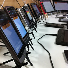
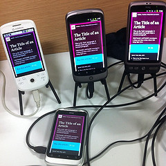
Laboratory conditions
Whenever I mention the communal Brighton device lab on Twitter, or post pictures of the devices, I always get questions about it. So here’s a quick rundown of how things are set up.
Most of the devices are plugged in to two 10-port powered USB hubs made by Trust.
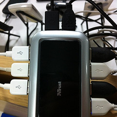
I tend to clump the devices by operating system: a bunch of Android devices here, a bunch of Windows Phones there. That might just be my mild OCD; there isn’t really any particular advantage to doing that.
I’ve also rearranged the home screens to be consistent. All the Android devices have these icons, in this order:
Browser
Settings
Opera Mobile
Opera Mini
Adobe Shadow
Adobe Shadow is a very handy way of avoiding manual refreshes on Android and iOS devices. It has a lot of moving parts, but it’s worth setting it up. As well as installing the Adobe Shadow app on each device, you’ll need to download and run the desktop app on the computer you’re “driving” with and you’ll need to install a Google Chrome plug-in. It’s worth taking the time to do it though: you’d spent a lot more time manually refreshing each and every device.
More often than not, you’ll want to test websites before they launch so you’ll need some way of looking at locally-hosted sites. Localtunnel and showoff.io are just two ways of doing that—I’m sure there are many more. Personally, I use showoff.io for $5 a month and it works well for me.
Finally, there’s the question I get asked more than any other…
— Josh Crowder (@JoshCrowder) August 10, 2012
@adactio ooo I like those stands where are they from? Thats exactly what we need@seriousfoxhq
— Vincent Pickering (@VIPickering) August 10, 2012
@adactio What are the fancy stands all the devices are sitting on?
— Khoa Nguyen (@khoaski) August 10, 2012
@adactio, where did you get those stands?@stubbornella
The stands are from The Iron Mill just outside Ballymena in County Antrim. The iPhone stands are nice and sturdy, they work for other models just fine, and delivery is free within the UK and Northern Ireland.
And now, here’s Remy conducting mad experiments with JSbin at the device lab:
August 6, 2012
Noon
Just when I thought the first week of September couldn’t get any better, Brighton SF has ramped up: there will now be three world-class science fiction authors for me to be fanboyishly nervous around. Adopted Brightonian Jeff Noon is going to be there!
So for the princely sum of seven British pounds, you can spend an hour and a half in the company of these SF luminaries:
Brian Aldiss,
Lauren Beukes, and
Jeff Noon.
Blow me down with a psychedelic feather!
Tagged with
brighton
digitalfestival
brightonsf
event
sci-fi
sciencefiction
Countdown to September
It’s less than a month until the Brighton Digital Festival and I’m already ludicrously excited …and somewhat nervous.
The festival will kick off on September 2nd with fireworks …digital fireworks, courtesy of Seb.
The 2nd of September is also the first Sunday of the month, which means it’ll be time for The Geekest Link pub quiz at The Caroline Of Brunswick. And yes, this will be an official Brighton Digital Festival event. If you want to start swotting now, the rounds will be:
Artificial Intelligences,
Simulated Realities,
PC Games,
CGI picture round and, of course,
General Nerdage.
I’ll be there, hoping to improve on last night’s performance when our team—Quidditch Pro Quo, Clarice—pulled ahead from a very shaky start to come in second. Second! If you’ve been to the Geekest Link before, and you know how hardcore it can be, you’ll understand why we were so pleased with that result.
The next day, the internet geekery gets in to full swing with Reasons To Be Creative—formerly Flash On The Beach—running from Monday, September 3rd to Wednesday, September 5th.
Wednesday, September 5th is also when the dConstruct workshops kick off. The two workshops going on that day—Ethan’s and Remy’s—are already sold out, but there are still some spaces available for the workshops on Thursday, September 5th from Lyza and Jonathan. They will kick ass, so I highly recommend grabbing a workshop ticket, which comes with a free pass to the dConstruct conference day.
On the same afternoon, Improving Reality will be taking place over at the Pavilion theatre, featuring Warren Ellis amongst others. Once that wraps up, there’ll be a break—time for a drink at the bar—and then, from 6pm it’s time for Brighton SF.
This is what I’m nervous about. I think it’s going to be great—in fact, I know it’s going to be great because it features the great Lauren Beukes and the great Brian Aldiss—but I’m going to be playing the part of the evening’s chat show host. I’ve always enjoyed moderating panels at conferences like @media, South by Southwest, and Mobilism, so I’m hoping my nervousness will evaporate and I can enjoy it.
Seriously, it’s going to be pretty damn great so if you have any interest in speculative fiction, grab a ticket for just £7. Better yet, grab a combination ticket for Improving Reality and Brighton SF together for just £20.
All of those great events will be happening in the lead-up to the big one: dConstruct on Friday, September 7th. I still can’t quite believe the fantastic line-up we’ve got, and I’m looking forward to every single talk. I’ll be introducing the speakers on the day so I hope I don’t make too much of an idiot of myself.
Amazingly, there are still a few tickets left for dConstruct! When I say “a few”, I really mean a few …a handful might be more accurate. But if you’ve been thinking about going, you’ve still got a chance to get in there and snap up a ticket.
If you’re thinking of coming en masse from a single company, check out the sponsorship options. The magnificent Mailchimp and Heart Internet are already on board. As well as our gratitude, you will get your logo on the website and badges, a number of free passes, and a stand at the conference to show off your wares.
If you’re not into the stand idea, another option is to sponsor the pre-party or after-party—always a big hit with the attendees. Or you could sponsor a coffee cart at the event; the coffee from the Brighton Dome is notoriously crap, so any company that sponsors a Small Batch coffee cart will earn the undying gratitude of the multitudinous geeks. Drop me an email or give me a call if you or someone you know wants to be the hero of the hour.
Just one month until dConstruct …I can’t wait!
Tagged with
brighton
digitalfestival
dconstruct
brightonsf
event
conference
August 2, 2012
Things
Put the kettle on, make yourself a cup of tea, and settle down to read a couple of thought-provoking pieces about networked devices.
First up, Scott Jenson writes Of Bears, Bats, and Bees: Making Sense of the Internet of Things:
The Internet of Things is a growing, changing meme. Originally it was meant to invoke a giant swarm of cheap computation across the globe but recently has been morphing and blending, even insinuating, into established product concepts.
Secondly, Charles Stross has published an abridged version of a talk he gave back in June called How low (power) can you go?:
The logical end-point of Moore’s Law and Koomey’s Law is a computer for every square metre of land area on this planet — within our lifetimes. And, speaking as a science fiction writer, trying to get my head around the implications of this technology for our lives is giving me a headache. We’ve lived through the personal computing revolution, and the internet, and now the advent of convergent wireless devices — smartphones and tablets. Ubiquitous programmable sensors will, I think, be the next big step, and I wouldn’t be surprised if their impact is as big as all the earlier computing technologies combined.
And I’ll take this opportunity to once again point to one of my favourite pieces on the “Internet of Things” by Russell Davies:
The problem, though, with the Internet Of Things is that it falls apart when it starts to think about people. When big company Internet Of Things thinkers get involved they tend to spawn creepy videos about sleek people in sleek homes living optimised lives full of smart objects. These videos seem to radiate the belief that the purpose of a well-lived life is efficiency. There’s no magic or joy or silliness in it. Just an optimised, efficient existance. Perhaps that’s why the industry persists in inventing the Internet Fridge. It’s top-down design, not based on what people might fancy, but on what technologies companies are already selling.
Fortunately, though, there’s another group of people thinking about the Internet of Things - enthusiasts and inventors who are building their own internet connected things, adding connectivity and intelligence to the world in their own ways.
You can read it on your networked device or you can listen to it on your networked device …while you’re having your cup of tea …in a non-networked cup …with water from a non-networked kettle.
BBC - Podcasts - Four Thought: Russell M. Davies 21 Sept 2011 on Huffduffer
July 24, 2012
How do I convince…?
When I was speaking at An Event Apart in Austin I gave a somewhat rambling presentation. As usual, I was hammering home the importance of progressive enhancement, a methodology that’s actually not that tricky once you accept that websites do not need to look exactly the same in every browser and neither do websites need to be experienced exactly the same in every browser.
I had some time after the talk to answer a question or two from the audience—something I always enjoy. One of the questions went something along the lines of “All of this sounds great, but how do I convince my boss…?”
I smiled.
I smiled because I had been having exactly this same conversation with Beth at the opening party the night before. Here’s what I told her (and what I repeated in answering the person who asked the question)…
I’ve been giving talks since around 2005. At first I talked about DOM Scripting, trying to convince people that JavaScript wasn’t evil (at a time when JavaScript was very unpopular). Later I spoke about Ajax and progressive enhancement, hoping to persuade people to use the technology in a responsible way. Sometimes I gave talks about microformats. Later I got excited by HTML5 and spoke about that. More recently I’ve been talking about the importance of taking a Content First approach to responsive design.
Almost every time I gave a talk—no matter what the subject matter—someone would inevitably say “Yes, but how do I convince my boss?” or “That’s all well and good but how do I convince my clients?”
In fact, one time when I was giving a talk at From The Front in Italy, I made an extra slide that I kept in reserve after the final “thank you” slide. It simply read “How do I convince…?” Sure enough, when I was taking questions from the audience, someone asked that very question (and I advanced my slide deck and looked like a mind-reader).
The reason I mention this recurring trend is that I find it reassuring. We’ve been here before. What each one of my previous experiences has shown me is that things do change. Change might seem slow at times, but there’s a big difference between slow and static.
I remember the days of the web standards campaign. Trying to convince developers to use CSS for presentation instead of tables seemed like a Sisyphean task. But we got there.
I felt like a lone voice in the wilderness crying out in favour of liquid layouts for years, but now—thanks to the rise of responsive design—change has finally come. As for responsive design itself, I was sure it was going to be another uphill struggle to convince people of the benefits—and I was all set to take a hardline approach—but I’ve been pleasantly surprised to see that it’s an idea whose time has come.
I’m not the only one who has noticed this cyclical trend of new technologies and methodologies being pessimistically dismissed. Eric recently said:
The one consistent criticism I’ve gotten throughout my entire career is “that sounds cool, but we can’t use it in browsers today”.
— Eric A. Meyer (@meyerweb) July 18, 2012
So take heart. All of this has happened before. All of this will happen again.
But what about answering the question? How do you convince clients/bosses to adopt a new technique or technology?
I’m afraid that this is the point at which I tend to throw up my hands and say, “Don’t ask me! That’s not my job—I just make websites.” But it’s a perfectly valid question and I think it would be good to have resources we could all point to when we need some ammunition.
Luke is exceptionally good at providing data to back up his arguments. I wrote on the back of his book:
Luke doesn’t just rely on his wondrous wit and marvellous writing style to make an overwhelmingly convincing argument for designing the mobile experience first; he also hammers home all of his points with oodles and oodles of scrumptious data.
That’s a good tactic. As he once said to me, “If you torture data for long enough, you can get it to confess to anything.”
Something I’ve found useful in the past is the ability to point at trailblazers and say “like that!” Selling the idea of web standards became a whole lot easier after Doug redesigned Wired and Mike redesigned ESPN. It’s a similar situation with responsive design: clients are a lot more receptive to the idea now that The Boston Globe site is live. But of course if you only ever follow the trailblazers, you’ll never get the opportunity to blaze a new trail yourself. Frustrating.
Another tactic that I’ve used in the past is to simply not ask for permission, but go ahead and use the new technologies and techniques anyway. That isn’t always practical but it’s worth a try. Rather than spending valuable time trying to convince your boss or client that they should let you do something, just do it (if you’ll pardon the Nike-ian platitude).
Andy likens the “How do I convince…?” conundrum to having a plumber come ‘round to fix your sink, only to ask you “Is it alright if I use this particular wrench?” You’re the plumber—you decide!
Except we’re not in the plumbing business (and we’re clearly not in the metaphor business either).
I do sometimes wonder whether we use the big bad client or the big bad boss as a crutch. “Oh, I’d love to try out this technique, but the client/boss would never go for it. Something something IE6.” Maybe we’re not giving them enough credit. Given the right argument, they might just listen to reason.
Tagged with
standards
process
work
history
speaking
conference
presentation
development
July 20, 2012
Device labs
Following the example of the communal Clearleft test lab in Brighton that I keep harping on about, a number of other locations are also sprouting shared device labs.
The London Device Lab has just been set up by Shaun Dunne at Mozilla’s Space.
The Malmö Open Device Lab should prove very handy for inhabitants of southern Sweden (and Copenhagen too—just a short train ride away).
Here’s the Exeter device library.
Cole Henley is looking for devices that could be contributed to a communal device lab in Frome in Somerset.
Want a communal testing lab for your town? Do it. It doesn’t matter how small it is initially; it will grow once your fellow developers come out of the woodwork and start contributing their devices.
I guarantee you that every web developer out there is thinking the same thing: “I don’t have enough devices to test on.”
Start a device lab. Get the word out. Tell me about it and I’ll shout it from the rooftops.
Share and enjoy.
Jeremy Keith's Blog

- Jeremy Keith's profile
- 56 followers

