
Jeremy Keith's Blog, page 153
December 2, 2010
A brief list of false dichotomies
In the world of web development, there are many choices that are commonly presented as true or false, black and white, Boolean, binary values, when in fact they exist in a grey goo of quantum uncertainty. Here are just three of them…
Accessible and inaccessible
Oh, would that it were so simple! If accessibility were a "feature" that could be controlled with the flick of a switch, or the completion of a checklist, front-end web development would be a whole lot easier. Instead it's a tricky area with no off-the-shelf solutions and where the answer to almost every question is "it depends." Solving an accessibility issue for one set of users may well create problems for another. Like I said: tricky.
Documents and applications
Remember when we were all publishing documents on the web, but then there was that all-changing event and then we all started making web apps instead? No? Me neither. In fact, I have yet to hear a definition of what exactly constitutes a web app. If it means any URL that allows the user to interact with the contents, then any document with the slightest smattering of JavaScript must be considered an application. Yet even on the desktop, applications like email clients, graphics programs and word processors are based around the idea of creating, editing and deleting documents.
Perhaps a web app, like obscenity, cannot be defined but can only be recognised. I can point to Gmail and say "that's a web app." I can point to a blog post and say "that's a document." But what about a Wikipedia article? It's a document, but one that I or anyone else can edit. What about Twitter? Is it a collection of documents of fewer than 140 characters, or is it a publishing tool?
The truth is that these sites occupy a sliding scale from document to application. Rather than pin them to either end of that scale, I'm just going to carry on calling them websites.
Desktop and mobile
The term "mobile phone" works better than "cell phone" because it defines a phone by its usage rather than a particular technology. But it turns out that the "phone" part is just as technologically rigid. Hence the rise of the term "mobile device" to cover all sorts of compact Turing machines, some of which just happen to be phones.
In web development, we speak now of "designing for mobile," but what does that mean? Is it literally the context of not being stationary that makes the difference? If so, I should be served up a different experience when I use my portable device in the street to when I use the same device sitting down in the comfort of my home or office.
Is it the bandwidth that makes the difference? That would imply that non-mobile devices don't suffer from network scarcity. Nothing could be further from the truth. Performance is equally important on the desktop. It may even be more important. While a user may expect a certain amount of latency when they're out and about, they are going to have little patience for any site that responds in a less than snappy manner when they're at home connected with a fat pipe.
Is it screen size that matters? That would make my iPod Touch a mobile device, even though whenever I'm surfing the web on it, I am doing so over WiFi rather than Edge, 3G, or any other narrow network. What about an iPad? Or a netbook? When I was first making websites, the most common monitor resolution was 640 by 480 pixels. Would those monitors today be treated as mobile devices simply because of the dimensions of the screen?
I'll leave the last word on this to Joaquin Lippincott who wrote this in a follow-up comment to his excellent article, Stop! You are doing mobile wrong!:
Devices really should be treated as a spectrum (based on capabilities) rather than put into a mobile vs. desktop bin.
Tagged with
web
development
accessibility
mobile


December 1, 2010
Adfonting
It's the start of the Christmas season. I know it's the start of the Christmas season, not just because Brighton is currently blanketed in snow, but also because 24 Ways—the advent calendar for geeks—has kicked off with its first article. Hurray! And this year, all of the articles will be available as a book from Five Simple Steps for a mere £8, with all the proceeds going to charity. Grab a copy before the end of December because this is a time-limited offer.
This year, 24 Ways isn't the only advent calendar for geeks. While I was off galavanting up and down the west coast of the US last month, my cohorts at Clearleft were scheming up a little something special: an advent calendar for fonts. Every day, for 24 days, release a Fontdeck font for one year's free use.
When they told me, I thought "great idea!" …then they told me they were going to call it an "adfont" calendar and there was much groaning and gnashing of teeth.
The Adfont Calendar 2010 (groan) is now live.
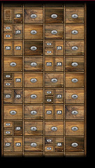
The lovely visual design comes courtesy of Michelle, the latest addition to the Clearleft team, and it mimics a type case; just like the one we happen to have in the office. Every office needs a type case.
Originally, the interface was going to be one looooong type case with some JavaScript layered on top to allow smooth horizontal navigation. But when Rich asked me for some advice on implementing it, I steered him down a different path. Instead of displaying everything horizontally, why not use media queries to show just enough drawers to fit the user's browser window and allow the rest to stack vertically?
I didn't think he'd take my challenge seriously but he's only gone and bloody done it!


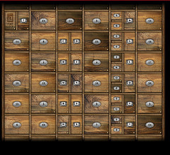
Have a poke around and see what's behind drawer number one.
Tagged with
adfont
calendar
fontdeck
responsive
design
mediaqueries
css
November 30, 2010
Spacelogging
When I was gushing enthusiastically about Old Weather, I tried (and failed) to explain what it is that makes it so damn brilliant. I've just experienced some of that same brilliance. This time the source is Spacelog:
Read the stories of early space exploration from the original NASA transcripts. Now open to the public in a searchable, linkable format.
You can now read the transcripts from the Apollo 13 and Mercury 6 missions, and every single utterance has a permalink. For example:
The beauty of the idea is matched in the execution. Everything about the visual design helps to turn something that was previously simply information into an immersive, emotional experience. It's one thing to know that these incredible events took place, it's another to really feel it.
Spacelog shares the spirit of Science Hack Day. It's a /dev/fort creation, put together in an incredibly short period of time; Norm! has the low-down.
Apollo 13 and Mercury 6 are just the start. If you want to help turn more transcripts into an emotionally engaging work of hypertext, everything is available under a public domain license and all the code is available on Github. Transcripts are available for Gemini 6, Apollo 8, and Apollo 11.
I can't wait to read Charlie Duke as hypertext.
November 21, 2010
Pattern praise
Two months ago, I called Twitter out on their insistence that developers use OAuth when authorising with Twitter while they themselves continued to use the password anti-pattern when they wanted to peek into third-party address books.
I'm happy to report that Twitter have since fixed this. If you go to the Find Friends portion of the "Who To Follow" section, you'll now be greeted with links that lead to correct authentication with LinkedIn, Gmail, Yahoo and Hotmail.
Thanks, Twitteroonies!
Meanwhile, Flickr recently launched their own "Who to Follow" functionality. There is nary a password request in sight: they've implemented correct authentication right out of the gate for Yahoo, Gmail, Hotmail and Facebook.
Thanks, Flickroonies!
See? I'm not always bitching'n'moaning.
November 19, 2010
Spacelift
My sojourn up the western seaboard of the United States has come to an end. It began in San Diego with the final An Event Apart of the year, which was superb as always. From there, I travelled up to San Francisco for Cindy and Matt's wedding celebration, followed by a few days in Seattle. The whole trip was rounded out back in California at the wonderfully titled Institute For The Future in Palo Alto. For that was the location of Science Hack Day San Francisco.
It was an amazing event. Ariel did a fantastic job—she put so much effort into making sure that everything was just right. I suspected it was going to be a lot of fun, but once again, I was blown away by the levels of ingenuity, enthusiasm and sheer brilliance on display.
In just 24 hours, the ingenious science hackers had created particle wind chime which converts particle collisions into music that Brian Eno would be proud of, grassroots aerial mapping with balloons which produced astonishing results (including an iPad app), as well as robots and LEDs a-plenty. The list of hacks is on the wiki.
My own hack was modest in scope. Initially, I wanted to build a visualisation based on Matt's brilliant light cone idea, but I found it far too daunting to try to find data in a usable format and come up with a way of drawing a customisable geocentric starmap of our corner of the galaxy. So I put that idea on the back burner and decided to build something around my favourite piece of not-yet-existing technology: the space elevator.
The idea
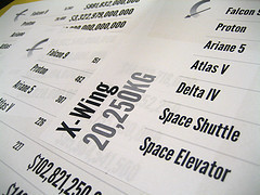
Spacelift compares the cost efficiency of getting payloads into geosynchronous orbit using a space elevator compared to traditional rocketry. Basically, it's a table. But I've tried to make it a pretty table with a bit of data visualisation to show at a glance how much more efficient a space elevator would be.
The payloads I've chosen are spacecraft. Beginning with the modest Voyager 1, it gets more and more ambitious with craft like an X-Wing or the Millennium Falcon before getting crazy with the USS Enterprise and the Battlestar Galactica.
So, for example, while you could get a TIE-fighter into the Clarke belt using a single Atlas V, two Ariane 5s, or three space shuttles, it would cost considerably more than using a space elevator, where you're basically just paying for the electricity.
If you click on the dollar amount for each transport mechanism, you'll see the price calculated as a tower of pennies. Using a Falcon 9, for example, will cost you a tower of pennies 22 times larger than a space elevator, assuming a space elevator is at least 38,000 kilometres tall/long. Using a space elevator, on the other hand, requires spending a tower of pennies about the same height as itself. I don't even bother trying to visualise the relative height differences for getting anything bigger than the Tantive IV into orbit as it would require close to infinite scrolling.
I'm fairly confident of the cost-per-kilogram values for the rockets while the space elevator cost-per-kilogram value is necessarily fuzzy, given that the mechanism doesn't exist yet. But by far the trickiest info to track down was the mass of fictional spacecraft. There's plenty of information on dimensions, speed and armaments, but very little on weight. Mathias saved the day with some diligent research that uncovered the motherlode.
Having such smart, helpful people around made the whole exercise a joy. It was quite a pleasure to walk over to a group of hackers, ask Is anyone here a rocket scientist? and have at least one person raise their hand. The constant presence of Cosmos playing on a loop just added to the atmosphere of exploration and fun.
Implementation
I've put the code on GitHub, 'cause that's what a real hacker would do. It's my first GitHub repository. Be gentle with me.
There's CSS3 and HTML5 a-plenty. I deliberately don't use the IE shim to enable styling of HTML5 structural elements in lesser versions of Internet Explorer; there wouldn't be much point delivering RGBa, opacity and text-shadow styles to a browser that can't handle 'em.
The background colour changes depending on the payload. I'm using a variation of the MD5 colour encoding popularised by Dopplr and documented by Brian in his excellent new book, Designing With Data.
I'm using League Gothic by The League Of Movable Type for the type—ya gotta have a condensed font for data visualisations, right?
There's also a google-o-meter image from the Google chart API.
Needless to say, the layout is responsive and adapts to different viewing environments …including print.
Using CSS transforms, each page of table of price comparisons becomes a handy page to print out and stick on the office wall to remind yourself why the human race needs a space elevator.
November 5, 2010
Drafty
A litte while back, Khoi—who, by the way, has a a book on grid principles for the web coming out soon—asked for some suggestions on Twitter:
Question for bloggers: what tools/methods do you use to manage your queue of future posts and ideas for future posts?
I responded with:
The submit button.
I wasn't being facetious. I think keeping drafts can be counterproductive. The problem is that, once something is a draft rather than a blog post, it's likely to stay a draft and never become a blog post. And the longer something stays in draft, the less likely it is to ever see the light of day. Or, as I posted to Twitter as The First Law of Blogodynamics:
A blog post in draft tends to stay in draft.
I have the functionality for draft posts in my DIY blogging software, but I've only used it once or twice. But maybe that's just me. I still don't really consider this a blog. I find the label "journal" to be more appropriate. And having a draft journal entry just doesn't seem right.
So I write, and I hit submit. I can always go back and edit it afterwards.
October 29, 2010
Layered
It's been a busy week in Brighton. Tantek was in town for a few days, which is always a recipe for enjoyable shenanigans.
The latter half of the week has been a whirlwind of different events. There was a Skillswap on Wednesday and on Thursday, I gave a talk at the Async meet-up, which was quite productive. It gave me a chance to marshall some of my thoughts on responsive enhancement.
The week finished with Layer Tennis. I was honoured—and somewhat intimidated—to be asked to provide the commentary for the Moss vs. Whalen match. Holy crap! Those guys are talented. I mean, I knew that anyway but to see them produce the goods under such a tight deadline was quite something.
Meanwhile, I just blathered some words into a textarea. When it was all done, I read back what I had written and it's actually not that bad:
There Will Be Blood
Pukeworthy
Plastered
Bacon Nation
Zoom In. Now Enhance.
It Ain't Meat, Babe
Longpork Is For Closers
Bass. How Low Can You Go?
Dead Rising
Troll Man
Craven Applause
It was a somewhat stressful exercise in writing on demand, but it was a fun way to finish up the week.
Now, however, I must pack a bag and fly to San Diego. No rest for the wicked
Tagged with
async
skillswap
layertennis
writing
October 28, 2010
Listening
When web designer James Martin asked his peers what they listen to while they work, he came to two conclusions:
Stop listening to music with any lyrical content and
start listening to Explosions in the Sky!
If you're already doing that, then I suggest that the next step is to check out The Orchid. Their New Mexico is rather excellent. And I'm not just saying that because Jason plays guitar.
If you're looking for more music recommendations, I suggest tuning into the inaugural episode of Clagtunes, Richard's latest project. It's rather excellent.
ClagTunes episode 1 on Huffduffer
Tagged with
music
October 24, 2010
Super-Toys Last All Summer Long
When I was in Boston for An Event Apart back in May, I bought an iPad.
That makes it sound like a very casual act. Back then, iPads were in very short supply. When I asked an employee at the Apple Store in Boston if they had any iPads in stock, he didn't answer Hmm… let me check, or Not at the moment. He answered Oh, God no!
Fortunately, Malarkey was far more persistent than I and managed, through means fair or foul, to track down the only two iPads for sale in all of Beantown.
I used the device for two months and then, as predicted, I gave it to my mother. It was definitely the right decision. She loves it. She's using it all the time, surfing the web wherever she pleases.
I liked using the iPad, but I didn't love it. Once the novelty wore off, I found I had few good reasons to use it rather than use my Macbook.
Some observations from a Summer spent in the company of the iPad…
The iPad is almost exactly the wrong weight. It's just that little bit too heavy to comfortably hold in one hand. It's no coincidence that all of iPad demonstrations show it resting on a raised leg. I found that if I was using the iPad for any length of time, I would adopt a more and more relaxed, nay… slouchy position. Before I knew it, I was supine on the sofa, one leg raised with the iPad resting against it, like a Roman emperor waiting to be fed individually-peeled grapes.
The iPad is a great device for reading. I rediscovered the power of RSS. The iPad is also a great device for browsing the web. The problem is, I don't really browse the web that much. Instead, I browse, I bookmark, I quote, I huffduff, I copy, I paste, I tweet, I share. Using an iPad made me realise that the web is very much a read/write medium for me. While it's possible to do all those things on the iPad, it isn't easy.
The tell-tale moment came when I was reading something on the iPad—supine on the sofa, of course—that I wanted to post to Delicious. Rather than fill in a form using the iPad's on-screen keyboard, I found myself putting the iPad down and reaching for my Macbook just to accomplish that one little task. That's when I knew it wasn't the ideal device for me.
Don't get me wrong: I'm not joining in the chorus of those silly enough to say that the iPad can't be used for creating, editing and updating. That conclusion would be far too absolute and Boolean. But I think the iPad favours consumption more than creation. And that's okay. That still makes it a great device for many people—such as my mother.
There's one big fly in the ointment of the iPad as a device for non-geeks—such as my mother—and that's the out-of-the-box experience. John Gruber pointed this out in his review of the iPad:
One thing that is very iPhone-like about iPad is that when you first take it out of the box, it wants to be plugged into your Mac or PC via USB and sync with iTunes. … It creates an impression that the iPad does not stand on its own. It's a child that still needs a parent. But it's not a young child. It's more like a teenager. It's close. So close that it feels like it ought to be able to stand on its own.
My mother has an old G3 Ruby iMac which doesn't have USB 2, so I had to set up the iPad on my machine before giving it to her. It's such a shame that this step is even necessary. I love the idea of a portable touchscreen device that you can simply turn on for the first time, connect to a WiFi network, and start surfing the web.
Perhaps later versions of the iPad will support account synching via MobileMe. Perhaps later versions of the iPad will support multiple accounts, which would make it a great family household device. Perhaps later versions of the iPad will have a front-facing camera and support FaceTime. Perhaps later versions of the iPad will be slimmer and lighter.
Perhaps I will get a later version of the iPad.
October 22, 2010
Crowdscribing
I mentioned in my last post that I was looking for volunteers to help transcribe the video of my talk at Fronteers 2010. I didn't get much of a response so I put the word out on Twitter. Then I got plenty of offers.
I owe a pint to these people:
Jon Linklater-Johnson
Jason Fry
Matthias Reuter
Richie Coss
Jennifer Hageman
Matthew Loseke
Danielle Huntrods
Ian Lunn
You can see the results of their work here: The Design Of HTML5. Each volunteer transcribed about ten minutes of the talk, which equates to about an hour's work.
As it turned out, the Fronteers folks had commissioned a transcription from Casting Words, the service built on Amazon's Mechanical Turk. You can see the result—not bad. I've used Casting Words in the past to get transcriptions done although lately I've found they take far too long for somewhat inconsistent results.
I think that, for the best results, you can't beat hiring a professional transcriber. But, in lieu of that, I think the aforementioned volunteers did a great job, for which I am very grateful.
Incidentally, the talk—The Design Of HTML5—is licensed under a Creative Commons attribution licence so if you want to republish it or adapt it, please go ahead.
Tagged with
transcript
accessibility
twitter
presentation
conference
Jeremy Keith's Blog

- Jeremy Keith's profile
- 56 followers

