
Jeremy Keith's Blog, page 150
March 13, 2011
Managing Southby
I was somewhat trepidatious about coming to South by Southwest this year. It's big. Really, really big. It was already quite big last year and it was kind of hard to see everyone so I assumed that this year the problem would be exacerbated.
I have been pleasantly surprised. On the first day alone I met so many friends I was hoping to see over the course of the whole event. This makes me very, very happy. I'm also meeting lots of new people. This too makes me very, very happy. The excellent weather and delicious food of Austin, Texas is also making me very, very happy.
So far I've been pretty fortunate in my choice of panels and presentations. I'm generally avoiding HTML/CSS/JavaScript talks and going for material that's only tangentially related to my work. To that end, I've enjoyed presentations on cargo containers, mad science secrets of DARPA and the influence of science fiction on cities.
Finding and managing SxSW presentations can be a chore. The official panel picker is pretty bad—an event site without microformats is just broken. Taylor's project, Sched, is a much better substitute.
Figuring out which presentations to go to has been a whole lot easier this year. It's all thanks to Lanyrd, which has a dedicated sub-site just for Southby. Putting a schedule together has been a breeze and getting my calendar into iCal onto my iPod is nice and straightforward. The grid view is particularly handy for making panel choices; a distant location can make or break the decision.
For such a well-thought out and executed service, you'd be forgiven for thinking that Lanyrd has a team of team working on it. But the team behind every single part of Lanyrd is just two people: Simon and Nat. The site would be an impressive achievement anyway but it's quite amazing when you know that it's the work of just two people—admittedly two of the most talented and hard-working people I know.


March 10, 2011
Drupalcon in Chi-town
The last time I was in Chicago the weather was rather lovely. I spent some time walking around, gaping up at the skyscrapers and exploring the city.
This time the weather has been a bit chillier. My attempts to venture out and explore the city on foot ended in defeat as I was beaten back to the warmer confines of the hotel playing host to Drupalcon.
My first day, as anticipated, was spent hunting down a mythical FedEx/Kinkos so I could print out workshop materials—paper-based exercises and HTML5 pocketbooks. With that task achieved—at no minor expense; charging for ink on paper is clearly a lucrative business model—imagine my surprise when I turned up the next day for my workshop and I was handed the printouts of my workshop exercises; the same materials I had been told I would have to print out for myself. Clearly, I didn't get the memo …possibly because said memo was never conjured into existence.
Apart from that breakdown in communication, the HTML5 workshop went smoothly. Better than smoothly. The attendees were asking excellent questions and some great discussions emerged. Running a workshop can be very tiring but it can also be very rewarding.
The next morning I attended Dries's pep-talk keynote. It was like experiencing a milder, kinder more collaborative version of Scientology (I kid, I kid; 'twas a lovely State of the Union address).
Part of the keynote was a compilation of answers to the question "What is Drupal?" put to a backing track of a suitably schmaltzy motivational song (David Brent would've been jealous). As I watched the quotes appear on screen, I noticed that one of them was attributed to me. Except… I have no recollection of ever saying or writing something along the lines of:
Drupal makes complex things easy and easy things complex.
I guess it sounds like something I could have said. In fact, I could justify the quote thusly: If you want to get a database-driven site up and running quickly, you can do that with Drupal simply by pressing a few buttons and pulling the software equivalent of levers. However, if you want to edit, for example, the way that a particular form field has been marked up, or you'd like to remove some superfluous div elements …well, for that you need to really know what you're doing.
Hence, Drupal makes complex things (like setting up a website) easy and easy things (like editing some markup) complex.
I had quite a few conversations with people about the nature of frameworks and Drupal in particular. Personally, it doesn't appeal to me, not just because it doesn't output the kind of markup that I'd like. It doesn't appeal to me simply because it outputs any markup at all. I prefer something more like Django that takes care of abstracting away all that server-side complexity and database work, but leaves it entirely up to you to create the front-end (well, except for the admin interface).
But that's just me. And I totally understand that for other people, that just isn't a priority and Drupal's ability to deliver an entire site, front-end included, is a godsend. Different frameworks will appeal to different people—the trick is in finding a framework that matches the way that you approach a problem. A framework is, after all, supposed to be a tool to help you get work done faster. No one framework is suitable for all projects and no one framework can possibly hope to appeal to everyone.
Yet, at Drupalcon, I got the impression that Drupal might be attempting to do just that. Rather than focusing on the kind of sites for which Drupal is particularly well-suited, the goal appears to be nothing less than total domination of the web. I'm not sure that's such a good idea. If you try to please literally everybody, I think you'll probably end up pleasing nobody.
I did hear rumblings of the possibility of changing Drupal so that there would be no markup in its core release. Rather, different distributions (built on top of core) could be used to create the right kind of site; one distribution for news sites, another distribution for company websites, and so on. I like that idea. It would also make it easier for Drupal to adapt its output to different devices—something that Dries touched on his keynote.
Meanwhile Jen is spearheading an effort to update Drupal's output to include HTML5 additions—new input types for forms, sectioning elements for content, and so on. She's beginning by proposing some design principles. I believe this is a thoroughly excellent approach. At Jen's Drupalcon core conversation I offered my feedback (and encouragement) on how the design principles are shaping up.
For the rest of Drupalcon, I found plenty to keep my interest. There was a significant design portion to the proceedings so even a non-Drupal person like me could find some great talks, like Samantha's superb round-up of design techniques—I'll be bringing some of those gems back to the Clearlefties.
My final night in Chicago was nigh-on perfect. Adrian Holovaty had been in touch to let me know that his band would be playing in the historic Green Mill. I rustled up a little posse of designers and we spent the evening listening to superb gypsy jazz in an amazing venue that was once a favourite haunt of Al Capone (rumour has it that the grumpy doorman is related). A nightcap of beer and cheezborger, cheezborger, cheezborger at The Billy Goat Tavern was the coup de grace.
Now I bid farewell to Chicago and hello to Austin, where the weather is significantly warmer.
March 4, 2011
American Odyssey
I've been back in Brighton for just a couple of days and now I'm about to embark on a fairly lengthy trip away to the States.
Tomorrow I'm flying to a somewhat chilly Chicago. I've only been there once before, but I absolutely loved it. The architecture! The hot dogs! Cheeseborger! Cheeseborger! Cheeseborger!
I'm going there for Drupalcon. I'll be leading an HTML5 workshop on Monday. I'd love to try to Abe Froman my way into the Web Science Workshop the day before, but I'll probably be too busy finding somewhere to print off workshop materials (a service the conference organisers are unwilling to provide …it's like the opposite of how Sophie runs UX London).
Right about the time that Drupalcon is wrapping up, I'll head down to Austin for the annual geek pilgrimage to South By Southwest Interactive. I should really pay close attention Tantek's SXSW packing and check list.
This year, I'm not giving a presentation or speaking on a panel so I can relax and enjoy myself. If you're heading to Southby, I look forward to sharing a Shiner Bock or three—one of the reasons I like going is not just to see people I haven't seen in ages, but also to meet new people who equally geeky about the web.
After the craziness of Austin, I'm going to unwind for a while with the in-laws down in Saint Augustine, Florida, which should be nice and relaxing.
After that, I'm off to Portland, Oregon; a place to which I've never been but about which I've heard plenty of good things. There's geek meet up planned for March 24th. Come along for a beer and a chat.
Finally, I'll finish up in Seattle for the first Event Apart of the year. I have no doubt that the conference will be excellent, as usual. I just hope that the presentation I've got planned can meet the high standards set by the other speakers.
If you're going to be in any of those places—Chicago, Austin, Saint Augustine, Portland, or Seattle—I look forward to seeing you there.
Tagged with
travel
conference
america
sxsw
drupalcon
sxswi
sxsw2011
sxswi2011
aea2011
chicago
austin
florida
portland
seattle
February 28, 2011
101000
The travelling time is underway. I'm in Denmark right now, leading an HTML5 workshop at NoMA, the Nordic Multimedia Academy, and thanks to some excellent questions from the students, it's all going smoothly.
Last week I was in Belgium for the Phare conference, which also went smoothly. I enjoyed giving my presentation and I really enjoyed the excellent hospitality of the Ghentians.
While I was in Belgium, the occasion of my fortieth birthday arrived with a sense of long-foreseen inevitability. I spent it in Bruges.
Four zero. The big four oh. Two squared times ten. The answer to life, the universe and everything minus two.
The photons that were reflected from Earth at the time of my birth are arriving at GJ 1214 b. Or, to put in another way, the light that left GJ 1214 at the moment of my birth is entering our solar system, perhaps even reaching the retinas of human beings somewhere on this planet who happen to be looking into just the right part of the sky at just the right time.
Tagged with
denmark
belgium
phareconf
birthday
40
forty
astronomy
gj1214b
light
February 22, 2011
The long prep
The secret to a good war movie is not in the depiction of battle, but in the depiction of the preparation for battle. Whether the fight will be for Agincourt, Rourke's Drift, Helm's Deep or Hoth, it's the build-up that draws you in and makes you care about the outcome of the upcoming struggle.
That's what 2011 has felt like for me so far. I'm about to embark on a series of presentations and workshops in far-flung locations, and I've spent the first seven weeks of the year donning my armour and sharpening my rhetorical sword (so to speak). I'll be talking about HTML5, responsive design, cultural preservation and one web; subjects that are firmly connected in my mind.
It all kicks off in Belgium. I'll be taking a train that will go under the sea to get me to Ghent, location of the Phare conference. There I'll be giving a talk called All Our Yesterdays.
This will be non-technical talk, and I've been given carte blanche to get as high-falutin' and pretentious as I like …though I don't think it'll be on quite the same level as my magnum opus from dConstruct 2008, The System Of The World.
Having spent the past month researching and preparing this talk, I'm looking forward to delivering it to a captive audience. I submitted the talk for consideration to South by Southwest also, but it was rejected so the presentation in Ghent will be a one-off. The SXSW rejection may have been because I didn't whore myself out on Twitter asking for votes, or it may have been because I didn't title the talk All Our Yesterdays: Ten Ways to Market Your Social Media App Through Digital Preservation.
Talking about the digital memory hole and the fragility of URLs is a permanently-relevant topic, but it seems particularly pertinent given the recent moves by the BBC. But I don't want to just focus on what's happening right now—I want to offer a long-zoom perspective on the web's potential as a long-term storage medium.
To that end, I've put my money where my mouth is—$50 worth so far—and placed the following prediction on the Long Bets website:
If you have faith in the Long Now foundation's commitment to its URLs, you can challenge my prediction. We shall then agree the terms of the bet. Then, on February 22nd 2022, the charity nominated by the winner will receive the winnings. The minimum bet is $200.
If I win, it will be a pyrrhic victory, confirming my pessimistic assessment.
If I lose, my faith in the potential longevity of URLs will be somewhat restored.
Depending on whether you see the glass as half full or half empty, this means I'm either entering a win/win or lose/lose situation.
Tagged with
longbet
prediction
digital
preservation
urls
phareconf
belgium
speaking
sxsw
travelling
February 20, 2011
Voice of the Beeb hive
Ian Hunter at the BBC has written a follow-up post to his initial announcement of the plans to axe 172 websites. The post is intended to clarify and reassure. It certainly clarifies, but it is anything but reassuring.
He clarifies that, yes, these websites will be taken offline. But, he reassures us, they will be stored …offline. Not on the web. Without URLs. Basically, they'll be put in a hole in the ground. But it's okay; it's a hole in the ground operated by the BBC, so that's alright then.
The most important question in all of this is why the sites are being removed at all. As I said, the BBC's online mothballing policy has—up till now—been superb. Well, now we have an answer. Here it is:
But there still may come a time when people interested in the site are better served by careful offline storage.
There may be a parallel universe where that sentence makes sense, but it would have to be one in which the English language is used very differently.
As an aside, the use of language in the "explanation" is quite fascinating. The post is filled with the kind of mealy-mouthed filler words intended to appease those of us who are concerned that this is a terrible mistake. For example, the phrase "we need to explore a range of options including offline storage" can be read as "the sites are going offline; live with it."
That's one of the most heartbreaking aspects of all of this: the way that it is being presented as a fait accompli: these sites are going to be ripped from the fabric of the network to be tossed into a single offline point of failure and there's nothing that we—the license-payers—can do about it.
I know that there are many people within the BBC who do not share this vision. I've received some emails from people who worked on some of the sites scheduled for deletion and needless to say, they're not happy. I was contacted by an archivist at the BBC, for whom this plan was unwelcome news that he first heard about here on adactio.com. The subsequent reaction was:
It was OK to put a videotape on a shelf, but putting web pages offline isn't OK.
I hope that those within the BBC who disagree with the planned destruction will make their voices heard. For those of us outside the BBC, it isn't clear how we can best voice our concerns. Nicola Ivory, publicist for BBC Online, can be contacted at nicola.ivory@bbc.co.uk: she may be able to help funnel our concerns to the right people. You could also make a complaint to the BBC, though that seems to be intended more for complaints about programme content.
In the meantime, you can download all or some of the 172 sites and plop them elsewhere on the web. That's not an ideal solution—ideally, the BBC shouldn't be practicing a deliberate policy of link rot—but it allows us to prepare for the worst.
I hope that whoever at the BBC has responsibility for this decision will listen to reason. Failing that, I hope that we can get a genuine explanation as to why this is happening, because what's currently being offered up simply doesn't cut it. Perhaps the truth behind this decision lies not so much with the BBC, but with their technology partner, Siemens, who have a notorious track record for shafting the BBC, charging ludicrous amounts of money to execute the most trivial of technical changes.
If this decision is being taken for political reasons, I would hope that someone at the BBC would have the honesty to say so rather than simply churning out more mealy-mouthed blog posts devoid of any genuine explanation.
Tagged with
bbc
archive
history
online
digital
preservation
culture
politics
linkrot
February 17, 2011
Sea change
I remember when Google Maps first launched back in February 2005. As well as being enormous fun—I spent hours finding famous landmarks and places—it was a complete game-changer. The "slippy maps" style of interaction felt weird, then delightful and then just …right.
Things move fast on the web. It didn't take long for us to get used to slippy maps. Before too long, we came to expect them. These days, if I see a map in a web page, I expect to be able to drag and pan within it. If instead, when I click and and drag, I discover that the map is just a plain old-fashioned image, it feels …wrong.
Similarly, if I visit a web page that's about an event, I expect to be able to use a bookmarklet or browser extension, or click a link to add it my calendar by converting the page's hCalendar. If instead it turns out that the page isn't using microformats, it's like discovering that what looked like a house on the outside is actually just a facade with nothing behind it. It feels …wrong.
Increasingly, I'm getting that feeling whenever I visit a website that doesn't respond to the size and capabilities of my browser. If I get handed a crawlbar, I try to understand the reason for it but more often than not, it's simply a sign that the website has been built by someone with a non-web, print-based, fixed-canvas mentality. It feels …wrong.
That's why I can relate to what Andy says:
Today, anything that's fixed and unresponsive isn't web design, it's something else. If you don't embrace the inherent fluidity of the web, you're not a web designer, you're something else.
Web design is responsive design, Responsive Web Design is web design, done right.
Web designers and developers have become very comfortable in approaching the web from one context: the so-called "desktop" environment (just as they got very comfortable a few years back designing for a stagnant, slow-moving browser landscape). This complacency has led to lazy and sloppy thinking; assuming that any content can be served up in a 960 pixel wide container; assuming that using plenty of large images isn't a problem because bandwidth has improved over time.
I'm glad that the increasing diversity of devices—together with the ascendancy of so-called "mobile"—is forcing designers and developers to move beyond their fixed-width comfort zone.
There's still a lot of resistance, though. That's why the idea of creating separate silos for "mobile" devices is initially so appealing. But that approach won't scale: it's just not practical to spend equal time and effort crafting different endpoints for iPhone, Android, Palm, Kindle, iPad, etc. The solution is to either reject part of your potential audience and concentrate only on a subset of users like, say, just iPhone users …or you can embrace responsive design. The first option is the cure that kills the patient. The second option might seem intimidating at first, but it's going to become increasingly accepted. Inevitable, even.
Those who are currently rejecting responsive design point to the difficulties of making desktop-optimised sites work on small screens with potentially narrow bandwidth. They're right. But the solution is not to create a separate site just for smaller screens. The solution is to fix the site so it isn't optimised for just one environment.
The truth is that web designers and developers have been making device-specific websites for years; it's just that the device in question was the desktop computer. But just about every point in the W3C's Mobile Best Practices should be applied to all websites.
This new approach to designing and building websites reminds me of a similar sea-change a few years ago. The change from table-based layouts to CSS and semantic markup seemed far from inevitable at first. It met with a lot of resistance from designers and developers who had grown comfortable with their existing sets of skills. It took trailblazers like Doug, Mike, Dan and Dave to demonstrate the possibilities by launching the Wired redesign, the ESPN redesign, the Fast Company redesign and of course, the CSS Zen Garden.
As always, the innovation begins with personal projects. Take a look at the Media Queries website—a showcase for responsive designs and a handy place to find out how others are dealing with fluid grids and resizing images. The majority of the showcased sites are personal sites, demonstrating the possibilities of device-agnostic development.
I'm looking forward to seeing the first really big brand relaunch that embraces responsive design. After that, prepare for the floodgates to open.
If, by the way, you happen to work at a company that's looking to abandon a desktop-specific web presence in favour of something that's truly native to the web, get in touch with Clearleft. We're excited about this approach to web design. It feels …right.
Tagged with
responsive
design
February 16, 2011
New day rising
I don't get up to London that often. Much as I like the place, the travel to and fro from Brighton can be exhausting, given the woeful state of the rail services on that line—just ask anybody who does the daily commute.
On Monday, I had an appointment in London. Rather than take the usual train to Victoria, it made more sense to take the London Bridge route. It must have been quite a while since I was last on that train because, as it pulled into London Bridge station, I was confronted with the impressive sight of a science fictional structure rising out of the city: the Shard.
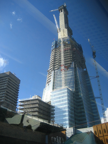
From my subjective perspective, it came out of nowhere. The sense of having a large chunk of the future come crashing into my present was amplified by the soundscape; I was listening to the soundtrack from science-fiction film on a small, handheld touchscreen device with more storage than the combined hard drive space of all the computers I ever used up to just a few years ago. The last time I experienced this collision was on the train between Copenhagen and Malmö, listening to the soundtrack to Blade Runner, looking out at the colossal turbines of the offshore wind farm.
On my way back to Brighton, the experience was reversed. Heralded by the kind of doppler-stretched whistle that you only hear in old films, a steam engine raced by, hauling dining cars of elegantly-decked tables draped in white, a lamp on each one.
"The future is already here", said William Gibson. "It's just not very evenly distributed." The past is still here too, equally unevenly-distributed.
The present is a lumpy place on the timeline.
Tagged with
london
architecture
future
shard
February 8, 2011
Going Postel
I wrote a little while back about my feelings on hash-bang URLs:
I feel so disappointed and sad when I see previously-robust URLs swapped out for the fragile #! fragment identifiers. I find it hard to articulate my sadness…
Fortunately, Mike Davies is more articulate than I. He's written a detailed account of breaking the web with hash-bangs.
It would appear that hash-bang usage is on the rise, despite the fact that it was never intended as a long-term solution. Instead, the pattern (or anti-pattern) was intended as a last resort for crawling Ajax-obfuscated content:
So the #! URL syntax was especially geared for sites that got the fundamental web development best practices horribly wrong, and gave them a lifeline to getting their content seen by Googlebot.
Mike goes into detail on the Gawker outage that was a direct result of its "sites" being little more than single pages that require JavaScript to access anything.
I'm always surprised when I come across as site that deliberately chooses to make its content harder to access.
Though it may not seem like it at times, we're actually in a pretty great position when it comes to front-end development on the web. As long as we use progressive enhancement, the front-end stack of HTML, CSS, and JavaScript is remarkably resilient. Remove JavaScript and some behavioural enhancements will no longer function, but everything will still be addressable and accessible. Remove CSS and your lovely visual design will evaporate, but your content will still be addressable and accessible. There aren't many other platforms that can offer such a robust level of loose coupling.
This is no accident. The web stack is rooted in Postel's law. If you serve an HTML document to a browser, and that document contains some tags or attributes that the browser doesn't understand, the browser will simply ignore them and render the document as best it can. If you supply a style sheet that contains a selector or rule that the browser doesn't recognise, it will simply pass it over and continue rendering.
In fact, the most brittle part of the stack is JavaScript. While it's far looser and more forgiving than many other programming languages, it's still a programming language and that means that a simple typo could potentially cause an entire script to fail in a browser.
That's why I'm so surprised that any front-end engineer would knowingly choose to swap out a solid declarative foundation like HTML for a more brittle scripting language. Or, as Simon put it:
Gizmodo launches redesign, is no longer a website (try visiting with JS disabled): http://gizmodo.com/
Read Mike's article, re-read this article on URL design, or if you prefer an audio-visual message, watch the final minute of this interview with John Resig:
Tagged with
urls
javascript
web
development
ajax
google
rest
twitter
gawker
lifehacker
robustness
accessiblity
Linkrotting
Yesterday's account of the BBC's decision to cull 172 websites caused quite a stir on Twitter.
Most people were as saddened as I was, although Emma described my post as being "anti-BBC." For the record, I'm a big fan of the BBC—hence my disappointment at this decision. And, also for the record, I believe anyone should be allowed to voice their criticism of an organisational decision without being labelled "anti" said organisation …just as anyone should be allowed to criticise a politician without being labelled unpatriotic.
It didn't take long for people to start discussing an archiving effort, which was heartening. I started to think about the best way to coordinate such an effort; probably a wiki. As well as listing handy archiving tools, it could serve as a place for people to claim which sites they want to adopt, and point to their mirrors once they're up and running. Marko already has a head start. Let's do this!
But something didn't feel quite right.
I reached out to Jason Scott for advice on coordinating an effort like this. He has plenty of experience. He's currently trying to figure out how to save the more than 500,000 videos that Yahoo is going to delete on March 15th. He's more than willing to chat, but he had some choice words about the British public's relationship to the BBC:
This is the case of a government-funded media group deleting. In other words, this is something for The People, and by The People I mean The Media and the British and the rest to go HEY BBC STOP
He's right.
Yes, we can and should mirror the content of those 172 sites—lots of copies keep stuff safe—but fundamentally what we want is to keep the fabric of the web intact. Cool URIs don't change.
The BBC has always been an excellent citizen of the web. Their own policy on handling outdated content explains the situation beautifully:
We don't want to delete pages which users may have bookmarked or linked to in other ways.
Moving a site to a different domain will save the content but it won't preserve the inbound connections; the hyperlinks that weave the tapestry of the web together.
Don't get me wrong: I love the Internet Archive. I think that Brewster Kahle is doing fantastic work. But let's face it; once a site only exists in the archive, it is effectively no longer a part of the living web. Yet, whenever a site is threatened with closure, we invoke the Internet Archive as a panacea.
So, yes, let's make and host copies of the 172 sites scheduled for termination, but let's not get distracted from the main goal here. What we are fighting against is link rot.
I don't want the BBC to take any particular action. Quite the opposite: I want them to continue with their existing policy. It will probably take more effort for them to remove the sites than to simply let them sit there. And let's face it, it's not like the bandwidth costs are going to be a factor for these sites.
Instead, many believe that the BBC's decision is politically motivated: the need to be seen to "cut" top level directories, as though cutting content equated to cutting costs. I can't comment on that. I just know how I feel about the decision:
I don't want them to archive it. I just want them to leave it the fuck alone.
"What do we want?" "Inaction!"
"When do we want it?" "Continuously!"
Tagged with
bbc
archive
history
online
digital
preservation
culture
politics
linkrot
Jeremy Keith's Blog

- Jeremy Keith's profile
- 56 followers

