
Jeremy Keith's Blog, page 146
June 7, 2011
Ethan
Jeffrey, Mandy and Jason have created something very special with A Book Apart. This lovely video from the good folks at Mailchimp does a nice job of capturing the spirit of this publishing enterprise:
Needless to say, I was incredibly honoured to write the first book they released. But my little contribution was but a harbinger of what was yet to come. I am John The Baptist to Ethan's Jesus Christ.
As of today, you can buy Responsive Web Design from A Book Apart. I urge you to do so. And don't skimp on the electronic versions either—the ePub has been crafted with a wonderful level of care and attention.
I could try explain what it is about this book that makes it so special, but I've already tried once to do that. Ethan very kindly asked me to write the foreword to his book. I was—once again—honoured.
This was the best I could come up with:
Language has magical properties. The word "glamour"— which was originally a synonym for magic or spell-casting— has its origins in the word "grammar." Of all the capabilities of language, the act of naming is the most magical and powerful of all.
The short history of web design has already shown us the transformative power of language. Jeffrey Zeldman gave us the term "web standards" to rally behind. Jesse James Garrett changed the nature of interaction on the web by minting the word "Ajax."
When Ethan Marcotte coined the term "responsive web design" he conjured up something special. The technologies existed already: fluid grids, flexible images, and media queries. But Ethan united these techniques under a single banner, and in so doing changed the way we think about web design.
Ethan has a way with words. He is, of course, the perfect person to write a book on responsive web design. But he has done one better than that: he has written the book on responsive web design.
If you're hoping for a collection of tricks and tips for adding a little bit of superficial flair to the websites that you build, then keep looking, my friend. This little beauty operates at a deeper level.
When you've finished reading this book (and that won't take very long) take note of how you approach your next project. It's possible that you won't even notice the mind-altering powers of Ethan's words, delivered, as they are, in his light-hearted, entertaining, sometimes downright hilarious style; but I guarantee that your work will benefit from the prestidigitation he is about to perform on your neural pathways.
Ethan Marcotte is a magician. Prepare to be spellbound.
Tagged with
abookapart
responsive
design
publishing
book


May 30, 2011
Hashcloud
Hashbangs. Yes, again. This is important, dammit!
When the topic first surfaced, prompted by Mike's post on the subject, there was a lot of discussion. For a great impartial round-up, I highly recommend two posts by James Aylett:
Wisdom comes from genuine reflection and
Client-side routing, the teenage years.
There seems to be a general concensus that hashbang URLs are bad. Even those defending the practice portray them as a necessary evil. That is, once a better solution is viable—like the HTML5 History API—then there will no longer be any need for #! in URLs. I'm certain that it's a matter of when, not if Twitter switches over.
But even then, that won't be the end of the story.
Dan Webb has written a superb long-zoom view on the danger that hashbangs pose to the web:
There's no such thing as a temporary fix when it comes to URLs. If you introduce a change to your URL scheme you are stuck with it for the forseeable future. You may internally change your links to fit your new URL scheme but you have no control over the rest of the web that links to your content.
Therein lies the rub. Even if—nay when—Twitter switch over to proper URLs, there will still be many, many blog posts and other documents linking to individual tweets …and each of those links will contain #!. That means that Twitter must make sure that their home page maintains a client-side routing mechanism for inbound hashbang links (remember, the server sees nothing after the # character—the only way to maintain these redirects is with JavaScript).
As Paul put it in such a wonderfully pictorial way, the web is agreement. Hacks like hashbang URLs—and URL shorteners—weaken that agreement.
Tagged with
urls
javascript
web
development
rest
twitter
robustness
accessibility
May 24, 2011
Topically hot
I'm heading up to London for the next few days to soak up all the knowledge being distributed at this year's Web Directions @media. I wish it weren't a double-track conference—no-one should have to choose between Lea Verou and Douglas Crockford—but I'll be doing my best to maximise my knowledge acquisition while fending off feelings of FOMO.
As well as attending, I'm also going to be facilitating. So I'm not just going there as an fomo-ing attendee; I'm also going to be a mofo-ing facilitator.
Yes, it's that grand ol' @media institution: The Hot Topics Panel (sszzz!):
A popular @media tradition, hosted by Jeremy Keith, the final session for day one will feature a selection of speakers discussing questions posed by conference attendees. A lively conversation and some passionate debate will occur, so bring along your questions and enjoy the robust discussion.
Last year's panel was a blast. Now I am rubbing my hands in gleeful anticipation. I get to play Wogan again. I have no idea who I'll pulling up on stage but I've quite a stellar list to choose from.
I also have no idea what we'll be discussing/debating/arguing/quibbling about but I hope that by the time the panel actually starts I will have amassed some suggestions. Conference attendees can provide burning questions on the day, through whatever medium they choose; a tweet, a scrap of paper, a sandwich board.
I'd like to get a head-start on gauging the relative mean temperature of various topics. After all, the nature of the topics should probably influence my decision about who to coerce into getting up on stage with me.
That's where you come in. What burning web design and development topics are keeping you awake? Is there something that really grinds your gears? Vent for me. Vent into my comment form.
(Yes, comments are open. No, you shouldn't just write "First!")
Tagged with
atmedia
conference
webdirections
wdx
panel
The good new days
I'm continually struck by a sense of web design deja vu these days. After many years of pretty dull stagnation, things are moving at a fast clip once again. It reminds of the web standards years at the beginning of the century—and not just because HTML5 Doctor has revived Dan's excellent Simplequiz format.
Back then, there was a great spirit of experimentation with CSS. Inevitably the experimentation started on personal sites—blogs and portfolios—but before long that spirit found its way into the mainstream with big relaunches like ESPN, Wired, Fast Company and so on. Now I'm seeing the same transition happening with responsive web design and, funnily enough, I'm seeing lots of the same questions popping up:
How do we convince the client?
How do we deal with ad providers?
How will the CMS cope with this new approach?
Those are tricky questions but I'm confident that they can be answered. The reason I feel so confident is that there are such smart people working on this new frontier.
Just as we once gratefully received techniques like Dave's CSS sprites and Doug's sliding doors, now we have new problems to solve in fiendishly clever ways. The difference is that we now have Github.
Here's a case in point: responsive images. Scaling images is all well and good but beyond a certain point it becomes overkill. How do we ensure that we're serving up appropriately-sized images to various screen widths?
Scott kicked things off with his original code, a clever mixture of JavaScript, cookies, .htaccess rules and the -data HTML5 attribute prefix. Crucially, this technique is using progressive enhancement: the smaller image is the default; the larger image only gets swapped in when the screen width is wide enough. Update: and Scott has just updated the code to remove the -data-fullsrc usage.
Mark was able to take Scott's code and fork it to come up with his own variation which uses less JavaScript.
Andy added his own twist on the technique by coming up with a slightly different solution: instead of looking at the width of the screen, take a look a look at the width of the element that contains the image. Basically, if you're using percentages to scale your images anyway, you can compare the offsetWidth of the image to the declared width of the image and if it's larger, swap in a larger image. He has written up this technique and you can see it in action on the holding page for this September's Brighton Digital Festival.
I particularly like Andy's Content First approach. The result is that sometimes a large screen width might mean you actually want smaller images (because the images will appear within grid columns) whereas a smaller screen, like maybe a tablet, might get the larger images (if the content is linearised, for example). So it isn't the width of the viewport that matters; it's the context within which the image is appearing.
All three approaches are equally valuable. The technique you choose will depend on your own content and the specific kind of problem you are trying to solve.
The Mobile Safari orientation and scale bug is another good example of a crunchy problem that smart people like Shi Chuan and Mathias Bynens can tackle using the interplay of blogs, Github and to a lesser extent, Twitter. I just love seeing the interplay of ideas that cross-pollinate between these clever-clogged geeks.
Tagged with
responsive
design
images
development
github
collaboration
css
javascript
May 17, 2011
The sound of song
Brian Eno has much to say on the subject of singing:
I believe that singing is the key to long life, a good figure, a stable temperament, increased intelligence, new friends, super self-confidence, heightened sexual attractiveness, and a better sense of humor.
You can read the whole thing or listen to his voice.
The Key to a Long Life on Huffduffer
He may be overselling it but I think he's onto something, as I noted last time I sang karaoke in Brighton. And it's not just karaoke—singing in a church choir, playing Rock Band, performing in a cheesy covers band …none of these activities really have anything to do with virtuosity and everything to do with opening up the lungs and passing air over the vocal cords in an uninhibited way.
I used to sing all the time. Before I had a "real" job it was how I made ends meet, busking my way 'round Europe.
These days when I reach for my bouzouki or mandolin, it's usually to play some tunes—jigs and reels. But lately, with Grant McLennan on my mind, I've been rediscovering the songs of The Go-Betweens. As well as listening to their back catalogue, I've been recalling their songs I used to sing and I've started singing them again.
It feels good. Eno describes it thusly:
You use your lungs in a way that you probably don't for the rest of your day, breathing deeply and openly. And there are psychological benefits, too: Singing aloud leaves you with a sense of levity and contentedness.
It feels especially good in combination with the plucking of strings …or as Shakespeare put it:
Is it not strange that sheeps' guts should hale souls out of men's bodies?
For no particular reason, I've been recording some of those Go-Betweens songs. They're very rough. They're very lo-fi. But playing and singing them …well, it just feels good.
Bachelor Kisses
Bachelor Kisses on Huffduffer
Rock and Roll Friend
Rock and Roll Friend on Huffduffer
Bye Bye Pride
Bye Bye Pride on Huffduffer
You Won't Find It Again
You Won't Find It Again on Huffduffer
The Devil's Eye
The Devil's Eye on Huffduffer
Tagged with
singing
go-betweens
music
May 15, 2011
Mobilism browser panel
I spent the last few days in the beautiful surroundings of Amsterdam for Mobilism. 'Twas an excellent affair: a well-organised, focused single-track conference. It may have helped that Amsterdam itself was looking bloody gorgeous for the duration.
All the talks were great but I was particularly happy to finally hear Bryan and Stephanie Rieger having so often favourited their presentations on Slideshare. They both blew my mind, though I'll admit to a certain amount of confirmation bias in hearing their Content First message.
For my part, I moderated what I believe may have been the world's first panel dedicated to mobile browsers.
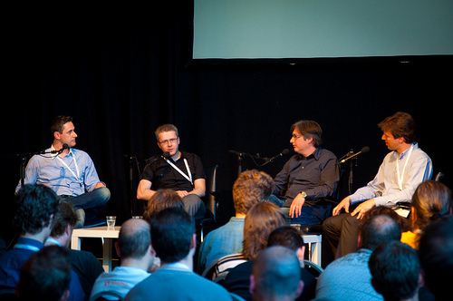
I thoroughly enjoyed myself …somewhat at the expense of the panelists. There were representatives from Opera, Nokia and RIM present, ready and willing to take their punishment. They were the ones brave enough to actually show up. Despite PPK's best efforts, there was an Apple- and Google-shaped hole on stage. Apple never sends anyone to any event to speak on behalf of the company. And Google were clearly just too chickenshit.
So kudos to the mobile browser vendors that did have the guts to take a grilling from web developers. The panel got quite technical for a while—which you may or not find boring, depending on how much of a browser nerd you are—but once we moved on to more philosophical bigger-picture questions, it got very interesting indeed.
Luke took some notes and the whole thing has been recorded for posterity. Oh, and a big "thank you!" to everyone who took the time to answer my request for questions.
May 9, 2011
Questioning mobile browsers
I'm off to Amsterdam later this week for Mobilism, a design and development conference with a focus mobile devices. I won't be giving a talk—there are far more qualified and talented people on the roster—but I will be moderating a panel. I love moderating panels.
My panelists will be exemplars of that strange breed of supernerd, the browser maker. Specifically, the mobile browser maker. More specifically still, Opera, RIM and Nokia.
So if you've got a question that you'd like answered by any or all of these representatives, let me know. I've got a few questions of my own but I'm looking for more ammunition.
Okay. Let 'er rip. Comments are open (gasp!).
Tagged with
mobilism
conference
mobile
panel
browsers
Ampersand
What with all the overseas travelling I've been doing lately, I'm quite looking forward to going to some conferences here in the UK. I'm definitely looking forward to Web Directions @media in London later this month and DIBI in Newcastle next month although there's something about both events that troubles me: they're both double-track conferences, splitting the talks into "design" and "development" categories.
Don't get me wrong—I think the line-ups look great. But that's just the problem. I know I'm going to have make some very hard choices when two excellent speakers are on at exactly the same time. It's a guarantee that I'll have strong feelings of FOMO.
Personally, I'd rather not have to make those decisions. That's one of the reasons why I really like the single-track format of dConstruct and An Event Apart. I think that the playlist-like curated single-day line-up of events like Build and New Adventures In Web Design really contributes to their special atmosphere.
The single-track single-day format works especially well for tightly-focused conferences like the JavaScriptastic Full Frontal.
If you're looking for a single-track, single-day conference devoted entirely to typography on the web, then you simply must get along to Ampersand right here in Brighton on June 17th.
Yes, I am biased: we at Clearleft are organising it, but if you've been to any of our other events—dConstruct or UX London—you know that we kick ass when it comes to crafting conferences.
To say that I'm excited about Ampersand would be an understatement. I mean, come on! A day of font geekery with speakers like Jon Tan, Tim Brown, David Berlow and Jonathan Hoefler …it's going to be typography heaven! It's also a good excuse for you to come on down to Brighton at the start of a Summer weekend …and you could stick around for the typography tour around town with Phil Baines the next day.
There are some other reasons you should register for Ampersand:
One lucky attendee will receive a gorgeous lesson plan print from those lovely chaps at Ligature, Loop & Stem.
Every attendee will receive $20 worth of fonts from Fontdeck.
Oh, and if you're a student …it's half price. Not that the price is much of a limiting factor: a mere £125 is pretty excellent value for such a great line-up.
So book your place and we can get together for a beer—either at the pre-party or the after-party—and we can geek out about typography on the web together.
Podchatting
There was an episode of the SitePoint podcast a little back wherein Max Wheeler and Myles Eftos discussed many matters mobile, including a look at responsive design. A post of mine—Sea Change—came up in the conversation.
Now admittedly this was before I published my clarification to make my point clearer, but I felt that my view was somewhat misrepresented on the show and I left a comment to that effect. I also said I'd be happy to come on the show and have a natter. Louis, the host of the show, was kind enough to take me up on the offer and we had a really good chat about responsive web design.
Have a listen for yourself or if you'd rather not hear my voice in your head, I've published the transcript amongst my articles.
SitePoint Podcast #111: Responsive Web Design with Jeremy Keith on Huffduffer
May 8, 2011
Bye, bye pride
It was an evening flight out of Boston. The fasten seatbelt sign was switched off as the plane rose above the clouds and I was greeted with the sight of a gorgeous sunset to the west as I reached for my noise-cancelling headphones.
Normally I'd spend the time catching up on my podcasts but I felt like hearing some music. Specifically, I wanted to hear The Go-Betweens, having spent the day hanging out Chloe, fellow web developer and Go-Betweens fan. I listened to Bachelor Kisses as the last rays of sun streamed across the clouds and into the cabin.
Don't believe what you've heard,
Faithful's not a bad word.
Have you ever noticed the way that your emotional reactions can be heightened when you're on an airplane? Like when you watch a sappy movie that would normally evoke a cynical sneer but you find yourself blinking away tears instead. Maybe it's something to do with the amount of oxygen, or maybe it's something to do with the cabin pressure. Or maybe it's the feeling that your soul is trailing behind you, as William Gibson described in Pattern Recognition:
She knows, now, absolutely, hearing the white noise that is London, that Damien's theory of jet lag is correct: that her mortal soul is leagues behind her, being reeled in on some ghostly umbilical down the vanished wake of the plane that brought her here, hundreds of thousands of feet above the Atlantic. Souls can't move that quickly, and are left behind, and must be awaited, upon arrival, like lost luggage.
Admittedly, Bachelor Kisses is such a beautiful song that it could make me tear up at the best of times.
Exactly five years ago to the day I found out via text message that Grant McLellan had died. He will never write any more songs.
Maybe it was that thought that was bringing tears to my eyes. Maybe.
Tagged with
travel
music
go-betweens
Jeremy Keith's Blog

- Jeremy Keith's profile
- 56 followers

