
Jeremy Keith's Blog, page 145
July 14, 2011
OurSpace
It's hard to believe that it's been half a decade since The Show from Ze Frank graced our tubes with its daily updates. Five years ago to the day, he recorded the greatest three minutes of speech ever committed to video.
In the midst of his challenge to find the ugliest MySpace page ever, he received this comment:
Having an ugly Myspace contest is like having a contest to see who can eat the most cheeseburgers in 24 hours… You're mocking people who, for the most part, have no taste or artistic training.
Ze's response is a manifesto to the democratic transformative disruptive power of the web. It is magnificent.
In Myspace, millions of people have opted out of pre-made templates that "work" in exchange for ugly. Ugly when compared to pre-existing notions of taste is a bummer. But ugly as a representation of mass experimentation and learning is pretty damn cool.
Regardless of what you might think, the actions you take to make your Myspace page ugly are pretty sophisticated. Over time as consumer-created media engulfs the other kind, it's possible that completely new norms develop around the notions of talent and artistic ability.
Spot on.
That's one of the reasons why I dread the inevitable GeoCities-style shutdown of MySpace. Let's face it, it's only a matter of time. And when it does get shut down, we will forever lose a treasure trove of self-expression on a scale never seen before in the history of the planet. That's so much more important than whether it's ugly or not. As Phil wrote about the ugly and neglected fragments of Geocities:
GeoCities is an awful, ugly, decrepit mess. And this is why it will be sorely missed. It's not only a fine example of the amateur web vernacular but much of it is an increasingly rare example of a period web vernacular. GeoCities sites show what normal, non-designer, people will create if given the tools available around the turn of the millennium.
Substitute MySpace for GeoCities and you get an idea of the loss we are facing.
Let's not make the same mistake twice.
Tagged with
preservation
history
culture
myspace
creativity
geocities


July 12, 2011
Digital Deathwatch
The Deatchwatch page on the Archive Team website makes for depressing reading, filled as it is with an ongoing list of sites that are going to be—or have already been—shut down. There are a number of corporations that are clearly repeat offenders: Yahoo!, AOL, Microsoft. As Aaron said last year when speaking of Museums and the Web:
Whether or not they asked to be, entire communities are now assuming that those companies will not only preserve and protect the works they've entrusted or the comments and other metadata they've contributed, but also foster their growth and provide tools for connecting the threads.
These are not mandates that most businesses take up willingly, but many now find themselves being forced to embrace them because to do otherwise would be to invite a betrayal of the trust of their users, from which they might never recover.
But occasionally there is a glimmer of hope buried in the constant avalanche of shit from these deletionist third-party custodians of our collective culture. Take Google Video, for example.
Earlier this year, Google sent out emails to Google Video users telling them the service was going to be shut down and their videos deleted as of April 29th. There was an outcry from people who rightly felt that Google were betraying their stated goal to organize the world's information and make it universally accessible and useful. Google backtracked:
Google Video users can rest assured that they won't be losing any of their content and we are eliminating the April 29 deadline. We will be working to automatically migrate your Google Videos to YouTube. In the meantime, your videos hosted on Google Video will remain accessible on the web and existing links to Google Videos will remain accessible.
This gives me hope. If the BBC wish to remain true to their mission to enrich people's lives with programmes and services that inform, educate and entertain, then they will have to abandon their plan to destroy 172 websites.
There has been a stony silence from the BBC on this issue for months now. Ian Hunter—who so proudly boasted of the planned destruction—hasn't posted to the BBC blog since writing a follow-up "clarification" that did nothing to reassure any of us.
It could be that they're just waiting for a nice quiet moment to carry out the demolition. Or maybe they've quietly decided to drop their plans. I sincerely hope that it's the second scenario. But, just in case, I've begun to create my own archive of just some of the sites that are on the BBC's death list.
By the way, if you're interested in hearing more about the story of Archive Team, I recommend checking out these interviews and talks from Jason Scott that I've huffduffed.
Tagged with
digital
preservation
archiveteam
google
bbc
July 11, 2011
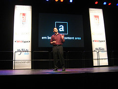
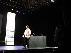
Responsive dConstruction
Tickets for dConstruct 2011 went on sale last Tuesday. Tickets for dConstruct 2011 also sold out last Tuesday.
That's kinda crazy: a conference for almost 800 people selling out in one day! I think it's partly down to the great reputation that dConstruct has established for itself over the year's as the thinking geek's gathering. But I think it must mostly be down to the fantastic line-up of speakers: Don Norman, Frank Chimero, Kevin Slavin …it's going to be quite a day!
If you didn't manage to get a ticket, don't despair. Technically, there are still some tickets available. If you book a place on one of the workshops taking place in the run-up to the conference day itself, you'll get a complementary ticket to the main event. Also, if you book a workshop place before August 2nd, you can get the early-bird rate of £395+VAT rather than the full price of £445.
You might choose to attend Dan Lockton's workshop on influencing behaviour, Josh Clark's tapworthy mobile design or Scott Jehl's jQuery mobile workshop but I'm going to humbly suggest that you might also be interested in the day-long course I'm putting together on responsive enhancement.
As the title suggests, this is going to be all about the intersection of responsive design and progressive enhancement: a content first approach. Because of that, the workshop won't just be dealing in the technologies involved. It will also spend plenty of time tackling the planning and process. So while there are obvious benefits for front-end developers, it's also going to be a valuable day for UX designers, project managers and just about anybody involved in building websites today.
Oh, and the workshop will feature a special guest appearance by Scott who will give a peak behind the scenes of the forthcoming Boston Globe responsive site.
I'm going to be spending a lot of time preparing the materials for this workshop. In fact, it's going to be occupying most of my time between now and August 31st. If you want to be there for the final result, go ahead and book your place.
Tagged with
dconstruct
conference
workshop
event
responsive
July 6, 2011
Citation needed
Over on the HTML5 Doctor site, Oli has written a great article called Quoting and citing with , , , and the cite attribute
.
Now, I still stand by my criticism of the way the cite element has been restrictively redefined in HTML5 such that it's not supposed to be used for marking up a resource if that resource is a person. But I think that Oli has done a great job in setting out the counter-argument:
By better defining , we increase the odds of getting usable data from it, though we now need different methods to cover these other uses.
Oli's article also delves into the blockquote element, which is defined in HTML5 as a sectioning root.
Don't be fooled by the name: sectioning roots are very different to sectioning content in a fundamental way. Whereas sectioning content elements—section, article, nav and aside—are all about creating an explicit outline for the document from the headings contained within the sectioning content (using the new outline algorithm), the headings within sectioning roots (blockquote, td, fieldset, figure, etc.) don't contribute to the document outline at all! But what sectioning roots and sectioning content have in common is that they both define the scope of the header and footer elements contained within them.
The footer element is defined as containing information about its section such as who wrote it, links to related documents, copyright data, and the like.
This gives a rise to rather lovely markup pattern that's used on HTML5 Doctor: why not use the footer element within a blockquote to explicitly declare its provenance:
The people that designed .mobi were smoking crack.
—
Tantek Çelik
(and yes, I am using the cite element to mark up a person's name there).
Well, apparently that blockquote pattern is not allowed according to the spec:
Content inside a blockquote must be quoted from another source.
Because the content within the blockquote's footer isn't part of the quoted content, it shouldn't be contained within the blockquote.
I think that's a shame. So does Oli. He filed a bug. The bug was rejected with this comment:
If you want the spec to be changed, please provide rationale and reopen.
That's exactly what Oli is doing. He has created a comprehensive document of block quote metadata from other resources: books, plays, style guides and so on.
Excellent work! That's how you go about working towards a change in the spec—not with rhetoric, but with data.
That's why my article complaining about the restrictions on the cite element is fairly pointless, but the wiki page that Tantek set up to document existing use cases is far more useful.
July 3, 2011
Farewell to June
June was a busy month.
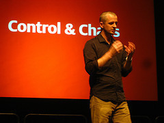
I went to Newcastle for the DIBI conference, which was quite excellent. I was very pleased with the talk I gave—called "One Web". I think the talks were recorded on video so I hope they'll be showing up on a video-sharing site before too long.
I spoke on the Using Blue podcast about all sorts of design- and development-related topics.
I went to An Event Apart Atlanta which was, as always, excellent. As usual, it was the people that really made the event so special.
I made it back to Brighton just in time for Ampersand, which was genuinely wonderful …just ask anyone who was there.
Then I hopped back across the Atlantic for Indie Web Camp in Portland, which was inspiring and invigorating.
July is looking a lot calmer. I'm going to be in Brighton for the whole month. I will, however, be using the time to prepare for the onslaught of events in the coming months. In September alone, Brighton will play host to a whole slew of events falling under the banner of the Brighton Digital Festival:
dConstruct,
Maker Faire,
Update,
BarCamp and
Flash On The Beach.
I'm going to be spending my non-travelling time this month preparing a workshop to precede dConstruct. Keep an eye on the site for more details very soon.
Oh, and remember: tickets for dConstruct go on sale this Tuesday, July 5th.
Tagged with
event
brighton
conference
dibiconf
ampconf
dconstruct
aea
aneventapart
July 1, 2011
Mobilism transcription
Remember that mobile browser panel I moderated at the Mobilism conference in Amsterdam earlier this year? Well, I've had the whole thing transcribed. You can now:
read the transcription,
watch the video or
listen to the audio.
Enjoy!
Tagged with
mobilism
panel
conference
mobile
browsers
transcription
Indie Web Camping
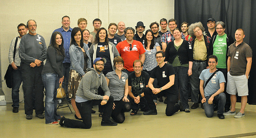
It seems like just a fortnight ago that I was in the States for An Event Apart Atlanta. Wait a minute …it was just a fortnight ago! It would be utter madness, then, for me to willingly make another trip across the Atlantic so soon after that. And yet, that's exactly what I did for Indie Web Camp.
Now, admittedly, the fact that the event was taking place in Portland may have swayed my decision; it's a place I'm very fond of, filled as it is with good coffee, a giant bookshop, food carts and excellent geeks most dear to my heart. But the premise of Indie Web Camp also tugged heavily at my heartstrings: the desire to have control over my my own data—living at my own URL—syndicated out to third-party sites …the Pembertonisation of personal publishing. I knew that if I didn't attend this event, I would just be miserable watching Twitter posts from a timezone eight hours away. So I made the trip from England to the Pacific Northwest to spend two days in the company of some very, very smart people.
I wasn't sure whether it was going to be like a Barcamp or more like a hack day. In the end, it was the perfect mixture of both. The first day was spent brainstorming ideas. The second day was spent coding.
I feel bad that I didn't contribute more to the coding side of things (especially after travelling so far to be there) but I did at least take some notes on the demos presented at the end of the event.
There were some fascinating themes throughout. Chris spoke about the possibilities of distributed web intents and the possibility of hijacking proprietary actions—such as Facebook's "like" and Google's "+1"—through a browser plug-in. On the subject of browser plug-ins, Glenn blew everyone's minds with a demo of the latest Firefox extension he's been working on. It more or less turns the browser into an artificially intelligent user agent. I hope there'll be some documentation forthcoming soon.
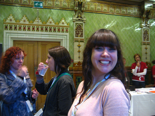
Ward Cunningham—yes, that Ward Cunningham—spearheaded an initiative for creating a distributed wiki. Meanwhile, a whole bunch of us were concerned about how much pictorial data we are entrusting to Flickr, a service owned by Yahoo; a company with a dreadful track record for preserving personal publishing (Geocities—never forget, never forgive). There was much brainstorming and coding around backing up Flickr photos as well as figuring out ways to post to Flickr from your own website.
I should have been contributing to that but instead I was getting some valuable Github advice from Shane on how to contribute to No More Sharecropping. Check out the README file if you'd also like to contribute.
All in all, it was a great gathering, ably organised by Tantek, Amber, Aaron and Crystal …well worth the trip.
June 20, 2011
Ampersanded
Remember when I said that the Ampersand conference was going to be great? Yeah, well, I wasn't wrong. If anything, I underestimated how great it would be.
Make a venn diagram of web nerds and type nerds; Ampersand was all about the intersection of those two circles. There was something special about having so many domain-specific nerds in one place at one time. It made for a very special atmosphere. It also helped that all the speakers were excellent. I particularly liked the fact that Ethan's book was pimped in four different talks.
You can read more about the individual talks in an article over at Eye Magazine called Web typography comes of age at Brighton's Ampersand conference.
All in all, it was an excellent day. The only bittersweet note came from the fact that it marked Sophie's last day at Clearleft—she's off to Lanyrd. But Sophie left us on a high note: she and Rich put together one hell of an event.
Tagged with
ampersandconf
ampconf
ampersand
conference
typography
June 10, 2011
Newcastling
Usually when I go to a conference it involves crossing a body of water to arrive on foreign shores, often in Europe or America. But the last two events I attended were much closer to home.
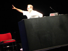
Two weeks ago there was Web Directions @media in London. Thank you to everyone who provided questions for the Hot Topics Panel. It went swimmingly, thanks to the eloquence and knowledge of the panelists: Brian, Relly, Bruce and Douglas Fucking Crockford. There was a surprising lack of contentiousness on the panel but I made up for it by arguing with the audience instead. Once the audio is available I'll be sure to get it transcribed like I did last year.
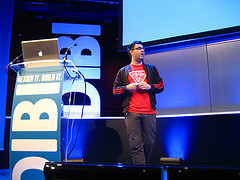
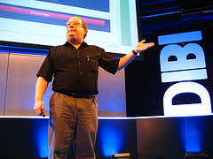
I just got back from another conference that didn't involve crossing any international boundaries: DIBI in Newcastle.

It was an excellent event …with just one exception. It bills itself as "the two-track web conference" and that's the problem. As with Web Directions, I found myself torn between the "design" and "development" talks (a fairly arbitrary distinction for me). The first thing I had to do was choose between Yaili in one room and Jake in another. An impossible choice! I went for Jake in the end and he was absolutely bloody brilliant (as usual) but I'm sure Yaili's talk was also excellent …and I missed it.
Apart from that heavy dose of FOMO it really was superb. The venue was gorgeous, the quality of the talks was really, really high, the attendees were super friendly and the organisers did a fantastic job of looking after everyone and making sure everything ran like clockwork. I doff my hat to Gavin and his gang.
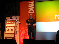
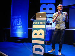
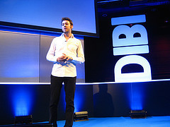
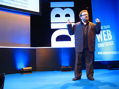
I was nervous about my talk. It was material I hadn't presented before. But once I got on stage I just reverted to ranting, which people seemed to enjoy. I had fun anyway. Again, once the audio or video is available I'll be sure to get it transcribed.
It was also my first time in Newcastle …or Gateshead, whichever. It was certainly showing its best side. It really is quite a lovely place.
My next destination is bit further afield. I'm off to Atlanta for An Event Apart which kicks off on Monday. If you're going too, be sure to say hello.
Tagged with
conference
webdirections
atmedia
dibi
dibiconf
newcastle
aea
aneventapart
atlanta
L33t ski11z
Here are three life skills I have learned from the internet:
How to fold a T-shirt in 2 seconds.
How to peel a banana like a monkey. (Thanks, Kyle!)
How to tie my shoelaces correctly.
You're welcome.
Jeremy Keith's Blog

- Jeremy Keith's profile
- 56 followers

