
Jeremy Keith's Blog, page 142
November 2, 2011
Timeless
When I first heard that Hixie had removed all traces of the time element from the ongoing HTML spec, my knee-jerk reaction was "This is a really bad idea!" But I decided not to jump in without first evaluating the arguments for and against the element's removal. That's what I've been doing over the past week and my considered response is:
This is a really bad idea!
The process by which the element was removed is quite disturbing:
Hixie (as a contributer) opens a bug proposing that the time element be replaced with the more general data element.
Lots of people respond, almost unanimously pointing out the problems with that proposal.
Hixie (as the editor) goes ahead and does what exactly what he wanted anyway.
Technically that's exactly how the WHATWG process works. The editor does whatever he wants:
This is not a consensus-based approach — there's no guarantee that everyone will be happy! There is also no voting.
Most of the time, this works pretty well. It might not be fair but it seems to work more efficiently than the W3C's consensus-based approach. But in this case the editor's unilateral decision is fundamentally at odds with the most important HTML design principle, the priority of constituencies:
In case of conflict, consider users over authors over implementors over specifiers over theoretical purity. In other words costs or difficulties to the user should be given more weight than costs to authors; which in turn should be given more weight than costs to implementors; which should be given more weight than costs to authors of the spec itself, which should be given more weight than those proposing changes for theoretical reasons alone.
The specifier (Hixie) is riding roughshod over the concerns of authors.
I'm particularly concerned by the uncharacteristically muddy thinking behind Hixie's decision. There are two separate issues here:
Is the time element useful?
Do we need a more general data element?
Hixie conflates these two questions.
He begins by bizarrely making the claim that time hasn't had much uptake. This is demonstrably false. It's already shipping in Drupal builds and Wordpress templates as well as having parser support in services and at least one browser. If anything, time is one of the more commonly used and understood elements in HTML5.
There's a very good reason for that: it fulfils a need that authors have had for a long time—the ability to make a timestamp that is human and machine-readable at the same time. That's the use case that the microformats community has been trying to solve with the abbr design pattern and the value-class pattern. Those solutions are okay, but not nearly as elegant and intuitive as having a dedicated time element.
Crucially the time element didn't just specify the mechanism for encoding a machine-readable timestamp, it also defined the format, namely a subset of ISO 8601. That's exactly the kind of unambiguous documentation that makes a specification useful.
Hixie correctly points out that there are cases for human and machine-readable data other than dates and times. He incorrectly jumps to the conclusion that the time is therefore a failure.
I think he's right that there probably should be a dedicated element for marking up this kind of data. We already have the meta element but the fact that it's a standalone element makes it tricky to explicitly associate the human-readable text. So the introduction of a new data may very well turn out to be a good idea. But it does not need to be introduced at the expense of the more specific time element.
I think there's a comparison to be made with sectioning content. We've got the generic section element but then we also have the more specific nav, aside and article elements that can be thought of specialised forms of section. By Hixie's logic, there's no reason to have nav, aside and article when a section element has the same effect on the outlining algorithm. But we have those elements because they cover very common use cases.
Hixie's reductio ad absurdum argument is that if there is a special element for timestamps, we should also have an element for every other possible piece of machine-readable data. If that's the case we should also have an infinite amount of sectioning content elements: blogpost, comment, chapter, etc. Instead we have just the four elements—section, article, aside and nav—because they represent the most common use cases …perhaps 80%?
The use case that the time element satisfies (human and machine-readable timestamps) is very, very common. The actual mechanism may vary (the time element itself, the abbr pattern, etc.) but the cow path is very much in need of paving.
There's also a disturbingly Boolean trait to Hixie's logic. He lumps all machine-readable data into the same bucket. If he had paid attention to Tantek's research on abstracting microformat vocabularies, he would have seen that it's a bit more fine-grained than that. There's a difference between straightforward name/value pairs (like fn or summary), URL values (like photo) and timestamps (like dtstart). The thing that distinguishes timestamps is that they have an existing predefined machine-readable format.
To strengthen his position Hixie introduced two strawmen into the discussion, claiming that the time element was intended to allow easier styling of dates and times with CSS and to also allow conversion of HTML documents into Atom. Those use cases are completely tangential to the fundamental reason for the existence of the time element. Hixie seems to have forgotten that he himself once had it enshrined in the spec that the purpose of the element was to allow users to add events to their calendars. I pointed out that this was an example usage of the more general pattern of machine-readable dates and times so the text of the spec was updated accordingly:
This element is intended as a way to encode modern dates and times in a machine-readable way so that, for example, user agents can offer to add birthday reminders or scheduled events to the user's calendar.
No mention of styling. No mention of converting documents to Atom.
I'm not the only one who is perplexed by Hixie's bullheaded behaviour. Steve Faulkner has entered a revert request on the W3C side of things (he's a braver man than me: the byzantine W3C process scares me off). Ben summed up the situation nicely on Twitter. You can find plenty of other reactions on Twitter by searching for the hashtag #occupyhtml5. Bruce has written down his thoughts and the follow-on comments are worth reading. This reaction from Stephanie is both heartbreaking and completely understandable:
I have been pretty frustrated by this change. In fact, when I read the entire thread on the debacle, it nearly made me want to give up on teaching, and using HTML5. What's the point when there's really no discussion? A single person brings something up. Great arguments are made. And then he just does what he originally wanted to do anyway.
I'd like to think that a concerted campaign could sway Hixie but I don't hold out much hope. Usually there's only one way to get through to him and that's by presenting data. Rightly so. In this case however, Hixie is ignoring the data completely. He's also wilfully violating the fundamental design principles behind HTML5.
So what can we do? Well, just as with the incorrectly-defined semantics of the cite element we can make a stand and simply carry on using the time element in our web pages. If we do, then we'll see more parsers and browsers implementing support for the time element. The fact that our documentation has been ripped away makes this trickier but it's such a demonstrably useful addition to HTML that we cannot afford to throw it away based on the faulty logic of one person.
Hixie once said:
The reality is that the browser vendors have the ultimate veto on everything in the spec, since if they don't implement it, the spec is nothing but a work of fiction. So they have a lot of influence—I don't want to be writing fiction, I want to be writing a spec that documents the actual behaviour of browsers.
Keep using the time element.


October 31, 2011
Carpenter
One of the things that makes Remy's Full Frontal conference so good—apart from the great content—is the venue: Brighton's excellent Duke of York's cinema.
The cinema occasionally plays host to all-night movie marathons like all three Lord Of The Rings films (the extended editions, of course). This weekend in preparation for Halloween their was a John Carpenter all-nighter. By pure coincidence, the AV Club just published this primer on John Carpenter.
The four-film marathon started at 11pm and finished at mumble-mumble o'clock. It was a blast. The chosen selection was:
Halloween (1978)
The Fog (1980)
Escape From New York (1981)
They Live (1988)
It's a shame that The Thing wasn't included but it was a great line-up.
However, it still can't compete with the sheer brilliance of seeing John Carpenter's directorial debut Dark Star recreated with puppets before my very eyes.
Tagged with
brighton
film
dukeofyorks
horror
sci-fi
sciencefiction
October 27, 2011
Stallmania
I'm sure that by now you've already seen the infamous email from Richard Stallman—free software's own worst enemy—detailing his somewhat eccentric approach to speaking at conferences.
I particularly like the memetic variation of The Stallman Dialogues. There's a real genius in the way that it quotes passages from the email verbatim.
Y'know, I'm supposed to have a Skype call with Andy sometime next week about my upcoming talk and workshop at Build (tickets are still available for the workshop, by the way). I'm very tempted to channel my inner Stallman for the duration of our conversation.
Meeting that sad animal is not an agreeable surprise.
October 24, 2011
HTML5 For Web Designers
I've just finished speaking at An Event Apart in Washington DC (well, technically it's in Alexandria, Virginia but let's not quibble over details).
I was talking about design principles, referencing a lot of the stuff that I've gathered together at principles.adactio.com. I lingered over the HTML design principles and illustrated them with examples from HTML5.
It's been a year and a half now since HTML5 For Web Designers was released and I figured it was about time that it should be published in its natural format: HTML.
Ladies and gentlemen, I give you: HTML5forWebDesigners.com.
Needless to say, it's all written in HTML5 making good use of some of the new semantic elements like section, nav and figure. It's also using some offline storage in the shape of appcache. So if you visit the site with a browser that supports appcache, you'll be able to browse it any time after that even if you don't have an internet connection (and if you're trying it on an iOS device, feel free to add it to your home screen so it's always within easy reach).
You can read it on a desktop browser. You can read it in a mobile browser. You can read it in Lynx if you want. You can print it out. You can read it on the Kindle browser. You can read it on a tablet.
And if you like what you read and you decide you want to have a physical souvenir, you can buy the book and read it on paper.
Tagged with
html5forwebdesigners
abookapart
markup
html5
publishing
October 23, 2011
Brookland
I'm on a bit of a sojourn in the United States right now, and I'm having a rather lovely time.
It all started with Brooklyn Beta which was a jolly gathering in New York. It reminded me a bit of the Reboot events of old: grassroots gatherings that may be rough around the edges but are put together with much love and affection. There were plenty of inspiring talks and repeated entreaties to go out there and change the world. As with Reboot, I think Brooklyn Beta is an excellent part of a balanced conference diet: other conferences will give you more detail on how exactly you can go out there and change the world.
In fact, my trip is perfectly balanced by two complementary events at either end. I'm in Alexandria right now for An Event Apart DC—the perfect hands-on, practical counterweight to Brooklyn Beta's dose of inspiration.
In between those two events I've been spending time with Jessica getting to know Brooklyn. We rented an AirBnB place in Park Slope which turned out to be the perfect base of operations.
Every time I've been to New York before now I've only ever been in Manhattan. I always said "I love New York but I could never imagine living there." Now that I've spent time in the leafy streets of Brooklyn, I have revised that assessment—I could certainly imagine living there.


Tagged with
brooklynbeta
aea
aneventapart
conference
newyork
brooklyn
airbnb
October 21, 2011
Candygram
Every year in the run up to Halloween Jason asks some people to write short stories about candy. He then takes those words and turns them into beautifully-designed web pages: candygrams. I encourage you to revisit the wonderful tales from Jeffrey, Frank, Jim, Rob, Mandy, Erin and others.
This year I was very honoured to be asked by Jason to contribute some words of my own. For the life of me, I couldn't think of anything specifically candy-related (or "sweets" as we would say). So instead I wrote down my memories of spending Halloween at my cousins in Kerry:
Monkey Nuts, Barmbrack and Apples
October 11, 2011
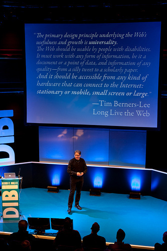
One Web, transcribed
I spoke at the DIBI conference back in June. It was a really good event, despite its annoying two-track format.
My talk was entitled One Web:
The range of devices accessing the web is increasing. We are faced with a choice in how we deal with this diversity. We can either fracture the web by designing a multitude of device-specific silos, or we can embrace the flexibility of the web and create experiences that can adapt to any device or browser.
The video has been online for a while now and I finally got 'round to getting it transcribed. You can pop on over to the articles section and read One Web. I should really re-name that section of my site: "articles" isn't the most accurate label for a lot of the stuff there.
If you prefer listening to reading, the audio is available for your huffduffing pleasure.
Adactio: Articles—One Web on Huffduffer
I also put the slides on Speakerdeck so you play along with the presentation.
I reprised this talk in Italy recently at the From The Front gathering. The audio from that is also online if you want to compare and contrast.
Jeremy Keith at From The Front 2011: One Web on Huffduffer
Tagged with
dibi
conference
dibiconf
presentation
oneweb
transcription
October 10, 2011
Analogue
I like my Kindle. I mean, I hate the DRM and the ludicrous overpriced badly-typeset books but I really like having a browser with a free internet connection just about anywhere in the world.
The Kindle is a particularly handy device when travelling. I can load it up with science fiction and popular science books without weighing down my carry-on luggage.
But when travelling by plane, there are two points in the journey when the Kindle must be stowed. Even though it's using e-ink, it is technically an electronic device so it must be switched off for take-off and landing. So I still find myself packing some good old-fashioned paper in my bag.
I noticed that almost all of the printed items I've been travelling with aren't available from bricks'n'mortar shops. These books are generated by the internet.
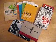
Adaptive Web Design
Aaron's book is a great read: nice and short but with plenty of meaty hands-on practical stuff. If you haven't bought it yet, go ahead and read the first chapter to get a taste for the quality of the writing.
Everything published by A Book Apart
I'll admit that I'm biased because I wrote the first book and penned the foreword for the most recent one, but c'mon: these little beauties are perfect for travelling with.
Back in March when I was bouncing around within the States, Mandy gave me a copy of Erin's brand new Elements Of Content Strategy at the start of my trip in Austin. By the time I got to the Pacific Northwest later that month, I had finished the book …just from reading it during aircraft ascents and descents.
Six-Penny Anthems II
Kevin's somewhat-twisted sense of humour appeals to me. A lot. Six-Penny Anthems II is a great hodge-podge of his cartoons.
I distinctly remember reading this during the landing at the end of a transatlantic flight and giggling uncontrollably to myself. I may have worried my fellow passengers.
SVK
Actually, I'm not sure if this excellent collaboration between Warren Ellis, Matt Brooker and the BERG gang is suitable for take-off and landing. That's because the accompanying ultra-violet light is technically an electronic device. But you should definitely get your hands on it.
The Manual
If you fancy some thoughtful reading material delivered in a beautiful vessel, be sure to get your hands on the first issue of Andy's creation. Each essay is written by a web professional but you'll find no talk of software or hardware.
I'm flying across the Atlantic to New York tomorrow for Brooklyn Beta, which I'm looking forward to immensely. I'll have my Kindle with me for the flight. I'll also be bringing one of those artefacts of the network with me.
Building
I never made it to the Build conference in Belfast last year or the year before. I think it clashed with previous commitments every time.
This was going to be the third year in a row that I was going to miss Build. I had already slapped my money down for the excellent Full Frontal conference which is on the very same day as Build but takes place right here in Brighton in the excellent Duke Of York's cinema.
But fate had other plans for me.
Ethan was going to be speaking at Build but he's had to pull out for personal reasons …so Andy asked me if I'd like to speak. I may be a poor substitute for Ethan and it's a shame that I'm going to miss Full Frontal but I jumped at the chance to join the stellar line-up.
As well as speaking at the conference itself on November 10th, I'll be leading a workshop on responsive design and progressive enhancement on the preceding Tuesday. The conference is sold out but there are places available for the workshop so grab yourself a slot if you fancy spending a day working on a content-first approach to planning and building websites.
If you can't make it to Belfast, I'll be giving the same workshop at Beyond Tellerrand in Düsseldorf on Sunday, November 20th and there are still some tickets available.
If you can make it to Belfast, I look forward to seeing you there. I'll be flying my future friendly flag high, just like I'm doing on the front page of the Build website.
That attire would also be suitable for my post-Build plans. The day after the conference I'll be travelling to San Francisco for Science Hack Day on the weekend of November 12th. If the last one is anything to go by, it's going to be an unmissable excellent weekend—I highly recommend that you put your name down if you're going to be in the neighbourhood.
Looking forward to seeing you in Belfast or Düsseldorf or San Francisco …or wherever.
October 7, 2011
What technology wants
Technology enabled Sloan Churman to hear for the first time.
Technology enabled her to capture that moment.
Networked technology enabled her to share that moment with the world.
The network enabled me to share it with you.
Tagged with
technology
youtube
video
accessibility
sharing
Jeremy Keith's Blog

- Jeremy Keith's profile
- 56 followers

