
Jeremy Keith's Blog, page 147
May 7, 2011
All Our Yesterdays: the links
If you were at An Event Apart in Boston and you want to follow up on some of the things I mentioned in my talk, here are some links:
Stock and Flow by Robin Sloan.
Archive Fever by Matt Ogle.
This Place Is Not A Place Of Honor on Damn Interesting.
The 10,000 Year Clock by The Long Now Foundation.
Carl Sagan And Ann Druyan's Ultimate Mix Tape by Radiolab.
Small Pieces, Loosely Joined by David Weinberger.
Lest We Forget or Why I chose the World Wide Web as a repository for archival material by Simon Pockley.
Cool URIs Don't Change by Tim Berners-Lee.
"The original URL for this prediction (www.longbets.org/601) will no longer be available in eleven years." on Long Bets.
Game Web 2.Over? by Meg Pickard.
Link Rot by Connor O'Brien.
Ugly and neglected fragments by Phil Gyford.
Yahoo!locaust by Jason Scott.
Goodbye Pownce, Hello Six Apart on the Pownce blog.
Why you should have a website: it's the law! by Steven Pemberton.
The Domesday Project by the BBC.
Preservation and Long-term Access through Networked Services by the Open Planets Foundation.
Swiss Fort Knox.
Validation by Own Briggs.
[whatwg] several messages about HTML5 by Ian Hickson.
Juggling oranges by Mark Pilgrim.
Accelerando by Charles Stross.
Microsoft and FairUse4WM by Bruce Schneier.
Forever by Mandy Brown.
Why The Net Matters: How the Internet Will Save Civilization by David Eagleman.
Here are some related posts of my own:
The format of the Long Now,
Tears in the rain,
Erase and rewind,
Linkrotting
and a previous talk entitled The Long Web.
More recently, Nora Young interviewed Jason Scott on online video and digital heritage.
Full Interview: Jason Scott on online video and digital heritage | Spark | CBC Radio on Huffduffer
Tagged with
digital
preservation
archiving
presentation
aea
aneventapart
aea2011
links


An Event Apart apart
I'm back from An Event Apart in Boston. It was quite an experience …and not just because I went to Fenway Park for my first baseball game. It was quite an experience because of the people that were there.
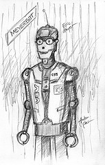
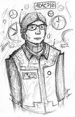
The Brads were there. The Spiderwomen were there. Anton was there drawing the speakers as robots.

I surprised myself by successfully liveblogging all six talks on the first day:
Jeffrey Zeldman: What Every Web Designer Should Know — A Better You At What You Do
Whitney Hess: Design Principles — The Philosophy of UX
Veerle Pieters: The Experimental Zone
Luke Wroblewski: Mobile Web Design Moves
Ethan Marcotte: The Responsive Designer's Workflow
Jared Spool: The Secret Lives of Links
I received lots of nice emails and tweets from people thanking me for the liveblogging. Some people remarked that it was almost like being there. But that simply isn't true. You really had to be there to experience it.
Still, a long-form report in the shape of a blog post is better than live tweeting, which is like trying to understand a conversation two houses away by putting your ear a cup filled with cotton wool pressed to the wall.
I didn't do any liveblogging on the second day as I was too nervous before—and too relieved after—delivering my own talk. But Luke took some notes:
Eric Meyer: The CSS3 Anarchist's Cookbook
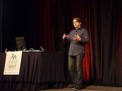
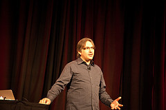
Jeremy Keith: All Our Yesterdays
Aarron Walter: From Idea to Interface
Andy Clarke: Smoke Gets In Your Eyes
Adam D. Scott has notes from all the talks including the triumphant finalés from Mark and Jeff.
Like I said, I was relieved when my talk was done. I was thrilled and surprised by how many people said they enjoyed it. This was a different talk to the one I gave at An Event Apart in Seattle. Back then I gave a talk on design principles but as Whitney was presenting on the same topic in Boston, I took the opportunity to rant about something very dear to my heart: digital preservation.
Usually when I craft a presentation for An Event Apart, I try to create a mixture of the the inspirational and the practical. But this talk had nothing practical at all. It wasn't exactly inspirational either. If anything, the topic is somewhat depressing.
And yet, people liked it. I can't even begin to describe how it makes me feel that Zeldman wrote:
Although it is hard to pick highlights among such great speakers and topics, this talk was a highlight for me. As in, it blew my mind. Several people said it should be a TED talk.
This is the talk that I had proposed for South By Southwest. It was rejected. 'Nuff said.
There are going to be four more instantiations of An Event Apart this year and I hope to repeat my rant on digital preservation at at least one of them. If you haven't been to An Event Apart, I highly recommend registering for one near you.
But I have to say, excellent as the conference always is, An Event Apart Boston 2011 will always have a special place in my heart.
Tagged with
aea
aneventapart
conference
boston
May 2, 2011
Jared Spool: The Secret Lives of Links
The final speaker of the first day of An Event Apart in Boston is Jared Spool. Now, when Jared gives a talk …well, you really have to be there. So I don't know how well liveblogging is going to work but here goes anyway.
The talk is called The Secret Lives of Links. He starts by talking about one of the pre-eminent young scientists in the USA: Lisa Simpson. One day, she lost a tooth, put it in a bowl and when she later examined it under a microscope, she discovered a civilisation going about its business, all the citizens with their secret lives.
The web is like that.
Right before the threatened government shutdown, Jared was looking at news sites and how they were updating their links. Jared suggests that CNN redesign its site to simply have this list of links:
The most important story.
The second most important story.
The third most important story.
An unimportant, yet entertaining story.
The Charlie Sheen story.
But of course it doesn't work like that. The content of the links tells the importance. Links secretly live to drive the user to their content.
Compare the old CNN design to the current one. The visual design is different but the underlying essence is the same. The links work the same way.
All the news sites were reporting the imminent government shutdown with links that had different text but were all doing the same thing.
Jared has been working on the web since 1995. That whole time, he's been watching users use websites. The pattern he has seen is that the content speaks to the user through the links. Everything hinges on the links. They provide the scent of information.
This goes back to a theory at Xerox PARC: if you modelled user behaviour when searching for information, it's very much like a fox sniffing a trail. The users are informavores.
We can see this in educational websites. The designs may change but links are the constant.
We've all felt the pain of battling the site owner who wants to prioritise content that the users aren't that interested in.
The Walgreens site is an interesting example. One fifth of the visitors follow the "photo" link. 16% go to search. The third most important link is about refilling prescriptions. The fourth is the pharmacy link. The fifth most used links is finding the physical stores. Those five links add up to 59% of the total traffic …but those links take up just 3.8% of the page.
This violates Fitts's Law:
The speed that a user can acquire a target is proportional to the size of the target and indirectly proportional to the distance from the target.
Basically, the bigger and closer, the easier to hit. The Walgreens site violates that. Now, it would look ugly if the "photo" link was one fifth of the whole page, but the point remains: there's a lot of stuff being foisted on the user by the business.
Another example of Fitts's Law are those annoying giant interstitial ads that have tiny "close" links.
Deliver users to their desired objective. Give them links that communicate scent in a meaningful way. Make the real estate reflect the user's desires.
Let's go back to an educational web site: Ohio State. People come to websites for all sorts of reasons. Most people don't just go to a website just to see how it looks (except for us). People go to the Ohio State website to get information about grades and schedules. The text of these links are called trigger words: the trigger an action from the user. When done correctly, trigger words lead the user to their desired goal.
It's hard to know when your information scent is good, but it's easy to know when your information scent is bad. User behaviour will let you know: using the back button, pogo-sticking, and using search.
Jared has seen the same patterns across hundreds of sites that he's watched people using. They could take all the clickstreams that succeeded and all the clickstreams that failed. For 15 years there's a consistent 58% failure rate. That's quite shocking.
One pattern that emerges in the failed clickstreams is the presence of the back button. If a user hits the back button, the failure rate of those clickstreams rises to above 80%. If a user hits the back button twice, the failure rate rises to 98%.
The back button is the button of doom.
The user clicks the back button when they run out of scent, just like a fox circling back. But foxes succeed 'cause rabbits are stupid and they go back to where they live and eat, so the fox can go back there and wait. Users hit the back button hoping that the page will somehow have changed when they get back.
Pay attention to the back button. The user is telling you they've lost the scent.
Another behaviour is pogo-sticking, hopping back and forward from a "gallery" page with a list of links to the linked pages. Pogo-sticking results in a failure rate of 89%. There's a myth with e-commerce sites that users want to pogo-stick between product pages to compare product pages but it's not true: the more a user pogo-sticks, the less likely they are to find what they want and make a purchase.
Users scan a page looking for trigger words. If they find a trigger word, they click on it but if they don't find it, they go to search. That's the way it works on 99% of sites, although Amazon is an exception. That's because Amazon has done a great job of training users to know that absolutely nothing on the home page is of any use.
Some sites try to imitate Google and just have a search box. Don't to that.
A more accurate name for the search box would be B.Y.O.L.: Bring Your Own Link. What do people type into this box: trigger words!
Pro tip: your search logs are completely filled with trigger words. Have you looked there lately? Your users are telling you what your trigger words should be. If you're tracking where searches come from, you even know on what pages you should be putting those trigger words.
The key thing to understand is that people don't want to search. There's a myth that some people prefer to search. It's the design of the site that forces them to search. The failure rate for search is 70%.
Jared imagines an experiment called the 7-11 milk experiment. Imagine that someone has run out of milk. We take them to the nearest 7-11. We give them the cash to buy milk. There should be a 100% milk-purchasing result.
That's what Jared does with websites. He gives people the cash to buy a product, brings them to the website and asks them to purchase the product. Ideally you should see a 100% spending rate. But the best performing site—The Gap—got a 66% spending. The worst site got 6%.
The top variables that contributed to this pattern are: the ratio of number of pages to purchase. Purchases were made at Gap.com in 11.9 pages. On the worst performers, the ratio was 51 pages per purchase. You know what patterns they saw in the worst performers: back button usage, pogo-sticking and search.
Give users information they want. Pages that we would describe as "cluttered" don't appear that way to a user if the content is what the user wants. Clutter is a relative term based on how much you are interested in the content.
It's hard to show you good examples of information scent because you're not the user looking for something specific. Good design is invisible. You don't notice air conditioning when it's set just right, only when it's too hot or too cold. We don't notice good design.
Links secretly live to look good …while still looking like links. There was a time when the prevailing belief was that links are supposed to be blue and underlined. We couldn't have made a worse choice. Who decided that? Not designers. Astrophysicists at CERN decided. As it turns, blue is the hardest colour to perceive. Men start to lose the ability to perceive blue at 40. Women start to lose the ability at 55 …because they're better. Underlines change the geometry of a word, slowing down reading speed.
Thankfully we've moved on and we can have "links of colour." But sometimes we take it far, like the LA Times, where it's hard to figure out what is and isn't a link. Users have to wave their mouse around on the page hoping that the browser will give them the finger.
Have a consistent vocabulary. Try to make it clear which links leads to a different page and which links perform on action on the current page.
We confuse users with things that look like links, but aren't.
Links secretly live to do what the user expects.
Place your links wisely. Don't put links to related articles in the middle of an article that someone is reading.
Don't use mystery meat navigation. Users don't move their mouse until they know what they're going to click on so don't hide links behind a mouseover: by the time those links are revealed, it's too late: users have already made a decision on what they're going to click. Flyout menus are the worst.
Some of Jared's favourite links are "Stuff our lawyers made us put here", "Fewer choices" and "Everything else."
In summary, this is what links secretly want to do:
Deliver users to their desired objective.
Emit the right scent.
Look good, while still looking like a link.
Do what the user expects.
Tagged with
aea
aneventapart
aeabos
liveblogging
conference
jaredspool
links
design
ux
usability
interface
Ethan Marcotte: The Responsive Designer's Workflow
The next talk here at An Event Apart in Boston is one I've really, really, really been looking forward to: it's a presentation by my hero Ethan Marcotte. I'll try to liveblog it here…
The talk is called The Responsive Web Designer's Workflow but Ethan begins by talking about his grandmother. She was born in 1910 and she's still in great shape. This past Christmas she gave Ethan a gift of three battered and worn books that were her father's diaries from the 1880s. They're beautiful. The front is filled with almanac data but the most fascinating part is the short updates, mostly about the weather. They're imperfect with crossing out and misspelling but they're very visceral.
Stories are important. Passing on stories is an important part of what makes us human. Ethan illustrates this by showing some of my tweets about eating toast.
Newspapers are an odd paradox. For one day they are filled with the most important stories but just a day later they lose that immediate value. Take the Boston Globe, for example. It has a long history. Looking at old copies, the artefact itself is quite lovely.
But it's a changing industry. This year nearly half of American adults will receive their news through mobile devices. The industry is trying to catch up with various strategies: separate mobile sites, iPad apps, and so on.
Ethan's response last year was to talk about Responsive Web Design, which breaks down into three parts:
flexible grids,
flexible images and media and
media queries.
The idea has taken hold and lots of very talented designers have adopted a responsive approach.
Well, today you can add one more site to the list: The Boston Globe, relaunching with a responsive design this Summer.
Up 'till now, responsiveness has been about layout—that's different to design. As Paul Rand wrote:
Design is the method of putting form and content together.
There were three firms involved in the Globe redesign: The Boston Globe itself, Upstatement, and Filament Group. Ethan was in that third group. Everyone's got a wide range of skills. It's tempting to divide skills into visual design and interaction design. But that distinction is often a reflection of the job roles at design agencies.
Is the traditional design agency process part of the problem? We have this linear approach: discover, design, develop, deliver—like a relay race. But for a responsive site, you can never really say what the final deliverable is. You could try to come up with Photoshop comps for all possible layouts but that just doesn't scale.
Then there's the tools. The first thing you do when you open up Photoshop is to create a fixed canvas size in pixels. This is what Jason was railing against in his quest for a real web design application.
For the responsive workflow, what's needed is …design-o-velopment (no, not really).
The group convenes. The designers introduce the comp, explaining their decisions. The developers ask lots of questions. Where does content come from? How does the user interact with it? And the important one: how is going to look on a smaller screen? How should it adapt? They discuss the various input modes: mouse, touch, keyboard, voice. The questions are more important than any particular answers at this point.
"What value does this content have for our mobile users?" That question can be best answered by adopting Luke's Mobile First approach. Narrow screens force us to focus.
Look at an article on AOL. The mobile version is great. The desktop version is cluttered. We drown the content. "Mobile" has become a synonym for "Less" and "Desktop" has become a synonym for "More."
If you were asked to describe a mobie user, you might think of someone on the go, easily distracted. Whereas you may imagine a desktop user as sitting comfortably with plenty of screen size and attention. But it's not that simple. People use their mobile devices in all sorts of environments at all sorts of times.
Making decisions about what people want based simply on the device they are using is a little bit like telepathy. Context doesn't necessarily determine the user's intent.
Even a good mobile experience, like Flickr's, gets things wrong. Content is withheld from visitors with mobile devices. Lots of people click on that "desktop version" link because they feel they are missing out.
When you practice Mobile First, you're making a commitment to the content. Everything that's displayed on the page deserves to be there. Mobile First really means Content First.
Now you prototype like wild. A pixel-based tool like Photoshop is limited in what it can convey so you need to start making prototypes from the outset.
Figuring out the proportions for a flexible grid is fairly straightforward: target divided by context equals result. Slot in your pixel values to that equation and you get a percentage that you can declare in your stylesheet. Now you've got a liquid layout.
Resizing images is simple:
img { max-width: 100%; }
For important large images you can use Scott Jehl's script to swap out the image src attribute based on the viewport size. It defaults to the smaller-sized image.
Finally, there's the media queries. There's a lot of devices to test on. Fortunately the Filament Group are involved with jQuery Mobile so they've already got a lot of devices. But rather than designing for specific devices, they searched instead for commonalities, like screen sizes. These are common breakpoints so they are what's used in the media queries.
There's very good browser support for media queries but there are still some laggards. Scott Jehl's other script, Respond, bootstraps media query support using JavaScript.
It's worth pointing out that they don't have comps for all these breakpoints: they're designing in the browser at this point. But they take these prototypes back to the designers so that they can vet them. They ask more questions. How well does the layout adapt? Do individual elements still feel usable? Most importantly, do any page elements need additional design work?
The masthead of the Boston Globe was a tricky problem. The result from prototyping wasn't satisfactory so the designers came up with a different solution. As the layout shrinks, the masthead functionality changes. This solution wouldn't have been possible without reconvening to review the prototype. So they're designing in the browser but what they're designing are design recommendations.
A responsive site isn't flipping between a set of fixed layouts. It's liquid. Breakpoints that you haven't thought of will still work.
You have to figure out what is the most appropriate experience for what device. Stephen Hay wrote a great post called There Is No Mobile Web. His point is that the rise of mobile should encourage to revisit our principles of accessibility and progressive enhancement for everyone.
When responsive design meets Mobile First—starting with the narrowest width and building up from there—what you're doing is progressive enhancement. You'll even see this layering in the way that the stylesheets are structured.
The basic experience is still very attractive. The next step is enhancing for browsers that support media queries …and Internet Explorer. They get an enhanced stylesheet.
There are other things you can test for: are touch events supported, for example. So an iPad has the screen size of a laptop but it also supports touch events. They get some enhanced JavaScript functionality.
A really tricky question is "is this key content, or is it simply an enhancement for some users?" Web fonts are good example of this grey area. For the Boston Globe, they decided to make a hard cut-off point and only serve up web fonts to viewports above a certain size.
Conditional loading in JavaScript is very useful for serving up the right functionality to the right devices.
Let's pull back a bit before we wrap up.
Just as there has been discussion "Mobile" and "Desktop", there has also been discussion of "Mobile" and "Responsiveness." A lot of the discussion is around butting heads between idealism and realism. Ultimately the decision about whether to make "Mobile" site or a "Responsive" site is more about the designer's philosophy than about devices.
This has been quite a day for announcements. As well as the forthcoming Boston Globe redesign, Ethan also has a publishing date for his book: Responsive Web Design will be published by A Book Apart on June 7th.
Tagged with
aea
aneventapart
aeabos
liveblogging
conference
ethanmarcotte
responsive
mobile
design
css
mediaqueries
Luke Wroblewski: Mobile Web Design Moves
Next up at An Event Apart in Boston is Luke Wroblewski. Let's see if I can liveblog just some his awesomeness.
Luke begins with some audience interactivity. We've all got to stand up. Now we learn a few small moves. Put them all together and what have you got? The Thriller dance!
There's a point to this: his talk is called Mobile Web Design Moves. Small moves can add up to very big things.
But why learn new moves? Well, Mobile changes things:
Mobile web growth and
Mobile is different.
Mobile web growth
A few years ago, Morgan Stanley published a report in which they predicted that somewhere in 2012 more mobile devices would be shipped than PCs. Well, it happened two years earlier than predicted. As Eric Schmitt has said, everything to do with mobile happens faster. There's been a 20% drop in PC usage, with the slack taken up by tablets and smartphones. But as Luke points out, the term PC—Personal Computer—is actually better suited to a mobile device; the device you have with you on your person. The way we interact online, email, etc., is shifting to mobile devices.
But is all this usage happening in native apps? No, as it turns out. 40% of Twitter's traffic comes from mobile, of which 78% is from the mobile website. Mobile browser users increased over 300%. What people forget is that growth of native apps also drives growth of mobile web use.
In a nutshell, more people are going to be accessing your websites with a mobile device than with a desktop device. Find one study of mobile usage that doesn't show exponential growth.
Even if you have native apps, like Gowalla with a client for iOS, Android, Blackbery, etc., people will still post links in your native app and where does that take you? To a browser.
Anyway, it doesn't have to be either a native app or a mobile web site. You can hedge your bets and do both …so you're protected if Steve Jobs pulls the rug out from under you.
Mobile is different
When you're sitting at a computer at home, you're sitting comfortably with a keyboard, mouse, chair and coffee mug. The mobile experience involves a small screen, short battery life, an inconsistent network, fingers and sensors. This tactile experience makes it intensely personal.
Where do people use these devices? There's the sterotypical picture of the businessman on the move, walking down the street. But 84% of mobile usage happens at home; watching TV, for example. 74% of people use them standing in line. People use them in the toilet.
What about when people use these devices? All throughout the day, as it happens. That's quite different to desktop use. iPad users do a lot of reading on the couch in the evening and in bed at night.
Mobile devices have different technical capabilities and limitations and there are also some distinct times and behaviours associated with their usage.
By now you should be convinced: I need new moves!
Organise yourself
Try to understand why someone would pull out their mobile device. What is that device good at? Try to marry that up with your content. Luke breaks down mobile behaviours into these categories:
Lookup/Find — usually location-related.
Explore/Play — often related to reading.
Check in/Status
Edit/Create — email, for example.
Think about organising your structure to fit these tasks. Luke shows a college site that prioritises campus information less than marketing fluff. But you know, this isn't just about mobile users. That useful information—like a campus map—is useful for everyone, regardless of their device. So if you go through this process of prioritising for mobile, you will also be prioritising for desktop.
Mobile forces you to prioritise. Screen space is tight. Attention is short. Apply the same prioritisation to desktop users.
Here's a good rule of thumb: content first, navigation second. Give people what they're looking for first.
Don't try to port all of your content to mobile. Instead use this as an opportunity to prune your content and get rid of the crap that people aren't interested in.
What people want to do on mobile is the same as what people want to do on the desktop. For some reason, Yelp only allowed mobile users to point "mini" reviews …at the very time when people are in the place they are reviewing!
Don't dumb it down for mobile.
Use your head
Content first, navigation second; yes, but navigation is still important. Facebook's mobile version originally had 13 navigation elements, which is a bit much. YouTube puts the navigation on a different screen. The pro is that this saves screen estate. The con is that you lose context. ESPN's mobile site has a navigation that you pull down. There's also navigation at the end of the page. That's better than what YouTube does: when you get to the end of the page on YouTube, it's a dead end. One of the challenges with the ESPN site is that the navigation is duplicated (the pull-down nav and the footer nav). A potential solution is to have that nav link at the top point to the navigation at the bottom of the page.
What about fixed position menus? The iPhone has permanent software buttons on screen in the browser, right? But to do fixed positioning on mobile you have to use some hacky JavScript. And even if you get it working, it's eating up valuable screen real estate. On the Android device, there's the problem of the proximity to hardware buttons: people will accidentally mis-tap the hardware controls trying to use on-screen navigation anchored to the bottom of the screen.
So don't just slavishly copy iOS conventions. Don't put a back button in your site. It makes sense in an app but on a website, the browser provides a back button already.
Take it in
Input is interesting topic on mobile. The traditional advice is to avoid text input on mobile ….and yet billions of text messages are sent every day. So let's reverse the traditional advice. Let's encourage people to input on mobile.
The workhorses of input on the web have been checkboxes, radio buttons, drop-down lists, etc. Using these standards on mobile means you can type into the device interface features, like the select UI on the iPhone. But the constraints of the smaller screen on a mobile device introduces some challenges even if you use these standard controls. If you make your own interface elements, you can given them touch target sizes.
The stuff that we have to programme for ourselves today will become standard declarative features in the future. That's already happening with HTML5 input types like date. But even small things can make a big difference. Use input types like url, number, email, etc. to get an appropriate on-screen keyboard on iOS. Make use of new input types and attributes. Every little bit helps.
Input masks—confining what's allowed in a form field—can be very useful on mobile devices. Right now we have to do it programmatically but again, it should become declarative in the future.
Avoid the gradual reveal, where you format as people are typing but in a different format to what the placeholder text displayed. Beware with placeholder text: people can interpret it as the form field already being filled in. Phrase them as questions if you can.
There's a lot of really exciting things happening on the input side of things with mobile devices. More and more device APIs and sensors are being exposed.
Ask for it
Input is the way we gather answers from people but we also have to think about how we ask the questions.
Many mobile browsers try to optimise desktop-specific sites to help mobile users by using zoom. In that situation, right-aligned form field labels are problematic: when you zoom in on the form field, you can't see the label. Top-aligned labels work better …and there are many other advantages to top-aligned labels that Luke has talked about in the past.
Some people are trying to use placeholder text as labels. But the problem there is that as soon as you tap in there, it disappears. Again, watch out when putting labels within input fields: it's not clear if the form field is already filled in or not.
Make your moves
Here's an opportunity. Mobile is growing so quickly and it's all new. Now is our chance to come up with new innovative stuff. This stuff hasn't been figured out yet. More and more devices are coming online every day and they've all got web browsers.
We can push towards natural user interfaces where the content is the user interface. Minor rant: our design processes are more about designing navigation instead of focusing on the content and designing that. It's a challenge. As Josh Clark put it:
Buttons are a hack.
So make your own moves. Yes, it's a scary time; there's so much to learn about, but also also a huge opportunity.
Keep an eye out for Luke's book from A Book Apart called Mobile First coming out in Summer 2011.
Tagged with
aea
aneventapart
aeabos
liveblogging
conference
lukew
mobile
design
ux
interface
Veerle Pieters: The Experimental Zone
The next speaker at An Event Apart in Boston is Veerle Pieters. I'm going to try liveblogging some of what she's got to say.
Veerle's talk is called The Experimental Zone and it's all about experimentation in web design. People often ask her how she comes up with, say, certain colour combinations but she doesn't really have a straightforward answer—a lot of it is down to experimentation. So it's good to learn how to experiment better. Pablo Picasso said:
Inspiration exists, but it has to find you working.
Spirographs seem complex but they are a perfect example of how experimenting with really simple fundamental rules and shapes can lead to a beautiful result: start with a simple, translucent square and start applying the same transform multiple times e.g. scaling 85% and rotate -10 degrees. Object: transform: transform again.
You can also experiment with colours in spirographs. Start with a translucent triangular shape, copy and rotate it by 18 degrees but before that, change the colour values. Try different blending modes and see what comes out. Combine different layer modes with different scaling values e.g. 115%. Try different rotation angles to see how they turn out. An extreme value like 48 degrees applied to translucent circular shapes of different colours leads to some interesting results.
Transparency. Blending. Scale. Rotation. Colour. Experiment with those combinations.
But why play around with this stuff? Well, Veerle used some of the results in client work for some background images on sites and on physical credit card designs.
Start with some circles in the colours defined by the client's in-house style guide and start experimenting with combinations. It's okay to try out a dozen versions. When you really need to have control, you can get in there and change the overlapping colour combinations manually.
Veerle also does small experiments not related to work; a little every day. She's got a folder full of patterns and experiments that she hasn't used yet but they might come in handy later on. Another example of experimentation was the Duoh Christmas card. She began with a star and started experimenting with repeating patterns. Those experimentations didn't lead anywhere so she went back to the star and tried a different approach. That's often the way things work out: you have a starting point, you experiment from there and if it doesn't work out, return to the starting point and try a different direction. For the Christmas card, scaling the star to different sizes with different colours and opacity lead to the final result.
Logo design works in a similar way. The typeface is the starting point (in this example, Dessau Pro Regular). Veerle tweaked the letter shapes and started experimenting with shapes within the shapes. In this example, Veerle took the bowl of the letter A and starting duplicating and rotating, getting some really nice results. You're playing around and then suddenly you go "Oh, that's it: that's what I was looking for."
Veerle sketches her ideas down. For her own blog, she started sketching variations based around the letter V but she didn't like any of the results so she left the sketchbook and jumped into Illustrator. Sometimes it's a bit of both that works: experiments in a sketchbook and in Illustrator.
If time permits, Veerle likes to leave a design (like a logo) alone for a while. Then come back to it and see if you still like it. For her blog, the initial logo she created didn't stand up to this test. So she went back to the starting point, the letter V, and went in a different direction, keeping the elements she liked from the previous attempt—like the colours—but experimenting with shapes.
Mood boards can be useful for getting started. For the book cover of Aaron's forthcoming book Adaptive Web Design, she began with her scrapbook-like collection of images and started putting some together into a mood board, trying to visualise the concept of progressive enhancement. The first design direction was ruled to be a bit too abstract. So the simple cubes were ditched in favour of something more sophisticated. The end result is the chameleon on the cover—it's built of abstract shapes and many colours, but the result is something recognisable.
"Let's experiment," says Veerle.
As Erik Spiekermann has said, you can be inspired by something but you can't just copy it wholesale. But Veerle likes to begin by reproducing something side-by-side and then, maybe a few days later, try to reproduce it without the original. The result is stamped with your own take on the original. She did this with the book cover for Imaginary Cities.
She started sketching it from memory. Her version turned out different; more cube-based. She imported that sketch into illustrator and started making outlines with the pen tool. Once the tracing is done, she started filling in shapes with translucent colours. She used the colour picker to take colours from some of the overlapping shapes for use in a different layer with a different mode: the resulting colour fill is very different. She didn't know what the end result would be but she just tried things out. Once the colours have been gathered together, she created some gradients with them and applied them to some of the cubes. Then she added some dashed lines that she recalled from original cover. Finally, she upped the contrast.
But let's go a step further. Let's try to do this with CSS.
Alex Walker's article The Cicada Principle is all about introducing pseudo-randomness into tiled multiple background images: the image sizes are all based on different prime numbers. The result looks random. For the curtain example, a ruffle is the base unit: the first image has 1 unit, the second image has 3 units, the third has 7 units.
Veerle takes this idea and applies to her cube-based design. She went with multiples of 3: 300 pixels, 600 pixels, 900 pixels. The result is a great backdrop of overlapping cubes and no matter how wide your browser window, you won't see the repeat. You can see in action at http://www.duoh.com/varia/cicada.
Veerle has some practical tips to finish with.
Name your layers. Turn off that preference in Photoshop that says "Add 'copy' to copied layers".
If you rotate a bitmap, you sometimes end up with odd shifting pixels that look blurry. Change the point of origin of the rotation: use one of the corners instead of the centre.
If you paste from Illustrator to Photoshop the result can be blurry. Before pasting, select exactly the size you want to paste in. Experiment to find the right size to avoid blurring.
Tychpanel by Reimund Trost is a very handy tool for calculating sizes.
Another useful tool is a plugin called Guide Guide by Cameron McEfee which is particularly useful for grids.
Extensible baseline grids by Mike Precious is also really handy technique for creating a baseline grid.
When tweaking letter shapes and spacing, for a logo, for example, try turning the letters upside down to get a different perspective. It can be clearer what needs to be tweaked.
Colour management is tricky. Some people turn sRGB off for exporting to the web to avoid colour shifting. Actually you need to set up your environment the right way. Calibrate your screen. Then set up colour management for Adobe Creative Suite. Veerle chose the Adobe RGB environment: she works in print as well as web, so just using sRGB isn't going to work for her. Have your environment set up to have a wide gamut; you can always narrow it down for specific exports like for the web, for example.
When importing, assign a profile rather than converting to a profile. Converting is a destructive process whereas assigning a colour profile doesn't actually alter the image file.
Veerle likes to start by forgetting about technical constrains and just experimenting in a free-form way. That can lead to more creative, new ideas instead of limiting yourself. Of course you can't go too far, but still, there's a good zone for experimentation.
Tagged with
aea
aneventapart
aeabos
liveblogging
conference
veerlepieters
design
experimentation
process
Whitney Hess: Design Principles — The Philosophy of UX
The second speaker at this mornings An Event Apart in Boston is Whitney Hess. Here goes with the liveblogging…
Whitney's talk is about design principles. As a consultant, she spends a lot of time talking about UX and inevitably, the talk turns to deliverables and process but really we should be establishing a philosophy about how to treat people, in the same way that visual design is about establishing a philosophy about how make an impact. Visual design has principles to achieve that: contrast, emphasis, balance, proportion, rhythm, movement, texture, harmony and unity.
Why have these principles? It's about establishing a basis for your design decisions, leading to consistency. It's about having a shared vision and they allow for an objective evaluation of the outcome.
But good design doesn't necessarily equate to a good experience. The Apple G4 Cube was beautifully designed but it was limited in where and how it could be used.
Good design can equal good experience. That's why Whitney does what she does. But she needs our help. She's going to propose a set of design principles that she feels are universally applicable.
Stay out of people's way. The Tumblr homepage does this. You can find out more about Tumblr further down the page, but it doesn't assume that's what you want to have thrust in your face. Instead the primary content is all about getting started with Tumblr straight away.
Create a hierarchy that matches people's needs. This is about prioritisation. Mint.com uses different font sizes to match the hierarchy of importance on its "ways to save" page. Give the most crucial elements the greatest prominence. Use hierarchy to help people process information.
Limit distractions. Don't put pregnancy test kits next to condoms. On the web, Wanderfly does this right: one single path, completely self-contained. Multi-tasking is a myth. Let people focus on one task. Design for consecutive tasks, not concurrent.
Provide strong information scent. Quora does a great job at this with its suggested search options. It's actively helping you choose the right one. People don't like to guess haphazardly, they like to follow their nose.
Provide signposts and cues. Labelling is important. The Neiman Marcus e-commerce site does this right. It's always clear where you are: the navigation is highlighted. You'd think that in 2011 this would be standard but you'd be surprised. Never let people get lost, especially on the web where there's a limitless number of paths. Show people where they came from and where they're going.
Provide context. A sign that says "Back in 30 minutes" isn't helpful if you're in a hurry—you don't know when the sign was put up. On the web, AirBnB provides everything you need to know on a listing page, all in one place. It's self-contained and everything is communicated up-front.
Use constraints appropriately. Preventing error is a lot better than recovering from it. If you know there are restrictions ahead of time, stop people from going down that route in the first place.
Make actions reversible. (illustrated with a misspelled Glee tattoo) Remember The Milk provides an "undo?" link with almost every action. There's no such thing as perfect design; people will make errors, so you should have a contingency plan. Undo is probably the most powerful control you can provide to people.
Provide feedback. How do you know when you're asthma inhaler is empty? You don't. You won't find out until the worst moment. On the web, loading indicators provide useful feedback. Tell people that a task is underway. Design is a conversation, not a monologue.
Make a good first impression. Vimeo has one of the best first-time user experiences: "Welcome. You're new, aren't you?" Establish the rules, set expectations about the relationship you're about to initiate on your site.
The basis for all of these principles are Aristotle's modes of persuasion: logos, ethos and pathos—the rhetorical triangle.
Are universal principles enough? Probably not. Every company is different. Some companies publicly share their principles. Take Google's "Ten Principles That Contribute to a Googley User Experience" as an example, or Facebook's design principle …or Windows design principles for a good laugh. Look beyond the tech world too, like Charles and Ray Eames or Burning Man's design principles.
So what are your company's principles? Without principles, we don't know what we're trying to achieve. Here are some guiding ideas:
Research available principles from elsewhere.
Gather, list and print out the business goals and user needs.
Brainstorm with key collaborators.
Narrow down to no more than 10, preferably 7.
Make sure they don't overlap.
Make them peppy.
Use the design principles at kickoff meetings, when your prioritising features, brainstorming sessions, design critiques, stakeholder presentations, resolving conflict, postmortems and web metric analysis: evaluating the success of the feature or product.
Remember, user experience is the establishment of a philosophy of how to treat people. Help people make their lives better.
Tagged with
aea
aneventapart
aeabos
liveblogging
conference
whitneyhess
ux
design
principles
Jeffrey Zeldman: What Every Web Designer Should Know — A Better You At What You Do
I'm at An Event Apart in Boston where Jeffrey Zeldman is about to kick things off. I figured I'd try my hand at a little bit of good ol' fashioned liveblogging…
Jeffrey's talk is called What Every Web Designer Should Know—A Better You At What You Do. He asks "what does it mean to be a designer when everyone is calling themselves a designer?" 15 years ago, Jeffrey thought everyone would learn HTML and be a web designer. That didn't happen but what did happen is social media, which is democratising online publishing. His 6-year old daughter uses an iPad like a natural, figuring out the interfaces of drawing tools.
The rules are changing. You may not be in control of the user's visual experience. (those are direct quotes from his slides—he's delivering pre-formatted tweets for the audience's benefit)
Here's the website of Roger Ebert. He's a great guy and his website is full of links but it really isn't set up well for reading. But that's okay. Jeffrey uses Readability (and there's also Instapaper) to format the content.
It used to be that the client or boss was in charge of the brand but that's changing. There was always a minority of web users—using older devices, say—that wouldn't see what you intended, but nowadays every user has the power to manipulate the output. Sure, us geeks always used user stylesheet to hide ads, but now it's mainstream.
Readability is open source and it's also the underlying code behind Safari's Reader functionality
Definitions are in flux, discussion is contentious. A List Apart runs a survey every year. They ask "what is your job title?" They get a lot of different job titles that sound like they're doing the same thing. At a university you might be called a "webmaster" whereas at an agency you might be called a "creative director" and yet you'd be doing the same work.
We geeks love to argue about definitions. See, for example, Whitney's recent post called You're Not A UX Designer If… A lot of people loved what she wrote; a lot of people didn't. Luke wrote on Twitter:
Happy to find I'm not a UX designer.
Jeffrey responded:
Me neither. That's why I hire them.
There are different kinds of creative people. That's why Jeffrey likes to have a mix of people at his agency—the intuitive creative types along with the researchers.
Design that does not serve people does not serve business. It used to be that designers would respond to client feedback with their opinions; "here's what I think…" and we could present data and research. It's really important to think about the user first and foremost.
For example, apps that auto-spam people on Twitter sounds like a great idea to the client …but of course users hate it. It's an anti-user pattern. Anti-user patterns are anti-business.
As Jeffrey was getting ready this morning, he want on Facebook and announced he was about to give a talk. He found thousands and thousands of spammy updates from some automated app. It's embarrassing for the users who have been taken advantage of.
Content precedes design. Design without content is decoration. Jeffrey wrote that on Twitter, which is a great way of planting an idea in people's minds Inception-style.
Remember Blogger? When Google bought it, they hired a bunch of people—including the viking-like Jeff Veen's Adaptive Path—to retool the user experience of signing up for Blogger to make it accessible for everyone. They turned to Douglas Bowman. He reached out to a bunch of his designer friends, asking them to design templates. It was a really, really hard design job because there was no content to design with. Jeffrey feels that he himself failed at the task but somehow Doug managed to do it. He created a really nice template that worked for everyone. It has stood the test of time remarkably well. In his fifteen years of designing websites, this is the only example Jeffrey can think of of a good design created in the absence of content.
On a related note, 37 Signals have famously declared war on lorem ipsum placeholder text. All websites are based around content—including web apps. Take this link call-out to their first million-selling book Defensive Design in the sidebar. You need to know how long the blurb is going to be to make sure it works with the design.
You can't solve the problem until you define it. You probably can't solve it alone.
If you can't solve a problem alone and you need to some user testing—not that we're testing users; it's design testing with users—one of the ways to do that is with Silverback. But like Jeffrey said, there's always dissent. Naz Hammid said:
User testing is great but it can also be a crutch when what you really want to be doing is changing behaviour and thought patterns.
Take for example the "pull down to refresh" gesture from Tweetie. That was an innovation that wasn't based on user testing. It worked though, and apps that didn't use that pattern started to feel old-fashioned and dated.
Then there's Tweetbot. Some people feel that the interface is excessive but they're trying out new stuff like swiping left on a tweet to see a whole conversation and swiping right to see related tweets.
So you can innovate and get the innovation to go viral.
He not busy being born is busy dying. The three books from A Book Apart are quite different, from HTML5 to content strategy. What's surprising is that the same people are buying all the books. We need to know a bit of everything in this industry. Maybe I'm not going to be a content strategist, but I need to know about content strategy.
It's remarkable how nice is everyone is in this line of work. We all blog and share our ideas and techniques. That's not the norm in other disciplines.
RIGHT NOW is the best time in more than a decade to create websites and applications. There are new opportunities: Webkit and Mobile, HTML5 and CSSS3, UX and Content Strategy. The landscape has changed in a good way. It's bringing up a lot of challenges, for instance…
A Mobile and Samll Screen Strategy: what's the difference? A lot of time we say "mobile" when what we really mean is "small screen." Is the "mobile" version of A List Apart really mobile? No. It doesn't do any location-based cleverness. Instead it's a layout optimised for a small-screen. So ask yourself, do you need a mobile site or do you need a small-screen site?
For some sites, especially content-driven sites, small-screen optimisation is the smartest strategy. For other sites, especially those with a location pivot, a mobile strategy is what you need.
Real web designers write code. Always have, always will. That's another controversial little soundbite that Jeffrey put out on Twitter to spark discussion, like Whitney's post. You don't to code to the level of say, Ethan Marcotte, but you do need to know what's possible with markup and CSS.
Progressive enhancement is a universal smart default. This is the watchword of the web standards movement. We're okay with everyone not have the same experience as long as everyone has a good experience. Be sure to check out Adaptive Web Design by Aaron Gustafson. (note: seriously, this book is going to be amazing: I've had a sneak peek)
Some more soundbites:
Semantic markup is a fundamental skill.
UX and design are not antonyms.
A quick look at HTML5 Design Principles. We can learn a lot from ideas like "Pave the cowpaths." Fail predictably. That's a really, really, really important part of HTML5: consistent error handling. Beyond outline documents. Audio, video, articles, sections …HTML5 has new features that people want. If people are publishing video, shouldn't HTML5 allow that?
Happy Cog wrote an article about strategies for using HTML5. Jenn Lukas did some research into how many sites are switching to HTML5. There are a lot of big sites switching their doctype: Google, Yahoo, etc. It's kind of crazy the way that HTML5 has become a mainstream meme. Like, for example, Steve Jobs publishing his letter the day before HTML5 For Web Designers came out (good timing, Steve).
HTML5 DOCTYPE using limited HTML elements and ARIA roles. You can tailor your HTML5 strategy.
HTML5 + CSS3 = vector art in browsers. Experiment with things like RGBa.
There's more that Jeffrey would like to cover, like Responsive Web Design, but the other speakers—like Ethan—are going to cover this stuff and time is up so that's it, folks.
Tagged with
aea
aneventapart
aeabos
liveblogging
conference
zeldman
design
development
April 27, 2011
Content First
Andy recently published 320 and up, a fork of Mobile Boilerplate that inverts his previous boilerplate media queries i.e. now it starts with the small-screen styles and layers on the styles for larger widths, rather than beginning with larger-width styles and nullifying them for smaller screens.
This is definitely the best way to apply width-specific styles, be it with media queries or with JavaScript. But I get a little nervous when I see pixel values that correspond to specific device widths: 320 pixels, 480 pixels, etc.—it's certainly an improvement on relying on one mythical width like 960 pixels, but I worry that it still means crafting the display of content to match the dimensions of currently fashionable viewports. This is what Mark describes as the "canvas in" approach:
It's my belief that in order to embrace designing native layouts for the web – whatever the device – we need to shed the notion that we create layouts from a canvas in. We need to flip it on its head, and create layouts from the content out.
Now it may well be that your content is pixel-based—images or video perhaps—and the dimensions happen to correspond to the viewport widths of specific devices, but in my experience most of the content I deal with is still very much of the written word variety …and pixels aren't necessarily the best unit for dealing with text. That's one of the reasons why I tend to use em-based media queries.
My basic point is that it should be the content that dictates the media queries. For some sites, it might be appropriate to only serve up a linearised layout to very small screens while applying a columnar layout for slightly larger devices like tablets. For other sites, tablet-sized screens should get a linearised layout—it all depends on the content.
One of my favourite examples of content-out thinking is Dan's article on type-inspired interfaces. I think there's a general agreement amongst web designers that we should be designing from the content out but there's still an over-reliance on canvas-in tools like predefined grids. Likewise in the world of wireframing and information architecture, when we should be concentrating on the content we often gravitate towards designing the menus and navigation first.
This is something that Luke talked about with Jared recently, mentioning his design principle of "content first, navigation second."
Luke Wroblewski — Designing Mobile Web Experiences » UIE Brain Sparks on Huffduffer
Luke has famously advocated a mobile first approach to web development, which is a great way of focusing on what's most important to deliver to the user. But don't take it too literally. In some ways it would be equally viable to try out "print-stylesheet first" or any other "non-desktop environment first" strategy. The key point is that you're thinking about the content first and foremost:
Losing 80% of your screen space forces you to focus. You need to make sure that what stays on the screen is the most important set of features for your customers and your business. There simply isn't room for any interface debris or content of questionable value. You need to know what matters most.
That isn't to say that you can't serve up some extra nice-to-have content to wider screens, but that should be added on—possibly with conditional lazy loading—rather than having everything including the kitchen sink thrown in from the start.
Mobile web design has already established a number of excellent best practices whereas traditional "desktop" web design has become the domain of laziness and complacency. The result is a web of bloated documents with buried content, as documented in Merlin's Flickr set, Noise to Noise Ratio:
Sure. There's definitely some excellent original work in there — in the middle of all those ads and self-links and chrome and value-added "journalism."
Yeah. Keep looking. No, seriously. There's gotta be something in there.
Right?
There's a general agreement that the "mobile" user is not to be trifled with; give them the content they want as quickly as possible 'cause they're in a hurry. But the corollary does not hold true. Why do we think that the "desktop" user is more willing to put up with having unnecessary crap thrown at them?
Unnecessary page cruft is being interpreted as damage and routed around with tools like the Readability bookmarklet, Safari's Reader functionality, and Instapaper. These services exist partly to free up content from having a single endpoint but they also serve to break content free from the shackles of stifling overwrought containers. This isn't anything new, of course; we've been here before with RSS. But the existence of these new reader-empowering tools should be taken as a warning …and a challenge—how can we design for our content in such a way that the reader won't need or want to reach for Readability or Instapaper?
Some of the worst offenders in creating bloated content-crushing designs—often news sites—have separate mobile versions, usually at an m. subdomain. There the content is served up without the frills, cruft and pagination of the "desktop" version. I've started noticing that when people are sharing links—via Twitter, email, or whatever—it's often these leaner m. versions that are getting passed around …precisely because they are often easier to read, no matter what device you're using.
We've been here before, as I pointed out in a comment to Paul's misguided post on mobile design:
In the bad ol' days, it was common practice to create a "separate but equal" text-only site for screenreader users. It ghetto-ised those users and it was, frankly, a cop out. These days, it's understood that screenreader users should get the same content as everyone else, but that the site should be built the right way to begin with. (interestingly, some sites noticed that "regular" non-screenreader users were choosing to go to the "accessible" version because it was faster and simpler—there's a lesson to be learned there for those who still think of desktop and mobile sites as different things)
Needless to say, I disagree completely with this proclamation from Jakob Nielsen:
Desktop computers and mobile devices are so different that the only way to offer a great user experience is to create two separate designs — typically with fewer features for mobile.
I'm perplexed by the reasoning that concludes that if a website is suffering from clear usability issues, the solution is to create a splinter site for some users while leaving everyone else to suffer on. Note that I'm not suggesting that everyone get the same experience—far from it. Thanks to progressive enhancement (and let's face it, responsive design done right is a perfect example of progressive enhancement) we can serve up the content that people want and display it to the best ability of any particular device.
That's the key difference: start with the content, not the device.
This is a really exciting time for web design. The increasing diversity of devices is throwing into sharp relief just how complacent and wrong-headed our traditional fixed-width bloated desktop-centric approach has been. As with any period of change, there's plenty of nervousness too. People are scrambling to figure out how best to deal with mobile devices:
"Should I be learning Objective-C?"
"Should I be mastering HTML5?"
"Should I be learning a mobile app framework?"
You could be doing any or all of those things. But don't skimp on the content strategy.
Reminder: the usual caveat applies.
Tagged with
responsive
design
mobile
content
April 26, 2011
Voice of the bot-hive
Creating telephone answering systems can be fun as I discovered at History Hack Day when I put together the Huffduffer hotline using the Tropo API. There's something thrilling about using the human voice as an interface on your loosely joined small pieces. Navigating by literally talking to a machine feels simultaneously retro and sci-fi.
I think there's a lot of potential for some fun services in this area. What a shame then that the technology has mostly been used for dreary customer service narratives:
Horrific glimpse of a broken future. I sniffed while a voice activated phone menu was being read out and it started from the beginning again.
There's been a lot of talk lately about injecting personality into web design, often through the tone of voice in the microcopy. When personality is conveyed in the spoken as well as the written word, the effect is even more striking.
Have a listen for yourself by calling:
206-504-2025 from within the States or
+990009369996101162 on Skype.
That's the number for Customer Service Romance:
What happens when Customer Service bots start getting too smart? What if they start needing help too? How would they use the tools at their disposal to reach out to those they care about? What if they start caring about us a little too much?
It's using the Voxeo service, which looks similar to Tropo.
The end result is amusing …but also slightly disconcerting. You may find yourself chuckling, but your laughter will be tinged with nervousness.
Customer Service Romance on Huffduffer
On the face of it, it's an amusing little art project. But it's might also be a glimpse of an impending bot-driven algorithmpocalypse.
Jeremy Keith's Blog

- Jeremy Keith's profile
- 56 followers

