
Navicon
Daniel recently asked a question on Twitter:
I vaguely recall someone (
— Daniel Burka (@dburka) August 9, 2012@lukew?) posting examples of ‘open nav’ icons (eg Path and Facebook) showing an emerging de facto standard. Link?
It was this article by Malarkey that he was looking for. Andy did a great job of comparing the iconography used for navigation in mobile apps and responsive sites. His conclusion:
Unless our navigation’s arranged in a grid (and so we should use a grid icon), I’m putting my weight behind three lines because I think it’s most recognisable as navigation to the average person.
The three-lines icon is certainly very popular, as can be seen in this collection of mobile navigation icons I gathered together on Dribbble.
But Tom has some reservations:
— Tom Coates (@tomcoates) August 9, 2012
@dburka@adactio@malarkey I’m a bit suspicious of the three lines thing when not in a clear button though. Looks like a drag affordance
Andy Davies points out another potential issue:
— Andy Davies (@andydavies) August 9, 2012
@sunpig@adactio Chrome canary is now using the triple line for the menu toolbar button twitter.com/andydavies/sta…
I noticed this in the more recent versions of Android too. It does indeed look a little odd to see the same icon used in the browser chrome and in the document within the browser.
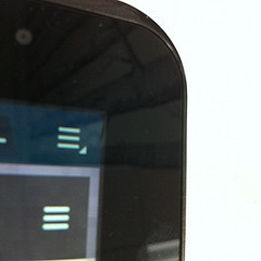
But I still think it’s a good shorthand for revealing a list of items.
The unicode character ☰ ☰ (U+2630) is the Chinese trigram for sky (or heaven)—one of the eight bagua. It consists of three horizontal lines. Now that could be a handy resolution-independent way of representing navigation.
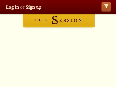
Alas, when I tested this on a range of mobile devices, some of them just showed the square box of unicode disappointment. I had much better luck with the unicode symbol for black down-pointing triangle ▼ ▼ (U+25BC).
Mind you, with a combination of @font-face and sub-setting we’re not limited to what the browser ships with—we can provide our own icons in a font file, like what Pictos is doing.
Tagged with
icon
navigation
mobile
unicode
symbol


Jeremy Keith's Blog

- Jeremy Keith's profile
- 56 followers

