Harry S. Dent Jr.'s Blog, page 132
October 19, 2015
Don’t Fall for a Trap! How to Invest in Dividend Paying Stocks
 In investing – heck, life in general – if something looks too good to be true, it probably is.
Nowhere is this more true than in the world of high-dividend stocks.
A generation ago, investors looked to the bond market for income. That made sense when you could get a safe yield of 8% or higher.
But at today’s puny yields, bonds aren’t going to cut it for most retirees. The 10-year Treasury yields about 2.1% as I’m writing this. That means you’d need to have $3.6 million invested just to generate an income of $75,000 per year.
Needless to say, most retired investors don’t have $3.6 million just lying around. Most don’t have one tenth that amount.
To make up for the money they don’t have in the bank, they’ve been committing that cardinal sin of investing: chasing yield in high-dividend-paying stocks.
Let’s say that you find a stock yielding a fat 10% in dividends. You can generate that same $75,000 with just $750,000 invested. Now, that’s still a lot of money, of course. But it’s a lot less than $3.6 million.
But there’s a problem with this. Remember, bond interest is a contractual obligation. If the bondholder doesn’t pay you, you can sue them. And if they fall into bankruptcy, you are first in line to get paid.
Not so with dividends. A company can cut its dividend at any time at the discretion of the board of directors. And as an investor, there’s not a thing you can do about it.
Dividends get slashed all the time. According to Street Insider, 837 companies have cut or eliminated their dividend this year alone, including large players like Freeport McMoran.
As recently as August, Freeport-McMoran was yielding nearly 10%. They were paying out a quarterly dividend of $0.313 per share. Now? A lousy $0.05 per share.
I’m not going to tell you to dump all of your dividend-paying stocks. But I am going to give you some advice on how to better think about dividends.
To start, longevity and growth are far more important than current yield.
The longer a stock has paid a dividend, the less likely it is that dividend will be cut. Sure, a crisis can always come out of the blue – think the 2010 Gulf of Mexico oil spill that clobbered BP – but if a company has managed to pay and grow its dividend for multiple consecutive decades, this is a company that can likely survive a zombie apocalypse.
The next point to remember is the payout ratio.
This can be defined differently for different types of stocks. For example, REITs and MLPs use different accounting terminology.
But the concept is the same. A healthy company should be paying out considerably less in dividends than it takes in as earnings and cash flow. It’s not sustainable for a company to pay out more than it makes.
Still, it never ceases to amaze me how investors routinely get suckered into yield traps like these.
So, if you want a durable income portfolio to tide you over in retirement, repeat after me:
Don’t chase yield!
Don’t risk dividends just because they pay out more than bond interest!
And don’t trust a company that pays out more than it takes in!
Trust me, you’ll thank me later.

Charles Sizemore
Editor, Dent 401k Advisor


October 16, 2015
We’re Flirting With Another Recession
 Back in May, we were about to go to the printer with the June issue of Boom & Bust when I put on the brakes.
My team wasn’t happy to hear it since these things take time to put together. But I didn’t have a choice. I had found compelling evidence to suggest that we were not just looking at another recession, but already possibly back in one.
So, we took a close look at how we’d been flirting with recession over the first half of the year, while economists kept spouting that we had reached escape velocity.
Now, after a bit of reprieve during the summer, it looks to be happening again.
We recently got the worst nonfarm payroll jobs report in months as only 142,000 jobs were created last month, with August revised almost 40,000 jobs lower. Plus, labor force participation hit a new low at 62.4%.
Overall, we’ve averaged 198,000 jobs per month in 2015, compared with 260,000 jobs in 2014.
For this reason and others, I have reason to believe we’re once again falling into a recession.
What makes the jobs report so concerning is that it’s a lagging indicator – meaning, it’s following a particular trend that’s already started. It supports the possibility that recession is already here.
But let’s also review some of the indicators I looked at back in June.
The U.S. Macro Surprise Index shows when indicators beat or miss expectations.
Green is when we’re dancing on rooftops because everything’s better than expected. You know what red means.
And you can see that 2015 has been a total miss. It’s been negative all year, with early 2015 being the worst period since early 2009.
It might be up from earlier this year, but after the last couple months, it’s dangerously close to falling again.

Another concern is sales in the retail and wholesale sectors. They’ve been declining all year. Wholesale’s actually been declining since the middle of last year.
The troubling bit here is that early 2015 was the worst since late 2008 when we were entering the recession. And sure enough, we usually don’t see trends like these until a recession is on our heels.
These are more coincident indicators, suggesting a recession while it’s going on. Meaning, it might already be here.

It’s no surprise then that since sales of wholesale goods are dropping, their inventories are building. That means goods are not moving off the wholesale or retail shelves. Consumers aren’t buying as much!
Fewer sales, more inventory… eventually, that means falls in production levels. Just another slowing of the economic engine.
This next chart shows that. Specifically, it’s the ratio of inventories to sales. A higher ratio means a build-up in inventories and sluggish sales.
Coming off the lows of early 2011, we’re clearly in territory we haven’t seen since the last recession and approaching levels near the worst in early 2009.

So we’ve got the economic surprise index at its lowest levels in four years… sales that are starting to roll over… inventories that are spiking…
And finally, exports that are sharply declining, partly due to global slowing, and partly due to a stronger dollar.
Exports (the red line below) have slowed and are down 11% for the year – granted, nowhere near the worst levels in mid- to late-2009 when they were down 28%, but again, clearly in territory we’ve only seen in the past two recessions!
As you see, imports (the blue line) have also slowed due to slightly weaker domestic demand. But that’s no surprise, as I’ve already showed you how pitiful sales here are getting!

Since the beginning of the year, I’ve been warning 2015 would be slower than 2014. And 2016 will only be worse.
Due to rising income inequality, it is the top 20% of households that have been holding up our economy. They’re the ones that have benefitted most from rising assets prices like stocks, as QE and zero interest rates have served only the richest of the rich.
They’ve kept spending and stimulating the economy, while everybody else still struggles to get by!
But these affluent baby boomers are about to fall off their spending cliff…
Right now, the peak are at 54. That’s when they reach their final spending peak, which falls off dramatically from age 55 forward – meaning 2016 and beyond! From there, it’s a rapid decline in spending. And I’ve shown in my 30 years of research, that kind of drop means curtains for the economy.
Don’t expect us to come out of this anytime soon.
Get defensive. Focus on the areas of your business that are strongest and drop the others. Subscribe to a shorting service like John’s Forensic Investor and make money while everything’s dropping. But don’t sit passively in risky assets while the fires blaze around you and your net worth falls 30-50%.
I assure you – it’s going to be ugly.

Harry
Follow me on Twitter @harrydentjr

This Is Truly a Game Changer in the Battle Against Cancer
 The old math trick of adding two negatives together to make a positive has been leading a new charge in the world of fighting cancer.
October 15, 2015
Biotech and Pharmaceuticals: The Next Boom to Go Bust!
 Whenever I start talking about “mean reversion,” I prepare for people’s eyes to roll back into their heads. It’s complex as far as topics go, I realize… but it’s also one of the deadliest forces in the market, and it can wipe out as much as 90% of yours gains if you’re not careful.
You see, there are two types of mean reversions.
The first is what I call your “everyday variety” of mean reversion. This is when market prices, after rising mildly for a day or two, fall mildly for a day or two. It’s so subtle that you hardly notice it happen. It’s also routine and completely harmless.
The other type of mean reversion is not-so harmless. In fact, it’s the most devastating, wealth-destroying kind.
I call this the “boom-to-bust” variety of mean reversion. And avoiding its wrath is absolutely critical to capital preservation and the long-term success of your investment portfolio.
The bad news, today, is that I’m beginning to see the early signs of a boom-to-bust style of mean reversion in an industry that I’ve long favored.
And if the bust side of this industry’s cycle plays out… I’ve identified two ETFs that could lose between 45% and 70% in as little as 12 to 18 months.
These industry-specific ETFs are already down 30% since July, meaning they’re officially in a bear market. But as I’ll show you, history suggests they still have a lot more to lose.
I’m going to run through a couple examples so you can see what I mean.
First, the Miners
The metals mining industry was the first to go through a boom-to-bust mean reversion cycle since the bull market began in March 2009.
At one point, in April 2011, the SPDR S&P Metals & Mining ETF (NYSE: XME) had gained an astonishing 230% off the March 2009 lows, just two years prior. And the price of copper (JJC) was up more than 160%.
Meanwhile, the SPDR S&P 500 ETF (NYSE: SPY) had gained only 80% over the same time.
So copper prices had doubled the gain produced by stocks… and the shares of metal miners had nearly tripled them. Clearly, the industry was booming.
But not for much longer, as you’ll see in this chart:

A boom-to-bust style of mean reversion struck the metals markets in 2011. Four years later, and the industry still hasn’t recovered. Miners’ stocks (XME) are now trading 28% below their March 2009 prices… losing the entirety of their 230% gain, and more!
Of course, plenty of investors made money on mining stocks on the way up. That is… if they got out in time. The price weakness turned out not to be temporary. And investors who thought there was an opportunity to buy the dip were truly sorry.
Next, the Drillers
Shortly after the mining industry began its dreadful decline, the oil and gas industry showed investors promise of a new, up-and-coming boom.
For the entire bull market that began in March 2009, the SPDR S&P Oil & Gas Exploration ETF (NYSE: XOP) and the SPDR S&P Oil & Gas Equipment ETF (NYSE: XES) outperformed the S&P 500.
By June of last year, the stocks of oil and gas producers were beating the broad market by a full 70 percentage points.
Just like the mining industry, the oil and gas industry appeared to be booming. And just as miners met a dreadful fate, oil and gas stocks too got hit with the bust-side of a nasty boom-to-bust mean reversion cycle, as this chart shows:

Again, there was good money to be made on the boom-side of this cycle. That is, for investors who acknowledged the changing of tides quickly enough…
Because in just 15 months, both oil & gas producers (XOP) and equipment providers (XES) gave back a full 90% of the gains they had accrued between March 2009 and June 2014.
This industry-wide decline, too, appeared to be temporary at first. But it wasn’t… and so any investor who ignored the newly-emerging downtrend – either waiting for a recovery or, worse, buying the dips – fared quite poorly.
Now, the Pill Providers
The health care industry is looking like it might be the next major U.S. industry to meet the vicious fate of the bust-side of mean reversion.
This is troubling for a number of reasons, not least of them being that I’ve long viewed the health care industry as one of the most robust and promising sectors of the U.S. economy.
My bullishness on the sector has been based on a number of factors. Fundamentally, the baby boomer generation has been, and will continue to be, a driving force of demand for health care services, equipment and pharmaceuticals.
And technically, health care stocks have shown in recent years the ability to lose less in down markets and gain more in up markets – a wonderful, have-your-cake-and-eat-it-too sector that any investor would be happy to own.
But health care stocks have suffered badly through the broad market sell-off that began in late August. Since August 1, the sector has lost nearly 12%, while the S&P 500 is down just 5%.
And the troubling news is… the health care industry might just get worse before it gets better.
This is particularly so for the most speculative and volatile subsets of the health care industry, namely biotech and pharmaceuticals.
And it shouldn’t be too hard to see why. These high-flying subsectors have clearly already enjoyed the boom-side of the boom-to-bust cycle… just as miners had by late 2010, and oil companies by early 2014.
Take a look at this chart, which shows the SPDR S&P Biotech ETF (NYSE: XBI) and the SPDR S&P Pharmaceuticals ETF (NYSE: XPH), relative to the S&P 500:

I trust you can see the similarities between biotech/pharmaceuticals, today, and the once-boomed-now-bust mining and oil industries, as they looked at their respective peaks.
Simply put: biotech has boomed too long, too far… and it’s due for the bust-side of its boom-to-bust mean reversion cycle.
Cycle 9 Alert readers have an open trade betting on one pharmaceutical company’s downfall. It’s not too late to get in on that trade.
To good profits,

Adam
Chief Investment Strategist, Dent Research

It’s Gone Berserk! Stocks Have Climbed Too Far, Too Fast
 Man, do I feel like a mouse on a treadmill. This market is exhausting!
For the past couple of weeks I’ve been telling subscribers to my shorting service Forensic Investor that I was short-term bullish and expecting a bounce in the market. So, I held off on making any new short recommendations.
Still, I’ve been surprised at how far and how fast the stock market has come back. The question is, how much longer will it last?
I discussed this in a recent call we have twice a month among the Dent editors.
After the rally, nearly everyone has turned bearish again. Harry said he would not be surprised if there was another flash crash. And Adam O’Dell’s been focusing on the short side.
I agree with them.
The bounce back that I thought might take several months took just a few days. Many stocks have zoomed 15% to 20% or more.
So this past weekend as I was going through several indicators that I look at each week, I was struck by how much the indicators have reacted. They’re out of control.
Investors Intelligence puts out one that truly shocked me. It’s a short-term trading signal that looks at two-dozen price indicators. The secret sauce isn’t as important as the levels this thing was reading.
It got freaky. On September 29 the indicator was at 5.2 – the lowest of the year. Things were so bad that there was very little downside risk left in stocks.
They almost had to rise from there.
Just eight days later, the level hit 77.6. And that is the highest of all of 2015!
That’s right. It went from its lowest to its highest in a matter of days. That means stocks have risen too far, too fast.
They almost have to go down from here.
That, my friends, is bear market action.
Huge moves back and forth don’t occur in bull markets.
Needless to say, the technical picture doesn’t look good. But it gets better. By that, I mean worse.
We’ve only barely started earnings season, but big companies like Alcoa and Caterpillar are already falling short of expectations. If the leaders are in trouble, then the second tier players are next. They don’t have the financial strength to handle a weakening outlook.
To add a cherry on top, the U.S. market is one of the most expensive in the world. Based on fundamentals, valuations have no reason to be this high. Something’s got to crack.
The bounce came. It happened fast. It’s time to get defensive again.
October 14, 2015
Congress Is Proposing Taking Even More Money From Savers
 It’s no secret that America’s highways and bridges are a sham and the overall transportation system is in desperate need of funding.
What is troubling is Congress’ latest solution.
We pay for our highways and bridges through a tax on gasoline, which puts the cost of the transportation system squarely on users. Currently, the federal tax on a gallon of gas is 18.4 cents. That tax hasn’t changed since 1993, when gas was $1.16 per gallon, making the tax rate 19%.
But it’s not levied as a percentage, which is why the tax hasn’t changed in more than two decades.
That’s a problem.
Heavier vehicles tend to use more fuel, and therefore pay more tax. Smaller cars, which tend to be light, pay less.
Yes, there is the added twist of hybrid and electric vehicles, which rack up lots of miles while paying almost no tax since they buy little gas. But, as a percentage of all cars, there aren’t many of those on the road.
The problem is that vehicles in general get better mileage today than they did in the 1990s.
In 1993, we used 137 million gallons of gas to drive 2.3 million miles. Vehicles averaged 20.6 miles per gallon. In 2013, we used 169 million gallons to drive 3.0 million miles, and got 23.4 miles per gallon.
We traveled 30% farther, but only used 23% more gas, thereby shortchanging the highway funding mechanism.
To make matters worse, the 18.4 cents paid on every gallon doesn’t go as far as it used to (pun intended). To maintain its buying power, the tax would have to be 30 cents today. So we are paying less tax per mile driven, and the revenue doesn’t go as far.
It’s not surprising then that the transportation system is woefully underfunded. It’s gotten to the point where Congress had to top off the fund on several occasions over the last six years because it couldn’t pay its bills.
Possible answers to the funding woes are obvious. Congress could raise the tax. That would be a start, but would leave the funding vulnerable to the same problem in the future.
Instead of just raising the tax, they could also index it to inflation to keep the purchasing power constant. This won’t address the small, but rising number of cars that use almost no fuel, but it would keep the potholes filled and bridges repaired for the next decade.
But apparently such an approach is too simple.
Our Congress can’t agree on raising the fuel tax, so instead they’ve looked to other methods of funding.
The latest one, which has already passed the Senate, calls for reducing the dividends the Fed pays to banks, and instead funneling the cash to the highway fund.
I can’t find any reason why this makes sense, but I know of one big reason why it’s a bad idea: it’s not their money to give away. It’s ours.
When the Federal Reserve System was set up in 1913, nationally chartered banks were required to join the club. These banks buy shares in their regional Fed bank based on their size, and the Fed pays them a 6% dividend on the stock.
The only difference is, in today’s interest rate environment, 6% looks out of whack. Interest-free, 10-year Treasury bonds pay 2.07%, while 30-year Treasury bonds pay 2.90%. No entity is more risk-free than the Fed, since it can effectively print its own money. So earning triple what a 10-year Treasury pays on Fed shares is a tad generous.
There might be cause to cut the dividend, but redirecting it to infrastructure?
Let’s take a step back and recall where the Fed gets its money. The entity (Is it an agency? A consortium? An academic society with a secret handshake?) charges for services like Fed Fund wires, and also prints cash to buy bonds, on which it earns principle and interest.
The bond returns provide the lion’s share of the Fed’s income. By printing money to buy bonds, the Fed takes a little bit of value from every saver that has accumulated dollars. Essentially, the Fed’s income is taken from all of us.
When the Fed has extra cash at the end of the week, which it almost always does, it sends the extra to the U.S. Treasury as a gift. I’ve covered this many times, so I won’t dwell on it here, even though the disposition of printed money is a mystifying topic.
Now, the Senate bill would have the Fed pay banks a lower dividend – 1.5% to banks with more than $1 billion in assets – and send the excess cash to the transportation fund, not the Treasury.
Granted, I’ve never been a fan of the Fed sending its excess cash to the U.S. Treasury. Just as they print new money, which is an effective tax on all savers, I think they should destroy the extra funds they collect, which would be a benefit to savers.
That said, I’m definitely not a fan of creating a direct pipeline from the Fed’s coffers to an agency of the U.S. government!
At least when the dollars go to the general fund at the Treasury, Congress still has to pass laws to spend it. If they’re allowed to divert funds from outside sources to pay for things, then they don’t have to go through the very difficult task of legislating tax hikes.
There’s a reason it’s hard. They’re supposed to justify what they spend.
Without the vetting process, spending other people’s money gets even easier. If this approach is approved, what’s to stop Congress from grabbing even more cash directly from the Fed, and taking even more from savers?

Rodney
Follow me on Twitter @RJHSDent

Could Stocks Suffer a Hangover After a Volatile Summer?
Bullish investors are counting down the days until November 1, when the stock market’s “sweet spot” returns.
But they may be disappointed this year, as 25 years of evidence suggests stocks could suffer from a nasty “hangover” following a volatile summer.
You see, the “Sell in May and Go Away” adage essentially divides the calendar year in half, then shows that stock market returns between May and October (the “go away” period) are weaker than returns from November to April.
So investors have been conditioned to expect great things from the market, beginning in November.
But my research shows that not all November-to-April periods are created equal.
Specifically, the stock market tends to underperform following a volatile summer – like the one we just had – compared to a quiet summer.
Here, I define a “volatile summer” as one in which volatility has spiked by 50% or more between May and October. Over the past 25 years, that’s occurred roughly half the time.
And it seems stocks tend to suffer from a lingering “hangover” following those rocky summers, as returns have historically been weaker and more volatile.
Take a look at this performance summary table, showing the difference in two-month returns following quiet summers and volatile summers:

Clearly, the stock market has underperformed in the aftermath of volatile summers. But it’s also been more susceptible to a sharp sell-off in November and December.
For example, the S&P 500 lost 10.2% between November 2007 and the end of that January – on the heels of a volatile summer.
And in 2008, stocks lost 9.9% during the last two months of the year – again, in the wake of a volatile summer.
That sure sounds like a miserable summer hangover to me!
And it makes a lot of sense…
Investors are naturally more hesitant after getting smacked around by volatility. They might buy stocks… but they’re nowhere near as aggressive in bidding up prices.
Of course, this research in no way guarantees we’ll see lower prices by the end of the year. No historical study can determine with certainty what will happen this time around.
But it does warrant a neutral or bearish bias, and suggests it’s far too early to get excited about bullish opportunities.
Adam
Chief Investment Strategist, Dent Research

October 13, 2015
The Most Meaningless Chart in All of Economics
 Since the invention of the microchip in 1971, the device has multiplied by the trillions at exponentially lower costs, creating more chips per person and a revolution in human communication.
Yet people have trouble applying the same logic to the multiplication of dollars.
Why not? With more dollars we’ve been able to foster a revolution in urbanization. It’s allowed the specialization of skills and trade, all of which has raised our standard of living – even when adjusted for inflation.
So why is this not seen as a sign of progress?
I’ll tell you.
It’s because economists and financial analysts, for the most part, are idiots.
More specifically, the analysts who misinterpret the most meaningless chart in all of economics.
You’ve no doubt seen this chart dozens of times.
At face value, it is rather shocking. That’s why people who see it are quick to jump to faulty conclusions.
But it doesn’t mean a damn thing they say it does.
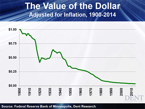
Looks bad, doesn’t it? Our All-American dollar has gone down 97%!
Guess again. This chart holds about as much meaning as my left toenail!
Yes, overtime the so-called “value” of the dollar has decreased as we’ve created more of them, like microchips…
But since 1900 we have dramatically increased our standard of living. Yet many continue to whine and complain that, collectively, our wealth has been devoured by evil inflation.
It’s moronic, but who can blame them?
We’ve all been conditioned to believe that inflation is a bad thing. Gold bugs and fiscal hawks tell us over and over again there’s irrefutable proof that the dollar is going to hell in a hand basket. And this ridiculous chart is used as evidence.
But the truth is, inflation – when held in moderation – is actually a good thing.
Think about how people lived back around 1900 when the U.S. was emerging as the up-and-coming new global leader.
Life expectancy was low, and the quality of life was even lower. There were no microwaves dinners or takeout menus. Families largely built their homes with their own bare hands, and fished and farmed for most of their food. All it took was one bad season to threaten your life and your livelihood.
It was dirty, dangerous, and back-breakingly hard. By comparison today, we practically live like royalty.
And it’s all thanks to inflation.
Over the long-term, inflation correlates with a rising standard of living. Inflation rises as populations grows, empires are built, and new technologies advance.
I learned this back in the early 1980s when I undertook a rapid and intensive survey of 3,000 years of western history.
Inflation rose as the Greek and Roman empires rose. It increased in the centuries following the printing press, gunpowder, and the discovery of the Americas from the late 1400s forward. And it’s boomed in the last century with the creation of electricity, automobiles, and now the Internet.
In brief periods like the 1970s, inflation goes to extremes and hurts the economy, but that is the exception, not the rule. And even in such periods, rising costs encourage new innovations that pay off for many decades…
Do you realize that personal computers emerged in the late 1970s near the top of that inflation cycle?
But swinging back to the broader picture, in each stage, inflation of dollars was necessary.
We needed the cash and more of it to implement each of these developments, and ultimately make our lives easier.
We needed more money to pay someone else to prepare our food and be able to deliver it to us 24/7.
We needed more money to pay someone else to take our kids from us for six hours a day and educate them.
We needed more money to pay someone else to build our homes. Clean our homes. Supply electricity, water, and gas. To cart away our sewage.
We need more money to pay doctors, accountants, lawyers, dentists, financial advisors, mortgage brokers, real estate agents…
You get my point… economists call it “the specialization of labor.”
That’s why inflation in the amount of dollars is natural. The cost of goods you consume is going to be higher when you pay a lot of middlemen to produce them and bring them to you.
The thing is, by living in a more urban, interactive, and specialized economy where work can be done most efficiently, our higher wages from higher productivity have more than offset the rising costs of living.
In fact, our wages adjusted for inflation are 7.1 times higher than they were in 1900, when inflation started rising and the “value of the dollar,” as shown in this perverted chart, started falling.
It’s not the number of dollars that count. It’s the rise in your standard of living adjusted for inflation that is most important. And how lucky we’ve been in the last century or two!
So do yourself a favor…
Next time you see that dollar chart and someone tries to tell you you’re worse off now thanks to inflation and a declining currency, tell them they’re a nutless monkey. You can tell them Harry says so.
Harry
Follow me on Twitter @harrydentjr

Investors Are Predicting Another Round of Quantitative Easing
 We might be returning to the days of “bad news is good news.”
It’s been well documented by us and others that all three rounds of quantitative easing (QE) did was to prop up financial assets, and artificially at that.
Recently, stocks have been trading as if the Fed plans yet another round of its bond buying program. Bad economic data makes it more likely that the Fed will try to stimulate the economy again, hence propping up stock values.
Bank of America has offered another interpretation. They noted that short interest had recently risen to levels not seen since just before the collapse of Lehman in late 2007, and that the recent rally was due to short covering.
Whichever one is correct, it doesn’t really matter. Both scenarios could result in a short-lived rally and a severe correction. And a short-term rally is likely how the smart money is seeing it. I doubt they see it as a new bull market driven by good earnings and an improving economy… because both of those are in short supply!
At this point, the Fed will likely do nothing to raise interest rates. With each new data point, a rate hike before the end of the year becomes less and less likely.
The minutes from the last Fed meeting (released last week) confirmed the overall theme of “wait and see.” Richmond Fed President, Jeffrey Lacker, thought rates should be raised, but the rest weren’t so sure.
The Fed chair, Janet Yellen, stated the same in her press briefing. The minutes indicated the Fed was worried about the lack of inflation, but believes we are on the way to full employment. I guess it was too early for them to react to the dismal September jobs report.
It was also interesting that the Fed held off on hiking rates because of global risks, mainly out of China. Since China’s markets were tumbling and causing panic elsewhere, the Fed thought it prudent to hold off once again.
Overseas troubles are here to stay. They aren’t “transitory,” a popular word in the Fed’s vocabulary. So the message here is that we shouldn’t expect a hike if there’s any chance of a market sell-off anywhere in the world.
Yields are virtually unchanged since the end of August (see chart below). Since the Fed is reacting to economic data and doesn’t seem to be planning to act ahead of possible inflation or move to normalize rates, the market is reacting to the data as well.
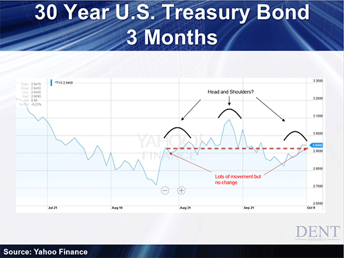
Not only have rates not changed much, but an interesting technical pattern has developed.
Note the head and shoulders pattern above. This pattern suggests long-term Treasury bond rates should drop down at least back to the 2.70% level, and possibly much lower.
You can extrapolate that to assume the stock market’s in for another selloff. But on the interest rate side, Dent Digest Trader readers are poised for an upcoming drop in yields, which appears to already be starting.

Lance Gaitan
Editor, Dent Digest Trader

October 12, 2015
VW’s Scandal Comes at a Bad Time For Germany
 The German economy has been nothing if not impressive. In the face of ugly economic circumstances across Europe, this country held fast to fiscal discipline while staying on track with exports. Hence, Germany ran budget surpluses for the last three years and has a cost of capital so low that its bond yields rival that of Japan.
Then, out of nowhere, comes a claim of corporate cheating that rocked iconic Volkswagen, the “People’s Car” company, maker of the famous Beetle.
It’s too early to know the full extent of the fallout from the scandal, but contrary to the happy face their officials put on the state of their nation, the embarrassment from this episode is just the latest punch to land on Germany. Their economic engine is running out of fuel just as they need to provide more power.
500,000 Americans own VW’s that are illegal to drive. These clean-burning diesels spew nitrogen oxides at up to 40 times the proscribed level under normal driving conditions.
VW admitted to installing software that instructs the vehicles to cheat whenever they encounter test conditions (no movement of the steering wheel, no speed registered while the engine revs, etc.). Now they face $18 billion in fines.
That’s bad. But what’s worse is the potential backlash against the company, which is synonymous with the country itself.
Volkswagen employs more than 270,000 people, which doesn’t include all of the suppliers and ancillary support organizations. They own Audi and Porsche. Cars and auto parts represent 20% of all German exports. The company just announced it will stop selling diesel cars in the U.S. immediately.
This doesn’t represent a big number of cars, but what if the negative effect on the brand dramatically reduces sales outside of Germany in the year ahead? That thought should send shivers down the spines of German leaders, particularly since their economic engine appears to be throttling back.
In August, a month before the VW scandal broke, exports fell 5.2%. This was the biggest drop since the financial crisis in 2009. Still, exports were up 5% over August of 2014, but the development has to give Germans a reason for apprehension.
The biggest overseas buyers are in the U.S., non-euro zone EU countries, and Spain. China accounts for 6.5% of exports. Anyone counting on sales in China, Spain, and non-euro European countries for growth should be nervous right now. The U.S. is doing well comparatively, and we certainly have a strong currency, which helps us buy imports, but this is where VW lied about emissions!
In line with falling exports, industrial production was down 1.2% and manufacturer’s orders were off 1.8%. Both were up over August of 2014, but only by 2.5% and 2.2%, respectively. The decline was broad-based, coming from capital goods, consumer goods, energy and construction.
This is probably why the IMF lowered its estimate of German economic growth this year and next to 1.5% and 1.6%.
German officials have a different take, expecting growth at 1.8% in both years. But that assumes that China doesn’t suffer a hard landing, U.S. growth continues unabated with Americans buying German cars, no economic upheaval in the greater EU, and consistent orders from Spain.
And then there’s that little matter of dealing with massive waves of immigrants.
Germany took the lead on providing a destination for asylum-seekers. Now the country expects more than 1 million immigrants this year, up from 200,000 in 2014.
No matter what people think of the choice to grant asylum to so many, in a country of 84 million it will take some time and money to get everyone settled. And a similar number of refugees is expected in 2016, repeating the process.
The cost of handling the flow of people is estimated at $10 billion to $20 billion. That won’t break the German piggy-bank, but it still represents an additional cost at a time when so many other headwinds are already blowing.
Investors should underweight their exposure to Germany, or exit positions altogether. Better to step aside than get run over.

Rodney