
R. Scot Johns's Blog, page 23
August 14, 2011
Page Layout 3
 Well, it's Sunday, so time to post up this week's work. New pages are up at Fantasy Castle Books, with some new ebook reading features as well. I'll try to post at least one new page each week, given time and other obstacles.
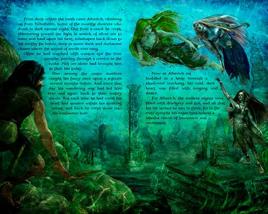
 This week's installment officially introduces us to Alberich, the instigator of the Curse. This page was not actually in my original outline or draft, at least not in this form. In Wagner's opera Alberich simply pops out into the Rhinemaids "lair", emerging from a crack in the rocks. No explanation is given, and it appears to be mere chance, although other authors and translators have given more or less believable explanations. One such laughable excuse was that Alberich actually knew about the Rhinegold and was only toying with the sirens to get at it. Not only is that directly in opposition to what Wagner specifically states, but it proves problematic on a number of other levels, not least of which is our need to empathize with his downtrodden state, which provides the real impetus for his later actions.
To that end, I had from the first intended to play much more on Alberich's infatuation with the Rhinemaids, and this scene is the ultimate result. My contention is that being a dwarf smith, Alberich would always be on the scout for ore to mine, and the gleam of distant gold would not long escape his eye. But here I give the real reason for his visit on this particular day, and that is entirely of my own devising: he is smitten with the loveliness of the river nymphs, which stirs something that is sorely missing in his own life. This leads us naturally in the direction we need to go, and provides more than ample motivation for what is to come.
I should mention here that in the writing of my finished draft I am deeply indebted to the genius of Oliver Huckel, whose 1907 poetic rendering is in my view among the very best.
It might also be mentioned that Alberich himself, and the scene of the gold's theft, is an amalgamation of several variant versions of what was apparently an old Teutonic folk tale. Very different takes on it appear in the Old Norse Eddas, the Icelandic Volsunga Saga, and to a lesser extent, the late Germanic Nibelungenlied. From the latter is drawn the characters of the Rhinemaids themselves, who do not appear elsewhere, and there not in connection with a treasure, though certainly with a river. I won't here go into the details of the various elements that make up the Alberich episode, as I've written more on that elsewhere, but suffice it to say that here is Wagner at his best, drawing diverse pieces together into a cohesive whole far greater than its parts.
As for the artwork itself, essentially I wanted to view the scene from Alberich's perspective, so it is more or less the same scene from the prior page, but darker, and more mysterious. This is closer to how I envisioned the set initially, and I may yet go back and remove much of the bright color from the preceding page, which now seems to me a bit too "tropical" and oceanic. It's difficult to find good digital models for underwater props that aren't ocean sets. But then, this isn't exactly the realm of reality, where dwarves can breathe underwater and sirens swim in a region of subaquatic ether. But, then, maybe that didn't bother you, so forget I mentioned it.


August 11, 2011
Kindle Edition Art - Addendum
 Here's a quick screenshot of how the art will look on the Kindle. Not as pretty as I'd like, and it will take some tweaking to get each image right, as far as contrast and detail is concerned, but it's better than nothing at all. One of the main difficulties with the Kindle's screen is it's low resolution and dynamic range, which has to render everything in 16 shades of gray (one of which is the off-white background). That may be fine for text, but it leaves much to be desired where images are concerned.
 In fact, if anyone views this on a first generation Kindle - which can only render 4 shades of gray - it will look like crap. But I doubt many people still have one of those, since the Kindle didn't really become popular until after version two, when the price went down.
 For this screenshot example, the color/sketch composite shown in the last post was used, so all the colors are simply desaturated shades of gray, giving the image much more shadow than it should really have, and washing out anything that's close to white. The sketch render composite shown at right might work better for the black and white screen, since there are no colors to convert, but it loses much in the way of subtlety and depth, not to mention the dynamic range that color gives.
Another element to bear in mind when adding images to a Kindle ebook file is that while the screen size is technically 600x800 pixels, due to the quarter-inch border, the actual viewing area is only 520x622 dpi. Any images larger than this will be scaled down automatically, while any images more than half this size (260x311 and up) will be re-sized up to fit the screen, until either the horizontal or vertical dimension (or both) reaches the border. Images smaller than half the screen size are not resized, so that you can add drop caps or graphic section dividers without their changing size. Consequently, any images that are not exactly 520x622, or less than 260x311, will lose quality when their resolution is changed by the Kindle's inner software. Thus, if you want an image that is, say, three fourths the width or height of the screen you'll need to add white space until it's either 520 pixels wide or 622 high.
 That being said, there is a lot of room to work with in the Kindle, particularly if you're into pen and ink or pencil art. Unfortunately I have yet to see anyone take advantage of this, either because Amazon has not been exactly helpful in aiding authors with anything beyond simple text formatting, or because the vast majority of book illustrations are done in color, and it's just not practical or advantageous to convert them into basic shades of gray. But with so many authors now publishing directly, if not solely, on the Kindle, I would have expected to see more use of the benefits this new medium has to offer. So far it's been more like trying to paint with watercolor on an oiled canvas. Books are a square peg that have been repeatedly crammed into a digital round hole, with unsurprisingly poor results.
August 10, 2011
Kindle Edition Art
 I spent the better part of this past week working over some of the art for the first section of The Ring Saga in order to make it work on the Kindle. I've toyed with this off and on since beginning this project, and it's been a bit of a thorn in my side all along. The fact is that more Kindle editions of ebooks are sold than any other format (and that certainly holds true for me), so it deserves some serious consideration as to how to deal with the graphic elements of this book.
 At one point I had considered just abandoning the Kindle altogether, since its 4" black and white screen is simply not compatible with full color art. Graphic novels and comics are really only suited to reading on LCD screens 7" or bigger, but as I said I've been mulling over how to deal with the Kindle's limited screen real estate and lack of color. In addition, graphics on the Kindle can only be placed between lines of text, although with a bit of clever formatting, small thumbnails can be added within a line, like drop caps, but this is extremely limited and hardly ideal.
 Some word wrap can be achieved with Kindle formatting, but only around square boxes, just like in this blog; but with such a small screen, that doesn't leave you much in the way of resolution. And as you can see from my last two posts, resolution is something of a concern here. Even on a 10" tablet, a two page spread will look pretty small, though of course you can turn it sideways and view one page at a time for easier reading. And with touchscreen you have the benefit of pinch and zoom as well. Not so with Kindle.
 So as far as I can tell the only real solution is to eliminate the backgrounds altogether and retain only the main elements of each piece, creating mini vignettes, if you will. But unfortunately size isn't the only consideration. In order to accommodate the Kindle's grayscale screen, the color must also be muted and the line detail increased. I could, of course, simply eliminate the color altogether, but not everyone reads Kindle ebooks on a Kindle reader, so it needs to look good in the Kindle app on tablets and computers as well.
 To achieve this I did a series of render passes in Poser using the Sketch Designer to create some hand drawn styled images, onto while I composited several color render layers using various filters and blend modes in Photoshop. The "Find Edges" filter is particularly useful to create an outlines layer, and I'm also fond of the "Ink Outlines" filter for this purpose. It takes a bit of tweaking to get the color balance right, but then that's a big part of doing digital art in any form. I'll just be glad when the Kindle has a nice big 7" color touchscreen like it's competitors.
August 3, 2011
Page Layout 2
 As promised, here is the next in the series of "finished" page layouts for
The Curse of the Rhinegold.
As before, you can click the image to visit the host page at Fantasy Castle Books, where additional notes and art elements have been posted up, detailing some of what went into creating the image. I have also started posting detailed credits for all the elements used in making each piece, from digital models to Photoshop brushes used.
As promised, here is the next in the series of "finished" page layouts for
The Curse of the Rhinegold.
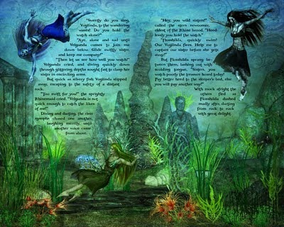
As before, you can click the image to visit the host page at Fantasy Castle Books, where additional notes and art elements have been posted up, detailing some of what went into creating the image. I have also started posting detailed credits for all the elements used in making each piece, from digital models to Photoshop brushes used.As for the text, we're now getting a bit into the story, so maybe a word or two should be mentioned here. While overall this is a very dark and violent story of mayhem and destruction, this opening sequence is right out of a children's fairy tale, and I've written it intentionally to feel that way. Don't let it put you off. This is not a children's book, and many pages will be splashed with blood before we're done.
But every conflict begins with relative stability, so my goal in creating these first few pages was to visualize a lush paradise before the fall, so to speak. I wanted the colors to be vivid and dynamic. In addition, it felt only natural to use a watercolor motif, given the setting. (On that note, I also posted an alternate version of the first page spread which used a watercolor splatter effect that I ultimately removed, for reasons I make note of there).
This image was particularly difficult to finish, for a wealth of reasons, not least of which is the several hundred models and layers involved. Virtually everything that could go wrong did, and it's a wonder it ever got done at all. Of course, I have no illusions that it's actually finished, but for now it's close enough. Final color adjustments and printer's proofs must wait for another day.

August 2, 2011
New Ring Saga Art
 Beginning today I will be posting new "final layout" pages for
The Ring Saga
over at the Fantasy Castle Books site. Go to the "Ring Saga" menu and click on either or both the "Artwork" or "Final Layout" links. The first will give you additional submenus divided into sections for characters, sets, props, etc., where you will find among other things early concept art, test renders and character model sheets. There are new model sheets for Alberich and each of the three Rhinemaidens, with more to follow. Final Layouts is where I will be posting the completed page spreads like the one shown here, which I plan to do for the entire first book. The additional Research button also found there gives you supplemental info and links to download a great many of the source texts I've used in undertaking this project, including my own "Comparative Text Editions" of Wagner's opera librettos, the Norse Eddas, and the Icelandic Volsunga Saga.
Beginning today I will be posting new "final layout" pages for
The Ring Saga
over at the Fantasy Castle Books site. Go to the "Ring Saga" menu and click on either or both the "Artwork" or "Final Layout" links. The first will give you additional submenus divided into sections for characters, sets, props, etc., where you will find among other things early concept art, test renders and character model sheets. There are new model sheets for Alberich and each of the three Rhinemaidens, with more to follow. Final Layouts is where I will be posting the completed page spreads like the one shown here, which I plan to do for the entire first book. The additional Research button also found there gives you supplemental info and links to download a great many of the source texts I've used in undertaking this project, including my own "Comparative Text Editions" of Wagner's opera librettos, the Norse Eddas, and the Icelandic Volsunga Saga.I know this has been a long time coming, and as I haven't posted in awhile, I'm certain many of you must have thought I'd given up. But that is not the case. I have, in fact, been hard at work all the while, to the extent that I had to stopped blogging about book industry news and tech and just focus on my own work. Indeed, it's been a lot more work than anticipated, and as always, a great many things have gone haywire in the process. But I'll spare you the tedious details.
I have been intending for some time to create a new Wordpress site in order to incorporate this blog with an actual author website, but I just haven't had the time to build it. As soon as I do I'll let you know. Meanwhile, I'll try to post more regularly now that finished pages are beginning to flow off the press. Once the first chapter is completed, I will be printing up a limited edition chapbook series, which I will give away free, so stay tuned for that.

May 6, 2011
Smashwords Book Apps
 Smashwords this week announced that they have reached an agreement with ScrollMotion to convert their 33,000 title Platinum catalog into individual book apps, which will be available on all the major phone and tablet platforms via a growing host of app marketplaces.
 This brings yet another level of marketing clout to ebooks distributed through Smashwords' already impressive list of retail outlets, with no additional effort required on the part of the author. Indeed, Smashwords is rapidly becoming the digital distributor of choice for many self-published authors.
Still, while this inherently increases the visibility of an author's work, promoting those books remains mainly in the author's hands, for tips on which see today's other post.
To read the full press release click here.

Book Promotion for Independent Authors
Here's an informative video featuring a talk given by BookBaby president Brian Felson at the London Book Fair about how to promote yourself as an independent author. BookBaby offers both ebook publishing and web hosting services, which the lecture promotes to some degree, but all of the strategies given are useful for any author, from self-published to traditional, since these days it's incumbent upon the creator of a book to sell it as well.
This is one of the foremost reasons to forgo trade publishing in lieu of an independent approach, since traditional publishers require you to establish a platform before they'll even take you on, and if you have a platform, you already have your target market. With all the tools and retail avenues available today you can reach your readers without the need of intermediaries, and consequently make more for your efforts. So promotion is really just a question of how to build a platform, and that's what Brian Felson talks about in this video.
An interesting note you might catch is a passing mention of Kindle book apps coming soon, which may be a reference to the next gen Kindle, which will very likely be a 7" tablet like the Nook, with the ability to read book apps that Amazon will sell in its new app store.
April 22, 2011
Kindles for Kids
Check out this video for the WorldReader "iRead" program, which is bringing literally millions of books to students in impoverished nations via digital editions on donated Kindles.
Visit the WorldReader webpage or read the post on the BookLending blog for more information on the program and how you can help them reach their goal of $5000 by the end of May!
And in other Kindle news, this week Amazon announced they have joined with Overdrive to launch a lending program in 11,000 public libraries later this year. The lending capability will be available on all generations of Kindle readers and apps and will function much the same way the current book loan program does, except that books will be renewable - meaning you can check them out more than once or for extended periods of time, a huge boon for longer books and slower readers.
In addition, the borrowed books will be fully functional with annotation and sync capability. This means that you can mark up a book with highlights and notes to your heart's content, insert bookmarks, or stop reading in the middle, and when you borrow the book again - from anywhere, or even purchase it - your annotations will still be there and it will remember where you left off reading. And since those annotations are linked to your Amazon account, no one else but you will see them. How cool is that?
April 19, 2011
eBooks Sales Surpass Print Books
 It's official: eBooks are now the single biggest selling format in U.S. trade book sales. Bigger than Hardbacks. Bigger than Adult Mass Market titles. Bigger than any Children's & Young Adult categories. And now, for the first time, bigger than Trade Paperbacks (this includes both fiction and non-fiction titles, everything from graphic novels and travel guides to Bibles). Of course, we're comparing all eBooks here to just a single category of print, so the comparison is not exactly accurate; but if digital is considered a "format" on its own, then the distinction is correct, and well worth taking note of regardless.
According to the latest AAP report for February sales, ebooks brought in $90.3 million in revenue for the month, a 202.3% increase over the previous year, while Trade Paperbacks accrued just $81.2 million. And while digital editions continue to soar month after month, all formats of print continue to decline, fueling concern and speculation as to the extent of cannibalization that has occurred, and how far it will extend. And although one of the most significant factors behind this shift is the sudden prevalence of reasonably priced ereaders, another (possibly more important) reason is that the average price point for print editions is $15.50, compared to just $8.75 for the equivalent ebook. At any time price will be a factor, but more so when times are hard and funds run thin.
And this is the result: for the first two months of 2011 print sales were down 24.8% overall, with Adult Trade categories falling 34.4%. Religious, Educational, and Academic texts all declined by single digit figures, while Chidren's/Young Adult print editions were down 16.1%. Meanwhile, eBooks have climbed 169.4% overall, and downloaded Audiobooks rose 36.7%. I don't even need to mention the stunning numbers of ebook readers sold recently, but with those figures running in the tens of millions, it's not very difficult to figure what's coming next. After all, what good is an ebook readers with no ebooks on it?
All this goes to show that digital editions are here to stay, and should be given the same consideration that print has always had. This means that independent publishers and self-pubbed authors need to pay start paying more attention to formatting, and build their ebooks with the same care and attention to detail that print has always received. Simply dumping a text file into a conversion program or uploading the print edition pdf to an ebook retailer isn't good enough any more (not that it ever was). Given that for many readers these days a digital edition may very well be the only edition of a title they ever see, it behooves the creators of that book to make it the best edition they can.
With that in mind, I'll be starting a series of posts in the days to come dedicated to ebook formatting. It's something I've spent a great deal of time studying of late, and a subject which is both confusing and rapidly evolving. With iBooks now supporting fixed-layout ePub files and ePub3 pending, far more complex layouts are possible in digital than ever before, and will only continue to improve, making graphic novels and highly illustrated storybooks not only possible, but with embedded audio and video, more exciting than ever.

April 3, 2011
Intro To Smashwords
 So I suppose I should take about Smashwords a bit. I haven't done much blogging on publishing lately (or anything else either, really), as I've been utterly swamped with book production issues that have just been sucking up my time. But I started this blog with the intention of discussing my experiences in independent publishing, and as many of you reading this are doing so because you're self-pubbed authors yourselves, Smashwords is a service you should know about, if you don't already.
As I mentioned in a prior post, Smashwords functions as an aggregator, producing and distributing ebooks to several online retailers, foremost among these being Barnes & Noble, Sony's Reader Store, the Kobo Store, Diesel eBooks, and Apple's iBookstore, as well as via their own online storefront. Founded just three years ago, Smashwords has published over 40,000 ebooks from 16,000 different authors, all of whom retain full rights to their own works, set their own prices, and decide in which formats and venues to release them.
 I won't go into a load of detail here, as they describe their services best themselves. But I will point out a few of those that stood out for me. First off I should say that I hadn't initially given them much consideration, due to the fact that most ebooks distributed via Smashwords list them as the publisher. And since I went to all the hassle of establishing my own publishing company in order to work with Lightning Source, I didn't want someone else's name on my books in some formats, but mine on them in other versions. However, I later discovered that this isn't required, so long as you provide your own ISBNs. Consequently, all my editions are published under the Fantasy Castle Books brand. That said, one of the best features of Smashwords is that they will provide a free ISBN if you don't want to shell out a couple hundred bucks to buy your own block of ten or more from Bowker. This does, however, list them as the publisher of record. But for a mere ten bucks they'll give you the ISBN and list you as the publisher if that's an important consideration for you. I think it should be, but Mark Coker, Smashword's founder, disagrees (for obvious reasons). You'll have to decide for yourself. But then, that's the job of being self-published, isn't it?
And, of course, it could be argued that this is irrelevant in the end anyway, since what is important is actually getting your book out there, and readers don't generally pay attention to the publishing imprint or even care one way or the other. While there is still a stigma attached to self-published works, and books produced through CreateSpace, Lulu, BookBrewer and the like can suffer as a result, that is quickly changing as readers themselves become the ultimate and final arbiters of taste and quality, as it should be. As ebooks gain more and more ground, and indie authors like Amanda Hocking gain notoriety, books will be judged more on their own merit than by the channel through which they reach the reader. Indeed, the entire field of publishing is now wide open, with the path between source and destination shorter than ever.
 This is where a company like Smashwords comes into its own. Functioning essentially as a new mediator between the author and retailer, aggregators like Smashwords and BookBaby step in to fulfill many of the functions once performed by traditional publishing houses and literary agents. That is, they take a manuscript, format it into a marketable product, and ship it to a variety of retail outlets. Marketing is still essentially left to the author, as are things like editing and cover art, but each of these receive a great deal of aid throughout the Smashwords process. For example, the ebook conversion process rejects poorly formatted manuscripts and automatically generates notes on needed changes; web pages are created for every author and title; and basic cover stock can be produced using standard templates.
For all this (and much more), Smashwords charges nothing, making its revenue through a 10-15% share of all ebooks sold, depending on the channel (who themselves, of course, take a share). So for example, Apple gets a 30% cut of the retail price, with Smashwords taking another 10%, leaving the author with a full 60% profit. No traditional publisher comes near that, with 25% being the norm for digital sales at present. In additional, there are a surprising number of promotional and marketing tools available, such as a coupon generator, to assist you in selling your work.
 Now, seeing that I have an established account with Ingram, I could get onto the iBookstore that way. But there is an upfront fee, and Ingram still takes a cut as well. Smashwords, on the other hands, acts as a one-stop shop not only for iBooks, but half a dozen other ebook readers, all of which are available to the customer with a single purchase. There's no need to buy a title in Kindle format, then again for the Nook if you decide a NookColor is really cool, or again when you pick up an iPad and want to read in iBooks. And all titles sold through Smashwords are Digital Rights Management free, meaning you can transfer them from one of your readers to another, to your home computer and back again, without having to worry about not being able to open the file ten years from now when the Kindle has been replaced by who knows what. You bought the book, you should be able to read it when and where you want.
Which brings up another important point: Smashwords only publishes ebooks. And while there is a growing movement of digital-only authors, print books still make up the vast majority of sales, and likely will continue to do so for some time, so it's a good idea to pursue Print on Demand options as well, or continue to do so. Some books just don't translate well to the digital format, as I'm discovering with my current project (Argghhh!!), and the wide variety of screen sizes and reader formats is a hindrance at best, limiting what digital publishing is currently capable of producing. But Smashwords does the best job yet of standardizing those variables for the best presentation on them all, and for that alone they're well worth looking into.


