
R. Scot Johns's Blog, page 21
October 24, 2011
FREE eBooks and Call for Beta Readers

You can now download The Theft of the Rhinegold , the first completed chapter of the Curse of the Rhinegold , in three formats as a digital chapbook. Click the Fantasy Castle Books tab up there and scroll down to the bottom for the links. The links will remain active for a limited time only, so get yours while you can.
As for the formats, the PDF is an exact replica of the final print format, in high resolution quality, so I recommend it above the others, although it's a fairly hefty 47 megabyte file. I've also included both ePub and Mobi files for those who want a smaller file size or to use with a particular eReader/app, but be forewarned that both will have white borders around the edges, whereas the PDF does not. However, that being said, if you open the PDF in iBooks it will revert to that reader's default margin settings, adding white space around the edges that is not in the actual file. I will be creating a fixed layout ePub edition for iBooks at some point which will do away with this, but I haven't got that far just yet.
Also unfortunate is that the new Adobe Reader app for iPad only allows you to view a single page at a time, rather than the preferred two page spread, so that is not ideal either. Of course, on the NookColor and similar 7" screens you can only view one page at a time anyway, and I've designed the page layouts with that in mind. But if you view the PDF on your computer screen you'll be able to see it as it was ideally intended with both pages joined together at the spine to create a complete image. You can also, of course, view the online version of the book on the Fantasy Castle Books webpage.
Feel free to download and share these files with anyone you want. Just be aware that it is copyright material, and you are not allowed to sell it or use any part of it for commercial purposes without my permission, as per the copyright page. If you have a blog of your own, you are welcome to offer these free ebook files to your readers as well.

CALL FOR BETA READERS:
As an incentive (or a bonus, if you will), for anyone who sends in a review, comments, or critique of this section I will send you an autographed, limited edition print chapbook, as seen in the image on the right. These are hand-produced by myself, color laser printed on high quality paper stock and hand cut and stapled. The book measures 5" x 8" and runs 22 pages long, as you know if you've been following along.
I plan to do this for each of the five sections of this first book (and possibly the rest, depending on how this one goes), and anyone who reviews all five sections will receive an autographed copy of the complete finished print edition, as well as their choice of final ebook format.
In order for this offer to be valid there are, of course, a few stipulations involved. Foremost, reviews must be a minimum of one full page of single-spaced typed text (roughly 700 words or so, but more is always better), and cover at least some of the following criteria:
Overall presentation: i.e. visual aesthetics and appeal, general impressions
Readability: are the text and font style clearly legible and easy to read?
Story Content: general issues of plot, pacing, and character development
Writing Style: comments on the use of semi-archaic narrative style are welcome
Grammar: as always, please point out any stray errors you might find!
Art Layout: overall composition and balance of the graphic and text elements
Color Balance: are the colors vivid enough, or overly so? Too dark? Too light?
Characters: are the four main characters appealing and visually interesting?
Setting: do you get a good sense of the story world from the elements presented?
Do you want to read more after finishing this section?
Is this a book you might buy if you saw it on the bookstore shelves?
Don't feel obligated to hit each point, but just give me what sticks out the most for you. And feel free to add any other points you might think of as you're reading. If you do reviews you'll know what I mean, but otherwise just give me a general sense of how the book affected you, and any particular details that stand out. Of course, the more specific detail the better, as it will help me to refine my future efforts, and/or go back and fix things in revision. Negative comments are as welcome and helpful as positive ones, so don't hold back.
Send your reviews to: reviews@fantasycastlebooks.com, and be sure to give me your name and address so I know where to send your chapbook. Also let me know what format and reading device you used, and how that experience was, bearing in mind the caveats given above.
Thanks in advance, and I hope you all enjoy the book.


October 21, 2011
READ!
[image error]
Here I am on the new "Read" poster created by librarian Bret Fowler at Caldwell High School here in Idaho. Mr. Fowler was awarded a grant for some much needed computer hardware, which included along with a copy of Photoshop Essentials a software package from the Read people containing all the fonts, backdrops and borders you might ever need to create your own Read posters (actors not included). I was subsequently marshaled into the library's makeshift photo studio, handed one of the library's two copies of my novel (well-worn I'm happy to report), and propped against a wall where shooting soon commenced. The results are what you see above (and that is why they like to use professional actors). Excellent job on the poster composition, Mr. Fowler!
Here I am on the new "Read" poster created by librarian Bret Fowler at Caldwell High School here in Idaho. Mr. Fowler was awarded a grant for some much needed computer hardware, which included along with a copy of Photoshop Essentials a software package from the Read people containing all the fonts, backdrops and borders you might ever need to create your own Read posters (actors not included). I was subsequently marshaled into the library's makeshift photo studio, handed one of the library's two copies of my novel (well-worn I'm happy to report), and propped against a wall where shooting soon commenced. The results are what you see above (and that is why they like to use professional actors). Excellent job on the poster composition, Mr. Fowler!
October 15, 2011
Ring Saga I, Pages 21-22 - The Theft of the Rhinegold
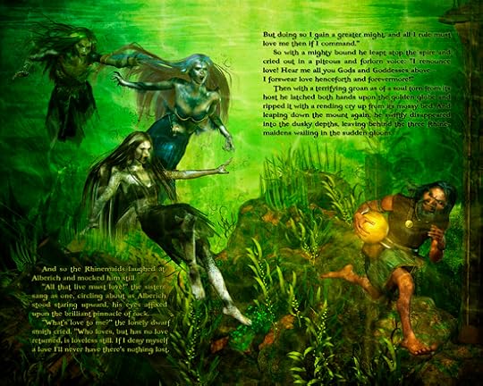
At last we come to the culmination of Act One, with Alberich's renunciation of love and subsequent abduction of the Rhinegold. Here we see the pivotal event occurring just moments after the scene visualized in the cover art I did nearly two years ago now. To build this scene I used the original cover set files, altering the perspective and reposing the newer Rhinemaiden figures to closely match the cover art. At some point I'll have to redo the cover itself in order to match the character models, but I'll wait on that for now, as I'd rather press on with the story.
For this page sequence I feel I've really put my writing skills to the test, having to create and resolve a culminating crisis moment in a matter of just a few short paragraphs. This is one thing I've been struggling with throughout the process, with somewhat mixed results. One thing I've realized is that in focusing so heavily on the creation of the artwork I haven't put as much emphasis on the text, letting my rough draft stand in many cases with little or no revision. In the back of my mind I've been planning on a last minute revision of the entire text once all the art is finalized, so that my main task at this point is to simply narrate the basic plot points of each scene in the space provided, leaving the final phrasing for later editing. Here I feel I've done a fairly good job of it from the start, since it really all comes down to this moment, and Alberich's motivation is critical to understand his actions, so I've put a lot more thought into it, but in other places there is still a lot of work to do.
I have to say that writing to a confined space is something entirely new to me. I've always written what I felt needed to be said, in however many pages that required. The first draft of The Saga of Beowulf came in at well over 800 pages, and the screenplay nearly 200. Here I have a total of 400 pages to tell the entire four-volume story, roughly half of which will be taken up with art, making it a 200 page novel start to finish. That means that each volume can contain no more than fifty pages worth of text. This makes it more like writing poetry than prose, and since it's based on Old Norse poetry and Wagner's score librettos it seems only fitting.
As for the art, I've left the usual notes and whatnot on the Fantasy Castle Books site, which you can now access from the tab at the top of this cool new blog template. This blog has been wanting a revamping for awhile now, but I just haven't had the time to mess with it. This week Blogger sort of forced me into it, so I took the opportunity to tweak the site design a bit. Let me know what you think.

October 8, 2011
Ring Saga I, Pages 19-20: The Lure of the Rhinegold
At long last, I have reached the final page of this sequence... or not. As originally planned there were to be seven page spreads for a total of fourteen pages in this opening section. Now here I am at twenty pages, and there's still one more yet to go. I promise. Just one more...
The good news is that while doing my detailed page outline (very detailed outline), I built in a certain amount of leeway which allows me to add up to roughly fifteen pages without going over my maximum limit. The bad news is that I've now used up half of that amount in less than a quarter of the story. For the digital editions this makes little difference, aside from issues of pacing and narrative detail. But for the print editions every page adds to the production cost and eats into my profits. My goal is to keep each of the four volumes under ten bucks, which means a limit of right around a hundred pages each. Every new page spread will cost me ten cents off the top, and/or reduce the discount I can offer to book stores.
For the record, a 100 page full color edition in the 5.5" x8.5" size will run $6 to print through Lightning Source. That means at a retail price of $10 and a 20% discount to online retailers, I'm left with two bucks each. Or $1.90 for 102 pages... or $1.80 for 104 pages... you get the picture. And that's with just a 20% discount. If I give book shops 40% I'm making nothing. To get it into Barnes & Noble and the like, who require 50% or better, I'd have to raise the SRP to more than $12 to break even. Now, that's not excessive for a full color graphic novel, but each dollar reduces the number of copies that will likely sell, and adds to the overall cost of the four volume set, so you can see why I hesitate to add additional pages.
Still, the story must be told in whatever space it takes. For this opening sequence I felt it was important to establish the setup fairly clearly, even though only Alberich remains a prominent figure throughout the book. The central figure, of course, is the Rhinegold itself, about which this sequence turns, so it's elemental nature is imperative to understand. To that end, I've added some explanatory dialogue of my own which introduce some important concepts for both the story and the mythology behind it. Ultimately, though, some of the page spreads that you're seeing may be cut from the final print edition, which means excising some text, and/or rearranging some of the graphics. That's not an easy task, and it's one I'd like to avoid if I can.

So I've added some fairly extensive notes on the Fantasy Castle Books page for this spread, mostly on the creation of this background plate. Every background uses different elements, and they all come together differently as a consequence, but the general working method is the same, and I lay it out in detail for this one. It's not exactly a tutorial, but from the notes you can get the general sense of how it's done and see each piece of the puzzle separately. Click the pic here to see a bigger version. And as always, you can click through the finished image above to read the page online in higher resolution.

October 1, 2011
Stupidest Kindle Touch Feature

Standard touch-screen tap zones
In all fairness, this should be called the "least well thought out" feature, or the "clumsiest execution of a good idea," or something along those lines. But anytime you can use the word "stupidest" in a blog title you should, because it will inevitably draw in more readers. People love to read about stupid stuff other people do. And while I'll allow for "best intentions" and give kudos for the effort, I have to say that this is one of the most awkward solutions I've ever seen to what is inherently a very simple problem.

The new Kindle Touch screen tap zones
I mean, in all honesty, who thinks this was a good idea? How does a very narrow (half-inch or so) "previous page" zone on the very far left side make anything easier for the vast majority of us right-handed readers? That is not an "EasyReach" for me. I don't know about the rest of you, but my right thumb isn't six inches long. I'm not a monkey, after all (not for several million years at least). And being right-handed I tend to hold a book more often with my dominant appendage (unless I'm drinking coffee or taking notes, that is). Why handicap the majority of readers by making it virtually impossible to turn back a page while holding the device in your right hand?

What I like to call "Smart Zones" (graphic by me)
An old adage says that all else being equal, the simplest solution is always the best. With that in mind, the correct solution is simply to turn the standard three vertical zones into three horizontal zones, thereby creating three equal areas that either thumb can easily reach without having to awkwardly stretch over or across or around another, and with ample area to accommodate various sized fingers (even six inch monkey fingers). Tap anywhere around the bottom corner on either side to advance to the next page...simple! Tap anywhere near the middle of the page with either thumb to go back...easy!! And tap anywhere around about the upper region to access the menu...what could be more practical or elegant than that? Symmetrical, harmonious, and universal, as all tech things should be. Seriously, how on earth did this possibly escape what is otherwise one of the most innovative design teams on the planet today?
P.S. If anyone affiliated with Amazon reads this, please pass it along to your R&D department for future reference, with my regards!

September 30, 2011
DC Comics Exclusively on Kindle Fire

Amazon announced today that 100 DC Comics will be made available on the Kindle Fire, some of them exclusively, including Watchmen, Batman: Arkham City, Superman: Earth One, and my personal favorite, V for Vendetta, none of which have been available in digital format before. What isn't know is what specific format the files will be presented in, but a few details are known.
First of all, Watchmen and Superman: Earth One are now available for pre-order at a price of $9.99, but with a file size listed as 11kb each, leading one to suspect they'll only be available as streaming content residing in the cloud, although downloads may still be possible for offline reading, as per Jeff Bezos' presentation comments.

Secondly, a short description given on each book's Amazon page under the heading "Kindle Fire: Comic Books" reads:
"Graphic novels come alive on Kindle Fire with Kindle Panel View. Double-tap on
any region to see it magnified. You can also swipe forward or backward to be
guided through the panels in the author's own sequence for an immersive reading
experience."
This sounds very much like the "Guided View" now used in apps by ComiXology, Dark Horse and the like, and as ComiXology was featured in the Kindle Fire promos one might speculate a partnership here. My guess is a DC Comics app will be packaged with the unit, or made available for free from the Amazon App Store.

And finally, here's the complete list of all 100 DC titles to be made available for the Kindle Fire on November 15th:
All Star Superman
All Star Batman & Robin, The Boy Wonder, Vol. 1
American Vampire Vol. 1
Batman and Robin, Vol. 1: Batman Reborn
Batman and Robin, Vol. 2: Batman vs. Robin
Batman and Robin, Vol. 3: Batman Must Die!
Batman and Son
Batman: Arkham Asylum
Batman: Arkham City
Batman: Hush
Batman: R.I.P.
Batman: The Black Glove
Batman: The Dark Knight Returns
Batman: The Long Halloween
Batman: The Return of Bruce Wayne
Batman: Year One
Blackest Night
Blackest Night: Black Lantern Corps Vol. 1
Blackest Night: Black Lantern Corps Vol. 2
Blackest Night: Rise of the Black Lanterns
Blackest Night: Tales of the Corps
Brightest Day, Vol. 1
Brightest Day, Vol. 2
Brightest Day, Vol. 3
Daytripper
Fables Vol. 1: Legends in Exile
Fables Vol. 2: Animal Farm
Fables Vol. 3: Storybook Love
Fables Vol. 4: March of the Wooden Soldiers
Fables Vol. 5: The Mean Seasons
Fables Vol. 6: Homeland
Fables Vol. 7: Arabian Nights (and Days)
Fables Vol. 8: Wolves
Fables Vol. 10: The Good Prince
Fables Vol. 11: War and Pieces
Fables Vol. 12: The Dark Ages
Fables Vol. 13: The Great Fables Crossover
Fables Vol. 14: Witches
Fables Vol. 15: Rose Red
Green Lantern Vol. 3: Wanted Hal Jordan
Green Lantern: Agent Orange
Green Lantern: Blackest Night
Green Lantern: Rage of the Red Lanterns
Green Lantern: Rebirth
Green Lantern: Secret Origin
Green Lantern: The Sinestro Corps War
How to Understand Israel in 60 Days or Less
Identity Crisis
Kingdom Come
MAD About Oscars
MAD About Superheroes
MAD About Superheroes
MAD About the 50′s
MAD About the 60′s
Marzi
Planetary Vol. 1: All Over the World and Other Stories
Planetary Vol. 2: The Fourth Man
Planetary Vol. 3: Leaving the 20th Century
Planetary Vol. 4: Spacetime Archaeology
Superman for All Seasons
Superman: Earth One
The Dark Knight Strikes Again
The Flash: Rebirth
The Joker
The League of Extraordinary Gentlemen (Vol. 1)*
The League of Extraordinary Gentlemen (Vol. 2 )*
The Sandman Vol. 1: Preludes & Nocturnes
The Sandman Vol. 2: The Doll's House
The Sandman Vol. 3: Dream Country
The Sandman Vol. 4: Season of Mists
The Sandman Vol. 5: A Game of You
The Sandman Vol. 6: Fables and Reflections
The Sandman Vol. 7: Brief Lives
The Sandman Vol. 8: World's End
The Sandman Vol. 9: The Kindly Ones
The Sandman Vol. 10: The Wake
The Sandman: Dream Hunters
The Sandman: Dream Hunters (P. Craig Russell)
The Sandman: Endless Nights
The Unwritten Vol. 1: Tommy Taylor and the Bogus Identity
The Unwritten Vol. 2: Inside Man
V for Vendetta
Watchmen
We3
Y: The Last Man, Vol. 1: Unmanned
Y: The Last Man, Vol. 10: Whys and Wherefores
Y: The Last Man, Vol. 2: Cycles
Y: The Last Man, Vol. 3: One Small Step
Y: The Last Man, Vol. 4: Safeword
Y: The Last Man, Vol. 5: Ring of Truth
Y: The Last Man, Vol. 6: Girl on Girl
Y: The Last Man, Vol. 7: Paper Dolls
Y: The Last Man, Vol. 8: Kimono Dragons
Y: The Last Man, Vol. 9: Motherland

September 29, 2011
Kindle Videos & Comparison Chart
Here's a selection of videos that have shown up on the web since yesterday, giving more insight into the new Amazon ereader line. The first is Amazon's new "Kindle Friends" commercial for the $79 model...
Then there's the new "Quick Tour" ad for the Kindle Fire, which shows off the device quite nicely...
And this shorter television ad...
Check out this video for an insightful description of how the new Silk "split browser" has completely changed the future of Internet browsing....
Finally, here's the complete video for Jeff Bezos' presentation yesterday morning. It's nearly an hour long, but it's well worth a watch if you're at all interested in the details of what these new devices can do...
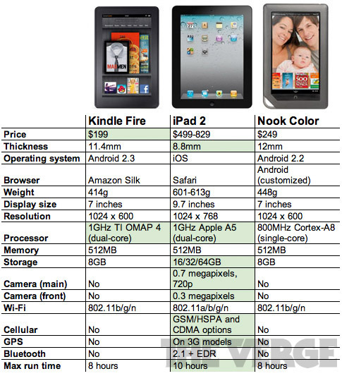
Lastly, here's a nice comparison chart I found today lining up the specs of the Kindle Fire against the iPad 2, and its more direct competitor, the NookColor, which it will all but replace in the market unless the NookColor 2 is utterly stunning - and more importantly, cheap. But don't expect huge price drops to happen across the board: experts are estimating that Amazon will lose $50 on each Kindle Fire sold, a business practice no other company out there can afford, and certainly not Barnes & Noble. And while the Fire has half the features of an iPad 2 (plus a few big ones the iPad doesn't have, like cloud computing and direct access to the biggest bookstore in the world), they're all the features that are used the most, for a fraction of the cost. And let's face it, even in good financial times, price is the biggest factor in almost any buying decision.

Then there's the new "Quick Tour" ad for the Kindle Fire, which shows off the device quite nicely...
And this shorter television ad...
Check out this video for an insightful description of how the new Silk "split browser" has completely changed the future of Internet browsing....
Finally, here's the complete video for Jeff Bezos' presentation yesterday morning. It's nearly an hour long, but it's well worth a watch if you're at all interested in the details of what these new devices can do...
Lastly, here's a nice comparison chart I found today lining up the specs of the Kindle Fire against the iPad 2, and its more direct competitor, the NookColor, which it will all but replace in the market unless the NookColor 2 is utterly stunning - and more importantly, cheap. But don't expect huge price drops to happen across the board: experts are estimating that Amazon will lose $50 on each Kindle Fire sold, a business practice no other company out there can afford, and certainly not Barnes & Noble. And while the Fire has half the features of an iPad 2 (plus a few big ones the iPad doesn't have, like cloud computing and direct access to the biggest bookstore in the world), they're all the features that are used the most, for a fraction of the cost. And let's face it, even in good financial times, price is the biggest factor in almost any buying decision.

September 28, 2011
Big Day For the Digital Revolution
 So the news is out at last, and it's a stunner: not one new Kindle, but FOUR of them are on the way, with prices ranging from $79 for a basic eInk model to -- not $300... not $250... but
$199
for the Kindle Fire tablet. I nearly drove off the road when I heard it on NPR this afternoon. I could almost visualize Steve Jobs' big screen slide presentation of the then-amazing $499 iPad entry price being crushed to dust beneath a massive $199 price point graphic. THUD!!! The battle has begun.
So the news is out at last, and it's a stunner: not one new Kindle, but FOUR of them are on the way, with prices ranging from $79 for a basic eInk model to -- not $300... not $250... but
$199
for the Kindle Fire tablet. I nearly drove off the road when I heard it on NPR this afternoon. I could almost visualize Steve Jobs' big screen slide presentation of the then-amazing $499 iPad entry price being crushed to dust beneath a massive $199 price point graphic. THUD!!! The battle has begun.  Don't get me wrong, I love my iPad. Use it all the time, and will continue to do so. But the specs on Amazon's first entry into the tablet wars is the first significant shot across the bow of Apple's floating fortress. And frankly, the two devices aim at very different markets (albeit with a fair amount of overlap). Apple has done an utterly miserable job of satisfying my reading habit, and as far as I'm concerned the iBookstore is not far behind Borders in its success rate for digital conversion. The iPad is simply not a serious reading device for anything but comics and the handful of interactive graphic novels that have as yet found their way onto the market. Amazon, on the other hand, has almost single-handedly made digital literature a household trend. They own the market. And having that much content makes virtually giving away the necessary tool to use it a brilliant strategy. Now, for less than the price of three hardbacks you can have an eInk Kindle with immediate access to millions of books - 2 million of which are free. How is that not a stunning economic value? If you thought last holiday season was big for digital, just wait. You're about to see something truly amazing.
 Last week, Apple cut its manufacturing orders for iPads by half, and one has to wonder if they got wind of what was coming today. Get this: you can buy all four of the new Kindle devices - or six base model Kindles - for less than the price of one entry level iPad. Not that you would likely want to, but it makes a serious point. For those considering an ereader (or two or three) as gift items this year, $79 is pretty appealing. It will certainly make it a possibility for a lot of shoppers for whom the iPad, or even a NookColor was just not a serious consideration. Seeing the price point of an ereader under $100 was a day I've been waiting for with much anticipation for a long, long time (I've been reading on pocket pc's and such for nearly twenty years now), but a price under $80 was not something I had expected to see. And today Amazon gave us two ereaders under $100.
 So here's the scoop on the new Kindle devices. As you can see from the pics, there are three hardware layouts: one 7" tablet with a capacitive touchscreen (available in WiFi only at the moment), and two Kindle formats: one with with a standard 5-way controller and WiFi only ($79), and one with a new eInk touchscreen interface, available in WiFi ($99) or 3G models ($149). You can get all the specs on the relevant Amazon pages, so I won't go into that here. What I will point out are some of the more outstanding features that makes these truly amazing entries into the digital reading device market. So astounding was the announcement of the tablet price point that it virtually overshadowed the news of a Generation 4 Kindle with an eInk touchscreen. That alone is a huge step forward - not that this is a first, but on a Kindle it will be the first that is a success. As you can see from the spec shots, the new eInk models are far smaller than past Kindles, but with the same 6" screen size: the touchscreens are 11% smaller, while the base model is 18% smaller - small enough, in fact, to easily slip into the pocket of your jeans. In addition, the touchscreen is 8% lighter, while the base model is an astonishing 30% lighter at 5.98 ounces: far less than the weight of a single paperback. A new feature that is really exciting is X-Ray, which allows you to tap the screen once and access a virtual database of info on fictional or historical characters, places, phrases, topics, or what have you, as well as descriptions and reviews from Shelfari and Wikipedia.
 But today was really the Kindle Fire's day. And it can really be summed up in one word: CLOUD. As nice as all the other features of the Fire are, the one that truly sets it apart is the cloud. The Kindle Fire comes with 8 gigs of storage, but you won't really need it (except maybe for games). Just as with the previous Kindles, anything you buy on Amazon is held in perpetual storage for you in their archive. But unlike before, now you can stream that content without ever downloading it onto your device (although you can do that too if you like, say, for when you'll be traveling and away from WiFi for awhile). The Fire's dual core processor is fast enough to stream music while browsing the web, or read a book while downloading videos. And with the Fire, Whispersync extends to video as well as books, so you can resume a movie on your TV where you left off on your tablet, and your place in ebooks is synced with any Kindle reader. Then there's the browser. Amazon put out a separate press release just for its new browser, dubbed Silk, which utilizes all of Amazon's substantial customer data and cloud resources to customize each user's experience and accelerate the browser speed (read more about that here).
  The one drawback to the Kindle Fire (and it's potentially a big one, although for Kindle users its nothing new) is its lack of support for the ePub format. That's right: Amazon's tablet will NOT read ePubs natively, although as an Android device with a web broswer, you should be able to do so via apps (how easy this will be has yet to be seen, since its onboard app store is also Amazon's). Honestly, however, this is no real surprise, since Amazon wants you to buy your content from them, and can only sell the Kindles at these prices if you do. And to be fair, the lack of ePub support is offset quite nicely by the tablet's Flash support. With a color screen now in play for Kindle users, Amazon's propriety ebook format may well give ePub a run for its money where children's books and graphic novels are concerned (and for graphic novel fans, yes, that is the Watchmen on the tablet there: it will be available for the first time in digital exclusively on the Kindle). New Kindle formatting possibilities is something I plan to keep my eye on. I imagine some changes are on their way for the Kindle Direct Publishing program, and I'll let you know as soon as I know.
 The Kindle Fire will sell out fast - very likely within a week, if not by this weekend - as Amazon only placed advanced orders for 900,000 units to be made. But since they won't ship until November 15th, that was a pretty wise idea: if they sell more they have plenty of time to crank up production, and if not, no loss. But I honestly can't imagine that will be the case. If people were willing to throw away a hundred bucks on an HP tablet - with virtually no content or plans for future support - you can bet they'll jump at a device which is nothing short of a window into a world of digital wonders: Amazon now has 18 million reasons to do so (and growing every day).
 Click here to read an open letter from Jeff Bezos, or here to read the press release.

September 27, 2011
Kindle Library Lending Requirements
 I mentioned last week that I had contacted Amazon regarding the requirements for inclusion in its Kindle library lending program, and that they had passed me on to OverDrive, their distribution partner, and the leading digital content service for libraries. Today I received their response, which included a link to a pdf brochure entitled "Intro to Digital Distribution" that lays out some very basic guidelines and provides a set of resources for various ebook creation/conversion services and news sources (at least two of which have incorrect hyperlinks). The email also contained the following statement:
As a smaller publisher to qualify for review of your account application you must offer a minimum of 20 unique titles by 5 authors. We do not review manuscripts and accept only market ready, professionally acquired, edited and packaged eBooks. We will evaluate self-published authors for individual accounts if the writer has been credibly published, the title(s) have registered credible sales ranking at leading retailers, and the title/author has received favorable reviews.
If you meet these minimum requirements you must complete an online application located at:
https://secure.contentreserve.com/publisherapplication.asp and wait for your petition to be reviewed.
No mention was made of author/publisher compensation, nor are any financial terms laid out in the above application. The only mention of monetary compensation was this bit on the OverDrive publisher info page:
Once a publisher has been approved and has accepted the Content Reserve Distribution and Publisher Service Account Agreement and fee structure, the publisher is granted access to Content Reserve via private login ID and password. OverDrive works with the publisher to confirm a wholesale discount (Distributor Cost) that will be used to determine the amount the publisher is paid for each digital product sold.
How author shares are paid out is very likely left up to the publisher to work out with the author's agent, and would be contained within the digital distribution section of the author's contract.
So essentially this means that few, if any, self-published authors are currently included in the Kindle library lending program, or likely to be anytime soon. With two of the big six publishers still withholding their catalogs from library lending (Macmillan and Simon & Schuster), as well as HarperCollins' 26-loan limitation on its titles, even many of the major authors are still unavailable to digital libraries. This will all change one day, but for now just write it off to growing pains.

September 26, 2011
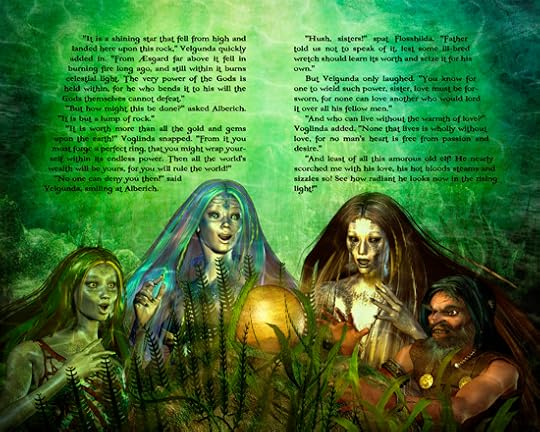
Ring Saga I, Pages 17-18 - The Rhinegold Awakens
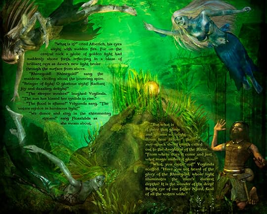
At last the long awaited moment arrives. This week's installment of The Ring Saga brings us to the crucial moment when the Rhinegold awakens. Just as Alberich has reached the limits of his
tolerance for the
Rhinemaidens' trickery and guile, the morning sun breaks through the water's surface to illuminate the Rhinegold. The sister nymphs break out in joyous song, circling around the spire of rock on which the golden globe is enthroned as rays of gleaming sunlight shimmer in the flowing stream.
Meanwhile, Alberich is caught in awe-struck wonder, enraptured by the
wonder of the unexpected sight.
For this page layout I've finally been able to lighten up the background layers and shed some light upon the scene, so to speak. Because we're underwater there's still a lot of murkiness around the edges, which helps create a high degree of contrast with the brighter center. I've also given the whole page a nice burnished gold hue by overlaying a sheet of yellowed parchment and blending it with Soft Light in the Photoshop composite, as well as adding the golden light rays effects with brushes. I've added the usual notes to the art page on the Fantasy Castle Books website, so I won't go into it in detail here, except to say that it's really nice to be able to work with real light for a change. In fact, it took better than a dozen lights set up in Poser to get the right effect.
Also, for the first time here I've used a light font on a dark background for the text block on the right. This was not entirely on purpose, as I hadn't originally planned it that way, but I liked the effect of the greenish-gold lettering better than adding a light gold glow layer under black letters. The main reason is that it creates a nice shadowed side to the rocky pinnacle, which allows the light on the other side to stand out more, but I also think it nicely compliments the overall color scheme, and signals a shift in the sequence of events.
I welcome your feedback on the readability and aesthetic appeal of not just this page, but any or all of those I post. At some point down the line I'll be calling for beta test readers to give input and opinions on various aspects of the project, but any thoughts you might have as I post each page will certainly be welcome. It can only help me to fine tune and hone my craft as I progress, rather than having to go back and fix everything later. I will be printing up a limited edition set of chapbooks for each chapter, and anyone who gives me useful input will receive a complimentary autographed copy, and for those who provide reviews of the entire work once it is done, a signed edition of the final published book. You can leave comments here, or send your notes to: reviews(at)fantasycastlebooks.com.


![[image error]](http://1.bp.blogspot.com/-udNuQ-fxFqg/TqIiocy0Y1I/AAAAAAAABQg/WdQU7paOthw/s1600/READ%2521+%2528Levels+Adjusted%2529+550x850.jpg)