
R. Scot Johns's Blog, page 22
September 24, 2011
Kindle Library Lending + Tablet News
 By now I'm sure most of you have heard that Amazon has launched its public library lending program. As of Wednesday, the Kindle loan program went live at over 11,000 libraries throughout the U.S., with some 25,000+ titles available for immediate borrowing. While that figure was taken from the Seattle Public Library system (where the test program was first rolled out), a quick browse through my local public library showed just 4530 copyrighted titles available in the Kindle format, of which some 1200 were already checked out (The Help, for example, has all 8 "copies" out with 54 patrons on the wait list). However, another 34,000+ public domain titles are also available. And unlike the others, the public domain ebooks are available to anyone at any time, with no restrictions on the number of patrons who can check it out at one time, or on the length of time that they can keep it. These are essentially the best and most popular of the Project Gutenberg collection, the classics of literature, made available via your local library's virtual stacks. Of course, more and more contemporary titles will be added to the program as the various publishers and authors come on board.
 One of the best things about the Kindle program over all the others is that any bookmarks, notes or highlights you make in your borrowed book (yes, it's now okay to write in your library book!) will be saved for future use if you should ever buy or borrow the book again, although no one else will see them except you. I'm an avid highlighter and note taker, so this is an exceptionally useful feature for me. In addition, there is no need to ever plug your reading device in, as all books are transferred via Amazon's Whispernet, so that once you check out a book from your library's website, it automatically shows up on your Kindle. Loan periods are the now standard 14 days, but if you check the same book out again (or purchase it), it will remember exactly where you left off reading last time. All the normal Kindle features are also active, such as public notes, social network sharing, and real page numbers for reference. For more info on the Kindle library lending program, visit this page at Amazon.
 In related news, the new Kindle Tablet is due for launch seemingly very soon, with Amazon scheduling a New York press conference for this Wednesday, the 28th, where it is presumed the new device will be officially announced, with release coming shortly after. Pre-orders are expected to begin on Tuesday for the 1st generation 7" model, which will feature 6 gb of memory and a 2-finger touchscreen, driven by a single core processor in order to keep the price down to an expected $250 to compete with the NookColor. It will run on a custom Android OS tailored to utilize Amazon's extensive distribution channels (i.e. app store, cloud player, etc.), with no reference to Google anywhere in the picture. Somewhat confusingly, the Kindle tablet will be named simply the "Amazon Kindle" - as if they foresee a time in the not too distant future when it will be the only Kindle on the market. Original analyst expectations for the new tablet to sell 4 million units through the holidays have recently been cut in half due to the continued economic downturn, but last weekend's record-breaking sales of $85 million in Star Wars BluRay box sets proves that tech nerds and sci-fi geeks (like me) are more than willing to reallocate their food budget in order to be entertained. I'll be eating Ramen noodles for the next three months to pay for my Star Wars, and I'm guessing next month's rent will go to Amazon.
Amazon Kindle Tablet Mockup
ADDENDUM CONCERNING THE LIBRARY LOAN PROGRAM:
There has been a lot of talk and speculation (and complaining, as usual) on message boards and comment trails concerning how authors are to be compensated for the use of their intellectual work in the new library loan program, with no real factual substance to any of the arguments so far as I can tell. A lot of authors seem to think their books are simply being stolen, although I doubt any of them actually have any books in the program, as Amazon generally sends out a contract addendum notification regarding major changes in policy. However, Amazon's current contract does specifically state that ebooks netting the 70% royalty must be made available for loan, with no specifics given concerning modes of distribution. The fine print also stipulates that Amazon is allowed to add additional distribution channels and programs as it sees fit, so authors who have Kindle editions available at that rate really have no case for complaint. An email I sent to Amazon yesterday regarding author compensation and how to sign up for the library loan program redirected me to OverDrive, the operators of the public library lending system. Queries to them have yet to be answered, but I'll keep you posted. Regardless of whether any monetary compensation is forthcoming for authors, the whole point of libraries as a social program is to stimulate and improve overall literacy, which ultimately creates avid book readers. Additionally, the more exposure a book receives, the more buzz and word of mouth promotion is generated (assuming, of course, that the book is good), which itself ultimately results in sales. Good books will be bought, and bad ones will not. It's up to the readers to decide.


September 18, 2011
Ring Saga, Book I, Pages 15-16
 This one's a little overdue, I know. In fact, the whole project's well past due, as I'm off my production schedule by quite a bit. But then, I've never been able to stick to a schedule, so I don't know why I bother making one. Still, I do. Sometimes it's just good to know how far behind you are. Helps to keep me from slacking, I suppose.
So here's the reason this one took so long. It wasn't a particularly difficult scene to do, and the background came together fairly quickly, all in all. Although I use entirely different background elements for every page, by now I've got the color scheme pretty well figured out for this sequence, so it's easy enough to blend blues and yellows and greens to get the desired effect. And the prop elements here have all been used before, so there's no surprises for me there.
The difficulty came in posing the main figures. For this one I initially wanted a more graphic novel, comic book style, with fairly extreme camera angles, looking down on Alberich from up high, while at the same time having the Rhinemaidens hovering above. With the water above and the ground below I thought I could push the perspective further. Had I done this as two separate pieces, with each one broken off in boxes like the comix do, it would have been easy enough. But as a single piece it just didn't gel. The background required a far more radical shift in the middle to accommodate the two perspectives, and that just made it look like Alberich was falling off the edge of the world.
So I pulled it back together with a front facing camera view and columns down the sides. Unfortunately, by then I had already spent several days rendering layers I ultimately couldn't use, and had to completely redo. But that's the great thing about working with digital: you can alter any single element without effecting any of the others. Had I been painting this with watercolor I would have had to start all over.
You can see the alternate Alberich pose over at the Fantasy Castle Books page, along with several other early renders and the individual background plates it took to make the layout. Click the image above to read the book online.

September 14, 2011
Tablet Sales Update

Following up on my prior post, a few new numbers are coming in that shed a bit more light on the digital impact. The figures given in that post were for the first six months of 2011, but some numbers from the Census Bureau are in for July as well which show brick and mortar bookstore sales dropping 4.2%, their largest loss for the year thus far. And this with the overall retail segment gaining 6.9% for July and 7.9% for the year to date, and Borders selling off large chunks of its inventory at greatly reduced prices, which does not bode well for August.
Meanwhile, tablet sales are skyrocketing well beyond expectations. As you may recall (if not, see my prior posts here and here), at the end of 2010 the IDC's predictions were for tablet sales for this year to reach some 45 million units by year's end. Revised projections now put that figure at 62.5 million, based on a second quarter jump of 88.9% over the first quarter of this year (which was down slightly due to Japan's earthquake causing supply chain problems, and many potential buyers waiting for the iPad 2's April launch), with 13.6 million tablets shipped in Q2 and slightly less than 5 million shipped in Q1, for a total thus far of 18.5 million or so. This represents a whopping 303.8% increase over the second quarter of 2010 - the iPad's first trimester of life when initial sales of 5 million iPads took everyone but Apple by surprise.
Apple's share of those Q2 numbers is 9.3 million, for a 68.3% share of the tablet market. Android tablets, by comparison, made up just 26.8% combined (Google, Samsung, Acer, etc.) with the BlackBerry PlayBook coming in third at 4.9% of the market. And while Apple is certain to retain the lion's share throughout the year, with Amazon's 7" & 10" tablets pending that ratio is bound to shrink, quite possibly by double digits through the holidays if Amazon enters the tablet market near the $250 mark as expected. You may also recall my prediction from those prior posts that the Kindle would be significantly revamped this year; and while the "Kindle Tablet" is planned as a companion device to the standard Kindle eReader, Amazon has most definitely revised their device strategy, with a new app store, a cloud service, and a proposed ebook subscription service pending publisher approval.
With regards to dedicated ebook reading devices, IDC's figures show a 167% increase over the same period last year, with 5.4 million units shipping in Q2 (down 9% over an impressively strong post-holiday first quarter). This has led the IDC to revise its projections for dedicated e-readers to 27 million for the year, up from 16.2. Dividing out the shares, Amazon held a respectable (but shrinking) lead with 51.7%, followed by Barnes & Noble's Nook, which increased to 21.2%.
All of this has put a damper on PC sales, which are virtually stagnant with a mere 2% growth for this year over last. And we all know what it's doing to the print book industry. Just ask anyone who worked for Borders.

September 12, 2011
E-book Sales Update
I haven't talked about the sales stats of digital versus print for awhile, but the figures for the first half of this year are in and they're frankly staggering. Even more dramatic than I had imagined, given the ongoing closures of all Borders stores throughout the U.S.
I had wondered how much and just what effect those store closings would have on book sales - whether sales would decline overall with fewer storefronts to stimulate impulse purchases, or if those sales would simply shift to another vendor (namely online). With ebooks now firmly in the picture, the answer is slightly more complicated than that.
I was talking to the owner of a used bookstore today, a guy who apparently makes a living by selling beat up paperbacks for two bucks each that he gets from yard sales for .25 cents, and I was taken aback when he stated unequivocally that ebooks were just a passing fad. No one in their right mind would actually want to read on a "computer screen" he said, when they could smell the musty stench of mildewing paper instead (okay, the adjectives are mine). As if smelling a book has anything to do with the actual literary experience - the intellectual and emotional pleasure derived from a compelling plot and fascinating characters. And while there are some who still prefer their vinyl records, frankly I don't miss the skips and scratches in my mp3's. That is to say, bookstores are going the way of the record store, whether they like it or not. And libraries are not far behind.
So here are the cold, hard facts...
Ebook sales are up 161% for the first six months of 2011, and 167% in June alone, to close the period just shy of a half billion dollars in revenue (this with ebooks being priced lower than their equivalent print editions, and in the midst of an ongoing economic slump). Meanwhile, trade paperbacks fell by a drastic 64%, with children's hardcovers down 31% and adult hardcovers losing 25%. Mass market sales declined by 22% and children's paperbacks by 13%.
Some of that may be due to Borders shutting its doors, but most of it would have happened anyway. I can tell you from personal experience that I sell close to a hundred ebooks for every print edition of my books. So why would I possibly want to promote my print editions with book signings or convention appearances? When you can buy a book from anywhere you happen to be, and start reading it immediately, convenience alone dictates that a lot of books will be acquired that way. After all, why go to the bookstore when the bookstore will come to you?
September 6, 2011
Ring Saga, Scene 1, Pages 13-14
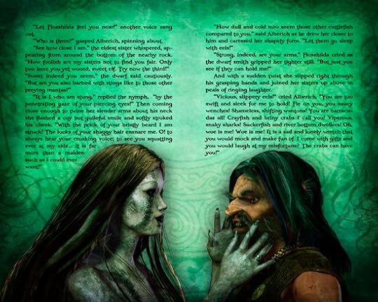 Another new page is up today after a frenzied but productive four day weekend. I'm back to work at the day job tomorrow, so I wanted to get a jump start on this week's section, and it came together fairly fast. That's not to give myself too much credit, however, since it is a pretty simple scene, and I had it well in envisioned long before I started. The part that took the most time was just waiting for the renders to get done. That took fifteen hours to complete.
I did the usual dozen multipass renders at a pretty high resolution (3375x2000) to achieve as much detail as possible. The high resolution images I have posted up on the Fantasy Castle Books site are somewhat smaller than that (2000x1600 for the virgin art and 1280x1026 for the text layout), but large enough so you can see good detail. In print, of course, it will only be a 6x9" page, or 9x12" for the full layout, and smaller than that for the ebook, depending on your reader (although you'll be able to zoom in). But here for the first time you can really fully see the texture in the fishscale skin (and Flosshilda's is my favorite of the three), as well as the dirt and grunge on Alberich's clothes and skin. You can also clearly see the Viking torc he wears, and the ring on Flosshilda's finger.
Mainly this image was all about facial expressions. Faces are often really difficult to pin down, since every subtle shift somehow alters them in unexpected ways. The human face is made up of a myriad of tiny muscles, each of which add minute detail and meaning to a certain look. And it's almost impossible to define just what each movement does - why a lift of the brow makes one seem quizzical, or a twitch of the upper lip means something is funny. But these expressions came together almost exactly as I wanted right away, so it was only a matter of some fine-tuning to get the (hopefully) seduction look in Flosshilda's smile, and the wanton lust in Alberich's grin. Maybe I'm just seeing it because it's what I expect to see, so I can only hope you see it too.
The text again is pretty much straight out of my first draft, with only minor edits for space and pacing. I should say at this point that all of the text will ultimately be revised and edited once all the art layouts are finalized. There's not a lot of point in going over the text extensively right now, as I'm almost certain to want to change it later anyway. As a story progresses and characters evolve it often becomes necessary to go back and alter, add, or adjust what's gone before to make it more cohesive, or to set up minor subplots and twists that develop unexpectedly, and they tend to do. So while I'm fairly happy with the rough draft text (unusual in style though it is), if at times it seems redundant or stilted or just plain poorly written, bear with me as it will theoretically get fixed later. That is assuming, of course, my writing is any good in the first place. If not, I hope you like the pictures.

September 4, 2011
Ring Saga, Scene 1, Pages 9-10
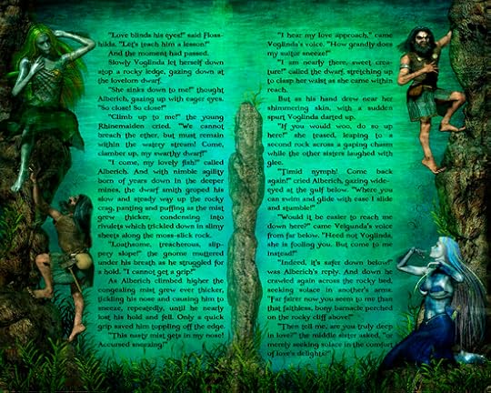 Another page is done and up. Or more or less done, I should say. I'm realizing now that there will be a lot of final color correction to do once all the pages are complete, in order to achieve an overall balance, with a consistent range of hues and brightness. Some of this will have to wait until I see some page proofs printed out (my color laser printer is out of toner), at which time I'm sure I'll have to go back and change everything. But for now I'm just trying to get them somewhat close, so I don't have to make too many changes. Initially I had intended to make each of the underwater scenes slightly brighter than the one before, to emulate the approach of dawn; but that has proven unrealistic given the need to backlight the text areas enough to read without excessive straining. As it is I'll likely have to adjust these up to be even brighter, since anything less than pure black on white is bound to be a challenge for some readers, but I'll leave that for later. And I have to say I'll be really glad to leave these underwater scenes behind and deal with normal light for a change. Only five more to go...
This is the first "split" page layout, with what amounts to two separate scenes on one canvas. Bear in mind that in many formats only one half of each layout will be seen at a time, with the print edition being divided by an inner margin. Consequently I have to conceive each two-page spread as both a single, cohesive image, and a series of two separate ones. Here the composition works fine either way, since the eye will naturally read from left to right, and follow Alberich as he clambers up the pinnacle of rock. As the book progresses many pages will take on a more "graphic novel" approach, with multiple scenes on each page, particularly where there's a fast paced action sequence with a rapid-fire series of events. In general, in laying out my storyboards I tended to start with wide shots and work my way inward as the sequence of layouts progress. For this one I had to back off a little in order to get the two halves in with all the text. But the next few pages push in pretty close, so you'll see a lot more detail there.
As far as the story goes, this is the segment I refer to as the "Rhinemaid Seduction Sequence," in which our poor dwarf gets the runaround from all three sister nymphs, as they tease and taunt him mercilessly until he's nearly fit to be tied. By the way, I'm also writing this as a filmscript as I go, so hopefully one day we'll see it on the big screen. Unlikely, but you never know. This particular scene would be a lot of fun to watch.
As always, there are more notes and test art up on the main pages, and you can click the pic above to get there and view it in higher resolution.

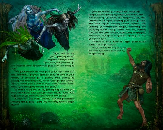
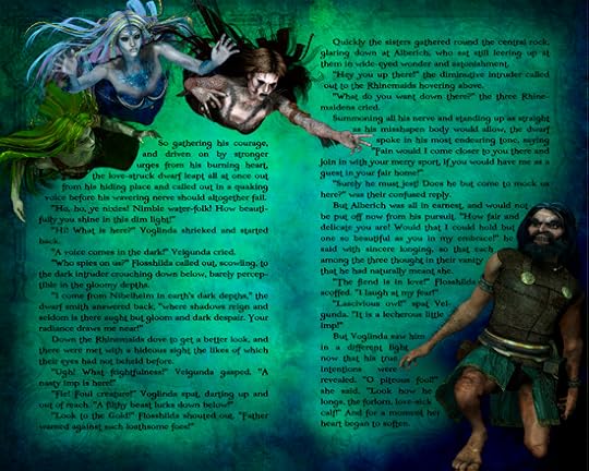
Ring Saga, Scene 1, Pages 11-12
We are now well into the "Rhinemaiden Seduction Sequence" which at around this point might better be dubbed the "Taunting of Alberich" scene. The page spreads have become intentionally darker as we have plunged into the lower depths of the Rhine, leaving the bluish hue of the surface behind. Where the waters were clear above we now see moss and murky haze below. I've also used some swirling Celtic patterns and caustic overlays to give a sense of churning motion as Alberich tumbles to the ground.
I've tightened up this section quite a bit from Wagner's sprawling opus, in which each Rhinemaiden would have pages to provoke our poor dwarf smith before dismissing him with howls of laughter. I had intended at first to give one page to each of the three, but ultimately it took a little more than that, so here the second siren gets the better part of two full pages, with Alberich still bitterly lamenting the loss of the first.
I've also given Voglinda an extended appearance here on Velgunda's page as she admires the craftsmanship of the "gift" the smith has brought. On that note, I have made some slight revisions to the text of the preceding page to better set up the "giving" of the necklace. And, as a minor clue as to who the gift was actually intended for you might consider the color of the gems and beads he used.
Despite its seeming simplicity, this was a rather difficult scene to compose visually. I wanted to move in close on the characters, but needed to give a sense of depth with Alberich laying on the bottom of a looming pinnacle of rock. Since there was no room for a lot of landscape props, I used a bit of rocky texture over the whole to give the feeling of high spires of stone rising from the depths. You'll have to decide for yourself whether or not it was successful.

August 26, 2011
Page Layout 5
Another page is done and up. Or more or less done, I should say. I'm realizing now that there will be a lot of final color correction to do once all the pages are complete, in order to achieve an overall balance, with a consistent range of hues and brightness. Some of this will have to wait until I see some page proofs printed out (my color laser printer is out of toner), at which time I'm sure I'll have to go back and change everything. But for now I'm just trying to get them somewhat close, so I don't have to make too many changes. Initially I had intended to make each of the underwater scenes slightly brighter than the one before, to emulate the approach of dawn; but that has proven unrealistic given the need to backlight the text areas enough to read without excessive straining. As it is I'll likely have to adjust these up to be even brighter, since anything less than pure black on white is bound to be a challenge for some readers, but I'll leave that for later. And I have to say I'll be really glad to leave these underwater scenes behind and deal with normal light for a change. Only five more to go...This is the first "split" page layout, with what amounts to two separate scenes on one canvas. Bear in mind that in many formats only one half of each layout will be seen at a time, with the print edition being divided by an inner margin. Consequently I have to conceive each two-page spread as both a single, cohesive image, and a series of two separate ones. Here the composition works fine either way, since the eye will naturally read from left to right, and follow Alberich as he clambers up the pinnacle of rock. As the book progresses many pages will take on a more "graphic novel" approach, with multiple scenes on each page, particularly where there's a fast paced action sequence with a rapid-fire series of events. In general, in laying out my storyboards I tended to start with wide shots and work my way inward as the sequence of layouts progress. For this one I had to back off a little in order to get the two halves in with all the text. But the next few pages push in pretty close, so you'll see a lot more detail there.
As far as the story goes, this is the segment I refer to as the "Rhinemaid Seduction Sequence," in which our poor dwarf gets the runaround from all three sister nymphs, as they tease and taunt him mercilessly until he's nearly fit to be tied. By the way, I'm also writing this as a filmscript as I go, so hopefully one day we'll see it on the big screen. Unlikely, but you never know. This particular scene would be a lot of fun to watch.
As always, there are more notes and test art up on the main pages, and you can click the pic above to get there and view it in higher resolution.
August 24, 2011
Formatting Graphics for the Kindle
 I've talked a bit about getting images into the Kindle in prior posts, but in the meantime I've done some experiments and tests and thought I'd share some of what I've learned.
Firstly, of course, the current Kindle screen can only reproduce images in 16 shades of gray, so the best graphics use fewer colors in high contrast lights and darks. Otherwise you'll lose a lot of detail. So something that looks a bit "cartoonish" is really best, with dark outlines and lighter color fills. But a blend of dark and light color works just fine as well. You'll want to retain some of the color present in your images, and not just convert them to gray, because your book may also be read in Kindle apps on color screens. And at some point the Kindle itself will get a color screen. Of course, if your images are already black and white or gray this isn't a concern.
 The second major issue is image size and resolution, and this is a little bit trickier. As I mentioned before, while the Kindle screen size is 800x600 pixels, due to its page margins the actual maximum size for interior graphics is 622x520. You can override the default 1/2" margin setting in your header coding, so long as you use very clean and systematic CSS styles to retain proper margins for your text, but I find it a bit disconcerting to have inconsistent alternating margins, so I've opted to retain the defaults myself. This is generally a best practice anyway, but be aware that you can change the margin spacing if you want to.
Where image size becomes more difficult is in dealing with the various screen sizes for devices that handle the Kindle app. The iPad's landscape layout, for example, creates pages slightly smaller than the Kindle's, at 412x544 ppi, plus three 1/2" margins horizontally (left, center, right) and upper and lower margins of 3/4" and 1" respectively. However, in portrait mode the iPad's Kindle app converts to a 792x554 pixel area, plus margins, without increasing either font or image size (the iPad's overall screen size is 1024x768). Consequently, images inserted at the native Kindle reader size will look very small surrounded by all that extra text.
 In addition, image resolution is a major consideration. The Kindle's native resolution is 167 pixels per inch, while the iPad's is only 132. Interestingly, the original black and white eInk Nook and Sony readers both have screen specs exactly the same as the newest Kindle. The newer NookColor's LCD screen, meanwhile, is 1024x600 at 169 ppi - the same height as the iPad is wide, but narrower and with slightly higher resolution to fit images into its smaller 7" screen. The larger format Kindle DX, by the way, has a screen size of 1200x824 at 150 ppi, although I've never met anybody who actually has one.
As far as the other major tablets go, both the Motorola Xoom and 10.1" Galaxy Tab boast the largest screens, these being 1280x800 ppi at 160 and 149 ppi respectively (making the Xoom the overall pixel winner). The 7" Tab, by the way, is 1024x600 @ 171 ppi, nearly identical to the Color Nook. And to confuse matters further, Kindle apps are found on iPhones (640x960 @326ppi for the iPhone 4) and Androids (480x854 @228ppi for the Droid X), their smaller screen sizes being made up for by greatly increased pixel density.
And finally, if you're using Word to do your writing and layout, any images imported there will be automatically converted to its native 96dpi format, which I find to be a good compromise due to the Kindle's limitation on file size: images must be 127kb or less, and any that are larger than this are automatically resized at the expense of image quality, so take care in creating graphics that meet this stipulation.
Interestingly, at 96dpi images are sized most accurately on the iPad, even though its screen resolution is higher. I did a series of experiments for this using incrementally sized versions of the image below to see at what size they looked best, and at what point the image was resized to fit the screen. An image 554 pixels wide at 96 dots per inch displayed edge to edge with no resizing or noticeable artifacts in either the horizontal or vertical grids, while higher resolution images no longer reached each edge and lower ones distorted the alternating lines into shades of gray (a good sign that the image has been resized). Each black and white line on the left is one pixel in width, while the lines on the right are two pixels wide.
 The solution to all this, for me, was to format my images for the largest logical screen size, that of the iPad in portrait mode, and let the Kindle scale the graphics down to fit its screen. Since the Kindle reader can't reproduce high quality pictures anyway, it seemed far less drastic than compromising the more pristine, high-contrast screens found on tablet readers. Plus, screens are only bound to get better, so that in a year or two the Kindle will boast far better graphics than it does right now, and having those already loaded in will save a lot of time and frustration later.
August 21, 2011
Page Layout 4
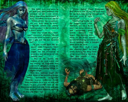
 This week's page is a comparatively simple affair, relative to any of the three preceding ones. For this layout I wanted to focus entirely on the characters, as the sequence we are now entering upon is all about the interactions of these four figures. Additionally, I knew this page would be fairly text-intensive, as the next few will be also. The text was left almost untouched from its first draft incarnation, needing only minor editing and very slight modification to fit the allotted space (final revisions notwithstanding).
 In this opening salvo, the three Rhinemaidens are confronted by the repugnant visage of our dwarf intruder, extending a somewhat less than amiable welcome. While none of the replies might be considered kind, each of the three sister nymphs responds as their nature dictates, with the younger sister Voglinda (left) showing some small measure of curiosity after her initial surprise. The middle sister, Velgunda, finds the dwarf repulsive, and Flosshilda (on the right), the eldest and most stern, responds with innate defensive angst.
The story at this point follows Wagner very closely, and I have attempted to retain as much of his wit and humor as possible. Many of the Rhinemaidens' lines are direct translations from the original German libretto. As mentioned in the previous post, I have veered off slightly on my own with regards to Alberich's intentions and motivation. Here I have developed that somewhat further, to the extent that I have given our dwarf a clear initiative: in the opera it is left at best a bit muddled and unclear how this interaction actually begins. Additionally, Voglinda's tinge of optimistic curiosity is entirely my own invention.
Click the image to visit the Fantasy Castle Books pages to read in full resolution, and for more behind the scenes details on the creation of this and all the other page layouts. A number of improvements have been implemented this week to augment and ease the reading experience - click on the left and right page borders to "turn the page" either forward or back. And as always, feel free to let me know what you think!


