Kindle Edition Art
 I spent the better part of this past week working over some of the art for the first section of The Ring Saga in order to make it work on the Kindle. I've toyed with this off and on since beginning this project, and it's been a bit of a thorn in my side all along. The fact is that more Kindle editions of ebooks are sold than any other format (and that certainly holds true for me), so it deserves some serious consideration as to how to deal with the graphic elements of this book.
 At one point I had considered just abandoning the Kindle altogether, since its 4" black and white screen is simply not compatible with full color art. Graphic novels and comics are really only suited to reading on LCD screens 7" or bigger, but as I said I've been mulling over how to deal with the Kindle's limited screen real estate and lack of color. In addition, graphics on the Kindle can only be placed between lines of text, although with a bit of clever formatting, small thumbnails can be added within a line, like drop caps, but this is extremely limited and hardly ideal.
 Some word wrap can be achieved with Kindle formatting, but only around square boxes, just like in this blog; but with such a small screen, that doesn't leave you much in the way of resolution. And as you can see from my last two posts, resolution is something of a concern here. Even on a 10" tablet, a two page spread will look pretty small, though of course you can turn it sideways and view one page at a time for easier reading. And with touchscreen you have the benefit of pinch and zoom as well. Not so with Kindle.
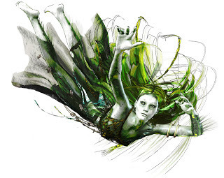
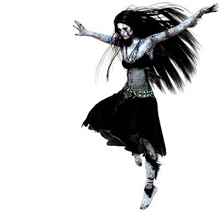
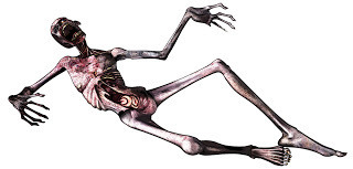
 So as far as I can tell the only real solution is to eliminate the backgrounds altogether and retain only the main elements of each piece, creating mini vignettes, if you will. But unfortunately size isn't the only consideration. In order to accommodate the Kindle's grayscale screen, the color must also be muted and the line detail increased. I could, of course, simply eliminate the color altogether, but not everyone reads Kindle ebooks on a Kindle reader, so it needs to look good in the Kindle app on tablets and computers as well.
 To achieve this I did a series of render passes in Poser using the Sketch Designer to create some hand drawn styled images, onto while I composited several color render layers using various filters and blend modes in Photoshop. The "Find Edges" filter is particularly useful to create an outlines layer, and I'm also fond of the "Ink Outlines" filter for this purpose. It takes a bit of tweaking to get the color balance right, but then that's a big part of doing digital art in any form. I'll just be glad when the Kindle has a nice big 7" color touchscreen like it's competitors.
Published on August 10, 2011 19:09
No comments have been added yet.


