
Emily Henderson's Blog, page 77
September 19, 2023
The Design Collabs We Have Been WAITING For And Other News We Didn’t Know We Needed:)

There are usually at least two times a month that I just randomly exclaim, “DESIGN IS SO COOL!” That could be because of a wild before and after makeover, a random thing I see on the IRL or internet, OR a new collaboration. I freaking love seeing the minds of a designer and a brand collide into making something that screams them. This post consists of mostly those. Incredible collaboration of different styles from the hearts of friends and people we admire in the industry. This is the kinda of news I want!
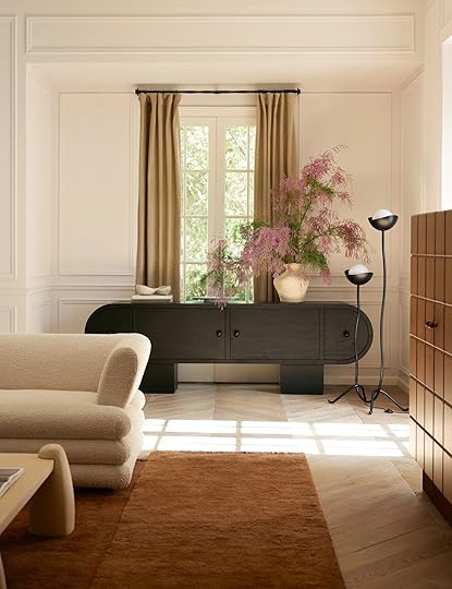
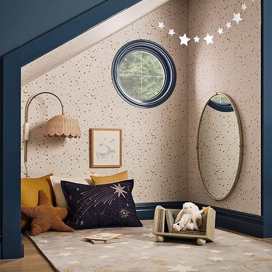
Sarah Sherman Sherman X Lulu And Georgia

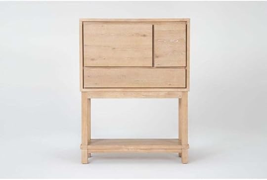
I feel pretty confident that we are ALL waiting for this new collaboration to drop with Sarah! While she keeps her color palettes neutral, she really leans into incredible shapes and small details. That’s why they are also so exciting…like this cabinet.
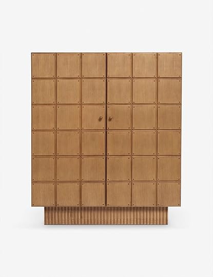
I mean what a gem! And what’s even more fun, if you follow her on social media, is that she drops little easter eggs with the current things she’s designing. This square door design for instance (and if my memory serves me correctly) was first tested out with a large room door she designed and her dad built for the SSS Showhouse. It’s moments like these that really make me love her work even more and feel her so deeply in them.

And how cool is this cutie?? It makes SUCH a statement and yet is really simple. This is the total power of shapes! Think how fun it would be to mix this piece into a more traditional room?? Oh, and it also comes in a nightstand version which I also very much love.


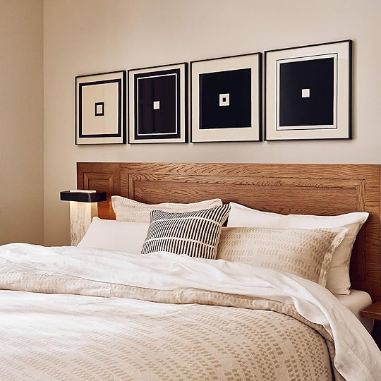
Dashell Ottoman | Essie Hemp Sham | Ripple Nightstand
More fun things! I adore the base shape and wood tone of the ottoman paired with her playful fabric. It could work in so many spaces. Then if you are more of a minimalist design-wise in the bedroom, like me, then these squiggle-edge pillow shams are really perfect. They have a few different colors too! And the wonderful squiggles continue with this sweet nightstand.


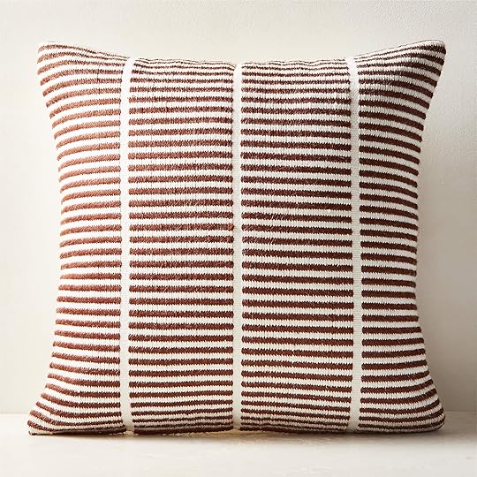
Velvet Clover Pillow | Checkerboard Bath Mat | Kohta Pillow
More bold shapes! Um, a chunky, elevated clover-shaped pillow???? Sign me up! Designing an “interestingly-shaped” pillow that doesn’t look like it’s exclusively for a kids’ room isn’t easy but Sarah nailed it with these (two more colors available). The other two pieces may have been made for just me in mind because you can bury me surrounded by checks and circles. I truly might buy that bathmat for my bathroom (it comes in two sizes and two other colors) and that pillow is simply perfect! But it also comes in a square if you need:)
There is so much more to this collection that the team and I loved so go see for yourself.
Jenni Yolo (I Spy DIY) x Chasing Paper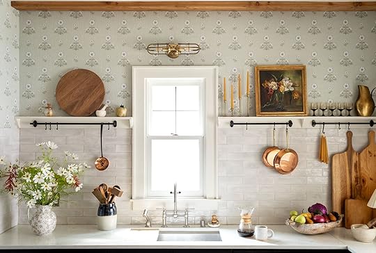
I LOVE looking at wallpapers but it’s not super frequent that I am thinking “Oh, if the style of my decor was (insert decor style) I would use this in a second!” I mean adding in wallpaper can feel overwhelming. HOWEVER, I truly love this drop from Jenni Yolo (from I Spy DIY) and Chasing Paper SO MUCH! Let me show you.


Cosmo Block Print | Tulip Ticking Stripe
First off, yes, there are more pretty patterns but these two spoke to me the most. They read classic, fresh, and interesting. I really dig the red and dark tan option for the Cosmo Block print paper but the neutral white and light tan is stunning in that kitchen above if color is too intense for you or your home (they also have one more color option!). Then look at that navy Tulip Ticking Stripe. It’s perfect? Yes, perfect:) A very not boring stripe that also isn’t too visually overstimulating. But if the blue isn’t your preference, it comes in two other colorways!

Ummmm, did you also know that Chasing Paper sells prints starting at $15 with the option to frame??? Maybe I’m late on this but I had no idea and think it’s so cool! They have some really pretty nature scapes (like the one above) if you are in the market.
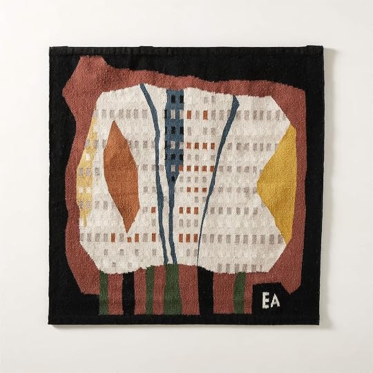
Ackerman Modern X CB2

Op 66 Black And Ivory Wool Tapestry
I’m a little embarrassed to say that before this collab I didn’t know anything about the MCM design icons, Evelyn and Jerome Ackerman. And while I need to do more of a deep dive, I really love the collection that CB2 did honoring them. How cool are these modern tapestries? What a perfect and cool way to bring texture and dimension to your wall! I just can’t decide what color I like more. This art is right up my personal alley:)
Autumn Trees Black Wool Tapestry
Then they did this design and my socks were been fully blown off. Somehow this is neural AND really colorful which is my ideal combo. If I didn’t already have 1000 pieces of abstract art, this would be mine.

Quarto Framed Wall Art (Set of 4) | Stria Sienna Brown Woven Silk Throw Pillow
I would also buy these pieces of art too! If you love them but don’t need all four, they are also sold separately! But there is a MAJOR deal if you do want all four:) Then this pillow is such a great pattern addition to any room and that color is stunning. It also comes in a lumbar size.


Tovek Grey Terracotta Vase | Luma Hand-Knotted Ivory New Zealand Wool Rug
These are two more decor pieces I really loved from the collection. That vase truly looks handmade and vintage which is so cool. Plus the design and tones are so pretty. Oh, and that rug could work in almost any home! It comes in other sizes and a darker color but I love the design color mixup and the asymmetrical pattern. Too good!
Target Opalhouse™ Designed with Jungalow™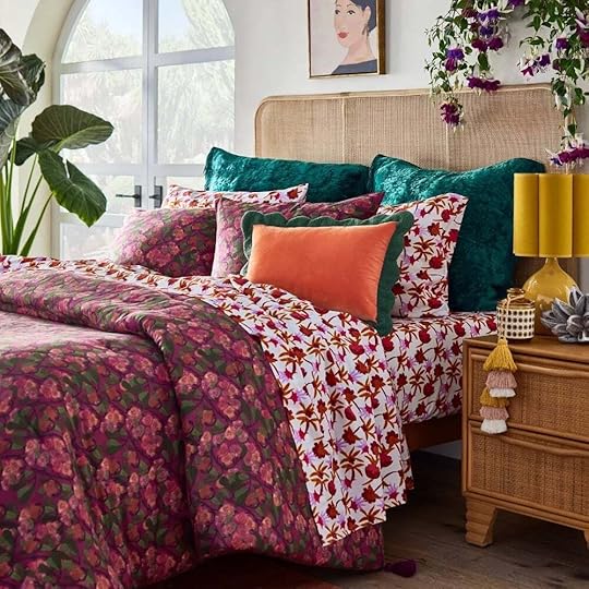

Printed Comforter and Sham Set
Another incredible collection by the Jungalow and Target teams! I am here for all of these colors (especially of the berry variety). How beautiful is this floral comforter and sham set? The color is obviously awesome but look at the movement in the pattern. It’s GOOD.

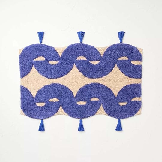

Concentric Wave Blue Bath Rug | Hand Towel
I also really love this bright blue. It’s happy but not too youthful for us adults:) That bath mat is so cool and that hand towel (which comes in more colors and a variety set) is giving tile pattern which I love too.

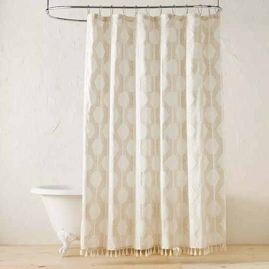
Seasons Go Round Shower Curtain with Tassels | In The Name of Love Clipped Shower Curtain
Well, if you need a shower curtain then look no further than these two! One for the color lovers and one for the neutral lovers. Both are awesome (but there are more on the site if you want to check them out).
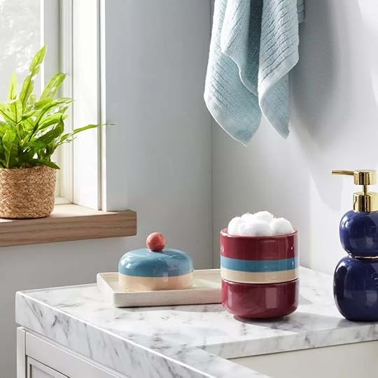

Um, I just think this canister is the cutest and I really love that color combo! The fact that it’s practical for bathroom storage is just a perk for me:)


Don’t underestimate the decor power of a cool bookend! And these can be cool bookends or just cool objects meaning they can go anywhere in your house.

Chenille Square Geometric Patchwork with Tassels | Banana Bowl Basket
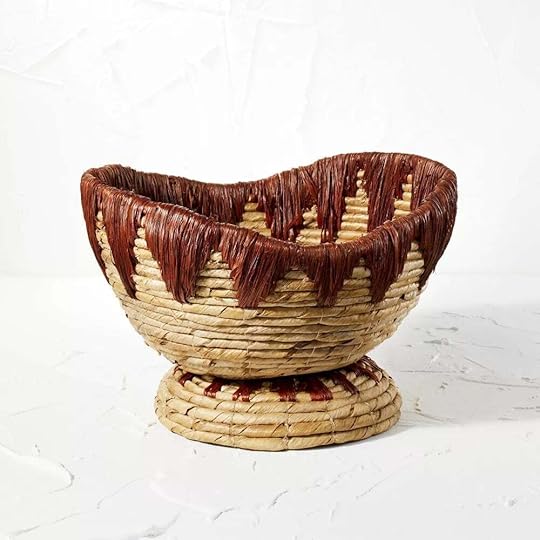
That pillow looks really expensive to me but is only $25 (because Target is the best)! I just think those rusty colors work with so many other colors and are especially perfect for this time of year. And then if you need a basket, make it cute and footed like this one. Easy storage never looked so cute!
Joseph Altuzarra X West Elm Kids

If you are looking to decorate a whimsical nursery then THIS is your collab! Fashion designer/dad of two, Joseph Altuzarra, designed the sweetest collection starting with this hot air balloon mobile. There are a few pregnant people in my life who might need this because I need to buy it…
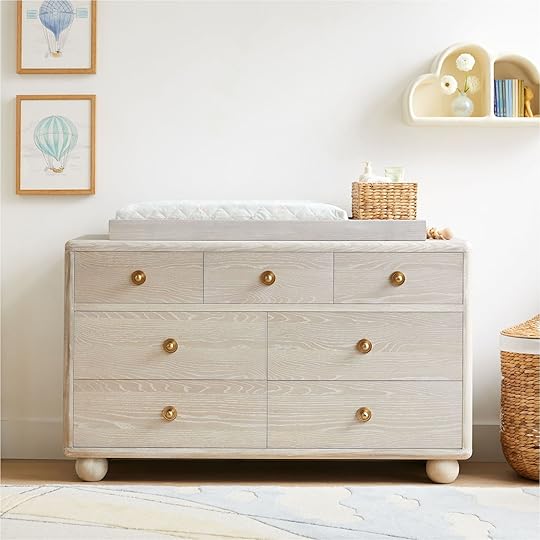


Sphere Foot 7-Drawer Changing Table | Woven Moon & Stars Hamper
I love the organic glam of this changing table! Those knobs and feet are so good! Then try to tell me that isn’t one of the cutest hampers you’ve ever seen. I love that everything in this collection is also so gender-neutral!


Moon & Stars Peel & Stick Wallpaper | Sphere Foot Book Caddy
What else is there to say but that wallpaper makes me wish I had a nursery to design? It just feels special with the pattern looking handmade and simply magical. And we all know how adamant Emily is about having kids’ toys and books in open storage so this wonderful caddy is perfect. Ah, those ball feet!


A glider is a must-have nursery item according to every parent I’ve talked to and this one is cool and chunky. I think it’s great there are a few different color options!
Nate + Jeremiah For Living Spaces

Accent Chair | Hexagonal Marble Coffee
Speaking of cool and chunky, look at that accent chair above! Nate and Jeremiah are always on point. It looks so comfortable and you know I love a cool foot (furniture foot, of course!). Then as someone who has a hexagon coffee table and loves it, I fully support this shape. Mix it up, baby!
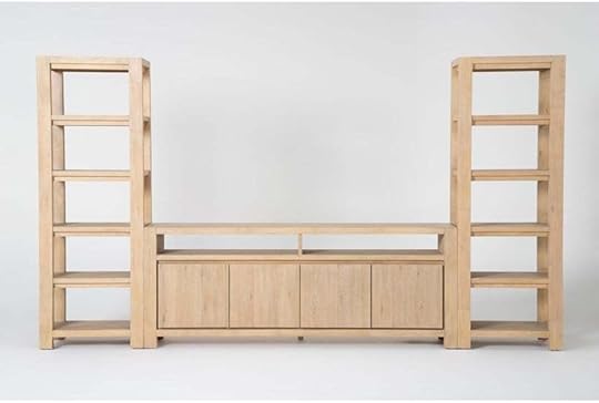
Bar Cabinet | 3 Piece Entertainment Center With 80″ TV Stand
I also really love both of these pieces. The lines and wood tones are beautiful! They feel very Crate and Barrel, but more budget-friendly which is never a bad thing.
Hay X Liberty via hay
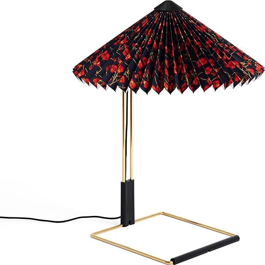
Cherry Drop | Ros | Mitsi
Yes, our favorite lamp just got better (Em has the solid red shade)! I need to know more about Liberty but if this is the kind of collab they are about then I am all about them. What a fun and unexpected way to bring in a really playful pattern. 10/10!
Banana Republic Home LAUNCH
I know I was surprised too when I heard that Banana Republic was coming out with a home line. BUT then I SAW it was like, “Oh I like this!” Exhibit A is that chair and a half. Chic lines and looks real comfortable!


Porto Upholstered Chair | Hugo Swivel Lounge Chair
Then for a more sculptural option that Porto chair is so pretty! I know not as functional given that it’s armless but such a stunning piece. But for some function and style, that lounge chair is GOOD. Do you see that wood frame??
If you love joinery like we do and need a long coffee table for your long sofa then BR may have solved all of your problems with this beauty! It could easily go farmhouse but could really be used in a lot of homes with those more modern lines.

Savannah Round Coffee Table | Lisbon Coffee Table
Ok, now I know this isn’t “the Emily Henderson live edge coffee table” BUT it definitely has the same energy🙂 The organic legs with visible knots are SO PRETTY. But if you want something more refined and long, the Lisbon coffee table is another piece that could work with so many styles! Plus I love that dark wood tone.

Beautiful and simple with lots of texture. I am a very large fan!

Tuscany Nightstand | Celia Floor Lamp
But maybe you love the look but only need a nightstand…there’s an equally beautiful option! Again, NOT the same but they also have a more neutral energy of Emily’s old leather nightstands if you’ve been reading for a while:) Then finally I really really love this floor lamp. Actually, I just had a piece for my living room go into production that I designed that may have a similar detail! But truly, while this has a reclaimed wood vibe I think it’s so chic and modern looking. 10/10.
Studio McGee X Kohler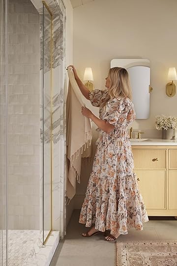 via studio mcgee

 via kohler
So this one is a bit of a tease because it doesn’t come out online until Oct 2nd (in-store Sept 29th). But Kohler is an EHD favorite and we also love Studio McGee so this is VERY EXCITING!! Shea is someone who loves details and beautiful materials so there is no chance we aren’t going to love this new line. Congrats Shea!
Isn’t design SO COOL! I’m going to assume you agreed and hopefully minimally enjoyed looking at all of those amazing collections. Any others that I missed that you want to shout out? Let’s chat!
Love you, meant it.
Opening Image Credit: via Lulu and Georgia
The post The Design Collabs We Have Been WAITING For And Other News We Didn’t Know We Needed:) appeared first on Emily Henderson.


September 18, 2023
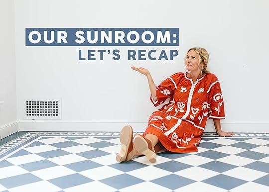
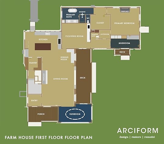
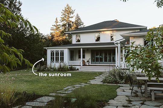
My Favorite Spot In The Farmhouse: Our Sunroom Reveal!
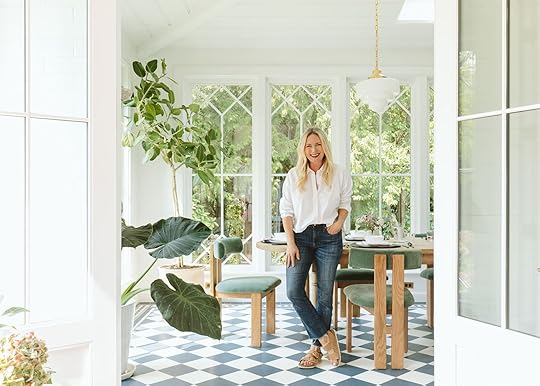

Today I have for you my favorite child/room in the house – not because it’s the BEST room (it sure might be) but because this room has brought me almost zero stress (comparatively). It was pretty darn easy to design/decorate, I had a clear vision, and has provided me years of happiness, working in here. She is just bright, happy, energetic, and comfortable. So with so much pride, I would love to introduce you to my favorite child – our sunroom/formal dining room/my writing studio.
P.S. If you are just landing here for the first time (welcome!) don’t forget to read about the process posts about how we designed the mosaic tile and border, the installation, and built this room from the ground up. While I say it was “easy,” it was still so much hard work by so many talented people and that’s more of a comparison than a fact. A huge thanks to the ARCIFORM team – Anne, Stephyn (that tile design/order was NOT easy to calculate), Adam Jamie (our building leads), and Level Plane Tile & Stone (our tile installers).
We, of course, made a really fun YouTube video so please go watch and subscribe!! I just love making them. Here’s a little teaser if you wanna get a taste (just wait for the short ad to run:)):

Dining Table | Dining Chair | Tile | Pendant | Windows | Skylight | Wall Paint
My design for this room was clear from day ONE – this room was for my own personal inspiration and daily JOY while working from home. I wanted to create an indoor room that had the same feeling, level of color, and pattern as our patio in LA that I loved so very, very much. And y’all, it does. It just SINGS. All my favorite friends came to play here – the blue and white Victorian tile (please note the border in the other shots), farmhouse table, contemporary chairs, vintage-inspired lighting, and just tons of blue, green, wood, gold, and all day long stunning natural light.
We decided to style it out for a dinner party (with dinnerware I already had) because you’ve seen snippets of this room enough that I wanted to show it off with a dress on it 🙂


The color palette works so well – the green of these incredible Athena Calderone for Crate and Barrel chairs worked so well with the blue of the Pratt + Larson tile (and somehow I found that perfect lampshade at a thrift store!). And while the wood of the chairs is technically different than the table they have similar undertones and are both matte (not shiny) and work perfectly. The second the chairs came in this room they were everything that I wanted them to be (and they are so comfortable).

Y’all these windows are INCREDIBLE. As I wrote about on Friday, we custom-designed and made them with Sierra Pacific to specifically marry the diamond pattern of the second-floor windows with the more traditional/modern grid of the first floor. They are just so beautiful (and yes, some open if we want). The Velux skylights in here create such soft light all day (they are north-facing which tends to be the best softest light). We didn’t have them in for a while and the living room and sunroom didn’t have the light we wanted. So once we put them in it solved this problem in both rooms immediately. These have light filtering shades and can open for venting, too. Even in the rain it’s such a dream to be in this happy room and hear it on the skylights 🙂

The tile has its own post (go here) but I want to make sure it feels properly worshipped on its big reveal post. We designed the color with Pratt + Larson, heavily inspired by so many Victorian mosaic patterns that I’ve been pinning for years. Again, a huge thanks to Stephyn from ARCIFORM for helping figure out how much of each tile we needed (I basically did the pattern with paper, but as you know I’m not good with “details” or “counting” and there was a LOT of details and counting – see below). Level Plane were our installers and they did an excellent job and really cared about it being perfect which matters with a pattern like this.

The lighting is the Rose City collection from Rejuvenation in an unlacquered brass that will patina with age. I love this fixture because (like all of Rejuvenations lights) you can really customize everything – the length of the cord, the finish, and of course the shade (I LOVE this deco shade and have forever). Also if you have a faulted ceiling the chain (versus a stem) makes it still fall correctly.
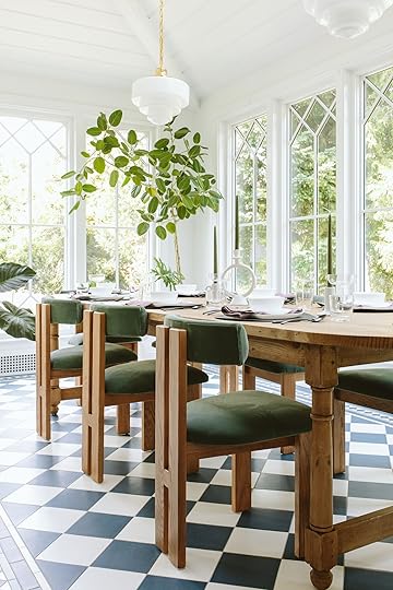

The table was custom-sized from a design by Elsie Green – a small furniture maker (with reclaimed material) in the Bay Area. It’s incredibly perfect for this space. We needed narrow (but not too narrow) and really long (120″), and I wanted curved ends and some round legs to offset all the squares from the tile and the windows. The chairs could not be more perfect with the table – the soft curve on the back was also what I wanted (to offset the squares) and the velvet feels so warm, comfortable, and earthy in a room with no other textiles. This room needed fabric (as most rooms do) and not just wood chairs with wood table and wood credenza.

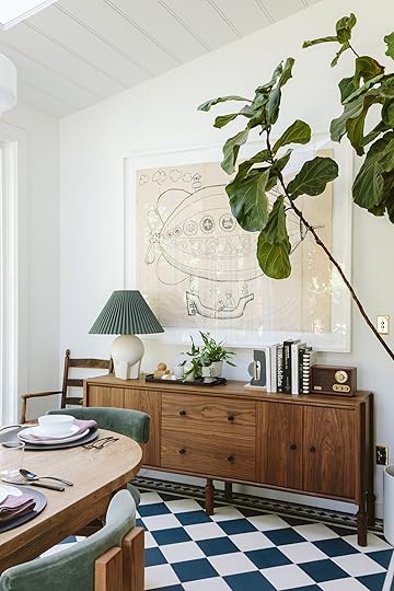
Credenza | Chair (vintage) | Lamp | Art (vintage) | Black Tray | Wrapped Stone | Bookend Sculpture | Radio | Outlet Cover
This piece by Crump & Kwash out of DC is so beautiful and timeless, high quality with some extra details that take it next level. It was hard for me to find the exact piece in here – there are a million great credenzas out there, but I didn’t want it to go too “TV stand” and couldn’t be as high as a buffet would be. Plus it needed to be shallow – no more than 19″ deep. This holds our printer and all my samples for this house for easy access. Please note the legs!!! I love (and looked for) a darker wood tone so it pulled you over there, grounded that wall, and didn’t just match the table and chairs.
Wooden Bird (vintage)
My antique wooden bird came inside and I love it even more in here. It did alarm people on the front porch so maybe it needed a context that was more whimsical? It looks fun in here (sorry I don’t think we got another shot of it). The other plants all came from either Arium Botanicals or Drake’s 7 Dees on Scholls Ferry. Both have EXCELLENT indoor plant selection.

Bowl | App Plate | Dinner Plate | Napkin | Placemat | Flatware | Water Glasses | Coup Glasses (similar) | Small Candlestick Holder | Large Ring Candlestick Holder | Green Candlesticks | Vase Pitcher (similar)
I wanted to show you what it would look like if I was having a casual (but slightly elevated) dinner party. These are all things I already had (like those white, lightweight Target plates and placemats I love SO MUCH). It’s amazing with a few pops of color (navy, sage-y green, and mauve) and some fresh flowers (these are from my garden). Highly recommend using a candlestick color in your color palette to add just a little extra something special:)

Fluted Planter (no longer available) | Tall White Planter (locally sourced) | Terracotta Planter
It’s such a great room to spend time in and I’m endlessly grateful that we could and decided to add it onto the house. This room definitely makes a case for going for bold pattern in the right places:) xx
Oh and don’t forget to watch that YouTube video!
Sunroom Resources:
Tile: Pratt + Larson
Windows and Doors: Sierra Pacific
Skylights: Velux
Lighting: Rejuvenation
Wall Paint Color: SW 7006 Extra White by Sherwin-Williams
Dining Table: Elsie Green
Dining Chairs: Crate & Barrel
Credenza: Crump & Kwash
*Design by Emily Henderson and ARCIFORM
**Tile Installation by Level Plane Tile & Stone
***Photos by Kaitlin Green
The post My Favorite Spot In The Farmhouse: Our Sunroom Reveal! appeared first on Emily Henderson.
September 17, 2023
The Link Up: Em’s Ultra Cool “Mom Bag”, Mal’s Chapstick That Actually Works, And Two Cookbooks That Will Make Your Fall WAY More Delicious

Happy Sunday ya’ll! Hope everyone who has started school or has kids in school had a smooth transition back. For a back to school gift (ha) we have THE SUNROOM REVEAL YOUTUBE VIDEO for you today!!! It’s truly such a special room and we can’t wait for you to see it all styled out. Here is a little teaser (just wait for the short ad to play) so enjoy that, then get into the links, and lastly go watch the full video:) Oh, and have a wonderful day!
This week’s house tour is an incredible warm and personal space designed by best friends turned girlfriends, model Candice Huffine and interior designer Shelly Lynch-Sparks! But the twist here was that Shelley moved into Candice’s home making it a fun challenge to create a space that fully felt like “theirs”. Go see all the beautiful choices they made.
From Emily: I got this tote/weekender bag for hauling my kids’ sports stuff in. I know it may seem like too nice of a bag for that type of use but I love the fun contrasting stripes, its size (it can hold three different sports worth of kid gear), and the fact that it snaps close if I want to. It would clearly also be a great quick-trip bag since that’s what it was technically made for. Ultimately, it’s really practical for me and makes me feel a little cool which I don’t hate:)
From Mallory: They say don’t wear white after Labor Day but 1. I disagree and 2. It’s the best time to shop for white clothing (because it’s all on sale). I recently popped into Nordy’s Rack and bought these madewell shorts on a massive sale (only $19 originally $76!!) Em wore them in this fashion post if you wanna see them styled out…you guys I cannot tell you how much I love them. I’ve worn them this entire week (because it is STILL SUMMER). Also if you didn’t find your size on Nordstrom Rack they’re also on sale for $20 on Madewell’s site here!
Also From Mallory: I used to have the craziest chapped lips 24/7 until I found this chapstick. It’s not Glossier packaging and it doesn’t taste like cookie dough (smells more like vanilla Blistex lol) but it WORKS and it actually saved my life. If you struggle with the chap and are striving for soft, kissable, luscious lips… give it a shot!
From Arlyn: For anyone who doesn’t know, September comes in like a lion with book releases, particularly of the recipe variety. I’ve long been awaiting the release of two titles, one from my favorite food follow on social media Dan Pelosi (a.k.a. @grossypelosi), and the other from a kind-of-friend-turned-pasta-superstar Meryl Feinstein. Dan’s Let’s Eat is the kind of book you just want to hug every few pages while going through it. Plus, his Italian-American recipes (many of which come from his own family) are legit delicious and perfect for cozy season. And I guess because I can’t get enough pasta, I’m also recommending Meryl’s Pasta Every Day. I’ve never made a recipe of hers that didn’t immediately make me moan out loud upon taking a bite (plus her pasta dough recipe is my go-to after trying many, many others). If not for yourself, grab a few copies of each for any of your foodie friends for the upcoming holidays. They will LOVE these, I promise. 🙂
From Jess: I am on the hunt for a curling iron because I found out I will be doing my own hair for my brother’s wedding…While this may be no big deal to most people, I am NOT a natural at doing my hair for events. So I need to get a curling iron and practice ASAP since I only have a month. When I asked Emily’s hair and makeup stylist, Alyssa Fitchie, what she recommends, she said for a more professional option that BaBylissPRO was great (she likes this one). Then for an awesome even more affordable option, this Hot Tools one does a great job. She says she uses a 1-inch barrel for most styles in case you don’t know where to start! Wish me luck:)
From Caitlin: I have a new favorite podcast!!! (And that’s huge news, coming from the type of person who struggles to muster up enthusiasm for some of the series that my friends love. It’s just rare to find a podcast that can really hold my attention for the long term, you know?) It’s called Search Engine, it’s hosted by PJ Vogt (of Reply All fame – notably my former favorite podcast!), and OMG I LOVE IT. Remember how exciting the early days of blogs were, when you’d log on and excitedly scroll through updates from people who felt like real-life friends? THAT’S HOW THIS FEELS, IN AUDIO FORM. Every week(ish), PJ answers a question – is airplane coffee safe to drink? (This one surprised me.) Why can’t we just turn office buildings into housing? (So much good info!) How did fentanyl end up in, well, everything? (Fascinating reporting, conveyed with lots of humanity.) – but I haven’t stopped thinking about the “does anybody really like their job?” episode since it dropped early this month. As a person who does love (not even like! Love!) their gig, I really enjoyed the exploration of how your ambition affects your happiness (or does it?!), and tapping an Amex employee-turned-rockstar as the central storyline was a pretty brilliant narrative move. If you’ve never really been able to get into podcasts, PLEASE give this one a try. It’s really great, I swear!!!
Also from Caitlin: How am I just now finding out that Draper James carries the world’s cutest affordable shoe selection? I stumbled upon these bow-front denim mules while compiling yesterday’s fall dress roundup and I could not be more impressed! Love the leg-elongating shape, the comfortable block heel (it’s padded and SUPER low, but it adds just the right amount of polish!), and the attention to detail (did you clock the cute scallops on the heel of the footbed?). The price is more than fair for the quality and they’ll be so easy to style all fall alongside my black jeans or colored corduroys! (Next up: eyeing these plum velvet mary janes with a brass heel for Thanksgiving and Christmas. Hoping they don’t sell out before I save up!)
From Gretchen: A few weeks ago I was grocery shopping in Whole Foods and decided to mosey on down the beauty aisle. I love to peek at their natural skin care and was glad to see a bunch of items marked down. These Glow Pads were among those on sale, which is mostly why I bought them, but also because they promised to brighten up my skin. And brighten they did! This is totally TMI, but for the longest time, I have been bothered by my darker underarms and have tried just about everything to lighten them. While these little pads have worked well on my face, they’ve done wonders for my pits! Now, I’m no doctor, so tread lightly if you try this yourself, but so far I’ve had zero irritation and a noticeable lightening going on under there. Plus, they just smell divine and make me feel fresher with every swipe.
We have been heartbroken over the news of last week’s earthquake in Morocco. Here is a really helpful article of where we can all donate to help if you have the means to. Sending all of our love and hopefully we can all send resources.
Also, our comment section was broken this week and if you tried to leave a question about Em’s floors, please try again now that everything is working again! See you all for our VERY SPECIAL farmhouse reveal and be sure to watch Em’s really exciting YouTube video<3
Opening Image Credits: Photo by Sara Ligorria-Tramp for EHD | Art directed by Emily Henderson | Styling/Design led by Velinda Hellen and Emily Bowser | From: In Defense of the Comfy Sectional—A Friend’s Almost-Finished Family Room
The post The Link Up: Em’s Ultra Cool “Mom Bag”, Mal’s Chapstick That Actually Works, And Two Cookbooks That Will Make Your Fall WAY More Delicious appeared first on Emily Henderson.
September 16, 2023
Long Sleeved Dresses That’ll Take You From Work to Weekend This Fall (22 Picks From $34 to $200)


I need to open today’s post by paraphrasing Carrie Bradshaw (but like, season 4 Carrie, if that matters. Stick with me here!): “There’s a time of year when, even before the first leaf falls, you can feel the seasons click,” she says (in a dramatic nighttime monologue, of course). “The air is crisp, the summer is gone. And for the first night in a long time, you need a blanket on your bed.” And she’s right! I don’t know what the weather’s like where you are, but we’ve finally hit that autumn inflection point here in LA. Temperatures have dropped from the mid-90s to the mid-70s, there’s a cool breeze at night, and it just feels like fall. Can you relate?
If so, today’s roundup is for you – we’ve scoured the market to find 22 incredible fall dresses, all with some sort of sleeve. They’re perfect for staying a little warm on a crisp night; for feeling pulled together and comfortable in your office; or, if you’re like me, for hiding any tattoos that you’d rather not talk about ad nauseam. (Don’t get me wrong – I love what I’ve added to my arms, but you can only answer “what does it mean?” or “did it hurt?” so many times, you know?) ANYWAY. Enough about me, my tattoos, and my long-term love of 1990s HBO comedies. Wanna see some cute dresses?
Harriet Cord Dress, $104

Full disclosure: despite my best efforts to be fully at peace in my body, there are still days where I get dressed and feel frustrated with how my clothes look and feel. The best antidote I’ve found? Scrapping whatever outfit I’d envisioned in favor of a classic, structured dress with a defined waist, just like this one. I love the sleeves (a little volume, but not linebacker-y), the cut, the pockets, and the material – it’s the perfect choice to keep you warm all winter long. (Bonus: this dress comes in a few other shades through size 22, and Boden also offers a bonus discount for teachers, students, first responders, and military personnel. They also carry lots of other cute sleeved options, if you’re in the market!)
Sadie Dress, $195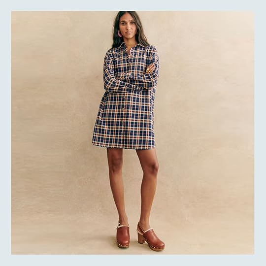
Is Sezane expensive? Uh, YEAH. But if you have the budget to spend, they also make high-quality pieces that’ll stand the test of time. (Case in point: Em’s Leana dress from Sezane – currently sold out, unfortunately – which still looks and wears like new, despite repeated washings.) The Sadie dress you see above is perfect for fall, though – the blue and beige tartan is a fresh take on a classic autumnal color scheme and it’ll be easy to layer all season long. Keep it unbuttoned as a topper; pair it with a chic belt bag to add some shape; throw a cozy sweater up top (might I suggest one from this post?) and build out an effortless layered look.
Striped Sweater Dress, $38.50

SO COOL. When people say “effortlessly chic,” this is what they’re talking about! Throw on some sneakers, some loafers, and a hat – you’ll be totally ready to float out the door in a matter of minutes. (This one also comes in a high-end camel and black stripe, and I love how they styled the look out with some cute motorcycle boots!) I’ve really appreciated the shift towards more relaxed styles – it kind of rocks that it’s finally ON-trend to wear a comfortable dress with some breathing room.
Reba Wrap Dress, $93.75
But if you still enjoy a more fit-and-flare option (it’s my preference, too), GET A LOAD OF THIS CUTE PICK. It comes in 8 different colors and patterns through a size 24 – the tartan version, in particular, is a standout (only $89 right now and perfect for the holidays!) – and it’s an absolute workhorse. Could this be office-appropriate? Absolutely. But could you also wear it to a dinner with the in-laws, or to a PTA meeting, or to brunch, or to a fancy date night with your partner? YOU SURE COULD. (PS. If you’re worried about cleavage, take a peek at some of the models – they feature the dress on women of all shapes and sizes, so you can get an idea of how much coverage it provides to larger chests. It’s a good one!)
Organic Cotton Puff Sleeve Midi Dress, $69.90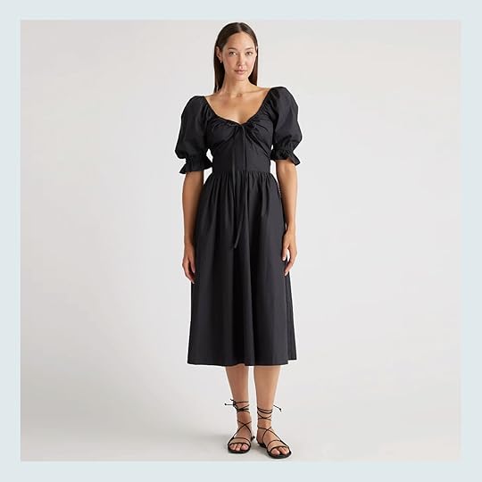

Okay – as a person who has stalked the iconic, oft-sold out Hill House Home Ophelia Dress for years, this was a HUGE FIND FOR ME. Quince has brought us the same look and the same high-quality construction (it’s 100% cotton, baby!) at almost ONE-THIRD OF THE PRICE. I know this might be a touchy subject for folks – dupes often are, and we can definitely talk about it in the comments! – but as someone who couldn’t really justify dropping $200 on a milkmaid dress that would only be worn once a month at best, stumbling upon this affordable alternative was SUCH A DELIGHT. (Pro tip: if you’re between sizes, order the smaller size. Trust me!!!)
Ruffle Collar Shirtdress, $61.60
If you’re skimming this post like, “Caitlin, girl, why are you giving us back-to-back “little lad who loves berries & cream” dresses?” then here’s my counterpoint: THERE ARE DOZENS OF US who like dressing like we’ve stepped off the set of a viral 2007 commercial. DOZENS! Let us have our moment. I love this updated version of a shirtdress – it’s pretty specific, yes, but it’s also a really fun blank canvas with a little built-in personality (you know, for the days when accessorizing just feels like too gargantuan a task).
Mini Shirtdress, $73.50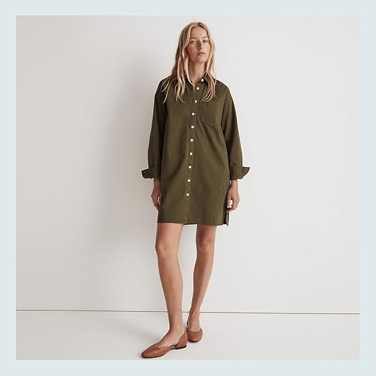
ALRIGHT. BACK TO REALITY. For your consideration, I’d like to present a classic shirt dress – this one comes in three colors (the white is more expensive, FYI), but I’m especially partial to the rich tone of this loden version. (How cute does it look with those flats, too?) If you’re curious about how this will wear over the coming months, I really love the “How to Style It” feature on Madewell’s website right now – there are some VERY cute ideas that totally transform the look and feel of this dress! (I love the tall boots + blazer look, personally.)
Fresh Buds Dress, $198
OBSESSED. I know we normally reserve florals for spring, but the tones in this dress make it the perfect contender to pair with a bright and cheery pair of tights this fall (and plus, you’ll be able to wear it year-round once temperatures heat up again!). Plus, if stamped block prints are more your thing, this one also comes in a more simple black floral version. (The reviews are overwhelmingly glowing, too, for the record.)
Long Sleeve Button-Up Mini Dress, $198

HI BARBIE. This office-appropriate number is available through size 24 (hooray!) and the construction is just SO. DARN. CUTE! I know it’s on the expensive end of the spectrum for this post, but the tailoring here is to die for – I love the nipped waist and the a-line skirt. (It looks more form-fitting on the model than it does in real life – take a peek at the product shot to get a better idea of how the bottom half fits.) This one makes me wish that EHD had more of a corporate culture because NOBODY could tell me ANYTHING if I was wearing this dress in the office – it makes me want to grab an old school cellphone and make some DEALS. Obsessed.
Frances Dress, $168
If flow is more your thing, this maxi dress may be right up your alley – the olive tone is perfect for this time of year and you can tweak this dress to fit your modesty preferences. Leave the button-front open to show some skin; loosen the waist tie after a big burrito lunch…gotta love a dress that works with you, don’t you think? (PS. This is from one of Em’s new favorite brands, Emerson Fry – y’all have loved their block print tops in particular, but they make REALLY cute dresses, too!)
Babydoll Dress, $112.50

OOPS. My hands slipped, and then I accidentally typed out my credit card details, and then somehow, this dress showed up AT MY HOUSE only a few days later. CRAZY HOW THAT HAPPENS, HUH? (I must enter some sort of dissociative state when I see a bow. I’m a total sucker.) Anyway – THIS DRESS IS SO DANG SWEET. The “babydoll” term is a bit of a misnomer, I think, as it falls a bit closer to my natural waist and flares out in a really nice way. It’s been hard to find a denim dress that works for my specific style and I’m just thrilled with this one!
Sandwhisp Dakotah Dress, $168
Have you ever seen a dress like this on a model and been like, “well, she looks cool styled like that, but I couldn’t pull it off?” Because I’m here to tell you the honest truth: YOU DO LOOK COOL AND YOU CAN PULL IT OFF. All that negative self-talk is just in your head! (This is a note to myself, too, for the record.) Scroll through the gallery and see for yourself – this dress looks SO refined and polished on women of all shapes, styles, and sizes.
Plaid Tiered Mini Dress, $33.60
Simple, affordable, and easy-to-wear – what else can you ask for? FYI, Gap also carries a rich burgundy and navy plaid version of this dress in addition to the timeless black-and-white and blackwatch versions pictured here. (Did anyone else rock some classic navy and green blackwatch in their high school uniform? It was the plaid of choice at Ursuline Academy in Delaware, and I’m surprised to find that I still have a huge affinity for the pattern! Do I have any uniform twins out there?)
Corduroy Collared Shirtdress, $59.50
The unanimous 5-star reviews can’t be wrong, friends! Grab this little frock in deep raspberry, old forest (pictured here), or golden brandy (that color is only $49.50 right now, FYI!). I love how this tiered shape falls cleanly on all different types of bodies – shoutout to brands who show clothes on a variety of models!!! It’s about time!!! – but my favorite detail is the elastic around the wrist, which makes simple work of “rolling up your sleeves.”
Midi Sweater Dress, $89.95

Speaking of models with all different types of bodies: how incredible does the XL model look on the right?! This charcoal gray color is beautiful, but I REALLY love the camel version of this dress (and there’s a really pretty garnet, if red is more your thing). It’s a blank canvas that only looks expensive, you know? Dress it up! Dress it down! It’s the stylish equivalent of wearing a blanket outside during the winter. I LOVE.
Long Sleeve Twofer Midi Dress, $180
Folks, we’ve got ourselves a twofer!!! This is actually a two-piece set – the cropped sweater can be removed and paired with anything else in your closet. (Might I suggest some on-trend high-rise flares, perhaps?) Worn together, though, it’s giving STRONG “ballerina off-duty” vibes, which is very charming. The black and navy feels very seasonally appropriate to me, but you can also grab this one in gray and white and monochromatic pink.
Puff Sleeve Midi Dress, $47.60

SORRY. Just one final milkmaid dress, I promise. (Some of us just can’t resist the siren song of a puffed sleeve and open neckline, you know?) I’m just so charmed by the khaki and black floral on the left – it feels like it belongs in the halls of a warm, custom, historic home. (Like, I want to wear this and then be transported into a Heidi Caillier home. That’s normal, right?)
Square Neck Midi Dress, $47
If you’ve got Reformation taste on an Old Navy budget, THIS ONE’S FOR YOU. (And me. It’s for both of us.) Huge fan of this trending cut – the slit and neckline are so beautiful! – but love that it was done in a durable, practical, easy-to-care-for fabric. (And it’s from a sustainable brand, to boot!) This one’s almost sold out, so move quickly if it seems like it may be a fit for any of your upcoming winter soirees.
Turtleneck Sweater Dress, $79.50

Highly recommend clicking through on this one – I LOVE how effortless this dress is when styled with a simple black pair of shades, chunky hoop earrings, and motorcycle boots. There’s something about the slouchy construction that’s just so cool, right?
Scalloped Hem Cashmere Dress, $198
I hope this one goes on sale soon because I WANT THIS TO BE MY NEW GO-TO LBD. A sweet rounded neckline? A body-skimming fit with a little extra room in the waist and hips? A pair of perfectly-tailored long sleeves, destined to hide my tattoos? A SCALLOPED SKIRT?! Pack it up, send me home, I AM DONE. I had a similar scalloped shift dress from J. Crew back in the day and I’ve always regretted parting with it as it’s been impossible to find an LBD that has the same level of charm…until now. (If anyone is feeling charitable, my birthday is on October 14th. You know, in case you want to send a gift my way.) (I kid. But hopefully, it goes on sale before then, you know?)
The Mariana Dress, $178
If you love the earlier look of a turtleneck but you prefer something a little more fitted (or with a little less fabric around your neck), this is a great option. I love the flirty, swingy skirt, but if you’re looking for something a little (read: a lot) more covered, they also make this style in an ultra-cozy maxi cut. Either will keep you both warm AND stylish this winter – it’s a win/win 🙂
Denim Shirt Dress, $170
Closing our roundup out with a dupe of one of Em’s most popular pieces! This Anthro dress is durable, comfortable, high-quality, top-rated…aaaaaaand, more than anything, it’s about HALF the price of Em’s go-to denim dress (pictured in the opening photo of this very post, if you need a refresher). But wait, it gets better: if this price is still a little too prohibitive, Target has also launched a $35 version! I do prefer the drape of Em’s and the wash of this Anthro piece, but man…that Target dress is a great way to get the look for a tenth of the price.
ALRIGHT, PALS. This is where I leave you (a mere 2,400 words later). Wanna chat about anything? I’ll be around, enjoying the fall breeze through my windows, waiting to hear from ya. See you in the comments. xx
Opening Image Credits: Photo by Kaitlin Green | From: 5 Flattering Dresses, 1 Cute Matching Set, And A Romper That’s Actually Comfortable: Emily’s Warm Weather Wardrobe Review
The post Long Sleeved Dresses That’ll Take You From Work to Weekend This Fall (22 Picks From $34 to $200) appeared first on Emily Henderson.
September 15, 2023
Our (Almost) Sunroom Reveal – But First A Recap
The sunroom reveal is coming at you on Monday (new Youtube episode Sunday – subscribe here so you don’t miss it!!!), but it’s been a long project and I wanted to remind us all where we started (and why). Listen, I’ll likely be working from home for the foreseeable future (turns out I didn’t thrive in an office job – even when it was my own office!) and I wanted a really pretty, well-lit room to write, meet, and work on design projects in (at least until we tackle the other house on the property that likely won’t be finished for years). So in other words, this room is ALL MINE – it MY Mojo Dojo Casa House (and sure, probably twice a year winter dinner party location). And I love it so VERY VERY MUCH. I can’t WAIT to show you the fully monty on Monday (with a fully set table, too).
In case you don’t know where we are – this room was added, it didn’t exist and it’s right off the living room, connecting to the back porch. When I’m not solo writing in it, Gretchen and I take many a call in here, and I’m sure there will be a lot of in person meetings in here, too. We have only eaten in here (for dinner) probably five times because we mostly eat outside (or at nook, island or in front of the TV – obviously).
This room also really changed the entire architecture of the house – and helped us create the covered back porch which we love.
Of course my Mojo Dojo Casa House had to get built, poured, framed, sided = all the things. And at times we nixed this room altogether due to budget reasons, but since it’s my writing space – my “office” if you will – the whole thing could be written off (which isn’t free, but can be run through the business).
ARCIFORM drew up so many versions (see the porch post here) and we ultimately found it’s right location. I had never done an addition before so I learned so much about the process.
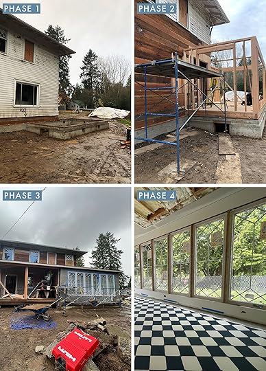
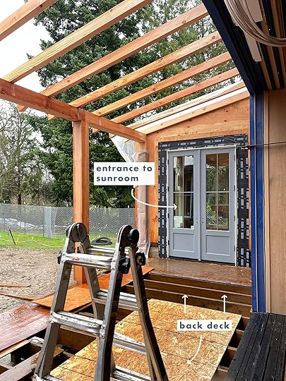
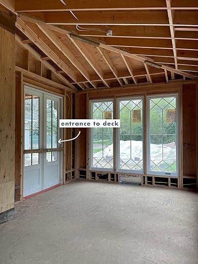
They poured the foundation, framed it up, connected the roof, added the HVAC (mini split) and then the fun stuff – tile and windows.
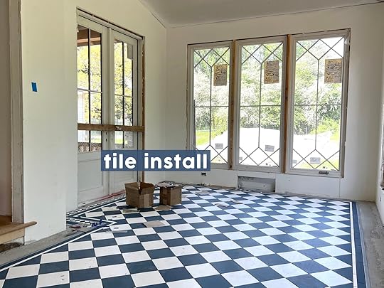
The tile design took me forever (mostly because I had the time – and wanted to play a LOT – see this post), and we ultimately went with something classic (in a really bright fun color). We partnered with Pratt + Larson and created this gorgeous bright blue color that couldn’t make me happier. At times I worried that it was going too bright (I think I designed this when I was in a more muted/neutral period of my life) but boy am I glad that we went with this bright blue – it’s just incredible (and so me).
I did have a hilarious freakout after the tile was totally done because she is BUSY, and pre-table it made me slightly dizzy. Brian and I gave each other one of those uh-oh looks, like with the subtext of “is this a lot for you, too?” It’s not like there was anything we could do about it. But the second that the table came in it was PERFECT.
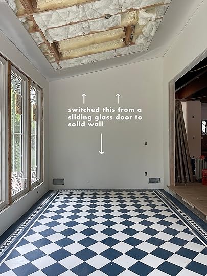
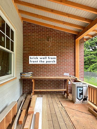
Of course there were two late in the day changes – we originally had a sliding door on the back wall (to the front porch) but then we realized that we had no room for storage or wall space (for art) in the whole house (LOL), so we nixed it and bricked it up. Once we took that out we realized that we were going to miss the natural light so even after the insulation we added two Velux skylights (shout out to Jamie for being so flexible) and I’m SO glad we did. North facing skylights FTW.
WAIT, I Never Told You About Designing The Windows!!!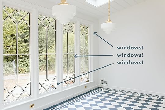
I’m sure you noticed, but we custom designed the windows with Sierra Pacific to marry the design of the original diamond windows and the new more traditional grid on the first floor. You can see it more in the big pulled back shots of the house:
 from: the full before and after backyard makeover – the overall layout + our first official oregon summer at the farm
They are just so beautiful and Sierra Pacific was so wonderful to work with with such an excellent quality product.
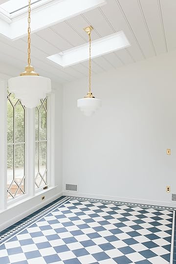
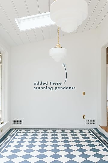
We added the pendants from Rejuvenation (Rose City fittings, art deco shade) which worked so well because the ceiling is vaulted and the chain helps it hang straight down. They are definitely more vintage-y and whimsical than some of the other fixtures in the house, which I love.

Obviously, then I had to shop for (and choose) the perfect dining table, chairs and credenza which you’ve seen here and there but not all together.

So come back Monday. I know you think you’ve seen it, so to shake it up I set the table for a dinner party (with flowers cut from the garden) so you’ll see it try on a different costume. This is the room that currently makes me the happiest and on Monday I break down why. 🙂
*Pretty Photos by Kaitlin Green
The post Our (Almost) Sunroom Reveal – But First A Recap appeared first on Emily Henderson.
September 14, 2023
The Colored Plumbing Trend Is Here To Stay – Would You Try It In Your Home? (+ 4 Tips For Pulling It Off Like A Designer)

Alright, color lovers. This one’s for you. Buckle up, because today, we’re going WAY back in time – all the way to the 1920s – and together, we’ll trace the trajectory of the colored plumbing trend over the past hundred years. You know – how it started, why it fell out of favor, and how it’s making its way back into our homes today (but like, relatively quickly and at a high level, seeing as this is supposed to be a “fun blog” and not “Caitlin’s unsolicited Thursday morning dissertation on the history of colored plumbing.”) But wait – WHY THE HECK ARE WE TALKING ABOUT THIS? Let me set the scene for you…

It’s February 2023. The Kitchen & Bath Industry Show (or KBIS, more colloquially) has just kicked off in Las Vegas. And for the first time in recent memory, it’s COLORFUL. Instead of stark-white porcelain and stainless steel, KBIS is littered with a vibrant selection of jewel-toned ovens, cheery concrete sinks, bold faucets and fixtures, and then..this Kohler display. To a rational person, this may just look like a rainbow array of toilets. (Mainly because it is, in fact, just a rainbow array of toilets.)
But y’all, this booth honoring six of Kohler’s historic colored plumbing finishes flooded my brain with so much serotonin that it made me question my neural pathways. (Like, toilets? Seriously? Why can’t I get a boost from things like “going outside” or “chatting with a friend?” Why am I destined to love things like “plumbing fixtures?” Is anyone else in this boat with me?) ANYWAY – we’ve seen a resurgence in the popularity of colored appliances in the kitchen (remember Sara’s blue oven?), but there haven’t been a ton of new, mass-market options for the bathroom…until now. AGAIN, FINALLY. I haven’t been this excited about a trend in a long time – doubly so because of the historical roots.
From The (Very) Beginning
ZAP. It’s the 1920s and – as luck would have it – we’ve reached the “learning” part of this post. (You know how you have to sneak vegetables into your kids’ meals to make sure they’re getting all their nutrients? That’s me, shoving a little bit of history into every one of my dispatches here. IT’LL STILL BE GOOD, I PROMISE. Just try it! You’ll like it!)
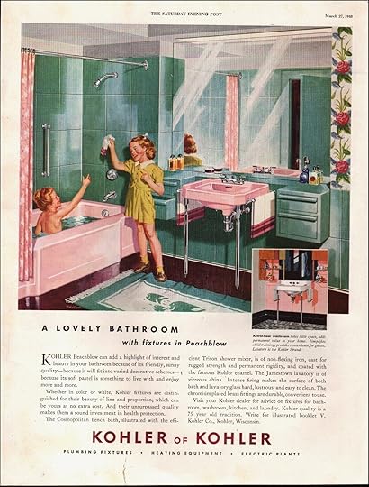
In the early part of the 1900s, white plumbing fixtures dominated the bath market. (Sound familiar?) Here’s where Kohler ties back in: after over 50 years in the business (they were founded in 1873 – who knew?!), they wanted to elevate their plumbing fixtures from “functional necessity” to “key design element.” Their solution? Introduce a full bath suite in soft pastel shades, which allowed customers to design and customize their whole bathroom for the first time ever. (To be fair, colored fixtures did exist previously, but they had to be purchased separately and the color-match between pieces wasn’t great. Modern comparison: if you’ve ever bought wallpaper or a bridesmaid dress online, you might be familiar with the variance that can occur between dye lots – Kohler had to figure out how to standardize the process to guarantee a uniform color every time, which was an enormous achievement!)
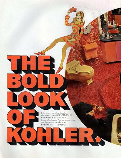
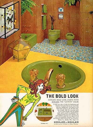
As time went on, Kohler introduced some of the (in?)famous colors that we now associate with the 1960s and 1970s, like the iconic avocado shade from 1967. (Also introduced: the “bold look of Kohler” tagline, which is still used today. Who would have guessed that it was originally referring to day-glo neon toilets? A bold look, indeed!) This is an awesome timeline of fixture colors through the ages, if you’re also a big ol’ dork who likes thinking about which color tub they would have purchased in the 1930s. (I’m a Cerulean Blue girl, I think.)
Colored fixtures continued to dominate the plumbing market throughout the 80s – more than 50% of Kohler’s output was nonwhite product! – but over the last 40 years, the siren song of the stark white toilet lured homeowners and renovators back into the safe, sterile embrace of an all-neutral bath. It had a lot to do with economics – colored fixtures didn’t feel like a safe choice for those who may need to sell their home in a recession (again – sound familiar?), and the rainbow hued baths slowly began to feel more and more dated. Until…
A Trend Emerges…the mid-2010s, when the punchy, graphic, vivid bathroom fixture started making a triumphant return. (In a small way, of course.) While color in the bathroom never totally went out of style (highly recommend checking out @vintagebathroomlove on IG for all your historic bath inspo!), we finally started seeing color being offered in new modern, streamlined silhouettes.
These bright faucets, knobs, and shower heads were a low-stakes way to bring color into the bath, and their mainstream introduction seemed to whet the appetite for bigger, bolder statement pieces of plumbing.
A Bigger, More Vintage-Inspired FootprintWe began to see more and more of our favorite designers sourcing entire vintage bath fixtures for their projects. This wasn’t just a knob or a faucet – this was the whole freakin’ shebang. Alternatively, those with deeper pockets were able to order vintage-inspired pieces – and for them, I am grateful, for they have paved the way to a mass market reintroduction of colored fixtures. Case in point:
The Next Wave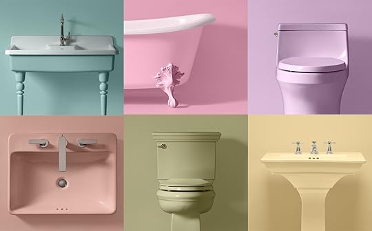
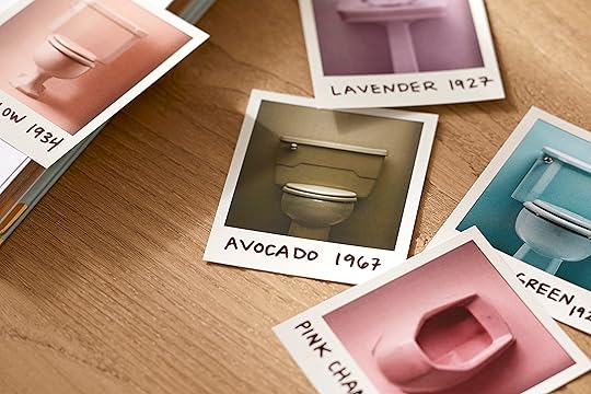
Andddddd we’re back to 2023. To celebrate their 150th birthday (!!!), Kohler has resurrected a few of their historic colors – that’s Spring Green (from 1927) on the top left, followed by Pink Champagne (1973), and Lavender (also 1927!). On the bottom, we have Peachblow (1934), Avocado (1967), and Sunrise (1953).
The best part? You can now purchase seven different plumbing fixtures – ranging from kitchen sinks to toilets – in Spring Green and Peachblow. (You can see everything here, if you’re interested – the utility sink in Spring Green is my absolute favorite. I think I prefer the vintage-inspired shapes, but how exciting to see some modern silhouettes in there! Word on the street is that there’s more to come with these heritage colors, too.)

 design by jonathan adler | via kohler
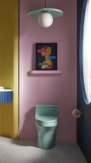
Here’s a powder bath designed by Em’s former boss (!), Jonathan Adler. IT AIN’T YOUR GRANDMA’S BATH, THAT’S FOR SURE. It’s a really high-impact, manageable choice that totally transforms the look and feel of the room, don’t you think? A few cans of paint and some different art would take this space in a totally different direction – these colored fixtures are a design-forward, versatile way to bring a lot of interest into a space without spending a small fortune on permanent tile or a new vanity.
 design by justina blakeney | via kohler
 Same goes for this sweet and modern space designed by Justina Blakeney, a dear friend of EHD! I love the contrast of the graphic, modern floor tile with the antique-inspired sinks and tubs. The deco tile motif on the walls really bridges the gap to bring both styles together! Honestly, white sinks and tubs would have been just as beautiful in this space…but there’s something special about the Peachblow that says “I live here.” We spend so much time personalizing our living rooms and bedrooms – it’s so exciting that we’ll have an affordable, high-quality way to personalize our practical spaces now, too.
Make It Work: Stick to A Color PaletteSO. You’ve seen the inspo and you’re considering a switch to colored fixtures in your next remodel. Let’s just review a a few pro tips that’ll keep the space feeling like a time capsule (unless that’s what you’re going for, in which case I admire your commitment to preservation and I’d love to see pictures when you’re finished!).
First up: pick a color palette…and stick to it. Your plumbing is going to draw a lot of attention, so make sure to tie it in with the space via tile, wallpaper, paint, or decor (even your towels and shower curtains will make a difference here!). A restrained palette will make your space feel pulled together and intentional (even if said palette has a lot of color in it, like the bath on the left). More than anything, be sure to pick something you love – it’s about time we start designing our homes for us and not just for resale, you know?
Mix In Some ModernLOVE THESE. Both baths feel vintage AND fresh, right? On the left, modern art and shelving balance out a classic cast iron tub. (That toothpaste-y mint and red is a really on-trend choice, too. Did you also see the geometric shapes on the tile towards the bottom right? It’s the little things!) On the right, plywood walls, modern pulls, and dynamic lighting placement take this mauve toilet from “ancient relic” to “I paid a designer big bucks to plan this bathroom for me.” Remember to mix eras and styles here – we’re not recreating a bathroom from the past with these fixtures; instead, we’re curating our favorite things in a bathroom fit for the future. 🙂
For Longevity, Pick a Muted ColorAn alien has clearly possessed my body, because I can’t believe I’m about to say this: when it comes to choosing a color for your plumbing fixtures, keep it desaturated. Pastels are great, and so are the muted tones above. The tub on the right is one of my favorite examples – it’s deep crimson that’s rich, matte, and a little muted. (Far preferable to a glossy, fire-engine red tub, no?)
When in doubt, consider the earthier version of your favorite color – a sage over a lime; a Peachblow over a hot pink; a Spring Green over an aquamarine. These shades will be WAY easier to decorate around long-term, which is key for a big fixture!
Fake The LookLove the look of a colored bath fixture, but not interested in a full-blown bath remodel? Consider cladding the exterior of your existing tub (and for extra points, paint your vanity to match). Be sure to choose water-resistant or waterproof materials here – there are tons of great DIY instructions and transformations on Youtube.
Where Can I Get Colored Plumbing Fixtures?WOAH. That’s a lot of information to digest, huh? But the tides are changing, and I’m so excited to welcome in the next era of cheerful, personalized bathrooms that feel like the folks who designed them. If you’re excited about hopping on the colorful plumbing train, here are a few vetted suppliers that I love (no matter your style, budget, or continent there’s a resource for you here!):
KohlerWater MonopolyKastVolaThomas CrapperVilleroy & Boch DrummondsNoodCieloRuvatiKonkretus MarmiteGroheRubinetAnd now, I gotta ask: what say you? Could you ever see yourself going for a green bath suite, or are neutrals more your thing? Are you worried about resale, or would you embrace these colored fixtures with open arms? Do you think we’re headed into a new 60-year cycle of nonwhite baths? LET’S TALK ABOUT IT. (Seriously, please, none of my friends care about which color toilet was released in 1927 – I need to be amongst people who ~get it~.) See you down there… xx
Opening Image Credits: via Kohler
The post The Colored Plumbing Trend Is Here To Stay – Would You Try It In Your Home? (+ 4 Tips For Pulling It Off Like A Designer) appeared first on Emily Henderson.
September 13, 2023
Our Sustainably Grown White Oak Wood Floors, One Year Later (Why We Love Them And What Makes Them Special)
I love our wood floors so much and today I’m going to tell you why and brag a bit about them. Wood flooring might be the most important “permanent finish” in your home. It’s clearly a very high-impact design element (you see it everywhere, all the time, from every angle, in so many rooms) and it also gets a ton of wear and tear so longevity and durability are crucial. “Fashion” and “function” should be really scrutinized here. I’ve always chosen fashion over practicality and am so excited to report that this white oak flooring checks both boxes equally (and more).
As you might know, we reached out to Zena Forest Products a couple of years ago when we first bought the property, thanks to a few reader suggestions. I really, really wanted Oregon-grown and sustainably-milled wood for our home. I can get really woo-woo about this stuff, but to me, it’s like buying lettuce from your farmers’ market (or better yet growing it yourself) versus packaged lettuce from the supermarket. Both work! But not only do you feel better about your purchase (which is a privileged one), but you get a better-tasting product, that lived a happier life and took less energy to get to you. It’s not always possible, of course, and maybe it’s not possible for a lot of things in your home, based on your budget. But I like to think that real wood brings so much soul, and soul makes a home feel just so happy. Zena Forest Products makes sure that the trees have a happy life and they only mill them when they are ready. And yet they are relatively affordable, family-owned, and – importantly – so beautiful. So today, now that it’s been installed for over a year, I’ll walk you through our flooring so you can see why we chose it and how it’s holding up to wear-and-tear from our family. If you are in the market for flooring please read the blog post about Zena Forest Products (outside Salem) where I show you the whole process of how our flooring was milled, soup to nuts 🙂
Family-Run, Locally Produced, Sustainably Milled

 living room reveal | pantry reveal | kitchen reveal
I wrote a whole post about it, but I couldn’t leave this point out of this post because it matters. YAY to people/companies like this who despite increasingly challenging profit margins continue to care and do it in such a beautiful way. Ben Deumling (who owns and runs the mill) was raised on the Zena Forest property and knows every inch from working it as a child. He and his wife are now raising their two kids there and after spending the day with him and his crew, seeing how they are real stewards of the land and care so much, watching the whole milling process I can’t tell you how happy we were to be partnering with them on this. Listen, I like a lot of wood flooring out there and I’m not saying this is perfect for every project or budget, but boy I am so pleased with this flooring in every single way.
We Love The Natural Grain Variation, Knots, And Character
Our flooring is so darn pretty. It’s Oregon white oak (which is native to our area and has been here for hundreds of years, if not more). At Zena Forest Products, an actual 1300 acre forest outside of Salem, these trees grow to maturity before being milled, and when they are finally cut more are planted immediately. They live with many other flora and fauna – not like a Christmas tree farm that you might think of. White oak is a hardwood (cliff notes: hardwoods are from deciduous trees, softwoods are evergreen like pine and Doug fir). I love both, but pine or Doug fir can stain really yellow and dent easily (which is why they are usually used as building materials). In our white oak flooring, as you can see, there is so much variety in the knots and grain. We didn’t want the “clear” version (which is actually more expensive but available as an option) that eliminates knots and looks more uniform. Knots are actually where branches formed out of the trunk – and we were adamant to include them.
Various Widths And Lengths = Non-Uniform Yet Cohesive Look
We have various lengths and widths, allowing for it to again, not look uniform in the best way. While the wide plank is the current trend/preference, it either has to come from extremely old growth (thus very expensive) or is mass manufactured (which can be great, but not what we were looking for). So you’ll see anywhere between 4″ – 6″ widths and 2′ – 8′ lengths. I personally think this adds more character and you can barely notice – nothing jumps out, but it reads as natural.
Real Wood On Engineered Backing from: introducing the most beautiful wood flooring in the world, by an oregon run, family-owned, sustainably sourced mill – (zena forest products) for the farmhouse
We have always preferred and installed real wood without it being applied to engineered backing and every time we’ve loved the look of it and yet had issues with it. We’ve had either extreme cracks (that collected crumbs and snagged toes), acclimation issues, or buckling if water sat for too long (which happened in all three houses). I LOVE our mountain house reclaimed wood flooring so much, but we have to wear slippers to not get splinters (Ross Alan fixed this after our install and now adheres it on engineered backing – we also did not have an experienced installer who neglected to put the filler layer, which we now know is crucial to smoothing out natural cracks, holes and gaps. It also keeps them from getting worse).
That’s all to say we really, really didn’t want to run into this problem again, and yet we wanted real wood that could be refinished multiple times over the next 100 years. When I reached out to Zena I was fearful that they would say they were solid hardwood, and that was a deal breaker for us (mostly Brian – that guy got more splinters than the rest of us combined). So when they said they had them sustainably adhered to engineered wood – wood that doesn’t move, swell, change size, etc – we were ecstatic. Fifteen years ago engineered wood flooring was a thin layer of veneer on faux backing and didn’t look as good. However, now it’s executed so beautifully and gives a better more long-lasting product with a thick layer of real wood on top – up to four refinishes which is a LOT. To be fair if you have old-growth real wood flooring – wide plank and from really mature trees, you are so lucky. But most wood from newer milled trees doesn’t have the same level of strength and density that the more mature trees have so engineering them truly elongates their life. I loved the white oak in our LA house, but every spring it would buckle in places with moisture (it was herringbone so maybe that had something to do with it). We just didn’t want to have to worry this time and my goodness it’s a solid, smooth floor. We LOVE IT.
Stain In Place, Not Pre-Finished
There are two types of wood flooring you can install and both can be good for different reasons – “pre-finished” or “sand & stain in place.” Pre-finished can be more budget-friendly and is a great option for sure. But our Zena flooring is “sand & stain in place,” which means your installer lays it (it’s tongue and groove and installs very easily) and then sands, fills, and stains or seals it. The install can be more expensive because of the process (which only takes 2-3 more days depending on your square footage), but the benefit is that you get a totally smooth surface without a micro bevel in between the wood planks. It just looks so beautiful, seamless, and high quality. You can also obviously control the color, too, as you choose the stain or sealant. We wanted white oak with a clear matte sealant to enhance the grain but nothing more and got just that. Of course, we could have gone darker but we LOVE this warm color.
I feel like right now what is “in” is a cooler version of this which I also love (and my brother chose it for their house), but this warmth is just so stunning, happy and I think unique. It looks so real and we get compliments on it every day when people come into our home. Also, it mops up so easily (which is my job on Sundays after Brian vacuums) and sparkles pretty darn easily (we use Bona wood cleaner, that’s it). I can’t speak to the longevity of the stain as I’m sure it will fade in places where the sun hits it more, but it’s just gorgeous and easy to maintain because it’s real, smooth wood.
The warmth of the natural color with the clear matte sealant works so well with all our blues and whites in the house. You can certainly tweak the tone (easily) but we didn’t want to.

 Lastly, Affordability
 We needed 2000 square feet of flooring including overage (just the first floor and not the tiled rooms) and it would be 10$/square foot – so it would have cost $20k (not including install which was basically another $10/square foot). This is, of course, more expensive than a lot of basic flooring, but it’s actually far less than some of the other wood flooring we were eyeing that I had gotten samples of. The price is actually so competitive with really good quality, sustainably sourced wood, and yet it’s sourced in Oregon/America, and it’s a small family company.
 Custom Wood Vents

kitchen reveal | closet reveal
They also make custom wood vents that can be installed when the flooring is installed and stained along with them. You can order any size and they just integrate so perfectly into your flooring.
 from: introducing the most beautiful wood flooring in the world, by an oregon run, family-owned, sustainably sourced mill – (zena forest products) for the farmhouse
 from: introducing the most beautiful wood flooring in the world, by an oregon run, family-owned, sustainably sourced mill – (zena forest products) for the farmhouseWe Love Our Wood Flooring So So Much
I can’t tell you how happy we are. We all know what cheap flooring feels like, which has its place and is often a budget necessity (we floated laminate “wood” in our old basement – it was the right choice for the space) but for this home we wanted it to feel solid, grounded, smooth, and yet it’s still SO durable. It’s only been a year, but so far it’s beautiful and flawless. It’s so tightly installed that it feels unbreakable and impossible to dent. No pup nail scratches, either – we just don’t worry about it at all.

A huge thanks to Zena Forest Products for partnering on our flooring. Ben and his family are just so wonderful. Like I said at the start, the owner, Ben, was raised on the property and has worked the land since he was a child and is now raising his kids there. Maybe I’m getting sentimental in my old age (or just wanting purpose and meaning in everything) but that really matters to us. It’s a great high-quality product, so thoughtfully made, by great people that makes our home look so beautiful everywhere you turn. We feel very lucky. If you are in the market for wood flooring know that I wholeheartedly endorse this family, this forest, and our beautiful white oak flooring. xx
*Photos by Kaitlin Green
The post Our Sustainably Grown White Oak Wood Floors, One Year Later (Why We Love Them And What Makes Them Special) appeared first on Emily Henderson.
September 12, 2023
More Kitchen Palettes! 6 Color Schemes to Make Your Cherry Kitchen SO Much Better (I Promise!)

Attention, attention! The EHD universe cannot get enough color palettes to use for dated and tired kitchen cabinets! I’m back yet again (and fair warning, this won’t be the last post in this series) with moodboards full of products in very specific color pairings for cherry cabinets. This whole thing first started when I walked you through my cherry rental kitchen refresh plan, where some of you asked me to tackle honey oak next. That post blew UP, so we decided to go back to my original design pain point and dream up some more options for anyone with a similar cabinet hardship.
Just as in the previous post, all the inspiration photos require a bit of imagination. As you can probably imagine, there is not a wealth of beautiful cherry cabinet kitchens out on the internet to build this post around. I dug up spaces with darker, warm-toned wood that could easily still work within the space if it leaned redder. In some cases, I piecemealed a color scheme based on a few images since I prefer a more robust marriage of hues.
For the moodboards, as a reminder, what you see isn’t necessarily me saying “GET THESE PRODUCTS” but rather a visual jumping-off point for you to pull your own inspiration. There’s a barstool on every board, but that just represents the color of a piece of furniture you might have in your space. Maybe the exact tile doesn’t make sense in your kitchen, but you can use it as a muse for say, what color to paint beadboard you add instead. You’re all creatively-minded people, right? You’ve got this!
Before looking over some quick rules, I also want to say that floors and countertops (of course) play an enormous role in how any of these would render out. If you’re looking to refresh your kitchen but keep your cabinetry intact for now, perhaps you have the budget to update an old Formica or tile surface with white or gray quartz. If not, there are so many DIY fixes you can try (like painting old granite or covering your counters with contact paper). The same applies to floors.
7 Things To Consider When Revamping That Heavy Cherry KitchenBalance the cherry with a tone of red somewhere else in the space. Think on a dining chair seat fabric, window covering or rug, a piece of furniture, or plates on a shelf. Simplify the palette (keep the table and chairs the same color if you have an eat-in kitchen, or pick the same color barstools for an island as any shelving you may add if you take down uppers, for instance).Lighten the load of the cherry with another wood tone. If your space is small, opt for a cooler-toned neutral wood like a white oak. If you get good natural light and your kitchen isn’t closing in on you, you can push the boundaries with a rich wood such as walnut.Pick a hardware finish that’s anything but brushed nickel to keep it from going too “landlord” in vibe. Think polished nickel, chrome, unlacquered brass, polished brass, and even oil-rubbed bronze. Change the focal point. An interesting backsplash like a hand-glazed tile, a statement floor, fun pattern via your textiles, etc. Speaking of floors: If you can and have the option/budget, the right floors against cherry cabinetry would make ALL the difference. Avoid gray-washed or yellow-toned woods, or any tile or vinyl that feels dated.Match your appliances as best you can so your eye has to make sense of fewer variances.Alright, let’s get into some color chat, shall we?
Color Palette to Try: Greige, Taupe, Cream & ChromeThe Inspiration:
View this post on InstagramA post shared by Blanc Marine Intérieurs (@blancmarineliving)
There’s A LOT of color in this post, so I wanted to start with the easiest to swallow if you’re color-averse. Because cherry cabinets range in just how red they are, this one works regardless of whether your wood leans more subtly brownish-red (what I call “Mystic Pizza Julia Roberts”) or cherry Coke red-red (“Pretty Woman Julia Roberts”). While the inspiration photo above of a bathroom by Blanc Marine Intérieurs is a far cry from any cherry kitchen you’ve ever seen, I felt it was still a good representation of how charming and welcoming sticking with warm, natural neutrals could feel.
The Moodboard:
The key here is a mix of beige, greige, cream (not white) and taupe. I picked a creamy, interesting backsplash tile whose tone is mirrored in the Roman shade and lighting fixture. A greige on the walls and in the seating feels a bit updated and modern (same with the polished nickel hardware), while the darker but still neutral rug and walnut shelving grounds the lighter picks so it’s not too much contrast with the cherry.
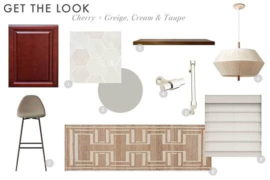
1. Celine 4″ Hexagon Glossy Porcelain Floor & Wall Tile in White | 2. Cornforth White by Farrow & Ball | 3. Walnut Floating Shelf | 4. Signature Hardware Strasbourg 1-3/4 Inch Diameter Bar Cabinet Knob in Polished Nickel | 5. Signature Hardware Strasbourg 3-3/4 Inch Center to Center Bar Cabinet Pull in Polished Nickel | 6. Totora Oak Pendant Light | 7. Copley Upholstered Barstool – Project 62 | 8. Naira Handwoven Jute Runner | 9. Rustic Americana Roman Shades
Color Palette To Try: Sage, Burgundy, Natural Wood & BrassThe Inspiration:
View this post on InstagramA post shared by Jenna Chused (@chusedandco)
View this post on InstagramA post shared by Anna Eleri (@annaelerihome)
 photo by rett peek | design by meet west
For anyone following my own kitchen, you may recognize this palette (sort of…mine has the addition of blue). Red and green are complementary colors, so per the laws of the color universe, this just works. For me, though, it’s important to adjust the shade and pigmentation of both shades.
For anyone considering adding a Carrera-type stone, the bathroom above by Gachot Studios (shared through Jenna Chused’s profile) may be just the thing to get you to go through with it because WOW is it beautiful and makes me almost want a cherry-toned vanity like that. Anna Eleri posted a kitchen by one of my all-time favorites Ashe Leandro and while I’d be lying if I didn’t say that (superimposed??) duck didn’t play a part in drawing me to the image, I do think the space shows how lovely and timeless a cherry cabinet situation could feel if paired with the right elements.
And of course, this kitchen by Meet West Studio that I shared in my original kitchen post. What a triumph of marrying warm wood cabinets, a terra-cotta floor, a mahogany vintage island, and a gorgeous sage moment from the countertops up.
The Moodboard:
A chalky yet cream sage tile and paint is the perfect companion here, and a rich, deep burgundy in just a small moment like a curtain fabric is the balance you need to make the red cabinetry feel intentional. Blonde wood and soft matte brass work hard to modernize the cherry.

1. Vernici 2″x10″ Italian Subway Wall Tile | 2. SW 6177 Softened Green by Sherwin-Williams | 3. 5″ Sidra Brass Cabinet Pull – Thin Profile | 4. Pleso Solid Brass Round Cabinet Knob | 5. Hattchet 3 Piece Tiered Shelf | 6. Agnes 2.25″ Pendant – Natural Brass | 7. Rus Light Oak Counter Stool | 8. Athena Reversible Persian Rug | 9. Cotton Blend Striped Room Darkening Thermal Grommet Curtain Panels (Set of 2)
Color Palette To Try: Olive, Ochre, Blonde Wood, Cream & BrassThe Inspiration:
View this post on InstagramA post shared by Clever (@getclever)
View this post on InstagramA post shared by Nicola Harding & Co (@nicolahardingandco)
Here’s a situation in which I had to mentally stretch just a bit to create a color palette but I kind of love where it landed, tbh. Another take on red and green, but this time, we go with a green that has more yellow undertones (olive) combined with an orangey-goldish ochre. That first photo from Clever (a design by GRT Architects) really sold me on the buttery walls, the burgundy tiled island, and the ochre and white checkerboard floors (and you might miss it but there’s an olive bowl in the shelving that rounded out the combo for me). In the honey oak palettes post, I leaned on crisp white to lighten the load of the wood, but here, I actually don’t love a bright white with the cherry. I much prefer a non-yellow cream as a neutral like they used here.
I pulled this second shot of the seating corner by Nicola Harding & Co to show how the colors can work together to give modern or traditional/cottage-y vibes. It’s all in the textile and hardware choices.
The Moodboard:
As I mentioned, the previous board used a green with blue undertones, but here, we go yellow for a very different aesthetic. It’s super important to make sure whatever cream colors you bring in here do not turn yellow in the light of your space or else everything will look overly tea-stained and old. I picked a floral print curtain for some playfulness but I’d also love a simple, solid natural linen shade or cafe curtain if this isn’t your look. Again, we stick with balancing the cherry with more of a white oak in other wood furniture or finishes.

1. Reine 3″ x 12″ Ceramic Tile in Castle Moss Green | 2. Like Buttah by Clare | 3. Wall Shelf – Natural Oak Oiled | 4. Williamsburg Collection 3 in. (76 mm) Polished Brass Cabinet Door and Drawer Cup Pull (10-Pack) | 5. Williamsburg 1-1/4 in. Diameter Polished Brass Cabinet Knob (10-Pack) | 6. Danish Minimalist Cone Iron Acrylic 1-Light Pendant Light | 7. Latte Sarno Counter Stool in Eggshell | 8. Plaid Wool Rug – Tawny | 9. Amber Lewis for Anthropologie Rowena Curtain
Color Palette To Try: Dusty Blue, Walnut & CreamThe Inspiration:
View this post on InstagramA post shared by Anna Eleri (@annaelerihome)
View this post on InstagramA post shared by Heidi Caillier (@heidicaillierdesign)
View this post on InstagramA post shared by Anna Eleri (@annaelerihome)
On to blues, but specifically dusty, moodier blues with gray undertones. I first saw this color combo on Caroline Winkler’s Lazy Girl $500 kitchen makeover over on YouTube and loved it but knew it was a bit darker than I wanted in my own space. And because I couldn’t find a photo of it on Instagram, I dug around for some more inspo to show you how it could look here. Designer Anna Eleri went for a lighter French blue on the walls of a dining nook with a cherry-toned table and chairs and it feels happy, friendly, but storied. Heidi Caillier’s kitchen uses a slightly greener-toned slate but I included it to show you how powerful it could be if you really jump into the deep end here. And the sweet bathroom, also by Anna Eleri, reminded me how much I like some gray moments with cherry cabinets (like a gray and white marbled checkerboard floor, perhaps, or even a gray stone countertop!).
The Moodboard:
I’m really feeling this board, but I know in my own home, it just isn’t what I’m going for (though that bird fabric just might turn me…). Don’t let that stop you, though! Someone bring this to life, invite me over for afternoon tea and I’ll bring the plum torte to share. Isn’t that how this feels to you? Like the ideal space to sit and shovel jammy stone fruit desserts into your mouth. I went with a more ornate look for the fixtures like the milk glass shade pendant and the brass kitchen rail, but the walnut barstool and the small vertical offset tile stack on the backsplash keep things a bit more contemporary. At first, I didn’t love how the rug and the window covering fabric looked next to each other, but I trusted in my gut that IRL, they’d play nice (they just compete a bit here overlapping like that). As for paint color, the choice is yours how intense you want to go (a monochrome look would be nice if you prefer a more saturated design scheme) but I kept it light and airy with a perfect milky white.

1. Wabi Sabi River Blue 1.5×9 Glossy Ceramic Tile | 2. Morning Ritual by Backdrop | 3. Stella Kitchen Rail Bar | 4. Walnut Floating Shelf | 5. Mercer Bin Pulls | 6. Mercer Cabinet Knobs | 7. Modern Milk Glass Pendant Lights – Rowan | 8. Jackson Counter and Bar Stool | 9. Amber Lewis x Loloi Billie Ocean / Brick Area Rug | 10. Kalida Fabric, Walnut
Color Palette To Try: Salmon, Teal, Black & SilverThe Inspiration:
View this post on InstagramA post shared by Vivir Design (@vivirdesign)
Please do me a favor before reading and click the arrow on the image above until you get to the seventh photo of the wavy marble sink basin and the pink-y plaster walls. Are you there? Okay, let’s continue (I couldn’t get it to default to that in the carousel…sorry).
This palette was a bit of a wild card (as is the one below) and I almost didn’t include it but hopefully, it services someone here! Some reader at some point during all these kitchen posts of mine mentioned using a salmon-y pink as a complement to the cherry cabinet (or maybe it was honey oak, but either way, I made it work). I can see this palette being incredibly dreamy in a kitchen with warm, equally dreamy sunlight. It’s giving “golden hour” and I’m INTO IT! I plucked the rest of the palette from the tile used by Heidi Caillier but I shifted it to be a bit more on the teal end of the spectrum because I wanted to see how that would render out.
The Moodboard:
I was itching to try something with more pattern for a backsplash and stumbled upon this that isn’t exactly teal but isn’t really slate either. The paint color is peach-meets-salmon-meets-plaster-meets-sunset and it could be great in the right space. I own this rug and it’s so, so good in real life and has a mix of pinks, teal, blue, yellow and red which helps to make the rest of the choices here feel a bit more worldly. And because I used brass in the hardware of nearly every other moodboard, I went with a polished nickel here (it has a warmer undertone than chrome), but gold would be just as beautiful.
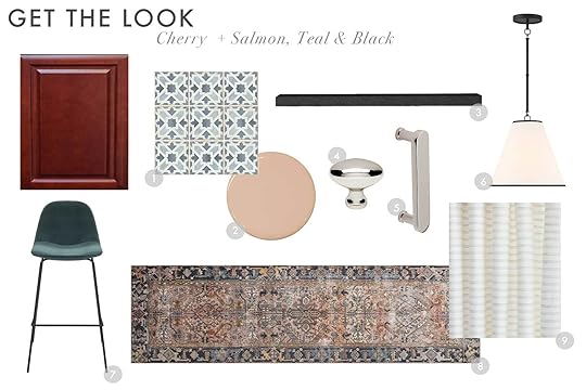
1. Casablanca 5″ x 5″ Matte Ceramic Tile in Gaza | 2. Portofino by Portola Paints 3. Sherice Floating Shelf | 4. Solid Brass 1 3/8″ in Polished Nickel | 5. 4″ Centers Pull in Polished Nickel | 6. Luca Small 13″ Conical Pendant, Matte Black | 7. Kody Stool (Set of 2) | 8. Chris Loves Julia x Loloi Jules Oriental Machine Made Polyester Indoor Area Rug in Terracotta/Beige/Black | 9. Conway Stripe Fabric, Parchment
Color Palette To Try: Mauve, Mustard, Emerald & BrassThe Inspiration:

Alright, I’ve asked you to be creative all along, and this last palette (bonus number 6 because I was feeling frisky) is no exception. I could not find an actual inspiration photo, but I was standing in my kitchen the other day and thought “Wait…what if I go purple, instead?” This is a thought out of absolute left field because #1: I don’t normally like purple, and #2: this completely upends my initial design choices.
But anyway, I have always loved purple, mustard and red together in my wardrobe, and figured…what the hell. How might it pan out in a kitchen design? I grabbed a photo of my kitchen and did a crude Photoshop overlay with a dusty purple wall, cream backsplash, mustard checkerboard floor and emerald dining cabinet. It’s definitely a look, but I think it works! I’m likely not going this route, but I needed to see it before ruling it out. Thoughts?
The Moodboard:
There’s a lot going on here, and maybe the emerald doesn’t even belong, but…I kind of think it does? A neutral-ish rug, curtain fabric and backsplash set the stage for all the other elements, especially that mauve paint (find one with red undertones rather than blue). Brass hardware plays off the warmth of the cherry cabinets, mustard floor, and camel leather dining chair.
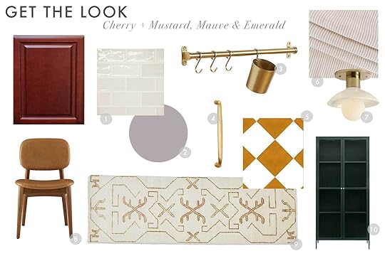
1. Marin 2.5″ x 5″ Ceramic Wall Tile in Sand Dollar | 2. Sanctuary AF-620 by Benjamin Moore | 3. 24″ Brookside Rail System, 1 Cups & 3 S-Hooks – Aged Brass | 4. Mercer Drawer Pulls | 5. Sunrise and Off White Checker Peel & Stick Tile Sticker | 6. Siena Stripe Linen, Buff | 7. Crawford 7″ Glass Flush Mount | 8. Kelsey Leather Chair, Walnut Stain | 9. Evet Rug | 10. Arnika Dining Cabinet
Phew…there you are. SIX color palettes to try in your kitchen if you have cherry cabinets, wish you didn’t, but don’t have the time, energy, will, or budget to do a reno (or even paint them). I’m having so much fun with this and keep surprisingly myself with the color combos I’m finding and cooking up. I really REALLY hope this is helpful content and my explanations guide you to take my moodboards and make them work in one way or another for your own homes.
I’d love to hear from any and all of you in the comments…thoughts, other tips, other requests…give it to me.
Stay tuned for espresso cabinets next!
See ya!
Your friend in design, Arlyn.
Opening Image Credits: Design by Meet West | Photo by Rett Peek
The post More Kitchen Palettes! 6 Color Schemes to Make Your Cherry Kitchen SO Much Better (I Promise!) appeared first on Emily Henderson.
September 11, 2023
Introducing A New Feel Good Makeover For A Very Special Group Of Women (And We Need Your Help!)
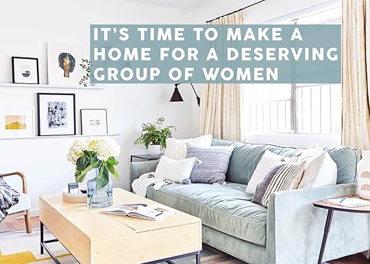
Ashley Newman of Bluestocking Interiors here. Long-time reader, sometime commenter, and first-time contributor (squee!). The end of 2021 was something of a perfect storm for me. First, I read Emily’s post seeking volunteers to take Pen + Napkin national and knew I just had to be part of it – there could never be a more “me” volunteer opportunity than giving people beautiful homes. Then, I realized the level of anxiety I lived with wasn’t normal, and I finally got on medication. Between those two things and switching careers to interior design – something I’d been thinking about for probably a decade (I mean, why design endless imaginary rooms when I could design real ones?) – suddenly everything felt possible. In this career switch, I took a leap and started Bluestocking Interiors with the goal of making it possible for everyone to get the help they need to create a home they love.
But, even though I signed up with Pen + Napkin right away in 2021, I couldn’t find local organizations that wanted to partner with us (uh, what?!?!). Finally, one amazing woman introduced me to another amazing woman who introduced me to another… until I was connected with Oxford House, a nonprofit that sets up sober houses for people in recovery. They were opening a new house in my town, called Bellatrix House, which would house eight women… and they didn’t even have mattresses for people who would be moving in that weekend.
I tear up every time I read what these women have to say about the importance of Oxford House in their recovery.
Sabrina says, “Oxford House has saved my life in so many ways. Without Oxford House, I would not have a safe and stable place to call home.”
Lydia says, “It’s good for me to be around ladies that can keep me accountable. Oxford House helps save lives.”
Laura says, “I have been homeless, jobless, and emotionally and spiritually bankrupt. Oxford has been life-changing – for the first time in many years I have a safe place to recover. Oxford is such a beautiful thing. It has truly given me so much hope.”
When I first met these ladies and told them what Pen + Napkin was going to do for them, they couldn’t believe it – they said, no one had ever done anything like that for them, that people usually judge them and think they aren’t worthy because of their struggles with addiction. I can’t wait for us to band together and change that.
We even got on the local news, so you can see them say some of what this means to them in their own words.
Anyway, Pen + Napkin came to the rescue with an immediate order of mattresses, but now we need to make the rest of the house comfortable and functional. This includes turning an unfinished basement into a livable space!

 before – and currently – i hung curtain rods and donated a few spare curtain panels i had so they could divide the space and have at least a little privacy, but we can do better than this!
One of the fun parts of this project is the mix of single and double rooms. The double rooms are for people who are new to sober living – often they have just been released from rehab or prison, and many own only one box of belongings when they move in. So the goal for these rooms is to create a neutral, cozy space that makes these women feel at home right away but gives them plenty of freedom to add their own personality as they settle in.
For the basement, that looks like this:

Surrounding the room with velvet curtains will feel super luxe while actually being a very affordable way to hide the ugly, and the string lights will add a lot of cozy ambient light without hogging too many of the limited plugs.
Adding some closet racks so they can hang their clothes is another thing that is going to make a huge difference for them!
For the upstairs:


One thing they’ve requested is inspirational word art, so I made sure to include that, especially in these rooms.
Then for the single rooms, we can really show off their personalities.
One woman wanted black and red, glam, crown motifs, and somewhere to do her makeup.

But another one wanted bohemian, with calm blues:

Having a space that really feels customized to each woman is going to make them all feel so much more at home, settled, and like this hard thing they’re doing is that much more achievable.
So, here’s where you all come in. Even though the house is being designed on a tight budget… well, six bedrooms for eight people, plus a downstairs hangout room, it adds up fast. I thought, “That’ll be like $4,000, right?” Spoiler: hahahahahahaha oh how naïve I was. Despite the biggest pieces are all under $200, by the time you do a bed, mattress, bedding, curtains and curtain rods, a dresser or storage piece, a nightstand, a lamp, and just one piece of décor, it comes out to nearly $1,000 per person.
We have some wishlists of specific items on Amazon and Wayfair if you prefer to donate an actual physical item, but campaign donations to cover things that have already been purchased, items for residents whose rooms haven’t been designed yet, or things sourced from other places, are helpful, too. Plus, if any extra funds are raised, they will be used for future Pen + Napkin projects – maybe even some future Oxford Houses!
Amazon Wishlist Link | Wayfair Wishlist Link | Campaign Link
Of course, we’ll come back and show you the final results so you can share in their excitement!
On behalf of the Oxford House ladies and myself, thank you, thank you, thank you!
Live beautifully <3
Ashley
Opening Image Credits: Photo by Sara Ligorria-Tramp | From: New Reveal: A Colorful, Happy Home Makeover For An Incredibly Deserving Family
The post Introducing A New Feel Good Makeover For A Very Special Group Of Women (And We Need Your Help!) appeared first on Emily Henderson.
September 10, 2023
The Link Up: The Boots Em’s Been Wearing NONSTOP, A Cute Fall Dress Mal Found, And Our Great Org Hack

Happy Sunday everyone! Hope you had a great final “official weekend of summer” last week. Actually, we let those warm weather vibes continue into the week as we revealed Emily’s whole backyard. Did you see it?? If not, go now and make sure you watch the full YouTube video to really get the full scope! The transformation is wild. Then after you do that we’ll have all of our links waiting for you:)
Oh and if you want a teaser of the full video, watch this below! (Just wait for the ad to play)
This week’s house tour is a glorious design collaboration between the homeowner (model, actor, activist), Adwoa Aboah and one of EHD’s favorite designers, Beata Heuman. It’s welcoming, lived-in, elevated, cozy, colorful, all the wonderful things! It’s clearly a space that was designed with intention and for the person living in it. Go check it out here!
From Emily: So I really can’t stop RAVING about my new chunky Sorel waterproof Chelsea boots. I know I talked about them in yesterday’s boot review post but I think they deserve another special shoutout. They are as cool looking as they are practical and comfortable which is VERY. If you see me walking around town there’s a high chance I’ll be sporting these guys. 10000/10.
From Gretchen: Our recent Labor Day break gave me some extra time to overhaul my apartment organization. I live in an older place (built in 1925) with a lot of quirks. It’s one of those paint-over-everything-including-the-hinges sort of spots, which means I have more wiggle room to drill into things without my landlord noticing. With that in mind, I tackled my very narrow, ridiculously deep linen cabinet, complete with built-in shelves spaced too far apart to function. If I were to stand up a collection of shampoo bottles in there, I’d have about a foot above them unusable and a foot and a half behind them unreachable–just so much wasted space! My solution? I installed these ClosetMaid drawers and basically doubled (maybe tripled?) my amount of functional storage! I can fit so much in each basket and can finally reach things in the back without a struggle. I ended up buying the single versions for my kitchen too because adding a drawer inside a cupboard (especially a deep, lower cabinet) is truly transformative!
From Mallory: I recently was introduced to the cutest clothing store. One of my friends was wearing this dress and I immediately fell in love. It’s flowy but polished and has the cutest contrasting line details that make it more elevated than your standard button-down puff-sleeve dress!! Also, let’s have a moment for this top!!!
From Arlyn: I’m not big on decorating for the different seasons but there’s something about fall that makes my palms itch to sprinkle in some new decor. I’ve been eyeing these beautiful colored glass taper holders from Crate & Barrel for the last few weeks and I think I’m ready to cross that purchase finish line. My dining room needs a pretty little vertical moment that these would provide. Now the question is…green or amber? I’m thinking green… 🙂
From Jess: Another NY friend rec that I couldn’t stop using while I was there was this Everyday Oil. It smells so good and natural and can be used ALL over your body – I’m talking face, body, and hair. It’s one of those small luxuries that makes your day better. Plus who doesn’t love smelling good??
From Caitlin: It’s the last day to save up to $700 on a new Tuft & Needle mattress and if you’re on the fence about upgrading your mattress, I’m here to give my official RINGING ENDORSEMENT. I have one! Jess has one! Em has one! So do Bowser, and Julie, and Malcolm, and…you get the gist, right? We obviously have a lot of opportunities to try out and work with a lot of different mattress brands due to our job, but there’s a reason that we’ve all landed on T&N – they’re THAT GOOD. I’ve had mine for about a year now and it ROCKS – at first I was a little taken aback by the feeling of the foam and coils after 30 years of snoozing on classic innerspring mattresses (It’s so supportive? But also soft? How???) but I’ve literally never slept deeper or more comfortably. Beyond that, IT’S SO FREAKIN’ COOLING. T&N also has a great return process and a long test window if you’re on the fence…but I have a feeling you’ll find the perfect fit for you, too.
Hope you have a great rest of your day and see you tomorrow. xx
Opening Image Credits: Photo by Kaitlin Green | From: The Backyard Makeover: The Overall Layout – Our First Official Oregon Summer At The Farm
The post The Link Up: The Boots Em’s Been Wearing NONSTOP, A Cute Fall Dress Mal Found, And Our Great Org Hack appeared first on Emily Henderson.
Emily Henderson's Blog

- Emily Henderson's profile
- 10 followers

