
Emily Henderson's Blog, page 75
October 8, 2023
The Link Up: Em’s Cool Layering Shirt She Loves, The Best Undereye Concealer Jess Has Used In Years, And The $5 Magical Stain Remover We Won’t Live Without

Happy Sunday everyone! It was another super busy week over here but a really good one. We hope it was the same for you too. So now that all of Em’s wonderful Halloween decorating is finished (did you see what she did inside?!) we are getting back to revealing more of the farmhouse! But first, next week we have a pretty special home we are sharing with you that’s been a long time coming:) Sorry for the tease! Let’s get into the links…
This week’s house tour is one for the books! EHD favorite (and AD 100) designer Giancarlo Valle and his wife, Jane Keltner de Valle (Cofounder Paloroma and former style director of AD), designed just the most special home. This home, originally built in 1863 is filled with glorious, rich colors, woods that make your soul feel happy, and a style that is both sophisticated and welcoming. If you don’t know, Giancarlo is also a furniture designer, and many of the pieces in the home were made on-site! We just can’t rave enough so go see it now…then come back and tell us what you think of the ceramic medallion wall:)


Beanie | Cardigan | Striped Shirt | Pants | Boots | Purse
From Emily: The problem with loving one color so much (blue) is that layering blue under blue looks boring. So I bought this shirt to layer under my blue, not just because it’s a great stripe (it’s a dark camel color with a tiny pinstripe of black) but also because it drapes very well, is very thin and therefore is a great “under-cardigan” layer. I hate when stiffer button-ups – cotton, linen, or poplin get stuck in the armpits or bunch up around the chest where the buttons are, but this one is slick so you just slide right into the sleeves. I truly sound like the laziest person ever but not all buttons are good under cardigans and we know this. Anyway, if you are in the market for a great layering button-up I love this one (wearing a size small).
From Mallory: I’ve got some fall links for you all!! I swapped my normal candles for THESE and they’re so cute. Plus they’re just the right amount of spooky and they won’t break the bank at only $3 per candle! Highly recommend. My second fall link is this Mrs. Meyer’s everyday cleaner – the acorn spice sent is IT and I wait for it to drop every single year. Lastly, if you have yet to get a pumpkin candle I recently snagged this one and it smells great and is super cute 🙂
From Caitlin: I’m officially a Nuuly convert, guys. I just got my first order – 3 pairs of pants and 3 dresses – and I’M OBSESSED. I recently cleaned out over half of my closet and I’m trying to rebuild my wardrobe with a bit more intention, so I wanted to be able to try lots of different new brands and styles while keeping my self-esteem intact (I really don’t love the fitting room process, you know?). ANYWAY. Nuuly is a $98 monthly clothing rental service which isn’t cheap, but it’s SO WORTH IT. I’ve been able to break out of my Madewell rut a bit and also able to keep the pieces I love at a discounted rate (some of the dresses in my box were 73% off retail!). So my first month actually saved me A LOT of money on clothing that I wouldn’t have been brave enough to try on in-store (really not trying to play “guess the size” under fluorescent lights, ha). My two favorite pieces from my current shipment are these famous Anthropologie pants and these corduroy flares from Free People. I never would have assumed that either of those would fit my big hips/butt/thighs or that they’d fall like they do on the model, BUT BOTH PAIRS DO! I think a lot of my mindset is still stuck in the early 2000s where finding pants was a total nightmare so it’s really exciting to learn what fits me now, in 2023, in the comfort of my own home. HUGE FAN. (You can get your first month for $78, too – not sponsored, just genuinely excited by the service, the variety, and the wide range of sizes available!)
Also From Caitlin: I really liked this video from Rita Konig on how to lay out a room. It’s a few years old, but it’s SO HELPFUL – the information isn’t groundbreaking, but it’s such a great refresher and Rita really breaks down the process in a way that left me feeling empowered. It’s a little under 20 minutes and the entire thing is packed with helpful reminders. I’m currently working to update my living room (more on that here, if you missed it earlier this week!) and I can’t wait to implement a few of her ideas:)
From Gretchen: This week I’ve been suggesting (to just about anyone who will listen) a new movie to watch called Flora and Son (on Apple TV). I’m a big fan of cute movies–the kind that make you grin hard without realizing–and this movie made me stupid-smile for sure. It follows a young mother, Flora, and her teenage son in Dublin as they struggle to relate to and get along with each other. She finds a guitar and encourages her son to learn to play, hopeful that a hobby will keep him from getting into trouble, but instead ends up learning it herself. The acting is INCREDIBLE, the storyline is just so sweet and redeeming, plus it’s got JGL (Joseph Gordon-Levitt) playing her guitar teacher–I love that man. Just writing about it makes me want to go turn it on again! Definitely adding it to my Top 10 Movie List but would love to hear what y’all think if you give it a watch.
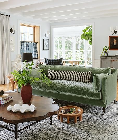 photo by kaitlin green | from: farmhouse living room reveal


Striped Velvet Ball Pillow | Toivo Pedestal
In case you didn’t know and have been waiting for Lulu and Georgia to have a sale then y’all this is your week! Until Tuesday night (10/10) they are giving 25% off sitewide for their anniversary sale. We don’t have to tell you what fans we are giving that we’ve been using and loving their products for YEARS. Above are just a few things that we’ve gotten recently like Emily’s beautiful green traditional sofas and Jess’ cognac-colored Ginny MacDonald sofa. We can confirm their real-life beauty and more importantly their real-life comfort. Then Emily bought and loves the Sarah Sherman Samuel new striped ball pillow (that also comes in more colors) and her very cool pedestals! They add a wild cool contrast to her farmhouse aesthetic but would look awesome in so many types of homes.
From Jess: I found the perfect pair of heels! Actually, I talked about them in another color for a wedding last year but only as ones I was looking at. This year my brother is getting married (in less than 2 weeks!!) and I needed black heels that wouldn’t sink in the grass during the ceremony. I went back to these, slightly underwhelmed, but couldn’t find anything I liked more that fit the bill and the budget. But then to my delight, they look SO GOOD ON! Like really good. And here’s the other great part – they come in A TON of colors and I was able to get mine for half the price on Poshmark! The heel is around 3.75″ so they aren’t short but they feel comfortable so far (I am going to try these gel pads because I don’t plan on leaving the dance floor:)). I highly recommend!
Also From Jess: Undereye concealer was the first “real makeup” my mom ever bought for me. I got these dark circles from BOTH sides of my family. I had no chance. Needless to say, I have tried A LOT of concealers and have always come back to the NARS Radiant Creamy Concealer until I found HAUS LABS’ Triclone Skin Tech Hydrating + De-puffing Concealer with Fermented Arnica. Because I now learn 80% of new things on TikTok, that’s where I was convinced to try it. It was a risk but one that has PAID OFF! Thanks to The Lipstick Lesbians’ Concealer Wars video. What’s great about it is that it’s hydrating and doesn’t need any powder to set! As in it will look worse with powder (or so said the kind Sephora employee who was helping me). Now it still will crease a little (because duh, wrinkles) but less than other ones I’ve tried. It’s also medium coverage which I prefer given I don’t wear a ton of face makeup but also have dark circles that need covering. However, it’s also buildable when I do want more coverage if I’m wearing more makeup. Super pumped about this new find!! Thanks gals!
From Arlyn: There are some household products you can’t believe you ever lived without, and this Fels-Naptha laundry bar soap is 100% one of them. My family’s clothing is plagued with stains. Marinara, oil, Greek yogurt, and a multitude of other kid-friendly foods. It’s always smeared all over us and sometimes, my detergent just isn’t enough. Basically, you just rub the bar on the stain, and then wash like normal. It’s AMAZING at taking out really tough stains, especially on light fabrics. Grass stains, dirt, food…all of the above. I even used it on old set-in stains that didn’t wash out the first time with just detergent, and it got the job done. Best $5 spent in a while!
Have a beautiful rest of your day. xx
Opening Image Credits: Styled by Emily Henderson (me!) and Birdie Henderson | Photo by Kaitlin Green | From: A Vintage Halloween Inside Our Farmhouse – Creepy Portraits Of Dead Strangers And Googly Eyes Included (Per Usual)
The post The Link Up: Em’s Cool Layering Shirt She Loves, The Best Undereye Concealer Jess Has Used In Years, And The $5 Magical Stain Remover We Won’t Live Without appeared first on Emily Henderson.


October 7, 2023
The Year Of The Structured Mini Skirt – Cute Skirts And How I’m Styling Them

In the continued attempt to not constrict my crotch/stomach with uncomfortable clothes and yet still feel/look put together when I leave the house, I’ve had to make a pretty big winter life pivot. I’ve worked from home for the last ALMOST FIVE years so my tolerance for being uncomfortable when I do leave the house (rare) is very, very low. Of course, I’ve adopted the drop crotch pants but as you can imagine not everyone (ahem, Brian) is a massive fan of the cool “saggy bottom” look, and yet the super baggy jean trend doesn’t look good on all of us. As you have probably surmised from years of seeing me wear teeny tiny shorts I’m more apple-shaped (I carry more weight on my top than bottom) so I like a blousier top and skinny jeans. But skinny jeans aren’t that comfortable (some are) and apparently they are not having a moment right now (but rumor is coming back soon???). Also, I feel so frumpy in the “blouse on top and baggy on bottom”. So this winter for going out I’m leaning into the structured mini skirt – with tights, socks, and boots. Here are a few that I’m loving (and more affordable options at the end).
A Patterned (And Quilted) Number


Jacket | Shirt (similar) | Skirt | Socks (similar) | Shoes
Here we have a quilted plaid skirt that I just bought. I paired it with a fancy sock because that’s a thing apparently and I think I like it (especially with those pumps that I got years ago and rarely wear). The denim blazer is the one from Madewell that I love (roomy but still flattering). I bought both a size 4 and 6 in the skirt and much prefer the 6.
A Large Floral In A Tiny Skirt
Jacket | Blouse (similar) | Skirt | Boots
While Brian remarked how this looked very sofa fabric-esque (not wrong) I LOVE this “suit”. I bought it for an event then realized that in Portland I might have stood out more than I wanted to while I was there (I was right). This is thick brocade-like fabric and really busy (and thus forgiving). Of course, these boots are the star of the show (and come in blue suede, too which I wish I had bought but I love these).


This matching jacket look might not be for everyone (or every occasion) so I also tried it with an oversized sweater which is probably what I’d wear more often.


The sweater is old from Alex Mill and has a cute boxy cut with dropped shoulders. It takes what could feel more statement-y and calms it down a lot. The skirt is short but pairing it with suede over-the-knee boots (are we still saying thigh-highs?) covers up most skin and would look cute with brown tights, too. I also like the boots being suede instead of leather as it also tones it down a bit.
A Little Denim Number
Sweatshirt (similar) | Bandana (similar) | Skirt (similar) | Belt (similar) | Boots (similar) | Bag (similar)
I’ve had this skirt for a long time and just unearthed it (same with the boots!). I threw on a vintage sweatshirt, bandana, and belt (although I think I’d skip the belt next time).


This feels far more fall than winter, but tis the season 🙂
A Black Leather Mini – But Make It Serious 🙂
Blouse | Skirt (similar) | Tights (similar) | Boots (similar and only $25!)
Another skirt I’ve had forever that I’m so glad I kept (same with the shoes, but these are so close). I wanted to calm down the vibe of the black leather with tights, wooden-heeled shoes, and again, a blousy top (I just bought this for a huge shoot I had a few weeks ago).


I really look like I love drinking coffee in my mini skirt ha. But honestly, I do really love this look and feel good in it. So if you are interested we pulled together a handful of affordable options with some great size-inclusive picks too!
 Denim Micro Mini Skirt | 2. High-Waisted Mini Skirt | 3. The Colette Faux Leather Mini Skirt | 4. Jacquard Mini Skirt | 5. Denim Mini Skirt | 6. Houndstooth Mini Skirt | 7. Saddle Wrap Mini Skirt | 8. Faux Leather Mini Skirt | 9. Corduroy Miniskirt
Happy Saturday and happy mini skirting. xx
*Photos by Kaitlin Green
The post The Year Of The Structured Mini Skirt – Cute Skirts And How I’m Styling Them appeared first on Emily Henderson.
October 6, 2023
The Ultimate EHD Vintage Resource Guide (Our Best Tips, Hacks, And Shops All In One Place!)

Earlier this week I talked about my vintage bathroom (well, mostly about my vintage toilet), and the love in the comments for all things vintage was resounding. Despite knowing this blog was heavily built on the love of vintage, it was a little reminder of just how much! I hope it’s clear that our love for vintage is as deep as ever too. So with all that said, I thought I’d grab all of our amazing vintage content (tips, tricks, and resources) all in one place. Even I forgot about some of these awesome posts! To give credit where credit is due these posts are almost exclusively written by Emily and Caitlin and for good reason – they are pros!! I’m truly never not endlessly impressed by their knowledge. I’m sorry (not sorry) if I send you down a very fun vintage decor wormhole. See you on the other side!
The Best Places To Buy Vintage Furniture And Decor Online (You’re Going To Want To Bookmark This One) photo by sara ligorria-tramp
Sure, we all know Etsy, Chairish, Craigslist, etc. but this isn’t just that. This list by the one and only Caitlin K. Higgins is a thorough, in-depth list of truly awesome online shops for great vintage finds. I figured I’d start with this one in case you just wanted to immediately start window shopping. BUT, may I suggest you keep scrolling because with more information you might get better results:)
The Vintage Design Cheatsheet – Names You Should Be Searching To Find The Pieces You Really Want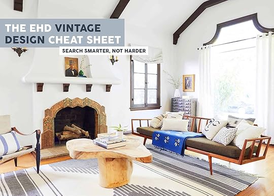 design by michael keck | photo by sara ligorria-tramp
I remember when Caitlin pitched this post and I instantly thought, “YESS!! I NEED THIS!” Not only does she give you specific keywords to search, but she breaks it down by style. Gone are the days (if you want) of endlessly scrolling to maybe find one thing you might bookmark. Work smarter, not harder. And no, we don’t deserve her.
15 Flea Market Secrets; How I Find The Best Vintage Pieces (From 2012!!)
This might be one of Emily’s first flea market tip posts since it’s from 2012! But you know what? It’s still GREAT info and there are extremely fun pictures of cool vintage finds and Orlando and her having a lot of fun together. A true gem.
How to Haggle (Or Not) At The Flea Market Like Emily Henderson
So actually I technically wrote this post but I interviewed Emily for it as I am only kind of sorta ok at haggling…I needed her advice! Emily is big on respecting the vendor but also knows there’s fun in the haggle game for both parties:) I highly recommend you read these tips to make sure you are getting a great deal and that the vendor feels good about the sale too! Plus look at this sweet photo of Toddler Charlie that I forgot I put in there!! See everyone loves vintage.
 Budget Hacks: Caitlin Furnished Her Apartment Basically For Free (& You Can, Too)
Another Caitlin vintage post that blew my mind! She takes you through how she basically hasn’t paid for her large vintage furniture pieces in years. This might be the most useful budget hack I’ve heard about.
Just A Couple Of EHD Gals Back At The Rose Bowl (A Real Flea Market Diary With Some Very Helpful Tips)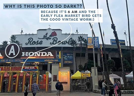
Speaking of Caitlin, a couple of years about we decided to go to the Rose Bowl together and write about it! It was extremely fun and fruitful (as you’ll read) but before we get into the adventure, Caitlin takes you through all of her personal flea market tips! Things like what to wear, what to bring, when to get there, etc. I might be biased but it’s a fun and happy read:)
My Latest Vintage Haul + HOT TIPS On What To Buy (& Skip) At The Antique Mall/Flea Market photo by veronica crawford
If you think you already read all of her shopping tips from the first post you are wrong. This post is filled with really useful, practical advice that Emily uses herself when shopping for vintage. It’s about how to look for great pieces that won’t give you buyer’s remorse. A must-read!
Consider This Post Your “Craigslist Hacks Master Class” for Buying Good Stuff Cheap (& Selling it For $$$)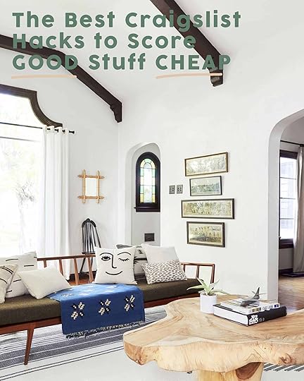 design by michael keck | photo by sara ligorria-tramp
The pitch of this post was when we found out that Caitlin (an EHD employee of two months at the time and now over four years) previously had a side business/hustle buying and selling furniture! Her tips were (and still are) INCREDIBLE. She really takes you through how to spot the good stuff for cheap, gives a super in-depth best practices guide for searching on Craigslist, AND teaches you how to sell online if you are interested. Another GREAT one.
Find GOOD Furniture On Facebook Marketplace For Cheap (+ The Search Terms To Use) photo by sara ligorria-tramp
This is the only Facebook Marketplace guide you will ever need (well for vintage shopping that is). Caitlin does it again, showing and telling you how to really find what you want on FBMP! It’s very detailed which is such a gift.
The 20 Best Vintage Instagram Sellers That Are Delivering To You (All Across The USA)
Now this post was born out of the pandemic, wanting to support wonderful vintage sellers that were being greatly affected by the lockdown. Thankfully, we are back outside and at those flea markets, but this is still an incredible guide that is categorized by state for those who’d rather scroll on their phone than hit the pavement to find awesome vintage.
Our Ultimate Vintage Rug Resource Guide photo by genevieve garruppo
Our love for vintage rugs runs deeeeep and this post is a beloved one by all. But in case you didn’t know it existed and had your heart set on a beautiful vintage rug then we hope this helps! Don’t worry there are great buying tips as well as descriptions for different types of rugs too:)
How To Find Great Vintage Lamps (7 Hot Tips And 9 EHD-Approved Online Shops) photo by david tsay
 Vintage lighting may be my kryptonite because I couldn’t count the hours I’ve spent looking at vintage lights. This post however gives you great tips and even greater shoppable stores to start your journey. If you haven’t ever had a vintage lamp in your home, we promise it’s a game-changer.
My Favorite Before And After Vintage Pieces (With Some “Good To Knows” For Vintage Shoppers) photo by tessa neustadt
 Emily is no stranger to buying a piece of vintage furniture and customizing it while maintaining the integrity of the piece. So in taking that journey many many times, she’s learning a thing or two to look out for. It’s so fun to see so many of her transformations and very useful to see the power in it! Go check it out if only for the eye candy:)
46 Of Our Favorite Etsy Shops That We Keep Going Back To Again And Again design by lea johnson of creekwood hill | photo by erin francois
 And finally, we’ve come to the end but ending very strong with…Etsy! Man, we love Etsy and so do you if our numbers are any indicator:) So Ryann, another Etsy fanatic, put together this incredible list of sellers. Fair warning they aren’t all vintage but there are a ton of great vintage options.
Hope this was fun, got you excited to look at some vintage, and sent you into the weekend in a good mood. It’s almost guaranteed to when talking about beautiful old things:)
Love you, mean it.
Opening Image Credits: Photo by Sara Ligorria-Tramp | From: Styling To Sell: How We Staged Our Dining Room And Kitchen (With The Changes I Should Have Done Years Ago!)
The post The Ultimate EHD Vintage Resource Guide (Our Best Tips, Hacks, And Shops All In One Place!) appeared first on Emily Henderson.
October 5, 2023
Plagued With Boring Closet Doors? Arlyn Explores (Renter-Friendly) Ideas For Making Hers Less Sad
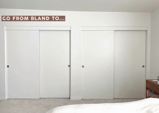
Can you believe it?!? I’m not talking about kitchens! But I *am* talking about how to make something so-so in your home better without ripping things out and starting over (particularly helpful for renters like me who have no other options). I write this currently sitting on my bed, looking to my right onto the world’s most boring, mundane wall full of sliding closet doors. I mean, it’s the entire right wall of my bedroom. I can’t place furniture on it, I can’t hang art, I’m stuck in an all-white cheapo hollow sliding door design purgatory here.
And in case you can’t picture it, I came prepared:

While yes, I am grateful for a decent amount of closet space as compared to my old 1930s apartment, it pales in comparison to the charm of my previous room. Here, take a look, in case you forgot my Makeover Takeover reveal (how dare you):
 photo by sara ligorria-tramp | design by arlyn hernandez | styling by emily edith bowser | from: 3 years in the making then an unexpected move: arlyn’s bedroom reveal is a lesson in the beauty of “unfinished” design
 photo by sara ligorria-tramp | design by arlyn hernandez | styling by emily edith bowser | from: 3 years in the making then an unexpected move: arlyn’s bedroom reveal is a lesson in the beauty of “unfinished” design
I still have all the pieces pictured here, but now I have this closet wall to contend with. Frankly, I’ve ignored it wholeheartedly since we moved in seven months ago. I didn’t even let the thought of a “project” creep into my mind considering my entire first floor is one giant unchecked box on my house to-do list. But I’m nothing if not absolutely unreasonable with myself and suddenly, I find myself itching to do something about it.
That, and the same closet situation in my (also unfinished) daughter’s room:

Now, what I’m about to walk you through should hopefully serve two purposes:
#1: Inspire anyone reading who may have a similar boring-as-a-sack-of-flour closet door situation in their own homes.
and #2: Completely derail my hopes for a calm, renewing fall and winter season. (I’m kidding, nothing gets me more excited than a home project, but I’m afflicted with a condition called ICantSeemToFinishAnythingBeforeStartingTheNextThing-Itus. It’s quite serious and my doctor says there is no cure. Have you heard of this?
Regardless of the tragedy of #2, I must volunteer as tribute to help with #1. Let’s start in my daughter’s room.
3 Ideas For Leveling Up the Sad Closet Doors in My Toddler’s NurseryFirst, for anyone sitting here, reading and wondering why I would even bother undertaking this task, know that it’s for a VERY good reason: because I want to. Particularly for my girl’s room, I’ve been meaning to do something about her plain walls. I’m not showing it here, but I hung a pair of curtains on her window that I sewed about 10 years ago with a gorgeous watercolor floral pattern. I swore if I ever had a daughter, they would go in her room, and so here we are. Lavender is one of the key colors in the fabric so I always knew if I went forward with intentionally decorating her space, it would be the hue I brought to the walls somehow. I thought of simply painting, but my sweet girl just loves pointing at all the things that excite her so much, including butterflies (and yes, the color purple, too).
So every option below includes a lavender butterfly print I stumbled upon from a brand called Love vs. Design.
Idea #1: Paint the Doors a Coordinating Color to Wallpaper
I like this mock-up more than I thought I would before doing it in Photoshop. The doors are still there, still plain, and still enormous, but the purple feels intentional and kind of a nice visual break from the busier wallpaper repeat. One problem remains, however: never being able to access all parts of the closet at once. The door on the left and right meet in the middle to cover the center door which is a little recessed. I can’t tell you how bothersome it can be when I’m sliding doors side to side to side to grab a pair of leggings….sliiiddee….get a shirt…oh wait, it’s chilly…sliiiddeee….pick a sweater….sliiiddeee…pull some socks out of the little dresser I have inside. Will I survive if the doors survive? 100%. Will I dread putting away Evelyn’s laundry every week more so than I would under normal circumstances? Also 100%.
Idea #2: Swap Doors for Curtains to Match Wallpaper
While I do think this looks soft and welcoming and lovely (you know…if you can get past my C- Photoshop skills), remember that there is already a pair of drapes in this room, directly across from these. I think it just might be too much fabric everywhere. Not to mention, have you ever met a 1.5-year-old? Hanging fabric to a toddler is like a freshly delivered box of pizza to me: absolutely irresistible. Not to also mention having to break the news to my husband that I have yet another thing to store in the garage that already doesn’t fit either of our cars…
BUT, if I did go this route against all odds, I could buy some simple white cotton IKEA drapes and stain them in this pretty purple shade from Rit.
 Idea #3: Just Put Wallpaper on *EVERYTHING*
Being that the wallpaper I’m considering is peel-and-stick, I wanted to see what it might be like if I just…stuck it everywhere, including the doors. I do very much worry about what the doors would look like after removing it since they’re flimsy and seem kind of papery, tbh. I suspect I’ll have a bit of a mess on my hands, but let’s just take a look, shall we?
Here’s a little inspiration from an Architectural Digest home tour. It’s hard to go wrong with any application of a de Gournay hand-painted wallpaper, surely. See how lovely?
I’m afraid the effect wasn’t as, uh, successful when I mocked it up. It’s a bit of an assault on the eyeballs, but I also don’t want to discredit the shortcomings of this being a flat, digital representation with no shading, shadows, or IRL anything. It feels kind of wild here, but I’ve seen it done successfully elsewhere and I’m certain this would look much better off a screen and in a real room. Regardless, it’s not the solution I think works best for the space.

If I’m picking right here and now, I’d go with option #1, since I don’t have to worry about storing the doors or ruining them with wallpaper. Painting back to white would be a very straightforward task upon moving out. I’m even contemplating hanging some lightweight art on them with command strip velcro to give them more of a wall treatment but I haven’t decided if that’s the rantings of an exhausted, braindead toddler mom or a genius idea. Thoughts?
Alright, let’s move on to my bedroom, where I cooked up far more choices to talk through.
Have another quick look at where we’re starting:
If these were bi-fold doors, my options would be considerably more interesting, but instead, I’m working with large 36×80 sliding doors. If anything, these are actually worse than my daughter’s because I can’t ever fully access the center of my closet. There is always a door in the way so I have perpetual dead zones to deal with. Total bummer.
A few scrolls through Pinterest while searching for ideas to better my doors had me ready to roll up to Home Depot and just buy new doors. Maybe I could swap them out to open myself up to a whole new world. Of course, I didn’t think through it fully before getting overly excited that I wouldn’t know how to handle the actual track system that’s already in place or the headrail I’m not going to bother removing. Also, did you know how expensive even the cheapest bi-fold doors are!?!? At best, they’re each around $150 (so $600 total here), at worst, they’re several hundred dollars each. That’s a no-go, because while yes, I have 19 months of sleep deprivation debt in my tank, I’m not that deranged.
But should you have bi-fold doors, here are some of my favorite ideas for making them better:
I adore the gathered fabric in that photo above (did you also spot the mulberry-hued printed lampshade?). If you were skilled enough, you could just cut out the top portion of your door and add your textile of choice to a top and bottom dowel which you can affix to the door with a small pipe bracket.
Caning was by far the most common DIY for bi-fold closet doors. I do love the look, and if you want to know how to achieve it, Pinterest has more tutorials than my face has visible pores.
At first, I thought this was also caning but a bit of zoom tells me it’s actually a reeded panel. Cute.
This last one isn’t a bi-fold door, but rather more so what I have in my house. These are actually custom from a seller on Etsy but they do give me an idea for a possibly reversible DIY (keep reading).
Idea #1: Just Paint Everything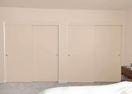
Look, I realize this doesn’t look very good. I’m actually laughing as I stare at this concept. This is English Scone by Dunn-Edwards which is the color that was in my previous bedroom. I loved it against the mustard velvet bed and the rich walnut wood tones in my storage pieces. Anyway, let’s move on…
Idea #2: Use Curtains To Replace Just The Doors
I don’t hate it. In fact, I kind of like it. It *is* a lot of fabric, but the room is large so it wouldn’t be fabric overload in addition to my actual window covering. The ticked brick red color of these IKEA curtains would be great against the fleshy pinky peach and give enough contrast that it feels tonal but interesting.
Idea #3: Use Curtains To Cover *Everything* UpI love the look of a full floor-to-ceiling drapery on a ceiling track lately. It’s less “ballroom-turned-conference-room at the local Marriott” and more boutique hotel with the right vibe. I think my furniture can support the aesthetic, however…not on this wall (it’s something I’m considering for the wall behind my bed with a VERY uncentered window…more on that in another post). See what I mean:

When there’s nothing against a full wall of drapery, it just looks like you’re trying to hide something, which is exactly what I’m doing. NEXT!
Idea #4: DIY Some Character Onto The DoorsThe above pin sparked an idea for me: what if I use command strips or the like to affix some “molding” to them and at least make them more interesting to look at? I could buy some very thin sheeting, cut out some simple shapes like below, and then attach it to the door. I can’t do much about the existing handles, but that’s alright.
What I can’t help but ask myself is…am I actually going to do this? Or am I going to mentally commit to it, and then let the idea haunt me for months on end and make me feel like a failure for not making the time to do it? Possibly, unless a certain handy friend of mine ::cough Jess cough:: helps me tackle it.
 Idea #5: Add Curtains & Wallpaper
Allow me to riff off my just-curtains concept to see how this Backdrop wallpaper I’m obsessed with looks. You know what this is? It’s like going to the mall (what’s that?!?), trying on a very expensive dress you know you can’t afford to torture yourself, and then talking yourself into buying it. I say that because I have NO intention of wallpapering my bedroom. I barely have intention of painting it, but that’s far more reasonable for me to undertake. But seeing this is like me calculating the cost per wear of something I promise myself I’ll never take off to justify the cost. But doesn’t it look great?!?
Idea #5: Wallpaper & Cool Doors Combo
And now we enter the part of this story where Arlyn lies to herself about who she is and how much time she has to do anything in her house. Wallpaper AND DIY my doors? SURE WHY THE HELL NOT. But admittedly, it looks so tidy and sharp…uh oh…
Idea #6: Try Another DIY That’s Probably Even More Complicated Than The FirstView this post on InstagramA post shared by Cyn (@hotpinkpineapples)
What’s that saying? When in Rome? (Or rather, when in DIY dreamland?). Cyn from DIY account Hot Pink Pineapples transformed her boring sliding closet doors in her previous rental with some raffia webbing, paint and thin sheeting cut with a jigsaw. Honestly, she made it look easy. While I do like it, does it feel too “now” with the pill shape cutouts? I think it could be fun, but maybe not in the English Scone I mocked up here:


I like it better if the whole wall is painted the same color as the doors, but again, will I ever really do this? (I hope someone reading does though…send me pics!).
That was A LOT to take in and you probably forgot what the other ideas looked like already, so let’s have a gander at them all side-by-side:

Looking at everything together, the top contenders are fairly obvious to me: #2, #4, #5 and #6. Option #4 would require no painting of me, but I do very much miss that warm, glowy color on my walls. Shall I share Charles’ phone number so my EHD cheerleaders can convince him it’s the right move, too? The wallpaper is hugely tempting, but it’s a big room and that’s a lot of paper…It’s also not peel and stick, so I’d have to hope my liquid fabric starch method I’m trying in my powder bathroom works down there and up here, too.
Honestly, I don’t have a solid answer or path for myself even after walking through all of that. Desire is one thing, but the realities of doing the work are another.
Help me decide, and if you have any other suggestions for my room and Evelyn’s, please drop them in the comments.
Your (indecisive and a little bit lazy) friend in design, Arlyn
The post Plagued With Boring Closet Doors? Arlyn Explores (Renter-Friendly) Ideas For Making Hers Less Sad appeared first on Emily Henderson.
October 4, 2023
A Vintage Halloween Inside Our Farmhouse – Creepy Portraits Of Dead Strangers And Googly Eyes Included (Per Usual)
I didn’t really have any intention of doing much inside our home for Halloween until Brian was watching football all Saturday a couple of weeks ago and I didn’t have much to do so I put on a podcast, started shopping from my prop garage, and went to Halloween TOWN. I had enough leftover from outside decorations to fully deck it out and within a few hours had four fun areas with ample spook.
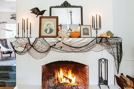
Black Cloth | Orange String Lights | Black Taper Candles | Candle Holder Trio | Crow | Mirror | Dolls (vintage) | Candelabra (vintage)
The black creepy cloth was leftover from the covered walkway (I originally wanted to mix black and white cloths but it didn’t look good.)This one is from Target and $10 and wow, quite the impact. The mirror was leftover from the Crate & Barrel kitchen shoot and it’s so pretty (and has that slightly Victorian vibe which fits this vibe). I found the creepy dolls during my mimosa-infused birthday vintage shopping trip with Kaitlin (shout out to Monticello Antique Marketplace and adjoining cafe). The candles are a mix of vintage ones I had and this trio from Target.

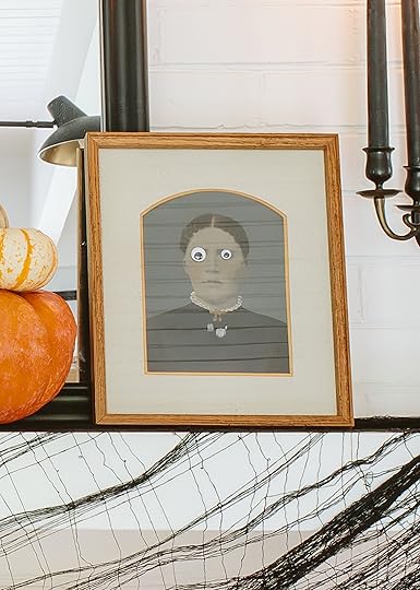
When it comes to portraits of dead people it’s the almost unanimous feeling by all family members that these are “creepy” and “weird”. And they are very vocal about it. FINE. So one month a year they will make their debut inside. This year Birdie and her friends helped don them with googly eyes (they put different sizes on each eye which I think is a GREAT styling touch). I also want to point out that we are not going to light the candles on the mantel and I plan on replacing them with battery-operated ones (much to Orlando’s total disgust:)). Brian came in and schooled me for open flames near the cloth and the, you know, feathers… Don’t do this at home, obviously, and was just for the shoot.
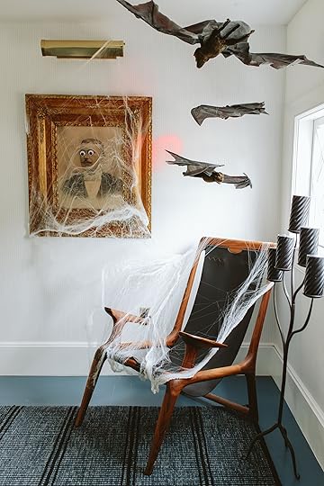


Floor Candelabra (vintage) | Target Pillar Candles | Bats | Spiderwebs | Portrait (antique)
The stairway wasn’t a normal place to decorate for Halloween, but I had that large antique portrait so I popped it there, found this floor candelabra (shout out to Jess for her well-timed post last week), and bought these $8 twisted candles from Target (I like how they catch the light in a pretty way). I had bought two boxes of bat trios but only used one on the front porch so hung these here and threw some spiderwebs on the whole thing.

Pre-Lit Twiggy Trees | Portrait (antique) | Baby Doll (vintage) | Skeleton Hand | Spider | Radio (similar)
Another creepy cloth + dead doll + orange lights moment. This time without the googly eyes because it’s an actual painting (and was splurgy from an antique mall, she is from the 1700s!!!). Still perfect for Halloween, but she stays there year-round. The “vintage” radio is from Target, again like eight years ago and it plays spooky static with voices that the kids love.

Light Up Ghostly Dress | Broomstick | Pre-Lit Twiggy Trees
Inside we hung this hanging headless lady that I thought I was going to put in entry but it didn’t have any power there (white dress against white house and already had black bats and spiderweb). She is PERFECT here. We’ve had that black plastic cat from Target for seven years and it still terrifies me (if you walk by it will move its head and screech at you with red eyes). It also terrorizes the pups.

Likely my favorite of them all is the entry. We took down the art (thank goodness for that gallery rail) so Mom and Dad could go here. There is definitely a dead bride vibe with the white spooky cloth. I got them both together from an antique store in Sellwood. I loved their blue color palette (shocker).

There you go – Halloween inside and out (check out the front porch and covered walkway if you missed it). Birdie helped with most of it because she is my little styling buddy (truly some of the most joyful seconds of my life are doing this with her). Thanks to you all for giving us an excuse to go for it 🙂
*Styled by Emily Henderson (me!) and Birdie Henderson
**Photos by Kaitlin Green
The post A Vintage Halloween Inside Our Farmhouse – Creepy Portraits Of Dead Strangers And Googly Eyes Included (Per Usual) appeared first on Emily Henderson.
October 3, 2023
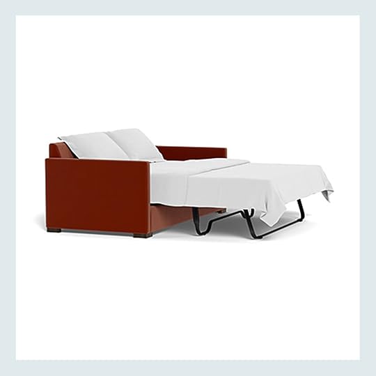
22 Design-Forward COMFORTABLE Sleeper Sofa Beds That Make Your Eyes Happy And Your Guests Sleep Well

…because I have a new dream sofa, guys. Huge news alert: after about a year and a half of long-distance dating (and more cross-country flights than I can ever begin to remember), my cute and kind boyfriend Dennis and I are making plans to turn my LA apartment into our LA apartment. (Ahhh!!!! Please drop any cohabitation tips in the comments, if you have them.) Our first order of business? Acquire a sofa or sectional that we can both simultaneously lounge on comfortably. (Den loves my current vintage leather number and thinks it’s more comfortable than I do – he’s definitely napped on it more frequently than I have! – but your girl is a SPRAWLER who’d prefer some space for both of us to lay down, you know?)
To that end, I’M IN THE MARKET FOR A NEW SOFA. And since Dennis and I both still have family and friends back in Delaware, I’d love it for the aforementioned new sofa to double as a bed for guests. (I hosted one of my best friends for about 10 days earlier this spring and I gotta say that the air mattress really lost its luster – I can’t put anyone through that again!) ANYWAY. I’ve spent the past couple of months researching – I will not make an uninformed sofa purchase again! – and today, I wanted to share the 22 design-forward sleeper sofa beds that I’ve considered for my own apartment. They’re all highly-rated, comfortable (both the “sleeper” part and the “sofa” part), and aesthetically appealing. I’ve also noted shipping times, for those of you looking for a quick addition to your home before the holidays, and I’ve called out the pieces that were made here in America (in case that’s important to you). You can scroll down to get to the picks, but first, I wanted to answer a few FAQs…
Four Quick FAQs About Sleeper Sofa BedsHow long should a sleeper sofa bed last?A LONG TIME. Look, you’re not going to use this as your everyday bed – most of these mattresses are around 5″ or 6″ thick, so they’re not built for daily use – but a modern sleeper sofa should last at least 5 years. Designers will also throw around the fact that sofas can last “up to 17 years,” but honestly, the pieces I’ve linked below are high-quality. They’re the ones that you’ll find in 50 years at the flea market. If you take care of them, they’ll take care of you.
Are any of them actually comfortable?YES. I’ve done a lot of research – both in-person and via talking with experts – and both furniture and mattress technology have come A LONG WAY. (I mean, we can ship mattresses in boxes now – of course we can fit more comfortable beds into sofas.) This ain’t your grandma’s 1970s sleeper! The sofas really feel like sofas, too – not just like a cushion on top that’s been balanced atop a metal frame. If you’ve written off the sleeper, you might want to try one out at a local store to see how different they feel now!
Why are they so expensive?OH MY GOSH. This is MY question, too. And to be clear, you can absolutely get a sleeper sofa for $300 – $700…it’s just not going to be the most comfortable, and it’s not going to stand the test of time. Honestly, a lot of the options below will require a hefty amount of planning and saving (at least for me – sofas are expensive!), but I’ll also be keeping an eye out for any and all of these styles on Facebook Marketplace or OfferUp. They’re expensive because they were made from high-quality materials by people who really know what they’re doing, you know? (But that also means these sofas will be just as good secondhand…so keep those eyes peeled when you’re trolling for finds on Facebook Marketplace! You might score a deal. :))
Why don’t my sheets fit right on my sleeper sofa bed?THIS IS THE MOST IMPORTANT QUESTION. Huge PSA: oftentimes, a “queen-sized mattress” in a sleeper IS NOT A QUEEN-SIZED MATTRESS. Some quick numbers for you to keep in mind:
A twin bed is 38″x75″. A full bed is 54″x75″. A queen bed is 60″x80″. A king bed is 76″ x 80″. And the most common “sleeper queen?” 60″x72″. That’s right: sleeper mattresses are often significantly shorter than TWIN SIZED BEDS. Just something to keep in mind!I’ve highlighted bed sizes below – you’ll see true kings, queens, and fulls, alongside a selection of “sleeper queens” with more petite profiles. If your guest’s comfort is a priority (or if you come from a particularly tall family), be sure to check the actual dimensions – sleeper queens are totally fine for quick stays, but they may become frustrating after several weeks. No one loves their feet hanging off the edge of the bed for that long, you know? ANYWAY. You’ve officially been briefed – onwards to the picks!!!
Mulholland Drive Sleeper Sectional


Pricing: From $4,622.40 (On Sale)
Timing: Ships in 2-4 weeks.
Bed Size: Full
Customization: 50 fabric options, 3 leg finishes, left or right chaise, standard or memory foam mattress available.
Manufactured: Made to order in the USA.
Procrastinators, this one is for you! Apt2B is going to be your best bet for stylish, comfortable, and quick-ship sleeper sofas and sectionals that are easy to customize. I love the wood base and clean lines of this sectional, but you’ll also see a few more of their pieces below.
Landry Sofa Bed


Pricing: $1,899
Timing: Back in stock in 2 weeks.
Bed Size: Sleeper Queen
Customization: 2 colors available.
Manufactured: Produced abroad.
OK, ARTICLE! I see you. Talk about the look for less, right? (I’m partial to the taupe color, TBH.) This sofa looks like it costs at least twice as much, but there is one caveat: the mattress is pretty short. (Only 68″ – that’s 5’8″, for all of us doing the quick math.) That’s may be a welcome trade for some – I know I’d take a short mattress for a sofa that looks this good at that price! But if your family and friends err on the taller side, you may want to consider investing in a different option.
Coniston Sleeper Sofa

Pricing: From $4,273.50 (On Sale)
Timing: Ships in 6-8 weeks.
Bed Size: Queen, King
Customization: 8 fabric options.
Manufactured: Made to order in the USA.
Like this little number, designed by our very own Ginny Macdonald! (Em is thinking about putting a king-sized sleeper in her guest room, so you know I sent her this one to consider.) The best part: the included mattress is SUBLIME. No joke – the reviews confirm it unanimously, too. The Coniston is perfect for those who want the best of both style AND function. (PS. It’s currently on sale for 25% off, in case you want to bring it home before the holidays.)
Jylin Woven Athena Sleeper Sofa


Pricing: $2,898
Timing: Available December 2023.
Bed Size: Sleeper Queen
Customization: The standard version comes in 49 colors.
Manufactured: Made to order abroad.
FUN, RIGHT? A bold, vintage-inspired print meets a simple, minimalist shape. Perfection. If you have a more formal living room, the Athena sleeper might be a great fit for you (note the lack of back cushions – she’s more of a “sitting” sofa, if you know what I mean). If the print is a little too loud for your taste, though, never fear – this clean silhouette also comes in 49 other cheery shades. 🙂
The Mellon Sofa
Pricing: From $5,450
Timing: 10-14 days for sketch approval; production times may vary.
Bed Size: Twin, Full, Queen
Customization: 12 layouts, 194 fabrics, 9 widths, 4 depths, 9 cushion configurations, 3 cushion fill options, 3 base styles.
Manufactured: Made to order in the USA.
The Mellon was designed as a nod to the “chic, geometric stylings of the 1970s”….and, well, mission accomplished. This one comes from Clad Home and it’s endlessly customizable (seriously – you can work one-on-one with their team to build the exact sofa of your dreams).
Soto Queen Sleeper Sofa Bed


Pricing: From $2,150.40
Timing: Ships in 2-4 weeks.
Bed Size: Sleeper Queen
Customization: 90 fabrics, 2 leg finishes, standard or memory foam mattress available.
Manufactured: Made to order in the USA.
Here’s another easily-customizable, quick-ship beaut from our pals at Apt2B. (Did you know Arlyn used to work there?) A timeless shape and great construction at a budget-friendly price – what else could you ask for?
York Slope Arm Deep Seat Slipcovered Side Sleeper

Pricing: From $3,499
Timing: Arrives in 8-10 weeks.
Bed Size: Queen
Customization: 2 cushion configurations, 120 fabrics.
Manufactured: Made to order abroad.
LOVE this sleeper for so many reasons. The sideways construction is genius – it’s a great way to fit a full-sized queen mattress into a sofa. (Caveat: if you’re sleeping 2, someone’s going to have to do a little gymnastics move if they need to get up in the middle of the night. To that end, this may not be the best choice for hosting your grandparents.) I’m also partial to the fabrics available – I’d go for one of their performance options, like Sunbrella, to keep it all easy to maintain.
James Sleeper Sectional With Contrast Piping

Pricing: From $4,595
Timing: Arrives in 10-14 weeks.
Bed Size: Sleeper Queen
Customization: 25 fabrics, 25 piping options, left or right chaise, 2 chaise lengths, bench cushions available, 3 fill options, standard or memory foam mattress available.
Manufactured: Made to order abroad.
Oh man…after working on this post, this one miiiiight be turning into my first choice. I’d love a sectional (you know, with space to sprawl), but I’m also loving the bumper (I see a little console table/desk pushed up to that edge in my future!), the piping, the bench cushions, the extra-long chaise – OH MAN, I’M SELLING MYSELF. Don’t be surprised if (when?) I accidentally add this to my cart on Black Friday, okay?
Una Sleeper Sofa


Pricing: $1,999
Timing: Estimated early October.
Bed Size: Full
Customization: 2 fabric options.
Manufactured: Produced abroad.
The classic futon gets a modern upgrade in the Una Sleeper. (And believe it or not, it’s comfortable, too – it’s made from springs and foam, so it really is like having a flexible mattress!) If your home leans a little more “California Cool” or “effortless expensive,” this would be a great pick for you.
Spruce Street King Sleeper


Pricing: From $6,798 (On Sale)
Timing: Arrives in 6-8 weeks.
Bed Size: King
Customization: 153 fabrics, 4 leg color options.
Manufactured: Made to order in the USA.
If you’re on the hunt for a printed option, you’ve GOTTA check out the Spruce Street sleeper from Serena & Lily. This is the most expensive one on our list, but it also boasts a true king-sized mattress. (And honestly, it looks timeless in a neutral fabric, too!) I’d personally opt for a vibrant gingham or a happy cabana stripe – your guests will NEVER guess that your cheery sofa is hiding some secret sleeping quarters.
Nora Queen Sleeper Sofa Bed

Pricing: From $3,454.40 (On Sale)
Timing: Ships in 2-4 weeks.
Bed Size: Sleeper Queen
Customization: 56 fabrics, 2 leg finishes, standard or memory foam mattress available.
Manufactured: Made to order in the USA.
Here’s one for my pals whose style leans a little more glam! The Nora is universally adored by those who have purchased it – seriously, there’s not a single bad review, outside of one 4-star rating that recommends the memory foam mattress – AND FOR GOOD REASON. The channel tufting is simultaneously vintage AND on-trend; plus, you won’t need to worry about any dust or debris getting under the sofa. Dreamy, yeah?
Sherwood Sectional Sofa

Pricing: From $6,195
Timing: 10-14 days for sketch approval; production times may vary.
Bed Size: Twin, Full, Queen
Customization: 11 layouts, 194 fabrics, 5 widths, 4 depths, 6 chaise length options, 4 cushion configurations, 2 cushion fill types.
Manufactured: Made to order in the USA.
Not to be like, “it was designed by Sarah Sherman Samuel for her own home, so it has to be good,” but…I mean…it was designed by SSS for her own home, so it has to be good. This sleeper is also very spendy – the right configuration could make it the most expensive piece on this list – so be sure that you’ll really love your customizations for the next couple of decades before you add to cart, okay?
Notch Queen Sleeper Sofa

Pricing: From $2,099
Timing: Delivery as soon as Mid-November.
Bed Size: Sleeper Queen
Customization: 268 fabric options.
Manufactured: Produced abroad.
Cute, simple, stylish, AND it might arrive before your guests do this Thanksgiving? SLAM DUNK. But wait, there’s more! The Notch is a Goldilocks level of firm – not super hard (you’d never guess you’re sitting on top of a mattress!), but not so soft that it’s difficult to stand up, either. (Full disclosure: this is the sleeper that I recommend to my friends.)
English Arm Slipcovered Sleeper Sofa

Pricing: From $1,999
Timing: Arrives in 8-10 weeks.
Bed Size: Sleeper Queen
Customization: 120 fabric options.
Manufactured: Made to order abroad.
Slipcovered sofas are no joke, and this one from Pottery Barn is AWESOME. The covers are actually easy to remove, launder, and put back together – have you ever heard of such a thing?! (Love it when things actually work the way they’re supposed to.) English roll arms are pretty endlessly charming, too – how good would this look in a cozy library/office space?
Lotte Sleeper Sofa

Pricing: From $3,748.50 (On Sale)
Timing: Ships in 6-8 weeks.
Bed Size: Sleeper Queen
Customization: 7 fabric options.
Manufactured: Made to order in the USA.
If you love the look of Em’s living room sofas but need the functionality of a sleeper, well…the Lotte is for you, baby! The deep bench seat is plush and comfortable, and the mattress is simple to slide in and out. (No huffing and puffing to pull it out, I promise.)
Alesso Sleeper Sofa

Pricing: From $2,199
Timing: Estimated late October 2023 (or early January for custom fabric orders).
Bed Size: Full
Customization: 25 fabric options.
Manufactured: Produced abroad.
COOL, RIGHT? I’m disappointed to admit that I’m no longer as interested in sleeping as close to the ground as I once was, but the Alesso sleeper might be changing my mind a little bit. I’m obsessed with the safari-inspired leather straps and the cove-like nature of the sofa bed – I bet young ones would LOVE building a fort here. (On a more serious design note, I love that this is a modern interpretation of the uber-expensive, uber-iconic Anfibio sofa bed from the 1970s. It’s fun to see how pieces are reimagined over time!)
Avalon Sleeper Sectional

Pricing: From $4,214.40 (On Sale)
Timing: Ships in 2-4 weeks.
Bed Size: Sleeper Full
Customization: 57 fabrics, 3 leg finishes, left or right chaise, standard or memory foam mattress available.
Manufactured: Made to order in the USA.
The Avalon has a smaller mattress, buuuuuut it also has one of the highest seats here (20″ tall). The average sofa has a 17″ or 18″ seat (though some can be as low as 15″!), but higher seats are often far more comfortable for older guests or those of us with mobility issues (fellow back and hip pain gal, where you at?). If you’re using your sectional for lounging and quick hangs more than long, overnight stays, this may be a great option.
Willow II Slipcovered Bench Queen Sleeper Sofa

Pricing: From $2,599
Timing: Some configurations are ready to ship! (Others have estimated delivery in mid-November.)
Bed Size: Sleeper Queen
Customization: 18 fabric options.
Manufactured: Made to order abroad.
Nothing says “I’m a casual, refined, pulled-together human with a vacation property by the lake” quite like a casual, tailored, slipcovered sofa. Much like its earlier counterpart, this Crate & Barrel version also boasts slipcovers that are easy to maintain. (Bonus: check out the reviews, too – there are some repeat customers who have been loyal to this sofa for decades!)
Westlake Sectional Sofa
Pricing: From $5,795
Timing: 10-14 days for sketch approval; production times may vary.
Bed Size: Twin, Full, Queen
Customization: 11 layouts, 194 fabrics, 5 lengths, 4 depths, 6 chaise lengths, 4 cushion configurations, 3 cushion fill options, 6 leg styles.
Manufactured: Made to order in the USA.
SHE’S LARGE AND IN CHARGE. And, more importantly, she’s an English roll-arm sectional that actually looks good. There’s something so charming and endearing about the classic English sofa shape – it’s hard to see it scaled up in this way, and it often looks kind of bonkers. NOT HERE, THOUGH! It’s so elegant and refined – I feel like this sleeper belongs in a celeb’s cottage tour on AD, don’t you?
Soma Sofa Bed


Pricing: $1,699
Timing: Delivery as soon as this week!
Bed Size: Sleeper Queen
Customization: 2 colors available.
Manufactured: Produced abroad.
Dang, Article is really bringing it with their quick-ship, ultra-modern sleepers! I’m OBSESSED with the stainless legs on this one – I think they’re very early to a trend (and you can be, too!). I know the old idiom is “fast, cheap, and good: pick two,” but I think Article’s sofas maaaaay be the exception – reasonable lead times, affordable pricing, AND design-forward styles. This is a really good piece. 🙂
Scarlett Sleeper Sofa
Pricing: From $3,045
Timing: Arrives in 6-8 weeks.
Bed Size: Sleeper Queen
Customization: 43 fabrics, 3 leg colors, 2 cushion material options.
Manufactured: Made to order abroad.
I think you probably get it at this point – they’re all a bunch of beautiful, comfortable sofas. Buuuuuut if you’re looking for something a bit more minimalist or colorful, you’ve found it in the Scarlett! (I mean, I know how it feels to struggle to find a sofa with a slim, low-profile arm, so…here’s an option if you’re also in the market for that silhouette.)
Katina Sleeper Sofa

Pricing: From $2,398
Timing: Select configurations deliver within 2-4 weeks. (Made-to-order pieces are expected in February 2024.)
Bed Size: Sleeper Queen
Customization: 52 fabrics.
Manufactured: Made to order in the USA.
Who wouldn’t want to sink into those cushions? Can you imagine taking a (regular) nap on a sofa that looks that comfortable? Add a cozy blanket and I’d be out for HOURS. I love the relaxed cushions and the boxy frame on the Katina sleeper – it’d be easy to make this sofa sing, regardless of your home’s style.
I gotta be honest with you: I’m VERY excited to have a sofa arm to curl up against again. (And I’m really excited to have Dennis living here, too! We spent the last 6 weeks together – first in Delaware, then in LA, then back in Delaware – and I can’t wait til we host some friends here.) BUT OKAY. Enough about me – what say you??? Any sofa favs? Any words of wisdom? Bueller???? See ya in the comments 🙂 xx
Opening Image Credits: Design by Caitlin Higgins (me!) | Styled by Emily Bowser | Photo by Sara Ligorria-Tramp | From: The Reveal We’ve All Been Waiting For! Caitlin’s Mostly Thrifted, Postmodern Regency Deco Living Room
The post 22 Design-Forward COMFORTABLE Sleeper Sofa Beds That Make Your Eyes Happy And Your Guests Sleep Well appeared first on Emily Henderson.
October 2, 2023
The Saga of Jess’ $3k Vintage Toilet (+ Her Bathroom Design Plan!)

There are a few things I never thought I’d love and as the title suggests, that thing is a vintage toilet (and as you and I will come to find out…a VERY expensive one). When I toured my apartment for the first time this toilet was a PERK. The Grecian style pattern, the above-average seat height, the cute blue stamp on the inside of the bowl, what more could I have wanted?! This love affair continued for over two years until one day she wasn’t flushing well, the tank wasn’t filling properly, and now (after some temporary problem-solving) the eternal need to jiggle the handle. Look needing to jiggle a flush lever is not the end of the world, but as the building’s highly experienced plumber stated, this gal is on her last leg, and getting a new one sooner than later is advised. A new toilet? From this century?? DEVASTING NEWS as you can imagine. But look. I’m a reasonable woman who doesn’t want her toilet to crack open and flood her usually unflooded apartment. It’s just hard to say goodbye. So to ease my impending bathroom depression, I got to creating a design plan to make over the whole room. My thought was if I love everything else in this room maybe I’ll soon forget a piece of my heart is missing.
And don’t worry! I’ll show you the plan and walk you through a few other issues that need tending to because with the charm and beauty of a 100-year-old building comes really cool challenges. But first, let’s walk through what this bathroom looked like the first time I saw it…
Love At First Sight (My Initial Walkthrough)

The potential is almost too much to handle. The floor, while a bit dingy and cracked, is my favorite. The blue tile border that matched the toilet pattern is hysterical and incredible. The AC is a bummer, but it’s the only window in my apartment that can have a window unit. I also don’t understand all these towel bars since there are also three other hooks between the two doors. Two people can live in this apartment MAX. But removing both and replacing maybe one is super easy.

Here is a close-up of her! She’s not in perfect shape, but my god is she cool. I wish I could end here and this just be a show-and-tell but now I will show you the less-than-cool reality that my plumber pointed out to me…
The Current (Gross-Looking) Issues…You’ve Been Warned

The real issue is that crack in the back of the bowl. According to him, it’s not worth trying to fix given that in a few years we could have the same issue come back. The other photo is just a pic of the corrosion that’s forming on the tank pipe. That could be replaced I guess, but again, no real point.
After the plumber and I broke the news to my landlord (the sweetest and coolest woman in the world) she asked me to find one I liked knowing I love design and very much respect the history of this building (as she does). I asked what the budget was and she said not to worry about it. Dangerous words to a design-loving gal with tragically expensive taste. I was a little nervous since I’d never shopped for a toilet before, but I began my search. Naturally, I started with salvage yards, eBay, Etsy, etc. Then I saw it!
Ummm Excuse Me???
WHAT?! This is my exact toilet bowl!! While I wasn’t given a budget, I knew that $3,200 for only a bowl (aka no tank or pipes) was far too much. And I definitely needed a new tank too. But man, was it fun seeing what it was selling for!
I kept searching and came across this guy who restores and sells truly beautiful vintage toilets on eBay!
My First “Real Find”


I feel HARD for this one. Sure it was less ornate but it was from the same time period of the home and those curves were UNDENIBELE. I’m sure you are curious about the price…it was $2,100 but hear me out. This toilet is fully constructed (minus the seat) and has gone through a thorough series of tests to make sure it’s solid and functioning perfectly. I also contacted the seller and worked out a deal to give him my bowl and get $500 off the price of the new one. “But Jess, that other site said it was worth $3,200!” Correct. But remember mine is cracked and while I didn’t notice it until he pointed it out, the tank is clearly not original to the bowl. A bummer but $500 off was helpful!
Okay, so imagine me, PUMPED that I found a vintage toilet that runs like a new one and was now at a slight discount. While $1,600 is a lot for a toilet it’s not the most considering the market AND I was told not to worry about budget. Well, as you can imagine, that price was more than my landlord could (or more likely and understandably, wanted to) spend on a toilet…especially in a rental property regardless of its history.
Ok, The Real Replacement Options

After her very kind “it’s a no-go, Bunge” on the vintage one, she mentioned a couple of other affordable retailers to look at where the prices were closer to $300. Now, I say this with all the love in my heart… always give a budget! Had I known that likely $400/$500 was the max budget, my search would have looked muuuuuch different. Anyway, these are the two top contenders currently. Originally, I was leaning toward the one on the right because the details looked a bit more vintage and sweet. But then after reading a few reviews, it was mentioned that too many parts were made out of plastic which doesn’t give me confidence for longevity. So now, that simple but perfectly great one on the left is top billing. I really love the Kohler one Emily has but it’s too far out of budget, unfortunately. Any vintage-inspired budget-friendly suggestions (with personal experience) are very welcome! Nothing has been ordered yet.
Current Photos (Don’t Judge)

Now, before we move onto the other not-great issues, this is what this bathroom looks like now. It’s still very much in the “so much potential” stage.
Oh, There’s More…Shower Plumbing Issues (HELP!!)
Ah, the shower. In terms of functionality, it’s perfectly fine with zero complaints. Well, aside from needing that skinny section of shower curtain on the far side of the shower plumbing. But as you can see quite clearly, I am dealing with A LOT of corrosion. It’s pretty gross and according to my plumber also not really fixable… I guess I could have helped to maybe prevent some of it but I was never told I needed to do anything and as someone without any vintage plumbing knowledge that wasn’t something I knew to do.


Here’s a very beautiful, closer look at the irreversible damage to my pipes. COOL! And if all this wasn’t fun enough, I have NO IDEA where to get replacement plumbing because this particular type and configuration isn’t something that is widely sold. Is it even sold at all? It’s a mystery that if any of you have knowledge I would be SO so so so so grateful. I know some of you will say your landlord should be handling this but I want to help and honestly wouldn’t mind having a say in the design decisions. No, I do not have any control issues thank you very much:)
My main worry is that it’s a ticking time bomb for bursting pipes that are not easily replaceable. So if something starts leaking or worse, it’s not like my landlord can just order something for a next-day delivery or pickup. My biggest concern is that if a pipe bursts I might have to temporarily move out of my apartment and I DO NOT want to have to do that. PLEASE HELP!
This Vanity Needs A Facelift
This next issue is purely cosmetic so no need to panic. But if I’m going to design this bathroom and love it, I need to do something about this vanity. As you will see on my moodboard, I have this vanity as the dream option. But with the repairs needed, I don’t see a world in which my landlord will pay to replace a perfectly fine vanity for one that is simply prettier. So my current plan is to get it reglazed which I learned from Ajai is not too expensive and then replace the plumbing and front legs. Not exactly sure how I’m going to be that but I’m sure I can figure it out.
Reality Bites But At Least It’s Keeping Me Sort Of Cool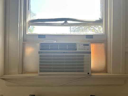
My love and my nemesis. As I already said, this is the only window that can hold an AC unit. Again, the charm of an old building has costs. I would like to make it clear that I am not the one responsible for this foam/masking tape situation but also haven’t been bothered yet to fix it. And while this AC works fairly well, there are newer and WAYYYY prettier options on the market that will make this necessary evil less evil-looking.

Currently, this July air conditioner is my top choice. It’s sleek, has a pretty cream color option for that front panel and it doesn’t make me sad when I look at it. Does anyone have this? Do you like it? Are there any other pretty options I should look at? This is turning into a “Please help me” post but I actually do need some real help if you can’t tell.
I Want A Custom DIY Makeup Vanity (Les Bunge Has Been Called)
I took this photo on Friday so it’s very current but far from how I want it to look. I borrowed this table from Emily when I was going to style a sponsored thing two years ago. It was for a styled Urban Outfitters entry vignette that ended up being something else. So since Emily was already in Portland, I asked if could use it temporarily for my bathroom. You actually might remember it as her mountain house quarantine desk. What a DIY that was. Anyway, it’s been useful but it’s clearly too long and too low for what I really want which is a makeup vanity. And no I don’t think I want the paint can look🙂 I really want something that’s wood but in a deeper and warmer tone so why not torture my father once again and have him help me build something “simple”? The 3-D wood panel below is the inspiration so stay tuned!
Just in case you were wondering, that towel bar is outta here and that Tushie bidet has never been connected to the water line. Whooops. Oh, and I found that trash bin at the Rose Bowl and I will never part with it. It’s one of my forever treasures:)
The Dream Design Plan
And here is the overall plan! I want to wallpaper at least the top half of my walls with that VERY cool sand-colored wallpaper. Oh, and if you are wondering what happened to my closet design, that is still in the works because honestly, this design will dictate that space since they are A. the first thing you see when you want in the front door and B. you can see then at the same time meaning they need to talk to each other nicely. NO FIGHTING in this house. So yes, the plan for the bathroom is to be mostly neutral (letting the floor tile shine) and really play with pattern and texture. I love my black toilet seat so that will go on the new toilet, as well as my vintage flush lever. Fingers crossed I can switch it out!
 cool thumb dad.
If you are wondering what is on the far top left that is a new door!! Yes, my dad found the perfect-sized glass center door from an architectural salvage yard, Greenlynx in Santa Rosa, CA, where a VERY dear family friend of ours works. With her discount, it was $50!!! This door will replace the one that connects my closet to my bathroom. Why replace it? Well, I don’t love that a toilet (even a cool $3k one) is the first thing you see when you walk into my apartment. BUT, I don’t want to lose the only natural light that the closet and hallway get by closing the door that’s there. So getting this door means I can close it and potentially add a light filtering shade or (and ideally) somehow replace the plain glass with ribbed glass so it has a cool texture. I just don’t know how much that will cost…knowing me probably one million dollars. It’s a gift really.

 with the natural light | without the natural light
Only Available Items Listed: Brass Vacant Engaged Lock | AC Unit | Wicker Pendant | Wallpaper | Brass Knob | Vanity | Soap Dispenser | Faucet | Switchplate Cover | Towels | Ceramic Vessel | Table Mirror | Stool | Black Toilet Seat | Toilet | Bath Mat
Now back to the design. I really wanted to use brass but the shower pipes are silver meaning it might be too imbalanced for everything to be brass except the shower. So, that’s why I chose a polished nickel vanity, faucet, and switchplate cover. Most everything that is more “permanent” goes with the shower and then the accessories (like my ridiculous $90 French soap dispenser) can be brass. I think choosing a warm-toned silver like polished nickel works nicely with a warm brass:)
Oh, and see that’s that wood piece I’m using as my vanity inpso and I am excited. For the lights, those are really there for the vibe I want rather than actual pieces I’ll use. First off, a bathroom needs good light for activities like doing your makeup. Neither of those lights will provide that but man are they sick. As for the checkered towels, I have wanted those from the moment I saw them. My hand-me-down sad, not soft dark gray ones need to go. Oh, and how fun is that bath mat! It might not be right but I really liked it on the board.
Ok, I think that’s it for now. I still have more design things to think about like paint? Ah! Maybe another post is coming your way. Until then truly any and all advice for my shower is VERY welcome. I feel pretty lost in the vintage plumbing game. Oh, and if we can all pour one out this month in honor of my toilet I would really appreciate it.
Love you, mean it.
The post The Saga of Jess’ $3k Vintage Toilet (+ Her Bathroom Design Plan!) appeared first on Emily Henderson.
October 1, 2023
The Link Up: An Exciting Design Announcement, Caitlin’s Money Saving Decor Hack, And Our Favorite New Scent

October?! Yes, hello October. Arguably one of the best months, right? And no, a person whose birthday is in October is NOT writing this post… 🙂 Anyway! We had SUCH a fun week not only showing off the sunroom with a new incredibly fun tablescape but TWO outdoor Halloween decor posts. You saw them right? The front porch and DIY graveyard? We think this might just be the beginning for Emily and her love for exterior holiday decor.
This week’s hour tour was SUCH an exciting treat when it popped up on Domino this week! If you are someone who is nervous about adding color to your home take a peek at the STUNNINGLY bold yet soothing palette of artist couple, Cristina Martinez and Al-baseer Holly. It’s a visual feast for the soul and WILL make your day better. The 92 paintings don’t hurt either. GO LOOK NOW.
From Emily: WELL WELL WELL, one of my nearest and dearest has launched online design consultations – THEE Orlando Soria. Also if you aren’t subscribed to his Substack you really should (and pay if you can). So, he is now booking through his own site one-on-one design consultations if you are stuck on something (or if you just want to hang out with him, which is a real joy IMHO). He has a ton of experience (and is great with budget ideas, where most designers simply are not). He’s one of my favorite people in the world and I want you to all experience his magic. Now you can:)


Left: Hat (similar) + Jumper + Mules (currently 30% off) + Purse (similar) | Right: Jumper + Flannel + Sneaker
Also From Emily: For those of you who also loved the short version of this jumper I can personally endorse the pant version – you know for the winter months. Roomy where you want it to be (or where I want it to be – around the tummy) but fitted in the armpits (which is flattering). Good structure, and thick but not too thick linen. It’s just good and versatile (dress up and down). Do I wish it were more affordable? Absolutely. But, I wore the shorts version no less than 40 times last year, so I feel good about this being a huge fall/winter/spring (and summer) staple. I’m wearing a small here, and I’m a size 6, FYI. xx
From Caitlin: OH MY GOSH. Guys. MAXXINISTA HERE! I just scooped two of these Serena and Lily-style nightstands for only a FRACTION OF THE PRICE (with free shipping!) from TJ Maxx. (Here’s the S&L version, if you want to do a side-by-side comparison.) I’ve been looking for rounded nightstands with closed storage and open shelving for over a year – no joke – and I’m so excited to have found these, which fit the bill perfectly!!! (Saving over $1,400 wasn’t too shabby, either.) To that end, TJ Maxx is actually carrying a few great “looks for less” right now – I also loved these classic raffia nightstands (nearly $2,000 cheaper than these after shipping – insane), these slipcovered linen chairs (even better in person, and for less than half the price of Crate’s version!), and this Tito Angoli dupe (you know, for those of us who don’t have years to spend sourcing or $4,000 to drop on a single wicker chair). Here’s their entire home offering if you want to peek – highly recommend perusing the site (or the in-person store, let’s be real) if you’re on the hunt for an affordable addition to your furniture or decor this fall! (PS. I’M SERIOUSLY SO EXCITED ABOUT MY NEW NIGHTSTANDS, THOUGH.)
From Gretchen: With Halloween in full swing over at the Henderson Homestead—we just finished decking out the front porch and covered walkway for the spooky season, here and here on the blog if you missed it—I’ve been on the hunt for a few inside finishing touches. Em’s moved on to decorating various indoor vignettes but was missing some candles. Specifically, black candles and the ones I found during my search are just too cute not to share! This scary skull and spider pillar are the bee’s knees (and 100% beeswax). I only snagged the spider because we had plenty of these twisted, black pillars from Target to fill out the scene, but I’ll be going back for the skull for myself—it put a spell on me! We added a bunch of these beautiful, black tapers to the cart too, for a very necessary candelabra moment. It all turned out so cute and I can’t wait for y’all to see the photos soon!!
Did you see the new Rugs USA collaboration with fashion designer, Prabal Gurung?! It’s full of bold patterns and colors which is SO fun. We really love this one, this one, and this one. Oh, and this colorful one too!
From Mallory: While putting the final touches on my apartment for my MOTO shoot, I stumbled into CB2…or should I say limped…I sprained my ankle last week but that did not stop me from running to purchase two duvets for options for my apartment shoot!! I think I’m gonna go with this polka dot-ish one (it’s stylist, Emily Bowser-approved) but I love this one too SO SO MUCH.
From Alryn: You know what we all deserve? A great-looking rug that feels nice underfoot and doesn’t require us to tap into our 401K just to afford it. While I love a vintage option most times, they can be tricky to find in *just* the right size you need. Enter: my bathroom vanity area. The space required something no wider than about 24 inches so the door to the wet room could open and no longer than 6 feet. I grabbed this runner (by Loloi from the Chris Loves Julia collaboration) and was quite pleased when it arrived. The colors are gorgeous, it’s just thick enough that it feels substantial, and is soft on my feet. I LOVE it. Plus, it’s available in 11 sizes.
From Jess: I’ve recently realized a common thread through all of my current favorite body care scents and that’s Hinoki! It’s a native Japanese cypress and I can’t get enough. Remember this body wash I was raving about?? It’s woodsy, warm, and yet still fresh. Totally intoxicating. So when I was searching for a new natural deodorant in store, I stopped to smell Salt & Stone’s Bergamot and Hinoki option and fell deeply in love (they even have a sensitive skin option). So much so that I want to get the body lotion too. I basically want to be a Hinoki tree every day.
That’s it from us today! Hope you have a great rest of your day and see y’all tomorrow. xx
Opening Image Credits: Styled by Emily Henderson | Photo by Kaitlin Green | From: Our Front Porch Decorated For Halloween (+ How It Looks Spooky At Night For Trick-Or-Treaters)
The post The Link Up: An Exciting Design Announcement, Caitlin’s Money Saving Decor Hack, And Our Favorite New Scent appeared first on Emily Henderson.
September 30, 2023
Our DIY Halloween Graveyard (+ My Favorite Halloween Decoration To Make Your Spooky Yard Come Aliiivve)

Earlier in the week I showed you my front porch wearing its Halloween costume. Today, I have the side yard (where the kids actually walk by or under every day), and is far more visible and “seen” than the front porch. So consider this more “front yard” decor that could be in front of the porch if you are decorating for trick-or-treaters. Our house is situated on the property in a way where you basically drive past the front porch immediately and park over here – so the kitchen is our main entrance and the kids never go in and out of the front. And how we walk into the neighborhood is through the back fence so if we get trick-o-treaters they’d definitely see this first. I was really torn between doing the front porch (classic) or this covered walkway (more unusual, but more used), and I obviously decided to do both 🙂 And while it seems like this would take so much time, it was actually far less than I planned for. After I had everything ordered (weeks in advance) I actually was able to do most of it with Birdie on the Saturday before we shot the following Wednesday (Christmas takes so much more time for whatever reason). I had booked two assistants on Monday/Tuesday to help dial it in, but we didn’t even need Tuesday because we were done. The point is, most of this decorating came together really fast and easy so if you feel up for it, steal some of these ideas. There is still no pressure to go this big (remember we still have to de-decorate before “Christmas” starts, November 3rd…But if you enjoy decorating like I do, then you might be surprised what some command strips and cheesecloths/lights can do to transform your yard. P.S. This is what it looks like near dusk…
 The Graveyard – During The Day
I’ll show you it during the day first, so you can really see the details (then at night where it really comes alive – SEE WHAT I DID THERE). Okay, so the fence – I did a lot of pinning on graveyards and my favorites had a perimeter fence (mostly iron and ornate). But ours needed to be at least 50 feet which is a lot of plastic or metal (and pretty expensive). But I felt it was an important element. Since I’m likely committed to doing this year after year I felt ok about investing in this. So I went to Lowes and bought three options to test out and this simple white picket was the unanimous winner. Originally I was going to paint it black, but y’all it looked so good white! They are in 3′ lengths, and go easily into the ground with two points on each end (I used a mallet) and seem easy enough to store (admittedly we don’t have a huge storage issue here).

Picket Fence | Light Up Chains | Small Spider
Then we put glow-in-the-dark spider webs on it (which do NOT work so don’t bother) and these light-up orange chains which are admittedly a little tacky but at night they are SO FUN.
Filler Gravestone Pack | Animated Gravestone | Etsy Gravestone | Splurgey Gravestone | Crows
I collected gravestones from all over the internet – some cheap “fillers” from Target (pack of four), but to make it look really good, I did invest in some larger more odd shapes (like the cross which is sadly now unavailable, or the really thick ones that look totally real). Etsy had a great selection and I splurged on this one from Grandin Road. P.S. That stone fountain was left on the property and is PERFECTION with that crow on it.


Of course, we added some graveyard elements – skeleton parts and a grim reaper to really make the message clear.

Snake Skeleton | Rigg R Mortise Gravestone

The covered walkway just felt like somewhere that had to be decorated. It’s such an experience walking under it during the day even without Halloween, so I knew that just adding a few elements would make it incredible at night. We hung spooky cloth (cut with scissors to look creepier) and hung these orange string lights inside. We painted more foraged sticks for the entrance and added a few crows and spiders.

Spooky Cloth | Orange String Lights | Spider | XL Spider


One of my favorite elements is the BEWARE sign that we DIY’d with leftover wood in one of the garages (and paint and screws). 10/10 recommend. It looks so authentic and is such a fun focal point.
 The Graveyard Glow At Night
Y’all – it is VIBEY. With all the lights on (orange sconce bulbs, chain links, string lights, and solar orange spotlights) it’s just really fun.


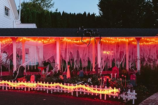
I placed the solar lights to add depth and light up the gravestones and without them you wouldn’t really be able to see what is going on. These change colors so after Halloween we’ll try them in the yard and see if Oregon can handle solar in the winter (mixed reviews … I won’t put them in direct shade but those clouds can be mighty powerful).


FYI, don’t get the creepy cloth with the faux holes in it – they don’t fool anyone. I had already opened them so I used them, but they are too perfect and there are just too many of them.


All in all, we accomplished a real nighttime vibe that is pretty darn fun. Again, I think I’m just having so much fun with this new house – it’s like a first for everything here this year. Sure, we had Christmas here last year but our living wasn’t even close to done, so using this house as a canvas/excuse to style out all my holiday fantasies is making me really really happy and grateful. Are we going to have a party? I don’t think so (our weekends are slammed right now with multiple birthdays and random trips), but I sure am going to invite a few friends over to hang out the next month and make them stare at my graveyard. 🙂


*Styled by Emily Henderson (me!)
**Photos by Kaitlin Green
The post Our DIY Halloween Graveyard (+ My Favorite Halloween Decoration To Make Your Spooky Yard Come Aliiivve) appeared first on Emily Henderson.
September 29, 2023
GET EXCITED! 5 Color Palettes & Design Schemes to Wake Up A Builder-Grade White Kitchen

You asked, I delivered: We’re talking white kitchen cabinet color palettes today. Maybe you thought I was done when I tackled espresso last time, and frankly, so did I, but the comment section in that post was a resounding DO WHITE CABINETS, so do white cabinets I must. Today, instead of focusing on a hard-and-fast palette, I, instead, pulled together a few different styles because the white kitchen cabinet is the white T-shirt of the design world: you can dress it up or down depending on how you style it.
This post applies to anyone with white cabinetry, but specifically to those with builder-grade, flat-front or Shaker-style kitchens devoid of character. So many of these were put into our homes and apartments after the craze of cherry and espresso died down, and they can tend to feel a bit 2012. But GOOD NEWS! They don’t take that much to bring them out of a just-dated-enough haze to get you feeling excited again. Let’s do this.
The Deal With The MoodboardsI’ve repeated these same rules in every one of my previous kitchen color palettes posts and I’ll do it again here:
The products selected aren’t necessarily absolute picks, but rather jumping-off points for you. Pull inspiration from the color, the material, the shape, or the design era. Every board has a paint blob on it, which can be used on walls, on cabinetry (uppers, lowers, all cabinets, even islands or stand-alone display cabinetry), or as a color to pull in for any additional accents or furniture you may have or need in your kitchen. The shelf on each board is more representative of the wood tone that works best, which can be brought in through a shelf, yes, but also countertops, cutting boards, etc. The soft goods like the rug and shades, again, are a visual starting point for you. A runner fit on the board better than a 4×6, but use the best shape and size for your space. Same with the window covering, though you can hardly ever go wrong with a Roman shade, tbh. And finally, the backsplash tile included is just in case you’re looking to do a small amount of demo for an existing backsplash, or even just want to find something similar in a peel-and-stick to lay overtop of your current situation. White Cabinet Helpful TipsYou know when you have too many options and your brain just kind of freezes? I think this can happen a lot with predominantly white kitchens. So many of the ones I stumbled upon on Pinterest and Instagram while diving around for inspiration were fairly free of color, pattern, or texture. It was a white cabinet, white subway tile, white or gray quartz, nickel hardware and see ya later. I don’t know about you, but I just don’t want my kitchen to look straight out of an office building, you know? Displays at IKEA are more interesting than that, tbh. But it doesn’t take much to make your white cabinetry come to life, so you have that going for you. There are no undertones to work around or pull from like with oak or cherry, it’s kind of just a blank slate.
So because of all that, my only real tip is don’t put the foot on the gas all the way. Let’s go a nice, safe, and comfortable 45 mph. Meaning, maybe go with an interesting light fixture, a fun combo of hardware, a great barstool or dining chair. Everything can’t be a star because then nothing is a star.
If You Have A Good Neutral Foundation But Want To Step It Up: Add Just A Hint Of Burgundy And CognacThe Inspiration:
 design by rashida banks | photo by keyanna bowen | from: rashida’s totally transformed kitchen reveal (that includes one of our favorite “new classic” kitchen trends)
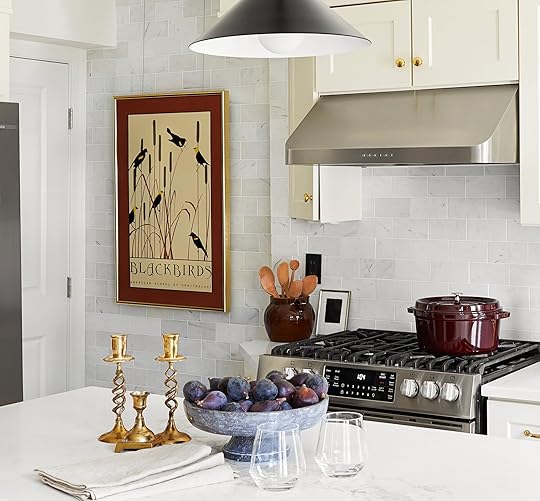
design by rashida banks | photo by keyanna bowen | from: rashida’s totally transformed kitchen reveal (that includes one of our favorite “new classic” kitchen trends)
If you do nothing else today, click on the link to see the “before” of Rashida’s kitchen. No, it doesn’t really have anything to do with today’s post, but it’s mindblowing what a little paint and some cosmetic changes like swapping the backsplash can do for a room. You did it? Amazing right? Okay, let’s continue.
I totally understand that not everyone craves as much color, pattern and visual layering as I do, so we’re starting off with just a touch of color. In Rashida’s kitchen, she went with a beautiful rich burgundy, figgy purple, and amber but only in her styling. If you stripped that all away, her space would be creamy white, marble, and brass. I think these work particularly well since they’re on the warm end of the spectrum and balance the cool tones of the neutrals, but you could easily pick another hue to play with to similar effect.
The Moodboard:
Where Rashida went with a black and brass pendant, I used that as an opportunity to splash in some color. You could totally keep that fairly neutral and use small decor to bring in a touch of color, instead. I love the addition of a true oak, whether as shelving, inside a cabinet, behind the island, or even as a countertop. Don’t underestimate what bringing in a cutting board in a similar wood tone would do for your space, too. I’m a big fan of bringing creams in to make the bright white cabinetry feel more inviting and homey, and that’s easy to accomplish through rugs, window coverings, and even the wall color if you feel like painting. Oh, and a dash of black here and there never hurt anyway…quite the opposite.

1. Brushed Stone Carrara Marble Subway Tile, 2×8 | 2. Creamy White by Benjamin Moore | 3. Custom Floating Shelves | 4. Solid Cabinet Knobs, 5 Pack Bright Gold | 5. 5 Pack Bright Gold Solid Zinc Alloy Cabinet Handles | 6. Butte 18″ Cone Aged Brass Pendant | 7. Rosa Bar Stool | 8. SAFAVIEH Handmade Flatweave Montauk Salinda Casual Cotton Rug in Ivory/Light Grey | 9. Prestige Series Woven Wood Shades
If You Want Some Color And Warmth But Still Want It To Feel Inviting And Comfortable: Brass, Oak, Rich Green & NeutralsThe Inspiration:
 design by julie rose for velinda hellen design | photo by sara ligorria-tramp | styling by emily edith bowser | from: a kitchen makeover that focused on small changes for a big impact (julie and velinda did it again!)
 design by julie rose for velinda hellen design | photo by sara ligorria-tramp | styling by emily edith bowser | from: a kitchen makeover that focused on small changes for a big impact (julie and velinda did it again!)
Allow me to take a tiny bit of creative license here. “Arlyn, this isn’t a boring, standard white kitchen.” Of course it isn’t. Our beloved EHD alums Julie Rose and Velinda Hellen were at the helm of this, so you know it’s going to be good. BUT BUT BUT. It inspired me to create a more family-friendly (but chic) vibe, nonetheless. I love how they mixed up the wood tones here with dark walnut and red oak (I think?) combined, as well as the touches of green with blue undertones. The dining area with the built-in storage mixes white(ish) cabinetry and a rich wood paneling and countertop which is another solid inspiration point for anyone looking to add some character to their standard white Shaker fronts.
The Moodboard:
Instead of a marble and brick backsplash like in the kitchen above, I opted for this absolutely gorgeous green Pratt + Larson tile from their Craftsman glaze line. To me, a Craftsman is the epitome of the “family home” (I may be biased considering I live on a street littered with them and often dream of what life inside is like) so I pulled a bit from that aesthetic here but kept it a bit more modern with ribbed brass hardware, a Nelson saucer pendant and walnut bentwood bistro chairs. I went ahead and picked yet another creamy non-yellow beige here as my paint blob because I love it with the creams and woods. Feel free to use that on walls, or, if you’re feeling VERY adventurous, crafty and have a ton of time on your hands, on your actual cabinet fronts and frames (eek).

1. C360 Craftsman Glaze Tile | 2. No Filter by Clare | 3. Heritage Ledge | 4. Francoise Kitchen Knobs Set of 2 | 5. Francoise Kitchen Handle | 6. Nelson Saucer Bubble Pendant | 7. Natural Elm Wood Kitchen and Dining Room Chair | 8. Waite Flatweave Rug | 9. Liz Polyester Linen Roman Shade Cord Lift
If You Love A Hip, Trend-Forward Vibe: Cream, Blonde Woods, Rounded SilhouettesThe Inspiration:
 design by natalie myers/veneer designs | photo by charlotte lea
 design by natalie myers/veneer designs | photo by charlotte lea
 design by natalie myers/veneer designs | photo by charlotte lea
When I saw this fun, modern kitchen by Natalie Myers, I knew readers here who have similar flat-front white cabinetry would want to see it, so I decided to bring it into the mix here. This is squarely a modern vibe but it still feels approachable, inviting, and fun. My biggest takeaway is the fluted wood exhaust surround and the crema zellige tile. These two design choices add so much soul to an otherwise all-white space, don’t you think? I think someone could do a fluted or scallop wood on the backside of an island if you have one or around a hood like Natalie did here.
Oh, and if you haven’t noticed by now, cream + white = making white feel less stark. Bonus points for some red- or yellow-toned wood somewhere like a pendant light, cabinet hardware, barstools or all of the above.
The Moodboard:
The only thing this mooboard is missing is some terra-cotta accents, tbh. A tea towel here, a pretty planter or bowl there. It would really make these warm neutrals sing. Speaking of the warm neutrals, I kept the wall color super white (the same Extra White by Sherwin-Williams that Emily used in the farmhouse) because I think this aesthetic needs it. Otherwise, the creamy backsplash and textiles might get too muddy and not lean contemporary.
I borrowed a page from Natalie’s design book with a simple brass finger tab pull mixed with a sprinkling of a VERY fun split circle wood knob. I carried that wood into the pendant lighting, and into the barstools that emulate the arch of the designer pick above but at a fraction of the cost. I also think those curved lines add to the Cali Cazh look.
1. Zellige Unmounted Square in Parched Vellum | 2. Extra White by Sherwin-Williams | 3. 1″ Single Bead Tambour – Red Oak | 4. Floating Lines Single Shelves – White | 5. Semicircle Wooden Handles | 6. Lincoln Collection 3-1/8 in. Satin Gold Contemporary Drawer Edge Pull | 7. Margo Metal Pendant | 8. Meru Counter Stool – Mindi | 9. Timka Vintage Turkish Runner Rug | 10. Luxe Linen Blend Curtain
If You’ve Always Loved Brady’s Old Kitchen: Black, White, Brass & A Dash of MintThe Inspiration:

 design by brady tolbert | photos by tessa neustadt | from: brady’s kitchen reveal
 Blast from the EHD past! I kind of feel like Brady’s kitchen from his previous apartment single-handedly brought back the black-and-white checkerboard floor. Yes? No? Maybe so? Anyway, black + white + brass is always a winning combo and a no-fail design solution for almost any vibe you’re going for. It can lean modern or classic depending on things like tile choice and styling. One of the tiny details I pulled from that first picture of Brady’s kitchen is the strip of minty sea glass green from his vintage tilework. Then, a mix of knobs and cabinet latches gives it that little extra punch of interest.
The Moodboard:
Give me a hex mosaic tile any day, friends. I love the minty flower pattern and it’s just what a serious black-and-white design scheme needs to take it into “touch of vintage/classic vibe” territory. The matte black and brass pendant as well as the leather sling barstool are cool and a little edgy so nothing here feels overly 1950s. All the other whites are just as crisp as the cabinetry to keep the contrast and energy high.

1. Retro Rosette and Quad Hexagon Patterns | 2. Affinity Tile Merzoni Checker Ruzzini – 17.88″ Square Tile | 3. Extra White by Sherwin-Williams | 4. Large Oval Cupboard Latch | 5. Round Dish Cabinet Knob | 6. 8″ Arched Shelf Bracket Set Of 2 With Shelf | 7. Endicot 15″ Pendant | 8. Rake Black Leather Bar Stool | 9. Macro – Medium Gray Flatweave Wool Rug | 10. Classic Woven Cordless Roman Shade
If You Want To Feel Like You’re In The English Countryside: A Mix Of Wood Tones, Blue & White Tile, Beadboard & BrassThe Inspiration:
View this post on InstagramA post shared by Arthty Ragupathy (@av.home)
View this post on InstagramA post shared by Plain English Design (@plainenglishdesign)
I left my favorite for last because that’s what we’re supposed to do right? Finish off on a high note? This whole thing is a *look* that’s not for everyone, but I just want to sit in here watching the Great British Bakeoff, sipping an English breakfast tea with a biscuit, judging how stodgy my Victoria sponge cake turned out. The first space is by Arthty Ragupathy and literally stopped me in my tracks. Can we all pause for a minute and wonder if we’re allowed to put a cafe curtain under a Roman shade? Wait…should I do this in my own kitchen where I need some privacy in the breakfast nook? Fascinating. I love the addition of gray on the floor and textiles to bring a cool lightness to this galley.
In the second photo, from one of my favorite kitchen design companies Plain English, my eye went straight to the blue and white tile above the range which just adds in so much character. They’re both friendly and charming without going overly ornate or fluffy, and that’s a look I can get behind.
The Moodboard:
Did I mention that this is my favorite board I created? The amber glass fluted pendant, the walnut wood cutting board (which is actually an inspiration for a countertop), the peg rail, the not-quite-gray-not-quite-blue paint color (try painting the peg rail in that!), the spindle leg vintage dining chair. Be still my heart. If you can’t do a floor swap for a checkerboard, a rug in the beloved pattern is an easy no-reno way to bring in that look if you love it. I also included a combo of blue-and-white tile and beadboard that I think would be lovely together (beadboard below a rail or shelf, tile above…or vice versa)!
1. Maiolica Tratti Porcelain Wall Tile – 4 x 4 in. | 2. Motor City by Clare | 3. 32 sq. ft. 3/16 in. x 48 in. x 96 in. Beadboard White True Bead Panel | 4. Hanging Basket | 5. 6-Peg Maple Shaker Rack Unfinished | 6. Atlas Homewares Bradbury 3 Inch Center to Center Handle Cabinet Pull | 7. Atlas Homewares Victoria 1-1/4 Inch Mushroom Cabinet Knob | 8. Walnut Edge Grain Butcher Block | 9. Antique 1900s Bentwood Spindle Back Farmhouse Chair | 10. Francis – FRA-01 Area Rug by Chris Loves Julia x Loloi | 11. No 918 Brinley 2-pc. Tab Top Window Tier | 12. American Vintage Stripe Glass Pendant Lamp in Amber
AND I’M DONE. The last post I did on the espresso cabinetry, I swore would be my past in this series, but who am I to turn down the cries of help from others with lifeless white kitchens? I certainly cannot, and did not. I do, however, think I’ve finally reached the end, and boy was it a fun ride. Be sure to go check them all out because even if you’re not working on sprucing up a kitchen, there are so many color palettes to choose from to help inspire another room in your house (with or without cabinetry).
*** Color Palettes to Try For: Honey Oak | Cherry | Espresso/Dark Stained ***
Until next time…
Your friend in design, Arlyn
Opening Image Credits: Design by Rashida Banks | Photo by Keyanna Bowen | From: Rashida’s Totally Transformed Kitchen Reveal (That Includes One Of Our Favorite “New Classic” Kitchen Trends)
The post GET EXCITED! 5 Color Palettes & Design Schemes to Wake Up A Builder-Grade White Kitchen appeared first on Emily Henderson.
Emily Henderson's Blog

- Emily Henderson's profile
- 10 followers

