
Emily Henderson's Blog, page 76
September 28, 2023
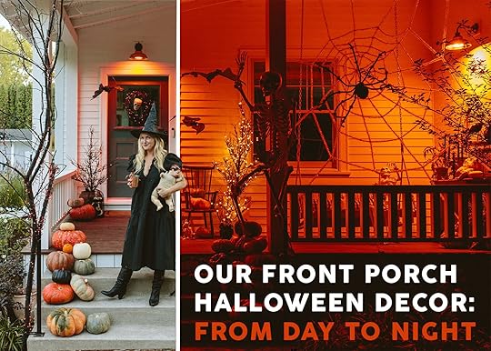
Our Front Porch Decorated For Halloween (+ How It Looks Spooky At Night For Trick-Or-Treaters)
It seems almost inexcusable that for someone who “moms so hard” and goes all out for Christmas, that this is our first time decorating the outside of our house for Halloween. But listen, prior to Covid, in LA, we didn’t live in a thriving trick-or-treat area (and never spent Halloween in our neighborhood because we went to “those streets” instead – shout out to Atwater Village and Toluca Lake), and then during Covid, we lived in the mountains. Then we had the year in the rental (where I wasn’t in the best mental state) and a year of mud – which was scary in a different way, lol. So with the kids being 7 and 9, and finally living in a trick-or-treat community, they begged and I screamed, “OK! LET’S DO THIS!!!” I’m sure it also has to do with the fact that we are done with the renovation and I have the bandwidth…and perhaps I want to show off the house a bit 🙂
So while it was an initial investment and a few days of (super fun) work, I’m officially a Halloween person and my kids are SO EXCITED (if not still disappointed that I didn’t buy huge inflatables, BTW. I swear they are not as impressed with my work as they should be ;)). I think my enthusiasm also comes from living in the northern states, having actual seasons (no offense LA), and up here it gets dark earlier. So the houses that are decorated with festive lights really add to the day-to-day love of the neighborhood on all my walks. Of course, our house is super set back from the road so I’m going to have signs/lights to ensure people come up, but I’m excited to finally be someone who hands out candy and really participates in this totally superfluous and absolutely made-up holiday.
Before the fun photos, here’s a really cute video of the space! (Just wait for the short ad to play:))
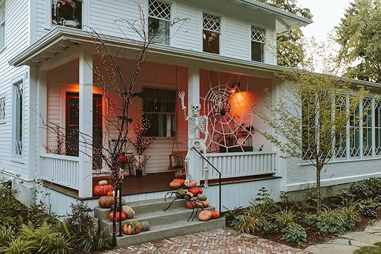
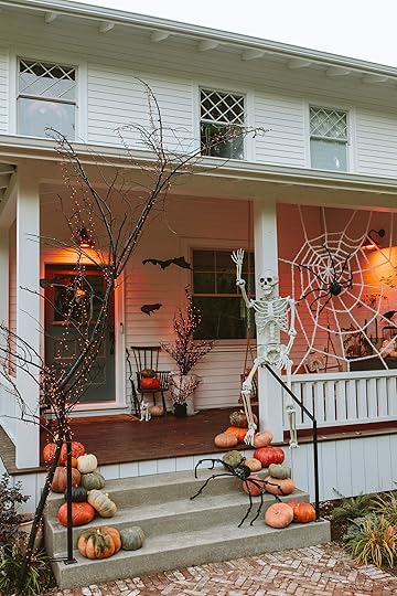
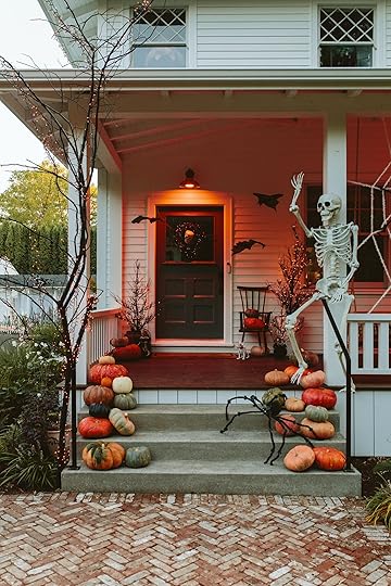
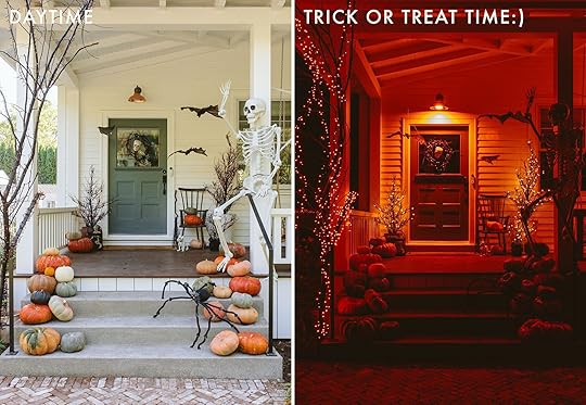
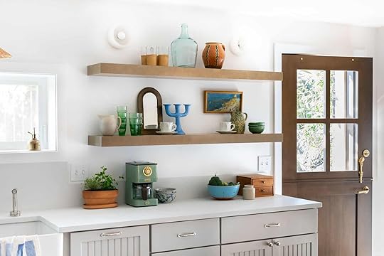
The Front Porch – Daytime
As you can see I went with a spooky vibe, with a side of harvest. I remember years ago I got shade for not having orange in any of my holiday decor, which I actually did really understand and retroactively agreed with. That punch of orange I think is a real necessity, especially when you have a white house with just hits of blue/black. So during the day, it looks really pretty and definitely fun (keep scrolling for how it looks at night).

Dewdrop Halloween Fairy String Lights Garland
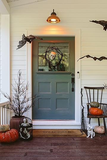
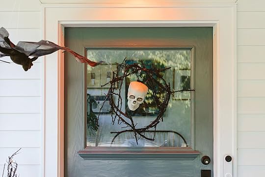
We foraged and painted huge branches black and zip-tied them to the big posts. Now, I know that a lot of people might not have these sticks just lying around (if you are in our neighborhood – shhh – and need some feel free to reach out – we have a TON), but usually they are at parks, too, just on the ground. I then strung battery-powered orange mini lights on it (on a timer) and at night it’s SO FUN. My kids helped spray paint them (because it’s one of the fun jobs) and we even made that wreath for the door, too. (But Crate & Barrel has an excellent branch wreath, BTW).
Pre-Lit Twiggy Trees | Planter | Skeleton | Birdcage (vintage) | Broomstick | Dog Skeleton | Three-Legged Chair (vintage)
Yes, that is an antique-legged chair that I can’t seem to quit. It’s been in storage because it’s so special to me (I sound like one of my kids with their collection of stuffies when I try to purge them – NO THIS ONE IS SO SPECIAL TO ME MAMA). But lo and behold it is PERFECT here next to the front door – creepy and rickety. The trio of pre-lit trees is also pretty great (and splurgy – but you’ll have them for YEARS) and at night it gives so much ambiance in a classy way (no offense to non-classy Halloween methods – I’m an equal opportunity holiday decorator and just want people to have fun). We’ve had “Boris” the dog skeleton and all the spiders and spider webs for years (from Target). I found the birdcage at a vintage store (shout out to Montevilla Antique Mall in NE Portland – where you can buy mimosas to “help” you shop – GENIUSES).

All pumpkins (except the faux black one) came from Trader Joe’s and I’m just so thrilled that they had these beautiful colors. No offense to the typical orange (that little one) but these more interesting tones and the green just feel so much more real. Like many other things (peonies for example), the highly perfect and ubiquitousness of the real thing has almost ruined my love of the real thing, so these organic/bumpy and misshapen pumpkins are what I’m drawn to right now.

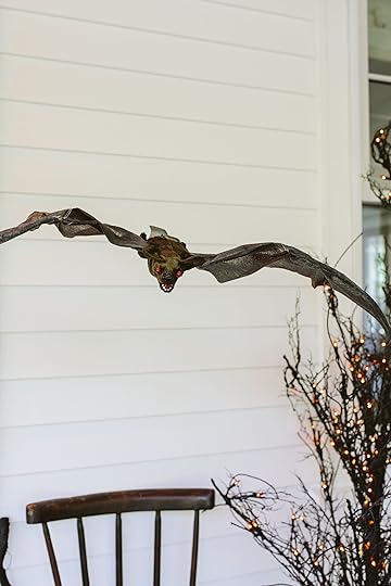
These hanging bats, with creepy light-up eyes, are pretty great and high quality. We hung them with fishing line and you can’t really control what way they face, but it doesn’t matter.

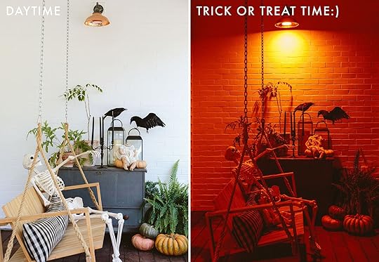
Pillow | Talking Skeleton | Candelabra (vintage) | Lanterns | Headless Babydoll (vintage) | Crows
I bought two skeletons – a Crazy Bonez (that talks) and the 7′ huge dude who is strapped to the front post 🙂

Tall Branch Lights | 7ft Skeleton
So here’s what this area looks like around 6 pm, dusk – which is so much more fun and festive.
I focused a lot on the lighting for this – again because it gets dark up here soon really early and you wouldn’t really be able to see the decor at night. Similar to Christmas, I feel like you only see shots of content creators’ work during the day when the light is the prettiest, but so much of the holiday is enjoyed at night. So keep scrolling…
That orange light bulb had SO much impact and not something I would have thought to do. And here you can see the impact of the pre-lit black trees flanking the door.

I love how that Schoolhouse pillow works so well out here (and this is pretty covered from the elements so I think it should be ok?). Also yes, that is another headless antique doll – thanks to the mimosa-driven birthday antiquing session that Kaitlin and I went on (candelabra, too, which I painted black as well as the birdcage).


 The Front Porch – AT NIGHT (Trick Or Treat Time!)
Now, if that’s not glowy and festive I don’t know what is. Admittedly it’s a LOT of orange and I’ve thought about maybe switching the sconce bulbs to purple so that we have orange (from the trees) AND purple. But it’s honestly so fun either way.

I feel like it’s spooky and creepy, but not too scary. Because SPOILER – kids that say they want to be scared (but you know they don’t). So we had to return or donate the two animatronics that we had bought because one of my children, in particular, was terrified and had nightmares immediately. But this vibe they can handle (and I can’t wait to show you the graveyard/covered walkway on Saturday).


This girl came home from cheer practice right when we were shooting portraits of me (excuse the witch’s hat – I didn’t plan to be on camera at all and this is actually just a 99-cent hanging decor piece that we shoved on our heads). She immediately went upstairs, dug into her costume box, and came down wearing this 🙂
And now to prove a point about how much I care about both daytime and night-time vibes – feast your eyes on some good old-fashioned side by sides.
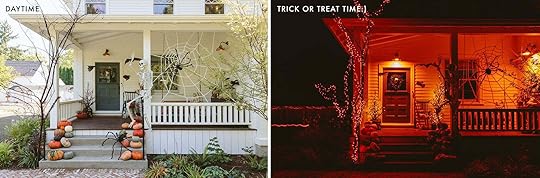
I know that for a lot of you who aren’t going to go all out, so this post might just be a fun distraction from work. But as someone who will now be looking for fun Halloween ideas for trick-or-treaters, I hope that seeing it at night is helpful.
A huge thanks to Kaitlin for coming over to shoot at 8 pm one night – not our usual call time, but getting these dark shots felt strangely important to me. Halloween isn’t just for pretty daytime Pinterest shots – I hope the neighborhood kids make the trek up so my obsession over the vibe can be fully appreciated (spoiler: they, like my kids, might likely only care about the candy, but maybe the moms??). Everything that isn’t vintage (or pumpkins) is linked up below!
Halloween Resources:
10ft Spider Web
Large Spiders
Dewdrop Halloween Fairy String Lights Garland
Skull
Pre-Lit Twiggy Trees
Planter
7′ Skeleton
Large Talking Skeleton
Broomstick
Dog Skeleton
Bats
Pillow
Lanterns
Crows
Orange Light Bulb
Front Porch Resources:
Bench: Danish Design Store
Bench Cushion: Sunbrella
Lighting: Rejuvenation
House Paint Color: SW 7005 Pure White by Sherwin-Williams
Door Paint Color: SW 9655 Mountain Pass by Sherwin-Williams
Windows and Doors: White oak, Aspen Casement by Sierra Pacific Windows
Door Lock: Level
*Styled by Emily Henderson (me!)
**Photos by Kaitlin Green
The post Our Front Porch Decorated For Halloween (+ How It Looks Spooky At Night For Trick-Or-Treaters) appeared first on Emily Henderson.


September 27, 2023
The Smartest Way To Add Coziness/The Accessory That Everyone At EHD Wants

Are you on the edge of your seat wondering, “Jess! Please tell us about this magic that’s going to solve all of my cozy decor problems!”?? Well, it’s the candelabra. So while it won’t dance around your home like Lumière, it will add a stunning sculptural decor moment, a beautiful ambiance if lit (and honestly even when not lit), and add a little color should you so choose.
I’ve come to realize that I have an infinity for sculptural pieces, be it fashion or design (I mean I won’t shut up about my shoulder pads or wide-leg trousers!). It’s just that those types of pieces are usually simple yet so impactful which means you don’t really need much else to complete the look (an outfit or a designed room).

 styled by emily henderson and emily bowser | photo by steven mcdonald | from: what’s next in fall decor from crate & barrel (spoiler: it’s real cozy) + my personal rules on designing with extreme comfort In mind
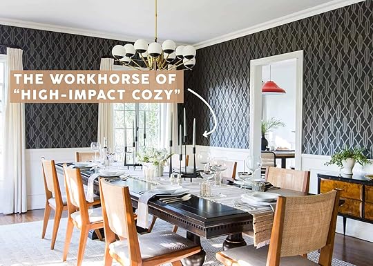
Take this room that Emily styled with Crate & Barrel. Look at that wildly cool candelabra (ugh I wish we had a better shot of it!). See the difference with and without it?? It adds instant art and texture! Plus this one is BIG in person so the high impact is completely undeniable. Em even said she was planning on getting it for her house because it was so cool.

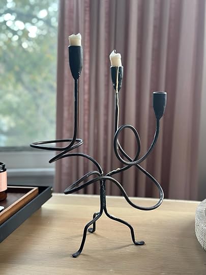
I myself have a bit of an issue with purchasing candelabras. Or wait, can I call myself a candelabra collector?? Does that make it OK? In reality, I think I only have about three but in a one-bedroom apartment that’s not a small amount. Regardless, I love them all dearly. The one above is one of my most prized possessions and when asked last week what my favorite piece in my living room was it was on the list. If they thought I could only choose one piece they were out of their mind.
I actually found this perfect piece of wrought iron art in Chicago at a thrift store called Brown Elephant for $6!!!!!!! This could EASILY go for a couple of hundred dollars if it was sold at a high-end decor shop. It just looks so beautiful and adds so much visually to my room. I will never part with it.
 photo by sara ligorria-tramp | from: how to have great holiday cocktail party in a tiny apartment (all the hacks you need to know)
But the first candelabra that made my serotonin levels go through the roof was that black metal beauty above by ferm LIVING. There was no stopping me when I laid my eyes on it. And look what a cool and modern shape it brings to this table setting! Impact!
 design by cassandra lavalle | photo by ellie lillstrom | from: cassandra lavalle’s basement kitchen reveal!! + a case for that one original design element you hate becoming your favorite
The other cool thing though about candelabras is that you honestly don’t even need to put candles in them if you don’t want to like Cassandra LaValle did with that really sweet blue ceramic one. It can just act as an object rather than a potential fire hazard:)

 photo by tessa neustadt | from: griffith park formal dining room reveal
Or if you really want to make a grand tablescape statement, you can easily double up on the candelabras like Ginny and Mel did for the Griffith Park formal dining room.
 photo by tessa neustadt | from: the finished patio (with the tile!)
But one trick I truly love that is SO easy is to play with the candle colors. See how Em chose those pretty blue ones for her old patio? They aren’t super bold but they also bring the whole look together in a more unexpected way don’t you think?
 styled by emily bowser | photo by sara ligorria-tramp | from: how to throw an elevated garden party with press premium seltzer + sustainable outdoor party styling tips
And what I really love about them is that they really bring in height in such a cool way with not a lot of fuss. Take this incredible candelabra Emily Bowser used for a sponsored party we had. First off, it’s simply beautiful. But second, it brings your eye up, adds another warm neutral color with the candlesticks, and instead of needing a bunch of individual candlestick holders, this is a one-and-done, baby!
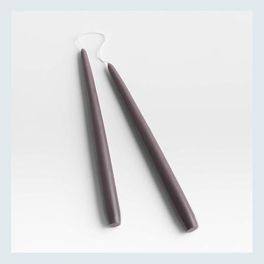
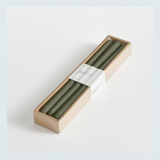
Now, I’m sure I don’t actually need to convince you that candelabras are awesome. But I do think that when we think of them we associate them with being really fancy or over the top when that’s really not the case for most of what’s on the market. Instead, they add a visually impactful moment in your home and make it feel cozier, lit or unlit. I decided to round up 15 of my current favorites with taper candle pairings. These pairings are just suggestions so do as you wish! (And if you’re into patterned candlesticks get some great ones out here:))
Eliana Iron Candelabra + 100% Pure Beeswax Dinner Candles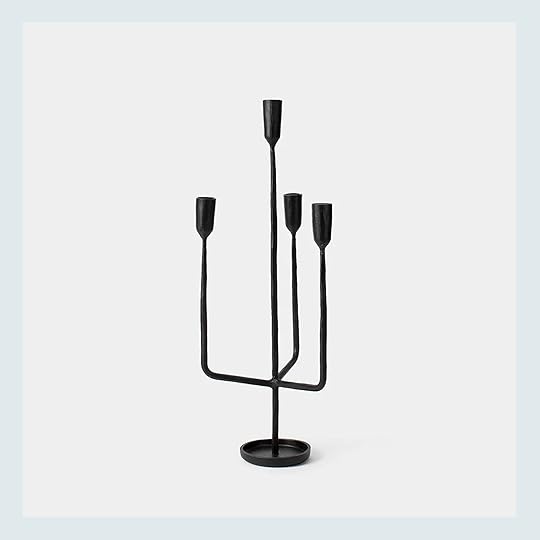

The angled cousin of my curvy candelabra! I think this guy is so beautiful and a classic so there’s no fear of it going out of style. It also would look great with almost any color taper but I love these natural beeswax ones as a neutral alternative to white that feels perfectly fall.
Marble Candleholder + Blue Scented Dripless Beeswax Taper Candle

I almost got goosebumps when I saw those shorter dark blue candles. I’m very much into shorter tapers right now! These ones are scented but say it’s a “crisp and clean” smell as well as “burns clean and smokeless with a warm golden flame.” There are more great things about them if you go to the site! I wanted to pair them with something luxe and what better option than a white marble candelabra?? Oh, I know what’s better…the fact that it’s only $35:)
Gold Candelabra + Fluted Taper Candles

Speaking of luxury, gold is also kind of THE option when talking about that topic. This modern but versatile candelabra is awesome and is only $37! I love the way it all connects in the center. Then for the candlesticks, I loved these ivory-fluted beauties. They are just a softer warm option that looks still simple and elegant (especially with that gold).
Rustic Metal Candlestick + Twisty Tapers

Let’s get moody for a second, shall we? This rustic metal candelabra looks very vintage-inspired which I love! And since it has those sweet leaf (?) details, I thought to contrast, a twisted taper but in a dark color would be perfect. Very happy with the pairing!
SIN Wyat Candelabra + Ombre Taper Candle Set

Do you all know the story of how Emily bought that SIN candelabra (well, the larger version) at a flea market? Regardless, it’s so beautiful and was designed by Virgina Sin who I am personally a huge fan of. I actually got to go to a sample sale of hers in NYC last year which what awesome. But I digress. As you can see, a simple white candle is a beautiful match but trying something like these ombre candles would be a cool and interesting way to add in a fall color, no?
Scandinavian Candelabra + 5 in. Taper Candles

Of course, I was going to add a couple of vintage options. I actually think you can find a ton of great deals on really cool ones from local thrift shops, garage sales, flea markets, etc. I am clearly speaking from personal experience:) I do however love this one from Etsy! As the title suggests, it’s very Scandinavian and wildy sweet. I love that it’s wood too! For the candlestick pairing, I wanted to go for another short taper and fell for this color! I think it would all look so great together.
Orb Candelabra + Blue Taper Candles

This candelabra looks like it belongs in the same family as my ferm LIVING one meaning I am automatically a massive fan! The ball center is so cool and those cone candlestick holders are also so chic. But um, it’s part of the Sarah Sherman Samual collection so of course I love it! I do think pairing this with a solid-colored taper is the way to go. I really like this blue but honestly, any color would look great.
Stoneware Candle Holder + Dark Beige Tapered Candles

Would you believe me if I told you this was H&M?! I know! It’s so cool and affordable and would add the perfect amount of modern texture to any styled room. I honestly really loved the dark beige tapers they paired it with so it’s 10/10 all around for me!
Ceramic Candelabra + Light Pink Tapered Candles

I had to add one colorful piece and boy do I love this one. It’s not inexpensive but it is completely handmade and currently on preorder (there are more color options too!) What a perfect piece to add to your home for more color and pattern. And again, I loved the taper candle choice so light pink it is!
Rodin Black Iron Floor Candelabra + Slate Grey Taper Candles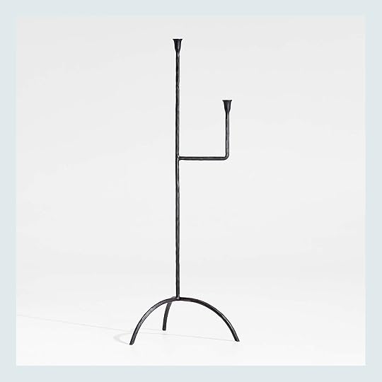
Iron candelabras have my heart! And it’s no surprise that this one is a part of Athena Calderone’s collaboration with Crate & Barrel. Simple and stunning and no notes. But I do think a moody grey taper candle would look incredible with it. Thoughts?
Marizia Candle Holder + Unscented Pleated Taper Candles

Now, let’s get a little more whimsical with this beautiful gold number! It’s feminine without being too ornate and that warm gold tone is perfect. So to keep the warmth going (especially since it’s fall), these short pleated tapers are perfect. Simple details are the name of the game here.
Freya Bronze Taper Candle Holder + Moss Modern Taper Candle
It was time we got a little postmodern, don’t you think? I am a BIG fan of bronze (and squiggles) so you know I love this. I also love that this squiggle doesn’t feel too trendy. It’s the bronze that tones it down. But it comes in gold if you want it to feel a bit more contemporary! Then I knew the candle had to be this mossy green. Isn’t that a beautiful color pairing??
Coventry Taper Holder + Mixed Silhouette Tapers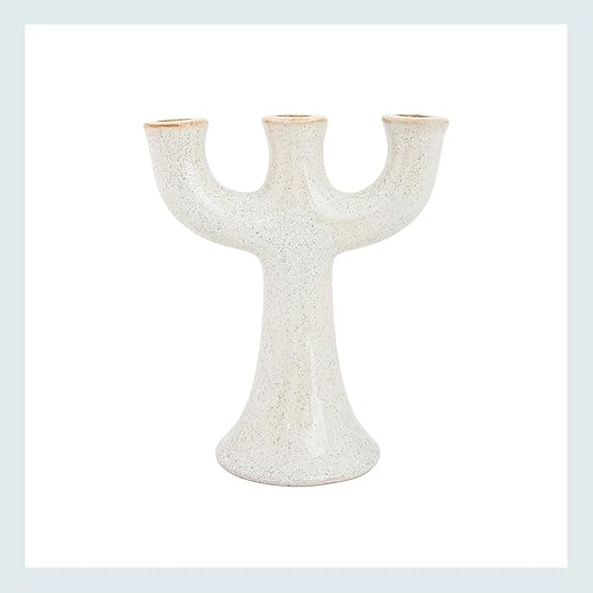

So while I love that handpainted floral one I just talked about, this one has the same vibe but neutral which might be more up your alley. It’s also more affordable since it’s not handmade which could make it more accessible for you! Then look at those mixed sky-colored tapers! Three candles for three spots on that candelabra:)
1920s Chrome Plate Solid Metal Candelabra + Light Grey Modern Taper Candle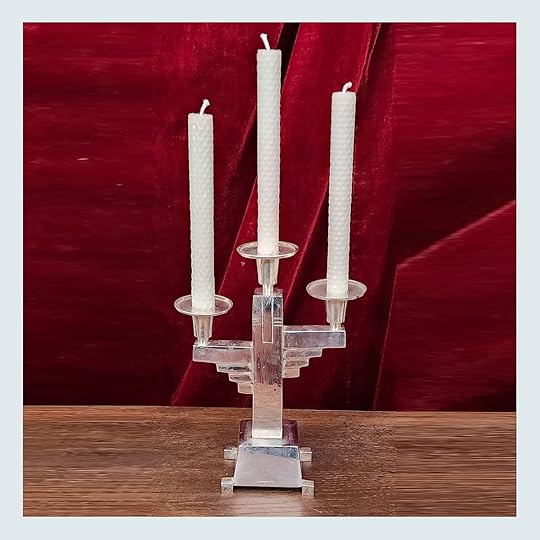

Come on Art Deco candelabra!! It’s vintage (clearly) so there’s only one, but if anyone buys it please take a pic of how you style it and send it to me! It’s just so special. And since it should shine I think going for a light neutral taper is the way to go like these light grey ones.
Bowl Candle Holder + Black Taper Candles

I don’t know if you can consider this a candelabra since it’s also a bowl but I am! What a cool take on the idea. It’s also from ferm LIVING and they can do no wrong in my eyes. And since it’s a natural texture and tone, going with a bold contrasting twisted black taper candle would look pretty sick…especially (but not exclusively) for Halloween;) Stay tuned tomorrow for more on that!
I hope my love for candelabras got you excited to either bust out one or two that you already have or maybe consider grabbing one to make your house a little cozier (and cooler if you ask me).
Love you, mean it.
Opening Image Credits: Photo by Tessa Neustadt | From: Griffith Park Formal Dining Room Reveal
The post The Smartest Way To Add Coziness/The Accessory That Everyone At EHD Wants appeared first on Emily Henderson.
September 26, 2023
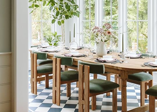
A Whimsical Fall (Holiday + Year-Round TBH) Tablescape In Our Sunroom

A few weeks ago Anthropologie reached out about a social media partnership and in true “over-deliver” EHD fashion, I thought it was too pretty (IMHO) not to shoot it for the blog, too. If I’m being honest, I just love shooting this room so much because it’s so pretty. I’ll use any excuse to take the styling in a different direction because it really brings me a lot of joy. These kinds of contained, fast, and beautiful shoots (with flowers) are why I got into styling in the first place. If I could do this all day every day I would. I curated the look based on products I truly loved and wanted for myself, and the color palette is both fall and holiday. So today is really just a show and tell, and hopefully some inspiration for any dinner parties you have coming up for any season, honestly.

Blue Floral Platter | Blue and Floral Pitcher
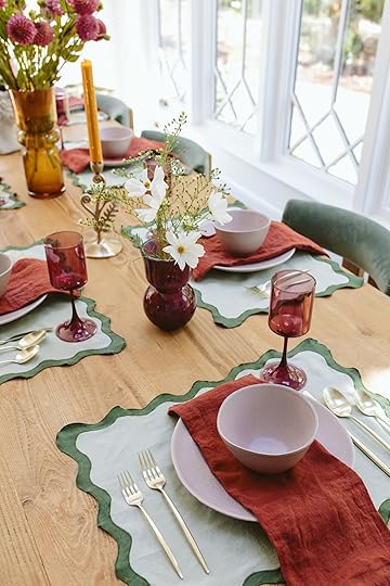
It all started with the blue floral platter and pitcher (and plates that were on back order but I REALLY want them), because my inner English grandma LOVES this color and floral motif so much. If I had registered for fancy china when we got married, these would have been them.

Grecian Bust Pot | Orange Glass Vase | Wine Glass Vase
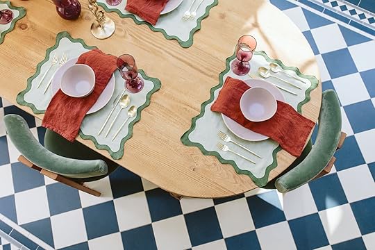
Then my next love has to go to the scallop placemats (that also come as napkins and in other colorways). They literally couldn’t be more perfect with my green chairs.

Placemat | Pink Plate | Pink Bowl | Napkin | Gold Flatware | Wine Glass
I ordered more napkin options from them but not all arrived in time and at first I was nervous about the color palette – the orange/red tone of the napkins, light mauve plates with the purple glasses, mossy green, bright blue, and amber – it just isn’t a palette I’ve played with before – but my goodness it turned out to be unexpectedly fun. It’s a lot going on, but somehow really works.
It’s all a very good reminder that I need to go outside my color comfort zone 🙂 Purple and brick red aren’t usually my go-to’s and look at them shine! It makes me appreciate what an unexpected palette does for a vibe (it feels exciting, I guess?)

Candlestick Holders | Taper Candles
Also, the champagne brass (lighter and almost in between gold and silver) is such a pretty, warm, and less in-your-face metallic. Originally, I had ordered the candle holders in white (which I think I still prefer) but the flatware with these champagne brass candles was a lovely subtle warm tone. And the Grecian lady pot is now on my credenza and hangs out with me on my writing days.

I hope this brightens up your Tuesday like it did mine (it’s so rainy here so staring at these photos that we shot last week when it was so bright and sunny makes me really happy). Everything linked below. xx
Sunroom Resources:
Tile: Pratt + Larson
Windows and Doors: Sierra Pacific
Skylights: Velux
Lighting: Rejuvenation
Wall Paint Color: SW 7006 Extra White by Sherwin-Williams
Dining Table: Elsie Green
Dining Chairs: Crate & Barrel
Credenza: Crump & Kwash
Tablescape Resources:
Blue Floral Platter
Blue and Floral Pitcher
Grecian Bust Pot
Orange Glass Vase
Wine Glass Vase
Placemat
Pink Plate
Pink Bowl
Napkin
Gold Flatware
Wine Glass
Candlestick Holders
Taper Candles
*Styled by Emily Henderson (me!)
**Photos by Kaitlin Green
The post A Whimsical Fall (Holiday + Year-Round TBH) Tablescape In Our Sunroom appeared first on Emily Henderson.
September 25, 2023
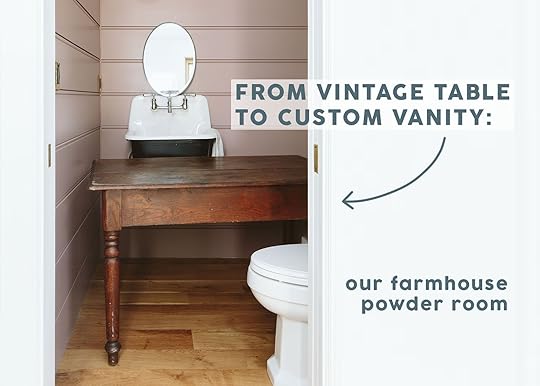
Our Farmhouse Powder Bath Reveal – Pink And Wallpaper And Vintage OH MY!
A tiny reveal day to hopefully enjoy on another manic fall Monday 🙂 The powder bath is here and she turned out pretty darn cute (with a 100-year-old royal pug photograph no less). These rooms are always so hard to shoot (no natural light and so tiny so you can’t really get pulled back) but Kaitlin and I managed to get enough photos to show it off 🙂 Let’s dig on in.
As a reminder here is where we are in the house:


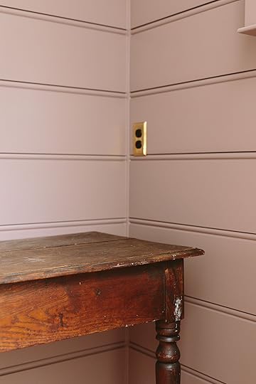
This room is RIGHT off the family/media room so as you can see I wanted the colors to coordinate and flow nicely. I love how the blue of the wallpaper calls back to the color of the room (SW 6223 Still Water). That dark mauve color (SW 9078 Cocoa Berry) is SO hard to read properly on camera/computer. Here is it looks more pink than it is, but you get the gist of it.

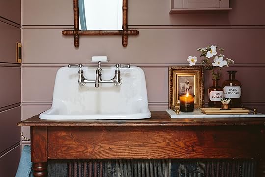
Wallpaper | Paneling Color | Sconce | Switchplates | Mirror (vintage) | Hanging Cabinet | Sink | Faucet | Vanity (vintage) | Japanese Boro Fabric (vintage) | Hook
She is a little moody and full of a lot of soul/fun. I’m really glad we did the custom paneling in here (a large 12″ beadboard) and then topped it off with some pegs (from which to hang a lot of fun stuff). I bought that hanging cabinet unfinished from Etsy and had it painted to match, which I LOVE. I had plans to put a fun lamp on the side of there, but once we hung the cabinet it felt perfectly balanced so I could just focus on styling it out.
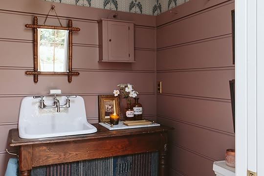
The sink is wall-hung (from Rejuvenation) and we put it off-center on purpose – mostly because I thought the asymmetry would look cool (and I liked that the sink was centered on the door.)
The sink is more utilitarian which I love and because its so deep it catches all the water so that the wood has stayed dry thus far. This is where our kids wash their hands after feeding those little piglets and it’s also where they brush their teeth in the morning (because somehow the walk to their bath upstairs leads to one million distractions and they are never to be seen again for 20 minutes IYKYK).


We used some of my vintage Boro fabrics as the skirted panel, but I had a piece with this darker pink tone that we sewed into the already patchwork pattern to bring the colors together. We simply staple-gunned it underneath the table (and we keep extra TP behind the curtain). I love how it turned out so much.

That’s the beauty of this Boro – it is super forgiving and flexible. If you are following not so closely you’ll have seen it in two different rooms (Charlie’s and the living room), but if you are following really closely you’ll notice it in THREE (the family room, which is yet to be fully shot/revealed – happening soon I promise).

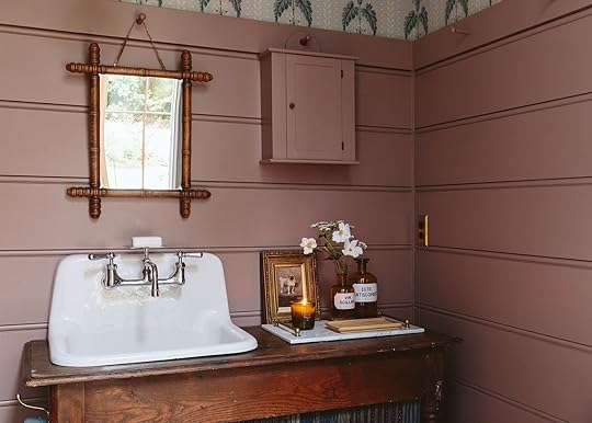
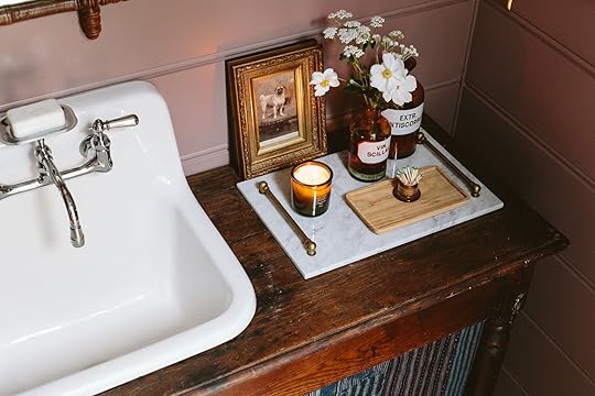
All the fun styling elements I had in my prop room. I’ve been collecting amber vintage apothecary jars for a long time and these two look so pretty in here. The cosmos are from my garden (and are bursting out there – SO PRETTY). The tray I’ve had forever from Katy Skelton. And re the pug – listen, I got sold this by an antique dealer hard. He said that it was a royal pet, from some Queen/King dynasty and the fact that there was a photograph of it taken in the late 1800s or early 1900s (I don’t remember) means that it was of utmost importance. I think it was strangely expensive (like $110) and it certainly doesn’t have much design impact, but I was enthralled by the idea that some queen/king had their precious pug photographed with an old time-y camera to capture its essence. I love the sentiment that it reflects (I think that’s why I love pet portrats so much – it’s such an investment and you have to really love your pet in order to even think to do it – Birdie is making and selling them for Christmas gifts FYI and I LOVE how hers are turning out – runs in the family I guess!).


I LOVE this wallpaper. I bought it from Scandinavian Wallpaper who has a large selection and ships pretty quickly (no affiliation, despite my attempts LOL). It’s both floral and a stripe, with a warm taupey- gray background and of course that dusty blue which I love so much.

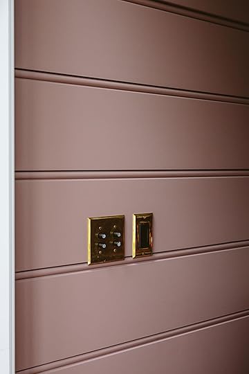
Shout out to Rejuvenation for their articulating light and all the switches. I love how the sconce comes out from the side, slightly unexpectantly and creates such a fun vignette over the sink.

Art (DIY) | Frames (vintage) | Candle | Toliet
Y’all. These sillhoettes that the kids made during the first month of lockdown bring me SO MUCH JOY. Whenever I see them (which is frequent) it reminds me of that extended togetherness time. I found the matching antique frames off Etsy and had the glass put in by our framer, Dave. We hung them off the peg rail with S hooks and gallery chain. I truly treasure these so very much. You can see the full tutorial HERE. Oh and here’s a hack – ask to do it with your kids for your birthday or Mothers Day, that’s what I do now (otherwise they aren’t into such things). Mother’s Day weekend is now my “let’s scrapbook together” time because I can’t seem to get us to do it any other day. Growing up, my parents had us do it twice a year during general conference (the TV session of mormon church where you listen to the prophet talk – wow that sounds weird as I’m typing it) and we’d sit around and label the years worth of photos and artwork and put together our albums. 🙂

Yes, we have a toilet in the powder bath. Hilariously, we decided to take it out of the main shot (below) because you could only see a bit of the front of the bowl (and y’all AI photoshopping did it in two seconds – under Kaitlin’s guidance of course).
There she is! I think it turned out so sweet, fun, with some unexpected moments. Definitely not too simple, but full of character – probably how a powder room should be. 🙂 Resources below. xx
Powder Room Resources:
Sink by Rejuvenation
Faucet by Rejuvenation
Vanity (Vintage/Custom)
Japanese Boro Fabric Curtain (Vintage)
Wall Color by Sherwin-Williams
Wallpaper by Scandinavian Wallpaper
Sconce by Rejuvenation
Wood Flooring by Zena Forest Products
Toilet by Kohler
Hardware by Rejuvenation
*Design by Emily Henderson and ARCIFORM
**Photos by Kaitlin Green
The post Our Farmhouse Powder Bath Reveal – Pink And Wallpaper And Vintage OH MY! appeared first on Emily Henderson.
September 24, 2023
The Link Up: Emily’s $10 BIG Front Porch Halloween Decor Hack, Jess’ Cool Jeans, And The Perfect Toy For A Toddler
Happy Sunday everyone! First and foremost did you see the sunroom reveal and watch the YouTube video!! Not to keep talking about it but we are just SO excited about them. However now that it’s officially fall, are you also digging up your fall/Halloween decor? If you watched Em’s stories this past week then you know she has something very fun in store for you:) A sneak peek is below. Ok, now links!
This week’s house tour is technically a kitchen we talked about in our 2023 kitchen trends post but this week it got it’s OFFICAL DEBUT! EHD friend, Bri Emery, may have the most fun kitchen out there. The colors are bright and happy, the design choices are bold, and you can only feel joy when looking at the photos. Go see the before and afters now!
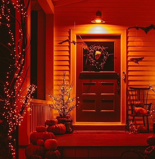 sneak peek photo by kaitlin green
Orange Light Bulb | Wreath (similar) | Skull | Dewdrop Halloween Fairy String Lights Garland | Pre-lit Twiggy Trees | Birdcage (similar) | Twig Broomstick | Halloween Bats with Flashing Eyes (Set of 3) | Skeleton Dog
From Emily: Y’all I feel like I have been living under a Halloween rock (partly because if you aren’t in a neighborhood that decorates, you don’t really have the motivation). And now that I decorated for Halloween (coming next week) I realize one of the best hacks is switching out your exterior sconces for orange bulbs. It’s INSTANT IMPACT. Gretchen suggested it as if this is a thing everyone does so I ordered these and these (less expensive and more of them but technically shouldn’t get wet so keep them on a covered porch). I can’t believe the difference it made. In fact, here is a sneak peek so you get it. Living in CA this is less of a thing because it stays so much lighter, later, but if you want to have an instant Halloween ambiance (and perhaps less work in the decor) then switch out these bulbs (and just save the boxes to store for next year).
From Arlyn: This Melissa & Doug wood-cutting fruit set is a GODSEND for my toddler. She will happily sit on the floor in the kitchen while I cook, “cutting” her little fruit for at least a solid 10 minutes, which might as well be 10 hours in toddler time. Similar sets charge extra for the little wooden crate to hold all the pieces, others have magnets on the inside (choking hazard!) but this one uses velcro and is just challenging enough for her to slice open on her own. For around $20, it’s money well spent for you or someone who has a tiny human they are trying to entertain.
From Jess: I guess all I can talk about this weekend is pants (yesterday was my love letter to trousers) because I just bought a new pair of Madewell jeans. Now, I have been dabbling in some new shapes but this one was for sure a change for me. As a short, not uncurvy gal, having denim looser around the butt and legs isn’t always my favorite look. But when I tried on these they were perfectly high-waisted, fitted in the midsection, then had this slightly voluminous look towards the bottom, oh and they’re cropped (which at almost 5’4″ means I don’t have to get them hemmed if I don’t want…jury is still out on that for these). These aren’t barrel pants but have a slight barrel nod if that makes any sense. They aren’t necessarily the jeans you feel super sexy in but they are the ones you will feel super cool in. I got the curvy version but here’s the none curvy option too! Also not for nothing but Madewell is having a crazy sale where everything is 25% off and an extra 40% off sale items.
From Gretchen: I’ve been long overdue for a work bag upgrade. My H&M “leather” tote has finally bit the dust. The chestnut-colored coating is peeling BAD, like an old, pleather Facebook Marketplace couch, and there is no structure or shape left to speak of. Knowing I needed something that would last AND look good, I started browsing Portland Leather Goods and was so excited to see they were having a fall sale!! Perfect. I got the Oversized Leather Tote Bag in Nutmeg and can’t wait to bring it to work for all my schlepping! They have an “Almost Perfect” section where they price some of their goods at a hefty discount if you don’t mind a small mark or missing stitch–and I don’t.
From Mallory: My favorite boots are officially available again (and they’re on sale for almost 50% off!!) I have them in black and have worn them for almost a year now. They’re super comfortable, easy to walk in because the heel is chunky and it isn’t too high, and they have a give to them (so it’s not a super stiff leather). I’m a big fan of the brand Franco Sarto because the quality is there but it’s a really lightweight boot which is so refreshing for this style! Plus at $89 you really can’t find a more affordable tall boot:)
From Caitlin: I have some cold-weather trips planned over the next couple months, so I needed an affordable fall/winter coat. Enter: this half-priced modern barn jacket (!!!) in a cheery olive hue. (J. Crew is carrying a lot of outerwear in this shade right now and I love it – it’s a vibrant, happy take on a traditional fall color.) I hate splurging on jackets since I live in LA and only need them for trips, but I also want pieces that are high-quality, durable, and easy to mix and match…and this one checked all the boxes. It’s easy to layer, simple to style (it looks SO COOL – though my mom’s been riding horses for years, so I think I have an affinity for this type of quilting and collar), and it’s a compliment magnet. I know coats are a more infrequent purchase for those of you who live in colder climates – I bet you have pieces that you turn to year after year! – but if you’re in the market for something a little special, you’ve gotta do a quick scroll of all of J. Crew’s outerwear here. Their pieces are so freakin’ cute and fresh this year!!!
So while we don’t have a YouTube to show you a sneak peek, we still have an incredible reveal tomorrow so see you then! xx
Opening Image Credits: Design by Emily Henderson and ARCIFORM | Photo by Kaitlin Green | From: My Favorite Spot In The Farmhouse: Our Sunroom Reveal!
The post The Link Up: Emily’s $10 BIG Front Porch Halloween Decor Hack, Jess’ Cool Jeans, And The Perfect Toy For A Toddler appeared first on Emily Henderson.
September 23, 2023
21 Cool Trousers And Fun Pants To Break You Out Of Your Jeans Rut

My deep and true love for a wide leg trouser or “fun pants” only rivals my other greatest fashion love…the cropped shoulder padded t-shirt (of which I have three and am pretty sure by now I’m making good money off of them in price per wear). SO, when I say that I love trousers I hope you know I mean it. Here’s the thing, the right pair just makes you feel cool, chic, and dare I say powerful. They can easily go casual (like an off-duty model) or dressier (like an on-duty model). Warning you might feel as fashionable as a model:) Jeans are great but maybe you want to mix it up. And now that we’re officially in fall, we can wear our trousers and other fun pants loud and proud. However, if you need a new pair or two, I have curated quite the selection with most on them clocking in under $150. Full disclosure, I bought a pair in the prepping of this post. No one is safe…
Pleated Tapered-Leg Pants, $88
See what I mean? On OR off duty model, or ya know, just different styling options for different events. The slight crop here is so good. These are from Madewell so you know the quality is solid, they come in petite, standard, and tall, they the look effortless cool. All that for $88 isn’t a bad deal. Especially with their 25% off everything sale happening this moment.
The Harlow Wide-Leg Pant, $118

Now, these ones I have physically put on my body and really loved them. I just didn’t need them so I decided they had to be returned (you saw the opening photo right??). But they were super flattering and the wide leg is perfect! Had I kept them I would have needed to get them hemmed (hey, barely 5’4″) but having a pair like these are a true staple so totally worth the extra cost. Oh, and they also come in nine different colors.
The Structured Cotton Belted Pant, $148

Hey cute belt! If you love a structured pant then baby look no further. These are fun but professional and even look like they do nice things your butt. I can see these being great for the office but then throwing on a heel or fancy boot with a cute top and you are ready for a fun night out. They also come in three other colors.
The ReWool® Way-High Drape Pant, $148
If there was ever a pant that screamed “FALL” it would be these camel houndstooth ones. I like the slouchy, casualness of these and think that styled with sneakers and a crewneck sweatshirt the whole look would be so cool and comfortable.
Blush Organic Cotton Cargo Pants, $185

Yes. I love these. No, they aren’t the ones I bought BUT I thought about it. That color is insanely good (but also comes in bright green) and those oversized pockets are so fun. They are unexpected but not in your face which I’m also a big ole fan of. Also notice how they taper into the ankle, elevating the look a bit (and eliminates a trip to the tailor for us short kids:)).
High-Rise Relaxed Fit Full Length Baggy Wide Leg Trousers, $32

I also tried these on in person for preparation for this post and I am telling you they are great (and for $32 how can you beat it!?) I would have bought them but again, I’m trying to not buy too much of the same thing…it’s a mostly successful mission. They sat a little lower on me because I sized up one which I preferred the look of if that’s helpful to anyone.
Studio Pant, $155

These are the pants I ALMOST bought last year in NY but they were out of the the size I really needed. I definitely sound like I have a pant shopping addiction that I’m just barely keeping in check. Anyway, I can personally attest that they are great and were high waisted and cropped on me like the photo on the left. But they wonderful part about this company, WRAY, is that their pant sizes go from 0 to 28! This an awesome and inclusive brand that should absolutely be on your radar. Side note – look at this killer denim dress my friend got which is not on sale!
The Avery Pleated Wide-Leg Trousers, $148

I had to put these on the list for a few reasons. 1. They are a perfectly classic wide-leg pleated trouser. 2. The reviews are almost all raves. 3. The sizes range from petite to plus. 4. They come in four great colors. I personally might considering sizing up or if you’re in between sizes go for the larger size. I’m hooked on the slightly oversized look, what can I say?
Blue Canvas Maxi Pleated Pants,$195
But I am also hooked on the REALLY oversized pant! I am DYING over these. Sure, they aren’t for everyone and the styling they did here isn’t really for me either. But the shape, the contrast stitching, THAT BLUE? All so incredibly fun. If I could I would give all of my money to Farm Rio for all of their pants. Well actually, I have twice with these black pants and my #1 favorite brown/rust pants that I wear all of the time. Dare I say too much of the time?? They both feel so good on because the quality of the fabric is incredible. Oh, and I always feel cool in them:)
The Colette Cropped Wide-Leg Pants, $130
If you’ve been reading for a minute it will be of NO surprise that these are the pants I bought. They basically scream, “JESS BUNGE, THESE FUN PANTS WERE MADE FOR YOU!” what with that checker print and cognac/black color combo. Ok, well technically I already own them in green and white:) One pair for spring and summer, the other for fall and winter?? Ryann bought them too because they were that fun, flattering, and almost too comfortable. Truly, pajama-like comfort. Traditionally, I prefer to play with fun solid colors because busy patterns are not something I usually feel super confident in. Meaning these are special in that I don’t feel “too loud” in them. Ha. They have other patterns and color ways if the checks aren’t your vibe, but I promise the fit will be.
The Colette Cropped Wide-Leg Faux Leather Pants, $148
OK, ok. I have been on the hunt for a faux leather pant for a couple of years now and I am very tempted to try these. They are the same cut as the ones above and have 253 at 4.5 stars. That’s a convincing number don’t you think? Also, think how cool we would feel walking around the world in these this fall?? These too come in all different sizes and in two other colors. Should I try them??? TBH I love that whole outfit above…
Black Ponte Knit Straight-Leg Pant, $198

I don’t know about you but I have been marketed these HARD on Instagram so, naturally (or really unnaturally), I have thought about buying them a couple of times. They claim to be “the perfect pant” and as the owner says in the instagram ad “people say these pants will land you the job or get you laid.” I’m paraphrasing because, of course, when I searched for the ad it was nowhere to be found. Regardless that’s not a bad sales pitch. From the photos they look super cute (I’m partial to the cropped version) so I’m a fan. They also go up to 3x! Has anyone tried them?
Pull On Pixie Wide Leg Studio Luxe Ponte Pant, $76
A moody plaid for fall feels pretty perfect, no? These are from Torrid so sizing runs from size 10 to 30! For those of you uninteresting in zippers and buttons, I’ve got you. These are hardware free so you can just slip them on and go. While this is a cute look, I also think to make it more “everyday” a sneaker and a slouchy sweater would be very cool and modern.
High-Waisted Pull-On Pixie Wide-Leg Pant, $55

Another pull-on plaid pant! This color way is personally more up my alley and see how fresh the styling is on the model on the left?? That’s what I’m talking about people! Oh, and that price is incredible and these are highly reviewed so they are an top contender.
The TENCEL™ Way-High® Taper Pant, $138
Oh, this cropped pleat is making my feel things. These pants say, “I may dress in a suit everyday but it’s the coolest suit you’ve every seen.” I also love that wide waistband. I tend to find them more flattering which I don’t hate:) It also comes in three other colors. I would also recommend wearing clogs because as you can see it looks sick.
Classic Corduroy Wide Leg Pant, $91

When I saw these pants, I had a pang of nostagia. I used to own very similar pants and loved them! Caitlin had (or probably still has) them too. Perfect for fall, perfect for the holidays, and clearly looks cute with any style of boot. I also just really love corduroy.
The Corduroy Way-High® Drape Pant, $128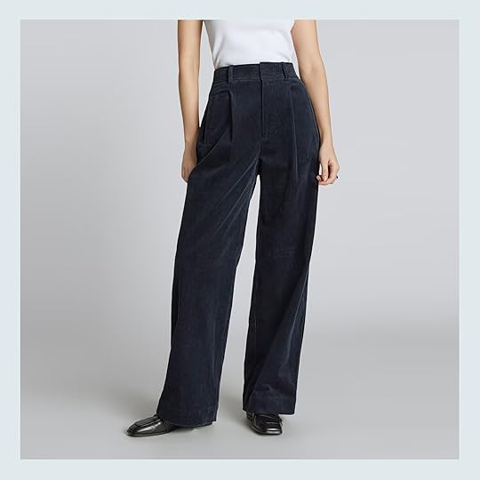
Speaking of…a pleated corduroy pant?! As I’m looking at them again with that side waistband I really want to buy them. AHHH. I won’t…yet. But if you need a fun pant may I highly recommend these (they also come in green). Wear them and try not to feel cool. I dare you.
Wide-Leg Corduroy Trouser, $148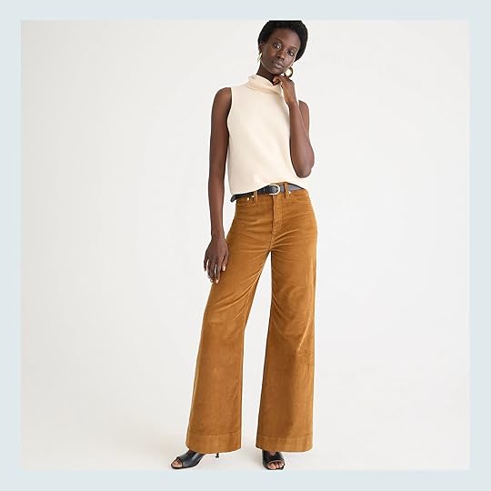
Here is a more classic corduroy pant and is also a J. Crew bestseller! They come in a few colors but this is my favorite and could easily take you through spring. They function more like jeans than trousers if you didn’t want to have to wear “jeans” but want that look.
Wicklow – The Italian Chino, $278

Frank & Eileen has swiftly become one of Em’s new go-to brands. So we know these pants are awesome because she raves about the fit and quality of their clothes (hence the price). The could easily give off a summer vibe with that frayed hem but style them with a cool tall sock, boots, a great jacket, and you are set my friend. They also come in A TON of other colors. Enjoy!
Wide-Leg Essential Pant, $125

Almost all of the reviews talk about how perfectly these pants drape which in a trouser is WILDLY important. These really seem like a 10/10 wide-leg trousers that come in three other colors! Plus, I think it’s safe to say J.Crew knows how to make a classic silhouette:)
Curve Love A&F Sloane Tailored Pant, $90

Well, 705 people gave these trousers 4.7 stars! I also have a friend that bought them and LOVED them. So for under $90 with 16 different color options, these seem like a VERY good option. Abercrombie just keeps bringing the goods.
Extra High-Waisted Pleated Taylor Wide-Leg Trouser Suit Pants, $50

And finally, are these Old Navy trousers that also had over 700, 4.5 star reviews! But these are only $50 which is great. They do have a bit of elastic in the back in case you love (or don’t love) that. Otherwise they go up to 4x and come in four other colors. Win/win.
Did this get you a little excited for fall, for cool new outfits, for comfortable stylist pants?? I hope so:) I’ll let you know how the new pair goes and if I get the faux leather ones! And if any of you have tried these let’s us know what you think.
Love you, mean it.
Opening Image Credits: Photo by Sara Ligorria-Tramp | From: MOTO Reveal! How Jess Made Her WFH Office/Living Room Totally Multifunctional (With Big Help From The World’s Most Beautiful Smart Monitor)
The post 21 Cool Trousers And Fun Pants To Break You Out Of Your Jeans Rut appeared first on Emily Henderson.
21 Cool Trousers And Fun Pants To Break You Out Of Your Jeans Rut
My deep and true love for a wide leg trouser or “fun pants” only rivals my other greatest fashion love…the cropped shoulder padded t-shirt (of which I have three and am pretty sure by now I’m making good money off of them in price per wear). SO, when I say that I love trousers I hope you know I mean it. Here’s the thing, the right pair just makes you feel cool, chic, and dare I say powerful. They can easily go casual (like an off-duty model) or dressier (like an on-duty model). Warning you might feel as fashionable as a model:) Jeans are great but maybe you want to mix it up. And now that we’re officially in fall, we can wear our trousers and other fun pants loud and proud. However, if you need a new pair or two, I have curated quite the selection with most on them clocking in under $150. Full disclosure, I bought a pair in the prepping of this post. No one is safe…
Pleated Tapered-Leg Pants, $88See what I mean? On OR off duty model, or ya know, just different styling options for different events. The slight crop here is so good. These are from Madewell so you know the quality is solid, they come in petite, standard, and tall, they the look effortless cool. All that for $88 isn’t a bad deal. Especially with their 25% off everything sale happening this moment.
The Harlow Wide-Leg Pant, $118Now, these ones I have physically put on my body and really loved them. I just didn’t need them so I decided they had to be returned (you saw the opening photo right??). But they were super flattering and the wide leg is perfect! Had I kept them I would have needed to get them hemmed (hey, barely 5’4″) but having a pair like these are a true staple so totally worth the extra cost. Oh, and they also come in nine different colors.
The Structured Cotton Belted Pant, $148Hey cute belt! If you love a structured pant then baby look no further. These are fun but professional and even look like they do nice things your butt. I can see these being great for the office but then throwing on a heel or fancy boot with a cute top and you are ready for a fun night out. They also come in three other colors.
The ReWool® Way-High Drape Pant, $148If there was ever a pant that screamed “FALL” it would be these camel houndstooth ones. I like the slouchy, casualness of these and think that styled with sneakers and a crewneck sweatshirt the whole look would be so cool and comfortable.
Blush Organic Cotton Cargo Pants, $185Yes. I love these. No, they aren’t the ones I bought BUT I thought about it. That color is insanely good (but also comes in bright green) and those oversized pockets are so fun. They are unexpected but not in your face which I’m also a big ole fan of. Also notice how they taper into the ankle, elevating the look a bit (and eliminates a trip to the tailor for us short kids:)).
High-Rise Relaxed Fit Full Length Baggy Wide Leg Trousers, $32I also tried these on in person for preparation for this post and I am telling you they are great (and for $32 how can you beat it!?) I would have bought them but again, I’m trying to not buy too much of the same thing…it’s a mostly successful mission. They sat a little lower on me because I sized up one which I preferred the look of if that’s helpful to anyone.
Studio Pant, $155These are the pants I ALMOST bought last year in NY but they were out of the the size I really needed. I definitely sound like I have a pant shopping addiction that I’m just barely keeping in check. Anyway, I can personally attest that they are great and were high waisted and cropped on me like the photo on the left. But they wonderful part about this company, WRAY, is that their pant sizes go from 0 to 28! This an awesome and inclusive brand that should absolutely be on your radar. Side note – look at this killer denim dress my friend got which is not on sale!
The Avery Pleated Wide-Leg Trousers, $148I had to put these on the list for a few reasons. 1. They are a perfectly classic wide-leg pleated trouser. 2. The reviews are almost all raves. 3. The sizes range from petite to plus. 4. They come in four great colors. I personally might considering sizing up or if you’re in between sizes go for the larger size. I’m hooked on the slightly oversized look, what can I say?
Blue Canvas Maxi Pleated Pants,$195But I am also hooked on the REALLY oversized pant! I am DYING over these. Sure, they aren’t for everyone and the styling they did here isn’t really for me either. But the shape, the contrast stitching, THAT BLUE? All so incredibly fun. If I could I would give all of my money to Farm Rio for all of their pants. Well actually, I have twice with these black pants and my #1 favorite brown/rust pants that I wear all of the time. Dare I say too much of the time?? They both feel so good on because the quality of the fabric is incredible. Oh, and I always feel cool in them:)
The Colette Cropped Wide-Leg Pants, $130If you’ve been reading for a minute it will be of NO surprise that these are the pants I bought. They basically scream, “JESS BUNGE, THESE FUN PANTS WERE MADE FOR YOU!” what with that checker print and cognac/black color combo. Ok, well technically I already own them in green and white:) One pair for spring and summer, the other for fall and winter?? Ryann bought them too because they were that fun, flattering, and almost too comfortable. Truly, pajama-like comfort. Traditionally, I prefer to play with fun solid colors because busy patterns are not something I usually feel super confident in. Meaning these are special in that I don’t feel “too loud” in them. Ha. They have other patterns and color ways if the checks aren’t your vibe, but I promise the fit will be.
The Colette Cropped Wide-Leg Faux Leather Pants, $148OK, ok. I have been on the hunt for a faux leather pant for a couple of years now and I am very tempted to try these. They are the same cut as the ones above and have 253 at 4.5 stars. That’s a convincing number don’t you think? Also, think how cool we would feel walking around the world in these this fall?? These too come in all different sizes and in two other colors. Should I try them??? TBH I love that whole outfit above…
Black Ponte Knit Straight-Leg Pant, $198I don’t know about you but I have been marketed these HARD on Instagram so, naturally (or really unnaturally), I have thought about buying them a couple of times. They claim to be “the perfect pant” and as the owner says in the instagram ad “people say these pants will land you the job or get you laid.” I’m paraphrasing because, of course, when I searched for the ad it was nowhere to be found. Regardless that’s not a bad sales pitch. From the photos they look super cute (I’m partial to the cropped version) so I’m a fan. They also go up to 3x! Has anyone tried them?
Pull On Pixie Wide Leg Studio Luxe Ponte Pant, $76A moody plaid for fall feels pretty perfect, no? These are from Torrid so sizing runs from size 10 to 30! For those of you uninteresting in zippers and buttons, I’ve got you. These are hardware free so you can just slip them on and go. While this is a cute look, I also think to make it more “everyday” a sneaker and a slouchy sweater would be very cool and modern.
High-Waisted Pull-On Pixie Wide-Leg Pant, $55Another pull-on plaid pant! This color way is personally more up my alley and see how fresh the styling is on the model on the left?? That’s what I’m talking about people! Oh, and that price is incredible and these are highly reviewed so they are an top contender.
The TENCEL™ Way-High® Taper Pant, $138Oh, this cropped pleat is making my feel things. These pants say, “I may dress in a suit everyday but it’s the coolest suit you’ve every seen.” I also love that wide waistband. I tend to find them more flattering which I don’t hate:) It also comes in three other colors. I would also recommend wearing clogs because as you can see it looks sick.
Classic Corduroy Wide Leg Pant, $91When I saw these pants, I had a pang of nostagia. I used to own very similar pants and loved them! Caitlin had (or probably still has) them too. Perfect for fall, perfect for the holidays, and clearly looks cute with any style of boot. I also just really love corduroy.
The Corduroy Way-High® Drape Pant, $128Speaking of…a pleated corduroy pant?! As I’m looking at them again with that side waistband I really want to buy them. AHHH. I won’t…yet. But if you need a fun pant may I highly recommend these (they also come in green). Wear them and try not to feel cool. I dare you.
Wide-Leg Corduroy Trouser, $148Here is a more classic corduroy pant and is also a J. Crew bestseller! They come in a few colors but this is my favorite and could easily take you through spring. They function more like jeans than trousers if you didn’t want to have to wear “jeans” but want that look.
Wicklow – The Italian Chino, $278Frank & Eileen has swiftly become one of Em’s new go-to brands. So we know these pants are awesome because she raves about the fit and quality of their clothes (hence the price). The could easily give off a summer vibe with that frayed hem but style them with a cool tall sock, boots, a great jacket, and you are set my friend. They also come in A TON of other colors. Enjoy!
Wide-Leg Essential Pant, $125Almost all of the reviews talk about how perfectly these pants drape which in a trouser is WILDLY important. These really seem like a 10/10 wide-leg trousers that come in three other colors! Plus, I think it’s safe to say J.Crew knows how to make a classic silhouette:)
Curve Love A&F Sloane Tailored Pant, $90Well, 705 people gave these trousers 4.7 stars! I also have a friend that bought them and LOVED them. So for under $90 with 16 different color options, these seem like a VERY good option. Abercrombie just keeps bringing the goods.
Extra High-Waisted Pleated Taylor Wide-Leg Trouser Suit Pants, $50And finally, are these Old Navy trousers that also had over 700, 4.5 star reviews! But these are only $50 which is great. They do have a bit of elastic in the back in case you love (or don’t love) that. Otherwise they go up to 4x and come in four other colors. Win/win.
Did this get you a little excited for fall, for cool new outfits, for comfortable stylist pants?? I hope so:) I’ll let you know how the new pair goes and if I get the faux leather ones! And if any of you have tried these let’s us know what you think.
Love you, mean it.
Opening Image Credits: Photo by Sara Ligorria-Tramp | From: MOTO Reveal! How Jess Made Her WFH Office/Living Room Totally Multifunctional (With Big Help From The World’s Most Beautiful Smart Monitor)
The post 21 Cool Trousers And Fun Pants To Break You Out Of Your Jeans Rut appeared first on Emily Henderson.
September 22, 2023
Choosing The Wallpaper For Our Farmhouse Powder Bathroom

Our powder bath reveal is coming at you VERY SOON, so one of the last elements we needed to figure out was the wallpaper. I was SO happy with the color of the walls (soft and moody but with so much warm pinkiness) and my original idea of going quiet with the paper was starting to bore me.

As a reminder, here is where we are in the house (the circled part). So it’s near the family room (which is a very dark teal called Stillwater by Sherwin-Williams) and also near the mudroom (Dew Drop, also Sherwin-Williams) and our bedroom (Debonair, yes, Sherwin-Williams). We also plan on wallpapering that Anteroom (a fancy word for “before” room – as in before the primary bedroom) which is a whole debate too. Do all rooms need to “go together”? Meh, sure but not necessarily. But I do want them to flow nicely and not feel redundant. I want each room to feel like a pleasant surprise, but not like, “Woah, what house are we in now?”

 from: the farmhouse powder bath update (did we stick with the blue walls??)
 from: the farmhouse powder bath update (did we stick with the blue walls??)
At first, I tried to work with the original blue paint color, and I selected all these quieter Scandi patterns – sweet plaids and the ticking stripe (that we ended up using in the stairway and landing).
 from: the farmhouse powder bath update (did we stick with the blue walls??)
At the time I was also playing around with skirting the sink with this vintage Japanese Boro fabric so that would help inform the wallpaper as well.

But after painting the walls this deep rose/mauve (Cocoa Berry by SW) those papers shifted, obviously. Up here you can see one from Farrow & Ball (I will always love their hand-painted papers) and a Kelly Ventura paper which I also LOVE.

I kept collecting and collecting, mostly from my favorite designers (Scandinavian Wallpaper, Schumacher, Rebecca Atwood, Kelly Ventura, Farrow & Ball, Sandberg, and Borastapeter).

Those were the final ones I stared at and stared at for a long time. But the skirt that we ended up putting on the vanity helped sway me into a clear choice. And you’ll have to come back Monday for the reveal to see how it all turned out. Also, I styled it out with some fun stuff that I can’t wait to show you 🙂
*Photos by Kaitlin Green
The post Choosing The Wallpaper For Our Farmhouse Powder Bathroom appeared first on Emily Henderson.
September 21, 2023
Our Powder Makeover Process: A Recap And Our Custom Vintage Vanity
Time to jump into the next room (did you see the Sunroom last week?) as we get closer and closer to being done with the first floor of our home. This powder bath is on the first floor, in the hallway to the mudroom and our primary bedroom, and gets a ton of use (like the kids brush their teeth in here in the morning and many a child races here right after school if you know what I mean). but a powder bath is where we can have more fun – and usually, without natural light, you kinda of want to do something in order to add some interest. I had the initial idea to offset the wall-hung sink and make it all symmetrical (And guess what? Once those decisions are made, they are MADE). Thank goodness I love how it turned out because when my cabinet dreams fell through we had to improvise.
Here’s where it is in case you want a visual:
 The Initial Plan
From the beginning, I knew that I wanted the sink where it is with a custom wood cabinet underneath, with a simple panel curtain (take a shot, if you are playing the “where else can she put the boro fabric” drinking game – and bring a flask on reveal day). ARCIFORM rendered it up and we couldn’t quite get it there. But around that same time my “good design decision ability” was waning, along with the budget being super depleted. When we got this quoted initially it was $2,500 and we hadn’t even dialed in the special details. I was like, “Nope, let’s just wait and see if a better, more interesting solution arises, we aren’t in a rush”. We ended up waiting for about nine months – which isn’t that long, BTW, and the only reason we even tackled this now was because we found a solution worth trying.


The original blue paint color was not the right vibe for me (SW 9147 Favorite Jeans). It was just too bright and periwinkle from the second I saw it all up. It wasn’t until a few months later that I felt confident enough in my instinct to make the change to SW 9078 Cocoa Berry. And while it’s just paint, when it comes to painting wood paneling like this it has to be sprayed super evenly/perfectly so doing this still took two and half days (a couple of hours to tape off, prime + first coat, then second coat on day two). You see I had fallen in love HARD with our guest room color (SW 6030 Artistic Taupe) and realized that a deeper version of it could be so pretty. Plus near this room, we had multiple blues and greens so I wanted a contrast.


So I started playing with other wallpapers along with other tables/vanities. I found this desk that is so pretty but clearly not the right height or width OR depth. That’s a lot of retrofitting. Oh, and the paint color on the left is the most accurate, BTW.
The Blanket Box
 left photo from: front porch reveal
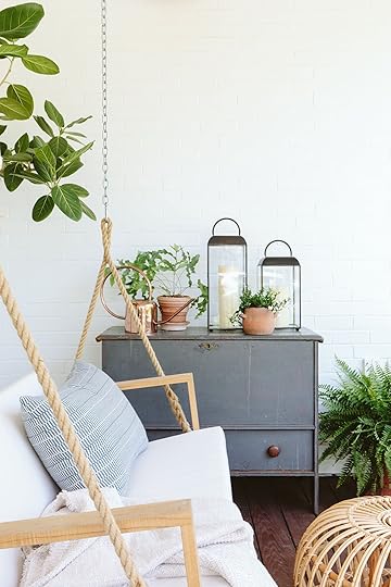
At Aurora Mills, I thought I found my piece – it almost fit in every single way, but once I got it in there it wasn’t a “hell yes”. And it was going to take so much work to retrofit it into a vanity (we’d have to raise it somehow, cut it open – do all this permanent stuff). And I figured to do all this permanent stuff it needed to be a “hell yes” (it was also really expensive, around $1k which admittedly is a bit overpriced for this, so I’m VERY glad I found a place for it on the front porch).
The Winner – A Vintage Table turned Vanity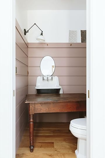
Then one day, our client from the Crate & Barrel kitchen remodel, Julie, gave me this extra table. She asked me if I liked it and I of course did – it was such a great classic farmhouse table. We awkwardly shoved it in there and immediately loved the vibe. The warmth of the wood complemented the paint color and just added so much soul.


Of course, we had to make it work, which required again a lot of permanent cuts. So Dave, our handyman, came over and troubleshooted it with us. The plan was to cut off the back legs to make the depth right, then cut a perfect hole for the sink.


Then we took the bottom of the back-turned legs and cut them off to add to the height of the front two legs. I came back from Arrowhead this summer and it was DONE!!!

Paint Color | Sconce | Sink | Faucet | Switchplates | Hook | Table (vintage)
It turned out so great! We ended up pretty much centering it on the wall, which worked well because the wood on the front of the sink was around the same size as the excess wood on the right (so it looked really intentional).
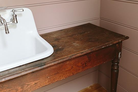
The table is really rustic and old, with a billion imperfections and patina so we haven’t worried yet about caulking it, but that sink really catches almost all the water so I’m not worried about it.

BTW we actually ordered this sink with a chrome P-trap (the pipe underneath the sink) and we still have it but have yet to do it (mostly because calling a plumber to do this is not on my priority list, especially now that it’s covered).

So there’s where we landed – a free vintage farmhouse table, with the most perfect undertones for our vanity. Come back tomorrow to see some wallpaper options (with the reveal next week). She is turning out pretty darn cute …. (And a huge thanks to Julie for this table!! and to Dave for making it happen at MUCH less than the $2500). Julie and Dave FTW!
*Pretty photos by Kaitlin Green
The post Our Powder Makeover Process: A Recap And Our Custom Vintage Vanity appeared first on Emily Henderson.
September 20, 2023
Dark Kitchens Rejoice! 5 Color Palettes to Breathe Some Life Into Cold Espresso Cabinets

Well, well, well…what do we have here? MORE READER REQUESTS COMING TO FRUITION! In my quest to make everyone’s kitchen a whole lot better without any reno, I’m back with my third installment of non-boring kitchen color palettes. This time, we’re entering the realm of dark-slash-espresso cabinets. I’ve gotta tell you, this one gave me a run for my money, and it found me bankrupt and destitute. Unearthing inspiration took me days. Knowing what to do with that inspiration took me another few days. Texts were sent back and forth between me and the EHD team…”I can’t do it…I need more time…I’m a failure.”
If you missed it, I tamed the wild beasts that were honey oak and cherry kitchen cabinets. The warmth of both of these wood finishes actually gave me a lot to work with. It’s much easier making something made to be inviting feel inviting. But espresso cabinets? These were made to feel “elevated” and “fancy” by the builders that graced many an “upgraded” kitchen in the 2000s (and even now). But most of the photos I found of dark wood-stained cabinets felt cold and uninspired, tbh. Everything was brown, cream, or beige (but like, the not great kind of cream or beige), and NEEDED MORE LIFE.
I get it because it’s H-A-R-D to bring these to life. I see that now. I had to walk crawl so you could run…straight into your espresso kitchen twirling with your arms up in delight for a new design scheme to bring it to life. Where honey oak and cherry kitchens seemed to run the gamut with regards to the countertops, espresso kitchens had one of four options about 98% of the time: heavily veined cream granite, white/marble-like quartz, black granite, and grey granite. So that’s what I tried to build off of here, creating schemes for each scenario.
Get ready to invite over your friends, your family, and even that neighbor you try to avoid on your nightly walks because your kitchen is about to seriously level up and everyone needs to see it.
But first, a few ground rules, as per usual.
How To Read The MoodboardsEverything pictured is representative of a concept, rather than just a direct one-to-one product pick. Meaning, I may show a runner, but maybe you have room for a 4×6…pull colors from my sample; you need barstools rather than a dining chair but I’m showing one or the other…just borrow the color or material idea; Maybe you need a long linear chandelier over an island or even sconces above a window rather than a pendant…that’s cool, it’s a style inspiration. Etc., etc., etc.
Espresso Cabinet Helpful TipsAs for the kitchen itself, espresso (or any dark-stained wood) cabinet fronts and frames are the heaviest of the entire bunch. I think even heavier than straight black because it doesn’t work that well with bright white as a contrast. The slight red undertones feel stark against a true white unless you have the right elements already in place to balance it (the right floors, the right layout, the right amount of natural light). So, assuming anyone here who could use my design tips is working with what they have with the exception of a few little updates here and there (lighting, backsplash, hardware), that’s not going to be the case.
If you’re willing to put in a little bit more elbow grease and $$$, here are just a few things that can drastically modernize the vibes in your dated, dark kitchen:
Hone your granite. I discussed this in my earlier post where I walked through real reader kitchens, but bringing down the sheen on that mirror-finish granite is key if you can muster it. I don’t know why everything had to GLOW in the year 2010, but espresso cabinets are already so shiny, let’s amp it up even more with an ice skating rink on your countertops, shall we? Rates vary depending on where you live and how much square footage you have, but it’s much more reasonable (and less wasteful) than ripping out your stone for something new. Considering losing the weight up top. At this point, I feel like I’m being paid by the No Uppers council for evangelizing the visual benefits of taking down some or all of your uppers if you have a dark or heavy wood kitchen. This obviously is in no way the route for someone in a small space who needs a lot of closed storage, but if you can spare them, rip those puppies out (carefully…you can save them, sell them, or donate them). That or consider painting just the top of your cupboards another color to lessen the load above your space’s eyeliner. Avoid anything overly ornate or industrial. That’s right. The name of the game here is middle of the road in terms of design style. Anything too heavy and you risk crossing over into Tuscan territory; too modern and you might as well grab your parka because it’ll be so cold and uninviting, you’ll be ordering takeout every night just to stay (figuratively) warm. We’re skipping any nickel, chrome or silver here and relying more on different brass finishes, some copper and even bronze.Got it? Great! Let’s go!
If You Have Espresso Cabinets With Black Granite/Quartz…The Inspiration:
View this post on InstagramA post shared by Chateau de Ron (@chateauderon)
I know, I know. These are not espresso cabinets. BUT! From all the photos of real, live espresso kitchens I found, they all had dark brown, slightly reddish tones to them, so when I saw this gorgeous kitchen by designer Lesya Pechenkina (shared by account @chateauderon), I knew it had to be a foundation for a color palette. The dark gray/black stone basically disappears and all you see is the gorgeous tile and the dark dage uppers. Black or charcoal velvet seating is also low-key, keeping everything visually calm and on the same wavelength to let an interesting tile be the star.
The Moodboard:
Here’s how I rendered out what I saw above. I desperately tried to find a similar mosaic tile, but at some point, I came across this one in the same color palette and I thought it would be an interesting addition. The mossy green paint color can be used on uppers, on an island you’re willing to paint, or even on walls (but I’d skip it in that application if you don’t get good natural light). The burnished brass hardware is so gorgeous and, just like the dark velvet seating and black granite, would feel muted but textural.

1. Vegas Cement Tile | 2. Succulent by Sherwin-Williams | 3. Kitchen Shelf Girder Black Brass | 4. KEPLER Knurled T-Bar Pull – Antique Brass | 5. HUMBOLDT Knurled Button Cabinet Knob – Antique Brass | 6. Cloak Pendant | 7. Azalea Mink Grey Velvet Dining Chair | 8. Pascala Moroccan Hand-Knotted Copper Wool Runner Rug | 9. Organic Cotton Roman Shade in Walnut
If You Have Espresso Cabinets With Cream Granite…The Inspiration:
View this post on InstagramA post shared by Lone Fox by Drew Michael Scott (@lonefoxhome)
Remember Drew Michael Scott’s (a.k.a. Lone Fox) unreal DIY kitchen reimagining from this post? Well, it arrived wearing its cape to save the day for our second color palette for all your neutral girlies out there. And just like the first kitchen, let’s squint our eyes and use your imaginations because no, this doesn’t have a cream granite countertop. I’m sorry I can’t be literal a single time, but I promise there’s something here for you.
Yes, Drew’s beautiful and bold Arabescato Breccia (I think) marble is a far cry from the beige granite of the Boy Band era, but hear me out. The tumbled stone he used as his floor made me think that a tumbled marble might work great against a warm granite as a backsplash (or yeah, even a floor). It’s all about intention when it comes to making beige feel current. Don’t try to counteract it with too much white, because it’s going to look like you’re trying to hide it when in fact you’re making it even more obvious. He rounds his design out with antiqued brass and copper metallic accents and (not shown here) warm textiles throughout.
The Moodboard:
A creamy, taupe-y paint color would work on any vertical surface (wall, cabinet, island, display cabinet) and mirror a tumbled marble tile backsplash. Just like Drew, a mix of copper, bronze and burnished brass leans into the timeworn vibe here (again, without hitting “Tuscany” notes). I picked a cerused oak barstool for added texture and character.
1. Crema Marble Tile | 2. Beigeing by Clare | 3. Enclume Wall-Mounted Deep Bookshelf Rack in Copper | 4. Rhodes Drawer Pulls in Tumbled Brass | 5. Rhodes Cabinet Knobs in Tumbled Brass | 6. Andre Brass Cone Pendant Light | 7. Revival Boucle Oak Counter Stool by Athena Calderone | 8. Elowen Rug | 9. Belgian Flax Linen Roman Shade in Oatmeal
If You Have Espresso Cabinets With White Granite/Quartz:The Inspiration:
If you have white or quartz countertops, congratulations because you won the espresso cabinet lottery. At least when it comes to styling it for modern day. Above, queen Athena Calderone‘s Brooklyn brownstone (RIP) kitchen basically broke the Internet when we all saw it, so I couldn’t help but use it for something in today’s post. Again, not espresso cabinets but the ebony stain/paint on Athena’s Shaker fronts gave me the jumping-off point to build a similar color palette around. This was photographed for her collaboration with Beni Rugs and I just love how the yellow-toned green, taupe, and cognac play against the black.
The Moodboard:
I pulled straight from Athena’s photo with an olive green plush runner rug and a cognac velvet barstool. Plenty of black touches like shelving and the barstool’s metal frame feel modern, but are balanced with warm Calacatta gold marble subway tile, a wicker and brass pendant, and a white chocolate Roman clay treatment for the walls. Honey bronze cabinet hardware is simple but stately. And I can never resist a linen pinstripe for a curtain treatment.

1. Calacatta Gold 2″ x 4″ Marble Mosaic Wall & Floor Tile | 2. Lumiere Roman Clay | 3. Skaksel Black Floating Shelf | 4. Top Knobs Barrington 7/8 Inch Round Cabinet Knob | 5. Top Knobs Rounded 4 Inch Center to Center Handle Cabinet Pull | 6. Uttermost Phuvinh 1 Light Rattan Shade Pendant | 7. Inna Bar Stool w/ Backrest | 8. Kole Performance Nylon Olive Green Runner Rug | 9. Montauk Pinstripe Sheer Fabric, Natural
The Inspiration (Part 2):
View this post on InstagramA post shared by Nicole Cole | Interior Design (@vestigehome)
Since white countertops were much easier than the rest, I decided to do a second option for something with a different aesthetic, in case someone wanted something a little homier. I’ve had this image from Vestige Home bookmarked for a while. I admired the room’s Parisian-modern aesthetic, and I’d be hard-pressed to ever ignore a full marble mantel and surround with a carved wood mirror above it. But I scrolled past it in my journey to find inspiration for this post and after some consideration, I grabbed it to include here.
In the case of the espresso kitchen, I think this photo and the color palette I built from it would work best with the minimum amount of dark cabinets (meaning, in a space where the owners are willing to part with uppers). Otherwise, the crisp white might come off abrasive.
The Moodboard:
I can see this coming to life with a full wall of honed blush tile, dotted with red oak shelving. A modern metal light fixture is a foil to the vintage rug and Shaker cabinets, polished brass act like jewelry and a dusty, denim blush upholstery plays nice with the blush while keeping it grounded.

1. Makoto 2.5″ x 10″ Matte Ceramic Wall Tile in Momoiro Blush | 2. SW 7005 Pure White by Sherwin Williams | 3. Volume Floating Shelves in Cool Walnut | 4. Rigdon Cabinet Knob With Round Backplate in Aged Brass | 5. Rigdon Drawer Pull in Aged Brass | 6. Gemma Black Pendant Lamp | 7. Nosh Denim Blue Counter Stool | 8. Gisa Vintage Distressed Runner Rug | 9. 2-pack Linen Curtain Panels
If You Have Espresso Cabinets With Gray Granite/Quartz:The Inspiration:
We’ve reached the end, with our final countertop scenario: gray stone or granite. Not as friendly as white, but not as fickle as cream, gray granite really needs some warmth to make it feel more at home with dark wood cabinetry. I saw this image above (I believe from the Schoolhouse catalog a while back) and immediately wanted to try a wood backsplash. I also like how the hardware is just barely there and there’s only a touch of another color in the palette via a striped dish towel.
The Moodboard:
I knew I had to start with the wood backsplash first and foremost since that’s the main event here. I found this wood-looking tile that I thought would look awesome and be easier to maintain, but by all means, go the actual tongue-and-groove or shiplap route. Just be sure to keep the wood tone more neutral (not too red, not too yellow). Your espresso cabinets can’t handle much undertone competition. The blue comes into the mix in our soft goods like the rug (which was actually in Sara’s kitchen makeover, too!) and tier curtains. I picked Atrium White from Benjamin Moore because it’s a fantastic creamy non-yellow white, which is important if you’re dealing with gray surfaces. Dark bronze metal in the hardware and lighting feel nicely monochrome.

1. Montgomery Ribbon 24 in. x 48 in. Porcelain Ribbed Wood Look Wall Tile | 2. Atrium White OC-145 by Benjamin Moore | 3. No Stud Needed Floating Shelf – Simple Mount in Marble | 4. Linden Cabinet Knob in Dark Bronze | 5. Tilden Drawer Pulls in Dark Bronze | 6. Gabbie 1 – Light Schoolhouse Pendant in Oil Rubbed Bronze | 7. Riley Counter & Bar Stool in Cream | 8. Baltinglass Washable Runner Rug | 9. Cackleberry Home Navy Blue and White Ticking Stripe Woven Cotton Panel Curtains
So that’s that. I survived. I’m in 17 color palettes deep now as I reach the end of this series and honestly, I had so much fun. Espresso kitchens might have almost taken me out, but I conquered that mini-boss in the end.
As always, please chime in. I think we covered all the bases of the bad, dated kitchen wood finish club but if there’s anything else you want to see, let us know.
For now, stay tuned for an update on MY kitchen ASAP, because after all of this work, I’ve cooked up a handful of new ideas for myself. Let’s just say my moodboard looks quite different now and I’m rounding the corner on the finish line.
Your friend in design, Arlyn
Opening Image Credits: Design and photos by Drew Michael Scott of Lone Fox Home
The post Dark Kitchens Rejoice! 5 Color Palettes to Breathe Some Life Into Cold Espresso Cabinets appeared first on Emily Henderson.
Emily Henderson's Blog

- Emily Henderson's profile
- 10 followers

