Emily Henderson's Blog, page 23
March 15, 2025
The Best New Spring Denim I’m Really Really Into (And Everything Is Comfortable)
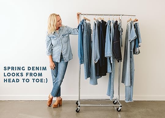

I didn’t set out to buy new denim when I went shopping – heck, I don’t LOVE wearing restricting clothes at all (a covid holdover), but I loved some of what I found so much, in a refreshing way – like denim, but dare I say special? Also, if you haven’t checked out the spring basics post, there are shorts and jeans in that post (that are just great staples), but this one is more head to toe denim (with a few matching sets I’m obsessed with). Let’s dig into it.


Blouse (size small) | Long Shorts (size 27) | Belt | Clogs
Hands down my favorite “shirt of the summer” (tied with this one from the Gap – both so good). I’ve worn it so many times since I got it because it’s both casual and stylish (versus a denim button-up that mostly reads as casual). I also love the one I’m wearing in the opener for a more western inspired button-up (that is super affordable). Now the shorts I think are more on trend and stylish than my shorty shorts that I typically wear. I bought them (and modeled them) for those of you who don’t LOVE wearing short shorts, because they are really good. They flare in a good way and that cuff is strong and cool. They aren’t the trendy “bermuda shorts” that were in last year, they are more flattering and yet still long. I added the belt to make it look pulled together (which worked!).

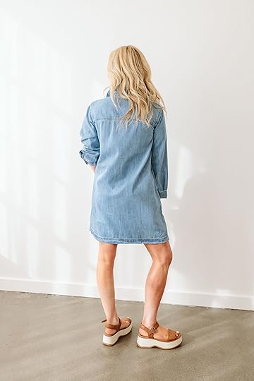
Bandana | Dress (size small) | Sandals
Now, this denim dress is a real affordable winner, clocking in on sale at $29.99. So easy to throw on, dress up, dress down, light weight, cute, flattering, comfortable, not body-con – all the things I like in a spring/summer daytime dress. The sandals I bought last year, and they are the most wearable around town heels that I own (like I wouldn’t go out for an intentional long walk in them, but heels that you can wear all day, out and about, walking for hours and be super comfortable).
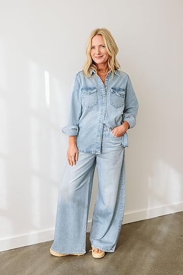

Button Up Shirt (size small) | “Denim” Sweatpants (size 27) | Sandals
This is the other button-up that felt worth having (love the little western pockets and so affordable). It’s a bit thicker (less drapey) so good for more structure or to wear as a shacket. But the real reason we are here is to talk about the famous SWEATPANT JEANS!! Yes, these are the Rag & Bone, printed jeans that are actually sweats. My review of them is “darn incredible” because they are obviously incredibly comfortable. They look “real” (even the backpockets are printed). Now, I get why they are expensive ($238) as I’m sure they had to perfect and have the perfect printing ink and technique to look so real, but I ended up returning because I mostly work from home (where I can wear more affordable, comfortable clothes). Plus, if I am to leave the house and want to look cute I’d opt for actual jeans. But for people who have to leave the house daily to look presentable and still want to be super comfortable, these are 9/10 (again, missing a point because so $$$). If you want SUPER soft and comfortable but not seatpants and not $238, I bought and kept these Dean jeans from Madewell, which are not printed, but just somehow soft, a bit drapy and extremely comfortable. Like I would wear them on a plane kind of comfortable (always baffled by people who wear hard pants on a plane, TBH).
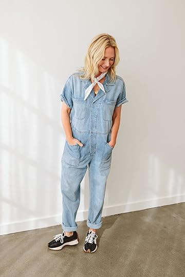

Bandana | Gold Necklace | Jumpsuit (size small) | Sneakers
I’ve been wearing this on repeat since I got them – IMHO the easiest to wear denim jumpsuit I’ve owned – not trying to be all hour-glassy and therefore uncomfortable after lunch, but has a slim enough leg that you aren’t just one big box. I like the short sleeves and the tapered leg, and it’s mid-weight so it falls nicely, isn’t too constricting or thick and is just so darn easy to wear. Plus, huge pockets for your phone, etc – I literally throw this on when I want to look stylish but still need to work (i.e. on set, styling, shopping, etc).


Gold Necklace | Top (size extra small) | Skirt (size 4) | Heels
Well this was a surprise – both from H&M and super affordable and so darn cute! Granted I like wearing boxy tops and tiny skirts, so this isn’t for everyone, but this is in my “spring date night” arsenal for sure. The sandals are Korkease (so very comfortable for heels).

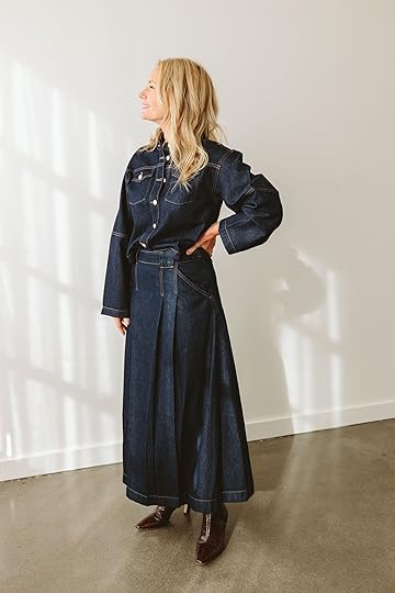
Denim Shirt (size extra small) | Long Skirt (size 26) | Boots
I LOVED this outfit – it’s more of a city look for sure, but I’m so excited to have it as a go-to for when I go to New York for meetings where I want to look cool, be comfortable, make a statement, but not stress. It’s oversized but there are so many times where we all just want to look cool but don’t necessarily let people see our bodies, and this checks the box for me. Also, that dark wash is super in (with the silver buttons and contrasting stitching). LOVE THIS LOOK.

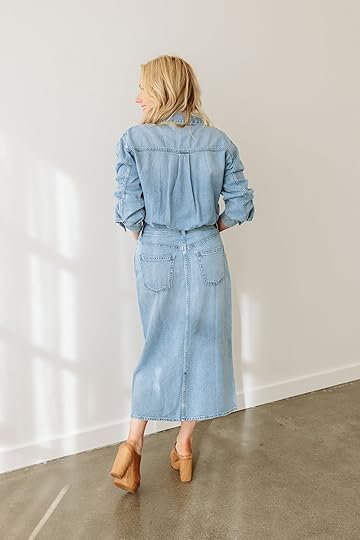
Denim Dress (size 4) | Clogs
This last one that I’ve become super obsessed with is this denim dress that looks like a shirt and skirt!!! But it’s a dress!! Finally a non-body-con denim dress that is so flattering. I think a belt would even make this outfit look better. Cute with sneakers or sandals, great with clogs – just a nice “I’m casual, comfortable but still cool” outfit but with just one piece of clothing. HUGE FAN.
*Photos by Kaitlin Green
The post The Best New Spring Denim I’m Really Really Into (And Everything Is Comfortable) appeared first on Emily Henderson.
March 14, 2025
The Official (Mostly Affordable) EHD 2025 Outdoor Furniture Roundup
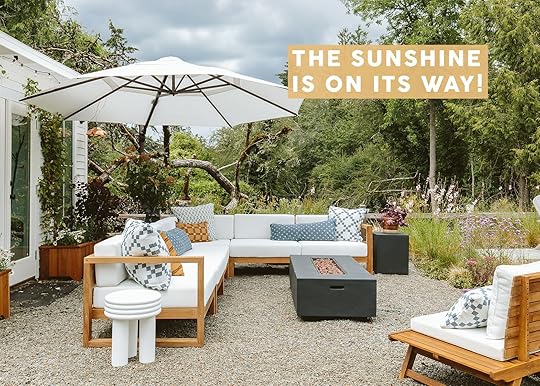

While it’s not “warm” in most places, yet (in the US at least), it is on its way, meaning our outdoor spaces are going to be calling our names sooner than we think. And if you are someone who needs either a new piece of furniture or an entire set, this post is here to help. Now, I say this anytime I write about outdoor furniture…it’s not cheap stuff. So while it’s always a bit shocking, outdoor furniture does have to hold up to the elements (ideally), making the price tags a little more justified (?). But remember that as much as we wish outdoor furniture was a “set it and forget it” category, you do have to protect those cushions, cover that furniture, etc, to keep things nice season after season. I really did my best finding pieces that looked great and that, based on the market, were on the affordable side, which is, as always, relative. This post was also really hard to put together this year because there were SO many great and beautiful options, but also lots of them were very pricey. I did sprinkle in some of the higher priced pieces because I simply couldn’t help myself. Y’all at least needed to see them:) Let’s jump right in, shall we?

1. Laholm Outdoor Sofa | 2. San Marcos All Weather Wicker Deep Seat Outdoor Sofa | 3. Leni Outdoor Sofa | 4. Matilda Acacia Outdoor Patio Sofa | 5. Isla Indoor / Outdoor Sofa | 6. Melrose Teak Outdoor Patio Sofa
Seating is such an important part of relaxing in an outdoor area, and if you have the space for a sofa these six are pretty great options. I think that #4 is SUCH a great find for that price and while cream cushions may make some people nervous, you can buy a cover for $65. Done! #3 and #5 are the high rollers of the group but my oh my are they pretty beautiful. I love that you can see the straps on the front of #5. But if you have a more mid-range budget (and light cushions aren’t your preference) #1 and #6 are really amazing choices.
 photo by kaitlin green | from: river house patio reveal – the case for the “matching set”
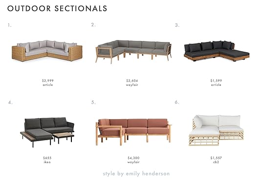
1. Capra Outdoor Sectional | 2. Clearwater Outdoor Patio Teak Wood 6-Piece Sectional Sofa | 3. Lubek Outdoor Low Right Sectional | 4. REVSKÄR Set | 5. Haven 4-Piece Teak Outdoor Sectional with Sunbrella | 6. Cana 3-Piece Outdoor Patio Sectional Sofa
But maybe you need (or want) a sectional! We have used #3 in two projects (Bowser’s and the River House) and everyone loves them. I got the sofa version of #5 and it was real simple to put together myself, and I love love the cushion color so much. Perfect for someone who doesn’t want a really light cushion color but also doesn’t want to go too dark. Big fan if you have the budget. However, wanting a sectional doesn’t mean you need a huge space, #4 and # are ideal for a small outdoor area.

1. Henryville Round Teak Outdoor Coffee Table | 2. Pebble Indoor/Outdoor Oval Coffee Table | 3. Pertti Rectangular Steel Outdoor Coffee Table | 4. Peggy Outdoor Oval Coffee Table | 5. Orb Coffee Table | 6. Fayette Round Coffee Table
If you have (or are getting) a sofa or sectional, you’ll likely need a coffee table, right? Where else shall you put your charcuterie board and fine wine? Or you know, a bowl of chips and some ice cold White Claws:) Both pairing sounds pretty dreamy to me. But back to coffee tables! I think this is a perfect place to have a little style fun that feels less like a big risk. All six of these have a good amount of personality, but all say something different stylistically. The traditional modern twists of #3 and #4 are so good (FYI #3 is a small one so great for a small space or you could double up!). I was shocked and delighted by the price of #6. It’s so pretty and claims excellent durability. And if you have the budget, #5 is insanely cool and could easily be an indoor coffee table too. You can’t go wrong with this group.
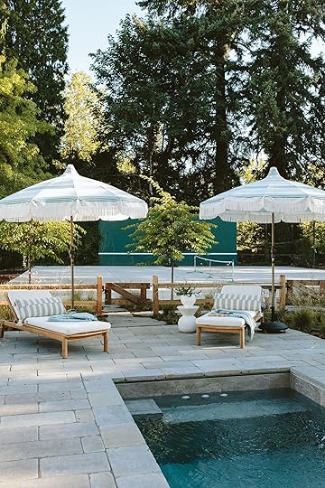 photo by kaitlin green | from: farmhouse soake pool reveal
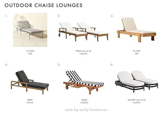
1. Costa Black Metal Outdoor Sun Lounger | 2. Saeon Outdoor Acacia Chaise Lounge Set (Set of 2) | 3. Monterey Outdoor Teak Chaise Lounge | 4. Laholm Outdoor Chaise Lounge | 5. Alvah Outdoor Eucalyptus Chaise Lounge | 6. Everlee Outdoor Powder Coated Aluminum Chaise Lounge Set (Set of 2)
If you have the space, an outdoor chaise lounge is THE BEST. You will not regret it. Even on my weird super skinny balcony, you bet I found a chaise lounge that fit. It’s a bed for the outside, what’s not to love? I’m pretty partial to the adjustable back so that’s what all of these have (mine doesn’t and I really wish it did). I want lounge height options (I’m an options gal, can you tell?). Of course, I’m drooling over #1 and #3 for different reasons but for the price and flair, #5 is hard to beat. The shape of #6 is so cool and #4 is from Article so it’s both beautiful and undoubtedly comfortable (I have yet to experience anything from Article that has been so comfy to sit on and it’s been a lot of pieces).
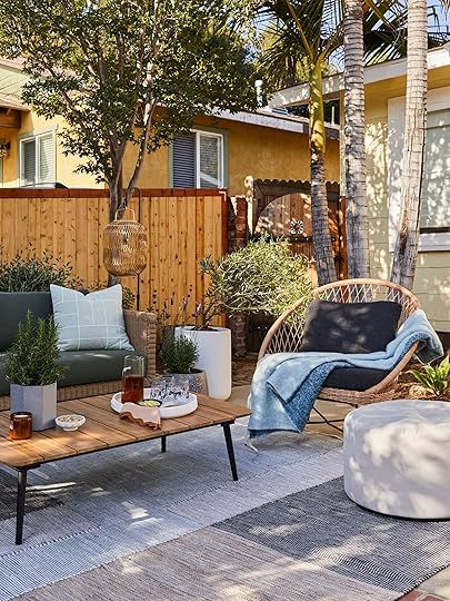 design and photo by sara ligorria-tramp | styled by emily bowser | from: this yard makeover only took 3 weeks, some elbow grease, and a new (very good) seating area
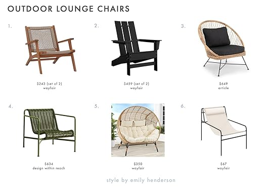
1. Kaetlin Acacia Outdoor Lounge Chair (Set of 2) | 2. Ratcliff All-Weather HDPE Adirondack Chair (Set of 2) | 3. Aeri Outdoor Lounge Chair | 4. Palissade Cord Lounge Chair | 5. Damarie 2 Person Chair | 6. Chrystan Metal Outdoor Lounge Chair
Of course we can’t forget a great lounge chair. Perfect for a conversation area, around a fire pit, etc. #1, #3, and #6 are huge bangs for your buck and are all different styles so there’s something for everyone! I have sat and didn’t want to get up from #3 (actually got to watch a movie sitting in it). I love the color and modern curvy shape of #4 (it also comes in a deep red). And who doesn’t love a good egg chair (especially if it fits two)?
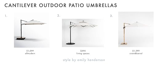
1. Menades Cantilever Outdoor Umbrella | 2. Easy Open Ivory Outdoor Cantilever Umbrella | 3. Square Canvas White Sand Sunbrella® Cantilever Outdoor Patio Umbrella
Yesterday, as I was prepping this post, I had a conversation with my best friend about outdoor umbrellas. The house she and her husband bought came with one, which was of course nice, but stylistically isn’t what she ultimately wants. And like any normal afternoon conversation amongst best friends, I asked her what she wanted out of an outdoor umbrella/what did and didn’t work about the one they have? She loves that it’s a cantilever since her sweet but active little boy is constantly moving around the backyard playing. Plus, this little munchkin (along with this mother) has sensitive pale skin. So having an umbrella that can easily move with the sun is key. What she hates about her current one is the big chunky plastic base, which I very much get and would feel the same. Oh, and she doesn’t want to spend a million dollars…which I also very much get. So I tried to find a few options that fit the bill (mostly). #1 is awesome because of the wheel on the base and I love the wood accent. The price is right with #2 and while it’s harder to move, that base is way less intense than the average affordable option. Then #3, the most expensive, is honestly just so pretty. I love the “wood” stand and base so much. I know they are all white canopies but #2 has some darker shades if that’s your preference!
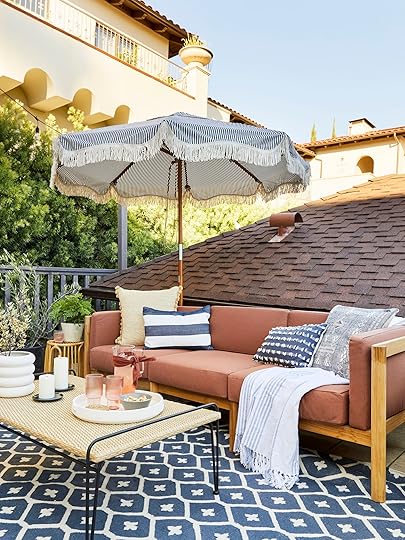 design by jess bunge | styled by emily bowser | photo by sara ligorria-tramp | from: jess’ communal patio reveal
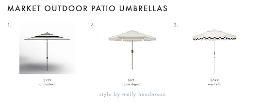
1. Natalie Sunbrella® Outdoor Umbrella | 2. Steel and Aluminum Market Crank and Tilt Outdoor Patio Umbrella | 3. Business & Pleasure Co. Market Umbrella
For those of you who prefer or only need a market style umbrella, I’ve got you too. Now, #1 and #2 do tilt so they do have a little more functionality. Both have those classic stripes we love and those prices are pretty great! Of course you do need to buy a stand but I’ve got you covered in the next section. Then while pricey, #3 is pretty special. The trim is actually a dark blue but comes in other, brighter, colorways. Honestly, Business & Pleasure has a ton of really fun and colorful options if that’s more your style.
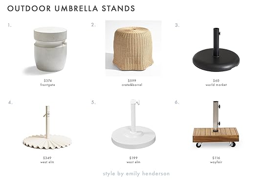
1. Corbyn Umbrella Table | 2. The Felix Wicker Outdoor Umbrella Side Table | 3. Round Black Concrete Patio Umbrella Stand | 4. Business & Pleasure Co. Clamshell Base | 5. Wheeled Umbrella Base | 6. Concrete Free Standing Umbrella Base
Ah yes, the necessary stands. You can go super simple with ones like #3 and #5 (this one has wheels:)) or have one that’s got a little more something happening like #4 and #6. But if you aren’t using it in the middle of your dining table, I love these umbrella side tables like #1 and #2. #2 is brand new and part of the incredible new collection that Jake Arnold just did with Crate and Barrel. Go check it out!
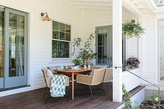 photo by kaitlin green | from: farmhouse back deck reveal
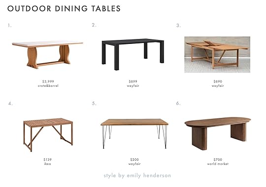
1. The Townsend Wood and Stone Outdoor Dining Table | 2. Spector Extendable Rectangular Outdoor Dining Table | 3. Alyisa Extendable Rectangular Eucalyptus Outdoor Dining Table | 4. NÄMMARÖ | 5. Vikesha Rectangular Outdoor Dining Table | 6. Savio Oval Light Brown Eucalyptus Outdoor Dining Table
Speaking of Jake Arnold’s new collection, when I saw that dining table (#1) my jaw dropped TO THE FLOOR. Please, someone get it (if you need a table) and invite me over. I promise I’ll be a delight and if all else fails I’ll bring a great bottle of wine. But a $4,000 is not a super doable purchase for a lot of us, which is why there are five other great options:) If you want to go simple but classic, #3 and #4 are perfect. #3 can seat up to 10 people when fully extended! #2 is also extendable and real chic.
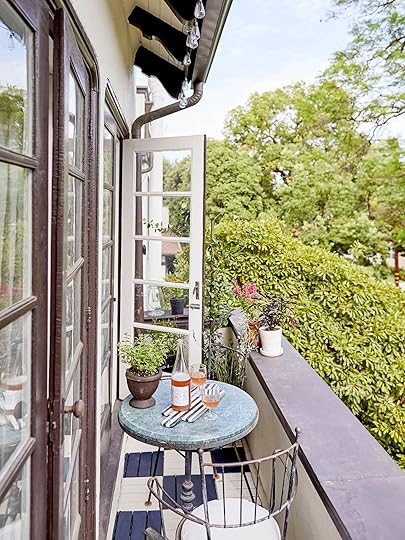 design by jess bunge | photo by sara ligorria-tramp | from: jess’ long and skinny balcony reveal
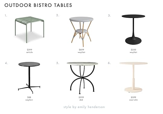
1. Sarek Outdoor Dining Table | 2. Ellie Bistro Table | 3. Brogel Bistro Round Steel Dining Table | 4. Dairon Round Iron Outdoor Bistro Table | 5. Colima Round Black Metal Outdoor Bistro Table | 6. Sydney Outdoor Bistro Table
I had to make sure I looked out for the small space dwellers like myself and find some pretty bistro tables. #5 is a real beaut and right up my alley but less affordable. #1 and #6 are awesome modern options that also feel special:) #4 is pretty small which is great if you only need something little but pretty (and under $100?!).
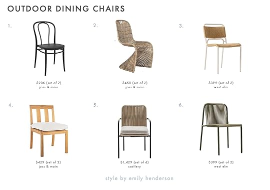
1. Farrah Outdoor Stacking Dining Side Chair (Set of 2) | 2. Outdoor Dining Side Chair (Set of 2) | 3. Sydney Outdoor Stacking Dining Chair (Set of 2) | 4. Melrose Teak Outdoor Dining Side Chair with Cushion (Set of 2) | 5.
Sierra Outdoor Dining Chair Set (Set of 6) | 6. Oceana Outdoor Stacking Dining Chair (Set of 2)
And finally we’ve come to the end, the dining chairs. I’ll never not love the shape of #2, and for that price, I would be so tempted if I needed a set. For an ever better price tag, #1 is a total classic and comes in other colors! And if you like a little color, I really love #6. It’s such a cool chair. But I get if you want to keep things neutral, like #3 and #4, they are happy and bright and will go with anything. If you have a bigger table and love a cushion, #5 has a ton of visual texture that I love. It’s a set of 6, y’all!
Ok, this is where I leave and hope this post was helpful if you are in need of some new pieces. If anyone has any other recs, put them in the comments!
Love you, mean it.
Opening Image Credits: Photo by Kailtin Green | From: Our Outdoor Living Room + Firepit Area Is The Sleeper Hit Of Our 2024 Summer
The post The Official (Mostly Affordable) EHD 2025 Outdoor Furniture Roundup appeared first on Emily Henderson.
March 13, 2025
Backyard Updates: Plants, Plans, Big Trees And Bigger Gazebos


Very exciting stuff is happening in the “backyard” right now as we entered phase two of landscape construction (that we put off for a couple of years to save and learn). The main goals of this phase were outlined in this blog post, but essentially it was reducing the size of the sports court (for more green/usable space) and adding an outdoor kitchen/bbq area under a covered gazebo. It’s a LOT, but it’s going so well and FAST! And I’m grateful to be able to give you all an update today.

We hired Dennis’ 7 Dees for this phase of the landscape design – we were so nervous to jackhammer up the sports court without cracking the rest of it and they put my mind at ease. Eric (one of their head designers) then came up with a hardscape and plant plan that would incorporate a couple park-like seating areas (picnic tables) surrounded by shrubs (more evergreen than we have now).

Essentially we added more variegated bluestone flagstone that meanders into two landing pads for picnic tables. We have so many families over for backyard hangs (think frat house for families) so we needed more places to hang, but not in a formal way. I can not tell you how much better it looks every single time I look outside. I’m THRILLED. Also, massive shout out to Dennis 7 Dees – their speed, communication and professionalism have been incredible. Granted they were able to put two crews on this job (benefit of a February install when they are a bit less busy) but they were done with most of the work in a little over two weeks (we aren’t fully done yet, but waiting for warmer weather to plant the clover field and then it has to grow in). These photos were taken last week, and they literally planted everything the next day. Then added the irrigation and lighting.
What We’re Planting
This time around my direction was 70% hearty evergreens – while I love a lot of what we have around the house (beautiful perennials), in the winter months it’s all super cut back (which is fine because it’s incredible in spring – early fall). But I wanted more winter happiness. So Eric chose all the plants from Monrovia (super high quality plants, locally grown, etc) and we have a mix of evergreens and showier spring/summer (including some really hearty hydrangea that like the sun).


For those interested, I’ll do a plant post once the final list is in (they are still adding more to another area around the pool and tweaking some of these per our opinions).

Brian and I are mostly just trusting Eric and the Dennis 7 Dees crews – they know Oregon, they know what will thrive in different seasons here, and while I love certain plants so much I don’t want my opinion to sway what will actually thrive here. Again, in the past I’ve been pickier about wanting what I love, but this time I really just gave all my trust. They’ll also be doing the maintenance, so I feel in very good hands that if something doesn’t work or thrive we have easy communication to switch it out.

Eric did take inspiration from what we have around the house that is more evergreen and implemented them here (under the trees, should they need less sun). We always like a mix of lighter and darker greens (sometimes dark greens can read as brown in the winter IMHO) and then I love deep warm pinks and purples (like not purple purple, but more aubergines) and always white flowers. I’m really open to learning so that when we start tackling some other areas, I can do it more myself and just repeat what is really working here.


I just can’t say enough thanks to Eric and the Dennis 7 Dees crew – just solidly impressed with the entire process – with big emphasis on the incredible communication, professionalism, and speed. If you haven’t hired a landscape team before it’s similar to interior design in the sense that you won’t believe how much time and labor (and therefore budget) it takes to execute well, so IF you are in Portland and looking for a solid team for your landscape overhaul I HIGHLY recommend them. When it comes to the big stuff like hardscape, irrigation, lighting – there was simply NO WAY I could just cobble it together, so having them manage the whole project was an absolute dream.
Big Trees Today… Literally…
With the addition of the picnic tables we needed more shade – and as you know I love trees more than anything. Two years ago we bought from Big Trees Today and we loved them all – they grow mature trees in Oregon, then they come and plant for you and guarantee the health of the tree for a year (assuming you sign their watering contract).


We ordered, and they planted, 3 Katsuras that were 3 1/2 caliper (so a larger size trunk than a newborn) and about 18′ tall. Essentially we are paying for 5 years of growth, putting in more teenagers than babies. They were about $2,500 each (including planting) which is a lot, but also remember that they grow them for years on their property and take care of them, plant them for you, etc. I think if you are looking at your yard and wish you had a big tree, this is a way to transform it all very quickly (They have many that are $1k – $1,200, too – not as big but still much bigger than the $100 tree that you’ll get at a nursery).
Gazebo Update
This is very exciting. I hired my brother’s new company (shout out to Nick and Ken at Afore Construction & Consulting) to do our gazebo. We wanted/needed a covered BBQ area (not because Oregonians BBQ in the rain that much – although we do grill food a lot even in the winter, but mostly to protect everything from elements and provide shade (which is why we chose a gazebo over a pergola). Now, we originally wanted a smaller footprint, but like all things, once we really played everything out, how we were going to use the space, we made it go all the way to the sports court so that we could seat people along a bar comfortably. But yah, she’s big! Don’t worry – it will be painted white to match and we have some very cute corbels and string lights to add charm.

Of course gazebos don’t just go up in one day – they have to excavate, put in footings (pour concrete), posts, then the big beams, tongue and groove ceiling, roofing, electrical, plumbing and gas. Then paint the gazebo and stain the deck. It’s a whole thing! They are almost done now and should be good to go by Easter. Wahoo!
 Next Steps… The Kitchen
We ordered our RTA kitchen (Ready To Assemble, super solid weatherproof cement construction) and the whole installation should happen in a couple of weeks. I’ll be doing a full blog post about the outdoor kitchen and specifically RTA soon (we pitched and partnered), but we are so excited about it all. We are really investing in long term materials, withstanding a lot of wear and tear and rain. All in all, we feel in very very good hands. Between Dennis’ 7 Dees (design, execution and, maintenance), Afore Construction (gazebo), Big trees Today (the big trees :)) and RTA (outdoor grill/kitchen) we are solid and I’ve never felt so taken care of (I’m not just saying that, it’s been absolutely seamless with everyone).
It looks so incredible already now that it’s all planted and sure they are little, but just not having that hulking sports court (ie, cement parking lot) makes me soooo happy. Oh, and you bet we are going to finally resurface the pickle ball court – just need a 5 day break in the rain 

*Photos by Kaitlin Green
The post Backyard Updates: Plants, Plans, Big Trees And Bigger Gazebos appeared first on Emily Henderson.
March 12, 2025
Looking For Alternatives to Amazon and Target? Here Are Some That Might Better Align With Your Values


There’s been a ton of chatter in the first few months of 2025 regarding companies either leaning into or pulling away from their diversity, equity and inclusion programs—or DEI—that have been in place at the very least since 2020, but in some cases decades. There have been boycotts both ways, and while there is so much to get into about this specific topic, it’s also quite the mine field that I’m not necessarily an expert in. However, I am quite literally an expert in shopping, and as a woman of color married to a Black man, who also had a brother with severe disabilities, DEI from a purchasing perspective hits very close to home for me.
And look, Amazon has long held a reputation for “these people are crap, don’t shop here” and admittedly, I kept shopping there. It was SO EASY to just pick up my phone, click a few buttons, and boom, whatever I bought was on my doorstep sometimes as soon as later that same day. As a working mother of a young child, it’s hard to beat that level of convenience. But to what end?
Then came Target. Boy did that one hurt. Target has long been “the good one” in terms of big box stores. I haven’t shopped at a Walmart in maybe as long as a decade, but Target, I felt mostly good about that one. They felt like a pillar of their community, but their roll back of their DEI programs really got me, and I haven’t shopped there since the end of January. It’s been really freaking hard, and not to mention inconvenient because in a world where most people shop online (at these very places), it can be hard trying to find what you need NOT at places like Target or Amazon (please, someone tell me where to buy a flat outlet extender cord PLEASE!).
And to top off the complexity of it all, I’ve also heard the argument lately that boycotting stores with DEI rollbacks only hurts the workers. Or in the case of Amazon, boycotting them isn’t going to screw Amazon, but rather the small storefronts selling their goods on the mega marketplace. Yes, I could see that, but I wasn’t sure what to do. I remembered that my husband’s cousin, Monique Little, is the founder and CEO of hair accessories company YGN (You Go Natural) that sold through Target, so I wanted to get her perspective as both a Black woman and a company owner directly affected by this. Here’s what she said:
“We actually lost our contract with Target in the midst of the DEI stuff. We were definitely hitting our sales targets, but did have some trouble shipping toward the end of last year. We had a 2025 PO [purchase order] but it was pulled right before the DEI announcement. My guess is since there was no DEI initiative there to support it, they had no reason not to pull the order.” Well…that freaking sucks.
She adds: “Honestly, it depends what your individual stomach is for causing selective pain to brands in support of the greater good. For some, those large contracts are all they have and to lose them as a result of the political climate could mean immediate loss to small business owners and their employees. If the goal is simply to support BIPOC brands (as opposed to making a larger statement about DEI), I’d say go ahead and make targeted purchases within the stores to support them.” Better yet? Buy directly from the brands if they offer that, though keep in mind that some do not, and their products in places like Target and Amazon are their only line of revenue.
That said, if you’re looking for places to spend your dollars that are aligned with values that support diversity, equity, inclusion and just a general sense of “better,” I found 17 places to do just that.
One caveat I want to include before continuing with the list. When I say “better”, I realize that’s going to be different for everyone. Today’s post is solely focused on diversity, equity, and inclusion (with two sort-of exemptions). Companies are complex, and everyone’s threshold for their own social justice leanings and political preferences are different. Almost no brand or company is perfect by any means (if you know of one, please let us all know). The best answer for “Everywhere sucks now, where should I spend my money” may look one way to me, but another to you. Local mom-and-pops are great, but how much do you know about the owners? Second-hand and vintage purchasing is awesome from an eco-conscious perspective, but what if the person you’re buying from doesn’t align with your values? You’ll likely never know any of this. All of that to say, it’s not so straight-forward. But it’s in my heart right now to spend my money on products that don’t directly support something that goes against my very person. “Don’t shop where they wouldn’t hire you,” I often hear.
Okay, let’s go:
Cleaning & General Home GoodsView this post on InstagramA post shared by Public Goods (@publicgoods)
Blueland: Blueland sells earth-friendly and nearly plastic-free cleaning products with a focus on sustainable and concentrated refills rather than adding constant empty bottles to the landfill. In terms of diversity, I found on their site that this B Corp proactively supports and spends with Black-owned businesses and brand partners, gives each of their team members paid time off for political and civic engagement, and makes diversity a priority in every hiring decision.
Public Goods: I have a membership to Public Goods and even I forgot how much they offer. It’s all white-labeled “generic” stuff, but it’s all very good. Plus, the prices are really fair (and members get 20% off, on top of that). You’ll find cleaning stuff, kitchen and dining goods (I have these cutting boards and love them), home products such as bedding and bath and even planters, beauty products, pantry staples and coffee. It’s awesome. Also awesome? Their dedication to sustainability and thoughtful consumption. I couldn’t find anything in my research specifically about their DEI impact (which sucks), but at the very least, I wanted to present them as an option for everything else they stand for.
Grove Collaborative: Another site that I need to add to my bookmarks for more regular shopping because they’re fantastic not just from an environmental impact perspective but also for their dedication to social impact. They have cleaning supplies and essentials, personal care products, vitamins, even things for babies like diapers and bathing products. A certified B Corp, Grove Collaborative provides grants for increased diversity, equity, and anti-racism initiatives led by their “Diversity & Inclusion squad.” Most of the information I could find on them dated back to 2020, but I haven’t read anything since about rollbacks on their commitments.
Food & SnacksView this post on InstagramA post shared by Thrive Market (@thrivemarket)
Thrive Market: If you tend toward fulfilling pantry staples and snacks from Amazon, Thrive Market might just be up your alley if you’re looking for a better alternative (bonus points if you prefer organic and non-GMO). In terms of inclusion, Thrive has established employee groups like the Black Thriver Union, which aims at offering a safe space for BIPOC employees and allies to engage. They also have a partnership with the Pride Pantry to support food equality within the LGBTQIA+ community and beyond.
Imperfect Foods: I know it feels like literally everything is a monthly subscription these days, but I was always happy with my Imperfect Foods box when I got it. Their pricing was great, and I felt good about saving hundreds of millions of pounds of food from waste because they were less than perfect (hence, not deemed sellable by grocery stores). I also feel good about supporting their “Grow With Us” program via my dollars, which addresses racial discrepancies between leadership teams and hourly associates. It promotes career growth and development opportunities within Imperfect Foods by offering a clear pathway for upward mobility within teams and even across departments.
Of course, supporting your local farmer’s market and any local farmer produce boxes as well as locally owned grocery stores puts the power in your hand to directly impact the people you want to support!
Books & AudiobooksView this post on InstagramA post shared by Libro.fm Audiobooks (@librofm)
Barnes & Noble: Good ol’ Barnes & Noble. While they may have ignored my application to work there in college, I won’t hold a grudge any longer as they’re doing things right. A few years ago, they partnered with Billie Jean King Enterprises, which works with organizations to improve diversity, equity, inclusion, and belonging. They also support independent bookstores by carrying independent books, books from small presses, university presses, and independent publishers, and by publishing independent books that allow independent authors to publish and gain access to online promotional opportunities.
Better World Books: Admittedly, I couldn’t find any specific information about the DEI efforts of Better World Books, but this B Corp is an amazing site to purchase new and used books that you can feel really good about. Every purchase you make from them directly contributes to donating books to hundreds of non-profit organizations. So far, they’ve been able to donate 38 MILLION books!
Libro.fm: I can’t believe I’m only just now finding Libro.fm, because it’s such a wonderful concept. Essentially, Libro.fm shares profits from your audiobook purchases (either a la cart or with one of their subscription models) with the local bookstore of your choice! It’s the convenience of a digital storefront and experience, but gives you the power to keep your money in your local economy. Plus, it’s 100% employee owned.
Bookshop.org: Another B Corp (of which DEI is central to achieving), Bookshop is very similar to Libro where you get the choice of a local bookstore to support with your purchase, but with tons of physical books and e-books, as well (as opposed to just audio books). Their platform gives independent bookstores tools to compete online and financial support to help them maintain their presence in local communities.
Furniture & DecorView this post on InstagramA post shared by GOODEE (@goodeeworld)
Wayfair: I have to be honest. I didn’t know much about Wayfair as a corporation until recently. As in, I’ve shopped there plenty of times, sing their jingles in my head nearly daily, but had no clue about their corporate commitments and efforts. It’s a good sign when they list out their DEI efforts first in their list of impacts, meaning they aren’t trying to hide anything. They also have their Wayfair Neighborhood Fund (according to their site, “a donor-advised fund sponsored by a national donor-advised fund program”) which was launched in 2023 to advance their social impact efforts for recommending grants to nonprofits focused on housing.
Uncommon Goods: I remember Uncommon Goods from around 15 years ago when it was a place to go for weird, off-beat things. But since then, it’s become a store to shop with yes, some weird and off-beat things, but plenty of other things for home, gifts, and life. They’re a certified B Corp, and have a Planet, People, Profit guiding light (in that order). Their website states that their starting pay for hourly team members is more than double the federal minimum wage, and have championed paid family leave in New York State where they are based, and will continue to fight the good fight in other states, as well.
Goodee: Goodee and Amazon may not be exactly synonymous but that doesn’t make it worthy of this list. We’ve written about Goodee a few times. It’s a highly curated marketplace where all the makers align on their environmental efforts and social impact. They’re mission is to create change by championing community, transparency, and sustainability from both their creators and consumers.
Etsy: Amazon may have the edge on fast and free shipping (duh), but Etsy takes it on artisanship. I don’t have to do much of an introduction here, because we all know Etsy, but on a corporate level, you can really feel good about supporting them. For instance, they’re working to achieve a Net Zero goal by 2040, and in the meantime, support carbon offsetting programs. They also have partnered with a company called EcoEnclose, which brings sellers packaging made from 100% recycled materials or certified responsibly sourced paper at competitive prices, helping them run more sustainable businesses. I also loved that when doing a quick Google search for Etsy, one of their first sublinks was “Black-Owned Shops”.
And don’t forget to check out Caitlin’s list of her favorite small business home decor shops, too!
BeautyView this post on InstagramA post shared by Credo Beauty (@credobeauty)
Credo Beauty: We’ve written about Credo a handful of times on the blog over the years, but in case you aren’t familiar, it’s essentially like a Sephora but for only clean beauty vetted to a high standard. It’s great, so the next time you’re faced with a drawer full of empties and need makeup, skincare, haircare, and beyond, be sure to check them out. From an impact POV, Credo has an amazing annual accelerator workshop called Credo for Change which aims to empower college students who self-identify as historically underrepresented in the beauty industry, such as Black, Latino, Hispanic, Asian, and Indigenous individuals. From their site: “Our goal is to provide equitable opportunities to all individuals who want to help push our industry forward through clean and sustainable positive impact.”
Ulta Beauty: I’ll admit that Ulta doesn’t give me the same boutique shopping vibes as say, Sephora, but from an online shopping perspective as an alternative to Amazon, it beats out Sephora by also offering plenty of drugstore brands. Plus, Ulta supports True Colors United, a non-profit that helps eradicate homelessness that disproportionately affects the trans and LGBTQIA+ communities, in addition to a slew of other social and diversity-focused impact projects.
Home ImprovementHarbor Freight: I’ve actually read that The Home Depot gets a fairly good rating on their equity and inclusion, but for personal reasons, I tend to shop somewhere else if I can help it. The Harbor Freight that used to be near my previous home closed years ago, but I recently found one near(ish) by and am happy with their Goods Unite Us rating. Like some others here, I couldn’t find much in terms of DEI promises, but again, a good option if you have one near you!
All of the AboveView this post on InstagramA post shared by Costco (@costco)
Costco: Costco has famously leaned into their diversity, equity, and inclusion stance after numerous rollbacks from other big box retailers. Not to mention, they just really take care of their employees. And in general, I’m typically fairly happy with the stuff I buy here, especially their store brand Kirkland Signature. I have towels and sheets that have stood the test of time, which can’t always be said about the ‘zon. I’ll gladly give them my $65 a year for our family membership.
—
Please feel free to look up any of these on sites like Goods Unite Us or Opensecrets to see if they fully line up with your personal values. And if you have any other great larger marketplace-type shops that can help me, you and all of us break up with Amazon (or Target, etc.), please share in the comments. Thanks all!
Until next time…
The post Looking For Alternatives to Amazon and Target? Here Are Some That Might Better Align With Your Values appeared first on Emily Henderson.
Looking to Break Up With Amazon (& Target)? Here Are 17 Alternatives That Might Better Align With Your Values


There’s been a ton of chatter in the first few months of 2025 regarding companies either leaning into or pulling away from their diversity, equity and inclusion programs—or DEI—that have been in place at the very least since 2020, but in some cases decades. There have been boycotts both ways, and while there is so much to get into about this specific topic, it’s also quite the mine field that I’m not necessarily an expert in. However, I am quite literally an expert in shopping, and as a woman of color married to a Black man, who also had a brother with severe disabilities, DEI from a purchasing perspective hits very close to home for me.
And look, Amazon has long held a reputation for “these people are crap, don’t shop here” and admittedly, I kept shopping there. It was SO EASY to just pick up my phone, click a few buttons, and boom, whatever I bought was on my doorstep sometimes as soon as later that same day. As a working mother of a young child, it’s hard to beat that level of convenience. But to what end?
Then came Target. Boy did that one hurt. Target has long been “the good one” in terms of big box stores. I haven’t shopped at a Walmart in maybe as long as a decade, but Target, I felt mostly good about that one. They felt like a pillar of their community, but their roll back of their DEI programs really got me, and I haven’t shopped there since the end of January. It’s been really freaking hard, and not to mention inconvenient because in a world where most people shop online (at these very places), it can be hard trying to find what you need NOT at places like Target or Amazon (please, someone tell me where to buy a flat outlet extender cord PLEASE!).
And to top off the complexity of it all, I’ve also heard the argument lately that boycotting stores with DEI rollbacks only hurts the workers. Or in the case of Amazon, boycotting them isn’t going to screw Amazon, but rather the small storefronts selling their goods on the mega marketplace. Yes, I could see that, but I wasn’t sure what to do. I remembered that my husband’s cousin, Monique Little, is the founder and CEO of hair accessories company YGN (You Go Natural) that sold through Target, so I wanted to get her perspective as both a Black woman and a company owner directly affected by this. Here’s what she said:
“We actually lost our contract with Target in the midst of the DEI stuff. We were definitely hitting our sales targets, but did have some trouble shipping toward the end of last year. We had a 2025 PO [purchase order] but it was pulled right before the DEI announcement. My guess is since there was no DEI initiative there to support it, they had no reason not to pull the order.” Well…that freaking sucks.
She adds: “Honestly, it depends what your individual stomach is for causing selective pain to brands in support of the greater good. For some, those large contracts are all they have and to lose them as a result of the political climate could mean immediate loss to small business owners and their employees. If the goal is simply to support BIPOC brands (as opposed to making a larger statement about DEI), I’d say go ahead and make targeted purchases within the stores to support them.” Better yet? Buy directly from the brands if they offer that, though keep in mind that some do not, and their products in places like Target and Amazon are their only line of revenue.
That said, if you’re looking for places to spend your dollars that are aligned with values that support diversity, equity, inclusion and just a general sense of “better,” I found 17 places to do just that.
One caveat I want to include before continuing with the list. When I say “better”, I realize that’s going to be different for everyone. Today’s post is solely focused on diversity, equity, and inclusion (with two sort-of exemptions). Companies are complex, and everyone’s threshold for their own social justice leanings and political preferences are different. Almost no brand or company is perfect by any means (if you know of one, please let us all know). The best answer for “Everywhere sucks now, where should I spend my money” may look one way to me, but another to you. Local mom-and-pops are great, but how much do you know about the owners? Second-hand and vintage purchasing is awesome from an eco-conscious perspective, but what if the person you’re buying from doesn’t align with your values? You’ll likely never know any of this. All of that to say, it’s not so straight-forward. But it’s in my heart right now to spend my money on products that don’t directly support something that goes against my very person. “Don’t shop where they wouldn’t hire you,” I often hear.
Okay, let’s go:
Cleaning & General Home GoodsView this post on InstagramA post shared by Public Goods (@publicgoods)
Blueland: Blueland sells earth-friendly and nearly plastic-free cleaning products with a focus on sustainable and concentrated refills rather than adding constant empty bottles to the landfill. In terms of diversity, I found on their site that this B Corp proactively supports and spends with Black-owned businesses and brand partners, gives each of their team members paid time off for political and civic engagement, and makes diversity a priority in every hiring decision.
Public Goods: I have a membership to Public Goods and even I forgot how much they offer. It’s all white-labeled “generic” stuff, but it’s all very good. Plus, the prices are really fair (and members get 20% off, on top of that). You’ll find cleaning stuff, kitchen and dining goods (I have these cutting boards and love them), home products such as bedding and bath and even planters, beauty products, pantry staples and coffee. It’s awesome. Also awesome? Their dedication to sustainability and thoughtful consumption. I couldn’t find anything in my research specifically about their DEI impact (which sucks), but at the very least, I wanted to present them as an option for everything else they stand for.
Grove Collaborative: Another site that I need to add to my bookmarks for more regular shopping because they’re fantastic not just from an environmental impact perspective but also for their dedication to social impact. They have cleaning supplies and essentials, personal care products, vitamins, even things for babies like diapers and bathing products. A certified B Corp, Grove Collaborative provides grants for increased diversity, equity, and anti-racism initiatives led by their “Diversity & Inclusion squad.” Most of the information I could find on them dated back to 2020, but I haven’t read anything since about rollbacks on their commitments.
Food & SnacksView this post on InstagramA post shared by Thrive Market (@thrivemarket)
Thrive Market: If you tend toward fulfilling pantry staples and snacks from Amazon, Thrive Market might just be up your alley if you’re looking for a better alternative (bonus points if you prefer organic and non-GMO). In terms of inclusion, Thrive has established employee groups like the Black Thriver Union, which aims at offering a safe space for BIPOC employees and allies to engage. They also have a partnership with the Pride Pantry to support food equality within the LGBTQIA+ community and beyond.
Imperfect Foods: I know it feels like literally everything is a monthly subscription these days, but I was always happy with my Imperfect Foods box when I got it. Their pricing was great, and I felt good about saving hundreds of millions of pounds of food from waste because they were less than perfect (hence, not deemed sellable by grocery stores). I also feel good about supporting their “Grow With Us” program via my dollars, which addresses racial discrepancies between leadership teams and hourly associates. It promotes career growth and development opportunities within Imperfect Foods by offering a clear pathway for upward mobility within teams and even across departments.
Of course, supporting your local farmer’s market and any local farmer produce boxes as well as locally owned grocery stores puts the power in your hand to directly impact the people you want to support!
Books & AudiobooksView this post on InstagramA post shared by Libro.fm Audiobooks (@librofm)
Barnes & Noble: Good ol’ Barnes & Noble. While they may have ignored my application to work there in college, I won’t hold a grudge any longer as they’re doing things right. A few years ago, they partnered with Billie Jean King Enterprises, which works with organizations to improve diversity, equity, inclusion, and belonging. They also support independent bookstores by carrying independent books, books from small presses, university presses, and independent publishers, and by publishing independent books that allow independent authors to publish and gain access to online promotional opportunities.
Better World Books: Admittedly, I couldn’t find any specific information about the DEI efforts of Better World Books, but this B Corp is an amazing site to purchase new and used books that you can feel really good about. Every purchase you make from them directly contributes to donating books to hundreds of non-profit organizations. So far, they’ve been able to donate 38 MILLION books!
Libro.fm: I can’t believe I’m only just now finding Libro.fm, because it’s such a wonderful concept. Essentially, Libro.fm shares profits from your audiobook purchases (either a la cart or with one of their subscription models) with the local bookstore of your choice! It’s the convenience of a digital storefront and experience, but gives you the power to keep your money in your local economy. Plus, it’s 100% employee owned.
Bookshop.org: Another B Corp (of which DEI is central to achieving), Bookshop is very similar to Libro where you get the choice of a local bookstore to support with your purchase, but with tons of physical books and e-books, as well (as opposed to just audio books). Their platform gives independent bookstores tools to compete online and financial support to help them maintain their presence in local communities.
Furniture & DecorView this post on InstagramA post shared by GOODEE (@goodeeworld)
Wayfair: I have to be honest. I didn’t know much about Wayfair as a corporation until recently. As in, I’ve shopped there plenty of times, sing their jingles in my head nearly daily, but had no clue about their corporate commitments and efforts. It’s a good sign when they list out their DEI efforts first in their list of impacts, meaning they aren’t trying to hide anything. They also have their Wayfair Neighborhood Fund (according to their site, “a donor-advised fund sponsored by a national donor-advised fund program”) which was launched in 2023 to advance their social impact efforts for recommending grants to nonprofits focused on housing.
Uncommon Goods: I remember Uncommon Goods from around 15 years ago when it was a place to go for weird, off-beat things. But since then, it’s become a store to shop with yes, some weird and off-beat things, but plenty of other things for home, gifts, and life. They’re a certified B Corp, and have a Planet, People, Profit guiding light (in that order). Their website states that their starting pay for hourly team members is more than double the federal minimum wage, and have championed paid family leave in New York State where they are based, and will continue to fight the good fight in other states, as well.
Goodee: Goodee and Amazon may not be exactly synonymous but that doesn’t make it worthy of this list. We’ve written about Goodee a few times. It’s a highly curated marketplace where all the makers align on their environmental efforts and social impact. They’re mission is to create change by championing community, transparency, and sustainability from both their creators and consumers.
Etsy: Amazon may have the edge on fast and free shipping (duh), but Etsy takes it on artisanship. I don’t have to do much of an introduction here, because we all know Etsy, but on a corporate level, you can really feel good about supporting them. For instance, they’re working to achieve a Net Zero goal by 2040, and in the meantime, support carbon offsetting programs. They also have partnered with a company called EcoEnclose, which brings sellers packaging made from 100% recycled materials or certified responsibly sourced paper at competitive prices, helping them run more sustainable businesses. I also loved that when doing a quick Google search for Etsy, one of their first sublinks was “Black-Owned Shops”.
And don’t forget to check out Caitlin’s list of her favorite small business home decor shops, too!
BeautyView this post on InstagramA post shared by Credo Beauty (@credobeauty)
Credo Beauty: We’ve written about Credo a handful of times on the blog over the years, but in case you aren’t familiar, it’s essentially like a Sephora but for only clean beauty vetted to a high standard. It’s great, so the next time you’re faced with a drawer full of empties and need makeup, skincare, haircare, and beyond, be sure to check them out. From an impact POV, Credo has an amazing annual accelerator workshop called Credo for Change which aims to empower college students who self-identify as historically underrepresented in the beauty industry, such as Black, Latino, Hispanic, Asian, and Indigenous individuals. From their site: “Our goal is to provide equitable opportunities to all individuals who want to help push our industry forward through clean and sustainable positive impact.”
Ulta Beauty: I’ll admit that Ulta doesn’t give me the same boutique shopping vibes as say, Sephora, but from an online shopping perspective as an alternative to Amazon, it beats out Sephora by also offering plenty of drugstore brands. Plus, Ulta supports True Colors United, a non-profit that helps eradicate homelessness that disproportionately affects the trans and LGBTQIA+ communities, in addition to a slew of other social and diversity-focused impact projects.
Home ImprovementHarbor Freight: I’ve actually read that The Home Depot gets a fairly good rating on their equity and inclusion, but for personal reasons, I tend to shop somewhere else if I can help it. The Harbor Freight that used to be near my previous home closed years ago, but I recently found one near(ish) by and am happy with their Goods Unite Us rating. Like some others here, I couldn’t find much in terms of DEI promises, but again, a good option if you have one near you!
All of the AboveView this post on InstagramA post shared by Costco (@costco)
Costco: Costco has famously leaned into their diversity, equity, and inclusion stance after numerous rollbacks from other big box retailers. Not to mention, they just really take care of their employees. And in general, I’m typically fairly happy with the stuff I buy here, especially their store brand Kirkland Signature. I have towels and sheets that have stood the test of time, which can’t always be said about the ‘zon. I’ll gladly give them my $65 a year for our family membership.
—
Please feel free to look up any of these on sites like Goods Unite Us or Opensecrets to see if they fully line up with your personal values. And if you have any other great larger marketplace-type shops that can help me, you and all of us break up with Amazon (or Target, etc.), please share in the comments. Thanks all!
Until next time…
The post Looking to Break Up With Amazon (& Target)? Here Are 17 Alternatives That Might Better Align With Your Values appeared first on Emily Henderson.
March 11, 2025
Not Ugly AFFORDABLE Ceiling Lights To Replace Your Boob Lights
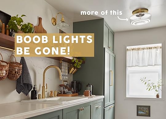

Hi! It’s me Jess—your resident light fixture obsessed friend. Today I am here to chat to you about your boobs. BOOB LIGHTS! We allll know the ones. Landlords and flippers love them because they are cheap (especially when you need to get a lot of them). It’s a real “don’t hate the player, hate the game” situation but honestly I’m not a fan of either. I am sure there are some of you reading this who have wanted to switch those puppies out from the moment you toured your home for the first time and either haven’t had the bandwidth to search for the right replacement or haven’t had the budget, or both. Well, I hope this post will solve both of those problems.
I know it can feel intimidating to replace a hardwired light but I promise it’s easier than you think! I’ve switched out so many lights in my many rentals on my own, but of course, if you don’t know how, then get a person who does (and maybe they’ll teach you for the future). Safety first, deal? Or if you have the budget to pay someone, then that’s the easiest option:) Ok, let’s take a quick trip down memory lane to see the profound power of saying buh bye boobs, and hello beautiful ceiling lights.
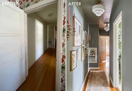 left: design by caitlin higgins | styled by emily bowser | photos by sara ligorria-tramp | from: caitlin’s long, dark hallway makeover
No one on this earth could tell me Caitlin’s hallway in her rental apartment doesn’t look one million times better post its makeover/new lights. It, of course, would have been massively upgraded with the paint and art added while still keeping the boob lights. BUT it’s so stunning and so special with the new semi flush mounts.
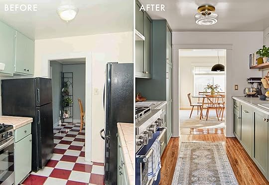 left: design and photos by sara ligorria-tramp | styled by emily bowser | from: sara’s galley kitchen “update” turned into a full renovation (and the result is well worth the wait)
Sara’s kitchen in the home she and her husband bought got a wonderful gut job with the help of her dad and brother. There was no way a new and improved ceiling light wasn’t going to be installed. The size is similar to the original but the shape and accents make the space more elevated and works perfectly with the rest of her design/the home’s architecture.
 left: art direction by emily henderson | styled by emily bowser | photo by sara ligorria-tramp | from: it’s time to organize – small entry organization hacks for those of us who are “mudroom-less”
The original entry ceiling light at the mountain house is more of a cousin to the classic boob light but it had the shape and nipple accent so I’m counting it! It was dated and didn’t work with the light, airy, Scandi vibe the home would eventually have. So Emily and the design team picked out this beautiful semi flush mount that was simple in shape but had fun modern accents (like most of the house had). A MUCH better fit.
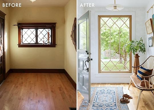 left: photo by kaitlin green | from: farmhouse entry reveal
And for my final example today, I’m taking you to the farmhouse entry. Again, the original light was more “boob light adjacent” but regardless it wasn’t a style fit. Instead, Emily chose a more pendant-like light that was simple and neutral (and beautiful) so that the wallpaper and art wall could really shine. Couldn’t have picked a better one if I tried.
Now, let’s talk about your home, shall we? I chose lights that range from $28 to $339 (don’t worry, the over $250 section is the smallest, but I loved them so wanted to add). And style-wise, I really tried to find something for everyone. And of course, even if you don’t have a boob light to replace and just need a ceiling light (flush and semi flush mount) recommendation, you are welcome to:) Let’s take a look.
UNDER $150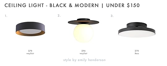
1. Savita Glass Flush Mount | 2. Glass Flush Mount | 3. KABOMBA
Why not start off modern? A black ceiling light can either be a fun, bold, but cool statement on your light colored ceiling, or blend in nicely on your dark colored or dark wallpapered ceiling. What I like about #1 is that there’s a gold accent on the inside so it’s not so visually heavy. Plus, the shape is great. #2 is both cool and playful. It also comes in brass if that’s more your style. Then #3 has an awesome utilitarian shape. I do want to point out that it has a built-in LED light that is bright so it’s a great fit for a bathroom, mudroom, or anywhere else that needs a very bright light.
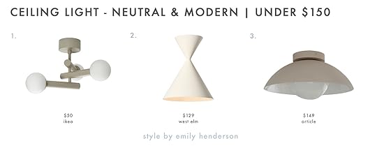
1. KRANBALK | 2. Warren Semi-Flush Mount | 3. Gemma Flushmount Ceiling Light
I was pretty happily stunned when I saw that #1 was an IKEA fixture. Not that it was shocking that IKEA had a great light (they have many) but this one just looked more elevated. The color is so chic. Then I just love the shape of #2 so much. Vintage-inspired but still so modern. It also comes in gold and black. They show them on the site over a kitchen island, but I would put them all over my house. Just make sure your ceilings are decently high since it’s a direct light. Then the #3 is also such a great find! The color is a soft warm beige that I’m in love with (you can see it better on their site). To me it looks like an affordable Schoolhouse fixture, which is a high compliment.

1. Starla Natural Rattan Basket Semi Flush Mount Ceiling Light | 2. Liz Rattan Flush Mount | 3. Light Raffia Dimmable Metal Drum Flush Mount
Now, for the woven lights:) If you want to add more visual texture to your home then these would be great options for you. I really like the mix of materials in #1 which makes it feel a little more modern. I’m sure it’s going to be no surprise that I love the shape of #2 and the medium tone of that rattan. #3 comes in two different sizes and colors with a fun shape (and at a great price!). I will say for all of these you can likely expect a medium to low amount of light. Rattan/woven lights like these are great for a more moody vibe. Just want to manage those expectations:)

1. Natural Jute and Linen Bell Semi Flush Mount Ceiling Light | 2. REGNSKUR
If you want a soft texture/organic looking ceiling light but aren’t looking for that rattan look then these two are perfect! #1 is an awesome dupe for a Crate and Barrel one that’s on this list in a bit. The shape is so elegant and the warm linen would give off the prettiest light. Then I love #2 not only for the wildly affordable price but for the great shape and accents. Both have a very European vibe to them if that’s what you’re looking for.

1. Tolio Brass Conical Flush Mount Light | 2. Calcott Flush Mount
In total transparency, I didn’t have a perfect “category” for these two lights but I loved them so here they are. #1 is a stunner. It’s definitely a brighter brass (at first) so will make more of a statement but in the right space it would add SO MUCH. But what’s even better is that the brass is unlaquered so it will patina over time and look vintage. Chef’s kiss! #2 is another light that has a built-in LED bulb so this puppy is going to be bright but with that ribbed terra cotta shade it’s a winner. It also comes in two other colors!

1. Odette Flush Mount Conversion Kit | 2. Gem Natural | 3. Scallop Flush Mount Conversion Kit
Now, while I’m a renter who will change her ceiling and wall lights without a second thought, I do understand that not every renter is like me. There have been some new developments in the boob light concealing arena that are very cool and don’t require an electrician. Welcome to boob light covers! #1 and #3 are both from Urban Outfitters and have really fun and playful looks. There are a couple more options on their site if you want to see. But if you’re looking for something a little more organic and neutral, take a look at #2. Gretchen was the first one to make me aware of this brand, Tulip Shades, and I think they make the coolest designs. There’s a lot to choose from so go take a peek.
$150 – $250Let’s go up a little bit:)
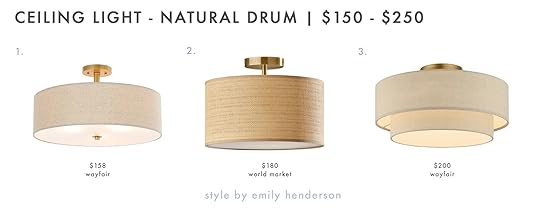
1. Romines Cotton Semi Flush Mount | 2. Landor Natural Woven Drum Semi Flush Mount Ceiling Light | 3. Bhagipuri Linen Blend Semi Flush Mount
We all know that a drum shade gives off beautiful, soft, even light. A real 10/10 if you will. These were my favorites that I found. #1 is simple and classic and can do no wrong. It also comes in all white if you want it a little more modern looking. Then for a warmer/more natural look, #2 is perfect. It’s got an organic vibe while still working seamlessly with a more traditional style. #3 is awesome with the 2 tiers. A little more of a statement but there’s nothing wrong with that!

1. Anders Porcelain Flush Mount | 2. Zara Semi Flush | 3. Allegra Large Linen Flush Mount Light
These next three are also soft light beauts. #1 is going to give off a more directional light, but I love the drum shape in that more organic porcelain material. That plus the brass base is such a pretty style contrast. Then #2 is giving modern art deco. Simple and special is the only way to describe this cutie. #3 is what I think the World Market one duped. It’s $100 more which is a pretty big difference if you have a smaller budget. I do of course love this one and the ball finial (yes, it’s kinda like the boob light nipple but waaaay prettier, ok??!).

1. Copa Tiered Natural Rattan Flush Mount Light | 2. Soleil Rattan Flush Mount | 3. Flared Woven Flush Mount
Another rattan roundup but with a bit more of a luxury look (aka mainly the brass accents). I’ve gotten very into Italian rattan (like a lot of the design world) and #1 is really giving that kind of look. It’s been around for a minute and for good reason. #2 is a great option in my book because you get the rattan, the pretty shape, and a good amount of light! Since the shade doesn’t cover most of the bulb, it’s going to light the space it’s in way better than most rattan lights that are similar. #3 does such a great job mixing a more traditional metal base shape with a trendier shade. It looks completely classic and will stand the test of time!

1. Scarlet Flush Mount Light | 2. Stefanie Silk Flush Mount | 3. Harriet Ambient Flush Mount
Pleated shades are still going strong and I for one am very happy about it. #1 is as classic as they come and with the light filtering base it’s guaranteed to give off a soft, beautiful light. #2 I love because of the reverse shade. This one isn’t a knife pleat like the other two but it still counts in my book. The brass detailing is also so pretty. #3 is more of an exposed bulb look that I’m really into. Seeing the white wiring I think makes it more modern, which is a cool contrast. Big fan.

1. Farmhouse Metal Flush Mount | 2. Rosanne Glass Flush Mount
Oh, I really love #1 and I think would be so so pretty in a modern farmhouse. Can’t you see these also in Em’s house? Of course, it can work with other styles too and the black/brass is really elegant on this light. It does come in three other color options if this one doesn’t work with your home. #2 is another great modern traditional light that is simple but not boring and could work with so many styles.

1. Drift Adjustable Ceiling Lamp | 2. Harper Flush Mount Light | 3. Ardsley Flush Mount
I don’t have a place in my apartment for #1 but I wish I did! It’s so chic and simple and feels vintage-inspired. It also comes in green/brown combo if you want some color in your ceiling light. Speaking of color, #2 is such a fun option! The style is also simple but cool and comes in a bright red if you’re looking for an “unexpected red” moment to add to your space. Lastly, #3 feels like such a classic at this point. It’s a forever cool light that you would absolutely want to take with you if you moved.
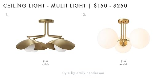
1. Coy Flushmount Ceiling Light | 2. 3-Light 22 Modern Sputnik Globe Semi Flush Mount
If you’re a fan of a more “chandelier look” then these two lights could be great picks for you! #1 is another from Article that I’m so impressed by. The shapes of the shades give it an extra cool edge and with 4 bulbs, you’re getting a very lit room (I would recommend a dimmer:)). It also comes in black. Then #2 is a total classic that’s another one that won’t go out of style. It also comes in a black/gold combo and you can pick from a white bulb or a hammered glass bulb. I tend to prefer the white since the light is filtered and softer.
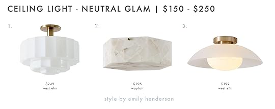
1. Jules Flush Mount | 2. Ardythe Alabaster/Metal Semi-Flush Mount | 3. Bezel Metal Flush Mount
And speaking of filtered and soft lights, these three also fit that bill. #1 is a great affordable option to the ones Caitlin has in her hallway. Art deco inspired, so beautiful and gives off a great light. Now, #2 won’t work in every home but for the right style I know it would look so incredible. #3 has a sandblasted glass shade that stylistically is so versatile. Modern, cool, beautiful. It also comes in a perforated gold shade which is also pretty sick:)

1. Aneve Silk Flush Mount | 2. Naomi Flush Mount
I love a modern scallop, what can I say!? #1 is the higher end version of the $28 IKEA one. Both are great but this one is a bit more refined hence the price difference. It also comes in three sizes! This is one very me, ha. Then #2 is another directional light fixture so isn’t really going to give you that “fill the room” look. But if you don’t want or need that then the shape and material are SO good.
$250 – $350
1. Gull Flush Mount | 2. ELIANA Flush Mount | 3. Moxie Semi Flush | 4. Rainier Black Conical Flush Mount Light | 5. Dilworth Flush Mount | 6. RUE Flush Mount
I know it’s debatable to call these “affordable” but since everyone has a different budget I wanted to give just a few more options (plus once I start finding lights I love it’s really hard to not want to share:)). I’m obsessed with the shape and two-tier look of #1. The modern but vintage styles of #2 and #6 are so so good (and would give off beautiful ambient light). I adore the modern boldness of #3 and #4. I really love a cone shaped light. And finally, the mix of materials in #5 is so so good. If you haven’t heard of Worley’s lighting then go to their site now. Their pieces are so beautiful and Emily even used them in some of the River House rooms. Just saying.
Ok, end of session. As always, I really hope this was fun, gave you some ideas, and for the sake of this post’s mission, convinced you to replace that boob light:)
Love you, mean it.
Opening Image Credits: Design and Photos by Sara Ligorria-Tramp | Styled by Emily Bowser | From: Sara’s Galley Kitchen “Update” Turned Into a Full Renovation (And The Result is Well Worth the Wait)
The post Not Ugly AFFORDABLE Ceiling Lights To Replace Your Boob Lights appeared first on Emily Henderson.
March 10, 2025
Emily Reviews Her First Professionally Shot Apartment From 2010 (Lots Of Feelings!)
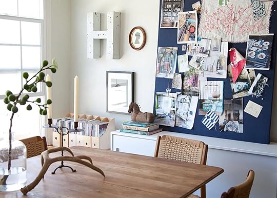

Fifteen years ago (when I was 30) this whole thing began – both DesignStar and the blog launched in early 2010. Y’all, we barely had smartphones, the OG Facebook had just reached the non-college population, and Pinterest was just an idea without an office (thus me having boxes of magazines and an actual pin board). It was before blogs destroyed magazines, Pinterest destroyed blogs, Instagram took over almost all blogs/Pinterest/Twitter/FB, and now TikTok and YouTube are continuing to threaten literally all of media. I find it all endlessly fascinating and truly grateful to still be here (and with enough different revenue sources to hopefully continue to run this until I’m 80). I love writing about digital media and content creation culture, because the evolution of it all is just so wild to not just witness but be so deeply affected by it every. single. day. (…And will be writing even more soon, stay tuned). Being on the inside makes my specific scoop pretty deep and nuanced – talk about seeing every side. For instance, I just finished the first episode of the Meghan Markle show and I’m having so many conflicting thoughts and feelings!! More to come. ANYWAY, we recently found these photos of my apartment tour from that first year, 2010, via Apartment Therapy, shot by Teri Lyn Fisher and thought it would be fun to repost (and react). Part of me wants to shout “cringe”, but that would only be my shadow self trying to convince myself and you all that I somehow deserve to be here, now, despite this being the apartment of a literal DesignStar then. But the more generous part of me knows that this girl had zero money or training and scraped together a lot of vintage stuff and DIYs to create an apartment that had some semblance of unique style. I’m actually really proud of this girl for putting this out there despite it not being great, not just because of it. I suppose that’s where the fanbase started – lots of vintage stuff on a budget with more confidence and bravery than expected. My budget has changed, but she is still there 
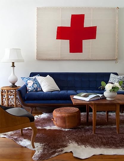
We’ll start with the most promising image, where I actually still love everything in there (“love” might be strong?). That sofa was my first big vintage purchase ($800 shout out to The Good Mod) and something I would now pay $3k to get back for sentimental reasons (I sold to a reader years ago, much to my future regret – if you are out there let me know!). I sewed both blue patterned pillows, and I wish so badly I had kept that coffee table (drop leaf and so simple/pretty). I framed that flag with cheap furring strips, brackets, and black nailheads and it’s such a great hack for massive unique art on an extreme budget (I did that move many times). All in all, I’m not embarrassed by this – it’s also just full of so much nostalgia that it makes me happy.
Here’s what I wrote about it then (via the article):
Indulgences: I’m frugal by nature, but my biggest purchase ever was my navy blue 60s sofa, and it was $800 (pretty sure I told Brian, my husband, it was $600 at the time because it was and is so much money for us) but besides that I can’t get enough weird old artwork. I know I have too much and I’m bordering on hoarding, but it makes me so happy and the house still doesn’t feel cluttered because it’s on the walls. At least that’s what I’m telling myself. In general, my problem is losing judgment at flea markets or thrift stores – you know that ‘if-i-don’t-buy-it-now-i-will-regret-it-for-the-rest-of-my-life’ syndrome? Yep, I got it. Bad. Terminally.

Now nothing is wrong here, but I just don’t totally connect with it – it feels a bit empty and cold. What I do remember is that I found that table on Craigslist – a really dark shiny wood and stripped it myself in the parking lot of our Los Feliz apartment. Everything else was thrifted, including the $50 Persian style bright blue rug that had 3 huge holes in it prompting my DP of Secrets to ask me – “are you poor?” which I’ll never forget (he wasn’t into the extreme “patina” of the rug). I wish badly I had it still to turn into an ottoman or cover a bench in – so much nostalgia in that rug as I had it for years and years.
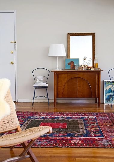
Now this is where I’m like “huh”, not because there is anything “wrong” per se but because that vignette is just kinda boring. The blue wire chairs are tiny outdoor chairs, that the IKEA lamp feels oddly modern and oversized, and all of a sudden I drank different bourbons and scotch? I do still have that blue dog painting, of course, and will forever (It’s in our kids’ bathroom right now). I like the rug, the planter on the chair, the folding woven chair and that painting on the floor (??) – but collectively it’s just a bit boring and off (which is OK!).
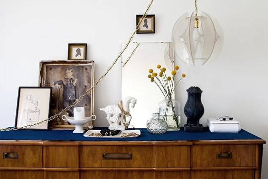
This one really cracks me up – again not against everything in this shot, just collectively it feels a bit try hard, but I think I literally was trying so hard… I remember thinking “how did I win this show?!! How can I prove to the world I’m unique??” This was the dresser in my bedroom and I guess this was my collection on top? I actually would love that projector screen drawing on the left (It’s very Hugo Guiness-y) and I LOVE that Scandinavian black owl. I still have that indigo runner (which I bought in Vietnam when Brian and I went backpacking right before DesignStar) and the glass vases were from my wedding (where all the vases were vintage mason or faceted jars). The silhouettes are random and that swag cord was a move that I liked doing (that I still kinda love – I did it in Elliot’s room). Not sure what is up with the portrait of the ghost-looking boy (??!!) and probably wouldn’t buy that again, but certainly not off brand as I sure do love a stranger portrait.
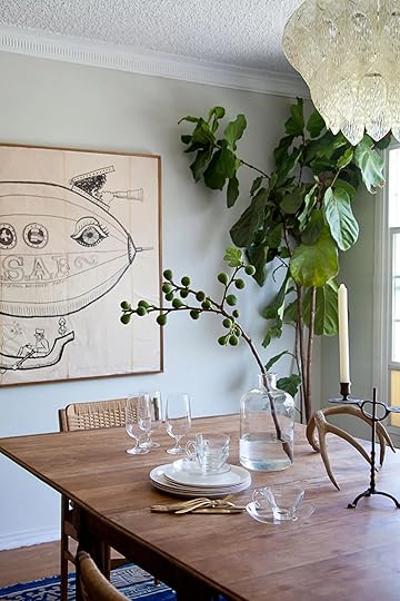
Y’all, that was the Blimp before its glow up (framing). Gah, seeing it with a fig tree with wood table in here, is so similar to it in the sunroom with another fig tree and wood table. See?
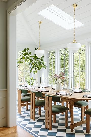
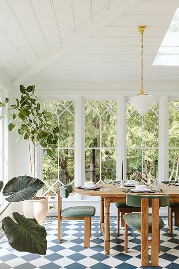 photos by kaitlin green | from: farmhouse sunroom reveal
Here is what I said at the time:
2010 Emily: What’s My Style: Weird, eclectic and modern, but loose and casual. All vintage all the time. And as far as color, I mix a lot of blues, grays and whites with natural materials like wood and leather. The blues keep it modern and masculine, while the leather and wood bring in warmth. My furniture tends to be straight and masculine while my accessories are more curvy and feminine. I don’t plan it that way, it’s just my instinct
Y’all – this is still me!! I mix more new and care about having more contemporary artists and hiring local makers (because I can afford them now), but the general spirit is similar.
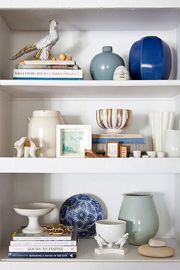
Ok, now that shelfie I’m still all in on and is full of SO MANY nostalgic things. I know where I got almost everything there (and now I’m sad that that blue plate broke after 10 years of loving it – bought in Italy). I’m on a plane now, but I want to race to my prop room and see if I still have some of these things (like the simple footed white bowl). The gold and white vessel broke, but I repaired it and if you look closely, right under it, you’ll see my framed collection of dollhouse fly swatters and mousetraps – yes, you read that correctly.

That white vessel is SOLID and I love that little table (notice the drawer detail). Now the creepy boy painting (WTF, I had two of them???) can go and I’m not sure why I had a rock collection, but I also think they are pretty rocks (note that now I collect leather or twine wrapped rocks to put on top of books so I suppose I’m still into using rocks as styling elements).
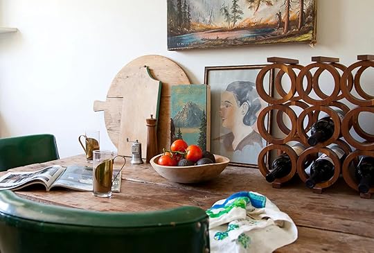
I think this was an attempt to create a sweet vintage vignette – all things I’m still into, but collectively maybe not super strong? I glued that wine holder back together SO MANY times before I called it. I still have that wooden bowl and I hoarded those brass and glass mugs for years. I don’t think I have that exact round breadboard, but I have a very similar one that Suz gave me that lives on our island. As you can see my love of forestscapes (or any landscape or seascape) was a thing even back then. Pretty sure there is some Two Buck Chuck in that wine holder – or if not maybe I splurged on prop wine to not look quite so broke.
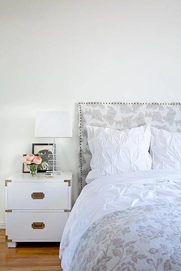
I think the only photo in this mix that actually makes me cringe is this one – mostly because I’m embarrassed about how I wanted to be perceived then. You see this was my attempt at doing something elevated, that didn’t look like the thrift store girl – as I was feeling super subconscious about not being more “legit”. So I bought this “sophisticated” fabric and with nailheads made this headboard. I refinished the campaign nightstand (was yellow) and bought a crystal lamp! I did NOT like that pintuck bedding at all (still don’t, I hate textured bedding). But I also still really do like a calm and serene bedroom (think mountain house bedroom!) so maybe this is a version of me, just a more budget/ boring version. I guess I’m still proud of myself for doing the DIYs and TBH those garden roses are so sweet.
*Unless Otherwise Noted, Photos by Teri Lyn Fisher via Apartment Therapy
The post Emily Reviews Her First Professionally Shot Apartment From 2010 (Lots Of Feelings!) appeared first on Emily Henderson.
March 9, 2025
The Link Up: Em’s New Everyday Necklace, Mal’s Affordable DIY Art Ideas, And Easiest Self Tanner Maybe Ever


Happy Sunday Everyone. Emily came to LA this week for a fun shoot that we can’t wait to show you! We also got to have a little team time, though we missed our wonderful Caitlin, who is on the East Coast. Guess we’ll just have to plan another hang where the whole gang is back together:) Hope you all got to hang with people in your lives that you care about because there are few things better or more important than that. Ok, let’s link!
This week’s house tour is the home of the co-creator of Stranger Things, heard of it? But the actual cool thing about this particular home was that the previous homeowners hired the current owner’s dream designer, Amy Kehoe. In a truly meant-to-be scenario, she was more than happy to “lean into that a bit more with the next evolution.” Go check out this truly stunning, happy, and whimsical home.
From Emily: For those of you wanting to mix pearls into your necklace layers, I just bought these micro pearls that are so sweet and not so big and pearly (so less preppy). My MIL always said to put something white around your face (I think to offset and flatter your eyes) and I do agree that I like the look! Anyway, this one is really good.
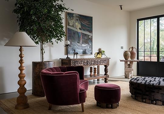 design by austin carrier and alex mutter-rottmayer, of hommeboys | photo by adam potts
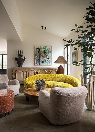

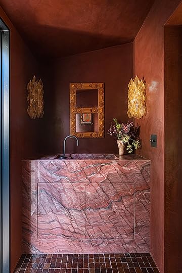 design by austin carrier and alex mutter-rottmayer, of hommeboys | photos by adam potts
The extremely talented Austin Carrier and Alex Mutter-Rottmayer, of Hommeboys, have opened up what looks like an insanely beautiful showroom in downtown Sonoma called Haus of Hommeboys. If you’ve been following their work like we have then you know their taste is impeccable! The showroom will have their first ever furniture line as well as feature locally-made furnishings, art, and objects. You can shop online here, or if you are in Sonoma and need a little break from all the wonderful wine, go check it out in person (but FYI you need to make an appointment first)!
From Arlyn: I’ve been working on a book project along with a designer for nearly two years now and we’re finally rounding the corner on it. So I’m in deep design book research mode as we figure out what they call the “front” and “back” matter of books. I’ve been digging around other design books for inspiration and I’m only just discovering Interiors: Styled By Mieke Ten Have. It came out last fall, and it’s SUCH eye candy. I’ve long admired Mieke’s work. Every home I drool over from AD has her styling credit on it. Her work always gives me ideas, fresh perspectives, and so many “huh! I’d never have thought of that” type of moments. It’s an absolutely gorgeous book, and I recommend picking one up if you’re itching for some new, charming ideas.
From Caitlin: Remember when folks used to build those sweet little Geocities sites for their niche, ultra-specific interests? If so, you’re in luck – because I’m newly-obsessed with Abandoned America, a website that harkens back to the good ol’ days of the internet. There are THOUSANDS of photos of stunning old hotels, homes, factories, towns, theaters, and other structures that have been lost to the sands of time. Often, these places are quite literally fossilized – threads still remain in sewing machines, clothing still hangs in closets – and I’m moved to think that this type of imagery will cease to exist in the future. (No offense, but I can’t imagine many – if any! – of LA’s new builds decaying so beautifully.) Refill your coffee and dive in for a fun scroll – you’ll feel like it’s 1998 again, if only for a few moments.
From Jess: If you need a pick-me-up, as man of us do, and you haven’t seen Heartstopper then you must go watch IMMEDIATELY! There are three seasons so you’ll get to really settle in and fall in love with these characters.
Also From Jess: Given that spring break time is upon us, I want to re-shout out the gradual tanning lotion photographer Kaitlin recommended/let me borrow last summer at our Rugs USA shoot. Honestly, I am so impressed by Emily and others alike that are good at the fake tanning foams with the mitts, etc. I’ve done it once but I found it a little too stressful (but those sorts of things easily stress me out so know that). However, this gradual tanning lotion is so easy to use. It’s just like putting on regular lotion! It’s easy, effective, and works great for my sensitive skin (Often with lotions that aren’t the most boring plain thing in the world, I get a rash. But not with this one!). I use the medium to dark and it just feels like a good glow for me.
From Gretchen: I just spent the week in Santa Fe, NM with my sweet mom (our first girls trip together in YEARS) and we had the best ol’ time. The food was amazinggg (can you say ‘sopaipilla’?) and I essentially had a margarita IV drip strapped to me the whole time. It was great. But the real reason we came was for the art, and oh boy did we get our fix. From the galleries along Canyon Rd (our favorites were Materiality and Tierra Mar) to the incredible Native artists who set up under the portal of the Palace of the Governors by the Plaza to sell their wares–mom and I lined our (now cashless) pockets with sterling and turquoise treasures from so many talented artisans. Rings, bracelets, earrings–the craftsmanship, creativity, and all of the makers we met were truly inspiring. I bought an incredible, chunky sterling silver ring complete with hidden carvings on the inside from local artist Allen Bruce Paquin, who shared some of his story and the meaning behind his designs with me. This article highlights him, his work and other vendors from the portal. Such incredible works, traditions and people. I’m already dying to go back!
From Mallory: Need a cute, cheap and easy art idea?? VINTAGE POSTCARDS. In my dining room I’m doing a gallery wall of vintage LA/Los Feliz postcards and it’s turning out SO cute. I found most of mine on eBay, but Etsy also has some great ones!! Highly recommend:)
From Marlee: Recently I’ve been feeling especially passionate about scents – I want to be wafted with incredible smells every time I enter my room. At the same time, I’m pretty sensitive to artificial or intense smells and can be easily overwhelmed by too much action. One thing that hits the “just right” sweet spot for me is this teakwood & tobacco room + linen spray by PF Candle co. I love a few spritzes around my room here and there, or on my laundry right when it comes out of the dryer and it smells so fresh, clean, and cozy. It’s not too sweet or intense and lasts so long – I’ve been using this bottle almost daily since I moved into my new apartment 6 months ago and I’ve barely put a dent in it. I’ve used a couple other things from this brand (like their reed diffusers) and have loved everything. Also, the brand started as a one-woman Etsy shop and now I see them in tons of local retail/home goods stores around town which is super cool to see!
Thank you for stopping by and see you tomorrow. xx
Opening Image Credits: Design by Austin Carrier and Alex Mutter-Rottmayer, of Hommeboys | Photo by Adam Potts
The post The Link Up: Em’s New Everyday Necklace, Mal’s Affordable DIY Art Ideas, And Easiest Self Tanner Maybe Ever appeared first on Emily Henderson.
March 8, 2025
Really Great (And Mostly Affordable) Spring Basics
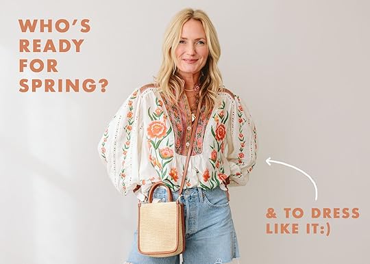

We are ready up here for spring (had a few mid 60s sunny days in February which is always such a tease). I’m mostly just fantasizing about spring break (sun! warmth! very little wifi!). So as I went shopping I found a decent amount of stuff that I LOVED, mostly on the affordable side (which is all relative I know). And per usual I try on a LOT more that I don’t love or wouldn’t bother to show you, so these are my favorites 
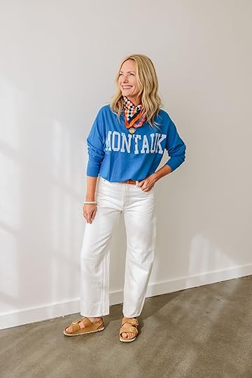
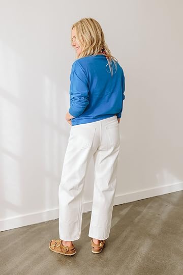
Shirt (size small) | Bandana (similar) | Pants (size 25) | Belt | Shoes
Solid long sleeve shirt with a raglan sleeve that looks so casual and still fun. 10/10 love that shirt. The pants are the famous Madewell darted barrel jeans in a cream (not bright white which always makes me nervous!) and this time I sized down to make them fit a bit more flattering. The Milano Birks I’ve had for years and I was pretty proud of myself for putting on a belt, which makes me feel VERY pulled together (bandana is old Clare V. but they sell something similar).
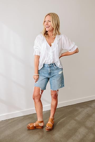
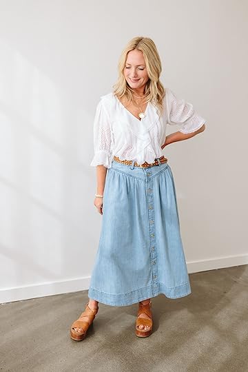
Ruffled Top (size extra small) | Shorts (size 27) | Skirt (size 27) | Belt | Sandals
A great thin white top (very Doen-esque) that is easy to tuck and perfect for humidity or high heat. I paired it with Gap’s new Bermuda short (which are long and not too tight but not too wide). They are GREAT (see them below in cream). But for those of you who like the skirt route, we LOVED this denim prairie style skirt – medium-weight, but has a nice thick hem at the bottom to keep some sort of structure. Would also just be cute with a sweatshirt or a tank top (this look was a bit too “church” for me, but admittedly pretty cute).


Sweatshirt Shirt (size small) | Shorts (size 27) | Tote | Sandals
HUGE fan of this short sleeved sweatshirt (it’s coming with me on spring break for mornings). It 1/2 tucks really nicely, looks cute with shorts, jeans, skirts, athleisure – just a real win for when you want to be casual but still look fun. These are the white versions of the longer Gap shorts – BIG FAN.
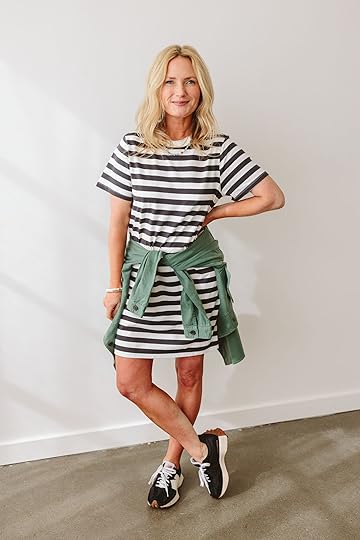

Dress (size small) | Jacket (size small) | Shoes
Clocking in at $24.99 this is my summer “play dress” – tie anything around its waist, throw on sneakers (with socks if you want to be cool, I do not) and go have fun. I could even play pickle ball in it, perfect for long walks to the village for a beer – just so easy and affordable.

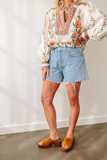
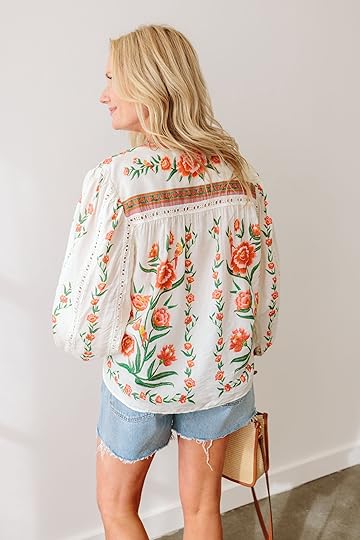
Shirt (size small) | Shorts (size 28) | Bag (unavailable) | Shoes
This shirt was a splurge, but my goodness it’s so pretty. It’s coming with me for spring break because it’s cotton so it’s still really breathable (so good for dinners with bugs but still warm at night). While this is Farm Rio (which typically is very resort wear) I think this is a solid spring and summer top that I will wear ALL THE TIME.
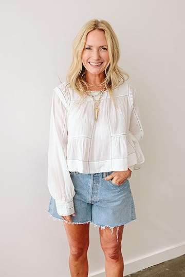
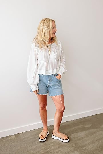
Shirt (size small) | Shorts (size 28) | Sandals | Necklace (similar)
A solid denim short and breezy white top with cute stitching (so great for hotter climates). And I even paired with more of a statement necklace which is pretty dang cute.
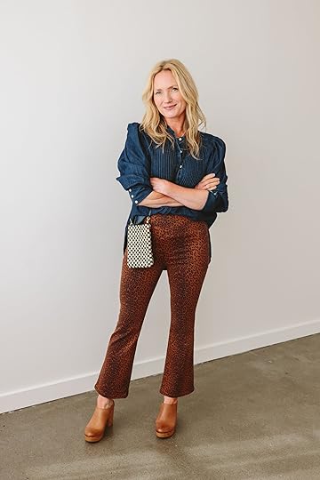
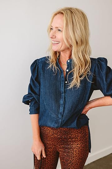
Shirt (size 1 which encompasses sizes 25 – 30, v stretchy, like HOT PANTS!) | Pants | Bag | Shoes
While the leopard pants are certainly not “affordable spring basics” (I love them BTW) the shirt sure is. It’s from The Gap and is so flattering and looks very high end, IMHO. Here I’m wearing a small (which I returned for an XS) so it runs pretty big. It’s rather long (which I stuffed into my leopard stretch pants, as you do) and the buttons on the sleeve are so pretty. I LOVE this shirt (dark denim is a thing right now) and it comes in white and black as well. But yeah, the leopard hot pants are giving RHONJ in a way that I’m actually into (but dressing them down with a sweatshirt might be the better move).
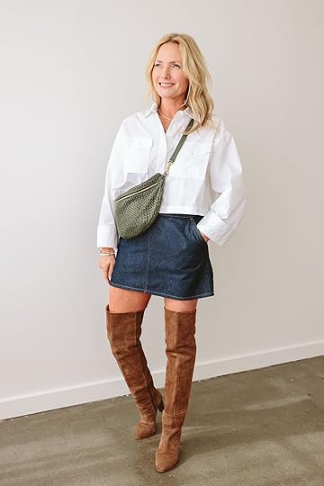
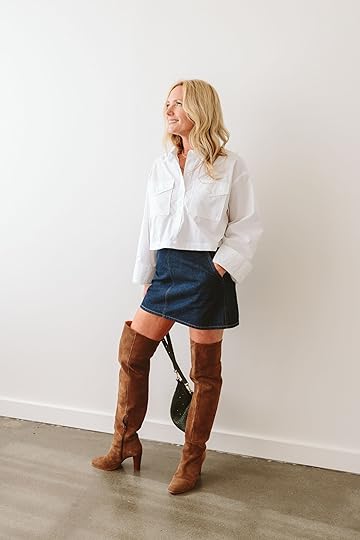
Shirt (size s/xs) | Skirt (size 4) | Fanny Pack | Boots
I was so intrigued with this convertible Gap top – very architectural and cool. The buttons unsnap, going from a longer shirt with a tail to more of a cropped boxy shape. I’m wearing an xs and it’s still pretty oversized. I really liked it but ended up returning it just because I didn’t think I’d wear it that often (since I don’t go into an office). The skirt is a new mini from H&M that is pretty dang cute (and I bought the top to match – denim post coming soon!).
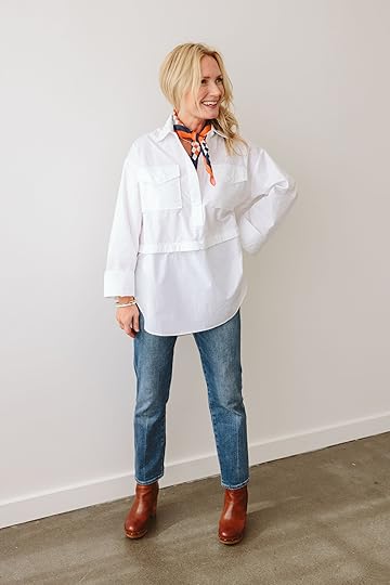
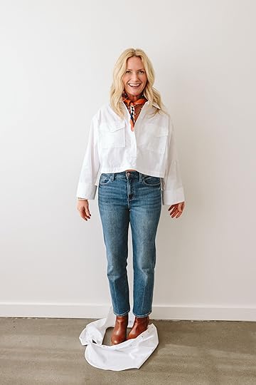

Shirt (size s/xs) | Bandana (similar) | Jeans | Boots (unavailable)
Here’s the top in action!

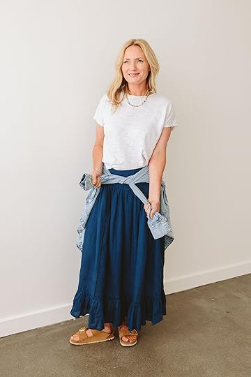
Denim Shirt (size small) | T-Shirt (size small) | Skirt (size small) | Fanny Pack | Sandals
Another great lightweight peasant skirt with such a cute ruffle. For me, the winner is the H&M denim shirt – it’s stiff, more like a shacket in a good way, and has the cutest Western-style buttons. Feels FAR more expensive than it is.

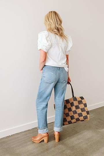
Shirt (size xs) | Jeans (size 26) | Tote | Shoes
Of all the white blouses that I tried, this is the one I know I’ll wear the most this spring. It has a lot of structure to it, feels more like canvas or denim than cotton. But such a flattering fit and the stitching and ruffles are so cute. The jeans are CRAZY COMFY, so much stretch and drape and yet still flattering. I tried on the famous sweatpant jeans (which I LOVED, TBH) but these are 1/2 the price for almost the same level of comfort (and without printed pockets).
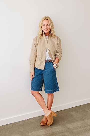
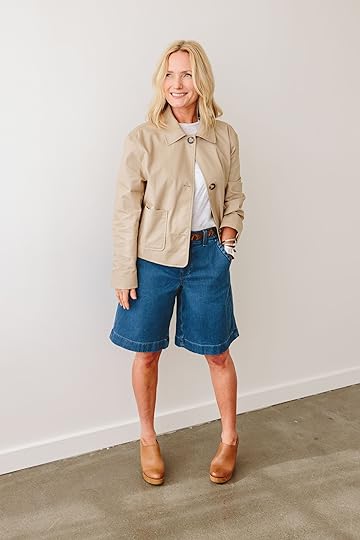
T-Shirt | Jacket (size small) | Shorts (size 2) | Shoes
This outfit was a bit controversial because those are bona fide culottes. Half of us thought it was a cool, more androgynous look, the other half wasn’t sure. While I typically would wear smaller shorts, admittedly this looks cool and stylish. And yes, those clogs are still my current favorites for when I want some height (but with comfort). The jacket is a perfect spring half trench coat (not sure that’s a thing) that has a cute collar, pockets and buttons (and H&M so very affordable).
Lots of good things, now just if the Oregon weather will behave 
*Photos by Kaitlin Green
The post Really Great (And Mostly Affordable) Spring Basics appeared first on Emily Henderson.
March 7, 2025
8 Not Ugly Dog Beds (And The Affordable One I Love Having In My Home)
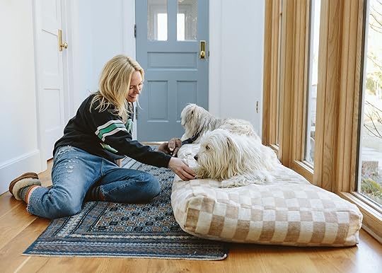

I had to shop for new dog beds recently because ours were DISGUSTING, likely because we don’t wipe our dog’s feet and we have construction outside (and they were vintage patchwork denim and the pups had been abusing them for 3 years). So after shopping for a while, annoyed at all the patterns I found out there, I found these that I love because where we have them in the house (both in the living room and here in the hallway where they sleep at night) are kinda prominent. So I wanted dog beds that look like nice looking floor pillows, or honestly just anything that wasn’t too ugly or basic.

I found these on Wayfair and they come in a bunch of colors (and includes the inserts). Our pups are medium – large (like not huge, but “medium” feels too small). The stuffed animal sloth (was Elliot’s) is Oscar’s current “baby du jour” – he LOVES taking care of a stuffy.

So far so great – the medium tones hide their hair and can be taken off and washed. The pattern is fun and they came in at $100 which isn’t cheap, but honestly I found almost none that were that I loved for this price (and once you get higher than $150 it feels like a lot when you need two). But there were a lot more that were contenders and I figured if I was in the market for non-ugly dog beds that maybe some of you would be, too. Here you go 
This one is definitely bolder with its pattern but also pretty awesome. Love that the pattern orientation is different on the sides. So this one comes in four sizes, has five other colors to choose from and the biggest size clocks in at $87! Cute and pretty affordable.

This one is for sure more expensive (still under $200), so if you don’t have more than one dog, it may be more doable. I love the two-tone design and if this color isn’t great for your home or your pup’s fur color there are four other color options and don’t worry, it’s machine washable:)
Who doesn’t want a little corduroy in their home? This one is perfect if you aren’t a big pattern person but want a bed with a little fun texture. Aside from the green, it comes in two more colors (a camel option too for our light-colored dog friends), three sizes, is machine washable, AND water/stain-resistant. A solid pick for a super affordable price. The largest size is only $60!

Maybe you have a more colorful home or you want to add more color, this one is a great option. This photo makes it look green and pink, but it’s actually green and white (although a green and pale pink would be very fun in the right house). But if a color isn’t what you are looking for, it also comes in black and white, has two size options, is washable, water-resistant, and scratch-proof. So a lot of perks which is great since it’s about $180.


Now, this one is the most expensive on the list but my is it GOOD. A designer/pet owner’s dream and it’s reversible! I will say that if you have the budget to buy one of these, this is a company you can feel really good about buying from. It’s a queer led company that’s a certified B Corp, making all of their products ethically. The designs and craftsmanship are awesome. This one also comes in one other color, a happy coral and mint combo, and it’s washable.
Ugh, I love this color combo a lot. But if red and tan check is not a good fit for you, it comes in a ton of other patterns and four sizes. They also really focused on durability using a “dig-proof knit” as well as making it washable and non-slip. It’s on the higher price end at $189 (with mattress) but is more affordable if you already have a mattress and only need a cover.
Lastly, we have another great company doing good things for the world – in their case, they focus on sustainability. This plush bed comes in 5 other colors in this recycled velvet, but they also make the same style in hemp and a hemp blend. The colors are just a bit more limited with those. And because doing things in sustainable ways costs more (hopefully that won’t be the case forever!), this bed is also a bit pricy at $225.
Hope this helped any dog parents/design lovers and see you tomorrow for a very fun spring-themed post. xx
*Photos by Kaitlin Green
The post 8 Not Ugly Dog Beds (And The Affordable One I Love Having In My Home) appeared first on Emily Henderson.
Emily Henderson's Blog
- Emily Henderson's profile
- 10 followers


