
Emily Henderson's Blog, page 26
February 14, 2025
Arlyn Is Considering Turning Her Dining Room Into A Playroom: 3 Options To Make It Work


The dining room in my previous home was *literally* the jewel box of that place. It was my showpiece, the room I loved to just sit in and look around. I was proud to host dinners and game nights there. I was grateful for a beautiful space like that when it became the impromptu home office for my husband and me when we were sent home to work at the beginning of the pandemic in 2020. We didn’t have a breakfast nook, so it’s where we say like six times a day giving our baby (at the time) purees and snacks in her high chair (RIP rug). And then we moved.


Don’t get me wrong. I feel like I often talk about our home now disparagingly. I love where we live for many reasons, but it’s definitely lacking the luster of our old place. Mostly because everything that’s here is just a holdover. It was picked for over there, but living its next life here.
Another thing about where we currently live? It doesn’t accommodate all of our daily needs, specifically having office space for two working adults and an area for our toddler to freely play. We have alllllll of her stuff scattered between the living room (which I affectionally refer to as the luxe daycare when people come over), dining room, and her bedroom upstairs. She’s perfectly content because she doesn’t know anything else. But we do. Long story short, she had so much room to play where we were staying over our Christmas vacation, as well as at our friends’ place where we stayed during our fire evacuations.
So when we settled back home after a whirlwind month, I sat down at my spot on the dining table where I work and looked around, contemplating how I was using the spaces in my home. (For the record, my husband now works in a small office downstairs that we call the dungeon because it has no windows, and I can’t stand the idea of writing in there so it’s all his.) Was I being fair to my girl by commandeering the dining room because of what I *wish* it was? A whisper of my old jewel box? Sure, we used the 6-seater table here and there to host friends, but certainly not more than a handful of times per year. Did I like sitting here with a perfect view out the window that frames the beautiful trees on our street while I tapped away at my keyboard? Yup, sure did. But am I also tired of my living room being drowned by IKEA TROFAST units, play kitchens, make-shift ball pits made out of balls and a large storage container, etc. etc. etc.? Also yes (especially because the actual floor space for my daughter to play is super limited).
Living in a smaller home that doesn’t check all your boxes, in terms of spaces needed, always means someone or something is being sacrificed. If I’m being honest with myself, I want a formal dining room. I want a beautiful space to sit down and enjoy a meal with friends and family (we have a little bistro table in the kitchen we use when it’s just us). I want to sit where I’m sitting with easy access to the kitchen for a snack, right next to the powder bath for quick restroom breaks, across the window so I can see when my husband pulls up from an errand or a work outing. Seeing our neighbors walking by with their dogs’ leashes in hand, or the mailman popping over to the other side of the street to make their deliveries is good for my soul. But having a singular, big and open spot for my girl to play and do her arts and crafts and zoom around as a superhero and read her books under a Nugget couch fort might just be even better for my soul.
All of that to say, I’m pretty torn on what to do with this space. The dining room is always the easiest option to turn into a flex space. I know even our own Caitlin from EHD is talking about changing the function of her beautiful dining room into a spot for both her and her boyfriend to work out of. My family needs a living room, but maybe it doesn’t need a dining room as badly as a play space. So, let’s explore some options.
What I’m Currently Working With

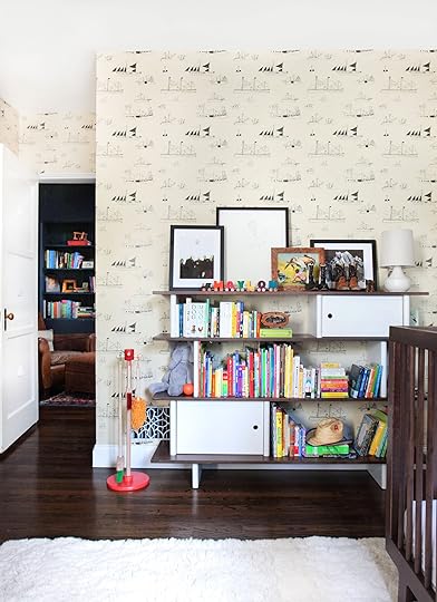
This is the current state of my living room. Like, I snapped this photo as-is without even attempting to make it look any nicer 15 minutes before writing this sentence. Half of the large cabinet under the TV is full of coloring books, dot markers, board games, and various other toys. In front of the sofa chaise (at left in photo), there’s a toddler armchair and a container of balls and random blocks my girl throws in there regularly. The coffee table always has something currently in play on it, and other toys just finished being played with on the bottom shelf (and rogue MagnaTiles and drawings and construction paper…). The ENTIRE right side of the living room—I’m talking plant to stair banister—is toys and toy storage.
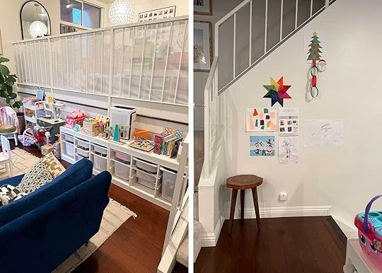
Here’s another view. The left photo is the wall right by the landing five steps up into the dining room from the living room (it’s a multi-level townhome). Guys, it’s not great, but I also acknowledge that this is for such a short time. My daughter is about to turn 3, and I’d be lucky if I had another 5 years of her little kid toys taking over my living room. It’s a blessing, I know that.

Here’s the dining room in question. We have toy overflow in here, a mail landing spot (and let’s be honest, a junk-landing spot most days), and my little work spot. The chair is NOT ergonomic by any means, but I’m only ever sitting for like two hours of straight working time so it’s not a big deal (I don’t think). I’d love to get a big rug in here to break up all the wood tones that are all on top of each other, and likely would still do that even if it became a play space.

This is the footie-pajamaed angel in question who needs more room to play. Again, she’s totally happy fluttering between the small amount of floor space in the living room, to the small amount of floor space in the dining room to the middle of the kitchen but you know…there are reasons why that isn’t ideal. We don’t spend a ton of time playing upstairs in her bedroom because the layout of her room doesn’t allow for much toy storage (an issue to get into for another day), and I don’t like leaving her alone to play up there while I get some other things done around the house the way I can when she’s downstairs.
All things considered, I’ve come up with three possible options if I decide to give my ol’ dining room the official boot (gosh, that hurts to type):
Option 1: Turn it into a multi-functional space to check all the boxes.I’m talking play area, small dining nook, and maybe even a little desk set up. That or I use the dining nook as my desk the way I currently do, and bring in a bit of a library vibe, too. Because I still have tons of boxes of books sitting in the garage from when we moved in two years ago that I’d love to get out and onto some bookshelves. I could possibly get a 4-seater table that expands into a 6-seater when we need it, and tuck that into a corner by the window.
Here’s a messy sketch of some initial thoughts:
 *not to scale (table and banquette would likely take up more room than shown here)Pros of option 1: I get everything I want in one space (but do I really have enough room for everything?). I can also make it pretty enough that it doesn’t feel too kid-like, but is still happy enough for my actual kid.Cons of option 1: I’d have to get rid of all my furniture that’s in here, and that makes me very, very sad. Plus, I use that credenza to store a lot of small appliances, platters, and other kitchen and dining things I can’t fit in the kitchen (but often use). Also, me trying to do everything might end up being everything done poorly. Can you really have it all? (With good design, yes, possibly).Option 2: Try to fit in both a home office and a playroom.
So, maybe there’s a world where we get a folding table and chairs that we keep in the garage when we need to feed more than three people, and I focus in on two primary uses: workspace and play space. For anyone wondering how I could possibly work with a toddler playing around me, the answer is: I do not. I work while she’s at preschool or sleeping or being cared for by someone else. I’d still have to get rid of basically everything in my dining room, but I’d get back my entire living room. I could do a very pretty vintage secretary desk in front of the window, turn the area where the bar is now into a reading nook for my girl, and have so much space left over for all of her imagination and playthings.
Here’s another hurried sketch of how I could make this work:
 *not to scale by ANY meansPros of option 2: Plenty of space for both work and play, and an opportunity to have some breathing room aesthetically (we have too much furniture everywhere and it’s sometimes suffocating).Cons of option 2: No more dining room. No more dining-related storage. Setting up a temporary eating space in a playroom when the need arises.Option 3: Use it just as a playroom with tons of open space.
As I’m writing this, I can already tell you that I don’t think this is the move. While I know I can find a spot to work in this house (upstairs in my bedroom, in the breakfast room, even in the “dungeon” if worst comes to worst), I’m not sure it’s the best move for prime writing Arlyn. And writing is my livelihood so…yeah. I needed to go through the exercise of typing this out to know that I’d be the least happy with option 3.
Now, for some cons about ALL of these plans: Wise parents of EHD—Will my kid even play in here or will she just go to the living room anyway? I might be okay with that scenario because at least I know that everything lives together in one space at the end of the day. But please, enlighten me with your wisdom before I make any drastic choices like putting my beloved table and chairs up for sale on Facebook Marketplace.
Oh, also! I have my couch to sit on in my living room where she currently plays and well, I’m 40 now and would rather not sit on the floor when she’s playing or I’m playing alongside her. A Nugget-esque couch could solve this, surely.
—
Before wrapping up, I pulled some inspo of play areas with some of her existing storage pieces set up in a way that could work for us if they all lived in the same room, but also a few rooms that seem to have a few purposes.
View this post on Instagram
A post shared by Barkoff Coppola Interiors (@barkoffcoppola.interiors)
As much as I love this, we won’t be doing any built-ins because we’re just renters and don’t know how long we’re even staying here. BUT, I love the idea of the larger low table for play in the center of the room. We’re big Playdoh/coloring book/watercolor/paper mosaic-gluing people and more surface area would be great!
View this post on Instagram
A post shared by Studio Gild (@studiogild)
If you stretch your imagination a little, I could see something like this for my space. A small table (though maybe something that extends), a few chairs, lots of books/bookshelves, and a window seat!
View this post on Instagram
A post shared by courtney gault | MS Ed, MFA (@greenwich_play)
Same kind of thing here (the first image), just a bit too plain for my taste. But good to see how much space is opened up with a much smaller table (and something round is easier to place in a corner and still look good).
View this post on Instagram
A post shared by Mollie (@modest_mollie)
And kind of just what I want to be able to give my Evelyn. A bunch of open space to make a big mess, have space to build, climb, sit and read, and all the things she loves.
SO: WHAT SAY YOU?? There’s a lot to consider, and while I’m not locked into any “design” at the moment, I do think this exercise has at least gotten the wheels churning a bit. The idea of selling furniture and finding room for the things *inside* the cabinets in my dining room is daunting, but so is every new project I suppose. Would love to hear your thoughts or encouragements. 
Until next time…
***Dining room after photos: Design by Arlyn Hernandez | Photos by Sara Ligorria-Tramp | From: Arlyn’s Moody Dining Room Reveal Is All About the Insane Power of Paint
The post Arlyn Is Considering Turning Her Dining Room Into A Playroom: 3 Options To Make It Work appeared first on Emily Henderson.


February 13, 2025
I Searched For A Comfortable, Stylish AND Affordable Club/Reading Chairs – This Is What I Found


The “I” in the title of this post is from Emily as she was the one who pitched and did the initial research for this post. It all started with that little cutie green chair above from her best friend Robyn’s recently revealed living room. As most home projects go, the money-spending faucet was raging and all of them (Emily and her best friends) wanted to turn it way down. So when it was time to find a cozy chair for the reading corner, the term “affordable” when shopping was a priority. Now, the chair they chose was more in the $700 range which while not as expensive as it could have easily been, it also is cheap. However, in Em’s (and my) search we found nine high-rated, very cute, cozy reading chairs that are all under $400. What each of us considers “affordable” is based on a lot of different factors but given the current market, we felt good about these and thought the pricing was fair (and for those slammin deals, there’s always vintage shopping but that can come with all sorts of cost variables is reupholstering is needed). Hope you’ve got your book and a hot drink handy because it’s time to get cozy…
Soft Padded Armchair – $340

This was an Emily find I loved as soon as I saw it. The shape is the perfect balance of curved and sleek and how cute are those rounded feet?! Those really make this chair look more expensive than it is. If the white fabric makes you nervous, this chair also comes in three darker colors. It’s just so versatile style-wise so 10/10 from us.
Wide Oversized Armchair Accent Chair – $310

Another Em find and what a great one! For it to be oversized (love a roomy chair) at the price is awesome. The MCM-inspired design will add a lot of style to your room and if green isn’t your preference there are eight other colors to choose from.
Chanequa Oversized Upholstered Accent Chair – $340

This one I found on Wayfair and fell for the size and that wood base. So often the more “affordable” chairs have wood bases that don’t look…great. But from the looks of this photo and the customer one on the site, I’m impressed. This is another one that could be a style shapeshifter so it’s going to work in most homes. It also comes in 3 other more classically neutral colors.
Extra Deep Accent Chair – $300

This cutie was an Emily pick and another one with a pretty wood base! I would call this look “soft modern”. It comes in four other colors and I also really like the camel boucle.
Corduroy Deep Seat Single Sofa Accent Chair – $300

Oh, you know you could just sink into this one. It really reminds me of the Article sectional Emily put in the mountain house so it’s probably way she wanted to include it in this post. It’s big and comes in four other colors (the dark green is also so pretty). Reading a book, watching a movie, or scrolling on your phone would likely be a big joy in this one.
Swivel Accent Chair Modern Barrel Armchair – $310

If you love an Amber Interiors or Studio McGee look, this is your chair. She’s cute, she swivels, she’s got a skirt and the reviews say she’s comfortable! What’s not to love? Well aside from the fact that it comes in two other colors.
Namiyah Upholstered Armchair – $340
When I found this one I knew I had to include it. It’s a chair and a half (yay, big!) and the reviews confirm it’s as comfortable as it looks (and to me, it looks super comfy). There are also five other colors to choose from! This is definitely a better style for a more modern home but of course, we are fans of breaking the style rules if you want to. And actually, in the really light colors, it would be great with an organic casual style. P.S. You can also buy a version with a matching ottoman
Upholstered Accent Armchair – $360

I wanted to make sure to give you some traditional options and this one is pretty perfect for this category, right? It’s also oversized which we again, always love, and so classic in shape. It also comes in a green velvet (but looks pretty shiny) and a cream boucle.
STRANDMON Wing Chair – $349

We had to include an Ikea chair and this one is amazing! Often affordable chairs don’t come in fun (and cute) patterned fabrics but this one is an exception. Houndstooth is, of course, a classic pattern but in this high wingback chair, it looks so fresh. I think this could work in a ton of different spaces seamlessly. It does also come in three solid colors (the green is my favorite) if that’s better for you:)
Stutsman Upholstered Chair And A Half – $354

The final chair is a great choice. It’s simple but with some really pretty arms. This puppy is also real solid and such a great size (we’re really a big fan of a chair and a half – especially for snuggling). It does come in two other colors! For our modern traditional lovers, this is a home run for you.
Ok, that’s it for our research and hope it was helpful! Let us know if there are any other types of furniture you’d like us to find you for. xx
Love you, mean it.
Opening Image Credits: Photo by Kaitlin Green | From: My Best Friend Robyn’s Living Room Reveal – We Added So Much Color, Charm, Coziness (And A Lot Of Heirloom Quality Pieces)
The post I Searched For A Comfortable, Stylish AND Affordable Club/Reading Chairs – This Is What I Found appeared first on Emily Henderson.
February 12, 2025
Your Decor Rut Is OVER – The 7 Decor Trends That We Can’t Wait To Try (And Keep) In 2025
All of our trend posts got pushed back a bit because well, January was an extremely difficult month for many reasons. However, we LOVE talking about trends and decor trends are extra special to my heart because they are inherently more user-friendly. They are the kind of trends that don’t require a big renovation which is great considering like a lot of people, I will not be renovating a home in 2025 (I mean who knows but it’s unlikely:)). So with my very mathematical and strategic formulas (ha), I am very confident that these 7 trends/great design ideas are going to be popping up all over our magazines, Instagram, Pinterest feeds, and hopefully some of your homes which makes me very happy. Ok, let’s go!
Curtains As “Doors”
While conducting my research I was kind of taken aback by how many rooms I saw that were using curtains to “separate” adjoining rooms. And no, this is not a new idea as also shown by the opening photo (my living room in 2019) and from general history, but let’s just say they are having a moment and are being done in BEAUIFUL ways. Also, this made me extra happy because I just installed a curtain in my friend’s apartment to give her vanity area a little more privacy. So yes, it’s renter-friendly too!
View this post on Instagram
A post shared by Arent&Pyke (@arentpykestudio)
View this post on Instagram
A post shared by Tamsin Johnson (@tamsinjohnson)
Who doesn’t love a little home decor drama right? The photo on the left, a home by the incredible Arent&Pyke, gave its entrance a moment to remember. Those warm velvet drapes are perfection. But what’s even more special and detailed is that the arch was made to house them meaning the rod is completely hidden. This method is definitely more “custom renovation” than installing a renter-friendly curtain rod. Regardless it’s such a stunning example of this reemerged design idea. Then the photo on the right is a retail shop but another Australian designer we love, Tamsin Johnson. The shape of the doorway is so beautiful and the added detail of that fringe is not only so pretty but also immediately draws your eye up.
View this post on Instagram
A post shared by The Design Files (@thedesignfiles)
View this post on Instagram
A post shared by Chairish (@chairishco)
These next two examples actually show the rods which would be more standard for those of us adding them into existing homes and doorways:) Of course, the rods in these two homes are very special and likely very expensive but are inspirational nonetheless. The exaggerated curve of the one on the left looks like a sculpture in and of itself and the thick brass rods in the bathroom only add to the luxe and glamour of that space. Love both of these.
View this post on Instagram
A post shared by Panoplie (@panoplieshop)
Finally, this space is a hotel but I love the softness that the drape brings to that fairly large doorway. I don’t see why you couldn’t do that in a home as well. Plus, I’m sure it helps with draftiness!
The Droopy Roman
Maybe I’ve missed something but another design detail I’ve noticed a lot more lately is relaxed Roman shades. And this is across many different styles which is what feels different to me. Let me show you what I mean…
View this post on Instagram
A post shared by domino (@dominomag)
View this post on Instagram
A post shared by Jessica Helgerson (@jhinteriordesign)
I think I have associated that type of Roman shade with more classic/traditional-style homes. I could be off on that but that was what I put them with. Now, as you can see from the examples above, a relaxed Roman is spreading its wings. I love the added softness it brings to the very calm and simple room on the left. Then for the room on the right, it feels like a nice little style contrast to all the straight lines in the space.
View this post on Instagram
A post shared by Clever (@getclever)
Also, you don’t have to do a plain neutral linen, you can add something like a stripe! Just kidding you can do way more than that, but I do love this example and how much soft sweetness this window treatment brings to this little office space. So if you love a Roman but want some soft romance…go relaxed.
Oversized Lighting
This is another one close to my heart because not only has my love of lighting been very well documented on this site, but I also really love it when people go BIG with their lamps. I really want this trend to stick hard this year/forever. Let me show you some pretty awesome examples.
View this post on Instagram
A post shared by Clever (@getclever)
View this post on Instagram
A post shared by Lucy Alice Home (@lucyalicehome)
Look, I know that huge fringed floor lamp is pretty specific but it’s also AMAZING!!! What a find. I always think of lighting as art pieces (or have the potential to be) but this one really takes that idea to the next. In the other room, the floor lamp is nearly as large but much more neutral so a little less “in your face,” but in terms of scale just as impactful. Playing with scale in a really purposeful way is such a surefire way to make your home have that designer touch:)
View this post on Instagram
A post shared by ELLE Decoration UK (@elledecorationuk)
View this post on Instagram
A post shared by domino (@dominomag)
But it’s of course not just floor lamps, it’s all lights! I love that this works with every style too. Both that stunning vintage sconce and incredibly fun table lamp add just the right amount of “cool” to these spaces. They are oversized but in a more manageable way if this idea makes you a little nervous but you want to try:)
What’s also pretty great about this trend is that it really encourages vintage sourcing. There are definitely new options on the market but it seems to really nail this trend it’s all about that thrift hunt (plus the deals tend to be better too).
Unframed Art
A trend that makes things “more affordable”?? Yes! We love a beautifully framed piece but we also know that especially if it’s a large piece of art that big frame isn’t going to be cheap. So let’s talk more about the good news…
View this post on Instagram
A post shared by Arent&Pyke (@arentpykestudio)
View this post on Instagram
A post shared by PARIS BERBÈRE (@parisberbere)
This particular trend does focus on large-scale art as you can see in the two examples above. The paper or fabric should have a solid texture of its own to visually hold up without a frame. I’ve done this before with medium-sized pieces and loved how it looked. It gives such a fun and unexpected dimension.
View this post on Instagram
A post shared by Y S G (@ysg.studio)
Modern tapestries are another type of unframed art that’s having a very chic rebirth. It’s drapier like in the space above. I’m excited to see a lot of this too because it’s high-impact and can be done for a super affordable price if you find the right piece of fabric. Another reason to go vintage shopping!
Retro-Inspired Graphic Fabric Prints
This trend one is really cool and I’ve been trying to get a piece of the action myself – I’m talking Euro (?) Retro-inspired geometric fabric prints. These high-impact, colorful but cool fabrics are becoming more and more popular. In my searches, they tend to be pricey but I haven’t given up hope yet. Ok, on to the beautiful examples…
View this post on Instagram
A post shared by Taylor Simon (@intayriors)
View this post on Instagram
A post shared by The Design Files (@thedesignfiles)
Same fabric (Limpopo by Pierre Frey), different orientation, both awesome. When you have such a stunning fabric like that one you really don’t need much else and these bedrooms are testaments to that. And actually, if you scroll on the post on the left you’ll see a lot more examples of this trend! I didn’t even realize that’s what the carousel was until I added it here.
View this post on Instagram
A post shared by Architectural Digest (@archdigest)
View this post on Instagram
A post shared by Justin DiPiero (@justindipiero)
All you need is a little too. I mean yes, in the bedroom on the left the bolster and an entire bench seat are covered but if it was only the bolster it still would have looked great and packed a fun-sized punch. And that bench cushion on the right is perfection. I love that the thinness of the cushion quiets down the visual impact of the pattern so it’s a great accent instead of taking over the space.
View this post on Instagram
A post shared by Clever (@getclever)
I also love that they come in different fabric types – some are embroidered while others, like this one above, is stamped. It still holds the essence but in a more casual way.
The Romantic Drape
I’m realizing a lot of these trends are fabric-focused but I’m not made about it:) Now, I’m a little embarrassed to say I don’t know the name of this hanging/draping style but it is here to play decor trend ball, people. It’s old world, it’s romantic, and with some beginner DIY skills, not hard to achieve.
View this post on Instagram
A post shared by GREEN RIVER PROJECT LLC (@greenriverprojectllc)
I first took notice of this accent from the beautiful home of Emily Bode and Aaron Signh Aujla a couple of years ago. Also, THAT BLUE! It’s a beautiful and very romantic way to “make a headboard” so I was immediately onboard.
View this post on Instagram
A post shared by Chris Mottalini (@chrismottalini)
View this post on Instagram
A post shared by Jenna Chused (@chusedandco)
Then I started to notice it more on my feeds and continued to love it. What is fun about these two examples is that since their fabrics are solid, they added art and a mirror to them for more dimension. This trend has such a high impact and is also super renter-friendly which is another reason to love it. I think the key is for the rest of the room to feel relaxed, a little mismatched, and full of other old-world vintage.
View this post on Instagram
A post shared by Tamsin Johnson (@tamsinjohnson)
Here is a different kind of example that I LOVED too (and another stunning space by Tamsin Johnson). She took this draped look and created a very special corner banquette. It’s just so cool and the tassels make it even better.
Light Blue
This was a trend I called last year and it’s only gotten bigger so we can’t ignore it! Also, Arlyn declared it a 2025 paint color last week so let’s talk about it again. Plus, as I was writing this post I may have purchased a linen curtain panel as a potential option for my bedroom. I too may have finally given in (not that I was ever opposed:)).
View this post on Instagram
A post shared by Yellowtrace (@yellowtrace)
View this post on Instagram
A post shared by Marie-Louise Høstbo (@marielouise_hoestbo)
I mean if these don’t make a case for using light blue in your home I’m not sure what will. Especially when paired with medium-toned woods and reds, light blue is both happy and wildly chic. I am so in. Plus, paint is always a fairly affordable way to try something new!
View this post on Instagram
A post shared by Architectural Digest (@archdigest)
View this post on Instagram
A post shared by Vogue Living (@vogueliving)
But you can also go for the banquette cushion or stand-alone bathtub route (!). These spaces are also so dreamy I could cry. But for options that are a little more “tip your toe in” vibes, you can get light blue taper candles, a throw blanket or pillow, or yes, even…linen curtains;)
So that’s where we stand on the 2025 decor trends and we can see what blossoms/the new ones that pop up. Got a favorite?
Love you, mean it.
Opening Image Credits: Design by Jess Bunge | Photo by Sara Ligorria-Tramp | From: Jess’ Studio Apartment Living Room
The post Your Decor Rut Is OVER – The 7 Decor Trends That We Can’t Wait To Try (And Keep) In 2025 appeared first on Emily Henderson.
February 11, 2025
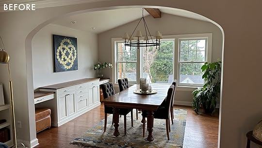
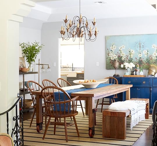
Introducing The Next Room…Robyn’s Welcoming Patterned Dining Room Reveal
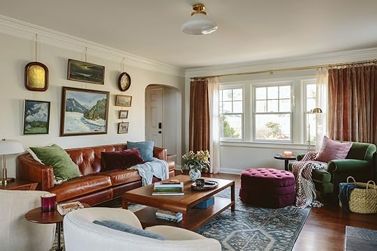
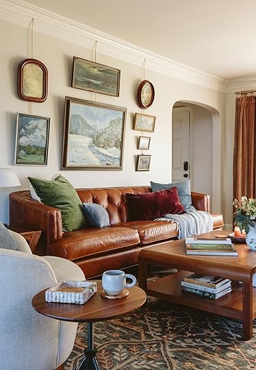
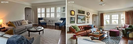
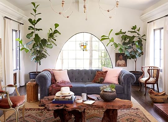
This dining room reveal is one of my favorites ever, and not just because it was for one of my best friends in the world (but that probably helps). It turned out so gosh darn elegant and yet livable. If you missed their living room reveal (which you’ll see a peak of below) head there first for the background and the befores) because today is focused on this jewel box of a room that I’m so proud of (and jealous of, TBH).
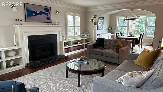
Remember, the move-in before was colorless, pretty charmless, and cozy-less. So we had a clear directive – but that doesn’t mean it was fast, cheap, or easy (nothing ever is). It took a year, a fantastic partner (yes, perks to being my friend), and a lot of meetings squeezed in to make it happen.
Green Pillow | Small Blue Lumbar Pillow | Square Blue Pillow | Rosewood Velvet Pillow | Throw Blanket | Vase | Red Marble Tray
But you can see the potential, right? The big window that frames Mount Hood, the pretty original floors, the built-ins – all just needed some color and point of view. The dining chairs were 10 years old (and falling apart), the chandelier was honestly fine (but sold on FBMP now), and the rug felt too boho for this elegant room but the table? Oh, that heirloom table that’s been in her family for generations was so pretty so we knew that we’d keep that.
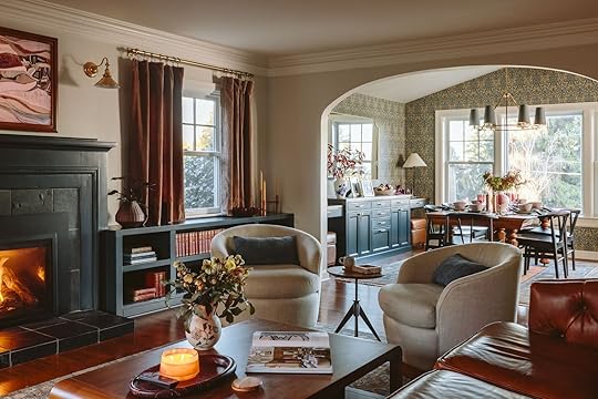
You can see here the connection between the living and dining room here, with a shared color palette of such warm tones, mixed with so many blues and greens. The dining room properly draws you in, while being totally balanced with the living room – not one room feeling heavier than the other. Almost like magic! (but not magic at all, LOL, it’s a hefty combination of effort, intuition, risk-taking, mistake-making, time, money, and experience…so easy!).
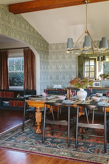
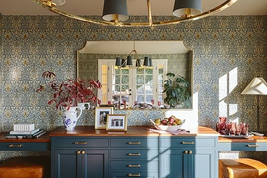
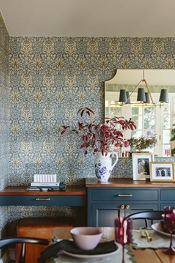
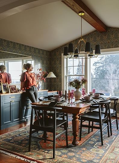
Introducing The Dining Room…
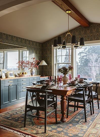
Wallpaper | Cabinet Color | Mirror | Table Lamp | Chandelier (no longer available) | Table (vintage) | Chairs | Rug
Kaitlin Green blew me away with these photos – the vibe is captured so perfectly! I think my favorite thing here is the rug with the wallpaper – neither “matching” necessarily and both rather busy, but because they are both classic and even historic, it now looks so vintage and original in here. I feared that it would be too much (especially with the other Persian rug in the living room) but now I see that when you are using such classic motifs and are wanting an old-world vibe, this is the way to go (and let’s be clear the tones and colors work really well together – a lot of complementary tones, not just random).
The Pretty Brass Chandelier
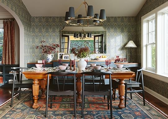
We almost kept their chandelier because it was “fine” but boy am I glad we didn’t. This one is so incredibly beautiful and the slate blue shades make it feel so updated, while the finish and the shape are classic. You can customize the drop, the finish, and the color of the shades (we almost did the burgundy but Robyn got scared and I complied). We kept it high enough to see the view from the living room, but low enough to still feel connected to the table. It’s perfect. And I apologize to those of you who hate it when we photoshop out recessed lights – While I didn’t ask Kaitlin to I am so grateful she did as they can be distracting if they are wrong, stylistically. One thing we could have done is replace them with brass spotlights but they were done spending money and making decisions, and since they didn’t mind the recessed lights we left them and just photoshopped them out for cleaner shots).
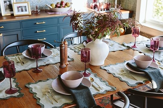
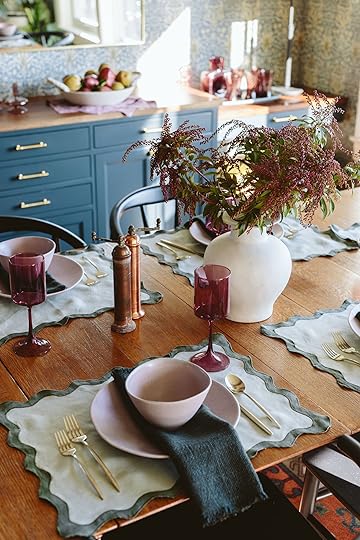
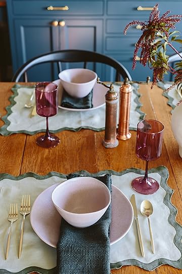
New Dining Chairs + Antique Table FTW
White Vase | Placemats | Gold Flatware | Plates | Bowls | Napkins | Wine Glasses | Salt and Pepper Grinders
The wallpaper is a classic William Morris pattern (that Rejuvenation sells!) and it was Robyn and Ryan’s first choice so YAY!!!! I loved it too so it was a real win. The chairs are a nice modern pairing to the more detailed/decorative table legs and the black finish added a nice depth and edge to the room. The wishbone shape is not only super ergonomic but the roundedness always adds a nice contrast to a rectangle table.
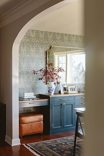
We knew that we couldn’t do a bold piece of art in here, and no gallery wall (too busy + there is one in the living room) so we hung this gorgeous huge mirror which obviously reflects a lot of light and adds so much elegance. The brass frame works so well with the hardware and the chandelier (obviously) and that rounded cut-out detail in the corner keeps it from looking too simple and modern (by giving it a vintage vibe).
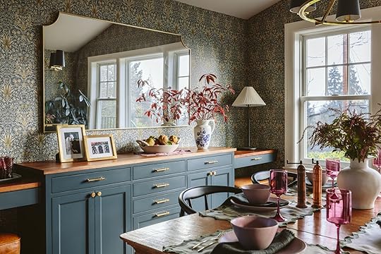
I know I’ve been harping on the dark blue paint color, but it sure is so perfect, especially with the unlacquered brass handles popping off.
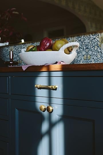
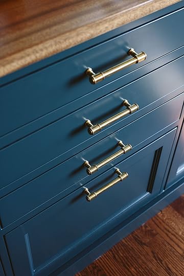
We chose a hardware (The Ladd Collection) that has a little bit of detail, leans more elegant than utilitarian but still feels fresh and modern. My goodness, did this elevate this built-in a lot.
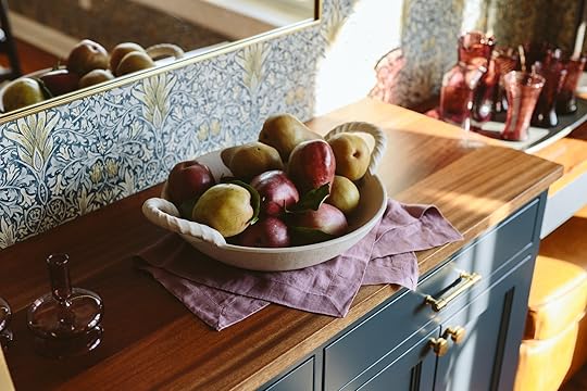
Fluted White Stone Box | Pitcher Vase (no longer available) | Gold Frames | White Handled Bowl | Burgundy Glassware (Vintage) | Table Lamp
I styled the credenza with winter branches, a big bowl of mixed pears, family photos in frames (From World Market), and a vintage set of the perfect-toned glassware and carafe (from Stars Market in Portland – although I saw very similar ones from World market the next day that were much more affordable lol). We put a nice classic candlestick lamp in the corner to balance out the branches, draw your eye, and provide a nice ambient glow.
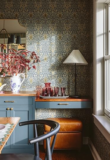
Burgundy Glassware (Vintage) | Table Lamp | Leather Ottoman (Vintage)
We brought over my beautiful inventory of tablescape pieces (that are from Anthropologie for the most part) to style it all out and boy did it look so pretty. Again, all the tones just work so well together.
I think this tour isn’t complete without some before and afters:


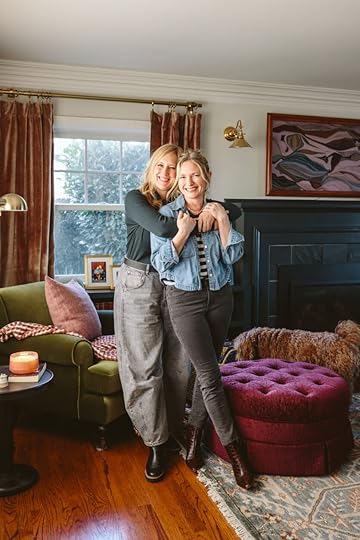
What a difference a year makes. They are sooooo happy and grateful (me, too). Here’s one more of Robs and I for those of you who like to see best friends being unabashedly affectionate
*Design by Emily Henderson
**Photos by Kaitlin Green
The post Introducing The Next Room…Robyn’s Welcoming Patterned Dining Room Reveal appeared first on Emily Henderson.
February 10, 2025
My Best Friend Robyn’s Living Room Reveal – We Added So Much Color, Charm, Coziness (And A Lot Of Heirloom Quality Pieces)
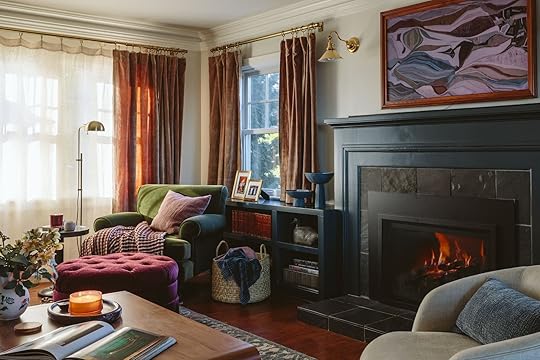
If you like friendship romance stories you’ll like this one. Girl-meets-girl in 6th grade and stays best friends through long-distance high school, reuniting as college roommates, ripped apart to spend decades across the country pursuing careers only be reunited, able to live 7 minutes apart and go on long weekly walk and talks. That’s us and this project has been so fun. Today is Robyn’s living room reveal and to be fair Robs is only one of my three best friends – all of which were huge factors in moving back to Portland, and helping them love their homes more has been one of the joys of this job. While she lives close it still took a year to squeeze in during all our other projects so I hope you agree it was worth the wait.
A quick recap: Robyn and Ryan bought the house last summer and these before shots were when they had just moved in. It’s such a beautiful house, and they were ready to upgrade from their 15-year-old starter furniture but were paralyzed on where to start, and like most people, really didn’t want to get it wrong. The previous owners had stripped the house of color (or maybe just painted it a neutral to sell). So we needed to A. replace almost all the furniture with more high quality “grown-up” furniture (i.e. heirloom quality where possible) and B. add color, coziness, and charm – The three C trifecta that so many people (myself included) want in their home. And a year later, here is how it turned out

We are collectively pretty darn thrilled with it all – it’s so layered and warm, and yet still works functionally so well for their family (two teen boys and a dog) as both a living room and TV-watching room. We also have a video tour of the space below (just wait for the ad to play):
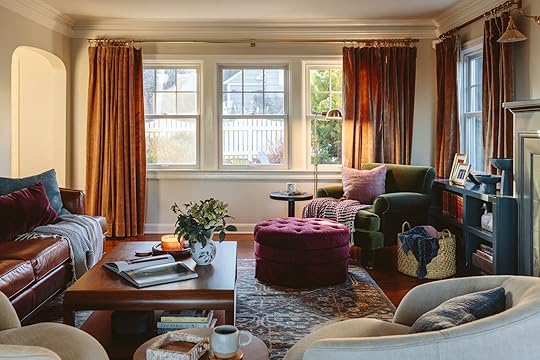
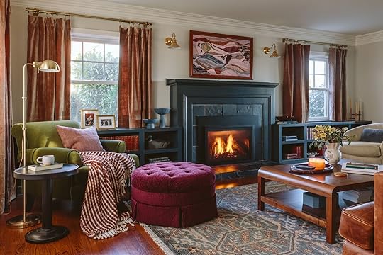
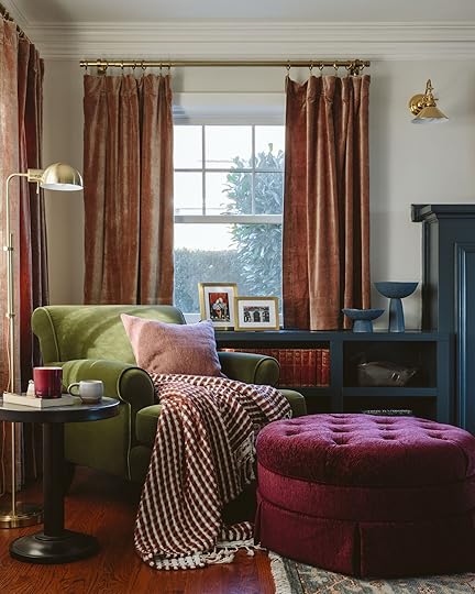
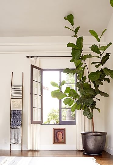
We grounded the living room with this beautiful Persian-inspired rug from Rejuvenation that pulled together all of our colors (and is just so durable and forgiving). The coffee table, another RJ heirloom is so gorgeous and solid. We knew we wanted a reading corner and I ended up finding this chair online that checked all our boxes – really comfy, affordable, roll-armed but not too granny, and green velvet – which Ryan loves – GO DUCKS! We custom-made the ottoman because we couldn’t find what we wanted on the market, and it’s honestly the first thing you see (so we don’t want to throw in a pouf or something basic).
Sofa | Green Chair | Ottoman (Custom) | Swivel Chairs | Coffee Table | Rug | Curtain Rod | Velvet Curtains | Sheer Curtains| Flush Mount
We worked really closely with Rejuvenation on this space because I had some of their brand new furniture from our partnership that needed a home and I thought that Robyn and Ryan’s was that perfect fit for their entire vibe (and all Portland-based which we love – Rejuvenation is an institution here and has so much Portland loyalty). The layout was pretty darn intuitive since this is their living room/family room and TV room (they have a basement TV room for the boys but it’s not done yet). So we put the sofa facing the TV and swivel chairs that can also face the TV (or one person can put feet up on the other one to lounge) and a cozy chair and ottoman in the corner.
I’m extremely envious of this color palette – so rich and yet cozy and casual. These jewel tones are so pretty and are so grounded by all the wood and leather. Add that deep dark blue on the fireplace and boy does it feel balanced (very much tooting horn here, which I don’t always do but we are OBSESSED with this room and it turned out so much better than expected so I’m pleased as punch writing this).
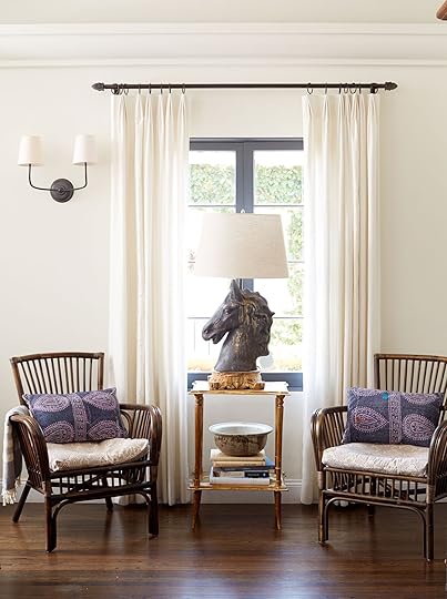
The Lighting
Green Chair | Ottoman (Custom) | Floor Task Lamp | Side Table | Pillow | Throw Blanket | Sconces | Frame TV | Coffee Table | Rug
Once again I was so grateful for Rejuvenation’s customization ability. We chose unlacquered brass finishes for all four hard-wired fixtures, knowing that it will age so nicely with this older home. We didn’t want to move the J-boxes above the fireplace but they were pretty high so we chose these sconces that hang down a bit (and the directional light on a dimmer is nice not to blind you while watching TV). The flush mount is so simple and pretty.
[image error]
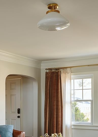
They are classic and modern and look very high-end and original to the house (plus work so well with the dining chandelier which you’ll see later).
I know that Rejuvenation rugs are investments for sure, but man are they forever pieces and like all high-quality Persian knotted rugs, just hide everything so well. So with two boys + a lot of their friends, a ton of foot traffic + a dog, Robyn and Ryan have ZERO stress about wear and tear on this rug, which is a real gift. And the color palette of this one is really gorgeous.
The Window Treatment Saga
Ready to nerd out? No project goes unscathed from annoyance and figuring out the window treatments here was the biggest issue so imma go off for a bit. They had cheap shutters and they liked the function of them (can easily angle for privacy during the day while still getting natural light coming through the slats). They were a hard no for me but telling my friends they needed to spend $3k on custom window treatments felt wrong when they liked what they had. They also didn’t want five Roman shades that would have to go up and down every day – up when they wanted light, down when they wanted privacy from the street walking traffic. They wanted light and a privacy filter, which the shutters gave them. I felt that this wall needed floor-to-ceiling curtains to add the coziness, so layering curtains with shades is doable…but custom fabric Roman shades are so expensive and this house is too traditional to do a roller shade, and a wooden or natural shade felt too beachy/boho for them (but I could have made it work). We went round and round and I just wanted to snap my fingers. Now I’m sure there are other solutions for this, but two weeks before when we thought we were going to shoot I just made the call to do sheers layered with heavier curtains and use a double curtain rod on the main street-facing window – a move I haven’t done in a while and frankly didn’t feel confident about, stylistically (if done wrong it can look dated, TBH). But it just made sense functionally and I knew we could execute in time with readymade curtains and rods. This way they can easily pull the sheers open and closed (or just leave them closed since they let so much light through) but they are flanked by more substantial curtains (which is great for summertime evening TV watching since this room faces west and gets blasted). We used four sheers and four panels, two on each side, and Robyn’s mom is going to sew them together at some point (but we didn’t for the shoot). But that’s not where the saga ends. The rods were drilled and installed as high as possible because I was supposed to order 96″ curtains, and then hemmed to the perfect float length. But I ordered the wrong length of curtains and when we held up the 84″ ones we realized that if we used clips with rings they would actually just barely float off the floor (my preference). I usually prefer S hooks which hang close to the rod. The clips added the extra 2″ in length that we needed to not have to hem at all. This felt like BY FAR the easiest and best solution (and I was so over troubleshooting these things), plus the rings slide so fast making them super easy to pull open and closed all day. IT WORKED THANK GOD AND IT STILL LOOKS GOOD!!!
But what about the shorter windows??? Right. Everything is a thing. Well as you can see below, we took the same curtains (ordered their shortest version) and DIY’d them via hemming tape into cafe curtains. We treated the hardware the same (except no sheers so just a single rod) and used the same rings/clips. The rods are from West Elm and unfortunately don’t come with the finials (they say they do, but they don’t when you read the fine print and they never arrived) and you can’t order the finials separately (we were on with customer service for a LONG TIME and even they couldn’t figure it out what the deal was). So we bought the finials on Amazon at the last minute – just a heads up. Why didn’t we order from RJ? Because we thought we were going to shoot in November and they were on backorder but we ended up shoving the shoot til January due to holiday overwhelm. SO THAT IS MY WINDOW TREATMENT TED TALK THAT I WOULD NEVER SIT THROUGH. But look how good they turned out!!
Gold Frames | Blue Footed Bowls
The curtains actually really soften the space and the color and the fabric really balances out the intensity of the dark blue shelving. It is honestly such a win. (Shout out to Gretch for her meticulous hemming tape skills). I love the rosy tones of the curtains, with the more deep aubergine of the pouf and all the blues and greens – it’s my new favorite color palette.
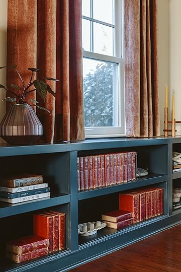
Bookcase Paint Color | Vase | Wooden Candelabra | Ruffled Candelabra (no longer available)
Robyn and Ryan already had all these vintage dark red books and were an inspiration to bring in more of that so we have punches of this deep red/brick throughout the space.
The Pretty Leather Sofa
The leather sofa from Rejuvenation is such a classic, feels so “library” and is extremely comfortable. The leather was scratching easily so the first year of ownership is hard emotionally if that bothers you, but the patina really comes alive and it gets better every year. The tufts with the modern curve are so pretty.
The Picture Molding Gallery Wall
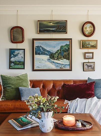
Green Pillow | Small Blue Lumbar Pillow | Square Blue Pillow | Rosewood Velvet Pillow | Throw Blanket | Vase | Red Marble Tray
I wrote a full post about how we hung this gallery wall on these art rods (my new favorite trick – SO EASY if you have picture molding but still doable if you don’t) so check it out here if you are interested. We collected all the vintage art from local antique stores (except for one – can you spot it??)
Left: Side Table | Table Lamp | Right: Side Table | Marble Fluted Tray
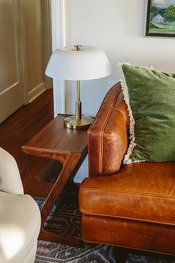
We incorporated a lot of pretty wood side tables and brass lamps throughout – all so high quality and perfectly curated. Rejuvenation’s quality is just superb and I feel confident that they’ll have them forever and pass these down to their kids.

Clyde, their perfect dog is really nailing these makeovers (he was also the star of their former basement makeover, seen here). Quite possibly the perfect tones of browns and reds in his fur
Here are a couple of before and afters:)

I know that are dying to see the dining room and I can’t wait to show you, but I will because this post is already too long. So here is a sneak peek of it but please come back and get the full tour – Kaitlin’s photos are just so pretty and we set it all up for a meal which we don’t do that often. It’s such a homey and elegant dining room with an epic view of Mount Hood:)
*Design by Emily Henderson
**Photos by Kaitlin Green
The post My Best Friend Robyn’s Living Room Reveal – We Added So Much Color, Charm, Coziness (And A Lot Of Heirloom Quality Pieces) appeared first on Emily Henderson.
February 9, 2025
The Link Up: The Fabric Source Em’s Been Keeping A Secret, Gretch’s $10 Celeb-Approved Eyeliner, And A Great Le Labo Dupe


Happy Sunday, everyone. I think this week, among many other things, was a bit of a photoshoot recovery week. Don’t worry, we’re still making fun content for you but after a big produced shoot, a little decompression is very welcomed. Other happy news is that we have TWO very exciting reveals to show you next week. We are pretty excited and hope you are too. Ok, links!
This week’s House Tour + From Arlyn: I’m SCREAMING! Dan Pelosi (a.k.a. Grossy Pelosi) is one of my favorite content creators. I’ve shared his cookbook here before. His Hudson Valley house was just featured in Domino, and my GOODNESS I’m obsessed with it. I’m not sure there is a single white surface in that house. And it’s wild because I follow him closely and watch all his Stories and had no clue allll of that was there behind him that he was keeping close to his chest. It’s just like a bag of very chic Skittles (with an English accent) exploded in the best possible way. If you would like to smile today, go check out this tour!
From Emily: I feel like I’ve been gatekeeping a bit with some awesome printed fabric. For those of us who want small-scale patterns on cotton, linen, and muslin, for all different applications – curtains, pillows, lampshades, and small pieces of furniture I have found a lot via Etsy. I’m talking the types of patterns that give English/cottage/granny vibes, etc. Etsy has a lot of brands that seem to be block printed in India, with multiple colors. And while I haven’t vetted these companies or factories personally it feels like at least we are supporting the country that does this really well and authentically. While they aren’t cheap (anywhere between $15-$35/yard) that is WAY less than a lot of spendier fabrics that you see all over designers’ portfolios (trust me, I shopped and was like WOAH). I have ordered and loved Fabritual which has a ton of patterns, colors, and types of fabrics that they print on. Again please let me know if this is in any way a red flag but I have found that the quality, the customization, and the styles/colors are so beautiful so I wanted to share. Coming to some cafe curtains and lampshades near you soon:)
From Gretchen: Billie Eilish. Ever heard of her? Not too long ago I came across a video of her doing her own makeup before one of her concerts and the internet (myself included) went nuts for it. More specifically, everyone was sold on her eyeliner routine and shocked to see not only a celebrity doing their own makeup, but using a drug store product to do it. AND IT LOOKED GOOD. She lines her upper eyes and lower waterline and sort of smudges it for this sultry, effortless look. I have a very similar eye color to Billie so I thought I could probably pull it off too. Probably. You know the line in Mean Girls that’s like, “I saw Cady Heron wearing army pants and flip flops, so I bought army pants and flip flops”? Well, the same rule applies–I ran to the store immediately to grab the same Maybelline Tattoo Studio Eyeliner in Bold Brown as my girl. And I gotta say, I love it! It’s blendable, super pigmented but the brown isn’t too bold (despite the name), and lasts all day. And it’s only $10!
From Jess: As the reality of a natural disaster has become more real than ever after the LA fires (THANK YOU FIREFIGHTERS), I am more committed than ever to being prepared even on a small scale at home. One thing I was advertised recently was the Prepared Hero Emergency Fire Blanket. This is meant for a smaller home fire, but considering I’ve never used a fire extinguisher, this looks much easier to use when I might be say, panicking. It’s also great because is reusable, and is said to be fire department-recommended. I have it in my kitchen and it makes me feel just a little bit better in case my cooking decides to go off the rails…
From Mallory: I used to have a $30 Crosley record player but it was pretty janky so I ended up getting rid of it. I was really missing playing records so I snagged this one which arrived quickly and didn’t break the bank. I like that you can have it play on a Bluetooth speaker (I know that’s controversial) or hardwire it (it’s nice to have the option).
From Marlee: DUPE ALERT! A while ago I got my hands on a sample of Le Labo’s Noir 29 fragrance – it sat in my bathroom drawer for months but I finally started using it the last few weeks and got very attached to it. Sadly 0.05oz does not go far and I’m not quite ready to go all in on a $200 bottle, so I did a little digging online to find a similar scent. I followed a recommendation from the people of Reddit and went for Dossier’s “Citrus Tea,” which claims to be “inspired by Le Labo’s Thé Noir 29.” It came in the mail yesterday and…it passes the test! And for less than $40! I am by no means a scent expert but I would say I’m more than satisfied with this scent…it’s definitely not the exact same but it’s VERY similar and I might even like it more than the Le Labo one. All the perfumes on Dossier’s site are supposedly inspired by bestselling scents from mainstream brands so I will definitely consider trying a few more down the line.
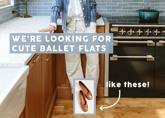
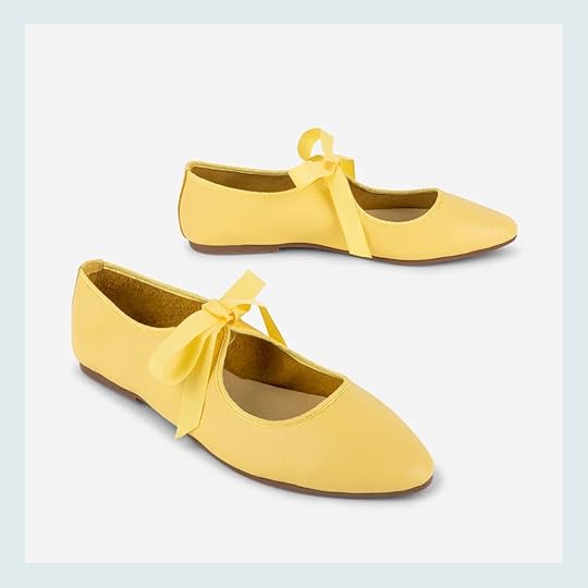
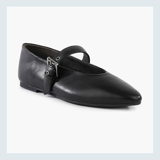
From Caitlin: Can I please add my voice to the chorus singing the praises of Everlane’s Day Glove to Friday’s post? I have big, wide, flat feet and took the gamble of ordering the Mary Jane style on final sale in early January. (The cute shape, $63 price tag, and cheery yellow velvet won me over!) I love wearing them and find them surprisingly easy to style – they feel like a fresh alternative to a statement red flat.
Thanks for reaching and see you tomorrow for A BIG REVEAL!!! P.S. The opening photo might be a hint:)
Opening Image Credit: Photo by Kaitlin Green
The post The Link Up: The Fabric Source Em’s Been Keeping A Secret, Gretch’s $10 Celeb-Approved Eyeliner, And A Great Le Labo Dupe appeared first on Emily Henderson.
February 8, 2025
The Spanish Home Re-REVEAL + Some Important Design Lessons I Learned From It
 For those of you who have been around since the beginning (I LOVE YOU) you’ll recognize this project, but for those who are new in the last 8 years you might not remember this lady. This was a house I designed over 10 years ago (I think even before I had Charlie and he’s 11 now). It was for a friend of a friend (who became my friend), two filmmakers in LA in the Los Feliz neighborhood (fun fact, it’s now owned by a super famous podcaster who was also a friend of a friend – LA is wild, folks). I recently re-discovered this project and I thought it would be fun to repost it with fresh commentary.
Now Shana, the client, is a massive antiques collector so a lot of pieces were hers already (that she sourced at Big Daddy’s or deKor). I came in to help with the kitchen and to finish decorating/styling. Some of these shots were styled by a stylist for a magazine (I think Country Living? Shana wrote Country Strong so I think that was the feature title). I remember thinking that I didn’t love how the rugs were layered because the bottom one was pretty small, but we loved the colors and we were done spending money so we made it work.
This is some classic 2013 Emily Henderson styling right there. It’s a lot There is nothing I don’t like, but it’s borderline too much and I think could look a bit messy. But it’s also eclectic and fun
Shout out to the white and gold ceramic cowboy hat – I do love some quirk!! I still love that chair by the window. The coffee table was from Santiago’s – I’m not sure it’s still there, but it was part of a strip of vintage stores in the Valley that I shopped at weekly when we lived in LA. Never not into fig trees – I know they got a bit played out for a while, but boy do they pack a powerful punch.
This was the famously controversial “art under the window” move which I don’t think I would do now, but I applaud past Emily for doing the weird thing! I mean, I still like the idea (and recently hung our dog painting in front of the window in our kids’ bath so I’m clearly still into putting art in unexpected places). But certainly, weigh in
Design Lesson: Opening Shelving

If I remember correctly (which I do) this house was bought mid-flip and the contractor had already ordered the cabinets. We couldn’t change them so we painted them instead (which at the time was a $3k upgrade). We canceled the upper cabinets in favor of these shelves which made the kitchen look a lot bigger (and more charming). But hot tip that I’ve had to learn many times – you HAVE to know that you are putting shelving before you drywall because you need it to be re-inforced to hold heavy dishes. Also, an additional hot tip, you have to put that in writing to the contractor because otherwise, they will frame things normally.
Design Lesson: Cement Tiles In Kitchens
The only regret here is not upgrading the fridge to panel-ready (especially because you see it immediately from the living room). I think the plan was to do that later, but we never did. I LOVE this cement tile floor, but remember that cement is porous so it has to be sealed and resealed or it gets stained so easily. I wouldn’t do it again in a kitchen unless it was a darker tone and could hide more.
Boy do I LOVE that blue antique credenza. That color is perfection!! I wish I could take credit for it but I think that Shana collected it before me. I will take credit for the brass knight helmet (???) and the biggest wicker bowl of apples ever
I LOVE this dining room so much. I think had we had the budget this would be a perfect room for a built-in nook on all three sides, but it’s so pretty as-is. Also, I think wrapping the beams with wood would be prettier, but it didn’t bother me at the time and it’s still such a pretty room.

I LOVE that cow painting so much. Shana had the most incredible eye for antique art.

This was their out building that they turned into a writing studio. I don’t believe I really helped with this beyond styling – I think full credit goes to Shana and Isabelle from deKor (I can’t believe how little I remember of the process). But it’s just so pretty!
I believe it was a garage. I love how bare-bones they kept it – adding to the charm (I even love how the ceiling fixture is on the brackets and all the cracks of the wood show).

Back inside, this is their primary bedroom, finished off with some antique movie seats (which were just for charm). The lamps were planters! OMG, I totally forgot all of this. Next time I’d add a beautiful big worn Persian rug, but again at a certain point we stopped spending money


Look at us taking a photo of a normal “non-Frame” TV. Truly shows the era that we shot this in
Design Lesson: Thick White Grout

This is where I learned the lesson of the dangers of thick white grout – I’m assuming they didn’t use the right kind (or maybe it didn’t exist 12 years ago) or they didn’t seal it properly. That would drive me nuts now. I love how we put the vanity in front of the window with just one mirror in the middle. Less practical but way prettier.
Design Lesson: Plumbing Placement
This is also where I learned the lesson that unless you indicate higher, plumbing contractors (at least 12 years ago) did a very low “standard” height for shower fixtures. This fixture was so low that Brian (Shana’s husband) had to duck his head under it. I believe they ended up changing the fixture to be a gooseneck (or at least that was the intent once we realized it was so low and the tile was already installed). Also how pretty is that pink antique mirror over the tub?

I love this bathroom but it’s always driven me nuts that I allowed only one foot of that towel holder to be on the mat – very poor styling by me.
The guest room was a color departure – so fun and a bit more whimsical.
The nursery was tiny but so sweet. The wallpaper was hand-drawn ships (I forget where we bought it from, but this is the only place we could find it now).

This blue wall color (Hague Blue, I still remember!) is still one of my favorites and we almost used it at the river house in the guest room. I think I would have liked it more here if there wasn’t a skylight, leaning into the moody vibe more. We exposed the bookshelves during framing (if there isn’t electric behind it they can often utilize the wall space to add more storage and shelves are the least expensive type of storage). Actually, this is basically what Jess wrote about a couple of days ago!

I wanted to show you the outdoor space again, but I didn’t do this – this is 100% Isabelle from deKor. She is so talented and has an incredible store that sells really beautiful antiques, vintage, and newer pieces (and we stayed at her house in Mexico last year that you can rent out in Todo Santos – INCREDIBLE).
I hope you enjoyed this trip down memory lane xx
*Design by Emily Henderson Design, Isabelle Dahlin, and Shana Fest
**Photos by Tessa Neustadt and David Tsay
The post The Spanish Home Re-REVEAL + Some Important Design Lessons I Learned From It appeared first on Emily Henderson.
February 7, 2025
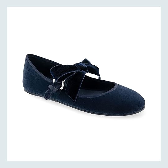
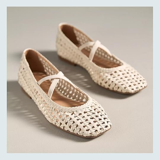
The Cool Slip-On-And-Go Shoes We Are Into – 25 Ballet Flats That Are Both Trendy And Comfortable
Guess who’s back on her ballet flat search?? Me:) But I’m not the only one on the team. Look. We love a cool boot, a fashionable sneaker, but sometimes you just want to slip on a cute flat to feel slightly more put together as you’re rushing out of the house. The last time I was all about ballet flats, I was on the hunt for the mesh version, and boy, did I find one I loved. Because of that deep love, I may have worn them a little too much. It’s kinda like when you only have/wear a single pair of jeans and the inevitable upper thigh hole emerges from constant friction. I want to avoid that intense amount of wear and tear and have a few more easy-to-wear, stylish shoe options. And to me, there’s nothing easier than slipping on a ballet flat. So come see what my research divulged as well as one pair I did purchase:)
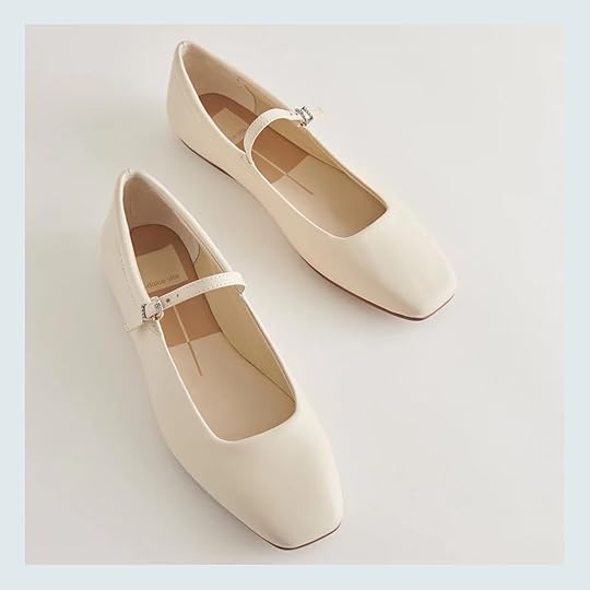
The Day Glove
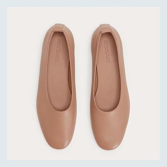
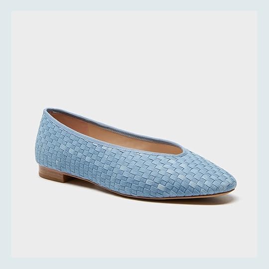
I wanted to start with the pair that Emily had not only in this color but also in navy. She bought them for our big shoot and loved how easy they were to pop on and off. I love how simple but slightly modern they are. I really like the toe shape and in case tan or navy aren’t your colors, they have 13 other options to choose from! They do recommend going up a half size from your normal size. These give a perfect classic basics look.
Faux-Leather Ballet Flats
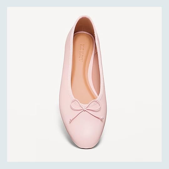
Faux-Leather Ballet Flats – $20
But if we’re going to talk about classics then to me this ballet flat is the epitome of that. Ok, maybe if you added a strap then it would be “peak ballet flat” This is also a very sleek shape but has the addition of the traditional thin bow. I don’t think you could go wrong with these and they also come in three other neutral colors if pink isn’t your style. Oh, and did I mention they are $20!!
Leather Ballet Flats + Sway Square Toe Ballet Flat
Leather Ballet Flats – $56 | Sway Square Toe Ballet Flat – $180
This deep burgundy isn’t just a beautiful home color trend, it’s also very much happening in fashion. I am very in love with both of these options. The pair on the left this that classic style but really feels special in that dreamy color…plus that price is not bad. They do also come in tan. Then the pair on the right are on my list!! I learned about Alohas from Emily years ago and not only are their shoes extremely cool, I really love their commitment to sustainability. And while there’s the extra step of tying the bow, I think they are unique without being “too out there”. This pair also comes in two other colors and if you are a half size, they recommend sizing up.
Oh, if you love this color I also found a really pretty woven version for $80!
The Day Ballet Flat
I love velvet. Like a lot. So these puppies are on my list too! Aside from the leather pair above, I’m not a huge ballet bow gal, but for whatever reason, I really like it when the flat is in a velvet. Just think how cute these would be with jeans and a white T-shirt?! Effortlessly cool. Plus, this version is on a great sale, which makes them that much more enticing… They also come in seven other colors, but not all are on sale.
The Greta Ballet Flat

What a beautiful blue! This shoe is a Madewell bestseller and Emily had their leather open-weave one from last year. She’s traditionally not a huge ballet flat wearer so I very much trust her when she likes one. These are great for either a dress-up or dress-down situation which is real nice – neutral enough but also a little pop of color. But if blue or velvet isn’t your style they have six other colors/designs at varying prices. Go check em out!
Valley Black Sole Ballet Flat + Poppy Mary Jane Flat
Valley Black Sole Ballet Flat – $154 + Poppy Mary Jane Flat – $80
These might not totally be my cup of tea style-wise but at the same time they are so much fun! Those yellow ones are so freaking sweet but I think would also look rad paired with a simple jean and a plain tee. They are from a small shoe brand we love – Intentionally Blank. Emily has known them from when they first opened and I have two of their clogs I wear all of the time. So big stamp of approval from us. Oh, they do come in other colors if you aren’t a yellow person. Then the blue ones are made by Areosoles which makes me think they are likely very comfortable! These ones are also a bit more affordable and have that buckle so you don’t have to worry about tying the bow perfectly every time. It comes perfect! They also come black.
Reyes Ballet Flats + Mary Jane Square-Toe Ballet Flats
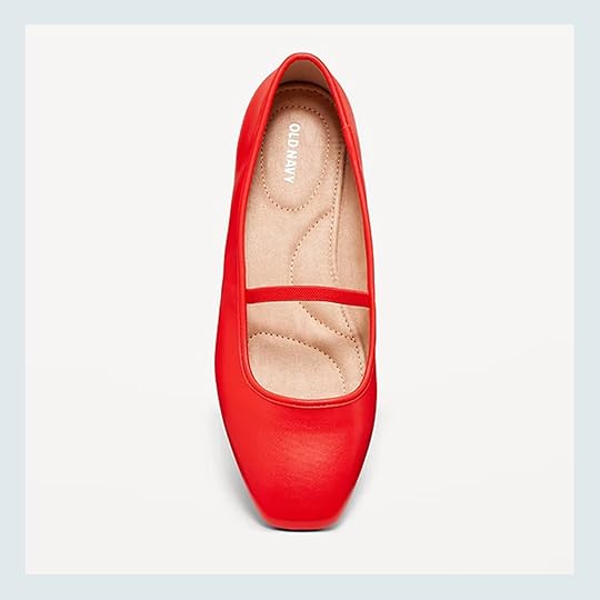
Reyes Ballet Flats – $120 | Mary Jane Square-Toe Ballet Flats – $20
Now, when I first saw this white pair last year I almost hit purchase. I saw them on a gal I know and fell for them hard. They are really elongating which I also loved. I honestly don’t know why I hesitated so maybe I’ll fix that soon:) Also, white isn’t always the easiest color to care for but they come in eleven other colors and patterns in case you were curious. Now for the other pair that’s $100 cheaper (!), these Old Navy ones are so cute. I like that the toe is a little squared off, there’s no bow but still has the classic strap. Plus, that red color is so good and very fun. However, if red is not for you they come in six other colors.
Leni Brown Suede
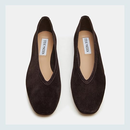
I think I’m adding a fourth (OOPS!) to my list because wow wow I love these! I’ve always been a brown fan so these would work seamlessly with what I already own. Plus, these are real slip-on-and-go shoes. But why I really love them is the shape of the opening. Sleek and chic. I’m very impressed, Steve Madden. They also come in four other colors.
Kasey Flat
I know the point of a ballet flat is that it’s FLAT. But this heel is still pretty low and is the star of the whole shoe. I really really love it. Very quiet luxury but a statement, you know? They say, “I know style but I’m not in your face about it.” So yes, I want these too. And while this is just my opinion, I’ve always found Sam Edelman shoes comfortable. Oh, and they come in a cream that’s on sale for under $100.
Vana Ballet Flat + Jessie Flat
Vana Ballet Flat – $80 | Jessie Flat – $248
At some point, I’m going to get a sliver flat because it’s such an easy and fun way to make a simple outfit unexpected. And this one is so understated which I really love. Plus, the shape of this Franco Sarto flat is so beautiful. But if you love the shape but not the color it does also come in two other options. The Jessie Flat I just saw in person because my friend was in town and wore them. They are bolder statement but in such a fun way and the shape is also so good. They actually look even better in person. These are also from Freda Salvador which is an incredible brand but definitely pricey. And while these aren’t cheap by any means, they are about 50% which is a pretty big deal. Just saying in case you were interested:)
Matilda Ballerinas
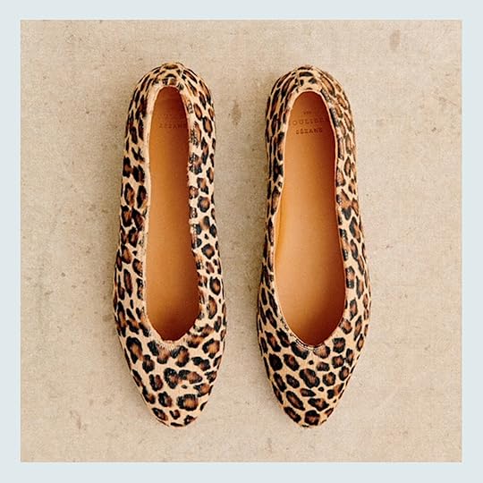
I BOUGHT THESE!! The first thing you should know is that I’m not really a leopard print gal (shocking, I’m sure:)) But in high school/college I had a pair of Steve Madden leopard “fur” loafers that I loved. They just made any simple outfit a lot more fun. Sadly, they got too beat up and had to be trashed. This means I’ve been living sans leopard flats for over a decade now! Then for my birthday last year, my sweet (and very generous) cousin gave me a $100 gift card to Sezane. I was so excited but also so nervous to choose something which is very typical of me. When I would look I kept coming back to these flats, remembering the good times with my loafers (rip). So I did it, I bought them and they will arrive early next week! They also come in black, which I debated between, but knew my heart wanted to go for the leopard. Very excited to wear them if you can’t tell. The site does say that if you are between two shoe sizes, choose the size below. Otherwise, choose your usual size.
Dream Team Mary Jane Flat
Dream Team Mary Jane Flat – $50
This is the same shoe in two different colors because I liked them equally:) I love the pointed toe and thicker strap with the buckle. It makes it feel ever so slightly punk (?) lol. Basically, it has a little bit of edge that I’m into. Plus, that price is awesome! They also come in two other colors – light pink and silver.
Mellie Mary Jane Flat
Even though this one is sooo similar to the one right before, the toe on this one is more rounded. It’s totally a personal preference. I tend to prefer more of a square or a point. But a rounded toe is perfect for others. You really can’t go wrong with either…well, I guess you save $20 if you get these:) They also have two other material options.
Arissa Woven Ballet Flat
Arissa Woven Ballet Flat – $138
Now let’s get into my other favorite version of the ballet flat – the woven ballet flat! These are right up my alley! That brown leather is such a pretty, warm tone and the toe shape is a dream:) While a woven ballet flat could be considered more spring and summer, these leather ones are good easily through fall (weather permitting, of course). They also come in two other colors.
Light Woven Denim Nina Flats
Light Woven Denim Nina Flats – $195
Ever since I saw Em wearing her light blue suede over-the-knee boots (which I am saving up for) I haven’t been able to get light blue shoes out of my head. I think they are the perfect mix of fun and chic. These cuties are prefect for the spring and summer. Can’t you see it!? I think they may be a bit darker in person because of the styled photos on the site but honestly, that may make me love them more. Definitely go check out those shots because you WILL want them (or maybe don’t if you’re trying to not buy more shoes:)) They do come in five other colors but are in leather or velvet.
Arissa Woven Ballet Flats + Bleached Beechwood Michaela Flats
Arissa Woven Ballet Flats – $128 | Bleached Beechwood Michaela Flats – $130
For my natural material lovers, the flats on the left are so pretty! Can’t you see yourself, strolling along in a beach town for spring break in these? Or feeling like you’re on spring break because these cuties on your feet? That’s at least where my head is at. Ha. The reviews do say that they run a little big so keep that in mind. Then the ones on the right, are also extremely cute and are ideal for the warmer days ahead. I had a pair of slip-on flats in a similar color and material and wore them so much. They went with everything! A big thumbs up and they also come in one other color.
Ruby Buckle Ballet Flats + Woven Leather Ballet Flats
Ruby Buckle Ballet Flats $138 | Woven Leather Ballet Flats – $140
If you’re someone who wants a woven look but something a little different/unique, the pair on the left is perfect! The color is what is unexpected about them. I think it’s just a cool color and a great shape. They also come in what they call “sunset ochre,” which is like a burnt orange-red. Also very cool. Then, for the final pair on the right, I know they are more in the “mesh ballet flat” category, but I loved them too much not to include:) The open weave is just enough to be super breathable but not too “look at my toes!” and the criss-cross straps are so freaking cute. And because my “list” is clearly endless, two of these (especially the white ones) are on it. Oh, those also come in two other colors, and the reviews say they run big.
So while my ballet dancing days are far behind me, I will be cosplaying a ballerina for probably most of the year and beyond. There were also some stunning satin options, but even for me, those felt like they would get ruined after about one wear. But if you love the idea of that, these were my favorite:) Talk about looking like a ballerina! Ok, happy ballet flat shopping.
Love you, mean it.
Opening Image Credits: Photo by Kaitlin Green | From: Some Cute New Fall Clothes I’m Wearing On My Body…
The post The Cool Slip-On-And-Go Shoes We Are Into – 25 Ballet Flats That Are Both Trendy And Comfortable appeared first on Emily Henderson.
February 6, 2025
A Fresh Way To Add Storage Without Adding Furniture But Lots Of Charm
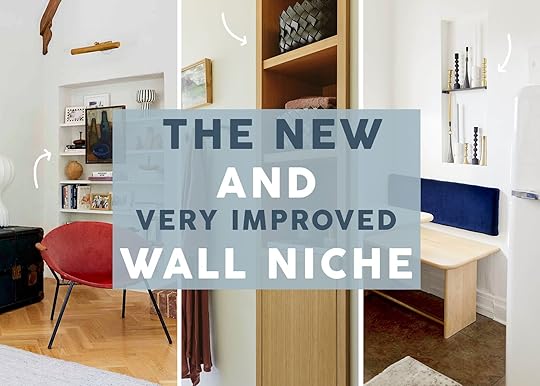

There’s been a little secret trend that’s been popping up more and more on my feeds and I am so in love with it. It’s not a brand-new concept (little is these days) but designers are really running with it in some extremely cool applications. What am I talking about? Well, I’m talking about tall vertical wall niches. This is a really simple but beautiful way to add storage that doesn’t take up square footage as well as adds an intentional design moment into your space. The only downside is that you likely need to own your home because a little demo is usually required. But, if you are already renovating, I hope this post can give you a decent dose of inspiration. Let’s start with a personal favorite…
View this post on Instagram
A post shared by Mother Studio (@mother__studio)
This dreamy Massachutes home was designed by Mother Studio and Maryann Thompson Architects. The warm natural wood and hits of pattern are pretty perfect (oh, wouldn’t a Noguchi pendant look incredible in here?? :)) But what captures my eye the most is the marble niche. It’s such a cool contrast to the other materials in the space but isn’t so visually overpowering that it distracts from everything else. It also visually balances the darker tones of the bedding. However, practically, it’s perfect for a little storage. The designers said that these bedrooms were made intentionally on the smaller side to create a coziness. Plus, since most everyone spends their time in the communal main spaces, there was no need to use extra square footage for the bedrooms. So a cute little niche is a great use of space for books, objects, and any other little display items.
View this post on Instagram
A post shared by Sophie Rowell (@cotedefolk)
I am such a Sophie Rowell fan and this room is another testament as to why. Go check out the whole room here, but for today’s purposes, we will be talking about this incredibly sweet niche! Now in terms of style, I love the choice of painting it yellow (and the perfect one at that). It’s not too bright, not too mustard, just a happy but medium-toned yellow that can work really well with other colors. That way if they decide to change the bedding, it’s still going to look awesome. What I also love about this one, in particular, is the cork chequerboard shelf that can fold in as well as the enclosed cupboard under it. A perfect way to have a little closed storage while having other spaces to show off decor. It’s a design statement with purpose.
View this post on Instagram
A post shared by Vinterior (@vinterior)
Ok, this is the only example where “the niche” isn’t carved into the wall, but it almost feels like it and it’s so cool. I really love that the homeowner and founder of Vinterior, Sandrine Zhang Ferron, went basically floor-to-ceiling and narrow. And while I’m going to show a handful of wider niche examples, I think the narrow vertical is what we can expect more of. Also, this is a great example for handy renters! No stress if you can’t cut into a wall, just DIY a whole wall unit:) It could be this awesome if you are up for it.
View this post on Instagram
A post shared by Float Design Studio (@float.studio)
See how cool yet elegant this looks?? As something who has yet to renovate a home (SOMEDAY!!) I don’t know how much something like this would cost to add to a space but I really think it’s worth looking into. And what’s even more practical about this style is that unlike the niche with the marble, you don’t need to purchase any other expensive materials (at least that’s what it looks like). And think, if you don’t want to take up space with a credenza or even shelves, this is the perfect solution to still be able to show off your beautiful things!
View this post on Instagram
A post shared by austin carrier + alex mutter-rottmayer (@hommeboys)
The HommeBoys are always leading the design charge, so seeing them apply a very similar feature in their space makes me feel very confident about this call.
View this post on Instagram
A post shared by Vogue Living (@vogueliving)
Here’s where things get wider but also are making a bigger statement. This wood-framed niche is so beautiful. It’s not only a perfect place to display their vessels and objects but clearly OSKLO, the design firm, knew it would add an important amount of warmth and texture. Imagine that wall was simply white. Would the home be beautiful? Of course. But is it so much more inviting with that light warm wood feature? Absolutely.
View this post on Instagram
A post shared by MANERA Magazine España & México (@maneramagazine)
Now while wood is beautiful it’s also not cheap. But you know what is much more affordable and can be just as impactful? Paint. I love love this bold pop of blue in this wall niche. It looks so fresh, adds balance to the neighboring room with its lack of intentional clutter, and is just cool. For those of you living in homes with niches already there, maybe a little weekend paint job could transform the room it’s in…just saying:)
View this post on Instagram
A post shared by Arent&Pyke (@arentpykestudio)
I think kitchens and bathrooms are where we are used to seeing a tall vertical niche so I wanted to show some examples I really love. Take this one above. It perfectly pops off the white walls visually, is a perfect contrast to all the closed storage, and gives the homeowner a place to show off some decor.
View this post on Instagram
A post shared by SHAPELESS STUDIO (@shapelessstudio)
Shapeless Studio to me can do no wrong. The color of this bathroom is so warm and beautiful, the marble is UNREAL (I really love a marble trim), and that little wall niche is placed in a slightly unconventional spot and I couldn’t love it more! I think bathrooms especially are improved by having a feature like this since they tend to be small spaces with a lot of little things you need on hand. What I would give to call this bathroom mine:)
So what are your thoughts? If you were remodeling would you want to add something like this into your home? Did you and do you love it? Let’s chat!
Love you, mean it.
Opening Image Credits: Left – Photo by Sara Ligorria-Tramp, From: Final LA Living Room Reveal | Middle – Photo by Kaitlin Green, From: River House Primary Bathroom | Right – Photo by Sara Ligorria-Tramp, From: Jess’ Kitchen MOTO Reveal
The post A Fresh Way To Add Storage Without Adding Furniture But Lots Of Charm appeared first on Emily Henderson.
February 5, 2025
Craving Some Color? These 5 Hues Are *It* for 2025

Color is kind of my “thing.” If you’re a reader who recognizes bylines, you may already know that by now. Hi, my name is Arlyn, and having someone ask me what my favorite color is is like asking if I’d rather live without cheese or chocolate. It’s just not a possible scenario. And today, I get the privilege of downloading my thoughts about all the colors in the limelight right now and for the foreseeable future. Welcome to our 2025 Color Trends post.
Last week, the team shared their thoughts on the 2025 Pinterest Palette, which is built from increases in searches and interactions on the photo-driven inspiration platform. Some of those colors are in here (spoiler alert: butter yellow is the color right now), while others are not (Aura Indigo—a lilac for anyone who would rightfully think it’s a deep blue—is not). While I do think purples are trending and have been for a bit, I didn’t think it was big enough to showcase here.
Earlier this year, I dove into three colors I thought were entering the mainstream, and some of them are still going strong with no signs of stopping. There was this post on orange. This one covering primary colors. And this one about brown. Spoiler number 2: I was right about brown (and red, but…duh).
So, let’s dive deep into the top five prevailing colors likely to make their way into your homes in one form or another.
Chocolate & Truffle BrownsOf the five shades we will discuss today, brown (and the color that follows) is undeniable. Everyone knows it. I’d be remiss to be a contrarian and not include it. I’d be lying if I didn’t say I was a bit taken by surprise with this one those months back when it started to become obvious. Brown?? You mean, that color I poo-pooed (pun intended) since we all gratefully moved out of the Tuscan-everything era into the not-really-any-better gray era? Brown is so…brown. Heavy, sparkless, and not that exciting. BUT WAIT, brown has had a strange glow-up, where suddenly it was the key color in a quiet luxury palette. Creams, warm whites, taupes, rich brown. It unexpectedly felt luxurious, sensual, and powerful. It must have gotten the same PR agent as cottage cheese, cauliflower, and kale did. Brown is back, baby, so much so that the Pantone Color of the Year for 2025 is Mocha Mousse, an elegant tan brown with pink undertones. Darker, more pigmented chocolate browns with red undertones were also BIG. I mean…who would have thunk it?
View this post on Instagram
A post shared by Ome Dezin (@omedezin)
This living room by Ome Dezin shows how much a design-forward brown sofa can really ground a grand ceiling height. I think brown seating can be tricky to get right to not look instantly dated and like something you’d normally stash away in a basement, but a velvet material is a near fail-safe to get it right. It makes the brown come to life by reflecting light in varying intensities, as velvet does.
View this post on Instagram
A post shared by Birgit Maria Otte (@birgitotteinterior)
Designed by Christiane Lemieux, this is an example of that beautiful velvet giving the brown so much depth, lightness, and texture on a large piece like a sofa.
View this post on Instagram
A post shared by domino (@dominomag)
I have been seeing SO much brown tile in bathrooms lately, like in this space by Lala Reimagined. Similar to a sofa, I think the key is to find something with a complex texture, like these hand-glazed Zellige tiles. I love to see this mixed with rich non-lacquered, polished brass and some putty-like gray color on the walls and floors.
View this post on Instagram
A post shared by domino (@dominomag)
See!? The bathroom tile is where it’s at, clearly. Hudson + Bloum Design went with more of a flat, glossy tile, which comes off more modern but still grounded.
View this post on Instagram
A post shared by domino (@dominomag)
Chocolate has many degrees of depth, and this pantry by Bungalowe falls more into the category of milk chocolate. Maybe even lighter. This is what I’d call more of a truffle brown, and think the subtle red undertone is complementary to a lot of different colors. It works great with reds, greens and purples, but also plays fair with high-contrast black and white.
View this post on Instagram
A post shared by domino (@dominomag)
Case in point, by Blanc Marine Intérieurs. This is certainly a bit darker than that previous pantry but still in the same truffle family. It’s so beautiful with dark charcoal grays and a variety of lighter wood tones.
View this post on Instagram
A post shared by Lulu and Georgia (@luluandgeorgia)
For anyone who can’t do brown in large doses, it really can be such a lovely touch in a compact package, like the lamp here in a shot from Lulu & Georgia.
All The RedsLike brown, red is an undeniable force in color trends this year. It all started with the explosion of the Unexpected Red Theory, and while the chatter of that specific phenomenon has died down, using red (any shade, really) is very much alive. I mention any shade because it’s not just primary red that I’m seeing. It’s deep burgundies, cool cherries, warm bricks, and lots of pinks, which frankly could have been its own category in this post, but five felt like a more auspicious number than six so I dropped it from the lineup. I’m talking fuchsias, mulberries, raspberries, etc. Let’s take a look.
View this post on Instagram
A post shared by Anthony Rodriguez (@136home)
Popping in a hue of red into a mostly neutral space is such a power move, and always works to bring in intrigue and tension without feeling overly colorful, like Neptune Home did here. If you’re opting to paint something like millwork, doors or a furniture piece, going with a matte finish will keep the red more subdued.
View this post on Instagram
A post shared by Architectural Digest (@archdigest)
It’s funny how comfortable people are with painting the exterior of their front door red, but then choosing white for the interior. We’re only seeing the exterior here in a home by Bespoke Only but based on the trimwork inside being red, I’m going to take a not-so-wild guess that it’s also red inside. And it’s so special!
View this post on Instagram
A post shared by Claire Champion (@charnwoodtowers)
Need a color for a vintage casegood find that could use some new life? Claire Champion went with this bright red and doesn’t regret it for a second. It’ll completely transform whatever room it’s placed in.
View this post on Instagram
A post shared by Zoe Feldman (@zoefeldmandesign)
Don’t forget that red can be a design cameo, not having to take over a whole wall, cabinet or furniture piece. Sometimes, just some hardware, for instance (thanks for the idea Zoe Feldman Design), is all it takes to zip some energy into a room.
View this post on Instagram
A post shared by The Expert (@theexpert)
Ryan Lawson pairs a garnet velvet bed with rich brown bedding, which is a color combination I wouldn’t traditionally go for but works as a way of bringing life to the brown, but toning down the red.
View this post on Instagram
A post shared by Summer Thornton (@summerthorntondesign)
Not into brown and red? Maybe try pink and red, like Summer Thornton Design. The red here is more of a brown-tinged cinnamon, so it feels less like intense color blocking against the rosey wallpaper and more like two sisters mingling.
View this post on Instagram
A post shared by Architectural Digest (@archdigest)
A daring ruby velvet TOGO sofa in the home of Coleman Domingo makes the wood paneling on the wall feel both retro but fresh when paired with the electric blue artwork above it. A play on primaries with just a shift in hue can be a bit less playful (in a good way).
View this post on Instagram
A post shared by Sarah Sherman Samuel (@sarahshermansamuel)
While I love a jazzy punch of primary red, I think I love a slathering of deep burgundy more. Especially on cabinetry like Sarah Sherman Samuel did above. This is almost plum or purple in the right light, and I’m not mad at it one bit.
View this post on Instagram
A post shared by The Expert (@theexpert)
Lisa Staton Interior Design kept the burgundy kitchen from feeling over the top by keeping the bosom of the space a creamy tone. That shade of red practically begs to be paired with warm neutrals and a dose of black and gold.
Sky BlueOkay, we’ve entered the less obvious area of this year’s trending colors. While blue is essentially neutral at this point, never going out of style in any capacity, it’s been used so thoroughly in a chalky, grayish shade for the better part of a decade. While that Swedish or French variation is gorgeous, I’m putting my money on a brighter, clearer sky blue.
View this post on Instagram
A post shared by
ABBIE
Something like the color a NABER DESIGN used in this kitchen reno is just so happy without feeling juvenile. It doesn’t have the cloudiness of muddy blues but still feels easy on the eyes. Marrying it with serious wood tones (think oak and walnut) keeps it squarely adult.
View this post on Instagram
A post shared by Yond Interiors (@yondinteriors)
Here’s another example of sky blue with grounding wood tons, by Yond Interiors.
View this post on Instagram
A post shared by Sarah Peake (@studiopeake)
I have always loved the combo of sky blue and bright or brick red, so I love to see this sweet room from Sarah Peake. It’s a kids’ room, sure, but feel free to add my name to the sign-up list if one were to ever pop up.
View this post on Instagram
A post shared by domino (@dominomag)
There were a handful of comments from my bathroom trends post that everything was too dark, too moody, not light enough. Well, STUDIO DUGGAN is here to show us that a sky-blue tile is an express ticket to a gorgeous shower stall without all the drama.
View this post on Instagram
A post shared by NINA CARBONE inc (@ninacarbone)
Unsurprisingly, sky blue works wonders in a colordrenching application. This one is maybe a bit more on the chalky side but still feels bright enough to be appropriate in this category. (This one is by NINA CARBONE inc.)
View this post on Instagram
A post shared by Lisa Henderson (@lisamhenderson)
A pretty formal room by Lisa Henderson shows that a peppering of sky blue in some small accessories is a great palette completer (the door shade is a bit more serious, so I’m not counting it). If you feel like your room is missing one more layer of color, give it a try.
View this post on Instagram
A post shared by Architectural Digest (@archdigest)
Take a cue from ROMANO and use sky blue as a complement to anything orange-toned in your space. Here, the beams are actually orange, but the same applies if you have woods with orange undertones, too.
View this post on Instagram
A post shared by Architectural Digest (@archdigest)
Kate McElhiney, I’m obsessed with this photo of a room you designed. That sky blue banquette is like a cool breeze cutting through a warm humid day. Crisp, cool and welcoming.
Buttery YellowHave you ever had a situation where you had someone in your life who went from friend zone to lover kind of out of the blue? Like, they were always there, always around flying under the radar but then BOOM, you noticed your feelings for them and then it was like your life flashes before your eyes and it was them all along?!? No? Not you? Well, I’m about to change that, because that is how butter yellow has been. It was a bit of a sneak attack but yes, butter yellow is touching everything right now, and in the homes, it’s especially fond of the kitchen. So much so that I dare declare that yellow is the new blue or green cabinet.
View this post on Instagram
A post shared by 𝐅 𝐢 𝐧 𝐜 𝐡 𝐬 𝐭 𝐮 𝐝 𝐢 𝐨 (@_finchstudio_)
Example #1 also happens to sport red and sky blue. Finch Studio is out here checking allll the boxes. Is this not just so sweet? Sure, the specific style isn’t for everyone, but it sure is fun to look at.
View this post on Instagram
A post shared by deVOL Kitchens (@devolkitchens)
Another butter yellow kitchen but in more of an English style, by Lucy Cunningham.
View this post on Instagram
A post shared by Y S G (@ysg.studio)
The caption for this YSG Studio bathroom is “Golden wheat shades cast this bathroom in the glow of an eternal summer escape,” and I agree that it feels like the warmth of an eternal summer. So inviting.
View this post on Instagram
A post shared by Merete Coleman (@metacoleman_)
Aaaaand yet another butter kitchen, this time by Meta Coleman. This one is more of a whipped butter, lighter and almost daring to be cream. Soft yellow as opposed to simply going with a true white or even a warmer white feels like something that might have always been there. Like a place where pies are cooled on window sills, and people call the fridge the crisper or ice box. It’s a vibe, but one I’m inclined to sign up for.
View this post on Instagram
A post shared by Uns Hobbs Interiors (@uns.hobbs_interiors)
To drive the point of the yellow kitchen home, here’s a charming little spot by Uns Hobbs Interiors.
View this post on Instagram
A post shared by Guild Anderson | Bespoke Kitchens (@guildanderson)
Aaaand one more for good measure! Via Guild Anderson.
View this post on Instagram
A post shared by Lulu and Georgia (@luluandgeorgia)
Okay, leaving the kitchen now, Sarah Sherman Samuel strikes again in her Grand Rapids Tudor home. Depending on the light, this yellow can come off mustard or butter, and either is fine by me. I love the detail of the yellow window frame and baseboard, especially.
View this post on Instagram
A post shared by Folk Studio (@folk.studio___)
For the contemporary folks out there, yellow still works for you. Here, Folk Studio used it on the bench seat of the dining area, and the soft mint it’s seated next to is a happy little companion.
View this post on Instagram
A post shared by Lucy Cunningham (@lucycunninghaminteriors)
Yellow isn’t just alive and well in paint and accessories. Peter Pennoyer Architects used a golden-hued wallpaper that lends such a friendliness to the room. (Yellow wallpapers are also having a moment, especially any with floral block prints, FYI.)
Grass GreenFinally, number five on the list is in line with the Pinterest report I shared at the start of this post. They’re calling it “Dill Green” but to me, it’s just a grassy green. A shade with warm, yellow undertones, rather than the cool-toned greens that have dominated in previous years. Grass green is straight-shooting, drama-filled but natural.
View this post on Instagram
A post shared by Sarah Brown (@sarahbrowninteriors)
Here it is along window frames and on the millwork/door, by Sarah Brown. To my eye, it comes off more contemporary than a softer green, with a lot of determination.
View this post on Instagram
A post shared by House & Garden Magazine (@houseandgardenuk)
Of course a green like this is a perfect pair to red, but Kate Guinness Design avoids Christmas vibes with—would you look at that—buttery yellow and a touch of sky blue.
View this post on Instagram
A post shared by Bradshaw Designs (@bradshaw_designs)
You could use it to great dramatic effect like in this head-to-toe green space by Bradshaw Designs or…
View this post on Instagram
A post shared by Reath Design (@reathdesign)
…just a teeny tiny moment, such as a striped lamp shade in an otherwise Earth-toned palette like Reath Design did here.
View this post on Instagram
A post shared by Thea Speke (@theaspeke)
Grass green works really well in small doses, too. Thea Speke brings it in via a small stool as a cheerful moment amongst the chalky green on the walls and moldings.
View this post on Instagram
A post shared by STUDIO BOSKO | Interior design & architecture studio (@studio.bosko)
Same here, by Studio Bosko, who clearly has a thing for grassy green, because they used it to tremendous effect as a stain (yes, really!) on this large cabinet and shelving in a super cool, punchy home they designed:
View this post on Instagram
A post shared by Maison Cotidiano | Interiors and architecture (@maison.cotidiano)
View this post on Instagram
A post shared by Jill Macnair Interior Design (@jillmacnair)
And finally, a friendly breakfast nook (by Jill Macnair Interior Design) made that much more energetic by bright green dining chairs.
—
Alright, so, we’ve reached the end of today’s post. Thoughts? Concerns? Comments? Of course, like everything else in design, color is subjective, but everything doesn’t have to be for everyone. Should these trending hues make you run to the store to buy something in the shade just to feel “now”? Heck no. But if you’re after a small moment to freshen up a vignette, or maybe your room has felt like it’s been missing something in terms of color palette for a while, there could be something here to help round things out. Or you know…you’ve been waiting for just the right inspiration for your kitchen cabinet painting project (DO IT!). May these colors spark joy, intrigue, and conversation.
Until next time…
Opening Image Credits: Design by Yond Interiors | Photo by Malissa Mabey
The post Craving Some Color? These 5 Hues Are *It* for 2025 appeared first on Emily Henderson.
Emily Henderson's Blog

- Emily Henderson's profile
- 10 followers

