
Emily Henderson's Blog, page 24
March 6, 2025
Arlyn’s Dining Room-Turned-Playroom Update: See Where She Landed After A TON Of Reader Advice

I am absolutely blown away by the response and the engagement in my last post about possibly taking my dining room and turning it into a dedicated play space in order to bring some peace to my living room. There were so many great ideas in the comments; some that I decided weren’t right for me, and others that I acted on.
So today, I want to walk you through what has changed since I wrote that post a few weeks ago, where I currently am mentally about it all, and where I’m planning to go with both spaces.
First and foremost, the advice I knew I needed but just didn’t have the impetus to act on: GET RID OF HALF THE TOYS! While many of you recommended I purge, I’m entering phase one of this: keep almost everything (except for the things my daughter is obviously too old for), and find a way to rotate things out. I may find that I don’t want to spend the energy rotating, and that no one misses anything that’s tucked away waiting its return, and it’ll be refreshing to know I can pass things on to other families.
Another piece of advice I was given was to pick one space, designate it as the “adult” room, and make adjustments to the other to accommodate my toddler and all her stuff. After a lot of hemming and hawing that helped us realize what we really needed *and* wanted, I decided to actually leave my dining room how it is: as a dining space and casual home office for myself.
But that’s not to say there aren’t things I can do to our current living space to make it less cluttered AND ALSO a more practical play space. Let’s get into it.
Here’s Where We Started
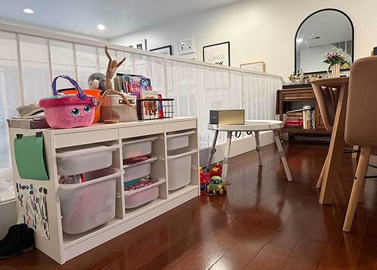
Alright, so the above and below were the set up of the toy situation in both my living and dining areas. What’s wild is I remember taking these photos not even three weeks ago and thinking “I mean, it’s not that bad, is it?” I knew it could use improvement—otherwise what was even the point of writing the post—but I had gone so blind to the toys stacked on top of the toys that it felt normal to me.
I look at it now and my eyes feel uncomfortable. Heavy. Dizzy. Overwhelmed. There are puzzles on top of puzzles, things pushed behind stacks of books, drawers that could barely open because they were stuffed to the brim. I know now that my daughter played in spite of the madness, not because of it.
Someone in the comments recommended bringing this one IKEA Trofast unit down to the living room so they all lived together, and it made me remember that that was always the point, but we couldn’t manage it because we had too much else in the way. The little messy-looking table there used to be a baby activity center that comes apart to become a toddler table. We keep it in the dining room because I feel okay with my daughter using her finger paints, watercolors and acrylics here where there is limited potential for permanent damage (it’s also where she plays with her kinetic sand so it doesn’t get lodged into the carpet). Spoiler: I haven’t yet come up with a solution for where she can do her arts and crafts, but hey…maybe someone here will know what to do!
Where We Are Now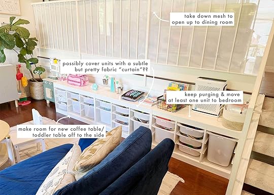
OMG THIS IS SO MUCH BETTER I’M SCREAMING. Two Sundays ago, during my daughter’s nap, I put on my sound cancelling headphones, blasted early 2000s jams, and got to work. I went drawer by drawer, pulling things out. I assessed everything we had, organized them by groupings, then took half (or more) of any given category of things, and put them away in bins I already had in my garage. I also collected all of the toys she was well past the appropriate age for and put them in a bin to save for a potential future child. If that child never comes, then buh bye.
I also took out my label maker and labeled the bins by rough category: things like “balls and cars” and “dress up” and “paint supplies.” There are two bins I couldn’t quite pin down but I’m okay with that for now. I can be flexible, after all (she says, twitching).
All the stuff that was crammed on top basically disappeared with the exception of my daughter’s Tonies (a little music box that plays songs and stories), the scale she loves to throw things in, and some books she grabs regularly.
I also cleared out 2/3 of my IKEA Besta unit under the TV wall for some closed storage. So far, she almost never opens those to play with anything in there, so that might not work for the long haul (unless it’s more of a bank than an in-play storage solution).
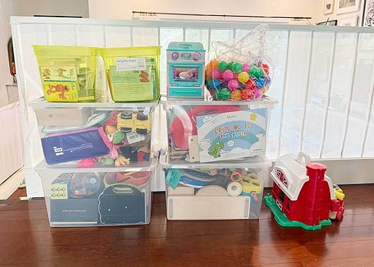
Here’s everything I pulled out of her stash and set aside. One of these is going into the garage, and the others are going into her closet to be rotated at the beginning of every month. It’s what we’re calling our “toy library” and my girl was such a champ about it. It’s actually quite cruel to leave these out for her to walk by every day, asking me when she gets to play with the toys in her library haha. But there is a little shift that needs to be done in her bedroom to allow room for these. Hopefully it can be complete in a week or so once I find her a dresser (and move a small, not-so-functional dresser out of her closet).
It’s hard to believe that ALL OF THIS was downstairs in the living room. The living room STILL has too many toys in it, even after taking these away. In an ideal world, I’ll get to a place where we have half what we currently have now, but I’ve gotta start somewhere. Listen, I’m the type of person who brings 14 undies in my suitcase for a 3-day vacation “just in case,” so it’s not easy to just chuck three-quarters of my daughter’s prized possessions. I know the studies about how children focus harder and longer and play better when they have fewer things to play with, so I’ll get there eventually. Give me grace, please. 
So, part of the plan for the living space was to make it work better as a play space, which for me meant two things: 1) Make it look more fun by giving it a little refresh, and 2) Swap out the coffee table for something small that could be moved out of the way to create an open play area.
Because our rug has different pile heights, it’s fairly terrible at facilitating things like balls or cars rolling, little toddler chairs being pushed in and out, and even sliding a coffee table around to make room for…anything. Not to mention it’s had three years of constant living with a small child and has dot marker blemishes, embedded kinetic sand and dried Playdoh…it’s a full-on Monet. Looks pretty from afar, but a big old mess up close. I still love the rug and plan on getting it professionally cleaned, and saving it for when we have a larger home one day in need of rugs.
Swapping out the rug kind of inspired me to consider a few style swaps for some other things in the space, mostly to make it feel more “us” now: colorful, playful and happy. Here’s what I’ve come up with, quickly:

Sectional | Rug | Coffee Table | Blue Oak Doors for Besta Unit | Curtain | Quilt | Yellow Bolster | Olive Round Pillow | Flax Linen Pillow | Floral Pillow | Solid Burgundy Pillow
I know I don’t want a rug that will add too much visual clutter because that’s what I’m actively fighting against. I like the idea of a solid color rug, but also like the subtle pattern on this olive and cream grid. My existing white curtains have always been too short for that window (a hold over from my previous home), and were put up one weekend as a “just for now” solution to provide privacy…that has lasted two years. I’ve toyed with a pattern here, as well, but worry that the sheer number of panels needed to cover this three-pane sliding glass door would be A LOT for my senses. A soft steely blue is more up my alley right now.
Oh, and for anyone who remembers my post about updating my IKEA Besta unit, I love the light blue stain of these door fronts, tops and sides from Fronteriors. I believe the color is actually a bit brighter in real life, but it’s so fun and different!
I think a smaller rectangular coffee table would work far better than the two-tiered round one we have now, and I envision taking it and pushing it against the wall where one of the Trofast units is (which I plan on moving upstairs potentially). It could serve as a “desk” for my girl as it’s a good height for her existing chair; this would open up the center of the room for more playing. Then, after bedtime, when it’s adult time, we can easily shift the table back into place to hold our drinks, laptops, casual dinners, etc. I’m not sold on this exact table, as I’d prefer to find something solid wood and second hand, but that’s the gist of what I’d be looking for.
Okay, so now an idea I’m throwing around my brain cells:

Storage Unit: Trofast Storage Combination | Fabric: Siena Stripe Linen, Buff | Trim: Ric Rac Tape Medium
I have some mixed feelings about this. The “design-y” part of me loves trying new things and challenging myself to find solutions to “problems.” But the parent in me doesn’t want to cover my kid’s stuff and make them have to work to play. Will she see this curtain and internalize that her “stuff” is somehow less-than in her own home? “Mama, why are my toys hiding?” I can almost hear her asking me. “Well, baby, mama’s brain can’t handle seeing lots of different things all at once so I put up a fun curtain, just like over the windows! Let’s see what we can find behind them!” Eh, I’m not landing that one.
Anyway, I digress. I’m intrigued by the concept, but the execution is in question. One way around my girl feeling like her toys are in time out is perhaps to not have the curtains up most of the time, but instead, having them on hand to put up (possibly with velcro?) when it’s just adults in the room or I need a mental/visual break from the clutter. I do worry that it’ll all get too fabric heavy, but in real life they wouldn’t have so many folds in them. I grabbed that photo off the internet to use here and I’d create something flatter. This is the same fabric I have on my curtains in my kitchen (from Tonic Living), and I love it. It has such a soft stripe that adds some oomph without being overkill. An unexpected red moment via some ric rac trim could shake things up.
Now, on to my dining room…

While I still have all those bins (a.k.a. the toy library) hanging out on one side, once I make room in my daughter’s closet for the overflow, this space will be mostly an “adult” space. She’s of course welcome to play in here, but when everything is tucked away, this is MINE. What’s interesting when I look back at this photo is how homogenous it feels. In real life, it’s actually much less boring to my eye. It feels peaceful (when I’m not looking at bins of toys and art supplies and paint-smudged toddler tables) and happy, especially when the curtains are open. But I can see that it could really use a rug to ground it. I skipped having a rug here because my then one-year-old used to eat all her meals here before we set up the breakfast nook, and it was such a gross mess on the floor all the time. No rug would have survived it.
But she’s mostly a civil eater now and rarely frequents this table anyway, so it’s time to finally get what I want: a rug.
These are a few I’m looking at:
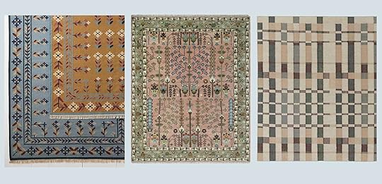
Left: Danish Floral Flat-Weave Wool Rug | Middle: Pink, Olive and Beige Traditional Vintage Heriz Serapi Wool Rug | Right: Marli Flatweave Wool Rug by Nina Freudenberger
The Danish Floral rug on the left (especially the ochre one) makes my heart sing. I’ve been itching to add in some more folk-y prints somewhere, and I think it plays nicely with the living space. The rug in the middle is one I’ve crushed on for close to five years, but it might be too heavily printed for what I’m after. And this Nina Freudenberger rug from Lulu & Georgia is another I’ve admired for years, though I worry the colors are too muted. I’m not sure yet, but I know anything would be a vast improvement.
I’d also love to recover the lampshades on my sconces, and figure out my curtains because those are a work in progress. In my last post, I talked about maybe swapping the bar for a bookcase, and that’s a possibility, as well, but I’m going little by little and not sure it’s what the room needs, necessarily.
—
So that’s where I’ve landed. It’s all a work in progress, but I already feel SO SO SO much better sitting in my living room. I literally feel my soul take a deep sigh of relief when I sit on the couch now and look around. Everyone, including our babysitter, knows where all the toys can be put away thanks to my labeling, and some big bulky things that used to live on the floor or under the coffee table now have room inside the TV cabinet. Things are looking up, people.
Thanks to everyone for all your advice. No, I’m not making any drastic moves here, but this is just a reminder to everyone that it’s not always giant changes that make our homes work and feel better, but the little things. Cleaning out one drawer, decluttering one corner, freshening up your curtains…small shifts that can breathe new life into you, your room, and your life.
Stay tuned on this, and as always, if you have any more advice, please chime in in the comments! Until next time…
The post Arlyn’s Dining Room-Turned-Playroom Update: See Where She Landed After A TON Of Reader Advice appeared first on Emily Henderson.


March 5, 2025
How To Style Your Bed The Easy Way (+ 21 Curated Pillow Combos)
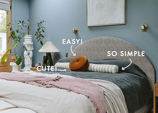
Remember that throw pillow scene in Along Came Polly?? That bed had ELEVEN throw pillows on it. And look, that was the style for a time but I might have taken a knife to them too. I’m pretty sure my own parents had about six on their bed most of my childhood. If that is still your thing and you love it, then I love it for you. No shame. Now, at the current design moment, it feels as though using any decorative throw pillows is “out”, which, at least for me, isn’t my preference either. Is it “AD chic” why of course! Could it be a little more fun? Why yes of course. I want to advocate for this easy way to add a little zhuzh to my bed, be it pattern, texture, and/or a fun shape. But what I also want is for it to take as little time as possible to make my bed. About 10 years ago Emily first wrote about her love of the single lumbar pillow and everyone was on board! One long pillow that would make your bed look put together and only take half a second to put on or take off? The dream. And while we still love the “one pillow wonder”, I am personally really into the two-fer. Two different pillows that each bring a little something different to your bedding game. It’s what’s currently happening on my bed, so I can attest to the total ease of taking them off and putting them back on. Basically, I want us all to keep things easy, breezy, cool but with a tiny bit more variety.
I thought I’d bring back some old school pillow combos in a bunch of different styles to help you envision what your bed could be asking for:) My bed throw pillows genuinely make me smile every time I look at them and that’s how I want everyone to feel. A small change to help make your day a little prettier. Seems silly? Sure. But also not kidding.

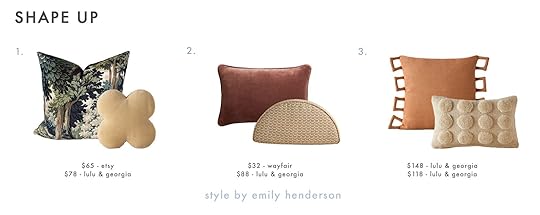
1. Mint Green & Red Pom Pom Trim + Irregular Dots Pillow | 2. Embroidered Cushion Cover + Bettie Tapenade Yellow Velvet Round Throw Pillow | 3. Luna Lumbar Pillow + New Zealand Collection Wool Throw Pillow
Let’s start with a bang! I know these are pretty specific but man do they have bold personalities. I am really loving the color mint because it feels fresh and fun but also doesn’t overpower in a bad way. I also think that design elements like tassels or fringe will add instant whimsy and softness to an otherwise bold design. Another deep love of mine is a camel colored sheepskin fur pillow. That little ball one isn’t cheap but it is so fun and versatile. That kind of pillow is one that you could use with nearly any style you want to try. 10/10.

1. Velvet Disc Pillows | 2. Shorn Camel Brown Sheepskin Fur Throw Pillow + Mariata Pillow | 3. Tiger Jacquard Pillow + Mauree Velvet Round Pillow
I’ve always designed my bedrooms with a bit more “romance” and ” softness”. I mean they kind of lend themselves to that, right? For some, that might mean an all white/neutral color palette, while others prefer a moodier look. Regardless, some playful pillows like these would only add to the vibes. Emily used one of those disc pillows in her primary bedroom reveal! She only chose one with a long lumbar, but I love the idea of choosing two colors of the same pillow to keep it simple but fun. These also have a really great texture on the sides and act as a great lap pillow for your laptop. And see? Another camel fur pillow. Chic but fun! Then paired with that tapestry-inspired lumbar, it’s a dream combo for me. Oh, and in case you haven’t noticed, ruffles are very in!

1. Velvet Reversible Throw Pillow + Block Print Linen Pillow | 2. Green Block Print Pillow + Liza Throw Pillow | 3. Indian Hand Block Stamped Linen Print Pillow Cover + Velvet Piped Pillow
Block print has been around for thousands of years and is in no way “new”, however it’s hard not to notice the wonderful resurgence it’s having (for instance, Fariha’s wallpaper line!). Emily was also toying with the idea of using block print fabric for her kitchen cafe curtains. If you look on Etsy, there are so many beautiful pillow options to choose from if you’re looking for options. I personally really loved these three. I also wanted to pair with a velvet accent pillow to make the combos feel really rich. The sky’s the limit on the amount of combos and colors you can choose from.

1. Hi-Lo Checker Velvet Pillow + Patchwork Lumbar Pillow Forest | 2. Honeycomb Silk Pillow Cover + Carys Contrast Linen Pillow | 3. Valentina Velvet Fringe Pillow + Holly Cushion Cover
Some of you might disagree but these feel a little less “bold” than the first set of combos. So while not quiet, I love how these would bring a solid visual punch to your bed. Emily has and LOVES that multi-colored velvet lumbar pillow and can’t recommend it enough. For a much neutral option, combo #2 is a great and I adore the contrast piping on the linen lumbar. It comes in other colors too! The patchwork pillow in combo #1 is so pretty and made by a B Corp that ethically makes all of their products and is overall just a wonderful and beautiful brand. Go check them out if you haven’t yet.

1. Viola Long Lumbar Pillow + Luna Boucle Reversible Throw Pillow | 2. Oversized Textured Boucle Throw Pillow + Plaid Indoor/Outdoor Lumbar Throw Pillow | 3. Fringed Throw Pillow + Two-Tone Chunky Linen Tassels Pillow
Naturally, I had to do a blue focused set of combos. Would this be an EHD round up without it?? That first combo is a pretty special one and mostly because of that Johanna Howard pillow. The colors are stunning and the pattern feels both modern, but in a really versatile way. And for its friend, who doesn’t love a little boucle ball?? Speaking of boucle, a large square one is also a great style maverick if you will. It works with everything. And that little blue plaid cutie is a perfect companion. Finally, I wanted to give a more “coastal” option which I know we probably don’t do enough. The textured look of the fabrics, with the soft beachy tones, and fun tassels/fringe are the epitome of dreamy coastal. Take me to a beach now please.

1. Beige Cream and Dark Brown Patchwork Velvet with White Fringe + Terre Olive Green Velvet Sphere Throw Pillow | 2. Darla Throw Pillow + Popcorn Plaid Pillow | 3. Heiden Cotton Throw Pillow + Burnt Green Throw Pillow Cover
Don’t worry, I’ve got green too! These combos are a little more varied in styles:) The first one is definitely on the trendier side but also just really freaking cool. That checkered pillow is handmade and stunning. Then for a more modern traditional feel, combo #2 is a great mix of patterns and their scale. But they are both beautifully calm (but not boring). The last combo is for my mod lovers. Again, I wanted to play with pattern scale and that little lumbar is so awesome with its teeny embroidered design.
1. Moody Decor Sofa Pillow Cover + Velvet Clover Pillow | 2. Reversible Liza Pillow + Sweeney Half-Disc Pillow | 3. Sofia Linen Pillow + Kohta Pillow
I couldn’t not play with a few more shapes. I think that beds are the perfect place to have fun in terms of pillow shape because, unlike sofa pillows, you really don’t spend much time leaning them…so let’s get a little wild, ya? From the moment I first saw Sarah Sherman Samuel’s Clover pillow, I loved it. It’s cool but very whimsical. You are an undoubtedly cool person if you have that pillow on your bed. And I, of course, love the style contrast of that beautiful traditional tapestry pillow. Now, I also really love a “taco” shaped pillow. But what’s so fun about this one is that it has a great pattern on it. I feel like they are usually a solid color. Then finally, while the shapes of combo #3 are standard, the square handle-like trim on the larger one is bonkers cool. And what’s a fun contrast to squares? Circles, of course. If you have an earthy toned room, one or both of those pillows would look sick.

1. Schoolhouse x Rachel Murray Flower-Bed Bolster Pillow | 2. Artigo Brown Leather Lumbar Pillow | 3. Moroccan Woven Oversized Lumbar Pillow | 4. Bettie Light Brown Velvet Lumbar Pillow | 5. Alcove Pillow Dusk | 6. Painterly Stripe Linen Long Bolster Pillow
So while I’m on the two pillow train, a long lumbar is also a slam dunk. Here are six of our current favorites. That Schoolhouse one is SO GOOD!
Ah, hope that was fun and maybe gave you a little bedding inspo. Sometimes a small decor change can be surprisingly impactful. And if buying new pillows is not in the budget or you just don’t have the desire, maybe play with the pillows in your home! Maybe swap a sofa pillow for a bed pillow. It’s free, easy, and very allowed:)
Love you, mean it.
Opening Image Credits: Photo by Kaitlin Green | From: Farmhouse Primary Bedroom
The post How To Style Your Bed The Easy Way (+ 21 Curated Pillow Combos) appeared first on Emily Henderson.
March 4, 2025
How We Really Kept The Charm & Character Of The Farmhouse (HINT: It’s Salvaged Pieces)
If you are into drinking games, I dare you to try to count how many times I say “character” or “charm” in this post – maybe just water in those shot glasses?? Someone recently asked what pieces are original to house and while there isn’t a ton, it was actually far more than I originally thought. So I thought I’d round them all up, and add a few pieces of furniture that we converted. A huge thanks to ARCIFORM who spearheaded this endeavor. They have a ton of experience restoring everything, so I felt in very good hands. I bought most of them at Aurora Mills, and then ARCIFORM found a few at an auction, but all local and for the most part super affordable for how charming they are. While we really gutted the house these pieces helped build back the character that we love about old houses. Here you go:
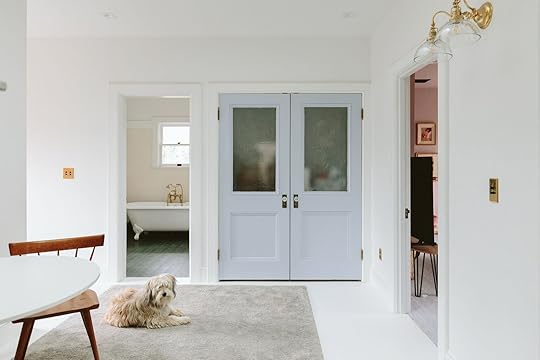
The Pocket (And Mudroom) Doors from: how we are restoring our vintage doors + splurging on some special salvaged doors
I found these two matching school doors and loved the glass in them. I feel pretty strongly about adding pieces with a lot of architectural integrity and Anne (from ARCIFORM) really empowered me to go for it with the doors without needing them to all match. I don’t remember how much these were (I think a couple hundred each) and then they had to be patched, cleaned up, and painted (which honestly is the most expensive part of the process so if you don’t DIY be prepared to spend a few thousand on someone else’s time and expertise).

 left from: dining nook reveal | right from: mudroom reveal
I love them so much. We ended up removing the brass kickplate and shove plate thing (I think they had to remove to dip them) and honestly they were so beaten up that once painted we knew it would be distracting. Now vintage doors (especially these) are super heavy so if you attempt this make sure to get the right pocket hardware that can hold them. The mudroom door isn’t pocket by the way, just the family room door by the dining nook.
 from: how we are restoring our vintage doors + splurging on some special salvaged doors
While we loved the idea of keeping the original patina it wasn’t a very pretty color. I think in a different house mismatched shabby doors like this could work, but not in this one
 left from: how we are restoring our vintage doors + splurging on some special salvaged doors | right from: mudroom reveal
I think the panels and the glass give it so much character and it’s clear they are vintage without having all the age on them.
 from: dining nook reveal
We painted the inside of this one the same color as the family room (and split the door jam, 1/2 and 1/2 blue and white). Just couldn’t love them more (although at times I wondered if I should have painted some of the doors a fun color).
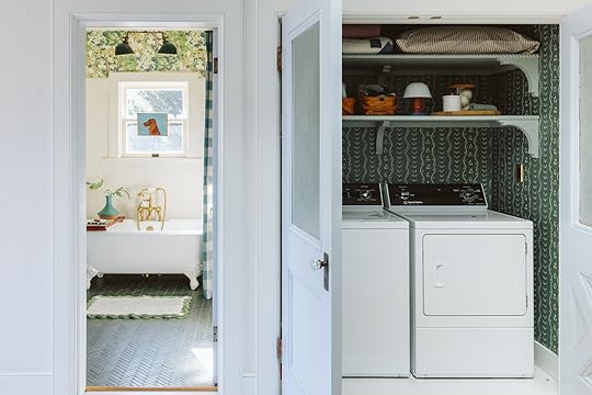
The Upstairs Laundry Doors from: how we are restoring our vintage doors + splurging on some special salvaged doors
While the laundry closet certainly didn’t need to have glass in it, I just felt like these would be so charming once I found them at Aurora Mills.
And they are! Although it pains me that apparently, we haven’t shot a still photo of these closed since we finished the bathroom and the laundry closet. Here you can see them open
 from: kids bath wallpaper update
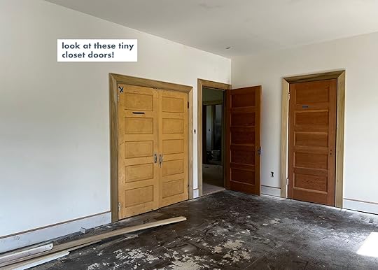
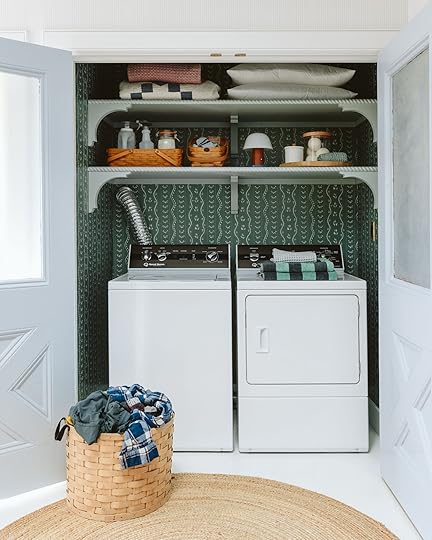 from: laundry closet revealUpstairs Room Doors (Closets And Bathroom)
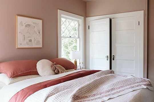 from: guest bedroom reveal
The rest of the bedroom closet doors were all salvaged, too. Shout out to Marty (from ARCIFORM) who found these all at an auction for I think $50 each or so.
 from: how we are restoring our vintage doors + splurging on some special salvaged doors
I mostly just trusted that they would work since I wasn’t going to be the one installing them.
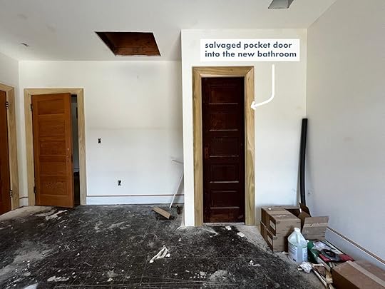 from: how we are restoring our vintage doors + splurging on some special salvaged doors
I was definitely at times nervous about how skinny that door was, but it’s so freaking cute (and allows for a bit more wall space inside the bathroom).

 left from: guest bedroom reveal | right from: guest bath reveal
That’s the inside of the bathroom as you know – I don’t think I’ve ever shot the door fully closed (probably because there is the world’s biggest TV on the wall next to it in the guest room LOL).
Charlie’s Closet Doors right: charlie’s bedroom update
No, we don’t use that as a stuffy closet – I think we just styled it this way for the shoot? I don’t remember. But yes, all his closet doors are also salvaged.
 from: how we are restoring our vintage doors + splurging on some special salvaged doors
I didn’t notice that these were shorter when I approved them so when I saw them installed I certainly was nervous that it was a mistake.
 from: how we are restoring our vintage doors + splurging on some special salvaged doors
 from: farmhouse painting
But once they were in (and now that we’ve lived here for a while) I actually think the oddness is so sweet. It was such a great reminder that old houses have weird things about them and if you make them all perfect they might not have the same character. So even putting these odd things into the house really amped up the charm (IMHO).
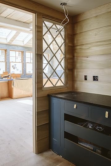
Original Interior Windows from: pantry update
We LOVED the original double Dutch diamond windows, but we wanted to open up that wall to the backyard. So we actually kept them all and used them in three other places in the house.
 from: pantry update
We took the two that matched and installed them vertically as windows into the pantry. Could not love these more, honestly.
 from: pantry reveal
The glass is old and shaky (and surely does look dirty in here, LOL). But I love them.

 from: pantry update
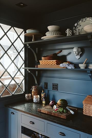 from: pantry reveal
From the inside, I love looking out into the kitchen, too. We also found an additional vintage window that had some of the same diamond motifs and installed it into the pantry to add some natural light in there (it’s non-operable).
 from: pantry revealThe Pantry Door
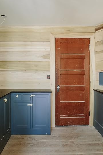
 right from: pantry update | left from: pantry reveal
Oh one more door Y’all we used a lot of salvaged doors in this house! I love them A LOT.
 from: kitchen island update
Probably my favorite salvage was and is the kitchen island. I found it at Aurora Mills for around $3k. It has a ton of function (those drawers, while heavy totally work) and ARCIFORM added to the top seamlessly, I should add, to give it the overhang that we wanted so we could eat at it (which we do, a ton).
 from: kitchen reveal
Prettiest island I ever did see. And the redder tones in it are so pretty – I was so worried it would clash in a bad way but it really just adds a lot of warmth and character.

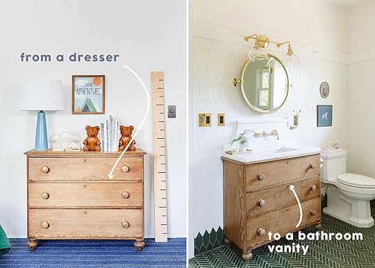
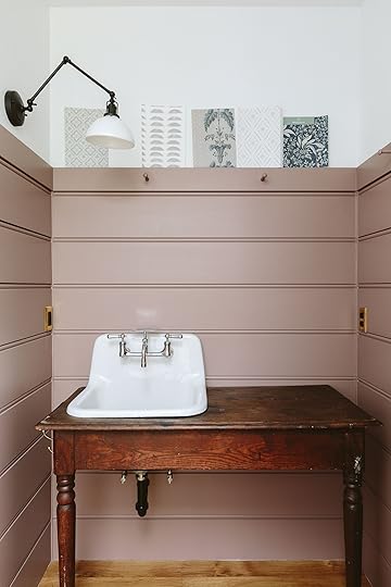
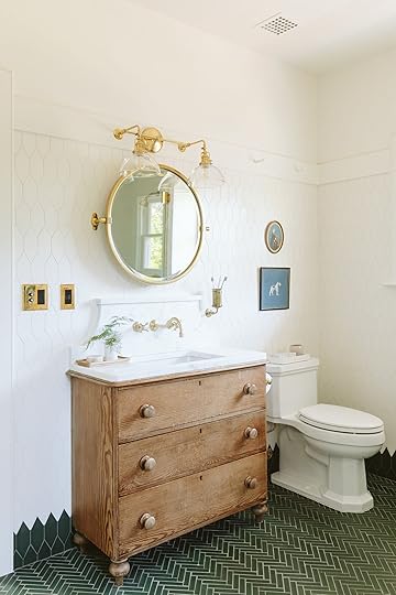
 from: kitchen revealTwo Converted Vanities
 left from: powder bath reveal | right from: kids’ bathroom reveal
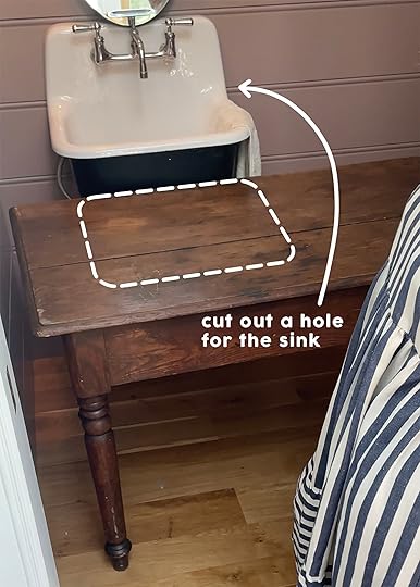
We didn’t stop there and actually converted a dresser and a table into vanities for two of our bathrooms.
 photo by sara ligorria-tramp | from: the mountain house kids’ room reveal
 from: kids’ bath vanity process
The kid’s bath was an old pine dresser that was in our house in LA (and the mountain house) and while it was a bit shallow for the sink, it worked fine since we had a wall-mount faucet. I wrote a whole post about how we converted it here.
 from: powder bath vanity process
For the powder bath, I really struggled with this one until our kitchen makeover client (Hi Julie!) literally gave me this farmhouse table. So nice. So then Dave took off the back legs and secured it to the wall around the wall-hung sink.
If you have an old house and are renovating but want to make sure it remains charming this is such a great strategy. Sure, it takes more time to find and likely more money than just buying 10 matching doors, but boy does it add so much character and charm to any home.
*Unless Otherwise Noted Photos by Kaitlin Green
The post How We Really Kept The Charm & Character Of The Farmhouse (HINT: It’s Salvaged Pieces) appeared first on Emily Henderson.
March 3, 2025
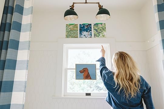
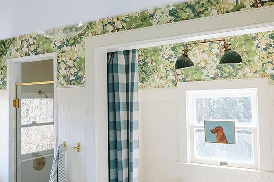
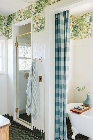
Another Design Box Checked – The Kids’ Bath Wallpaper Reveal!

Well, well, well. A year and a half after the “reveal”, I finally did the update that this bathroom always wanted – wallpaper, and it looks so good that even my kids noticed and went out of their way to tell me! There is nothing sweeter than your 11-year-old son saying “Mama, I love the wallpaper” before you even have time to point it out. I always knew that this bathroom wanted wallpaper above the tile and trim, but I needed to shoot it and I hadn’t found the right paper. It was still pretty beforehand, but now it’s just so much better.
Before Wallpaper
Here’s how we shot it in August of 2023, it really remained the same for the most part. The art fell down off the tile (dumb Command strips) but otherwise, it was sweet and worked. So I kept my eye out for the perfect pattern and colorway…
Choosing The Right Paper
I fell in love with a few of these from Graham & Brown, ordered some samples, and was delighted that there were many that I loved.
Left: Ruskin (Green) | Middle: Folklore Tree (Blue) | Right: Folklore Tree (Sage)
While the middle blue one looks so powerful on camera (and I think maybe one on stories?), I went with the green colorway on the right that has hits of blue in it just so it felt a little more timeless and less saturated I guess? I think the intense color on top with the green tile might have been too much, whereas the green obviously spoke to the floor, more in harmony.
The Reveal
I LOVE IT. The “wood” of the branches speaks to the warmer tones in the room (like the vanity and the gold fixtures) and the green and blue work so well with the green tile and blue accents (like the curtains and the vintage dog painting).
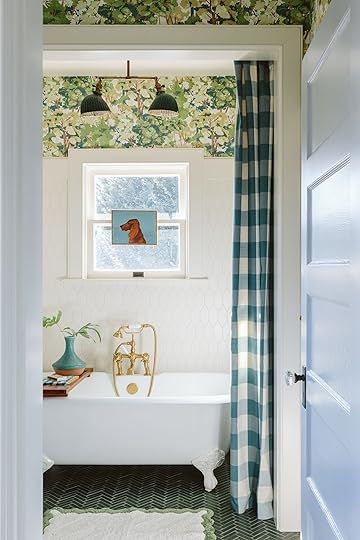
I love that the green vintage light fixture still pops off it nicely without getting too lost. And while I was open to changing out the curtains (I mean, it was just yardage that I iron hemmed and hung up) I think this looks so fun and cute. The colors are great together and the scale of the large gingham is offset so nicely with the organic movement of the wallpaper pattern.


The bathroom just feels so much more finished, like it was always meant to be this way.
The only thing/s that I’m still debating are: Do I add crown molding? My typical answer would be yes, but outside the tub niche, it would end up being just a little sliver. But you could skip the molding on that front part (maybe, unsure about that) and just do the perimeter of the room… I also might add cafe curtains IF I find the right pattern, but I’m not terribly motivated to persist on that one. Like sure, it could look cute but there is a lot happening already – we may have hit our whimsy quota.


It’s another box checked and only 3 years after we moved in which I don’t think is THAT bad. I actually am loving adding these layers in a slower (and less stressful way).


It’s just so happy and feels appropriate to the house (Scandinavian farmhouse vibes FTW). The organic nature of it contrasts well with the tile, too. With the green floor/wall tile border looking like grass and the wallpaper clearly being a forest, we have a fully executed theme in here What do you think??
*Photos by Kaitlin Green
The post Another Design Box Checked – The Kids’ Bath Wallpaper Reveal! appeared first on Emily Henderson.
March 2, 2025
The Link Up: The Show Emily Can’t Stop Thinking About, The LED Face Mask Jess Is Finally Ready To Recommend, And A Gripping Article
Happy Sunday everyone! We are still just staring at the photos of the river house guest room reveal. We collectively all considered painting our room a moody pink after seeing the shots come through. Aside from that, we are full steam ahead on more projects, even a fun shoot Em is coming to LA for this upcoming week:) It’s going to be a wild one! Until then here are this week’s links…
This week’s house tour is a 1920s Washington DC brownstone that perfectly marries glam and eclecticness. EHD favorite, Zoe Feldman, also designs the most inspiring homes that are equally as livable so it was no surprise that this gem was hers too. Go check it out here!
From Emily: Some solid weekend entertainment suggestions – Besides the obvious, White Lotus Season 3, (I haven’t started yet) I flew through and couldn’t stop thinking about Apple Cider Vinegar. I remember both cases (fictionalized for TV but definitely based on true story) – one influencer who faked brain cancer and became a wellness influencer, and another who chose alternative medicine (and also became a wellness influencer). It was the 2010s and it was (and still is) a wild ride in this industry – but BOY is this show hard to stop thinking about. TW: it is a lot about cancer and can be unsettling so be careful if that feels too close to home. The acting, directing, writing – it’s all so good. I found it thought provoking – especially since I’m such a sucker for the latest “snake oil” that the wellness industry is trying to push on me and the psychology about fictionalized disorders (wild stuff). I really just couldn’t stop thinking about this show (and highly entertaining).
But more importantly, if you haven’t seen In The Heights, might I suggest a solid watch? We are massive Lin Manuel Miranda fans over here (Encanto, Moana, and of course, Hamilton) and his 2021 movie based on his Tony Winning play set in Washington Heights during 2001 is so freaking good. We watched it a few times during lockdown but just rewatched with the kids and I was reminded how good it is (up there with Paddington 2 and Wonka IMHO). The music is incredible, obviously, the story is so good, the acting is awesome (so many Hamilton cameos!) it’s culturally important AND the directing/producing just feels like a fantastic huge performance. The lyrics move fast (like all his work) so feel free to put subtitles on to help follow. So if you are looking for a family friendly musical movie to watch this weekend, watch In The Heights (our kids are 9 and 11 and it has some cursing and some suggesting stuff, but overall we felt it was totally appropriate – and heck, they watched it at 6 and 8 and loved it then).
 photo courtesy of chasing paper
Fariha Nasir is such an insanely talented designer and DIY queen (have you seen her show Problem Spaces)?? So when we heard she had a wallpaper collection with Chasing Paper we couldn’t wait to see.

 photos courtesy of chasing paper
Flower Garland | Nargis Block Print | Ajrak
Here’s a little blurb about her process – “I’ve been working on this for over a year and my goal was to bring a block print wallpaper collection to the market with authenticity and nuance. I’ve hand sketched, painted and worked with a South Asian surface designer to put this together.” It’s so fun thinking back to watching this bathroom makeover she did where she painted her own wall pattern and it was clearly part of her design process! Needless to say, this is a deeply personal collection and as the pictures show, an incredibly beautiful one. Check them all out here!
From Marlee: Let me share with you one of the greatest culinary creations I’ve ever discovered – Ground Up Nut Butters. They have a ton of super fun flavors that sound super sweet, but there’s no sugar added – my favorite is Coconut Cardamom with Chia seeds, but Cinnamon Snickerdoodle gets an honorable mention! It’s amazing on toast, ice cream, a yogurt bowl, with a banana, on its own… something about this product just does it for me. Not only is it incredibly yummy, but the company is local to PDX, woman-owned, and partners with local nonprofits to provide work opportunities and job training to women overcoming adversity in the Portland area. Big fan all around. I usually grab them at New Seasons (a Portland grocery store) but they can be found at stores all over (check out their store locator). If you want to level up your nut butter game (not a sentence I ever thought I’d say) and support a great small business, you should 100% check them out.
From Caitlin: When I saw this piece on Dwell titled “Is GoFundMe the New Insurance?“, I can’t say I was chomping at the bit to read a heady piece about crowdfunding. But when the piece later appeared in my email, I gave it a shot – and I’m SO glad I did. Told through the lens of the LA fires, it explores why insurance often fails to be the safeguard it’s promised to be and how we’ve come to fill the gaps ourselves…often unfairly. Safe to say, it’s a must-read for any policy wonks (guilty as charged) or homeowners who’d like to be prepared in the event of a natural disaster (do you have enough “depth” or “breadth” in your network to help you rebuild?). I promise, it’s a fascinating read!!!
From Mallory: It’s not often I give a food rec on here but have ya ever heard of Aaron Franklin?? BBQ LEGEND – so when I was in Austin last weekend hitting up his BBQ place was a must-do (and was honestly a big point of the trip). But the line is known for being 4-6 hours long on the daily, so I’m gonna drop the hottest tip for all of you guys if you happen to be in Austin or visitng soon: THEY DO PICKUP ORDERS SO YOU CAN SKIP THE LINE!! But there’s a caveat – you have to order 5 pounds of meat lol. So to hit the minimum, we ordered our lunch and then ordered a chilled brisket to go (and yes we did take a brisket through TSA and onto an airplane over ice) and we’re gonna have a dinner party with it. So your question now probably is…was it all worth it? Absolutely. My expectations were so high and they were immediately exceeded. Franklin’s is truly the best bbq y’all.
From Jess: Ok, so I wanted to wait to recommend my Dr. Dennis Gross red (and blue) light face mask because it’s not cheap and it’s also not the kind of thing you see results immediately with. But now the time has come. I’ve been using it very consistently (almost every day) for 3 months and I really feel like my skin is looking great. My best friend even told me that she noticed which is honestly maybe one of the greatest compliments, well at least to me, when I’ve been working hard at it:) I will say that I’ve also been really consistent with my vitamin C serum in the AM and my retinol in the PM. Like anything, consistency is key and I was doing those before I started the mask. The mask automatically shuts off after 3 minutes, so it really doesn’t take much time, is cordless, so you can move around, and you have the option of red light, blue light, or a combo (red is more for collagen production, whereas blue is more for acne). My friend also has one and she uses it on her neck and top of her head too. This little guy is versatile but FYI you will scare your family when you’re wearing it lol. Good. keep em on their toes!
From: Arlyn: I guess now that I’m 40, my brain is preoccupied with questions like “Am I getting enough daily fiber?” (I’m not kidding). I’ve been working with a dietician since last fall, and while I eat fairly balanced with tons of fruits, veggies and whole grains, I’m still struggling to reach my goal. (For the record, the recommended daily intake is 25 grams for women and 35 grams for men, but most of us only get 10-15 grams.) I’ll calculate a whole meal thinking it was a fiber home run, and it ended up being something like 3 grams of fiber. WHAT ON EARTH. It’s so much harder than I ever thought. ENTER MY NEW CHEAT CODE: Olipop! You guys, I’m not a soda drinker, and I can’t stand the taste of Stevia, but these Olipops are actually pretty tasty and have 9 grams of fiber in each can. NINE GRAMS! They have some proprietary blend of root vegetables but it just tastes like a bubbly treat. So far Orange Crush and Cherry Cola are my favorites, but I’m excited to explore more flavors. Check out their site to see where they are carried near you! (And if you have any other fiber cheat codes that aren’t supplements, please leave in the comments.)
From Gretchen: I recently ran out of my face lotion and decided to switch it up to a brand I keep seeing everywhere–Byoma. To be totally transparent, the branding and fun, bright packaging is what initially drew me in, but the reviews were also quite promising and I’ve gotta say, I’m a fan now too! I tried the Moisturizing Rich Cream, which comes in this cute and funky rectangular, purple bottle, and it works so well! I really do feel like it keeps my skin feeling hydrated all day and I love how smoothly it goes on. Doesn’t feel sticky whatsoever and I’ve even started mixing a little with my foundation, after I’ve already lotioned up, because I like how well it blends into my skin. I definitely want to try more of their products, and after a little research, found that you can actually take a quick skin analysis test on their website to help you decide what products are right for you! After seeing my results, I think I’ll also be giving the Hydrating Recovery Oil a try at night.
Thank you so much for reading and see you tomorrow for a pretty exciting reveal/update!
Opening Image Credit: Design by Fariha Nasir | Photo Courtesy of Chasing Paper
The post The Link Up: The Show Emily Can’t Stop Thinking About, The LED Face Mask Jess Is Finally Ready To Recommend, And A Gripping Article appeared first on Emily Henderson.
March 1, 2025
Really Good Spring Break/Vacation Dresses

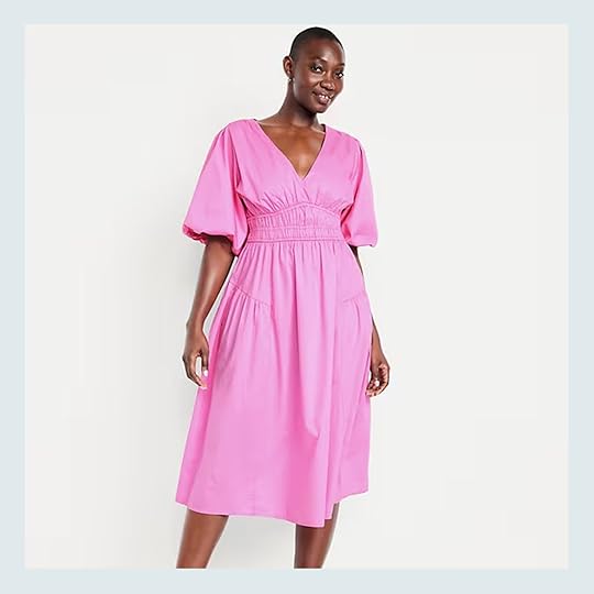
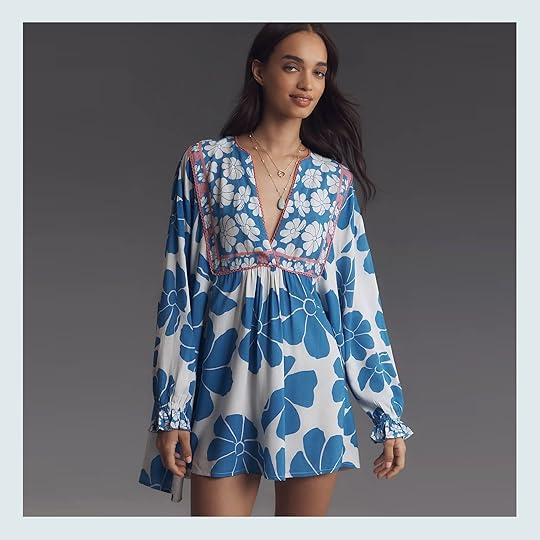
It’s 60 degrees and sunny in Portland (February 28th) so people are in shorts and drinking margaritas (I’m cutting out early at 3 pm to go on a long family bike ride along the river). And while we have a couple more months of potential rain up here, I know a lot of people go to the sun for spring break (including us – we are off to Belize with the kids which I’m INCREDIBLY excited and grateful for – never been and the personal reviews from so many people have me pumped). When we went to Costa Rica for Spring break a couple years ago, I didn’t bring the right humidity-friendly clothes – too many jean shorts which is decidedly not what you want to wear when it’s 90 percent humidity. And yet at night you don’t want to just sit in a tiny dress at dinner. So I did shop a bit and after trying on many many dresses, these were the four that I thought were worth recommending. Here you go
This was my #1 – so soft and drapey, thin (but not see through), drawstring but not tight, flattering but not fitted. I have been shopping and wearing Emerson Fry since before DesignStar (budget depending) and it’s just such high quality made in America stuff that is so timeless and lasts. The prints say “spring/summer/vacation” without just screaming “TROPICAL RESORT” so I think I can also wear this all summer long up here. So flattering, such good details with the stitching – a 10/10. Oh, and I have found that with the bugs it’s actually nice to be more covered up at night for dinner.
Aubergine Sannar Dress | Sandals | Purse (unavailable)
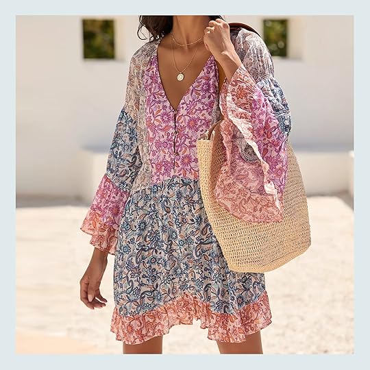
I loved the color and pattern of this dress – with big balloon sleeves. This one is a bit warmer (still cotton, just slightly thicker) and yet still drapes really well (not too stiff). It has pockets, too. Definitely a great boho dress all spring/summer, especially if you live in one of the southern states.

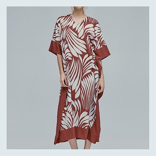
Blush Striped Bouquet Long Sleeve Salty Paloma Caftan | Sandals
I was surprised how flattering this dress is for being really voluminous. Because I have bigger ladies, these types of dresses don’t always work on me (just where the umpire seam hits at the mid-boob) but this one was fitted enough in the armpits, and the seam was low enough that it falls really well into the tiered skirt. I don’t need all four of these so I’m still deciding between this one and the brighter pink one – literally can’t decide!!
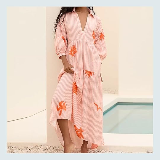
This one is so fun and swingy – with pockets and a low V. My only issue with this (and why I decided to return it) is that the V comes so low into a drawstring that you either have to not wear a bra, wear a pretty showy bra or wear a swimsuit underneath. Here I’m not wearing a bra because the one I had on yesterday was NOT a pretty showy bra (flesh toned and meh), and that 5 minutes of shooting this bra-less felt VERY scandalous No thank you! But it’s a really pretty dress and comes in a pink color as well.

Ok, this is such a fun look, but pretty specific, ie, very resortwear. People love Farm Rio and I do, too! But I find that I simply don’t have enough opportunity to wear this type of look in Portland (and the set together is expensive). This does scream resort or SoCal summer and it’s undeniably cute, but I don’t think I have the lifestyle to support wearing it enough to spend the money (and have it take up real estate in my closet). But if you are going on vacation and want a cute set to show off – I LOVED THIS. Oh be warned, I ordered a small top (which fit great – so good over a suit) and a medium bottom and the bottom still cuts in too much in the waist for me.
All in all, I’ve learned that I don’t really wear very cute “looks” on these more kid-focused adventure jungle vacations. It’s a lot of playable swim suits, cute swim shorts, and Tevas, then loose clothes at night that don’t stick to me, so I’ll likely bring that first dress for dinners and I’ll wear it over and over We are so excited to explore some Mayan ruins, zip line, snorkel, and do lots of cave exploration (i.e, I’m not bringing any platform sandals on this one). Let me know if you want me to do a recap on the Belize trip – I never did a Costa Rica blog post, actually, so if you want our itinerary from that trip let me know and I’ll share (it was a 15/10 itinerary, BTW – the entire family loved every second of it – thus us going back to a similar vibe, but with ruins and Caribbean waters instead). Often recapping these trips feels braggy so I kinda avoid it but I also know how helpful it is so share our experience in case you are planning yours (and these beautiful countries are still really affordable once you get down there.)
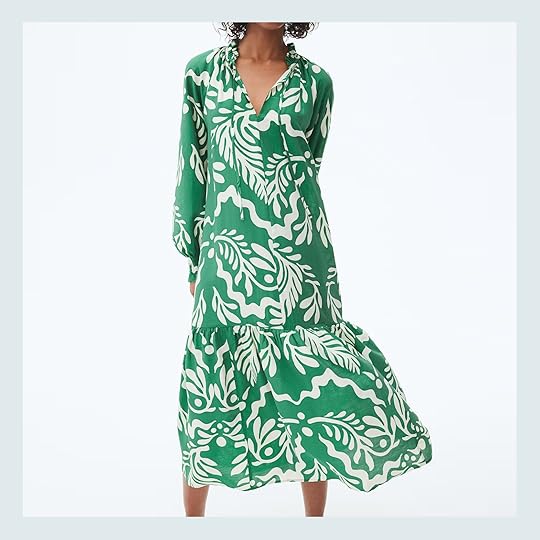
We rounded up more vacation dresses for you – Sandals, Affordable Spring basics, and “New Spring Refreshingly Good Head to Toe Denim” posts are coming soon…
Love the colors and the mix of prints! The reviews say the fabric is lightweight, but there are differing views on whether or not you need a slip if you want to use it more than a vacation cover up:) So pretty regardless and also worth a slip purchase if needed!
Waist-Defined Puff-Sleeve Midi Dress
This might be a little more “spring” than “spring break” but either way it’s so pretty! For only $42 you get the chinching, the puff sleeves and that beautiful pink color. But if pink isn’t your thing, it comes in two other colors.
Now this screams spring break. That bold pattern is extremely fun and the green is so bright and happy. Did I mention it’s only $35 and comes in two other colors? This colorway is decidedly the most “vacation-y” but all of them are fun.
Puff-Sleeve Printed Midi Dress
Such a pretty Farm Rio dress that could effortlessly work for both a vacation and a fun spring event. The colors feel fun but not too bold and the pattern is just so beautiful.
Boho Cover-Up Tunic Dress | Floral Mini Kaftan
If you like a shorter cover-up, both of these are great! I love how the colors are the main event for the one on the left while the pattern is the statement for the one on the right. You can’t really miss with either.
This one looks very chic and sophisticated but it’s only $45. A steal! This is great for someone is who doesn’t love super bright colors but sill wants a classic vacation look.
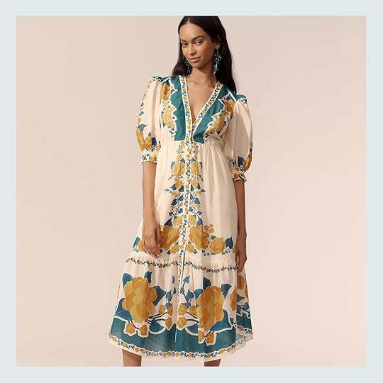
The Carolita Printed Tiered Shirt Dress
Oh, this one is good. And from the over 300 reviews giving it over 4 stars, we are correct in our assessment. The warm pink strips are so pretty and the added orange accents make it “vacation”. Love it.
Another super affordable ($30) spring/spring break dress! A belt is always a nice option for some shape too. That print is really good.
For my simple stripe lovers, this dress is for you. It’s so versatile and could go from the office to the beach to brunch with a change of a few accessories and shoes. It comes in two other colors if you prefer a solid color.
Eyelet Embroidered Shirt Dress | Elena Puff-Sleeve Dress
I wanted to throw in a couple more slightly “formal spring” options because they were pretty and some of us need those too. That white eyelet dress is so pretty and under $100! Then the print and shape of the floral dress is real good. Perfect for Easter, a spring trip to Europe, or any other slightly dressier occasion:)
Hope this was helpful. xx
*Photos by Kaitlin Green
The post Really Good Spring Break/Vacation Dresses appeared first on Emily Henderson.
February 28, 2025
10 Small Business Home Decor Shops That Will Make You And Your Home Feel Better (+ Caitlin Spills Her Secret Favorite Resource)
In an era where shopping has become a battleground – where we’re critiqued from every angle for where, when, and how we spend our dollars – supporting our local small businesses can feel like a quiet revolution. By buying locally or shopping small, even online, you’re investing in community, sustainability, and integrity – it’s a way to support businesses that enrich your neighborhood; that create jobs for your friends and family; that maintain values you can stand behind.
Which is why my 2025 New Year’s Resolution read as follows: “shop small, or not at all.” (I admire folks like Leslie Stephens, who are looking to pull off a “no buy 2025” – that’s like playing on expert mode.) And so far, my year of small shopping has been a blast – I’ve met folks in my community, discovered the best moisturizer I’ve EVER used at a Pennsylvania farmer’s market (they don’t even have a website – you have to call a phone number to order), and I’ve scored art that I love, straight from the source (thank you, Abel!).
So today, in honor of today’s economic blackout – a day to abstain from shopping at all major retailers – I’d love to share a handful of the small businesses I’ve been patronizing recently. (Perhaps you might share yours, too?) Because whether you’re shopping for a gift, a throw pillow, or something that just feels good, these upstarts provide more than just products – they’re supporting their communities.
YowieView this post on InstagramA post shared by The Cut (@thecut)
Located: Philadelphia, PA
The Deal: Yowie curates small collections from independent artists and designers. After starting as a pop-up and growing into a full-fledged retail space, Yowie expanded into hospitality with a boutique hotel (!) that blends retail, lodging, and community space. Come for the design-forward ceramics, stay for the events and workshops.
Shop For: Hand-crafted gifts, incredible coffee table books, and unexpected decor.
View this post on InstagramA post shared by GOODEE (@goodeeworld)
Located: Montreal, Canada
The Deal: Looking to source sustainable, ethically-made home goods WITHOUT undertaking an entire research project? Goodee is here for you. (Until March 4, at least – tariffs will add a 25% fee to American orders.) The brothers behind Goodee partner with artisans and brands worldwide to offer exclusive, limited-edition products that support traditional crafts and communities.
Best For: Beautiful daily essentials, heirloom-quality linens, and sustainably-crafted furniture.
View this post on InstagramA post shared by Portmanteau New York (@portmanteau.nyc)
Located: New York, NY
The Deal: Portmanteau offers one of the world’s best-curated online vintage collections. (I fully anticipate a flurry of texts from angry designers today, frustrated that I’ve revealed their go-to destination for room-making pieces from every era.)
Best For: Warm, charming, soulful vintage for every budget.
View this post on InstagramA post shared by Lichen [Lī-ken] (@lichennyc)
Located: Brooklyn, NY
The Deal: Lichen operates as a design incubator and retail space, focusing on accessible, functional design. The founders aim to create a community hub that fosters creativity and collaboration among designers and shoppers – it’s pretty much the platonic ideal of the shopping environment I detailed above.
Best For: Iconic design stalwarts, small-batch household tools, and sustainably-designed home goods.
View this post on InstagramA post shared by Curves at Home (@curvesathome)
Located: Toronto, Canada
The Deal: Launched in 2020, Curves hopes to bring artistically-inspired home goods into everyday living spaces. Case in point: the brand launched with a fabulous collection of rugs and decor inspired by iconic album covers.
Best For: Perfect gifts for your terminally online friends (might I suggest the iconic chair blanket?), statement-making reusable totes, and one-of-a-kind floor coverings.
View this post on InstagramA post shared by Johanna Howard Home (@johannahowardhome)
Located: Montclair, NJ
The Deal: Johanna Howard Home combines the Swedish textile tradition with modern artisan craftsmanship. The result? Sustainable pillows, throws, and table linens that count Oprah (!) as a vocal fan.
Best For: Stunning table runners, blankets woven to last the test of time, and Scandi-style pillows (designed by a Swede, no less!).
View this post on InstagramA post shared by Woodward Throwbacks (@woodwardthrowbacks)
Located: Detroit, MI
The Deal: Woodward Throwbacks creates furniture and home goods from reclaimed materials, particularly those sourced from Detroit’s abandoned buildings. They create bespoke pieces, employ local workers, and collaborate with organizations that help support Detroit’s urban renewal. (And don’t even get me started on the vintage!)
Best For: Classic American vintage, architectural salvage, and handmade, reclaimed pieces for every room.
View this post on InstagramA post shared by Candice Luter Art & Interiors (@candiceluter)
Located: Cedar Rapids, IA
The Deal: After being laid off during the pandemic, Candice Luter jumped headfirst into her weaving practice – and it was the right call, as she’s gone on to create collections with giants like Target, West Elm, Bloomingdales, AllModern, and more. A project that started on the floor of a dining room now inhabits a warehouse, employs 5 Midwestern women, and has grown into a holistic home business with furniture and ceramics.
Best For: Small-batch, customizable furniture, textural accent pieces, and fresh art.
View this post on InstagramA post shared by TRNK (@trnknyc)
Located: New York, NY
The Deal: Lovers of architectural, fresh design – think Frank Lloyd Wright-meets-Bahaus – this one is for you! TRNK crafts customizable, made-to-order furniture with modern lines and flawless proportions. (PS. Alongside their in-house product line, they carry a selection of home goods from a handful of global artists…and the curation is top notch.)
Best For: Showstopping lighting, geometric tables and rugs (the Terra collection!), and beautifully-angled seating.
View this post on InstagramA post shared by Ifsthetic | Luxury home & Lifestyle brand (@ifsthetic)
Located: Los Angeles, CA
The Deal: Ifsthetic was launched after the founder struggled to find pieces for her own home – “everfything was either beige or boucle,” she told Good Housekeeping – and decided to launch a business that offered maximalist pieces produced the artisan way. (Think solid brass coasters, geometric candles, handwoven Moroccan rugs, and limited-edition pillows.)
Best For: Grin-inducing textiles, eye-popping candleholders, and Colman Domingo-approved slippers (seriously).
And now, I have to know – have you been feeling similarly? Has anyone else felt their shopping habits change? Which businesses are YOU proud to support? I’d love to hear about them. xx
The post 10 Small Business Home Decor Shops That Will Make You And Your Home Feel Better (+ Caitlin Spills Her Secret Favorite Resource) appeared first on Emily Henderson.
February 27, 2025
My Brother’s Beautiful Guest Bedroom – A Warm and Modern Retreat
I wouldn’t exactly say Ken asked for a pink and dare I say purple guest bedroom but here we are (and we all really love it). But the thing is, bedrooms are my favorite, and guest rooms (and kids’ rooms) are my most favorites – you can lean into an idea, a theme, or a style without as many functional constraints (like living rooms or even “storage” stuff with everyday used grownup bedrooms). It’s a luxury for sure, and one that we had so much fun designing – AND IT WAS SO EASY!! We pitched this to AllModern, and almost everything in the room is from them. They hand-vet their designs for quality and pretty much everything was delivered fast + free. See? Easy. So let’s take a tour

Bed | Blue Pillowcases | Shams + Quilt | Green Lumbar Pillow | Duvet Cover
We started by choosing the perfect bed – we needed a bed that would be low, i.e. a platform that didn’t have a high headboard blocking the window. I loved that the Liza Upholstered Bed from AllModern not only checked that box, but the shape of the headboard complements the more rigid squared-off window and is a softer transition in front of that big square. The fabric is a really warm light caramel that works as a neutral (that I think could go with so many color palettes). It also comes in a few neutral boucle fabrics as well. And BTW the bed was super easy to put together, FYI – just clips into place.
Blackout Curtains | Curtain Rod (similar) | Rug
The rest of the room came together in textures and tones with a few bolder patterns. The blackout curtains are so excellent – They are 100″ wide and 108″ long which fit this room almost perfectly (there is a bit of a puddle behind the bed) and the width of them made it so easy to cover the huge window. Shout out to our Rowena rug, which we chose because it gave a nice graphic, but simple pattern and a bit of lightness and balance to the room.
Nightstand | Lamp | Bud Vase | Sconce
The nightstands are simple, but we chose them for the mixed material (marble and walnut) and we liked the depth of the wood tone (versus just choosing white oak). I felt that this room could handle deeper, warmer tones since it got the least amount of natural light and was tucked away in the house. The nightstands are super heavy and solid, FYI – if you are into high-quality furniture (and need two people to move them) just know we are so impressed with these. The lamps are also really heavy (cement) and brought a pretty texture to the room, as well as a graphic shape of the lamp.

Paint Color | Art | Black Vase | Mirror
It’s likely time to talk about the paint color which I didn’t realize I’ve used before!! It’s called Cocoa Berry by Sherwin-Williams and I just LOVE it because I randomly chose it twice (our powder bath too). It’s a really warm dark mauve that can definitely lean towards “purple”, although we try not to use that word because people have FEELINGS about purple, but this color is just gorgeous.
The incredible painting is by MaryAnn Puls – they bought it from the OG Portland project years ago. It works so well in the family room downstairs, but once we brought it up here I knew we had to hang it.
Blue Pillowcases | Shams | Green Lumbar Pillow | Beige Fringed Pillow | Brown Lumbar Pillow
All the bedding and pillows are from AllModern (I also love that brown-toned pillow from the Chris Loves Julia collection on Wayfair).
Faux Tree (similar) | Black Planter (similar)
The room really came together so quickly – we chose the paint color last, which is not how everyone’s process works, but in my mind it’s the easiest way to do it. Choose the furniture or conversation pieces first (like the bed, rug, and art) because there are more color limitations on those things, and then make the paint color work with those (not the other way around).
The architect, Anne Usher, designed all of the bedrooms to have bench niches in them so we added this beautiful Pollack fabric for the bench cushion – the deep blue felt like a really pretty complement to all the warmer pinks (and we used the green colorway in the dining room so its a call back to that).

Denim Blouse (size down) | Jeans
I truly LOVE how this bedroom turned out so much – the colors, tones, textures and the overall vibe really hit a 10/10 of cozy. And yet it’s so livable, comfortable, and inviting. It’s an absolute retreat of a room, and perhaps we’ll be crashing here after many a summer BBQ gone rogue
A huge thanks to AllModern for partnering on this room and making it all so easy with excellent modern furniture and decor that mixes so well together. AllModern keeps things simple with hand-vetted modern collections. Their designs are made for real life (which I can attest to!) and are made to stand the test of time.
*Architect: Anne Usher
**General Contractor: JP Macy of Sierra Custom Construction
***Interior Designers: Emily Henderson (me!) and Max Humphrey
****Styling: Emily Henderson (me!)
*****Photos by Kaitlin Green
The post My Brother’s Beautiful Guest Bedroom – A Warm and Modern Retreat appeared first on Emily Henderson.
February 26, 2025
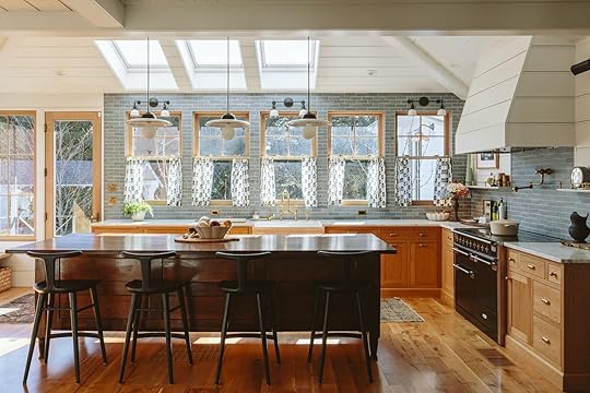
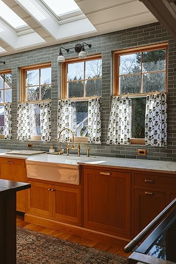
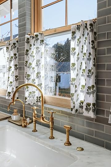
How I Made No-Sew Cafe Curtains For My Kitchen
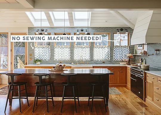
While I have done many DIY projects in my life, I don’t know if I would consider myself an “expert”:) I’m not without skill but I’m also not a DIY influencer (plus, the wonderful Marlee and Gretchen are incredible DIYers and are always here to help me!). Those designers are so freaking talented. So believe me when I tell you that anyone with an iron can make these incredible sweet curtains. In case you missed the last post where I wrote about the final two fabric options, these block print ones may have come in second to my beloved Boro ones. What can I say, I can’t get enough, ha. But I still think they are so sweet and I am about to take you step-by-step on how to make your own. There are infinite places to put a cafe curtain so once you learn the steps, let your imagination go wild:) Let’s get into it.
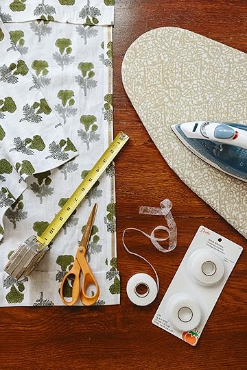
These curtains were so easy to make. A little too easy. Here’s what you’ll need for fast and dirty cafe curtains:
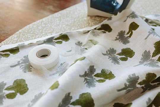
Measuring tapeFabricFabric scissorsIron on seam tapeIron and an ironing boardCafe pinch ringsCafe tension rods
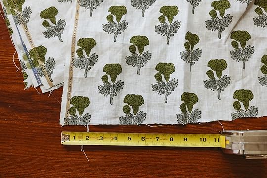
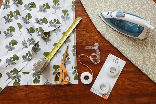
Start by measuring your windows to figure out what size to make your cafe curtains. You may need to experiment with how much or how little fabric to use, depending on the amount of gathering you’d like the curtains to have. Our windows are 30″ across, and I knew I wanted the fabric to stay somewhat pleated even when closed, so we’d have to account for that in the fabric measurement and add to the total length. We cut a few scrap pieces to play around and find our perfect gather amount and then decided on a final width. Because we’re making two panels per window, we landed on each panel being 38″ across, and made sure to leave seam allowance on all sides.
Before cutting each panel, decide on the overall length, where you will hang the curtains from, and take into account the size of the “hem” you want at the top and bottom. For us, about 3″ felt good, like traditional curtains. For the sides of the panels, we allowed for about an inch on each side to give it a clean edge. We cut out our 10 panels (two per window) and gave them a quick pass with the iron. Then we folded over the side seams and pressed those to give them a crisp edge, and repeated the process with the larger top and bottom hems, making sure to fold under the frayed edges.
Once we had a fairly clean hem guide, we used iron on seam tape to hold everything in place. This stuff works great and I’ve used it in a number of other projects. It gets the job done fast and is fairly forgiving if you mess up or need to start again.
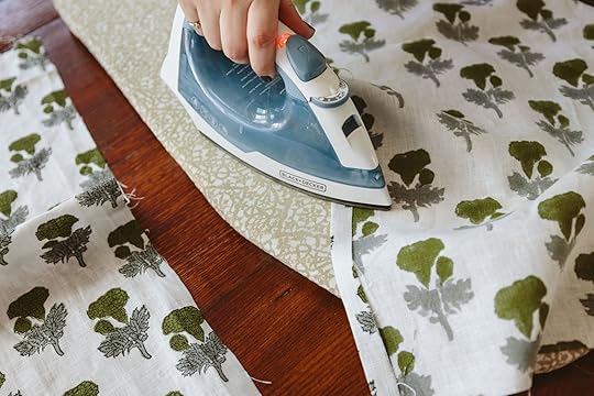
You place the tape flat in between your fabric folds and press your iron down to create the bond. We used a high heat setting because our fabric was linen, but follow the instructions on the box and according to your chosen fabric type. Using a damp cloth in-between the fabric and your iron can help with fusing if for some reason the iron isn’t enough to set the bond.
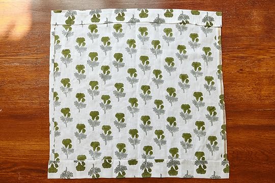
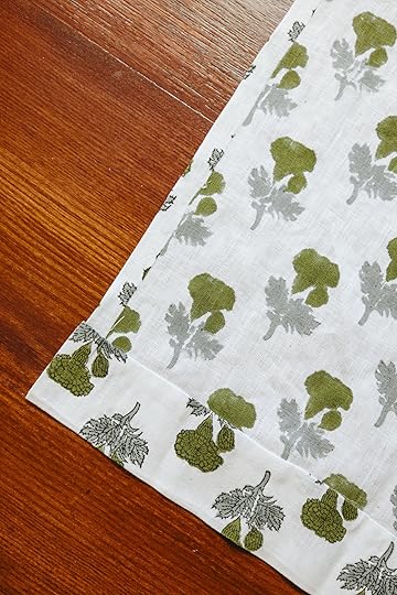
Keep placing the seam tape and pressing your iron across all the edges until you have a finished panel. Is it the most perfect thing you’ve ever seen? No! But your edges won’t fray and because the curtains are designed to stay gathered whether opened or closed, the imperfections will disappear into the folds.
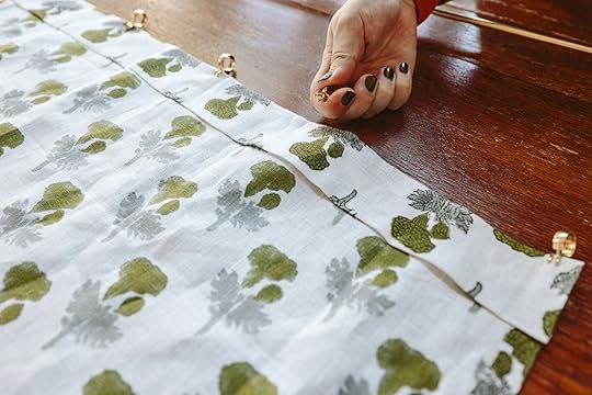
Now you may be wondering where the rod pocket or tabs are to hang the curtains. That’s the beauty of this crazy simple DIY–you don’t need them! Instead, we found these great pinch ring clips from Rejuvenation which grab directly onto the fabric, making it really easy to throw it all together. Our fabric was reallllly thin, and the pinch clips didn’t want to stay gripping, so if you run into the same issue, all you have to do is pull the rings apart some to create more tension before you pinch them onto the fabric.
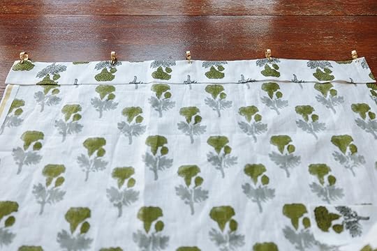
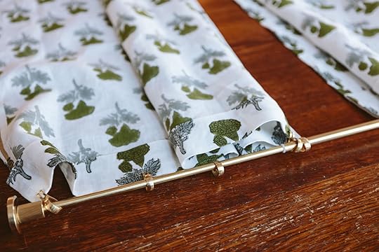
The best part is these clips are very easily moved. We played around with how many would be needed to create the right amount of pleats and landed on five per panel, spacing each clip out across the fabric evenly. All that’s left is to slide the two panels onto each tension rod, and hang them up!
OUTRO
*Photos by Kaitlin Green
The post How I Made No-Sew Cafe Curtains For My Kitchen appeared first on Emily Henderson.
February 25, 2025
Our Outdoor Project Update – Phase 2 Is So Exciting (AND FAST!)
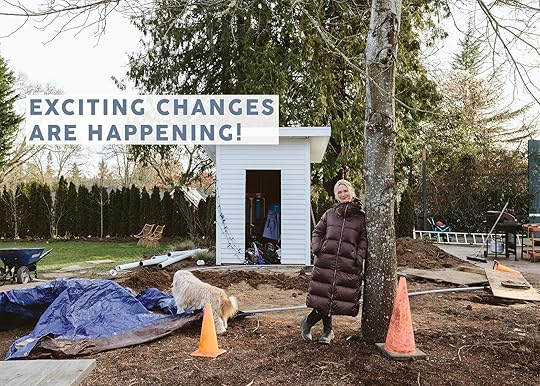
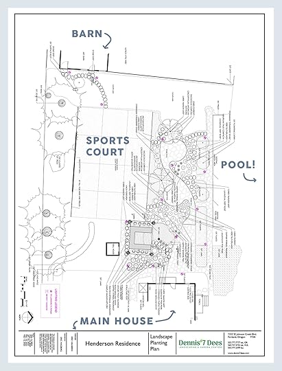
This will be our third summer living here and we have learned a LOT about how we use the backyard. First off – we love to have huge multi-family neighborhood gatherings (our school community is so awesome) which included a few fundraisers (and now an annual “wine and swine”‘,”, lol). They are basically family frat parties and they are SO MUCH FUN. We knew that at one point we’d want to have a proper area to grill and cook, but they can be such an investment so we wanted to wait until we knew exactly where it should go before we tore up whatever we needed to to make it happen. Plus, we needed to save some money and gear up mentally for having construction here again). We reached out to Dennis’ 7 Dees in November in hopes of doing it in the winter and being done by spring and I’m THRILLED to say that they are killing it. I love the design (shout out to Eric) and my goodness their team is moving so fast and they are so skilled. We feel like we are in very good hands.
So I’ll walk you through the goals and the big old plan:
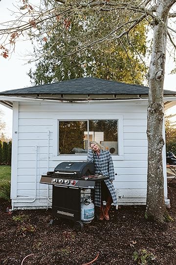
A Gazebo Grilling Area For Big Ole BBQs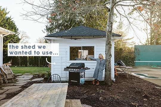
I wanted to turn this cute shed into the outdoor kitchen so badly but it was in such bad shape (foundation crumbling, wood rotting, blah blah) so all the experts involved gave us the same review – it needed to be torn down and rebuilt. But the location of it was PERFECT for the kitchen – right in the middle between the future pickleball court and the lawn, but not too far away from the house. I’ll likely write a separate post about all things outdoor gazebo/kitchen. We are working with RTA Outdoor Living and so far the process has been incredible, and we should have them delivered in a month – so much faster and more affordable than a custom kitchen BTW. We are building a deck with a covered gazebo for hanging out, with the kitchen inside of it. I’ve hired my brother’s company (recently started with a friend) and I’ll link them up as soon as they get all their social and website stuff going. They are doing such a great job on this gazebo/deck/kitchen and our storage garages.
The “Sports Court” Is Just Too Big
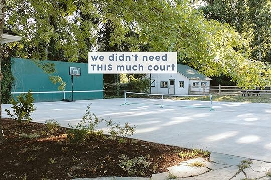

Y’all this is one of the most expensive and regretful mistakes we’ve made to date!! Congratulations on being here to witness it. Now, I think I can give credit to Brian and maybe even my brother for this one as the sports court was Brian’s domain. Also, we need to remember the OG court was literally twice this big before. But despite reducing it in half it’s still too massive and we really just want the size of a pickleball court. But even worse, it’s just not the vibe of the farm. Too much cement, not enough nature. And I think since the pool/jacuzzi is so small (11×14 and we LOVE IT) it just all looked so out of proportion. We waited on properly resurfacing it with the pickle ball lines (which admittedly would have helped it look less like a parking lot) which I’m grateful for. When we reached out to Dennis 7 Dees to help with the landscaping I threw out the wishlist of reducing the size of it, and while it was a huge expense ($15k) they made me feel so comfortable and sure that it was the right move (and that they could do it properly without cracking the remaining concrete). It’s already gone and I can kinda see the future greenery and I’m so excited.
What’s Going In The Place Of The Now-Demo’d Out Portion Of The Sports Court?We want to create a more natural park-like setting. More greenery and shrubs that hopefully your eye goes to first. We’ll add two small flagstone landing pads for picnic tables with paths connecting them for more seating for families (and future events). We are also putting in three large trees (shout out to Big Trees Today – they have larger trees and they plant them for you and guarantee them for a year). While it might take a while to really grow in, we are buying a lot of plants from Monrovia that are more mature in hopes of having it look better sooner.
Clover Lawn Near The Paddock
While we didn’t hate the area by the fenceline where the animals are, in the summer it looked like garbage. Plus at one point they trenched up a bunch to put electrical into the barn and never covered over it so there are these huge dangerous trenches that are now solid as a rock from the sun. 7 Dees had a beautiful plan for this area, but frankly, due to budget, we nixed all their pretty plans in favor of just installing a seeded clover lawn. Brian needs this area to wheel over all the animal food and honestly, we just had to reign in the scope at some point. We might add more shrubs at some point but without irrigation (which we opted not to do also for budget purposes) we aren’t sure what will survive our rather long and hot summers. We’re putting in a path there from the sports court to the art barn
Well, this is the real question, right? When we found it 5 years ago we knew it would be a lot, but similar to birth and parenting you really don’t know what you are getting yourself into until you are in it We know that this property is our business, essentially, and where we do a ton of partnership photo and video shoots. Additionally, since we are a farm in the middle of the city (that is also zoned for commercial) we do think future events, retreats, small corporate off-sites, or parties could happen here (likely after the kids graduate high school). So when making improvements we are thinking of what will make it desirable to rent out and how it can be beautiful and really functional (i.e. a janky 30″ BBQ wasn’t exactly going to draw in the big family reunions or big summer BBQ fundraisers). It’s a dream property for us, but as our family business we are hoping to be able to create some revenue from all this hard work someday (let’s just I have serious DREAMS of running some design, antique, and wellness retreats here. And then long term maybe I’ll insist that my kids and grandkids live here while Brian and I retire and live in the barn… Real Mormon commune stuff that I am certainly not above. My parental manipulation abilities (to spend time with my kids) knows no bounds!
It’s certainly a lot, and we feel so incredibly lucky to be doing it. And again a huge shout out to Dennis 7 Dees (landsape design and construction as well as two awesome Portland nurseries), Monrovia, Big Trees Today (Portland-based Tree service), and RTA (Ready To Assemble Outdoor Kitchens). While some of these companies have discounted services for photography/PR trade, my personal experience thus far has been incredible. More to come soon.
*Photos by Kaitlin Green
The post Our Outdoor Project Update – Phase 2 Is So Exciting (AND FAST!) appeared first on Emily Henderson.
Emily Henderson's Blog

- Emily Henderson's profile
- 10 followers

