
Emily Henderson's Blog, page 21
April 3, 2025
10 Online Sources You Might Not Know For Collecting Super Cool Art (Whether You Have $40 or $4,000) + A Quick Ask the Audience

Six years ago, I knew I wanted to create a baseboard-to-ceiling gallery wall in my dining room. The wall was already a deep, rich jewel tone, so the art I selected was fairly neutral. Now, over half a decade later, most of that same art lives in a very different room in another home on a white wall, and it’s just not exciting me like it used to.
I want to draw attention to my phrasing up top because it was fairly deliberate. “…the art I selected.” Of the 15 pieces that comprised my gallery wall, I owned five of them previously. Things I acquired (the MaryAnn Puls mixed media at the top right, for instance) or made (like that big black and white photo of the pencil shavings my husband photographed or the EHD “compliments” papers) over the years prior, but all the other 10 pieces were picked quickly online and rather unceremoniously just to fit a “vibe.” At the time, it felt okay. Though to be honest, it was a bit soulless. And art should never be soulless.
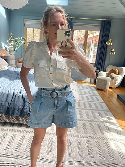
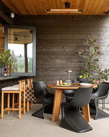
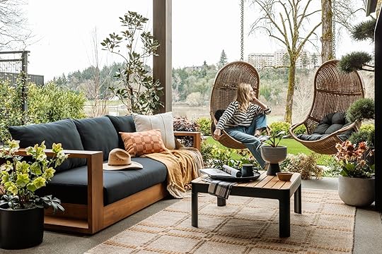
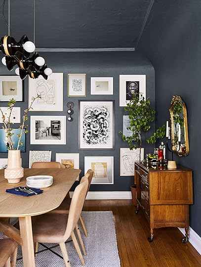 design by arlyn hernandez | photo by sara ligorria-tramp | from: arlyn’s moody dining room reveal is all about the insane power of paint
 i actually have some photos i need to frame for some of those blank spaces on the top left that i’m just remembering as i look at this.
I realize now that my approach to it was all wrong. In my opinion (now), art is something you buy because it touches you or means something to you, whether it’s $5 or $50,000, bought online, at a gallery or flea market. Curation is one thing, “filling holes” is another.
My bedroom, on the other hand, actually has art I sourced and saved over the better part of a decade (including a scroll that Charles brought me as a gift on our first official date; it was from China when he visited during a semester abroad). And I love it.

Anyhow, I’m exploring the idea of starting to collect art for both my living room and my home in general that feels more “us” now. If it were up to my husband, everything on the walls would be a photograph straight from his camera. Me? I like a variety of media (and am particularly enamored of embroidered art these days). And while I knew for a while that my heart wasn’t content with my walls, it wasn’t until I saw Dan Pelosi’s gallery wall in his “library”, heck just all the art in the home he shares with boyfriend Gus Heagerty, that I realized why: that feels like the personality I’ve come to know of him online. Authentic and unapologetic. My art? Besides the actual photos of our faces, it could be anyone’s walls.
View this post on InstagramA post shared by DAN PELOSI (@grossypelosi)
View this post on InstagramA post shared by DAN PELOSI (@grossypelosi)
I’m not rushing to refill my frames for the sake of change, because then I’d be in the same position then that I am now. Instead, I’ll take my time. If I find something at an estate sale or thrift store or basically anywhere and I love it (and can afford it), I’ll buy it and find a home for it. Too long I’ve spent filling spaces in my home just to get to the end product (mostly so that I can photograph it), and I’m getting to the other side of that; I’d rather stumble upon or hunt down things I live and then place it somewhere. If that means something has to sit empty for a while, so be it.
Now, while I know many, many people would recommend finding second-hand or vintage art, that wouldn’t be much of a resource guide for anyone here. That’s my caveat for today. Here, I’ve compiled a list below of places online where you might want to start collecting art from—or dig around to find artists you love so you can follow and support them individually. This is in addition to doing things like going to local art walks, digging through local thrift and antique stores, deep diving into Etsy or 1stDibs or any other in-person means to discovering art that excites you.
So, if like me, you are hungry for some meaningful, beautiful, personality-filled art at different price points, read on.
1. Tappan CollectiveView this post on InstagramA post shared by TAPPAN (@tappancollective)
Tappan Collective is a Los Angeles-based gallery with a strong online presence. The founder, Chelsea Neman Nassib, believes everyone should be able to follow an artist’s career and collect pieces they love. Their roster includes up-and-coming artists as well as mid-career artists. While many of their original pieces are in the thousands in terms of price (out of my league), they do sell prints starting at about $100.
2. Head West StudioView this post on InstagramA post shared by @headwestprints
Okay, hear me out here. Head West Studio mostly features art that is themed around Western imagery and cowboy culture (is that a thing?). That is not my look. But there is just something about the colors and art styles of some of their pieces that always makes me do a double take, particularly the Melissa Lakey series. The cut paper works by Andrea Cira are also incredibly cool, depending on the space (not every room can carry a large armadillo artwork, after all…or can it??). I may not always live in California, so I can definitely see myself collecting something from here to mark my time out west. Prices start at around $50 for a small 8″x10″ unframed print.
3. House of SpoilsView this post on InstagramA post shared by House of Spoils (@houseofspoils)
When I think of Los Angeles “cool factor,” I think of House of Spoils. I’ve actually worked with them to borrow art for photoshoots in the past when I worked at a furniture company, and they were really great. If you’re in the Southern California area, you can make an appointment with a team member at their Venice gallery to walk you through their collection of lifesetyle- and adventure-focused fine art photography. Prices start at $165 (with a free membership sign-up) for smaller prints, and everything comes matted and framed.
4. UptonView this post on InstagramA post shared by Upton (@upton_home)
Upton is both an art and home brand from the artist mind of owner Michael Upton. While they do sell prints on paper, my favorites are the prints on canvas and woven art. It’s a small collection, but I just like the simple yet punchy and graphic nature of the works. A hanging canvas like the one in the image above runs you right around $200.
5. Saatchi ArtView this post on InstagramA post shared by Saatchi Art (@saatchiart)
Saatchi is definitely for the most seasoned art collector, with a budget to match. You can work with them to acquire original paintings, photography, sculpture, and drawings, but if you’re still in the “gotta keep this under a few hundred” group of art enthusiasts, you may want to stick to their prints. What’s cool about their sites is that they include the price of the original along with the print in case it’s something you want to consider acquiring. Usually, a print and the original are fairly far removed on an artist site, and I like how they are married here.
6. PSTR StudioView this post on InstagramA post shared by PSTR studio (@pstr.studio)
I *feel* like I’ve written about PSTR before, but I simply cannot remember so I apologize if you’re thinking “yes Arlyn, we know already.” Actually, I don’t apologize because we all need reminders sometimes! PSTR is fairly on par with a lot of websites like Society6, for instance, that sell really affordable art prints, but to me, it feels so much more pared down in a good way. They also offer framing and matting for incredible prices (starting at $43 for the frame and $11 for the mat plus free professional mounting for a poster that’s 30×40 cm). The works of the artists they sell are exclusive to the site and super modern, punchy, colorful, and graphic.
7. 20×200View this post on InstagramA post shared by 20×200 | It's Art for Everyone
(@20×200)
For nearly two decades, 20×200 has offered a tight collection of limited-edition, museum-quality prints, photos, and artist-made works. They focus on emerging, established, and “legendary” artists, as they say on their site. Their mission states that they want everyone, no matter their budget, to be able to collect limited-edition art, so they have a super wide range of prices, though each piece comes numbered and hand-signed by the artist with a certificate of authenticity. I really like how they organize their art by room, theme, color, and mood so you feel like you have somewhere easily to dive in and start exploring.
8. Art FinderView this post on InstagramA post shared by Artfinder (@artfinder_com)
Art Finder, I’ll admit, is pretty overwhelming, but if you have the patience, you’ll likely find something really special. They are all about connecting the collector directly with the artist who sells original works from all across the globe. Kind of like Etsy but just for art.
9. Uprise ArtView this post on InstagramA post shared by Uprise Art (@uprisenyc)
I love Uprise Art and hope to collect original pieces from here one day. They have a gallery space in New York, but make it very easy to buy online. There’s something so charming to me about the floral paintings of Andrew Alba, and on the flip side, the contemporary shapes and colors of Scott Sueme make me dream of owning something from his current exhibition. They do also have pieces under $350! If you’re looking to start collecting original works and love contemporary art, definitely pop over to see their collections.
10. Etsy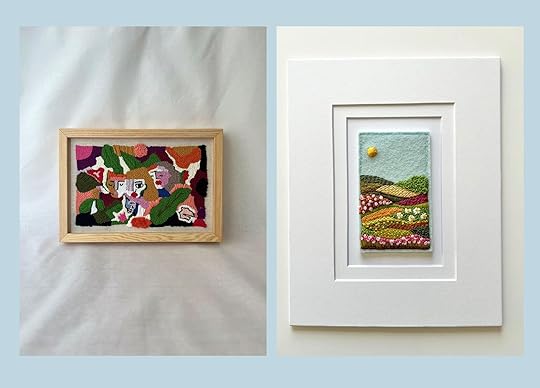
Left: Talking Yarns | Right: Dutch Wool Designs
I know I mentioned Etsy earlier on but I did just want to showcase some of the sweet embroidered art I’ve been loving so much as of late. You know that art you look at and think “Psssh, I could do this,”? Well, this isn’t that for me. Sure, maybe if someone gave me an exact template/pattern and I had tremendous patience, but let’s be real…I’m not doing that. Anyway, how sweet is that petite rolling landscape from Dutch Wool Designs? It’s like 4 inches tall, which makes me love it even more. Not all art needs to be hulking and giant to make an impact. Sometimes, putting a tiny little thing somewhere unexpected can speak similar volumes.
—
So now I have a late-to-the-party Ask the Audience. What artists do you love? Do you follow? Have you purchased art from directly? I’d love to hear some names and research their work to keep an eye on over the next few years. I fancy myself being able to support their work over time, collecting pieces for our home, so please do help a girl out by giving me a head start on artists to give some love to.
Thanks as always for being here and reading my words.
Until next time…
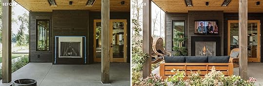
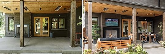
Opening Image Credits: Design by Arlyn Hernandez | Photo by Sara Ligorria-Tramp | From: Arlyn’s Moody Dining Room Reveal Is All About the Insane Power of Paint
The post 10 Online Sources You Might Not Know For Collecting Super Cool Art (Whether You Have $40 or $4,000) + A Quick Ask the Audience appeared first on Emily Henderson.


April 2, 2025
In Search Of Weatherproof Outdoor Stools (That Will Actually Last In Oregon)… Oh, And We Need 10
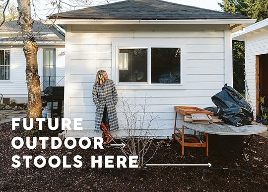
I’ll be the first one to admit I used to get wrapped up in style and de-prioritize longevity (less so now, but still). Loving things that look good is not only my job but in my blood. But when it comes to things being left outdoors up here in Oregon, my #1 priority was to have it last so that it didn’t become my problem later (and obviously very bad for the environment). Now, if you are a normal person and you are good about “covering or storing your furniture” then you have more flexibility with your choices. But for these stools (that will be under a gazebo) I didn’t want to have to store them (y’all we need 10-12) nor cover them, so my search changed to “most durable” and “long-lasting” in addition to “classic + modern”. I’m a style snob and I need them to look good, appropriate for a farm-style BBQ area… that is getting admittedly kinda fancy. So today I’ll show you all that I considered before honing in on my real needs, at many different price points (from $50 each to $1,100 each). And you bet you’ll see what we ordered.
But first, and why this was more of a challenge, my biggest fear is that in 4 years, 3 of the 10 will be broken by my partying guests, and then what? What if they aren’t available anymore? What if they rotted even though they said they wouldn’t? Then we have 3 mismatched stools? Hell, no. And unlike indoor dining chairs, trust me outdoor furniture will not last as long unless you are vigilant about covering or storing (as mentioned, we are not). Similar to pets on furniture, I know that many of you will just say “Grow up and just join the rest of us” (ie. no pets on furniture and cover your outdoor furniture), but I’d rather find stools that can last a long time AND withstand the elements while looking good. Possible? (and I like to cuddle with my dogs…)
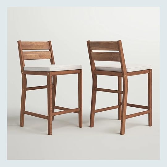
Fitzrovia Upholstered Counter Stool (Set of 2)
Now, as I was shopping these stood out for their affordability (making 12 of them $700). For classic stools that are super affordable, these had me at $57 each. Now that price point indicates it probably won’t last 10 years (I have no evidence of this, just being judgemental based on my experience) so this one isn’t for us, but y’all these are classic and nice for $57 each:)

We used these at my brother’s house and I LOVE them. They are at a higher price point ($700) and while I might have been able to get them partnered I was honestly still worried about wood outside for years. My only beef with these is that if you take off the cushion it’s just the webbing, meaning that you can’t use them without. I wish they had made the seat wood so if I didn’t want to have to deal with the cushions year-round in the rain I could just leave them out without the cushion.
If I wasn’t worried about upholstery outside (which I am) these are GREAT. Multiple finishes and so nice looking. Alas, not for me for this project, but I love these.
Ronaldo Polyethylene Wicker Outdoor Bar Stool
These were a solid option since they are plastic and wood (not natural material) meaning, they should last a lot longer. Very handsome and classic.
Lesley Metal Frame Patio Bar Stool
These don’t fit our style but I did appreciate that the “wood” is actually metal (which typically I would not like, but again for longevity maybe it’s better?).
Yvaine Franc Teak Patio Bar Stool
So pretty and very tempting. Do I think we can leave them outside for 10 years uncovered? Probably not. But I love.
Ruta Outdoor Counter Stool (Set of 2)
Now they are SOLID contenders. More affordable (2 for $350), metal, and has a nice classic shape. They look ergonomic and they come in a lot of colors. Stylistically are they as pretty as ones with upholstered seats or mixed material? NOPE. But they are good and look like they will last (but I have zero proof of that TBH).
Farrah Solid Back Outdoor Bar Stool (Set of 2)
Another solid contender that I showed Brian. More bistro style than farm, but classic nonetheless. You could always add cushions in the summer. I was very tempted by these…
Dark Green Metal Stackable Outdoor Barstool (Set Of 2)
For a second I thought maybe backless would be better so they could tuck underneath the counters. But they felt too contemporary for our gazebo kitchen.

I LOVE these, but there were two things wrong with them – $600 each (x 10 = $6k) and 10 weeks out. But they are classic, feel right for the more farm-like vibe and the color is fun. This brand (Fermob) is powder-coated and lasts a long time, but that price point is steep!
THE WINNERRR!!!!!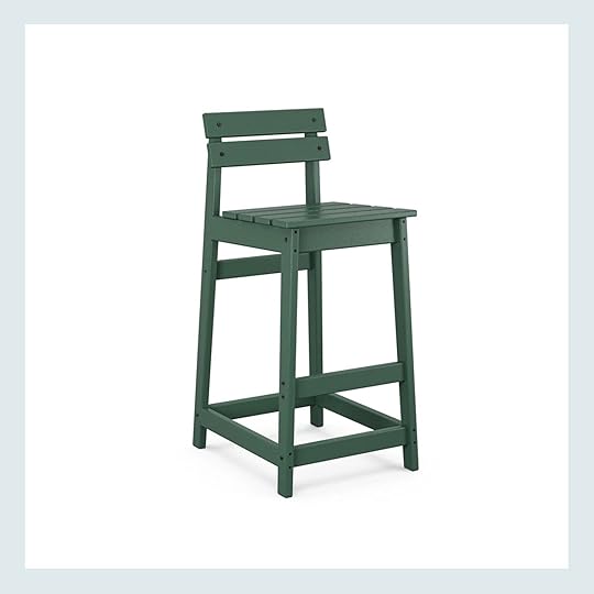
Modern Studio Plaza Lowback Bar Chair
As I was shopping I was like “Wait, what is that company that looks like wood and says they last forever” and I remembered Polywood. So I took a peek and not all styles were right for me but then BOOM, their modern low stool felt perfectly farm and classic. I loved the green (was tempted by black and white), but the best part is that they are guaranteed to last for 20 years. The “wood” slats allow water to go through and also feel farmlike at the same time. After hours of showing Brian all my options, he said “Oh yeah, get those” and I put 10 in my cart. At $200 a piece (not nothing, but felt appropriate) I felt really good about it. I did reach out via IG to see if they wanted to do a PR trade for my services and they did, but these are my stools no matter what. Also, they were made to order and still shipped within 2 weeks. I feel like once assembled and in place I’m not going to have to think about them for the rest of my life and all 10-12 of them (still figuring that out!) will LAST, will hold all of my friends easily, can be left outside year-round (still under the gazebo, but not covered). Plus, that pop of green will liven up the white outdoor kitchen. More to come, but I’m so excited to have the confidence that these will last forever (and are literally guaranteed to do so). You’ve seen their Adirondack chairs everywhere for a long time (sold by a lot of our favorite brands – VERY popular) but if you are in the market for outdoor chairs, stools, or sofas, check out Polywood. We are very excited 
Opening Image Credits: Photo by Kaitlin Green
The post In Search Of Weatherproof Outdoor Stools (That Will Actually Last In Oregon)… Oh, And We Need 10 appeared first on Emily Henderson.
April 1, 2025
Team Building (And Bonding) With The Best Team Ever…

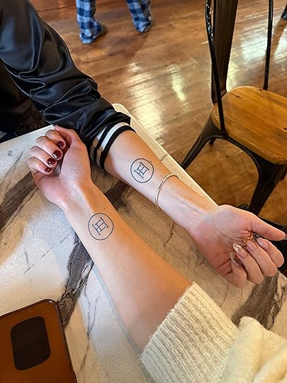
It’s no secret that one of the most fulfilling parts of my life is leading this crew of incredibly talented, smart, and creative women. I often feel like we are colleagues and friends instead of me being their boss because I love hanging out with them so much (let’s just say there are a lot of HR violations in the way of conversations during photo shoots or retreats). So last year when we were in Mexico we did a thing that for the record was NOT my idea, but when they got all worked up about getting matching tattoos I was three margaritas in and overwhelmed with love for them – I was NOT going to be the one to say “no”. I waited to see if anyone hesitated and everyone really, really wanted to do it. So with the enthusiasm that only comes with inebriation, we found a tattoo parlor in Todo Santos (outside Cabo) and sat down.
Luckily the EHD logo is really simple, so once we showed it to the tattoo artist (who should have been more skeptical about our inebriation level) we figured that even if someone does eventually leave the company, it’s just a simple circle with some lines in the middle that they can add to. Everyone agreed that regardless of what happens in their career this tattoo would represent a time in their lives, a really special era that meant something monumental to them. I couldn’t disagree.
So like the enneagram 7 that I am (enthusiastic! wanting to be popular!) I was THRILLED with this tattoo, knowing that at least I wouldn’t have any regrets because it’s my own logo. Did I worry they would? Not at the time.
Some of us have a lot of tattoos like Gretchen (which I think looks pretty great with hers). Caitlin also has a ton of awesome ones. And while Marlee wasn’t on the team during our Mexico trip, she has a few tattoos already and was really down to get another since we’ve all bonded so quickly. It seems like once you have a few most people are pretty down to get more.
While others (myself) this was my first one and it hurt! Luckily that 4th margarita kicked in just as any last hesitation of “bad judgment” slipped away. Funny how that works. Inebriation = adios inhibition.


It is quite possibly the best feeling in the world knowing that your team loves you so much that they’d tattoo your logo on their bodies, permanently. I received it as such an honor, truly.


When we got home Brian saw these all, was absolutely shocked, laughed a ton, and made fun of me, naturally. But listen, that guy has so many sentimental tattoos each one representing someone he loves. He has the plane his dad flew in Vietnam, the oak tree from his backyard (for his mom), a bear for Charlie, and a bird for Elliot. He claimed that the moon was for me because our song is Dancing in the Moonlight, but it felt like a copout to me.
So after guilting him a teeny tiny bit (“My team loves me so much they got our logo on their bodies, you can’t even get my initials!”), he surprised me with his new ink. And I was FLOOORED. After 25 years together, it felt enormously loving to see this on his shoulder.

So thank you to the best team and husband for doing this life with me. I hope this isn’t our last tattoo together I love you all so so so so much. xx
Also…April Fools
The post Team Building (And Bonding) With The Best Team Ever… appeared first on Emily Henderson.
March 31, 2025
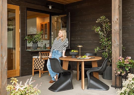
I’ve Been Secretly Decorating My Best Friends House – Living Room Reveal Today!
People use the word “thrilled” far too often when it should be reserved for me in moments like this. When it comes to this house I’m like a proud grandpa shoving wallet photos of my grandkids into strangers faces. Expect pride + bragging, with a big dose of personal bias. This is one of my best friend’s homes in Portland and I weaseled my way into decorating it because I wanted my hands on this house (and I needed a solid excuse to hang out with them frequently). It wasn’t a secret, but it was a project I did on the weekends so I haven’t really shown it to you. Nicole and Curtis are two creative executives who are very cool, have great taste, and really appreciate good design. They are willing (and able) to invest in awesome pieces because they value good craftsmanship, and are even willing to sacrifice a bit of function for more style (YAY!!!!!!). And yet with two tween girls and very busy lives, it had to really work for them. This house is really traditional (A colonial from the 30s) so the goal was to, of course, work with the home’s style, but in an edgier, more youthful way. Think “Soho House” as their designers do such an incredible job of taking risks within the style they are leaning into. Now, when I joined the project the paint and wallpaper were done (they did this before they moved in) so I inherited these elements that were a bit risky and frankly not what I would have chosen, but I LOVED THEM and I was really excited that these risks were taken. They have worked with Max Humphrey so I believe he weighed in on some of these decisions, but he was super busy working on another project of theirs so I took over. I pulled together a plan for all the furniture, rugs, and decor (and Max did the window treatments, bundling them with the other project). Basically, I got to do the fun stuff, and they had an assistant who handled all the minutia and labor (unpacking, booking electricians, returns, etc). We did it over a year and I knew that someday we’d shoot it, but it really was more for fun (nothing was sponsored or gifted…at least not for this project). So yes, it took about a year, meeting on weekends here and there, and me badgering them with mood boards or links for stuff for them to buy on Saturday mornings. It was 100% fun and I consider it a true gift that I get to use my job and talents to hang out with my best friends in the name of “work”. I suppose these are the perks of being best friends for 30 years
This is a real story in color and cohesion within a juxtaposition of styles because as we reveal this house (four rooms done thus far) you’ll see how they all flow and yet each room has a very distinct vibe. They all talk to each other in a way that feels so vibey (you are getting peeks into the other rooms here, of course).
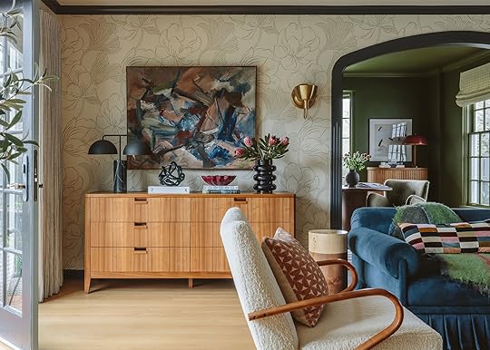
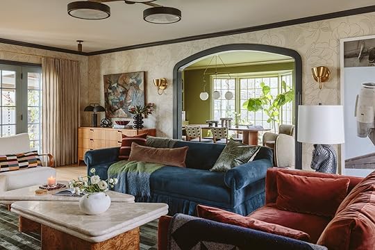
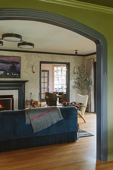
The Living Room (Which Is Also Their TV/Family Room)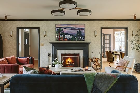
Wallpaper | Trim Color | Sconce
This room needs to function as both their living room and TV room, so we set it up to do that job. There was nowhere else to put the TV except over the fireplace, which I think looks pretty great here (it’s a Frame, obviously). We flanked the main sofa with a small loveseat (super comfy) and I sold them my vintage chair that I had recovered in a cream boucle.

Chair (vintage) | Pillow

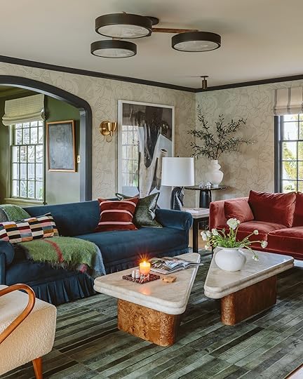
Blue Sofa | Striped Velvet Pillow | Loveseat | Coffee Table | Rug
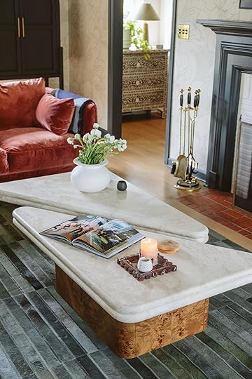
The room is so cozy, the tones are so warm, with a really good amount of contrast and balance. The sofa was a big purchase from the Sarah Sherman Samuel Atelier and it couldn’t be more beautiful. It is very very very firm (we were surprised) as it looks more loungey. So we took off the back cushions and put pillows to help it be more loungey for TV. We did it in a really pretty blue velvet from the Kate Ause Studio in Portland (the nicest showroom owner ever). The coffee tables are from Soho Home, so heavy and the organic textures of the marble and burl wood are incredible (very jealous).
If you want to see a video walkthrough of the space – we’ve got it for you here…(just wait for the ad to play!)
The ceiling fixture is stunning, from Urban Electric and I love how it makes a statement, adds a lot of light being three fixtures and is still really short (close to the ceiling). This was super splurgy, so it seems like there is a hole in the market for more affordable versions.
The green suede rug was chosen because of its rich tonal colors, but also because suede rugs are impossible to stain and this room is a pass-through room so I knew it would get a decent amount of traffic. I chose it way before our new rug line came out with so many pretty green rugs so of course I wish that were in there instead, but admittedly this rug is rad.
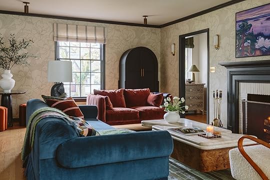
The rust velvet loveseat is where one of the girls lays down to watch TV (it’s so soft and comfy). We switched out their big canned light with these pretty brass spotlights which might not create as good of light but it looked so much better in this older home. The big arched hutch is from Lulu and Georgia and really helped anchor the space and balance out all the dark trim.
They had that dresser forever which works well here, and I shopped and brought a lot of my own props to style it out. Sneak peek into their green dining room that I can’t wait to show you But also look at that sofa – it’s just ridiculously beautiful (that arm! the skirt!). I was so glad that Nic and Curtis were all in to get it.
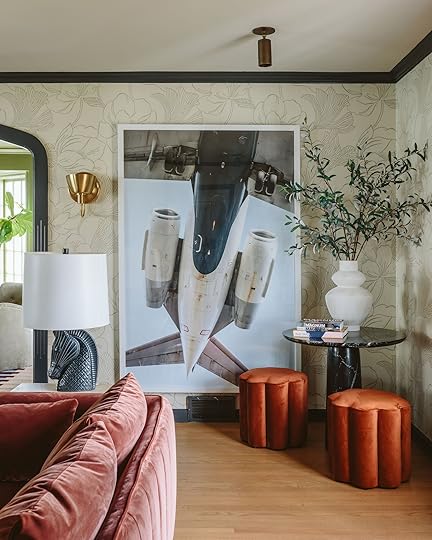
Art (unavailable) | Gold Sconce | Marble Table | Vase | Orange Ottoman
They had that massive photograph from their old house which at times I was worried was too intense, but it also really helped edge up the floral wallpaper (Farrow & Ball, incredible). The black marble table is CB2 and we just found those scallop ottomans at World Market which we were nervous were tonally off, but ended up loving them in the room (and they were $130 which felt like a good price).
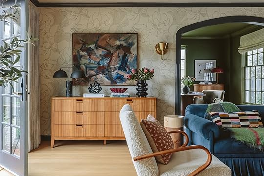
Art (vintage) | Lamp | Dresser (old) | Bowl
I found that vintage painting at 20th Century Interiors, which is a Scandinavian vintage dealer in Portland and if they didn’t love it, I was going to keep it. It’s so beautiful.
I’m so excited to show you the other three rooms. And let me know in the comments if you want us to pull together a “get the look” but on more of a budget. The vibe is just incredible and I think there is absolutely a way to do this but on a budget. Thanks to Nic and Curtis for making my job so easy and making me look really good – that’s what friends are for
Oh, and of course, here are some VERY fun before and afters…
*Decorated by Emily Henderson (me!)
**Photos by Kaitlin Green
The post I’ve Been Secretly Decorating My Best Friends House – Living Room Reveal Today! appeared first on Emily Henderson.
March 30, 2025
The Link Up: The Spicy Books Em Is Reading On Spring Break, Arlyn’s Dream Undies, And Some VERY Cute Spring Shoes

Happy Sunday everyone. Emily is off on her spring break adventure but fear not. Emily prepped a bunch of really great posts so we promise you won’t feel her absence:) With that said we have such an exciting reveal tomorrow as well as a post about some team bonding we did! Hope y’all are ready. Ok, let’s get to the links!
This week’s house tour is a meticulously restored traditional Japanese machiya in Kyoto, Japan. You have to read the whole article because it’s so special how much detail and consideration went into this restoration. Plus, it’s a little history lesson. Oh, and of course it’s beautiful. Check it out!
From Emily: The book influencer I get all my recs from – especially for spring break. Beach Reads & Bubbly is DEDICATED to all the beach reads, thrillers, romance, romantasy, and fantasy novels. She has amassed a huge following by reviewing them all, creating book clubs all over the US, and our styles are so aligned so I really trust her. She and I were both lit majors so while these books are not Pulitzer prize winners, there are some that are WAY better than others and I love how she breaks them down in ways that mean something to me (spice level, level of world-building, arcs, and character development). We both agreed that Bride by Ali Hazelwood was our favorite book of 2024 if that says anything (I just started Ali’s new book and love it so far). Anyway, on spring break I might dive more into thrillers than I usually do in my real life so I’m looking to Katie to help me decide what to download. It’s truly one of the best things about IG – recs from experts in fields that typically wouldn’t get notoriety (and she’s a generally great follow, adorable, wears cute clothes, and has a really charming accent:))
From Marlee: Recently I ordered some essentials from Sephora during a promo and they gave me a little sample leave-in conditioner by Crown Affair with my order. I just finished the little 1.7oz bottle off (which lasted surprisingly long, maybe 7 or so washes) and loved it. I have fine, somewhat thick hair that is pretty wavy and tends to air dry super frizzy. Since it’s fine, most leave-in conditioners or products just weigh it down and make it stringy instead of hydrated. This leave-in made it super soft and didn’t weigh it down at all, which has been pretty hard to find! It also smells very…luxurious. Definitely ordering the full-size, which is a bit pricy but after seeing how far the product goes it’s worth it.
From Mallory: I needed a new pair of “walk around flats” that are suitable for short walks comfortably around the neighborhood but still look cute and I FOUND THEM. Jess had a great post about the mesh ballet flat trend happening and while I was shopping in store I stumbled upon these cuties! Super comfy, goes with everything, and VERY breathable. Highly recommend if you need a new spring-summer flat!
Well something VERY EXCITING has just happened in the design world and that something is that the ever-inspiring and talented Pierce & Ward have just launched a collaboration with West Elm! We dare you to not want nearly everything. We refuse to choose favorites so go check it out now!
From Gretchen: ‘Tis the season to be tan! The only problem is the sun is acting pretty shy here in Portland and I’m impatient. Thankfully there are quite a few fake-tan solutions out there and this week I tried a new one. The St. Tropez Bronzing Mousse is one I’ve been eyeing for a while and friends of mine have raved about it for years. I finally decided to try it, but as I mentioned, I’m impatient. So I snagged the express version, which promises 1, 2, and 3hr glow options depending on how dark you want to go. There’s some color to this product, which I really like because I can see where I’m going with it. And of course, I can also see how dark I want to be as it develops. My sweet spot seems to be right between 2-3 hours before a quick rinse for a color that feels tan but not obviously fake tan. The smell isn’t bad to me and is hardly evident after a wash. I’ve used it a few times now and really like it, with only one complaint–I need to chill out after I apply it. If I move around too much and break a sweat (hello armpits) the color definitely rubs off. But that’s for sure a “me problem”. It’s on sale at Nordstrom right now (ONLY THRU TODAY!) and also available in a travel size (with a tanning mitt) if you’re not ready to commit to the full shebang!
From Jess: Along with my new ballet flats, I also bought a new pair of sneakers:) I’m very late to the Adidas Gazelle trend but man am I happy I finally jumped on the wagon. I got these green ones because I wanted to add a little pop of color to my otherwise neutral outfits. But what I was so happy about was how instantly comfortable they were and so far no blisters (something I almost always deal with in new shoes). So if you’ve been wanting to add a color something to your outfits, that’s also comfortable, I love my new kicks. Oh, I also needed to size down half of a size.
From Arlyn: I feel like I’m forever on the hunt for the ideal undies. I liked these Pact ones I bought a year or two ago, but I’ve lost a few pounds and they’re a bit big on me now. I considered just buying them again but while hunting for something else on the Felina website, I found these Pima cotton hipsters that I love way more than I thought I would when I bought them (they were 40% off so I thought…why the heck not). The cotton is really light and thin and you can barely feel them when you’re wearing them. They don’t move around to give you the dreaded wedgie, and the waistband—which I think might be a little restrictive—is perfect. They aren’t too low and not too high. So comfortable and perfect for everyday (for anyone who is well past the point of caring about VPL or thong-wearing). Grab those full-coverage undies ladies, and never look back!
Thank you for hanging out with us and see y’all tomorrow for another GREAT reveal!
Opening Image Credits: Photo by Kaitlin Green | From: My Brother’s Kitchen Patio Reveal (Yes, With A Huge TV….Of Course:))
The post The Link Up: The Spicy Books Em Is Reading On Spring Break, Arlyn’s Dream Undies, And Some VERY Cute Spring Shoes appeared first on Emily Henderson.
March 29, 2025
10 “Emily Henderson-Approved” Spring Blouses

I have a big shoot coming up in LA in a couple of weeks and I was tasked to find a wardrobe for a “fun, summer BBQ” which is obviously right up my alley (shooting in Orange County). I need 3-5 looks so I tried on a lot of tops (and a couple of dresses), and these are my favorites FOR SURE. So while I’m out of the country with my fam, here are some cute spring/summer blouses that I really love (just not sure I need ALL of them, but we’ll see). I haven’t really curated outfits yet, just dialing in the top first since that is what you’ll see the most, then I’ll pair it with the right pants/shorts. So if you are underwhelmed by the pants and shoes being the same I get that

Blouse | Pants | Shoes (similar)
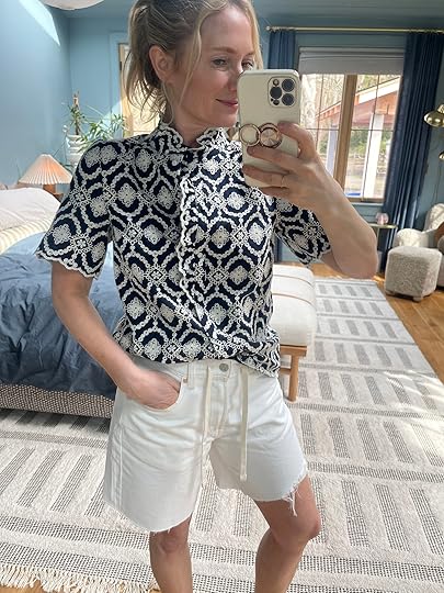
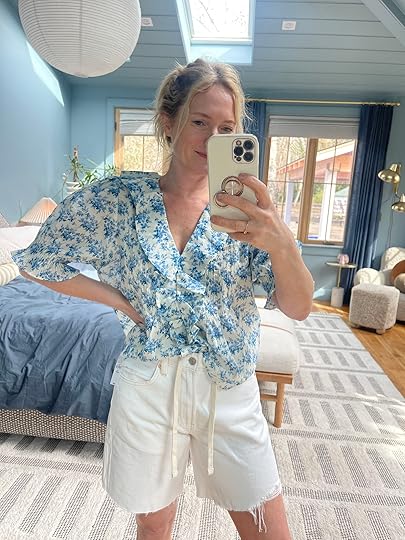
Love this. It’s a solid yes because it’s a good cut, a good color, the embroidery detail is great, and it’s lightweight enough for summer, but still has good structure. The little princess sleeves are so flattering. I can’t tell if I need to size up as it’s pulling a bit in the chest area (wearing a size small), but I love it. The pants are the barrel pants that I LOVE right now (button-fly making them more flattering and the length is perfect). The shoes were from last year and I hadn’t worn them yet (from Beek which is spendy, but I love their shoes so much).

Another Sezane number that I thought would look good with white shorts (not these though). I love this top but my only beef with Sezane is that their fabric is often thick (which is great) but also long and with a straight hem, making them hard to 1/2 or even full tuck. This shirt is great on camera and has a lot of detail, but I wish it weren’t so thick so it could tuck better (and I have a short torso so if you have a longer torso you might not need to tuck).
Blouse (color unavailable, alt same blouse option + blue option) | Shorts
I love this blouse – a lot of detail, but still simple and easy to understand on camera I.e. not busy). It’s lightweight, has covered buttons, and that sweet little collar. I guess it’s all out of stock in this color (sorry!) even though I just bought it! Boo!

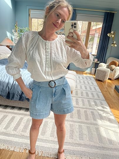
Blouse | Pants | Shorts | Shoes (similar)
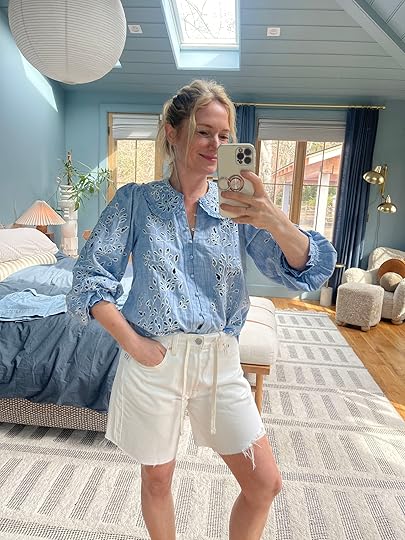
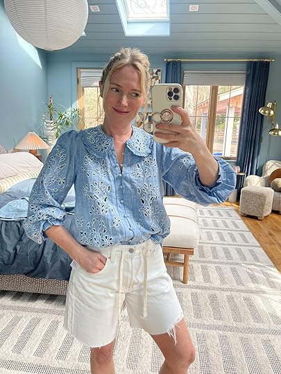
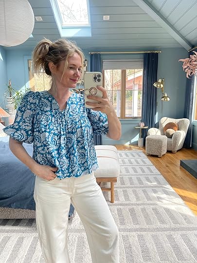
10/10 I LOVE THIS and just ordered the dress version to see if it could work as well. This blouse is so pretty and flattering and the second I put it on I was like “Oh wow, this is so good”. Extremely airy/lightweight, the colors are so pretty, the neckline so flattering, easy to tuck, pretty sleeve details – just perfect. I tried it with these cute new shorts which I really love (and they come in a lot of colors) but I think I like it with the pants more.

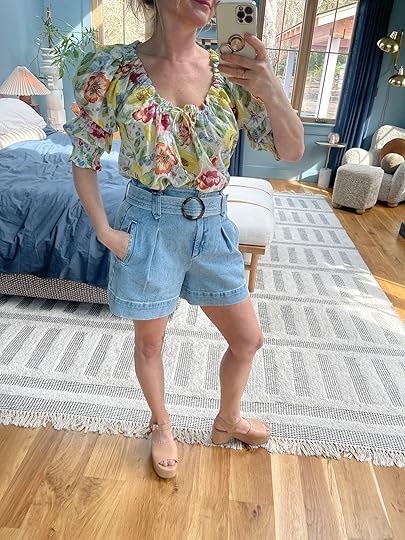
I have this blouse in pink from last year which I love, but my only beef is that it’s really oversized intentionally. This is a small (I just ordered an XS to see if that would fit better). The pattern is so pretty and it’s so easy breezy to wear. Madewell did an almost exact knockoff of this shirt in white that is more affordable, but Doen has these pretty patterns.

LOVE THIS. I’m wearing this top on spring break a lot because no one does, “I still look nice, but I’m not sticky” like Emerson Fry. Such an easy cut to wear, so lightweight, with beautiful colors and patterns. LOVE.
Blouse (color unavailable but here’s an alt option) | Shorts
Here is another one that is oversized (only comes in one size, actually) and I think a better summer shirt than for a photo shoot. Comes in a lot of colors and is so easy to wear. Love those shorts, A LOT.
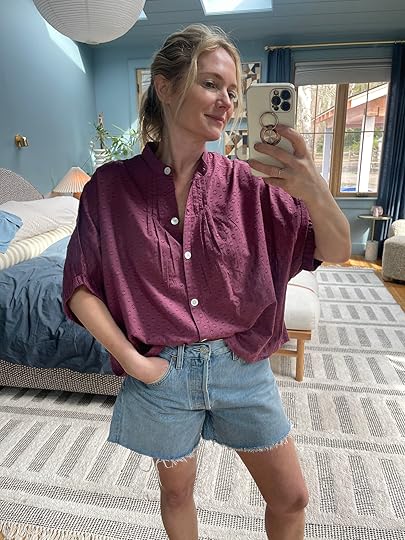
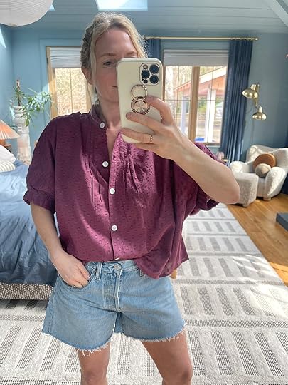
I was excited about this, but I think it’s giving safari in a way that I probably don’t want for my BBQ shoot. I love that top though, a lot. It’s a bit thicker (think denim weight) and is easy to tuck (and comes in a couple of other colors).

This is a nice, sweet blouse, with cute denim shorts – no one is mad at this outfit, but maybe could be more fun?
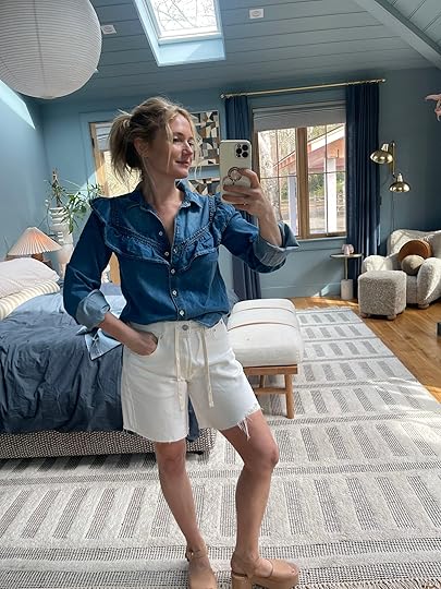

Blouse | Shorts | Shoes (similar)
I’ve been wearing this shirt a ton since I got it – thin, but not too thin, drapey denim with ruffles (that are holding up well after washing/drying a few times FYI). I want it in the short-sleeved version like the white one, too. Those Gap Bermuda shorts are SOLID.
I sent all of these to the client so we’ll see what they choose (and I have more to try on). However, if you are in the market for cute spring/summer blouses I really love all of these
The post 10 “Emily Henderson-Approved” Spring Blouses appeared first on Emily Henderson.
March 28, 2025
Really Good Affordable Outdoor Pillows And Rugs (The Sunshine Is Coming!)

Two weeks ago I pulled together our (mostly) annual outdoor furniture roundup. I hope it was really helpful for anyone needing to fill a new outdoor space or refresh a piece or two in an existing one. But I think it’s fair to say that a solid number of us don’t need a ton of new furniture; instead, we would like to breathe some new life into our mostly decorated outdoor spaces without totally breaking the bank. That’s where those glorious outdoor pillows and rugs come in. By simply swapping out one or both of those elements, your outdoor hang area is going to feel brand-spankin’ new! Now, it’s important to remember that while these items are designed for the outdoors, they do need to be taken care of. It’s not a “set it and forget it” thing as much as I wish I was. Covering when possible is important and definitely putting textiles away when big weather is coming or for the non-warm seasons. That’s how to make sure they stay nice for many years to come.
As an outdoor textile lover myself, it was pretty fun getting to research all of the very good pieces on the market right now. I know the word affordable is wildly subjective, but I did my best with the options available while leaving out some of the historically “affordable” online sites. I also didn’t include throws because honestly there aren’t a ton that are truly meant for the outdoors and if they are, they aren’t particularly affordable. So we suggest finding a cute indoor throw blanket and bringing it in or storing it when you aren’t using it:) Ok, now for the pretty stuff!
Outdoor Pillows
 photos by kaitlin green | left from: farmhouse back patio reveal | right from: a fun fast post about sweet new spring decor
1. Striped Olefin Indoor/Outdoor Reversible Pillow Cover (Set of 2) | 2. Blue Striped Indoor/Outdoor Throw Pillow (Set of 2) | 3. Woven Stripe Tassel Indoor Outdoor Lumbar Pillow
What’s more classic for an outdoor space than a cabana stripe? Not much! All of these options are so great and you can’t beat the price of #1. That’s just over $8 for each pillow. WILD. It also comes in a navy and white option and #3 also comes in two other colorways. But that rust and yellow is very fun:)

1. Striped Indoor/Outdoor Accent Pillows (Set of 2) | 2. Grant Striped Indoor/Outdoor Reversible Throw Pillow | 3. Sunday Indoor / Outdoor Pill Pillow
These ones are a little pricier but so good. I love that olive green on #1. The quality of number two and that happy yellow look awesome and how can you not love that little pill-shaped cutie? Lulu and Georgia is a little on the higher end side of things but man are their outdoor textiles insanely good.

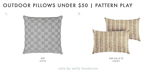
1. Iver Indoor/Outdoor Pillow | 2. Joen Indoor/Outdoor Pillow | 3. Green, Coral and Yellow Stripe Indoor Outdoor Throw Pillow
Personally, I love the desaturated look of #1 and #2. So fun but also not super bright which is more my style. Plus, they are from Article and I trust their quality so much. But on the flip side, if I were a bright color fan, I would be very into #3. It’s still not super intense but is so happy, and vibrant and the colors are so fun.
 design by emily bowser | photo by sara ligorria-tramp | from: emily bowser’s back unit yard reveal
1. Outdoor Chunky Linear Pillow | 2. Outdoor Modern Block Fringe Pillow
West Elm is another site where I kept saving pieces for this post. They are really stepping it up these days! How cute are both of these pillows and how cute would they look together? The small-scale pattern of #1 paired with the medium-scale pattern of #2 is perfect. Don’t make me pick a favorite, ok?

1. Lauren Plaid Indoor/Outdoor Reversible Throw Pillow (Set of 2) | 2. Checkered Pattern Woven Cotton Pillow Cover
Now, plaids and checks are a classic for a reason and these two are perfect if that’s your look. Not the mention these prices are VERY good. #2 comes in other colors and is machine-washable!
1. Smilla Indoor/Outdoor Pillow | 2. Indoor/Outdoor Reversible Throw Pillow (Set of 2)
For a classic check-inspired look I think #1 is awesome. The detailing is so pretty and it’s so versatile style-wise. Then #2 is both bold but not super loud. It would give just a nice little visual kick to any outdoor space.
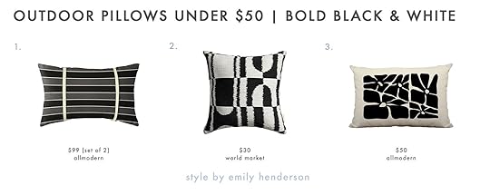
1. Grinell Striped Sunbrella® Indoor/Outdoor Lumbar (Set of 2) | 2. Black and White Geometric Indoor Outdoor Throw Pillow | 3. Polyester Lumbar Rectangular Indoor/Outdoor Pillow
Another classic? Black and white…but bold. If you want a modern feeling space but color isn’t really your thing or you want to mix it up with a bold pillow, any of these will work perfectly for that. Now, I know #1 is $99 but that’s for two pillows so technically each pillow is under $50. I mean it’s a great pillow so how could I not include it, you know?
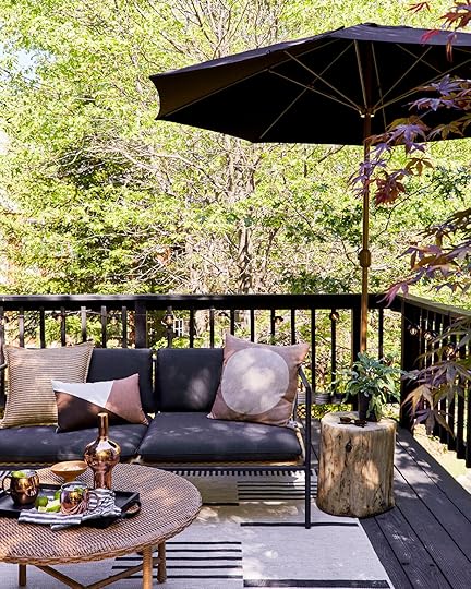 photo by sara ligorria-tramp | from: mountain house upper deck reveal
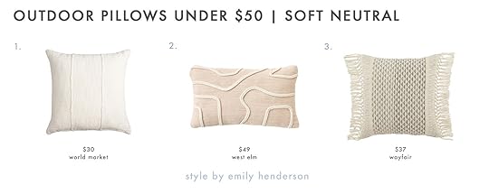
1. Mud Cloth Indoor Outdoor Throw Pillow | 2. Outdoor Abstract Roping Pillow | 3. Tassels Indoor/Outdoor Throw Pillow
Whether it’s mixing in a neutral to give your space a little visual calmness or you’re going for the neutral beach look, I really love all three of these. Emily has used #1 in a couple of different colors and so clearly is a fan! #2 is neutral but fun and unique because neutral does not mean boring (it also comes in other colors). And what is a soft neutral outdoor space without some tassels? #3 is a steal for how cute it is.
1. Sintra Indoor/Outdoor Pillow Cover | 2. Outdoor Natural Split Stripe Pillow
Onto the pricier neutrals, this lumbar pillow is so good. I love the tonal stitching and it’s nice and long at 36″! No notes. Then I just really like the detailing and color variation of #2. Another super versatile neutral pillow that isn’t boring.

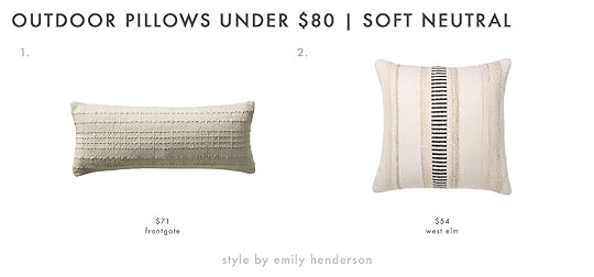
1. Silves Light Brown Boucle Outdoor Throw Pillow | 2. Storm Indoor/Outdoor Reversible Throw Pillow
If you love a desert look then rust and terra cottas are a must. A boucle pillow for outside? Sign me up! Plus, that “light brown” color is so freaking pretty. It does come in other colors if this one isn’t right for you but the material is:) Then the rust lumbar pillow is so good and under $20? Ya, that one needs to get snagged asap.
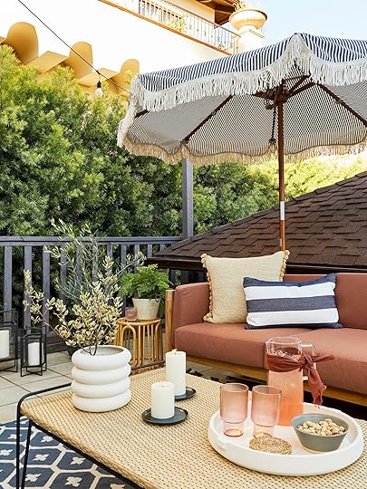
 design by jess bunge | photo by sara ligorria-tramp | from: jess’ balcony reveal
1. Cotton Indoor/Outdoor Pillow Cover | 2. Floral Cotton Indoor/Outdoor Pillow Cover
Block print patterns, while not new by any means, have really hit the design world hard this past year and we don’t want it to go anywhere. They are beautiful! I think these two would actually look so great together on an outdoor sofa, don’t you? The colors are happy but not too saturated and the patterns are awesome.

1. Linen Indoor/Outdoor Pillow Cover | 2. Haylen Block Printed Lumbar Outdoor Pillow | 3. Linen Indoor/Outdoor Pillow Cover
Then for a little bit more cash, here are more options. Don’t make me pick a favorite because I fear that’s an impossibility. These also would look amazing together. You really can’t go wrong. (But also #3 is kinda to die for, right?)
 design by jess bunge | styled by emily bowser | photo by sara ligorria-tramp | from: jess’ communal patio reveal
1. Ivory and Blue Seashell Shaped Indoor Outdoor Throw Pillow | 2. Silves Yellow Boucle Sphere Outdoor Throw Pillow
I think your outdoor space is the perfect place to have a little fun so why not add in a fun-shaped pillow? That shell is so freaking cute but also not too cutesy if that makes sense. When paired with the right elements it would look real cool. Then the joy that yellow brings to my heart is A LOT. I am always down for a sphere pillow and the fact that this one is for the outdoors AND in a boucle fabric is a 10/10 for me.
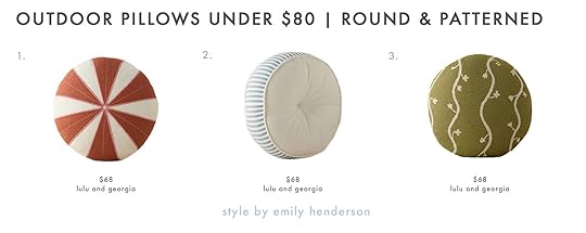
1. Wrenley Indoor / Outdoor Pillow | 2. Littu Indoor / Outdoor Striped Disc Pillow | 3. Satu Indoor / Outdoor Pillow
But if you want to play with a fun shape but in a slightly more traditional way, a circle is the perfect way to dip your toe in. All of these patterns are so playful. Remember when I said that Lulu and Georgia was killing the outdoor textile game? Well, here’s even more proof. Most of them also come in other colors.
 design by jess bunge | styled by emily bowser | photo by sara ligorria-tramp | from: jess’ communal patio reveal
1. Faux Natural Fiber Pom Pom Outdoor Pillow | 2. Sunbrella® Solid Fringe Outdoor Lumbar Pillow
Last but not least (for pillows) are our fun trim friends! As you can see I used #1 in my communal patio makeover and I love it! It adds such a simple but playful feel to the sofa. Then I immediately fell in love with that fringed lumbar when I saw it. It comes in other colors and is made in a Sunbrella fabric so you know it’s built to last.
Outdoor RugsNow onto rugs! I also adore an outdoor rug (especially if you don’t have a beautifully patterned tiled patio:)). However, it’s important to look at materials and colors to see what will last in your outdoor space. For example, take that beautiful navy rug I put on my communal patio. After a couple of years of relentless sunshine, it went from navy to light blue. And don’t get me wrong it still looked pretty in its lighter hue but did not hold its original color given the non-stop sun exposure. Now, if it would have been under a covered patio I bet it would have held up much better. Probably choosing a more neutral-toned rug would have been a smarter choice. This is all to say that it’s clearly important to consider where you are putting your rug to then determine what options make the most sense for longevity. And if you live in places that have hard colder months, just make sure to pack those textiles away to keep them nicer for longer (which I’m sure most of you do:)).
 photo by zeke reulas | from: giving new life to our old wood deck
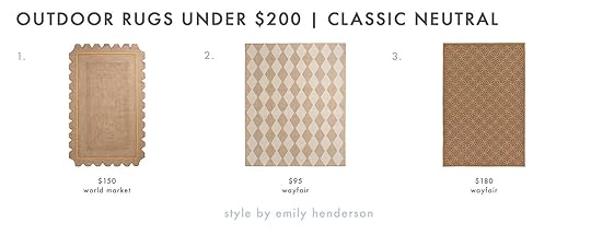
1. Camila Double Border Scalloped Recycled Indoor Outdoor Rug | 2. Positano Argyle Indoor / Outdoor Rug | 3. Macrae Geometric Indoor / Outdoor Rug
So speaking of some neutral-toned rugs that may have been a more ideal option for my patio, here are three very classic/traditional-looking rugs. I love #2 and #3 because they still give that tiled look I personally love in an outdoor rug. But you really can’t not love a fun edge like #1 has. Plus, it has just a little color to make it feel more summery.

1. Paseo Moran Leaf Casual Coastal Striped Havana Outdoor Area Rug | 2. Rio Black Broken Stripe Reversible Indoor Outdoor Floor Mat | 3. Leila Gold and Ivory Diamond Geo Recycled Indoor Outdoor Rug
Then for a little more of a modern geometric look, these are pretty perfect. I reallllly love #1. The darker brown with that subtle but chic pattern is right up my alley (it also comes in more colors). But for a bolder look, you can’t go wrong with a black-and-white broken stripe. This one is 6×9, fade resistant (hello!), and that price is wild. Then for a fun and colorful option, I really adore the pattern of #3.

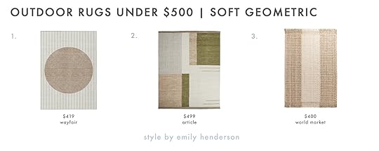
1. Amber Lewis x Loloi Indoor/Outdoor Topanga Area Rug | 2. Bronwyn Geometric Indoor/Outdoor Rug | 3. Amber Lewis x Loloi Indoor / Outdoor Topanga Silver Area Rug
All three of these give such cool-girl/calming energy. This tracks because #1 and #3 were designed by the Amber Lewis. It’s so hard to choose a favorite so I won’t:)

1. Kavi Black and Tan Indoor Outdoor Rug | 2. Dune Black and Natural Diamond Reversible Indoor Outdoor Rug | 3. Gray and Multicolor Global Stripe Indoor Outdoor Rug
If your style is more global, any of these three are so good! I would definitely be careful about putting #1 in constant direct sunlight but #2 would likely be fine. I really love #3 because of all of the colors. It looks like it could easily cost double of what it is.
 design by jess bunge | styled by emily bowser | photo by sara ligorria-tramp | from: jess’ communal patio reveal
1. Maelle Indoor / Outdoor Rug | 2. Parker Blue And Ivory Stripe Indoor Outdoor Rug
Ah yes, the beautiful darker blues. As I said, be careful where you place these in terms of sun exposure but man are they pretty. I really love the detailing in #1 but the boldness of the stripes in #2 would bring more of a visual punch. I guess you can’t go wrong here either.

1. Machine Washable Indoor/Outdoor Chantille Chocolate Rug | 2. Chris Loves Julia x Loloi Providence Indoor/Outdoor Area Rug | 3. Braddock Bamboo Slat/Seagrass Indoor/Outdoor Area Rug
Now, #1 really looks like an indoor rug but that’s also why I love it. It’s unexpected but for the right home, it would look so beautiful. Oh, and it’s machine washable! #2 and #3 feel super classic but are also really versatile. They can easily go traditional or be an eclectic choice for something a little more varied in style.
 design and photo by sara ligorria-tramp | styled by emily bowser | from: sara’s front yard makeover
1. Resort Boxes Geo Indoor Outdoor Rug | 2. Tundra Indoor/Outdoor Rug
I know we aren’t always the biggest promoters of gray but these two rugs make us big ole fans. The patterns feel fresh but not trendy. #1 also comes in a beige and #2 is actually on clearance so you know it’s a good rug for a good deal. Plus, that price is for an 8×10 so if you need something smaller then that price goes down too:)
1. Machine Washable Indoor/Outdoor Chantille Ivory Area Rug | 2. Elko 8 x 10 Indoor/Outdoor Rug | 3. Inira Brown and Ivory Stripe Indoor Outdoor Rug
To finish us off (we made it!) let’s get a little trendy, shall we? Now these rugs are just cool. Yes, they feel more “2025” than maybe some of the others but they also aren’t so trendy that they won’t look cool in years to come. #1 reminds me of a Block Shop-style design which is an EHD favorite textile and art company. I’m in love with the soft but not too neutral colors of #2 (plus, the color blocking is awesome). Then #3 is a more interesting neutral-toned rug that could work with almost any space. 10/10 all around!
Well, that’s it from me today. If you have any recs you drop them in the comments and next week I’m planning to do a post about outdoor decor storage. I truly can’t wait for consistent warm weather!
Love you, mean it.
Opening Image Credits: Photo by Kaitlin Green | From: We Designed Our Back Porch For Peak Summer Enjoyment… Here’s How She Looks
The post Really Good Affordable Outdoor Pillows And Rugs (The Sunshine Is Coming!) appeared first on Emily Henderson.
March 27, 2025
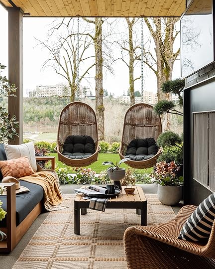
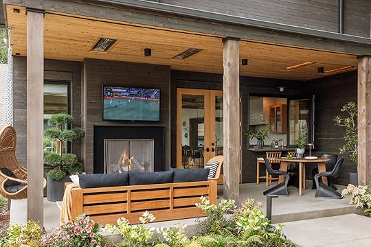
My Brother’s Kitchen Patio Reveal (Yes, With A Huge TV….Of Course:))
My brother has this side patio right off the kitchen that is covered year-round and the architecture is so pretty (thanks to architect Anne Usher) so I wanted my hands on it, mostly so I could convince him to have us over for summer kid outdoor movie nights while I swim in the river. It had room for a little dining area for their family of four, a couple of stools at the bar (accordion window into the kitchen), and a living area with a huge TV over a fireplace. IT’S SO AWESOME. I pulled together the design plan (blacks, woods, and all-weather wicker for some warmth), pitched it to AllModern because I know all of their pieces are hand-vetted and really high quality. Then a few weeks later it was done
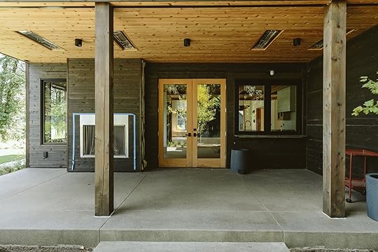
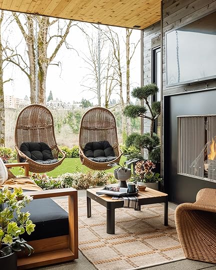
Here you can see the full space. Narrow and long, with doors in the middle breaking it all up. This is right off the kitchen and not far from the grill area, but this is more of an outdoor hang space than where they’d BBQ (likely on the back patio). The windows on the right accordion open and the fireplace to the left is topped with a big TV. Y’all, this is luxury living, TBH, and hanging out there is such a delight.
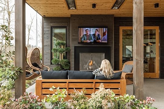
I turned it into a dope outdoor living room, with hanging swings (so fun), a big sofa, and a side chair. My main goal was to have it work with the architecture of the home (so black and wood) and be more contemporary/modern in vibe. AllModern (as per its name) has a huge outdoor inventory of high-quality modern pieces (I should know I have a lot). So I was able to quickly pull together a design plan that didn’t feel generic, had cool shapes and textures, and created a vibe but in a really curated world. Plus you can watch sports (or Shrinking in my case) out here. Imagine all the Love is Blind parties you could have out here! The Bachelor final episodes! (are we still doing that?) and Ken is obviously very excited about watching sports out here in the summer.
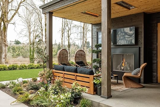
The swings were crucial as you want to swivel and look at the river and since they had a support beam above they were easy to hang (and feel safe) and their kids LOVE twirling and twirling and twirling. I also love that S-shaped all-weather wicker chair (which echoes the shape of the dining chairs you are about to see).
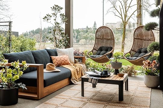
Sofa | Cream Pillow (similar) | Lumbar Pillow | Hanging Chair | Coffee Table | Footed Planter (no longer available) | Rug
The sofa is incredible – the arms are wide enough for a drink, the seat is deep enough to snuggle up on and the cushions are firm (like all outdoor cushions should be) with softer back cushions. We stuck to the warm tone world with all the woods and wicker and it feels so appropriate. Shout out to our rug from our collection (which technically isn’t an outdoor rug, but it’s covered and we had it so maybe it will be fine?).
The coffee table is smallish, but there isn’t a ton of space there so it works perfectly to allow enough flow.
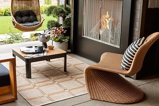
Armless Lounge Chair | Striped Sunbrella Pillow
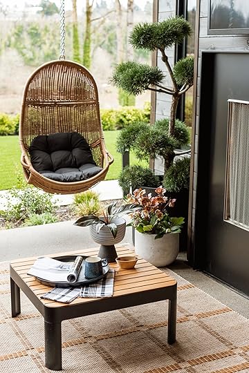
A big shout out to Dennis’ 7 Dees (in Lake Oswego) for loaning us plants to shoot – how awesome is that topiary? I tried to convince my brother to buy it and they still might.
As you can see here’s how the whole space interacts and how the furniture fits so well. The sofa faces the TV/fireplace and creates a conversation area with the hanging swings and the big comfy lounge chair.
The Dining Area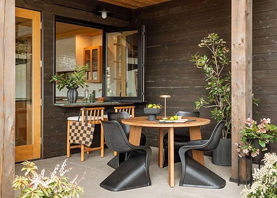
Counter Stool | Tote | Dining Table | Dining Chair | Black Vase | Footed Bowl (similar) | Rechargeable Lamp
I LOVE these black S chairs – they are a super midcentury/mod shape and yet they stack and are perforated – so smart for outdoor seating (and these are so comfortable). This hypermod style wouldn’t work as well at my house (at least not in the black) but my goodness they look perfect here.
The dining table is so pretty – a teak wood with really pretty wood grain and slats on top. AllModern has a huge selection of outdoor tables in a lot of different finishes and shapes/sizes so we had a lot to choose from but the size and finish were perfect with the other elements.
Black Vase | Tall Green Glass | Stool | Tote
I love these round legged stools, with a modern windsor style back. These are on the wider side so we only needed 2 and the cushions are removable (but it’s black webbing underneath so you need the cushions to sit on them).
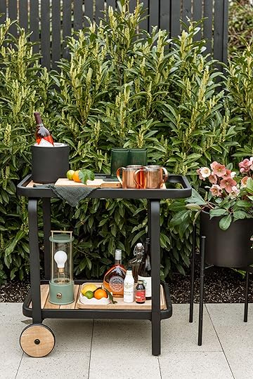
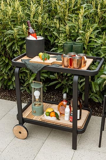
Bar Cart | Ice Bucket | Tall Green Glass | Copper Mug | Wood Board | Rechargeable Lantern
We ordered this bar cart that matched the coffee table (please note that very cute wheel). We styled it out with the usual copper moscow mule mugs, an AllModern wine cooler, wood board, and acrylic glasses. The rest is from my prop house (which is coming in handier and handier these days :))
It’s all proof that if you stick within a curated color palette, add a ton of textures and some pattern, plus a hanging chair or two, you don’t really need to do much else. AllModern has a ton of white or lighter wood options as well – it’s a deep inventory that is still really heavily curated.
The space itself was awesome so I had no doubt I could make it inviting, but within a few weeks it was fully done. Now just waiting for the rains to stop (March has been brutal). We could be watching White Lotus out here!
A big old thanks to my team and AllModern for helping with the transformation. It’s a luxury to have for sure, but our big Starke Family BBQs are going to be better because of it.
Resources and Crediting :
Furniture and Decor: AllModern
Plants (and Propped Plants in the Garden Beds): Dennis’ 7 Dees
Photos: Kaitlin Green
Landscaping: Pistils Nursery
Architect: Anne Usher
Builder: JP Macy of Sierra Custom Construction
Styling: Emily Henderson (me:))
The post My Brother’s Kitchen Patio Reveal (Yes, With A Huge TV….Of Course:)) appeared first on Emily Henderson.
March 26, 2025
This Tile Trend We’re Eyeing Isn’t Just Chic & Bold, It’s Also Affordable

It’s not often that the words “design trend” and “affordable” go together, but I’m happy to report that today’s post does just that. As a design writer, my eye has been trained to pick up on details in projects that have a common thread from home to home. When I start seeing it enough over several months (sometimes even years), I feel confident in my expertise to call a trend a trend. Now, if you know anything about me, you also know I really do not like that word, as it has connotations of something fleeting and wasteful, mainstream, and eventually kind of corny. If you love something in your home, you should be able to live with it happily for as long as you wish, regardless of what other people are doing. But I digress. Back to tile trends.
Of course, zellige tile has been the darling of designers for nearly a decade now—it dates back to the 10th century in Morocco!—but it can be pricy, anywhere from $20 to $30 a square foot, and needs an expert installer. Plus, while it’s wildly beautiful, it doesn’t always suit every style of interiors. Possibly because of these facts, there’s another tile contender that is everywhere now: solid color 4″ by 4″ tile.
For anyone thinking “You mean that cheap stuff I have in the old bathroom of my rental??”, the answer to that is “Yes!” I get it. I had white glossy ceramic 4×4 tiles in my previous rental kitchen. It made up the backsplash and countertops (which I absolutely hated because the grout never stayed clean). And now, in my current home, my powder bathroom sports mint 4×4 floor tiles and my primary bathroom has yellow and white checkerboard 4×4 tiles on the floor—both of which I’ve grown to love.
Small square tiles can feel both retro and contemporary, depending on how you use them. Not to mention, the most affordable ones can be easily found at your local hardware store and run you anywhere from $2 (!!!) to $6 a square foot. Like anything else in design, there are more expensive versions of a simple thing, so yes, I’ll be including pricier options, but in general, it can be as affordable as affordable gets for tile.
These days, you can get 4×4 tiles in a traditional glaze, a satin finish, matte finishes and even hand-glazed finishes (my favorite). Below, I laid out some layout options for what you can do with these little square babies, including some of the more graphic patterns that can also be created:

While all of these would be great, I personally love just the classic straight stack, the offset horizontal thick grout and the checkerboard pattern. But that’s the beauty of the 4×4 tile: it’s really versatile, especially when you get into the business of bringing in multiple colors to create graphic patterns.
Let’s explore some 4×4 tile in application, shall we?
Solid ColorView this post on InstagramA post shared by domino (@dominomag)
I have such a love affair with the kitchen of Dan Pelosi (a.k.a. Grossy Pelosi). While the color story isn’t something I’d likely pick for myself, I just love the square tile enclosure of the range and hood nook. He worked with Fireclay, which sells SO many color options in both their new pressed tile finish (a bit more satin/matte), and their traditional glazed ceramic.
View this post on InstagramA post shared by MOLLY BAZ (@mollybaz)
Molly Baz’s kitchen is no longer with us, sadly (it was lost in the fires earlier this year), but it will forever showcase my favorite way to level up a simple material like a $5 per square foot tile: color drenching. Taking that same cornsilk yellow across other surfaces makes the tile feel custom, rather than an affordable design choice.
View this post on InstagramA post shared by Fireclay Tile (@fireclaytile)
The Fireclay account is actually a great place to dig around for inspiration. I love the application of a square tile on both floor and wall. It lends a really clean, modern look that’s not devoid of personality. And don’t forget, just like with any tile, grout choice can completely change the vibes. Here, they used a dark gray which brings down the contrast (but is also much easier to keep looking clean in a high-traffic room like the bathroom).
View this post on InstagramA post shared by Cristina Poelk (@cristinapoelk)
People either love vintage pink bathrooms or they hate them. As long as the materials are in good shape, I think they are glorious, and can be made to feel especially “now” if colorblocked with fixtures or wall paint in a similar shade, like in this bathroom I found on Cristina Poelk‘s feed (she’s the creative director for Hem).
View this post on InstagramA post shared by Alex March Studio (@alexmarchstudio)
Gosh I love this creamy 4×4 tile, with what looks to be a hand-glazed. Placing it not just on the backsplash of the kitchen by Alex March Studio but also on the wall leading into the space is inspired.
View this post on InstagramA post shared by Fireclay Tile (@fireclaytile)
We’ve already seen a dark green version of the 4×4 tile (by Fireclay), but this time, it’s with a much higher contrast white grout, which changes the vibes for sure. I also love how they’re using the same green square as the baseboard mixed with a cream stacked brick tile for some variation.
View this post on InstagramA post shared by Clever (@getclever)
Just a simple offset horizontal stack in a compact kitchen featured on Clever. I would have loved to see this all the way up the wall, but it’s a good reminder that even a three-tile high installation can be enough.
View this post on InstagramA post shared by Fireclay Tile (@fireclaytile)
Another offset horizontal, in a lovely soft pink. (Didn’t I tell you that Fireclay had so much eye candy??) Note the larger tile as the baseboard to elevate it just slightly.
View this post on InstagramA post shared by domino (@dominomag)
Instead of swapping the bottom row to a larger tile, you can also just change the color to create that delineation, like in this bathroom I spotted on Domino pulled from the book “Cheap Old Houses: An Unconventional Guide to Loving and Restoring a Forgotten Home.”
View this post on InstagramA post shared by Storey Design (@storeydesignsf)
I’m not usually one to be drawn to grays, but this one, in a kitchen by Storey Design, is like a soft morning mist. It’s so satisfying and easy on the eyes in a clean classic grid pattern.
View this post on InstagramA post shared by Claire Thomas (@clairethomas)
Though I’m fairly certain this is likely a zellige tile, I still wanted to show it because of the application ideas (slide 1 and 2). Claire Thomas created a “speakeasy” in a historic home, and I love the use of tile along the wall of the banquette area, as well as on the countertop and front on that second slide.
View this post on InstagramA post shared by Rae Rockwell Studio || Joshua Tree, CA (@raerockwellstudio)
For anyone considering using 4×4 tiles on a countertop, you can choose to use tile nosing like in this space by Rae Rockwell Studio or not (like in the project right before this).
Stripes, Checks & PlaidsView this post on InstagramA post shared by Yana Molodykh
(@yanamol)
Now, moving on to further creative uses for these fairly simple tiles. There is a lot to study in the image above, by Yana Molodykh, but particularly the grouting. Mixing two colors of tile can be done in many ways, and here, she swapped the grout color for each, which is so clever. Red grout for red tile, mint grout for mint tile. The resulting look is decidedly modern.
View this post on InstagramA post shared by Zia Tile (@zia_tile)
There is almost nothing cheaper than white glazed 4×4 tile (I’m not saying the one here is cheap, but it can certainly be found for very little money if you wanted). These here are from Zia Tile, a brand I love. The double horizontal stripe just north of the centerline—likely so that the sink basin didn’t cut into the top green stripe—feels so timeless but adds a little sumptin sumptin to a clean, classic room.
View this post on InstagramA post shared by Mosaic Factory (@mosaic.factory)
Yes these are zellige tiles (from Mosaic Factory), but I wanted to show the pattern application, which could be recreated in a more cleanlined look with a simple ceramic 4×4.
View this post on InstagramA post shared by Gray Benko (@graybenko)
How fun, right? What an absolutely darling look for a young person (heck, I’d take it for myself). Gray Benko worked with Fireclay here, and used 5-6 colors to create this alternative “checkerboard” look that’s playful and fresh.
View this post on InstagramA post shared by domino (@dominomag)
Another way to go if you like checkerboard but want something a little different is a plaid pattern, which can be made with a dark center tile, a lighter shade for the tiles touching the center tile, and an even lighter or white tile everywhere else, like in this bathroom from Domino.
View this post on InstagramA post shared by Natalie Myers (@nataliemyers)
Natalie Myers toned down the contrast that normally comes along with a checkerboard pattern by using a soft gray and not super bright white 4×4 tile in this bathroom.
View this post on InstagramA post shared by Fireclay Tile (@fireclaytile)
Go crazy, if you want, and just make your own designs with two or three different colors a la the image above yet again from Fireclay.
View this post on InstagramA post shared by Bedrosians Tile (@bedrosianstile)
This is also a great technique for making a special detail (like a dog bath!) stand out. The taupe and white check here uses tiles from Bedrosians, which I love for their selection of fairly affordable materials like these glazed tiles.
View this post on InstagramA post shared by Clever (@getclever)
And finally, another checkerboard, but I loved the juxtaposition of the more modern gray and white check with the antique fireplace box. It’s such a great way to create tension (every room needs a little tension, after all).
Now that we’re all inspired, it’s time to take a look at some beautiful tile you can actually buy for your own home.

1. Khaki 4×4 Ceramic Tile | Matte | 2. Karma 4×4 Glazed Ceramic Wall Tile by Bond Tile | 3. Cement Solid Chestnut Petite by Cle Tile | 4. Celine 4×4 Matte Porcelain Floor & Wall Tile in White by Bedrosians | 5. Color Ways Shadow 4×4 Glossy Ceramic Subway Wall Tile by American Olean | 6. Color Wheel Classic – 4×4 Wall Tile – Glossy Visual in Cornsilk by Daltile | 7. Sap Green Gloss 4×4 by Fireclay Tile | 8. Sahara 4×4 Porcelain Wall & Floor Tile by Bedrosians | 9. Terre Verte Satin 4×4 by Fireclay Tile
As I mentioned, 4×4 solid tiles can be super affordable (like this dark slatey blue-gray from Lowe’s that’s $4 per square foot) or just as pricey as something like a zellige. There’s a high-gloss finish like the gorgeous olive green from Fireclay, a soft matte finish like the khaki tile from Riad Tile, and everything in between. I love the glazing on the light blue option from Bond Tile (#2) for something that feels more organic and visually moving. The cornsilk yellow tile from Daltile is affordable at just $5 per square foot, and just so happens to be the exact tile Molly Baz used in her gorgeous kitchen I shared at the start of this post.
So…what say you? Honestly, if I were renovating a home right now, I’d seriously consider finding a color I love and going the affordable 4×4 tile route because it’s such a classic material. Depending on how you use it and color mix it, it’ll likely feel relevant for decades. Thanks for reading, and I’ll see you around these parts next time.
Opening Image Credits: Design and Styling by Emily Henderson and Kaitlin Green | Photo by Kaitlin Green | From: Kaitlin’s 70s Inspired, Colorful And Cool Living Room Revealed (Y’all, I’m So Jealous)
The post This Tile Trend We’re Eyeing Isn’t Just Chic & Bold, It’s Also Affordable appeared first on Emily Henderson.
March 25, 2025
Everything You Wanted To Know About Soft Water – You Asked, We Answered
What’s the deal with soft water??? Unlike a design trend piece or makeover reveal, this post is for those of you who are considering investing in a water softening system for your home and are genuinely curious about what it’s all about. It is real peak adulting, the quietest of luxuries that once you try it, is really hard to go back. In fact, most of Culligan’s clients are repeat customers – people who have moved to a new house and need that soft water back in their lives or who grew up with a Culligan system and can’t imagine going without it in a home of their own. But “softening your water” also sounds intimidating, expensive, and just, like, “how??” So I figured I’d break it all down for you.
We worked with Culligan when we lived in LA, where our water was VERY HARD without us knowing it. We accepted this as just part of life until we softened it and the difference was incredible. After we moved to Oregon, getting Culligan out to the new house was on our minds – so when they approached us to partner I was so excited, thrilled even, to have them install the system that I know benefits my hair and skin (and my entire home!) so much.
Why Would You “Soften” Your Water?
My #1 reason for wanting soft water at my house: Softer Hair and Skin! A water softener reduces the hard water minerals that make my skin dry and my hair frizzy. It’s science! On your skin, the combo of hard water (basically excess calcium and magnesium, FYI) and soap or shampoo can block your pores and/or not completely rinse off, which can prevent your natural body oils from reaching the surface of your skin. If your skin is more sensitive like mine, it might dry out, get itchy, red, or you might even get a rash. NO BUENO.
The same thing is true for your hair. The residue clings to your follicles, which makes your hair stiff and dry. If you feel like you need to wash your hair every day, your hard water might be a factor. (You can have Culligan test it for you – seeing the hardness levels can be eye opening!)
Soft water, simply put, is much softer on everything – less harsh. If you’ve ever had hard water and then stayed at a hotel with softened water, you’ve felt the difference. It’s like that every day here
If vanity isn’t your #1 driver in life (LOL), then you should also know that soft water helps so much with the cleaning (and longevity) of your bathroom, kitchen, and all water-using appliances in the home. When you are showering in, cleaning with, or washing hands in soft water, there is SO much less buildup on all the home surfaces and faucets your water hits frequently. Shower doors, tile, backsplash, stone, bathroom sink drains – anything that you typically have to scrub and squeegee is no longer covered in hard water residue.
Everything is WAY easier to clean and keep looking brand new. I know the hard water minerals don’t seem like a big deal, but over time they really build up on (and in) all the surfaces and appliances that water touches (including laundry!). Now that our water is soft, our home is cleaner. And I didn’t have to lift a finger!
 What’s a Culligan Water Softener install like?
 Ok, I was intimidated by the idea of getting a softener installed (just like I am anything I don’t fully understand) especially since we did it after we had finished renovating. I learned through this process that working with the pros at Culligan is such an easy process, whether your kitchen is fully renovated or in the process of being built! Their process is simple: A Culligan team member will come over, test your water (to make sure you actually need a system), and they’ll personally recommend solutions for you. They can answer any of your burning questions and, if you want to move forward (we did!), they can help you plan the best place for your new system (in our case, a basement but could be a garage or utility room).
Then, an expert installer spent about ½ a day hooking the system up to our main water valve. (I’ve been told that the timing will vary depending on the location of your system, your water source, and your pipes, but both of our installs – both in LA and in Oregon – took about 4 hours.)
The Whole Home Softener we got includes the salt tank and the accessories that make the system “smart” (so it can alert you when the salt needs to be refilled, etc). Honestly, the best thing about it is that both times we’ve had it installed, it’s been so seamless that I haven’t had to deal with it ONCE. Not one breakdown, one time I needed to troubleshoot, zero frustrations, and honestly, I haven’t even thought about it.
If you have a lot of specific questions, I suggest booking someone from Culligan to come to your home to assess. But in short, they install it once and then you can either opt in to them servicing it (we did) or service it yourself. It’s a real “set it and forget it” situation, at least it’s been for us.
Why Do People Love Soft Water For Laundry?
As you can imagine, if hard water adds buildup on tile and glass, hair and body, then washing all your clothes, sheets, and towels in hard water is also less good, shall we say. With soft water, your whites are whiter, colors stay brighter and your soft fabrics stay fluffier. Plus, you use less overall detergent to get the job done – up to 50% less detergent is needed for a washing machine running on soft water. It’s really a whole home situation where I find that softened water is even better for cleaning our tile and honed stone.
Hard Water Destroys “Live Finishes”, I.E. Unlacquered brass

If my #1 reason for loving softened water is hair/skin, it’s closely followed by the fact that it allows my beautiful unlacquered brass (i.e. live finish) faucets to stay beautiful. You see, hard water is AWFUL for live finishes because the minerals can accelerate the corrosion of unprotected brass surfaces (literally turning it green in the not-so-good way and then eventually causing them to crumble). It’s not immediate but it is a real thing (and a huge bummer). We noticed our faucets turning green around the base in our Los Feliz home before we softened our water and I freaked out. Since softening our water we have zero issues (while we still have to care for them in other ways). So if you have live finishes like we do in our kitchen, then you’ll want to think hard (LOL) about softening your water.
Does This System Also Purify Your Drinking Water?

Soft water is totally fine to drink, but Culligan also has a reverse osmosis (RO) drinking water filtration system that gets installed underneath your sink. We installed this in my brother’s house as they wanted a filtered drinking system and they LOVE it – the RO system can reduce more than 90 (!!!) contaminants and makes it easy to grab a glass of delicious, filtered water straight from the tap. (Imagine – no more schlepping your plastic filter pitcher to-and-from the fridge all day!)
We weren’t able to install this one at our house because our cabinet under the sink was too short (due to our farm sink and our tall-ish toe kick), so the box-like system didn’t fit. We still might put it in our corner cabinet and have it extend to our sink (it can be installed elsewhere and connected to your water line – even your fridge or ice maker can get the RO treatment!) but Ken was BEGGING for the RO system so we installed this one very easily in his kitchen. They are so happy with it (and it’s great for washing veggies, making drinks/ice, water for pasta, and of course, drinking water). So this is our experience and we have LOVED it. For all your questions, the Culligan customer service and sales team are so well versed in this stuff, and honestly just seeing them test your water can be super educational should you be uncertain if you want to invest in a water softener system or RO drinking water system. If you’re interested in finding out more about your home’s water and Culligan solutions, schedule an in-home water test with your local Culligan dealer today by tapping here.
How Much Does It Cost?Culligan works with you to find the perfect solution for your water and home. This means the system + installs vary, so it’s impossible to say exactly what it will cost in your home until an expert has been out to test your water and assess your home. However, the brand does have flexible options to rent, finance, or buy systems – so you can work with them to get a solution that’s right for you + your budget. To get more information on what your home needs + pricing, tap to find a dealer near you + schedule a free in-home evaluation with Culligan today.
*Photos by Kailtin Green
The post Everything You Wanted To Know About Soft Water – You Asked, We Answered appeared first on Emily Henderson.
Emily Henderson's Blog

- Emily Henderson's profile
- 10 followers

