
Emily Henderson's Blog, page 221
April 14, 2020
Mallory’s MOTO Intro + All of Her “Beginner” Design Questions Answered
 design by martyn lawrence bullard | photo by jaime kowal | via the sands hotel and spa
Imagine this: you just moved into your first real adult apartment and you own zero furniture, and somehow you have to go from that to a fully-fledged, perfectly designed space that’s going to be posted up all over the internet for thousands of your closest friends to see. AND YOU HAVE NO INTERIOR DESIGN EXPERIENCE. Well, that’s precisely what I’m dealing with at this moment in time and it’s incredibly exciting.
Here’s my thinking. If your apartment is supposed to be a reflection of you and your personality, then how hard could designing your own space actually be?? The answer is really hard. Very difficult, in fact. If you’ve ever tried to design your living quarters you know this already, and if you’re on this blog reading this, you’ve probably tried to do it once or twice. The reason it’s so difficult is because when you have a blank canvas the options are ENDLESS. We run into all of these questions we so desperately wish a well seasoned interior designer could answer so they can just tell us what to do. That’s what I’m bringing you guys today. The answers we (my boyfriend Chase and I) so desperately want and need. Hopefully, they are relatable and can help you in your design process too.
My Naked Apartment
First, let me show you what we’re working with:

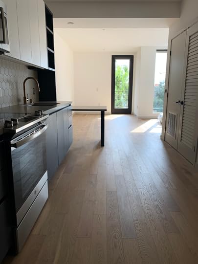

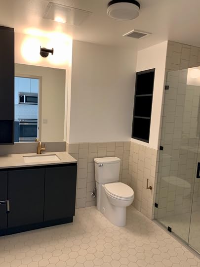
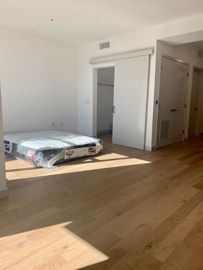

This is my boyfriend, Chase, and my studio apartment. It’s the first apartment that we both actually care about since prior to living here we lived in either college apartments, random New York subleases, or our parents’ houses. But this is our place which means we are real adults now. So let me tell you about our plan for this lil space…
Our apartment is located ON Hollywood Blvd, (yup, it’s above the walk of fame people) and so we feel like it’s our duty to lean into that at least a little bit. At first, we were thinking we should go full-blown glam. Full-blown. But after throwing our “glam” options into a google slide mood board, we realized it wasn’t “us”. So we went back to the drawing board. To start, we asked ourselves “what are some interiors that we both LOVE?” and this is what we came up with:
The Inspiration Photos
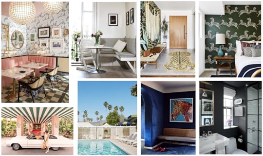 From left to right: image source | unknown image source | annie segal’s house | image source | image source | image source | image source
The place we collectively love most in this world is the Parker Palm Springs. When we saw it for the first time, our hearts dropped straight out of our asses. This. place. is. beautiful. Not to mention it’s designed by my favorite designer (and probably the only interior designer I knew for the first 15 years of my life ), Jonathan Adler. Luckily for me, Chase understands and respects my love for Jonathan Adler and in fact, he now has a STRONG love and appreciation of his style, too. So it’s our main inspiration and the basic gist of our style – let’s call it “chic palm springs hotel.” It suits us and we love it.
 via jonathan adler
While we’ve been staying at home, designing our apartment has been our absolute FAVORITE quaran-tivity. We’ve been watching interior design classes online like Emily’s Skillshare class and Kelly Wearstler’s MasterClass to try to understand how we’re supposed to do this whole thing. After educating ourselves a little, we realized a critical flaw in our plan that was brought to our attention by Kelly Wearstler herself (well, in her Masterclass). The problem was there was no story. What she means by this is there needs to be a throughline, a reason behind the design that will ultimately make it feel more cohesive. For example, in the Santa Monica Proper Hotel design, she wanted it to reflect the feeling of being at the beach, so every material and piece of furniture she curated was something “you could find at a beach.” Genius. So if Kelly tells me I need a story, I need a story.
After days of thinking about why we were all of a sudden making this “Palm Springs themed,” we came up with it. Palm Springs was THE ultimate getaway for Hollywood celebrities in the 1950s, and we want our apartment to feel like our little “escape” from the wild Hollyweird below us in that same way. So we want it to feel like a vacation, with a twinge of Hollywood Bungalow to stay true to the location and vibe of where we are. Want to know what the heck I mean by all this?? If you missed it from the “Projects We’re Working On” post a few weeks back, here’s the general mood board I showed you guys over there:
The Basic Design Plan

Obviously, for someone like me that so desperately wants my apartment to look awesome, this mood board wasn’t gonna cut it. I need to see every wall, every detail laid out so I can KNOW FOR SURE what this will actually look like. I now have 2 google slide presentations (and over 200 actual slides) with different options for how it could look (stay tuned for more of those). Naturally, we still had questions (and some I was embarrassed to even ask). So luckily I work for an amazing interior design company and was able to show Julie this early rendition of my design. This way she could understand what I was even talking about when I asked her my “dumb” questions. (She also assured me there’s no such thing as a dumb design question. Julie is very kind.)

Okay, now that you’re all caught up, let’s get to the meat of this. After staring at blank walls debating all of our endless possibilities, here are the questions that arose and the answers from EHD lead designer, Julie Rose:
My Dumb (or Shall I Say Beginner) Questions, Answered.
 design by jonathan adler | photo by nikolas koenig | via dwell
How do we make a small space feel bigger?
Make sure to vary the “visual weight” of your furniture pieces, there should be some with legs or open arms that can help make your room feel more spacious cause you can actually see more floor space. It’s all a mental game. For example, instead of a banquette bench seat where the base is fully on the floor, add some legs from Etsy to make the corner area feel more “airy”. Also, think about the materials and colors throughout the space. Too many upholstered pieces can start to feel “one note” or repetitive and make a room feel smaller than it actually is, so shake it up in the material department. Another misconception is that because you are in an apartment you should only buy pieces that are small scale but in actuality having a standard-sized piece can help ground the space and steers you away from over-cluttering with too many furniture pieces.
Do we want to try to make each space feel separate? Or do we want it to feel like one big space?
A little bit of both, you want the spaces to feel special on their own and yet cohesive. So instead of physically separating your space with a room divider try adding in a “special element” for each area. Try adding wallpaper in the living room and in the bedroom you could have a headboard feature wall or large scale art in the same color scheme.
How do we add texture? Do we create a feature wall where the bed is? WHAT THE HECK DO I DO WITH THE BLANK SPOT ABOVE MY BED???
 via new york times
Creating a headboard feature wall is a great idea to make your space feel more custom to your style as a couple. Box paneling using a thinner lattice lumber will give you that added texture but at the same time will be easy to remove and repair when you find your next place to live. A great example of this is the photo above that we featured a while back in the “Add Character to Basic Architecture: Wall Paneling” post from 2017. But remember that texture can be brought into your design in a lot of different ways. Wallpaper, even though it isn’t “texture you can touch,” will add the depth you are looking for as well as other patterns in the space. Textiles are an easy and affordable way to add texture and layers. Also, different types of lighting like a sconce, table lamp, floor lamp, etc. will make the “boxy space” feel cozier. Basically, it’s not always about the physical texture but the visual as well.
Where should I add color?
In the same sense as adding texture to a space, the easiest way to add a dose of color is through textiles, art, and accessories. These are all low commitment and do the least damage to your bank account. Ideal.
I love wallpaper so much but I have no clue where to put it? One wall? Our bedroom nook? The whole thing? Where do we stop wallpapering in an open floor plan studio?
In this case, I would wallpaper starting from the wall with the door to your balcony all the way over to the cabinet that divides the desk and the kitchen. If you were to add wallpaper on the return wall where your bar cart will go then you don’t have a good stopping point and over time the wallpaper might come away from the wall on that corner.

How do I know how much wallpaper to get?
A lot of online wallpaper vendors will have a tool on their site to help you calculate the quantity. So simply measure the width and height of your walls.
Hot Tip
Our wallpaper installer advises to add 4-6 inches to the length of the rolls (or overall height of the wall) this makes it easier to have some wiggle room when hanging the wallpaper so the design properly lines up!
If we leave some walls white, should we repaint it to a different white? How do I know which white is good!?
If you weren’t putting up wallpaper with a primarily white background then I would say to skip painting your walls (and ceiling) essentially the same color. Paint adds up and it already looks great as of now. Wait until you get your wallpaper sample to compare it to the rest of the room, if it is drastically different then pick out a white paint color from this post or this one. 


Mallory’s MOTO Intro + All of Her “Dumb” Beginner Design Questions Answered
design by martyn lawrence bullard | photo by jaime kowal | via the sands hotel and spaImagine this: you just moved into your first real adult apartment and you own zero furniture, and somehow you have to go from that to a fully-fledged, perfectly designed space that’s going to be posted up all over the internet for thousands of your closest friends to see. AND YOU HAVE NO INTERIOR DESIGN EXPERIENCE. Well, that’s precisely what I’m dealing with at this moment in time and it’s incredibly exciting.
Here’s my thinking. If your apartment is supposed to be a reflection of you and your personality, then how hard could designing your own space actually be?? The answer is really hard. Very difficult, in fact. If you’ve ever tried to design your living quarters you know this already, and if you’re on this blog reading this, you’ve probably tried to do it once or twice. The reason it’s so difficult is because when you have a blank canvas the options are ENDLESS. We run into all of these questions we so desperately wish a well seasoned interior designer could answer so they can just tell us what to do. That’s what I’m bringing you guys today. The answers we (my boyfriend Chase and I) so desperately want and need. Hopefully, they are relatable and can help you in your design process too.
My Naked Apartment
First, let me show you what we’re working with:
This is my boyfriend, Chase, and my studio apartment. It’s the first apartment that we both actually care about since prior to living here we lived in either college apartments, random New York subleases, or our parents’ houses. But this is our place which means we are real adults now. So let me tell you about our plan for this lil space…
Our apartment is located ON Hollywood Blvd, (yup, it’s above the walk of fame people) and so we feel like it’s our duty to lean into that at least a little bit. At first, we were thinking we should go full-blown glam. Full-blown. But after throwing our “glam” options into a google slide mood board, we realized it wasn’t “us”. So we went back to the drawing board. To start, we asked ourselves “what are some interiors that we both LOVE?” and this is what we came up with:
The Inspiration Photos
From left to right: image source | unknown image source | annie segal’s house | image source | image source | image source | image sourceThe place we collectively love most in this world is the Parker Palm Springs. When we saw it for the first time, our hearts dropped straight out of our asses. This. place. is. beautiful. Not to mention it’s designed by my favorite designer (and probably the only interior designer I knew for the first 15 years of my life ), Jonathan Adler. Luckily for me, Chase understands and respects my love for Jonathan Adler and in fact, he now has a STRONG love and appreciation of his style, too. So it’s our main inspiration and the basic gist of our style – let’s call it “chic palm springs hotel.” It suits us and we love it.
via jonathan adlerWhile we’ve been staying at home, designing our apartment has been our absolute FAVORITE quaran-tivity. We’ve been watching interior design classes online like Emily’s Skillshare class and Kelly Wearstler’s MasterClass to try to understand how we’re supposed to do this whole thing. After educating ourselves a little, we realized a critical flaw in our plan that was brought to our attention by Kelly Wearstler herself (well, in her Masterclass). The problem was there was no story. What she means by this is there needs to be a throughline, a reason behind the design that will ultimately make it feel more cohesive. For example, in the Santa Monica Proper Hotel design, she wanted it to reflect the feeling of being at the beach, so every material and piece of furniture she curated was something “you could find at a beach.” Genius. So if Kelly tells me I need a story, I need a story.
After days of thinking about why we were all of a sudden making this “Palm Springs themed,” we came up with it. Palm Springs was THE ultimate getaway for Hollywood celebrities in the 1950s, and we want our apartment to feel like our little “escape” from the wild Hollyweird below us in that same way. So we want it to feel like a vacation, with a twinge of Hollywood Bungalow to stay true to the location and vibe of where we are. Want to know what the heck I mean by all this?? If you missed it from the “Projects We’re Working On” post a few weeks back, here’s the general mood board I showed you guys over there:
The Basic Design Plan
Obviously, for someone like me that so desperately wants my apartment to look awesome, this mood board wasn’t gonna cut it. I need to see every wall, every detail laid out so I can KNOW FOR SURE what this will actually look like. I now have 2 google slide presentations (and over 200 actual slides) with different options for how it could look (stay tuned for more of those). Naturally, we still had questions (and some I was embarrassed to even ask). So luckily I work for an amazing interior design company and was able to show Julie this early rendition of my design. This way she could understand what I was even talking about when I asked her my “dumb” questions. (She also assured me there’s no such thing as a dumb design question. Julie is very kind.)
Okay, now that you’re all caught up, let’s get to the meat of this. After staring at blank walls debating all of our endless possibilities, here are the questions that arose and the answers from EHD lead designer, Julie Rose:
My Dumb (or Shall I Say Beginner) Questions, Answered.
design by jonathan adler | photo by nikolas koenig | via dwellHow do we make a small space feel bigger?
Make sure to vary the “visual weight” of your furniture pieces, there should be some with legs or open arms that can help make your room feel more spacious cause you can actually see more floor space. It’s all a mental game. For example, instead of a banquette bench seat where the base is fully on the floor, add some legs from Etsy to make the corner area feel more “airy”. Also, think about the materials and colors throughout the space. Too many upholstered pieces can start to feel “one note” or repetitive and make a room feel smaller than it actually is, so shake it up in the material department. Another misconception is that because you are in an apartment you should only buy pieces that are small scale but in actuality having a standard-sized piece can help ground the space and steers you away from over-cluttering with too many furniture pieces.
Do we want to try to make each space feel separate? Or do we want it to feel like one big space?
A little bit of both, you want the spaces to feel special on their own and yet cohesive. So instead of physically separating your space with a room divider try adding in a “special element” for each area. Try adding wallpaper in the living room and in the bedroom you could have a headboard feature wall or large scale art in the same color scheme.
How do we add texture? Do we create a feature wall where the bed is? WHAT THE HECK DO I DO WITH THE BLANK SPOT ABOVE MY BED???
via new york timesCreating a headboard feature wall is a great idea to make your space feel more custom to your style as a couple. Box paneling using a thinner lattice lumber will give you that added texture but at the same time will be easy to remove and repair when you find your next place to live. A great example of this is the photo above that we featured a while back in the “Add Character to Basic Architecture: Wall Paneling” post from 2017. But remember that texture can be brought into your design in a lot of different ways. Wallpaper, even though it isn’t “texture you can touch,” will add the depth you are looking for as well as other patterns in the space. Textiles are an easy and affordable way to add texture and layers. Also, different types of lighting like a sconce, table lamp, floor lamp, etc. will make the “boxy space” feel cozier. Basically, it’s not always about the physical texture but the visual as well.
Where should I add color?
In the same sense as adding texture to a space, the easiest way to add a dose of color is through textiles, art, and accessories. These are all low commitment and do the least damage to your bank account. Ideal.
I love wallpaper so much but I have no clue where to put it? One wall? Our bedroom nook? The whole thing? Where do we stop wallpapering in an open floor plan studio?
In this case, I would wallpaper starting from the wall with the door to your balcony all the way over to the cabinet that divides the desk and the kitchen. If you were to add wallpaper on the return wall where your bar cart will go then you don’t have a good stopping point and over time the wallpaper might come away from the wall on that corner.
How do I know how much wallpaper to get?
A lot of online wallpaper vendors will have a tool on their site to help you calculate the quantity. So simply measure the width and height of your walls.
Hot Tip
Our wallpaper installer advises to add 4-6 inches to the length of the rolls (or overall height of the wall) this makes it easier to have some wiggle room when hanging the wallpaper so the design properly lines up!
If we leave some walls white, should we repaint it to a different white? How do I know which white is good!?
If you weren’t putting up wallpaper with a primarily white background then I would say to skip painting your walls (and ceiling) essentially the same color. Paint adds up and it already looks great as of now. Wait until you get your wallpaper sample to compare it to the rest of the room, if it is drastically different then pick out a white paint color from this post or this one.
April 13, 2020
Design Agony Group Chat: The Living Room/Playroom Conundrum
 photo by tessa neustadt | from: a sophisticated playroom
We decided to shake things up with our Design Agony series after the huge success of “Design Mistake: Too Much Furniture” post the other week. One of our readers, Jessica, had an idea for us to simply post one person’s home and explain their design dilemma plus the wants/needs for the space. Then throw it to you all to start brainstorming all the possible ideas to help elevate their space. Thanks Jessica!
Well. Today is the day people, so put on your designer cap and let us know how you’d like to see the space transform. You may not know this but we took a lot of your suggestions from all of the : I Design, You Decide posts. Seriously, that house would not be the home (that Emily and her family are indefinitely staying at while I take over her LA home/life….I am the new influencer. Jk) without all of you. The more the merrier when it comes to creativity so bring on the comments and let’s help Kimberly and her family figure out their new living room. Here we go!
Kimberly’s “Need to Make a Living/Playroom ASAP” Agony

Kimberly’s email was at the top of our designagony@emilyhendersondesign.com inbox (wink, wink: that’s where to email us if you’d like help with a space in your own home). I think the email gods were on my side that day, even though I went through 20+ other submissions, as she was the first one in our inbox. The designer/problem solver in me really wanted to help her out first. She deals with not only the classic “long and narrow” living room but it also doubles as being the main entrance to their urban-dwelling (a fancy way of saying apartment). Their front door is the one closer to the bay window so it’s important to keep an entry moment like they have with the console and mirror above. The space is also a pass-through to the dining area AND needs to function as a playroom. They are currently on the hunt for some stylish toy storage solutions to mix into the space. Her daughter is only a year old right now and she already knows that with time the need for storage/space to play is only going to grow.

The main focal point in the room is the fireplace but the fact that it is so close to the bay window makes for an awkward furniture layout situation. I think Kimberly is onto something though by placing a pair of chairs by the large window but there’s another configuration for the space that could help to create those multifunctional zones and a better flow into the dining area. Adding more seating into the space is the second priority on her list and she is open to replacing some pieces to achieve this.

As you can see there isn’t a TV in the room so this opens things up a bit to help redefine the area where the sofa is currently. As of now, the sofa feels like it’s floating over on its own and instead this could be the area that is designated for a play space for her daughter. Kimberly said, “I can see having to add even more toys in the future like a table/chair set and/or a play kitchen”.

For the overall feel of the space there are 3 different storage pieces along the wall with the doors that if they were moved more evenly around the room it would help to make the space feel balanced. It’s just a lot of warm wood on one side and mainly cool tones from the sofa fabric and fireplace stone on the other.
KIMBERLY’S CURRENT SETUP

Let’s start with what we are recommending to repurpose to another room or start over on. First, both rugs feel small for the zones that they occupy. Then the entry console with baskets and the wood cabinet, I know I know, why would I suggest getting rid of any storage? Just wait for it. The heights and depths of these pieces are so similar that it makes this large space feel smaller by having one cabinet and door after the other.
Now for the fun part, let’s look at the room recommendations!
MY RECOMMENDATION

By moving the sofa in front of the window it will help to open up the room and combine the two seating areas so you’re not yelling across the space to your guests. Adding another either similar scale or two matching accent chairs across will allow an inside voice conversation area and an additional seat. Top it off with an airy & round coffee table, maybe with a shelf for some additional storage. That entry moment was important but it was also on the opposite side of the door swing, so let’s flip it to the other side. Instead of another “boxy” furniture piece, swap it for a demilune with two drawers & a basket on the shelf to bring back some storage. Then to create some varying height let’s throw a bench with, yup you guessed it, storage. Plus it makes for a great place to put on shoes and extend that ‘entry’ moment. Moving the tall glass cabinet into the opposite corner allows more visual weight to disappear from the bay window area.
And finally onto that important play area/storage. Start with an oval rug instead of another rectangle will allow your eye to see it as another zone but one that doesn’t compete in size. The chair and ottoman now live in the corner and to save some space Kimberly could add a plug-in sconce or a floor lamp with an attached side table. Add a big and low piece of toy storage under the window area will not only create ample storage but a hard surface to play. Finally, finish it off with a large lidded basket that can be filled with toys and easy for her daughter to help put away when she reaches that age.
What other main things do you think Kimberly should focus on? Is there a piece of furniture that you just feel isn’t working or serving her functional needs? I think there is so much potential for this architectural beauty so let’s all have a chat about it in the comments below. Talk to you all soon! xx
The post Design Agony Group Chat: The Living Room/Playroom Conundrum appeared first on Emily Henderson.
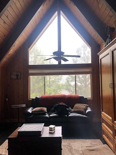
House Tour: The Investment House We Almost Bought (+ How We Would Have Designed It)

It’s a small world. About a year ago a house came on the market in our neighborhood near our mountain house. It was this adorable fixer of an A-frame – so much charm, so little work (compared to our house). Brian and I had dreams of doing a budget DIY reno as an excuse to live up here for a summer at some point (yes, we’d do it ourselves), and this one was PERFECT. It was so close (walking distance), needed some work but mostly cosmetic and stuff we could learn/do ourselves, and its potential was huge. Big windows, cute A-frame ceiling, deck, open layout – just CUTE. We came THIS close to buying it before we asked ourselves the most important question (and needed to have some solid answers) – WHY?? Here was the thought process.
But first, here is a little video we made with an inside tour…
It would be a great investment to Airbnb out as a vacation rental. We weren’t that keen on renting out our mountain house, but we KNOW that because of the location near the beach and its charm, we could rent this out for vacationing families for sure. But as we looked at the numbers and the time it would take to manage, we did worry that unless it was fully booked or we charged a lot more on holidays we might not cover our mortgage. Which would be fine if WE were using it too, but just as an investment it made us nervous. But I also know I would give it away to friends, family, my team, readers – and likely we would not cover our mortgage because of that too. So for us maybe doing it just as an investment wouldn’t be enough of a reason.
It would be a fun project! I really wanted to do a DIY budget project and had a concept for it (see below). But Brian basically reminded me that I had JUST finished the mountain house – a project that truly took me to the brink mentally and us financially (also I’ve never been so grateful for a project as I am right now). Sure, I like creating work for myself but would this really be “fun”? Or is it just the idea? Or am I addicted to creating challenges for myself that ultimately aren’t good for me and our family? Ok fine, maybe doing it for FUN wasn’t the right answer (besides, having a relaxing summer writing my book, hanging with my family might be the real fun that I need).
We’d document it for the blog and social content! Well, I love putting fresh projects out there, full of new ideas and I don’t want private clients. This is still true, but as Brian and I talked about it over and over, “content” doesn’t have to always sacrifice my mental health and our bank account. Besides, we just did a mountain house and if it were say in the desert or on the beach (ha) that would be one thing, but we realized that if the only reason left to do this was to be able to document a project – something you guys would be invested in – then another mountain house was definitely not going to be it.
Of course, then my business manager told us we couldn’t afford it, so we didn’t get it. It wasn’t right for us, it wasn’t going to pay for itself, it wouldn’t be an escape for our family, it was going to financially put us in jeopardy and create so much work and stress that I truly didn’t need. It also started to feel gross, where I was practicing overabundance in a way that was truly not necessary. The family that bought it is using it for their own getaway AND renting it out so it makes sense for them. We walked away and felt good about the decision.
Cut to last month when I saw it on Apartment Therapy’s Instagram – totally transformed but I recognized it. And get this, it was bought by a follower Casie Wilson, @Wilsonhaus. A dedicated reader in fact! I was so happy, jealous, impressed, all the things. So I reached out and here we are. They weren’t up here at the time but gave us the code and Brian and I (and the kids) snuck in and checked it out (and jumped on their trampoline). As I walked through we kept saying “oh that’s what we were going to do!” over and over although ultimately we had a very special and different plan for it (keep reading).
So we’ll start with the before and walk through what they did and what we had planned to do:

Here’s what it looked like when we saw it – the first day on the market. This area does EPIC garage sale weekends (4th of July and Labor Day weekend – literally everybody has one) so we were just at their garage sale when they were hammering the sign into their yard. We asked to go in and fell in love.
Our Plan for This House:

Here was our plan – this would be a 100% no waste project, where NOTHING would be new except mattresses/sheets, paint and maybe some appliances (I’ve never bought used before so I didn’t know about that). Everything else would be either thrifted, vintage, reclaimed, leftover from projects, kept as-is, found on the side of the road, or DIY’d – including the faucets, tile, etc. The other exception would be to paint it all white, but even with that I was like “I bet I can find a source for leftover white paint then just mix it all together.” It would absolutely be a budget project that Brian and I were going to DIY together, and I’d have days and days of thrifting ahead of me. In fact, my brother and his family were going to come live with us for the summer and do it with us (My brother Ken has to get on camera at some point in his life). It was going to be a real-time documentary project – not a year-long wait for the reveal, but a daily video/stories and updates. NOTHING WOULD BE NEW.
OMG, it still sounds like my dream project because despite loving the house where I’m sitting in right now SO MUCH. However, the financial and emotional stress of it definitely wore on us and I just don’t want to do a big fancy renovation ever again, really. This little house would be full of charm and soul and be super eclectic and eccentric – more quirky cabin than “scandi chalet,” BELIEVE ME. And such a good story about what you can do without creating any waste in the world. THAT was my plan and I still really want to do it at some point because I know that I can make it look rad while being environmentally friendly.
But as far as design-wise I didn’t have a plan because you can’t if you are going to thrift everything. We were also going to paint it all and we thought white for the main space, but could have done color or dark for a bedroom or two. And we knew that we were going to just sand/refinish that GORGEOUS flooring. But besides that, no real structural changes, no window replacement, nothing major – spend as little money as possible on the remodel and then thrift my heart out.


Obvious potential, right? Huge windows, cool/strange architecture, open plan, etc.


It’s a sweet 2 bedroom, 2 bath with a loft. It was on the market for 380k when we looked at it and it’s walking distance to the beach club which is huge for real estate up here.


I didn’t know what we were going to do for the kitchen – keep those cabinets and try to make them work? Paint the tile? I think we decided to get rid of the island, and upper cabinets, bring in a reclaimed island that would also act a kitchen table (kinda like what the new owners did!).

This bathroom was one that was recently renovated so we didn’t want to have to rip it all out. Instead, we were going to work with the tile – embracing the stone. I don’t mind the stone, but what dates it a bit is all the different directions and borders, etc. But it truly would have been a waste to demo out when its all one color and can easily be designed around. The vanity would have gotten a paint job, and likely kept the same stone top.

The loft above was their den, but we would have brought the TV down to the main floor and used this as a playroom and the murphy bed = extra bedroom. It was pretty dreamy up there with treetop views and felt like you were in a treehouse.


The bedrooms both were cute – the paneling was already white and the beams were dark (which we would have painted). They were simple rooms that didn’t need a lot – just fresh paint, sanded floor and decorated.
1 Year Later – How the Wilson’s Renovated

They painted it a warm white which I LOVE although I might have painted the exterior dark (cause I love a dark house).
Main Living Room and Kitchen

That fresh coat of paint absolutely transformed the house – and if you are a wood cabin lover (I hear you, I live with one) just know that it was pretty old, dated and kinda gross. Sanding and refinishing the walls is FAR more expensive than spraying it all one color. And remember that in the summer it’s really hot up here so yes, it’s a cozy winter cabin but it’s also walking distance to a beach so it can play that vibe really easily, too.

I spot my favorite Target chairs 
April 12, 2020
The Link Up: Emily’s “Grown Up” Purchases, Sara’s Eye Mask That Actually Helps Her Sleep, & The Book Ryann Can’t Put Down
 design by jono fleming| photo by caitlin mills | via the design files
Happy Sunday folks. If you are wondering how to celebrate Easter this year, or just running out of things to do with your family, Emily wrote about what she is planning for today here. And if you aren’t celebrating at all and are looking for a quick and fun read, you’ve come to the right place! As usual, EHD has some great recommendations in store so let’s get to it:
Today’s home tour (via The Design Files) is the exciting, colorful treat we needed. Earlier this week we were talking about how people are embracing more color nowadays since we are in our homes so much more. Minimalism, it seems, is going by the wayside. Do you agree?
From Emily: “Brian and I finally joined the world of “growm-ups” as Birdie calls us and bought our first food processor (based on Brian’s research and reviews) and first mixer!!!! Brian insisted we buy the gray one on closeout to save money (I didn’t disagree since I have no idea how much use it will get) but I personally love the blue one more. :)”
From Sara: “I have this weird thing where at night it feels like I’m having to WORK to keep my eyes closed, and any little amount of light makes it impossible for me to sleep. I’ve tried several sleep masks, but just recently got this one and love it. It looks absolutely ridiculous, but it’s super comfortable, blocks out all light, and puts a nice light pressure on my eyelids which helps with my weird “eyelids working too hard to stay closed” issue.”
From Jess: “In a time when I feel like I should have all the time in the world to take care of myself, I haven’t been. So when I looked in the mirror two weeks into the quarantine with my dark circles, more blemishes than normal and greasy hair, I knew I that some outside self-care was imperative to my diminishing mental state. So after seeing one of my best friend’s instastories trying her hairdresser’s “How to Get Wavy Hair, No Heat Required” I thought THIS is it! Calla Dawn (her hairdresser) has a “Get Wavy” highlight on her profile giving you a step by step how-to and product recs. I bought what my friend uses for her perfect ways which is a wide tooth comb, this reparative styling creme and this wave serum. They are not inexpensive as a set but the products smell SO GOOD and make my hair look and feel great (which makes me feel so much better). Now onto fixing those pimples”
From Julie: “Jess inspired me to purchase Slowdown Studio’s new puzzle. Added bonus it’s of Palais Bulles which is one of my favorite architectural homes in Cannes, France.”
From Caitlin: “Last year Em launched a design class with Skillshare (we documented the process here) about finding your own style. I signed up then (as the partnerships person, I truly drink the Kool-Aid for every brand we share on the site) but guys: I’ve been an actual, #notsponsored, real-life paying customer since then. I like the writing and drawing classes best, since those feel most accessible (no outside materials required, baby!), but there’s literally a lesson for almost anything. It turns out that Em’s link for 2 free months is still up and running, so I just wanted to share the wealth! If you want to learn something, for free, and don’t know where to start (or if you just need some prompts to get your creative juices flowing), it’s a fun resource to explore.”
From Ryann: “A few weeks ago at our weekly Zoom happy hour, as we were discussing the possibility of doing a EHD book club (stay tuned for that) Emily mentioned this book that she loved. Since it’s YA and is about teenagers almost kissing (Emily’s favorite genre) I bought it immediately – literally as we were on the call. And guys, I’ve stayed up LATE several nights because I can’t put it down. It just makes me think about my former high school self and it makes me sad, happy, lonely, yet completely understood. I haven’t cried yet but I cry when reading any book so I am assuming that will come very soon. Please tell me if you’ve read it and let’s talk about Lee!!!”
From Veronica: “If you haven’t seen John Krasinki’s Some Good News on Youtube yet, you need to stop what you are doing and watch RIGHT NOW. Especially episode 2. It is heart-warming, so funny, and uplifting for those of us who need a little sunshine in your heart these days. YOU GUYSSSS. It had me welling up like a baby!! I’m serious, go watch. Right. Now.”
From Mallory: “I’ve always been against tie dye. In fact, the last time I even considered putting it on my body was in the 5th grade when our class shirts were tie-dye. And even then, I felt uneasy and unsure…but quarantine is bringing out some weird stuff in me and I’m blossoming into a new Mallory. I would’ve never considered buying this before I spent every day in my house, but guys – I just pulled the trigger. In fact, I’m so into this whole tie-dye sweatsuit thing that my aunt’s friend is making me a custom one…and I cannot wait to spend every waking moment in it. I don’t know if I’ll still be into these when this is all over, but I’ll be sure to keep everyone informed. Wish me luck xx”
Lastly, today we want to start a fun (at least we hope) new segment. Every Friday we do a Zoom meeting/happy hour and we realized that in addition to discussing VERY important business, we usually end up diving into other topics that are sometimes controversial, sometimes just fun or interesting to us. This week, Emily asked a very polarizing relationship question: “Do you let your partner look through your phone?” Many of said yes, it’s no big deal. One of us felt STRONGLY that that’s such an invasion of privacy. So we want to know where you stand. Do you let your partner look through your phone? Do they know your password? And does your partner allow you to look at theirs? We sincerely hope this doesn’t cause fights, but we are VERY curious. Let us know how you feel about this and why. xx
Opener Image Credit: design by: Jono Fleming| photo by: Caitlin Mills | via: The Design Files
The post The Link Up: Emily’s “Grown Up” Purchases, Sara’s Eye Mask That Actually Helps Her Sleep, & The Book Ryann Can’t Put Down appeared first on Emily Henderson.
April 11, 2020
How I Fell In Love With Cooking, And a Man Named Matty Matheson + Four Of His Recipes Reviewed

I have a very annoying habit. It’s something that bugs Emily so much that it’s caused some big fights through the years. I’m aware of it and I’m working on it, but it’s a hard habit to break. Let me know if I’m alone on this one: I will take the advice of a specific friend over someone else’s advice, even when that bit of advice is THE EXACT SAME BIT OF ADVICE! I don’t know why I do it, I don’t know what goes into my decision making, but for some reason I will blow off someone’s recommendation (let’s say Emily’s for instance) but heed the exact same recommendation from a different source.
Examples: She said I’d like Paul Auster, I told her no. Our friend Paul said I’d like Paul Auster, I told him yes. She told me to watch Veronica Mara, I said “uh a teenage girl detective show?”, but then my buddy Dirks said “it’s actually really smart,” so I gave it a whirl. She told me I’d like Armchair Expert, but it wasn’t ’til Vulture told me I should listen that I put on my headphones and was like “shhh, I’m trying to listen to my new friends Dax and Monica.” There are tons of these examples.
Why?? Is it a trust thing? Is an ownership thing? A spite thing? Whatever it is, it’s annoying, I’ve been told. And it’s happened again. Emily told me I’d like cooking, but it wasn’t until this beautiful man (below), my new best imaginary friend, Matty Matheson, told me, that I actually started doing it.

I’ve tried “cooking” before in my life, but it was more like the college version of cooking where you pat yourself on the back for getting creative with .99 cent ingredients that you can make last a week. “You should try my marinara! It’s Prego, sure. But I then, and get this, I added meat! And you’ll never guess what else! I added some garlic powder! And this is what really sets it apart- I added, ready? I added… onions!” And that’s what I thought cooking was. Is this a guy thing? Are we getting placated into thinking we’re good at something we’re not? Are you all tricking us into thinking that our creations are good and unique even though every other dude makes this exact thing and wants to be thanked for reinventing spaghetti sauce? I have a feeling that’s the case. Oh, what sad creatures we are.
But there’s hope. At least I found some hope, and it took a crazy dude with head-to-toe tattoos and a rat tail to convince me. I’ve watched cooking shows before and followed recipes before, but it always felt like I was just visiting. Or like I was doing homework. Or like I was indulging in some la-di-dah version of a romantic night with Emily. I never was interested in actually cooking. That is, until I met my new friend Matty, and I took his advice over everyone else’s and started to f’ing COOK.
I was introduced to Matty through Instagram when a guy I follow, who sells vintage Grateful Dead shirts, posted a video of Matty cooking in a shirt that he had sold him. I was in love at first sight. Here’s a larger than life dude, tatted up to the neck, wearing a too-tight Bertha shirt, screaming a high-pitched song at the camera about chopping onions. WTF? I went to his YouTube channel and proceeded to watch almost all of the episodes of his newest Youtube show “Just A Dash” in one sitting. It was better than I had imagined.

Matty has a way of hitting the perfect balance of being hilarious while also teaching you how to cook a legit delicious meal. His show is kind of the anti-cooking show. It leaves in mistakes, curse words, messes, and in general pulls back the curtain on what goes into that kind of show. When Matty loses his mind while waiting for his chorizo lasagna to bake, you feel like you’re just hanging with your funniest friend in his kitchen.
I can’t put my finger on why he’s so strangely captivating and comforting. He yells a lot, he drops a ton of f-bombs, he goes on tangents, he picks his ear while he’s cooking. He’s a mess. But he’s an honest mess. I trust him, he’s not putting on an act, he’s just being himself, burps and all. And he makes us feel that we too could be good cooks, even though we don’t have French accents or perfect kitchen skills. I could watch him for hours. He’s like a lunatic teddy bear you just want to hug. And the icing on the cake is, his recipes are amazing.
When we started the lockdown here, we knew we would need to cook more than we normally do, and I was actually excited about that. I finally had a friend (Matty) that I trusted, who told me I should check out this “cooking” thing. So I dove in.
SHEPARDS PIE

We started with his Shepards Pie, which seemed like a good one for our family. We set up the laptop on the counter and got to it. This was the first exposure my kids had to Matty and they were instantly hooked like Emily and I were. “He’s funny!” they yelled as we dove for the mousepad trying to skip the parts where he cursed up a storm. Too late. Oops.


The whole family got involved in the cooking, and there was a huge pride that came when we finally ate our creation. It turned out super yummy.
JUICY BURGERS

Next, I made some burgers following Matty’s advice that you should treat a burger like a steak. That basically means that you don’t overdo it with additions to the meat, just some salt and then some pepper when it’s cooked. I’m usually a bit squeamish about handling raw meat, but Matty helped me face my fear of rolling those patties into perfect little pucks.
PERFECT STEAKS

We’ve been getting some frozen meats delivered to us, so we can avoid the grocery store as much as possible, and in one of the deliveries came some nice NY strip steaks, so I wanted to give those a go. Like every other dude out there, I used to consider my steak skills pretty good. I could grill them with a bunch of spices and usually get them to come out medium rare-ish. And I would get compliments, but given my previous Ragu recipe above, I’m now rethinking all compliments. Matty cooks his steaks on the stove by searing them in a ton of oil, then butter-basting, which makes them perfect. I then found a recipe he did for a kale based chimmichurri, which was the perfect topping. Yummmmmmm.
FLUFFY PANCAKES

Lastly, I tried his “Fluffiest Pancakes” and I kinda blew it. I read the recipe rather than watch the whole video for the first time, and I missed the tip about not over-mixing the final batter, so when I tried to pour mine it was way too thin. I added some extra flour and it helped. They were by far the best pancakes I’ve made. And it was the first time I made them without a mix, from scratch.


Please note my “Bo Knows Jerry” shirt in this pic, it’s one of my most prized possessions. And to keep it clean, I’m ordering my first apron. Hell, I’m even looking at a new chef’s knife, and definitely am going to buy myself some Matty oven mitts when my birthday comes. ‘Cause I’m a cook now.
I wish that there were online teachers like Matty in other intimidating fields. Like what if there was a mathematician with tats and a rat tail, who screamed, “That’s a f’ed up quadrilateral, but if you try this thing, you’ll be doing some sweet f’ng math!!” or if there was like a YouTube course on art history with a dude shouting, “That’s the thing with the f’ing Byzantine works man! They’re heavily influenced by those crazy ass Greeks!”. I’d be a really smart guy if those types of shows existed. But for now, I’m just an amateur cook. And I’m really enjoying it. I just needed the right friend to convince me to try it.
And I promise, I will listen to Emily the next time she suggests something. Except for Love Is Blind. I refuse to watch that one.
Unless someone else says it’s good.
The post How I Fell In Love With Cooking, And a Man Named Matty Matheson + Four Of His Recipes Reviewed appeared first on Emily Henderson.
April 10, 2020
53 Movies That Parents AND Young Kids Both WANT to Watch. AKA What to Watch When It’s “Family Movie Night” Every. Single. Night.
 photo by sara ligorra-tramp | from: the ultimate family-friendly media room + wet bar
Not to pat myself on the back but after 30 hours of watching trailers and Googling, I think this is the most comprehensive list on the internet. Ahem. While living our current “Groundhog Day” reality you want/need something to look forward to make the weekends, hell, every night feel different. Special, even. It’s Friday night and sadly we aren’t in the ’90s, so there’s no TGIF lineup to give us the milestone that says “we made it, now watch garbage together with the background of canned laughter.” What we all want are movies or shows that parents and our KIDS WANT to watch, together. The categories “family-friendly” and “kid-friendly” just aren’t accurate, they are too old or too young, respectively. I know because I’ve researched. So today I’ve reviewed and asked all my friends what are the movies that us parents AND our young kids actually love watching TOGETHER (once they are tweens it’s easier, so that’s why I’m focusing on young kids).
It’s important to note that my 4 and 6-year-old really sacrificed their days and nights to “work” with me and watch and “review” as many of these possible together (at least the trailers). They now really, really LOVE “mama’s job”. Also disclaimer – a lot of these on the list our kids aren’t quite ready for yet OR we haven’t seen them, but I wanted a really comprehensive list for ME to reference for the next year of nightly family movie nights – and yes, we are ok with that if they are good films that makes the whole family feel good, thus the impetus for this research and post. If nothing else our kids are going to come out of this as family-friendly film critics. Here you go:
Current/Recent Animated

These are our favorite cartoons, mostly with good messaging and funny enough for grownups. I’m going to quickly list the obvious only so they are included (for my own reference when I’m stumped) but I’m not going to “review”, say, Frozen, for obvious reasons. Here goes:
Moana
My all-time favorite animated movie that I’ve seen probably 25 times and still don’t mind when it’s the chosen flick (and we often force it). The music (Lin Manuel, come on – modern-day Shakespeare), the empowering female message, the environmental message, the feminine/masculine message, the lack of an exaggerated female figure (finally), combined with my love of The Rock. It’s just SO GOOD. I think what kept it from winning the Oscars was its font and logo. I’ve cried almost every time. I know you’ve seen it but if you haven’t please know it’s one of mine and Brian’s favorite movies of all time – kid or not.
Onward
YOU HAVE TO SEE THIS MOVIE. It just came out and we’ve watched it twice already and loved it. It has great messaging of empowerment, brotherhood, fatherhood, an awesome single mom, it addresses death, grief, and self-esteem with LOADS and loads of entertaining adventure. Moana level good messaging and totally entertaining. If you have two boys be prepared to WEEP.
Frozen 1 + 2
Not sure if you’ve heard of it – it’s about two sisters and one is kinda a B to the other, but since they end up being the love story and we aren’t used to strong female leads it’s heralded as some sort of anti-fairy tale modern film. I get how it’s also about female love and friendship, but more importantly … there is a talking snowman that basically steals the movie, along with Kristen Bell. I have seen both 10 – 30 times and I still sing along. They are GREAT not that you needed a Frozen review from me.
Finding Nemo + Finding Dory
Haven’t seen either in years and so excited. We are so excited to watch Finding Dory this weekend – the kids have never seen it and I’m hoping it’s as good as the first. Ellen is a national treasure.
How to Train Your Dragon
We loved the first one – so sweet and playful, exciting world of adventure, etc. The second was way less good – even the kids thought it was pointless.
Sing
WONDERFUL. Poppy music, hilarious characters, incredibly drawn – I’ve seen this 10 + times and could watch again. Reese, we love you.
Inside Out
A meta cartoon about childhood told through emotions. Be prepared to cry, but our kids don’t love this YET so they might not go for it. It’s obviously a bit high concept for them and there are some scenes that are scary but we are going to try this one again because it’s so good.
Up
Starts with love and then death and so Charlie always made us turn it off. Yes, it’s sad and there are some scary dogs (so maybe 4+) that our kids were afraid of for years, but now they love it.
Wall-E
Nothing like a dystopian animated film to really lift your spirits these days, but it does have hope. We tried this a couple of years ago and no-go. But then we watched this last week and they both LOVED it and they kinda even got it, too.
Ratatouille
Now that I cook soup after soup after soup I really relate to this plight of this rodent. It’s just so good – I’ve seen it probably 6-7 times and still don’t mind sitting through it. WHY HAVE I NOT COOKED RATATOUILLE YET????
Secret Life of Pets
This is a good “love the first time, but can’t watch 10 times” for me, but again it was still cute/fun/good mostly because of the concept. The psychotic bunny at the end usually scares our kids – because it’s TERRIFYING, but our kids are also really sensitive.
Zootopia
I think I’ll always resent the fact that this movie beat out Moana for best animated picture that year, but admittedly it is good and has a good message (but not as good as Moana).
Monsters Inc.
It took them a while to get past the first scene which is super scary for kids, but then finally we did and they love it. John Goodman and Billy Crystal just make it entertaining enough for grownups (and it’s a very sweet story).
Incredibles 1 + 2
We haven’t seen this in years, since before we had kids so I’m excited to watch it. Charlie got scared when he was 2 and made us turn it off, but he’s willing to give another go at 6.
Toy Story 1 – 4
You want to marathon something? We just watched a few of these, and #4 is worth the wait. I haven’t seen #1 in years so we’ll be watching this soon.
Wonderpark
I haven’t seen this but Brian took the kids to the theater and they love it. It’s on the shortlist for a desperate night.
Spiderman into the Spider-verse
We haven’t seen this yet, but plan on soon (if 4 and 6 are old enough) but I wanted to keep it on the list because it’s happening soon.
Coco
So critically acclaimed that I can’t wait to watch it. Brian and the kids had to leave the theater because they were scared (not Brian, ha) but again we have very sensitive kids and I’m still excited to give it another go.
Current or Recent Live-Action

The list below are the ones that I’m extra excited about because these are with real people, NOT cartoons and Brian and I feel like real human beings, not babysitters, when watching them.
The Biggest Little Farm
Yes, it’s a documentary about a farm with so many vegetables and yet our kids LOVED it. I will say this is hands down the most uplifting movie I’ve seen in so long. I cry EVERY. SINGLE. TIME. with happy tears knowing that there are people on this planet who are farming the way they are, caring for the planet the way they are, giving hope to us that if we shift how we grow food and raise livestock, we can all benefit so much (nutritionally and spiritually). And YES, it’s super entertaining, too – again, my 4 and 6-year-olds loved it). I’ve seen it 4 times, and it brings me so much joy each time.
Mary Poppins
Excellent in every way. We’ve only watched once and I’m excited to watch again – the kids can’t wait to watch it again, plus Brian has a huge crush on Emily Blunt. Also Lin Manuel. Mostly I just love Lin Manuel.
Enchanted
A HUGE hit with both kids and Brian and I LOL’d many many times (James Marsden and Amy Adams are legitimately hilarious). A whole family pleaser that we watched this week while doing “research” and made us think a lot of New York 
Insanely Comfortable Underwear & Bras (As Told By Women Who Can Personally Vouch)

For those of you working from home right now, what’s your wardrobe looking like these days? I (Sara) started off strong, waking up every morning and putting on a full outfit (with shoes). Then I stopped wearing shoes and switched to slippers. Now I’ve reached the “loungewear” phase of my work from home uniform. Luckily, I’ve realized my productivity isn’t linked to whether I’m wearing jeans or not. So I’m sticking with comfort to get me through the day, all the way down to my underwear and bra.
While the transition to daily leggings and sweatshirt is new to me, I’ve always been a connoisseur of ultra-comfortable underthings. So much so that I haven’t worn a bra with underwire in approximately two years, and since I switched to seamless underwear for reduced panty lines, thongs are a very rare occurrence. And now that so many of us are working from home, I have a feeling that there are more than a few pushup bras out of commission for the time being. With comfort and functionality on my mind more, I thought it would be the perfect time to share a round up of comfy underthings I’m obsessed with. But I’m just one person, with one kind of body. So I brought in the rest of the EHD team to share their personal favorites too (along with a special guest appearance by beloved EHD alum Arlyn, who has some comfy recs for the bustier among us).
Before we get into it, here’s a quick rundown on our measurements so you can get a better idea of who’s recommendations you might align with best:
Emily – Bra Size: 32dd, Height: 5’4″, Waist Size: 26
Sara – Bra Size: 34c, Height: 5’2″, Waist Size: 29
Caitlin – Bra Size: 36f, Height: 5’8″, Waist Size: 32
Jess – Bra Size: 36c/34d, Height: 5’3 3/4″, Waist Size: 31
Arlyn – Bra size: 36h, Height: 5’3″, Waist Size: 33/34
Veronica – Bra Size: 34c, Height: 5’7″, Waist Size: 27
Julie – Bra size: 32c/34b, Height: 5’5″, Waist Size: 26/27
Mallory – Bra size: 32a, Height: 5’7″, Waist Size: 26
BRAS WITH STRUCTURE
Like I said, I haven’t worn a bra with underwire in about two years. But for some, underwire is essential for comfort. And the majority of the EHD team do regularly wear bras with underwire. So here are the most comfortable bras we’re wearing these days – structure and support included.
 1. Matila Side Support Plunge Bra | 2. Classic Uplift Plunge Bra | 3. Auden Unlined Bra | 4. Lightly Lined Wireless Bra | 5. Amelia T-Shirt Bra | 6. Breathe Wireless Bra
 1. Arlyn – I’ve owned three of this bra and I don’t ever plan on stopping buying it unless Elomi betrays me and stops making it. It’s a great everyday bra but also works really well for nicer clothes. A true day to night situation. It’s by Elomi, and their sizing is SUPER consistent.
2. Caitlin – Around this time last year, I caved and ordered this Thirdlove bra after being served targeted IG ads for months. Once it came in the mail, I put it on and was like, “oh, why did I wait to buy this?” There are tiny inserts in each (I take my right one out because that boob is slightly bigger – TMI?) and it actually IS comfortable for my F.
3. Jess – I feel pretty silly that at age 31 I didn’t know that “no lining” bras were a thing until Emily Bowser told me about this one. I think I thought the only “non-lined” bras were the lacey sexy ones which are great but not what I want to wear on the daily. So basically this bra changed my life because no longer am I dealing with the horrible “extra bulk” that most larger chested gals have NO NEED FOR. Plus it was only $15 as opposed to the $50 bras I was buying before. It’s also super soft and the underwire still gives me the support I need. 5 stars!
4. Sara – This is the only bra I own from Victoria’s Secret, and it took me 4 tries to find the right one (back when I thought having a bra from VS was an undergarment requirement). But I actually love this bra. It’s ultra-comfortable because it doesn’t have an underwire, but still feels shaping and sexy.
5. Arlyn – I searched for a T-shirt bra that was supportive and not the least bit padded for, I’m not kidding, a decade? Doesn’t exist. But the closest thing I did find is this Amelia T-Shirt Bra by Elomi (one of my favorite big boob bra brands – bx4). It looks great under everyday clothes, doesn’t budge and also doesn’t feel like I’m in a bra prison. If it helps, I wear a 36H in this brand (yup, this is a size, people).
6. Sara – I’ve had a version of this bra from Gap Body since I was in college. It’s just the perfect t-shirt bra. Simple, classic, affordable. And the soft jersey material feels like a hug for my boobs.
BRALETTES
Bralettes are what I’m wearing 99% of the time. Even before I was spending most of my time at home, but especially now that my main go-to in terms of tops is a sweatshirt. And while half of the EHD team hasn’t been wearing a bra on the reg with our new WFH protocol, I personally like wearing some support throughout the day. The bralette is the perfect middle ground between a bra and going au natural.
 1. True & Co. V-Neck Bra | 2. Maddie Seamless Bra | 3. Modern Cotton Bralette | 4. Freya Francies Bralette | 5. Convertible Strap Bra | 6. Longline Lace Bralette | 7. Free To Be Bra | 8. Seam-free Tank Strap Bralette | 9. Auden Lace Padded Bralette
 1. Emily – I was never a real bralette person – I am an adult WOMAN after all. Definitely not in public, anyway. When this all went down I was unprepared for the extreme comfort that my ribcage truly desired, and the WIRE CAGE was just not working. We all brainstormed posts per usual and in a fit of desperate rage I shouted out, “I JUST NEED A COMFORTABLE BRALETTE!” My team gave me some ideas and I said, this has GOT to be a post and Sara totally agreed. So I ordered a few from Target that I LOVE and while there might be a lot out there that are awesome, I can tell you that I go from day to night to day to night in this one and this one and I’m about to order more.
2. Sara – Most of my bralettes these days come from Urban Outfitters. They just have a really good selection of cute and comfortable bralettes in tons of colors and styles. This is a recent favorite and works just as well under a sweatshirt as it does under a loose-knit sweater.
3. Veronica – I have this bra along with the matching underwear in three different colors and they are the comfiest darn things! I usually wear the bra under sweaters with sweatpants for around the house, or wear it to sleep in during the hot summer months.
4. Arlyn – Okay so no bralette will EVER be supportive at my chest size, but sometimes I do want a little shelf action without the intensity of an underwire. I’ve had this one for a few years and it does the trick for lounging around. Looks like it’s actually discontinued but there are lots of sizes and colors still available. I bought the largest size they made (XL) and while I won’t be doing any running in this thing, it at least has adjustable straps and looks really nice on.
5. Sara – This was a bra I bought due to marketing hype, but I’ve been really happy with it so far. I especially love the color, but I also like the wide comfortable band, the optional padding, and super soft fabric.
6. Julie – My everyday bralette still crosses the line onto the fancy side but is one that I forget I’m wearing halfway through the day. That’s cause I only wear a bra about half the time anyway.
7. Caitlin – Plot twist: these Lululemon bras used to be my pick for everyday wear. (Actually, now that I’m home, they’re back to being my first choice!) They’re ACTUALLY cute and they keep my boobs feeling kinda lifted and together without the annoyance of underwire or like, general back lumpiness. (And don’t be afraid of the A/B cup advisory — I buy either 10s or 12s and they fit F cups just fine! Plus, Lulu now offers these strappy back bras in medium and high support, so the site’s just worth a peek if you haven’t poked around in a bit.
8. Emily – This is the other must-have bralette I reference in #1 that I will never “lette” go of
Insanely Comfortable Underwear & Bras (As Told By Women You Can Personally Vouch)
For those of you working from home right now, what’s your wardrobe looking like these days? I (Sara) started off strong, waking up every morning and putting on a full outfit (with shoes). Then I stopped wearing shoes and switched to slippers. Now I’ve reached the “loungewear” phase of my work from home uniform. Luckily, I’ve realized my productivity isn’t linked to whether I’m wearing jeans or not. So I’m sticking with comfort to get me through the day, all the way down to my underwear and bra.
While the transition to daily leggings and sweatshirt is new to me, I’ve always been a connoisseur of ultra-comfortable underthings. So much so that I haven’t worn a bra with underwire in approximately two years, and since I switched to seamless underwear for reduced panty lines, thongs are a very rare occurrence. And now that so many of us are working from home, I have a feeling that there are more than a few pushup bras out of commission for the time being. With comfort and functionality on my mind more, I thought it would be the perfect time to share a round up of comfy underthings I’m obsessed with. But I’m just one person, with one kind of body. So I brought in the rest of the EHD team to share their personal favorites too (along with a special guest appearance by beloved EHD alum Arlyn, who has some comfy recs for the bustier among us).
Before we get into it, here’s a quick rundown on our measurements so you can get a better idea of who’s recommendations you might align with best:
Emily – Bra Size: 32dd, Height: 5’4″, Waist Size: 26
Sara – Bra Size: 34c, Height: 5’2″, Waist Size: 29
Caitlin – Bra Size: 36f, Height: 5’8″, Waist Size: 32
Jess – Bra Size: 36c/34d, Height: 5’3 3/4″, Waist Size: 31
Arlyn – Bra size: 36h, Height: 5’3″, Waist Size: 33/34
Veronica – Bra Size: 34c, Height: 5’7″, Waist Size: 27
Julie – Bra size: 32c/34b, Height: 5’5″, Waist Size: 26/27
Mallory – Bra size: 32a, Height: 5’7″, Waist Size: 26
BRAS WITH STRUCTURE
Like I said, I haven’t worn a bra with underwire in about two years. But for some, underwire is essential for comfort. And the majority of the EHD team do regularly wear bras with underwire. So here are the most comfortable bras we’re wearing these days – structure and support included.
1. Matila Side Support Plunge Bra | 2. Classic Uplift Plunge Bra | 3. Auden Unlined Bra | 4. Lightly Lined Wireless Bra | 5. Amelia T-Shirt Bra | 6. Breathe Wireless Bra 1. Arlyn – I’ve owned three of this bra and I don’t ever plan on stopping buying it unless Elomi betrays me and stops making it. It’s a great everyday bra but also works really well for nicer clothes. A true day to night situation. It’s by Elomi, and their sizing is SUPER consistent.
2. Caitlin – Around this time last year, I caved and ordered this Thirdlove bra after being served targeted IG ads for months. Once it came in the mail, I put it on and was like, “oh, why did I wait to buy this?” There are tiny inserts in each (I take my right one out because that boob is slightly bigger – TMI?) and it actually IS comfortable for my F.
3. Jess – I feel pretty silly that at age 31 I didn’t know that “no lining” bras were a thing until Emily Bowser told me about this one. I think I thought the only “non-lined” bras were the lacey sexy ones which are great but not what I want to wear on the daily. So basically this bra changed my life because no longer am I dealing with the horrible “extra bulk” that most larger chested gals have NO NEED FOR. Plus it was only $15 as opposed to the $50 bras I was buying before. It’s also super soft and the underwire still gives me the support I need. 5 stars!
4. Sara – This is the only bra I own from Victoria’s Secret, and it took me 4 tries to find the right one (back when I thought having a bra from VS was an undergarment requirement). But I actually love this bra. It’s ultra-comfortable because it doesn’t have an underwire, but still feels shaping and sexy.
5. Arlyn – I searched for a T-shirt bra that was supportive and not the least bit padded for, I’m not kidding, a decade? Doesn’t exist. But the closest thing I did find is this Amelia T-Shirt Bra by Elomi (one of my favorite big boob bra brands – bx4). It looks great under everyday clothes, doesn’t budge and also doesn’t feel like I’m in a bra prison. If it helps, I wear a 36H in this brand (yup, this is a size, people).
6. Sara – I’ve had a version of this bra from Gap Body since I was in college. It’s just the perfect t-shirt bra. Simple, classic, affordable. And the soft jersey material feels like a hug for my boobs.
BRALETTES
Bralettes are what I’m wearing 99% of the time. Even before I was spending most of my time at home, but especially now that my main go-to in terms of tops is a sweatshirt. And while half of the EHD team hasn’t been wearing a bra on the reg with our new WFH protocol, I personally like wearing some support throughout the day. The bralette is the perfect middle ground between a bra and going au natural.
1. True & Co. V-Neck Bra | 2. Maddie Seamless Bra | 3. Modern Cotton Bralette | 4. Freya Francies Bralette | 5. Convertible Strap Bra | 6. Longline Lace Bralette | 7. Free To Be Bra | 8. Seam-free Tank Strap Bralette | 9. Auden Lace Padded Bralette 1. Emily – I was never a real bralette person – I am an adult WOMAN after all. Definitely not in public, anyway. When this all went down I was unprepared for the extreme comfort that my ribcage truly desired, and the WIRE CAGE was just not working. We all brainstormed posts per usual and in a fit of desperate rage I shouted out, “I JUST NEED A COMFORTABLE BRALETTE!” My team gave me some ideas and I said, this has GOT to be a post and Sara totally agreed. So I ordered a few from Target that I LOVE and while there might be a lot out there that are awesome, I can tell you that I go from day to night to day to night in this one and this one and I’m about to order more.
2. Sara – Most of my bralettes these days come from Urban Outfitters. They just have a really good selection of cute and comfortable bralettes in tons of colors and styles. This is a recent favorite and works just as well under a sweatshirt as it does under a loose-knit sweater.
3. Veronica – I have this bra along with the matching underwear in three different colors and they are the comfiest darn things! I usually wear the bra under sweaters with sweatpants for around the house, or wear it to sleep in during the hot summer months.
4. Arlyn – Okay so no bralette will EVER be supportive at my chest size, but sometimes I do want a little shelf action without the intensity of an underwire. I’ve had this one for a few years and it does the trick for lounging around. Looks like it’s actually discontinued but there are lots of sizes and colors still available. I bought the largest size they made (XL) and while I won’t be doing any running in this thing, it at least has adjustable straps and looks really nice on.
5. Sara – This was a bra I bought due to marketing hype, but I’ve been really happy with it so far. I especially love the color, but I also like the wide comfortable band, the optional padding, and super soft fabric.
6. Julie – My everyday bralette still crosses the line onto the fancy side but is one that I forget I’m wearing halfway through the day. That’s cause I only wear a bra about half the time anyway.
7. Caitlin – Plot twist: these Lululemon bras used to be my pick for everyday wear. (Actually, now that I’m home, they’re back to being my first choice!) They’re ACTUALLY cute and they keep my boobs feeling kinda lifted and together without the annoyance of underwire or like, general back lumpiness. (And don’t be afraid of the A/B cup advisory — I buy either 10s or 12s and they fit F cups just fine! Plus, Lulu now offers these strappy back bras in medium and high support, so the site’s just worth a peek if you haven’t poked around in a bit.
8. Emily – This is the other must-have bralette I reference in #1 that I will never “lette” go of
April 9, 2020
Lacking a Laundry Room?? The Ultimate At-Home Hand Washing Laundry Guide
 photo by sara ligorria-tramp | from: how we designed a family-friendly laundry room in the portland project
LAUNDRY, GUYS. It’s all I can think about. Riddle me this: how is it possible to wear the same few pieces every day and STILL amass piles of things to be washed? Did I break a time-space barrier? Is this physics? Did my spring cleaning unlock a black hole of clothing that’s been sitting, un-laundered, for millennia? Is this what you talk about in science class?
Like a lot of apartment dwellers, laundry day is a whole THING for me. I wasn’t #blessed with an in-unit (or even in-building) washer or dryer, so once a week, I load up a sack and haul my clothes, towels, sheets, and other unmentionables down the block to the laundromat. It’s the only place in the world where I can simultaneously turn my life savings into quarters and spend 2 hours testing the structural limits of the 10-load washer. Honestly, I don’t miss it much.
But now, since I’m trying to avoid any unnecessary schlepping, I figured HEY, what better time to finally figure out how to do laundry — and do it WELL — at home? I wasn’t sure where to start, but guys, after some trial and error I FIGURED IT OUT and I may never go back.
So if you’re like me, overwhelmed by an overflowing laundry basket, or if you’re a parent just trying to make it through the now-daily loads (“we’re going out LESS, how are you wearing MORE?”) here are some tried-and-true tips on getting everything clean from the comfort of your own home. (I promise if you are one of the people #blessed with an in-home laundry situation, there are still some tips for you too. And if you have any advice — or if you’re just drowning in cups of detergent and want to commiserate — let’s dish down below.)
Alright, let’s get started. Manual laborers are up first.
Hand Washing

Castile Soap or Laundry Bar | Plunger or Laundry Wand | Tub or Trash Can
Yep, all you need are those three things. But first, let’s talk about the elephant in the room: the plunger. From personal experience, I promise that it makes this process so much easier. But first, let’s talk a little more in-depth about all of the tools:
Detergent: Because, duh. And some good news — your regular liquid detergent will work just fine for almost everything (be careful with your delicates since normal detergent can easily break down their fibers — I recommend this laundry bar for those)! If you’re nervous about touching detergent, a friend swears by this Dr. Bronner’s, but any liquid Castile soap will clean you AND your clothes safely.A bathtub, a sink, or a container: I used my tub, but you can also make this work with a large plastic storage box, a bucket, or a (clean) garbage can. The plunger: I learned from trial and error that this is really a lot easier if you have what I now know is referred to as “an agitator.” Details below. Bonus items: Vinegar, tea tree oil, spot treatments, or specialty detergent for delicates like this crowd favorite are great additions for “those extra attention jobs.”
EASY PEASY. You probably have most of these things in your home, and if not, they’re super affordable. (Cheaper than all the quarters I haul around the laundromat every week, at least.) I was able to safely pick up liquid detergent and a new plunger at my local Walgreens. If you want to get really fancy, you can buy something like this instead of a regular plunger, but come on…look at it. It’s basically the same thing.
INSTRUCTION TIME
Place the plunger: Plop that plunger right into the middle of your tub and make sure it’s sealed tight to the surface. Add in clothes: Place anything you’re ready to launder in the tub. Some people choose to run the water first, but I found that you can waste less water by just dumping your laundry basket in first.Pour in your detergent: You can use the same amount as you would normally — and fill with water till everything is submerged. Using cold or lukewarm water is fine as you’re about to let your clothes soak in this for a bit to loosen up the dirt. Let them soak: You know how sometimes you’re just not in the mood to do dishes, so you just let them soak? That’s ACTUALLY relevant here. Take a break and do something else — you can let them rest for as few as 10 minutes and for as long as 2 hours, depending on soiling — and then come back for your workout. Put the plunger to work: “Finally, it’s plunger time,” said no one ever…until today. You know how your washing machine tosses your clothes around? Start pushing on your plunger and it will agitate the water in your tub in the same way. Sure you can avoid the plunger and just swish everything around with your hands, but here’s the truth, I tried that and it made me miserable. Larger items are heavy when they’re soaked, I have a bad back, and I’m not particularly interested in leaning over a tub and getting water all over myself and the floor. Just plunge it. Channel your inner colonial woman churning butter and go to town for 5-10 minutes. (You know yourself and how dirty your clothes are. If they’re lightly soiled, you can just swirl them around. If they’re gross, throw in a teaspoon of tea tree oil (natural way to prevent fungal and bacterial infections), then pop on a podcast and try to make it 10 minutes with plunging. Feel the bicep burn. I believe in you!)Time to scrub: Once you’re done, you can hand-scrub any extra dirty or stained areas with a bit of soap. Hit those hot spots real quick!Drain the water: If you’re using a tub, drain it. If you’re using a plastic storage bin or trash can, you can dump the excess water down the shower drain. Rinse it all out: Now, onto the easiest part: rinsing. Pick your preferred water temperature and location (the tub? A shower? The sink? A hose outside? The world isn’t your oyster at the moment, but the water sources in your home sure are!) so go to town. You’ll actually be able to feel when the items are detergent- or soap-free (who knew?!). The end: YOU’VE DONE IT YOURSELF. Your clothes are clean. Congratulations! It’s time for phase 2.
Hot Tip
If you choose to use something skin-safe like Castille soap, you can replace a plunger or agitator with your children's (clean) stomping feet. They'll have fun stepping on clothes in the tub and shockingly, they'll get them cleaner, faster. A win-win!
Air Drying
 photo by tessa neustadt |from: how our new laundry room came together
Okay. All your clothes are SPARKLING. But that’s because they’re still soaked — you’re just looking at water droplets, you silly goose. You’re going to need to wring everything out, which is admittedly the least fun part of the process. Wringing out underwear? Easy. Wringing out sweatpants? Not my favorite hobby. You can skip this, but everything will take WAY longer to dry.
Once you’re finished with the wringing, you can finally start hanging your laundry out to dry (or laying it out flat, if it’s something like a sweater). I sped up the process a bit by rolling my heaviest pieces in a clean towel, which absorbed some extra water before putting them out on a drying rack. (Where’s the Shamwow when I need it? Do you remember those commercials, too?)
Another confession: I’m a recent drying rack convert. The first time I tried washing laundry at home, I just laid things out over my shower rod (effective), over chairs (kind of effective) and over open doors (not effective AND not recommended). Drying racks store almost flat and promote airflow. Just invest in one — even a cheap one, like I did — and save yourself the headache. I’m lazy and I’m telling you that it’s worth it, so you know that means something. Jess, who is a hardcore air dryer (like 80% of her wardrobe), also very much agrees and loves hers.
Now, if you’re in a pinch — like, for example, if you opened your underwear drawer and saw that you only had your FANCY and uncomfortable underwear left, and you really wanna speed up the drying process of your newly-cleaned comfy pair — you can hit your lighter-weight items with a blow dryer. T-shirts, tanks, and undergarments are fair game. I know it sounds nuts but I have done it and it works. For anything else, set up your drying rack near a fan or heater to promote air circulation.
And if you’re washing sheets (guilty as charged), it’s worth looking into something like a hotel-style clothesline. I “installed” (read: somehow got it to stay up) something similar on my balcony, but that one’s only $15 bucks and seems like it’d save a lot of hassle. (If anyone has any additional tips on hanging sheets for those of us without outdoor drying spaces, I’d love to hear them!) Here are some of our favorite current indoor options:
1. Real Simple Adjustable Drying Rack | 2. Bamboo Wooden Clothes Rack | 3. Gold Retractable Clothesline | 4. Trenton Laundry Drying Rack | 5. Wall Mounted Unfinished Drying Rack | 6. Folding Drying Rack | 7. Silver Retractable Clothesline | 8. Folding Sweater Drying Rack | 9. Hanging Laundry Drying Rack
And Some Hacks for Everyone (YAY)
 photo by tessa neustadt |from: laundry closet makeover
You didn’t think I’d leave my in-home washer/dryer owners out of this, did you? Let’s close strong with a few pro tips to get the most out of laundry day, whether you’re rockin’ it by hand or running loads through a machine.
Vinegar: A half-cup of distilled white vinegar can boost softness AND brightness while destroying lingering odors. (Perfect for things like sheets or workout apparel!) Chalk: Chalk can absorb grease stains. Just regular old .79 cent chalk, you guys. It’s super-absorbent, so grab some to keep on hand for kitchen spills (or if you’re just a messy eater, like me).Shaving Cream: If you’re out of stain remover, try blotting some shaving cream on the affected area instead. (Transparently, I didn’t think this would work…until it did.)Baby Shampoo: Baby shampoo can help remove sweat stains. Let it soak in for a half-hour before washing. I don’t know WHY this works — or who figured it out — but it can help extend the life of those white shirts. Pit stains be gone! Shoe Drying Hack: If you need to throw shoes in the dryer but HATE the banging sound they make, shut the laces in the door — they’ll stay stationary AND get dry. (I learned this from experience because I’m a disgusting person who wears my Nike Flyknits barefoot, so I gotta wash them.) Laundry Balls: This is a personal suggestion and not a hack, but I got these laundry balls from Food 52 a few months ago and I LOVE THEM. If you’re lucky enough to have a dryer, these made my towels SO FLUFFY, made the drying process faster (they actually saved me money, y’all), and I dabbed some beautifully scented essential oil on them to replace dryer sheets altogether. They’re incredible and the earth will thank you.
As it turns out though, I’m not alone: Em actually said that she’s also now racking up piles of laundry at unprecedented rates (HOW? Oh right, kids). Anyway, she was thinking that getting a pretty basket (instead of her plastic one) sounded like a easy way to make her wash and fold process a little more enjoyable. Em’s aware that sounds kinda crazy (especially now) but hey, we are a design people working for a design blog. It’s these little things that make us happy
Emily Henderson's Blog

- Emily Henderson's profile
- 10 followers

