
Emily Henderson's Blog, page 225
March 25, 2020
20 Of My Favorite “Happy Classic” Movies To Help You Escape (Plus My #1 Movie of All-Time)

We all deserve an escape right now with no shame in our Quarantine Game. But then again I’ve never been one to feel guilty about any of my pleasures and happily promote the genius of Outlander and Gillian Flynn books despite knowing that these will never be critically acclaimed. I actually wrote this post 3 years ago but never posted it because why would I publish a ‘my favorite all-time movies’ on a design blog? I’m not a film critic, in fact, quite the opposite. I mostly like entertaining rom-coms and coming of age movies. But these days I need a guaranteed good escape (we all do) so turning to the “happy classics”, as I call them, seems necessary. You’ve probably seen all these movies – they are the movies that when on a plane you can’t NOT watch. The characters feel like friends. You tell yourself you’ll just press play for a second then you find an hour and a half of JOY has passed as you’ve watched Kate Hudson and Matthew Maconahay flirt. So, here it is. My favorite “Happy Classic” movies (with some 2020 updates).
20. Someone Great

This one is more friend love than and dealing with a breakup than anything, but the LOVE is there – it’s just less rom-com and more about female friendship (which is, honestly, equally important).
19. How To Lose a Guy in 10 Days:

The first time you watch this you’ll be embarrassed by how much you like it. The plot is so cliche and shallow, but they both sell it, you believe in them, and there are some strangely hilarious moments having to do with a tiny yappy dog. It’s become a classic in my book.
18. Always Be My Maybe

Finally a new one from 2019 that is becoming a go-to in the background. Great acting and sweet story. Just talking about it makes me excited to watch it again.
17. Bad Moms

This is another go-to plane movie while I write posts, not that I’ll be on a plane anytime soon. It seems highly appropriate right now as a lot of us moms might be feeling extra bad (or good?) these days. Speaking of Kristen, a funny post I saw was a mom saying “While homeschooling we need more structure to our day, so tomorrow we are watching Frozen 1 BEFORE Frozen 2”.
16. The Proposal:

It’s practically perfect. Sandra and Ryan are so good, Betty White (and all the other silly character actors) entertain thoroughly and it has enough heart to really root for them the whole way.
15. Devil Wears Prada:

I worked in the magazine industry in New York in my 20s so this certainly speaks to me, but even if I didn’t I’m sure I would love it. Anne and Meryl kill it, and it has heart, glamour and some hunky love.
14. Set It Up

I watched this twice in the same week. The two leads have such good chemistry and all the acting is great. I, again, apparently love the “hustling in the magazine industry as a 20 something” genre, but maybe we all secretly do?
13. Bridesmaids

I can’t. It’s too funny. And has heart with the girl friendship situation. I know you have all seen it, but just watch it again. You’ll be so happy you did.
12. The First Time

YOU GUYS. No one has seen this movie and it’s VERY VERY VERY good, cute and a great one if you are with a partner to watch. It’s a rom-com meets coming of age and those are my two favorite movie genres.
11. The Notebook

I used to give myself a “1 Notebook a year” allowance for fear that I would watch it too many times and it would lose its specialness (besides the more you watch it, the more flaws you see). I swear I should be a Hollywood trend actor predictor. I KNOW when a male actor is going to hit big time from their first film. I was a fan of his before watching this, too, but after this, I was like THIS GUY WILL SWEEP THE WORLD. Of course, he turned slightly into a D-bag and he’s a bit oversaturated but this movie is still uncomparable on the romance/love-ometer (which is the only meter I care about).
10. Ten Things I Hate About You

’90s angst meets Shakespeare. It’s not particularily amazing but I love when its on TBS. Plus …. Heath.
9. A Lot Like Love
 Amanda PEET, Ashton KUTCHER – Visuel de l’Affiche Américaine en Couleur – Color Key Art
How is this not a more popular classic? I LOVE LOVE LOVE LOVE this movie. They have such great chemistry and it’s coming of age in a really fun 2000s kind of way. If you haven’t seen it, please rent it.
8. Definitely, Maybe

He can do no wrong, and while many people think this tale of a movie is cheesy, I for one love watching it over and over. Definitely. Not maybe.
7. Sweet Home Alabama

Pretty much the exact same plot as The Notebook (have you noticed that?) but I’m a huge Josh Lucas fan and I think this movie is entertaining from New York to Alabama.
6. Parent Trap

I was a Lindsey Lohan fan for a long time (and still am, despite her terrible childhood led by unskilled albeit surely loving parents). I love this movie. Not sure why. But it makes me happy.
5. Crazy Stupid Love

YES. UGH. All-star cast, about love and relationships. Emma and Ryan’s love + Steve’s hilariously depressing character makes me smile.
4. The Girl Next Door

This is lesser-known but it is GOOOOOOOD. It’s one of the few romantic comedies that Brian loves as much as I do. This one is about a girl know moves next door to a normal teenage boy, and she is a porn star. It’s not what you think. It’s full of heart and romance.
3. Dangerous Beauty

You are welcome, female America. You are all thinking “what is this movie that I’ve never heard of??” GAH. It’s so good!!!!! I would kill to watch it right now. It’s a sleeper hit (no pun intended) about a courtesan and it is romantic as HELL. It sweeps you away, puts you in the mood and yet makes you feel empowered. WATCH IT.
2. Mean Girls

See. I told you I was a Lindsey fan. And Rachel. And Tina Fey. It’s an obvious classic.
1. Dirty Dancing

That’s right. Dirty Dancing is my #1 movie OF ALL TIME and there is no shame in my Patrick Swayze loving game. And you know what? After I made Brian watch it recently it’s also one is HIS favorite movies. The acting, the production design, the music, the romance – EVERYTHING is so good. And Patrick Swayze truly was a national treasure.
But those are just my “can’t not watch” movies and while I may be able to sneak some time to watch them the next few weeks, even if it’s just on in the background while I write at night, I’d LOVE some new recommendations (or ones that I’ve missed). For instance my team already pointed out that I haven’t seen To All the Boys I’ve Loved Before and I’m so excited to stream it on my laptop while I organize SOMETHING, JUST ANYTHING this weekend. But it’s also been a couple of years since The Notebook so that might be on my agenda as well. Also please don’t forget any “switching bodies’ movies i.e. 13 going on 30, 17 again, The Change Up, etc. Also, I can’t believe I didn’t put Good Will Hunting up there, not because it’s a good rom-com, but Matt and Ben’s friendship makes me really happy. Ok gotta stop, now you please start – what are your “Happy Classics” for all of our no guilt escaping right now???
The post 20 Of My Favorite “Happy Classic” Movies To Help You Escape (Plus My #1 Movie of All-Time) appeared first on Emily Henderson.


Our Kid’s Attic Playroom -Update (and Mini-Reveal) + The Five Parenting Fails/Mistakes I Made


Welcome to the first post that Brian and I shot on our own since we’ve been social distancing up at the mountain house. But first, as you know, I love a disclaimer. A.) This isn’t finished – I have more plans and it’s not styled to camera or professionally shot, because B.) This is how we are living and frankly it’s good enough (but maybe I’ll feel motivated to do the projects I have in mind over the next couple months as we live up here. So stayed tuned for an eventual “full reveal”). In the meantime, if you want some tips from a real mom on playrooms, arts and crafts, as well as some parenting fails then keep reading. Thank you for sharing your time here – hopefully, it’s an escape right now.
Now let’s revisit the past. When we bought the house there was a pull-down ladder to this space, that the kids were obviously obsessed with.

The steep pull-down ladder (top left) that leads up to the attic was very dangerous because it was hard to pull down, could easily fall too fast on someone, and had sharp metal bits. Once up there, there were even more additional (read: dangerous) places to climb. The cubby (bottom left) was extremely treacherous as you could actually fall through the gap down to the second floor but the stationary ladder on the right is totally fine for ages 3 +(but we are likely still going to update it).

Back then, there was a window but that was the only source of natural light and it was not in the best shape, same with the wall-to-wall carpet. It was all at least 30 years old and could use a refresh.
Many of you already know and have seen this part, but once we realized how epic that space could be, we decided to lose the closet in the room and put in stairs instead of a ladder (we did consider a spiral staircase for a bit, not sure why we gave up that idea..)

So basically you enter the play attic through the kid’s room via those stairs, truly making it their own little suite. We will eventually put some sort of “pull out” closet where that little tree/stump vignette is, but for now they don’t need one.
Watch this video to see how it all flows (it’s so hard to show in photos)…

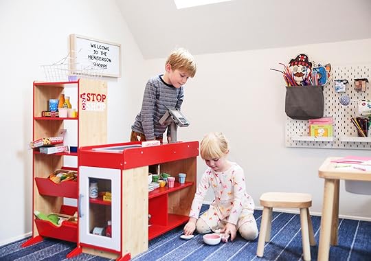
Here we are as of now. We really wanted this space to be theirs, where they would entertain themselves safely for hours without us (keep reading to see how that’s going). Once you get up there we have a few different zones – “arts and crafts,” a “grocery store”, “the costume zone” (NOT dress up, says Charlie), and “the hideaway”.

We’ve had that table and chair set up for 3 years (since we’ve been up here – yes almost THREE YEARS in July). They are getting too tall for it and bumping the storage bins underneath with their knees, but otherwise, it’s been great and it’s super affordable and cute.

They make a huge disgusting mess almost daily, but they do play for a long time up there by themselves – and that’s kinda the point of that place. It’s somewhere they can contain their messes (ha). We put an echo dot up there and they listen to soundtracks (Aladdin, Lion King, Little Mermaid, Frozen 1 and 2) and draw/color, or make robots, etc. We honestly can’t even hear them downstairs. But at this point, they are old enough that if one of them got hurt the other would come scream for us (when they were younger we had a baby monitor connected to the kitchen).

The peg art wall is awesome. I was skeptical at first, but it’s super easy to customize, and kinda genius. There’s so many ways to hold ANYTHING and it looks really cute, too. I wish I had done this so badly in LA (we attempted something fancier there before we knew how amazing this system is, read about that “fail” here).
Parenting Fail #1
A typical failing of mine is thinking my kids are ready for things they just aren’t. Things like “jewelry making,” “paper mache,” or all different types of painting alone, inside, on carpet. Yes, of course, they can do those things but mostly need help from us to not make the biggest mess, with mod podge all over the carpet and paint all over the walls. For instance, they love stamps so I bought a bunch of stamp pads and stamps and decanted them into the wall pockets (easy access!), just to find them later all dried up and ink all over the walls (I think this was a younger kid who was over playing, not ours, but still). It’s like I have a fantasy of them needing all these options but then they end up not knowing what to do with them.
Parenting Fail #2:
Oh has anyone made the “cute stack of board games and puzzles” fail? It’s an oldie but a goodie. Here’s how you do it, it’s super easy! You take a cute stack of games (Candyland, Monopoly, any puzzle really – the smaller pieces the better!) and style them into the perfect pyramid, then simply leave them in a room full of toddlers. Come back an hour later to every. Single. Small. Part taken out and mixed together. You can do it, too!!
Lesson learned.
But I didn’t know this at the time, so for the event my team went to all the craft stores and styled it with supplies that looked good, not knowing they would essentially just be dumped all over the ground, and our friends with small kids would put those pretty scandi wood beads in their mouths. While those art walls on Pinterest are fun to look at, definitely consider what your kids are ready for and what they really can play with independently from you – because that is the goal. Again, we wanted this space to be theirs, free to do what they want and again keeping it CONTAINED.
So we keep paints, puzzles, liquid glues, jewelry making supplies and board games downstairs in the family room cabinet where we can at least try to control how many we have out at a time (they are older now anyway, and actually want to play the games).

So what do our kids really want? Easy access to the following:
Basic art paper – white paper, colorful construction paper, origami paper (shiny/metallic), tissue paper and they love post-its for whatever reason. Drawing supplies – markers, erasable colored pencils, and while we have crayons Birdie refuses to use them because according to her, she is “an artist like a growmup, and growmups don’t use crayons.” We’ve tried different types of watercolor markers or easy glide, but they really just like the thin cheap washable Crayola markers in bulk (they are finally great about putting caps on after years of “this is the last marker I’m going to buy you if you can’t take care of it” lecture). Tape – MY GOSH THEY LOVE TAPE. Why do kids love tape so much???? Now, you don’t have to buy cute washi tape like we did (although I think it was crazy affordable for like 30 colors on Amazon), because they are just as happy with blue painters tape or white masking tape. Just TAPE. Glue – Sticks, NOT liquid white glue. Sure, they can handle the liquid stuff, but if it gets clogged they’ll just take off the lid to try to use it and then knock it over, leave it on its side and then yes, it will spill all over your carpet but nobody will tell you for days until its too dried and crusty to get it off. True Story. Easy makers supplies: Pipe cleaners, popsicle sticks, string, scissors. If you look closely you’ll see stamps and embroidery string, but we don’t use those – they just sit there, FYI.

The kids have easy access with this system. They can take the cups of markers/pencils off and put on desk when they are coloring, then back when not in use. Once I honed in on what they actually use vs. what needed more parental help, it’s been really great.

I wanted to display their art in a cute easy way – with these clips (similar) that I think were 3 for $20 at Crate and Kids (but are sold out now) and this really cute rail. The paper roll on wood with leather straps is from Etsy and its SO ADORABLE, but my fantasy of the kids painting a collective mural on it has never happened. It’s been that same scribble and tic tac toe game for four months.
Now to the store. Santa got this for them the first Christmas we were up here and it’s still VERY popular.
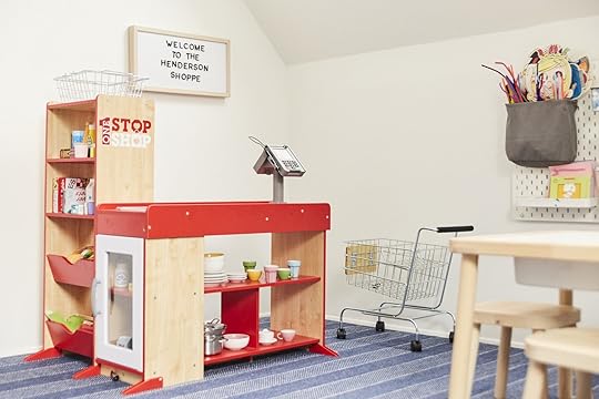
What’s so special about it is the conveyer belt moves with a crank, but that’s not all – the “product” BEEPS when it gets scanned. It’s incredibly fun because it feels so real, so “adult.”
Parenting Fail #3 + #4
Kids like stuff that feels more real and adult-y and less beautiful. For instance, I could have bought them a really pretty scandi-inspired shopping cart, but when I showed it to them online they opted for the metal one because that’s what “growmups” use. They don’t want it to look like a TOY. Same with our pots, pans, and cooking utensils in our play kitchen in LA – they prefer the metal ones to the pretty painted gray and natural wood tones. They even like our cleaned out recycled cracker boxes and tuna cans for the store (truly, it looks like a real Albertsons cracker aisle at times).
I’m going to keep talking about this while I have you. It became a joke over Christmas when I thought I did a smart affordable hack by buying raw ornaments and decor – wood, papier mâché, or unfinished ceramics. So simple! So chic! I thought it would look all quiet and scandi, but super affordable since they were really just pre-finished supplies. But Birdie had different ideas and every time I looked around she was “decorating them” with pink and purple markers, gluing sparkles all over them, thinking of course that these were meant to be colored or painted (which they were, typically). She couldn’t get her mind around why you would want something light raw wood when it could be pink and purple!!! We were not aligned stylistically (but don’t worry, I just encouraged her beautiful decorating then hid the rest).

Oh, the skylights and that window – they make this room so dreamy. And yes the skylights blackout if we were to ever make this a bedroom (and open to let out air in the summer since the window is inoperable). As a reminder, we had to either do a really high window or this shape because of the two roof lines that create that V, and we LOVE the whimsy of the diamond-shaped window.

The carpet – I love this wall to wall carpet so much. It’s from Stark and I love that it has a simple pattern which makes it feel more high end and special, but not too contrast-y. As a reminder we put 1/2″ memory foam carpet pad underneath it, making it basically a padded room – it’s actually kinda bouncy and wonderful. I also only wear Uggs now, so life always feels bouncy.
Onto the other side of the room – where we have our large spinny mushrooms, obviously.

Those following closely (I love you, truly, thank you) you might remember me buying these mushrooms at the flea market almost 2 years ago. We had just bought the house and I didn’t know what they would be for, but I knew that I had to have these two CRAZY HEAVY spinny mushrooms for our cabin. They were just so unique. Please disregard the black eye-patch on the stool – this is organic content guys!

I go back and forth all the time on recovering them, but I’m just not sure what they would be. I think ideally they would be white, but that seems stupid in a kid’s space. So maybe just a brighter green? Or a green with tiny polka dots? OR since we brought red in with the store, maybe red with big white dots like toadstools???? Oh, SHOOT that would be so cute. I could patch on or quilt the white fabric circles so it looks really random and handmade. Lord knows I need another project right now (not being facetious – I have to stay busy to stay sane so yes, I NEED another physical project to do).

As of right now that painting is there mostly because it was an empty wall and I had an extra pretty painting, but I want to use that space for something they’ll use more – either vertical book pockets or just more wall space to display their art, not mine.
Parenting Fail #5:
Last one (for now). Give up your dreams of your kids hanging their cute costumes on hooks unless you run childhood like the military and they only have 2 perfectly curated costumes, each. We had six hooks at one point on that wall because indeed styled out hanging costumes would look really cute for a photo. But they could never get them to stay on hooks, and then it always looked SO MESSY because they have a lot of masks and shields and garbage, as they like to don “baby unicorn princess” and “ninja vet,” etc. They really just wanted to be able to shove them in their cubbies when they are done, which works way better. So the bottom three cubbies are just for costumes/imagination play.
Onto the area that I really do intend to finish – the secret headquarters/hideaway.

We have great intentions (and actually met with a local carpenter before everything went down) to move the ladder to the front, and either paint the ladder or build a new one that is lighter wood (more like the railing going up the stairs). Then we have thought seriously about knocking out the 1/2 wall up top (it’s not load-bearing) and installing those railings all the way across so you can see more. Yes, almost like a jail, but a really cute scandi-jail! I also think that little area above would be the perfect place to either paint or wallpaper something magical and special (likely dark as they really treat it like it’s a secret space). The wall behind those cubbies could have something more special going on too like some sort of paint, mural, wallpaper, or decals…
Oh, If you are eyeing that light wood safe, DO NOT. I got it on Etsy from a maker in Poland and while it’s awesome in theory, it came in 200 parts and took me about 4 hours to get it to the point it’s at now and I can’t get the door to stay on, (but the cranks do move – it’s meant to be actually functional which is so fun). I might try to fix it while we are up here because it’s so dope in theory.

So there’s where we are now with the play attic that gets more use than I could ever have dreamt. If you want to see a walk and talk – check out the video that Brian and I quickly made below (just wait for the ad to play). Like everyone, we are learning to do a lot less and care about perfection even less. This room will eventually be styled out with more ideal looks and shot like a magazine, but it’s a magical little space for us to escape during this time and make paper plate jellyfish, recycled robots, and write letters to grandparents.
Now I’d love to know your parenting fails. I know that a lot of mine have to do with me being a stylist and caring more about aesthetics than most people who are frankly more practical than I have been in the past. But surely someone can relate to having failed ideas for kids room, especially in our early parenting years… Do dish.
The post Our Kid’s Attic Playroom -Update (and Mini-Reveal) + The Five Parenting Fails/Mistakes I Made appeared first on Emily Henderson.
March 24, 2020
Emily’s Roasted Tomatillo Shredded Chicken Soup Recipe + A Very Helpful (And Fun) How-To Video

I feel like I’m playing “The Mom” character in a homestead movie every day these days – It distracts me from it all and gives me a sense of “a role.” I wake up, put on my apron (costume), and get to work cooking, cleaning, or doing some sort of DIY. I have to remind myself to check emails and have calls with my team (reality! no!), but how can I when I have an important soup to make?? Now I’m not a food stylist nor photographer (and it pains me that I don’t have my bins of napkins, bowls, and spoons from our prop storage unit up here), but I am making food and feeling compelled to shoot and share it when it’s delicious – AND THIS RECIPE WAS.
Also, in order to shake up my soup flavor profile (and stay busy/keep anxiety down) I’ve been experimenting SO MUCH. A lot of the vegetables were gone from the store (this was over a week ago), but there was a plethora of peppers and tomatillos, so I looked up how to make a tomatillo soup. I found this recipe, which I made and liked but I wanted more veggies and more heat, so I adapted it and guys – THIS RECIPE IS SERIOUSLY GOOD. Brian’s exact reaction was “Woah, this is good, this could be at a restaurant.” Watch the pretty hysterical but informative video below to see more (but definitely follow the written directions – things changed). For instance, I realized after that the yellow peppers would have been better if they were cooked just a bit because the cherry tomatoes were enough on their own as the cold crunch on top. Also if you can find fresh peppers, roast them along with the tomatillos (just remove seeds if you don’t like super hot – Brian informed me of that, I didn’t know). Oh and I used cumin seed instead of powder (but likely powder would be better, right?). And Brian convinced me to not smash the garlic and just throw it in the pan since we were going to blend it all anyway, but not sure if that releases the flavor the same way.
Now enjoy this quick video tutorial (FYI there’s an ad first so just give it a sec), and if you end up making it please use the hashtag #showemyourfood, even if it’s ugly – although you can read Sara’s post about how to take a REALLY GOOD iphone photo to help. 
5 Steps To Taking Better Photos On Your Phone (As Told By A Seasoned Photographer)

The future is wild, and we’re living in it. Most of us have these insanely high powered little computers in our hands at all times, and they do 1 billion different things – they order hot food right to your door, they access instant messages sent from all over the world, and allow us to binge “Next In Fashion” without ever leaving our beds. But what’s my favorite thing to use my pocket computer (aka phone) for? Taking photos of my cats. Can you believe that I paid some insane amount for this thing and its primary function is cat photography? THE FUTURE IS AMAZING!
But I also happen to take a lot of photos of interiors. Mainly because it’s my job (wait, hire me to photograph your cats), but also because I just love interiors. Even when I’m “off duty” I’m still snapping interior photographs with my phone all the time – Pretty ones I see when I’m out and about, shots of my own home for Instagram, or truly inspiring spaces that I want to remember and share with the rest of the EHD team. Anyone else?
And while most of us have smartphones, not all of us have professional DSLR cameras at our disposal (or, you know, the energy to take it out, set it up, shoot, edit, and export photos on a Sunday afternoon). Luckily, these days you can get pretty good photos right on your own phone.
So whether you’re an interior enthusiast who just doesn’t have the funds for a DSLR camera, or you’re an up and coming interior designer who can’t afford to hire a professional to shoot your work quite yet, here are 5 tips for taking better interior photos using JUST your phone.
#1 – Clean Things Up

Before you start snapping, just stare at the space for a second. Look at it. LOOK. What is making the area look cluttered? What can you eliminate to give the shot more breathing room? There are so many times I’ll snap a phone photo only to realize later that there’s a wastebasket or pair of shoes I could have easily moved out of the way to make the shot just that much better.
#2 – Not Too High, Not Too Low…

When you take a photo you always want your viewers to feel like they’re “in” the space, or they can at least imagine themselves in it. Strangely enough, a lot of that has to do with the height you take a photo at. If you’re aiming your camera too low when you take a photo it makes the viewer feel like an ant, looking up at everything from low the ground.
But the most common issue I notice is photos taken from too high up. Eye-level through a lens is not the same as eye level for your eyes. I’ll often see someone photographing a room by holding their phone right up by their face, where their eyes are, which usually leads to the phone being tilted down in order to get all of the space in the frame. This causes the viewer to feel like a giant looking down on the room (or is this just how tall people experience the world?).

Instead, I usually take most of my photos from around mid-chest or waist height. This way I can keep my phone completely straight on to a space, and avoid the dreaded ant or giant distortions.
#3 – Get A Little More Intimate
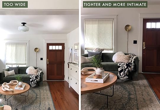
It can be difficult to decide how much or little of a space you want to show off. For the purposes of Instagram specifically, I like to stick to medium shots. I feel that they give just the right amount of context, without feeling too pulled back. A super wide shot can serve many a purpose, but going a little tighter always make a shot feel more intimate and brings your viewer “into” the space more. Going a bit tighter with your images also helps you avoid too much ceiling or floor.
Hot Tip
If you have to choose between getting more floor or more ceiling in a shot, I generally go for more ceiling. It'll help a room feel bigger, whereas more floor can make a room feel squashed.
#4 – Go Au Natural

Lighting can make or break a photo, I believe this to my core. Your lighting is really going to set the tone for your photograph – Dark shadows and rich tones will feel moody, blown out windows and bright light will feel happy. And unless you’re using an incredible lighting set-up, taking interior photos at night, with no natural light, can be incredibly hard.
Natural light is your friend, and what a stunning friend she is! I always shoot interior phone photos during the day, with a majority of electric lights off, and as much natural light as possible. It’s going to make photos feel more natural and warm.
Hot Tip
Overcast days can be great for shooting interiors, as the clouds naturally soften light. But I love a warm sun dapple coming through a window if you can catch one.

“But Sara, my photos are blowing out!” Well, that’s TOO BAD. Just kidding, we can fix that (or at least most of it). If you’re using an iPhone, you can control how bright your photo is before you take a photo. While in “camera mode” on your phone, just tap on the brightest part of the shot, and your phone will auto adjust the lightness of the photo to compensate for the brightness. And once that little sun icon is up on your screen you can slide the sun up and down to manually adjust the brightness.
My preference is always to underexpose (shoot darker, so my lights aren’t blowing out), because I can bring up the dark parts a bit when editing
March 23, 2020
Wanna Peek Inside Our Actual Work From Home Spaces? (Plus The One Thing That’s Made WFH So Much Better)


Welcome to the new normal. Work meetings (and happy hours) are via video chat, FaceTime dates with friends are essential for sanity, and pets are happy (albeit confused) that their humans are suddenly home all. the. time.
While our team is so grateful to be able to work from home, some of us weren’t fully equipped for the transition. We live in different square footages but even more so, we have different needs when it comes to creating an effective work environment. In addition, when isolation doesn’t end after work hours, we felt extra pressure to create designated work areas to simulate some kind of normalcy. (Check out today’s first post if you need help creating yours on a budget). So after sharing photos of our setups with each other and discussing what has worked for us so far, we decided you guys might want to peek behind the curtain and see where EHD is working for now. We tried to make them pretty, inspiring, and functional while working with what we’ve got. So without further ado, take it away Emily:

Who: Emily
What’s working for you? HA. “Working from Home” with two young kids. As you all know we are up at the mountain house and seriously feeling lucky to have this house and the forest behind it. But working, shooting and writing while trying to be with the kids (and teaching! Ha!) is both really fun, and highly challenging. Right now I’m sitting up there in the loft, trying to write this while listening to Birdie scream about how she all of a sudden HATES cuties as a snack and that her brother took her piece of paper that is “very special to me” – a phrase that all parents know so well, and if you aren’t a parent trust me. The second someone touches a Child’s ANYTHING, it could be literally a rock they found, it’s all of a sudden “so special to me”. I’ll fill you guys in later on what our days are looking like and how we are juggling it all, but I think it’s safe to say that I need to do most of my work in one of the bedrooms where I can close the door, not this beautiful loft space where I can hear everything and am far too available to them while I’m trying to write….Or buy some noise-blocking headphones
Need a Better WFH (Work From Home) Setup? Here are 9 Budget Office Combos That’ll Do The Trick (And Can Transition Back Quickly)
 home of noah riley | photo by david tsay for styled: secrets for arranging rooms, from tabletops to bookshelves
As I sit at my “desk” writing this post, I am so unbelievably grateful to A. still be working and B. have a place I can sit and comfortably work (my dining banquette). But I would be lying if I said I didn’t miss my real desk and more importantly my cushioned chair. I am sure some of you can relate. Going from working in an office to suddenly working from home comes with some potential challenges. How do I stay productive? Where and how do I set up a home office to keep me sane?? These are daunting questions so I interview Arlyn (EHD alum if you are new here) who worked from home for two years and wrote a post about her awesome and actionable insight. But today, we’re here to talk home offices.
Now I want to be clear that a dining table is a perfectly fine place to work (she says to herself). But for those of you who are wanting to create a small corner in your home, a place to work away from the distractions (maybe kids? roommates? a lover? O la la..) Julie has put together seven AFFORDABLE office setups to help bring back a tiny bit of normalcy to your work life. And even if you don’t have the space for an entire home office (trust me, I get it) adding a piece of art, a plant, candle, or any other accessory to your work space has serious positive effects.
So for today’s budget rooms (yes, budget rooms are back people!) we decided to include a small to standard-sized desk, a chair, a table lamp, and a few accessories. I don’t have the stats but I know that it’s 100% true for all of us that a pretty space equals more productivity and creativity (which if you come back later today you will see for yourself:)). So let’s enjoy Julie’s office design genius, starting with…

Chair | Chair Cushion | Desk | Table Lamp | Basket | Candle | Tray | Art
Warm, neutral, textural and the classic Scandinavian color palette. Yes, please. I know this is only the first combo but I think it’s my personal favorite. I love the deep but happy blue color of the desk that grounds the rest of the neutral tones. It looks like the calm hug we all likely need.
Hot Tip
Remember you can always add a cute cushion to a non-cushioned chair for extra comfort.

Chair | Desk | Table Lamp | Art | Shelf | Eyeglass Holder | Calendar Pad | Pen
Cool is exactly how you will feel in this little setup. And not only will you feel cool but you also feel smart because this little desk has an outlet cubby. Yep, cord management has never been easier. Cool, right?
March 22, 2020
The Link Up: The Show ALL The Hendersons Love, Mallory’s Innovative At Home Work Out Routine, & A Cool New Netflix Feature


Hello friends and welcome back. We know this week brought about a lot of uncertainty and anxiety, so we hope you are staying safe and finding ways to foster joy. That said, THANK YOU for continuing to support the blog. We couldn’t be more grateful for this community and you guys are the reason we continue to do do what we do. Thank you, thank you, thank you. Now, if you are interested, here’s what EHD has been enjoying this week:
First up, today’s home tour (via Remodelista) is what rustic townhouse dreams are made of. The warm tones and textiles are just what our eyeballs needed this week.
Finding a show that two adults, a 6 and 4 year can all happily watch is challenging. But when we found LEGO Masters is was the perfect show for all of us. It’s funny, so imaginative and all legos. I highly recommend it.
These sweatpants are Brian’s favorite. He says they are super comfortable, don’t cut in, are perfect for all-day wearing and I (Emily) think his butt looks cute in them.
From Mallory: As you know gyms are closed, so I’ve been trying more at-home workouts. The problem is I don’t have any at home workout gear because WHERE would I store it in my studio apartment??? So my boyfriend and I are using hairdryers as ankle weights and wine bottles as dumbbells over here. Please enjoy my instagram highlight if you want to see what I mean.
From Ryann: Well guys, I did it. I found my ideal WFH slipper. They are so comfortable and breathable and I LOVE the waffle knit fabric. I will be living in these for the foreseeable future.
From Caitlin: I’ve been playing a lot of Animal Crossing Pocket Camp on my phone this week. It’s free and there’s something SO RELAXING about crossing tasks off, building furniture, and designing your own space. I also play it with the sound on which is really saying something (like, I can’t remember the last time I took my phone off mute). Does anyone have a Nintendo Switch Lite? I’m considering ordering one (it’s 100 bucks cheaper than the regular, and it comes in colors!) so I can play New Horizons in full.
From Veronica: Netflix has a party feature for those on quarantine who would still love to connect with friends and family. You can watch with everyone online and playback is synchronized. And it is super easy to install!
Speaking of Netflix, from Julie: If you are looking to binge-watch something a bit more lighthearted these days check out 100 Humans on Netflix. One of the co-hosts on the show is Alie Ward who also has an amazing podcast called Ologies which I highly recommend.
From Jess: Taking care of my skin has been one way for me to feel a sense of normalcy and a tiny bit of luxury (of which I am so grateful for). This lotion is a true miracle worker and makes my skin feel so good. At only $13 it’s an absolute go to that I do not take for granted. Also, this article tells you all the different ways it can be used. I will be trying ALL of them.
From Sara: This is the webpage I’m going to be scouring this weekend to help me make the most of what I’ve got in my fridge and pantry.
Speaking of Sara, did you see her INCREDIBLE and BEAUTIFUL and COZY home we revealed this week?? If not, here is her living/dining room and here is her tv room (all designed by Velinda Hellen).
That is all for today so now we’d love to hear from you. What has helped you regain some normalcy this week? Do you have any tips for staying at home? Let us know and stay safe xx
The post The Link Up: The Show ALL The Hendersons Love, Mallory’s Innovative At Home Work Out Routine, & A Cool New Netflix Feature appeared first on Emily Henderson.
March 21, 2020
The Link Up: The Only Show ALL The Hendersons Love, Mallory’s Innovative At Home Work Out Routine, & A Cool New Netflix Feature
Hello friends and welcome back. We know this week brought about a lot of uncertainty and anxiety, so we hope you are staying safe and finding ways to foster joy. That said, THANK YOU for continuing to support the blog. We couldn’t be more grateful for this community and you guys are the reason we continue to do do what we do. Thank you, thank you, thank you. Now, if you are interested, here’s what EHD has been enjoying this week:
First up, today’s home tour (via Remodelista) is what rustic townhouse dreams are made of. The warm tones and textiles are just what our eyeballs needed this week.
Finding a show that two adults, a 6 and 4 year can all happily watch is challenging. But when we found LEGO Masters is was the perfect show for all of us. It’s funny, so imaginative and all legos. I highly recommend it.
These sweatpants are Brian’s favorite. He says they are super comfortable, don’t cut in at the waist, are perfect for all-day wearing and I (Emily) think he looks very cute in them.
From Mallory: As you know gyms are closed, so I’ve been trying more at-home workouts. The problem is I don’t have any at home workout gear because WHERE would I store it in my studio apartment??? So my boyfriend and I are using hairdryers as ankle weights and wine bottles as dumbbells over here. Please enjoy my instagram highlight titled “QUARANTINED” if you want to see what I mean.
From Ryann: Well guys, I did it. I found my ideal WFH slipper. They are so comfortable and breathable and I LOVE the waffle knit fabric. I will be living in these for the foreseeable future.
From Caitlin: I’ve been playing a lot of Animal Crossing Pocket Camp on my phone this week. It’s free and there’s something SO RELAXING about crossing tasks off, building furniture, and designing your own space. I also play it with the sound on which is really saying something (like, I can’t remember the last time I took my phone off mute). Does anyone have a Nintendo Switch Lite? I’m considering ordering one (it’s 100 bucks cheaper than the regular, and it comes in colors!) so I can play New Horizons in full.
From Veronica: Netflix has a party feature for those on quarantine who would still love to connect with friends and family. You can watch with everyone online and playback is synchronized. And it is super easy to install!
Speaking of Netflix, from Julie: If you are looking to binge-watch something a bit more lighthearted these days check out 100 Humans on Netflix. One of the co-hosts on the show is Alie Ward who also has an amazing podcast called Ologies which I highly recommend (and Emily knows her personally and vouches that she is RAD).
From Jess: Taking care of my skin has been one way for me to feel a sense of normalcy and a tiny bit of luxury (of which I am so grateful for). This lotion is a true miracle worker and makes my skin feel so good. At only $13 it’s an absolute go to that I do not take for granted. Also, this article tells you all the different ways it can be used. I will be trying ALL of them.
From Sara: This is the webpage I’m going to be scouring this weekend to help me make the most of what I’ve got in my fridge and pantry.
Speaking of Sara, did you see her INCREDIBLE and BEAUTIFUL and COZY home we revealed this week?? If not, here is her living/dining room and here is her tv room (all designed by Velinda Hellen).
That is all for today so now we’d love to hear from you. What has helped you regain some normalcy this week? Do you have any tips for staying at home? Let us know and stay safe xx
The post The Link Up: The Only Show ALL The Hendersons Love, Mallory’s Innovative At Home Work Out Routine, & A Cool New Netflix Feature appeared first on Emily Henderson.
Why I Went Back To Church (Even Though I Don’t Know If I Believe In “God”… Yet)

*I just wanted to start this post by saying that this post has been a year and a half coming. I finished writing weeks ago – right before the virus started spiking here in the US and quarantine efforts were started in earnest. I didn’t write this post because I’m scared of the world ending, although at times I sure am (but feeling more hope lately). We held off posting this because we were (and likely still are) all consumed, like most of the world, with the tragic state of things. But I suppose now is as good a time as any to talk about a higher power, our existence, and purpose. Of course, the irony is that I can’t go to church for a while, but that doesn’t negate my feelings and thoughts on the subject. Here goes…
Plot twist in the Emily Henderson story. After being raised Mormon, then spending 25 years agnostic, I have found myself wearing an ankle-length skirt, carrying a bag full of coloring books and snacks, sitting in a pew surrounded by stained glass. AND LIKING IT. What most of you have been wondering (and asking on social media) is, how the hell did I get here?
Well, a long-winded analogy seems only appropriate to help explain. Here’s how I look at it: Spirituality (and religion) is like exercise or playing a sport – you can dabble in it (the occasional hike), join a local team (a casual church), or dedicate your life to playing a professional sport. Some people like to do it on their own (the rock climber?), some need a group to stay motivated, some like a friendly coach, and some might prefer or need a strict regimen with a lot of discipline and punishment (NFL player). YOU GET IT. There are a million different ways to exercise your body and get those endorphins (if you are even into that) and finding the one that works best for you is the challenge. I think it’s the same with spirituality. There are too many “religions’ and non-religions to count, all with pretty much the same goals – to add or find a larger meaning to life and enrich our day-to-day while we are here.

I grew up LDS, aka Mormon. I left when I was 15 for the reasons that most people do – I didn’t identify with the conservative values, felt like there were a lot of hypocrisies, and didn’t feel seen as an individual who had a lot of questions that never could be answered. I also likely wanted to act like a normal teenager and make choices that weren’t aligned with the LDS doctrine, because as some of you might know, Mormonism is strict. But mostly it’s because I never really believed in God, which made all the above even harder. In all honesty, leaving the church didn’t feel like the hard part. But upsetting my parents was. Looking back now, I realize that rejecting and feeling rejected by something I’d known all my life, during such formative years, was perhaps traumatic and certainly skewed my view of organized religion. Not to mention affected my relationships. I wasn’t “kicked off the team”. I guess I just didn’t want to play anymore. I could write a whole book about that, and I realized it would be a big question in the comments so I wanted to address it. However, it’s not the point of this post.
So most of my 20s and early 30s were spent without religion, having no spiritual life, which seemed fine because it’s really easy to not have something that you never had before. Plus I was a bit angry at organized conservative religions and really wanted no part of it. When people said “I’m not religious, but I’m very spiritual,” I thought it was BS because I didn’t know how to divorce the two. I didn’t realize all the options that are out there. I’d think, “so you believe in what??? Spirits?? What does that even mean??” Now, I know.
WHY DID I START THINKING ABOUT CHURCH?
In my later 30s I softened and started to see more of the good that churches can do – including the LDS (although their support of prop 8 set me back a lot). I started thinking about church probably for the same reason a lot of people do: The longing for community, to connect deeper to others outside of our bubble, to find a potential higher power for guidance, and to know that there IS more than just “this.” Also let’s not forget the nostalgia for an easier life, fear of how to raise our children to be good, the desire to help others, and generally help to be a better person. I look at my siblings and parents and I can’t help but think “gosh, Mormons are just the nicest people,” and clearly I want that part for my kids.
Let me be clear, you don’t need religion or a church to do any of those things above, and many people would argue that there is more harm done with religion than good (I think the singular, and extreme view of the world is what causes problems – the interpretation of religion, perhaps not the religion itself). But historically, that small building in the middle of town could also help provide a lot of those things (when done right). “Working out” on my own was clearly not working. I needed the right “team,” the right church, one that was open and accepting, believed in science, but does that even exist anymore?
Most importantly I started wondering why we were here. The whole meaning of life thing, and thus began my existential crisis. I couldn’t get my mind around the idea that if one of my kids or Brian died, that was it. No way. I knew that if/when that happens I’d search for answers which prompted me to find them earlier. Also, surely I’m here to do more than just play with pillows and beg for a “swipe up”. I certainly didn’t think that church was going to be THEE answer, but I knew that it was one way that was clearly popular, and one that I was very familiar with.
But I didn’t believe in God or Christianity. I believe in equality and science and radical inclusivity. Also, I was generally nervous to be in a room where another flawed HUMAN BEING MAN might tell me how to think or what to believe. I just couldn’t . . . yet.
But I still had to find out the meaning of life, obviously.
So I began my detective work to “find my purpose” and shopped around for the type of spiritual “exercise” that hopefully checked all my boxes and got me a bit closer.
I listened to podcasts: The Liturgists, Super Soul Sunday, Goop. I read 7 Steps to Spiritual Wellness and Many Lives Many Masters amongst MANY OTHERS. I saw a spiritual counselor and mediums (tarot and palm reader), did sound baths and reiki. I tried meditating and read more about Buddha, and modern-day prophets like Gandhi and MLK. I even became more open to the idea of Joseph Smith – yes, the 14-year-old that founded the Mormon church. In my mind all of the philosophies don’t negate each other, you don’t HAVE to choose one, in fact, it’s my assertion that they are just different access points to the same higher power/s.
I believe in it all, total religious fluidity, and think there are many different “languages” (or types of “exercises”) because there are many different types of people and we all communicate and function differently. You might see this as a cop-out or even offensive if you believe more singularly – that there is only one true religion – but in a subject that has zero conclusive answers, who is to say anything is off the spiritual table?
So I suppose at this point I was spiritually lubed up and emotionally ready to step into that door because most of my individual research didn’t yield the community and service aspect that I craved for my family. I still wanted a physical place to meet, an organized way to help, and maybe I could connect more with others outside my bubble instead of me just complaining to my friends or shouting at the stars.
But before we go further here is a little video I made, talking out loud about my feelings…
So where did I go? What church did I choose?
**First off, this goes without saying, but I feel like I have to state it – I’m not supportive of any organization who interprets their doctrine to make people in any way feel bad about who they are or their choices, who supports political causes that exclude or seek to take away rights from people. It has to be progressive. For me to attend a church I need radical equality, Evolution is going to need to be recognized as a thing, and anyone can marry who they choose and all families are celebrated. Also, don’t lecture or tell me how to think*
My friend Suzanne was also searching for lots of answers and guidance and as raised Christian herself she felt the most comfortable going to a Christian church. She invited me and I was excited to go more as an anthropological study, definitely unsure that I would “fall” for Christianity. I didn’t the first time around, so why would I now? But the church was a 10-minute walk and only a 1-hour service. It felt like a healthy risk for a good story.
I prepped myself and dressed in what was almost a sister wife costume and my former church “uniform” – a cute, ankle-length skirt, modest white blouse, and a bandana headband. I didn’t know that at most progressive churches you can really wear ANYTHING. We shuffled in and found an empty pew while the kids focused on their wrapped peppermints (Candy!). The pastor (Bishop? Reverend? Priest? I didn’t know) was wearing a plaid button-up, slacks, and sneakers. Neither hipster nor formal. As he spoke he reminded me so much of my older brother – genuine, funny, self-deprecating, relatable, inspiring and very, very caring while being seemingly unjudgemental.
As the music started, and we were asked to stand up I held Birdie like a security blanket, swaying with her in my arms, singing in her ear the new words displayed on the projector screen. It was uncomfortable how comfortable it was.
I thought, “I can’t believe I’m at church…
And I like it.” It was shocking, but not surprising.
The tears came, as they are right now. I guess I was overwhelmed, maybe by “the spirit” (I’ve heard of that:)), more likely nostalgia. I was my mother. I had done all the things – packed a “church bag” full of snacks and coloring books and yelled “kids get ready for church!” as if they even knew what that meant – they had never been. I found myself shushing them gently the same way my mom shushed us. I was dying to listen to the pastor, as likely my parents also did the bishop 30 years ago, because now it mattered to me. I didn’t hate this nostalgic feeling, because the intention behind all of it, 30 years ago and now, was good. My parents had good intentions and so do I, despite all the mistakes I’m surely going to make when my children are teenagers. The sermon made me ask myself some hard questions in such a non-judgemental and casual way. There was this undeniable sweetness and earnestness from the few people who were there.
Why this church?
I suppose I found the type of “spiritual exercise” that works best for me at this point in my life. Let me explain.
I’m going to continue with my sports analogy, because now I’M READY TO HIT IT OUT OF THE PARK. This church is the super fun “community softball team,” with a really nice encouraging coach, and people of all different levels, that accepted me for my average talent but eager demeanor. It’s an “anyone can play” team. This isn’t dissimilar from growing up where I played every sport with such enthusiasm, despite my undeniable mediocrity. And every single year, I won the – I kid you not – “best attitude” award. I’m the exact same here. I’m not necessarily GREAT at the game, but I really, really, really want to play because it makes me feel good and for whatever reason, I will give it my all.

I like having a team because I’m not that disciplined on my own – I’m too scattered and get bored so easily, I won’t push myself on my own and I’m pretty social (as you can guess). I need a coach who encourages and teaches, but doesn’t yell, lecture, scream or make me feel bad when I mess up (or when I don’t show up). He wants me to be better and gives skills, tips, and tools that help, but no extreme punishment when I fail. I like teammates to share in the same experiences and I respect that some people are going to take it more seriously, be amazing, and leave me in the dust – I literally don’t care. You do you. I just want to set aside some time to be with them and my family, work on what I need to work on, and share some values. Basically, I want to “exercise” and leave feeling really good, taking that experience throughout the week.
This church is new and un-organized in the BEST way. It’s full of people that are in our community, yet outside my normal social circle, and it’s so refreshing. It is earnest and sweet and there is zero dogma and indoctrination (thus far). I told the pastor the second week (when he asked) that I didn’t believe in a “Christian God, per se.” He smiled and said, “I get that,” and then joked, “well …. at least not yet” with a proverbial wink, which was actually very funny and we both laughed at the challenge. I was totally accepted there even though I couldn’t and can’t say that I take Jesus as my Lord and savior. And I’m not sure I ever will. It just felt like you could be the worst version of yourself and still be accepted and loved.
I also really ENJOY learning about history. Despite your spiritual beliefs, a lot of what is in the Bible happened historically (with different versions obviously – no one REALLY knows) and I was gripped with a “what is going to happen next” curiosity, as if it were the hometowns of The Bachelor. And by the end of the never-long-enough talk, the sermon is always brought back to 2020 and how the message could somehow pertain to us now. We always leave wanting to be a better person in some way, with more introspection. Suzanne and I usually have a 2 hour debrief about what we learned, and how we are going to take the message into our lives, as I roast my Sunday supper chicken and sip orange wine or prosecco.
This church also cares about local causes and has provided a place for us to volunteer and help the community. This was one of my original drives towards a physical church versus just practicing my own spirituality. Of course, ideally, we’d be doing it more on our own, not needing the reminder or someone else to organize. But again, like working out, with busy lives it’s easy to forget this. There is some accountability, but most importantly it’s nice to do it TOGETHER. It’s very bonding for a community, hell it’s what makes a community. We aren’t perfect and I’m not saying that I’m using all my time to help others, but it’s more top of mind with more real opportunities.
Wait, What type of church is this???
The third Sunday I jokingly ask Suzanne “What are we again?” Oh right, Presbyterian (reformed). Now I currently don’t necessarily identify as being a Presbyterian, nor am I baptized (or however you become an official member). That may or may not happen. If you want to know what makes them different from other Christian sects here is my very rudimentary understanding (approved by our pastor): 1. Reformed Presbyterians let women become pastors and elders. 2. They accept science (evolution) and approach religion with what they say is a more intellectual viewpoint (like I said, so much history is taught). 3. They have open books and you know exactly how and where your donations are being spent, which is inspiring and makes you care more. But beyond that yes, it’s more progressive, with very little shame or emphasis on guilt, no “going to hells,” etc. It probably helps that the Pastor is in AA, so there are a lot of great messages from that philosophy.
Do I believe in God now?
I believe in a higher power that I have a strong connection with, which does give me a sense of calm, guidance, support, love and yes meaning. I also think that we are all connected, including animals and even plants/our soil, which has given me a much greater sense of connection to the earth and empathy. There is something bigger and greater than me, and I feel that pretty solidly in my soul.
However ….
I still struggle saying “God” in the Christian sense, and often transcribe “God” to “universe” or as my brother does “GOOD” in my head when it’s spoken. I think the easiest way to explain it is this: I’m open to it all, but Christianity is my “Native Language” – it’s my “way in,” because it’s close to how I was raised (Mormons are Christians). It’s comfortable and easy for me, but as I said earlier there are so many others “languages” that you can also speak (Judaism, Islam, Buddhism, Hinduism – ANY and all of them that I’m forgetting . . . .). I don’t believe it’s the only true religion, it’s just culturally the easiest for me to identify with.
I hope that saying I don’t believe there is only one religion or one God isn’t offensive to those of you who have more of a singular view, that is obviously not the intent or the *spirit* of the post. Spirituality is so individual and cultural, and I think whatever feels good, gives you a greater purpose, and helps you find meaning is right for you. Again, it’s a type of religious or spiritual fluidity that is working for me.
And listen, some times it gets too “religious-y” for me and that’s ok! I am at a church after all. I just think “this part isn’t for me” and then I listen, without judgment. It’s a lot to go from being agnostic for 25 years to attending a Christian church, weekly. I’m making small steps with an open mind and I’m sure as I learn more about Christianity and that undeniably great guy Jesus, some sort of faith will grow. I’m totally open to it (honestly I think I just need to understand the story more to “get” the story of Jesus, and our pastor agreed to give me some one on one time to ask all my questions).
Are we raising our kids religious?

Mostly we are doing our best in every way, and certainly not relying on church to teach them morality just as we don’t rely on their school teachers to teach them how to behave. For now, they are coming with us and enjoying it, but I’m nervous, Brian even more-so. It seems so far that they are just learning a simpler version of what we are learning. Hopefully, they are just taking away the idea of being kind and helping our neighbors, loving our enemy, etc. Although I know that there is a level of conditioning that is really hard to avoid in a church when you are so young. I try to casually ask them about what they learned and if they have any questions, without being too weird about it. Birdie just likes to color the cartoon angels, but Charlie sits with us in the service and listens to Every. Single. Word. It’s both impressive and kinda scary, fearing that he’s too young to hear the grownup bible stories (guys, the old testament is not G rated, and yes we had to leave once during the service where we learned about why it was called “Passover.” He got scared of blood on our door).
When Charlie asked me point blank if Jesus really came back from the dead, I said “I don’t know, bud. These are all stories that a lot of people believe are true, and you can learn and think for yourself. Ask all the questions you need and maybe someday you’ll decide if they feel true to you, too.” He accepted that answer, as I wiped the beads of sweat off my brow. I truly think we should foster the openness to faith, and create a space and conversation for their potential beliefs, inspire hope, etc. I personally don’t actually think telling them that these are the facts and that they have to believe helps them develop a healthy sense of spirituality in the long run. I resented that as a child and teenager, and I don’t want to repeat that.
We want them to enjoy it, not have it be forced upon them and Brian and I are even remodeling the kid’s ministry rooms to be more fun and inviting (coming to a blog near you soon) so it injects the new church with good energy. (See? I’m an ENTHUSIASTIC player.)
What does Brian think? Does Brian Henderson go to church?
The back story. Brian has always been a pretty atheistic, barely admitting that maybe there is something out there, referencing “science” all the time and needing “proof” (boring). His “know it all-ness” has infuriated me at times and we’ve actually had so many heated “debates” and wine-fueled fights about it over the last 10 years. How does HE know there’s NOTHING?
So when I first started taking the kids he was psyched to get 2 hours alone on a Sunday morning. He would listen to podcasts, clean the house, and watch sports. Then I’d come back in a GREAT mood and make us all a huge Sunday supper of roasted chicken and farmers market veggies. Yah . . . he loved “church,” with no intention of ever going himself.
But he wanted to participate in the service projects and knew that it was important that we do it as a family. Turns out he enjoyed the people, pastor, and the work. In fact, a couple of months ago our family spent the entire Saturday with some other volunteers cleaning and organizing the kid’s rooms. Not only did Brian not complain about how he was spending his weekend, but I could see that he really enjoyed it. This has continued and the past couple of weeks he has spent a large portion of every day putting down Flor tiles in the new kid’s spaces so the church didn’t have to hire someone.
He’s opted to come to the last two services and really enjoys the conversation – it’s thought-provoking and historically so interesting. Don’t tell us (or our kids) how to think or believe, but it’s hard to argue with inspiring people encouraging us to be less of an asshole, love more, and feel more universally connected. Knowing that something great exists beyond you, is good for all of our souls (and egos). But spiritually he’s still up in the air, but becoming more open.
How do our friends feel?
Ha. Well, it’s funny. They are watching from the bleachers, nay, across the street inside a house peering out behind the curtains, mostly thinking it’s weird and scared that we’ve changed and become super conservative. After over 10 years of friendship, it must feel odd to text “Brunch?” And get back “Sorry, going to church!” I try to explain it, but it always feels like I’m proselytizing and that’s not what I’m trying to do AT ALL. I also find myself really defensive. It’s kept kinda quiet here in LA (by others, not me), with people sharing political views and educational philosophy much earlier than mentioning any sort of church affiliation. I think there can be a lot of judgment about religion and “church,” mostly because of the stereotypes. The ones that say churchgoers are extremely conservative, hate gays, love Trump and hold “you’re going to hell” signs on street corners. Sure, that exists, but definitely not the case here. After years of angrily arguing about how some Christians are the least Christ-like, I’m relieved to finally be exposed to so many Christians that indeed are carrying more progressive views and are so open, loving and inclusive. It’s so refreshing.
Since I’ve spoken openly about going to church, people will perk up and say “me, too”. There are a surprising amount of “secret Christians” in LA (that’s what I call them). The irony is thick – that they/we are fear being judged out in society, as others do when they are in a church. Extremism in every religion is what people fear, me too, but it doesn’t have to be that way. In fact, I know some Mormons that believe wholeheartedly in the gospel but disagree with a lot of the interpretations of the doctrines that human men have put into place. This blew my mind – that you don’t have to buy into the whole thing. You can believe in the macro but know that some of the man-made rules and rights restrictions are perhaps not for you. I will pay $500 to anyone that can explain why they forbid drinking coffee but encourage diet coke. These kinds of inconsistencies distract (and taint) the entire religion, but I respect the individuals who are progressive enough to realize that there might have been a “language barrier” or a “lost in translation” issue with some of the doctrine from God to prophet.
But again, this post isn’t about why I left the Mormon church, it’s why 25 years later I’ve found myself in a church at all. It’s still shocking to me, and yet somehow not at all.
Speaking of … How do my parents feel about me going to church?
I had them read this beforehand, and my mom responded with a lengthy email including much, much more that I won’t share, that “We are thrilled”. Phew. Kinda.
Would I ever go back to the Mormon church??
While I have truly endless appreciation for how I was raised until I was a teenager (#mormontil15) I don’t identify with how conservative it is. I do however realize that no one does service and gives back more than the Mormon church – they just don’t shout about it. They do SO MUCH for so many, locally and internationally, and for the most part their intention is wildly pure. I am a highly positive person, with a crazy work ethic, and a very good moral compass because I was raised Mormon by people who dedicated their lives to the church (could be anecdotal, but those are the facts). But until the church can accept gay marriage, encourage more questioning and curiosity, and allow flexibility in rules then I know I won’t be able to make it my community. I’ve talked to the big guy about it, and he’s fine with me
March 20, 2020
How To Make Your Smallest Room, The Coziest Room In Your Home + Sara’s TV Room Reveal


Quarantine log, Day 5: If “social distancing” has proven anything to me, it’s that I am a true introvert. And now that all of California is officially supposed to stay indoors as much as possible, I have the perfect excuse to stay right here, on this velvet couch, surrounded by vintage oil paintings, binging the new season of Outlander.
Where is “here” you might ask? Oh, nowhere. Just my INCREDIBLY COZY, LIBRARY INSPIRED, DARK & MOODY TV ROOM. It’s only the room I’ve been dreaming of my entire life. Where I can lounge, dappled in the gentle afternoon sun, reading weathered copies of Jane Austen novels until I doze off. Now if only I could find a way to make velvet sofa lounging my full time job (Emily, we can discuss my proposal in detail later).
On a more heartfelt note, Mac and I are feeling VERY lucky that we have a safe place to live during this situation. The fact that it’s also incredibly beautiful is a true gift, and one that we don’t take lightly. Thank you to everyone who came and read yesterday’s post about our living and dining room, and for all the extraordinarily sweet things your wrote in the comments. Today we’ve got one more room reveal to share with you all, plus I’m going give you a few tips on how you to can achieve optimal small space coziness. In case you have some downtime in the next few weeks and want to create your own cozy corner. So let’s get started . . . .
Determine What The Space Is Going To Be Used For

Sofa |Leather Pouf | Rug (Vintage) | Brass Table Lamp | Paint Color
Maybe you have a tiny room you’re already using as a guest bedroom, an office, dedicated cat bedroom, or even a nursery (do you put children into the smallest room of the house? I don’t have one yet, so who knows!). Do you want to make it cozier? Yes? Great, you’re done with this step, skip to the next tip.
But maybe, like me, you’ve just bought a house with a strange small room that you’re sure has a dark, secret past, and you don’t know what to do with it. First, make sure all resident spirits inhabiting the room are amicable, then think of creative ways to use that space. Mac and I realized early on that our home (built in 1921), didn’t really have a dedicated space for a TV in the living room, because apparently TVs didn’t exist in 1921. And while Mac was ready to sacrifice form for function and put a TV over our fireplace, I was ready to burn our TV if it meant ruining the beautiful layout of our living room.
Instead, I suggested we turn the small, awkwardly shaped room at the back of the house into a dedicated TV room. We also decided on some minor, but impactful floor plan alterations that would make the layout of the house work better for us. Originally the master bedroom entrance was through the kitchen, and the room this post is about was a private space with a door. We decided to make it a pass-through space, removing the door between it and the dining room, sealing off the master entrance from the kitchen, and instead putting the door to the master bedroom IN this room. Here’s a visual to help you understand, because words are confusing:

This does mean that we legally eliminated the “third” bedroom from the house, for real estate purposes at least. But the flow of the house works SO much better now. If I could go back in time, the one change I would make would be to put a pocket door between the dining room and the TV room, just so we’d have the option of a door. But things aren’t perfect, and you move on. ANYWAYS, all of that is extremely specific to my house, so let’s get back to those tips.
Don’t Be Afraid To Go Dark (And Monochromatic)

Throw | Plaid Pillow | Silk Painted Pillow | Window Treatment | Sconce | Ceiling Fixture | Back Door Hardware
I think the first thing anyone would notice about this room is that we painted it dark. And I mean, daaaaark. One of the best posts I think we’ve ever written was a design mistake titled “Painting A Small, Dark Room White.” This post has STUCK with me for some reason, and I think it’s what really convinced me that this small room needed to be something other than white.
The second thing someone might notice is that while the walls are dark, so is almost everything else. The trim, the roman shades, the sofa, the built-in bookcase. Not only did we go dark, we went monochrome. I’d seen some version of this in a few historical homes, and felt entirely inspired. It felt both bold, edgy, and modern while also feeling timeless. You’re most likely to see it done in light colored rooms, but going that route in a dark room feels like more of a statement. Well, I was ready to make a statement.
Because I wanted to go for a monochrome lewk, and because paint colors come in so many different shades and tones but furniture and fabric options aren’t as abundant, I decided to source the sofa first and choose the paint second, using the color of the sofa as a guide. I started (and ended) my sofa search at Article, and went with my old standby – the Sven sofa, this time in Pacific Blue velvet. What. A. Dream.

I also ordered a swatch of the sofa fabric so I could easily hold it up against paint samples when searching for the right color. After much swatching, I found the absolute perfect color, which turned out to be Rookwood Shutter Green by Sherwin Williams. What I love about this color is that it has a touch of blue to it, so it really plays well with the sofa, but doesn’t feel like a blue (which I really wanted to avoid). It has so much depth to it, while still being a rich, dark green and doesn’t feel cold in the slightest. Quick technical note, we used Sherwin William’s Super Paint in here and the coverage was pretty fantastic. We went with eggshell on the walls and semi-gloss for all the trim (extra technical note, only because I just learned this as we were painting our house: A flat or eggshell paint is most traditionally used on walls and ceilings, but you should use a semi-gloss on things like trim, baseboards, and shelves so that you can more easily clean them).
What makes a dark, monochrome look work in a small room? The darkness of the paint feels intentional, like a comforting sleep mask rather than a pitch black pit. We’ve got three windows in the room that all get southern light, so when the shades are up parts of the room are bathed in stunning light, while others are thrown into even deeper shadows. It’s dramatic, but still totally cozy. And using the same dark paint on the ceiling as we did on the walls actually made the room feel BIGGER, because the ceiling almost just disappears.
If You Go Dark, Bring In Moments Of Light

I’m not talking about suddenly bringing in a white sherpa rug – unless you’re into big moments of contrast. For this room I really wanted a subtle, cozy vibe. Gentle transitions for the eyes as they move around the space, while still introducing enough pops of “lightness” to keep the dark monochrome aesthetic from going full goth (which, again, isn’t bad if that’s your wheelhouse).
I’d been hoarding this vintage rug from Neon Doves for about a year. Since we’d bought the house really, and didn’t know where it was going to go. I just knew it was “me” and I would find a place for it. It’s like this room was specifically created for this rug because it’s the perfect size, it’s got the perfect hits of blue-green to tie it in with the sofa and wall, and the style is just right for a historic library theme. It’s not a bright or ultra light colored rug, but the neutral tones are lighter than anything else in the room, so it doesn’t end up feeling like a hole in the floor.

Actual lights also bring moments of light to a room (what a concept). Besides the canned lighting we installed in the ceiling, I also choose three other key sources of lighting, and had them all share one common element – brass. Both the ceiling and table lamp are from Schoolhouse Electric, and between the opaque glass shade and their brass bodies, they’re the tiny pops of happy golden color that add some life into the room. The wall sconces are perfect for creating a warm glow in the room, and were essential for keeping the room from feeling like a never-ending hallway at night. When it starts getting dark we just flip those on (light switch cleverly hidden in the bookshelves), and suddenly the back of the house is a warm cozy den, rather than a gapping, black nothing.
Bring In The Warmth
I’ve gone on and on about painting your room dark, but what if that’s just not for you? I’m offended (get on this train with me), but fine. No matter what color you paint your small room, the rest of these tips are gonna help you make it ultra cozy. One of the biggest ways you can bring warmth and coziness in is through textiles. The velvet sofa, the rug, the leather pouf – all of these really evoke those “curl up with a good book” feelings. But the window treatments (from Decorview) are a heavy woven linen, which add another touch of rich textile. Their thickness and the heavy weave of the linen feel like a call back to rugs being hung over the stone walls in castles to help keep rooms warm. These also happen to be double-lined (blackout – aka perfect for daytime movie watching), so they feel extra warm.
Oh look, it’s our mid-post intermission – A video tour of the exact room you’re reading about (…would we call that an intermission?):
LET ME TELL YOU, being on camera is very hard and awkward. Emily always makes it look so easy, but as soon as I’m in front of the camera instead of behind it my mouth makes weird noises, I do odd things with my hands, and I never know whether to look at the camera or at Emily. Oh no, I’m having filming flashbacks. QUICK, let’s get back to the post.
Don’t Overcrowd A Small Space

When it comes to small spaces, they can get crowded fast. To keep them cozy you don’t want them too empty, but like, they’re also small so don’t try and shove a whole ton of stuff in there to try and inject coziness by way of claustrophobia.
Think about what you really need in the room to function, and then get rid of ONE thing (it’s just like fashion). What’s the weakest link in your furniture? Do you really need it? Get it out of there, and feel how much bigger the room suddenly gets. Since this is a TV room, which is basically a miniature living room, we started with all the normal dressing: Sofa, side table, coffee table, rug, lamp, etc. Then thought long and hard about the layout of the space and what had to go. The thing we got rid of was the coffee table. The space between the couch and the TV is already narrow, and adding a coffee table would essentially block our walking path.

So instead we have a side table tucked into the corner, a leather pouf for putting up feet, and since the shoot we’ve moved a tiny floating table into the room which we keep near the other corner of the couch (by the back door) that we can easily move around, and use to hold our dinner plates or snacks when needed. Though, we’ve been very good about eating dinner at the dinner table recently, and have been playing board games instead of watching TV. Am I bragging or not? It’s up for interpretation.
It’s All In The Styling

At the end of the day, a room isn’t fully dressed without accessories. These are the little things that can take the tone of a room from “box with furniture” to “cozy library.” The accessories you bring in can really help you communicate the overall desired effect you want the room to have. For example, if you want a room to feel minimal and modern you could use art with minimal colors and sleek frames. Or if you want a room to feel like you’ve spent a small fortune on lint rollers and you regularly clean up vomit from all the things you love, you could add a cat.
I did not want this room to feel minimal or modern (or vomit-y for that matter). I wanted it to feel old, worn-in, and full of soul. So I finally got to use (almost) the full extent of my vintage oil painting collection. All of these pieces are personal – one of them Mac and I bought together at a flea market, one I bought right out from under Emily’s nose, another I found at a vintage store in Berlin. Mac says I have a problem, but I always tell him to look inwards (at his own DVD collection) before throwing around serious accusations like that.

Under TV Shelf | Polaroid Frames
Instead of letting the TV dominate an entire wall, we added a little floating shelf below it as a way to bring in a few more personal accessories. Like more oil paintings (and a few photos).

Brass Sconces | Rock Vase | Cement Bust Planter | Stone Book End
But now I’d like to interrupt our current post for a sidebar about my favorite part of this room, and possibly the entire house. My custom built-in bookcase. It’s one of the very first ideas I had when we moved into the house, and so it’s wild to see it in reality. It started as a very rough sketch by me. I then relied on Velinda to translated it into an actual design that I could pass along to a contractor (hit me up in my DM on Instagram if you need a good contractor in the LA area, his name is Ron and he’s a really great guy).
A quick note from Velinda that more accurately describes how this went down – “Sara showed me her awkward corner, her rough sketch, and said ‘so you can just . . . design something to stretch from one wall to the other that makes the shape of the room feel more balanced and purposeful. Something with decent storage that will feel like it belongs with the rest of the house and hides this weird corner.’ Oh, okay Sara. Easy. I’ll just do that.”
It used to be an awkward, deep corner (formerly disguised as a closet). And now it’s a beautiful bookcase up top, and a functional storage cupboard down below (which still utilizes the depth of the aforementioned awkward corner). I whisper “I love you” to it every night as I walk by it on my way to bed.

Back to styling. Because I wanted this room to feel like a library, it’s only right that the bookcase be filled with a vintage mirror, cement bust, and more oil paintings. UGH FINE, we’re basic, we put books on the bookshelves. But we also put a vintage mirror (to bounce around a bit of light in the shelves), a cement bust, and more oil paintings (because it’s a LIFESTYLE). And a few little hits of life from greenery is always going to look good in any design. I particularly love the iron urn up top with the real limb-y plant that I found at my local nursery. It, in particular, makes me very happy.
My final and most important tip when it comes to styling is to keep it personal. If you want a room to feel lived in, cozy, and inviting then it needs to feel like a human actually spends time in it. Don’t be afraid to fill bookshelves with well-worn books, frame all sorts of family photos, and show off your tchotchkes. Get weird.
Ok, that’s it. Those are all the tips I have. I AM EMPTY OF INFORMATION. But I know you want to see some satisfying “before & afters”:


That was my last reveal for a bit. Next up, we’re working on the master bedroom and closet (I have plans, and yes, they include floor to ceiling wallpaper). And with all this time at home, maybe I can get Mac to design the office/guest room . . . .
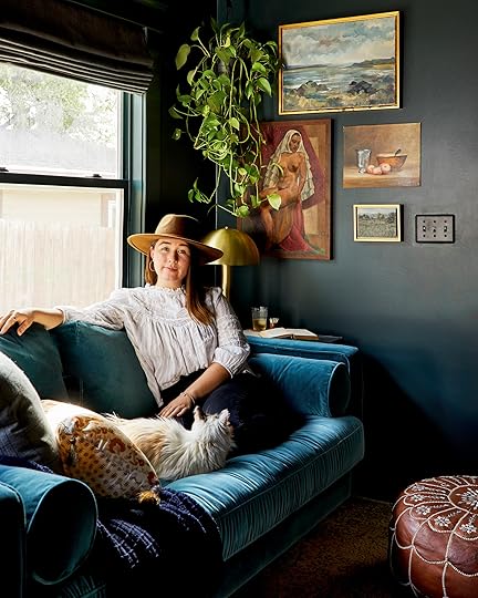
Big shoutouts to Emily Henderson – the momentum behind these beautiful projects, Velinda Hellen – Our designer, ever-present advice giver, and dear friend (who also happens to be taking on e-design clients right now, for human-contact-free design work. If you tried to contact her through her website yesterday, there was a glitch! It’s fixed now, so please try again :)), my family – who literally rebuilt this house for us, all then vendors we’ve worked with – you helped us turn this house into a home, the EHD team – YOU GUYS ARE THE BEST, and lastly to all of YOU. Thank you for following along thus far, and hopefully continuing to follow along as we keep working on our home. Giving you all internet hugs xx
#hotspot-228773 .hotspots-image-container {
background: #efefef }
#hotspot-228773 .hotspots-placeholder,
.featherlight .featherlight-content.lightbox-228773,
.qtip.tooltip-228773 {
background: #ffffff;
border: 0 #ffffff solid;
color: #000000;
}
.qtip.tooltip-228773 .qtip-icon .ui-icon {
color: #ffffff;
}
#hotspot-228773 .hotspot-title,
.featherlight .featherlight-content.lightbox-228773 .hotspot-title,
.qtip.tooltip-228773 .hotspot-title {
color: #ffffff;
}

Window Treatment
Paint Color
Ceiling Fixture
Throw Blanket
Plaid Pillow
Silk Painted Pillow
Brass Sconce
Stone Book End
Rock Vase
Cement Bust Planter
Polaroid Frame
Shelf
Back Door Hardware
Brass Lamp
Leather Pouf
Sofa
Rug
1. Window Treatment | 2. Rockwood Shutter Green by Sherwin Williams | 3. Ceiling Fixture | 4. Throw Blanket | 5. Plaid Pillow | 6. Silk Painted Pillow | 7. Brass Sconce | 8. Stone Book End | 9. Rock Vase | 10. Cement Bust Planter | 11. Polaroid Frames | 12. Under TV Shelf | 13. Back Door Hardware |14. Brass Table Lamp | 15. Leather Pouf |16. Sofa | 17. Rug (Vintage)
Catch up on all of Sara’s Makeover Takeover: Sara Buys A House Part I: Six Tips For First Time Home Buyers | The Designing Begins: A Floor Plan Design Agony | The Designing Continues: Time To Pick Furniture | The Final Design Plan | A Fireplace Design Agony | Sara’s Moody TV Room Plan | How Much It Really Costs To Work With A Designer: The Final Tally Of Sara’s Project | Sara’s Living Room & Dining Room Reveal
Design by Velinda Hellen for EHD
Photos by Sara Ligorria-Tramp
The post How To Make Your Smallest Room, The Coziest Room In Your Home + Sara’s TV Room Reveal appeared first on Emily Henderson.
Emily Henderson's Blog

- Emily Henderson's profile
- 10 followers

