
Emily Henderson's Blog, page 160
August 11, 2021
Caitlin And Emily Debate About Canopy Beds (And Discover The Secret To Making Them Work With Regular Height Ceilings)
 [image error]
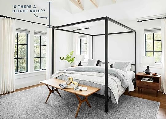
Two weeks ago, I pulled out my tape measure mid-meeting (as one does) and then asked Emily a question: would you do a canopy bed in an apartment with 8′ ceilings? I don’t actually remember her answer – it was a “maybe” or “it depends” or “I love the amount of space I have at the Mountain House and think that would make me feel crushed in” but whatever it was, it was not an unequivocal yes, which was what I NEEDED to feel confident in my decision.
Because guys, I want a canopy bed like Violet wants a chocolate factory and well…tragically, my current bedroom will never look like the one in the Portland House, seeing as I live in a regular apartment with an inconveniently-placed mini-split AC unit and 101″ ceilings (a little over 8′ – photos below) instead of inside an Emily Henderson-designed house in the Pacific Northwest. Now, I wanted to sway Em’s opinion a little bit, so I spent a tiny lifetime scouring the internet, started a post about the secret sauce, and then forced said boss to come write part of it because that’s what good employees do. (I am just kidding, do not leave an empty space in your work and then write “BOSS WRITE” on it. That is only okay in blogging.) To that end, I wanted to toss the keyboard to Em…

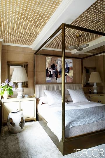
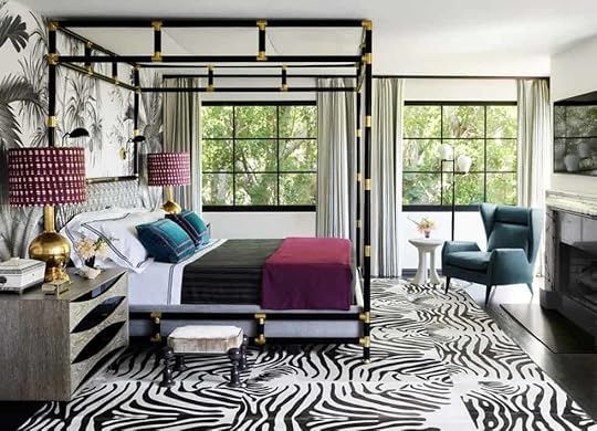
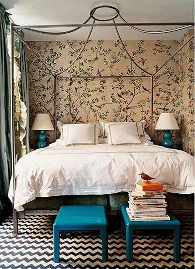
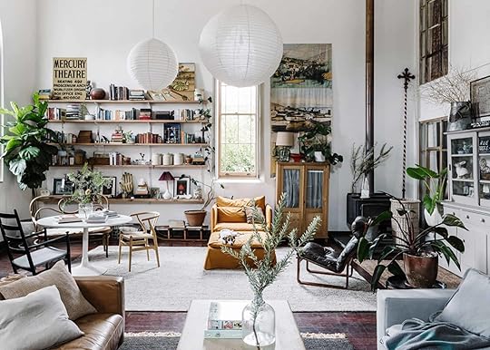
 photos by sara ligorria-tramp | from: portland master bedroom reveal
From Emily: I didn’t have a working theory about canopies before Caitlin asked me, but upon instinct I felt confident that they needed to be in taller rooms. It’s common sense scale – big beds need big rooms. I remember sleeping in the canopy bed in the Portland project when we were shooting there and it was AWESOME, but if the ceilings had been lower I think that I would have felt a bit claustrophobic. No real way to know as I don’t think I’ve slept in a low ceilinged canopy bed room, but going into the post I felt SURE that I was right. Canopy beds need higher ceilings. So, dear Caitlin, prove your boss wrong why don’t you???!!! (Caitlin note: This is what arguing at EHD is like. What a dream!!!)
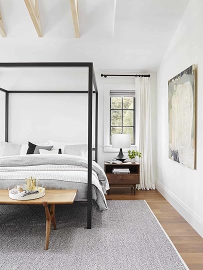
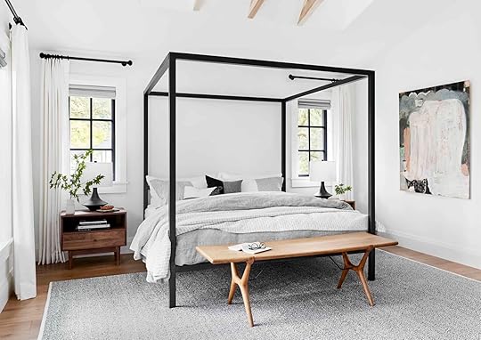 photo by sara ligorria-tramp | from: portland master bedroom reveal
I hear this. NOTED. And at the end of the day, Em was right – canopies aren’t for *every* standard-height bedroom, but they can work in ANY bedroom if given a little thought and love. (CUTE, right?) But when it comes to my bedroom, here’s what I’m actually working with… (These are pictures from the listing and from move-in day so please don’t look at this and be like, “THIS IS A PERSON THAT GIVES OUT DESIGN ADVICE?”)
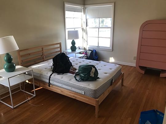
 left: design by caitlin higgins | via regularpeoplebedrooms.com| right: original listing photo by my landlord zach | via craigslist (probably my best-ever craigslist score, TBH)
So, yeah. It’s…fine. Average. But it’s also huge, super long, and pretty thin – 16′ wide by 11′ deep – with its fair share of design agonies. When Emily Bowser came over last week, the first words out of her mouth were, “why do you have the world’s biggest bedroom with the world’s tiniest bed in here?” And guys, SHE’S RIGHT. After 9 years with my full bed and IKEA frame, I’m finally in the process of upgrading to a king bed – just ordered this one after reading a glowing review on this post (your recommendations go a long way with this gal!) – but the room is so big that I feel like it deserves a statement bed frame, too.
8 FOOT CEILINGS BE DARNED, we’re going to find a way to make this work. To quote Leslie Knope: “I have the most valuable currency in America: a blind, stubborn belief that I’m 100% right.” Emily definitely has the design know-how but I have internet access, a Pinterest account, and an obsession with figuring out what makes things work. Let’s dive in, yeah?
Spice Up The Ceiling“But I don’t want to spice up my ceiling!” – that’s okay! If you’d rather leave it untouched, we still have lots of options and eye candy and design inspiration for you below. But if you are feeling like taking a paintbrush to your fifth wall or getting into a screaming fight with your partner about how to best hang peel & stick on a horizontal surface above your heads, these are for you…
 design by martyn lawrence bullard | photo by jaime kowal | via elle decor
WOAH, HELLO. If you weren’t awake already, this hotel room probably did the trick. But if you’re like “oh wow this is uh, maybe like, a little too much for me,” you’re not alone – Martyn Lawrence Bullard, the designer, had this to say: “Nobody is going to want to live in Mata Hari’s bedroom for the rest of their life, but they do want to spend three or four days feeling like they’re living on their own movie set.”And no offense – I know he designed it and knows what he’s talking about – but like, AU CONTRAIRE, MON FRERE. I’ll move in forever right now!!! This room has my maximalist-loving heart’s three favorite things (leopard, lucite, and lacquer) and it’s the space I keep coming back to as I attempt to design my own bedroom. (PS. Check out how minimal the styling is, too. The pillows are so simple and nary a tchotchke in sight??? ::chef’s kiss::)
Back to canopies, though: it can be easy for a tall bed to look kind of weird and wrongly-sized in a room with regular ceilings – I’m saying this as someone who spent the past two weeks looking at thousands of photos (not joking) of rooms with canopy beds – but when you actually do something to your ceiling, it makes the bed feel purposeful and considered and finished. Like, “YES, I did need this big bed in here, how else would you know to CHECK OUT MY COOL CEILING?”
 design by kelly wearstler | photo by william abranowicz | via elle decor
Kelly Wearstler agrees, so you know we’re on to something here. IMO, though, the real coup in this room is the scale – every piece in this shot is just the perfect size to fit into this little alcove and the canopy runs parallel with the two ceiling beams – it’s so special and elevated when the furniture can echo the architecture of a space. A regular headboard in this room would feel kind of dinky and sad (especially next to those substantial chests and huge lamps!) while a white ceiling would make it feel flat and unfinished, so it’s kinda nice that every component of the room needs each other  (Also, just as a fun fact: this is Cameron Diaz’s Manhattan apartment!)
 design by jeff schlarb design studio | photo by aubrie pick | via elle decor
Not one, but two wallpapers! OK, I SEE YOU. This one is super interesting for your eye as there’s no moulding to separate the walls from the ceiling. It makes the room seem SO tall, right? The curtains here are key, though – they’re doing a great job of bringing together the warm taupe/tan/gray from the wallpapers and the cool gray/navy/black from the rug and bedding (make a mental note, because we’re going to come back to this whole “light on top and dark on the bottom” thing a little later). Also a huge fan of the cord swagging on the lighting here – the random placement in and out of the bed makes the whole setup feel a little less precious (plus, it’s swagging is one of our favorite trends of 2021, so that’s neat).
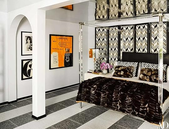 design by martyn lawrence bullard | photo by douglas friedman | via architectural digest
If you’re like, “hey, this kind of reminds me of the first room,” YOU’RE RIGHT. I’m just on a huge MLB kick right now, you know? The screens behind the bed are a great alternative to wallpaper and I mean…you know how I feel about lucite. The reflective ceiling is a nice modern alternative to hanging an actual mirror up there – this whole space is a little 70s, a little retro, a little glam, and just so SUMPTUOUS. It’s also in Palm Springs, which kind of explains the excess. It’s kind of cool to design a home to be period- or geographically-appropriate, right?

 left: design by nick olsen | photo by francesco lagnese | via veranda | right: photo by john merkl | via martha stewart
Ah, yes. Onwards to some paint ideas! I love these photos side-by-side because we’re looking at two VERY different takes on baby blue. On the left, I love how it pops against the antelope-print wallpaper and makes the ceilings seem sky high without feeling too unnatural or overbearing. (I remember once reading a Beata Heuman interview where she said she loved painting ceilings blue because you don’t really notice it and it makes the room feel tall – she’s on to something, guys!!) On the right, though, we see some super-sweet baby blue wallpaper that’s really anchored by the bold, black ceiling. Can you imagine how serene it must be in there at night?

 left: design by courtney bishop design | photo by katie charlotte | via the identite | right: design by dan mazzarini | photo by reid rolls | via architectural digest
Two tray ceilings, two canopy beds, two different approaches. LET’S TALK ABOUT IT. I love the choice to go bold on the left – it adds a lot of depth to that recessed space and makes the ceiling seem even higher! But I’m also a fan of the all-white tray ceiling on the right – my mom’s room has a similar layout and it’s always nice that her canopy bed draws your eye up to notice the architecture
 design by holly williams | photo by paul costello | via country living
Well…this is just freakin’ lovely, isn’t it? The room kind of reminds me of the Palm Springs house above in that if you jumped out of a dark alley and were like “TELL ME WHERE THIS IS OR I’M GOING TO TAKE YOUR WALLET,” I would be like “well, this is a weirdly specific scheme, but this room is obviously in Nashville.” I’m a huge fan of the semi-gloss painted ceiling, but I’m an even BIGGER fan of the petite size of this bed frame – it’s the perfect way to bring in a canopy bed without it feeling too tall or imposing.
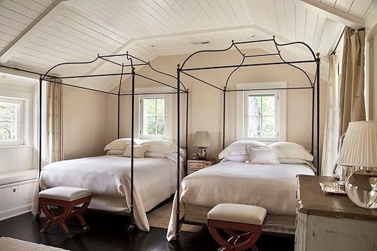 design by charlotte barnes
TWO FULL CANOPIES. IN ONE ROOM. Brilliant. You know this room must have been a total design agony to start – windows close together? Check. Windows of different sizes on every wall? Check. Blank wall space and a place where a bed really makes sense? No, sir! But I love the decision to eschew a low-framed king bed and instead place two canopy beds side by side. Two plain full beds would have felt cramped in this space, but the canopy (plus the shape of the ceiling) makes them feel really intentional. Most importantly, though – this just seems like a FUN place to stay. What else could you ask for from a guest room?

 left: design by connie braemer | photo by virginia Macdonald | via house & home | right: design by amber interiors | photo by tessa neustadt | via all sorts of
 Nothing says “foolproof” like a sturdy black canopy bed under some fresh white wooden paneling (I swear it’s underneath the beams on the left!). This is such a great solution for folks who find themselves drawn to calmer, more neutral bedroom spaces – the ceiling brings in an added layer of texture and the bed is like “HEY DIPPY, LOOK UP HERE, there’s something cool going on!!!” It’s like a flashing arrow pointing to good design chops without an actual flashing arrow (because that would be a no-go in such a restful space, you know?).
Think Beyond Just Paint design by juan carretero | photo by stephen kent johnson | via house beautiful
I’m normally not a big accent wall kind of gal, but I really like them in front of statement bed. I *thiiink* it’s just because that combo means that wall is the only place my eye is really drawn to (did you notice the left wall was painted instead of papered?). The height on this bed is really interesting, too – it’s below the door frame, which would make it 6’8″ or 6’9″ (a little above 80″ – at least in my house, where I just measured two door frames to verify measurements). The shorter size gives nearly TWO FEET of breathing room above the bed, which looks even bigger when it’s backed by a wallpaper motif.

 left: source unknown | right: photo by pieter estersohn | via architectural digest
I love these two for one big reason (and it’s not the chrome beds, shockingly): the embrace of architectural features. I know that design-wise, these rooms are SUPER different from the Wearstler room earlier, but I’m just really taken by the wallpapered beam on the left and the super thick cream-colored crown moulding on the right. I don’t know if I would have clocked either feature at first if not for an enormous shining arrow pointing straight towards them and both say SO much about the room’s inhabitant.
 left: design by martyn lawrence bullard | right: design by black lacquer design
Well aren’t these just straight outta my dreams!!! I’ve pinned both of these SO many times over the past few years and now that they’re side by side, I can see the similarities in color palette, pattern (palm prints and animal prints are basically neutral), and quirk (does that end table next to the chair on the right kind of remind you of the lamp on the left?). But most importantly, I see the similarity in bed size!! Two beds basically kissing the ceiling and I never even thought to notice because I was so excited by everything else going on. (These also make a surprisingly strong case for the accent wall + canopy combo – I never even noticed that the whole room wasn’t covered.)
 design by meg braff | photo by nick mele | via the glam pad
I don’t have much to say here other than I LOVE THIS and had to show someone!!! Talk about “if you’re not going all the way, why go at all?” turned up to ELEVEN. This room was designed for a show house in 2019 and I gotta know – could you live here? I think I could if we were in a bright and sunny place, but it would drive me nuts if I weren’t driving distance from the beach. LET ME KNOW – I think this could be a litmus test for something (not sure what yet).
 left: via flor | right: photo by lindsay salazar | via living etc
Before we talk about anything else – I pulled the image on the left from the FLOR website. The carpet tile website, you guys! Everyone else needs to step up their site merchandising because this shot BLEW. MY. MIND. Anyway. I’ll always be a sucker for wall moulding as every time I see it, my brain instantly goes “oh, this was a design choice and this person knows what they’re doing.” It’s funny that while the ceilings are white and the rooms are the same color all around, these canopies feel much more intentional when they’re in front of something like moulding – it just seems like the whole space was ~designed~, you know? Imagine each of these sans-moulding – they’d just look a little flatter and less special.
Play With Shape and Scale
 left: via wall street journal | via rue mag
It’s fun to see a canopy pushed against a wall! The canopy on this one brings such a nice symmetry that negates the little height difference between the top and bottom and makes it seem more like a daybed. And that photo on the right is such a classic – something about this shade of blue and orange kind of takes you back to the early days of design blogs, right? Like, I think I came up aspiring to be the type of person who lived in that room. (Fun fact: this shot was included in a 2016 book by Christiane Lemieux, who founded The Inside!) I also just love how *finished* these shapes make the beds feel as a whole – I covered up the tops of both beds with my hand and was blown away by the difference that such tiny details can make. Give it a try
 design by max rollitt | via remodelista
Oh me, oh my! I have a feeling that we’ll have some fun chats about this one down in the comments – I’m OBSESSED with this canopy, guys. We’ve taken an über-traditional bedroom and then *right* at the very tippy-top, the whole notion kind of gets turned on its head. How fun are those scallops??? I know we see that shape a lot hanging down in traditional cloth canopy beds, but it’s so fun and special seeing it sitting on top of the bed like a little crown. I wonder if I could DIY something similar with a vintage 4 poster bed?
 design by bruce budd | via architectural digest
Well isn’t this just a full combination of all the things we’ve talked about? We’ve got a fun bed frame shape – almost a necessity so those posts don’t bang into the wall – AND we’ve got floor-to-ceiling all-over wallpaper. The classic motifs (hello, florals, hello stripes) and hyper-restricted color palette keep it feeling soft and fresh while those beds add just the right amount of quirk and height. BIG FAN.

 left: via gp schafer | right: via new york times
Extra tall beds are SO GOOD, folks. Color me surprised – I never would have guessed before hunting down all these rooms! In case I haven’t said it enough, the real key to making a canopy bed work in a regular room is just making it feel deliberate and NOTHING makes it feel more deliberate than a bed that’s inches away from kissing the ceiling. Instead of looking crowded (what I would have anticipated), it actually looks really bespoke and high-end. BRB on the hunt for a 94-98″ bed, see you in a bit!!!
Go Halfsies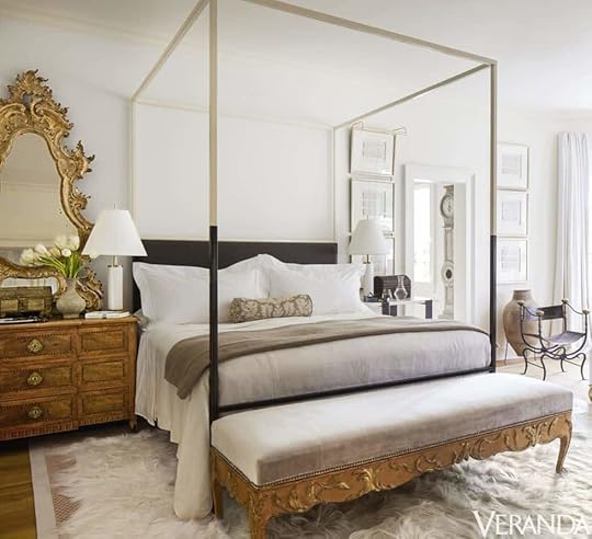 design by tara shaw | photo by max kim-bee | via veranda
A quick little digital resting point for my calm bedroom lovers I think this is a nice example of how to modernize traditional pieces. It honors the intent (a canopy bed absolutely belongs in a room like this) but adds a little spice (that dual-tone bedframe) in a way that’s updated but still neutral. Also very into how the top portion of the bed seems to match the moulding + ceiling + picture frames on the right. So polished and beautiful

 left: via colin king interiors | right: design by marie flanigan | photo by julie soefer | via architectural digest
Obsessed that the bed on the left feels bold and graphic while the one on the right feels light and airy. Same idea, wildly different execution. NEAT!! I was also so busy taking in these multicolored beds that I had no idea how tall either ceiling is, which is cool (and kind of the point of the post). My favorite thing about the photo on the left, though, is that if this had *just* been a big black bed in the middle of this room, you woulda been like “uh, why did they get such a heavy bed?” Instead, though, the canopy lightens the whole look and brings such a nice balance. It’s wild how something so simple can make a difference in perception!
 via new york times
Okay, okay, you caught me. THIS IS A TALL ROOM. But I just wanted to say that the half-and-half idea doesn’t just have to apply to the bed frame – you can make it work with some wall treatments, too. There’s something really serene about packing all your furnishings and a ton of classic color and pattern into a defined space and then letting your ceilings breathe – it simultaneously feels timeless AND fresh. (This home is in Italy and it belongs to an art historian, so like…of COURSE he nailed that balance.)
Pick Some Statement Flooring design by giancarlo valle | photo by stephen kent johnson | via architectural digest
I don’t know if y’all have noticed, but we’ve seen some big statement flooring choices throughout this whole post – wall-to-wall leopard carpet, so many hides, 3 chevron floors, and that gorgeous tile above – but MAN, this silk chartreuse carpet kinda takes the cake for me. The rest of the room is so quiet and lovely (I’m really loving the bed styling, are you??) and that paint texture is just sublime, but that bold color on the floor takes it from “beautiful” to “magazine-worthy.”
This brings us to the end, and our thoughts are this: CANOPIES FOR ALL. It may take a little extra time and consideration in rooms with standard 8′ ceilings but MAN, the design impact:cost ratio is HIGH. I’m finally feeling excited to take on my bedroom and y’all know I’ll be sleeping in something lucite and/or shiny by the end of the year. All the inspo I needed is right here Now, what say you??? Would you canopy in any room?
Opening Image Credits: Photo by Sara Ligorria-Tramp | From: Portland Master Bedroom Reveal
The post Caitlin And Emily Debate About Canopy Beds (And Discover The Secret To Making Them Work With Regular Height Ceilings) appeared first on Emily Henderson.


Caitlin And Emily Argue About Canopy Beds (And Discover The Secret To Making Them Work With Regular Height Ceilings)
[image error]Two weeks ago, I pulled out my tape measure mid-meeting (as one does) and then asked Emily a question: would you do a canopy bed in an apartment with 8′ ceilings? I don’t actually remember her answer – it was a “maybe” or “it depends” or “I love the amount of space I have at the Mountain House and think that would make me feel crushed in” but whatever it was, it was not an unequivocal yes, which was what I NEEDED to feel confident in my decision.
Because guys, I want a canopy bed like Violet wants a chocolate factory and well…tragically, my current bedroom will never look like the one in the Portland House, seeing as I live in a regular apartment with an inconveniently-placed mini-split AC unit and 101″ ceilings (a little over 8′ – photos below) instead of inside an Emily Henderson-designed house in the Pacific Northwest. Now, I wanted to sway Em’s opinion a little bit, so I spent a tiny lifetime scouring the internet, started a post about the secret sauce, and then forced said boss to come write part of it because that’s what good employees do. (I am just kidding, do not leave an empty space in your work and then write “BOSS WRITE” on it. That is only okay in blogging.) To that end, I wanted to toss the keyboard to Em…
photos by sara ligorria-tramp | from: portland master bedroom revealFrom Emily: I didn’t have a working theory about canopies before Caitlin asked me, but upon instinct I felt confident that they needed to be in taller rooms. It’s common sense scale – big beds need big rooms. I remember sleeping in the canopy bed in the Portland project when we were shooting there and it was AWESOME, but if the ceilings had been lower I think that I would have felt a bit claustrophobic. No real way to know as I don’t think I’ve slept in a low ceilinged canopy bed room, but going into the post I felt SURE that I was right. Canopy beds need higher ceilings. So, dear Caitlin, prove your boss wrong why don’t you???!!! (Caitlin note: This is what arguing at EHD is like. What a dream!!!)
photo by sara ligorria-tramp | from: portland master bedroom revealI hear this. NOTED. And at the end of the day, Em was right – canopies aren’t for *every* standard-height bedroom, but they can work in ANY bedroom if given a little thought and love. (CUTE, right?) But when it comes to my bedroom, here’s what I’m actually working with… (These are pictures from the listing and from move-in day so please don’t look at this and be like, “THIS IS A PERSON THAT GIVES OUT DESIGN ADVICE?”)
left: design by caitlin higgins | via regularpeoplebedrooms.com| right: original listing photo by my landlord zach | via craigslist (probably my best-ever craigslist score, TBH)So, yeah. It’s…fine. Average. But it’s also huge, super long, and pretty thin – 16′ wide by 11′ deep – with its fair share of design agonies. When Emily Bowser came over last week, the first words out of her mouth were, “why do you have the world’s biggest bedroom with the world’s tiniest bed in here?” And guys, SHE’S RIGHT. After 9 years with my full bed and IKEA frame, I’m finally in the process of upgrading to a king bed – just ordered this one after reading a glowing review on this post (your recommendations go a long way with this gal!) – but the room is so big that I feel like it deserves a statement bed frame, too.
8 FOOT CEILINGS BE DARNED, we’re going to find a way to make this work. To quote Leslie Knope: “I have the most valuable currency in America: a blind, stubborn belief that I’m 100% right.” Emily definitely has the design know-how but I have internet access, a Pinterest account, and an obsession with figuring out what makes things work. Let’s dive in, yeah?
Spice Up The Ceiling“But I don’t want to spice up my ceiling!” – that’s okay! If you’d rather leave it untouched, we still have lots of options and eye candy and design inspiration for you below. But if you are feeling like taking a paintbrush to your fifth wall or getting into a screaming fight with your partner about how to best hang peel & stick on a horizontal surface above your heads, these are for you…
design by martyn lawrence bullard | photo by jaime kowal | via elle decorWOAH, HELLO. If you weren’t awake already, this hotel room probably did the trick. But if you’re like “oh wow this is uh, maybe like, a little too much for me,” you’re not alone – Martyn Lawrence Bullard, the designer, had this to say: “Nobody is going to want to live in Mata Hari’s bedroom for the rest of their life, but they do want to spend three or four days feeling like they’re living on their own movie set.”And no offense – I know he designed it and knows what he’s talking about – but like, AU CONTRAIRE, MON FRERE. I’ll move in forever right now!!! This room has my maximalist-loving heart’s three favorite things (leopard, lucite, and lacquer) and it’s the space I keep coming back to as I attempt to design my own bedroom. (PS. Check out how minimal the styling is, too. The pillows are so simple and nary a tchotchke in sight??? ::chef’s kiss::)
Back to canopies, though: it can be easy for a tall bed to look kind of weird and wrongly-sized in a room with regular ceilings – I’m saying this as someone who spent the past two weeks looking at thousands of photos (not joking) of rooms with canopy beds – but when you actually do something to your ceiling, it makes the bed feel purposeful and considered and finished. Like, “YES, I did need this big bed in here, how else would you know to CHECK OUT MY COOL CEILING?”
design by kelly wearstler | photo by william abranowicz | via elle decorKelly Wearstler agrees, so you know we’re on to something here. IMO, though, the real coup in this room is the scale – every piece in this shot is just the perfect size to fit into this little alcove and the canopy runs parallel with the two ceiling beams – it’s so special and elevated when the furniture can echo the architecture of a space. A regular headboard in this room would feel kind of dinky and sad (especially next to those substantial chests and huge lamps!) while a white ceiling would make it feel flat and unfinished, so it’s kinda nice that every component of the room needs each other (Also, just as a fun fact: this is Cameron Diaz’s Manhattan apartment!)
design by jeff schlarb design studio | photo by aubrie pick | via elle decorNot one, but two wallpapers! OK, I SEE YOU. This one is super interesting for your eye as there’s no moulding to separate the walls from the ceiling. It makes the room seem SO tall, right? The curtains here are key, though – they’re doing a great job of bringing together the warm taupe/tan/gray from the wallpapers and the cool gray/navy/black from the rug and bedding (make a mental note, because we’re going to come back to this whole “light on top and dark on the bottom” thing a little later). Also a huge fan of the cord swagging on the lighting here – the random placement in and out of the bed makes the whole setup feel a little less precious (plus, it’s swagging is one of our favorite trends of 2021, so that’s neat).
design by martyn lawrence bullard | photo by douglas friedman | via architectural digestIf you’re like, “hey, this kind of reminds me of the first room,” YOU’RE RIGHT. I’m just on a huge MLB kick right now, you know? The screens behind the bed are a great alternative to wallpaper and I mean…you know how I feel about lucite. The reflective ceiling is a nice modern alternative to hanging an actual mirror up there – this whole space is a little 70s, a little retro, a little glam, and just so SUMPTUOUS. It’s also in Palm Springs, which kind of explains the excess. It’s kind of cool to design a home to be period- or geographically-appropriate, right?
left: design by nick olsen | photo by francesco lagnese | via veranda | right: photo by john merkl | via martha stewartAh, yes. Onwards to some paint ideas! I love these photos side-by-side because we’re looking at two VERY different takes on baby blue. On the left, I love how it pops against the antelope-print wallpaper and makes the ceilings seem sky high without feeling too unnatural or overbearing. (I remember once reading a Beata Heuman interview where she said she loved painting ceilings blue because you don’t really notice it and it makes the room feel tall – she’s on to something, guys!!) On the right, though, we see some super-sweet baby blue wallpaper that’s really anchored by the bold, black ceiling. Can you imagine how serene it must be in there at night?
left: design by courtney bishop design | photo by katie charlotte | via the identite | right: design by dan mazzarini | photo by reid rolls | via architectural digestTwo tray ceilings, two canopy beds, two different approaches. LET’S TALK ABOUT IT. I love the choice to go bold on the left – it adds a lot of depth to that recessed space and makes the ceiling seem even higher! But I’m also a fan of the all-white tray ceiling on the right – my mom’s room has a similar layout and it’s always nice that her canopy bed draws your eye up to notice the architecture
design by holly williams | photo by paul costello | via country livingWell…this is just freakin’ lovely, isn’t it? The room kind of reminds me of the Palm Springs house above in that if you jumped out of a dark alley and were like “TELL ME WHERE THIS IS OR I’M GOING TO TAKE YOUR WALLET,” I would be like “well, this is a weirdly specific scheme, but this room is obviously in Nashville.” I’m a huge fan of the semi-gloss painted ceiling, but I’m an even BIGGER fan of the petite size of this bed frame – it’s the perfect way to bring in a canopy bed without it feeling too tall or imposing.
design by charlotte barnesTWO FULL CANOPIES. IN ONE ROOM. Brilliant. You know this room must have been a total design agony to start – windows close together? Check. Windows of different sizes on every wall? Check. Blank wall space and a place where a bed really makes sense? No, sir! But I love the decision to eschew a low-framed king bed and instead place two canopy beds side by side. Two plain full beds would have felt cramped in this space, but the canopy (plus the shape of the ceiling) makes them feel really intentional. Most importantly, though – this just seems like a FUN place to stay. What else could you ask for from a guest room?
left: design by connie braemer | photo by virginia Macdonald | via house & home | right: design by amber interiors | photo by tessa neustadt | via all sorts of Nothing says “foolproof” like a sturdy black canopy bed under some fresh white wooden paneling (I swear it’s underneath the beams on the left!). This is such a great solution for folks who find themselves drawn to calmer, more neutral bedroom spaces – the ceiling brings in an added layer of texture and the bed is like “HEY DIPPY, LOOK UP HERE, there’s something cool going on!!!” It’s like a flashing arrow pointing to good design chops without an actual flashing arrow (because that would be a no-go in such a restful space, you know?).
Think Beyond Just Paintdesign by juan carretero | photo by stephen kent johnson | via house beautifulI’m normally not a big accent wall kind of gal, but I really like them in front of statement bed. I *thiiink* it’s just because that combo means that wall is the only place my eye is really drawn to (did you notice the left wall was painted instead of papered?). The height on this bed is really interesting, too – it’s below the door frame, which would make it 6’8″ or 6’9″ (a little above 80″ – at least in my house, where I just measured two door frames to verify measurements). The shorter size gives nearly TWO FEET of breathing room above the bed, which looks even bigger when it’s backed by a wallpaper motif.
left: source unknown | right: photo by pieter estersohn | via architectural digestI love these two for one big reason (and it’s not the chrome beds, shockingly): the embrace of architectural features. I know that design-wise, these rooms are SUPER different from the Wearstler room earlier, but I’m just really taken by the wallpapered beam on the left and the super thick cream-colored crown moulding on the right. I don’t know if I would have clocked either feature at first if not for an enormous shining arrow pointing straight towards them and both say SO much about the room’s inhabitant.
left: design by martyn lawrence bullard | right: design by black lacquer designWell aren’t these just straight outta my dreams!!! I’ve pinned both of these SO many times over the past few years and now that they’re side by side, I can see the similarities in color palette, pattern (palm prints and animal prints are basically neutral), and quirk (does that end table next to the chair on the right kind of remind you of the lamp on the left?). But most importantly, I see the similarity in bed size!! Two beds basically kissing the ceiling and I never even thought to notice because I was so excited by everything else going on. (These also make a surprisingly strong case for the accent wall + canopy combo – I never even noticed that the whole room wasn’t covered.)
design by meg braff | photo by nick mele | via the glam padI don’t have much to say here other than I LOVE THIS and had to show someone!!! Talk about “if you’re not going all the way, why go at all?” turned up to ELEVEN. This room was designed for a show house in 2019 and I gotta know – could you live here? I think I could if we were in a bright and sunny place, but it would drive me nuts if I weren’t driving distance from the beach. LET ME KNOW – I think this could be a litmus test for something (not sure what yet).
left: via flor | right: photo by lindsay salazar | via living etcBefore we talk about anything else – I pulled the image on the left from the FLOR website. The carpet tile website, you guys! Everyone else needs to step up their site merchandising because this shot BLEW. MY. MIND. Anyway. I’ll always be a sucker for wall moulding as every time I see it, my brain instantly goes “oh, this was a design choice and this person knows what they’re doing.” It’s funny that while the ceilings are white and the rooms are the same color all around, these canopies feel much more intentional when they’re in front of something like moulding – it just seems like the whole space was ~designed~, you know? Imagine each of these sans-moulding – they’d just look a little flatter and less special.
Play With Shape and Scaleleft: via wall street journal | via rue magIt’s fun to see a canopy pushed against a wall! The canopy on this one brings such a nice symmetry that negates the little height difference between the top and bottom and makes it seem more like a daybed. And that photo on the right is such a classic – something about this shade of blue and orange kind of takes you back to the early days of design blogs, right? Like, I think I came up aspiring to be the type of person who lived in that room. (Fun fact: this shot was included in a 2016 book by Christiane Lemieux, who founded The Inside!) I also just love how *finished* these shapes make the beds feel as a whole – I covered up the tops of both beds with my hand and was blown away by the difference that such tiny details can make. Give it a try
design by max rollitt | via remodelistaOh me, oh my! I have a feeling that we’ll have some fun chats about this one down in the comments – I’m OBSESSED with this canopy, guys. We’ve taken an über-traditional bedroom and then *right* at the very tippy-top, the whole notion kind of gets turned on its head. How fun are those scallops??? I know we see that shape a lot hanging down in traditional cloth canopy beds, but it’s so fun and special seeing it sitting on top of the bed like a little crown. I wonder if I could DIY something similar with a vintage 4 poster bed?
design by bruce budd | via architectural digestWell isn’t this just a full combination of all the things we’ve talked about? We’ve got a fun bed frame shape – almost a necessity so those posts don’t bang into the wall – AND we’ve got floor-to-ceiling all-over wallpaper. The classic motifs (hello, florals, hello stripes) and hyper-restricted color palette keep it feeling soft and fresh while those beds add just the right amount of quirk and height. BIG FAN.
left: via gp schafer | right: via new york timesExtra tall beds are SO GOOD, folks. Color me surprised – I never would have guessed before hunting down all these rooms! In case I haven’t said it enough, the real key to making a canopy bed work in a regular room is just making it feel deliberate and NOTHING makes it feel more deliberate than a bed that’s inches away from kissing the ceiling. Instead of looking crowded (what I would have anticipated), it actually looks really bespoke and high-end. BRB on the hunt for a 94-98″ bed, see you in a bit!!!
Go Halfsiesdesign by tara shaw | photo by max kim-bee | via verandaA quick little digital resting point for my calm bedroom lovers I think this is a nice example of how to modernize traditional pieces. It honors the intent (a canopy bed absolutely belongs in a room like this) but adds a little spice (that dual-tone bedframe) in a way that’s updated but still neutral. Also very into how the top portion of the bed seems to match the moulding + ceiling + picture frames on the right. So polished and beautiful
left: via colin king interiors | right: design by marie flanigan | photo by julie soefer | via architectural digestObsessed that the bed on the left feels bold and graphic while the one on the right feels light and airy. Same idea, wildly different execution. NEAT!! I was also so busy taking in these multicolored beds that I had no idea how tall either ceiling is, which is cool (and kind of the point of the post). My favorite thing about the photo on the left, though, is that if this had *just* been a big black bed in the middle of this room, you woulda been like “uh, why did they get such a heavy bed?” Instead, though, the canopy lightens the whole look and brings such a nice balance. It’s wild how something so simple can make a difference in perception!
via new york timesOkay, okay, you caught me. THIS IS A TALL ROOM. But I just wanted to say that the half-and-half idea doesn’t just have to apply to the bed frame – you can make it work with some wall treatments, too. There’s something really serene about packing all your furnishings and a ton of classic color and pattern into a defined space and then letting your ceilings breathe – it simultaneously feels timeless AND fresh. (This home is in Italy and it belongs to an art historian, so like…of COURSE he nailed that balance.)
Pick Some Statement Flooringdesign by giancarlo valle | photo by stephen kent johnson | via architectural digestI don’t know if y’all have noticed, but we’ve seen some big statement flooring choices throughout this whole post – wall-to-wall leopard carpet, so many hides, 3 chevron floors, and that gorgeous tile above – but MAN, this silk chartreuse carpet kinda takes the cake for me. The rest of the room is so quiet and lovely (I’m really loving the bed styling, are you??) and that paint texture is just sublime, but that bold color on the floor takes it from “beautiful” to “magazine-worthy.”
This brings us to the end, and our thoughts are this: CANOPIES FOR ALL. It may take a little extra time and consideration in rooms with standard 8′ ceilings but MAN, the design impact:cost ratio is HIGH. I’m finally feeling excited to take on my bedroom and y’all know I’ll be sleeping in something lucite and/or shiny by the end of the year. All the inspo I needed is right here Now, what say you??? Would you canopy in any room?
Opening Image Credits: Photo by Sara Ligorria-Tramp | From: Portland Master Bedroom Reveal
The post Caitlin And Emily Argue About Canopy Beds (And Discover The Secret To Making Them Work With Regular Height Ceilings) appeared first on Emily Henderson.
August 9, 2021
Jess’ Shared Patio Intro – SURPRISE She’s Designing Two Outdoor Spaces At Once!

Remember back when I first talked about my crazy list of demands for moving into a new apartment? Well, a private outdoor space was very high on the list. The universe clearly was trying to show off because it was like, “Ha. I’ll do you one better. How about a little weird balcony AND a communal patio where you can hang out with more than one person at a time??” So yes, there are not one but two places I can happily get feasted on by mosquitos!
Now at first glance, I wouldn’t call this a dreamy-looking patio setup despite the building being dreamy. There’s a handful of mismatched and nearly unusable pieces of furniture and a floor slant that is well, not not insignificant. BUT the size is great, the building next door gives a beautiful backdrop, and in my dreams, my neighbors and I can all use the main wall to project movies on warm (soon-to-be-fall) nights.
I had heard that my truly wonderful landlord (I know I’ve said it before but a great landlord should be celebrated always) wanted to spiff it up early last year but we all know what happened last March. Understandably she put a halt to those plans. But then a very pushy, design-obsessed tenant moved in last November (I am that tenant) and had her heart set on making that patio a retreat for everyone in the building. Plus it’s not a bad way to make good with the neighbors amirite? So let’s take a look at what I’m working with:

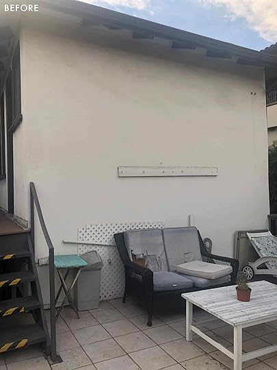
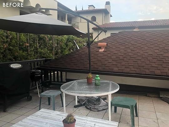
See what I mean?? A large space that needs A LOT of love. Here is my list of needs and upgrades:
All new furniture A large rug (or two since the stairway is in the way)String lights (need some mood lighting stat!)Lots of plants Classic but modern design to go with style of the buildingA new peg rail!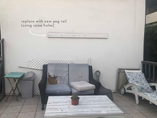
Speaking of a new peg rail, this one really has to go. It was rotting, looked too small, and was ultimately useless. Now a huge part of this makeover was that I didn’t want to make any new holes if I didn’t absolutely have to. This is a beautiful old building and I want to preserve it the best I possibly can.
So with the help of the one and only Les Bunge, we just made a new beautiful rail using the existing holes. I really like waiting for a big reveal so sorry but no teaser shots:)

Plants are a super important part of this design because I want it to feel kinda private and lush. The side that looks over the driveway isn’t too bad of a view but I think will be SO pretty with a handful of sturdy vines and a couple of flowering plants. Any specific recommendations are welcome!! I really don’t want succulents because they aren’t the vibe. But whatever they are, they need to be able to handle a lot of heat and full sun. HELP!


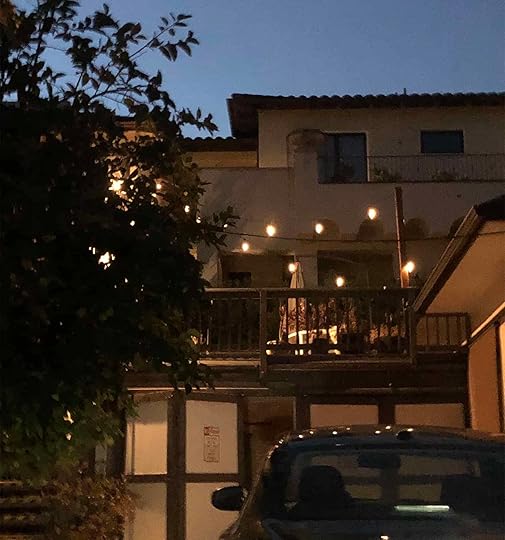
Ok, ONE sneak peek! Here is how my dad installed the solar string patio lights. We went to Home Depot, bought these two posts and these adjustable clamps (can’t exactly remember which size but it’s different for every project) and then banded the posts to the railings on each side of the patio. No holes made and not totally offensive to the eye. Originally my dad said we should get straps (they were black and red) and against my better judgment, I didn’t say no…in the store. While he might disagree, I really tried to not be a total pain in the butt and thought “Jess, your dad is doing a MASSIVE favor, so stop being such a design snob and be ok with these ugly straps!”. Well, I should have said something because I just couldn’t do it (and he also agreed in the end) so back to Home Depot for at least the thrid time that day.
I plan to camouflage the banding with plants so I think it’s going to be great. Now, my only issue is that I think my landlord might want me to paint the posts the color of the railing… I don’t hate that idea but also the railings are pretty aged so a freshly painted post might look off. Stay tuned.

Adding in solar lights was also a way to make this as landlord-friendly as possible so she didn’t have anything added to her electric bill. Plus it worked out for me because I didn’t have to worry about factoring where a plug was. It’s a win for my landlord, me, and the earth. And there’s LB installing the solar panel into the post, thus not making new holes into the building or railing:)
Here it is at night! Isn’t it so pretty??
The technical stuff is now over and now we can FINALLY talk about the pretty stuff.
I kept the color palette pretty similar to my balcony because it just feels right for the building. This also is technically my first time designing for someone other than just me! So I needed to keep the design crowd-pleasing and classic but still special and interesting. I’m pretty darn happy where I ended up:) Also know that these mood boards are very bare-bones so don’t worry, much more will be added. But first, let’s start at the beginning. The first attempt…
Moodboard One
Umbrella | Sofa | String Lights | All Blue Pillow | Cream and Blue Pillow | Coffee Table | Striped Rug | Jute Rug | Dining Chairs | Dining Table | Planter | Fabric Chair | Lumbar Pillow
I don’t dislike this one but it really just felt too toned down. Ultimately I wanted more pattern and a just more “fun”. Plus I think that a black peg rail would have been a little too visually intense. Onto the next…
Moodboard Two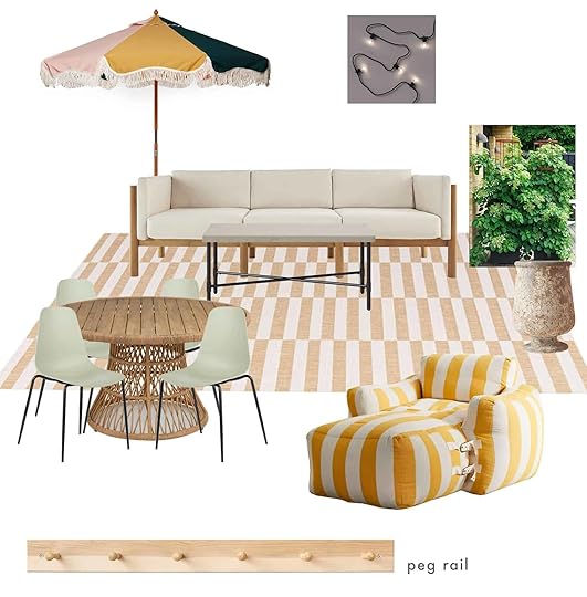
Umbrella | Sofa | String Lights | Coffee Table | Striped Rug | Dining Chairs | Dining Table | Planter | Fabric Lounge | Peg Rail
I think that while VERY fun this is what is considered an “overcorrection”. Basically, I fell deeply in love with that umbrella (they have a cabana version too!) so I desperately tried to make it work but it wasn’t right for the building. Too “Palm Springs” if you will. Plus the color of that rug would have blended in way too much with the existing tile. However, I love the texture that dining table brought in so it’s a keeper:) Also, see how much better the light wood peg rail tone is??
Moodboard Three (And Final…Probably:))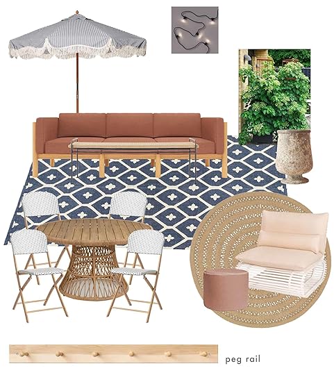
Umbrella | Sofa | String Lights | Coffee Table | Blue Rug | Dining Chairs | Dining Table | Planter | Round Rug | Accent Chair | Pouf | Peg Rail
Here we are! First, the change in sofa cushion color made a HUGE difference in making this design really pop and is honestly MUCH more practical for a shared outdoor space used by 14 units. Plus the fabric of the sofa and chair is Sunbrella! Couldn’t be more pumped. But there’s a sofa cover too which I plan to make everyone use. Maybe I won’t actually be that popular. Then I really wanted some bold contrast so that awesome blue outdoor rug that leans just the right amount of traditional and that super sweet striped umbrella checked that box real quick. But to make sure I’m spreading the blue love around I found these folding Target bistro chairs for the other side of the patio. I did purchase these already and I LOVE them. They are hard to find now (I had to drive two hours to get two of them) but I think they are a recurring style every year. Likely because they are super cute and so comfortable.
Let’s talk about that lounge chair for a sec. You might recognize it from Shavonda’s backyard reveal! The moment I saw them in that post I instantly wanted them but at the time had zero outdoor space. Well friends, times have certainly changed and I can’t wait to stare AND sit on it in person.
So this is where I am at and I couldn’t be more excited. I can’t wait for everything to arrive and to style the heck out of it. I also want to let you know that my balcony is actually done and we are shooting it THIS WEEK!!! So I promise I didn’t lose focus and you are about to get some really fun outdoor content just as we are heading hopefully out of this not great 90-degree weather, at least here in LA:)
Love you, mean it.
The post Jess’ Shared Patio Intro – SURPRISE She’s Designing Two Outdoor Spaces At Once! appeared first on Emily Henderson.
August 8, 2021
The Link Up: Emily’s “Sexy” Velcro Sandal, Caitlin’s $9 Pet Hair Hack, and The Easiest/ (And Very Delicious) Meal Kits We’re Eating

Hey all and welcome to our Sunday Link Up!! Today we’re sharing all sorts of fun things we feel you need to check out. We just got back from our team retreat this last week (because Em is 2 weeks from her Portland move…AH) and BOY it was good to see each other again and get to plan some really fun stuff for you all. We’re hoping you all had a great week & did things that make your heart full. Geez we’re being so sappy today. Alright, enough of that let’s get into it.
This week’s home tour is an EPIC 1870s church that Sarah and Adam Fairhead Hall renovated and made into their family’s dream home. The space is so unique, fresh, and has some REALLY beautiful styling (as per usual on The Design Files). When this home tour came out our entire team freaked out…Jess’s exact words are “now THAT’s how you do a renovation.” And you’ll totally agree.
From Emily: I finally got into the Teva trend 3 years later. One of my best friends who’s a fashion stylist saw them and bought them too welcome to the leopard Teva. It will be your summer shoe for life…and they’re on sale from $68 to $49!! Also, Mallory has them in tan and totally bats for how good they are –– we both wore them during our entire retreat.
From Caitlin: I’m normally the number one advocate for wool dryer balls (these multicolored ones, in particular, are my favorites) but I just discovered these dryer sheets specifically formulated for pet hair, and MAN, WHAT A GAME CHANGER. I tried them out last Sunday and they have cut my lint roller usage down by like, maybe, roughly…a million sheets this week? I don’t think I’ll need to use them every time moving forward – they really did capture a ton of hair and they somehow loosened up some tightly-wound lint balls that I had formerly just accepted as being forever-present so I could remove them easily (does anyone else get those on their sweatpants? Or like, on the inner thighs of leggings sometimes? Why does lint stick there so much!!!) – but I’ll definitely keep them on hand for my black clothes and for those pieces that cat hair just seems to cling to. FWIW, I used 4 sheets in a huuuuge load in the industrial-size dryer in my laundromat. There are some reviews from folks who are like “this is the same as a normal dryer sheet” but I think their loads may have just been a little too big for the sheet to do its job as it did make a marked difference in my clothes!!! That said, I haven’t noticed anything I washed being more hair-repellent (that’s another marketing touchpoint they have) but I don’t even mind because it was SO NICE seeing SO MUCH LESS cat hair than normal clinging to everything I pulled out of the dryer. If used infrequently – or you know, not in the industrial-strength laundromat – one pack of these should last you a whole year (or two) for only $9!! Highly recommended
From Mallory: We were talking about Soho Home during our company retreat because we are all OBSESSED with it. Their stuff is seriously so good and we’re all swooning big time. Specifically… I am heavily into this chair. HEAVILY.
From Jess: My friend introduced me to a pretty wonderful meal service called Splendid Spoon and I really really love it. I only get the soups but they have soups, bowls, and smoothies that are all plant-based, no added sugar, etc etc. I keep wanting to be someone who loves to cook but that someone hasn’t shown up yet. So when I’m feeling like I don’t want to cook (always) I pop one of these puppies on the stove and so far they have all been super delicious. Anyway, I highly recommend it for those who want to eat lots of tasty veggies but can’t be bothered to fully prepare a meal. Oh and another great thing is you don’t have to get a subscription. I just order 10 at a time and indulge at my leisure without having to worry about my next shipment (or figuring out how to cancel it). FYI this is in no way a paid ad or any kind of affiliate. Just one gal recommending something she likes a lot
Also From Jess: I’ve started to wear makeup a bit more often so my sunscreen reapplication hasn’t been great or easy. But then I saw that my personal favorite sunscreen brand (Supergoop!) has a translucent powder sunscreen and I was in! It’s so great when you are on the go. They also have tinted ones too but lord knows this tan is not going to last all year and I didn’t want to have to get another in a couple of months.
From Ryann: Via Emily’s post yesterday, I found out that milking stools, or as Charlie Henderson so sweetly described them, “a 1/2 stool that is broken” exist, and CLEARLY I need one now. I thought for sure they would be hard to find but nope, they are all over Etsy and I am obviously buying one for my MOTO. In particular, this shop has tons of great ones so please peruse it and buy one for yourself! There are plenty to go around.
That’s all for this week friends!! See you in the morning
Opening Image Credit: Design and Styling by Sarah and Adam Fairhead Hall | Photo by Marnie Hawson | via The Design Files
The post The Link Up: Emily’s “Sexy” Velcro Sandal, Caitlin’s $9 Pet Hair Hack, and The Easiest/ (And Very Delicious) Meal Kits We’re Eating appeared first on Emily Henderson.
August 7, 2021
What Furniture/Decor We’d Want If Money Were No Object – And WHY. Let’s Fantasize
I spend equal time on 1stDibs as I do on Craigslist. The strategy is to identify what I love (and what design elements make it so desirable) on 1st dibs then find a version of it more affordably on all the other sites (including Chairish, Etsy, eBay, FB marketplace, and Craigslist). One site for inspo on both new and vintage, and the other sites for actually pulling triggers (or maybe not). It’s F.U.N. and I literally can NOT wait to get up to Oregon and shop in person (not just in Portland, we are talking day trips around the state to good vintage malls). A couple weeks ago we all saw the photo of Richard Branson and Elon Musk standing in front of Bransons’ kitchen in one of his rental houses. The internet blew up with the debate about how billionaires decorate their house. So we were chatting about it on Zoom one day – and I think Caitlin asked me what I would want? And we all went around and fantasized and shared. It was FUN. So here are the splurgey design/decor pieces that we love, love love.
Emily
I’ll never not want this sofa (or the sectional version of it, or the club chair version). It’s the perfect “classic with some edge” that I’ve been coveting for about 10 years. It’s from BBDW and while I don’t know the exact price (you need to have all materials and the size chosen) I think it’s like $30-35k. Those legs. Those arms. I don’t resent the fact that I can’t have it. Instead, I look for why I love it and try to find those details in less expensive versions. I love that it has a single-seat, that the tufts are minimal and yet bring in that classic feel, and that the arms and legs have been highly considered and designed. So now when I shop for sofas I look at all the little details, not necessarily the bold gestures to see how something like a carved arm can send it over the edge of awesomeness.

I just discovered this modern Shaker furniture maker in Maine, and I was delighted that she is a woman. Heidi’s pieces are so beautiful, handcrafted, heirloom-quality, and a modern twist on the Shaker style we all love. That hanging cabinet starts at $11k and when I read that my first response was “oh shit, good for you, Heidi” and not in a snarky way. I’m genuinely happy that she is valuing her hard work and that clearly there is a market for it. It also has re-inspired me to look for more affordable versions and guess what, I’ve found them
I will also never NOT love a Papa Bear. It’s a whimsical version of a wingback (and I LOVE a wingback) boasting comfort, in a more upright position (verses sinking in too much, something I’ve realized I only love in TV rooms). It’s extremely classic in the Scandinavian style and while it is definitely being knocked off with affordable versions, I’ll wait till I can find an original. Hey Dave (MidCenturyLA) I’m looking at you It’s the big modern hug, in a healthy scale that just draws you in to read.

Now for one that is new. I think you can tell I’m really into comfortable and whimsical furniture. I’m a massive fan of Pierre Yovanovitch, the french architect and designer. These Papa Bear and Mama Bear chairs make my eyes so happy. If these were designed “wrong” they could be pretty darn silly looking, but the proportions and the finishes make it a happy little family. I couldn’t find a price, but I know that his dining chairs start at $15k each so I’d imagine these are, well, you can imagine. Hopefully, it’s not something that is knocked off. While I want design to be democratized (and the internet has sure helped) when you see the exact copy of something like this, mass-produced with far cheaper materials and craftsmanship, I get a little bit sad. Speaking of, did you see CB2’s collaboration with Paul McCobb? He’s one of my favorite designers EVER and they’ve done a great job of recreating some of his classics, but in collaboration with his estate which I appreciate.

 art by adam pogue
I first saw Adam Pogue‘s artwork in a retail store in LA 4 years ago, as the dressing room curtains. I immediately DM’d him telling him that I’m a huge fan and I’d love to talk (he followed me and we have a lot of friends in common). I’ve tried to commission him for a while, but he is super busy doing large collaborations with Commune and likely other really high-end clients and as an artist, he can only take on so much work which I totally get. But I LOVE his work and its inspired me to start collecting vintage plaids and Japanese Boro to try to get this hand-sewn, quilted textile art look, inspired by him, but in an EHD way.
Jess design by 6a architects | via remodelista
The one kinda unexpected thing that makes me hold my breath for a split second every time I see them in a space are these tiles from BDDW (after working here for almost 5 years Em has very much rubbed off on me:)). I think they are incredibly magical and if I were to ever buy a house (the real pick) and have endless money to spend on it to customize every freaking inch (the real REAL dream) then these puppies would go in there faster than a Beyonce concert selling out. I don’t know how much they are but I know that my bank account will likely never warrant this purchase. But who knows?! Maybe someday far far in the future.

Tove and Edvard Kindt-Larsen Cabinet
“I want you, I need you, oh baby, oh baby” but take out Julia Stiles’s sarcasm but every word is earnest. This vintage (and sadly now unavailable) cabinet is so incredible. It’s graphic but natural, simple yet interesting. A definite forever piece that could really work with any style giving whatever space it’s in a huge dose of special. Next time it’s available and I have $19,000 dollars to spare that baby is mine.
 design by gacho studios | photo by nicole franzen
I first saw this piece of art when I was doing research for an “unexpected wall art” post. I fell in love instantly and it’s been in the back of my head ever since. I love how graphic it is and the awesome visual impact it has. I love that it’s 3-D and made of wood, giving it some warmth and texture. And lastly, I love the colors. Now I don’t know how much this piece is but since the prices aren’t listed I’m going to take a wild guess that it’s most certainly in the “probably not ever Miss Bunge” price range. But again who knows?????
Ryann
19th Century Stained Pine Sofa
I am deeply attracted to this sofa. It reminds me of an old church pew but mixed with sexy Victorian era curves it’s so unexpected and spectacular, and the mustard upholstery color is 10/10. The price is not listed but I found it via Dorian Antiques so I can make an educated guess that it’s way out of my price range. Maybe someday, sweet sexy sofa. Maybe someday.
 via atelier vime
Here’s why I felt compelled to add this to my list: If I did have unlimited funds I could see spending big bucks on furniture and art. But if money truly were no object, I WOULD spend high dollar on this wicker screen by Atelier Vime even though it’s so extra. It’s listed here for over $8,000 and the special woven detail is just divine. Plus, you all know how I feel about wicker.
Mallory home of martina mondadori sartogo | photo by miguel flores-vianna | via architectural digest
These Frank Gehry chairs will never not be cool. I’m SO into how these bad boys look, but at a cool $11,000 it’s probably not in the cards. They look so epic in photos though and I love how sculptural they are!! If anyone wants to get one for me I wouldn’t be upset.

It’s always a little intimidating when you have to “request trade pricing” on a really cool piece of furniture. Like, to me, that basically just means it’s at least a couple thousand…but man if I had an ethereal couple thousand dollars I would spend it on this lounge chair or really anything from Cuff Studio
Lea via soho home
I love whites on whites on whites so when I first saw this Vivienne modular sofa by SOHO Home I fell instantly in love with its curves, texture, and those feet!
Caitlin
HOW DO YOU EVEN PICK? (Like, guys, my Chairish favs are filled with $2,000 busts of dogs wearing hats and $13,000 dining chairs.) But if someone handed me a wad of cash today, this brass dresser (which I will not link, because I am scared that one of you will scoop it!!!) is without a doubt the first thing I’d buy. It’s not technically super out of reach – it’s priced at $3,600 which is by no means cheap, but is hopefully manageable with planning – so I’ve been working to save up for the last few months. This is the only thing I don’t totally love about vintage – you can either pay up front and get what you want now, or you can just put it a wish out in the ether and hope to one day come across your dream piece at the price you can afford. In any case, please send positive vibes my way as I try to gather enough funds to grab this before someone else does!!!
Arlyn design by studio collective | via design hotels
From the first time I laid eyes on Eny Lee Parker’s lamps, they were cemented into my “one day if I ever had $5,000 to blow” dream design list. I’ve long had an affinity toward special lighting. At one point, I had four table lamps stashed in a corner of an apartment just waiting for their time to shine. But this lamp, oh boy. It wouldn’t have to wait a moment before I made it the star of a room. It’s quirky, artistic, special. When a decor item doubles as a work of art, you know you’re in business. I’ve seen her release limited edition colors like deep emerald green, for instance, and I promise you, my heart almost stopped. One day…
Now that you know our secret longings, we want to hear yours. Spill the deets down below. xx
Opener Image Credit: Design by The Brooklyn Home Company | Photo by Matthew Williams | via BDDW
The post What Furniture/Decor We’d Want If Money Were No Object – And WHY. Let’s Fantasize appeared first on Emily Henderson.
What We’d Buy If Money Were No Object – Let’s Fantasize
I spend equal time on 1stDibs as I do on Craigslist, shopping for, well anything worth pulling the trigger on. The strategy is to identify what I love (and what design elements make it so desirable) then find a version of it more affordably on all the other sites (including Chairish, Etsy, eBay, FB marketplace, and Craigslist). I use one site for inspo on both new and vintage, and the other sites for actually pulling triggers (or maybe not). It’s F.U.N. and I literally can NOT wait to get up to Oregon and shop in person (not just in Portland, we are talking day trips around the state to good vintage malls). That being said, we all saw the photo of Richard Branson and Elon Musk standing in front of Bransons’ kitchen in one of his rental houses. The internet blew up with the debate about how billionaires spend their money. I’m endlessly interested in this topic of how people spend their money and how we place value on, well, anything. So we were chatting about it on Zoom – the idea of having a billion dollars to decorate – and I think Caitlyn asked me what I would buy? This obviously spawned a fantasy conversation and one that we thought would be fun to share. And while I try to not have judgments on how people spend their money, especially two rich white dudes, I do think if I had that much I would want all the incredible artists, makers, and small vintage dealers out there to feel the love and yes, to also make money for their years of hard work and creativity. With that said this is what we all chose.
EmilyI’ll never not want this sofa (or the sectional version of it). It’s the perfect “classic with some edge” that I’ve been coveting for about 10 years. It’s from BBDW and while I don’t know the exact price (you need to have all materials and the size chosen) I think it’s like $30-35k. Those legs. Those arms. I don’t resent the fact that I can’t have it. Instead, I look for why I love it and try to find those details in less expensive versions. I love that it has a single-seat, that the tufts are minimal and yet bring in that classic feel, and that the arms and legs have been highly considered and designed. So now when I shop for sofas I look at all the little details, not necessarily the bold gestures to see how something like a carved arm can send it over the edge of awesomeness.
I just discovered this modern Shaker furniture maker in Maine, and I was delighted that she is a woman. Heidi’s pieces are so beautiful, handcrafted, heirloom-quality, and a modern twist on the Shaker style we all love. That hanging cabinet starts at $11k and when I read that my first response was “oh shit, good for you, Heidi” and not in a snarky way. I’m genuinely happy that she is valuing her work high and that clearly there is a market for it. It also has re-inspired me to look for more affordable versions and guess what, I’ve found them
I will also never NOT love a Papa Bear. It’s a whimsical version of a wingback (and I LOVE a wingback) boasting comfort, in a more upright position (verses sinking in too much, something I’ve realized I only love in TV rooms). It’s extremely classic in the Scandinavian style and while it is definitely being knocked off with affordable versions, I’ll wait till I can find an original. Hey Dave (MidCenturyLA) I’m looking at you It’s the big modern hug, in a healthy scale that just draws you in to read.
Now for one that is new. I think you can tell I’m really into comfortable and whimsical furniture. I’m a massive fan of Pierre Yovanovitch, the french architect and designer. These Papa Bear and Mama Bear chairs make my eyes so happy. If these were designed “wrong” they could be pretty darn silly looking, but the proportions and the finishes make it a happy little family. I couldn’t find a price, but I know that his dining chairs start at $15k each so I’d imagine these are, well, you can imagine. Hopefully, it’s not something that is knocked off. While I want design to be democratized (and the internet has sure helped) when you see the exact copy of something like this, mass-produced with far cheaper materials and craftsmanship, I get a little bit sad. Speaking of, did you see CB2’s collaboration with Paul McCobb? He’s one of my favorite designers EVER and they’ve done a great job of recreating some of his classics, but in collaboration with his estate which I appreciate.
art by adam pogueI first saw Adam Pogue‘s artwork in a retail store in LA 4 years ago, as the dressing room curtains. I immediately DM’d him telling him that I’m a huge fan and I’d love to talk (he followed me and we have a lot of friends in common). I’ve tried to commission him for a while, but he is super busy doing large collaborations with Commune and likely other really high-end clients and as an artist, he can only take on so much work which I totally get. But I LOVE his work and its inspired me to start collecting vintage plaids and Japanese Boro to try to get this hand-sewn, quilted textile art look, inspired by him, but in an EHD way.
Jessdesign by 6a architects | via remodelistaThe one kinda unexpected thing that makes me hold my breath for a split second every time I see them in a space are these tiles from BDDW (after working here for almost 5 years Em has very much rubbed off on me:)). I think they are incredibly magical and if I were to ever buy a house (the real pick) and have endless money to spend on it to customize every freaking inch (the real REAL dream) then these puppies would go in there faster than a Beyonce concert selling out. I don’t know how much they are but I know that my bank account will likely never warrant this purchase. But who knows?! Maybe someday far far in the future.
Tove and Edvard Kindt-Larsen Cabinet
“I want you, I need you, oh baby, oh baby” but take out Julia Stiles’s sarcasm but every word is earnest. This vintage (and sadly now unavailable) cabinet is so incredible. It’s graphic but natural, simple yet interesting. A definite forever piece that could really work with any style giving whatever space it’s in a huge dose of special. Next time it’s available and I have $19,000 dollars to spare that baby is mine.
design by gacho studios | photo by nicole franzenI first saw this piece of art when I was doing research for an “unexpected wall art” post. I fell in love instantly and it’s been in the back of my head ever since. I love how graphic it is and the awesome visual impact it has. I love that it’s 3-D and made of wood, giving it some warmth and texture. And lastly, I love the colors. Now I don’t know how much this piece is but since the prices aren’t listed I’m going to take a wild guess that it’s most certainly in the “probably not ever Miss Bunge” price range. But again who knows?????
Ryann19th Century Stained Pine Sofa
I am deeply attracted to this sofa. It reminds me of an old church pew but mixed with sexy Victorian era curves it’s so unexpected and spectacular, and the mustard upholstery color is 10/10. The price is not listed but I found it via Dorian Antiques so I can make an educated guess that it’s way out of my price range. Maybe someday, sweet sexy sofa. Maybe someday.
via atelier vimeHere’s why I felt compelled to add this to my list: If I did have unlimited funds I could see spending big bucks on furniture and art. But if money truly were no object, I WOULD spend high dollar on this wicker screen by Atelier Vime even though it’s so extra. It’s listed here for over $8,000 and the special woven detail is just divine. Plus, you all know how I feel about wicker.
Malloryhome of martina mondadori sartogo | photo by miguel flores-vianna | via architectural digestThese Frank Gehry chairs will never not be cool. I’m SO into how these bad boys look, but at a cool $11,000 it’s probably not in the cards. They look so epic in photos though and I love how sculptural they are!! If anyone wants to get one for me I wouldn’t be upset.
It’s always a little intimidating when you have to “request trade pricing” on a really cool piece of furniture. Like, to me, that basically just means it’s at least a couple thousand…but man if I had an ethereal couple thousand dollars I would spend it on this lounge chair or really anything from Cuff Studio
Leavia soho homeI love whites on whites on whites so when I first saw this Vivienne modular sofa by SOHO Home I fell instantly in love with its curves, texture, and those feet!
CaitlinHOW DO YOU EVEN PICK? (Like, guys, my Chairish favs are filled with $2,000 busts of dogs wearing hats and $13,000 dining chairs.) But if someone handed me a wad of cash today, this brass dresser (which I will not link, because I am scared that one of you will scoop it!!!) is without a doubt the first thing I’d buy. It’s not technically super out of reach – it’s priced at $3,600 which is by no means cheap, but is hopefully manageable with planning – so I’ve been working to save up for the last few months. This is the only thing I don’t totally love about vintage – you can either pay up front and get what you want now, or you can just put it a wish out in the ether and hope to one day come across your dream piece at the price you can afford. In any case, please send positive vibes my way as I try to gather enough funds to grab this before someone else does!!!
Arlyndesign by studio collective | via design hotelsFrom the first time I laid eyes on Eny Lee Parker’s lamps, they were cemented into my “one day if I ever had $5,000 to blow” dream design list. I’ve long had an affinity toward special lighting. At one point, I had four table lamps stashed in a corner of an apartment just waiting for their time to shine. But this lamp, oh boy. It wouldn’t have to wait a moment before I made it the star of a room. It’s quirky, artistic, special. When a decor item doubles as a work of art, you know you’re in business. I’ve seen her release limited edition colors like deep emerald green, for instance, and I promise you, my heart almost stopped. One day…
Now that you know our secret longings, we want to hear yours. Spill the deets down below. xx
Opener Image Credit: Design by The Brooklyn Home Company | Photo by Matthew Williams | via BDDW
The post What We’d Buy If Money Were No Object – Let’s Fantasize appeared first on Emily Henderson.
August 6, 2021
All the Vintage Stuff I’ve Bought For The Farm Already – Lets Go Thrifting :)

Every Saturday morning I get up early and with a hot cup of coffee in hand and in a silent house I settle in to jump on the internet and sift, shop, and troll for used goods. I have things I’m looking for, sure, but I also just love the hunt with the chance of finding something worth buying (and coordinating) from afar. But I learned my lesson with the cat chaise, and seeing something in person might be “important”, and yet there are some things that are worth the risk of buying off of photos. So it’s show-and-tell day, featuring the things I’ve pulled triggers on for the farm because they simply were “must-haves” (spoiler – they aren’t really).
A Step Ladder That I Totally Need

Obviously, we need a step stool for the kids to reach to brush their teeth … so why not get a shaker one in a totally random shape that we can hang on a peg rail? You know I love a sculptural weird chair, and I just couldn’t resist this. It was $70 + shipping ( and yes, shipping basically doubled the price). But boy do I love it. I found a few similar ones if you are ALSO in need of a weird likely rarely used but cool shaker step stool.

1. Long Handle Step Stool | 2. Shaker Step Stool | 3. Shaker Stool
Four Cafe Chairs That I Know I Can Find A Spot For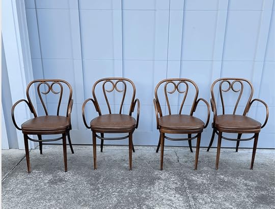
We have a love/hate relationship with our vintage Cherner chairs – they are so creaky and squeaky. They echoed so bad in the morning that I couldn’t sit in them for fear of waking up the kids (and turns out I’m crazy sensitive to noise which I didn’t realize until living up here). So my plan is to use the Cherner chairs in the sunroom, but not for our daily eating which meant I could shop for some other dining chairs. Now, listen, there is a 50/50 chance that these are also really creaky and squeaky and that I’ll regret this purchase and have to endure Brian’s passive-aggressive noises when he sits in them, but they were on Craigslist for all four for $150 so I felt it was a great risk.

I LOVE a vintage Thonet (or similar to Thonet, not sure). I love the whimsy of the bentwood and these even are upholstered so I’m hoping they’ll be comfortable!!! Of course, we’ll likely redo the vinyl at some point, but it looks pretty darn great to me and that was a VERY good price. The sellers dropped them off at my brother’s house and so I might have him do a story where he sits in them and assesses the squeakiness. But my brother is BIG (and he HATES delicate chairs, understandably) so maybe I’ll have his wife Katie do it instead.
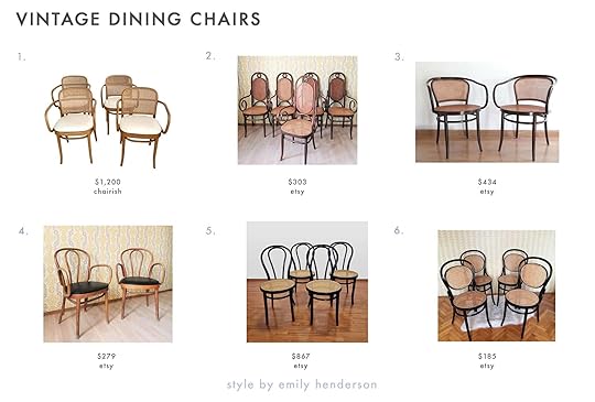
1. 1980s Vintage Thonet Arm Chairs – Set of 4 | 2. 1 of 3 Vintage Thonet Style Armchair Made by Mundus F. Bobic Varazdin | 3. Thonet Style Chair, Bentwood Chair, Classic Arm Chair | 4. 1 of 4 Vintage THONET Bentwood Armchairs | 5. 1 of 3 Vintage Thonet Dining Chairs / Bentwood and Rattan | 6. 1 of 3 Vintage Thonet Dining Chairs / Bentwood and Rattan
A French Primitive Milking Stool, Obviously.

As I was writing this post Charlie looked over and said “why are you buying a stool cut in half?”. It made me laugh hard because I’m so used to loving milking stools that it didn’t even occur to me that of COURSE it looks like a 1/2 stool. Now, do I need a french primitive milking stool? My first thought was “no” but then I immediately pictured our bathroom, next to the tub, housing all my spa stuff (and a big old branch), and immediately put it in my cart. To Charlie’s point, it IS a 1/2 a stool, for $80 + shipping. But I love the whimsical legs and of course the joinery on top. I need to strip it and clean it up a bit but it will be coming to a photoshoot near you soon (like, in a year).
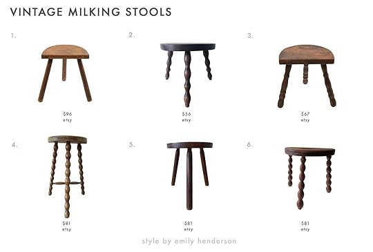
1. Vintage French Wooden Plain Three Legged D Stool | 2. Vintage Small French D Stool | 3. Vintage Wooden French Found Small Three Legged D Stool | 4. Wooden Brown Wood Small Chair | 5. Vintage French D Stool Traditional Milking | 6. French Stool with 3 Legs
Small Original Paintings
Charlie also saw me eyeing this mushroom painting and he was like “why would you buy a painting of a vegetable” which also made me LOL. He is NOT a big fan of vegetables (or paintings, really) so I suppose this is confusing to a 7-year-old boy. I think that is precisely why I like still lifes – they take something benign and make them SO IMPORTANT by painting them with such precision. Anyway, it’s going to go in our kitchen or pantry and I love it (it was $22 on Etsy, I believe).

Ok. So I’ve been told that portraits of dead people are creepy. I like them personally, but I appreciate the overwhelming feedback and don’t really want to creep out my house guests. So I figured I’d try to shift my collecting into portraits of pets (yes, also likely dead). As I’ve been collecting them I’ve realized why they make me smile – someone loved their pet SO MUCH to either take the time to paint them or they commissioned an artist to do so. I mean I get it, I take like 30 photos of my pets a day so if that wasn’t an option you bet I’d want someone to paint them. It just makes me laugh and smile and I want to cover our WC or hallway in them. This one wasn’t cheap ($75) but I do love it – he’s so emotional!! Honestly, all of them on the internet are so expensive so this might be something I have to scour antique malls instead.
ALSO – I do want to commission an artist to Victorian oil paintings of Bearcat and Mimi if anyone knows anyone. And no, not a normal pet portrait something that feels more serious and old world like this (mostly because I think it’s funnier – like they are actually posing for their big shot).

I bought that lady at the Sacramento Antique Mall a couple of months ago – So regal. So serious. SO IMPORTANT.

1. 1950s Dutch – Vintage Cat Portrait Oil | 2. Vintage Early C20th Watercolour of a Pair of Boxer Dogs | 3. Antique 1920s Beautiful Jack Russell Terrier Dog Portrait Painting | 4. Dachshund Painting Original Oil on Canvas | 5. Small Scottish Terrier Painting| 6. 1939 Horse Portrait Oil Painting in Thick Mahogany Frame
Fine, One Creepy Dead Guy Portrait
I think it’s just a matter of lack of self-control. This man is good and just felt so period appropriate to the house. I do sincerely regret selling so many of my past dead man portraits (don’t worry I still have some) but when I found him for $30 on Etsy (cheap because it’s charcoal?) I literally couldn’t resist.

1. Antique Art Charcoal Portrait Drawing | 2. Vintage Pastel Portrait Of A Black Woman | 3. Signed & Framed 1884 Charcoal Drawing | 4. Antique 19th Century Original Charcoal Portrait Drawing | 5. Civil War Portrait Photographic Charcoal Framed | 6. Antique Chalk a Charcoal Portrait
What I Came THIS CLOSE To Buying, But Didn’t And Now I’m Sad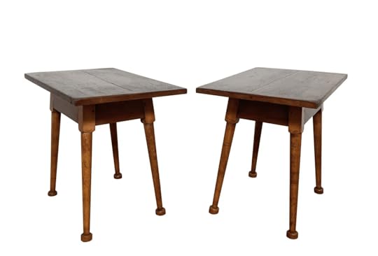
Ugh. I LOVE these side tables/nightstands. They are classic yet rustic, but not too shabby chic. They have these adorable little feet, pretty leg joinery, and the perfect amount of patina. They were on 1stDibs for $2k + $500 shipping and It just felt like too much when I haven’t even started shopping in person. So they got snagged by someone else, and that’s ok as the daily taunting of their availability was cruel and Brian was sick of hearing about them. I even looked up the maker to see if I could track them down more affordable ones over the next 6 months but the maker made very few things.
1. Shaker Style Cherry Bench Made 1 Drawer Nightstand | 2. Shaker Style Table | 11. Shaker Inspired Nightstand

These two were in Portland for $50 and I SHOULD have snagged them. But instead, I insta-storied about them and a reader grabbed them (which actually made me very happy). GREAT steal (but no, I didn’t need them).
1. Two Oak Folding Chairs | 2. Pair of Vintage Wooden Folding Chairs | 3. French Midcentury Wood Folding Chair, 1970

Lastly I love strange architectural tables that are sculptural and just odd. I believe this is a smoking table – (I think?) I didn’t snag it and now it’s gone and I’m sad and life will never be the same until I find another version of it and then life has meaning again.
We are moving up August 20th and while I need to “move-in” and “get settled” all I want to do is drop the kids off at school and go thrifting and shopping for vintage things I don’t need quite yet, but make me VERY HAPPY. I’m not alone, right? HAPPY WEEKEND AND TGIF EVERYONE!!!
The post All the Vintage Stuff I’ve Bought For The Farm Already – Lets Go Thrifting :) appeared first on Emily Henderson.
August 5, 2021
The One “Entire House” Paint Trick That Stole Our Hearts (+ A Bunch Other Ideas To Feast Your Eyes On)
I equate those quiet design details that you only probably clock at a second or third look to the background music in a movie or tv show. You’re so wrapped up in the “big picture” that you don’t realize a big part of what is drawing you in is the emotion of the music. What is Jaws without the “duunnn dunnn… duuuunnnn duun… duuunnnnnnnn dun dun dun dun dun“. Ok, a horror movie isn’t the ideal example when comparing it to a look at a beautifully designed home but you’re catching my drift, right? Actually, this has kinda been a very detail-oriented week if you also read Em’s big kitchen cabinet post on Tuesday. This really just goes to show that while decision exhaustion is super real and time is definitely money, just try and take a little time to dream up some small special moments. I promise you won’t regret it and they don’t have to be expensive.
So before we get into the very cool/smart paint trick the homeowners actually did on their own, I had some questions about the design because look at where they started…
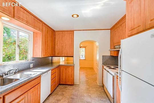
Here is a totally functional kitchen but given this home’s Spanish-style roots, there was a huge opportunity to bring back the soul of this room…and well, every room.
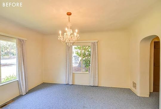
This lovely space off of the front door is now the dining room. Don’t worry. The arch and windows stayed and the blue carpet said bye-bye.
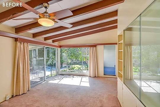
Unfortunately, we don’t get to see the whole transformation of this space, just a small peek, but you’ll want to remember that doorway that goes into that VERY blue room:) Ok onto the good stuff.
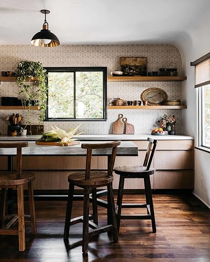
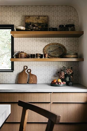
Pendant | Wall Tile | Countertops | Millwork | Accessories and Decor (not available)
A 100xBetter are total masters at mixing textures and woods (remember owner, Kirsten Blazek’s home?) Naturally, I wanted to know their multi wood mixing secret and this is what she said:
“We actually love to mix different types of woods, but there definitely has to be a method to the madness. There should always be some consistency in tones. One wood can definitely be lighter or darker than the other as long as the tones pair well together. For example, I wouldn’t pair an ashy-colored wood with one that has a yellow base. If one wood has a lot of grain then I would pair it with wood that’s a little quieter so that you are not getting into something that looks excessively textured or is too busy on the eye.“
Ok so to recap what you need to have when mixing different kinds of wood in the same space:
Some consistency in tones (aka don’t mix super ashy with yellow base).Don’t have all the same grain intensity. Some grainy, some not as grainy.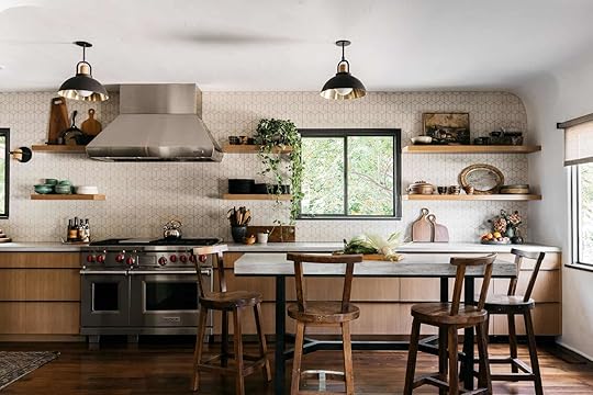
Range | Hood | Island (custom design by patrick maziarski)
As you can see, all of the wood tones have a nice, slightly warm undertone and use a slightly less grainy, more modern light wood for the cabinets, open shelving, and lighting accents. Then a rich darker and grainer wood for those really special stools and beautiful floors.
FUN FACT: The cabinet wood was rift-sawn when cut. That they have nice straight grain lines and zero sheen. Kirsten said that they chose that custom color finish because it evoked qualities of aged millwork. Very smart.
I also want you to notice how the darker wood tones are heavier on the bottom half and just get lighter are your eye goes up. That helps to make the space feel bigger, brighter and the ceilings taller. But to make sure it’s still visually balanced they styled the counter and shelves with a mix of darker-toned decor and add those stunning black pendants.

Planters | Wall Sconce | Faucet
I also am so sorry to let you that all of those beautiful accessories and ceramics are the homeowners (actually I was told that the owner is a very talented ceramicist which is VERY clear if you look at all of the ceramics in the house:))
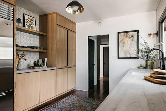
OK, HERE IT IS! The easy trick I’ve been holding onto. Look at that dark interior door frame trim color!! That also matches the window trim color!!! This isn’t the best shot of it (there’s a better one in a minute) but what an easy, affordable, and visually IMPACTFUL detail.
I love how it’s literally just in the frame but that’s also because of the style of the door. I think it adds so much soul and is really in line with the home’s original style.
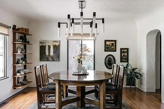
Chandelier | Furniture (not available) | Planter
O and look at the dining room transformation. See how the windows got that chic upgrade with the darker paint color? Also, the flooring is perfect and again the mix of wood varietals is on point.

This is that doorway I told you to remember! By removing the beam that was lining the top of the door and painting the interior framing dark, it now looks like you are going into a really cool secret room. And honestly, that’s not wrong because look.
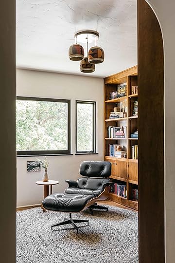

How stunning is this custom cabinetry? The wood is bursting with soulfulness and the mid-century modern style really makes the room/home feel really fresh. This mixing of styles and it specifically being mid-century modern was one thing that was important to the client.
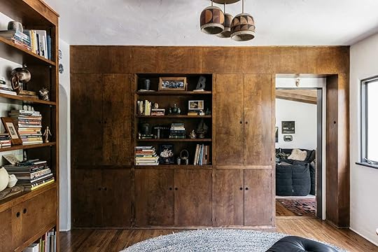
I also really love how they made sure to have a variety of open and closed storage and not perfectly line up the cabinetry with the passthrough door doorframe. It gives a little breathing room to the door and the room itself. Oh and there’s your little sneak peek into that large (probably TV?) room.

The design of this room feels really lived in because of the maximalist bookshelf styling (with books that the owners have probably actually read) and the variety of textures. I would feel very cozy and incredibly sophisticated reading in this room.
So aside from my excitement over the painted interior door frames, this powder bathroom you are about to see is really freaking cool.

Sink (custom design by patrick maziarski) | Sconces | Flushmount
I think we have said 19,374,985,437,854,390x that a powder bathroom is a great time to take a design risk whether that be a bold paint color, wallpaper pattern, and/or a cool tile. Do one or maybe do all, it’s up to you! Well, the lead designer on this home, Patrick Maziarski, may have skipped the wallpaper but he dove hard into dark bold colors, a modern Spanish tile pattern, and designed a killer custom vanity. All of it, perfect.
So yes, I am sorry to say that sink is not for sale anywhere so we all just have to look at these photos and pretend that we live there. And I’m likely pointing out the obvious here but that sink lip with the live edge wood tray is so good. What a creative way to create some counterspace.


Ah, there’s that magical tile. Ok, I’m going to stop gushing now.
Hopefully, you can now feel more confident in your wood mixing skills, and please if you can paint the inside of your door frames, DO IT:)
So what was your favorite element??
Love you, mean it.
*Design by A1000xBetter | Lead Design by Patrick Maziarski
**Styled by Patrick Maziarski and Jazlyn Jennings
***Millwork by Eaton Designs
****Photos by Virtually Here Studios
The post The One “Entire House” Paint Trick That Stole Our Hearts (+ A Bunch Other Ideas To Feast Your Eyes On) appeared first on Emily Henderson.
August 4, 2021
Calling All Portland Maker, Artist, And Vintage Dealers – Farmhouse Style
One of the best things about moving back to Portland is the amount of artistic, creative, and talented artists and makers there are, and the strong community they form. For years ago we borrowed a ton of art (because it was for staging the house) that was featured on the blog (and many purchased by myself, my brother, and the new homeowner) but I couldn’t believe the abundance of talent. For the farm, I not only want to collaborate with artists (but honestly I have a TON of art and we have way less wall space) but also furniture makers and vintage sellers. We are still at the stages of figuring out what we NEED and knowing that comfort is key. But I wanted to get these conversations going and if nothing else create a spot where other PDX folk (or general PNW) can find and support local small businesses.

It’s been 3 years since the first Portland project and I honestly don’t know the landscape up there, besides dabbling on social media. So leave in the comments any you know and love, so we can start pulling together posts as well as reaching out if something feels like the right fit for our home and family. I’ll never not love all my Marianne Plus art (amongst others) or all the pottery I bought from Mantel PDX – still some of my favorite pieces in the mountain house (shipped down from PDX and coming back up with me :)). And I recently discovered Notary Ceramics (maybe a lamp collaboration?) and of course, I love Fernweh Studio. So I figured the best way to get a solid list going is just to ask.
I’m so excited about the artistic community up there, seriously. While I’m still nervous to move back to a city with all the natural pulls that come with that (and warning, might be not-so social for a while as we get our life settled) the designers, artists, makers, and vintage dealers are a huge reason we felt that this was the right decision.
So who do you all know and love???
Opening Image Credits: Photo by Sara Ligorria-Tramp | From: Portland Reveal: You’ll Never Guess What This Bookcase Is Hiding…
The post Calling All Portland Maker, Artist, And Vintage Dealers – Farmhouse Style appeared first on Emily Henderson.
It’s Time. We’re Renting Out The Mountain House And Here’s How It’s Going Down…
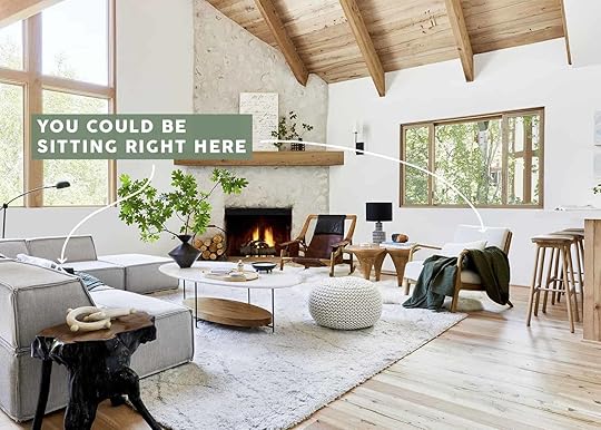

Hi gang. Brian here.
I probably shouldn’t write this, but I’ve done a lot of bad stuff in rental homes. I’ve barfed in bedrooms, tipped over tables, snapped sprinklers, I even woke up once with an enormous raccoon on top of the dining table that I forgot to clean the night before and left the door open.
Granted, this all happened in my twenties, I’m a responsible adult now. But there’s still an energy that comes when I’m staying in a vacation home. It makes me want to let my hair down and party like Prince. Like the normal rules have been put on pause.
And I don’t think I’m alone in that feeling.
So when it came to deciding what to do with the Mountain House when we permanently move up to Portland, I was pretty adamant about not renting it out. If it were up to Emily she would literally let all of you stay there for free (and the Vacay Getaway winner finally is in September), but I didn’t want a bunch of me’s up here, ralphing all over the dream home we worked so hard to build. I mean, I’ve never loved a house as much as this one, and the idea of total strangers running amok on our reclaimed floorboards made my sphincter pucker up. And it wasn’t just the fear of people partying, I’ve heard horror stories about what goes on in short-term rentals. Like, did you know that it’s a thing for people to shoot pornos in Airbnbs? For real. They like, rent them out under what looks like a family’s profile, then show up with truckloads of cameras and lube and make “movie magic” all over your house. It’s true! At least here in Southern California it is. And no offense to those hard-working folks in the sex industry, but we’ve already painted the walls in this house, we don’t need anything else on them, thanks.
So, no, we didn’t want to rent out this beautiful sanctum of peace and tranquility to complete strangers.
But we also didn’t want to have it just sitting here vacant for most of the year when we could be making enough to cover our mortgage on it and as Emily asserts – other people could be enjoying it. So after some intense deliberations, we’ve decided to test-run trial for renting out the Mountain House. I say test-run because we’re still not totally sure if it’s going to work, but we’re willing to give it a try. Again, I’m extremely protective of this place.
It won’t be on any STR websites, just run through the blog, overseen by me, and highly curated. Not that we need to worry about any of you. I mean, if you read this blog it means that you’re a highly intelligent, considerate human who would never accidentally spill a whole bottle of milk on a set of antique wooden figurines, making them smell like cat farts (I’ve never done that either). We’ve set up a separate email account for the rental, and we’ll be handling everything ourselves, aided by a neighbor who will be serving as property manager/concierge/narc.
It’s a wonderful home in Lake Arrowhead that can host multiple families or even a small company retreat. It backs up to acres of forest and is within walking distance of the lake. There are four bedrooms and four bathrooms, a play attic for kids, a hot tub, and a fire pit (only available in Winter months). It can sleep 12 people. Pets will be vetted on a case-by-case basis. Emily is going to be taking out the super personal and fragile stuff and redecorating a bit to make it more hospitable for guests, so keep an eye out for those posts.
We’re going to price it dependent on season and length of stay, so please email your dates and we’ll send the price. Currently, the going rate up here for a house this big is between $800 – $1400 a night, FYI. Also, please include the number of guests, why you’re coming up, and any info you think may be helpful. We have some dates blacked out because we’re planning on coming back frequently, but as of now, Labor Day Weekend is available so get your request in asap! We’ll rent it through December 16th when we’ll come down for holiday break and see how this goes before releasing winter dates in January. Those who want to rent a week or two will have preference:) We are booked for the weekend of September 17th, September 21st, November 1st, and have a hold on the week of Thanksgiving. We are hoping for multiple families, small corporate retreats, or photoshoots.
We’re actually very happy to be able to share it with you all, and hopefully, you’ll be able to come and enjoy the mountains as much as we have. Just don’t mess anything up or I’ll come find where you live and have a long weekend at your house, with plenty of whiskey and milk.
Emily will be writing a comprehensive “what to do, eat and see in Lake Arrowhead” post soon for all those interested. Trust us, it’s awesome.
Rental Email: hendersonmountainhouse@emilyhendersondesign.com
Here are some pics of the property in case you need a refresher:
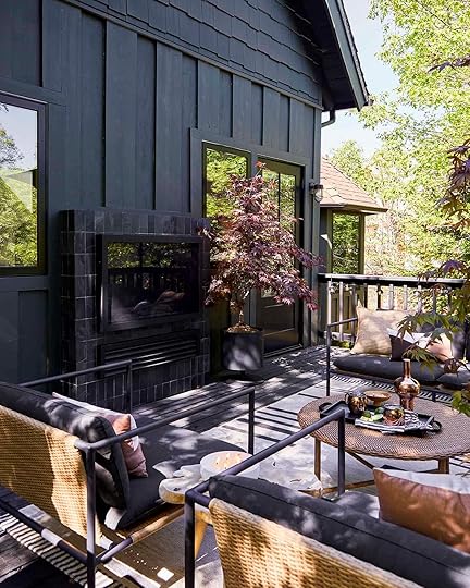 photos by sara ligorria-tramp | from: after three years we can actually use our upper deck
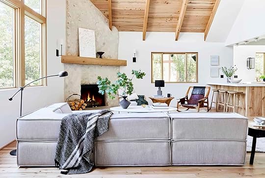 photo by sara ligorria-tramp | from: our light-filled neutral & textural living room
 photos by sara ligorria-tramp | left from: the reveal of the mountain house kitchen | right from: the dining room built-in dilemma (+ the 3 mistakes we made)
 photo by sara ligorria-tramp | from: how we designed our super kid-friendly family room
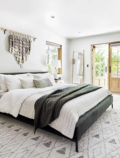
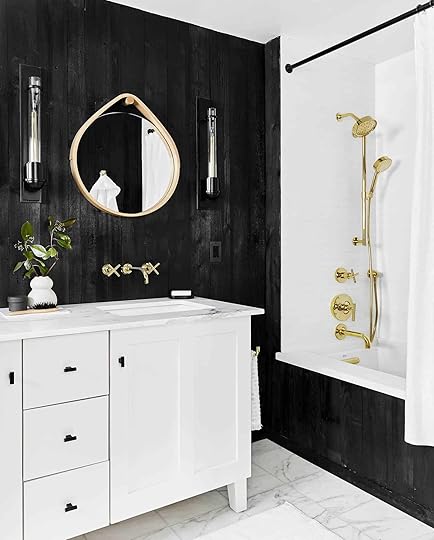 photos by sara ligorria-tramp | from: our soft yet secretly sultry downstairs guest bed + bath
 photos by sara ligorria-tramp | from: how i transformed an awkward space into my dream work loft
 photo by sara ligorria-tramp | from: the coziest upstairs guest “bunk” bedroom
 photos by sara ligorria-tramp | left from: the upstairs guest bath that used to be a closet | right from: our “quiet drama” powder bath
 photo by sara ligorria-tramp | from: the riskiest bathroom i designed—with a “how i’m feeling now” update
 photos by sara ligorria-tramp | from: a refresh of the kids’ room in the mountain house
 photos by sara ligorria-tramp | left from: our calm scandinavian master bedroom | right from: all the details of my master bathroom
Like I said, it’s a super special place and we want to share it. And again here’s the email: hendersonmountainhouse@emilyhendersondesign.com
Opening Image Credits: Photo by Sara Ligorria-Tramp | From: Our Light-Filled Neutral & Textural Living Room
The post It’s Time. We’re Renting Out The Mountain House And Here’s How It’s Going Down… appeared first on Emily Henderson.
Emily Henderson's Blog

- Emily Henderson's profile
- 10 followers

