
Emily Henderson's Blog, page 157
September 9, 2021
After Working For Leanne Ford, Anita Yokota, AND Living In A Van For 6 Months, You GOTTA See What Bronte Athearn Did To Her DTLA Loft

Before I dive into talking about the loft, I’d love to share a few moments leading up. Last summer when Covid became a harsh reality, my partner Jordan and I bought a van, and decided to leave Los Angeles for six months. We explored 32 states, took very few showers, saw dozens of National Parks, and eventually ended up in Brooklyn. We had become true nomads and had completely altered our habitual routine.
Living on the road, I had fallen in love with two things: the big city and the wilderness. I’m so grateful to have gone from exploring rural Montana where your only neighbor is bison and tall pine trees to exploring the Big Apple where your neighbors are street vendors and tall buildings.

We thought about staying in New York for a while but ultimately with my and Jordan’s work, we decided Los Angeles would be home for the time being. (Jordan is a filmmaker and I’m an interior stylist).
I didn’t always know I wanted to pursue interiors. I just knew I needed to do something creative with my life.
After college, I was floating. Questioning what to do with my Studio Art degree. I considered painting or even graphic design. Then, my career aspirations ended up completely changing when I became interior designer Leanne Ford’s assistant. Watching her transform a blank canvas into a masterpiece people could live in was an entirely new art form to me – one I was completely enamored by. I knew I would have A LOT to learn but that this was the path I wanted to pursue.
After working for Leanne, I decided to try out interior styling. I love interior styling because you get to collaborate with designers and other creatives. I’m currently a freelance interior stylist and have been consistently working on a range of projects with interior designer Anita Yokota.
As every creative knows, it’s important to give yourself a balance of space and time to grow to find your own creative voice. I saw our future LA apartment as the perfect canvas to play with a creative approach that was uniquely my own.
Once we made our way back to Los Angeles the apartment hunt began. We toured at least 10 apartments before stumbling across a loft listed on Craigslist. We set up a tour, fell in love with its character and charm, applied then got approved to move in the next day.
Crazy how some things just work out.
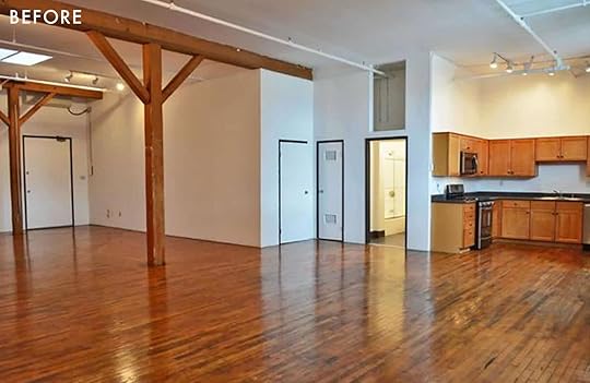
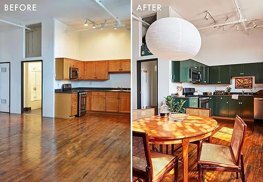
Moving day was a hilarious sight – picture a 1,200 sq ft open space with the only piece of “furniture” a queen-sized mattress on the floor.
It was time to start from scratch and I was ready for the challenge.
First Project: The Kitchen

I went back and forth on what to do. After all, this loft is a rental. Our landlord gave us the OK to paint the cabinets. Which then led to the question: “What color?!” I knew I’d be keeping the majority of the space neutral with tons of plants – so I wanted to tie in an earthy green that reminded me of the many trees we saw on our road trip. Jordan was hesitant to paint the cabinets… so I actually waited to paint when he was out of town to surprise him LOL. He came home to a very green kitchen. Don’t worry, he loves it.

Paper Lantern (ellipse) | White Kitchen Knobs | Cabinet Paint
The color I chose is Evergreen in Semi-Gloss and I also replaced the hardware with very affordable white knobs from Amazon. The green cabinets ended up complimenting the existing countertops so I decided to leave ’em be.
Second Project: Designing The Bookshelf

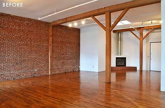
When it came to designing the space, I wanted to highlight what was already there – the tall windows, original hardwood floors and brick walls, the wood burning fireplace, and 12ft ceilings. I ended up sketching an 8 ft long, 12 ft high open bookshelf to wrap around the ceiling beams. This would divide the bedroom and living room space while still maintaining the loft/studio vibe.

Paper Lanter (large round) | Bed Frame | Bedding | Nightstands (no longer available) | Circle Vase
We consulted four different contractors/woodworkers to build the bookcase and all of them quoted between $4,000 -$7,000. Which was too expensive, especially for the loft being a rental. Then it dawned on us that maybe Jordan’s dad, Mark, could build it! He’s flipped dozens of houses and is very talented. Mark had all the pieces cut so that all we had to do was install. On the day of install we realized our old floors are slightly slanted – so he ended up having to cut each post to fit the slant in the floor. Somehow each post is a different height but all the shelves look straight. Still don’t know how he managed to pull that off but so happy he did. The entire bookshelf ended up costing us less than $500.

Another fun piece we made was our 10-foot desk. It was important to Jordan and me to have a nice spacious workspace. However, it was hard to find a long desk. I ended up going to a local lumber yard and got a 10-foot slab of butcher block then bought three IKEA filing cabinets. This was the perfect solution and cost less than $500.
Third Project: Choosing The Furniture

(vintage) | Drink Table
Left Art: Vintage from Saasaan | Right Art: Desert House Party by Slim Aarons
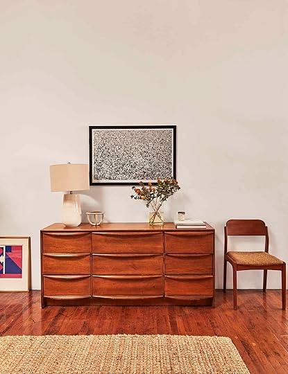
When it came to choosing the furniture, I remembered our time in the van – waking up in a different state every morning with a different view of nature. I couldn’t help but want to bring natural elements into our industrial loft. So, I styled the space with branches and rocks I found from our road trip mixed with aged leathers, woven rugs, and vintage furniture. Some of my favorite finds are our vintage cane dining chairs from , and of course Leanne Ford’s chairs she designed for Crate and Barrel. I also befriended this guy named Saasaan who travels to Europe every couple months and brings back a shipping container full of vintage furniture. He has a warehouse a few blocks from our loft. I got our coffee table, dining table, leather chairs, and artwork from him.
I love vintage shopping because you get to have one-of-a-kind pieces making any space extra special. I’ve learned a few tricks to vintage shopping:
Just because it’s cheap doesn’t mean you should buy it – I used to buy cheap decor or furniture all the time just because of the price. Reality is, you’ll only use it for a few months before it ends up in the back of your closetIt doesn’t have to be in perfect shape – I am all about pieces that look lived in. My favorite is vintage leather… I love the way leather ages, it’s timeless.Look for local mom-and-pop thrift shops/flea markets near you – I’ve come to find that “Trendy” thrift shops are overpriced and local thrift shops or flea markets tend to have better finds.Facebook Marketplace is your new best friend – to be honest, the only reason I still use Facebook is for FB Marketplace. I found our HD Buttercup leather sofa there for 80% off the original price.Don’t rush – It’s almost impossible to find anything when you’re under pressure. Take your time and visit your local thrift shops frequently. When you visit consistently, you avoid settling for something you’re not completely in love with.


I’m so excited that the loft is complete and to be back in Los Angeles. Though, I’d be lying if I said I wasn’t thinking about where we’ll explore next.
*Design by Bronte Athearn
**Photos by Veronica Crawford
The post After Working For Leanne Ford, Anita Yokota, AND Living In A Van For 6 Months, You GOTTA See What Bronte Athearn Did To Her DTLA Loft appeared first on Emily Henderson.


September 8, 2021
How To Actually Make A Gallery Wall: Our No-Fail Formula We Use Every Time (+ Our Favorite Original Art Resources)

Gallery walls, like hardwood floors or marble accents, are timeless and will never go out of style. But pulling a gallery wall of your own together might feel a little daunting at first. Art can be expensive, and curating personal items/photos can take a decent amount of time. But here at EHD we’ve got the gallery wall formula pretty dialed in. We pull them together for projects all the time, and several of us have them in our own homes. So how do we pull together a gallery wall?
 photo by geneieve garruppo | from: a 100 year old barn makeover
Guess what? I just wrote a post all about it, AND IT’S THIS POST. So, keep reading. I’m going to walk you through all the elements of a successful gallery wall, PLUS sprinkle in a few round-ups to help you on your way.
For those of your who want to skip the novel and dive straight into the recipe, here you go. This is our foolproof, step by step, gallery wall formula:

But now, if you want to sit back, drink your coffee, and chat a little more in-depth about the gallery wall process, come with me . . . .
FIRST, DON’T GET ALL HOLE-Y – LAY OUT YOUR GALLERY WALL BEFORE YOU HANG IT photo by sara ligorria-tramp | from: jess’ small space makeover takeover
Before we jump into the “whats” of a gallery wall, let me just give you a really quick “how” – How not to smash a bunch of holes in your wall.
Measure out the amount of space you want your gallery wall to filltape off a box that size on your floor (or, if you have access to it, a few strips of that wide kid’s art paper that comes in the rolls, taped together)Lay out all your pieces within that area. Then you can play around with all the art placement for as long as you like, moving things around with no fear of wall damage. And you can make sure your art all looks good together. Emily has a great IGTV showing you how she does it. Hot TipTry and keep the space between all your pieces around 3 inches apart. That way things don't get crowded.
CREATE A COHESIVE COLOR PALETTE FOR A PULLED TOGETHER LOOK photo by sara ligorria-tramp | from: a modern and organic dining room makeover
This isn’t a hard and fast rule, and if you prefer to just keep things personal and fun don’t worry about it. But if you’d like it to look a little more curated then sticking to a color palette can help. Try and keep your pieces feeling similar in tone and intensity. For example, in that vintage painting gallery wall above the colors were neutrals, blues, and hits of gold.
 photo by sara ligorria-tramp | from: how to make your smallest room, the coziest room in your house
Once you’ve got your “floor layout” locked down, snap a phone photo for reference and start transferring pieces up to your wall. You can do this by measuring if you’re dedicated, or you can just wing it like an impatient person *cough me cough*. And if you’re able to score that giant paper template, you can just tape that up directly on the wall, pencil in where the nails go, and nail directly into the paper. It’ll easily tear apart around the nails once you have them all in!
Ok, now here are the nitty-gritty details on how to make your gallery wall look professionally put together . . . .
GO BIG – START WITH SOMETHING LARGE AND IN CHARGE TO ANCHOR THE WHOLE COLLECTION photo by tessa neustadt | from: sara’s home office reveal
Start by placing your biggest pieces first, and build around them. I usually like to place my biggest piece in one of the four outer corners of a gallery wall if it’s a smaller collection, or just off-center, but towards the middle, if it’s a larger collection. This will be your jumping point for placing all your other pieces. Why off-center? So your eye travels around the gallery wall, rather than slamming straight to the middle of it.

1. “Waves No. 2” Art Print | 2. Shapes Framed Wall Art | 3. “Roast Chicken” Print | 4. “Santa Cesarea Terme II” Art Print | 5. Custom Large Scale Print | 6. Letter Pressed City Map
IF YOUR BIGGEST PIECE IS #1, THEN YOUR NEXT BIGGEST PIECE IS #2 photo by sara ligorria-tramp | from: emily’s master bedroom update
Try placing your second biggest piece diagonally from your biggest piece – whether that’s right next door or on the opposite side of the wall. Now you just need to fill in a little bit of empty space between and around them. YOU’RE PRACTICALLY DONE.
MIX YOUR HORIZONTALS & VERTICALS (AND GIVE PAIRS A TRY) photo by zeke ruelas | from: oh joy’s studio – the living room
To keep your gallery wall feeling interesting you’re going to want to have a good mix of vertical and horizontal pieces. If your largest pieces are horizontal, try placing a smaller vertical piece next to it (centered or bottom aligned), and vice versa. This is a good way to start moving inwards from your larger pieces.
 photo by sara ligorria-tramp | from: a budget friendly living and dining room
Creating grids within your gallery wall by putting a mini collection of 2, 3, or 4 pieces together is like gallery wall inception. It’s also pretty cool and can look very pulled together.

1. Autumn Landscape Oil Painting | 2. Original Painted Wood Blocks | 3. Neutral ML Art Handmade Cotton Rag Paper 5 | 4. Original Mixed Media Piece | 5. Speak The Things. See The Things. Collage | 6. Dibujo Sobre Papel n169 Drawing | 7. Hand Drawn Ellipse Art | 8. Death Valley Mountain #21 on Aluminum | 9. Beach Antique Oil Painting
WHILE WE’RE AT IT, DON’T FEEL LIKE YOU HAVE TO STICK TO ONE TYPE OF FRAME – MIX IT UP photo by zeke ruelas | from: a moody mid-century office
The larger the space, and the more pieces you have, the more frame styles you can mix in. If you’re worried about your gallery wall getting too chaotic or eclectic then I suggest starting with three frame styles and seeing how you feel. You could go with a nice clean option – white frames, black frames, and a wood option. Or start with two modern frames (like a simple black or white and a simple dark or light wood), and then bring in one more ornate frame style. Maybe a pop of gold, for example.

1. “Maverick” Print | 2. “Flowers In A Vase” Wall Art | 3. “At The Edge Stripes And Flags” Print | 4. “Face 2 Art” Print | 5. “Young Italian Woman At A Table” Print | 6. “At The Laundromat” Print | 7. “Married To The Sea” Print | 8. “Heirloom no. 1” Print | 9. “Sorrell Abstract” Print
DON’T BE SUCH A SQUARE – NOT EVERYTHING HAS TO BE FRAMED (OR SQUARE) photo by tessa neustadt | from: sara’s home office reveal
Sometimes mixing in a photo strip on a clip, a board painting, a flag or textile, or something sculptural like a ceramic piece can shake up a gallery wall. Don’t feel like you have to put everything in a frame. And a round piece, like an oval canvas, or an embroidery still in its hoop, can give your eye a visual break from the grid-like pattern a gallery wall can easily turn into.
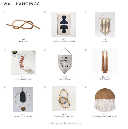
1. Wood Knot Figure Eight | 2. Vacilando Studios Wall Quilt | 3. Wooden Bead Hanging Tapestry | 4. Clay Wall Hanging | 5. I Am Rooted But I Flow Wall Hanging | 6. Medium Ceramic Double Arch (Clay) | 7. Brass Gold & Black Wall Hanging | 8. Ceramic Blue Polka Dot Circle Knot | 9. Half Circle Wall Hanging
WHEN IN DOUBT, FLOAT MOUNT photo by sara ligorria-tramp | from: a budget friendly living and dining room
Anything can look instantly elevated if it’s float mounted – a polaroid, a ticket stub, a stamp, a key. Just about anything. And luckily float mounting is easier than ever before. You can either send in your piece/item to a framing service (like Framebridge) OR order a few shadowbox frames from Ikea, and float mount the item yourself using a few foam adhesive stickers from the scrapbook aisle and some matte board or card stock.
ADD SOMETHING PERSONAL – ANYTHING CAN BE ART photo by sara ligorria-tramp | from: how we designed our super kid friendly family room
Art can be expensive, so digital prints are totally fair game and offer a great, affordable way to bring in art while also supporting independent artists. But only having digitally printed art can make your gallery wall feel a bit more “straight out of a catalog” than you might like. So be sure to include a few personal items! A drawing from a friend, or an old photo of your grandma from when she was your age. BTW a Polaroid printer is a great way to get a personal photo off your phone and onto your wall in a cute way.
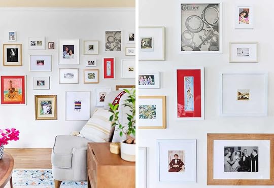 photo by sara ligorria-tramp | from: sara gives her momma’s living room a makeover
And remember, anything can be art! A cocktail napkin from a first date, an ultrasound, even your vows (Emily and Brian framed their vows and it’s super cute). Anything.

1. Polaroid Camera | 2. Open 4 Clip Multiple Image Frame | 3. Instant Gallery | 4. Magnetic Poster Hanger | 5. Instant Polaroid Printer | 6. Custom Framing | 7. Ultra-Thick Photo Prints | 8. Custom Modern Wall Calendar | 9. Custom Framed Instagram Prints
Lastly, have fun with it. Putting up a gallery wall can feel daunting, but once it’s up it’s incredibly satisfying.
 photo by sara ligorria-tramp | from: julie’s bedroom makeover takeover reveal
And now, if you’re more of an auditory learner, let’s send it to Emily and Orlando for a quick final overview:
OK, that’s it for this post. But in case you want more gallery wall inspo, check out all of these resources:
RESOURCES:
How to Hang Art Correctly | Affordable Large Scale Art & How To Get It In Your Home | Top 5 Most Affordable Online Art Resources | The Guide to a Well Hung Gallery Wall | The 7 Things You Need to Know Before You Try to Hang That Gallery Wall | Best Online Art Resources | Design Mistakes: Generic Art | 15 Ideas for Hanging Art We Got From You Guys | Stylist Hack: 7 Unexpected Places I Like To Hang Art (To Make Your House Look Unique) | Is This The New Gallery Wall (AKA Gallery Wall 2.0)? | Think Outside the Frame: Wall Hangings Are the Cure for Your Boring Walls | How We Shoot, Edit and Hang Family Photos With Framebridge | How To Choose, Frame And Hang An Art Collection | DESIGN MISTAKE: Different Walls, Same Art Configurations (AKA It’s Time To Bring Life To Your Walls)
INSPO:
Griffith Park Living Room Reveal | Silver Lake Hills Living Room Reveal | Moody Mid Century Home Office | Arlyn’s Moody Dining Room Reveal | Sara’s Office Reveal | Brady’s Kitchen Reveal | Jess’ Living Room Reveal | Portland Reveal: The 5 Design Elements Every Awesome “Big Kid” Playroom Needs | Mountain House Reveal: How We Designed Our Super Kid-Friendly Family Room | Sara’s TV Room Reveal | Cup of Jo Makeover: The Living/Dining Room | The Curbly Family Dining Room Makeover | Oh Joy’s Studio: The ‘Living Room’ | A 120 year old Barn Makeover with The Frame TV
Opening Photo Credit: Photo by Sara Ligorria-Tramp | From: A Budget-Friendly Living and Dining Room
The post How To Actually Make A Gallery Wall: Our No-Fail Formula We Use Every Time (+ Our Favorite Original Art Resources) appeared first on Emily Henderson.
What Are “The Young People” Into? It’s Called “Aesthetic” and “Avant Basic” I Had No Idea, And Now I Do
I had an interview request recently to identify what zoomers are into (Gen Z, mostly under 26). Uh. I had no idea and despite having one on my team (hey, Mal), none of us immediately knew what the style was called so I tasked her to infiltrate her age group (on social media) and find out what those, who are into home design, are loving right now. Mal came back from her mission with some shocking recon information – the movement that is happening is called “Aesthetic”. It took us a second. Well, more than a second. It’s literally a synonym for “style”, not really saying anything. But what they are trying to encompass or go after is what this Gen Xer will call “a good vibe” and THAT I can get behind. Like most teens and early 20 somethings of yore, their style (or aesthetic) culturally is nothing something that the generation above is supposed to “get”. It tends to be subversive by nature – my generation answered “rock and roll with emo” – it can be a rebellion even if it’s not going further into an extreme. I felt like I was an anthropologist, watching this generation try to find itself, just like we/I did twenty years ago. You see my generation was thrifted, cobbled together (backlash to overly decorated perfection), and a product of the evolution of the thrift store being all of a sudden cool (hey, grunge). The older we get the more “sophisticated” our homes get, and frankly, that’s not the adjective most 19-year-olds want. They want “Aesthetic”.
What is “Aesthetic”?
I feel highly unequipped to answer this with true expertise and yet I will. What I’ve witnessed from this movement (if you can call it that) is a desire to create a vibe that looks wild and weird, a no-rules boldness mixed with a sense of apathy, it’s sexual and non-binary, and then just when you think you’ve figured it out – don’t forget some plastic vines or flowers – not just almost childlike, like literal fairies. It’s definitely a “don’t put me in a box” or even “try to define me” feeling – thus the broad non-specific labeling. It’s unlabel-able, and yet of course I wanted to break down the elements and be told how wrong my analysis is (it’s part of the fun). It’s a cultural fascination and as a generational reminder to stay open (ironically the older I get the more open I am – it’s “YOU DO YOU” mixed with being almost completely un-offendable… which is a fun experiment to try if you find yourself offended by or judging others constantly – a symptom of being a millennial and gen X, for sure). So before you see the below and judge or say how it’s offensive, what if you reframed it more as a glimpse into a world that you aren’t rejected from, and an opportunity to bring you some smiles. In short – just because you don’t like something does not mean that it is offensive. It’s just not for you.
And as you can imagine this vibe has rarely been professionally photographed, so you’re about to see some Instagram photos – and yes, its unprofessionalism is indeed part of the “aesthetic”. Okay Mal, take it away…
ROGER THAT. Hey guys, Mallory here. If you’ve ever been on TikTok (even if it’s only been for 5 seconds), you might have encountered one of the major trends happening in the Gen Z world and have not even known it. As Emily explained above, there’s a trend called “Aesthetic” (which really is just its name by default, but we’ll get to that in a minute). Em was pretty much spot on in her explanation of what “Aesthetic” is, and social media has been at the forefront of propelling this trend into action. It’s totally about the “vibe” and it’s also about expressing yourself. I would say you can typically find it in the bedrooms of 13-18-year-olds. THIS HOWEVER is not the only trend Gen-Z is into (and I think it’s offensive to put all of them into the “Aesthetic” box). The other main trend dominating right now is called “Avant Basic”. The easiest way to separate them is to break it down like this: younger tween/teens generally are more into the “Aesthetic” vibe (I said 13-18-year-olds which I would still say is true) and the slightly older, 18-25-year-olds seem to be falling more into the “Avant Basic” vibe. Obviously, this is a generalization and there’s a lot of crossover for both, but that’s pretty much what I’m seeing on TikTok these days.
So, yes, the two main styles dominating the platform are called “Aesthetic” and “Avant Basic”. Let’s start with the former because I gotta explain the name in more detail. Let’s get something straight: Aesthetic is pretty much just the name of this trend because Gen Z TikTokers took to the platform to post their #bedroomchecks and by default also ended up using other hashtags like #aesthetic or #aestheticroom. So no one’s goal was to call it “Aesthetic” but some are referring to the trend as that because, well, that’s how you can find the trend: by hashtagging Aesthetic. Now, what is this Aesthetic trend??
Aesthetic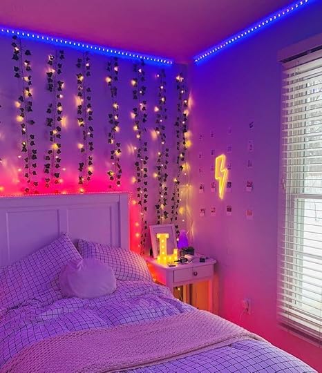
 left photo: via @artlesslyledlights.ph | right photo: via @santanafekete
There are 3 main components to getting an “Aesthetic” Room (which are most bedrooms because this age group is on the younger side and still living at home): LED lights surrounding the entire perimeter of the room, fake vines, and an abundance of records/magazine cutouts/photos on your wall. Let me show you:
Faux Vines
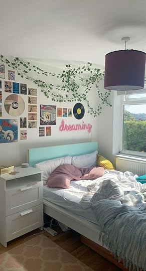 photo left: via pinterest | photo right: via pinterest
These are pretty much in every single #aesthetic room. They add a sculptural and green element that makes it feel more cozy, but it’s super low maintenance, AND it creates a big impact for not a lot of $$$ (which is what a lot of teens are tryna do of course). Also, a lot of times you’ll see some fairy lights mixed in with the vines (for the vibes of course)…
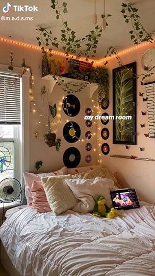 via @m.a.d.s.msRecords
 photo left: via pinterest | photo right: via @hellok1ttyadict
Records are KEY to aesthetic. They add a different shape than the art prints/magazine photos on the wall). Plus vinyl is just all around so cool, especially right now. Everyone’s got a record player these days so why not display them on your wall??? Hopefully, the cheap ones from the $1 section and not the nice ones because I’m pretty sure command strips are not the technical way to store a record. Okay now for the Aesthetic finale, the main event, THE MOMENT YOU’VE BEEN WAITING FOR:
LED Lights
 photo left: via pinterest | photo right: via pinterest
 photo left: via @elinfreidlitz | photo right: via @maxoshiro_
Just like Emily said in the opening paragraph: it’s all about a FEELING, a VIBE. If you want a mood, turn on some purple lights, and boom you’re there. It’s undoubtedly a vibe. Tweens and teens are heavily into this style because you got only one spot in the entire house that’s YOUR space: your bedroom, so you gotta make the most of it. Also as a side note, I chatted with some of my friends about this trend and they said that this is “an e-girl room.” If you’re unfamiliar, an e-girl or e-boy is defined by wikipedia as “a youth subculture that emerged in the late 2010s and is almost exclusively seen on social media, notably popularized by the video-sharing app TikTok.” My friends said lots of e-girls have the “Aesthetic” type room, whereas the more girly-girl type teens and or hip young adults lean more toward the “Avant Basic” trend. Curious what the heck that is? Let’s go:
Avant Basic
We always say around here that fashion trends inform design trends, and for the Avant Basic home style that is CERTAINLY true. The Y2K fashion trend has been hitting big now for about 2 years and it’s finally made its way into the home. I think we can all thank fashion influencers for making this happen…they’re most definitely the people that have made this style happen pretty much overnight. One influencer that has been one of the front runners of Avant Basic (or I’ve also heard it referred to as Danish Pastels) is Matilda Djerf…her room was one of the first I saw to go toward the Avant Basic vibe. Also, Wiggle Room NYC definitely contributed to the trend with their awesomely shaped tables and since we’re now talking about furniture makers, we’ll also have to give the wiggly mirror trend over to Gustaf Westman. There have been a lot of major players bringing this style from the fashion world to the home space, and Instagram and TikTok have collectively propelled this trend forward even more.
 left photo: via @matildadjerf | right photo: via @gustafwestman
Now the term Avant Basic is definitely a contradictory term: “Avant” means original or innovative, and “Basic” in current societal means mainstream and common. But, while it’s contradictory, I genuinely believe that there is no better way to describe this trend. The whole style is about interesting, pastel colors, psychedelic patterns, and wavy unique shapes. BUT it’s become so popular that now it kinda is basic (and before you get your panties in a wad, basic has a negative connotation, but it’s not always “bad” in my opinion). The pastels are used in “pops” rather than on walls or tonally throughout a room. Start with a white base (the “basic” part), then build in pops of weird shapes, patterns, and uniquely molded candles you’ll never light but you love. I can keep trying to explain it but it’s better if I just show you:
Pops of PastelsIt’s all about the pastels popping off the white background (specifically pinks, purples, greens, blues, and yellows) and in some fun, funky ways. You can’t have too many pastels, and as long as you go for it off of a white background and spread them around in small amounts, your color palette can pretty much be whatever. It’s also acceptable to lean into mixing some small neon pops in (greens, pinks mostly) layered in with the pastels.
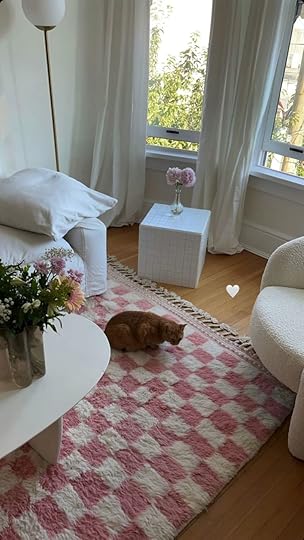
 photo left: via @emmaleger | photo right: via @charolettejohnston_
You can see the pastels in both prints and in decor pieces, and the most iconic decor pieces of the Avant Basic style are the uniquely shaped candles you’ll find everywhere (specifically busts, squiggly candles, and bubbly candles):

 photo left: via @eungaro | photo right: via @softparisianPsychedelic, Checkered, And Floral Patterns
 photo left: via @welfercc | photo right: via @its_fienie
You’ll notice from these photos above, the patterns are mostly checkered, or that floral pattern (made famous from clothing companies like Lisa Says Gah and House of Sunny). You can also mix in some more psychedelic patterns in rugs, pillows, and prints (see the “out of mind” graphic art above), but if you’re going for Avant Basic, again, don’t do wallpapers or anything too wild on the entire wall. It’s all about the pops. (PS that’s the bubble candle above on the right)
 via @aaricanicholePostmodern & Wavy Shapes
Another important element of Avant Basic we briefly touched on earlier is the squiggly shaped mirror and just all around oddly shaped furniture (lots of postmodern lines for sure) Here are some examples:
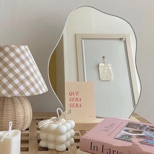
 photo left: via all good home | photo right: via @gustafwestman
 photo left: via @interhiors | photo right: via pinterest
 So that’s it. Those are the 2 major styles happening in the Gen-Z TikTok land today. Whaddaya think?? Have you seen these around? Do you like the looks? If you have teenagers or Gen Zers can you relate? Let’s chat in the comments…this is fun 
Opening Image Credit: Design by Zoe Schlacter and Buzz Slutzky | Photo by Simbarashe Cha | via
The post What Are “The Young People” Into? It’s Called “Aesthetic” and “Avant Basic” I Had No Idea, And Now I Do appeared first on Emily Henderson.
September 7, 2021
Need Help Tackling Your Garage?? Here’s Albie’s 5-Step Organization Process (And The Products She’s Using In Her Garage)

Welcome to one of the least sexy transformations I have planned for the hygge ranch, and also, the one I’ve been the most excited about for the past couple of months.
And FYI… the hygge ranch is what I’ve dubbed our home since (1) it’s a ranch-esque style of home and (2) my design ethos is very hygge inspired. Now back to the garage…
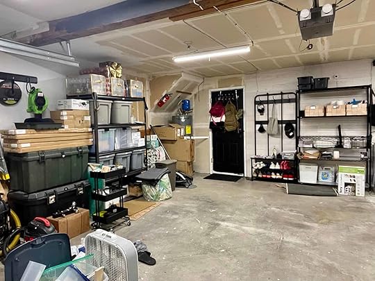
Before


If there’s one thing you need to know about me it’s that I hate chaos and disorder. This is in large part because of my anxiety — with so much outside of my control, keeping things organized and orderly is my way of controlling something… anything. All of the projects that we tackled since moving into the hygge ranch — the living room, launderette, media room, bonus bedroom, and kitchen — were back-to-back and starting to take a toll on my mental health. Things were in a constant state of disarray and I had very little control over anything, especially when it came to the kitchen renovation… but we don’t need to relieve that trauma… just head here to bask in the reveal.
 design by albie k. buabeng (me!) | photo by ellie lillstrom | from: reveal alert: how albie designed the hygge inspired luxe kitchen of her dreams (+ what she learned along the way)
With my mind chaotic and my home just a hot mess, I knew the only way I could get a handle on things would be through the garage.
We have a 2-car front-facing attached garage…. and it’s gotten A LOT of use! In addition to it being a place of storage for our grocery backstock, automotive tools, and all things home improvement, the garage is also where we receive deliveries, break down boxes, do DIY projects, and house my husband’s military gear.
The Garage Works Hard Y’all.
The kitchen renovation was when it really hit me how dysfunctional the garage really was and how much-untapped potential it had. With the right systems in place and some intentional organizing, it could totally transform the way we use the rest of the house. Once we wrapped up the renovation, we decided to take a break on major projects and redirect all of our energy so we could pour into the garage before taking on any more projects… because we definitely have a long list of projects ahead!
My priorities were purely functional — no razzle, no dazzle — with a focus on cleaning and organizing. It’s easy to hear “garage transformation” and to expect brand new floors and muraled walls and all kinds of custom upgrades.
Not this garage, lol.
Tackling The Garage Would Be A 5-Step Process:PurgeCleanSortZoneOrganizeAnd because there were no design or styling priorities — strictly utilitarian! — I could make choices based on practical measures answering the following questions:
Will this fit the space?Can this work with what we already have?How does this simplify our lives?Major Key: Organizing is all about simplifying!
Anything other than making our lives easier would just be us shuffling things around and wasting time!
Step 1: Purge
 we removed the cabinets & shelves, and installed insulation & drywall
Since we’d “just” moved in, there wasn’t much to purge. We didn’t accumulate anything new & instead we needed to get rid of the stuff that piled up from our projects — boxes, scrap wood — as well as things we thought we’d use but turned out we wouldn’t. This entire process involved a combination of a few trips to the local dump and selling things online. We were not afraid to get rid of things that no longer served us, no matter how good they were, because someone else could now benefit from them. One of our biggest sales was the cabinets that were in the garage. Since the cabinets were there, we planned to keep em and replace the counters, but the truth is… WE DIDN’T NEED EM! I suspect these cabinets were the original kitchen cabinets before the previous homeowners updated the kitchen before our update lol. We ripped em out and listed em, and 24 hours later they were gone!
Things we didn’t throw away or sell, we knew we could repurpose, like the 8’ x 4’ old brown pegboard. Yeah, we could’ve kept using it as we’d been doing for the past couple of months, but it was hung somewhere we didn’t want it and the size was inconvenient for the way we wanted to store things.

We took it down and have plans to use it in the garden shed for the outdoor tools… whenever I get around to organizing out there… stay tuned!
Step 2: CleanYou guys…do you know how much dirt, dust, and debris can accumulate in a garage? A LOT. Like a lot a lot. And it’s like sand… it just gets into everything! So much of what was in the garage was covered in thin layers of dust and debris from the projects — especially the drywall installation — there was no way it could ever really look put together ever after things were put away. Plus who wants to touch anything when it’s filthy?!

The cleaning consisted of wiping, dusting, sweeping, and more wiping… so much wiping.
Once everything was sufficiently wiped down — and I say sufficiently because this is still a utilitarian garage project after all — I could look at it once again with fresh eyes and feel safe in there with a clean tee… just in time for Step 3.
 Step 3: Sort
I naively thought this part of the process was going to be quick and painless… it wasn’t lol. I had to pull out pen and paper to take inventory of what’s in the garage and, spoiler alert: I still haven’t really gotten into the weeds of sorting things out but a superficial sorting is better than no sorting at all.

My sorting yielded the following categories…home decorseasonal decorin triage projectsmilitary gearautomotive essentialshome improvement essentialspantry backstock paint supplieseverything else that I’ll deal with later
This was, by far, my least favorite part of the process, and not because I don’t enjoy sorting — because I do! — but because in a space like the garage there are just so many small miscellaneous unidentifiable objects…so many things that I had to just guess what they were. How can you sort when you can barely identify? Because it was best that I do this with my husband — these are his things, by the way, because I am not nor do I have any desire to be the one who uses the garage… I’m just here to put everything in its proper place!
 Step 4: Zone (With Renders Of My Future Garage)
With so many different types of things being stored in the garage, zoning is a natural part of the process — these things need to have dedicated spaces so that getting to them is effortless and instinctual. I decided to create three major zones — using each of the walls — and then within each zone, subzones.
The Three Main Zones Are: In The House, Home Improvement, Important But Not Urgent.P.S. there is no “science” to naming my zones… literally just “how can I remember what goes here?”
1. “In The House” is the wall that’s shared with the house — on the other side of that wall is our flex space — and so that houses things that are more likely to come in and out of the house and/or impact the house more… think pantry backstock and coat rack. It’s also where my husband’s uniforms will live, which come in the house when it’s time to wash them.

2. “Home Improvement” is the left wall and home to 99.5% of our tools — everything from screwdrivers to hand saws — as well as anything else that would likely be used as part of a project. The subzones in this area are scrap materials, paints, and tools. And no zone is complete without its own miscellaneous section.

3. “Important But Not Urgent” is the last wall and exactly as it sounds — everything here is important but nothing there is pressing. For context, the sub-zones include military gear, outdoor tools, seasonal decor, and triage for new projects. Do you see where I’m going with this?

The most important consideration here is having subzones that are easy to maintain so that everything is easy to corral and put away. The point is to work smarter, not harder.
Step 5: OrganizeThis is my favorite step y’all. Why? Because it’s where all my previous (sometimes messy) hard work finally gets to come to fruition. It also consists of a sub-step that is totally my jam — SHOPPING! If you follow me over on my blog — which you should! — then you know I have been design daydreaming about the garage for quite some time now. Being an ambassador for The Container Store was the icing on the cake because it was my first stop for window shopping all the things for the garage.

1. 6’ Utility Track | 2. 2’ Utility Track |3. Swinging Pegboard | 4. Stationary Pegboard | 5. Harwood Workbench | 6. Pegboard Hooks | 7. InterMetro Black | 8. Clear Storage Totes | 9. Extra Large Turntable | 10. Stacking Storage Bins | 11. Canvas Cart | 12. Mesh Pull Out Basket | 13. Boot Tray | 14. 3-Tier Cart
I shopped for solutions that would be practical, above all else, so that all of the previously listed steps wouldn’t be for naught. No sense in doing all of that if things end up on pretty but not helpful solutions. Can storage be both? Absolutely! In places like the kitchen and the launderette, I prioritized stylish storage solutions. In the garage, I just wanna organize!
When all is said and done, this space will be one that can handle all of the things I outlined, and do so in a way that supports change and growth as we continue to get settled into the hygge ranch — there are projects in the pipeline and things we still have to fix aka #oldhouserivers, in addition to just our day to day necessities. While there’s always room for some fanciful upgrades, sometimes a practical space just needs practical solutions. Plus, I have lots of other spaces that’ll call for some before & after magic… but before we can get there, things need to be pulled together in here.
With the fall season around the corner, getting the garage pulled together feels like the perfect catalyst for a fresh start. P.S. can we make “fall cleaning” a thing aka a second “spring cleaning”?
Have you tackled a garage project? If so, drop your tried and true tips. Or if you’ve been avoiding your garage at all costs, I’d love to know what’s keeping you from getting started.
The post Need Help Tackling Your Garage?? Here’s Albie’s 5-Step Organization Process (And The Products She’s Using In Her Garage) appeared first on Emily Henderson.
September 5, 2021
The Link Up: Where Emily Bought Birdie’s First Day Of School Outfit, The Athleisure Mallory Won’t Stop Wearing, And The Perfect Summer To Fall Candle

You know you have likely the greatest boss in the world when she gives you off 3 extra days prior to a national holiday…because it’s HER birthday!!! So yes, we have been off since Wednesday, because Emily Henderson is the best. And while her birthday was a few days ago, we want to wish Em a HAPPY BIRTHDAY. We also hope you are getting to enjoy at least a three day weekend and that’s it’s made a little sweeter with these links:)
This week’s “House” tour isn’t so much a house but a very beautiful modern social club, Common House. If Chattanooga were closer, the entire EHD would HAPPILY work in this artfully designed yet extremely cozy co-working space. They even have seven bedrooms. Roadtrip??
From Emily: Last week, Birdie and I went online shopping to pick out her first day of school outfit and found the cutest shop called Little Stocking Co. And not only is Birdie EXTREMELY excited about her outfit, but they are also local to Oregon. She refuses to wear pants or shorts, only dresses and this place has not only adorable dresses, but a lot of cute and cozy cableknit tights and socks for under them. A very happy surprise. Win-win. Go check them out because their stuff is very cute.
From Caitlin: A friend who was cat-sitting recently pulled The Psychopath Test from my bookshelf and devoured it in a day, so I figured it may be up some of your alleys, too. I’ve been a HUGE fan of the author, Jon Ronson, since I first watched him do this interview on the Daily Show over 10 years ago (he also wrote The Men Who Stare at Goats, which inspired the George Clooney movie) and I can’t recommend ALL of his books enough. Check out the interview and if it strikes your fancy, grab the book!!! SUCH a good read.
EHD PSA: If you haven’t seen Malcolm’s bathroom reveal, GO NOW.
From Mallory: I’m VERY into the MWL athleisure line at Madewell, specifically these shorts (which are on sale for $30 right now originally $50!) that I wear every single day. I also usually pair it with this sweatshirt (also on sale for $30 originally $60). This is a 10/10 fit and I love wearing it!! (I have them both in green btw)
From Ajai: I have a love affair with baskets, especially when they are handmade. I’m big on function meeting beauty in a space, and this wire storage basket has my name all over it.
From Jess: This is by far my favorite candle of the moment. Are you ready?? Ginger Black Tea. It’s the perfect season transition candle because it’s light for the summer but still warming and cozy to get you gently prepared for fall. A total random find that now is in heavy rotation. O and it’s only $10. Dreams really do come true.
Ok now go enjoy your day (and maybe two days!) and we will see you on Tuesday. xx
Opening Image Credits: Design by Pfeffer Torode Architecture and Studio BOCA | Photo by Ali Harper | via Rue Magazine
The post The Link Up: Where Emily Bought Birdie’s First Day Of School Outfit, The Athleisure Mallory Won’t Stop Wearing, And The Perfect Summer To Fall Candle appeared first on Emily Henderson.
September 4, 2021
Emily Buys The Team Her 3 Of Her All-Time Favorite Products To Try… And They Give Their Honest Reviews

I try to not actually force other people to choose the products that I swear by – but every now and again, as we brainstorm posts based on our own grievances certain things come up. Once again we were discussing the frustration around comfortable and affordable underwear, beauty products, and tanning and I was like “CAN YOU NOT HEAR ME?? I HAVE THE SOLUTION THAT I’VE TOLD YOU ABOUT A MILLION TIMES!!!”. Now there are many things that I don’t have the answers for (best non-stick pan, really comfortable underwire bra for larger boobs, or good concealer). But when it comes to underwear, face masks, and tanning lotions I have tried so many, so I KNOW THE BEST. I think the hesitancy of my team to actually use these products was 1. maybe it’s just for you (me) and not for everyone’s body or skin and sure, that is definitely a good argument, and 2. they aren’t the cheapest on the market. So I begged them to let me buy them for them, put it on mommy’s card – virtually no risk!! So that’s today – my team honestly reviewing the products that I swear by.
Jockey Underwear Em Explains Why They Are The Best:
 I DESPISE a bad pair of underwear – one that cuts in, feels super uncomfortable, and frankly makes me feel bad and sad with the line it creates. So when I found this pair (totally randomly) I want to never go back. I get so bummed when I can’t find one pair and will often hand wash one rather than wearing a backup. Where do I start – this fabric is stretchy enough so they stay in place, but they do NOT cut in – like even if I’m bloated or gain some fun “summer/beer” lbs, they are still so comfortable (it’s nice to not feel shamed by your panties). There isn’t a “band” or seam at the top or bottom in which to cut in. They are SO THIN and soft, but so far (after 5 months) are still in great shape and have held their shape. I can NOT feel they are there, at all – both the thong and the normal underwear. They don’t ride up, they stay put, and they are so soft that I’d even say they make me feel sexy – despite being so simple.
JessThis actually might be the lightest and softest fabric I have put on my body. I completely get Emily’s obsession. I love that the tank top doesn’t scoop too low but I still feel kinda sexy in it. Then the hipster underwear truly doesn’t cut in at all, is a fuller coverage (my preference…especially for sleeping), but I feel really cute too! It really is such a “cute/secretly sexy in a not trying kinda way” set that I would happily (and will happily) wear to bed. I have already ordered more.
O and I really really like the thong which is a pretty big deal for me. Historically, I hate thongs. But these are thin, seamless, and have just the right amount of fabric between the buns;) I think they sit a little higher than in the model photo but that might just be because of my body type.
Rating: 10/10
CaitlinRating: TMI time: I’m wearing underwear like…25% of the time, maybe? I have a butt that eats fabric like NOBODY’S business, I’m not super crazy about thongs, and I got really tired of being like “hey can you block me while I fix my wedgie in the middle of this store/park/public place?” so I just kinda stopped wearing it. All that said, HECK YEAH – these will 100% be my new period week underwear. I got the XL-2XL and kind of wish I had sized down because I had a bit of an issue with the waist band slipping down (though I can’t imagine myself wearing underwear that would also fit Mallory, hah), but I can imagine that I’ll LOVE that stretch/flexibility when I’m dying of cramps and just want my underwear to be pulled up to my boobs. (Anyone else just want to feel totally swaddled when they’re on their period?) I also really do love the fabric – it’s different from all the other silky/stretchy underwear I had – and after reading Jess’ note, I have to say that I totally agree that the top + bottom combo ARE very cute in the “I’m not trying, I’m just naturally put together” way. I paid $45 for 5 pairs + 2 tanks and think that was a super fair price – would recommend.
Rating: 7/10 (but am I really qualified to judge? Unclear. I’m curious what you’d think about these!!)
MalloryEveryone on the team keeps raving about these, and after trying them out I have A LOT to say. First let me start with this: Emily has never steered me wrong on a product recommendation, but Jockey is the one thing I just can’t get behind and for weirdly specific reasons a lot of people just won’t relate to. 1. I have a problem with seams. Always have, always will. Let me tell you what I mean by this…when I was a young girl (like 3 years old young) I would FREAK out if my socks were on the wrong way or if I was wearing 2 different unmatching socks where the seams felt different and didn’t perfectly align with the top of my foot. It’s a weird flaw, but everyone’s got their thing and this one’s mine. So when I tried on these “magical” jockey panties (we all hate that word btw) I noticed an unseeming seam riding horizontally across the butt (but like low on the butt, like where the crotch line meets the underwear in the back if that makes sense) and it just drove me insane. I also exclusively wear thongs because wearing regular underwear feels like a diaper to me – especially in pants (I KNOW ALL MY WEIRD QUIRKS ARE COMING OUT IN THIS POST AND IM SORRY YOU ALL HAVE TO WITNESS THIS). So, I tried the jockey thong also, and it’s nice, but I didn’t think it was anything super special (my team so disagrees with all of this btw). The fabric is really soft and nice, so they got a point in that department, but all in all, I didn’t freak out over it like everyone else did (and continues to do) when they first put them on. Also, the tank top is very soft, but if you have broad shoulders and a long torso (like me) the straps might feel a little short (Jess and Emily said they both didn’t have that issue at all).
Rating: To Jockey, Emily, & the team: I’m sorry but this is a 2/10 (1 point for the soft fabric, 1 point for the stretchiness of the fabric)
Kate Somerville ExfoliKate Intensive Exfoliating Treatment
ExfoliKate Intensive Exfoliating Treatment
Em Explains Why It’s The Best:Like any mom/lady trying stupidly to chase youth, I’ve tried a lot of face masks. Almost all of them make me feel good, like I’m taking care of myself but very few do enough to make a visual change. I’ve been using this one, one or twice a month for probably 6 years. They call it the Hollywood’s 2-minute facial. It’s green and you can FEEL IT working (yes it kinda burns and buzzes). It is indeed intensive and not for all skin types – but listen, people say these types of intensive exfoliators aren’t for my skin type and yet every time I use it I glow, have far less visible fine lines and my skin is just tight and shiny for at least a day. I have thin skin so I need to be careful, but I also have dry skin so I have a lot to shlub off. There are many times where I’ve left it on for 15-20 minutes (NOT recommended) and it just WORKS. My kids, however, are very scared by it because it is bright green …
JessIn fear of being disowned, I wasn’t as taken with this treatment as I thought I would be. Look, it felt totally good. I felt very clean and it smells so great. But I guess I thought I was going to be transformed in some way. A “new Jess” if you will which is my fault for thinking any product could do that. Perhaps though because I already have a pretty involved regiment and do a chemical exfoliation about once a week, that’s also why it didn’t feel like a “new face”. Had this been Jess in 2019 maybe it would have been a different experience since that girl did not have any kind of routine. Regardless, I loved trying it and will for sure keep using the bottle I have.
Rating: 8/10
CaitlinOh my, this threw me for a loop. I have super sensitive skin and maybe didn’t read the description – you’re only supposed to leave it on for a minute if you’re tender, like me – and was like “AM I DYING???” about 90 seconds in…but yeah, this thing works. I have super dry skin (and a nice little flaky patch on my right cheek! Cool!) so I usually use more abrasive cleansers to get everything all smoothed out and ready for moisturizer. This was my first-ever chemical exfoliant, so I was SHOCKED that this sloughed off all my dead skin and left a super-smooth canvas without me having to do any rubbing and scrubbing. My real test for exfoliating products is when I put on my tinted moisturizer afterwards – dry friends know the struggle of seeing little flakes start to pop up as soon as foundation goes on! – and this just left a nice, hydrated, baby-soft surface for me to work with. Good call, boss!!!
Rating: 10/10
MalloryI’m not a skin guru, in fact, I find it difficult to wash my face every morning because I just forget about it (gross I know, I do my best). Because of that, I was reluctant to try another “holy grail” beauty product that sat in my medicine cabinet and MAYBE got used once a year. So, I apprehensively tried the ExfoliKate, which the bottle says is “Hollywood’s 2-minute facial” and I kinda liked that branding, so I tried to be a little more open-minded because I do live in Hollywood after all and I rarely spend the time or money on real facials, so this seemed more approachable to me. Immediate reaction was: Woah this stuff is GREEN, then I rubbed it on my freshly washed face (see I wash sometimes) and then started to rub it around in circles on my cheeks, chin, forehead & nose. Then something unexpected happened…IS THIS SUPPOSED TO BURN? I’m panicked and grab the back of the bottle to see if I should immediately rub this off my face and then I read “might cause skin tickling and light flushness” and I was like PHEW. Then it kinda turned into a good burn, dare I say, a light skin tickle. I waited the 2 minutes so I could get the full results out of my 2-minute Hollywood facial and then WOW. My skin felt like a baby’s butt. I was shook. I’m still shook. This thing actually works!! I will be using this more than once a year unlike my other face products (it recommends 1-2 times a week which seems manageable to me).
Rating: 10/10
St. Tropez Self Tan Classic Bronzing Mousse
Bronzing Mousse | Applicator Mitt
Em Explains Why It’s The Best:I was called an albino in high school. I was asked if I was related to Powder. My level of pale is far beyond what you think it is, and while nothing is wrong with it, I’m really self-conscious about it. So I’ve been dabbling in the self-tanner front since the industry was first discovered in the ’90s. We joke that I’d rather be orange than pale, which is not something I’m proud of, but I think from years of being made fun of it’s just my thing. I also get sun rash if I’m in the sun and have zero melanin in which to tan, so there is no way of me doing this naturally. I know how beautiful naturally fair skin can be, but I prefer some tone and I think I look healthier with some help. That’s all to say, again, I’ve tried them all and every time I try something new I’m like “nope”, this is better. A bunch of you recommended the one Goop recommended because it doesn’t get on sheets and ladies. I tried it and sure it’s fine but maybe if you already have a tone to start with. I also like Coco and Eve but it can go way too orange on my skin. Very few products can take you from stark white to California tan in 8 hours. You HAVE to use the mitt to make it even and you have to rub evenly and a lot over your entire body to ensure an even color. And yes it will get on your sheets and while technically it washes off, after like 10 sessions on your sheets (even washing in between) you’ll see some staining. So if you want to avoid it just sleep in PJs or a nightgown.
 photo by veronica crawford | from: are we wearing jeans again? an honest denim review at both high and low price points
While I used to get a weekly spray tan, Covid and living in the mountains took that option away from me and I fell back in love with what I think is the best self-tanner on the market. It instantly makes me feel better, healthier, and yes even in the winter (especially in the winter, but I just don’t use as much). Listen, do I wish that the world and myself were not conditioned to loved tan skin more, YES, but if you are like me and are self-conscious about how see-through your skin is then at least there is a very easy solution.
Jess
I am now VERY into this self-tanner and despite Emily recommending it…forever, I was just too nervous that it would look bad or I would do it wrong (and actually my feet were ummm, not good in the morning but a shower and a little scrubbing fixed them right up). It was super easy to apply, comes out very even AND now my pale legs match my tan arms. I actually only applied it to my legs because I just needed to even out my body tone. My skin (especially my arms) typically tans pretty easily without “trying”. But my legs are another story. First off, I only just the past couple of months really started to wear shorts outside regularly so that’s strike one against my legs getting sun exposure. Strike two (and a healthy strike at that) is that I don’t want to lay out anymore. I want to go to the beach, I want to be in a pool, and I want to just generally be outside, but gone are the days I want to just sit and bake. So with this tanning mousse, my arms and legs can look like they belong to the same body without playing fire with skin cancer. THANK YOU EM!!
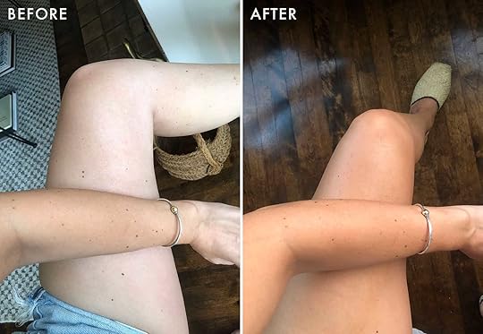 left: a two-toned body | right: a single-toned body (the light outside got warmer… i’m not quite that tan:))
Rating: 10/10!!
CaitlinLike Em, I am VERY VERY pale. Unlike Em, I have a crippling addiction to the spray tan from Sugared & Bronzed (see if they have a chain near you – it’s SO good, once you get over the whole “standing naked in a freezing room in front of stranger” thing) because their color is beet-based, so it runs a little more “human skin” and a little less “tangerine.” I tell you this because I am a HARD CUSTOMER to please when it comes to self-tanner – like, once you’ve had the spray tan of your dreams, can anything compare?! And thankfully, the answer is YES (but only if you use the mitt, TBH). I live alone and lack coordination so I just apply this in the area that the sun actually hits (arms, legs, shoulders, chest, etc.) and my favorite thing about this foam in particular is that it blends super naturally – like, I tan the parts of my upper thighs that see the light of day, but skip going any higher (no need to tan my butt if nobody’s looking, ya know?) and there’s never a crazy line of demarcation, thanks to the mitt. Just be careful around your wrists and ankles and you’ll be glowin’ in no time, guys. It’s the gold standard for a reason!
Rating: 9/10 (would be a 10/10 if I hadn’t been spoiled by the in-person spray tan wizards though)
Mallory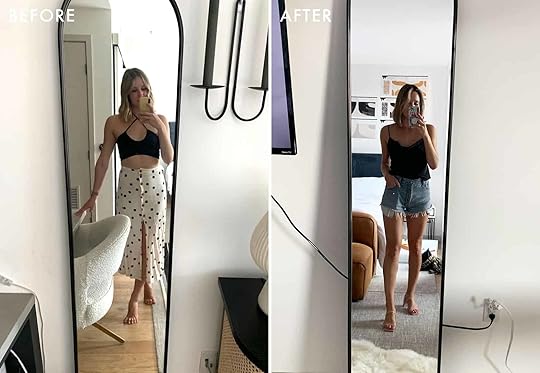
Emily turned me onto self-tanning pretty much immediately upon joining the company. I was a little reluctant at first because I didn’t know how to tan and I didn’t want to walk around like a streaky little carrot, but then this thing called the pandemic happened and I was no longer afraid of people making fun of me for how bad my first self-tan would look (because we were seeing nobody!!) We used the entire bottle between 2 people the first time we tanned (would not recommend) but now I’ve gotten the hang of applying it and I LOVE me a self-tan especially in the summer since I sunburn instead of tanning naturally. Oh, also I’ve tried the St. Tropez express tan as well (because I’m bad at planning when I want to be tan and I always wish I could tan immediately) and it works GREAT. 1 hour is a light glow, 2 hours is a decent tan, and 3 hours you’re BRONZED. I love this product.
Rating: 10/10!
So there you have it. Are there any products you recommend to all of your friends? Have you tried any of these? Let’s chat. xx
Opening Image Credits: Photo by Tessa Neustadt | From: Our Classic Modern Master Bathroom Reveal
The post Emily Buys The Team Her 3 Of Her All-Time Favorite Products To Try… And They Give Their Honest Reviews appeared first on Emily Henderson.
September 3, 2021
We Scoured The Internet And Found The Only Labor Day Sales Worth Checking Out

Gah. Labor Day. How are we here? How is it not still May? Where did the summer go? Like, guys, the sun is starting to set earlier. I’m neither mentally nor emotionally prepared to spend another winter sitting in the dark in my house. (“Can’t you just turn on a light?” – you, probably. And like, yeah, I could, but I’m being melodramatic.) That said, there are a lot of great things on the horizon – feeling cozy! Wearing sweaters! That feeling you get when it’s kind of cold outside and you eat something spicy and warm! Bachelor in Paradise is so good right now! And yeah, having a nice little long weekend to mentally switch into “fall mode” doesn’t hurt, either.
That brings us to today: y’all, there are SO MANY sales this weekend. (I’m sure you’re also being hounded with tons of targeted ads, right?) But as it turns out, a lot of them are for super-specific items or for negligible discounts (I know you always give out arbitrary 15% off coupons, unnamed retailers!!!), so I’ve pulled together the crème de la crème of Labor Day Sales – you know, the ones that are actually worth your time at the sites where your hard-earned dollars will stretch the farthest. Let the data wizardry and over-personal commentary begin!
Home & Decor photo by keyanna bowen| from: malcolm’s bedroom reveal is here…how he found healing through design + the DIYs that transformed the spaceAllModern
Dates: Through Tuesday, 9/7
Deal: An additional 20% off select items
Code: GET20
Our Picks: This huge, luxe sectional that’s more than $1,000 off | A plush, graphic rug | The platform bed that Jess and I both have our eyes on
Dates: Through Monday, 9/6
Deal: 20% off ready-to-ship furniture and decor
Our Picks: A Wearstler-esque coffee table | This cane and oak sideboard that could work in any space | These Capri Blue reed diffusers (I’m on my fifth and will never go back to the candles!!)
Dates: Through Tuesday, 9/7
Deal: 15% off sitewide; 20% off orders over $2,999; 35% off orders over $3,999
Our Picks: Albie’s tried-and-true queen-sized sleeper sofa | A long and low media console | This compact, quick-ship desk
Dates: Through Monday, 9/6
Deal: 25% off sitewide
Code: LD2021
Our Picks: This moody, perfectly desaturated bouquet print | A still life of several vessels (what more could EHD ask for)? | These fully-designed gallery walls that take the stress out of space planning
 photo by sara ligorria-tramp | from: one of emily’s friends gets the cozy yet sophisticated bedroom makeover she really deservesArticle
Dates: Through Monday, 9/6
Deal: Up to 30% off select items
Our Picks: An airy, Scandi-style floor lamp | This glam black marble clock
Dates: Through Monday, 9/6
Deal: Up to 30% off sitewide
Our Picks: My cabana striped indoor/outdoor curtains (I love them!!) | A very cool lucite & brass picture rail | Preserved boxwoods of all shapes & sizes
Dates: Through Monday, 9/6
Deal: Up to 60% off select items
Our Picks: The vacuum we recommend every time | A teeth-whitening kit with over 1,500 5-star ratings | This joint pressure cooker AND air fryer
Dates: Through Tuesday, 9/7
Deal: 20% off sitewide
Code: EHDESIGN20
Our Picks: The marble chain from Sara’s living room | These rust-colored ceramic pitchers (in 3 sizes!) | Handblown glass cloches for all your styling needs
 photo by keyanna bowen | from: key’s totally transformed office reveal – maybe the most dramatic before & after everCB2
Dates: Through Monday, 9/6
Deal: Up to 30% off fall updates; up to 40% off outdoor; up to 50% off clearance
Our Picks: The sofa our team loved sitting on | The leather & brass mirror that’s in my own cart as we speak | These copper linen curtain panels that are perfect for fall
Dates: Through Monday, 9/6
Deal: 10% off sitewide for text message subscribers
Our Picks: This wall-mounted leather headboard | A sustainably-harvested cypress blanket/towel ladder | This extra-long leather lumbar (what a showstopper!)
Dates: Through Sunday, 10/17 (yeah, it’s a long one!)
Deal: Up to 25% off all Elfa products
Our Picks: These pull-out cabinet drawers (skip the renovation, try these first!) | An over-the-door gift wrap organizer | And the whole Elfa custom closet system, of course
Dates: Through Monday, 9/6
Deal: 20% back in reward dollars
Our Picks: The desk that someone on team EHD just got delivered (it’s better in person!) | The bed that spawned my dissertation on canopy beds | These dining chairs with the coolest side profile
Caitlin Note: Please don’t open a credit card just for a sale!!! The clearance section is just as lovely without any potential credit score ramifications. But if you do already have a C&B card, this is a great deal.
 photo by sara ligorria-tramp | from: silver lake hills bath reveal + get the look Effortless Composition
Dates: Through Monday, 9/6
Deal: 25% off orders over $25
Our Picks: An organic modern mango wood chain | This abstract black and cream throw | These happy green and yellow baskets
Dates: Through Monday, 9/6
Deal: 15% off orders over $149
Code: OURTREAT
Our Picks: The stair-climbing rolling cart that changed my laundry/grocery/flea market trips for the better | Literally anything from the Five Two line (I’ve bought almost all of it, I’ve tested it, I love it) | These nesting microwavable storage bowls (you guessed it – have them in pink and love them)
Caitlin Note: Food52 has ~2 sales a year (yeah, seriously!!!) so this is a big deal. Get in while you can!
Dates: Through Monday, 9/6
Deal: “Storewide savings,” which isn’t vague at all!
Our Picks: The best deals are in appliances, outdoor equipment, and storage. Godspeed.
Dates: Through Monday, 9/6
Deal: 15% of sitewide
Code: LABORDAY15
Our Picks: A set of three sweet brass boxes for under $100 | This slim and modern round dining table | The most beautiful desk chair I’ve seen in 2021
 photo by keyanna bowen | from: rashida’s totally transformed kitchen reveal (that includes one of our favorite “new classic” tile trends Industry West
Dates: Through Monday, 9/6
Deal: 20% off sitewide, plus an additional 5% off quick-ship items
Code: LABORDAY
Our Picks: The uber-popular bar stools from Rashida’s kitchen | A cane sideboard that’ll be making an appearance in Mallory’s MOTO | These organic and modern dining chairs
Dates: Through Monday, 9/6
Deal: 15% off sitewide; 20% off orders over $499
Code: LDW15, LDW20
Our Picks: A classic x-shaped ottoman | This great-looking campaign chest | Some timeless Scalamandre zebra peel-and-stick wallpaper
Dates: Through Tuesday, 9/7
Deal: 15% off sitewide
Our Picks: The famous sectional from Arlyn’s living room | This storage ottoman with contrast piping (anyone else love trim right now?) | A clean, simple, timeless daybed
Deal: Up to 50% off closeout items
Our Picks: This sculptural taper candle holder | A glam-meets-library lucite tripod lamp | The cutest brass lock box I’ve ever seen
 from: maker series collaboration: jane dentonJonathan Adler
Dates: Through Tuesday, 9/7
Deal: 20% off sitewide
Code: SUNNY20
Our Picks: The cabinet I used as the jumping-off point for my living room | A fun and punchy vices canister | This on-trend needlepoint pillow
Dates: Through Tuesday, 9/7
Deal: 20% off select items
Code: TAKE20
Our Picks: This velvet English roll-arm side chair | A classic upholstered bed frame with simple lines and so many color options | This traditional chandelier with awesome lines
Dates: Through Tuesday, 9/7
Deal: 20% off sitewide
Code: LABORDAY20
Our Picks: *The* mirror (I guarantee you already know the one) | A bold yet neutral rug that made me shout “OMG, where is that from???” during a design concept presentation from Julie | The sumptuous sofa that you’ll see in an upcoming reveal
Dates: Through Monday, 9/6
Deal: 15% off sitewide
Code: BYESUMMER
Our Picks: A sweet oak step stool | Some “50% farmhouse, 50% bougie” rose gold & oak cheese knives | This dual-handed bread board
 photo by sara ligorria-tramp | from: grab a drink and explore this ehd stylist’s treasure filled living roomOne Kings Lane
Dates: Through Monday, 9/6
Deal: 20% off sitewide
Our Picks: A super-chic navy raffia nightstand with tons of storage | This super-plush and dreamy roll-arm sofa | A carved, round dining table with a gorgeous base
Dates: Through Monday, 9/6
Deal: Up to 70% off sitewide
Our Picks: This Mountain House guest bed dupe | Everything from the Halloween shop | A sheepskin rug that comes in so many sizes
Caitlin Note: Have recently learned that Overstock’s return policy is the worst so learn from my mistake – read reviews first! They charged me $50 to return 4 $36 curtain panels which I did not love and could have avoided had I done a little more research. (C’est la vie. This is why affordable curtains can be a double-edged sword. Now we all know better!!)
Dates: Through Wednesday, 9/8
Deal: Up to 70% off select items; an additional 20% off clearance; free shipping on orders over $99
Code: LABORDAY
Our Picks: These classic captain’s chairs to flank the ends of your dining table | Some sleek and thin iron & wood wall shelves | A substantial boho reclaimed wood coffee table
Caitlin Note: Really good selection here – there are high-quality furniture pieces for every room of the house. (And some great outdoor deals, too, if you have some storage space and want to get a jump start on spring 2022!)
Dates: Through Monday, 9/6
Deal: Up to 75% off select items
Our Picks: The semi-flush lights I’m getting for my hallway | A wingback recliner with reasonable lead times that actually looks good | All ~700 pieces of hardware, TBH (I’ll be grabbing some switchplates and cabinet knobs!)
 photo by sara ligorria-tramp | from: after three years we can finally use our upper deckTuft & Needle
Dates: Through Monday, 9/6
Deal: Up to 15% off sitewide
Our Picks: The Hybrid mattress | The dog bed that we get a million questions about whenever it appears in a room reveal | A set of these two sublime down-alternative pillows
Dates: Through Monday, 9/6
Deal: Up to 70% off select items
Our Picks: A 4′ long fire pit to keep you warm during another winter of outdoor gatherings | This deeply-discounted plug-in, swing arm sconce in 5 finishes | The Halloween decor section!!!
Caitlin Note: I’ve been writing these sale roundups for 2 years (!!!) and this is the best variety I’ve seen from Wayfair. Officially something for every decor style, which doesn’t always happen. Highly recommended!
Dates: Through Monday, 9/6
Deal: Up to 70% off select items
Our Picks: $2 glassware that looks like a million bucks | The pop-up storage coffee table we’ve shot and featured on EHD | This simple yet high impact navy & white woven rug
 photo by veronica crawford | from: new fashion on my body – the one where i dressed like a fisherwomanBloomingdales
Dates: Through Monday, 9/6
Deal: Up to 30% off select items; an extra 50% off select clearance
Our Picks: These super-sweet scalloped ballet flats | This cropped tweed cardigan with special detailing | A pair of denim jogger sweatpants (just trust me)
Dates: Through Monday, 9/6
Deal: 20% off womenswear orders over $250; 30% off womenswear orders over $350
Our Picks: A crisp and tailored wool bomber jacket | My dream winter coat | A statement little black dress you can still wear every day
Caitlin Note: Every time I look at this site it makes me wish I was that kind of cool, capsule wardrobe-y, Sartorialist-photographed minimalist type, you know??
Dates: Through Monday, 9/6
Deal: Up to 50% off select items
Our Picks: The best $10 drape-y white t-shirt | These lightweight paperbag pants, perfect for easing your way into fall | A comfy and highly-rated t-shirt dress
Dates: Through Monday, 9/6
Deal: Up to 30% off select styles
Our Picks: This instant outfit bundle | These perfectly draped long sleeve t-shirts in a ton of fall colors | A solid-colored, sturdy and sustainable backpack with no branding (the dream!)
 photo by veronica crawford | from: the fun, easy to wear and bold dresses i’m opting forJ. Crew
Dates: Through Monday, 9/6
Deal: 40% off sitewide; an extra 50% off sale items
Code: HELLOFALL
Our Picks: This tie-waist wool-cashmere cardigan dress | A chic and functional field jacket in 4 different colors | J. Crew’s classic merino crewneck sweater
Caitlin Note: TOO MANY GOOD AFFORDABLE THINGS. SOS.
Dates: Through Monday, 9/6
Deal: 60% off sitewide, plus an extra 15% off orders over $125
Code: YAY
Our Picks: A corduroy skirt that I own and love | The cutest color-blocked pullover sweater | This timeless city coat
Caitlin Note: 2011 Caitlin would have fainted had she seen this sale. 2021 Caitlin is definitely lightheaded. So good. So budget-friendly.
Dates: Through Monday, 9/6
Deal: An extra 30% off sale items
Code: SOLONGSUMMER
Our Picks: The sweetest green gingham dress with long sleeves | These spirited and happy polka dot heels | A crossbody bag shaped like a crab (because who doesn’t love a little fun?)
Dates: Through Monday, 9/6
Deal: An extra 30% off sale items
Code: CHEERS
Our Picks: The only cut of jeans I buy now (long live the demi boot!) | A midi skirt that’s perfect for back-to-school season | This lightweight pullover sweater with the perfect amount of drape
 photo by veronica crawford | from: my current favorite clogs – a reviewNordstrom
Dates: Through Sunday, 9/12
Deal: Up to 60% off select items
Our Picks: These slip-on mule-style smoking slipper/loafers | A plaid shacket from The Great | These fun Ulla Johnson wide-leg cropped trousers
Dates:
Deal: 25% off select items plus an 11-piece beauty bag with orders over $150
Code: LABOR
Our Picks: This oil and mitt that prevent ingrown hairs (they live up to the hype) | A scrub that helps reduce KP bumps (again, lives up to the hype!) | The only pimple patches that I will ever recommend
Caitlin Note: Skinstore usually has a TON of promotions and the best prices for skincare in the game – worth checking if your preferred brands are carried here!
Dates: Through Saturday, 9/18
Deal: 50% off select items
Our Picks: More like Ulta’s picks – head here and check out the selection that’s on sale today (it changes daily)!
I’ll be updating this post all weekend, so be sure to check back on Monday for a few last-minute additions. (Some folks just love those surprise day-of sales, you know?) As always, feel free to drop your own small business in the comments below – I know our audience would love to support you, too. Have a great weekend – happy window- and/or regular-shopping. xx
Opening Image Credits: Photo by Sara Ligorria-Tramp | From: After Three Years We Can Finally Use Our Upper Deck
The post We Scoured The Internet And Found The Only Labor Day Sales Worth Checking Out appeared first on Emily Henderson.
September 2, 2021
We Have Our First Feel Good Makeover Designer!! Now We Need Your Help

Well, you all showed up. After our announcement of taking the Pen and Napkin makeovers national, over 200 of you signed up to help decorate a family’s home. We are in the process of getting together a workflow to make sure that we can help as many people as possible in a streamlined way, so if you are one of them stay tuned – it’s all in the works. Today we have our first family, in LA with a pretty awesome volunteer designer, Lowe, and she and the family need some more support and resources. I’ll let Lowe take it away and show you what she has planned (and thank you so much,= Lowe, I hope you find this as rewarding as I have). xx


Hey friends, hello — Lowe here! I usually spend much of my time posting things on my tiny corner of the internet via Instagram at Hot Sunday Home. But like many of us, I am the hugest stan when it comes to all things Emily Henderson. Not only do I appreciate her impeccable eye for design, pattern-mixing, and all things soups and stews. But I am also always floored by Emily’s commitment to spreading the wealth when it comes to giving and helping others create the homes of their dreams.
So, accordingly, when I learned that the Em Henderson team was collab-ing with Pen + Napkin (another organization that I love for its selfless commitment to helping families transitioning out of homelessness) and inviting design enthusiasts to participate in Feel Good Makeovers across the country I was immediately all-in.
I’m far from a professional interior designer — really just a gal with a passion for good, affordable, and slightly odd décor. But I’ve been looking for ways to make my passion actually mean something for quite some time now. I’ve volunteered for Pen + Napkin before, but getting the opportunity to shop, create mood boards, and talk with Pen + Napkin founder Catie and lovely in-house designer Synthia daily to fully design a home is just beyond.
They brought me on board specifically to work on an apartment for *Jem, a fierce and bubbly mama, as well as her two little ones. The family of three recently got out of a not-great situation and moved into their place — a two-bedroom with a well-sized living room and dining area — but they didn’t have much by way of furniture. In fact, they still don’t, but we are working to remedy that ASAP. There were a few things this small family needed immediately: mattresses, bedsheets, pillows, towels, toothbrushes, and a hamper (the last of which Synthia sweetly offered to pick up and drop off on a Monday of all days). And those things have been taken care of because Catie just gets things done. But there are still quite a few steps I’d love to take to turn their new house into a real home.

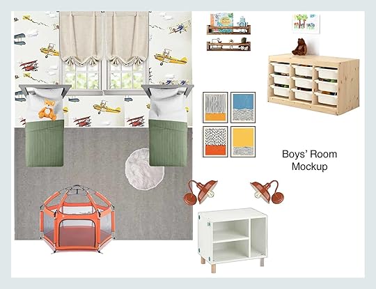
Luckily, I’ve been able to talk with Jem frequently about her routines, how she’d like to use her space, and things that are absolute must-haves. Her oldest kiddo is just starting school for the first time, so he needs a place to do projects and crafts. The youngest likes to be in the middle of all the action. And both boys love vibrant colors, airplanes, and trucks. Now I’m not super familiar with airplanes and trucks, not by a long shot, but I want to incorporate those things in their shared room. Jem is also teaching her little ones to organize their toys so I want to make sure their domain has a place for play and a place for order, not to mention cozy carpet tiles that can withstand daily romps and messes.

That brings me to the living room and dining area which will likely function as a study space, too. Jem plans to invite family over for home-cooked meals once she’s finally settled into her new home, so it’s super important to me that this hardworking area looks cool and feels cozy. We want things to be durable enough to withstand long bouts of recreation, so most of the furniture and the couch (which is being generously donated by Poly and Bark) will feature rich hues and hardy materials. Additionally, a TV in the living room will enable Jem and her boys to have movie nights on the weekends.
We think a spacious table will be best for the dining area for mealtime and homework time. And I’d love to add a colorful mini gallery wall in this space as well. Mom actually let me know right off the bat that things like art and throw pillows and plants hardly felt like priorities. And in the grand scheme of things, perhaps they’re not. But on the small scale, I believe personalized touches like these — that perfect painting of a woman who looks like you or an abstract watercolor that captures all of your fave hues — make us all feel good. They transform simple apartments into real respites. In the words of Pen + Napkin they “leave the family…feeling dignified, hopeful, and immensely loved.” So needless to say, I’m bringing in as much art, throw pillows, and plants as I can. To be resourceful (aka not break the bank because I’m nothing if not thrifty), I’m planning to DIY some art as well.


Now on to Jem’s bedroom — the space I’ve been referring to as the Queen’s Corner in my head. Now I’m not a parent, so I don’t pretend to know how much work goes into raising children. But I do know quite a few amazing mothers (my own included) who will endure anything to make sure their children get the best. And I think those moms, or mom figures, should absolutely have a space of their own that’s as decked out as can be. Enter: The Queen’s Corner. We’re adding a canopy bed because canopy beds (even the affordable one I found) just seem luxe for some reason. There have to be a few cozy layers because the little ones will likely sneak in on occasion. And I’d like to add a tiny bit of subtle pink and gold, too, because ~luxury~ Most of all though, I want this particular zone to feel like a retreat. We’re skipping the loud colors (Jem is a fan of neutrals and inky hues) and going for texture instead. I think a nubby bench at the end of the bed will be a welcome addition if we can get one to work. And a nice floor mirror (because parents need to take selfies, too!) should round out the royal digs.
And that’s all I have for now. I’m sure the mood boards I worked on will change a bit as Jem’s house/soon-to-be-home becomes a reality. But I can’t wait for things to continue coming together, and I am still so honored to be involved in the process! Thanks, everyone <3
Em again! Now that you can see how wonderful this home is going to be for Jem and her boys please (if you can) donate to this project HERE. These projects are life-changing and we (and they) appreciate every dollar you can spare. xx
Opening Image Credits: Photo by Sara Ligorria-Tramp | From: The Feel Good Flash Makeover Reveal (A.K.A. My Favorite Thing I Did All Year)
The post We Have Our First Feel Good Makeover Designer!! Now We Need Your Help appeared first on Emily Henderson.
Sofa Wars: We Sat On Every Sofa On The Market From CB2 to IKEA… Here’s Who Came Out On Top

Buying a stylish yet comfortable sofa online is like trying to hit a baseball with your eyes closed. There’s A LOT of information you need in order to make a successful sofa purchase that just isn’t possible to attain behind the barriers of a computer screen. I’m talking information like: 1. How soft is the fabric? 2. Is the cushion too hard or too soft? 3. Can somebody comfortably crash on this sofa and sleep the entire night through without getting irreversible back pain? You will never be able to know unless you know a guy who’s had your dream sofa & let’s you try it out, or if you go to the store to test it (which, what is this the 1800s?) We’re here to be your internet friends who actually did that thing people did before technology: we went to all our favorite sofa stores, sat in all the coolest sofas, and we’re dropping the full review, right here, right now, on this blog. It’s a bloggy blog world, so let’s get into it so you can online shop for sofas and have some fricken peace of mind.
Side note, we almost did this post about 1000 different times over the last 2, maybe even 3 years, but never got around to it until today. WE FINALLY DID IT. So, this post has been a long time coming and me, Jess, and Ajai are all very excited to share our findings with you guys!! Now let’s start out with those incredibly affordable sofas from that one Swedish furniture store enigma that every person wonders “is this cool or will it break in 2 days.” Time to investigate…
IKEAStockholm Velvet Sofa – $1,699
This pretty little lady caught our eye upon entrance into the sofa section. She’s a rich blue velvet that looks far more expensive than she is and she’s got some nubby little legs that make her very attractive. When we plopped onto this gal, we were immediately comfortable, but we had some debates on the depth of the seat:

As you can see from my and Jess’s demonstration above, as a guest coming into this house and sitting on this sofa, you might be a little unsure if you should sit at the front of the sofa –– feeling rather proper while having no back support (photo on the left) –– or if you should just full-on LOUNGE (photo on the right). We decided it’s a great couch for the “loungey people” or for the people who like to sit criss-cross-apple-sauce on their sofas rather than have their feet on the ground, or it would be great for extremely tall people like Ajai and her husband (she noted through our entire day that they MUST have a deep sofa in their family since everyone –– even extended family –– is very tall and will feel awkward on a narrower sofa cushion, more on that later).

I did the sleep test on this sofa though, and I give it a 10/10 for someone who’s down to crash on a couch and here’s why…The back of the sofa is filled with pillows that are super easy to remove, making your sofa/bed double the width so you probably won’t fall off. Also, I’m 5’7″ and noticed that there was plenty of clearance width-wise to sprawl my entire body across it, which is a major plus. Last thing I’ll say is that the velvet was VERY soft and the cushions were a great medium firmness: not too soft, not too hard, so it’s truly the ideal crash pad for a guest if that’s something you’re looking for in a sofa.
Price-wise, it’s a little more than we’d expect for something from IKEA (like at this point you might as well check out West Elm or CB2), but this sofa does LOOK a lot more expensive than $1,600 so we still think it’s a fair price for what it is. 8/10
Morabo – $1,499This sofa is in a similar price range as the blue velvet beauty but instead has a more “mid-century” leather vibe. Good back support, depth is standard, sort of firm… if you’re older you’d probably like sitting on this because it’s not too soft where you sink into it and then it’s hard to get up. Ajai said her 6’4 husband would want a deeper sofa for sure. The leather isn’t the best quality (if you’re looking for the same style but better quality, try the Article sofa we are all very obsessed with…all their leather is REALLY good quality & very legit).
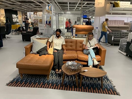
Lastly, the one thing we were a little unsure on was the leg-sleeves happening…kinda looks like the sofa legs were a little chilly & needed some extra warmth maybe? We were a little apprehensive about those but otherwise, the sofa was not bad, not great. Maybe a 7/10.
Söderhamn – $599+This is THE sofa that made IKEA the woman she is today. Its wildly affordable price has been something people have loved for years, and if you don’t love the legs you can swap them out very easily through pretty pegs or various Etsy shops (also just realized you can do this with the Morabo sofa above if you’re also unsure about the leg sleeves).
Ajai loves this sofa and has used it multiple times for different clients. It’s very classic and iconic. People love it because it’s modular and it comes in a bunch of different fabrics and colors, so you can really personalize it and make it your own. Also, the depth is really good on this sofa. It’s a perfect lounger/ploppable sofa, so if you’re looking for a cozy/den/movie night sofa, this is probably the best bang for your buck. 9/10 (some of us thought it could be a little less firm, but if you like a medium cushion firmness level, and an affordable price, this is the one for you).
 Slatorp Sofa – $999
This is a new sofa at IKEA and we were all wildly impressed with the design. Remember the first sofa we tried out at IKEA? The blue velvet lady?? Well, we felt awkward sitting down and having a drink because it was too deep for us, but if you’re a tall person, that might’ve been very comfy for you…this design lets you have BOTH…let me explain. The back cushions are modular so you can move them down and double stack them or you can stack them on top of each other: changing the depth & sitting position. It’s genius honestly. Now tall friends and short friends can enjoy a drink together on the same sofa!!


It’s kind of hard to tell what the heck I’m talking about from these photos so here’s another close up from the IKEA website to show you in further detail:
Pretty cool right? Again you could totally switch out these legs if you wanted to. The comfort level on this sofa was a 10/10 also…not too hard at all and was definitely more cozy/squishy than the Soderhamn. The only thing that was a downfall of this sofa was the fabric…it looked dirty on the showroom sofa, most likely because it’s that kind of fabric that gets little dirt particles stuck IN IT. So other than the fact that it looked not the most clean, it’s a great design and a good sofa, might just need to be cleaned more often or get it in another fabric.
Friheten Sleeper Sectional – $599We had to include AT LEAST one sleeper sofa and what better sofa to review than the one all of my friends had in college. YOU GUYS. This sofa is so well designed: the chaise lifts up to a bunch of storage underneath, and then the main part of the sofa comes up to create an entire full-sized bed. The design is VERY smart for small space living, so it makes sense why everyone would have this in their college apartments. The only major con to this sofa is that it’s EXTREMELY firm. I’d kinda equate it to sitting on a rock but for $600 and for how smart the design is, I think that might just be part of the charm.

I mean check out this design and watch the video of how it all works on the IKEA website…it’s SMART.
 West ElmHarmony Modular Sofa – $3,597
Need a big, comfy, ploppable sofa that every single person would want to snuggle up on??? THIS IS FOR YOU. The Harmony modular sofa from West Elm is so classic and so comfortable you’d have to be a monster to hate it. It’s practically unoffendable other than the fact that it’s a white fabric that could get dirty (but then you could just get it in a different color guys, so it’s really unoffendable). This comfy sofa shape will pretty much never go out of style and it’s perfectly soft yet feels structured enough that it won’t wear too quickly. And even if it does wear a little I think it’s so forgiving that it will be that cool/casual look that instantly makes people feel comfortable in your home. We are big fans (especially Ajai who has a sofa that looks pretty much identical to this one).

West Elm is really good at nailing the “corporate 30-year-old who lives in Brooklyn and loves MCM” kind of vibe, which is a good thing because their sofas are all really versatile in size and scale, meaning a lot of their sofas could fit into a Brooklyn apartment, but a lot of their sofas are also made to fit in a large house and go with different non-MCM (mid-century modern) styles….lots of modular options and different sizes which is great.
Andes Sofa – $1,399This sofa is a little higher off the ground, which would bring a lot of airy-ness to a room if you have a lot of low, chunky furniture and want to mix this kinda thing in. She’s sleek, she’s sexy and she has some very nice legs (you can customize and choose which color legs you want which is fun). It’s definitely more of a cocktail sofa: your friends will be very comfortable sitting on this and chatting in like a living room, but it’s less snuggle/watch a movie than the giant modular sectional before (obviously). It’s definitely more firm than a lot of the sofas we sat on, but not uncomfortable (like the IKEA sleeper sofa uncomfortable). 6/10.
 The Drake Sofa – $1,199
This is a great mid-century modern sofa that’s a little more sophisticated than the others. It’s a good amount of cushy and plush. Definitely great for small places. We’ve been talking a lot about the den/lounger sofa versus the cocktail/living room/formal sofa but what if you are in an apartment and can only have one sofa (like me, Ajai, and Jess?!) This one is a great in-between: comfy enough to lounge, not too deep to the point where guests feel uncomfortable, and stylish yet classic so you won’t have to rebuy a sofa because it was too “trendy”. 9/10
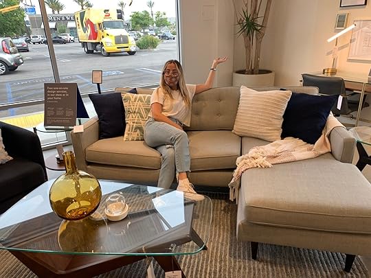 Dennes Leather Sofa – $2,399
SO classic. How could we not sit on this classic gal? She’s THE perfect apartment sofa when you’re low on space, investing in your first big piece, and want to make sure you’ll love it and other people will too. It’s that sofa that is a sure-fire buy. Pretty much unoffendable. A lot better quality than the IKEA version of this sofa, and all in all a really comfortable. 9/10
 Newport Sectional – $3,400
A surprising turn of events, we really loved this sofa too. It’s very beautiful. The fabric is like a woven grey that’s VERY pretty. It’s got foam core, and is fair-trade certified (yay!), really good back support, and totally works for tall and short people because the cushions in the back are squishy and can be compressed easily. She’s not cheap: $1800 for the sofa version and $3400 for this sectional, but we all agreed if you’re going to invest in a nice sofa, this one is definitely worth it because it’s SO comfy and the legs are really pretty. REALLY PRETTY. 10/10.
 CB2KST Sofa – $1,999
If you love Eclectic English Grandma style but want to do it in a hip and sexy modern way, buy this sofa. The back has those nice lines and it’s VERY comfortable. Plus it’s velvet which we believe is the easiest to clean & live with on the day to day. You’ll notice with pretty much all of the CB2 sofas they’ve been doing really cool, interesting designs which makes their sofas super unique and fun. If you want more of the “trendy statement sofa” these next few are for you (and they’re my favorite for sure). Btw this sofa also comes in a more neutral “sand” color that’s very cute
 Strato Sectional – $3,297
There are a bunch of sizes for this sofa/sectional (the 80″ sofa version is very cute) and the color options are cognac leather or this very cute boucle. This sofa is definitely on the firmer side, but with its shape and back support/cushion softness make it the perfect sofa for sitting and chatting for hours. Ajai and Jess literally said “wow this makes me just want to sit and talk to you” so if that’s the vibe you want, this bad boy is for you.
 Brace Leather Sofa – $3,499
Jess found this one quick and LOVED it. It’s definitely on the firmer side, and the leather itself is coated, so if you’re more into the patina, weathered leather look then this one might take a while to get there. Ajai did the “scratch test” which made me incredibly nervous…basically she scratched the sofa and then rubbed it to see if it would come out. It did, thank god, but boy I was sweating. Good to know though, if you’re considering buying this sofa, your scuffs and scratches will rub out fairly easily. Also that cool chrome detail on the side makes the whole thing. We are in LOVE. Personally, I think all of these CB2 sofas have been worth their $3,000 (ish) price point…they’re unique, comfortable and make a big statement (which we always say “splurge on the statement/conversation pieces in a room” and these are all certainly statement pieces in the best way).
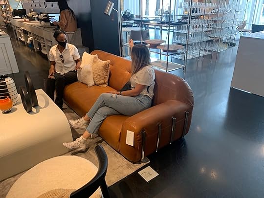 Perimeter Sofa – $1,999
Mohair is definitely back in again (what do we think about it??) so we were excited to sit on this cool, trendy, and well-designed sofa. She’s got great bones and is definitely a statement piece (which if you’re gonna spend $2,000 or more, it’s gotta either be VERY comfy or a cool statement) so this really fit the bill. I love it personally and think it would be awesome in a loungey, sexy living room or bar space. It also comes in a brown/grey color. Love!!!
 Alesso Snow Sleeper Sofa – $2,199
When we found out this was a sleeper sofa we were shook, to say the least. The pretty little leather straps on the side unbuckle and the top seat cushion folds to the floor to create an entire floor mat and it’s DOPE. A genius design, a comfortable sitting experience (maybe a little firmer than a plop down watch a movie sofa) but who even cares because it’s SO PRETTY. This was one of our favorites. 10/10.
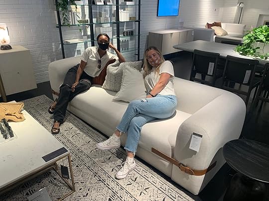 Turn 4-Piece Sofa – $4,196
For comfort AND style, this one gets high praise. We really weren’t unimpressed by any of the sofas at CB2 because they all clearly served a statement-y/awesome purpose, but in terms of ploppable comfort this one wins, for sure. We loved the curved sides and they added a level of comfort since it wasn’t just a right angle that’s awkward for your arm placement or a lean. It also comes with a chaise (not pictured here). Ajai though was worried about the shape of the cushions staying in place/keeping their shape since each seat and back cushion are actually one piece.
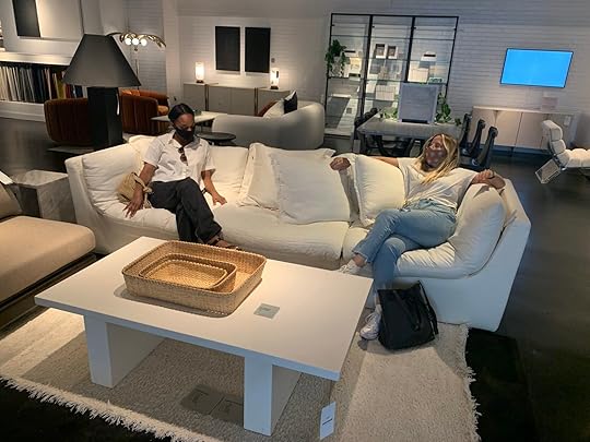 Interior Define
Okay, Interior Define has one very important thing down to a science: comfort. And as they say, comfort is key. If you’re not familiar with Interior Define, their sofas are what they do and they do it well. Jess actually had an Interior Define sofa in her last apartment that was VERY comfortable, so we love them and are excited to review this company. Basically here’s how it works: they have 3 levels of cushion fills: double down (softest), down alternative (medium/soft), and standard down blend (firmest, but still cushy). I liked the down alternative the best, Ajai and Jess were big fans of the double down. The double down they said needs to be fluffed the most, but was SO comfy to the point where you might not want to ever get up (which is a plus for some people). We sit on all of them…so we’ll show ya.
Oh and by the way you can customize any of the sofas to be any fabric you want, with any leg you want…here are just SOME of their options:
 hi jess
  these are their leg options…how cute are those little bobbley ones?? (that’s for sure the technical name btw)Jasper Sectional In Down Alternative – $3,295
Here are the beautiful Ajai and Jess sitting on the Jasper Sectional in Down Alternative (my favorite). There’s a little give in the cushions, as you can see, so it’s comfy enough to lounge on but it’s also not awkward for guests to sit on if they don’t wanna get all up in your white sofa upon entrance into your place. It also is perfectly sized for an apartment that only has room for 1 sofa (aka most apartments) and is shaped to perfectly foster conversation if that’s what you’re looking for in a sofa (I know I would be!). I would 100% buy this exact sofa for my apartment if comfort and conversation making are both priorities. It’s truly the best of both worlds and because of its versatility, you’ll get lots of bang for your buck.
 Winslow Sofa – $1,495
Okay here’s something important we haven’t discussed much in the sofa department: 1 long seat cushion versus multiple. There are benefits to both in my opinion. The single-seat cushion gives you less opportunities to lose things in your sofa, but more opportunity for wear in the cushion fill (especially if you go for double down like this one below). But lots of people prefer one or the other –– and we’re down to debate favorites in the comments below. Jess said this sofa was a big win for her and we all agreed it was SO comfortable, but I personally thought it was a wee bit too deep, but the associates at Interior Define told me you can customize the depth which is SOOO SMART and why we love this company (oh btw I believe their sofas are 15% off right now bc of Labor Day, so run don’t walk).
 Lukas Sofa – $2,195
My immediate reaction to this sofa was that it was too deep (42″) and a little too firm (standard down), then I remembered you can literally customize the depth and the firmness to what you like so there’s pretty much no way to hate any of these sofas. Again, you can also change the color/fabric and the length so you can truly have anything you want here which makes it hard to say anything bad about these sofas. If you like this style (Lukas sofa), you might also like the Tatum sofa (that green one in the back) because they’re very similar.
 Sloan Sleeper Sofa – $3,845
Okay let’s talk more about sleeper sofas, shall we? This sofa is created exactly like the IKEA one, except it’s made more for adults and less for college apartments (probably also because of the MASSIVE price difference). This was the standard down we were sitting on (so the firmest one that takes a second to break in) and it was still very comfortable. We were really just huge fans of the fact that it pulls out into a full-sized bed and then also has a storage component so you can store your extra bedding for said bed under the chaise (genius).


The very kind employee working there showed us how it looked pulled out (and he did it in his 6 inch very cute Jeffrey Campbell boots…that was probably more impressive than the couch itself). The mattress was compressed in plastic for the store model purposes, so it will expand more than this, btw. If you’re in the market for a high-quality, awesome sleeper sofa that will last and doesn’t feel like a rock (like the IKEA one) this is a very good purchase. Also, I’m not sure if this was intentional, but it’s named the Sloan Sleeper Sofa which is the cool girlfriend in Ferris Bueller’s Day Off, which I’d be lying if I said that didn’t make me like this sofa more.
 Crate and BarrelLotus 5-Piece Sectional – $6,795
Okay if you’re looking at a big sectional like the Harmony sofa from West Elm that we really liked or BIGGER, this one is definitely similar, but a little bigger and a little pricier. They have this sectional in a bunch of different sizes (extra-long, 4 piece all the way up to 7 pieces) and it’s VERY comfortable. Like this is the movie sofa of our DREAMS. It’s large, in charge, and is basically begging you to snuggle on it. The detail that I especially loved but might be a turn off for some is the fabric (it was for Jess): it has a little tiny gold shimmer to it which is VERY subtle and definitely not tacky AT ALL, that I thought gave it a really nice touch without making it fussy. 10 out of fricken 10.
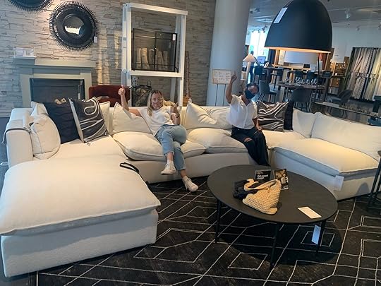 Ever Sofa – $2,299
We couldn’t come all the way to Crate and Barrel and not sit on a Leanne Ford sofa…I mean DUH. Also, this one was named after her daughter which is very sweet This sofa looks VERY ploppable and comfy, but was a little firmer than we wanted. It comes in lots of different colors and it’s a slipcover that you can throw in the wash (huge plus), good depth and we love the single cushion. All in all, we just wish it was a liiiiiiitle more plush for how comfy it looks but we think this sofa would also wear really nicely since it’s that casual look anyway.
 Sonoran Block Leg Sofa – $2,499
The legs on this guy were VERY pretty. It’s a simple but nice shape (trendy touch, but won’t go out of style probably), nice depth and the texture of the fabric felt like it was really good quality & sturdy (also comes in a bunch of different colors if that’s of interest to ya). It was a tiny bit more firm than we really liked, but again is a better “living room/conversation sofa” than a comfy cuddle sofa, so it just depends on what ya like.
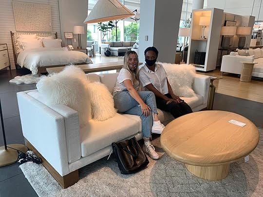 Pottery BarnBig Sur Square Arm Double Wide Sectional – $3,398
Ajai’s sweet sweet baby, Jack met us at Pottery Barn to test out this sofa with us and he was a big fan (his schedule was booked up earlier in day so he had to catch up with us later). As a bestseller from PB, it’s very comfy and we LOVE the double-wide (feels like you can just drown in this sofa in a good way).
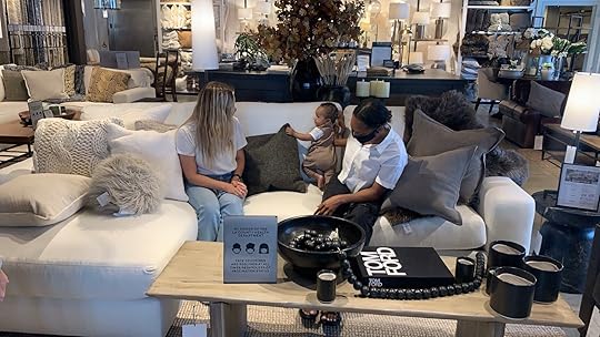 PB Comfort Square Arm Sectional – $2,437+
This sofa is also a bestseller according to PB, which makes a lot of sense because it’s super classic, very comfortable, and you can choose from a bunch of different configurations and even decide if you want roll arms or square arms. This collection pretty much comes in anything you could possibly want (we love customizable sofas/sectionals!!) The sofa/roll arm version’s coming up next…
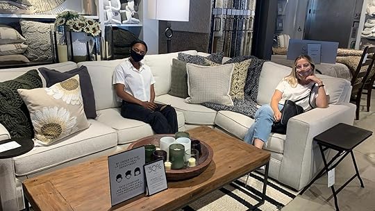 PB Comfort Roll Arm Slipcover Sofa – $1,299
This is the same sofa collection as the sofa above, just with a slipcover and roll arms. Again it’s got a SUPER classic shape and is VERY comfy (I mean come on, it’s in the name). You really can’t go wrong with this, and we love a slipcover SO MUCH.

PHEW! Now THAT’S what we call a review!!! Thanks everyone for sticking with us and reading this monster of a blog post. We hope that it was helpful and would love to know your thoughts on these sofas/your favorite sofas in general in the comments below! Thanks for staying with us through this whole thing, WE FINALLY DID IT! Love ya lots xx
The post Sofa Wars: We Sat On Every Sofa On The Market From CB2 to IKEA… Here’s Who Came Out On Top appeared first on Emily Henderson.
September 1, 2021
September 1st, 2021

Today is my birthday and the first day of our kid’s school in Portland. It’s been a year, or 42. The 4 of us are feeling equal parts excitement, relief, nervousness, and curiousness. They are curious how school works after a year and a half out of it, curious what it’s like to make new friends, and how nice their teacher is going to be. I’m curious if they remember how to read and right (JK). We are finding our new normal and not every day has been easy. The thing is, settling into the unpredictability of life is strangely comforting. My mantra for the last 2 years is dripping with bachelor-style-meets-Goop-sap, which goes as follows: “The obstacles are just part of the journey”. They are unavoidable and the only way over is through. Framing it like that lets me approach mistakes like lessons I get to learn and the missteps are actually challenges that I’m meant to face. It’s been far more freeing and allows me to almost watch along, view my life from a more objective perspective in addition to experiencing it. And y’all, it’s been pretty entertaining to watch.
The only newsletter I actively look forward to reading is Maybe Baby by Haley Nahman. The last few Sundays have been meaningful enough for me to forward them to friends, with a “you have to read this” subject line. A recent one posed her theory on life, which gave me a lot of comfort and insight into what has been happening internally with me the last few years. It’s about a search for what she called “existential frisson” – the tension or relief you feel when you move the dial towards or away from something in your life. I related to it SO MUCH. 15 years ago I bawled when we left New York – I wanted to live there forever, raise our kids there, craved the energy of the city with the daily search for the new and novel. How does that person end up isolated in the mountains, where there is virtually no newness, loving that every choice is so simplified – so simple you almost don’t think about it and it becomes a non-choice. It’s a jarring shift. Brian is ready to get back to a city, and frankly, I wasn’t and there are days still when I’m not. But our neighborhood is so quiet, the parks here are meandering and I’m baby-stepping it back into traffic and crowds. But maybe I’m watching too much Virgin River and fantasizing about a “small town” reality that doesn’t really exist.

And yet we are here and moving forward with this plan, with a lot of hope that our family will thrive here. Maybe we won’t. Maybe our search to find the adorable public school experience we longed for in CA will not pan out after all. Maybe the groundedness and normalcy we have been craving won’t be satiated by moving to Portland. Maybe I’ll be allergic to Alpacas. There are times when I’ve felt whiplash even watching myself, curiously thinking WHO IS THIS PERSON??? I guess Haley’s piece reminded me that it’s normal and maybe even the point of life is to make massive shifts based on current emotions or seasons of life – and that we find relief, joy, and even growth in the midst of that change, regardless if it sticks. I know that the isolation of the mountain house was an over-correction to living in the busyness of LA/NYC. And our extreme hope is that being in this more mellow city will be the right balance of nature + culture that will make both myself, Brian and the kids thrive.
So I’m waiting for things to normalize, and I know it only takes time – you can’t really rush the process. I’m equally grateful and privileged to be in this situation, this I know. Until I settle in this new life I won’t know what version of myself will come out to play, or how long that version will stay – the extrovert that likes newness and fun or the homebody who wants to cook and snuggle. I’m getting used to the consistency in the inconsistency. I’m appreciating the predictability of myself being unpredictable. I feel like I’m watching a bio-pic of my own life and I truly don’t know what’s going to happen next, but I’m pretty into the series and can really relate to the main character, plus her husband is hot. One thing I do know about myself, that will never change, is that I will always watch a long, meandering TV series, full of love, drama and levity, with characters that bring me comfort along with some surprise. Hopefully, you do, too.
Season 12 of this show starts next week. It’s set in Portland where the family lives in a rental house while they wait for their mini-farm to be livable. It’s sure to be a year of transition, of feeling unsettled, and likely some existential clarity. I have all my tools (soup, exercise, podcasts, romance novels, close friends/family, long baths) and I know that it’s really about us creating the right environment and energy for the kids to feel good. Some days it’s harder than others as I mourn the simplicity of our small-town life, and that is absolutely to be expected. So I do what all moms do – I find a shower to cry in, and get it all out. It works.
Grab your popcorn, get comfy on your human-sized fainting couch. Let’s watch it together and maybe play that drinking game that many of you have suggested in the comments – a shot for every time I say/write “simple”, “sweet”, or “special”. Except it’s Souptember so I’ll be drinking Kombucha and tea. Listen, mistakes and missteps have been made, and not just in design. I feel like I’ve grown up on the internet, accidentally, and with that comes a lot of successes and failures, and so much learning and personal growth. Knowing that there are people out there rooting for a happy ending, and willing to forgive when we’ve taken a wrong turn is truly what drives me to continue this “show”.
The plot will thicken with added chickens and rain. Thanks so much to all of you who have been watching and rooting for us over the years. It means more than I could possibly express. I still genuinely love this job, and am so grateful to be here and am even more grateful that you are here, too. Thank you.
The post September 1st, 2021 appeared first on Emily Henderson.
Emily Henderson's Blog

- Emily Henderson's profile
- 10 followers

