
Emily Henderson's Blog, page 115
September 14, 2022
This New Orleans Home Has A Secret Passageway That You Have To See To Believe

Deeply saturated moody walls, vintage portraits galore, and a secret passageway are just a few of the elements in this former church turned Airbnb that make it endlessly exciting to gaze at. This is a “home” tour like you’ve never seen before but before we get deep into it, a quick note from Emily:
We shot so many amazing houses for the book, and today we are launching a new series where we do features on the designers and homes, one at a time – with all their photos in one place. We are starting with likely the most jaw-dropping of all of the spaces, which doesn’t imply that it’s better than the others – just one that surprised us over and over. Sara Ruffin Costello is a total style maverick. This “house” is a former church in New Orleans and isn’t a home, but an Airbnb which allowed Sara to probably push boundaries further. It’s just incredible. I’ve known Sara since I was an assistant stylist 18 years ago in New York. She was one of the founding editors of Domino when it launched, the creative director, and I looked up to her so much in my 20s. She had this beautiful West Village brownstone, with sweet kids and was so lovely and down to earth. I was in my early 20s and I remember thinking that seemed like a pretty great life to aspire to. She since moved to Louisiana and when I saw this space on her Instagram, I immediately begged to shoot it for the book. It far surpassed our expectations. Sara Tramp, Velinda, and Erik really killed it on the photography and styling. So go follow Sara now. She continues to inspire with all of her projects and I was so lucky to have been near her while learning my way through this style industry. Thanks, Sara. xx

The first room of the tour reflects a vibrancy that rivals the very city it is housed in. A New Orleans transplant herself, Sara Ruffin Costello once wrote that “part of the allure, of course, is that even post-Katrina, New Orleans is like a movie set.” Indeed, those who have ever visited can attest that the city has a charm and appeal that is almost dreamlike. Considering her deep admiration for the city, it should come as no surprise that the same goes for this Airbnb she designed. It feels like a dream because it has all the things one hopes to find in interior design: unlimited charm, a mix of old and new, daring choices, vibrant colors, exciting patterns, and unbelievable art, all packaged together to create a warm, inviting feel.
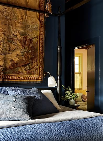
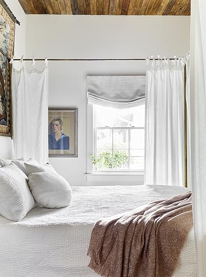
In this first bedroom, dark blue walls create the backdrop for a dramatic four-poster bed and a golden, decadent tapestry. Immediately you are enveloped by the moody blue color which is emphasized even more so with the matching blue bedding. The bedding adds a ton of texture which contrasts the smoothness of the walls, and the low brass sconces add warmth along with the tapestry. As you’ll continue to see throughout the home tour, it’s these small details that make a good design GREAT.

Connected to the bedroom is this bathroom that is decorated with floor-to-ceiling dark subway tile. It’s hard to tell from this angle if this is a full bathroom so I wonder, is it possible this is a single shower closet? If so, that explains the daring spirit of Sara Ruffin Costello’s designs to a T.

If you ever thought moody and saturated were contradicting adjectives, think again. The inky blue wall color is both rich and dark, adding so much depth to the room automatically.

It is worth noting that a four-poster bed draws the eye up, so the vaulted exposed wood ceiling is a treat for the eyes. As your eye is drawn up you’ll also see the jute roman shades, which complement the wood ceiling, and both work together to add an airy warmth to the space.

To contrast the dramatic wall color, SRC plays with patterns to brighten the space. The old-world Mediterranean style tile flooring is paired beautifully with a similar color Persian rug, creating a ton of pattern and texture. The rug adds a layer of coziness but has rich colors that complement the Victorian style of the room. Speaking of color, I really adore the subtle choice to paint the grid of the window panels a warm tone which adds to the red accents throughout the room.
Oh, and did anyone notice the painted-over electrical outlet? It’s such a good trick to “hide” it in plain sight.

As you’ll see, all the pieces of art throughout this entire Airbnb are striking and bring a vintage collected vibe into every room. In this mini gallery wall, she plays with scale but keeps the color palette and style consistent so the gallery feels cohesive. I also can’t help but love that mini soldier bust.

Moving on to the next room, the adjoining hidden door is a really unexpected and playful choice. Continuing the pink wall color and golden yellow baseboard across the door makes the door disappear seamlessly into the room. When closed completely, the tiny brass door knob and brass lock are noticeable and add a sweet and whimsical touch. To starkly contrast the pastel pink wall color, another awesome vintage portrait breaks up the wall color with a black ornate frame.

It’s nearly impossible to choose a favorite room from this tour, but this living room is hard to compete with. The mixing of styles (rustic meets glam meets Victorian charm comes to mind) makes it such an exciting room to behold. Immediately, SRC knows how to grab your attention and bring the eye up with that regal candle chandelier. Then as your eye bounces around trying to capture all of the decor elements once, it becomes clear that she is a master at combining textures. The plush cushions, velvet throw pillows, rustic wood ceiling, and mismatched vintage frames create so much depth. To round it out, the small-scale patterned cafe curtains add a perfect dose of southern charm.
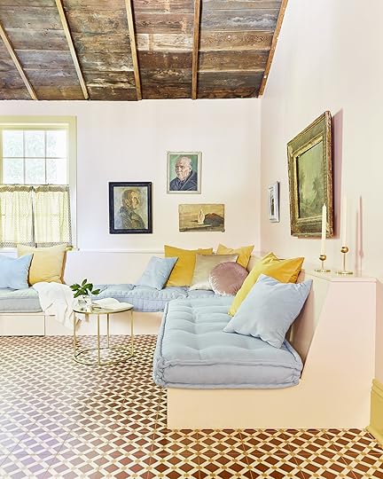
The softness of the pastels coupled with dark moody and comically serious oil portraits creates a really fun and unexpected juxtaposition. The brass tables also add a warm metallic tone that blends into the room nicely.
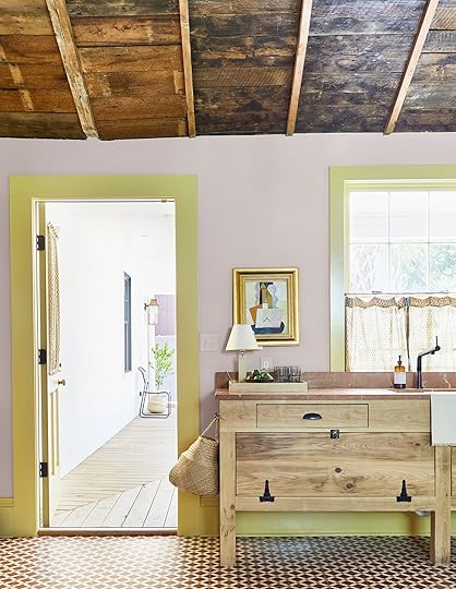
Since this is an Airbnb and is meant for overnight guests and not permanent residents, the layout and function are a little different, making the design even more playful. On the opposite side of the living room/sitting area, is this vanity cabinet with a built-in sink. No matter what the function may be, it definitely is a surprising choice making the room feel even more refreshing.
I must mention that one of my favorite decor tricks that SRC executes a lot is low art placement. The abstract piece above the cabinet could have been hung higher to be centered on the wall, but the low placement intentionally adds visual interest.
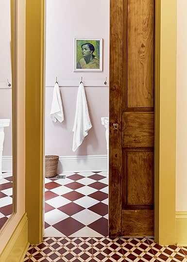

A wood sliding door with a gorgeous medium finish and dramatic grain separates the living room and powder bathroom. She switched up the tile in the bathroom but I love how the bathroom tile is a larger and simpler version of the living room tile and has the same color. It creates cohesiveness without being too predictable.

Listen, I’ve never met a built-in bookcase that I didn’t like, but this one will likely live in the built-in bookcase hall of fame. The narrow, light wood door separating the two sides feels very playful and gives this sitting room an enclosed hidden library feel. It’s just SO good.

While there’s so much to admire about this room, I couldn’t help but notice how the jute rug and wicker accents add a layer of warmth that helps create that lived-in, inviting feel. With so many dark tones, this room could come across a bit cold but the light decor pieces keep that from happening. And again, the brass accents add a warm metallic contrast to the space.

File this shot under Photos That Have Been Seared Into My Brain. I can’t get over that wingback chair with the modern pattern against the deep green shelves. Oh, and I love how the window shutters add charm and an endearing architectural feature instantly.

On the opposite side of the room, the tile flooring continues seamlessly into the next bedroom which is just as moody and dramatic as you’d expect…
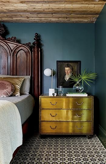
Another low art placement makes an appearance (I seriously can’t get enough of this trick) but holy smokes this brass chest of drawers is so dramatic and fun. The metallic gold shade pops against the inky blue walls so nicely.
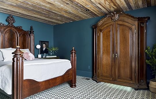
When the whole EHD team shared our obsession with this room, Emily immediately noted the deep mahogany bed in particular. It’s certainly a statement piece and one that was a bit of a risk but ended up really paying off. But bed aside, the armoire is impossible to ignore. If you remember this room from Emily’s book, you know that the regal size and dark wood finish of the piece are not the only noteworthy things about it…

That’s right folks, that is an antique armoire turned secret door that leads into the bathroom suite. Pardon this next phrase but, I CAN’T EVEN. It will be hard to talk about anything but this for the next several months, but it’s also worth noting that this room in general is a prime example of dark wood done right. I think it helps that the bedframe and armoire have similar wood tones and they really pop against this particular shade of dark blue paint.
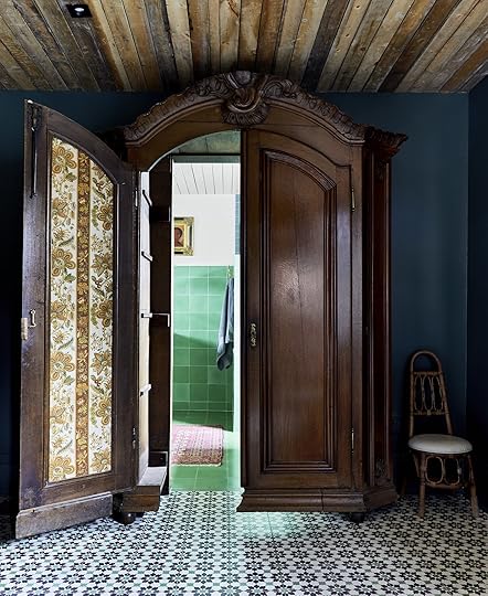
As if an antique armoire turned secret door isn’t cool enough, the inside of the door reveals a strip of bright botanical wallpaper. I do wonder if that was original to the armoire or added later but in any case, SRC never misses a surprising pattern moment.
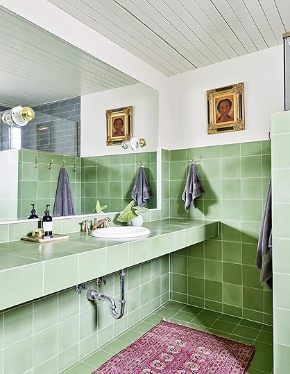
In the bathroom, green large-scale tile covers the floor and most of the walls creating a bright and happy atmosphere. It’s a surprising switch from the bedroom, making the tile color choice feel even more exciting.

HOT TIP: An easy way to add character and pattern to any bathroom is by opting for a vintage Persian rug instead of a bath mat. I love that she went with a bright pink rug to really contrast with the light green tile.

This tile wall has a soft gradient which makes the color change and reflects light differently, and white shutters add some sweet vintage charm to this otherwise modern bathroom.

It feels fitting to end with this bedroom, which is so different than the rooms we witnessed above, yet carries a familiar mood and dream-like state. Although it is the only neutral room in this home tour, there is no shortage of drama or elegance.
For starters, the curtains added to the four-poster bed make the bed feel like its own separate room within a room. So romantic and Victorian.

Now that we are nearing the end of this home tour, I can confidently say that SRC is a master of low art placement. I love how she hung the art almost directly above the cabinet/side table and placed the sconce directly over that. It makes this little corner feel like its own special design moment.

Just as I began contemplating a shift away from hanging tapestries, this room proves me dead wrong. The tapestry brings in so much color, whimsy, and movement to the room all while bringing in even more warmth because of the woven texture. It’s too good.
I’ll leave you with this dreamy bedroom shot as it feels most apropos to the reoccurring themes of this home: dramatic, collected, dream-like, and inviting to name a few. Now, I’d love to hear your favorite part(s) of this space so please drop a line down below. Thanks for reading and happy Wednesday. xx
*Design by Sara Ruffin Costello
**Styled by Velinda Hellen & Erik Kenneth Staalberg
***Photo by Sara Ligorria-Tramp for “The New Design Rules”
The post This New Orleans Home Has A Secret Passageway That You Have To See To Believe appeared first on Emily Henderson.


September 13, 2022
Welcome To Our Bedroom + All The Upholstered Beds We Considered And What We Chose
I feel like we’re those people who were obsessed with their dog so much that after it died, they immediately adopted the same-looking dog, and named it something similar in hopes of recreating what must have been a really well-fitting relationship or perhaps filling a loss… Everyone around them is like “wait, isn’t that…?” and they (we) are like, “oh no, this isn’t Lucky, this is our new dog Lucy, she’s totally different”. That’s us with our mountain house bedroom (previous dog) and our new farmhouse bedroom (new dog). We’ve been sleeping in this room for 10 days now and I’m so loving it, and that’s saying a lot since there is nothing in here (there’s more now, but you get it – it’s very unfinished). I’m just so happy to be here now and yes, it reminds me (intentionally) of my former favorite bedroom – at the mountain house (below).
 photo by sara ligorria-tramp | from: mountain house reveal – our calm scandinavian primary bedroom
When you walk into our new bedroom, it’s like the same room…The same layout, similar windows, vaulted ceiling, skylights… And if you think it’s weird that I want to copy a former room of my own, I don’t disagree. But it’s what we want – airy, simple, minimal, warm, with a fireplace, skylights, and a lot of wood. We want a low cozy unfussy bed, and big plush bedding – no dresser, no clothes, no mess but this time with a TV. Add some cool/quiet art, lighting, a reading corner, and that’s kinda it. It may not be the most exciting bedroom you’ve ever seen, but I’m pretty excited about it thus far. Think “Japandi Farmhouse in Oregon”… because that’s a thing. Also in a year from now, we can always paint, wallpaper, or add a mural if we feel it needs something more, but for now, we are loving the natural light simplicity.
Move-In Day – 10 Days Ago
Exterior Door | Window Treatments | Floors | Skylights | Sconces | Push Button Switchplate | Single Switchplate
As you can see it’s super blank, with just our pretty Zena Forest Products wood flooring, some micro sconces, our skylights, and white oak windows and doors. The bed will go in between the sconces.


Wall Color | Fireplace Paint Color
Before you get too far into judging this room, we aren’t sure about the fireplace color which I’ll write all about. We love the color (and actually proceeded to use it on the stairs after seeing it here – Smoky Blue by SW), but we thought it was going to be darker. They have to do another coat anyway since they weren’t finished with the masonry (at the bottom) but we are giving ourselves some time to make sure we are even headed in the right direction. So stay tuned on the color of the fireplace (wired for a Frame TV obviously).

Down the hall, you can see the bathroom and to the right of the fireplace, there is a big enough space for a chair/ottoman or my chaise lounge (which currently occupies that area). But this post is about the bed.
What Type Of Bed Do We Want And Why?This bedroom is tall and could hold a big four-poster bed or a canopy but Brian and I have specifics likes and dislikes when it comes to beds:
Brian doesn’t like sleeping in a canopy or four poster beds, for whatever reason. Something about feeling claustrophobic but I wonder if it’s stylistically a bit feminine for him. I could sleep in one because I want to not-so-secretly transport myself into one of my Victorian novels, but he’s not quite there yet in his “literature journey”, and I must be patient with My Lord. We like low beds and actually kinda hate high beds – I’m talking about the mattress height, not the headboard height. We like to be able to easily plop and land, not have to lift to get up. It’s a personal preference, but it just makes us feel safe and comfortable. Therefore, we don’t need a bed that needs a box spring and opt for platform beds. So all the beds you’ll see here are platform beds, which means it’s just a mattress on a frame. I went round and round about customizing a statement bed (remember this bed from our Glendale house??). But the more I remember that bed, the more I wanted to do something more timeless. Every time I see that bed I wish I still had it somewhere in my life (I sold it to a reader for far less than I paid for it since it wouldn’t work in our next LA home in any room). But I also figure that if I get a really simple neutral bed, I can drape any number of vintage fabrics or quilts over it to change out the look frequently. And the possibility of that makes me happy. The only other thing I considered was taking all of the vintage plaids I’ve collected and quilting them together to do a full custom vintage plaid bed (which sounds incredible), but I suppose the fear of it looking dumb and the time/cost that would go into customizing it won me over. We just want something quieter that I can play with stylistically and not be quite a permanent statement. So here’s what I considered:
1. Tessu Bed | 2. Cayman Upholstered Bed | 3. Cove Bed
I thought seriously about just getting this Article bed again (we have it in our mountain house bedroom). It’s simple, solid, and well made in a good color. I guess I didn’t go for it because I didn’t want to 100% repeat our bedroom… 2. This Pottery Barn barn one has cute little legs and nice proportions (a little taller). And while this Jenni Kayne bed is more expensive, it’s pretty and I love a skirt (especially for more traditional spaces).

I kept pinning and found myself still drawn to more contemporary beds and liked these two a lot. Fun fact – The Medley bed is made in Portland. Let’s give them some love!

1. Lafayette Natural Upholstered Tall King Bed | 2. Serina Bed | 3. Kipp Platform Bed
These three just felt a little special and I fantasized about them a bit.

1. Ava Stone Blue King Bed | 2. Solene Platform Bed
I wanted to go for a blue bed (shocking) but at the time we were seriously concerned that we had a “50 shades of blue” house… Brian especially was like, “No blue. Let’s do neutral”. And I was in this phase of “ok, whatever you think” due to decision exhaustion.

1. The Wythe Bed | 2. Modern Cushion Bed
The Winning BedI have had my eye on Maiden Home for a while – they are really killing it in the “American-made-women-owned-beautifully-crafted-contemporary-yet-timeless-furniture” department. Check them out and you’ll see that every single one of their pieces is so pretty (and man, their branding and marketing team really knows what they are doing – I want to live in their catalog).

Any of the above beds could work, and this bed isn’t a big loud statement and yet we really liked the knife edge simplicity, and Brian specifically loved how low to the ground it is. I realized recently that it’s too low for our leather nightstands, which will work great in the guest room, but now I’m on the hunt for low nightstands… and a tall piece of art 🙂 What I see is a really nice surface to hang different quilts or fabrics (hopefully this works as planned). Plus, supporting an up-and-coming women-owned brand is important to us. Full disclosure, we did a product trade for PR, social production, and photography assets, but that’s not the reason we chose it. We are very lucky that a lot of brands reached out about working in this room, but I’m really wanting to work with and showcase furniture and brands in a more intentional way.

Such a pretty profile. But what fabric????? They have like 75 fabrics to choose from (including this sustainably sourced gorgeous mohair and leather as well as performance fabrics, tweeds, linens, velvet, etc). I really really hope we didn’t go too safe, but we ordered it months ago and it’s getting here soon sooooo… Ok, to find out what color/fabric you’ll have to wait… As you know it’s not a crazy bright saturated color, but it’s not a white linen either. This bed just looks cozy and simple and while it’s not a big statement piece on its own I think you get that we are opting for simpler, more timeless main pieces of furniture because I like to have more fun in the art and textile world. And if you have “too much fun” in your furniture, art, and accessories then it can easily go very wild (which is awesome, but not the look we are going for in here).
Stay tuned…
*Bedroom Resources Thus Far:
White Oak Windows and Doors – Sierra Pacific (Aspen casements)
Window Treatments – Decorview
Flooring – Zena Forest Products(Oregon grown and milled)
Sconces, Switches, and Outlets – Rejuvenation
Fireplace Color – Sherwin Williams, “Smoky Blue” (might darken, but love the color)
Wall Color – Sherwin Williams, “Extra White” (which is a cool white, FYI).
Skylights – Velux (with room darkening shades, of course).
**Photos by Kaitlin Green
The post Welcome To Our Bedroom + All The Upholstered Beds We Considered And What We Chose appeared first on Emily Henderson.
September 12, 2022
Lea’s Calm Midwest Cali-Inspired Bedroom Makeover (DIY Dressing Area Included)

We did a thing. We redecorated our primary bedroom and I’m not at all mad about it. But to be fair, I can’t deny I loved our prior bedroom design. In fact, WE loved it. It was vintage and collected and so warm. So perhaps I should warn all of my vintage lovers that you may just cringe a bit at this post and TRUST me I processed the new vision for over two years before officially making up the decision to move forward. Granted the two years were during the pandemic and a lot of things changed during that time…
So what sparked the change or desire to change? I think it was everything my husband and I were feeling and processing during and around the pandemic timeframe and our near-relocation to LA (we have tabled the latter for now). I think we were both feeling heavy, the world was feeling heavy after countless attacks on people of color, everything in the news, the pandemic, social distancing, the mask-wearing, vaccine debates, adjusting to 4 people at home constantly, etc., etc. It was a LOT. I’m sure we all came out on the other side differently. I know we did.
A long time ago, someone once told me to make sure to make our primary bedroom our priority before our children’s rooms or any other space in our home. I thought to myself, are you nuts? I would absolutely move mountains to ensure my children’s rooms were “perfect” before my own. As a 40-something-year-old, I now get it. It’s like when flight attendants tell you to put your oxygen mask on first before your child or anyone else. Basically, if you’re no good, you’re no good to the person next to you. And our bedrooms are where we seek refuge at the end of a long day, a place we dream, pray, share intimacy, recharge, a place we spend a lot of our lives in (even if we’re not awake), and a place where most of us can quietly lay our heads down at the end of the day and let out a sigh of relief. And it’s where we rise the next day ready to take on the world all over again. “I love to go to sleep and wake up in a chaotic, not-so-feel-good space every day”, said no one ever. So as I grew, I learned from that advice passed down to me many, many years prior to make our bedroom a priority. And then the world changed and what we needed also changed.


After basically semi-living in LA for almost two years, when we came back home to the midwest, our bedroom felt less and less like a sanctuary. Maybe I should also preface this need for change due to my seasonal depression (that I self-diagnosed myself with) which seems to get worse as I get older. I mean 7 months of winter is a bit much for anyone.
We needed change, we craved CALM, we missed the west coast and we needed a space that felt lighter and sort of like a retreat especially once the winter months start to roll around.
I tackled this concept by first taking inspiration from our then home-away-from-home:

Then I started pulling our product board together:

At first glance, our original bedroom was pretty and functional but change is good and since we (my husband and I) evolved, so did our bedroom. This desire for a change happened to align with a brand that wanted to partner with me for our bedroom.


Remember the multi-generational living room makeover project? Well, I partnered with Slumberland Furniture again but this time, for my own project, and this time we needed a mattress. I fell in love with this one by Stearns and Foster.
Additionally, Slumberland asked if we were interested in a bed frame too, and I really wanted a more clean-lined upholstered bed because dusting between the spindles on our old bedframe every week for the past 15 years was not enjoyable. However, not just any ol’ upholstered bed frame would do, so I sat on the fence for a moment until I found this one that also had hidden storage in the frame. While this isn’t new, I hadn’t seen versions where the hidden storage drawer is pulled out from the foot of the bed (typically, it’s from the side of the bed or the bed itself lifts to reveal storage underneath) which for us, was exactly where I needed it to be placed. And who doesn’t love added storage, especially when it’s hidden in plain sight? This has now become a functional place where we store all of our bed linens (which simultaneously freed up a lot of closet space).

I’m really into scalable design and design that is easily or readily attainable. Most designers would probably cringe or give me the side-eye but I’m not a designer. I’m a stylist and as a stylist, my brain works differently and for me, that’s ok because tossing out “rules” is a favorite pastime of mine.

Ceiling Fixture | Hat (right) | Area Rug (similar) | Upholstered Bed
I’ll also be the first to admit I hate making the bed, but having this type of bed frame makes it so much easier because everything just tucks into the sides. No more lifting the mattress to tuck linens underneath and so on. Listen, I had to get up and make my bed every day while growing up in my parent’s house and it left me with this type of PTSD from bed making. So if a frame makes it that much easier then I’m all for it. Now, do I make our bed every day? Nope. But at least after the linens are washed it’s made again. Also, it’s a peeve of my husband’s when the bed isn’t made, and he’ll even one-up me on the pettiness meter and only makes his side of the bed. We may have had a lot of arguments over that. That’s 27 years of living together folks.
Ok, I digress, back to the bedroom makeover – With the bed being used as our jump-off point, the rest of the room started to unfold and our vintage dressers no longer gave the same energy we needed them to and so we searched for a more clean-lined, white oak piece like this.

Dresser | Lamp (similar) | Art (similar) | Vessel (vintage) | Surfboard (vintage)

Side Table | Dresser | Vase
I then DIY-ed a little storage situation for myself as I am the one who gravitates more towards capsule wardrobes than my husband does and who also has now taken over the entire walk-in closet for himself. See, you give them an inch and they take a mile.
Using very simple closet system pieces from the Home Depot, I carved out a small dressing space for me, utilizing that odd and previously wasted space under the ceiling eave (good thing I’m only 5’3”).
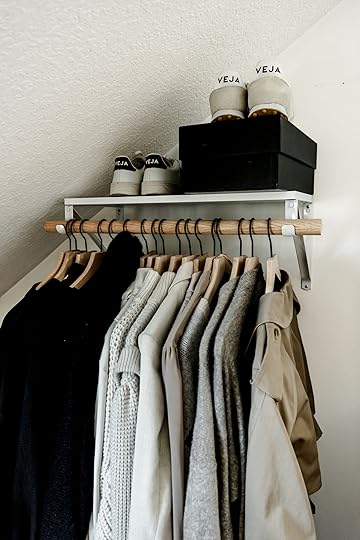
Sneakers | Trench Coat (vintage) | Shelf | Wall Brackets | Dowel | Hangers
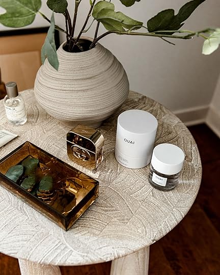
Ouai Perfume | LeLabo Perfume | Gucci Guilty Perfume | Vase
Adding this gorgeous table to act as my dressing table helped also finish this little corner.
Now that I have been kicked out of what was OUR walk-in closet, I needed a bit more storage than this nook provides. Now that we had our hidden drawer at the end of our bed, having something like a trunk at the foot for added storage wasn’t going to work. So instead, I looked for a sideboard that was low enough not to block our windows and long enough to fit proportionally in front of said windows.
Storage Cabinet | Dresser | Rug | Table Lamp
The cabinet doesn’t block the window and it is narrow enough to be pulled away from the wall far enough so that we can easily open and close the window drapery.

It also acts as another surface I can display a few of my favorite things like candles and incense because falling asleep after lighting incense while playing my favorite Lo-Fi music playlist on Google Home is a vibe.

Felt Tray Set | Wavy Wood Tray
HOT TIP: Displaying a few favorite accessories or go-to articles of clothing makes getting dressed feel more like you’re in a boutique than throwing clothes on from your closet (unless your closet looks like Carrie Bradshaw’s).
Side note: The real “particular” side of me comes out here as I sanitize my shoes and soles before I place them back into their boxes so that when I take them back out, they feel fresh to me again and they don’t have street residue from the last time they were worn. This also comes from the same person who refuses to make the bed. Virgo on that if you will.
Alright, I’ve talked about storage solutions here so let’s move on to something that there may be a hot debate going on about. Do nightstands need to have storage?

Side Table | Lamp | Stash Pot | Sonora Hat
We went from nightstands with storage to nightstands that have NO storage. That didn’t go over well with my husband but I snuck them in any way and asked that he try to embrace that change by dedicating one of his dresser drawers to his bedtime necessities instead. I mean, especially since he took over the entire walk-in closet, he really shouldn’t need so many dresser drawers anymore, am I right? Also, it’s easier to ask for forgiveness than permission. Remember that. Ha.
Clearly, Remi doesn’t mind the lack of bedside storage. And for those wondering, we did not hard wire these vintage Moroccan sconces yet (because future project Lea plans to plaster/paint these walls – in photography editing, they appear bright white but in real life they’re a warmer white than a cool one). Instead, they have puck lights (the kind from Amazon) inside that I use with a remote to turn on and off.
Awww…only a face a mother could love.


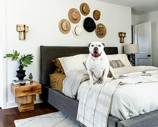
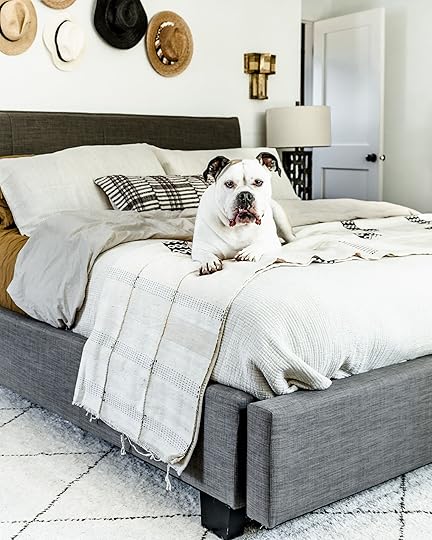
Macrame Wall Hanging | Blanket Ladder | Blanket | Dresser
Alright another shocker, and the reason I have never shared my husband’s side of the room on Instagram before is because there was a massive TV on his dresser that absolutely bothered me for the past 26 years of living together. But if I’m being kicked out of the walk-in closet then I need a little give and take here. Boom. No more TV.
Don’t worry folks, he got me back by utilizing this blanket ladder to hold all of his clothes from the end of the day – insert my not impressed face. Also, I really want to introduce you to The Nopo, if you don’t already know about it. Please do yourselves and our planet a service and check out their curated collections of handmade, fair-trade works from artisans and makers all over the world who geographically may not otherwise have the opportunity to sell their goods to the rest of the world. I mean, this wall hanging seriously took my breath away.

Dresser | Wall Hanging | Chair | Leather Vase
If you have a partner like mine, who refuses to put their clothes away and instead likes to pile them up on every surface until said pile topples over, you get them a chair. That way, when said pile of clothing topples over to the floor they can sit down comfortably and refold all of their clothes.

While all of the big furniture pieces here are new, and coming from a previously all vintage space, I mixed in vintage pieces, found pieces, or pieces that I felt were visually stimulating in a restful way to keep the makeover from feeling like a showroom floor display. Like that vintage horse head watercolor that I don’t think I will ever part with. It reminds my daughter of the training pony we “leased” for her to learn how to ride English for years while she grew up and who sadly passed away after over 30+ years of life. Horses will always hold a special place in my heart.
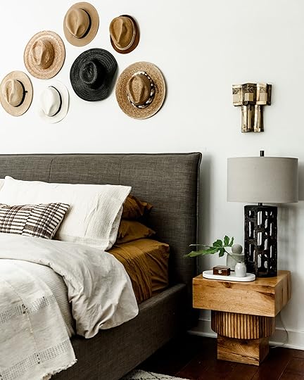
The vintage brass wall sconces may be one of the things I go back running into a burning building to save.

Why the hats on the wall over the bed? Why not? One, I love their texture, and two, I seem to have amassed quite the hat collection going back and forth to CA.

We are loving this room and the new vibe it’s giving us. I do wish we would’ve taken this shot with the storage ottoman that has now arrived, but this room will likely continue to evolve or at least grow new layers like our future plans to texture the walls. It was hard to let go of our vintage-style bedroom but none of us are static and so why should our homes be? As a stylist, I truly gravitate towards scalable design because my eye is always evolving and being drawn in all directions, while the creative side of my brain continues to need to create. We just won’t tear the house up overdoing it.
XOXO,
Lea
*Design by Lea Johnson
***Photos by Sage E Imagery
The post Lea’s Calm Midwest Cali-Inspired Bedroom Makeover (DIY Dressing Area Included) appeared first on Emily Henderson.
September 11, 2022
The Link Up: Em’s New Favorite “Everyday Dress”, A Caitlin-Approved Back Stretcher/Massager, And The First Item On Our Halloween Decor List

Happy Sunday, everybody. It feels really good to be back. There’s so much we have planned and are excited about as fall comes barreling towards us. At least us Californians are ready for it to because that heatwave was extremely ummm, extreme. A cool breeze may make us shed a big happy tear. But today is also a significant one. One that may never feel normal but that’s probably not a bad thing. There are likely very few readers who don’t have a visceral memory of September 11th. However, caring for those we know and those we don’t is one of the best ways to continue to honor the memory of the people we lost. So with that, let us shift to a pretty heartwarming story…

 design by nate berkus and jeremiah brent | styled by dorcia kelley | photos by kelly marshall | via architectural digest
 design by nate berkus and jeremiah brent | styled by dorcia kelley | photo by kelly marshall | via architectural digest
This week’s home tour is none other than the old/new 5th Avenue townhouse of Nate and Jeremiah. I know we are a little late to the drooling party but we were OOO! It’s not our fault! This is one of the sweetest home-buying stories we’ve heard in a minute. You definitely need to head over to AD to read the article and watch the video but a wonderful story very short, Nate and Jeremiah lived in this townhouse from 2013-2016, before they were married, before they had kids, right at the beginning of their lives together. If you haven’t read it or have stared at all of the photos now is the time!
 the dress
From Emily: This is new(ish) dress I wear ALL of the time. It’s definitely a splurge but the quality, cut, and comfort are all just so good. I throw it on to go to the grocery store, to pick up the kids, to go out to dinner – it’s great for so many things and makes me still feel put together with low effort. These are the kind of pieces I can keep for years and years. So if you have the budget, I can’t recommend it enough. Here are two budget-friendly options that have a similar vibe – this one and this one.
From Jess: If you need a new podcast and haven’t listened to Celebrity Book Club with Chelsea Devantez I highly recommend it! Each week she and a guest reads and analyzes a different female celebrity memoir. It’s fun, interesting, sometimes sad, but overall a great listen. SO happy to have a new fun show to binge!
Also From Jess: I know this is kinda specific but I have a wood stain color recommendation. I FINALLY finished (with a couple more tweaks needed) my media cabinet bench (sorry, no sneak peeks yet:))! Picking the stain color was a huge feat. I bought six colors to try. I’m a bit annoyed with myself about the excess and I want to figure out where to donate them to. Any ideas? Anyway if you are looking for a beautiful warm deep brown (mid-century modern vibes) check out this one from Home Depot. If you are a first time staining don’t be like me, watch this video FIRST.
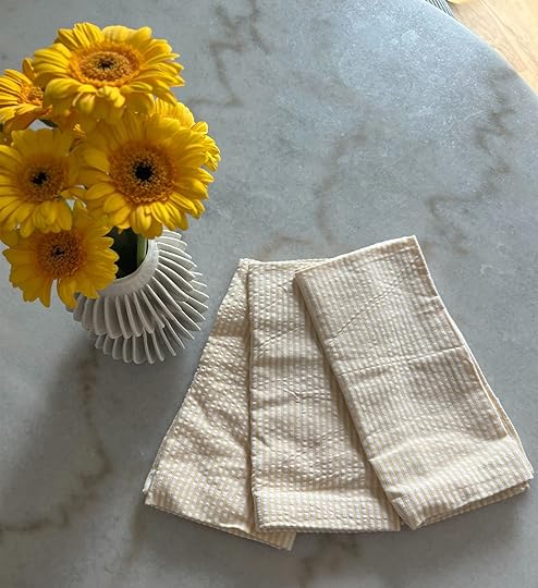
From Mallory: I thrifted some super cute yellow pinstripe fabric napkins that look just like this and I am SO inspired to have an “end of summer” dinner party…imagine these with a clam pasta and some white wine!! I love the idea so much & have never thrown a super fancy dinner party…what else would you guys pair them with???
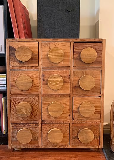

We got the sweetest email from a reader and had to share! It’s these kinds of emails that make our absolute days. All we ever want is to inspire people. From Linnea: “My husband and I inherited a small wooden chest that held CDs from my parents. It had intricate black iron pulls that weren’t really our style, but when I saw your organic brutalism post, I was inspired by the Lulu and Georgia dresser and decided to attempt my own DIY! I bought 12 4×4 wooden circles from Joann for $.99 each and some wood stain (and used a coupon of course!) for a grand total of $30. I stained the circles, removed the old knobs from the chest, and used some woodworking tape to put the new circles on and we now have a budget organic brutalism piece in our living room!” Doesn’t it look awesome!? Linnea, thank you so much for sending these photos to us<3

 left: on the stand | right: separated
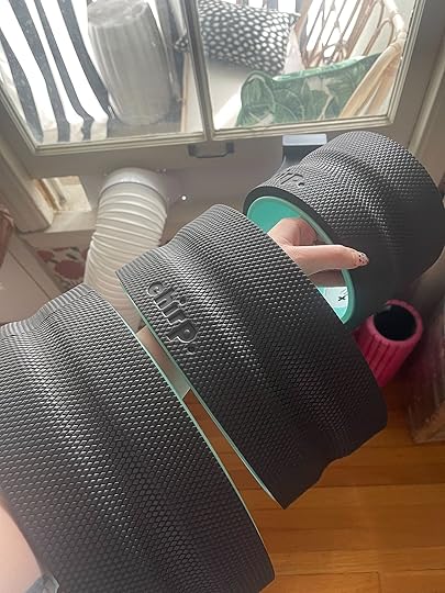
From Caitlin: OH MY GOSH. I am SO EXCITED because I’m coming in hot with a GLOWING review of something that I really think could help my fellow back pain sufferers!!! (Or, like, anyone who wants to stretch out their back – but truly, this is game-changing if you struggle with chronic pain.) I’ve been getting targeted ads for the Chirp Wheel for years, but could never justify the splurge as I already had a full suite of foam/body rolling products (you can kinda see some of them on the bottom right!). I WAS SO FOOLISH, GUYS. I spent five minutes on the 12″ wheel and the relief was IMMEDIATE – my upper spine was popping like Rice Krispies (AMAZING) and once I was satisfied and feeling a little looser, I spent some time really focusing on my lumbar spine with the smaller and more targeted wheels. There’s a channel/groove in each wheel for your spine and so I feel like I’m really targeting all the tension on both sides of my bones – it’s AWESOME. Sometimes I can feel my back tightening up when I spend too long sitting at my computer or when I’m waking up in the morning – a few minutes on the wheels makes SUCH a quick difference for me (and it feels so good that I want to do it, too). It’s kinda like a Swedish massage – there’s some pressure and tension that you need to breathe into and tolerate, but you can really feel your muscles stretching. I know how frustrating it can be to be so hyperaware of your back pain and to feel like it’s going to be locked up and tight forever, so this has been such a pleasant surprise!!! I highly recommend the four pack that I got, but I find myself turning to the 10″ and 12″ wheels most frequently. (If you also grab 4, here’s the rack!) I hope this helps – fingers crossed it can make a difference for you, too:)
From Ryann: I have been seeing this candle, or a version of the candle, all over TikTok for the past 2 weeks. I have never seriously decorated my home for Halloween but my moody living room could easily be transformed into a witchy dark academia Halloween vibe which sounds very fun. So yes, this cute candle definitely piqued my interest but now the question is do I go all out and fully decorate? I definitely would want to make it feel elevated and cool if that’s at all possible?? I’m thinking grown-up Harry Potter meets Dead Poets Society. Thoughts?? (I am clearly using you all to tell me yes so I have an excuse)
If anyone else is ready to start planning for Halloween decor check out these posts:
The 4 Budget (HIGH IMPACT) Halloween Decorations I’ve Used For The Past 4 Years (+ 6 Extra I Love)
The Only Outdoor Halloween Entertaining Idea Post You May Ever Need: Emily “BOOswer” Does It Again
How To Basically Decorate ONCE For Fall, Halloween, And Thanksgiving
Sara’s Haunted (But Happy) Halloween House with Affordable New and Vintage Finds
That’s it from us today. Have a good rest of your Sunday and see y’all tomorrow. xx
Opening Image Credits: Design by Nate Berkus and Jeremiah Brent | Styled by Dorcia Kelley | Photo by Kelly Marshall | via Architectural Digest
The post The Link Up: Em’s New Favorite “Everyday Dress”, A Caitlin-Approved Back Stretcher/Massager, And The First Item On Our Halloween Decor List appeared first on Emily Henderson.
September 10, 2022
The Sneakers We Have And Love + 6 Cool Ways To Style Them

Up until pretty recently, I never thought I would be able to “pull off” the cool sneaker look. You know, like those people who can make them look effortlessly chic with a simple dress. I wanted to try but I thought, “I’m not the right size. I’m not cool enough. I don’t have the right clothes to make it work.” All of those thoughts were wrong and harmful for A LOT of reasons. So much like my journey to wear skinny jeans back in 2006 or wear a middle part in 2009, I just needed to let go of all of that noise and try it. Guess what? It went great and I have a hard time wearing any other type of shoe these days. And I am not the only one on the EHD team:) Wearing a heel feels like the wrong call when I could wear my extremely comfortable sneakers. But I know that there may be some of you that are still on the fence about this look, maybe even have some intrusive thoughts of your own. If that’s the case, may this post be here to quiet your mind and get you excited to try something new (or a minimum get you a comfortable cute pair of new shoes if you need them). I know for me, the biggest hurdle when it comes to trying new to me fashion trends is “the how” and/or “do I have what I need in my closet?” That is why we are starting this post with six easy inspo looks so you can confidently nail the sneaker look if you want to. Then we’ll get into our shoe picks. Let’s begin!
Fun Printed Midi Dresses

 left: via who what wear | center: emili sindlev, via who what wear | right: bianca foley, image source
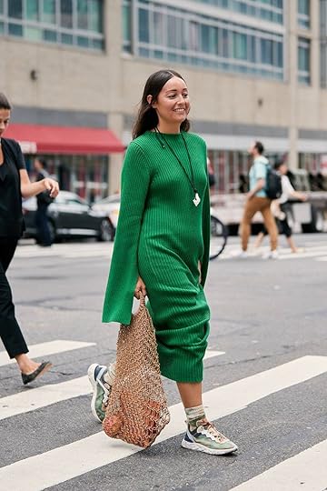
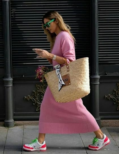
This is one of my favorites. The flowy patterned dress with a sick sneaker. The length of the dress can, of course, be shorter or longer depending on your preference but don’t these women look both super fashionable AND comfortable? I think the key if you have a bold pattern, like the one on the left and center, is to keep the shoe colors simple. Two solid colors max. That way the dress and shoes will complement each other instead of compete. Now, if you want to wear a sneaker with lots of colors and patterns go for it! This is just if you want an simple no-fail combo.
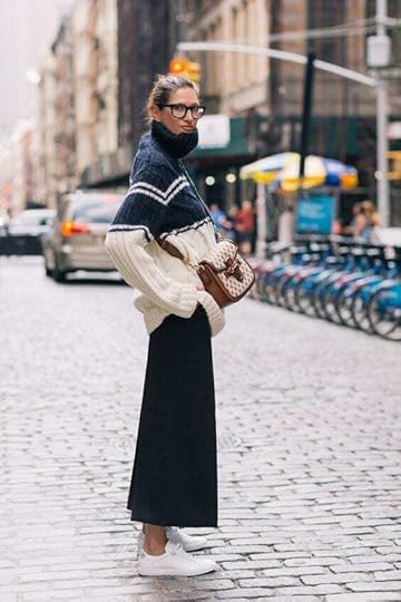
Cozy Sweater Dresses
 left: via yourstrulyyinka, | center: via who what wear | right: image source
What an easy and fun fall look! Just choose the sweater dress of your liking, then pair with some classic high-top converse (like the gal on the far left and my go-to) or choose a sneaker that has a color with works with your dress. See how the woman in the middle has different tones of green in her shoes? It works with the green of her dress without being matchy-matchy. Same goes for the pink dress. The hot pink in the shoes gives a fun edge to the outfit while still working within the color palette.
Chic Oversized Sweaters With Skirts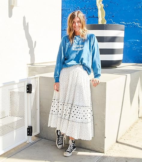 styling by suzanne trudelle | photo by veronica crawford | from: six fall sweaters i’m loving (+ how to wear them)
Look how cool our gal Suzanne looks! And this shoot was from 2019. It just goes to show that this look has longevity:) I’m sure a lot of us have a maxi skirt and an oversized sweater or sweatshirt in our closet too so let’s get into some more looks below…

 left: via karen blanchard | center: jenna lyons, via wit & delight | right: image source
Look at how versatile this combo is. I love that Karen styled that chunky orange sweater with that delicate silk shirt. Then to balance the sweater chose extra chunky sneakers. I would wear this in a heartbeat. I also like that each of these looks has sneakers that are neutral in color so that the clothes are the focus.
P.S. I just noticed that Jenna is actually wearing pants but it looked like a shirt when I picked it so I still think it’s good inspo. Ha. I mean that sweater is incredible.
Jeans!! via editorialist
Obviously, jeans had to be a category. Sneakers and jeans are basically the PB&J of outfit pairings. But now is the time to have a bit more fun in the sneakers department. Take these bright orange sneakers. This oversized white blazer and jeans would have been a cute look…but with those sneakers, it makes this outfit exponentially cooler.


 left: image source | center: tyla-lauren, via who what wear | right: claire rose cliteur, via leonce chenal
But you don’t always have to have a bold color to make the look cool. You can also play with your hemline. All of these sneakers are cool and classic but notice the difference in hems. You can have it hit right at the ankle, give them a little rolled-up cuff, or have them extra long. It all depends on preference but don’t be afraid to play around.
Business (Extra) Casual

 left: via shopoholic | center: cynthia andrew | right: vogue spain
If I worked in a slightly more traditional office, THIS would be my look. A tailored trouser, blazer (or jacket), and fun sneakers. It’s a cool professional outfit that’s also actually comfortable. I love the idea of getting to play with color and pattern too. But speaking of casual…
Trendy Loungewear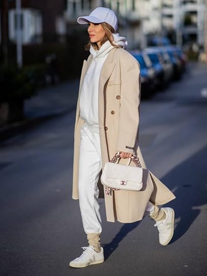
 left: via who what wear | right: via popsugar
This look makes me want to move back to the east coast ASAP! Sneakers and loungewear may be the actual PB&J of outfit pairings since there are very limited footwear options when it comes to sweatpants. Regardless this matching set/peacoat look is stylish and super cool. If loose sweatpants aren’t your thing, leggings are a great substitution. What a perfect running errands look.
So there you are with some inspo looks. Now onto our shoe picks. Some we own and love, some are in our carts but all are pretty great (if we do say so ourselves). To start us off we have Em in her new favorite pair. Enjoy!
 photo by kaitlin green
From Emily: I originally got these for a Madewell shoot and quickly loved them. They are the perfect balance of colorful/neutral and sporty/everyday casual. They just make any of my casual outfits more fun which I am very into since comfort is still my #1 priority.

From Jess: These are my go-to, goes with everything, effortless everyday sneakers that I LOVE. I first saw them on my cousin and they always looked extremely cool on her. So finally one day I asked if she’d be okay if I bought them too. She of course said, “DUH, yes!” and I haven’t looked back since. Also at $24 you can’t be it. 10/10 and they come in kid sizes too:)

From Caitlin: I love a loud/statement shoe (shocker) but these are surprisingly wearable – the olive background and snakeskin trim really make them feel a bit more neutral and the pink and blue are such unexpected and fresh pops of color. (They also come in a whole bunch of other colorways, if you want to get a bit louder!) These REALLY dress up a plain white t-shirt and jeans – huuuuge fan.

From Emily: I’ve been living in these sneakers right now. I lost one of my checkered Vans but these are solid summer sneakers, that feel graphic and cool and better for long walks than the Vans are anyway.
From Ryann: These are my favorite sneaker to wear when I am running errands, want to look cute and stylish, and also am living on a prayer that I’ll get myself to the gym at some point. They really are so versatile as they can be worn with so many outfits but are also supportive and comfortable to walk or even run in. I have them in an off-white and tan colorway with the orange swoosh. I truly wear them constantly and cannot recommend them enough!

From Caitlin: CLICK THROUGH!!! These velcro shoes are SO MUCH COOLER than the side profile alone indicates – there are 11 different colors (!!!) and the color-blocking on each pair is so cool and fresh. I get more compliments on my Charlotte Stone shoes than literally anything else I own (have been screaming about their platforms for the past 2 years!) and these are no exception. I love the profile, the exciting reimagining of velcro, and that they feel like a party on your feet. LOVE:)

Nike Air Force 1 ’07 Essential
From Mallory: The Air Force 1 has always and will always be one of the most popular sneakers on the block and I’m not gonna lie it’s taken me a long time to finally “add to cart” for this reason: I wanted a neutral (ish) pair but not the classic white one that everyone has, so when I came across this white pair with an orange paisley swoosh I was immediately sold!! I LOVE the way these look with denim & I am incredibly obsessed with them. Please note the sizing can be tricky (it’s been an ordeal over here). It’s recommended that you go a half size down, but I wanted mine snug & I wanted to be able to slip them on and off & never lace them all the way (and the leather will stretch a bit over time), so I ended up going a full size down. The full size down is a bit snug at first but they end up molding to your feet which is cool and incredibly comfortable.

From Jess: I’m a sucker for a light tonal sneaker and how pretty is that beige!? I also love the cool lug sole that makes them feel a little more on trend (but not too “on trend”). I also was an exclusive Adidas sneaker wearer in middle school and high school so those three diagonal stripes take me back in the best (and subtle) way. These just feel elevated but still fun/sporty.

From Emily: Ok so I haven’t actually got these delivered yet but I am SO EXCITED. They are extra sporty, look great for walks, and I love both the colorway and that cool thick sole. Also, the design is really fun and feels very Portland:) I seriously can’t wait to wear these.

From Ryann: These are almost the exact colorway as my Nike Daybreakers that I LOVE and wear constantly. I am considering buying these because I’ve wanted Nike Air Max’s for a while and I already know that I love how these colors look with so many outfits. They might even be more comfortable and supportive than my Daybreakers! I am also considering ordering them in black and white because I don’t have a black and white sneaker currently. Either way I am dying to try these and can see myself wearing them with jeans, trousers, and definitely loungewear.

From Caitlin: Click through again – coming in hot with another pair of multi-colored shoes! These have a pretty chic and retro profile (and they also have laces, if that’s important to you). They’re a new drop that I haven’t tested out yet, but again – can’t go wrong with Charlotte Stone shoes. Cheers to supporting a small, women-owned business with cute and fun products!!

From Ryann: You might recognize this shoe from a very little-known movie called Forest Gump :). Needlessly to say they are iconic and bring a retro 70s flair to any outfit. I love wearing them with black Dickies that fit like trousers, and a white t-shirt. They make a very simple outfit feel effortless and cool.
There you have it! Any thoughts? Are you ready to slap some sneakers on? Any other recommendations? Let’s chat,
Love you, mean it.
Opening Image Credits: Styling by Suzanne Trudelle | Photo by Veronica Crawford | From: Six fall Sweaters I’m Loving (+ How To Wear Them)
The post The Sneakers We Have And Love + 6 Cool Ways To Style Them appeared first on Emily Henderson.
September 9, 2022
What You Bought Last Month: Is Anyone Suprised By The #1 Purchase??

The bad news: it’s 108 degrees in LA, and about 105 degrees in my apartment (which, I learned yesterday, literally does not have insulation – it wasn’t a requirement when it was built and it’s never been added! Cool!). The good news: I LOVED THIS MONTH’S LIST and it was enough to make me forget that I live in a city with temperatures and a UV index that rivals the look and feel of the surface of the sun. I’m SUPER partial to the Top 2 items, in particular – for the first time ever, they’re both furniture pieces!!! – and the rest of the list is just as fun. READY?
10. Jess’ Belt Bag

I LOVE THAT YOU LOVE THIS, TOO. Jess scooped this very fun, very loud, and very neon fanny pack (or “belt bag,” if you wanna try to class it up a little bit) before a trip and had this to say upon her return: “I went to my cousin’s bachelorette in Valle de Guadalupe, Mexico last weekend and it was the best. Aside from eating endless delicious food, our big adventure was an ATV tour (highly recommend). I realized that I wanted to get a cute sling fanny pack for it and guess who delivered…Target. This $25 cutie was perfect.” (And it looks SO COOL on Jess, doesn’t it????!)
9. Lea’s Curio Cabinets
I mean…you guys saw how good these cabinets looked in Lea’s house, right? And they were 20% off during Lulu & Georgia’s annual sale at the end of August? LIKE, OF COURSE THIS MADE THE LIST.
8. Em’s Favorite Workout Shorts
Two months in a row, baby!!! Emily said it best in her pull-on shorts review back in July: “These are my go-to’s that I wear many mornings for my morning routine. The waistband sits nicely and stays put (but zero cutting in as it sits higher). There is a little flair which I find flattering, has pockets for my beach card, and after I work out, I jump in the lake and swim around and they are GREAT swim bottoms. Oh, and it has built-in red underwear (sounds weird, but excellent for being active). Again, I feel like these shorts with a swim top or tank would look cool and sporty at the beach, and just feels less exposed for daytime swimming with the kids. I wear them with my red swimsuit, mesh pullovers, and Tevas, and not to sound like quite the dorky mom, but I do feel like it looks cool while secretly I’m VERY comfortable and confident.“
7. Ryann’s Comfy Jeans
Ryann shared these jeans in last week’s link up (there’s a great photo of her wearing them, too – go check it out and then come right back, please!). She wrote, “If you ever see me wearing jeans, 90% of the time they are from Abercrombie. I have many different pairs but I am a huge fan of these in particular (in the black wash) and always get compliments when I am wearing them. I am not one to gatekeep so anytime anyone says “I like your jeans” I end up spilling where they are from immediately because I think they are too good to keep a secret. If you are looking for a new pair of jeans for fall, I can’t recommend them enough!!” (For any holdouts: it took a long time, but Abercrombie jeans are on par with Madewell jeans now. They’re great. For adults. Incredible.)
6. Mal’s Summer Sandals
If you’re also sweating through an unprecedented heat wave, you may be wearing a pair of these freshly-copped puppies AS WE SPEAK. Mal shared these on-trend sandals at the beginning of August, writing “I find myself exclusively gravitating towards these because they’re velcro but not ugly (I’m too lazy for any sort of buckle or lace these days). If you’re in the market for a nude everyday sandal snag these while they’re discounted!” WAIT, GOOD NEWS: They’re even more discounted right now – you can take 50% off the already-discounted price with code SALEONSALE
5. Em’s Sauna Blanket
If you read these “What You Bought Last Month” posts regularly, you know that I have run out of things to say about this sauna blanket. If you do not read these “What you Bought Last Month” posts regularly: OH MY GOSH THIS SAUNA BLANKET HAS BEEN ON THE LIST SINCE DECEMBER 2021. (Like…should I go start a line of sauna blankets? Is the universe trying to tell me something?)
4. Em’s Linen-Blend Shirt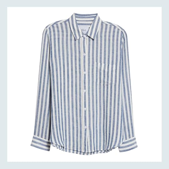
And like…same thing with this linen top, y’all!!! It debuted in June and it hasn’t left the list since (but it’s also a timeless and practical summer basic, so…I get it). If you grabbed this top, let me know if you agree with Em’s initial review: “This is my new favorite shirt that I’ve been wearing A TON. It’s a little splurgy but it drapes great, is lightweight linen, and is super breathable. Plus you know I love a good stripe. So it’s great for summer but also a great piece for all seasons because it’s really layer-able. Highly recommend!” THOUGHTS?
3. Caitlin’s Variety-Of-Shades Nude Heels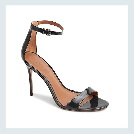
I know what you’re thinking – “Caitlin, girl, those are black shoes. Obsidian. Onyx. Midnight. Lost Soul. Rolling Blackout. Sleeping Panther. Void by Armani.” And yeah, while these are black shoes, Rebecca Allen also makes this style in a variety of nude shades – you can click through and see a few of their offerings – so that every person can have a skin-colored shoe that makes them feel sleek and polished and pulled together. (For the record: I’m a Nude IV.)
2. Em’s Family Room Sectional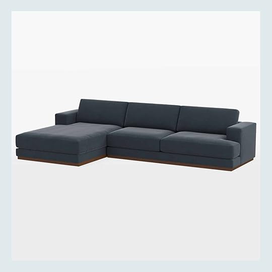
We’ve been loving this deep and cozy sectional for a while – it was one of the first furniture purchases for the farm! – and I’m so excited that you feel the same way, too. You may have seen this piece a few times over the past year (we’ve shared on IG stories and on the blog), but apparently, Em’s one-line description in her recent family room update – “We already have our cuddly sectional which we are obsessed with” – was compelling enough to convince a whole bunch of you to take the plunge on this sofa. (I have to laugh that this was the straw that broke the camel’s back – not the footage we’ve shared on Instagram, not the times I’ve linked up in sales posts…just one line (in a post about paint colors, no less!!) about a “cuddly sectional.” This job is full of surprises sometimes 🙂
1. Em’s Famous Abstract Coffee Table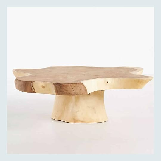
 right photo by tessa neustadt | from: how we styled our living room to sell
ABOUT FREAKIN’ TIME! This iconic coffee table is show-stopping, shapely, and the ultimate quiet statement piece. It’s also under $900 (how?!), one-of-a-kind, heirloom-quality…and, most importantly, FINALLY BACK IN STOCK. (Only took…uh…a decade? Half a decade? It’s been a long time coming, y’all.) Each table is made using a unique tree which means no two are the same and, to quote Emily, “It does the job of a square, rectangle, and an oval at the same time. It visually fills more space than its dimensions. It’s just so good.” RINGING ENDORSEMENTS ALL AROUND. (The bad news: while you can still order this coffee table, it’s backordered with an estimated delivery of March 2023. It’s a long wait, but I bet it’ll be worth it!)
THAT’S IT FOR ME. Thanks for an incredible August. Have a great weekend. xx
Opening Image Credits: Design by Lea Johnson | Photo by Sage E Imagery | From: Lea’s Open Concept Pass-Through Dining Room Design Agony – SOLVED!
The post What You Bought Last Month: Is Anyone Suprised By The #1 Purchase?? appeared first on Emily Henderson.
September 8, 2022
20 New And Fresh AFFORDABLE Pillow Combos (+ Our 5 No-Fail Combo Rules)

It’s been two years since our last pillow combo post and I have to say it was extremely fun to get those pattern-mixing muscles working again. I also have to say that this may be my favorite bunch yet. They flowed together like buttah, feel fresh yet timeless, and of course are still affordable. Most of them are under $75 in total:) I was actually planning to write a whole new post but when I look at this one it really had all the info I was planning on including. So let this be a refresher for your pillow refresh. Sometimes a quick reminder of the rules is all we really need. So please enjoy and if you need some new pillows I really hope this helps:
I think that throw pillows get kind of a bad rep sometimes. Even we, proclaimed pillow lovers, fuel the disrespectful fire. When Emily talks about searching for her greater purpose she says, “Surely I’m here to do more than just play with pillows.” And when people used to ask me when I first started at EHD and I would respond, “I basically pick out pretty pillows and put them on the internet.” But what did pillows do to deserve such treatment? What, make our rooms prettier and our heads more cushioned??? Exactly. So I am here today to show you how crucial throw pillows are to your life (but mostly remind you of the rules for making a perfect pillow pairing and to show you my 20 new favorite very affordable combos).
Ok, so to clear we are pillow lovers. They make spaces look more layered, textured, and cozy. They are basically these magical plush objects that can add the perfect amount of personality to a room. Plus, as we are about to prove in this post, they can be really affordable and by simply switching out some pillows you can make your old space feel brand new (I know it sounds not possible but we promise it is).
Since this is my 3rd time writing about pillow combos I am going to bestow my EHD learned wisdom upon you… again. Practice makes perfect, right??
OUR NO-FAIL RULES photo by sara ligorria-tramp | from: new moto reveal: emily bowser’s “refreshed for function” small living room makeover1. Keep a cohesive color palette
Look, it’s our favorite rule again (because it’s important). If you don’t have a cohesive color palette then you are setting yourself up to fail (or at least making the job much harder and full of second-guessing). We get it, we love color too, but choose only a few colors you want on your sofa or bed then buy tonally within those colors. Just make sure to leave room for neutrals and deeper/lighter hues from your palette, meaning it doesn’t all have to be the same exact shade of blue or green. If your palette is teal, yellow and rust, feel free to pick a punchy yellow then maybe a pattern with a lighter shade…same goes for all the other colors. This will help give dimension right off the bat.
2. Vary sizes and shapesMix it up with size. Buy large squares, medium and smaller rectangles/lumbars, circles, half circles… You get it. But remember, regardless of the shape, just make them different sizes (having three pillows in three different shapes and sizes is a good place to start/build upon). Again, it’s key to give you that sweet sweet visual dimension.
3. Add in different texturesIf you are mixing solids or wanting to stay pretty neutral, go for a variety of textures or some pillows with interesting details. That could be anything from the material (like velvet, linen, canvas), interesting hems, tassels, pom poms, or weaving variations. FYI, a neutral color palette can be just as exciting as a bold color combo if the textures are varied.
4. Balance out colors evenlySpread the love people. This rule applies mainly to sofas and benches. Don’t have all the blue pillows on one side and all the cream pillows on the other. Make sure the colors you have chosen are balanced on both ends. Your eyes will be much happier.
5. Vary the scale of patternsDon’t pick all large-scale patterns like bold stripes or all small scale like tiny flowers. Mix those up and maybe throw in a solid and you will look like a pillow pro.
Class dismissed. JUST KIDDING. Let’s now get into some examples for those who are visual learners (i.e. me)
 photo by sara ligorria-tramp | from: reveal: arlyn’s bright & happy rental living room makeover
Arlyn really nailed her pillow combo on her blue sofa. Let’s see why…
Color Palette: She kept the color palette simple with creams, dark muted blues, mustard, and dark copper which stood up beautifully to the rich velvet blue (but didn’t try and steal the show). Basically, your eyes aren’t on color overload. It’s warm but sophisticated.
Vary Sizes and Shapes: Notice that with each side, she varied the pillow sizes and shapes that were next to each other. It makes it look layered and interesting.
Different Textures: Since the sofa is velvet, Arlyn chose to use only one velvet pillow very intentionally with that dark copper number. Since the colors contrast, it doesn’t just blend in. Then mixing linen, cotton, tassels, and pom-poms make this sofa look SO welcoming and very well designed.
Balance Out Colors Evenly: Arlyn made sure to spread out the colors evenly. Both sides have a dose of cream, blue, and a warm tone.
Vary The Scale Of Patterns: On the left side of the sofa, you have the slightly larger scaled triangle pattern on the mustard lumbar paired with the more delicate and smaller ticking stripes on the large pillow. Then on the right, you have a large-scale floral print, a solid tone, and a smaller weaved pattern in the lumbar. No one is competing and it all looks balanced. You and your eye are very happy, right?
 photo by tessa neustadt | from: staging my dream parisian hotel suite with sothebys
A living room is not the only room where these rules apply. Yep, same goes for the bedroom so let’s jump into this Parisian Suite we designed in Pasadena and pretend we are all in Paris right now.
Color Palette: Ginny was the main designer on this project and she chose to keep things very neutral with black, white, gray, and a hint of red:) We always love a pop of color.
Vary Sizes and Shapes: As you can see, she only used lumbar pillows (even on the bench) but varied their heights and lengths. Because of this, you don’t even really notice at first glance that they are all rectangles. Very smooth, Ginny:)
Different Textures: She kept it simple with cotton, linen, and canvas. BUT those wonderful Rebecca Atwood pillows have a hand-stitched detail that really brings the whole combo to life.
Hot TipHaving a pillow with a 3-D element like embroidery, poms or tassels will really amp up the style factor in your combo.
Balance Out Colors Evenly: Since you can see the bench in nearly the same sightline as the bed, Ginny made sure to give each moment a bold dark-toned pillow. Then let the rest be lighter toned so as to not make it all look too visually heavy.
Vary The Scale Of Patterns: Both of those dark-toned pillows also have bolder patterns than their pillow partners. Those pillows have smaller, very busy patterns to bring more life to the whole design. Otherwise, the room could have looked stuffy fast.
Ooook! Now that you have the rules and examples you can throw them out the window because I did all the work for you with these 20 combos UNDER $100 (Disclaimer: A couple of these are cushion covers so you might need to buy an affordable insert). Ok, check out what I’ve cooked up for you…

1. Oversized Embroidered Block Print Square Throw Pillow | ÅSVEIG | Striped Square Throw Pillow
2. Oversized Blocked Woven Square Throw Pillow | Chunky Knit Pom Pom Square Pillow | Libb Pillow Cover Throw
3. Oversized Teddy Boucle Square Throw Pillow | Colorblock Verging Stripe Pillow Cover | Round Gusseted Velvet Pillow
4. Embroidered Floral Decorative Throw Pillow | Woven Geo Striped Square Throw Pillow | Velvet Throw Pillow
5. Linen-Blend Cushion Cover | Double Cloth Printed Decorative Throw Pillow | Tufted and Braided Lumbar Throw Pillow
6. Basket Weave Knit Throw Pillow | Linen-Blend Cushion Cover | SIMHALL
7. Windowpane Plaid Pillow | Floral Embroidered Lumbar Throw Pillow | Stone Washed Botanical Square Throw Pillow
8. Oversized Placed Striped Square Throw Pillow | Oversized Textured Woven Lumbar Throw Pillow | Andover Square Pillow Cover
9. Euro Woven Plaid Decorative Throw Pillow | Woven Striped Textured Lumbar Throw Pillow | Ivory Abstract Lines Throw Pillow
10. Velvet Cushion Cover | Embroidered Thin Line Lumbar Throw Pillow | Dorado Handwoven Thro Pillow

1. Oversized Chunky Woven Textured Square Throw Pillow | Floral Lumbar Throw Pillow | Textured Boucle Throw Pillow
2. AROMATISK | Woven Plaid Throw Pillow Cream | Edgar Throw Pillow
3. Wool-Blend Cushion Cover | Cowhide Print Lumbar Pillow | Cotton Canvas Pillow Cover
4. Floral Printed Square Throw Pillow | Windowpane Woven Throw Pillow | Chenille Diamond Patterned Square Throw Pillow
5. Linen-Blend Cushion Cover | Jute-Bend Cushion Cover | Woven Plaid Square Throw Pillow
6. Satin Cushion Cover | Oversized Embroidered Pomegranate Lumbar Throw Pillow | Velvet Throw Pillow
7. Oversized Woven Textured Check Square Throw Pillow | Olander Kilim Throw Pillow | Wabi-Sabi Floral Pillow Cover
8. Linen-Blend Cushion Cover | Oversized Space Dyed Striped Lumbar Throw Pillow | Striped Color Block Throw Pillow
9. Oversized Cotton Woven Striped Square Throw Pillow | Crescent Shaped Velvet Pillow | Floral Block Printed Square Throw Pillow
10. Linen-Blend Cushion Cover | Oversized Washed Pieced Chenille Lumbar Throw Pillow | Floral Jaipur Block Print Throw Pillow
Is anyone now pumped to start freshening up their home with a pillow or two..or three? Do you have the rules memorized yet? Kidding. Well, if you are ready for some new pillows I hope this helped. BUT if you have any more questions let’s chat in the comments:)
Love you, mean it.
Want more pillow combo magic? Check out these posts too: 18 Neutral (and Textured) Pillow Combos + 5 Rules for Guaranteed Combo-ing Success | 14 Rules for How We Style the Perfect Bedroom (+ 3 New Reveals) | 18 No Fail Pillow Combos | 22 Pillow and Throw Combinations for Any Style | Mixing Pillows and Patterns; 7 Different Ways | 18 Fun and Affordable Pillow Combos | How to Mix Decorative Pillows (+ 20 Guaranteed-To-Look-Good Combinations)
Opening Photo Credit: Photo by Tessa Neustadt | From: How We Styled Our Living Room To Sell
The post 20 New And Fresh AFFORDABLE Pillow Combos (+ Our 5 No-Fail Combo Rules) appeared first on Emily Henderson.
September 7, 2022
The Sunroom Tile (And Life) Update

We moved in last week and I have a LOT to show and tell you. I’m extremely overwhelmed right now and feeling like a really happy chicken with my head cut off. I don’t know where to begin, or what to prioritize, and am super distracted by people working all day every day so I feel like I’m so behind and not moving forward. I am looking to hire an assistant – social, personal, design (someone starting out, looking to build their career, willing to do anything, learn a ton about all the aspects of this crazy business) which I hope will help. But the morning that we moved in, with 19 workers trying to finish every room, Kaitlin (my photographer) and I tried to shoot as much of the house, fully empty, as possible but it was hard. It was 1/2 a construction zone with dust and tarps in many of the rooms and we didn’t have time to clear it because that would hold the work and we needed to move in 2 hours later. But this room was fully cleared and ready to go. And my goodness it makes me so happy (more life update at the end).
As a reminder we added on this sunroom, to be a formal dining room, writing studio, and where I’ll do the bulk of my meetings. At times I was worried that it wouldn’t be worth it, but every time I thought about the tile I knew we had to do it. And I’m SO GLAD WE DID.
It’s wild to think back to where we started…


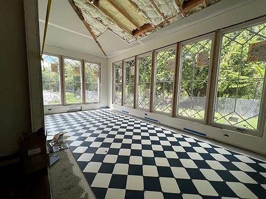 Move-In Day – It’s Done
Y’all. It’s just incredible. As a reminder, the tile was made here in Portland by Pratt + Larson in a custom blue and white, with a light gray accent color. It makes me so unbelievably happy, and I feel like the luckiest person in the world to sit in here and work.
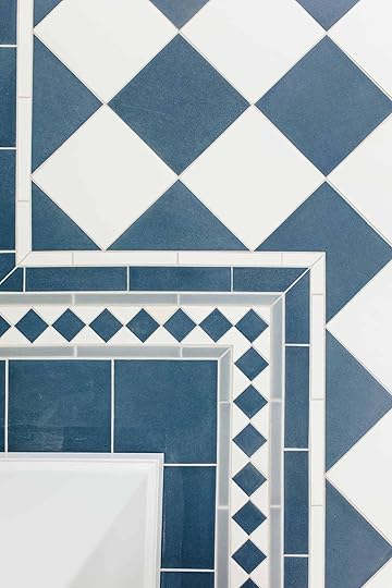
It was installed by Level Plane Tile and Stone and they did an incredible job that required a lot of math, precision, and experience. We did 3/16th” grout lines, with a light gray epoxy grout. We used 8×8 tile (that is their biggest size in porcelain tile) with 1×8 pencil tile, 2×8 brick, 2×2 squares, and triangles. It was very important to us to cut the diamond in half, which affected the math along the border (making the border not the same all the way around) but it looks awesome. By the way, we didn’t have time to mop or clean it very well, so some of the little paint lines will be gone.

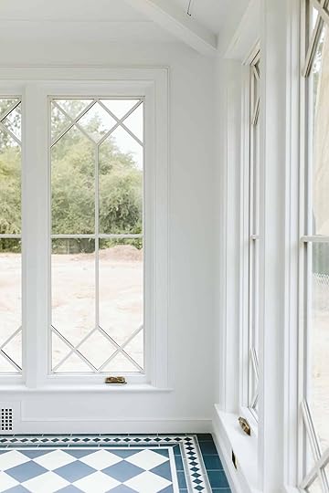
The windows are custom from Sierra Pacific (and the sashes still need to be painted – they are only primed right now, long story). They are SO PRETTY it’s unbelievable. Double-paned, simulated divided lights primed on the inside and aluminum clad on the exterior.
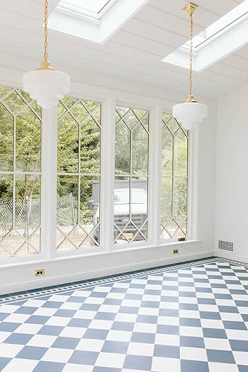
The light fixtures and outlet covers/switchplates are all unlacquered brass from Rejuvenation (Rose city fittings, with the deco glass shade) and I can’t wait for them to patina (which might take a while, but will be worth it).


We added the skylights late in the game and am SO GLAD we did. They add so much soft light to this room and to the living room (which was a huge goal of ours). This is a north-facing room so no harsh light ever comes in through them (it’s also west-facing which means sunglasses for dinner sometimes :)). We didn’t really need the light filtering shades in them but am also glad we have them.
A lot of people are asking how it feels to finally be in the house and it really is surreal. I have a lot of emotions, stemming from absolute elation (some rooms are so perfect IMHO that I wouldn’t change a thing), unbelievable gratefulness to the point that I must be dreaming, all the way down to some slight regret and disappointment (a couple of rooms just don’t sing the way I want them to yet). I also need to probably check myself into some sort of institution made specifically for design content creators – You know, help for those of us who publicly document our own homes, showcase all the ups and downs, please a lot of partners who are putting large budgets in their hands, all with high expectations while also making a home that we love and works for our own family needs…I’m not complaining at all and I LOVE my job so much and am incredibly privileged to be able to do this and have this home, but it can be very, very, very, very stressful at times and living inside a regret can be embarrassing and make you feel ashamed and dumb. Brian thinks I’m NUTS and he might be right, but here’s my analogy:
My Wedding Dress AnalogyIt’s like I’m a famous fashion designer, designing and sewing my own wedding dress for my very public wedding (think Bachelor style, on ABC, etc). It’s not just a dress, it’s not just for my family, and it’s not just for “a day”. But I haven’t done a wedding dress before (design a farm, in Oregon) and I certainly haven’t designed anything like this dress for myself. I don’t know why this home feels more stressful to me than , , or . I have my theories, but for whatever reason, I’m putting this crazy pressure on myself to not have any regrets and yet I do. Maybe it’s that I just published my book about “design rules”, a title I didn’t even want for this exact reason, and maybe I feel like a hack. It just became such a massive renovation with so many decisions at the same time. Back to the dress, this wedding dress needs to represent me and be really special, but in a lot of ways I want to just be really comfortable and casual so I can let loose on the dance floor and just have fun. I want a fun wedding that isn’t stressful, but after our wedding, this dress doesn’t go in a closet, no. It will be in a fashion museum, photographed til the end of time and people will stare at every. single. stitch. So right now I’m regretting that I did ivory instead of silver thread on the cuffs, and I wish I had lowered the neckline by 2 cm to create a different volume in the shoulders. Dumb stuff. To most people, it’s a beautiful dress. You might think that I’m being crazy for wanting to change some things, but to me – I guess I just really really need it to be as close to perfect as possible. It’s new. It was JUST DONE. So having to change something just sucks. As I started to have some of these fears and regrets a few weeks ago (as rooms started to get revealed after painting plastic came down) I had two options – 1. Stop the work, convince Brian something needed to change, troubleshoot the change QUICKLY, and live through REAL construction for weeks and weeks. Or 2. Be fine with it for now. Move in, slow down, decorate for a bit, finish the rooms that are SO CLOSE and then if I still think that something needs to change, take the time to make the right decision. I need a clear head and some perspective and I just can’t make another “permanent” decision right now. I feel like I’m off my game and I’m just full of self-doubt. So for now I’m going to try to enjoy the wedding, focus on the things that turned out even better than I imagined (the kitchen! the mudroom! the primary bath!), and enjoy living here for a bit as they wrap up the punch list. As I tell my kids every single day, “there is a solve for every problem” and per usual you guys will join me in that part of the process, too. So that’s how I’m doing. And thank you for reading. xx
*Photos by Kaitlin Green
The post The Sunroom Tile (And Life) Update appeared first on Emily Henderson.
September 6, 2022
The 4 Small Changes Ryann Wants To Make In Her Living/Dining Room (And She Wants Your Thoughts!)

Around this time last year, I was spiraling–shaking in my boots even–with the thought of revealing my very first makeover. I was and still am so proud of it, but sharing a creative project with the internet is bone-chilling. But what I didn’t know then, and what is perhaps even scarier now, is this lingering question “Does a room ever really feel finished?”
Recently, I ran into a friend who told me she saw my living and dining room all over Pinterest. She was so kind in her compliments about the design which I deeply appreciated. But being self-deprecating and unable to take a compliment, I had to tell her the photos she saw don’t exactly reflect our daily reality. The things that look good on camera are not always practical or even as good-looking in person. I guess I felt I needed to share this with her because photos on social media are deceiving and can make us feel bad about our own homes/lives. Uh oh, I think I just received my doctorate in Psychology?? My work here is done!! But in all seriousness, I look at my design every single day and I know that it’s not perfect. The baseboards have paint drips, a tangled mess of cords is clearly visible under the TV, and a gross lack of storage becomes a never-ending clutter issue. And that is honestly more than okay and it is normal (AKA inevitable) for a home to be imperfect. But does that stop me from thinking about new ideas for my “already-supposed-to-be-done” living and dining room? Not a chance (someone take away my doctorate quick!). And since I am not ready to get past the “pinning for inspiration” phase for my bedroom, I am seriously considering a few slight improvements for my beloved living and dining room.
So if you’ll be so kind and indulge me, here is what’s still on my mind about this design one year later:
SHOULD I PAINT THE CEILING?
In my reveal post, I wrote about when Sara came to shoot she asked if I ever considered painting the ceiling. I didn’t at first but once she mentioned it it was like she unlocked a part of my brain that can’t let it go. I do love the way it looks now but wouldn’t a painted ceiling look even better??

Guys. Even with my subpar photoshop skills, it looks so cozy. I think I just want to feel like I am being swallowed by this moody green color because I love it that much. It’s super exciting to think about but I remember some commenters said that the white ceiling actually pulls in the white accents like the baseboards, the bedroom door, and the white lampshade. I suppose I could paint the baseboards too so I wonder if that would help. Suggestions welcome!
Quick aside: people are always asking where the coffee table is from. I sourced it from Wayfair and it was sold out for a while but it looks like it’s finally back! It is a great coffee table and I highly recommend it if you are a magazine hoarder like me.
DO I WALLPAPER THIS NOOK?

I’ve talked about adding more pattern here by putting wallpaper in this nook since the very beginning. It still haunts me that I didn’t do it for the reveal. Is it necessary?? No. Does it excite me to even think about it? Absolutely. And I think if I am still thinking about it a year later that might be a sign to give it a try. Here are some wallpapers I am thinking about:

Option #1 | Option #2 | Option #3
I love how colorful and playful #1 is. It would add a lot of movement and would complement the Victorian style we already have going on. My only worry is it might be a little too busy, which leads me to #2. This one is calmer but still has the pattern and movement that I crave. #3 is sort of the in-between because it has the dark red which would really pop but the pattern is simple and classic. I am drawn to this one because it is the same color as our armchair but with a different pattern which I think could be really interesting.
My last caveat is that this might be more money/stress/labor than it is actually worth. Has anyone wallpapered a shelf like this before? It looks hard to do, but it would probably just require more planning and attention to detail than I am used to. Any tips?
DIY WALLPAPER IDEAS
 left: design by lindsay rhodes | photo by lelanie foster | via architectural digest | right: image source
Another avenue I am considering is making my own “wallpaper” from vintage postcards or vintage drawings. I wrote about this idea here and almost forgot about it until this house tour. That DIY wallpaper by Pierce and Ward is unreal and it reminded me that I can totally find a vintage collection of something and make my own wallpaper. For some reason, it feels less scary than using real wallpaper. I would probably use double-sided tape or putty so it would be easily removable. Has anyone tried this??
IS IT TIME FOR NEW DINING CHAIRS? (The Answer is Yes…)
The dining area is the part of my design that I am most proud of. The gallery wall was so tough but what we ended up with makes me so happy every single day. The table is so dreamy and is like it was plucked from my vintage dreams and I love it paired with my vintage bentwood dining chairs. But the chairs…ahhh the chairs. They are beautiful but not practical and about a month after getting them this happened:
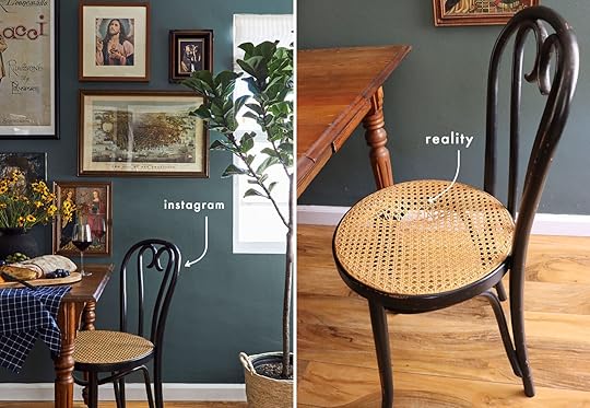
They are clearly not meant to be sat on by adult humans every day. I am sure the cane could be fixed but the wood is also very weak. They weigh less than 3 pounds each and are around 100 years old. We host our Sunday dinners here almost every weekend and it’s pretty humiliating having to pull out folding chairs because I am terrified a guest will sit on one and snap it in half. These chairs have become purely decorative which is not ideal for a dining experience. So one thing I really actually NEED to do for our safety and peace of mind is to find some new chairs. Here are some I am considering:
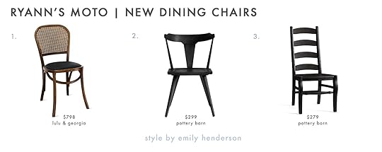
1. Brix Dining Chair (Set of 2) | 2. Westan Dining Chair | 3. Wynn Ladderback Dining Chair
I love how #1 has a similar look and feel to our current ones. #2 would bring in a more modern flair which I am not opposed to and I really like how wide the seat is (AKA I imagine it would feel like a chair fit for an adult). #3 is sort of a wild card but I find the really tall back intriguing and the shape is cool but maybe it’s too farmhouse-y? I don’t know why I feel like farmhouse isn’t far off from our current design even though farmhouse has never been a term I’ve used to describe this space…
My heart wants to consider vintage chairs but buying vintage chairs over the internet was what got us in this position in the first place. So unless I find some in person and can test their durability, I am going to do the responsible thing and buy new (in hopes they’ll last for a 100+ years).
SHOULD I REPLACE THE TAPESTRY OVER THE SOFA?
I love love love how the colors of this tapestry (read: rug I nailed to the wall) complement the color palette perfectly. We needed something that would tie in in the sofa, rug, and our red and tan plaid armchair which was a CHALLENGE but somehow I scored this from Chairish for like, $100. The problem is my husband thinks this tapestry reads too bohemian and thinks it confuses the overall style of the living room. I agree but it doesn’t bother me as much as it does him. I finally relented and said “fine, let’s replace it” but art that size costs double our rent. So I started researching DIY art ideas despite knowing DIY has never been my strong suit. For a hot second, I considered doing what Malcolm did in his dining room (wallpapering a large piece of plywood and hanging it like art) but truthfully I think that would fall flat in this space. SO NOW WHAT? Well, I reverted back to my go-to which is printing digital art and that’s when I saw this article. I’ll read anything that starts with the title “Free Art”. It is of course not free art but it does detail how you can download hi-res images from the New York Public Library digital collection. There are over 900,000 images from photography collections to cyanotype impressions. This intrigued me greatly and even though getting one of these printed in the size I would require would cost at least $150 and framing it would be another $150, that’s still cheaper than most art. So I of course took the bait and am eyeing quite a few including these:
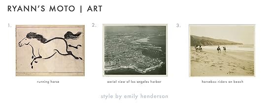
1. Running Horse | 2. Aerial View of Los Angeles Harbor | 3. Horseback Riders On Beach
For the sake of your time and mine, I am only including these 3 picks but there are about 100 I have already saved and could potentially choose from. And I believe art is highly personal so it’s a long process to select the right piece that speaks to me and my husband (and fits our style). To be continued!
So that is where I am at with this space that I still love to pieces and never ever want to leave. Does one ever get over their first makeover published on stylebyemilyhendersondesign.com? I am guessing not 🙂 I hope this little jaunt down memory lane wasn’t entirely self-serving and as always I would love to hear your thoughts down below. xx
**After Photos by Sara Ligorria-Tramp
The post The 4 Small Changes Ryann Wants To Make In Her Living/Dining Room (And She Wants Your Thoughts!) appeared first on Emily Henderson.
September 4, 2022
The Link Up: Em’s Go-To “Active Jacket” Shop, Mallory’s Most Comfortable Shorts, And The Perfect (And Affordable) Gift For the DIYer In Your Life
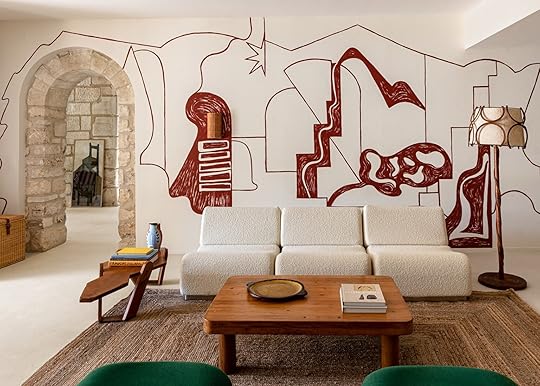
Happy Sunday and long weekend! Any fun plans? We hope so! We also want to wish Emily another happy birthday (it was on the 1st)! We appreciate her endlessly and hope it was wonderful as she is. Full disclosure we wrote this post before our break which is why we don’t have the celebration details yet:) Don’t worry though, we are back in action this coming Tuesday. So for now, enjoy these links and if you are looking for a sale be sure to check out our Labor Day Sale post.
 design by josephine fossey | photo by mr. tripper | via sightunseen
This week’s house tour is actually a home you can stay at if you have the do-re-mi to spend. The phrase “I want to go to there” from an episode of 30 Rock immediately comes to mind. This high-end vacation rental has “a dedicated concierge, swimming pool, open-air cinema, outdoor theater, a gym, a boules court, a children’s playhouse, and the ability to hire a chef on-demand.” Oh, and it sleeps up to 16. So not only is it visually stunning being built into the side of limestone cliffs, your every desire can be met with a snap of a finger. I think most of us will have to resort to looking at it from afar but wow is it dreamy. We highly recommend seeing the rest of the beautiful photos here🙂
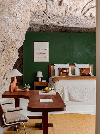
 design by josephine fossey | photos by mr. tripper and josephine fossey | via sightunseen
From Emily: I’ve always loved Lululemon jackets. Not a big purple person typically but I have an old purple one I’ve been wearing a bunch (you may have seen it in stories). It’s not available anymore but this one is similar. I’ve never not been happy with a jacket from them.
From Caitlin: A few months back, I got an IG ad for a woman who makes these unbelievable hand-blown glasses on Etsy and I haven’t stopped thinking about them since. Like…look at these little fruits! ARE YOU KIDDING ME? Or this holiday version, with little reindeers and penguins and snowmen! Or these little animal figurines!!! They’re so freakin’ cute, right?
From Jess: Today I give you a guaranteed put you in a good mood Spotify playlist…Grandma’s Home (the coolest Grandma if you ask me). It’s got everything from L-O-V-E by Nat King Cole to Dreams by Fleetwood Mac to Put Your Records On by Corrine Bailey Rae. There are just an infinite amount of incredible songs. Currently, You Send Me by Aretha Franklin is playing as I type! Thank you to my friend Emily for this perfect rec:)


Also From Jess: I saw this video on TikTok from @graceful_design_diy about a flexible drill bit extender and now know what I am buying for myself, my dad, and my brother for Christmas. So smart, seemingly easy to use, and very affordable. How did I not know this existed?!
From Mallory: These are the comfiest shorts I’ve ever worn. SOOO soft, I love wearing them to bed or lounging around but I love that they’re also designed for working out if you wanna wear them for that. I have the black heather color and am really into them, but that light blue is also so so pretty!
Also From Mallory: Anyone have recs for electronic wipes?? I’m ready for some squeaky clean screens – tv, computer, etc…are these any good?? What do you guys use?? Would love to hear your electronic cleaning hacks in the comments please and thank you!!! 🙂
From Ryann: Two weeks ago, Caitlin shared her favorite wedding heels and this week I am sharing mine! I alwaysss struggle with wearing heels at weddings because your gal loves to get down on the dance floor. If you ever see me at a wedding, by the end of the night you’ll find me on the dance floor, with shoes fully off. Trust me, I don’t want to be this way. Cut to earlier this month, I had another wedding to attend (wedding season baby) and needed a new pair of heels to match my dress. I ended up getting these which are truly perfect. They aren’t crazy expensive but the heel is sturdy as hell (so important) and they are simple yet sexy and go with everything. And guess what? I wore them to the wedding and didn’t take them off once. I’ll accept my award now thank you very much!!
Thank you for a great week and see y’all Tuesday!
Opening Image Credit: Design by Josephine Fossey | Photo by Mr. Tripper | via Sightunseen
The post The Link Up: Em’s Go-To “Active Jacket” Shop, Mallory’s Most Comfortable Shorts, And The Perfect (And Affordable) Gift For the DIYer In Your Life appeared first on Emily Henderson.
Emily Henderson's Blog

- Emily Henderson's profile
- 10 followers

