
Emily Henderson's Blog, page 114
October 3, 2022
An Old/New Trend That Has Us Thinking We Might Be Ok With “Faux-Aging”…

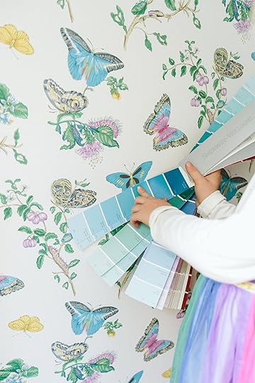
When I brought up the idea of this trend to the team there were mixed responses. Some were like “I LOVE this” while others didn’t deny its budding resurgence but weren’t necessarily sure about it. I had been seeing it pop up, feeling like we had a trend on our hands when last week on Elle Decor had it in a trend roundup article. Even as I was prepping this post AD did a piece on how mirrored walls are back! Needless to say, it was time to do a bit of a deep dive.
To start off, real antique mirrors age because for a long time “a thin layer of mercury was spread over a piece of tin then glass was placed on top which caused a reaction between mercury and tin causing the mirror-like substance to adhere to the glass” (Thanks, SF Gate for the info). So that’s why over time the mercury will tarnish or oxidize creating that aged look. A good one can look sooo special. I have an old family mirror that has some age on it and I LOVE it so much. It’s history staring at you while you stare at your face:)
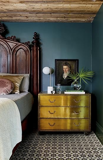
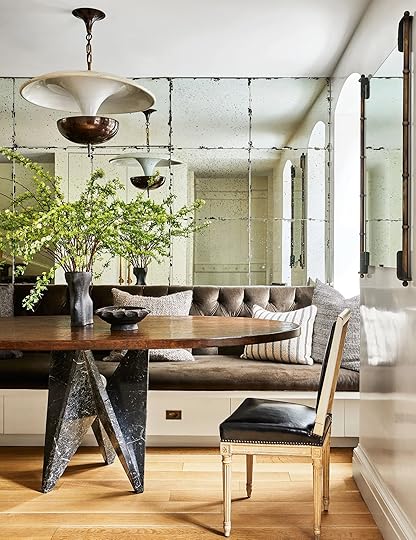 design by nate berkus and jeremiah brent | styled by colin king | photo by nicole franzen | via architectural digest
Now, I don’t know of any current designers that love an antique mirror or an antique mirror wall than Nate Berkus and Jeremiah Brent. I’ve been bingeing their shows (highly recommend if you were also wildly behind like me. Discoery+, baby!) and there is almost always some kind of aged mirror in every reveal. However, this love is proven most in their own homes. Take the first photo and this one above. These mirror tiles are A. real antiques and B. add both a ton of character and light to the space. A quiet, rich statement if you will.
 design by chris and julia marcum
Here is an example of using a faux-aged mirror in tile form. Julia and Chris did a great job making this tile look chic and natural in their colonial-style home. I think the key to successfully adding faux-aged decor into a home is to do it sparingly (and make sure it’s the good version:)). So with this backsplash, it totally works because there’s very little that’s also faux-aged in the room and naturally, they picked a good version of this kind of tile. If you like this look but want a larger statement, Pottery Barn is usually a good place to go. Take this wall mirror for example. You also can do a faux-aged DIY if you are feeling ambitious. Here is a video I found after a quick search.
 design by frances merrill | photo by laure joliet | via elle decor
I truly just can’t get over this room by Frances Merrill. Every time I look at it I see something new. So it wasn’t until the second or third time I stared at this photo that I noticed the bar nook had what looks like aged glass (faux I’m sure)! It’s a pretty fun and sophisticated accent. It’s warm but also makes the space feel a bit grander.

 design by alice lane interiors
These photos are from a reel I saw the other week which only continued my opinion that this trend is absolutely happening.
 design by gracinha viterbo | photo by francisco nogueira | via house & garden
Look to your left! A mirrored wall! What I love about this wall is that the light “age” complements the vintage feel of all of the other pieces in the room. It also, of course, bounces the light around the room but isn’t overwhelming because of that incredible piece of art that’s been put right in front of it. It just adds more texture to the space!
 design by jeremiah brent | photo by brittany ambridge
After looking at these photos, I think my personal favorite way to incorporate a faux-aged mirror is as a background piece like in the bar in Francis’ home and here in the back of these shelves designed by Jeremiah Brent. That way you get the visual texture and don’t immediately think, “Woah that’s a big faux-aged mirror.” It’s more of a fun surprise.
 design by kate marker interiors | photo by stoffer photography interiors
To further prove my point, I think having this entry table and its decor partially blocking this faux-aged mirror breaks up the intensity of its size and detail. It feels more welcoming. Also, look at how modern a faux-aged mirror can look?? It’s for all styles:)
Now, I think we’ve talked enough faux and should get into the real deal antiques…
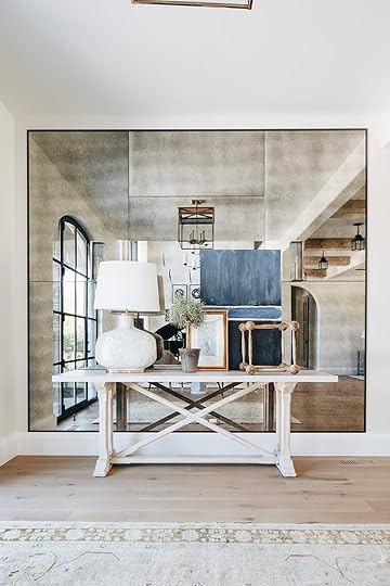
 design by jake arnold
I mean…STOP! It’s mirrors like these that make me never want to look at a new mirror again. This baby has almost too much soul. Save some for the other mirrors, K? It should also be stated that the one and only Jake Arnold designed this room which puts another official stamp of approval and makes this “trend” cool. And look, antique mirrors literally aren’t new to the design world and Jake isn’t the first (duh) to use them. BUT it is a good reminder of how goooood they are and how you won’t regret adding one to your home. It’s science.

 left: design by joanna plant, photo by owen gale, via house & garden | photo by nathalie mohadjer, via house & garden
Remember that there are leveling degrees of “age”. If you like the idea but don’t want your mirror to look like it came straight out of the Haunted Mansion, then go for one with light aging. Make it work for you and your style. You want balance within your vintage too. If everything looks 300 years old and is falling apart, it might feel heavy and lack any sort of freshness. But…
 design by marie flanigan | styled by jessica brinkert holtam | photo by julie soefer | via architectural digest
…on the flip side, this pretty room needed some pieces with age because everything is so new. A new modern mirror would have still looked nice but these add depth and dimension.
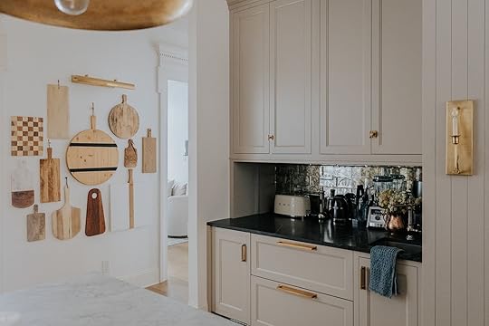
 design by athena calderone | photo by sarah elliott | via eyeswoon
They also can just be a little accent like in Athena Calderone’s kitchen. There are a ton of beautiful little aged mirrors on the internet, at vintage shops, and in flea markets. It’s an easy and affordable way to hop on board!

 left: photo by veronica crawford, from: our bedroom update (also how I feel about having a tv in the bedroom) | right: photo by ryan liebe, from: my powder room reveal
Emily is of course a fan of the real deal and has used lightly aged mirrors a ton. Above are two examples of them in her . I remember when she bought the oval one on the left and how enthralled she was with it. I’m pretty sure she wasn’t even 100% where it was going but she knew it was so special (and simple) that there were a ton of spots. She wasn’t worried:)
And that’s the beautiful thing about most old things, they never truly go out of “fashion”. So again a word of advice. Be very picky if you are going faux to make sure you love the added patina. Faux of anything can be a great affordable alternative because not all of us have that Berkus and Brent budget… maybe someday though, right? RIGHT??
Thoughts? Experiences? Any fun finds? Let’s talk!
Love you, mean it.
Opening Image Credits: Design by Nate Berkus and Jeremiah Brent | Styled by Dorcia Kelley | Photo by Kelly Marshall | via Architectural Digest
The post An Old/New Trend That Has Us Thinking We Might Be Ok With “Faux-Aging”… appeared first on Emily Henderson.


October 2, 2022
The Link Up: Em’s $15 Fall Candle Everyone On Set Loved, Ryann’s Sensitive Teeth Whitening Strips, And The Blowdrying Mist That Hairdressers LOVE

Happy Sunday. It was a shoot week up in Oregon at Anne and Richard’s (ARCIFORM) beach house and we can’t wait to see those beautiful photos. Oh, and we hope you liked that little farmhouse sneak peek this week. We are getting closer and closer to the first reveal:) So to help calm the anticipation, here are this week’s links…

 design by trung tu | photos by eve wilson for the design files | styled by annie portelli | via the design files
This week’s home tour is a vintage-filled family home that is modern but packed with soul. The designer, Trung Tu, is actually a design-loving IT engineer. This home looks like a beautiful vintage showroom that you can actually be comfortable and relax in. Don’t you want to curl up on that sofa?? We sure do. Go check out the rest of the photos and his story on The Design Files.
We know that last week’s Link Up was filled with links asking those who can to help all sorts of different people in need. Now, in addition, our hearts are breaking to have to talk about yet another natural disaster, this time in Florida. If you’ve been paying attention to the news at all we don’t have to tell you how deadly Hurricane Ian is. So again, for those that can, here is an article with multiple ways to help.

From Emily: I got to shoot Anne and Richard’s house this past week and man it was incredible. And like for any shoot, there was lots of shopping to get styling pieces and candles are always a must. We picked up this Apple Chai scented one from Target that we all loved. It got us in the fall spirit and it was so pretty. The leather wrapping is such a nice detail and makes it look way more expensive than it is. Plus it’s big (14oz)! You can’t beat it for $15.

From Caitlin: Two weeks ago, I proclaimed that clutter could not be solved with bins and baskets alone (and for the record, I stand by that statement!!!). That said, if you are in the market for some organizational tools, please do not spend $20-40 on ONE branded container from an org store – there are some really overpriced products out there and I can enthusiastically recommend a few WAY more affordable alternatives. Here’s the exact stack I use in my house (after lots of trial and error!): these $8 wire baskets (I do towels and sheets in these); these big $9 bins with handles (perfect for craft supplies, small toolboxes, candles, etc.) these $6 bins (great for everything – they’re a perfect size for vanities and shelves); these $10 stackable trays (I use these for iPhone cables, charging bricks, and old phones/tech); these $2 storage trays (it’s a pack of 4 – I use mine for rollerballs of perfume, tweezers, etc.); and these long $2 trays (great for razors, hairbrushes, etc.). I know that sorting through all the options on the market can be kind of a pain (and I literally cannot understand how comparable products can go for like, 5x the price), so hopefully this can help someone out a little bit:)
From Mallory: You know the age-old question “what should we make for dinner tonight??” I got SO fed up with trying to answer it (specifically when it came down to quick easy weeknight meals), so I found an awesome solution. My boyfriend and I love to cook, but I was always forgetting the good recipes we’d already made and wanted to make again. ENTER RecipeBox!! It’s an app where I can add photos of our dinners and put in the ingredients + grocery shopping list (if you want to, sometimes I get lazy and just do photos). But it makes meal planning so much easier because I can just go through the Rolodex of meals we’ve already made in the past. I showed it to Emily while we were at the shoot this week and she said “it’s like a meal scrapbook!” I love my meal scrapbook and it’s free so I highly recommend getting it & trying it out too.
 not sure I’m selling it with my no make up + breakout look but emily (who is the baseball hat expert) supports my hat choice
Also From Mallory: I’m a big fan of this $15 corduroy baseball cap!! I bought it in blush but they have some other fun colors too:)

 it comes in these two colors (also that’s the model from the site:)) and look how cute it is open!
From Jess: Ok last wedding-related link since I have no more weddings to attend this year! Now because my cousin is the coolest and most thoughtful, everything we got as gifts I actually want to use and wear. Number one on the list is this EcoStain loungewear set from OddBird. When I say these were incredibly comfortable and cool I am not exaggerating. I put it back on as soon as I got home. I also got to meet the gal who owns the company and she couldn’t have been sweeter. She’s completely dedicated to being a sustainable brand that uses 100% natural, mostly raw, unprocessed fibers, or recycled fibers. What’s also really special is that she offers LIFETIME repairs to help keep the garments looking beautiful and out of landfills. I was really inspired by her. I got this top and these shorts (it was literally 106 degrees the day of the wedding) but I got to try on the pants too. It was a tough decision but I have more lounge pants than shorts. TBH I was nervous that the shorts weren’t going to look good on my body type but I was wrong! I loved them. So if you are thinking the same thing, I think you should give them a try:) I got a large but they size up to 5XL! I really can’t say enough wonderful things about them.

Also From Jess: SIKE! I have a hair product rec from the gals who did our hair and makeup. It’s this blow dry mist. When I asked what it did after seeing it on the table next to me all three of the hairdressers raved about it! Apparently, it’s great for all hair types, is a heat protectant, cuts your drying time dramatically, AND is only $15. Ummm you don’t have to tell me twice. Add to cart.
Also Also From Jess: We aren’t shy about our love of Madewell over here but mine just got bigger. I just saw on Instagram that a vintage shop I used to love going to in New York, People of 2morrow Vintage, is now selling on Madewell.com. First off, I didn’t realize they were selling vintage, and second I’m so happy for the owner. Go check it all out!
From Ryann: I’ve been using these teeth whitening strips for a week straight and I have to say I am pleasantly surprised with the results! They are non-toxic and enamel safe so they are really gentle and don’t hurt your teeth. If you have sensitive teeth or don’t have a high pain/discomfort tolerance (me) then I think these are for you. I definitely see results but since these aren’t as harsh as other whitening strips, I think the process for really noticeable whitening just takes a little longer. I will keep using them and report back!
Thank you for reading and see y’all tomorrow. xx
Opening Image Credits: Design by Trung Tu | Photo by Eve Wilson for The Design Files | Styled by Annie Portelli | via The Design Files
The post The Link Up: Em’s $15 Fall Candle Everyone On Set Loved, Ryann’s Sensitive Teeth Whitening Strips, And The Blowdrying Mist That Hairdressers LOVE appeared first on Emily Henderson.
October 1, 2022
Where To Buy Size-Inclusive Vintage Clothing On Etsy

In my early twenties, I went through a very serious vintage clothing phase, so much so that I didn’t consider an outfit good or cool unless one piece of it was vintage. I felt like if what I wore was new or mass produced then it meant I wasn’t creative and therefore didn’t have good style. This sentiment is of course dumb and not true, and I have since ceased caring about wearing vintage clothes just to feel “cool”. That said, vintage IS still a big part of my life because it feels good buying second hand and I do like my clothes to have a little history. The twist is since I am no longer a size 2, buying vintage clothes can be quite difficult. Gone are the days when I could walk into any vintage store and find quaint little dresses and tiny T-shirts in my size. In fact, this feels true for even regular retail stores. I recently walked into an Aritzia (big mistake unless you want to hurt your own feelings) and found that they pretty much only carry up to a size 8 in-store. I digress but the point remains, buying vintage clothes when you are mid or plus-size is challenging. It can make you want to give up trying completely which is why we at EHD wanted to do some research and find the best plus-size vintage shops from our favorite online vintage retailer. So if you’ve been looking for some vintage shops with inclusive sizing, this post is for you. Let’s get into it.
The Curvy ElleYou’ll find: Feminine dresses and skirts, collared blouses, 80s vintage clothing.
Size Range: 12-22

1. Vintage Red & White Polka Dot Midi Skirt (Size L 12/14): Is there anything sweeter than a red midi skirt with little white polka dots? I love how the model styled it with a blouse with that cute scallop collar detail.
2. Vintage Navy Floral White Collar Surplice Dress (Size 12): This chiffon pattern sailor dress is adorable.
3 . Vintage Fuchsia Chiffon Mini Trapeze Dress (Size 22W): This fuchsia dress has cute little prince shoulder sleeves that I am obsessed with.
You’ll find: Casual dresses, pants, and tops, 90s vintage clothing
Size Range: XS-4X

1. Vintage 90’s Black Sheer Long Sleeve Dress Size 16: This sheer black dress is very simple but elegant. I love the pleated detail!
2. Vintage 90’s Beige Off White Pants Trousers Size XL: These drawstring pants could be worn for a casual walk on the beach or to dinner for date night. Versatility, baby!
3. Vintage 90’s Red Blazer Size 14: A red blazer is a great staple to have in your wardrobe IMO. This would be really cute with a white tank underneath and a good pair of jeans.
You’ll find: Vintage Levi’s
Size Range: Waist size 21″-35.5″

1. Vintage Levi’s 517 Jeans, 35”: Just as an FYI, Etsy is my favorite place to shop for vintage Levi’s. These are a great find and I love the dark wash that fades lighter up top.
2. Vintage Levi’s 550 Jeans, 35.5”: If you like more baggy/balloon-shaped pants, these are it.
3. Vintage Levi’s 501 Jeans, 35.5”: Levi’s 501 jeans are gods gift to earth. I love the color of these and am tempted to snag them for myself if I am being honest. 🙂
You’ll find: Dresses, vintage lingerie, 70s and 80s vintage clothing
Size Range: M-3X

1. Vintage Terrycloth White Shortsleeve Mini Dress Size 2X: This terry cloth dress would be a really cute swimsuit coverup and I love the little string tie detail on the top.
2. 1980s Woman Within Black Nightgown (size not listed): This dress is so up my alley. If I could drape myself in oversized smock dresses every day trust me I would.
3. 1970s White Polyester Jumpsuit (size not listed): Obviously a white 70s jumpsuit is a must-have, right? This would be great for a Halloween costume too!
You’ll find: Casual pants and tops, Y2 K-inspired fashion, 80s and 90s vintage clothing
Size Range: XS-4X

1. Denim Overalls Size 22: Overalls are the perfect garment and these are so nice and affordable.
2. Vintage 90s Patchwork Slip Dress SIze 3X: Coming from a girl who primarily wears black and white, I think this dress is so cute and is giving Farm Rio vibes. So that’s saying a lot!
3. Bill Blass Denim Maxi Skirt Size 10: I’ve given myself over to long denim shorts ever since I saw this image.
You’ll find: Slip dresses, pattern dresses, two-piece sets, 80s and 90s vintage clothing
Size Range: 12-28

1. Vintage Print Dress Size 12/14: The red floral pattern on this dress is so cute and I love the thicker straps so you can wear a bra underneath if need be.
2. Vintage Slip Dress Size 22/24: Who doesn’t love a slip dress? This pink one is really adorable and would be so cute paired with matching pink kitten heels.
3. Vintage Polka Dot Dress Size 20/22: This polka dot dress would be really cute styled with chunky loafers or even a cowboy boot!
You’ll find: Denim shorts and pants, outerwear, T-shirts, 60s, 70s, 80s, and 90s vintage clothing
Size Range: Jeans and shorts waist size 21″-38″, S-XL

1. 60’s LEE Vintage Low Back Dungarees Bib Overalls Size 28″-31″: These overalls are definitely splurge-y but like I said, overalls are the perfect garment so if they are in your budget I say go for it :).
2. Levi’s 505 Vintage Shorts / Size 31: Okay I will admit it, I want these shorts! I love the faded wash and am really into longer hemmed shorts nowadays.
3. Vintage Oversized Teal Denim Cargo Hooded Jean Jacket: This oversized cargo jacket is sooo cute. I love the color and if I lived in a rainy climate I would easily add to cart.
You’ll find: Feminine dresses and jumpers, 60s, 70s, and 80s vintage clothing
Size Range: S-3X

1. 1960s 1970s Blue and White Romper Size XXXL: Rompers are great because they are a one-and-done outfit. I love the button detail on this one.
2. Floral Print Short Sleeve Summer Romper Size 16: Here is another floral romper that is very 90s in the best way.
3. Baby Blue Dress Size XL: This sweet little blue dress has a really cool geometric pattern and square neck detail.
You’ll find: Button ups, blazers, business casual attire, 90s vintage clothing
Size Range: 14-36

1. Vintage 90s Y2K Navy Blue Ribbed Mockneck (Size 30): It’s officially fall, so black turtle necks are in order.
2. Vintage 90s Navy and Gold Scroll Swirl Rayon Midi Skirt Size 3X: This dress has a really cool gold and navy swirl pattern. It would be really cute paired with the above turtleneck!
3. Vintage 90s Navy Blue 100% Wool Blazer Jacket Size 18: I actually think the turtle neck, skirt, and this blazer would make a perfect fall outfit!
You’ll find: Colorful retro blouses, pattern dresses, 70s, 80s, and 90s vintage clothing
Size Range: S-3X

1. Plus Size Vintage Black Tee (size not listed): This cropped boxy T-shirt has a silky material so it could easily be dressed up or down.
2. Vintage Mustard Brown Top Size 3X: I love this mustard button-up with the 3/4 sleeve. I would totally wear this with light-wash denim jeans and cowboy boots.
3. Vintage Button Down Shirt Size L: This geometric pattern button-up would be a fun staple for fall. I can see it paired with black trousers and an oversized coat.
Alright, my friends, that’s all for now. I hope this post helped whoever needs it and let us know what other Etsy roundups you’d like to see from us. Happy Saturday!
The post Where To Buy Size-Inclusive Vintage Clothing On Etsy appeared first on Emily Henderson.
September 30, 2022
Birdie’s Wallpaper Room + What’s Next

Birdie’s wallpaper is up and we are both just so excited about every single inch, wing, and leaf of it. In case you haven’t caught up on what it’s like to give a lot of design control to a very color-driven and highly opinionated almost 7-year-old, read this post (and this post about my current philosophy on designing my kids’ rooms). I’m trying to involve her so much, celebrate her style and enthusiasm for color while not having it look like a unicorn-pokemon-lava-lamp-showroom (I’m not being mean, their interest in that stuff won’t last). So after much deliberation (and of course me curating), we both agreed on this incredible wallpaper by Schumacher (Butterfly Baudin) and I was ELATED that we had a jumping-off point that could keep us focused on a color palette and style while giving her SO much color and the life that she really wanted. She’s even saying things like, “Well, maybe this should be our bold moment and keep that quieter” which as you can imagine is filling me with so much joy (and yes, of course, I realize that is my ego talking – but you can’t help but feel good when your kids want to be like you and talk like you). So today we’ll show you a few other things in the works for this room, which might include a turquoise dresser 🙂
 Before – TWO YEARS AGO!!!
Of course, this took a long time to get where we are today. We thought that the second floor could be just updated with new carpet and paint until we realized that all the electrical had to be updated. Then once the walls were opened to rewire the house, we dialed it in with the right insulation, reinforced it in every way, and installed fresh drywall, electrical, and plumbing.

We painted all the doors Upward SW 6239, chose the blue striped carpet and the white paint all before we had chosen the wallpaper (this is how it goes with renovation, they don’t wait for you to decide on future decor to choose other more permanent finishes that involve subcontractors RIGHT NOW, especially with lead times involved like the shades and the carpet). But I’m actually ok with it all for now – it’s working together fine. At times I wish the white paint of the window casing was a bit creamier, and sure, the blue door could be brighter to match the wallpaper but it’s not bothering me enough to do anything about it right now.

Wallpaper | Carpet | Window Treatments | Door Color | Trim Color | Outlet Covers

It’s just so sweet and magical:) It’s an immediate vibe, that is going to be so easy and fun to build on. Moving forward I just give her the paint deck and let her choose the color as long as it “matches” one of the colors on the walls. It’s almost like the wallpaper is solving a lot of our problems. Did I want a more subtle wallpaper? Maybe. Would I choose to paint a bunch of furniture hot pink, teal, and purple? Not for me. But this is EXACTLY how I was when I was little, really only changing in the last ten years.

I love the organic nature of the wallpaper with the striped carpet and the diamond window pattern – they all just contrast and work so well together.
What’s Next?
I found this bed on craigslist and snagged it so that we could paint it a wild color (I don’t want to invest in a new piece that is a wild color, so painting a thrifted find is a great compromise for my colorful little lady). It’s a full bed, Jenny Lind-style, and she loved it A LOT. I checked that box quickly (although, I now wish it were a queen so it could be a back up guest room for a couple if we needed, but oh well).
The Dresser…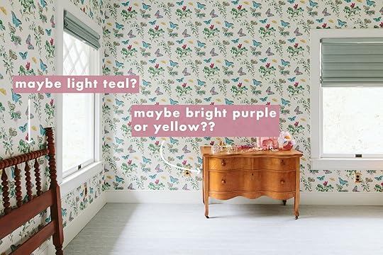
Then I found this dresser (and its “tall boy” brother), $200 for both also on FB Marketplace. She is so cute and ready for a makeover. I’m giving Birdie again almost free reign on the color so we snagged our Sherwin Williams paint deck and she quickly chose hot pink, but has since changed her mind to purple.

She’s VERY into the purple world of violets, lavenders and not the grayer versions or aubergine. We are talking BRIGHT lavender. Jury is still out 🙂
 the cool kids’ hair-tie and manicure “trend” from this designstar

The room is pretty darn sweet and this lady won’t stop doing cartwheels 🙂

We are planning on starting to paint the furniture next weekend, and I’ll likely do it wrong because I have poor patience. So I’m going to start on the bed (because its easier, despite the turned wood – it won’t chip as easily if done poorly) and then take more time with the dresser since it will get more manhandling. I hope you are ready for some wacky wacky colors 🙂 We are both VERY excited. xx
If you are curious, here are all of the room sources:
Carpet: Dorsey by Stark Carpet in steel
Windows: Vintage, original
Window Treatment: Decorview
Wallpaper: Shumacher Baudin Butterfly
Trim Color: Extra White SW 7006 by Sherwin-Williams
Closet Door Color: Upward SW 6239 by Sherwin-Williams
Outlet Covers: Rejuvenation
*Photos by Kaitlin Green
The post Birdie’s Wallpaper Room + What’s Next appeared first on Emily Henderson.
September 29, 2022
What You Bought In September (It Was All So Good We Couldn’t Wait To Tell You!)

Ready for some schadenfreude-y fun? I’m writing this post from my childhood bedroom in the midst of an impromptu trip back to the east coast because – buckle up – there’s black mold in my LA bedroom! (Stachybotrys and Chaetomium, in case you’ve also been through this process. Advice welcome!) This morning, I’ll be flying back to LA at the crack of dawn to kick off the remediation process, which seems like it should be pretty quick and painless (thank goodness). But since a lot of things are up in the air right now – including me, if you’re reading this between 3 AM and 9 AM PST – it felt like an appropriate time to shake things up a little bit. I know that this post is normally called “What You Bought Last Month,” but going through our data brings me a lot of peace (gotta love the stability of numbers when everything else is a mysterious mess, you know?) so the team let me spin up the September edition up a little early. To that end – let’s all indulge in a little escapism as we count down *this* month’s Top 10 Best-Sellers (just go with me on this, please – your girl needs a win!!!). HERE WE GO…
10. Mal’s Scalloped Ceiling Light

Scalloped Semi-Flush Mount Ceiling Light
I mean…it’s a huge ceramic semi-flush mount for $100. (And it comes in brass, too!) If you’re looking to swap out those boob lights but you’re also sticking to a budget (oh hey, been there), these are an INCREDIBLE deal. Mal had this to say: “I genuinely love this light from Target so much – I’ve been shopping around for lighting for my entry so I ordered this one. When it came I was SO impressed with the size and scale (and it looks WAY more expensive than it is). All in all, we wanted a light that gave off a softer glow for our space. Now, since it’s our only hardwired ceiling light in our entire apartment we hoped it would give off a little more light than it does but it’s SO pretty that we’re fine with it. That’s what lamps are for right?? If you have an entry or hallway that needs a new light fixture and doesn’t need a ton more light, this fixture is so beautiful and only $100!!“
9. Ryann And Em’s Go-To Sneakers
A few weeks back, we rounded up and reviewed our 11 favorite sneakers. I’ve since rounded up and reviewed the data (see what I did there?) and the results are in: Y’ALL LOVE SOME DAYBREAKS. It helps that both Ryann and Em had nothing but good things to say. Here’s Ryann’s take: “These are my favorite sneaker to wear when I am running errands, want to look cute and stylish, and also am living on a prayer that I’ll get myself to the gym at some point. They really are so versatile as they can be worn with so many outfits but are also supportive and comfortable to walk or even run in. I have them in an off-white and tan colorway with the orange swoosh. I truly wear them constantly and cannot recommend them enough!“
8. Ryann’s Halloween Decor
It’s not too late to hop on the Halloween decor train (if you want, that is!) This lil’ spooky soy candle has a burn time of nearly 50 hours (!!!) so you can have some nice mood lighting every night in October. Ryann shared this after spotting it on TikTok – she’s still considering doing a witchy/dark academia Halloween setup in there this month (“grown-up Harry Potter meets Dead Poets Society” was her design description.) Wouldn’t this candle look just at home in her little built-in nook?
7. A Labor Day Furniture Pick
Hyeres Oval Pedestal Dining Table
YAY!!! It makes me SO HAPPY when y’all are able to take advantage of the deals that I share each big holiday weekend. Those posts are behemoths to make (my mom can attest – I am not cute when it’s midnight and I’m posted up with my double monitors alongside a bunch of half-finished water bottles while panicking about linking the best deals) so it means a lot to me that y’all actually, like, find them helpful! The scale of this table is awesome (47″ x 31″ with a pedestal base, which makes it perfect for those L-shaped banquettes out there!) and the price is even better (even today, when it’s not on sale). If the wood was a little bit warmer, I also woulda brought this home over Labor Day weekend – it’s a really good find!
6. …And Another Labor Day Winner
 left: design by julie rose for ehd | photo by sara ligorria-tramp | from: one of emily’s best friends gets the cozy yet sophisticated bedroom makeover she really deserves
Arched Metal Framed Floor Mirror
It’s been 2 years since this huge mirror made its debut on the blog! Julie originally sourced it for this bedroom makeover – there was no overhead lighting in the room (classic LA), so a big mirror was essential to bounce both daylight AND lamplight around the space. I’m happy to see that so many of you took advantage of Rejuvenation’s Labor Day promotions and brought this home while it was on sale – hope it looks just as great in your home, too!
PS. Word on the street is that Em also just scooped this mirror for her closet at the Farmhouse. (Source: I was on an email thread where she wrote, “I just placed an order for this.” INTREPID REPORTING!)
5. EHD’s Famous Coffee Table
 left: photo by sara ligorria-tramp | from: a modern and organic living room makeover
The famous Emily coffee table may have fallen a few spots from last month’s #1 but top 5 ain’t bad! It’s truly such a great piece for a shockingly good price. And if you want to snag one I would hurry up because right now they are on backorder until NEXT FEBRUARY!
4. A Final Labor Day Steal
LOVE THE BALBOA COLLECTION. Y’all, I am obsessed with this dining bench – it was a frontrunner for my dining room banquette, but I decided against it as I don’t think my cat has the self-control required to live in a home with this much woven material. My loss is your gain, though!!! Serena & Lily had an INCREDIBLE Labor Day Sale (their holiday ones have been awesome this year – genuinely huge savings, beyond the normal 10-15% we usually see at other retailers) and I’m so excited that the Balboa bench was the right choice for some of your homes! Please send pictures once you receive – I’ll still be here, crying over the cute little brass-capped feet and thinking about all the things we do for the love of our pets 🙂
3. Em’s Sauna Blanket
Y’all, we are weeks away from this freakin’ contraption being on the best-seller list for a SOLID YEAR STRAIGHT. Who knew that Em’s sauna blanket review would end up being this popular? Who knew that a sauna blanket would be a top-selling item on an interior design blog? Shoutout to the Google algorithm for all the search traffic, I guess – this list wouldn’t be the same without this sauna’s omnipresence, you know?
2. Em’s Chelsea Boots

These are perfect for fall, right? Here’s what Em thinks: “And these boots – oh these boots. I thought I had all the boots that I needed, but I didn’t have any (except clogs) that have a heel anymore. And y’all it’s been a while since I’ve worn heels and forgot what it does to your legs (and confidence). These are really comfortable and don’t feel like I’m wearing “heels” yet they give you the lift that is nice to have, visually. I’ve worn them so many times since I bought them (you can snag them on sale right now – they are typically over $200). I wear them with shorts and cute socks and they look utilitarian enough to even wear with stretch pants and an oversized sweatshirt without looking try hard. Big fan here.” CUTE. AGREED!
1. Our Favorite Jeans

These first landed on my radar in 2019 after I spotted Jess wearing them at the office (RIP office – you were fun while you lasted!). I grabbed a few pairs (they’re my go-to cut now!) and then learned that they’d been EHD classics for years – Em’s been rocking these for nearly a decade! Here’s her review: “They are stretchy and therefore comfortable but without the feathering near the crotch (we really shouldn’t do that) that makes the stomach look like it’s protruding out. I find them very slimming (I wish I could have shown you all the jeans that I tried on that DIDN’T look good on me, but it’s not in my nature to go around bagging on myself or on other styles of jeans). So you’ll have to trust me that after trying on 12 pairs of jeans, these are the ones that were a solid “HELL YES” in both comfort, fit, and style. And I know that I’m not supposed to care about clothes that are “flattering” but I do, and these just are it you are into that. Right now I’m a solid 6, (I think) and first tried on the 28s (Madewell’s sizing is confusing), and they fit ok, but strangely the 26s were not tighter, just better scaled and more flattering. That’s all to say to size down a little bit in these (and they definitely stretch out).” (I co-sign this BTW – my normal size 30s have been AWESOME through all my quarantine weight fluctuations. Huge fan!)
This hereby concludes our September roundup (though we may need to amend a bit – yesterday’s post was a hit, y’all. Expect some shakeups in the year-end standings!!!). Wishing you a happy, easy, black mold-free Thursday. Anyone wanna chat? xx
Opening Image Credits: Design by Annie Segal and Marieke Ochtman of ASOM HOME | Styled by Pop Up Home
Photo by Corey Gibbons | From: Tour This House Flip In The Hills (By Emily’s Friend of ASOM HOME) That’s Full Of Design “Risks” That Really Paid Off
The post What You Bought In September (It Was All So Good We Couldn’t Wait To Tell You!) appeared first on Emily Henderson.
September 28, 2022
The Essentials We Needed At The Farmhouse – All From Target (+ An Exciting Announcement!)

We moved into the farmhouse a couple of weeks ago and while we are still organizing and decorating (obviously), I am so incredibly happy to show you some sneak peeks into the house along with some of our new essentials that we needed styled out for all of our viewing pleasure. After moving, you realize that you don’t have all the little things that help you complete your space – like bath mats, sponges, candles and bringing in your old gross ones feels sacrilegious. So I went to Target and shopped for the things that we really need to function (things I typically don’t want to splurge on) and when I got home I was like, “Oh this stuff looks so good and needs to be shot”. This post is sponsored by Target, and I’m thrilled to say my new partnership with them will look different from years past. I’ll be shopping Target for stuff we need, and shooting it organically in our house rather than having larger shoots that are 100% Target. It’s such an incredibly lovely shift that just makes so much sense for both of us. While I still really want to buy vintage and locally made when possible, there are many things that you must buy new (towels, bathmats, butter dishes :)) and I will forever feel good about spending money with and promoting Target because it’s such a good company that is striving to do the right thing at every turn and making pretty things for all budgets. I am THRILLED about being part of their family in a new way 🙂
So today you are going to see some of my Target essentials (all linked up in my new Target Store Front) that we needed after moving in and how we styled them in the new house (along with pieces I already had). I can’t TELL you how satisfying and easy it was to be able to shoot here. All my obsessing over making the rooms full of natural light really paid off and it was such a fulfilling day finally shooting in our new home. Here are some sneak peeks.
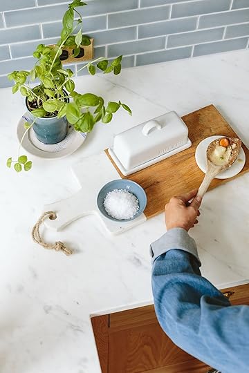
Basics That Make Your Kitchen Look Better
There are some things that never made it into our rental, left at the mountain house and I didn’t feel like replacing them last year because I didn’t want to bring in more stuff that we would just have to move. A spoon rest and butter dish are two of those things and it sounds so dumb, but having them makes the kitchen feel just so much more pulled together (and practically speaking I use them every day).


Cutting Board | Butter Dish | Spoon Rest | Wooden Spoon
We are “room temp butter people” (for eggs and toast) and have been using an upside-down bowl covering the butter on a plate for the last year. YAY to having a proper butter storage situation again (I usually face the “butter” labeled side against the wall, BTW because I like it simpler). There is also a matching spoon rest but I went for the marble one because it looks more high-end and just works really well in the kitchen. I’ve had that cutting board forever from Target and use it more as a tray in here, rather than a board (it’s too heavy to use on a daily basis, but good for charcuterie for sure).
 Paper Towel Holder (In Our Moody Pantry!!)
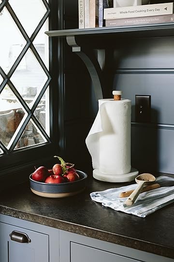
I already had this paper towel holder and can vouch for how solid it is (and if you like sets it goes with the cutting board and spoon rest – and there is also a utensil holder and tray that match). I snagged more of my Target dish towels (which are great – just wash them to make them more absorbent which isn’t uncommon). I also snagged that bowl because it’s just so pretty (no, I didn’t need need it but look how pretty it is in here?), and inside are some of the apples from our orchard (I cheated and supplemented some from the store but you can see the “real” ones with the leaves and bird holes 🙂

Paper Towel Holder | Dish Towel | Ceramic Bowl | Spatula | Slotted Wooden Spoon
I know that many kitchens are integrating a built-in paper towel holder slot into the cabinetry, but I try to do as little of that as possible because I fear that in 15 years that might somehow date the cabinetry or say we stop using paper towels altogether (ideally). But having a roll of paper towels just on the counter is a bummer so if you don’t have one of these, I promise it seems like a non-essential but it just helps everything feel more pulled together.
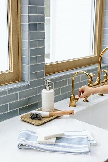
Soap Dispenser | Wood Tray | Dish Brush | Sponges
Lastly in the kitchen, I wanted a pretty refillable soap dispenser (I can’t handle looking at a cheap plastic one) and sponges. The head of that bottle washer also pops off and can be replaced if needed.
Dinnerware and Drinkware that are Simple and Very Durable
The glassware is also something I’ve talked about for a while now – modern and straight, but thick enough that they are still durable (Brian doesn’t let me buy those thin ones that stylists love so much anymore because they ALWAYS break and he’s totally right).


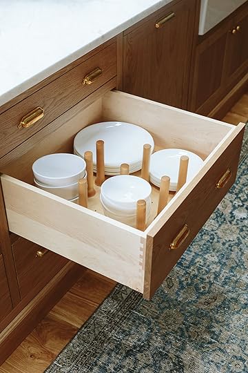
Dinner Plates | Side Plates | Soup Bowls | Cereal Bowls
Once again I’m singing the praises of our crazy affordable and long-lasting glass plates and bowls. I only needed to buy one set (so we have 12 of each) because we had 8 already, but here’s my pitch if you haven’t heard it yet. These plates are extremely flat, lightweight, and durable which means that the kids can easily set the table, do their own dishes, and easily load them into the dishwasher (it’s so satisfying, I’ll be doing a reel about it soon). While I love handmade pottery plates, those are more like the modern-day “fine china” – great for special occasions. But for day-to-day, I will only use these – little bowls for cereal in the morning, side plates for lunches for them, and dinner plates for everything else. They also have a large pasta bowl (not shown) and you’ll see the Threshold soup bowls in there (not glass, porcelain) as well that we’ve had forever (soup bowls have to be deep IMHO to keep the soup warm and thick so they don’t heat up too much).
Laundry Room Essentials
Glass Canister | White Canister | Ceramic Bowl
I needed a few things for in here (I can’t wait to show you this room). That lamp is vintage (and the tray and planter are old), but everything else helps pull this area together. The big canister is for our dryer balls, the little canister is for lint, the bowl for lipsticks and change from pockets, and the wicker tray for mismatched socks. P.S. The lamp has to be wired for American outlets so we just clipped the cord off so we didn’t have a huge rolled-up coil). Our washer and dryer has built-in detergent, btw 🙂 and not shown is this new laundry basket I got for the kid’s room (I didn’t want to give too much of the mudroom away yet, so we couldn’t do pulled-back shots).
In Our Bathroom…
Tray | Candle | Loofah Bath Brush
One of the first things I did when we moved in was take a year-long awaited bath (our rental didn’t have a usable tub and I AM A BATHER). But without a tray, I couldn’t do my full set up (which involves that candle). I even bought the same candle that I had at the mountain house because the smell is so incredible and it makes me feel so nostalgic for that year living there. They were out of the larger version, but I’m going to buy it the next time I see it as it lasted two years of using it 3-4 times a week and smells so great.

Bath Mat | Bath Sheets | Trash Bin
I needed bathmats and towels for all three bathrooms (I’ll show you the other two soon) and Target’s colors are so good. I bought 10 of these bath sheets in that pale gray because I’m currently boycotting white towels (do they ever stay white?). We opted for the large bath sheets but I’m going to go back for the smaller size towel for the kids, too (the sheets are almost too big for the kids and take up more space in the laundry). I’m using the vintage rug near the vanity but needed a mat for stepping out of the bath and love how this blue worked with the floor (and again, I’m nervous about buying white anything, especially until the construction/dust is down outside).


Denim Buttom Up | Striped Shorts
The little square garbage can is a really heavy faux marble that looks great (and is not something I wanted to spend real money on). And if you are staring at those huge knobs on the vanity know that once again I ordered the wrong size of something and these (while super cute) are going to be returned for the smaller versions. Whoops 🙂 The denim shirt and shorts are also Target by the way (I’m wearing a medium shirt and sized up to an 8 in shorts so that they were roomy).
Everything is linked up in this storefront (amongst other things I love but didn’t buy yet). Check it out!
This post was sponsored by Target but all words and opinions are all mine🙂 #targetpartner #targetfam
*Styled by Emily Henderson (me:))
**Photos by Kaitlin Green
The post The Essentials We Needed At The Farmhouse – All From Target (+ An Exciting Announcement!) appeared first on Emily Henderson.
September 27, 2022
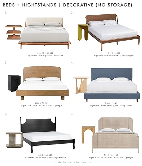
Power Couples: Bed And Nightstand Combos For Every Style (+ How To Pick The Right Size)

It’s been a while since I’ve contemplated bed and nightstand options. In fact, the last time I really thought about this particular combination of furniture, I divulged to the entire internet that I was sleeping on a mattress on the floor and did not have a nightstand to speak of. Charmed, I’m sure. I’ve leveled up since then, don’t worry, but still haven’t invested in a forever bed frame with a beautiful headboard. A metal IKEA bedframe has been a placeholder since I graduated from my mattress on the floor days. But now that I am a married woman, it does feel like time to give my husband and my bedroom some real attention. Wouldn’t it be nice to be proud of the way my bedroom looks instead of apologizing for it every time a person walks through our front door?? I think so. So, with some selfish interest in mind, I offered to put together some bed and nightstand options to share with you all. Sound good??
Before we begin, I want to share a few rules we find helpful for picking a nightstand. As always, once you understand the “rules” we believe that can empower you to bend or break them if you so desire 🙂
24”-27” is the ideal height for a nightstand but a good rule of thumb is to make sure the height is within the range of 5″ higher or lower than the top of your mattress.Keep your nightstand to scale with your bed. The average nightstand is 20″x20″ which will work for most beds. However, for larger beds (a king) you can use a larger nightstand (up to 40″) and smaller beds (like twins) maybe go a little smaller.Space permitting, you ideally want at least 36″ around all walkways to comfortably get around your space. If your room is tight and doesn’t allow for a good amount of space to walk then you could consider pushing the bed up against one wall or downsizing your bed to fit with the scale of the room. Have fun with style/shape! (and mix-matching nightstands is totally doable:)).Now that you are armed with some guidelines, let’s get into it starting with your standard-size nightstands.
Standard Size With Storage photo by sara ligorria-tramp | from: mountain house primary bedroom
In Emily’s mountain house primary bedroom, the nightstands are so structural and cool AND meet all the above guidelines. The bed frame is low to the ground so the nightstands are also shorter, but together they make so much sense. If she had a bed with a very tall headboard or opted for a four-poster bed, a smaller nightstand would look off. Truly when it comes to beds and nightstands, size IS everything.

 design by jess bunge for ehd | styled by emily bowser | photos by sara ligorria-tramp | from: the feel good romantic bedroom makeover
In the above bedroom makeover by Jess, she paired two different vintage dark wood nightstands with this tufted green velvet bed. The headboard extends past the mattress so she found nightstands that fit to scale in that space, making the bed and nightstands feel cohesive. The nightstand also stands as tall as the top of the mattress, which follows the above 5″ higher or lower “rule” and is pleasing to the eye. Oh, can we please note the raised scalloped detail on the right?? It’s such a sweet detail.
If you are in the market, here are some standard-size nightstand and bed combinations we love:

1. Garvey Side Table + Shinola Runwell Upholstered Bed | 2. Kono 2-Drawer Nightstand + Carson Ebonized Wood Spindle Bed | 3. Side Table + Clementine Platform Bed | 4. Postmodern Pink Lacquer Laminate Waterfall Nightstand + Jaiden Upholstered Bed | 5. Cortez Natural Floating Nightstand + Valen Platform Bed | 6. Black Wood Cottage Nightstand + Hargrove Canopy Bed
You might recognize the nightstand from #5 from Suzanne’s bedroom makeover, OR maybe you remember seeing it in a certain celebrity home tour? That’s right, we spotted this nightstand in Kasey Musgraves’ AD home tour. It’s such a minimal yet fresh piece and the curved shape gives it a softness that’s perfect for a light and airy bedroom. By the way, I’d be lying if I said the bedroom you saw above didn’t heavily inspire the #3 pairing 🙂 Deep greens and dark wood are a perfect match IMHO.
Oversized With Storage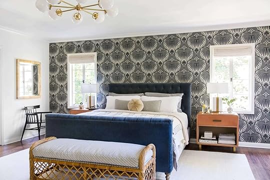 photo by tessa neustadt | design by ginny macdonald and melanie burstin for ehd | from: griffith park primary bedroom
If you are looking to go big and go home, you can replace a standard nightstand with a larger one or even a small dresser if you have the space. Remember, if you are going to go oversized, we suggest doing so only if you have the square footage and as long as you are pairing with at least a king-size bed. If you opt for a small chest of drawers you really want to be careful with that the height of your mattress isn’t too low. A great way to give you some height (if you don’t already have one) is to put a box string under your mattress.
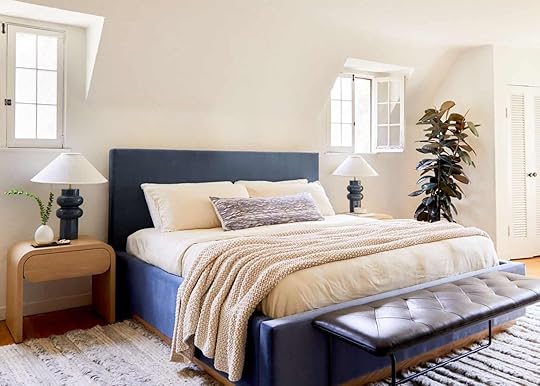
 design by sara ruffin costello | styled by velinda hellen & erik kenneth staalberg | photo by sara ligorria-tramp for “the new design rules”
In this bold Airbnb bedroom designed by Sara Ruffin Costello, she used a small chest of drawers in lieu of a traditional nightstand. It is oversized, but notice that it doesn’t look out of place because of the scale of the bed. The bed and dresser are both larger than average (note how the ornate headboard almost touches the ceiling!) so the scale doesn’t feel off.
If you are feeling like going big, here are some great options:

1. Wes 3-Drawer Wood Dresser + Arden Navy Upholstered Queen Bed | 2. Baskin 3 Drawer Accent Table + Rosalie Classic Velvet Platform Bed | 3. Kids Hampshire 4-Drawer Olive Green Dresser + Annabella Upholstered Bed | 4. Bedford Reclaimed Wood 3-Drawer Dresser + Alder Bed | 5. Jenny Lind Spindle 3-Drawer Dresser + Alexa Reclaimed Wood Bed | 6. Cayman 3-Drawer Dresser + Calistoga Canopy Bed
With each of these pairings, the headboard is taller or wider than average, so the oversized nightstands don’t look out of place. When in doubt, if you adhere to the 5″ higher or lower rule, the scale will make sense and feel intentional. Just remember, with smaller size beds, a too-big nightstand might look like a mistake instead of a cool design moment.
Decorative (No Storage) photo by sara ligorria-tramp | from: our guest room/office basement suite reveal
Sometimes a nightstand doesn’t need to have storage, and can just be a place to set your water down at night. If you already have enough closet space and storage (bless your heart) and you want your nightstand to take up the least amount of visual space, a stool like the one above is a great option. For smaller bedrooms, stools and pedestal end tables are ideal so the room doesn’t become overcrowded.
 photo by tessa neustadt | from: 1 bedroom 4 ways with the citizenry
I love this black pedestal table coupled with a simple, upholstered headboard. The height and scale are on point, and the traditional shape creates some movement but doesn’t take up a lot of physical space. Oh and if you are worried about not having a place to store some books, I personally believe books stacked lazily on the floor is always a cool look. 🙂
For all you storage-savvy people out there, here are some fun and decorative nightstand options:
1. Oline Side Table + Drommen Acacia Wood Bed | 2. Wendall Side Table + Maeve Platform Bed | 3. Zayden Side Table + Cyrus Platform Bed | 4. Geometric Side Table + Dean Jean Eastern Upholstered Panel Bed | 5. Halden Nightstand + Colestin Bed | 6. Delilah Nightstand + Brooke Platform Bed
Alright my friends, that is all for today. I hope this post helped whoever needs it, and please let us know what other power couples you’d like to see from us. xx
Opener Image Credit: Design by Julie rose for EHD | Photo by Sara Ligorria-Tramp | From: Suzanne’s Bedroom Reveal
The post Power Couples: Bed And Nightstand Combos For Every Style (+ How To Pick The Right Size) appeared first on Emily Henderson.
September 26, 2022
Introducing Bowser’s Never Before Seen Backhouse Backyard (+ Her Plans To Make This Awkward Space Great)

I’m coming to you all prettttttty raw. My most precious cat child, the queen of my heart and the reason I wake up in the morning (mostly), Daffy, has fallen very ill (not the cat pictured above). It’s too long of a story to go into here and truthfully, I’m exhausted. On Instagram, I have a highlight dedicated to it if you must know, but she’s flirted with death and seems like she may be able to recover into some form of her former self (TBD). I mention this because this blog took me about a week to write and I hope it makes sense, also a lot of the readers have gotten to know Daffy and it feels weird not to say something about it when it is literally the only thing I can think about. Send all the good vibes our way. OK, just needed everyone to know my brain space (as always)…
We’ve been on a journey of slowly revealing our outdoor transformation, each space is unfinished, some closer than others, but I have yet to introduce you to the back of the lot…The Back House Backyard, BHBY if you will. I like to think of it as pronounced, “BEH-BEE”. When purchasing our two-on-a-lot fixer, one of the biggest pluses was that the units were separate. Not only did the units not share any walls, but the units also had their own outdoor spaces. After renting for so long, and having way too many stories of knowing way too much about our neighbors, we were so so happy to find a setup like this. That said, when everything is split up like so, you end up with pretty small spaces. This space in particular is very tricky and chopped up so we have a lot of work to do!
Our lot is on a slight incline, with the back house sitting a bit higher than the front. I recently learned through our neighbor Ben, who has lived in the house next door since he was 5 (I would guess around 60 years), that the back houses were built first (his houses mirror ours). The man who built our houses used to live in mine and Ben knew him. There were gravel driveways with big front yards. It’s unclear to me when those houses were built because I’m pretty sure I’ve seen plans of our front house that were submitted to the county in 1930. All that to say, what is now the BHBY, wasn’t really meant to be a space to be enjoyed as much as the (former) front yard. There’s an awkward amount of space that wraps around, made even more awkward when someone added a bedroom to the back house at some point in the mid-century – very illegally and cost me a lot to fix, if I may add 🙂
Let’s take a look at when we bought the property:
 a before of the backhouse as seen from our back yard, gate leads to backhouse entry
 walking up through the gate, front door on the side of the house
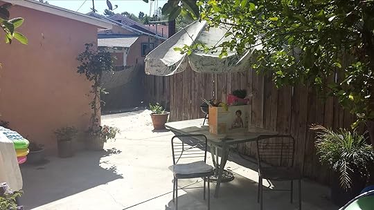 around the corner, the part of the house you can see here is the added-on bedroom
As you can see, no one in LA even tries to sell homes. In fact, I believe we are all collectively being pranked and/or are actually all inside a simulation, a la “The Truman Show” but, like, on opposite day, and I keep waiting for Ashton Kutcher to jump out of my hedges. AND this was 2016, which is as we know, when the world split in half and we all ended up on the wrong side of space and time. It’s only gotten worse since then. Check out this listing that was recently emailed to me:

I KID YOU NOT. THAT WAS THE PIC. It’s not even for the house on the right. Asking price? EIGHT HUNDRED AND NINETY THOUSAND DOLLARS.
Anyway, I digress.
It is always funny looking back at photos of when we bought the house and realizing I saw that and was like “$600,000? I’ll take it!” Constantly living in the blessing/curse of seeing the glass half full I guess.
These photos show the space a little better:
 door to backhouse on right, looking from the top of the property, through the gate and into my backyard.
 very, very back area. added on bedroom on left, very unfortunate view straight ahead, and why we are here today.
OK, so the photos are not very helpful because the space is very segmented. You know what would be WAY more helpful? For me to draw you a probably very inaccurate sketch and I’ll put it here. Oh, and take note of the numbered areas as I will be referencing them going forward.

So as you can see, it’s an odd shape. Especially this corner (4):

Honestly, your guess is as good as mine. 1. I have no idea why my lot is shaped like this, who decides these things? 2. Why is there a curb? When we moved in there was a water feature here that did not work, but honestly, I think that’s a creative use of space and we may come back to that. For the time being it is the only dirt in the “yard” and therefore where all the dogs who have lived here have relieved themselves. It’s a toilet. This space is a toilet.
Every renter we have had has had a dog. Say that 3 times fast. It makes sense. It’s a fenced-in space, which is a highly abnormal renting situation so we have to take that into consideration when thinking about this space. Because we ALL are thinking about it, RIGHT?? Seriously, halp.
Which brings me to why we are talking about this space. Actually, there’s no good reason. I really don’t need another thing on my plate right now. I simply just can’t not, you know?? The space has so much potential, but it’s hard to figure out (believe me, still working on it) and even though I don’t spend a ton of time out here, it bothers me that it technically belongs to me and it hasn’t fulfilled its calling in this life. I’ve loved every person who has lived in my back house and I’ve always wanted better for them, I’m finally in a place where I’m not *completely* in financial ruin and I’m already working on every other space outside, so now is the time.
Let’s talk positives first. Even though this space is small, it is mighty. I like to think of it as having 6 distinct spaces (marked on my highly accurate map). 1. Entrance.

This is the space closest to the fence that looks into our yard. It’s where Nora (the dog) likes to hang out and imagine eating all my cats. It’s about 8’x9’ (not including the walkway) and includes a half wall and steps up to the front door. This space is different from the rest because it is on a slant, making furniture a little tough.
There are 3 trees in this space, a lemon, a guava, and another lemon tree. Let’s call this space between the first two trees their “Front Patio” (2).

It’s a 6ish’x9ish’ space right off the front door. This picture is taken from me standing at the front door. Seems like an obvious space to have somewhere to sit right when you walk out. A place to sit and drink your coffee in the shade in the morning. Side note: Can you BELIEVE these trees come out of such tiny holes in the concrete?? It’s how the whole lot was before.

Between the second and third tree, we have the hammock area (3) that’s 6’x14’ish and is next to the weird corner, or toilet, (4) that we’ve talked about.
If you do a 180, space 5 – The Dining Area, is nestled into the corner where the interior dining nook and the added-on 2nd bedroom meet.
The furthest wall is the bedroom and is 9’ long, the wall on the left is 11’ long.

This space works for me as a dining space because it’s close to the door to the house, so bringing food out isn’t too much of a hassle and the 2 walls make a perfect place to hang lights over the table.

Next to the dining space, there’s a walkway that’s big enough for something, but not much because it leads to the weirdest space of all that has a small-ish opening that you wouldn’t want to block. The space between the fence and the corner of the house is only about 6 feet but then opens up to 15’ into an area I’m calling the living space (6)…

She’s a weird shape and has an awful view. In addition to what you see here are about 2093832847 power lines above going in every direction. Understandably, this has been the most underutilized space for any tenant. But it is space. Yeah, that’s the only positive I can think of here.
Now that you’ve been introduced, let’s talk plans. These were the most important boxes to tick for me:
Do something about that view of the neighbor’s roof. The fence is 6’ As you can see the neighbor on the right just extended their fence up to block both of our houses, and I can’t blame them. Unfortunately, now I have to look at all of this visual mess. I’d LOVE to replace our fence but it’s not happening any time soon.Create an outdoor living room. This space has lacked a cozy place for a group of people to hang out. Hope and Daniel (the current tenants) are lovely hosts and great cooks, so hanging out around the dining room table is great, but there is totally the space to be able to retire to something more comfortable 🙂Speaking of what good cooks and hosts they are, they deserve a larger dining space. Maybe even with a bar/console to help with surface area when hosting larger groups.The sun is pretty intense during certain parts of the day so we would love to come up with some DIY sun protection in the living space.Bring in greenery. The concrete is killing me. We need pots, we need plants. Something needs to be done about the weird corner. I hate to say this because then it means I probably have to do it, but the color of the concrete is annoying me. It’s not bad, per se, I just hate it 🙂 Honestly, I just want it to be warmer, maybe taupe? I think that will also hide dirt better.Now, I obviously am not funding this backyard makeover 100% by myself. I wish I could. I needed some amazing companies to collaborate with me in order to rationalize taking on another project. When I started thinking about this project, I had just gone to Article’s collaboration with Rooftop Cinema Club and got to sit in a bunch of their outdoor furniture, I was very impressed with the design and comfort (two of my favorite things!). Article was also an obvious first choice because I just love the people who work there. I can also say with conviction that the customer service is awesome as well. My friend Lauren had a cat that peed on her leather couch from Article and they worked with her to help remedy the problem without her having to buy an entirely new couch.
I also found this company called Veradek when I was being an amazing friend and helping Orlando source a pretty option for an outdoor kitchen in his own backyard. This company has very chic outdoor kitchens, privacy screens, firepits, and planters. Orlando’s use of the privacy screens immediately made me think about that unsightly roof line. Their biggest screens are 100” tall, that’s over 2 feet taller than the fence. This was really the jumping-off point for this project. I reached out and they sent through 5 of the Quadra Privacy Screen in corten steel, which looks like this:

My other plan for drawing attention away from the fence that needs to be replaced and the backside of my neighbor’s fence is to bring in greenery. Veradek’s planters are high quality, tested in Canadian extreme weather, and come in big sizes. We got 5 large Corten Span Planters as well as a few others from Veradek that you will be seeing in all the other outdoor reveals. My original plan was to put one planter each in front of each privacy screen but now I think they would be better used throughout the space as an anchoring piece, something every area will have to keep a sense of cohesiveness and as a way to get a good amount of greenery throughout the whole area, these things are huge (42″ L x 16″ W x 32″ H), especially for a space this small, so I think each one will pack a punch of green. They also can come with insert shelves that go 12inches down from the top, making it so you can use less dirt, or to help bring your plants up higher. We just built them all this past week, they were easy to assemble and I am excited to get them all planted. I met with my landscaper about trying to figure out if we can bring our irrigation from the back yard down the side of the back house to these planters. He thinks it will work out without having to get a whole separate system back here.
Side note: If we haven’t talked about it – I am very pro irrigation. Once plants are established they don’t need much water, at least the plants that grow well here in LA, but it is very easy to kill plants if you miss watering when you need to. I don’t know if I’ve had even one plant die since everything was planted in my backyard in 2018, and obviously, as we all know, I have the best hedge in town. Right now my plants get watered twice a week for five minutes. I have one sprinkler for my tiny amount of grass and drip irrigation for the rest of my plants. We can talk about this more later, but the short story is: I like irrigation, especially for the back house because I don’t necessarily have access to it and I don’t want to waste money or kill plants constantly. That said, I am VERY excited to get my Goodland tub hooked up and rain barrels going before our rainy season. Both will be excellent for supplementing irrigation with grey water.
Back to the design ideas, jumping off with the Article furniture and the Veridek planters and privacy screen, I went to work making some simple boards (I use Canva)


Some standout things from Article are this amazing sectional with a matching coffee table, it’s the perfect size for the living room space. I got some (very) comfortable lounge chairs as well. I sat in these while watching Dirty Dancing on a rooftop downtown and knew I had to have them. They are weirdly comfortable and more oversized than you think. Unsure if these will end up here or stay on my front porch where I have been enjoying them while we finish this space 🙂 I got a teak dining table (similar acacia table), but they were out of the benches so I ended up with 6 of these comfortable dining chairs. I love an arm on a dining chair and a thin pad that’s easy to stow when there is weather. I absolutely love these outdoor floor lamps. They are battery-powered (love my IKEA rechargeable batteries) and put off the prettiest light shapes from the shade.
There’s a lot of black back there because of the house, so I’m really going to have to work on softening it up with plants and textiles. I’ve had the best luck with black outdoor cushions as far as wear and tear. The space doesn’t get direct sun all day but we are looking into some kind of sun shade. Unsure if we are going to DIY or just get a large umbrella. The acacia and teak wood of the furniture will grey with weather, so the orange-y wood won’t always be so matchy-matchy with the corten steel. Also, the corten steel starts in its unrusted state. I could put a solution on it to speed up that process but I’m leaning towards letting it age naturally. Maybe the planters and furniture will meet in the middle :). Here’s a sneak peek that shows the steel raw and slightly weathered:
 raw the steel is dark grey with an…iridescent vibe?
 here you can see where it is starting to rust from being in my yard when the sprinkler went on overnight
Completely raw it is too black for the space but we’ll see what it looks like in a few weeks. I’m also going to try to get a mixture of jasmine and bougainvillea to climb on the privacy screens. Obviously, I’m concerned about the steel conducting too much heat but I’ve done a little research and have read it’s possible to do this if the plants are more established. I will also need to pay attention to how hot they get, not 100% sure how long that wall is in direct sun. If that doesn’t work I will definitely be planting climbers in the planters next to the privacy screen in the corner, hopefully covering up that fence situation asap. Because we hope to replace the fence in the next year or two, I will probably have to get a trellis so it doesn’t have to attach to the fence itself. However, the picture of the (in process) aging planter is on our neighbor’s fence. The same fence that we are trying to cover up in the front yard. Remember how we put in passion fruit to cover it up? Well, let’s just say that it understood the assignment.

It’s doing great and that space is VERY close to its reveal. We had a major heat wave so we have been unable to plant everything (thus the empty planters in this photo) but hopefully all that is coming in the next couple of weeks. Despite the heat, this vine has taken off and it had me thinking… ”how much passion fruit is too much passion fruit?” I mean, maybe I should just embrace it and have a passion fruit side hustle? I’m going to ask my landscaper what his opinion is, and if you have any other ideas for extremely fast-growing vines, let me know in the comments below.
On my to-do:
Paint the concrete (blahhhhh – especially since all that furniture is on it now)Talk to the landscaper and get the planters plantedFind a couple of things at the flea market: a bar/console for the walkway near the dining area, some vintage pots, an old ladder to help bring visual interest vertically onto the walls near the dining area, and some kind of large vessel to make a water feature out of for that weird corner (I’ve had some luck with solar water pumps)Troubleshoot weird corner, can it be planted in? Is the dirt deep enough?Buy cedar chips either way for the weird corner. I hear they are good for dogs to poop on 🙂DIY sunshade?DIY patio light pole pots, I’ve done it before, NBD. This may be a good way to have a connection for DIY sunshadeRehang bistro lightsI’m tired just thinking about it. Let me know your thoughts below and I will be giving a video tour/sneak peek of the furniture placement etc on Instagram today!
Opening Image Credits: Design by Emily Bowser | Photo by Sara Ligorria-Tramp | From: A Home Office Makeover With Threshold Removable Wallpaper by Target
The post Introducing Bowser’s Never Before Seen Backhouse Backyard (+ Her Plans To Make This Awkward Space Great) appeared first on Emily Henderson.
September 25, 2022
The Link Up: The Paint Color Em Is Using For A New Room, The Affordable Ceiling Light Mal Just Bought, And An Old Show We Can’t Stop Watching

It’s Sunday and we hope it’s been a good one. Also happy fall…it’s finally official. Did y’all see that Birdie’s wallpaper got installed this week on Em’s stories?! If you missed it, fear not because there will be a blog post soon. Until then let’s see what’s up with the week’s links.
 design by candace marie | photo by winnie au | via domino
 design by candace marie | photos by winnie au | via domino
This week’s home tour is of the incredible multi-hyphenate, Candace Marie (fashion influencer, social media consultant, creator, and founder of Black in Corporate). She is someone we’ve been following for a while so we were extremely excited to see her home in Domino’s newest digital issue. This 826-square-foot studio is a masterclass in what it means to create zones (and really beautiful ones at that). Look at how chic her weights are styled! Go have a look and a read of her article to not only see more photos but to also get a step-by-step guide for maybe the most desirable routine ever. She also has an account dedicated for her home so go follow her there too🙂

 shavonda’s coat closet’s before and after using sherwin-williman’s 2023 color of the year
 design by shavonda gardner
Also From Emily: I’m always nervous about the “color of the year” because I haven’t always loved it. Now if I’m being honest a couple of them I end up loving a couple of years later which shows that maybe I’m just behind on color trends and frankly am fearful of anything too bold or trendy. But this year’s COY by Sherwin Williams is SO PRETTY. I’m now considering it in a few different places on the property. I tried to convince Birdie to use it in her room but it is “not bright enough” but I’m very into it. Take a look at how great it looks in Shavonda’s coat closet! Such an awesome makeover. Can’t wait to use it:)
 daffy resting after coming home from a very rough week
Most of you know and love the incredibly talented Emily Bowser. Well her sweet cat, Daffy, was given flea medicine that triggered seizures that put her in the ER for nearly a week. Not only has it been emotionally gutwrenching for Bowser and her husband, not knowing for the better part of a week if she would survive, but the medical bills have also become extremely overwhelming (despite having pet insurance for years). You can read more about the whole story here because Bowser’s best friend set up a GoFundMe explaining everything. If there’s any way you can help we know that they would be unbelievably grateful.


From Caitlin: I’m not a big holiday decorator, but I have been in love with these Chinoiserie pumpkins for over a year. They don’t really go with my current color scheme – the classic motif clashes a little with all the pink/green/orange I have going on – but man, if I had a more timeless style, I would LOVE breaking these out every year alongside some classic blue & white plates and ginger jars. It’s kinda fun when your festive decor just slides into your actual style, you know?
Also From Caitlin: My boyfriend and I have been binging the early seasons of This Old House and THEY ARE SO GOOD. We just wrapped up Season 4 this week (shot in 1982, can you believe???) and I’m OBSESSED with how fun and authentic each episode is. (Case in point: In Season 5, Episode 1, they revisit the Season 4 home and the homeowner literally says, “I hate this paint. Why did you guys pick this?”) Bob Vila has NO GRIPES about calling things ugly or bad and it’s just really fun to see what home improvement TV looked like FORTY YEARS AGO. The pace is much slower and more detailed – 26 episodes for one house, versus watching an entire renovation in under an hour on today’s shows – and each segment is so informative and fun to watch. If you’re also looking for a new/old show to watch with friends or family, the early seasons of TOH are must-see TV. HIGHLY RECOMMEND.
Thank you SO MUCH to everyone who has made contributions to Miry’s List’s 2022 Bed Fund for Refugees campaign! We got an email from her earlier this week saying what an impact it’s already made. Organizations like this are more important than ever. She also mentioned that she co-wrote a children’s book with Jennifer Jackson called Our World Is a Family which “demonstrates the importance of welcoming people from all over the world into the community with love, compassion, and acceptance.” What an important and beautiful thing to teach our children. Please go make it a bestseller!!
From Mallory: I genuinely love this light from Target so much – I’ve been shopping around for lighting for my entry so I ordered this one. When it came I was SO impressed with the size and scale (and it looks WAY more expensive than it is). All in all, we wanted a light that gave off a softer glow for our space. Now, since it’s our only hardwired ceiling light in our entire apartment we hoped it would give off a little more light than it does but it’s SO pretty that we’re fine with it. That’s what lamps are for right?? If you have an entry or hallway that needs a new light fixture and doesn’t need a ton more light, this fixture is so beautiful and only $100!!
From Ryann: Around the virtual office this week, we have been talking a lot about shame around going to the dentist. I feel VERY shameful about the amount of time it has been since I last went, so when I saw this comedy short I felt so seen. It’s called “Cora and Same Hate The Dentist” and it stars Jade Taylor Kaiser and Eilise Guilfoyle, a comedian/actor I follow on Tik Tok who is so hilarious and makes me laugh every day. It’s so funny, so real, and I just love to see female comedians doing their thing. I think they wrote and produced it together too! I’ve watched it like 5 times and I think it needs to win allll the film festival awards. And while we are at it, someone get these two their own show!!

From Jess: I did it. I FINALLY finally got myself a Clare V Grande Fanny and I can’t even begin to tell you how much I love it. That Target cutie (which is now officially my “sporty fanny” *cue British laughs*) was just the beginning. I was lucky enough to get early access to the Clare V sample sale via a friend who works there so I took it as a sign to get myself the bag (and strap) I’ve always wanted. It’s my early birthday present to myself:) So while this exact bag material and strap aren’t available online, they have other awesome options (ie I LOVE the plum and tan rattan bags and this strap). They also have a pre-loved section which is so cool and great for a slightly more affordable price point:) If you’ve been considering this bag I can’t recommend it and this company enough. I can also say that from everything I’ve heard from my friend this company is awesome and is run by kind women that are insanely collaborative and talented. I really love knowing my money went to supporting them and their company:)

 lamps by in common with and sophie lou jacobsen | photo by william.jess.laird | via yellowtrace
Also From Jess: Look at this INCREDIBLE lighting collaboration between In Common With and Sophie Lou Jacobsen. If I had the money I would scoop one of these beauties up in a second! Go read this article about how this collab came about and the intense craftsmanship that went into creating this collection.
We of course can’t ignore the absolute devastation happening around the world. This doesn’t even include the wars still happening in Ukraine and Tigray. First, the catastrophic damage caused by the flooding in Pakistan. Now, the crippling damage caused by hurricane Fiona. If you have the means, here is a resource to help those in Pakistan, here is an article giving ways to help Puerto Rico, and this is a post on ways to help the Dominican Republic. If you have others please leave them in the comments.
So with that, hold your loved ones close and see you tomorrow. We have a post we really think you are going to love. xx
Opening Image Credits: Design by Candace Marie | Photo by Winnie Au | via Domino
The post The Link Up: The Paint Color Em Is Using For A New Room, The Affordable Ceiling Light Mal Just Bought, And An Old Show We Can’t Stop Watching appeared first on Emily Henderson.
September 24, 2022
The Fall Outfits I Love And Feel Really Good In (All From Madewell)

My life has become far more about utility than fashion, making me want to produce fewer fashion posts. I leave the house a few times a week but it’s not for fashion events. While I do miss dressing up and wearing oversized pink coats and snakeskin boots, it just doesn’t make as much sense for me in this “season of life”. So I’m far more interested in cute basics (that look like I still know what I’m doing and care) and ones that are comfortable but don’t scream “I’ve given up”. I had an Instagram partnership with Madewell so I went shopping and here is what I found that I actually need/love and will wear frequently. I found a lot that I love, but again am resisting the urge to hoard so know that these had to really grab me in order to add them to the closet.


Chambray Shirt | T-Shirt | Jeans | Sneakers
Do you guys remember these Cali jeans????? I bought them when Madewell first launched like 8 years ago and wore them til they fell apart (around year 4). When I put them on last week I was like “oh hey there old friend” and was reminded how good they are (they went away but somehow the little boot flare is back already!!). They are stretchy and therefore comfortable but without the feathering near the crotch (we really shouldn’t do that) that makes the stomach look like it’s protruding out. I find them very slimming (I wish I could have shown you all the jeans that I tried on that DIDN’T look good on me, but it’s not in my nature to go around bagging on myself or on other styles of jeans). So you’ll have to trust me that after trying on 12 pairs of jeans, these are the ones that were a solid “HELL YES” in both comfort, fit, and style. And I know that I’m not supposed to care about clothes that are “flattering” but I do, and these just are it you are into that. Right now I’m a solid 6, (I think) and first tried on the 28s (Madewell’s sizing is confusing), and they fit ok, but strangely the 26s were not tighter, just better scaled and more flattering. That’s all to say to size down a little bit in these (and they definitely stretch out).


Chambray Shirt | T-Shirt | Jean Shorts | Sneakers
Those sneakers are SO CUTE, and the T-shirt underneath says, “Let’s go Outside” and is a really good fit (flattering not too boxy, not too tight) I bought a small – which in Madewell world is a medium. The chambray shirt is boxy and these days I’m into wearing them unbuttoned and open. It’s a thing. OH and the shorts were so cute, with a little flare, and really cute in the butt (these more rigid than the Cali jeans so less good for sitting down all day if you know what I mean).

Blazer | T-Shirt | Jeans | Chelsea Boots
Same jeans, same shirt with an excellent tweed blazer with pretty details. It reminds me of a long tweed coat that I’ve been wearing since Charlie was born, but the shorter version. And these boots – oh these boots. I thought I had all the boots that I needed, but I didn’t have any (except clogs) that have a heel anymore. And y’all it’s been a while since I’ve worn heels and forgot what it does to your legs (and confidence). These are really comfortable and don’t feel like I’m wearing “heels” yet they give you the lift that is nice to have, visually. I’ve worn them so many times since I bought them (you can snag them on sale right now – they are typically over $200). I wear them with shorts and cute socks and they look utilitarian enough to even wear with stretch pants and an oversized sweatshirt without looking try hard. Big fan here.


Airpuff Long Shirt-Jacket | Jeans | Chelsea Boots
And then there’s this jacket that is so lightweight that it feels like you are wearing nothing, yet it’s so warm and cozy and looks cool. These are the same jeans that look great with the boots. This is a solid fall outfit that I can wear anywhere (soccer, a brewery, running errands). It was comfortable without being athleisure. Please note my trendy one-legged squat pose that my team laughed hard at me for EXECUTING LIKE A BOSS.


Blazer | T-Shirt | Cargo Pants | Chelsea Boots
Lastly, I tried on these cargo trousers that have this cute baggy almost balloon shape that I thought looked really cute with the more tailored tweed blazer. I cuffed them a bit and wore them with the same boots and felt pretty darn cute (TBH) which I really hadn’t felt in a while. Living on a construction site and working from home makes it so difficult to pull yourself together. Brian reminded me that I have a version of these pants already (some expensive brand I bought at a consignment shop years ago that I still love and wear) and he said (and I quote) “Do you really need two pairs of olive green drop crotch cargo pants?” and he was right. So I ended up returning them but if you don’t have even one pair of “olive green drop crotch cargo pants” then are you even living? Hot Tip! Men hate drop crotch pants! Hot Tip, Men! We don’t care! 🙂
Anyway, there are a lot of other cute things, including jeans that I really really really wanted, but didn’t let myself buy even with the discount because I don’t leave the house enough to warrant buying and hoarding the clothes (having less clothes is way more fun to manage both physically and mentally, TBH, not to mention better for the planet). But if you need new awesome basics, right now is a good time to buy what with the sale and all. I also bought these sunglasses, these socks, this cropped top tee, and my purse is still holding strong after 2 1/2 years if you need a good day purse (just grab yourself a cute strap to make it look cooler). That’s all. xx
**This post is NOT sponsored by Madewell – The Instagram stories were/are and we do affiliate links as you know, but we just love Madewell and I love recommending things that I love/use to others who might also love/use. xx
The post The Fall Outfits I Love And Feel Really Good In (All From Madewell) appeared first on Emily Henderson.
Emily Henderson's Blog

- Emily Henderson's profile
- 10 followers

