
Emily Henderson's Blog, page 110
November 10, 2022
I’ve Had My New Invisible Smart Locks For 4 Months – Here’s An Honest Review

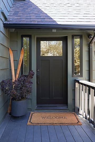
As someone who is “tech-wary” in my home, I am starting to make some pretty *smart* choices (this one I can even install myself). Sometimes “smart” stuff can actually overcomplicate, intimidate and frustrate people (myself), but not these – Level Home smart locks are shockingly simple, smart, and stylish. I had been eyeing Level’s products for a minute – I wanted something that didn’t scream “this house is a vacation rental,” but was still functional enough to provide controlled access for Airbnb guests, cleaning services, our property managers, handypeople, friends, family, etc. – so when Caitlin mentioned that Level had reached out about partnering on some social content, it was an easy “yes.” We installed the Level Lock – Touch Edition at the Mountain House earlier this year and love it so much that we ended up installing them at the Farm, too.
Their smart locks are aesthetically pleasing and easy to use for everyone, knowing that different people have different tech preferences and comfort levels. They can be locked and unlocked with a traditional/old school key, with your phone, with a key card (like a hotel!), with mini key cards (we put these on keychains), with your voice, with a keypad…Level Home is the creme de la creme of smart locks, folks. It’s VERY genius and I hope this is a new trend – having both manual and tech ways to operate something in your home.

We considered three of Level’s offerings: The Level Bolt, which goes inside your existing lock and transforms it into a smart lock (a great option for those who want to keep the aesthetics of their door the same, which wasn’t the case for us). Note: Level locks are compatible with residential doors that meet something called “ANSI standards” (American National Standards Institute). At the Farm, our vintage front door was an old-world mortise and tenon lock so Jamie had to fill the original hole/cartridge area to retrofit it for a 21st-century ANSI deadbolt lock (which he says he does all the time).
Since we were looking for a new slim profile for our Mountain House door, our two frontrunners were the Level Lock and the Level Lock – Touch Edition. Both have a ton of functionality, like access with a mobile app, key codes, voice entry and remote connectivity (so we can make sure the doors are locked from bed), but we ended up going with the latter because of its bonus touch and key card functionality. Being able to lock and unlock the front door with just a touch of my finger (if I have my phone with me) is game-changing, especially when you’re trying to get everything out of a car and into the house in one trip.
The Ingredients – So Simple
I originally figured I’d hire our handyman to install the lock, but after I opened the box, I realized it only required a screwdriver and that I’d be able to do it myself. (We also made a partnership reel documenting the process, which you can watch right here.) You can really see how sleek and well-designed the lock is here – it has the smallest footprint on the market (I checked) and it doesn’t scream “dorky smart lock,” which is nice (especially for the farm that is an older vintage door). We opted to add the Level Keypad accessory to pair with our lock for our Airbnb guests, and for a set of Key Card Minis for the kids.
STEP ONE AND TWO: Screw In The Deadbolt, Then Pop In The Motor

It’s recommended to use a screwdriver to prevent possible damage to the lock, but I couldn’t find one so I broke out the drill. Do you see that little Level logo? That’s actually where the battery that powers the lock will live – it has a lifespan of about a year and you’ll see a message in the app before it’s time to swap it out for a fresh battery. You can also always use the lock manually with a traditional key, so the technology can really meet you where you’re comfortable. Some people prefer using keys because that’s what they’re used to, while others prefer the app or entering with a code to be phone-free. It’s a smart lock that gives you the freedom to enter however you want.
STEP THREE: Add The Lock Exterior

We picked the Matte Black finish for both the Mountain and Farm, but Level locks also come in Polished Brass, Satin Chrome, and Satin Nickel.
STEP FOUR: Attach Backplate, Secure Thumbturn

Again, it was super easy, fast, and intuitive.
STEP FIVE: Insert the Battery
The lock makes a sweet little chirp when everything is turned on and ready to go. We took a few steps back to admire the handy work and were so excited by how simple and clean both sides of the lock looked against our current door. It was a nice improvement visually and functionally from the big, bulky keypad lock that had been taking up a ton of real estate previously. Also with our old lock, when the keypad would malfunction or run out of batteries, there was no way to get into the house. We love that we can use a traditional key backup with Level.
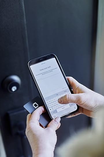
 STEP SIX: Connect Your Level Lock To The App
The app is really intuitive and easy to use, so we set up two Key Cards (for me and Brian) and Key Card Minis (for the kids, which we also really really love having at the Farm).
It’s easy to keep track of who has what, when they enter and exit, and it also shows you how long they were there. For instance, if you want to give your cleaning crew space to clean the house without you lingering, you can check the app to see if they’re still working. It’s also great to give easy access to handypeople, dog walkers, contractors, etc. (our property manager uses it to know when guests or the cleaning crew has left so she can ready the house for the next family). With Apple Home or Ring connected, there’s also a ton of other functionality, like the ability to remotely lock and unlock the doors, so there’s no more “wait…did I lock the door?” panic moments when we’re in the middle of a trip back to Portland. You can even create automations (i.e. locking and unlocking the door at certain times every day).
STEP SEVEN (Optional): Install a Keypad

As someone who loses most small things or whose phone/wallet is always at the bottom of my purses, I really like the Level Keypad, which can be placed anywhere within 30 feet of the lock (so it doesn’t need to be in plain sight – did you notice it in the earlier shots of the entry?). You are even able to create custom entry codes for guests, the dog walker, etc. (Fun fact: I was a dog walker in New York when I was 22 and yes, keeping track of all the keys was difficult – a code would have been wonderful.)

The codes are much quicker to generate and easier to share than I anticipated. Take it from this formerly tech-wary person 🙂
STEP EIGHT: Enjoy Entering A Billion Different Ways
You can use a Level Key Card just by tapping it (like a hotel key you keep in your wallet with the rest of your cards).
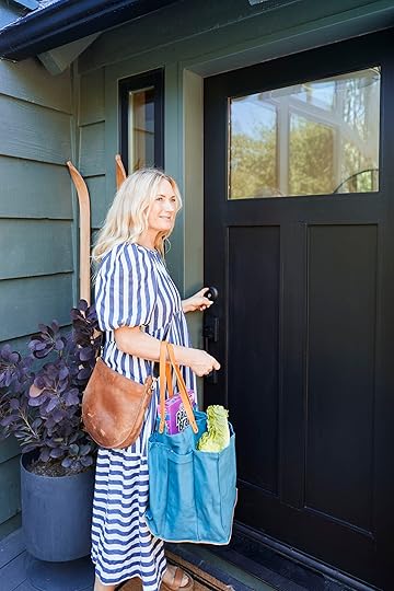

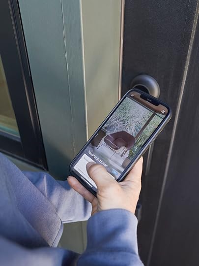
Or you can enter with a simple touch of your finger (hence the “Touch Edition” name). This works when your phone is within range of the lock (and the locks work with Bluetooth, so no worries if your WiFi goes out or if the power is off). The app doesn’t have to be open, your phone just needs to be near you (like in the bottom of your purse).


If you’re like Brian and like to go on runs without your phone, Keycard Minis are easy to keep on a zipper or inside a pocket. It’s great to be truly hands-free (and I could always use the Keypad in a pinch, too).

We installed and shot this over summer while we were living there. Since then, the kids (and the Airbnb guests) have been loving the Level Keypad.

And it’s been awesome to have a backup set of Key Cards that we can both just keep in our wallets.

When all else fails, we can break out the good old-fashioned hard metal keys. I LOVE THIS. This means that should you ignore the battery warning (that again, lasts a really long time) you can always have the OG key in a nearby lockbox or like us at a neighbor’s. No one will ever be locked out again. There’s an entry option that can make anyone feel comfortable!

We’ll be rolling out a few more Reels with Level over the next few months, so keep an eye out for those. We did a ton of research on the best smart locks on the market and Level’s options were outstanding in every aspect – they’re beautiful, easy to use, functional, and very safe (fully certified to meet highest standards for security/durability/reliability). I know that locks aren’t usually a super sexy topic, but we’ve genuinely loved our experience with these at both houses and I’m excited to support a brand that’s really innovating in the space. And with the holidays coming up…maybe it’s time to try a new lock at your house, too? (Imagine this: you can set up temporary codes for your family so they can enter and leave your home as they please. Kinda nice, right?)
*This post was sponsored by Level Home but all thoughts are my own
**Photos by Sara Ligorria-Tramp
The post I’ve Had My New Invisible Smart Locks For 4 Months – Here’s An Honest Review appeared first on Emily Henderson.


November 9, 2022
We Researched the Best Cordless Vacuum Cleaners For Pet Owners – Here Are Our 7 Favorites (+ The Vacuum We’re Buying On Black Friday)

The holiday season is upon us, folks! And this year, I’m asking for something really sexy and exciting: a new cordless vacuum cleaner. I acquired my current vacuum in 2013 (also a holiday gift – I love a good practical present!), but it’s time to find something that better suits my daily cleaning needs. To that end, I researched hundreds (okay – nearly a hundred, which is nearly every cordless vacuum on the American market today), watched countless YouTube reviews, talked to an expert (my cat’s groomer!), narrowed it down to a few final contenders, and finally found one stick vac that narrowly eked out the rest of the competition (for me, at least). Here were the factors I considered:
Cordless vs. Corded: I’ve spent nearly a decade schlepping my corded Shark canister vacuum around an array of Los Angeles apartments. While it made sense for my fully-carpeted rental in 2013, I’m ready to upgrade to something a bit easier to manage for daily home maintenance. Weight: My current vacuum clocks in around 20 pounds which makes cleaning feel like a drag. I know that the right tools can really transform the enthusiasm I have for tidying and maintaining my home – like, the Disneyland-style broom and pan was the impetus that ignited my love for cleaning – so I’m in the market for something that’s about 5 pounds. Battery Life: With 1100 square feet to vacuum, I’m on the hunt for something that can run closer to an hour – 15 minutes seems to be an industry standard – or for a vacuum that offers additional battery packs. Canister vs. Bags: Pet hair can fill a bag VERY quickly; the cost of those bag refills really compound up over time. This helped narrow the field – we’re looking for canisters only over here!Pet Functionality: A lot of pet-specific models include upholstery brushes, bristles that resist tangling, or an odor-reducing air filter. While all of those features are helpful, none of them are essential (or even more helpful) when it comes to actually getting pet hair off the floor or out of a rug. Price: We’re heading into Black Friday and Cyber Monday, so I had a bit more wiggle room here than I would normally – I felt comfortable looking at higher-priced models, knowing that they’ll likely be on sale in some capacity within the next few weeks.With that criteria in mind, here are 7 cream-of-the-crop options, including the vacuum I gifted my mom (only the best for Brenda!) and the cordless vac that’ll be topping my wishlist this winter…
Dyson V8 Animal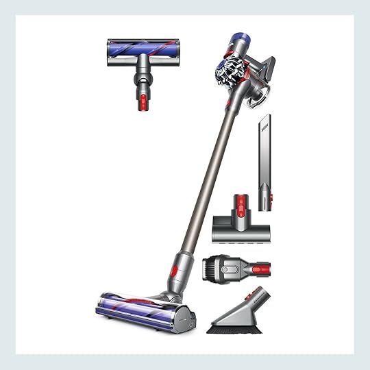
Weight: 5.63 lbs
Battery Life: Up to 40 minutes
Price: Currently $350 – $450
The V8 Animal is the gold standard of cordless pet vacuums and it’s a great entry-level option. Originally released in 2016, it’s Dyson’s longest-running model for good reason – it performs beautifully on both hard floors and low-pile rugs. That said, the short battery life (only up to 7 minutes in its most powerful mode) and long charging time (5 hours) can be disqualifying for those with larger spaces. I decided against the V8 Animal because I wanted a few more bells and whistles, but it’s a great choice for those with primarily hard surfaces or for those working to maintain smaller spaces.
Dyson Outsize+
Weight: 7.98 lbs
Battery Life: Up to 120 minutes
Price: Currently $950
This is Dyson’s largest cordless vacuum and includes a whole suite of advanced features, like nearly 2 hours (!!!) of run time, hair-detangling technology, and a laser that helps highlight debris in its path. It boasts a full-size bin (so it’s a great choice for bigger homes, or for fully-carpeted spaces), and while it doesn’t offer specific pet functionality, it HAS anecdotally held its own against the numerous animals currently residing at my mom’s house. It’s a little too much power for my current needs, but it’s an incredible piece of technology for those with a lot of home to clean!
PS. I gifted an Outsize+ to my mom and recommend buying this one straight from Dyson (or at least running a price comparison first) – I nabbed her a discounted Floor Dok AND a free furniture detailing kit, which was a way better value than any comparable sale I could find. Do your diligence, friends! 🙂
Tineco A11 Hero
Weight: 5.5 lbs
Battery Life: Up to 40 minutes
Price: Currently $210 – $260
You can’t beat the price or weight here – the Tineco A11 Hero is a great alternative to the Dyson V8 Animal, especially if you’re trying to find a great product for, uh, not a literal ton of money. (Looking at you, Outsize+!) This one has a trigger lock, so you don’t need to hold down the power button for continuous operation – a huge plus! – and backup batteries are available, too. The A11 seems to excel at picking up pet hair in particular – seemingly at the expense of other items, like cat litter particles – so it does seem like it’d be best suited for dog owners, but this stick vac was definitely a front-runner in my search.
Bissell CrossWave X7
Weight: 10.6 lbs
Battery Life: Up to 30 minutes
Price: Currently $345 – $500
This is Bissell’s top-of-the-line product for homes with pets. The run time leaves a little to be desired, but it’s the only product I considered that can vacuum AND mop at the same time. (Note: most mop vacuums like this are recommended only for area rugs and require about an hour of drying time – use on carpeted flooring is not suggested. Sorry, carpet friends!) Larger homes will require the filling and emptying of the tank several times, but it may be worth it for a product that can knock out two chores at once. I decided against the X7 as I didn’t want to make sure it was clean and dry every time I used it – remember, I’m looking for a daily tool – but if you’re still in the market for a vacuum product with carpet cleaning functionality, I can’t recommend the Little Green Machine enough for smaller jobs!
Roomba i3+ EVO
Weight: No need to carry!
Battery Life: It charges itself!
Price: Currently $443 – $549
Is it cordless? Technically! Is it a stick vacuum? Absolutely not! I hadn’t planned on considering a Roomba – my previous iteration was awesome on hardwoods, but much less effective on area rugs – buuuuuuuuut there have been some huge leaps forward with the i3+ EVO. My personal favorite update: this Roomba can now clean AND empty itself for up to 60 days. TWO MONTHS, GUYS. The i3+ EVO also has updated multi-surface rubber brushes (as opposed to a single bristle brush) that now flex to adjust to different floor types. I’m looking for something with a bit more control – I want to be able to tidy up immediately when I see a mess (or a collection of cat fur tumbleweeds), but this is an amazing choice if you’re more of a “set it and forget it” person.
Shark IZ682H Vertex Pro with Multiflex
Weight: 8.82 lbs
Battery Life: Up to 120 minutes
Price: Currently $500
This one is sick, y’all – my favorite feature is the flexible construction, which allows access to hard-to-reach places AND makes storage a breeze (you can fold it down on itself). The two batteries are a game changer, too – take a peek at the reviews and you’ll see a ton of Dyson V8 Animal converts who appreciate the long battery life of this model. It’s a bit heavier than the other cordless machines on the market, but it more than makes up for its weight with its fin functionality that picks up hair without risk of brush tangles. This was actually my backup choice – it’s easy to argue that it’s one of the top cordless vacuums available right now.
Dyson V15 Detect Absolute
Weight: 6.83 lbs
Battery Life: Up to 60 minutes
Price: Currently $800
DING DING DING – we have a winner, folks!!! The vacuum world is united – this is the best cordless vacuum ever made. (That’s not hyperbole, either – this is genuinely the best-reviewed product on the market right now, according to both experts AND customers.) The V15 Detect Absolute is a Dyson exclusive (and not to be confused with the V15 Detect, a sibling product) and it’s also the vacuum that’s topped my Christmas wishlist this year. Let me sing the praises really quickly: it’s Dyson’s most powerful vacuum (litter particles are no match!); it features laser illumination so you can actually see the dirt and dust you’re vacuuming; there are two cleaner heads engineered for homes with pets; it offers HEPA filtration; there are click-in batteries so you can always be charged and ready to roll; there are special tools, like a low-reach adaptor so you can vacuum underneath sofas and credenzas without crawling…I mean, is there any competition here?
I know the price is a bit high – if you’re also going to ask for one of these for the holidays, be sure to do it before Cyber Week! – but the battery life, weight, and canister size make it the perfect choice for daily usage.
Hoping that this research helps a bit as we head into Cyber Week – please let me know if you end up scoring a deal on any of these vacuums (or if there’s a cordless option that you own and love – I’m pretty set on the Dyson V15 Detect Absolute, but compelling anecdotes from y’all are always welcome!). Let’s chat CLEANING, yeah??? See you down there – have a great Wednesday 🙂 xx
Opening Image Credits: Art Direction by Emily Henderson | Photo by Sara Ligorria-Tramp | Styled by Emily Bowser | From: Kids Organization Hacks – Inspirational Ways To Get Them To Do More By Themselves And Make Our Lives Easier
The post We Researched the Best Cordless Vacuum Cleaners For Pet Owners – Here Are Our 7 Favorites (+ The Vacuum We’re Buying On Black Friday) appeared first on Emily Henderson.
November 8, 2022
Our Farmhouse Entry – An Update And Big Wallpaper Debate

**It’s election day and I hope you all had the opportunity to vote. I’m sure many of us will be glued to political sites and the news, and when you are ready for a design distraction while we await the results, I’ve got one for you today. xx There are some rooms that I’m struggling with (the living room), but this little entry is so bright and contained that I feel like no matter what we do it’s going to be so cute. Obviously, it’s the first room that you walk into and see, so it has the opportunity to set the tone for the house. You can see it from the living room so it should correspond, but it has a clear delineation of space so it’s the perfect little room to wallpaper with a pattern that will catch your eye from the living room and give you (me) a little burst of happiness even when you aren’t in it.
The Entry Before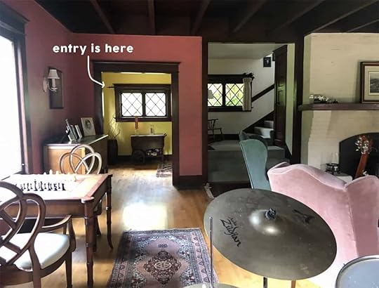
There she was before the project started – it was darker for sure (and fun fact–we salvaged one of those smaller windows in the entry and put in the new guest bath. It is inoperable but so cute).

You get a good idea of the bones from this shot. It’s a nice generous size–big enough for a bench or console, coat rack, a big piece of art, maybe some candle sconces, a rug, etc. This room feels so easy to me which I really really appreciate 🙂
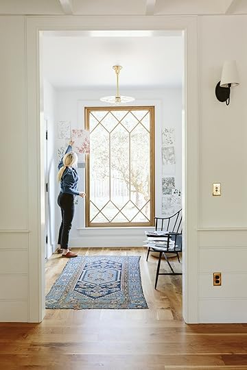
That custom Sierra pacific white oak window made my entry dreams come true. It brought so much light into the space, with views of the ancient apple orchard. ARCIFORM (hi Stephyn) helped draw out the proportions of the window grid so that it married the two styles of the house–the upstairs diamond pattern with the simpler squared-off pattern of the new windows on the first floor (we did this special pattern in the entry and sunroom but it was very splurgy so we kept the rest of the windows a simple grid for budget reasons). Knowing that we have yet to paint the living room, I kinda want to dial that room in before we make a wallpaper decision in here. Remember that the living room is more our problem child so I need to give that baby the attention it deserves before helping the easy kid learn math. Or maybe I’ll just choose my favorite and keep building the rooms together. I’m having such issues focusing and making any decisions in the living room (I think have SAD, btw) but I NEED to keep moving so maybe I will just choose my favorite in here and hope/feel confident that we’ll make it work with whatever we choose in the living room.
The light fixture is a vintage milk glass disc from Rejuvenation’s vintage and antique section. We put it on an unlacquered metal rod and their experts used a 3-bulb vintage base – which looks so awesome. We love that it has a presence but doesn’t distract from the window and isn’t too busy.

I love that Rejuvenation bench in here, but it’s actually a metal outdoor bench and we need a longer piece in here anyway, but she is really good. I’ve ordered this one from Thos. Moser which I think is going to be stunning and we’ll put this metal bench out on the front or back porch.

The wallpapers are mostly from Scandinavian Wallpaper, Schumacher, and House of Hackney. After we shot this I also was reminded by a reader about Kelly Ventura‘s new line. I promptly ordered so many samples that I just received and they are SO GORGEOUS. While I love all of these for different reasons I think Brian and I both want something that is soft, not too bold, and while I can go far into the floral world we both want it to be less Eccentric English Granny and more Chic Scandinavian Farmer, because that’s a thing (??). I actually ordered the bolder patterns for the upstairs guest bath (the pink bath) but I figured looking at them here gives us more to compare to and might help us hone in on what we love more.


It’s hard to decide because some of my favorites up on that wall we’ve seen a million times and nothing should be wrong with that, but it’s making it harder to commit. While others might be less ‘classic’ or more contemporary. I can’t tell you how helpful it is to be able to stare at it in these photos – giving me some distance from it which offers a bit of clarity.

Unfortunately, there is no clear winner yet. Brian really likes the one that is blue watercolor leaves and the longer we sit with it the more I think he’s right – at first, I thought it might be a bit too mellow but it has such nice movement, with an organic pattern that has life but definitely not bold. But some of these Kelly Ventura floral patterns (not shown) are so beautiful and just excite me more. But I’ve also learned that not everything has to be exciting and with the window, rug, art, candle sconces that I’d like to add, coat stand (yet to buy), bench, and light fixture there are already a lot of beautiful things happening. Stay tuned 🙂
Resources:
Floors: Oregon White Oak by Zena Flooring
Door Color: Poinsettia by Sherwin-Williams
Wall Color: Extra White by Sherwin-Williams
Windows: White Oak Sierra Pacific Windows
Bench: Rejuvenation
Light: Rejuvenation
Rug: Vintage
Basket: The Citizenry
Photos by Kaitlin Green
The post Our Farmhouse Entry – An Update And Big Wallpaper Debate appeared first on Emily Henderson.
November 7, 2022
Jess’ Closet Progress Week One – We Have A Pattern Idea, People!

This post will likely be the closest thing to my personal diary that I ever put on the internet (and I literally wrote about being single and depressed during the holidays during quarantine). I am slightly terrified that after seeing these “patterns” or “drawings” that I “created,” I will be immediately kicked out of the design community forever. Not that I thought I would only come up with masterpieces but I had higher hopes for my work. Showing them feels super vulnerable since they came physically from my right hand (FYI I’m right-handed) but the creative process is bad until it’s good right? RIGHT? The good news is that by the end you will see what I plan to paint in my DIY closet makeover and I’m really pumped about it. Ok, let’s remind you of what the space looks like…

Here she is in her current state. The shelves my dad built have been made (as you know) but I still need to sand and stain them which will happen this weekend since I am currently out of town:) A lot of you suggested I get hooks to hang my ladder and drying rack. Unfortunately, I need to lean a couple more things behind those two main pieces so they won’t actually be against the wall. But don’t worry, my curtain will cover everything and having those things on the floor doesn’t bother me. Now let me remind you of my paint plan…

As you can see from this graphic, I’m only painting the pattern above the trim. It’s going to be so much easier and most of the bottom will be covered by the curtain on this side and my clothes on the other. No point in wasting time, right? My one-month deadline is coming in hot!
Ok now, let’s get vulnerable…

This was my first attempt at doodling. I wasn’t trying to put any pressure on myself but I truly hated allll of it. I quickly started to doubt if I possessed even an ounce of creativity in my head. Then I decided to get out the watercolors.

I liked the idea of doing a really simple color block as the base under whatever pattern I came up with…but my watercolor palette was very limited (aka had none of the colors I wanted) and even with the paint totally dry, I couldn’t layer new colors on top. Maybe that’s something I used to know when I was young but my knowledge was now nonexistent and my patience ran out. So back to the pencil I went.

Here I made a rough template of the four walls and then photocopied a handful to try out different patterns. These would not have gone altogether FYI. I just did something different on each “wall” to see if I maybe liked any of them. I DID NOT. Maybe if I had the right colors to play with that would’ve helped but I still was NOT happy and again, defeated. Then I remembered how much I liked the walls in a room I stayed in at the Freehand New York. They were just simple line drawings on the walls and it looks awesome. So then I tried this…

The idea was to paint each wall a different but complementary color and then essentially have a single line make its way through each wall in a fun way. The paper on the left was a little too much. Ha. Then the one on the right is better but would need A LOT of editing. This was just the first draft.
But then an idea came to me! I’d seen morse code art and thought that would look so cool and could have a ton of meaning for me. I immediately thought of coding out my mom’s name and a sweet card she wrote me years ago. I love the idea of feeling her the moment I walk into my front door (and maybe forget that there’s a toilet staring at me dead in the eyes). I also think this closet is a perfect place for this design because not only did she love to dress up but some of my favorite pieces of hers are stored in there. For some context for those that may not know, my mom passed away 11 years ago. This probably makes more sense with that info:)
Anyway, this drawing of my mom’s card in Morse code looks comically horrible since I did it pretty fast, but I think it will look really cool when it’s carefully done and properly measured all out. Plus the “style” is totally in line with my love of shapes and goes perfectly with the rest of my apartment’s design.

So that’s the idea! I might play with scale and still might color block the walls to make it a little more joyful because that’s what it’s supposed to represent to me. It’ll be like my own little secret whenever I look up at it:)
Oh, I actually have another update!


Cafe Curtain Rod | Pinch Rings
I decided that as much as I wanted to have the rod attached to the bottom of the top shelf, it was going to leave a little gap between the side of the curtain and the wall. NO thank you. So I happened upon this cafe curtain rod from Rejuvenation. It was only $50 and could be cut to size! I paid for it with my own money and also bought 12 of the unlacquered brass version of those curtain pinch rings. All in all, after tax and shipping, it came out just over $100. I will be making two little holes in the trim but they can be easily patched and since this whole thing is custom I am happy to leave it for future tenants.


Semi-Sheer Linen Drape | Dark Linen Curtain
So now that I have the rod I need a curtain! I told my dad I was planning to go to my favorite fabric store and get one made when he asked why I wouldn’t just get a readymade curtain panel and get it hemmed. Great question dad. It hadn’t crossed my mind. Why do I always make things way more complicated than they have to be????? Now that I had a much smarter plan, I found these two blue linen curtain panels that should be wide enough so I only need one. The space is 52″ wide. I like the idea of the lighter blue but not sure quite yet. Next update hopefully I’ll have the answer.
Thanks for enduring my middle school-level drawings. I hope we are all impressed by the end result. GULP.
Love you, mean it.
The post Jess’ Closet Progress Week One – We Have A Pattern Idea, People! appeared first on Emily Henderson.
November 6, 2022
The Link Up: Em’s $8 Pantry Org Dupe, Jess’ No-Fail Holiday Gift Idea, And Our New Favorite Fun, Fast-Paced Card Game

Happy Sunday! So now that it’s officially November are you “team Christmas time ASAP” or “team whoa! let’s all wait a sec, Halloween was a second ago.” I feel like we are 50/50 over here (Mal and Caitlin are already spinning holiday albums:)). Whichever team you are on, we hope you had a good week with another fun one coming up. Oh and if you live in the US and haven’t voted yet PLEASE go vote! This is such an important election and among so many important issues, women’s rights is absolutely one of them. We have to fight to protect them. Ok, so until then just sit back, relax, and enjoy this week’s links.
This week’s house tour (not pictured above) is a treasure trove of architectural features and soul. But the story of this home is even more amazing. In 2018, Xan Balding bought back a beautiful home that was actually built by his parents in the 70s and that he partly grew up in! The staircase and the arched windows might be our favorite parts but you need to go see it and read the whole story on The Design Files.
From Emily: I’m deep in pantry org and styling mode and want it to be A. functional/smart/not annoying and B. nice looking. I can get so sucked into buying expensive accessories like that and did indeed buy these chip clips from Hawkins New York (a nice local company to support) but they were 3 for $18 and I don’t really need multiples of the coffee clip. So upon further internet research, I found these which are actually more functional, more affordable, still cute, and GREAT.


From Jess: My cooking adventures are still in full swing. This time I “helped” make a Middle eastern-inspired seared salmon Cous Cous bowl with tzatziki, and roasted tomato sauce with my friend on Halloween (I was only in charge of the tzatziki…baby steps). It was sooo good. As she was doing most of the cooking and explaining the process to me, I was snooping through her things, and naturally, my eyes went straight to this bottle of olive oil. My expert home chef friend thinks it’s a really good product and a great value for the price. Plus it’s less messy since it’s in a squeeze bottle! They are having a sale now so if you are curious this would be a good time to try. This would also be a perfect gift for either the home chef in your life or anyone who is hard to shop for. Add some Maldon salt to the mix and I promise it’ll be a home run. I know from experience. P.S. Add some fresh bread and that’s a perfect housewarming gift too:)

 via our place
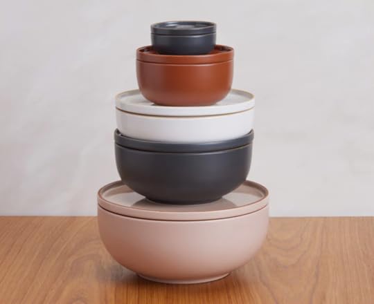
Also From Jess: Another item from this delightful dinner were the bowls we ate from (see previous dinner photo). They were the new Midi Bowls from Our Place. They are pretty, simple, durable, AND their Midi Plates can act as lids since they perfectly stack on top of the bowl. So smart! They also come in four other colors. 10/10.
From Albie: Last year I was introduced to Rainbow High by my mini — it’s an MGA series on YouTube that also streams on Netflix. I’d be lying if I didn’t admit that this show makes my inner child as happy as my actual child. To date, she has 16 of the dolls… and trust me there are a lot of dolls! Here’s what I’ve been loving lately — their latest season features a singing competition that includes Rainbow High, its sister school, its rival school, and some international exchange students. It’s very much giving a reality tv competition show. With it, they’ve released a World Tour Bus & Stage Playset and it’s already on the mini’s Christmas wishlist. It’s exactly how it sounds — a tour bus that converts into a stage — and my inner child loves this kind of imaginative play… and so does my real child. As a kid, I had BIG dreams of becoming a choreographer and going on tour with Aaliyah and Janet Jackson. I would’ve loved being able to have a playlet designed to help me play out these dreams with props & things specifically for that… not just dancing dolls around on a table. If it’s half as detailed as the Rainbow High Dollhouse we got her last year, this set may just be the perfect addition to her collection.
From Ryann: I have a brand new card game for all you word game/charades-loving people out there. It’s called Featherbrain and it’s a fun quirky card game that is perfect for game night. It works like this: The player whose hair is the most feathered reads the first card. All other players compete to win the card. The card will have the players doing something like guessing a word that the card reader says backward, guessing two words that are spelled the same minus the first letter but sound completely different, or acting out something ridiculous. The card reader chooses the winner and the winner reads the next card and so on. It’s fast-paced and fun and depending on who you are playing with, really funny.

From Mallory: If you’re looking for a restaurant quality dinner that’s EASY and COZY I have just the thing. The most delicious dish I have ever made is this lemon date chicken and it could not be more perfect for fall!! It’s by my favorite chef Alison Roman (she has awesome YouTube videos every week if you’re interested you should subscribe). It’s one-pot which makes clean-up easy and the date/lemon/shallot sauce is to die for. If you’re going to make this I HIGHLY recommend adding white wine instead of water (it makes the sauce way more flavorful) and I like to use bone-in skin-on chicken thighs because I think they work best with this. Let me know if you try this out!
Well, that’s it from us today so see y’all tomorrow xx
Opening Image Credits: Home of Jayma and Adam | Styled by Erik Kenneth Staalberg and Emily Edith Bowser | Photo by Sara Ligorria-Tramp | From: The New Design Rules
The post The Link Up: Em’s $8 Pantry Org Dupe, Jess’ No-Fail Holiday Gift Idea, And Our New Favorite Fun, Fast-Paced Card Game appeared first on Emily Henderson.
November 5, 2022
My Most Recent Vintage Haul For The BIG Kitchen Reveal
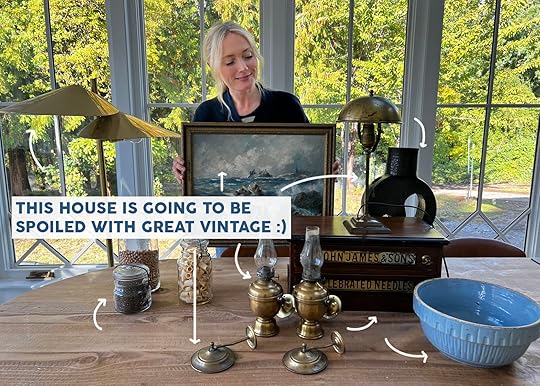
After showing you my prop room last week, I think we can all say that I don’t NEED more stuff. But when it comes to vintage I still snag things I think I can use or that will liven up a room or shot. Everything is a once-in-a-lifetime opportunity. But last weekend when I went to the Rose City Flea market in Portland I was seriously not planning on getting anything – I’m really trying to not keep accumulating for the sake of hoarding, but then as you can see below, I did. 🙂 It was no Rose Bowl but the serotonin flowed nevertheless and most of these pieces quickly found a place in our home and in a shot (NOT the prop room, I’m happy to report). A quick note about the prices – most of these pieces were on the spendy-er side, and if you are a big thrifter you are going to maybe think I overpaid – and probably I did. But after having my own online “flea” and having it end up not profitable at all, I have a lot of compassion for vintage dealers – it’s so much work for an unscalable business model. I think it’s safe to say that none of them went into it for the money – they all just love it and I want them to continue to do it!! I need them! I can’t really dedicate too much time to thrift shopping anymore, not because I’m over it but because it’s so much more work and time to find good stuff, especially when the antique malls in Portland are so good. There are more pickers competing than ever, and the thrift shops are mostly full of 5-year-old IKEA or Home Goods stuff (and I can’t believe what some thrift stores charge for home things – even more than they are new at the store!). So if I find something I love, that someone else spent hours sourcing, storing, transporting, wrapping, and unwrapping multiples times I really try to just pay for it without much haggling. But I also have a decent budget for home stuff (as it’s tied to work) and can write off anything that ends up in a reveal or on the blog – which yes, makes me very lucky. I’d just rather overpay on vintage than buy something new from a store that I might not keep forever. Again, I’m not saying that’s what you should do but if you are fortunate to have the extra money to spend – buying from local vintage dealers is the best way to go IMHO.
Sculpture (And Vase – Kinda)

This guy is so incredible, heavy, and oddly narrow – making it great to style on a mantel or even narrow bookshelves. It has a flower frog thing on top but I don’t think it’s meant to actually hold water (it doesn’t go all the way down). I’d more likely shove a weird sculptural branch into the frog. Excited about this on the mantel. It was spendy at $175 from @northwestmodern – a really awesome mid-century dealer. Zero regrets. It’s dope.
Drawer Box
As you know I have been collecting these store/apothecary drawer sets for a while now (mostly using them as side tables or nightstands). This guy was so cute but I couldn’t find a purpose for it…UNTIL I realized that I could use it in the pantry for all my teas!!!


It was expensive but I don’t remember how much because I got a lot from this dealer – I think it was between $150 – $250. Coming to a pantry near you soon – it looks SO SO CUTE.
Brass Floor Lamp
Now, this guy I got at the thrift store/consignment shop the next day (Hoot-n-Annie in Raleigh Hills for all you locals). It’s a Curtis Jere brass lamp from the ’70s and it was way too expensive (and yet not overpriced – these things run 2k + online). I passed on it the first day but then I kept thinking about it, picturing where it could go, and falling more in love. So I offered a much lower offer and got it (around $700. I KNOW I KNOW IT HURTS TO WRITE THAT).
Table Lamp
Oh, this little guy made their debut perfectly in the corner of the kitchen by the bar. We were even inspired by Chris Loves Julia and cut the cord to be shorter (yes this is a more permanent choice, but it looks perfect in the kitchen corner and if it doesn’t stay there it will go into the pantry, but I felt confident it didn’t need a long cord). This was a bit overpriced at $175, but I honestly didn’t have a tiny lamp for the bar which I wanted and we were shooting in a couple of days. And again – local, vintage, etc, so I talked myself into it quickly. Venmo is VERY DANGEROUS, FRIENDS.
Nautical Oil Lamp Sconces
A pair of nautical wall-mounted oil lanterns with little brass hats to block the smoke!!! How cute are these?!!! Ok, sadly these might have been the mistake – not because they aren’t awesome, but because I can’t seem to find a place for them. I was thinking they could flank the piece of art in the entrance, but the scale is pretty small in there.

Then I thought maybe flanking the entry into the pantry but I foresaw so many tragic accidents, bumping into them (and being glass, full of oil, etc). It’s weird to add more sconces into bathrooms that already have sconces, but then I thought maybe in the kid’s bath behind the tub or in the WC. That’s all to say that I’m still trying to find a spot for them but admittedly they are very specific and I probably should have skipped them until I knew for sure I could use them. Heck, since the other older house on the farm doesn’t have any electricity maybe I’ll install them on the walls of the prop room for nighttime searches (yes, they work but I’m also scared of fires so…. ). Maybe up the stairs mixed in with family photos/art? Stay tuned.
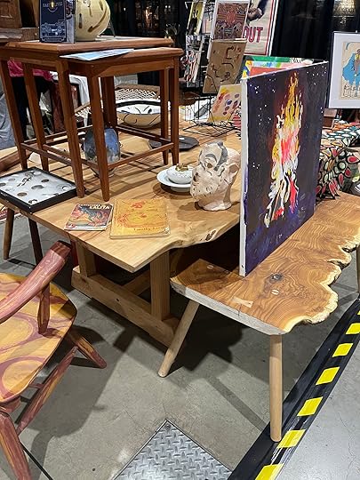
Cool Art Book By Local Artist

I met Purl, a local artist/maker who made these dope book covers for his art book that I thought could be used as art in Charlie’s room (which he LOVED – both kids loved them). Purl also makes custom furniture (like the table and bench below) which likely sold, but we might work together on a few pieces. You can follow in at @total_nonsequitur
 The Most Perfect Seascape
I was immediately drawn to this painting for obvious reasons – the colors. The vibe. The beautifully perfect blue and gold frame. I skipped it at first because it was $485. But it was the same dealer as the brass lanterns and the short brass lamp, and the more time I spent in his booth the more I KNEW it would work in the house. I have this other seascape that I’ve had forever (this one that was in our main bath).
 photo by tessa neustadt | from: our classic modern master bathroom reveal
I put that painting in the kitchen, on one side of the range and it looked SO GOOD and just appropriate. But I needed something to balance it out on the other side. Once I remembered that (while still shopping) and realized I had the exact spot for it, I could justify the splurge. Since I was buying so much from him he sold it to me for $400. And honestly, after seeing it in the shots (coming soon) it was worth every penny.
Pink Glasses
Now these coupe glasses (or desert cups?) I was unsure about needing or working perfectly on the bar, but for $30 I figured they were worth the risk of not working, and if they did work it meant not needing to buy new. Either way, I knew that Elliot would love to eat ice cream out of them (happy to report they are on the bar and look great).
Vintage Canning Jars
If you know me at all you know that I love vintage jars. A lot. We canned a lot of tuna growing up (not a tradition I will continue) and I started collecting these vintage ones for our wedding 15 years ago for vases/candle holders. These three were just so lovely and even though I had just bought a ton of pantry jars for decanting, these have so much character. They were $10, $15, and $20 (I think, somewhere around that) and I styled them on my kitchen counter for the shoot which looked VERY VERY PRETTY.
A Vintage Blue Salad Bowl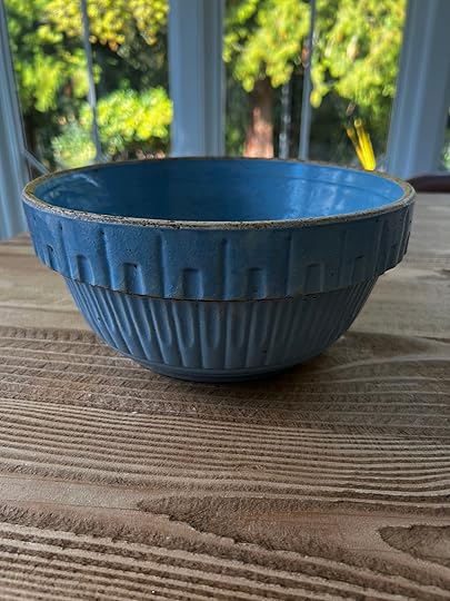
Lastly, from the same vendor as the pink glasses, I found this bowl which I thought would look really pretty styled up in the pantry as well as used for salads on our island, in the sunroom – anywhere. Just a pretty blue color, nice texture, farm-y in the sweetest way.
Here’s the first pic again (sans copy) of them all for scale (and as you can see they all work so well together!).

Obviously, we took super quick iPhone shots for today’s post, which always pains me to publish but I’m sticking to my mantra these days that done is better than perfect! And fun is better than done. 🙂
The post My Most Recent Vintage Haul For The BIG Kitchen Reveal appeared first on Emily Henderson.
November 4, 2022
My Favorite 5 Affordable (and Fast) Holiday Party Decorating Hacks


While we were contemplating what holiday content we would like to put out this year, we came across this post published a few years ago and realized these are the hacks I still go back to year after year. So if you are looking for some easy decorating ideas you can do with things you likely already own, this post is for you.
As a general mantra, I like to come across like I’ve cared, but not that I’ve tried too hard. I think it’s actually the secret to life. So at this point, your tree is likely up and decorated and you might have a garland or two, but maybe you are of the “lets amp this up” type say for a party or just a general injection of more holiday cheer. After seeing my house, Jess’ apartment, and Arlyn’s apartment decorated, plus past projects, we realized that there are some easy and affordable things that we have done (with stuff you might already have) that make a big impact. Let’s get right to it.
1. Wrap any and all presents and style with them
Of course, the key to this is hoping that you don’t only have pokemon wrapping paper on hand, but honestly, even if it’s just solid colors, craft paper, or newspaper (with simple ribbons), it does the job.

We use them almost like we would books in styling, in fact, yes I’ve wrapped MANY a book. See how cute a couple stacked on top of each other adds just a little more holiday cheer?
2. Pepper large plastic cheap ball ornaments on surfaces
They are graphic and simple for your eye to understand, but say holiday immediately. So easy and so affordable as you typically have leftovers hanging out in your bins (if not, your tree likely won’t miss a dozen or so).

I like to mix sizes, colors and even textures to add an extra layer of interest. You can group just a few (2-3) or even add a few solo moments here and there.
3. Cedar branches are a styling dream
Short on garland? Cedar (or eucalyptus or any green branches) can be a very cheap substitute for amping up the styling. I promise it’s SO EASY.

You can put it on shelving, credenzas, coffee tables, mantels even hang it on art, like Jess did.
4. Fairy lights will light up your holiday decor and life
Just put them on those cedar branches (or even a houseplant if it’s appropriate) for instant holiday ambiance, which is all we really want, right?


Arlyn even put them in her non-working fireplace. Like why not??
5. Red…it may be obvious but totally undervalued
You don’t need a ton of it. Bring in big bursts of this color in large ornaments, ribbon, bows, or wrapping paper. Yes, you can buy a poinsettia, just consider taking it out of its plastic coat and putting it in a more modern vessel.

You can also throw that pop of red in a pillow, throw and/or small decorative figurines. And the best part is literally any style can handle red. Take the Portland house above. It’s a traditional space so we used a classic red. Then below in Jess’ modern apartment, she used a less traditional berry red. It’s festive but in a fresh different way.

Both have the perfect amount of punch for a little more holiday love.
Holiday decor doesn’t need to be expensive or a money suck. Look around at what you have and you most likely have all (or most) of what you need to add that extra layer of holiday cheer. I hope this was just the right amount of inspiration to make your holiday a little happier and cozier. Do you guys have any other easy, budget-friendly styling hacks to share? Let us know in the comments.
And if you are looking for even more holiday inspiration, here are some very helpful posts for you:
#ShowEmYourHoliday: How You All Decorated For Christmas (Such Good Stuff, Folks)7 New Ideas That’ll Shake Up Your Old Christmas DecorWe Break It Down: How To Decorate For Christmas One Vignette At A TimeThe post My Favorite 5 Affordable (and Fast) Holiday Party Decorating Hacks appeared first on Emily Henderson.
November 3, 2022
Our Primary Closet Plan + Tips On Designing Your Closet For How You Dress

Without systems there is chaos. And while I’m decreasingly into fancy fashion (pandemic + working from home on a muddy farm + moving away from LA + rarely leaving the house) I still need a better system than two rolling racks and a dresser. I strangely still wear three outfits a day – workout clothes + comfy utility clothes + pajama sets. And oddly I need way MORE clothes here than in LA – not in quantity but in variety since we have seasons. And mud. I have what is called “jacket confusion” – and on any given day I wear THREE different coats – the cozy fleece, the rain jacket, the light parka that can also repel rain – not to mention if I want to look more pulled together and cute. Same with boots – I have my boots for cold but dry days, cold but muddy days, warm but muddy days, and finally warm (ish) and dry days (those are the cute ones). The weather makes it so you simply need more options for everyday utility. Regardless of how often I get dressed up, I needed something better than these two janky rolling racks. And while we didn’t need something fancy I didn’t want to be short-sighted and not be thoughtful about how we use our closet or how someone else might use it (should we ever sell). Here’s where we are currently:


I’ve worked with California Closets on our house in LA and frankly loved their customer service, expertise, and product. Also fun fact – the Oregon CC team is 100% women which is just nice to know 🙂 So Amy Bodi (one of their lead closet designers) met with me at the house and asked me all of these questions to help guide the function of the closet (and function leads form when it comes to closets). They take your info and present to you a plan (it’s full service). These are all very lifestyle questions that are obviously very personal to how you live your life. Brian and I are both on the messier side so we need extra help making sure that we are designing it to be easy to maintain and so that things are easy to put away (like literal children – it sucks).
What do you wear on an average day? Me: dog walking clothes/athleisure, then if I change for people to come over and then for shoots (a twice-a-week activity now) I’ll put on “harder” pants (jeans if they fit comfortably) and a cuter sweatshirt. Then pajamas – and I only wear sets.If it’s a shared space, what is the ratio of your combined belongings? (50/50, 70/30, etc.) Let that determine each user’s overall “real estate” in the closet. We are probably 70 (me) /30 (Bri). Do you like to hang or fold? This is hard because sometimes it’s just what you are used to. For instance, we’ve never had a walk-in closet except at our rental last year which was just four big rods (the mountain house is more like a galley but technically you can walk in) so I’ve never had the space to hang my jeans. That’s all to say since I hate steaming or ironing I like to hang most of my tops (not t-shirts) but not my pants. I also like to do laundry with the kids while watching TV on Sundays so folding is more fun than bringing hangers to hang. For us, we wanted ample “top” hanging space but prefer more drawers and shelves. How many “long things” do you have – aka dresses or coats? I only have about 10 long dresses but I have 7 fairly bulky long coats. Brian has 1 suit and 1 long coat that he never wears but dreams of wearing in December in New York again 🙂 Do you like to display your shoes? Do you want to see them? This was an easy no for us and I hate clutter (because I create it) so I did not want one of those fancy floor-to-ceiling shoe shelves with fancy lights. I’m just not a “shoe person” which is ironic because I have extremely unattractive feet (it’s ok, no self-shame, I think it’s funny) so you’d think I’d want to cover them up. But I think the cute shoes that you want to display are the delicate ones that I can’t wear because they really highlight my bunion and my pale or orange spray-tanned sausage toes. They are so special! How much of your clothes do you want to see and how many “steps” do you want to have to take to get clothes? At first, we thought that we wanted everything out of sight, but realized that it would A. look boring and B. be kinda annoying to open every single day. Plus covering it all up adds a lot to the cost and while we were partnering on this we didn’t want to be greedy. We had a budget we were trying to come in under. How Do You want to display your jewelry? I don’t have a lot of jewelry (I think I have a sensory thing because I just immediately take it off and leave it places. So I think some hooks are just fine, but we don’t need a drawer. Do you need a full-length mirror in the closet? Yes, but we will have this big one from Rejuvenation in our bedroom (better lighting for fashion posts), but a full-length mirror is still nice in here (it would just be super backlit if I were to take photos in it). Do you want a hamper in the closet, or if real estate is tight, should it be moved to the bathroom, bedroom, or laundry room? We hope to have a hamper in here and ideally not floating around 🙂 Are there any other non-apparel items that you prefer in the closet? (luggage, a steamer, etc.) Nope! We keep our luggage elsewhere and I use small steamers, not full-size. Hats…I do have a few hard-to-store hats!Two additional tips from California Closets: Where is the door opening? Let that determine where drawers, bins and/or baskets land. Drawers and bins/baskets are the nicest to look at and will function best if they have to open within the doorway (in a reach-in closet for example.) For a walk-in, try to keep hanging items along walls that have the most depth (and preferably away from the doorway.)
If you don’t have enough space in the closet for all your apparel, prioritize what’s in season, along with your daily undergarments. Use a dresser in the bedroom for off-season items and reserve a couple of bins and/or drawers in the closet for undies, bras, and socks so you can 1-stop-shop in the closet, rather than ping-ponging from the bathroom to the bedroom, to the closet, to the bedroom…you get the idea.
So here’s the process – they come to you to take measurements, you have long conversations about finish and style (which is better to do in their showroom so you can really experience everything) then your designer takes a stab at it and presents you the design. It’s WONDERFUL. Once again I was EXTREMELY impressed with their speed, knowledge, and expertise. When you only do storage design all day every day like they do, they bring such expertise that ensures long-term function and enjoyment.
Version A – Open Shelving With A Drop ZoneSo Amy (our closet wizard) sent two options the next week and we became just so excited.

This version is a lot of symmetry. Mirror in the middle (with my taller boots behind it). In this version (and others I think) I get the left side and the back side, Brian gets the right and some drawers along the back. Before you think I’m somehow steamrolling Brian (which literally never happens), Brian takes pride in how few clothes he owns. So yes, we both quickly agreed that I get more space than him.

This version allowed for a “drop zone” for both of us – to unload pockets and throw our wallets. We weren’t convinced we would keep them looking nice and they would get a lot of attention.
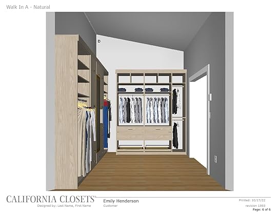
I think our feedback for this version was also that Brian doesn’t have that much to hang, so he wanted more shelves than hanging space.
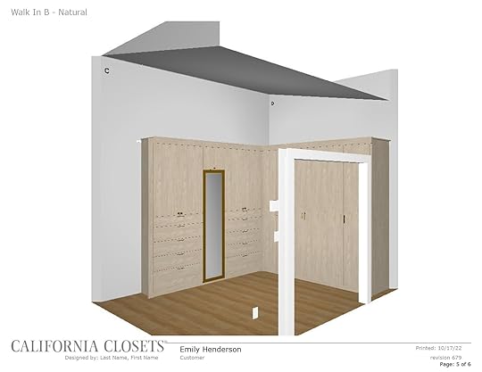
 Version B – All enclosed
Now this version was based on our initial request to not be able to see as much mess as possible. Once we saw what that would look like though we decided that they were right – that the “two-step” process would be annoying and that this is just less visually pleasing.

 Version C (Final Version)
So Amy took our feedback and did a final version.
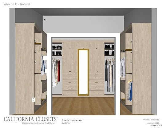
This felt perfect for us – a nice mix of hanging, shelving, and drawers.

The shelves on the left were going to have to be set back due to an outlet, but we are cutting out the wood instead to expose and integrate the outlet. We kept it there because I use a steamer a lot so I need to plug it in easily. The space under the shelves is for a hamper – I just bought this one, which admittedly now that it has arrived it might be too tall – not because it won’t fit, the dimensions are good, but it’s so deep that if you want to get out something you threw in at the bottom, you have to take it ALL OUT and make a huge mess. We’ll see if that annoys us too much or if it’s okay.

In this version, there is room for 16 pairs of shoes on the bottom, and obviously more room for seasonal shoes in the bottom of the hanging areas or above in shelves (like a bin of summer shoes). And again, my tall boots (that I have a lot of strangely) are behind the mirror.


In this version, Brian doesn’t get his own “full-length” section but I have too much of it so he’ll throw anything that is full-length (possibly just a nice coat and his only suit) on the back wall.

We chose the light natural wood – mostly because I loved it in Joy’s closet and felt that it had the most warmth (but they have a ton of different tones or woods or painted colors to choose from).
So we approved this design (and are so excited).
The post Our Primary Closet Plan + Tips On Designing Your Closet For How You Dress appeared first on Emily Henderson.
Designing Your Closet For How You Dress
Without systems there is chaos. And while I’m decreasingly into fancy fashion (pandemic + working from home on a muddy farm + moving away from LA + rarely leaving the house) I still need a better system than two rolling racks and a dresser. I strangely still wear three outfits a day – workout clothes + comfy utility clothes + pajama sets. And oddly I need way MORE clothes here than in LA – not in quantity but in variety since we have seasons. And mud. I have what is called “jacket confusion” – and on any given day I wear THREE different coats – the cozy fleece, the rain jacket, the light parka that can also repel rain – not to mention if I want to look more pulled together and cute. Same with boots – I have my boots for cold but dry days, cold but muddy days, warm but muddy days, and finally warm (ish) and dry days (those are the cute ones). The weather makes it so you simply need more options for everyday utility. Regardless of how often I get dressed up, I needed something better than these two janky rolling racks. And while we didn’t need something fancy I didn’t want to be short-sighted and not be thoughtful about how we use our closet or how someone else might use it (should we ever sell). Here’s where we are currently:
I’ve worked with California Closets on our house in LA and frankly loved their customer service, expertise, and product. Also fun fact – the Oregon CC team is 100% women which is just nice to know 🙂 So Amy Bodi (one of their lead closet designers) met with me at the house and asked me all of these questions to help guide the function of the closet (and function leads form when it comes to closets). They take your info and present to you a plan (it’s full service). These are all very lifestyle questions that are obviously very personal to how you live your life. Brian and I are both on the messier side so we need extra help making sure that we are designing it to be easy to maintain and so that things are easy to put away (like literal children – it sucks).
What do you wear on an average day? Me: dog walking clothes/athleisure, then if I change for people to come over and then for shoots (a twice-a-week activity now) I’ll put on “harder” pants (jeans if they fit comfortably) and a cuter sweatshirt. Then pajamas – and I only wear sets.If it’s a shared space, what is the ratio of your combined belongings? (50/50, 70/30, etc.) Let that determine each user’s overall “real estate” in the closet. We are probably 70 (me) /30 (Bri). Do you like to hang or fold? This is hard because sometimes it’s just what you are used to. For instance, we’ve never had a walk-in closet except at our rental last year which was just four big rods (the mountain house is more like a galley but technically you can walk in) so I’ve never had the space to hang my jeans. That’s all to say since I hate steaming or ironing I like to hang most of my tops (not t-shirts) but not my pants. I also like to do laundry with the kids while watching TV on Sundays so folding is more fun than bringing hangers to hang. For us, we wanted ample “top” hanging space but prefer more drawers and shelves. How many “long things” do you have – aka dresses or coats? I only have about 10 long dresses but I have 7 fairly bulky long coats. Brian has 1 suit and 1 long coat that he never wears but dreams of wearing in December in New York again 🙂 Do you like to display your shoes? Do you want to see them? This was an easy no for us and I hate clutter (because I create it) so I did not want one of those fancy floor-to-ceiling shoe shelves with fancy lights. I’m just not a “shoe person” which is ironic because I have extremely unattractive feet (it’s ok, no self-shame, I think it’s funny) so you’d think I’d want to cover them up. But I think the cute shoes that you want to display are the delicate ones that I can’t wear because they really highlight my bunion and my pale or orange spray-tanned sausage toes. They are so special! How much of your clothes do you want to see and how many “steps” do you want to have to take to get clothes? At first, we thought that we wanted everything out of sight, but realized that it would A. look boring and B. be kinda annoying to open every single day. Plus covering it all up adds a lot to the cost and while we were partnering on this we didn’t want to be greedy. We had a budget we were trying to come in under. How Do You want to display your jewelry? I don’t have a lot of jewelry (I think I have a sensory thing because I just immediately take it off and leave it places. So I think some hooks are just fine, but we don’t need a drawer. Do you need a full-length mirror in the closet? Yes, but we will have this big one from Rejuvenation in our bedroom (better lighting for fashion posts), but a full-length mirror is still nice in here (it would just be super backlit if I were to take photos in it). Do you want a hamper in the closet, or if real estate is tight, should it be moved to the bathroom, bedroom, or laundry room? We hope to have a hamper in here and ideally not floating around 🙂 Are there any other non-apparel items that you prefer in the closet? (luggage, a steamer, etc.) Nope! We keep our luggage elsewhere and I use small steamers, not full-size. Hats…I do have a few hard-to-store hats!Two additional tips from California Closets: Where is the door opening? Let that determine where drawers, bins and/or baskets land. Drawers and bins/baskets are the nicest to look at and will function best if they have to open within the doorway (in a reach-in closet for example.) For a walk-in, try to keep hanging items along walls that have the most depth (and preferably away from the doorway.)
If you don’t have enough space in the closet for all your apparel, prioritize what’s in season, along with your daily undergarments. Use a dresser in the bedroom for off-season items and reserve a couple of bins and/or drawers in the closet for undies, bras, and socks so you can 1-stop-shop in the closet, rather than ping-ponging from the bathroom to the bedroom, to the closet, to the bedroom…you get the idea.
So here’s the process – they come to you to take measurements, you have long conversations about finish and style (which is better to do in their showroom so you can really experience everything) then your designer takes a stab at it and presents you the design. It’s WONDERFUL. Once again I was EXTREMELY impressed with their speed, knowledge, and expertise. When you only do storage design all day every day like they do, they bring such expertise that ensures long-term function and enjoyment.
Version A – Open Shelving With A Drop ZoneSo Amy (our closet wizard) sent two options the next week and we became just so excited.
This version is a lot of symmetry. Mirror in the middle (with my taller boots behind it). In this version (and others I think) I get the left side and the back side, Brian gets the right and some drawers along the back. Before you think I’m somehow steamrolling Brian (which literally never happens), Brian takes pride in how few clothes he owns. So yes, we both quickly agreed that I get more space than him.
This version allowed for a “drop zone” for both of us – to unload pockets and throw our wallets. We weren’t convinced we would keep them looking nice and they would get a lot of attention.
I think our feedback for this version was also that Brian doesn’t have that much to hang, so he wanted more shelves than hanging space.
Version B – All enclosedNow this version was based on our initial request to not be able to see as much mess as possible. Once we saw what that would look like though we decided that they were right – that the “two-step” process would be annoying and that this is just less visually pleasing.
Version C (Final Version)So Amy took our feedback and did a final version.
This felt perfect for us – a nice mix of hanging, shelving, and drawers.
The shelves on the left were going to have to be set back due to an outlet, but we are cutting out the wood instead to expose and integrate the outlet. We kept it there because I use a steamer a lot so I need to plug it in easily. The space under the shelves is for a hamper – I just bought this one, which admittedly now that it has arrived it might be too tall – not because it won’t fit, the dimensions are good, but it’s so deep that if you want to get out something you threw in at the bottom, you have to take it ALL OUT and make a huge mess. We’ll see if that annoys us too much or if it’s okay.
In this version, there is room for 16 pairs of shoes on the bottom, and obviously more room for seasonal shoes in the bottom of the hanging areas or above in shelves (like a bin of summer shoes). And again, my tall boots (that I have a lot of strangely) are behind the mirror.
In this version, Brian doesn’t get his own “full-length” section but I have too much of it so he’ll throw anything that is full-length (possibly just a nice coat and his only suit) on the back wall.
We chose the light natural wood – mostly because I loved it in Joy’s closet and felt that it had the most warmth (but they have a ton of different tones or woods or painted colors to choose from).
So we approved this design (and are so excited).
The post Designing Your Closet For How You Dress appeared first on Emily Henderson.
November 2, 2022
Caitlin’s Bedroom Update! – The Disaster That Caused A 3-Month Delay And The 3 Design Questions She Needs Help With

SO MUCH HAS HAPPENED SINCE MY LAST BEDROOM POST. (In the world, but also in this room.) Schadenfreude fans, today’s update is dedicated to you!!! Things in here were very bad and scary and overwhelming (for me – it’ll be a fun read for you, at least), but we’re finally back on track after a multi-month delay. It’s been a minute (or, uh, 7 months?) since my last bedroom post, so let me catch you up on the complete unraveling of my life (followed by a few design conundrums, because technically this post is for “work” and not for “throwing myself a pity party”). We begin here…

 listing photo | move-in day
That’s the listing photo on the left and my move-in day on the right. The good: a palatial, 16′ x 11′ bedroom, really lovely light, plaster walls, and original hardwood floors and windows. The bad: THAT AIR CONDITIONER. Spoiler alert: it leaked. Badly. I’m still not sure of when it started – it was an early 2000s window unit (i.e. slightly different drain/overflow functionality than comparable wall units) and the A/C’s remote control meant that it was always a little “on” even when it was switched “off,” but a water damage expert later suggested it may have been going on for a while (like, since before I moved in).
I still remember getting the call from my landlord requesting entry to my apartment – mainly because it was really late at night, my boyfriend and I had just checked into the world’s tiniest Boston hotel room after a traumatic dinner that ended with a friend carted away in an ambulance (she was fine, thankfully!), and I’d just realized that I’d booked us a room that boasted really special amenities, like no staff on site (!), stained sheets (!!) and a whole room-sized bed with a stunning view of THE BATHROOM’S GLASS BARN DOOR (jackpot!). You know when people are like “chin up, it can’t get any worse?” They’re lying! It definitely can, baby!!!!
ANYWAY. The phone call. My landlord told me that the paint on my downstairs neighbor’s ceiling was peeling, which indicated water damage. Upon entering my room, my landlord later described seeing a few cupped and buckled OG hardwood floorboards (yeah, an absolute gut punch, I know) in addition to water damage surrounding the A/C unit. I flew back to LA and hired a water damage specialist, who officially confirmed that the A/C had caused the damage, and I made a plan to stick around the apartment for a few days to supervise the repair process. (LOL. A FEW DAYS. So naive.)

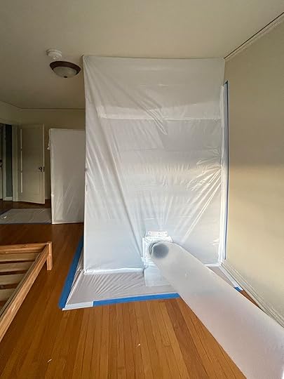
 we got mold, baby!!!
Well…that was the plan, at least, until I peeked inside the A/C cavity while my building’s handyman was cutting open additional sections of the wall to house the new replacement unit. (Side note: I learned my building literally does not have insulation, which is why the temperature outside is the temperature inside! Fun old apartment things!) I’d never seen inside an ~100-year-old building before, but I was preeeeeeetty sure that walls of any age are not supposed to be simultaneously slimy AND fuzzy.
But wait, there’s more! After the wall was opened more, I learned that there was no asbestos survey on file with the city for my building…so there was no way to tell if the thick layer of dust now coating the entire room was dangerous or not. (The good times kept on comin’!!!) After spotting what I thought looked like mold and learning about the asbestos risk, I stopped the work and called my landlord, who scheduled sample testing. About a week later, an inspector collected wall, paper, debris, and air samples and I’m SO glad I advocated for myself, because…

 nbd!
nbd!I MEAN. GUYS. Should I play the lotto or what?! LUCKIEST GIRL IN THE WORLD OVER HERE! I’m not joking, though – despite being built in the 1930s, I somehow live in the only old building in Los Angeles that wasn’t constructed with asbestos material. The testing did, however, indicate two types of black mold in the air – stachybotrys and chaetomium – and this literal Dexter scene went up in my apartment 3 weeks later. (I have to confess – the wait between my initial “hey, I think there’s mold here” and complete remediation was brutal and took waaaaay longer than I’d anticipated. So much sofa sleeping! So much back pain! I got my first ulcer from being so stressed!)
After the first round of remediation, air quality testing indicated that all the mold hadn’t been eradicated. The team came back the next week, cut out more of the plaster wall and original trim (again – a gut punch), and sprayed everything down a second time. A bright spot: my boyfriend flew out to LA and was present for most of the remediation – we slept on the floor of my living room while industrial strength fans ran 24/7 in the back of the apartment – and having someone who was willing to hoof it to Walgreens to buy Pepto for the aforementioned ulcer when I thought I was dying DID actually make the process a little bit (or a lot, TBH) better. I think it’s really easy to spiral in housing situations like this – especially when they’re going on and on, week after week – so I’m really lucky that I had a great support system who helped me figure it all out, at least 🙂
 SHE HAS A ROOM TO SLEEP IN AGAIN!!!!
And thankfully, the second round of remediation did the trick. I spent a week with that microbial crime scene in my room before the remediation company got the all-clear, and it only took about 4 half-days to put the whole space back together – one to measure, one to hang drywall, one to mud and paint, and one to fix the flooring (which had dried out significantly in the time it took to handle the other issues – the cupped boards had mostly flattened, and my building’s handyman was able to remove screws and knock the buckling floorboards back down into place). This weekend – after nearly 3 months – I was finally able to move back into my own bedroom. I WILL NEVER TAKE IT FOR GRANTED AGAIN, I SWEAR.


 loden | goldenrod | cognac
To that end, LET’S TALK ABOUT THE FUTURE. The last time we chatted about this room, I was working through three potential bedroom color palettes in an attempt to make a decision about which one of these beds to order. I loved reading your feedback – thank you for helping me work through my analysis paralysis! – and this weekend, my bedroom fiiiiiiinally started to take shape when my new bed frame was delivered…
DISCLAIMER: Before you look at these – yes, it is a king-sized bed. Yes, I do currently have my full-sized mattress in a king-sized frame (still deciding on my mattress – it’s a huge investment that I’ll spend 4 months a year asleep on! Though I am currently heavily leaning towards this one for its heating/cooling functionality – would be great to not have to use the heater or an A/C at night!). Yes, those are t-shirt quilts (I know I work at a design blog, but my mom gave them to me and I love them!). Yes, it is kind of nerve-wracking to put your VERY in-progress room on the internet, but…if I can use a bathroom with a glass barn door, I can do this too:)
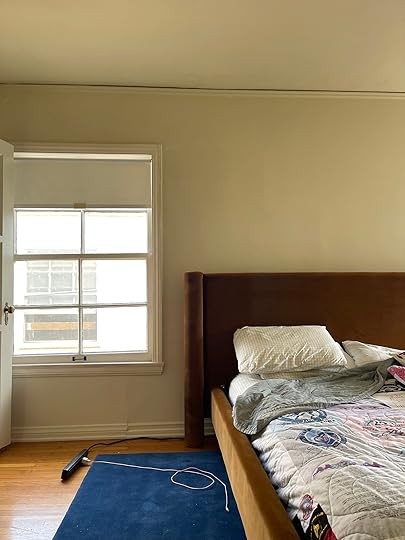

AHH. I know there’s a ton of work to be done here – and we’ll walk through it all below – but I feel like I’m starting to see what it can look like in here, you know? First: THE BED. I went cognac, y’all!!! I know the lighting on my iPhone isn’t the greatest – and these aren’t edited at all – but it’s such a luxe, rich, rust-meets-gold shade (at least in here, with northeast light!). My wall is 107″ long and this headboard is 97″, so I love how it fills out the space – going from the world’s bitsy-est bed to something that’s appropriate for the scale of the room has been a game changer.
And second: HELLO, RUG! Once I saw the Grand Rug in Deep Blue, it was ooooooover for me. I literally cannot tell you how much I love this rug – it’s so plush and the color is out of this world (it’s saturated AND quiet? Solid but still dynamic? It’s a literal dream! They just announced new colorways and I’m trying to figure out if I can work one into my dining room because I love it so much). I actually cried when I rolled it out (not joking – this whole mold thing has been weighing on me for a long time and finally seeing this beautiful rug against my brass dresser BROKE ME. I really truly love it and I can’t wait to style around it!!!!).

This brings me to my next point – y’all, I’m expanding the color palette a little bit (from “cognac and desaturated blues” to “cognac and pretty saturated, uh, everything else.” The front of my house is going to be pretty restrained and a little more minimal – mainly lots of pinks, greens, neutrals, and texture – so I want to make a space in my home that’s a little more vibrant and energizing. (Everyone I know will testify that I have no problems sleeping, so my bedroom priority is more “WAKE UP, LET’S GO” than “WIND DOWN, RELAX,” you know?)
I ended up pulling two of my favorite vintage pieces in here – an Otomi pillow (a 2017 Long Beach Flea score!) and a Tobacco Leaf card case (there are two sets of printed playing cards in there, too!) – to serve as the jumping off point for the rest of the color in here. I’ve loved both prints for years and I’m really excited to have a bedroom that makes me feel as happy and energized as these two pieces do:)

Which brings us to our first debate: What color should the walls be? I thiiiiink my current frontrunner is the faux grasscloth wallpaper from Society Social in either citrus or sage – I love how the classic texture balances out the super-modern bed shape, and it’d be a great backdrop for the rust fabric – but to be fair, I also don’t hate how the wheat faux grasscloth looks in my little keynote mockup, either. I’m also open to just painting in here, which is obviously the easiest and most affordable option – what are your thoughts?
Next up: let’s talk nightstands, please! I originally wanted something square and campaign-y to tie in the brass dresser, then I thought that something really long could balance the visual weight of the 8’ headboard (!!!), but now I think I’m back to looking for something a bit more squat and plinth-y that could fit in the confines of the rug. (I have about 23″ between the edge of the bed and the edge of the rug, and I do want something with storage – maybe campaign nightstands were the right call all along?) Either way, I feel like I’ll know it when I see it. (Also on the hunt for a cute vintage perch for the corner so my cat can sit comfortably in the window – she loves people-watching!)

MOVING ON. I still cannot believe that I own this dresser (and that I did not have to like, go into debt to acquire it!). VINTAGE DREAMS DO COME TRUE (if you are very patient and prepared to wait forever, at least). This one is in incredible condition – it was actually in better shape than the one I wrote about in our 2021 “if money were no object” post – and scale-wise, it’s almost like it was meant for this wall. Design-wise, I’m just planning to hang a few of my favorite art pieces up here (and I’m also on the hunt for a good vintage jewelry box to adorn the top of the dresser, if anyone has any fun leads!).

The last two walls are giving me a bit of design trouble, so stick with me for some external processing. The facts: there’s 3.5′ feet between the foot of the bed and this wall – it’s a super comfortable walkway, and I’d almost rather not clutter it with a bench or stools or baskets. That said, I am going to need to suck it up and figure out a location for a new full length-mirror (I don’t know if y’all can see that one, but it’s broken and it drops shards of glass every time I move it, so it’s probably time to call it and recycle her, hah).
I’m leaning towards placing it on this wall – a bit to the right of where the TV is right now, but I’m worried about the rest of the wall/walkway feeling sparse and empty. (Maybe it’d be a good use case for the huge famous Rejuvenation arched mirror?) I’m also worried about putting so many reflective items next to each other – will it be too much? Beyond that, will I regret not opting for an end-of-bed bench or baskets or even a narrow storage solution on the wall? I’ve only owned twin or full beds and am planning to celebrate this upgrade with some very liberal pillow usage, so I guess I do need to put them somewhere at night – if you’re currently a king bed owner, what works for you?

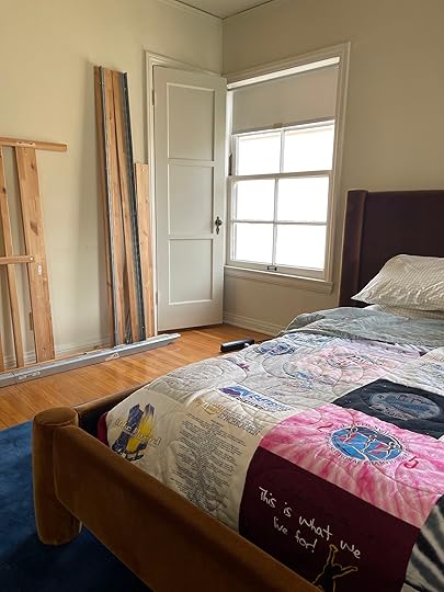
Moving on! First – if anyone wants a free IKEA Tarva bed frame in LA, please leave a note – it’s yours 🙂 I feel like the size of this wall is better scaled for a mirror, but the 5′ distance between the bed and wall have me considering some sort of vintage armoire or chest here. I originally thought it’d be a great place for a vanity or desk, but I like doing my skincare near a sink (because I’m messy, and I also because need water), my makeup near the window (better lighting), and my work from…well, not in my bedroom, I guess. I’d like the extra storage (and honestly, I’m not crazy about waking up and staring straight into my own eyes every morning), but maybe a smaller mirror closer to the hall door on the left would be nice?
Last but not least – let’s talk WINDOW TREATMENTS. I’m torn here – on one hand, I want to go with bamboo shades because I love the texture they bring to my home (I just hung these $48 cordless ones in my living room and they look just as good as the $600 versions!), buuuuut they don’t have awesome blackout functionality (which is okay in my living room when they’re layered with curtains – that’s just less of an option here, considering that a curtain would make that closet door on the right annoying to use). Light leak doesn’t really bother me, but I also don’t want to buy multiple window treatments if it ever does, you know?
My alternate option: go with a patterned shade. And while I love this idea now, I worry that any pattern (outside of something simple, like a neutral stripe or dot) will really lock me into a certain color palette or direction. Right now I love that the bed, rug, and dresser are functioning as such a versatile base layer – every piece I’ve brought in here has looked awesome against this backdrop. (I mean…I knew saturated blue with warm leather and brass is one of my favorite combinations to build upon – very classic EHD! – so of course, this cognac fabric is a great substitute for leather!) I’m excited about the flexibility to mix things up in here, and I can’t wait to figure out if I should optimize for texture or pattern. It’s a fun problem to have, at least. (FINALLY.)
That brings us to the end of your schadenfreude-y rollercoaster ride – another saga in the books. (Like literally, in the books – my apartment passed inspection yesterday at 10:50 AM and it’s officially a closed case with the city!) As a reminder, I’d welcome your thoughts on paint/wallpaper, nightstand shape, mirror placement, end-of-bed necessity, chest/armoires vs. desks, and window treatments. And if I can help answer any mold questions…or if you’re in the market for an IKEA bed frame…well, I’ll see ya down there. Happy Wednesday 🙂 xx
The post Caitlin’s Bedroom Update! – The Disaster That Caused A 3-Month Delay And The 3 Design Questions She Needs Help With appeared first on Emily Henderson.
Emily Henderson's Blog

- Emily Henderson's profile
- 10 followers

