
Emily Henderson's Blog, page 112
October 24, 2022
It’s Jess’ 6 Year Workaversary And Here Are The 6 Biggest Things She’s Learned So Far (+ A Never-Been-Told Story)

*** A highjacking from me, Emily, real quick. Today is Jess’ six-year workaversary and I literally couldn’t be luckier to call her my #2. She brings and gives so much leadership, creativity, insight, innovation, compassion, loyalty, love, organization, ease, and FUN – I’m just constantly grateful and impressed. She has talked me up when I’m been so low, and effectively helped save the company when I was at my lowest. This blog would absolutely not be as great as it is without her steering this ship through the incredibly difficult waters of digital media. So let’s show Jess so much love in their comments. WE LOVE YOU JESS AND THANK YOU FOR SIX WONDERFUL YEARS. Love, Emily.
6 years. I can and also very much can’t wrap my brain around it. All I can think about when I see that number is how when I was living in New York I told my friends that my dream would be to work for Emily Henderson but she’s in LA and I’m definitely not moving to LA. Well, the joke’s on me because fate decided to play the long game by moving me to Australia with an ex, then to San Diego for a short 5-month stint, until an opportunity from my cousin got me an interview with Emily for a graphic design/admin position. To say I literally couldn’t believe it at the time is an understatement. But I eventually let myself believe it, put on a light blue wrap dress from H&M that I bought for the occasion, tried to calm the nausea, and went to my first interview. Then, like a little crazy person, emailed her once a week for a month to check in to see if she had made a decision. After that fourth email, I decided it was time to let it go. I got the hint. Ha. Honestly, I wasn’t too shocked but I was a little heartbroken. It just felt too serendipitous not to work out, right? Why was the universe doing this to me? What a tease! But then, after I had finally let it go, about a month later, I got the email asking for a second interview which turned into a week-long trial. I think that’s where we should actually start today’s lesson plan…
1. A Little “Fake It Till You Make It” Attitude Isn’t The Worst Idea (Sorry, Em!) as a test, em asked me to create my dream living room and this is what I came up with. is it still the dream? no. but i still like it even though the price is WILD and it’s not even styled!
 I didn’t technically lie (see above graphic for proof) but I maybe didn’t say that some of the required skills for the position were pretty new to me…as in I started learning photoshop when getting an interview was a real possibility. In a perfect world, I would have been a photoshop wiz, and a photography pro but I was neither. However, I had very basic skills and was a dedicated learner, willing to put in whatever work I needed to so I wouldn’t screw up my big shot. To my credit, I did have a decent amount of admin experience:) Now, this isn’t a new idea but it’s so true that women especially feel like they have to be experts at something before they even think about applying to a job, and normally that is 100% me. But I didn’t know if this chance would ever come back around and I wasn’t going to let my insecurities take over and not even try. So let this be a lesson in confidence. If you’ve literally never touched photoshop and that’s a huge part of the job you’re applying for, then maybe wait until you have some skills. But a lack of confidence with basic skills versus not being able to do the job at all are clearly two different things:) Also to any actual graphic designers, I apologize for these amateur GIFs you are about to see…
 i actually sent this to emily with my resume and a few other graphics that I’m too embarrassed to put on the internet. smh.
I’ll never forget the first photoshop assignment that I was given on my first day. It was a GIF of Emily’s LA kitchen to help the readers see the vision. Brady asked me, “So you know photoshop, right?” to which I responded cool and calm with a quick “Yes.” Then with an “Ok, we’ll see” from Brady (accompanied by a gentle smirk as if he saw right through me!) I was off to hopefully be asked back the next day. Here is my masterpiece:
 doesn’t this feel soooooo long ago?2. Kindness And A Positive Attitude Are CRUCIAL For A Happy Work Environment (And Climbing The Ladder)
I can’t stress this enough and is HUGE to Emily (and me). When I say it’s essential to not only enjoying your work but also climbing the ladder is because I know that it was a factor in my getting promoted every couple of years. Yes, I work really hard and take pride in what I do so that’s paramount. But it’s much easier to hire someone who is clearly happy at work and brings good energy, right? If you were a boss isn’t that a person you’d want to keep around if their work was also on par? So even when some days are hard because you’re frustrated for whatever reason or you’ve got something hard going on in your personal life it just affects everything and everyone if you bring it to work. This isn’t to say you shouldn’t feel your feelings and bottle them all up, but your energy has power both positively and of course, negatively. Using it intentionally will make the work better, collaborating way more fun, and the overall morale of the company high. I think everyone here can attest to that. Please don’t take this as me promoting toxic positivity. We are really aware and sensitive so we can tell someone is off. Sometimes we check-in right away while other times we can tell they just need a little space. It’s just that at the end of the day, especially in a job that requires creativity, collaboration thrives with positivity and dies with the alternative.
The pandemic was, for obvious reasons, one of the most challenging times for this and I was promoted to editorial director less than a month before lockdown started. I am naturally a pretty positive person and felt I had learned so much about leading in this position from Brady and Arlyn who had been in this role before but this was uncharted territory. This was ALL of our first time being remote. We all, of course, had Emily but I wanted to prove I was up for the job and that she hadn’t made a mistake by promoting me. But I didn’t know how was I going to do my job and keep morale in a good place when all I could do outside of work hours was lay on the sofa in a near fetal position staring at the puzzle I had bought which was now taunting me. To be fair, everyone on the team has an incredible attitude but understandably we were in an uncertain time and I wanted to be there for everyone if they needed it.
We clearly made it through those extremely tougher times, navigating it daily together. As a whole, it’s everyone’s positivity and kindness, creativity, and humor that make me happy to come to work, even when life is really hard.
 kinda staged but mostly not<3
As a side note, a huge reason for all of this is Emily’s hiring skills. She hires great people that only add to the strength of our content and our team. While I don’t know all of her secrets, her gut is usually right and she tries her best to take her time. If I’m ever in a hiring position, I will absolutely take this with me. Skills are absolutely important but attitude and energy might be more…or at least equal.
I mean look at this hardworking, fun group! Not mandatory to all like each other, but definitely a HUGE perk:)


 pics from my personal files3. Embrace Change And Be Flexible

 how the studio looked when i first worked at ehd | after the first studio was designed | the new office before we officially moved in
At this point, I think I’ve been through six or seven versions of EHD. All special in their own ways. Every once in a while I’ll drive past our first office and really miss those days. Days when I was so new and SO scared but also incredibly happy because I loved the work and finally felt like I was building a career in the industry I’d dreamed about. But then we moved offices, decided to no longer take on private clients which meant Ginny and Mel were going to start their own companies, and a year after that, Brady decided it was time for a change. I remember thinking, “Brady can’t leave. What is EHD without Brady???” And while that shift was really sad because we all learned so much from him, we were ok. We knew what to do and of course, we had our Arlyn. Arlyn was the one who was willing to let me become a writer, drilled into me the importance of a work/life balance, and became one of my dearest friends. Then after a couple of years, Arlyn was ready to try her hand in a new field, giving her a new challenge after a decade in editorial. This then led to me getting the chance to take a stab at leading despite the similar feelings of not knowing how we would move forward without her. But here we are! We made it through lockdown, were are still doing great, and our real leader, Emily, is in a different state. Some of those shifts were easier than others, missing old coworkers persists, but I’m never not incredibly grateful for our team now. So just remember that change can be hard but also just be another kind of wonderful. Resisting change whether it’s employee shifts, location changes, or even a stupid algorithm, will only hold you back. Being adaptable is really the key to success. Em is the champ of this because after 12 years her business is still going strong and boy has she had to be willing to roll with the internet punches.
4. Fight For What You Believe In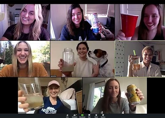
Sorry for that wildly cliché header but you are about to find out why it makes the most sense. This is also something I never thought I’d write about but got Em’s permission so here we go. Curtain lifted. Back in September 2020, it was a particularly tough time as a company. Our dearest Sara and Em’s #2 was ready to go freelance. We simply weren’t shooting any projects so most of the admin/HR stuff was given to her (and because she’s great at everything, she was nailing it but it wasn’t what she wanted to do. Very understandable.) As happy as we were for her and knew she would still be our photographer and friend, it was a really hard loss. That lady is a rock that we all leaned on. I know I did. So with Sara leaving, the world going through a raging pandemic as well as a necessary racial justice uprising, Emily understandably was having a hard time seeing the future of the company and if her voice could be of service or was even needed anymore. On top of that, Em had an offer to potentially sell the blog to a larger company. That’s hard to not consider when everything feels so uncertain.
So on a Monday call, she and Sara announced that Sara would be leaving in a few months (to become a full-time freelance photographer) and we could tell Emily wasn’t sure what the future of the company was going to be without her while being in another state. For that whole day, I was nervous and trying to stay calm. Could this job that I loved, that had been my home, that was a catalyst for my creativity just going to vanish? But then on day two, I said “no”. I got extremely fired up and decided, with the help of the team, we were going to prove to Em how we could make this work, even with her in Portland. We pulled together a PowerPoint presentation showing ideas for the blog and social, ways for her to be less involved if/when she needed a break, and financial projections. I’ve never been so nervous but with Caitlin by my side, we gave her our presentation. It was a beautiful and emotional meeting and when it was done Em was really grateful for the work we all had put in. Naturally, she took some time to think about it but the presentation gave her the confidence she needed to know that we’ve got this. Everyone, especially at that time, goes through hard moments and while this blog needs all of us to run it, ultimately it’s all on her. She’s the leader and the face so that comes with an unbelievable amount of pressure as well as scrutiny. I’d like to think (which she has confirmed) that us being so passionate (and researched) made her feel super supported during that time and you may have guessed the outcome because well, we’re still here baby, 2 years later:)
5. I Don’t Want To Own My Own BusinessThis feels like a strange and almost shameful thing to admit because it almost feels un-American as if you aren’t an ambitious person. Not that I care at all about “being American” but we are raised to strive for it. It’s seen as the ultimate goal because if you’re lucky there are big financial pay-offs. But working here has taught me that it’s not my goal and here’s why. First off, when you have a boss who trusts you, gives you autonomy and agency to say, go to a doctor’s appointment without needing permission or making you use PTO, encourages/supports creative ideas, and generously gives you financial and experiential perks, there is not a lot that leaves you wanting too much more. Imagine that! Look, more money is always great (especially with the cost of living increasing by what feels like every hour) but HOT TIP, treat your employees well and like real people with lives and they may want to stay working for you. Of course, if starting your own company is your dream then yes, go for it. But I’ve found that I really enjoy being a leader while still in a supporting role, I thrive in it. And it’s not that I don’t think I could start my own business but I also see the pressure that a job like Emily’s has. Not to mention once again, the intense scrutiny of the internet. So despite being grateful and excited to show my work to the world and get a little recognition for it, even I still feel some pressure. I give so much credit to Emily for how she handles it all and yes, there are SO MANY wonderful parts about Emily’s job that are extremely enviable. It’s such a great life! But these six years here have shown me more of who I am and how I’m built and I’ve realized that I am really happy in this type of role. I say this to hopefully release any weird shame around this if you feel this way too. The world needs awesome new businesses with strong, generous owners, but they also need talented people to help run them.
6. The Story Behind This Photo (That Ends In Good Lesson)
TW: Body Image
This is more of a personal lesson I continue to learn as opposed to a work lesson. So my eyes look pretty bright and green, right? Well, there were especially green for this photo because I was crying before it was taken. Up until this day I had been on a really great routine of eating well and exercising which resulted in losing a little weight. Body image has always been my biggest hill to climb and has taken up the majority of my therapy hours. As much as I know it’s SUCH a waste of time that I wish I could get back and not continue to think about – we weren’t there then and honestly are only a tiny bit better now. Anyway, we started taking photos in the office and every photo of me I looked at made me want to crawl into a hole. It was as if all of my hard work vanished. I could feel the tears coming so I quickly went into the bathroom to let them out. So not only was I upset with how my body looked but I was also pissed off that I was so upset to the point of tears. How was I still so affected at 30?! Anyway, we moved outside and sweet, patient Veronica took some more shoots and we got one that I was happy with. And it’s not that I think anyone who sees this photo even has two thoughts about the person in it. But I just want to remind you (and me) that no matter how beautiful the room on the internet is, there’s a room right next to it that’s A MESS. And no matter how confident a person may look in a photo, they are likely dealing with a few issues that might be the same as yours. It’s a story as old as time but working at this wonderful job, with incredible people in what is considered by most a dream industry, isn’t perfect and doesn’t lack lots of mess. So while I am absolutely still guilty of comparison, and I know Em is too (we are human, unfortunately), remember that a photo or an instastory or whatever it is almost never tells the full story. Also, do your best to love yourself for every part of you. We’re stuck with ourselves and I’m working on it too<3
 the blue dress and shoes i wore to my interview and honestly probably too formal ha.
Lesson plan/story time is over. Hope this was helpful or relatable, or minimally was fun to look at some old photos…and GIFs. It’s been a wonderful and wild six years and I can’t wait to see what the next year has in store<3
Love you, Most definitely mean it.
Opening Image Credits: Left Photo by Tessa Neustadt, From: Our New Design Library and a Sneak Peek Into Our Studio | Right Photo by Sara Ligorria-Tramp, Styled by Emily Bowser, From: MOTO Reveal! How Jess Made Her WFH Office/Living Room Totally Multifunctional (With Big Help From The World’s Most Beautiful Smart Monitor)
The post It’s Jess’ 6 Year Workaversary And Here Are The 6 Biggest Things She’s Learned So Far (+ A Never-Been-Told Story) appeared first on Emily Henderson.


October 23, 2022
The Link Up: Em’s Favorite New Collab, An Excellent Body Scrubber, And A $20 Kitchen Tool That Cuts Down Dishwashing Time

Happy Sunday yet again! It finally rained a little in LA which means it kinda feels like fall now and we are PUMPED. Oh and how fun was it to see a bedroom in the farmhouse mostly revealed?! That pink color is truly so soothing and happy. We all can’t wait for the next reveal. But until then we’ve got some links to get to…
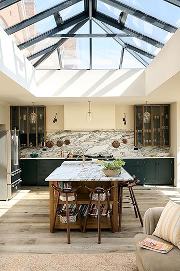
 design and photos by deVOL kitchens
This week’s hour tour is from none other than deVOL kitchens. When we got the press email about it we knew we had to share it with you immediately. That vaulted glass ceiling is what dreams are made of, the two-toned cabinets make it feel so inviting, and how sweet are those glass pendants above the dining table? Go check it all out on their site!
 photo via etsy

 photos via etsy
Birchwood Cozy Crochet Garland | Blue Checkered Furoshiki | Rose and Gold StarBurst Tree Topper
From Emily: Amber Lewis’ Etsy Christmas collaboration is really good. I’m putting like 6 things in my cart and it’s supporting a lot of makers. These collabs make me so happy and a Christmas one is so up my alley:)

From Ryann: For me to consider something a good product (and therefore good enough to recommend to y’all) I have to want to use it every day or at least once a week, depending on what the product is/does. This body scrubber meets that criteria. I’ve never been someone who uses a loofah, but I LOVE this body scrubber and use it every day. It’s nothing special but it’s affordable, and it just feels good on my skin. I feel cleaner and exfoliated when I use it and it makes me enjoy showers more. I actually got it as a part of a gift with other beauty products, so I think it would be a great little gift or stocking stuffer.

From Jess: I might be the last to know about this wildly useful kitchen tool but I am soooo tempted by this oil measuring dispenser bottle I saw on TikTok. Measuring spoons need not apply anymore. It also means fewer dishes and if you have a dishwasher, it’s dishwasher-safe. It’s definitely not a beautiful artisan-made bottle but that’s nothing a cupboard can’t fix:) Has anyone tried this? Does it hold up??
Also From Jess: Here’s another late-to-the-party rec. If you are looking for a new show, I finally watched Formula 1: Drive to Survive after hearing about it on Armchair Expert when Daniel Ricciardo was a guest a couple of years ago. It’s fun, exciting (but not too stressful which I prefer), and it’s pretty interesting how that whole F1 world works. Plus if you are into it there are four seasons to dig into! If you do watch it I would try to avoid looking up the drivers because you might see some spoilers. Oh, I also dare you to not fall in love with Lewis Hamilton:)


From Mallory: Let’s all take a moment for the heels I was going to wear with my Halloween costume – I LOVE these shoes (and was shocked to find them for such an affordable price). Sadly, I fractured my ankle and can’t wear them anymore (but don’t worry I’ll save them for another time) so I thought I’d link them here for y’all to enjoy!! Also if you’re more of a flats girlie or if you’ve also fractured your ankle there’s a flats version that I’ll be wearing instead:) HAPPY ALMOST HALLOWEEN!
From Caitlin: Starting this off with an adults-only recommendation – was feeling a little wary about sharing, but I really want to spread the word! Here we go: I’ve never been a huuuuge drinker but lately, my hangovers have been near-immediate and pretty untenable. (We’re talking “2 beers leave me with a raging headache within hours” here – it stinks.) Enter: PBR High Seltzers. These are legal and easy to find in CA – I get mine delivered through Eaze, which I highly recommend because it’s quick and safe! – and I love these seltzers as an alcohol alternative. The flavors are amazing but not too sweet (Strawberry Kiwi is my favorite; my boyfriend likes Mango Blood Orange the best), the ingredients are simple (water, sugar, juice, and cannabis extract), the price is great ($4.50 direct from PBR, about $6 delivered through Eaze), and there’s NO HANGOVER. They contain 10mg of THC and 2mg of CBD – an ideal amount for me, I’ve learned – and they kick in a bit quicker than alcohol, so it’s easy to find/maintain the “buzz” level that makes you feel your best. It’s been great to find something else that I can sip on while hanging out with friends or while relaxing before bed – they keep my head feeling pretty clear and normal and just leaves my body feeling way less tense, which I love (though obviously, effects are different for everyone!). I know we’re in a weird cultural time for THC and alcohol (the former becoming less taboo, while the latter becomes less popular – at least here in LA) but if you live in a state where this product is legal, I really really love it as a beer/wine/seltzer replacement. HUGE fan.
Also From Caitlin: Balancing things off with an extremely family-friendly recommendation: this SICK coloring book featuring cool houses!!! There are 40+ illustrations inspired by popular homes on IG and Airbnb, the pages are perforated so you can remove and frame your work (if you’re into that), and there are even colorable velvet stickers (plants, art, pillows, etc.) so you can decorate the rooms after you’ve colored them in! You can see some teaser shots of the inside of the book on Alli Koch’s Instagram. This would be a great stocking stuffer, everyone!!!
That’s it for this Sunday! Enjoy the rest of your day and see y’all tomorrow. xx
Opening Photo Credits: Design and Photos by deVOL Kitchens
The post The Link Up: Em’s Favorite New Collab, An Excellent Body Scrubber, And A $20 Kitchen Tool That Cuts Down Dishwashing Time appeared first on Emily Henderson.
October 22, 2022
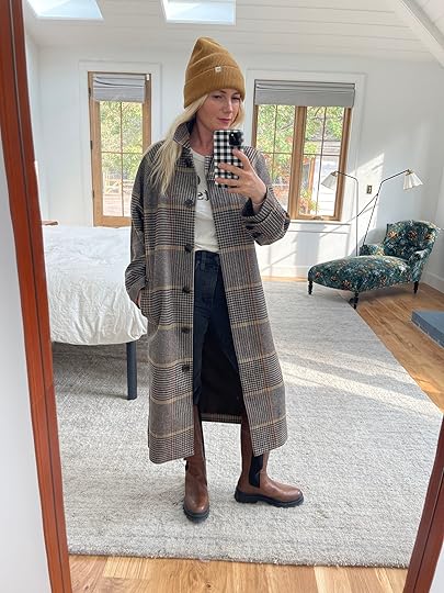
2 Really Great Coats And 3 Excellent Boots (Or “Six” If You Have Two Feet)

Coats! Boots! Oh how I love to hunker down and wear a comfortable outfit on the inside with a great coat and boots on the outside. I just shot another quick social partnership with Madewell but I know that many of you don’t follow over there (which I fully get). So I figured I’d post about my pics here with commentary and a few non-Madewell pieces that I’m into. For these partnerships, they give me free rein to order stuff for them to send, but not everything works. So I usually go to the store and find what I think is very, very, very good. That’s all to say that it’s very edited and stuff I legit love (not stuff they ask me to wear/post about). So here they are…

Coat | T-Shirt | Jeans | Beanie | Boots
I think I whispered out loud “oh, hell yes,” when I put this coat on. It’s EXTREMELY GOOD. It’s fancy like a tweed wood coat, but long (extremely warm and cozy – maybe not New York in 15 degrees warm) and drapes in such a flattering way. It has pockets, a cute collar, is lined (which makes it easy to slip into), and is a great colorway and pattern. I wore it all day yesterday and got like 12 compliments on it. It’s not too hot for inside either (if you don’t layer underneath) so it’s not one of those that you have to take off when you get in the grocery store or on the subway.
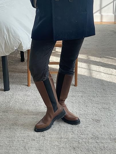
The pants are the Cali demi boot cut (super cute flare and also great to tuck). The boots are SO GOOD – a lug sole knee-high with an edge. If you are in between sizes, size up. Mine are 7 and tight on me and I’m a solid 7. I also have small calves and they are kinda tight but I saw they offered a wider calf which I kinda wish I had opted for.

Classic with a really great edge!!! This boxy coat has slim arms and those proportions play with the eye and from my perspective makes me feel small. It’s really, really pretty and I feel like a classy lady in it. It also feels very high quality (and is splurgy but 30% off right now).
Sweatshirt (can’t find!) | Jeans | Boots
I can’t find that Patagonia sweatshirt on the internet but it’s so cute! Nicely tailored shoulders, a cute front pocket, and cozy insides. We recently were downtown after a date brunch and Brian and I both went in and got some pieces to support this awesome company.

Button-Up | T-Shirt | Jeans | Boots
I’ve been on the hunt for good flannels and have found too many that are like trying to be fitted. This is from Pendleton and the cut is awesome – more boxy less body con. Madewell also has this one that is excellent (size down, I have an XS and it’s still roomy).
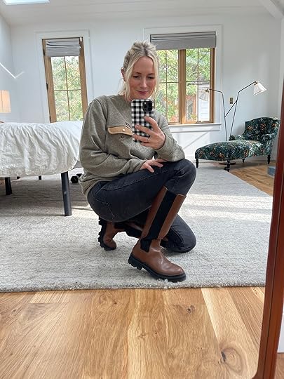
Jacket | T-Shirt | Jeans | Chelsea Boots
This fleece is GREAT, although I might have to return it for an XS. It has corduroy pockets and the inside is fleece, too (I hate it when the outside is cozy but the inside is like a weird lining -the whole point is to feel the softness!). I’ve been wearing those boots NON STOP. They feel so comfortable for having a little lift.


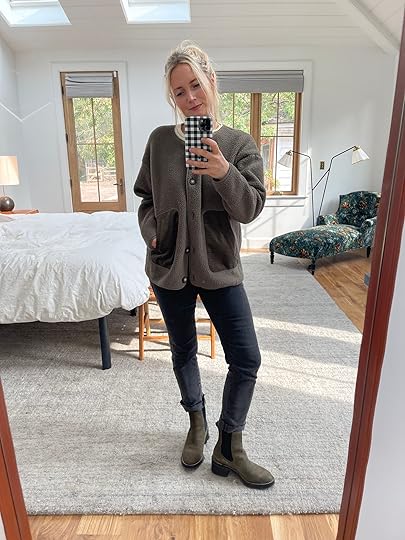
Airpuff Long Shirt-Jacket | T-Shirt | Jeans | Boots
I think I wrote about this shacket before but put it in my coat reel on IG and so took photos of it for here, too. It’s awesome for fall and if it weren’t going to be raining the next 14 days straight in Portland (maybe one day off) I would say it’s a good October jacket 🙂 The boots are new and have a very cool rubber sole that makes them feel more modern and cool IMHO.
Ok, that’s it. Most of this is in action on IG today if you want to see how things move on a body which I find always helpful. Also yes I got my hair finally done (and lightened) and it’s finally long again. PRAISE BE. xx
The post 2 Really Great Coats And 3 Excellent Boots (Or “Six” If You Have Two Feet) appeared first on Emily Henderson.
October 21, 2022
Albie’s Remodeled DIY Half Bath Is HERE (And Is The Perfect Balance Of Luxe And Organic)

Hi everyone! *pops up for air*
I can’t believe how many months have already passed since my last blog post…and even more since my last reveal. Sheesh! I am, however, the consummate multi-tasker; so while I was still in the throes of planning the first–ever Meridian Experience Weekend, we were also finally completing an overdue reno at the hygge ranch – our powder room… a.k.a. washroom!
When we bought the house, we suspected that the washroom was the only bathroom that hadn’t been renovated by the previous homeowners & it was confirmed by our inspection. While working on the launderette last year, I’d actually devised a parallel design plan for the washroom, which shares a wall with the launderette. Unfortunately, we had to take a long pause on that project…and that pause turned into a pivot…and that pivot turned into a hard stop…until this year. Between recovering from the kitchen renovation, unexpected plumbing hiccups, having to reprioritize other home improvement projects, planning The Meridian Experience, and life just life-ing, the washroom kept getting pushed down to the bottom of a long list of must-dos. Instead of fighting it, I just came to accept that the renovation would get done in due time, also keeping in mind that in our first year of home ownership, we tackled A LOT of projects. While not welcomed at first, the forced break was a necessary one.
Fast forward…
Doing the renovation in the background of the conference preparations – albeit messy – was actually a perfect little distraction from Meridian when time allowed. Being surrounded by the uncontrollable chaos of organizing a large-scale event, this mini reno was kinda comforting by comparison. Both were necessary. Both were a test of patience. And both were perfect illustrations of how you can accomplish a lot with a little.
Now let’s get into the design…

 original design plan | final design plan
The design plan was set – so I thought lol – and the only concern was what we’d find behind the walls, specifically the shared wall with the launderette. Plumbing & electrical can be tricky & unexpected, and we’re not professional plumbers or electricians. I should note that we didn’t have any plans to hire out this project… not if we could help it.
As with the launderette, I partnered with The Tile Shop and Build with Ferguson for all of the finishes for this 5’ x 5’ space. There are renovations that are a need, while others are simply a want. This was definitely more want than need, since the bathroom was completely functional…just not pretty.

Top of mind for a space this size is how to optimize, not increase, the square footage. This meant deciding to keep it as a 2 piece washroom. We would be keeping the existing toilet – although now I’m rethinking that decision but more on that later – and replacing everything else…
The To-Do List:
FlooringPaintWindow TreatmentsSinkLightingMirrorHardwareStorageTo transform the dated powder room into a sleek & modern washroom, I went with the same color story as the launderette with subtle luxe finishes, including the same Harley Lux Black 12 x 24 porcelain tile for the flooring.
On the plumbing wall – the full wall – we used a deco-inspired black & white porcelain tile. This design choice allowed me to make an impact without overwhelming the tiny space. I went back and forth on whether or not to carry the tile around the entire bathroom, and we ultimately decided to stick to the one wall. This is a decision that, like the launderette, we can always change our mind about later – it’s much easier to add tile than to remove tile.

The remaining three (3) walls – the door wall, the window wall, and behind the door – were slated to be painted Evergreen Fog SW 9130, the Sherwin-Williams 2022 Color of the Year. With paint shortages left & right, we decided to just finish up a can of paint of the same color from the launderette to keep the reno rolling along. This was a compromise I could live with that would, ultimately, end up paying off.
After having tiled the launderette & kitchen, my husband has become a lot more comfortable with DIY tile installation. It really is one of those things that the more you do it, the better you get – practice doesn’t make perfect, however, it does allow for progress & improvement. Already knowing that our old house has some less than perfect walls, the isosceles trapezoid shape of the tile turned out to be way less intimidating than we anticipated, also creating very unique grout lines. With the backsplash wall being the wall requiring the most cuts to accommodate the plumbing, the process went a lot smoother than anticipated.
The most challenging part of the process turned out to be the plumbing itself – zero stars, do not recommend. Is DIY plumbing difficult? That’s relative. Is it annoying? Absolutely. Tack onto that the age of this bathroom, and it becomes a downright pain in the neck. Plumbing lines that weren’t securely installed, off-center fixtures, rotted innards…all very gross & annoying, and still, very doable because we (and by “we” I mean “he”) did it. Okay, so maybe one star.
You know what’s almost as annoying as plumbing in an old house? Electrical. In the washroom, we updated the vanity lighting and overhead lighting with a vent – both equally challenging and culminating in the vanity junction box falling clean outta the wall one day. That was a sharp reminder of the potential deficiencies of tackling some renovations without the help of a professional tradesman. In our case, the issues were reparable with a few quick trips to The Home Depot for more updated lighting components, including a new exhaust ducting kit, j-box for the vanity, and GFCI outlet.

Wall Tile (unavailable but here is the same shape) | Faucet | Faux Flower Arrangement | Amber Glass Dispensers | GFCI Outlet
Now that we’d completed all of the major problem-solving, it felt like we could begin to breathe again. You ever reach a point in anything you’re working on – a renovation, a term paper, a work project… whatever – and you take a step back thinking you’re finally done, only to look at it and think “mm… not enough”? No? Just me? Well, that’s what happened here. I stepped back, looking at what anyone else would call “complete,” and just knew something was missing.
Maybe it’s the recovering perfectionist in me talking.
Maybe it’s the anxious procrastinator in me talking.
Maybe it’s the imposter syndrome in me talking.
I don’t know whose voice it was. I just know it was loudly screaming at me that this space wasn’t ready for public viewing yet. Two things jumped out the most – the walls needed to make more of a statement and the toilet needed to be black.

Door Color | Door Knob | Peel and Stick Wallpaper | Floor Tile | Rug | Console with Sink | P-Trap | Black Woven Waste Basket
A black toilet would serve two purposes – aesthetically, it’ll provide a continuity of the bold drama of the floors; and functionally, a slimmer, elongated style will be a better fit (literally) for the space. While it was too late for me to do anything about a toilet – risking a 2023 reveal lol – I could absolutely do something about the walls. Earlier this year, I’d gathered peel & stick wallpaper samples from Tempaper specifically for the washroom…just in case. Those instincts paid off. One of the samples was the exact punch this tiny space needed to bring everything to finally feeling like actual completion.

Roller Shade (Lisley in Bronze Sheen, Semi-Opaque) | Toilet Paper Holder | Floor Basket (Similar)
The juxtaposition of the cool wallpaper from Tempaper and bronze sheen of the roller shades from Decorview was an illustration of how a design can be delicate & dignified, with just a little bit of unexpected whimsy… a total metaphor for my life by the way.
Even with all of the delays and such, my hygge-inspired design ethos never wavered.
Toilet Lever | Mirror | Single Hook | Wall Towel Bar
I look at the washroom and it reminds me of my living room reveal from almost 2 years ago. The Cloud Velvet sleeper sofa always catches people off guard, in the best way. It doesn’t take away from the hygge-inspired design elements. It doesn’t take away from the modern luxe elements. This is what I strived for in the washroom. Moen hardware introduced a combination of matte black & brass hardware, much like the vanity lighting from Hudson Valley Lighting, for an effortless luxe combination. Textures – like the textured rug from Rejuvenation – and warm hues of brass & amber punctuate the entire design so that, like the rest of the hygge ranch, everything just plays together nicely. Also, like the rest of the hygge ranch – stylish storage solutions.


Vanity Light | Wall Shelf | Glass and Wood Canisters | Candle


At the top of the post, I talked about how this project paralleled The Meridian Experience Weekend… however, it wasn’t just in the timing. When I look at Meridian, I see a culmination of circumstances that don’t seem like they’d make sense together, and yet, in the end, I created an experience that was – wait for it – both delicate & dignified.


The completion of the washroom also means the completion of our home’s “must be nice” spaces. In case you saw my media room reveal last year, then you know it’s one of the spaces I dubbed as “must be nice” spaces – media room, launderette, flex lounge, and now…the washroom. This part of our home is where I designed all of our “luxury” spaces… more than just the creature comforts of our bedrooms, living room, kitchen, etc. These are the spaces that carried me through all of the turbulence of this year. This is where I freshen up after a quick workout in between work tasks. This is where my husband washes his hands & face as soon as he comes in from work. This is where the mini cleans up after creating her latest masterpiece. This is where we take bathroom breaks during movie nights. It’s our washroom.
I learned a long time ago, when things are seemingly going wrong, fighting against it is futile. Things are happening the way they happen to teach me something or lead me somewhere. Allowing for everything to transpire as it did, however, got us here and I’m happy with here. And I’ll eventually be even happier with my black toilet:)
I always try to wrap up every reveal with some sort of takeaway…more than just the design. The takeaway here is that no matter how big or small, to continue creating a home that can bring you joy when the world is unkind, will grant you peace when life is a little hectic.
*Design by Albie K. Buabeng
** After Photos by Ellie Lillstrom
The post Albie’s Remodeled DIY Half Bath Is HERE (And Is The Perfect Balance Of Luxe And Organic) appeared first on Emily Henderson.
October 20, 2022
A *First Round* FarmHouse Reveal – Readying Our Guest Room For Family To Visit

Round one guest room reveal – a quick scramble to make this room functional asap (and of course, it’s the most done room in the house). Brian’s parents visited almost immediately after we moved in, eager to see the house and squeeze some grandkids. Luckily, Target wanted to sponsor this endeavor (and post) so I was able to pull together this room very, very quickly – from the mattress on two weird twin bed frames to an inviting room over a weekend. As you might have seen on my instastories, I finally unpacked all my favorite things that were in boxes for two years from LA (it was like Christmas) and pulled mostly from that inventory versus buying new, but we needed new sheets, bedding, and towels. So I went to Target, found some pretty darn wonderful options.

Heavyweight Linen Blend Comforter & Sham Set | Jersey Solid Sheet Set | Machine Washable Cooling Bed Pillow | Patterned Quilt | Throw Blanket (unavailable) | Round Pillow (unavailable) | Sheepskin Rug
We don’t know what the full function of this room will be – def guest room, but possibly also Brian’s office and/or kid’s playroom/den. As you can see there is a desk in the corner where Brian writes right now which is working. While we love offering a king bed to Brian’s parents that come frequently, we also might forgo it for a pull-out sofa to have more space for Brian or the kids to play. But for now, we have this king mattress and a dumb bed frame that you can’t see so it’s a proper guest room with future use TBD. The walls are a really cozy rosy pink color (I’m obsessed with it, I love it so very, very much and wish it were in our bedroom), and it really determined the color palette for the rest of the room. It was a super clear vision which made it really easy to shop for and decorate: The brief was warm cozy pink-toned bedding and Target had it in store (shout out to the Beaverton Target).


I opted for the Casaluna comforter set (instead of the duvet set) because Brian’s parents are top sheet people, which means that we don’t have to wash the duvet each time, just the sheets (they are likely our only guests). But besides that, I had just styled with them in another shoot and the comforter is SO FLUFFY and cozy, and then I didn’t have to buy an insert. The side table is Target that I bought last year when everything was in storage and have found that I’ve moved it around a lot – it’s highly versatile. It works great here since the closet is so close to the bed.
I bought the jersey sheet set to be extra cozy and tonal and then layered on this pretty quilt to add some pattern and interest on top. The two decorative pillows I’ve had for a long time and worked really nicely. I have no idea what headboard/bed we want in here but honestly, the room works really well without one right now!

I want to say on the record that Brian was right about painting the window frames and sashes white, instead of the same color as the wall which is what I was pushing for. It really highlights the beautiful original windows and gives the pink more context. It makes me excited to paint our room a tone and see our windows pop more.

No curtains? Sleeping masks FTW. Now, you might notice that there aren’t window treatments in here, which historically would be very bad for guests. I was so tempted to hang some temporary curtains for this shoot (and for Bob and Suz) but am really trying to not do things just for quick photos (especially when it involves new holes in our home). For these windows, we need these top-down-bottom-up-shades because when you are in there the view is almost the entire roofline of the 60s addition. We have them in the kid’s room and love them so much, so we ordered some for in here as well. For now, I left some sleeping masks (these silk Casaluna ones are excellent) and hope that the early sunset and late sunrise are ok until the shades arrive.

Vase | Candle | Lamp (unavailable) | Chair (vintage) | Desk
This is right now where Brian is working (he’s in a master’s program for writing), so this desk needed to double as a nightstand as well. I bought this from Urbanite (an awesome Portland antique and craft mall), made by a local maker and the top is this really, really beautiful maple. It’s not game-changing but it was solid and affordable (and I felt good about supporting a local maker). The candle is the one we linked up the other week (apple chai) and the vase with the dried flowers is Threshold with Studio McGee (I know I have a lot of vases but the color/shade is perfect in here).


Chair (vintage) | Throw Blanket | Pillow (unavailable) | Side Table | Art (vintage)
I bought this vintage Carl Malmsted chair online (I must name-drop because I’ve wanted this chair for 10 years) a year ago, hoping that it would work somewhere in the house in its original fabric (which I LOVE). Sure enough, she found her home and it’s the perfect scale, shade, and style for this room. The vintage paintings I’ve had forever, from the Rose Bowl surely, and the tiny side table is new from Target and fit perfectly since we had very little space.

I bought these pink Casaluna towels because they look so good with the bedroom and bathroom, but I’m not ready to show you the bathroom yet so we styled them on this chair. They look extremely high-end for how affordable they are. I’m kinda done buying expensive towels because I find that even the $40 towels only last a year or two (less if rarely used, obviously) and I’ve ranted out white towels before and how hard they are to keep looking fresh. So for this house thus far I’ve only bought Target (pre-partnership) and none that are white (gray, blue, green, and now pink). If someone has a secret magic trick to keep white towels white hit me up, but until then I’m buying lovely-looking non-white towels like these.
Naturally, this room is the only room that is pulled together, as well as the room that is the least used or seen. Funny how that works. It did motivate me to not wait for a design plan and start pulling from my own inventory (which I’m obviously lucky to have) to make more of the rooms look styled out.
It was a big hit with Bob and Suz and gave me a big reminder of how fun decorating and styling can be. Now that the renovation process is almost over I’m having SO MUCH FUN playing with my things 🙂 Style. Play. Every Day, y’all.
A big thanks to Target for making stylish affordable bedding and towels for my parents-in-law to enjoy:) To see every Target item in one place head over to my new Target Store Front)This post was sponsored by Target but all designs, words, and thoughts are my own. Thank you all for supporting my favorite home brands that support this blog. #targetpartner #targetfam
*Styled by Emily Henderson (me:))
**Photos by Kaitlin Green
The post A *First Round* FarmHouse Reveal – Readying Our Guest Room For Family To Visit appeared first on Emily Henderson.
October 19, 2022
A Farmhouse Exterior Update – The Current State Of The House, Sports Court, And What Is Next

This landscaping project has been hard for me to get my mind around. We don’t have a final plan (will we ever?) and yet are moving quickly in some ways, very slowly in others which makes documenting a challenge. It’s exhilarating, intimidating, scary (financially), and yet we are full of hope and extremely grateful. We moved up here for the property. Having 2 1/2 acres of flat land close to a neighborhood and schools was a fantasy, and is why we finally moved back after wanting to for 10 years. We started brainstorming two years ago, thinking/hoping that we’d just landscape around the house and tackle the rest in phases. We’d add some chickens, goats, an alpaca or three, and a veggie garden then call it a day – and to some extent that hasn’t changed. But after 2 years of construction and no maintenance, it needed more than tweaking. It needed an overhaul. Oh, how I wish this was something we knew how to do ourselves or had the bandwidth to learn, but we don’t and instead are lucky enough to hire some experienced minds on both the design and the execution. As a reminder it’s almost 3 acres, and came with two houses (one I’ve barely shown you that needs everything and one we are living in), a massive sheep barn/carriage house that is falling down, a smaller barn that is so cute that I can’t wait to transform into something, a well house that we had to demo and now rebuild because we won the lottery and turns out it works(!), another well house that doesn’t work but acts as a cute shed, an enclosed paddock for future livestock, a sweet but not too healthy apple and pear orchard, and world’s longest cutest and most run down driveway. All of it is in the works to rehab, but honestly, it won’t be done for like 5 years and that’s okay (for the most part).
The Property When We Bought It made by studio campo
We hired Cali of Studio Campo pretty quickly after talking to her on the phone and Zoom. She was about to launch her own firm after working at larger landscape architecture firms for years and we just really loved her vibe and vision. She did the illustration above to help show us and you what we are working with.

This was the view to the back porch when we bought the house. The two big bushes blocked all the light to the living room and we knew we were going to open up the doors anyway so those were taken out.
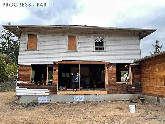
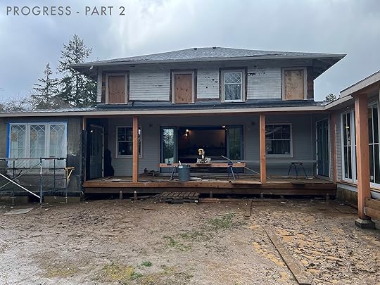
Woah. It’s wild to see how far we’ve come! I think “Progress part 1” was about a year ago. ARCIFORM really did an incredible job designing and executing the back porch, sunroom, and extending that wing. Here’s where we are today!

WOW. We live here and have obviously stared at this in person for weeks but looking at this photo while writing this sentence is an odd feeling – it’s not a house I ever pictured I’d be able to own or live in. It’s definitely not the house we bought 2 years ago. It’s so beautiful and grown up and well, I’m not sure I even deserve to live here but man am I grateful. Big thanks to every single reader who ever read a sentence on this blog. And thank you ARCIFORM for all your hard work turning it into this!!! You can see we added the back porch, sunroom, added a window upstairs so it’s more symmetrical, and all new windows on the bottom floor (vintage ones on top and sunroom windows to tie both styles together).

The mini porch on the right is to the mudroom (and ideally where the kids/dogs will drop school bags/shoes once there is some hardscape to it). We painted the house Pure White SW 7005, with Online SW 7072 as the trim color around the windows. We still plan on adding shutters to the second floor (likely a medium tone blue – thinking Smoky Blue SW 7604 because we love it so much inside – also does anyone know a good shutter company?). Right now we have sewer issues holding up this area of the property – we can’t trench for electrical, plumbing, or irrigation to the other areas of the property until the sewer is fixed (it actually started yesterday). Then the porch steps will get finished and the landscaping back here will begin (maybe – I’ll fill you in soon). We have to shoot around the house in May so we are focusing on those areas for now – hoping to plant in the next month in time for a rainy few months and then BOOM spring 🙂
A Sports Court Update
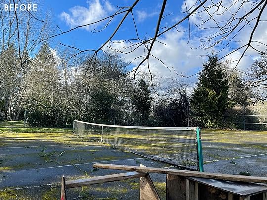
When we bought the property it had a massive sports court – like way bigger than a tennis court. But we LOVED the idea of it and like everyone else in the world, we are now into pickleball. It was in very bad shape (huge cracks with tons of weeds growing through them) and we went through every option possible to see how we could possibly keep it and just make it better. We had multiple resurfacers come to look at it and they all said they wouldn’t touch it because it would continue to crack. We thought about just keeping it for a few years, but knew that if we did eventually need to demo it out the machinery to do so would rip up any new landscaping we planted (which would be a lot). We also thought about just putting those sports court tiles on top, but opted not to do that for aesthetic and long-term reasons. We ultimately decided to pull the bandage off quickly and demo it out, to repour a smaller sports court that would be in better shape. We had multiple quotes ranging from $23 – $48k. We went with the $23k for obvious reasons.

Listen, if we were professional pickleball players we’d make sure it was poured perfectly but honestly we just wanted it to be better but didn’t need PERFECT. It was already such a sticker shock and not the way we had pictured spending our savings (from selling our house in LA). Plus the $23k guy was really lovely, nice, and ultimately did a good enough and fast job.

And it was a job. Like 6 layers of concrete because it had been poured over so many times. Our contractor said he could bring in a big rock-crushing machine and turn it all into gravel and then we spread it in our mud pit of a driveway to help with the mud/dust until we repour our driveway someday. So we were happy that it didn’t have to go far and that we could reuse it.
A Big Plot Of Dirt – With The Cutest Split Rail Fence
The “plan” for the rest of the project is still up in the air as we aren’t sure what is doable. I know that I want a pretty greenhouse (and we have leftover windows for it). I fell in love with the idea of a plunge pool from Soake Pools (hot tub in winter, very small pool in summer) but we are still figuring out if a crane can get it in here. My favorite thing we have done thus far is that split rail fence. We hired the most affordable fencing company (again, not where we want to spend our money). Brian was in charge of this because we both know that if I got involved in the design, I would likely make it complicated and expensive. We may never shoot the front and back entrances where the big privacy and vehicular gates are so I gave him full carte blanche to execute those (and they look great, although unfinished). But the fencing inside the property needed to be the right vibe, and I can’t TELL YOU how pleased we are with it. Sure, they put the gate in the wrong place (and we are adding another by the barn) but it’s a true split rail, made out of rustic wood, and it’s exactly what we had pictured. We will be adding more of that – possibly a shorter version around the greenhouse/garden area or around the sports court.
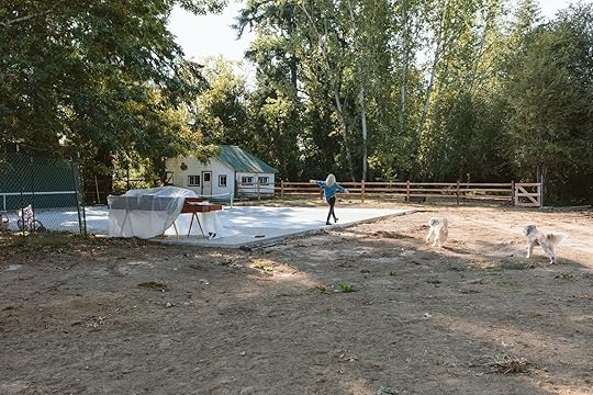

As you can see the sports court is still massive but has way less presence (in a good way). Brian is going to paint the pickleball lines (!!!) and I’m kinda staying out of it. I just love that we can go out there and hit the ball against the wall, ride bikes, rollerblade, etc. The kids already spend a lot of time out here which makes our desperate little confirmation bias hearts feel good about the decision to repour it.

More to come asap. Cali (Studio Campo) has been amazing and we have so many design plans and concept boards to show you. We also have an awesome expert landscape contractor that I’m going to tell you all about when we get further into the project as it’s a big operation and these people are very good.

It’s a lot and so many moving parts. It’s taken a decent mental jump to be ok investing so much into the exterior property. The reason we can do most of it is because of selling our house in LA and knowing that it’s a big part of my job (even those it’s not inside, landscaping projects are pretty popular which I get because it’s a lot) – both things I’m just so so grateful for. It’s going to be dirt for a while (but we got sod on the other side of the house!! Wahoo!!) with the hope that by summer we can enjoy it. Next week I’ll start showing you the overhead plans and all the mood boards that Cali came up with – paired with us changing our minds, changing the budget, changing our timeline – just not knowing exactly how we want to use the space. I’m happy she charged us by the hour because the amount of back and forth, editing, and rethinking she had to do with us was a lot. I can’t wait to show you what she came up with. xx
*The Pretty Photos by Kaitlin Green🙂
The post A Farmhouse Exterior Update – The Current State Of The House, Sports Court, And What Is Next appeared first on Emily Henderson.
October 18, 2022
This 80s Estate Home Was Completely Transformed Into A Modern, Organic Home For A Family Of Five

Ross Alan Reclaimed is an LA-based reclaimed lumber company run by husband-and-wife team Ross and Georgie, and if you read this blog, you are likely already familiar with this duo. Emily worked with them exclusively in the , where she used their reclaimed wood for all the floors, ceilings, kitchen cabinets, and that beautiful dining table. The work they do is stunning–as evidenced by each room in the mountain house. It’s not often we get to see the homes of the makers we work with and today, we have the pleasure of sharing Ross and Georgie’s newly renovated home that is warm, inviting, and of course, clad with different variations of their gorgeous reclaimed wood. It’s a home tour that will have you appreciating, if not coveting, reclaimed wood and all the warmth and texture it can bring to a space.
BEFORE
 living room before | kitchen before
 stairs before
The home originally had good bones but lacked warmth, and some elements could definitely use a modern update. But what was supposed to be a “simple” renovation, turned into much more than that due to unforeseen issues. I am sure all of you renovators out there can relate (and are perhaps rolling your eyes at me referring to any renovation being ‘simple’ :)).
According to Georgie, “There were a lot of things out of code that we had to replace and make right which cost us a lot more money than we planned. The staircase had to be redone because the original had no stringers (framework that’s load-bearing) in them, all the electrical was old and out of code, joists in ceilings had to be redone to code because there were several missing (which was very weird), and due to our pipes bursting in the bathrooms, we had to redo all of the plumbing and pipes in the house.” So to remedy all of these problems, the project turned into a full gut renovation that spanned over 3 years. They ended up doing the renovation in three phases which is why it took as long as it did, but the result is a beautiful, organic home that is as inviting as the people who live there.

Dining Table | Black Dining Chairs | Armchair | Light Fixture
The after is almost unrecognizable from the before, which is a testament to their style and expertise. Immediately, you can sense how the home feels more open and bright which is in part due to all of the large windows that let in so much beautiful natural light. The other source of warmth comes from all of the wood tones peppered throughout the home. The floors and ceiling are the most obvious and show-stopping, but as we move through this home tour you will notice that they also mix and match wood tones through furniture, decor, and built-in shelves. These aspects all work together to create a cozy and lived-in feel.
Side note: The dining table is from their new made-to-order furniture line, and features reclaimed barn wood and brass table legs. It’s SO good. I love how they gave a farmhouse-style table a modern flair with those awesome wishbone-shaped table legs.

On the opposite side of the dining area, large glass doors bring in an abundance of natural light, creating an extremely open and airy vibe. The space itself is also very open with minimal furniture, so the wood floors really stand out. Since reclaimed wood is such a big part of their lives, I asked Georgie what type of wood they used for the flooring and why. She explained, “We chose to use the oak mixture for the floors because of its durability and shelf life. We have three kids, animals, and a big family so our floors get a lot of heavy use. Oak is just super solid and has already stood the test of time in our house.” Not only is it solid and durable, but it has a beautiful finish that provides a quiet rustic vibe to the home.

In the kitchen, the blue picket pattern tile backsplash creates movement and a hint of Midcentury modern flair. If you remember from the before photos above, the kitchen was very beige and bland, and this kitchen is clearly the opposite of that. The tile is bold and bright and contrasts beautifully with the wood cabinets and shelves. I also love that they went with a white countertop to match the white walls and make the space feel dynamic yet pulled together. Also, how cute is the box on the top shelf that has little succulents popping out?? ADORABLE.

Dining Table | Black Dining Chairs
The dining nook, nestled between the tile wall and the yellow accent wall, is a perfect example of mixing wood tones. The dining nook bench is made with Black Walnut wood from a barn in Ohio, as are the kitchen cabinets. The way the cabinets flow seamlessly into the bench creates a cohesive look and I love how the movement of the grain brings in so much texture. I mean, seriously, that grain is STUNNING. Then there is the dining table with a black finish on top and a natural wood bottom which creates a nice contrast that is accentuated with more black wood dining chairs.
Sofa | Coffee Table | Rug
The living room sits opposite of the dining area and is extremely cozy due to the variation of colors and textures. Multiple wood tones, velvet cushions, organic shapes, and a tufted rug all work together to create a cozy, lived-in feel. The yellow sofa is custom-made by Clad Home and as you can see it was made to fit in this space perfectly, creating its own zone to separate the living room from the dining area. In an open-concept floor plan like theirs, it is so important to lay out furniture in a way that distinguishes the different spaces.

On the other side of the living room, the ceiling is clad with white oak and as you can see it is slightly lighter than the floors. This mixing of wood tones was intentional to keep the home from feeling too monochromatic but is also a result of their brand ethos: “We don’t like to waste materials” says Georgie, “and when ordering this batch of white oak from barn wood, there is a lot of red oak that sneaks its way in. You can’t always tell what species of wood it is from just the outside of the board which in our case was about 20%. Also, we loved the contrast that the red oak added to our floors which really gave us room to tie in all the other wood tones to the project like the walnut kitchen.” So with 80% White Oak and 20% Red Oak, the floors have a darker, richer tone that adds even more depth to their home.

Sofa | Coffee Table | Side Table | Arm Chair
Much like the downstairs living room, the family room is rich with texture. The use of so much texture allows the color palette to remain simple, and even with a small amount of color the room still feels so dynamic. One way they achieved this is by painting the ceiling black, which is unexpected but such a cool design choice. It highlights the other black accents in the room to create a cohesive, balanced look. And again, different wood tones are sprinkled throughout so this room has no shortage of natural, rustic warmth.

Wall Cladding | Arm Chair | Coffee Table | Side Table
The original primary bedroom had an option for a vaulted ceiling which they discovered one day while up in the attic space, so they decided to blow out the ceiling to reveal the vaulted ceiling. It automatically opened up the room and created a more grand feel. Once they vaulted the ceiling, they cladded it with their Coyote wall cladding, which has a diverse mixture of gray and brown tones. I love how there is so much variation in color and texture which brings an added layer of warmth to the space.

I love that they went with a light wood tone for the built-in bathroom vanity so it really pops against the moody gray tile. Also, continuing the floor tiles up the walls is an exciting choice that makes you feel completely enveloped by the color. It creates a spa-like vibe that is uber-relaxing and inviting.

In the kid’s bathroom, the tile pattern is playful and modern and is balanced with the blue-stained vanity. Seeing that the vanity is clearly made from wood, I asked Georgie if it was another piece made by them with their reclaimed wood. It of course is and shows just how much range reclaimed wood has. “We had so much fun using all of our wood to create these standout pieces in our home that are all unique in their own way,” says Georgie, “The vanity in our kid’s bathroom, as well as the guest bathroom, were done and stained using Rubio. It was fun to play with colors instead of the natural tone of the wood and the end result just gave it that extra ‘wow’ statement.”
Huge thank you to Ross and Georgie for sharing their lovely home and design process with us. Now I must leave you but not without sharing the remarkable before and afters:


*Design by Ross and Georgie Kidder
**Styling by Lori Manthei
***Photo by Sara Ligorria-Tramp
The post This 80s Estate Home Was Completely Transformed Into A Modern, Organic Home For A Family Of Five appeared first on Emily Henderson.
October 17, 2022
How To Start A Meaningful Art Collection (Told To Us By A Pro)

One of the best, most undisputed facts about art is that it is highly personal. What you like, dislike, and find emotionally or spiritually stimulating is completely up to you. Even when monetary value is placed on art, it is still up to the individual to decide whether they appreciate it or not. A piece could be worth one million dollars but that doesn’t mean I or you have to like it. Perhaps this is why the art world can feel polarizing, overwhelming, and even intimidating. There are no set rules for buying art that is meaningful so it can feel debilitating to start. So how does one navigate such unfamiliar territory??
Enter Liz Lidgett, an art advisor and gallery owner who represents 50+ artists from around the world. With 10+ years under her belt, she has a refreshing attitude toward art and emphasizes an approachable, non-pretentious experience for clients. After being introduced to her work, I was pleased she was willing to answer the rudimentary questions I have about buying art. Of course, she shared sage insight with me that I could not, in good conscience, keep to myself. If you have ever wondered how to start building your own art collection that is meaningful and personal, this post is for you. Let’s get into it.
 design by scott horne | styled by emily henderson, velinda hellen, & erik kenneth staalberg | photo by sara ligorria-tramp
Can you give us a brief background on how you became an art advisor/gallery owner?
For as long as I can remember, I have loved art and being around art. As years went on, I realized I could turn my passion into a career. After living in Los Angeles for a few years and receiving my Masters from USC, I moved back to Des Moines, Iowa, where I grew up. The Midwest art scene was and still is changing so much and I wanted to be a part of that shift. I worked as an in-house corporate curator for an amazing collection, but truly loved helping people start their collections. That’s when I started my own art advisory company and after seven years of that, I opened Liz Lidgett Gallery three years ago. Each step has been an important part of the journey to get me closer to my “why”. I believe art is for everyone and owning a gallery that helps clients find their perfect piece of art for their style, space, or budget is a dream come true.
What advice would you give someone who feels intimidated by art?
The art world can feel so intimidating but I urge you to keep looking for what feels right for you. Find a gallery that makes art accessible or find an artist whose work really speaks to you. The art world is for you— you just have to keep looking for the right open doors to step in and explore all there is to offer. When someone is beginning a collection, my first piece of advice is to be intentional about looking at a lot of art. I love to recommend a fun date night with your partner or friend and imagine that you have an unlimited budget. Pretend you have to pick one or two pieces in the museum to go home with that night — what would you choose and why? If you can articulate what you like about those pieces, that will get you a step closer to understanding your style and what your first purchase should be.
 photo by sara ligorria-tramp | from: living room update
Are there any Dos and Don’ts when it comes to collecting art?
The DO that matters most is: Buy what you love. Don’t worry about whether the artwork will “go” with your decor or if anyone other than you likes it too. You want to live around pieces that you want to spend time with and that make you feel good. With that in mind, here are some other dos and don’ts:
–DO Get to know the artist and their technique for a better understanding.
–DO Know your budget and where you’d like the piece to go. Have a photo and dimensions of the wall while you’re shopping.
–DO Confirm and consider the shipping price as a part of your budget. Shipping for artwork can be expensive so be sure to ask for that before you purchase if you are going to ship.
–DO Keep a file with information on the artist or gallery and a receipt.
–DON’T ask for a large discount or attempt to cut out the gallery. All creatives deserve to be paid for their work and pricing within smaller galleries doesn’t have much room to negotiate.
–DON’T buy a giclee or an open edition print. These types of works never hold their value and no matter if your budget is $100, $1000, or $10,000 you can find an original artwork.
–DON’T forget to add your new artwork purchase to your home insurance. You can send the invoice straight to your insurance provider to have it added.
 photo by tessa neustadt | from: my house tour from good housekeeping
What are some ways people can spot worthwhile investments?
At the risk of sounding like a broken record, buy art you love, not because you think you’ll be able to make money on it later on. However, I do, of course, want you to buy artwork that will at the very least hold its value. With that in mind, ask the gallery you’re working with about the artist’s career. Have their prices gone up consistently year over year? How prolific are they? If the artist is further along in their career, you can also ask about any potential collaborations with brands or upcoming shows that may raise their notoriety.
Do you have any tips for mixing and matching different styles of art?
I think one of the best ways to mix and match different styles is by being cohesive with the framing. If, for example, you are creating a large gallery wall with multiple styles or artists represented, then keeping the framing within 3 types of similar framing helps to keep things cohesive. Additionally, I often like to put several different styles in one room, but I try to keep it within one color story for example. My rule is that they should have something in common whether that’s color story, framing, style, or subject.
 design by jess bunge for ehd | styling by emily bowser | photo by sara ligorria-tramp | from: jess’ living room reveal
What is your advice on how to build an art collection that is personal and meaningful?
Oh no, I am going to say it again — buy what you love! But also, think about buying art to mark certain occasions like a wedding, a new job, or a birth of a child. Think of bringing back artwork from an amazing trip you never want to forget or from an artist you had a special connection with. Buy art that makes you think of wonderful things and that you love being around.
 design by velinda hellen design | styled by emily bowser | photo by sara ligorria-tramp | from: velinda’s first client reveal
Do you have a #1 tip for building a lasting art collection?
I won’t say it again but here’s another tip: Don’t be afraid to ask questions and have conversations. Everyone deserves to be treated with respect and welcomed into the art world. If you are working with a gallery or an artist that doesn’t treat you with the respect you deserve – move on. There are so many galleries that would love the chance to work with you and are wonderful to work with. I opened my gallery three years ago because I believed (and still believe) that both artists and clients deserve the best. The art world is a joyful, beautiful place to be a part of and I believe everyone deserves to experience that!

Big thanks to Liz for imparting her wisdom and expertise to us. Be sure to follow her and check out her shop here.
Opener Image Credit: Art Direction by Emily Henderson | Design and styling assistance by Emily Bowser and Julie Rose | Photo by Sara Ligorria-Tramp
The post How To Start A Meaningful Art Collection (Told To Us By A Pro) appeared first on Emily Henderson.
October 16, 2022
The Link Up: The Boots Brian FINALLY Bought For Himself, The Softest Lounge Shorts Ryann Has Ever Worn, And A DIY That Put Our Jaws On The Floor

Hope everyone is having a good Sunday and that fall coziness is in full swing! It’s finally cooling down here in LA (at least for part of the day) and it feels so good. But enough with the weather talk and let’s get into these links…
 design by dan john anderson and genevieve dellinger | photos by laure joliet | via architectural digest
This week’s house tour is home to Dan John Anderson, Genevieve Dellinger, and their two kids. Dan is a sculptor and is responsible for the incredible wood stools amongst many other pieces you see. We love the modern shapes in those warm, natural materials. This house was originally 900-square-foot and built in 1959. They have slowly been renovating, doubling its size. It’s most definitely a must-see and read. Head here now!
From Emily: After years of wearing Target knock-offs, Brian finally allowed himself to splurge on these shoes for his 44th birthday. It’s a great splurgy present that took him lots of research to find – we couldn’t believe they were at Madewell!
From Ryann: These are the softest, comfiest sweat shorts I have ever put on my body. I first bought them for myself and then after realizing how amazing they are, I got them for all of my bridesmaids in lieu of giving them a bridesmaid robe (those are cute but the bridesmaid robes I have gotten have never ever been worn again). The little dolphin hem on the side makes them really flattering, too. AND they are only $12. 10/10!
From Mallory: I’ve never sailed a day in my life but I saw this sweatshirt from this cute brand I didn’t know about until now and I’m highly considering getting it. It’s so nautical and fun!! They have a lot of cute accessories and shoes if you’re in the market. And if you’re near a store you should go in person…they are SO fun!!
 design by victoria ford
From Jess: My jaw went to the floor when I saw this photo/DIY by Victoria Ford! I’m not necessarily a big Hatty Potter gal but I think this is SUCH a fun way to decorate for Halloween that isn’t scary at all. I know Harry Potter and Halloween aren’t technically related but still…this is incredible. For a full step-by-step head to Victoria’s blog!
Also From Jess: I think I mentioned this hand soap (that also comes in a dish soap and hand location) before but it’s in my top two favorites of all time (and it’s the more affordable one!). I somewhat recently bought a super affordable hand soap and it really isn’t doing it for me. I truly enjoy washing my hands when I use Further soap. Especially with the holidays coming up, this is a soap smell your guests will love and remember.
As I am sure all of you know, the women of Iran, while incredibly strong and brave, still need our help to fight for their basic rights and gender equality. There isn’t a single reason why Mahsa Jina Amini and all the others who have died in solidarity shouldn’t still be alive. Here is an article that gives nine ways to both support financially and/or with your voice. Women, Life, Freedom.
Until tomorrow, enjoy the rest of your Sunday. xx
Opening Image Credits: Design by Dan John Anderson and Genevieve Dellinger | Photo by Laure Joliet | via Architectural Digest
The post The Link Up: The Boots Brian FINALLY Bought For Himself, The Softest Lounge Shorts Ryann Has Ever Worn, And A DIY That Put Our Jaws On The Floor appeared first on Emily Henderson.
October 15, 2022
My Morning Routine (Most Days)

I put off this post (and many others like it) for months because I don’t have an on-staff photographer in Portland and hiring Kaitlin to come over at 6 am to shoot me do the most mundane things just felt dumb. So here we go – get your pin button ready and settle into a journal-style entry where I just go on and on and on about my morning and life because I can’t just do a normal morning routine post without evangelizing or filling you in on my life. So here goes. First off, I joke that I want to design a non-denominational “CTR” ring – a ring on your right ring finger we wore growing up Mormon that reminds you to “Choose The Right”. The idea is that you know the difference between right and wrong, but sometimes that little reminder can help you hold your ground or shift you toward making the choice that is better for you. My morning routine has gotten so solid over the last four years, but some days I still need the push to make the good choice to maintain my mental and physical health. There are two sides of me, battling for lifestyle dominance, and lately (the last three years) “Bone Broth Emily” is winning. This is the really healthy version of me that started in 2018 (the OG Souptember) when I realized that I could squash life’s chaos/anxiety by implementing a stringent healthy routine (which starts most Sundays with a roasted chicken supper, making my own bone broth for the week). I’ve always worked out, that’s not a problem (y’all if you are in your teens or twenties start a habit of simply moving your body in a way that feels good to you NOW). But I never used to prioritize sleep, downtime, home-cooked meals, and then yes, I love to have a drink or 3. Now I don’t always stick to being Bone Broth Emily (I’m an enneagram 7 and love to have fun) but since lockdown when I had more time for good old-fashioned self-reflection. It’s been a very, very clear pattern that should surprise no one. When I make healthy choices I’m mentally and physically much happier, which produces a better parent, a better leader, and a more supportive partner, who can handle more stress, in better ways, which helps me make better long-term choices, have clearer priorities, and enjoy a more full life, etc. Obviously, the opposite is true – when I’m in a less than healthy pattern – with an overscheduled work and social calendar, extroverting too many hours a day, on camera too much (which I find depleting if it’s not for the right purpose), burning the candle at both ends, skipping workouts, eating chips and salsa for dinner, drinking too much wine, I slip into anxiety and feel panicked and then I want to quit my job, move to the mountains and home school my kids (as if that is any sort of good solution for us). It’s all so obvious and I’m not the first person to be realizing this, but it’s so crystalized now after 4 years of a more solid routine. When I break it (outside of holidays and vacations of course) I suffer. It’s SO BORING to talk about, but it absolutely works for me. It all starts in the morning and what you are about to read is the solid mon-Friday of a normal/good work week (Not a big shoot or travel week).
Before I tell you this treasured “Bone Broth Emily” morning routine, it should be clear that I am very privileged to 1. Work from home – i.e. no commute, 2. Work for myself and avoid scheduling anything before 9 am, and 3. Have a very supportive partner who honors this routine (and has his own). This might not be doable for a lot of people so please don’t compare or think I’m telling you this is the best/only way to be “healthy”. We moved here to slow down and I’m holding on tight to that goal, but I know that a lot of people have to live a faster-paced life with a lot of things not in your control. Maybe you can relate to it, or glean something from it anyway, if no, hopefully it’s entertaining. It involves an ice bath, so there’s that…
Wake Up – No alarm (Ideally) Usually Between 6-6:30 amI wake up with the sun which is crazy early in the summer for sure, and late in the fall/winter – making my schedule more erratic year round. Old Emily would set an alarm to work out at 5 am, or work before the kids woke up – but that was when getting them ready was more of a two-person job. Bone Broth Emily knows that sleep is far more important than almost anything, so I try really, really hard to not set an alarm before 6:15 to ensure I get as much of it as possible. This might be also an age thing. Brian and I LOVE getting into bed right after the kids, around 9, and we read for an hour or so and I’m asleep between 10-10:30. So the fact that I’m still sleeping in til 6 am is pretty incredible and I’m not messing with it. Of course, I wake up a couple of times throughout the night – mostly work-related rumination and so dumb. I actually recently (during lockdown) started taking 2.5mg of a THC Indica gummy to help and it absolutely relaxes me without me feeling any of the bad side effects I used to hate associated with weed (munchies or paranoia). I historically hated anything to do with pot and it took doing some experimentation during Covid to find that I love a tiny dose of fast-acting Indica for bedtime. Anyway, that’s all to say that sleep has become very important. But if I have a shoot or know my day is going to be crazy I’ll set my alarm to ensure that I get at least the first part of my routine in.
A Cup Of Coffee – Like Immediately
I understand the irony of talking about how healthy I’m being and then starting the day with a stimulant, but I live for my morning coffee and enjoy it so much and would give up almost anything first. Despite loving coffee and living in the PNW, we are not “pour over” people, NO. Brian sets the coffee maker the night before for 5:45 am and it’s ready by 6 am when I get up. While I would love to enjoy a leisurely 1/2 a cup while I read the news, the dogs don’t exactly let me do that (they start barking to go out which can wake up the kids). So I’m immediately off to…
6:30 – 7:30 am Walk Dogs – AKA The Most Important Thing I Do For Myself All Day

Two things have to happen at the exact same time – the kids have to get up, dressed, fed, and out the door and the dogs have to get walked (we can’t just let them out due to the yard being a dirt pit and they’ll come back totally covered in mud). I could just take them for a 15-minute walk but frankly, I love/need and have gotten used to a 3-mile walk (about an hour) every morning. I’m very, very spoiled and grateful. I have my coffee, a podcast, two adorable pups, and rain or shine I truly love it (when it’s pouring the schedule shifts, but last year there were very few mornings that were pouring, and walking in drizzle is totally fine for everyone except my hair). I usually try to get out of the house by 6:15 am so that I can be back by 7:15 am to help the kids get out of the house by 7:45 am but if I get a later start Brian takes care of it all which I’m also endlessly grateful for. He’s also a morning person but likes to wake up slower and would rather be with the kids around the island, making their lunch, than be outside moving his body up hills. We have also found that he does the morning routine better/differently than I do. Sometimes parenting together, when you have different energies and different ways of doing things causes more stress when you try to make them work together. I’m usually extremely distracted by what I have to do for the day and am obviously very capable of getting my kids out the door, but he’s just honestly better with their routine. I find myself sitting there making lists of what I have to do in my head, super distracted which isn’t very helpful. I always see my kids in the morning, but sometimes it’s just 15 minutes or sometimes I walk with them to school with the pups. And yes I set out my clothes the night before, including my apple watch (gotta track those steps!), my reflector vest (which looks VERY COOL – opposite), shoes, hat, poop bags, and headphones. It’s a thing, but I can usually be out the door in 5-7 minutes even in the pitch black. Admittedly walking the dogs before sunrise can be a little odd at first, but you guys, watching the sunrise, being outside in nature when the energy is so calm, moving your body amongst the trees – I’m telling you, once you start doing it you might crave it like I do. This routine started in lockdown when we got the dogs and I honestly think it helped stave off any seasonal depression when we moved up here. I prioritize it higher than working out or showering.
Oh, but I’m not done proselytizing about the importance of a long morning walk. This is also when I listen to my more educational podcasts – all my friends are with me. My go-to’s are Brené Brown (so glad she is back), Adam Grant, Simon Sinek, Malcolm Gladwell, and of course, Armchair Expert with Monica and Dax. I love true crime series and some comedy but tend to listen to those on my night walk (I often repeat this walk at night) or I binge on weekends. That’s all to say that if I don’t get in the rest of the routine that’s fine because this hour is the most important to my mental health and sets up my day for more success.
8 am – Quick Peloton or Apptiv
Back from my walk I drink my second cup of coffee and try really hard not to check my email because depending on what lies beneath, it can throw off the routine with more urgent matters. So I’d say 3-4 days a week I try to almost immediately jump on the Peloton or do a 20-minute strength training workout. Yes, the walk would be considered enough, but I’ve found if I also push myself a little more then MAN I’m feeling good. Recently I’ve shifted my working out goals to simply 20 minutes, every day, no matter what. And what I’ve found is that 20 minutes is SO EASY to fit into the day (again I work from home and my kids are older). Hillary Kerr inspired me with her goal of working out 365 days in a row. Could I do an hour every day? Of course not. But I certainly can do 20 minutes and have only missed a few days since my birthday. So I usually do a 20 or 30-minute Peloton class with Cody or Sam Yo, or if I don’t feel like hard cardio I’ll do my Aaptiv app and do a 20-minute strength training with Akeem or Pilates with Jenny. Sometimes this is skipped in the morning, then right before lunch I’ll pull myself away from the computer like I’ve been grabbed by some alliance force and shove myself into a quick workout. It’s annoying, but I’ve never ever ever regretted it. Sometimes if I have less time I’ll do a 7-minute workout that includes jumping squats. It’s that burst of cardio that changes the day because of the endorphins and dopamine it gives. Speaking of dopamine…
Followed By A Cold Shower Or Ice Bath (!!!)
Ok, now here is where it starts to get super weird (and next level) and if you aren’t familiar with cold plunging you might think it sounds like Goop-y BS, but keep reading. During covid, I started working out on a dock at the mountain house then jumping and swimming for at least 3 minutes every morning, even in the winter. It drastically helped my mood. In the summer it was refreshing, in the winter it is GLORIOUS. I’m now a sucker for all things Wim Hof and the benefits of cold plunging but I’m telling you – it’s a guaranteed dopamine burst for 3-4 hours. It’s really hard to be grumpy afterward (I write that with a grain of salt obviously). I really wanted to keep up the routine here so for now I either take an ice-cold shower or I put three large bowls of ice into our tub and sit in it for 3 minutes. I don’t do this every day, but again 3-4 days a week (either when I need to shower after a sweaty workout or when I’m in a bad mood that I can’t shake). But it should be said that after years of working out I have trained my body to crave endorphins and while I didn’t use to love pushing myself in this way at first, the dopamine and endorphins are worth it. It’s why I love the sauna blanket (that a lot of people can’t handle) or do sprints when I’m anxious. I look forward to it, not because I like getting into a freezing cold shower or bath (I scream every single time) but because the relief after is incredible. Again, it takes my day from OK to Good to GREAT. I also opt for this at night when I want a glass of wine (as I’m trying to not drink outside of fun occasions) – I’ll either do a quick cardio workout, walk the dogs, cold shower, or sauna blanket and boom, the craving is gone. Healthy coping habits, y’all!!
8:45 – Get Dressed…Maybe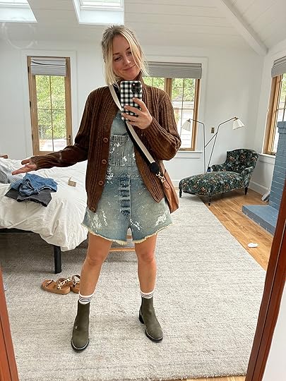
Y’all. It’s really hard to put on cute outfits these days and I’m trying to be kind to myself about it. Working from home on a dirty farm means that IF I get dressed in something outside of soft clothes or athleisure, it usually looks like this (on a good day). I rarely feel cute because I don’t leave the property enough to put on an actual outfit (and Portland, TBH has a far more utilitarian fashion culture). I’ve scaled back my closet a lot and curated it to be more for practicality and utility, with the occasional date night or a trip to LA to bring out “Fashion Emily”. My little sister is selling all of my old clothes on Poshmark very soon to help her buy a house:) Like I said before, the outfit above is me on a good day. This has made me being on camera less and less fun as I just don’t want to take the time to try to look good just to talk on instastories. And when I go on camera without getting ready there are always comments that are dumb but bum me out. I also don’t want sponsors to feel like I don’t care and want them to be happy with their content. So I’m trying to figure out a more scheduled routine, like 1-2 days a week where I do my hair/makeup and film a lot for the week so I don’t have to prioritize my looks every day nor put myself in a position to feel bad about myself. WHO KNOWS.
9 am – Email, Work, Meetings, etc.
Every day is different – a combination of emailing, zooming, meetings at the house with subs or the landscape team, and writing. I really need to start carving out creative time or just find better productivity tools for that. Right now, most of my design/creative time comes on the weekend which is slowing down the reveal process. We have team meetings on Mondays and Thursdays for 1-2 hours, shoot mostly on Wednesdays and just trying to keep my calendar fairly free to allow for time to enjoy life with the kids:) The next few months have been historically crazy as a content creator (not the last two years), so I’m really trying to say no to anything optional to ensure that I please my current partners, who I love, and still have time to prep and enjoy all the birthdays (both kids and Brian) and holidays that dominate my favorite time of year – October – Christmas. Right now is when we start to think about gift guide strategy which is always problematic for me (so much consumerism) but how we generate revenue for the slower months. It’s always a struggle to do it in a way that feels helpful, responsible, and yet profitable. Meanwhile, I have to reveal so many rooms that just need 4 little things fixed/installed before we can shoot, and they are things that I can’t do myself so I’m trying to get the styling as dialed in as possible so when they are done we can shoot and show you.
So that’s a little life update along with my morning routine. If you really want to know what’s going on, I found out my cholesterol is not good so I’m doing a 21-day body reset with the end goal of reducing my terrible cholesterol without getting on medication for it. This reset is no joke and is highly restrictive (just vegetables/fruits and some lean meat halfway through – it’s this one – and thus really effective (so don’t try it during the holidays – I had a 3-week window of no travel or fun occasions so I went for it). Anyway, I’ve been highly protective of this morning routine since we moved here last year (less so during the summer, but I even did it in Lake Arrowhead in July) because the simple truth is when I do this I have a much better day, and when I don’t I have a worse day.
My nighttime routine is just as regimented these days, too! Not on the weekends (I’m still an enneagram 7 so I get excited about fun stuff) but Sunday – Thursday our nights are booked solid with our routine and we rarely stray from it. GETTING OLDER AND MAKING GOOD CHOICES IS KINDA AWESOME BUT SO BORING TO WRITE ABOUT!! Thanks for reading 🙂
The post My Morning Routine (Most Days) appeared first on Emily Henderson.
Emily Henderson's Blog

- Emily Henderson's profile
- 10 followers

