
Did You Notice Something a Little Different?
UPDATE: Thanks for all the feedback! For those of you who were having issues with blurriness, we have good news: we pushed out an update this afternoon that improves the sharpness of the font for users who were affected. We’re monitoring all the comments and will keep you posted on any further updates.
If you’re a frequent visitor to Goodreads, you've probably noticed a few tweaks we’ve made to the fonts and colors on the desktop site today. Our goal with these small-but-important changes was to consolidate and refresh our visual styles and lay the groundwork for some design improvements that we’re planning in the future.
What’s different?
To enhance the readability of text on Goodreads, we’ve adopted two new open-source fonts. Lato, our sans-serif font, was designed by Warsaw-based designer Łukasz Dziedzic (“Lato” means “Summer” in Polish). Merriweather, our serif font, was created by Eben Sorkin and was designed to be pleasant to read on screens.
To make it easier to scan the page for information you need, we’ve touched up and modernized the design of common page layout elements like section headers, tabs and links.
To simplify and modernize our visual design, we’ve reduced the number of link colors we use, removed gradients from buttons and the site navigation, and applied a more harmonious color palette to interactive elements such as buttons, stars, and links.
Before:


Comments Showing 351-400 of 3,113 (3113 new)

 you have plenty of white space at both sides of the screen, maybe you can make the font bigger or the column at the home page bigger.
 It doesn't improve the usability. Everything was all right before. Who needs such tricks?
 Seriously??!!?! Perhaps you've modernized the overall visual design but it now requires a large magnifying glass to view it!! The font is tiny, faint, blurry and quite horrible. The pale blue colors might be lovely, if I could see them!!! Absolutely hate it! I used to enjoy reading reviews and comments, but now it just gives me a headache. You had a good thing going ..... why mess with it???
 The font is really difficult to read - small, blurry and letters are missing... -.-
 Everything is great, BUT the font.. this is super hard to read on a regular desktop (I haven't checked how it looks on my kindle yet). I've had to zoom in to like 125percent just to read it and not get a headache.
 I like the color pallet but the font? No. Absolutely no.
 Okay to this is how it looks like to me in Google Chrome:
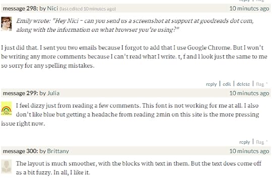
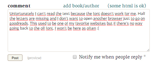
(Edit: It actually looks worse but the pictures here are so small and blurry, the font seems to look better in the screenshots)
 I concur with many of you. This new font/layout is headache inducing :(
 If you wanted to make text easier to read, then you have failed miserably.
 My eyes hurt and I got a headache from trying to decipher this post. The font is atrocious.
As usual, the change is NOT for the better.
 The new fonts are far too small and thin to point where some of the letters look like they're fading out.
 Fuzzy lettering on glaring white is all the rage these days, it seems...
 This is awful. Please allow us to revert back or something. This is really playing havoc with my eyes. And also could you stop tweaking shelf names limit? I lost the ability to advance on two challenges because my shelf name got shortened. And you added in some goodreads review link to my shelf as well.
 The new font feels blurry for me. It makes everything hard to read. :(
 Change is not a bad thing, but this font is. Oh my god.
 THis is terrible :( Can you please put things back to where they were! The font is too small, too skinny and too light in color :(
 All looks fuzzy, too, not just the font :(
 Put it back, PLEASE! the "My Books" page is all this awful, broken-letter green and it's very hard to read. I have a 24in monitor and very-high resolution, and it's still painful to read.
 This is bad. Put it back.
 I'm sorry, but the font is terrible. I get migraines and this is hurting my eyes.
 Goodreads: This font makes my eyes feel like I don't have the right prescription contacts in. Its really unpleasant. It makes me want to rub them. Please change it back!
 Please please change it back. The font is too faint and has a shadow to it. Intent is good, font is wrong!
 the new font is terrible, so hard to read.
If it ain't broke, don't fix it, I say
please bring the old font and graphics back
 No. I don't like it. I certainly don't find these fonts easier to read, it's much harder. There's a reason I don't use these for my selected fonts on Chrome or Firefox either. The fonts have a sharp appearance and are thinner than the previous ones used, making them lighter in color and harder to focus on when reading because there's less of it compared to the other fonts. The serif font is blurry. I've had to magnify the screen view twice in order to get this readable and the fonts still have this 'vibrating' and 'out-of-focus' appearance to them.
If you were looking for a more modern readable font, there are better ones out there than this one. I'd like to know who decided these fonts are easier to read? How many fonts did you actually look through?
I suggest you do a little more research and actually ask us readers before switching to something else.
I'm guessing you don't intend on changing the fonts back or looking for others, so how about at least making it optional for those who prefer using the others and who are finding it difficult to read these fonts?
 Nici wrote: "Okay to this is how it looks like to me in Google Chrome:
"
Thank you! We are looking into fixing this.
 Like many others, I'm having a very hard time reading anything. Bits and pieces of letters are missing, and so everything just looks like senseless squibbles. Could it be that the font is of a higher resolution than our monitors? Either way, it's very close to being completely unreadable.
 Just two suggestions:
Isn't it possible to add like buttons for comments??
Isn't it better to make reviews be justified??
Thanks.
 I don't like it. The font is unreadable, parts of letters seem to be missing. I don't understand why this is supposed to help make it more readable, since now I have to guess letters and everything.
 Also, but that is just a matter of taste, I preferred the green links over the new blue ones.
 Y'all freaked me out for a minute there.
But I think I like the change.
Carry on.
:)

 I like the new color palette but I, too, find the font difficult to read, and I have excellent vision. Is it possible that this font looks better on a Mac? I use a PC and have noticed that fonts often appear smoother on Macs.
 Nope, not good at all.
Fonts too big and still not clear enough, progress bar unacceptable, stars also suck big time.
The previous one was so much better
 I actually find this much more difficult to read. Sorry to be a downer!
 Wow, there's a lot of ridiculously harsh hate in these comments.
 I'm not usually a fan of any changes at first, but I always get used to them in no time. And in this case it looks nice! I quite like the sans-serif font and the whole thing has a calm look to it. I do agree that the bold black in titles etc. is kinda blurry. Overall, I like it. Thanks, goodreads people! I love this website. :)
On a side note, has Chrome changed its fonts as well, or am I seeing that wrong?
Update: I made the font on my computer huge and it looks great. By the time I shrink it back down to normal it becomes unreadable again. Seriously, this font is just bad.(If you want to test this yourself, hold the CTRL key on your keyboard while spinning your mouse's scroll wheel. This will alter the size of the font on the page you are viewing.)
 Hmm. I happened to have a page open when you updated and now I am looking at before and after tabs. I like the uncluttered look, but the font really is much harder to read compared to the old version, and it looks faint and fuzzy. (I'm on Chrome on a top of the line monitor.) Also, I actually don't like the links all being the same. It actually took me a minute to see the add book/author link now that it is blue. (The brown color scheme was actually much easier to see.) I suppose I will cope, but you need to set the font to a larger type if you are going to stick with this.
 I do not like it AT ALL. But I am sure that does not matter.
I think the mass is speaking Goodreads. You have failed.
I do not like it AT ALL. But I am sure that does not matter.
I think the mass is speaking Goodreads. You have failed.

 Those on a PC, you can press CTRL + [the plus sign] and it will zoom in slightly. Keep pressing to zoom in more. CTRL + [the minus sign] will zoom out.
 Love it. Much better now.
 Why are we changing how things look when there are simple functionality improvements we've all been asking for forever?
 So far, major dislike.
 Emily wrote: "Nesrin wrote: "Emily wrote: "... Nesrin wrote: "Maybe it's Chrome, but the font looks broken on GR now!
The Lato font is okay it seems, but the main font, Merriweather, is BS!"
What do you mean by..."
No problem...
Google Chrome with Zoom set to 100%...
 Whose idea was this? Very incompetent and unprofessional. Do not fix what isn't broken!
 I really like the changes. Very pleasing and easy on the eye!!
 The font hurts my eyes. Please create a way to change it back if you want it.
 Not crazy about the font change. It's actually a little difficult to read. :-(
 This font is awful and besides the fact that it hurts my eyes to read, half the letters don't come out right.
 And I'll also agree that the round avatars are awful. I don't want to have to format my images differently to fit a round template.
 I don't like this new GR.. Its messing up with my templates and such.. I feel like if You want to change the look of GR that's fine. But you should at least make it optional weather or not we can have the old font. Maybe in the HTML?
Keep in mind guys, we aren't complaining because we don't like it, we are complaining because the text is literally broken on our screens. I'd take a screenshot, but I'm leaving my house right now...
Steven wrote: "Why are we changing how things look when there are simple functionality improvements we've all been asking for forever?
I don't like this new GR.. Its messing up with my templates and such.. I feel like if You want to change the look of GR that's fine. But you should at least make it optional weather or not we can have the old font. Maybe in the HTML?
Keep in mind guys, we aren't complaining because we don't like it, we are complaining because the text is literally broken on our screens. I'd take a screenshot, but I'm leaving my house right now...
Steven wrote: "Why are we changing how things look when there are simple functionality improvements we've all been asking for forever? So far, major dislike."
This is the first thing that we are looking at for any future updates. Please feel free to let us know what else you would like to see changed!

I love it but perhaps one day we should give users an option when it comes to choosing their own fonts/size/format/colours because not ever..."
I second this!