
Did You Notice Something a Little Different?
UPDATE: Thanks for all the feedback! For those of you who were having issues with blurriness, we have good news: we pushed out an update this afternoon that improves the sharpness of the font for users who were affected. We’re monitoring all the comments and will keep you posted on any further updates.
If you’re a frequent visitor to Goodreads, you've probably noticed a few tweaks we’ve made to the fonts and colors on the desktop site today. Our goal with these small-but-important changes was to consolidate and refresh our visual styles and lay the groundwork for some design improvements that we’re planning in the future.
What’s different?
To enhance the readability of text on Goodreads, we’ve adopted two new open-source fonts. Lato, our sans-serif font, was designed by Warsaw-based designer Łukasz Dziedzic (“Lato” means “Summer” in Polish). Merriweather, our serif font, was created by Eben Sorkin and was designed to be pleasant to read on screens.
To make it easier to scan the page for information you need, we’ve touched up and modernized the design of common page layout elements like section headers, tabs and links.
To simplify and modernize our visual design, we’ve reduced the number of link colors we use, removed gradients from buttons and the site navigation, and applied a more harmonious color palette to interactive elements such as buttons, stars, and links.
Before:


Comments Showing 151-200 of 3,113 (3113 new)
message 151:
by
Michelle
(new)
Dec 15, 2015 10:49AM
 The more I'm using it the less I like it. I've had to zoom in my browser in order to not give myself a migraine from the small font.
flag
 Agree that the font is blurry, I thought I did something to my computer at first!
I think having the option to use the old font would be great for those of us that are seeing the letters as fuzzy...would kill me in the long run.
 Emily wrote: "Alexandra wrote: "Huge titles, tiny text, total chaos in fonts
"
Thank you for the screenshot! Are you at 100% zoom on your browser in that image?
Yep.
No, overall, the colors and some styles are better. But the font is just too small, the background too white and empty, and while I know what a big job that would be for your developers, I still hope that one day Goodreads will look more comfy, with more focus on the info and better background.
But at least Goodreads has the best support ;)
 Unfortunately I can't read the text because the font doesn't work for me. Half the letters are missing and I don't want to open another browser just to go on goodreads. This used to be one of my favorite websites but if there's no way going back to the olf font, I won't be here as often :(

 Looks great! We appreciate the effort you put into the site.
 I like it, although my eyes hurt a little. I wish the shelves and the 'currently reading' section on the profile were highlighted or something. It looks kinda boring and plain, like it's all part of the 'recent updates' section.
 Font is difficult to read, almost seems blurry. I am squinting trying to read the screen, and there it's not like we need more reason to get a headache from staring at a backlit screen all day.
Also, not a fan of the new teal color that is being used everywhere. "Streamlining" is one thing, but differences in color can actually HELP users quickly identify and process different types of content.
 I don't have trouble reading the new font although it is a bit blurry. I am on Windows 7/Chrome. I like the design!
 The irony of the site being called Good Reads when the new font is anything BUT a good read....
 Jennifer W wrote: "I am finding the font to be too small. I have excellent eyesight and I'm only in my 30s! I also don't like the blue text on a blueish gray background (like in the "message by:....." headers) . I im..."
Also, anywhere there is light gray font is much harder to read. It looks very washed out.
 Hate it. Some characters have holes, making it blurry and harder to read.

 This font is terrible. It's killing my eyes. The letters look like they came out of printer low on ink.
 It's hurting my eyes. I thought I had screwed up my settings at first. Please fix this. It's hard to focus and I feel a headache starting after only a few minutes.
 We'll all get used to it ;-) We always do :-)
 All the new fonts are so hard to read!! I'll definitely not be using Goodreads as often...getting a headache just typing this. They're so light and thin that I have to squint even with my glasses on!
 Heidi ~ [Daughter of Iris, Shipper of Caleo] ~ wrote: "Rainbowheart wrote: "I'll have to stop using GR if it stays like this."
Whoa, now, let's not be rash. I love Goodreads, and I wouldn't stop using it just because of a weird font."
But I can't read it. It's all blurry and giving me a headache. How are people supposed to use the site if they can't read what's written down?
I wish there was a way to subscribe only to the replies to YOUR messages. I just subscribed and got hella spammed in email lol
 it's like the words are now blurry. not a fan of this tbh.
 My eyyyes, my eyyyyeeeeessss.
What have you done.........
To make things even worse, the Listopia lists aren't working right. I tried to add a book to list just now by clicking "search," and nothing happens.

 This is how it looks like right now. The text in the comment field is especially unreadable.
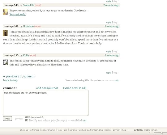
 aaaAAHH! At first I panicked a bit because change, but I love it! Goodreads is in desperate need of some design changes. Well done, guys!
 It'll take some to get used to....
 Letters ar too small and blury, background too bright. Your killing my eyes.
 mising in font letters ū ķ ē http://i.imgur.com/vObc8Z6.png

 The font is a little small is there a way to increase it? I would like it better if it was larger. The colors are good though.
 This change makes it harder for people with eye issues.
 This is a good day. The typeface is better, the general appearance and aesthetic is better, and the horrid gradients have gone. Praise be to the Amazonian gods.
 It makes it so much more difficult to read, everything feels blurry and a bit messy - it was much cleaner before.... it hurts my eyes now; zooming in or wearing my glasses doesn't help. And having titles etc in bold looks unprofessional and a bit of a mess.
 Woah, I really don't understand what so many people are compaining about! I love the new font, in my opinion, it's very aesthetic, but apparently some people find it hard to read, I'm not compaining though, great job!
 I do like the way the "more.." opens on the giveaway list - as an extension of the text instead of the little box.
But the font is blurry and hard to read. I can barely proof read what I am currently entering in this form. The lower case e (fifth letter of alphabet) look like a c (third letter of alphabet). Writing and proofing reviews is going to be impossible. using Firefox.
Just tried it in IE and it looks better, but still not great
 Ow, this new font really hurts my eyes. Please find a sans serif font.
 "Enhance readability" ? It's a well known fact that sans serif fonts give you eyestrain far faster than those with. It was fine before, give us a break.

 Awful. Awful. Awful. I am not amused. You've displeased me.
The font is extremely blurry and obviously I'm not the only one to notice.
It appears neither cleaner nor in any way more modern.
Consider this my wish for christmas: Please change it back. ALL of it. Please. New is not always better.
 No. This font KILLS usability. It's impossible to read! Pieces of letters are MISSING unless I zoom in on the page. Please, please, PLEASE. For the love of all that is holy (or even just in respect to your users, who are not complaining for no reason here), change it back.
 The font is too light and broken-up looking. WAY HARDER TO READ. Sheesh, actually hurts the eyes!
 Absolutely horrible to read... Please change it back!

 I'm normally the one to embrace change - but I do have to agree with some of the commenters above (just won't state it as harshly as some have), that the fonts used are harder to read on the desktop. They are blurry and too "fat" in the bold so that some of the letters look like they swim together.
 I think this may work for tablets or phones? But not for desktop screens.
 If by "enhanced readability" you mean "decreased readability," then congratulations--you've achieved it!
 My 2¢ : The bolder text is way too large, too bold or just a poor font choice. It feels like I'm being yelled at on my home page/recent updates thread. And, throughout my group, in areas such as our currently reading, the titles are way too large and it does not look appealing.
 Tytti wrote: "The font makes the text more difficult to read. I have to guess some letters."
My first thought, too.
 The font itself is fine but the light blue color is really hurting my eyes. It's just too light. I really prefer black lettering.

