
Did You Notice Something a Little Different?
UPDATE: Thanks for all the feedback! For those of you who were having issues with blurriness, we have good news: we pushed out an update this afternoon that improves the sharpness of the font for users who were affected. We’re monitoring all the comments and will keep you posted on any further updates.
If you’re a frequent visitor to Goodreads, you've probably noticed a few tweaks we’ve made to the fonts and colors on the desktop site today. Our goal with these small-but-important changes was to consolidate and refresh our visual styles and lay the groundwork for some design improvements that we’re planning in the future.
What’s different?
To enhance the readability of text on Goodreads, we’ve adopted two new open-source fonts. Lato, our sans-serif font, was designed by Warsaw-based designer Łukasz Dziedzic (“Lato” means “Summer” in Polish). Merriweather, our serif font, was created by Eben Sorkin and was designed to be pleasant to read on screens.
To make it easier to scan the page for information you need, we’ve touched up and modernized the design of common page layout elements like section headers, tabs and links.
To simplify and modernize our visual design, we’ve reduced the number of link colors we use, removed gradients from buttons and the site navigation, and applied a more harmonious color palette to interactive elements such as buttons, stars, and links.
Before:


Comments Showing 551-600 of 3,113 (3113 new)
I've been waiting for a change of desing and here it is. THANK YOU SO MUCH I LOVE IT!!!!!!!! :D
 It's so blurry I had to rewrite this about 3 times because I couldn't read if it was correct or not. I have bad eyesight already, please don't add to it and chance it back to the old one.
 Why does every web designer these days think tons of white space + tiny fonts in the middle = more legible?
 I'm blinking while reading, even if the font is "right" on Safari and after decreasing the screen light (by 25%). I second the "too much white", even if the full color palette is pretty.
And I'm looking forward to the new updates, I hope they add interesting and useful features.
 Emily wrote: "Update for everyone on this page of the comments: as Erin said above, we have a font rendering issue in a few browsers that we are working on. I will update with any news!"
Is there anyway the background can be made a different color than bright white? Aside from the font being unreadable (which is being worked on), my biggest gripe is the blinding white background. Honestly, I can deal with the changes (and possibly even like them, given the chance) if I'm not given a migraine from being on here for the past 20 minutes. X(
 I dislike it even more now that I can't read my own page. What size is this, like -11?
Seriously, I already have my desktop enlarged a bit but things are seriously too small. It's like fine print in an appliance brochure. You DO know lots of ppl have some vision issues, especially we older folks.
 This is lovely; nice colours and really good fonts.
 it is so difficult to read without zooming in at least 3 times. without zooming in there is no way to tell letters l,t,f,I apart and that's just one example. text simply looks blurry. it's like one of those fonts that only look good if it's used for one short word on a poster.
I'm all for aesthetics, and i'm glad A looks like a triangle rather than a capital a but it does make a text difficult to read.
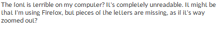
 The font is terrible on my computer? It's completely unreadable. It might be that I'm using Firefox, but pieces of the letters are missing, as if it's way zoomed out?
 It looks like this:
 The new fonts are wonderful!!! I've always hated Arial, Times New Roman, and their relatitves. Georgia, Merriweather, and their relatives are far easier on the eyes in the long run and look very classy.
Well done!
 I'm adding books from goodreads choice award into my shelf and the books I read are marked as "Want to read"
 The font is awful! It's too small and blurry. It's giving me a headache.
 I really hate the new font. I kept playing with the CTRL +/- zooming in and out thinking something with my screen was wrong. The e's look like c's, but that's probably because I'm on Firefox. When I go to Google Chrome, I can read it, but I think the font is still too small. I like the older version better.
 reading on a laptop screen, i find the text too faint and hard to focus on, even from a short distance.
 Nice change, but very blurry in Chrome and Edge.
 I don't mind the change with the colors, but I have to agree with other users that the font is actually harder for me to read. That was my first thought before I even read all these comments.
 Why was this not beta-tested in a trial run, rather than being forced on everybody at once with no choice? It's pretty obvious there is a major font issue, as around 99% of the comments on here agree that the font is unreadable, blurry, and makes the whole site look generic and messy - regardless of browser choice.I have a headache coming on from the strain of reading it - there's a reason the old font worked - it was clean and easy to read. As someone who spends several hours per week on here, it's pretty clear I'm not going to be able to do so any more.
 Might take a little bit to feel comfortable -- but I'll roll with the punches!
 The background is too bright, and the font is out of focus :( I do not like these changes at all! And I will probably spend a lot less time on here.

 Both fonts have some issues on my Firefox. There are gaps on some of the letters which make things very hard to read.
I can't tell if it's a transitional thing, but it's not good.

 The layout is lovely but the font is very difficult to read unless I zoom in to about 150%, at which point the font looks great...but it's horrible at normal web page size.
 I'm all for making Goodreads look nicer, but I agree with the MANY people saying the new font choices are extremely difficult to read. They are faint, grayed out, and much too small. Not a pleasant reading experience!
Steven wrote: "Is there anyway the background can be made a different color than bright white? Aside from the font being unreadable (which is being worked on), my biggest gripe is the blinding white background."
I'm all for making Goodreads look nicer, but I agree with the MANY people saying the new font choices are extremely difficult to read. They are faint, grayed out, and much too small. Not a pleasant reading experience!
Steven wrote: "Is there anyway the background can be made a different color than bright white? Aside from the font being unreadable (which is being worked on), my biggest gripe is the blinding white background."This. I don't really mind the colour scheme and the fonts (as tiny as they are), but combine it with this #FFFFFF background and you'll lose a lot of users to simple eye strain. Simple rule: Don't make your site physically painful to use unless you're selling Aspirin. (Then again, I guess Amazon does that...)

 If you were after better readability, then you've failed miserably. The new font looks like the letters are missing parts and it looks worn, which makes it extremely hard to follow. In a way it looks like the letters are blinking. Now that I'm writing this the ts and fs for example don't have the cross bars (t looks like l). The inventor of the font must be blind.
 Everything else works fine though.
 Kim wrote: "This font is very hard to read. It looks like the pixels along the top of each line of text is missing. Everything feels very small and blurry. Is there an option to revert back to the old font?
(..."
The broken fonts only appear for me in Firefox, but in Chrome everything still looks very blurry.
 Print size is now even smaller than before. I already had to zoom to 125% to read the reviews. Now I have to go to 150% and everything else is now too large. As usual, everything is designed by and for people in their 20's and not for those of us a bit older.
 The new fonts look horrible in Firefox and are much harder to read than the original. Honestly, between Goodreads and Twitter, I'm getting really tired of services changing things in the name of modernity and making them uglier and/or less functional than before.
 Agree with pretty much all the criticism offered already: the font is atrocious and giving me a headache, the background's too white, the lack of coloured borders is making everything much harder to navigate, the bold book titles are too bold, the orange stars are just as eye-searing as the font... all in all, this "improvement" gets 0 out of 5 horribly coloured stars.
If it ain't broke, don't fix it.
(In case this hasn't yet become obvious through the hundreds of negative comments: IT IS NOW BROKE. FIX IT!)
 Emma wrote: "Why was this not beta-tested in a trial run, rather than being forced on everybody at once with no choice? It's pretty obvious there is a major font issue, as around 99% of the comments on here agr..."
We would have loved to do a beta test for this, as we've done for many different features in the past, but given the nature of the change that unfortunately wasn't an option. We appreciate all the feedback we've gotten so far!
Vanessa wrote: "Emily wrote: "Update for everyone on this page of the comments: as Erin said above, we have a font rendering issue in a few browsers that we are working on. I will update with any news!"
Can I ask..."
This will affect multiple browsers, primarily Firefox. :)
 Seems cool but I find the font too small, it definitely feels weird. I guess I could adjust to the change in colors but the sizes need to be fixed. Like some said before, it kinda looks blurry.
Also, could you please give me back the frame/border thing there was around the text of the reviews? Pretty please?

 I appreciate the effort, but the new font is not nearly as readable or clear as the previous version. It looks smaller and as though it's missing some pixels.
 Bjorn wrote: "Why does every web designer these days think tons of white space + tiny fonts in the middle = more legible?"
Because they're not real professional. Maybe.
 I've been on the site for less than 10 minutes and my eyes hurt already. I've tried several browsers, but the font is too blurry and I have to squint to read it properly. Also, I agree with all the people who have asked for a less bright background. The current background makes everything worse.
 The layout changes in color and buttons are fine, quite pretty actually. But please use a bigger font size - I can hardly read it (even with glasses) .
 Design changes are never easy but personally I love the new design. The fonts look really good on my tablet and it was a good idea to remove the gradients, it gives the design a much more modern feel. Well done :)
 Thanks for the tips about zooming to 150%! When I do that, the combination of sans-serif and large font size gives me a genuine third grade reading experience. Classy work, Goodreads.
 Actually, the last font was waaaays better to read :(
Okay, after trying to read only one page of comments, I have a headache and my eyes hurt so badly I have to go and lie down. Thanks for this. Looks like I'm gonna use GR less.
Actually, the last font was waaaays better to read :(
Okay, after trying to read only one page of comments, I have a headache and my eyes hurt so badly I have to go and lie down. Thanks for this. Looks like I'm gonna use GR less.
 I haven't read the previous posts, but I just logged on and noticed this. My very first impression is that it's really hard on my eyes. Also, why the round avatar in the upper right-hand corner on the update feed page? My photo is now cut off a bit; plus, it's inconsistent with the square ones elsewhere.
 Like a lot of others, I'm fairly neutral on the color/layout changes, but the fonts might really need to be reconsidered. The serif font isn't great, but it is mostly readable. The sans serif font, however, looks almost distorted, and is disorienting to read. When looking the list of my bookshelves in My Books, for instance, a number of them, especially the smaller ones, are almost illegible.

 The font is terrible. The tops of the letters aren't clear, and it is extremely hard to read. Much too thin.
 Emily wrote: "Steven wrote: "If you're looking to make things more consistent, and you feel that style is the way to do this, why wouldn't you poll existing customers/users and get a feel for what they'd want to..."
Can you explain why shelf names got shortened? Cause I asked that a while ago.
And this page right now looks like broken squiggles forming words? I don't even get what happened with this or why you all did this and if you did test how no one brought this up.
 Did You Notice Something a Little Different?
Yes. Entropy is alive and well on GoodReads.
M'rella wrote: "It's not just the font. The background is too white. You can't have it on the computer. Any decent web master knows that :/"Thank you! I don't know who said snow white was a great background color.

Oh, I must have missed the polls or something. We..."
Yeaaaa me too. And I always answer the polls. Always.