Witold Rybczynski's Blog, page 18
June 29, 2019
BLACK IS THE NEW BLACK
 When I went to school in England in the fifties we were obliged to wear blue blazers with the school crest. I came across this photo of a class of the Interior Design Department of Northumbria University taken in the Bauhaus building in Dessau. Apparently strict dress code still apply, and are followed by instructors as well as students, and are even extended to hijabs. Gropius would be pleased.
June 20, 2019
THE KING JAMES VERSION
 While James Holzhauer was making his impressive run on Jeopardy I read several articles that suggested that his aggressive and risky mode of play had changed the game forever. Well, he certainly changed it for me–after more than a decade or more I’ve stopped watching. Mainly because Holzhauer didn’t change the game forever. After he lost, almost immediately things went back to the way they were: contestants timidly started with the $200 category and went on, square by square, and when they hit Double Jeopardy, the bets were pitifully small. The thrill of watching Holzhauer go all in was gone. And the contestants again took the time to laugh at the host’s lame jokes, instead of brusquely pushing things along as King James did. It’s now back to the same-old, same-old. Borrrrrrrrrrrrrring.
KING JAMES
 While James Holzhauer was making his impressive run on Jeopardy I read several articles that suggested that his aggressive and risky mode of play would change the game forever. Well, it certainly changed it for me; after more than a decade or more I’ve stopped watching. Holzhauer has spoiled it for me. Mainly because he didn’t change the game forever. After he lost,almost immediately things are back to normal: contestants religiously painfully work their way up from the $200 category square by square, and when they hit Double Jeopardy, the bets are pitifully small. The thrill of watching Holzhauer go all in is gone. And the contestants take the time to laugh at the host’s lame jokes, instead of pushing things along as King James did. It’s back to the same-old, same-old. Borrrrrrrrrrrrrring.
May 29, 2019
CATFIDDLE STREET
 Here is a recent photograph of Catfiddle Street an infill development in Charleston, which is slowly coming together. The house in the foreground is being built by Vince Graham and was designed by George Holt and Andrew Gould. The veranda will have wrought-ironwork, a signature of colonial Charleston. The walls are in the process of being painted a deep Pompeiian red. The shaded arched opening on the extreme right leads to Reid Burgess and Sally Eisenberg’s courtyard house. The next house was designed by Julie O’Connor. The turquoise house and its neighbor on the left are the work of Bevan & Liberatos. The vaulted opening is not a carport but a continuation of the street and connects to the Crosstown Expressway. The giant Doric column reminds me of Palladio’s unfinished Palazzo Porto-Breganze in Vicenza. Note the keystone in the form of a human head, the work of sculptor John Michel.
May 24, 2019
CHARLESTON, CHARLESTON
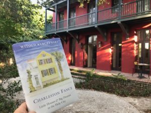 My friend Vince Graham holds a copy of my new book in front of his Charleston home. The house features in Charleston Fancy: Little Houses and Big Dreams in the Holy City, published by Yale University Press. The book combines three themes, architecture, cities, and real estate development (Vince is a character in the last). May 28 is the official publication date but the book is available now. You can read an early review in New Criterion.
May 12, 2019
SPUMONI IN THE FOGG
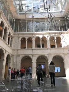 Harvard’s Fogg Museum, a Colonial Revival building at 32 Quincy Street, reopened five years ago after Renzo Piano’s major expansion, or “reboot” as The Guardian called it. The other day I had a free hour and I spent it in the Calderwood Courtyard of the old/new building. The architect of the original museum, Charles Coolidge of Coolidge, Shepley, Bulfinch and Abbot (H.H. Richardson’s successor firm), modeled the cloister-like arcades on the loggia of a sixteenth-century canon’s house in Montepulciano, designed by Antonio da Sangallo the Elder. Admittedly, the modeling is very loose, more like a stylized memory, and has a kind of American crispness in execution that is very different from the origonal. Piano added two stories on top of the arcade making a sort of spumoni—modern above, Renaissance below. The modernist layer is thin fare; Piano’s work, with its fussy greenhouse roof, looks provisional, like a temporary addition. I came to the conclusion that there were three chief reasons. 1) Steel and glass are simply not as engaging as travertine. 2) The orders of the arcades play with scale; the anonymous minimalist addition is more like utilitarian engineering—nothing but the facts ma’am. 3) The modeled arcades are defined by sharp shadows; Piano’s addition, which is mostly glass, contains no shadows. If architecture is indeed the “the masterly, correct and magnificent play of volumes brought together in light,” then the addition is not architecture at all. In the old arcades, our glance is caught by the details of the Ionic and Doric capitals; in the new addition there are no details (except for the lighting fixtures), and we quickly loose interest. Almost 400 years separate Coolidge’s work from that of Sangallo; less than 90 years later, Piano comes along and and it’s all gone.
April 19, 2019
IT OUGHT TO BE GOTHICK
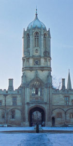 The organizers of the competition to design a replacement spire for Notre Dame Cathedral, “even more beautiful than before” in President Macron’s words, might take a lesson from an incident that happened more than 300 years ago. In 1681 the architect Christopher Wren was commissioned to build a bell tower for the quadrangle of Christ Church College in Oxford. The original tower had never been completed. The college had been founded by Cardinal Wolsey 150 years earlier, and had been built in the castellated Late Gothic style that was then popular but which was now long out of fashion. Wren was the country’s leading classicist. What did he do? As he succinctly explained, the tower “ought to be Gothick to agree with the Founder’s worke.” Enough said.
April 17, 2019
FIRE IN THE CATHEDRAL
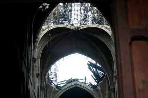 The heart-wrenching sight of Notre Dame de Paris in flames was a reminder that fire is the great enemy of architecture. So are earthquakes. The third enemy, ever since 1687 when the Venetians destroyed the Parthenon, is wartime bombardment. The Paris fire is also a reminder of what a weird hybrid structure Gothic cathedrals really are. The ancient Romans roofed their basilicas and baths with concrete vaults (the Pantheon with a dome), and the Byzantines used thin domes and vaults of brick. Over time, builders lost these skills and Romanesque cathedrals were roofed with exposed timber rafters like big barns. This made the buildings highly susceptible to fire, often caused by lightning strikes. The solution, pioneered at Durham Cathedral in the 11th century, was to build a lightweight ribbed stone vault over the nave. The timber roof remained, so the vault had no structural function (except to support itself) but it separated the interior from the flammable roof above. This was largely effective as the April 15 fire shows. However, news reports mention two “holes” in Notre Dame’s vaulted ceiling. This is misleading. As photographs (above) show, two large sections of the vaulted ceiling collapsed, unable to bear the weight of the falling debris. These will have to be repaired. I expect a debate when it comes to rebuilding the roof itself. No doubt metal will be substituted for the original lead roofing, but what about the (concealed) supporting rafters? Should they be “authentic” timber or “modern” steel? I vote for fire-protected steel.
April 12, 2019
LA LA LAND
 I have written crtically in Zócalo of LACMA’s decision to demolish its old museum. “Why does Los Angeles, which has little enough history, feel the need to keep reinventing its surroundings?” I asked. That was almost five years ago. Now we read that the LA county board of supervisors has finally given its approval and the new building will go ahead. I am not a fan of Peter Zumthor’s design. Apart from its rather simple-minded concept it does not look like it will be a sympathetic place to look at art. LACMA has not released any plans, but the views of the interior give the impression of an office lobby where the art is simply background wallpaper. Surely after Mies van der Rohe’s disastrous National Gallery in Berlin, we have learned that a glass-walled room is not a good setting for art? The rationale seems to be that old chestnut, flexibility. LACMA director Michael Govan is quoted by the New York Times as saying that the new museum will create spaces that are “good for different kinds of art.” Looking at the slow evolution of Zumthor’s design, now black now white, now blobby now zigzaggy, I am reminded of a comment that the landscape architect Laurie Olin made to me during an interview about Apple Park, Apple’s new HQ in Cupertino. “There are some architecture firms that could do a project of this size but not as refined, and there are firms that could produce as refined a design but could not handle the scale, but there are very few firms in the world that can do both.” Zumthor’s firm is not one of them.
March 29, 2019
THE TRANSPARENCY TRAP

Boston’s Copley Square with Richardson’s Trinity Church and Pei Cobb Freed’s John Hancock Tower
Blair Kamin, the architecture critic of the Chicago Tribune, recently made this wise observation about the latest crop of urban buildings: “Glass usually works best when it operates in counterpoint to richly articulated walls of masonry. When glass becomes the context, it often struggles to match the quality and character of limestone, granite, brick and terra cotta.” In other words, the first generation of all-glass buildings benefitted from their masonry neighbors (Pei’s John Hancock Tower, across from Richardson’s Trinity Church comes to mind). Today, not so much. Our downtowns are dominated by all-glass boxes, even cities like Washington, D.C. (once marble and limestone) and Philadelphia (once brick and limestone). Le Corbusier described (modernist) architecture as “the masterly, correct and magnificent play of volumes brought together in light.” Corbusier used glass but he never designed all-glass buildings. Neither did Mies; he added superfluous I-beams to his facades (which also had substantial spandrels). The problem with transparent glass is that it doesn’t hold a shadow, and without a shadow there can be no “play of volumes.” Since minimalist modernist architecture doesn’t offer decoration or ornament, that doesn’t leave much to look at.
Witold Rybczynski's Blog
- Witold Rybczynski's profile
- 178 followers


