
Melissa C. Walker's Blog, page 13
June 29, 2012
Photo Friday: Pimm’s Cup
I’ve had a lovely week of vacation. Back next week. Cheers!


June 25, 2012
Cover Stories: For Darkness Shows the Stars

Diana Peterfreund tends to have great covers, and when I saw her new one, For Darkness Shows the Stars (a post-Apocalyptic take on Jane Austen’s Persuasion, hello!), I fell in love with the starry sky. So I asked her about it, and here she is:
“I always have an idea in mind for my covers, but since I’m not an artist it’s probably best that my publishers ignore me. They did ask me to send inspiration pictures, though. I sent in a lot of pictures of harsh seascapes and rocky cliffs and beaches beneath a sunset/sunrise and a starry sky. Sometimes there were forlorn women standing on these beaches. I think Harper and I were totally on the same page about the direction we wanted to go in, which mostly makes me feel like I’m finally getting a hang of this imagery thing.
“I asked for something very lush and romantic, to fit the feel of the book. Also, because this book has such a distinctive title that bucks the trend of the one-word YA book titles, I asked for a fun font treatment that really highlighted the title.
“I was super excited when I saw the image. After eight books, I’m a bit of a pragmatist about covers. The job of a cover is primarily to make the reader pick it up – and this cover is swoonworthy and gorgeous. A secondary goal is to communicate to the desired audience what kind of book it is. We’re very thoroughly trained to respond to particular cover cues: illustrations are children’s books, photos are young adult books, a man and a woman is a romance, a shadowy figure is a thriller…
“I think this cover says that the book is going to be lush, romantic, and otherworldly, and that fits the story perfectly. And I went gaga for the title treatment!
“When I first saw the comp (the early, unphotoshopped version) the girl had some rather wild makeup and hair, which didn’t fit my homespun farmgirl heroine. So they warned me in advance they were planning on toning that down, probably to pre-empt my ‘holy eyeshadow, Batman!’ comment. They also hadn’t decided completely on the font/color for the title. One of the things I asked for was to incorporate some dawn colors, perhaps down at the base of the cliff where her eyes are focused, to indicate the whole ‘post-apocalyptic’ nature. I love that they ended up using those colors on the amazing ombre effect on the title. It’s like the words are on fire.
“It’s two stock photos: one of the girl, and one of the stars. I’ve been in contact with the star photographer, whose work is amazing. (I’ve seen the work of the other photographer online, but we haven’t communicated.)
“I may be in the minority on this, but I tend to prefer covers with stock photography to the ones that have been photo shoots. I think sometimes designers have more to choose from if they aren’t constrained by whatever they manage to get in photo sessions. The downside of stock usage is that you may be one of many who ends up with a particular image/model/shoot on your cover, but so far, that hasn’t happened with this model. (Fingers crossed!)
“This is my favorite cover yet. I think it’s highly metaphorical – obviously my heroine doesn’t have glowing blue skin with galaxies shining through her body and starlight in her hair, but the stars are such an important motif in the book that I love the way they are incorporated into the images. She looks sad, but she looks strong, and that’s Elliot. As to whether I think it’s an illustration of any scene – I’ve spent enough hours gazing on this cover that I’ve gone there, too. I see my heroine Elliot standing at the top of the Very Important Cliff in my story and looking down onto the beach where her Lost Love is building a ship to take him away from her forever. At other times, I think it’s meant to be a nod to another scene in my book, where Elliot ventures into an underground cavern filled with stars. She actually wears a black dress in that scene, so maybe that’s closer. (In passing, I love the unusual construction of her dress – it says ‘futuristic’ to me.)”
Thanks, Diana! This is a cover that I’ve seen on shelves and been drawn to, so I think it works. Any thoughts from you guys?
June 22, 2012
Photo Friday: Switzerland!
June has her first passport stamp (Switzerland), and she’s ready to take on the world! Happy Friday!

June 21, 2012
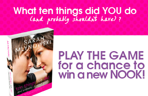
Win-It Wednesday: iPod and Nook!
Last week’s winner of The Secret Tree is… Lauren G! Send me your address, L. I have two giveaways to tell you about this week:
1. One for my book and an iPod nano (just share your broken-hearted playlist on Spotify)!
2. For Sarah Mlynowski’s latest (so hilarious and heartwarming) and a Nook! List up to 10 things you did, and shouldn’t have… (not here, on Facebook). here are my five:
1. Watched that scary movie. Can’t sleep!
2. Facebook-stalked the guy who broke my heart, uh, 10 years ago
3. Stopped by the Marc Jacobs sample sale “just to look”
4. Started “Friday Night Lights.” Now I’m SO SAD it’s over!
5. Left before my manicure was dry. EVERY TIME!
Click below to enter. Happy Wednesday! (Yeah, I know it’s Thursday, but we’ll pretend, okay? I’m behind.)
June 18, 2012
Cover Stories: Timepiece by Myra McEntire
 I have long been a fan of Myra McEntire‘s gorgeous cover for Hourglass, below, and now that Timepiece is hitting shelves, I’m taken aback again by the movement and wonder of these covers. Here’s Myra to share her perspective:
“I loved the Hourglass cover so much (below right), and I hoped my publisher would stick with that photographer. There was an original image I didn’t think did the story justice, and when I expressed my concerns, they listened.
 “Once we’d worked out some kinks, I was blown away by the cover they showed me. When I saw it on the book, actually held it in my hands, it was even more beautiful than I thought!
“The cover was shot by the girl in the picture! Her name is Lissy Elle, and you can check out her work here (prepare to lose yourself for a few hours!).”
Thanks, Myra! I love knowing that these are self-portraits by the photographer-model–even cooler. What do you guys think?
June 16, 2012
Photo Friday: The Brooklyn Bridge
Had to show this one: The new park near the Brooklyn Bridge is very fun for our city baby, who loves grass!
Happy weekend!
June 13, 2012
Win-It Wednesday: The Secret Tree by Natalie Standiford
[image error]Thanks for weighing in on my glasses options! I’ll show my pick soon. The randomly chosen winner of a signed copy of Unbreak My Heart is… Julie Fitch! Send me your address, JF.
This week, I have a signed ARC of Natalie Standiford’s awesome The Secret Tree. It’s a middle grade novel by the hilarious and fun author of How to Say Goodbye in Robot (a favorite of mine). I read it, I loved it. Such a sweet summer mystery filled with friendship!
I may try to write a middle grade story one day (those are the books for kids like 8-12ish, as I understand it?), so to win this book, tell me what your favorite middle grade novel is, or just one you’ve loved recently. I want a reading list. Go!
I’ll choose a winning commenter at random next week.
Happy Wednesday!
June 11, 2012
Cover Stories: Sophie’s Mixed-Up Magic Series
 Amanda Ashby has been here before with the GCC to share stories about her covers, and she’s back today with the story behind the Sophie’s Mixed-Up Magic covers, her first middle grade series.
“I’ve been lucky with my covers and I’ve loved them all, but without a doubt the covers for my Sophie’s Mixed-Up Magic series are my favorite! And I’m not just saying that because they are my first covers to have a head (though heads are cool!) but it’s rather because as soon as I saw them, I just knew that the girl on the cover ‘was’ Sophie!!!! From her straight blonde hair, her expressions through to the clothes that she was wearing, it was all the Sophie of my mind!
 “Sometimes I get asked if I have any thoughts on the cover, but this time I wasn’t and I hadn’t even realized that there was even a shoot until after it was all over. Anyway, I immediately emailed my editor to tell her how thrilled I was. She told me that the girl who had played Sophie was an absolute delight and had totally embraced the shoot. She also told me that the art director was Jeanine Henderson who also did the covers for two of my other books, Zombie Queen of Newbury High [read that Cover Story] and Fairy Bad Day [read that Cover Story]. I love Jeanine’s covers so I was thrilled to discover that she had worked on the Sophie books as well and I immediately asked my editor to pass on my thanks and let her know how much I loved the covers (that’s book 2 on the right).
“Then a few weeks later I got an email from the girl on the cover of the books. She was so lovely and I swear she is even more excited about the books coming out than I am! It was nice to get the chance to tell her how brilliant I thought she was and as soon as I got my arcs for book one, I sent her a copy (not all arcs have the real cover on them, but these did and I knew she would want to see it!)
“Anyway, a few months later I got a Google alert and I stumbled onto Jeanine’s blog, where she was talking about my Sophie covers!
“The post was about how she had been commissioned to do some hand drawn covers and that even though everyone had loved them, in the end it had been decided to do a photo shoot for the covers (which Jeanine was the art director for it). I’ve attached two of the original covers (below, books 1 and 3 have an illustrated comparison) and I love that her hand lettering was used in the final version!


“As for any surprises, I actually only received my author copies last week and while I had seen an arc for book one, I had never seen one for book two, so it wasn’t until last week that I realized that the ring Sophie is wearing on the cover IS the djinn ring I described in the book (an apple shaped rhinestone ring. Because obviously if you are going to have a djinn ring, it should be pretty and sparkly and shaped like an apple!!).”
Thanks, Amanda! I think the photo versions are great for Middle Grade, and I like the photo shoot versions–so glad the model looks like Sophie!
What do you guys think?
June 7, 2012
Photo Friday: Reading and Writing
Two things.
1. You should enter Figment’s flash fiction contest and do some fun writing prompts inspired by music in Unbreak My Heart (ends today!).
2. You should come to NJ this weekend, because I’ll be doing this:
Happy Friday!
June 6, 2012
Win-It Wednesday: NERD alert
Yay for all the pics of Unbreak My Heart in the wild! Fave pics from Jenny, below, because she spotted it under a “Not Just for Teens” sign and in GREAT company! Yay! I’ve emailed everyone who won to ask for their choice of books. Thanks again!
This week, I need your help choosing a pair of glasses. Pick one and let me know what you like in the comments below. Warby Parker is fantastic, btw, and has a fun try-on plan (plus they donate a pair of glasses for every one sold!). I have a top 2, but I want to know what you think… So here are options (1-5):
#1
#2
#3
#4
#5
Which ones!? I know they all look a bit similar, but that’s because this is the kind I like! Super nerdy!
I’ll choose one commenter at random to win a signed copy of Unbreak My Heart.


![[image error]](http://www.melissacwalker.com/wp-content/uploads/2012/06/photo-1.jpg)
![[image error]](http://www.melissacwalker.com/wp-content/uploads/2012/06/front_cover_secret_tree-210.jpg)
![[image error]](http://www.melissacwalker.com/wp-content/uploads/2012/06/teen-author-event.jpg)
![[image error]](http://www.melissacwalker.com/wp-content/uploads/2012/06/not-just-for-teens.jpg)
![[image error]](http://www.melissacwalker.com/wp-content/uploads/2012/06/good-company.jpg)
![[image error]](http://www.melissacwalker.com/wp-content/uploads/2012/06/glasses-1.jpeg)
![[image error]](http://www.melissacwalker.com/wp-content/uploads/2012/06/glasses-2.jpeg)
![[image error]](http://www.melissacwalker.com/wp-content/uploads/2012/06/glasses-3.jpeg)
![[image error]](http://www.melissacwalker.com/wp-content/uploads/2012/06/glasses-4.jpeg)
![[image error]](http://www.melissacwalker.com/wp-content/uploads/2012/06/glasses-5.jpeg)